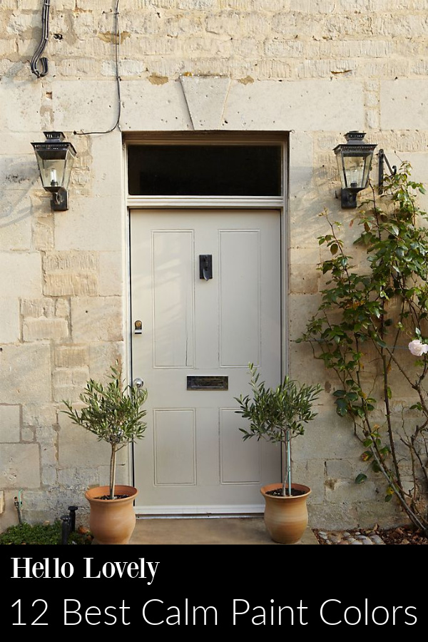
Tranquil calming hues, soft pastels, and soothing neutrals lend a serene, sedative feeling to these home interiors and restful spaces. Not sure where to begin in your search for the best calm paint colors for your room? Start with this primer post with photos of beautifully relaxing, calming paint colors and expert opinions from designers who share their favorites. 12 Best Calm Paint Colors has been freshly updated and aims to help you capture all the zen feels.
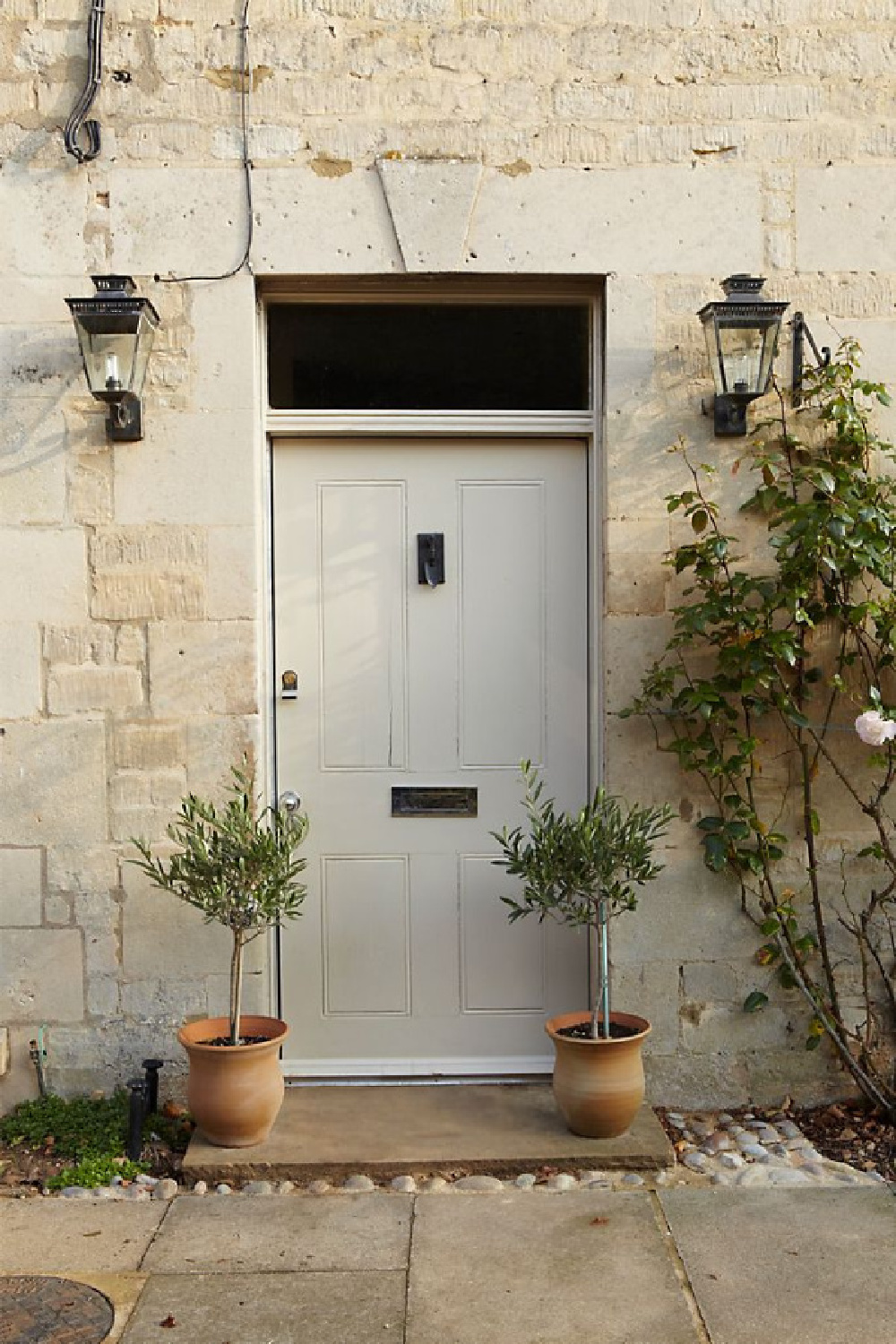
12 Best Calm Paint Colors {Top Picks from Designers!}
You’ll note there are a fair number of Farrow & Ball colors mentioned by designers…did you know you can order samples of them now? Yep. Find them RIGHT HERE.
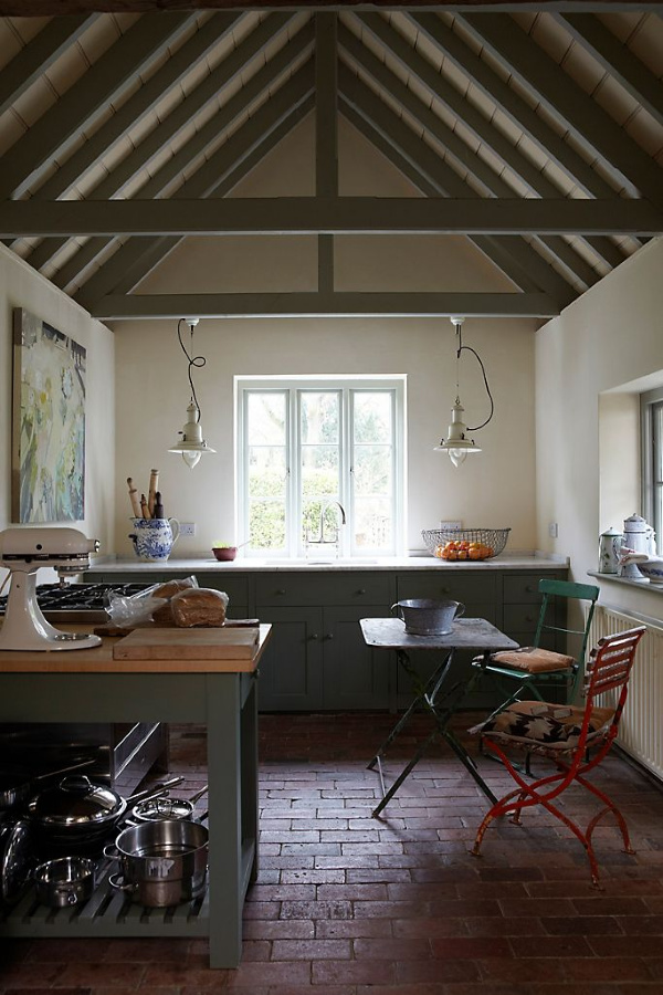
Farrow & Ball Wimborne White

Brooke Giannetti of Giannetti Home masterfully creates tranquility in the spaces she designs and likes to use Farrow & Ball paints. She definitely knows her way around relaxing, calm, colors.
One of Brooke’s favorite paint colors I learned from reading her blog Velvet and Linen is Wimborne White.
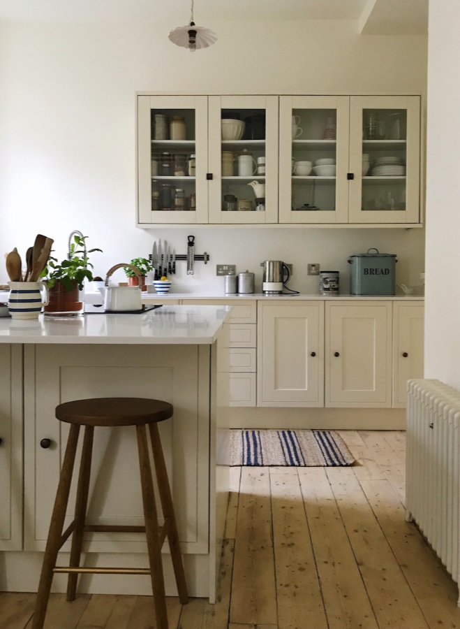
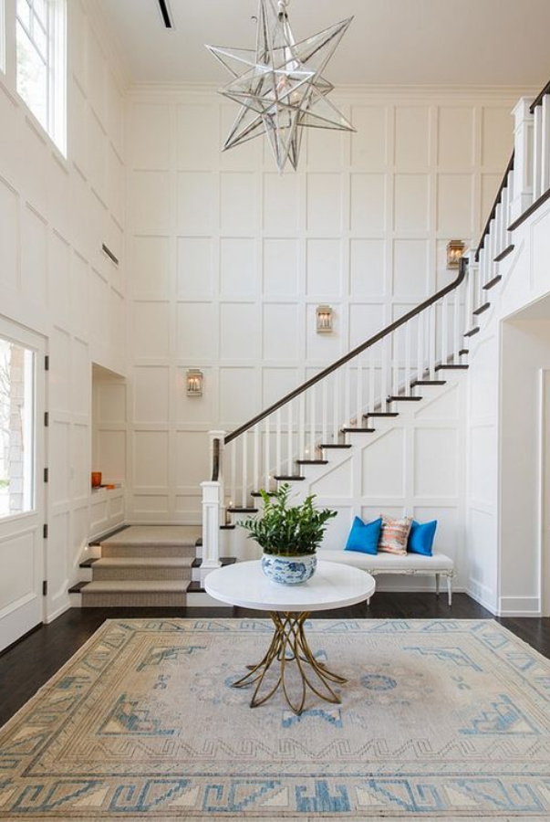
WIMBORNE WHITE…Farrow & Ball. This just off white is named after the market town of Wimborne in Dorset and home to Farrow & Ball. Only a shade away from a pure white, the addition of the smallest amount of warm yellow pigment creates a very versatile shade which is just a little softer than All White.

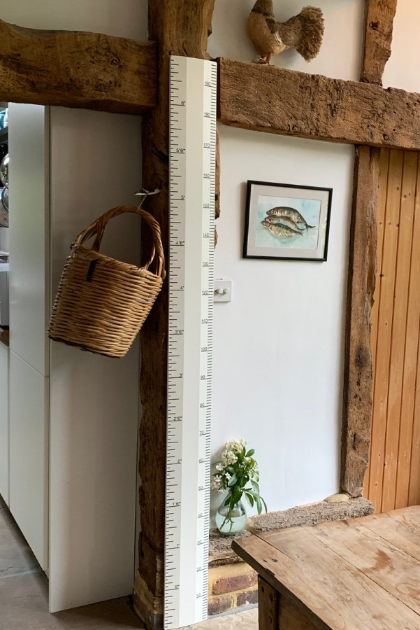
Farrow & Ball Pointing
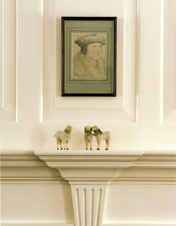

POINTING…Farrow & Ball. “This fresh and uncomplicated white is named after the colour of lime pointing used in traditional brickwork. One of our Red Based Neutrals, Pointing has a warm undertone to it which creates the prettiest of spaces when used on walls and always softens the feel of a room alongside strong, traditional colors.”

If you like a less yellow white, consider Farrow & Ball’s School House White.
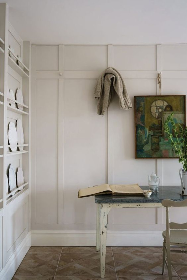
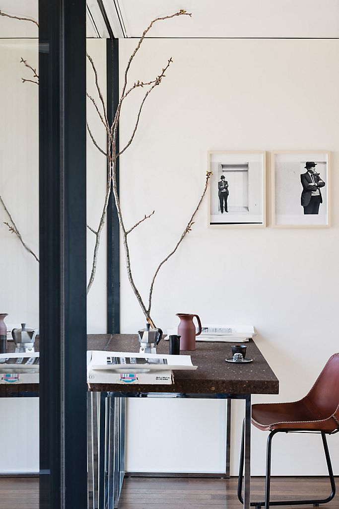
Benjamin Moore Cape May Cobblestone
When I researched the topic of designer picks for tranquil paint colors, this paint color from Benjamin Moore kept popping up: CAPE MAY COBBLESTONE: Benjamin Moore. This classic, elegant gray confers a sense of spaciousness that makes it ideal for small bedrooms and areas like hallways and mudrooms.

Modern Farmhouse Finds
Farrow & Ball: Ball Green No. 75
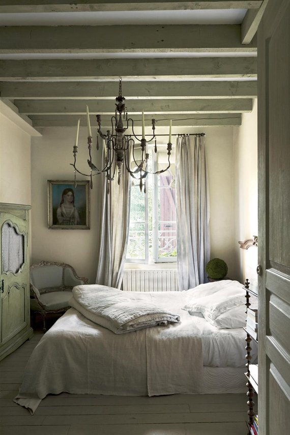
Greet Lefevre of Lefevre Interiors and Belgian Pearls
“One of my favorite tranquil paint colors is Farrow & Ball – Ball Green.”

BALL GREEN…Farrow & Ball. This muted green is a tribute to Richard Ball, the paint pioneer who first founded our company in Dorset, England with John Farrow. It is an old distemper colour with a more sober, established feel than fresh Cooking Apple Green. It has a magical quality of appearing almost silver in candlelight, so is great for use in dining rooms.

Farrow & Ball Stony Ground No. 211
Greet Lefevre also favors Farrow & Ball’s Stony Ground:
STONY GROUND…Farrow & Ball. This strong neutral is one of our most popular wallpaper background colours, so we couldn’t resist adding it to our collection of richly pigmented paints. A classic stone colour, Stony Ground has a slight underlying red which adds warmth and creates a soft beige finish. It pairs incredibly well with the lighter Shaded White or stronger Mouse’s Back for a quietly cohesive scheme.
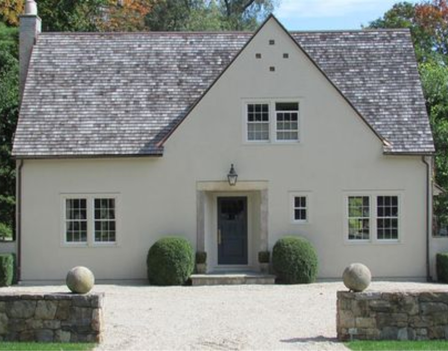
Benjamin Moore Alaskan Husky
Sherry of Design Indulgence:
“I once used Benjamin Moore Alaskan Husky for a gender neutral nursery and fell in love with it’s gray blue tones……It would be a pretty dining room or bedroom wall color mixed with creams and maybe a little gray sprinkled in!”


ALASKAN HUSKY…Benjamin Moore. This color is part of the Classic Color Collection. Surround yourself with your color favorites. These timeless, elegant, Classic Colors guarantee beautiful, usable color all the time, every time. A collection of 1,680 inspired hues that consumers and professionals have enjoyed for years, the colors in this palette are as timeless as they are forward.
Benjamin Moore Edgecomb Gray
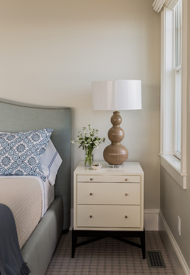
Elizabeth of Pretty Pink Tulips:
“My favorite tranquil paint color for walls is “Edgecomb Gray” by Benjamin Moore; it’s a perfect greige and super soothing.”

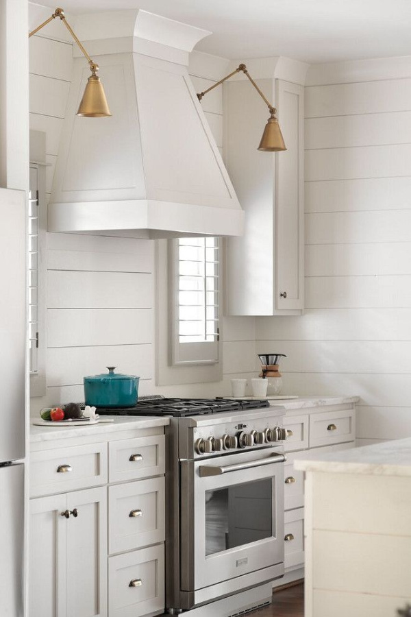

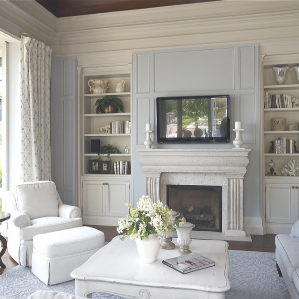

EDGECOMB GRAY…Benjamin Moore. A go-to gray that’s timeless with a modern edge, this earthy, organic neutral is soft and stylish, creating a setting that feels distinctly personal.

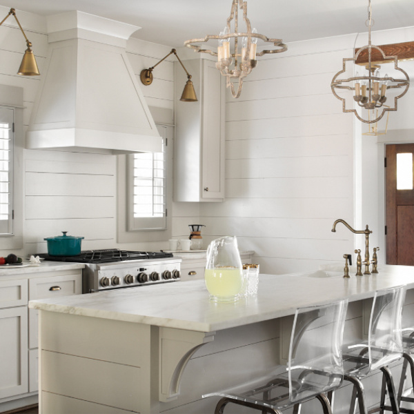
Benjamin Moore Hollingsworth Green
Amy of Maison Decor loves this soothing green.


HOLLINGSWORTH GREEN…Benjamin Moore. This color is part of the Historic Color collection. A collection of 191 time-honored hues comprises our most popular palette. Steeped in tradition, the refined, elegant colors of the Historical Collection deliver timeless color that can be used in traditional as well as contemporary spaces. Unveiled in 1976 to celebrate the US bicentennial, a collection of 191 colors inspired by America’s historic landmarks.
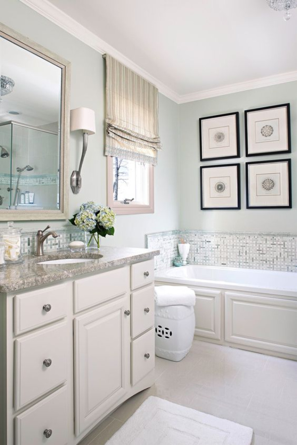

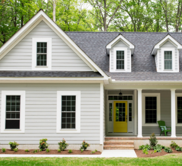
Similar in mood but less green and more grey, BEHR Quiet Time is a light green-gray, lovely for a house exterior. (Free shipping when you order samples from Home Depot!)
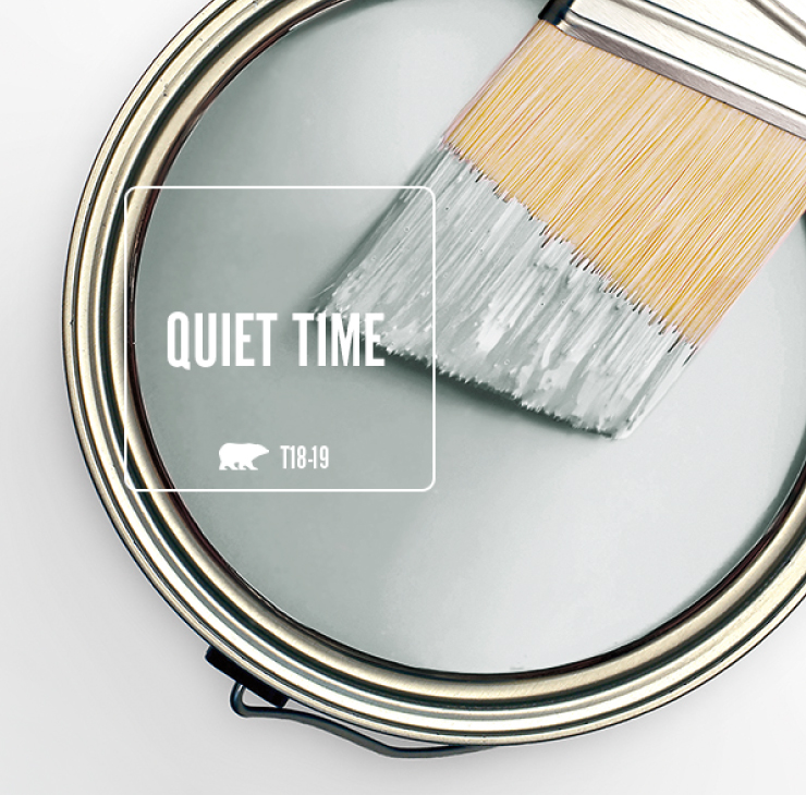

Benjamin Moore Glass Slipper
Mary Ann of Classic Casual Home:
“One of my favorite tranquil colors for bedrooms is Benjamin Moore – Glass Slipper.”

GLASS SLIPPER…Benjamin Moore. This color is part of the Classic Color Collection. Surround yourself with your color favorites. These timeless, elegant, Classic Colors guarantee beautiful, usable color all the time, every time. A collection of 1,680 inspired hues that consumers and professionals have enjoyed for years, the colors in this palette are as timeless as they are forward.
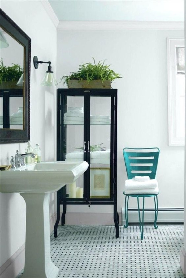
Farrow & Ball Light Blue
Megan Pflug of Megan Pflug Designs
“I love Farrow & Ball Light Blue–its looks more like a green but I find it very tranquil. In general, I love colors that visually, you can’t easily name. I think wall color looks best when the color formulas are complex.”


LIGHT BLUE…This silvery blue was so named because it was the lightest blue Farrow & Ball made in its first collection of colours. Light Blue becomes a little more silver in tone when used in shaded areas so is very popular for use on the walls of internal halls, especially when the remainder of the house is painted in cooler, more neutral greys. When used in well lit areas it feels both peaceful and calming, especially when paired with a cool white like Blackened.

More Love for Light Blue
As for Hello Lovely, we’re in agreement about the tranquil power of Farrow and Ball Light Blue!
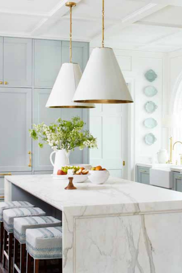
Who can forget those gorgeous painted kitchen cabinets in the Southeastern Designer Showhouse in 2017!?!
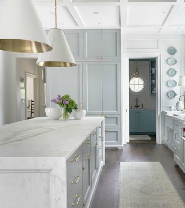
As for my personal picks for the best tranquil paint colors to use, I love all the shades of white, and I painted our interiors Benjamin Moore White OC-151. Yep, it’s just WHITE, and you can sample it HERE.
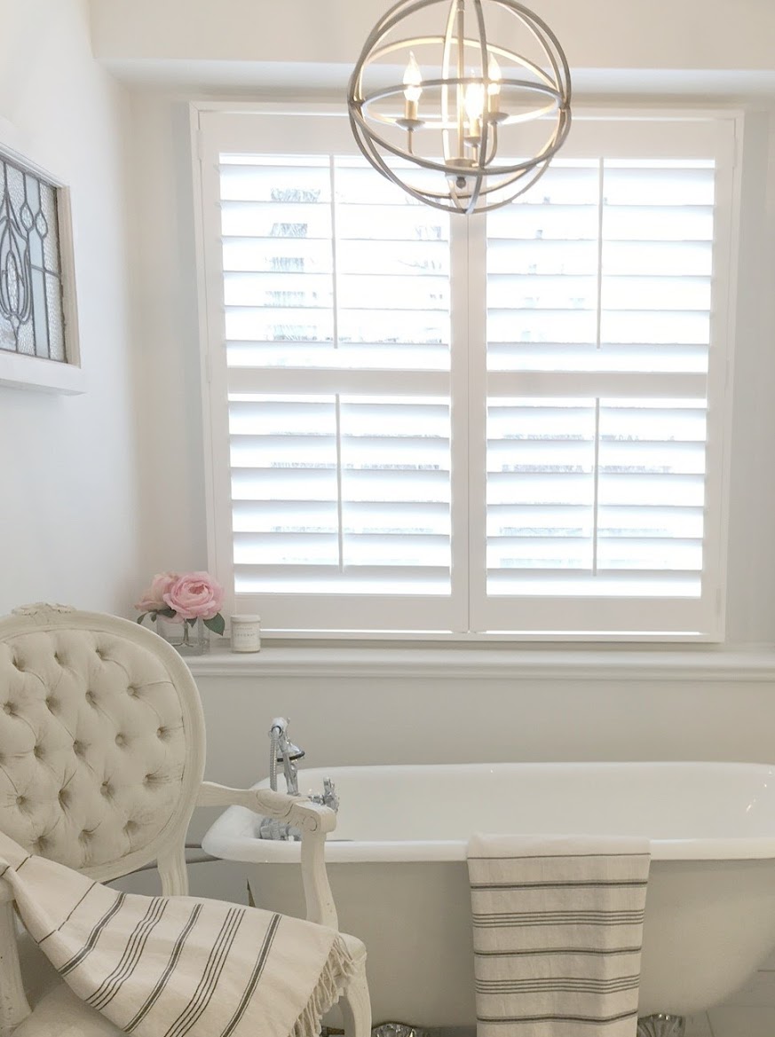
I love tender muted blue-greys that whisper and quiet grey-greens where you can’t clearly say immediately what tones you are seeing.
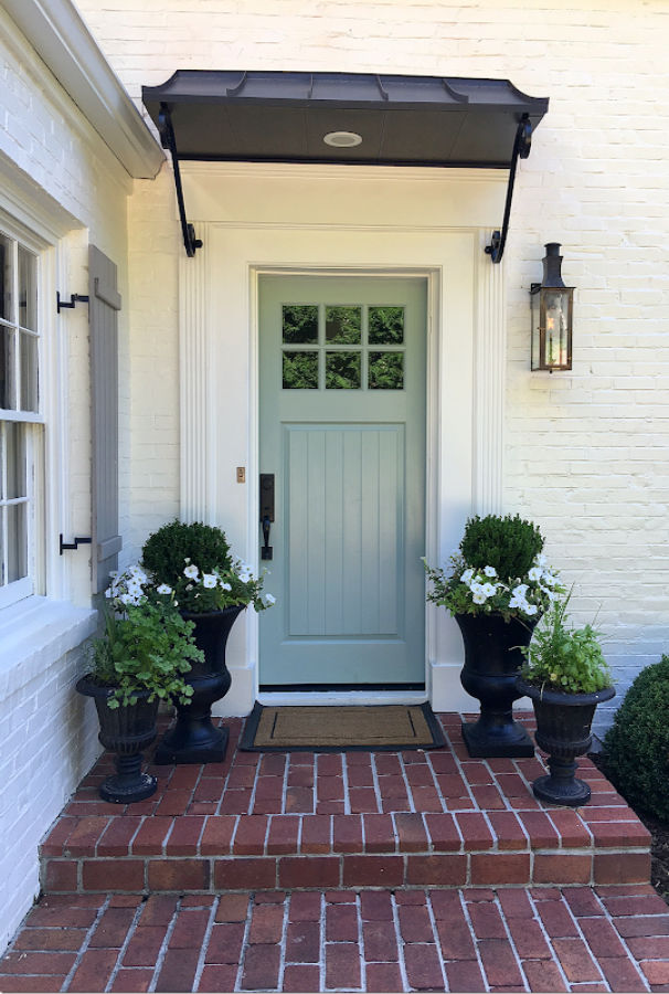
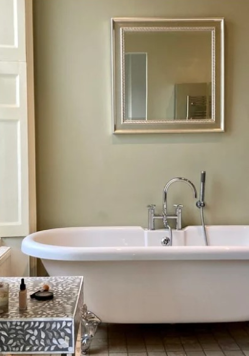
They’re floaty colors that whisper. We used this almost white, light and quiet Benjamin Moore Classic Gray for walls in a bathroom we built from scratch at our former fixer:
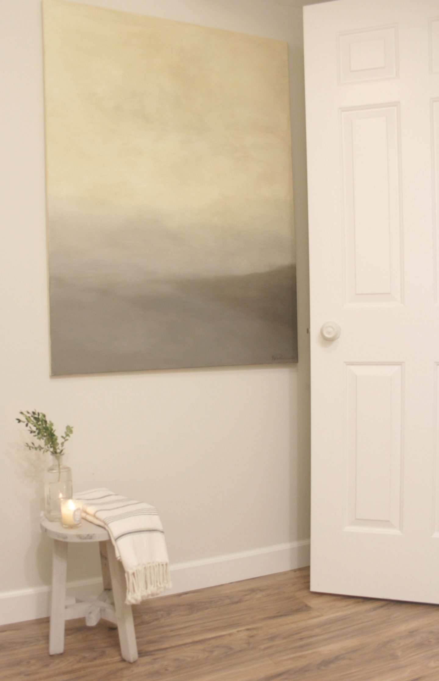
Benjamin Moore Classic Gray

CLASSIC GRAY 1548…Benjamin Moore. This color is part of the Classic Color Collection. Surround yourself with your color favorites. These timeless, elegant, Classic Colors guarantee beautiful, usable color all the time, every time. A collection of 1,680 inspired hues that consumers and professionals have enjoyed for years, the colors in this palette are as timeless as they are forward.

Benjamin Moore Revere Pewter

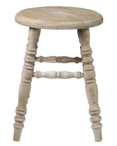
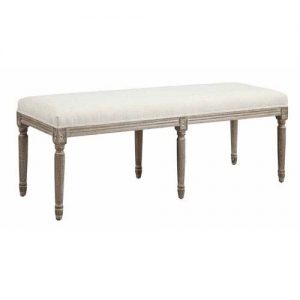
And I love Benjamin Moore Revere Pewter, which I diluted with water for a wash on the stool above and for our bedroom furniture.
REVERE PEWTER…Benjamin Moore. A light gray with warm undertones, this classic shade creates a unifying look that calms and restores. A great transitional color, it’s perfect for an open floor plan.
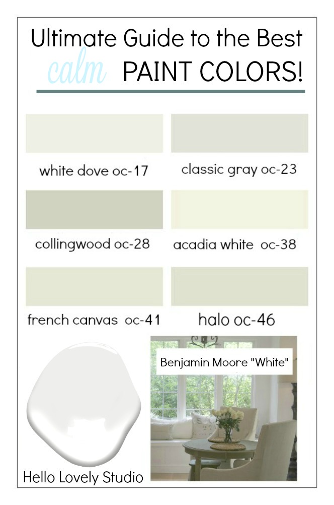
HOW ABOUT YOU? Have a calming paint color you rely on to create a peaceful vibe? Let us know!
For more ideas for choosing the right white paint colors, read this story.
For expert advice from a wall finish expert, here’s help from Segreto Finishes. Easiest way to see if a color is right? Order samples to be delivered to your door with Samplize (a peel and stick sheet of “paint” to stick on your wall and easily move around to other walls!).
And check out these smart tips for DIY painting like a pro.

I independently selected products in this post—if you buy from one of my links, I may earn a commission.
Peace to you right where you are.
-michele
Shop for items you already intended to buy on Amazon RIGHT HERE, and also find home decor here to keep decor inspiration flowing on Hello Lovely!
Hello Lovely is a participant in the Amazon Services LLC Associates Program, an affiliate advertising program designed to provide a means for sites to earn fees by linking to Amazon.com and affiliated sites.










Thanks for the info. We built this house 5 years ago and the builders white walls made me CRAZY:) I am a color person so couldn’t wait to get some color on the walls. These colors may be calming for some but I need a LITTLE more:) Have a beautiful weekend.
Author
I LOVE hearing from folks who love living with color and about a living with more philosophy – it all belongs, doesn’t it? If it was one size fits all, uniform world, this would be a bland universe. Thank you for adding to the beauty, Pinky. 🙂
Benjamin Moore’s “Revere Pewter” was my daughter’s recommendation after she used it for the interior of her two-story family home. It’s lovely for the shell of each room, so I chose it for our guest room with its muted gold brocade duvet cover set and drapers. For our drawing room and hallway, I’m thinking “Stony Ground” by Farrow & Ball.
Author
Jo, I love how gold and brass finishes look with the Revere Pewter! Great pairing! Let me know if you decide on Stony Ground and how it feels. Thanks for adding to the beauty and graciously sharing feedback about these colors. 🙂
How wonderful…did some pinning and will put on facebook. There are some problems with the text…looks like text on top of text. I can send you a screen shot if you like.
Author
You’re a superstar, Mary Ann! Everything looked fine on my laptop, but when I looked at it on a mobile device, it was nutty. Thank you!!! All fixed now I hope. 🙂
Ben Moore, Nimbus. Soft, blue/gray. One of my go to colors. Also mixed it with 1/3 China White for a softer look. Love to play with paint! What a perfect post. Awesome inspiration.
Author
Love that color, Mary! I’ll include it in the next story about the perfect blue-grey and credit you! Thanks for reading, friend.
We painted great room and kitchen in edge comb gray and love it! Such a nice warm greige. Awesome with simply white trim work.
Author
Thanks for the recommendation – I want to try it! Happy Sunday, Jolene. 🙂
Another excellent soft neutral calming paint is BM Muslin! I have BM Edgecombe Gray in my home and love it too!
Author
Ooooooh, I don’t think I know Muslin. I’ll check it out. Edgecombe Gray is a winner for sure. Thanks for adding to the beauty, Diana. xox
I’m a REALTOR and my go-to color for refreshing homes is Sherwin Williams Agreeable Gray — has just a touch of khaki to it, blends beautifully with upholstery of varying tones, really nice with warmer woods like oak and golden bamboo.
Author
Thanks, Lauren! I do love that color and need to devote a post to it – a great post idea too is what to paint your house before placing it on the market. 🙂
What is your go to color for trim when using calm wall paint colors?
Author
Benjamin Moore White Dove is hard to beat! 🙂
What white trim do I use with Benjamin Moore classic gray? This is for a condo on the beach of siesta key, fl
Author
I like Benjamin Moore White Dove best for an off white that is calm with minimal undertones and perfect for traditional interiors. If your space is in need of light or a touch of modernity though and you desire a brighter gallery-like white, BM Decorator White or Behr Ultra Pure White. Hope this helps – let me know if any other questions pop up. 🙂
Thank you for this post! The colors you are describing are just perfect. Especially for an older home. Whispery colors are the best. Just so difficult to find when looking at paint chips & samples. That’s why we need a blog like yours to share with the rest of us!
Author
I’m so glad it’s helpful, Lynn. I agree, it is overwhelming so starting with a handful of color options that designers keep turning to is a great place to start. Best to you.
We recently repainted the living area portion of our finished basement beige with one accent wall painted with Mega Greige. We loved how it turned out. Love Mega Greige so much, thinking of painting the small bedroom in this finished basement Mega Greige. There are only two small high windows in this room. Thoughts? Will it be too dark? Trim closet and door is a light wood color. I thought about changing those to white…but then the basement would need to be this way for consistency, right? But main question is…what do you think about Mega Greige(Sherwin Williams) for a small bedroom?
Author
I love Mega Greige – reminds me of all that taupe-grey you see in Paris. If you love it in the room that gets more light, my suggestion is to use it at 50% in the room that gets less light. If you’re not sure, ask for a sample of Mega Greige at 50% saturation so you can tweak it from there. This is how designers approach a project where they choose one color for the whole house but customize it according to each room’s exposure. That said, I painted a guest room here with a taupe-gey (BM Ashley Gray) and tired of it in less than a year. Painting it white took more coats than I can say…oy. But it’s still white! I would probably keep the trim consistent for the rooms, and I’m sure white trim would look amazing with the greige. I have painted more trim than I can say and have never regretted it. But if the wood trim looks good with the paint color – I wouldn’t go to the trouble.
Love Edgecomb gray and would highly recommend for kitchen cabinets if you want a lighter neutral, but not white! We used Edgecomb gray (after laboring over it!) on our kitchen cabinets with shiplap walls in White Dove (looks like pic in your post) and I couldn’t be happier. I like white but not stark white so White Dove was perfect for me. I also painted our interior doors Edgecomb for added interest and love the subtle contrast against the White Dove trim. All other walls are Shoji White and the subtle contrast between those three colors throughout the house is so calming and pleasant and looks great with all wood tones of furniture and wood flooring.
Author
You’re making me want to buy or build another house, Amy! You know the way to my heart with all this white paint chatter – the contrast of white dove and edgecomb gray is so gorgeous, and I’m not surprised you love it! Thanks so much for adding to the beauty here and helping all the peeps searching for inspiration. xox
I would love to see a picture. Have you posted one anywhere Amy.
I love all these recommendations. I decided on balboa mist for the entire but I ended up painting the office agreeable gray. Should I keep this pattern going and paint the bedrooms all agreeable gray or maybe just the master that’s also downstairs with the office. Then I could paint the upstairs bedrooms classic gray? Would that look ok?
Also, Would you recommend I keep the living room and dining also balboa mist? Or something else?
It would look like this, balboa mist in all the living areas, agreeable gray downstairs bedrooms, classic gray upstairs bedrooms.
I thought another greige for all the bathrooms
Thoughts?
I’m so lost. Thank you for your help
Author
I am partial to Balboa Mist, and yes, I’d suggest it for the living areas and downstairs bedrooms. If the upstairs bedrooms and baths don’t get great natural light, I’d go with Classic Gray. If they get plenty of light, I would probably stick with Balboa Mist since it would make life easier in the future when rooms need touch-ups. I love white bathrooms so a color like White Dove or Classic Gray is a safe bet esp when you want the space to feel clean and bright.
Looking for a paint color for a north facing room. I have jewel tones colors and beige and also have natural oak floors. I am lost I tried greys and they look green. Please help me.
Author
Try Sherwin Williams Agreeable Gray and also consider the greige/mushroom/putty options mentioned in this week’s post here: https://www.hellolovelystudio.com/2020/09/perfect-putty-paint-colors-for-kitchens-beyond.html
We are planning to paint our two small bathrooms in our condo and we need your advice! Both bathrooms have no natural light as they are inside bathrooms. The countertop are black/brown granite and the floors and shower stalls have tuscan tiles. We would like to lighten the look of the bathrooms would paint the vanities in white as well. We like Farrow and Ball’s Wimborne White. Have you any other suggestions that would work? We have painted the living room and bedrooms in White Tie and we love the colour but wonder if that would be too dark in the bathrooms with no light as it tends to look green when there is little light in the room…Thank you!!
Author
I agree that if you’re not after those green undertones, you might want to avoid White Tie in the baths. I like Wevet – maybe try a sample of it?
Hi would love your input i have a very large master bedroom/ bath that is painted in benjamin moore wythe blue with cloud white trim. And mostly white furniture with a grey brick accent wall behind my bed and grey floors. I’m looking for a serene spa like color to lighten it up and make it less busy since I have the accent wall and floors. Right now sherwin williams windowpane is sampled on the wall but feels too light or stark but I definitely want a color on lighter side and nowhere near the medium/darkness of the wythe blue . Thanks so much for any help !
Author
I think a grey color will create the tone on tone, calm effect you’re after and won’t be boring with those multiple textures. I wonder if you might like Benjamin Moore Stonington Gray. I just used it last week on a design project and it is one of those greys that looks wonderful in rooms with dim and bright light. Two other greys I like using are Benjamin Moore Revere Pewter and for a light grey, BM Balboa Mist. Let us know what you ultimately decide!
Hello! I so appreciate your post and your paint recommendations! I am working on calming neutral tones upstairs in my bedroom with an office off to the side and a bathroom. I am wanting to create a shabby chic bedroom and I was looking at Benjamin Moore Swiss coffee but I know that when I go to light it just feels too cool to me!
what are your favorites for a creamy warm neutral tone for the bedroom and then other warm tones may be bringing in a soft blue or green into the office space in the bathroom
i’m looking for a rich and creamy beige that has more brown than gray or yellow in it
Colors I’m considering now for the bedroom are
BM Brandy Cream
BM Carlisle Cream
Farrow and Ball Stonyground
Maybe office
mega griege
warm stone
What is your fave benjamin moore OC colors for bedroom that are WARM neutrals ?
Thank you!
Author
Thanks so much for including me in your quest. I have the most experience and love for BM White Sand and BM Ballet White – these work in a variety of settings and lighting conditions for a warm, earthy, natural, soothing, and nurturing mood. Soft blues are difficult to get right and so interdependent on lighting/location. In the Southwest, with harsh yellow sunlight, a cool grey color like Behr Classic Silver reads gentle, pale, blue-grey. A lot of Hello Lovely readers love BM Quiet Moments. An atmospheric, pale, blue-green, light grey that has worked in many Arizona rooms for me: Behr Eon. While it may look tan on the computer screen, in person it is one of those hues that is hard to pin down or describe – those are always my favorite paint colors.
I love Benjamin Moore Pale Oak/Athena as a very light beige with an ethereal feeling.
Author
Thanks so much for letting us know – have been meaning to try it myself as it is on one of my favorite BM swatches and such a soothing hue! 🙂
Hi there, love this article! Was wondering what you would recommend for a stucoo house we want to repaint the exterior The roof will be cedar shingles. We are thinking about a warm white or soft griege
Thank you 🙂
Author
You might like Benjamin Moore Balboa Mist or White Sand. You’ll find plenty of ideas if you peek around my archives or type a few keywords into the search box on the home page – start here: https://www.hellolovelystudio.com/?s=exterior+paint+colors Feel free to ask follow up questions as I’m always happy to help and brainstorm. 🙂
Can you tell me how you painted your furniture by watering down paint? Was it wood stain before you painted it? Thank you!
Author
Sure. The furniture had an antique white baked on finish to begin with (very yellowy). I thinned regular paint (satin) with a little water so that when I applied it, some of the warm white underneath came through – sort of a striated effect but very subtle. It doesn’t look busy. After it dried, I rubbed on a creme wax with a rag. Let me know if you have any other questions as I am happy to help. Sorry there is no tutorial – I can never find the time to slow down enough with these projects and document each step, and I apologize!
Can you please help me choose a color for my kitchen that has grey tile floors , glossy white top cabinets and grey bottom cabinets
Author
If the base cabinets and floor tile is a dark grey, consider Benjamin Moore Classic Gray for walls since it is a greyed white which will provide a little contrast with the white uppers. If they are a light grey and you want to keep things very tranquil and calm, choose an off-white with minimal undertones like Benjamin Moore White Dove or Benjamin Moore Chantilly Lace. You didn’t say the color of the counters which would influence the choice too. If they are bright white, you might want to bring home paint swatches and view them in natural light to make sure you like how they work with the color of counters.
I sampled BM Ashwood & it seemed to be a very soft gray/beige. It turned out to be the most beautiful very soft green/gray & is stunning! Trim is BM Simply White. Medium gray/brown floors & natural linen duvet & upholstered bed & chair. Furniture is soft washed gray oak. Drapes are a soft ivory. The color is NOT what I was aiming for but it is SO much better. Room gets both north & west lighting. One of those muted colors that is hard to describe. It is the most beautifully soft & soothing room.
Author
It truly sounds like a heavenly mix, Lynn. Ashwood reminds me of Sherwin-Williams Agreeable Gray which is also very atmospheric, sort of a chameleon, and a gentle green-greige. It is what our current bedroom is painted, and I love it, but it may be changing since it so closely matches the color of the furniture. I wouldn’t mind if it didn’t appear that we purposely matched it! I painted the furniture in 2015 and had no idea we would move into a new house with the exact same tone freshly painted on the walls. 🙂
I downsized to a one level open floor plan. I love Revere Pewter, Edgecomb Gray and Sea Salt. The living room has no windows and gets indirect light from the sunroom, kitchen skylight and adjacent dining room window. I’m confused about the direction the LR faces since it sits caddy corner. I want all over wall color that is creamy neutral, captures light but isn’t sterile white. White Sand? I’m considering painting my kitchen cabinets Revere Pewter and countertops. Help please.
Author
I highly recommend sampling before painting the whole room. And I think where I would begin, given these excellent cues from you, is securing a sample of one of those colors you mentioned mixed at 50%…a more light reflective version of the color you use elsewhere. If you have trouble at the paint counter securing that 50% custom sample, you could do what I do and simply mix your own sample. Stir a quantity of the color at 100% with the same quantity of an untinted white (right off the shelf, or a white such as chantilly lace). If the custom color does the trick, you can bring the sample you made to the paint counter for a custom color match.