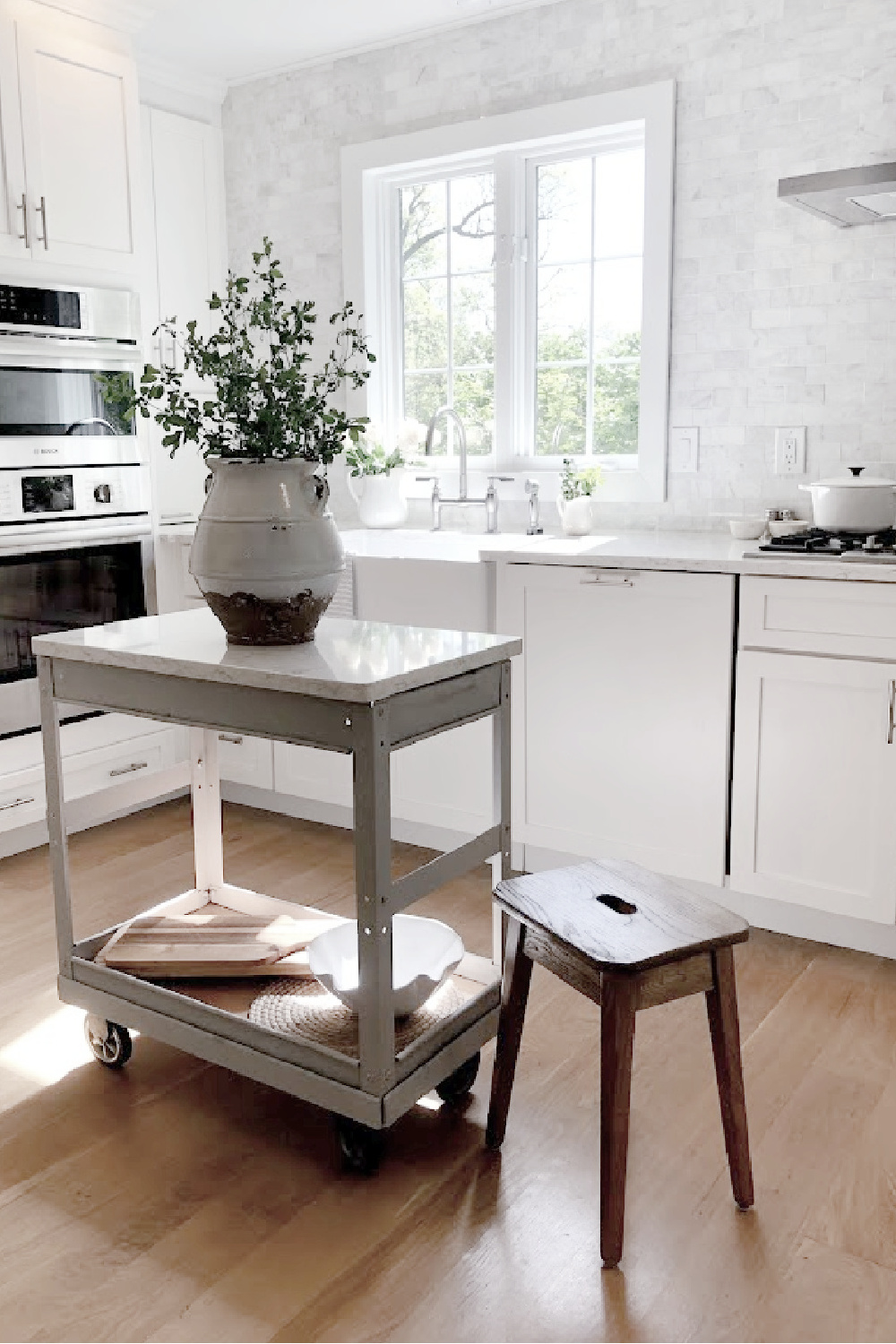
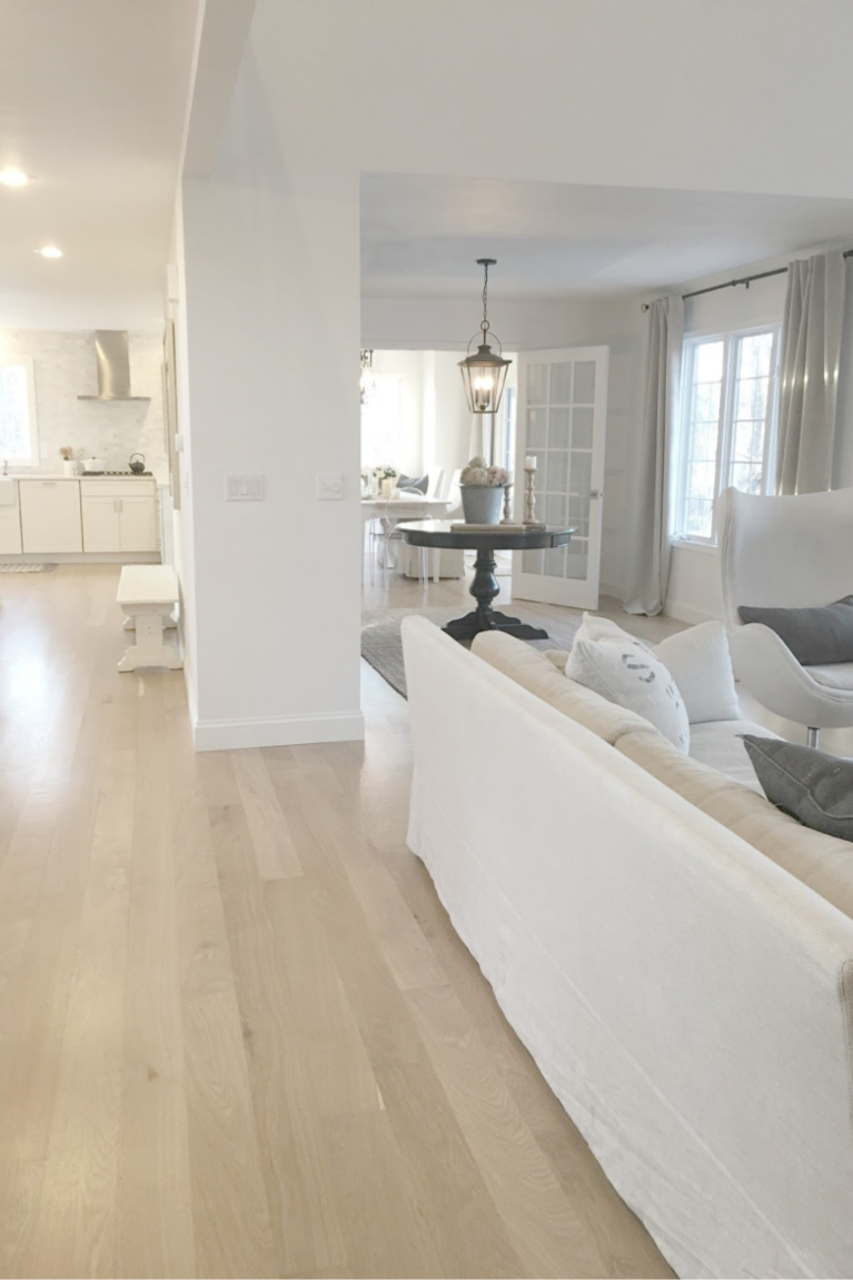
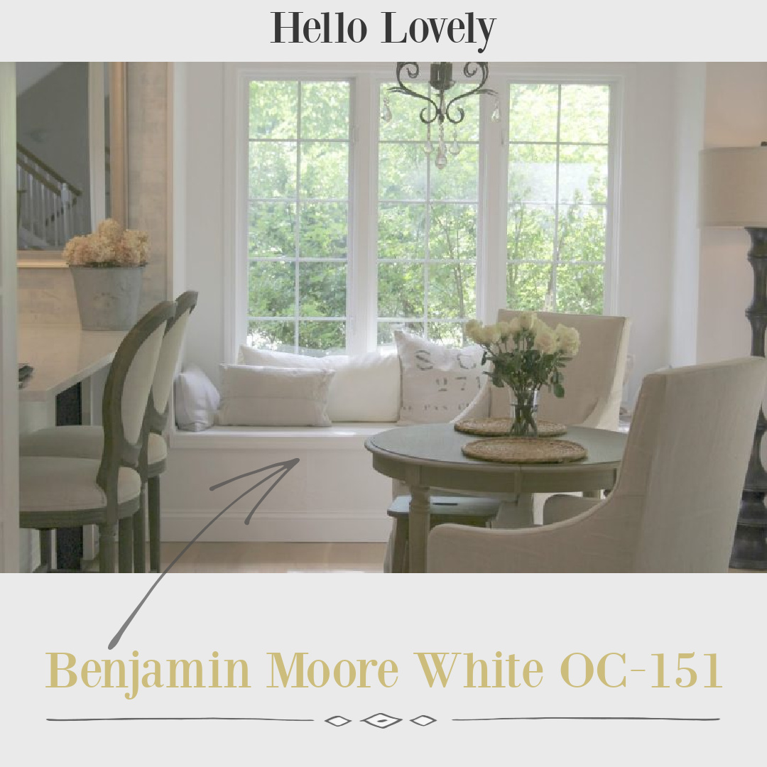
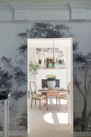
Need an idea for a cool, bright white paint for walls, trim, or even ceilings? Sometimes we simply need a place to start with plenty of images to get a feel for the paint color. In our former home, we chose Benjamin Moore OC-151 for all of the interior walls, ceilings, and trim. My style is modern European Country, and I wanted cool white subtle contrast with all of my warm neutral furnishings. BM calls this “a classic, all-purpose white that creates a clean canvas in the home,” and it definitely delivered on being a perfect white canvas to set a modern, gallery-like fresh mood.
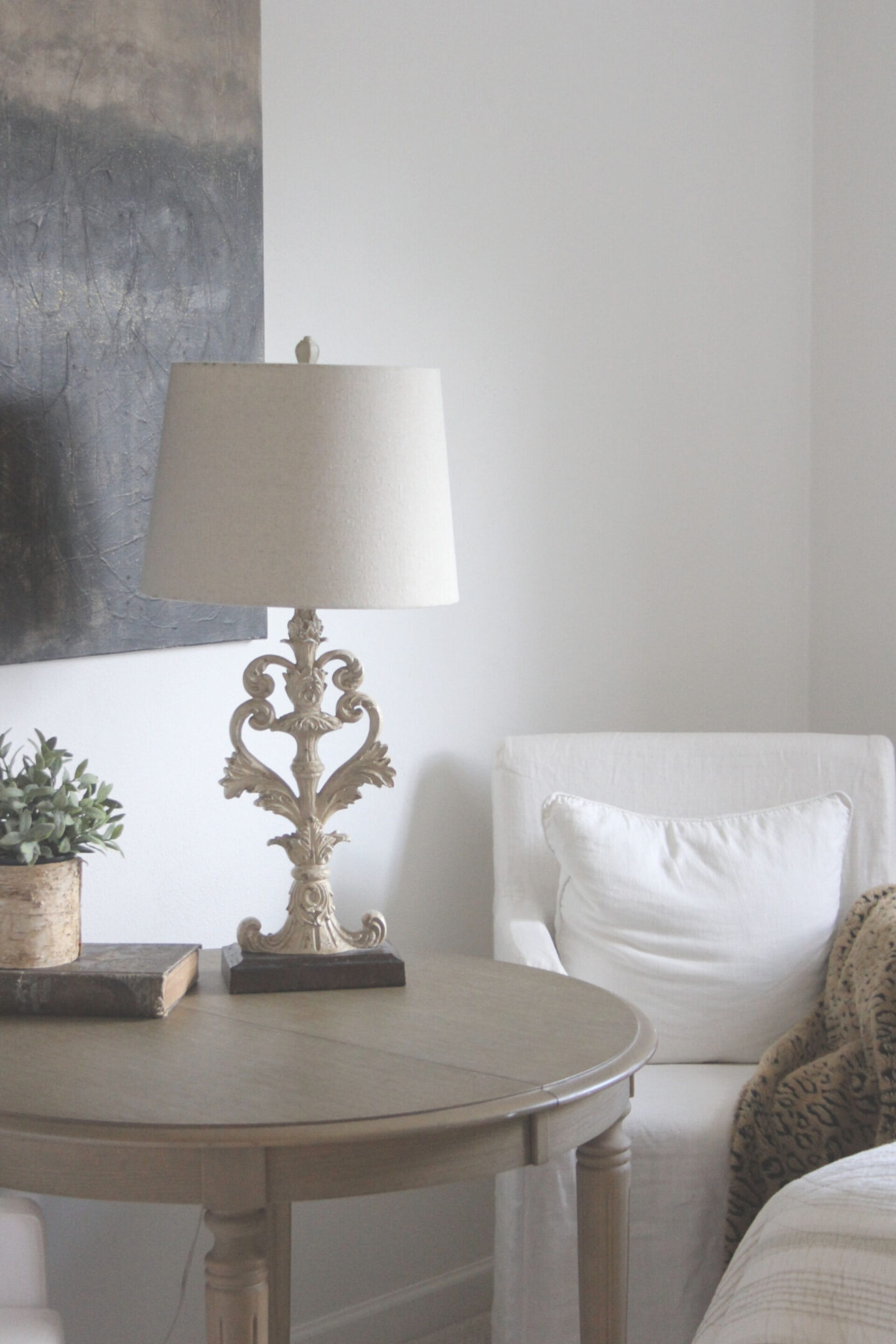
I’ll show you this color’s effect within different rooms at different times of day so you can decide whether to sample this white in your own home.
This post contains affiliate links which I hope you will use since they won’t cost you a penny extra yet may earn this blog a small commission.
Benjamin Moore OC-151 Photo Gallery
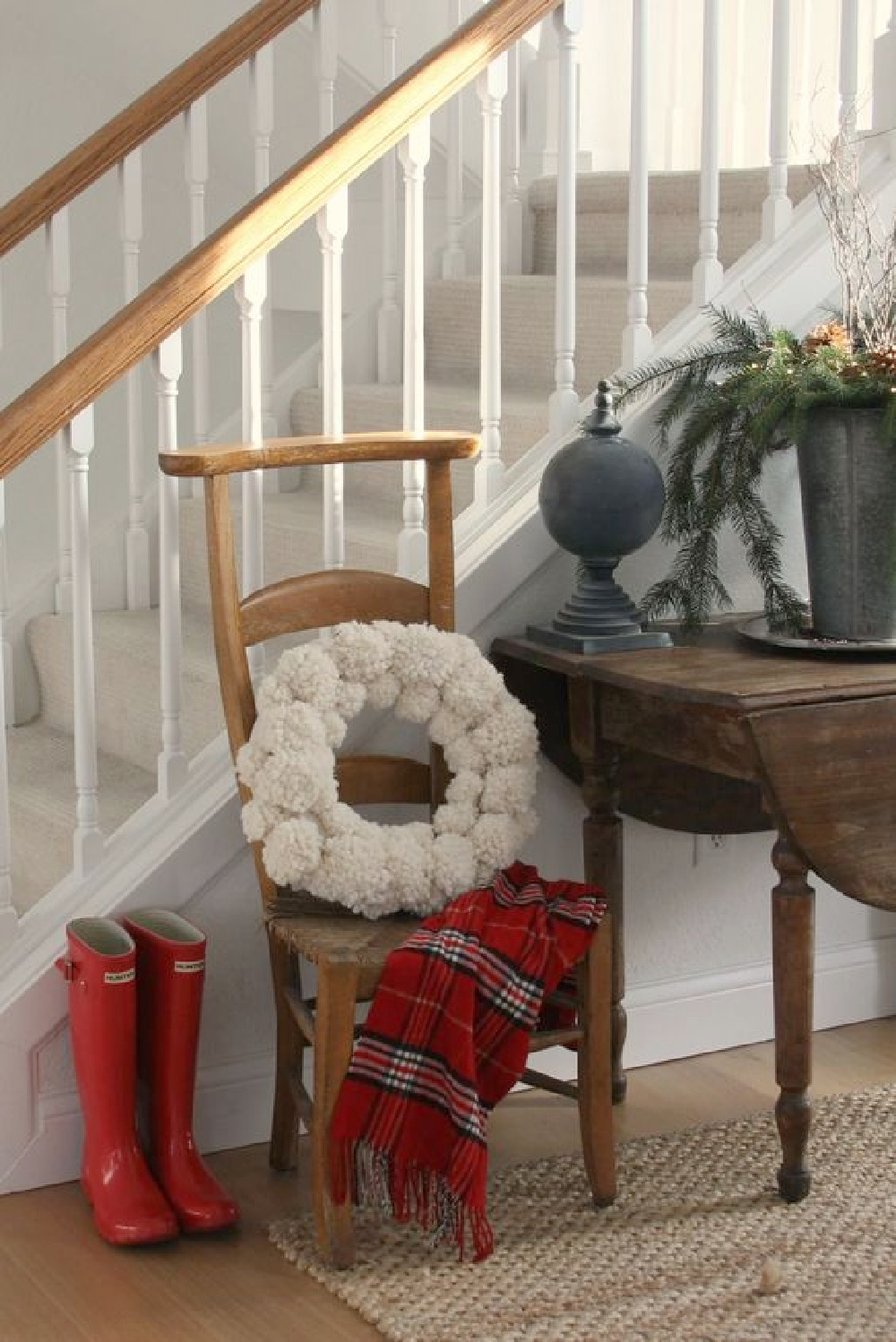
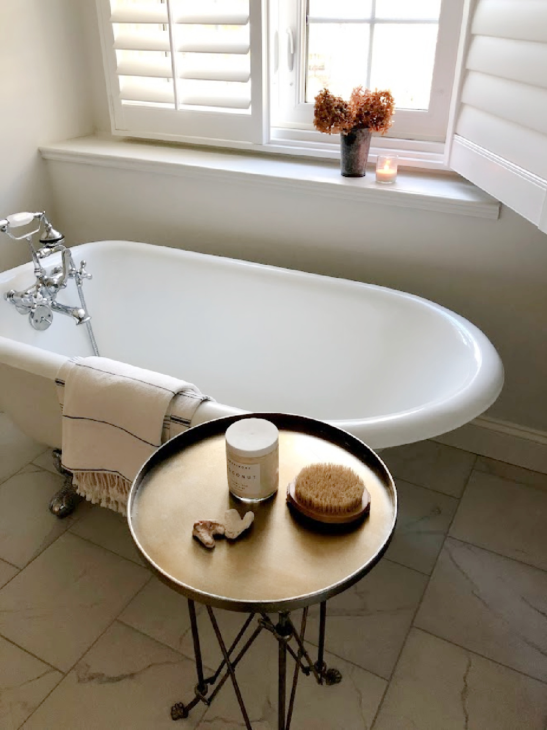
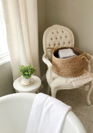
Hopefully it will help to see White OC-151 on walls (flat), trim (semi-gloss), and ceilings (flat) in various sheens in bedrooms, kitchen, bath, and living room with different amounts of natural light and in different seasons.
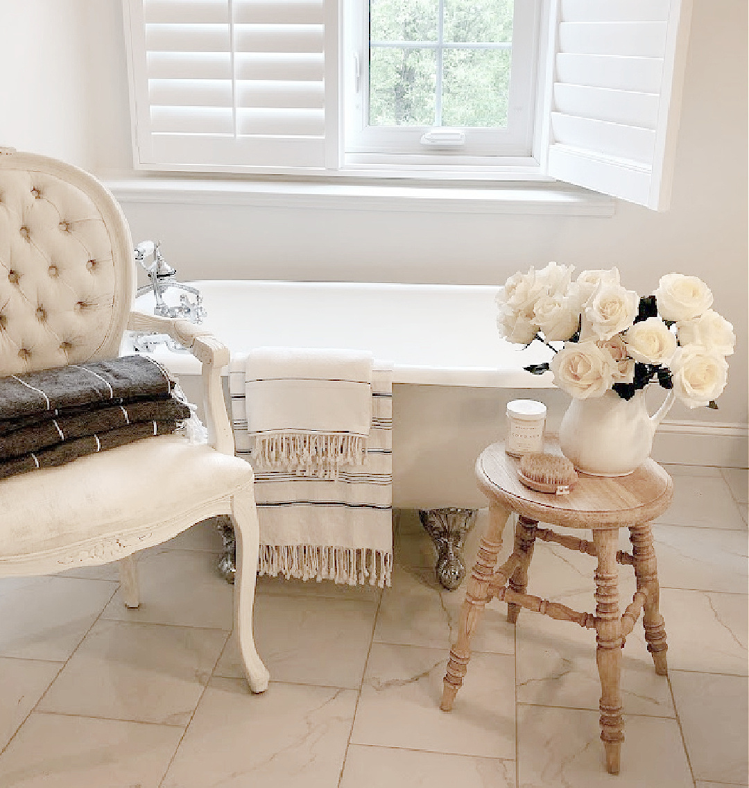
How Bright and Reflective is OC-151?
The LRV (light reflectance value) is 83.56 so it is going to reflect lots of light in the room. Our home receives a fair amount of strong yellow sunlight, and I needed a white that would not pull yellow or creamy warmth.

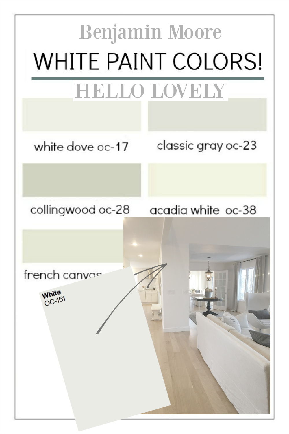
Plentiful shades of white paint exist for good reason: they vary in terms of undertones, light reflectance (LRV), and temperature (cool or warm?). Choosing the right shade of white for your unique space involves a little bit of detective work and mindfulness.
Even after you find what may be the best white paint for a particular room, it may look less than perfect in another part of the house or another home.
Why is that?
Your room’s unique lighting, exposure, lighting, furnishings, etc. impact perception of the color and the complete design picture. Rooms within your home vary in their exposure and window placement so the same color will vary.
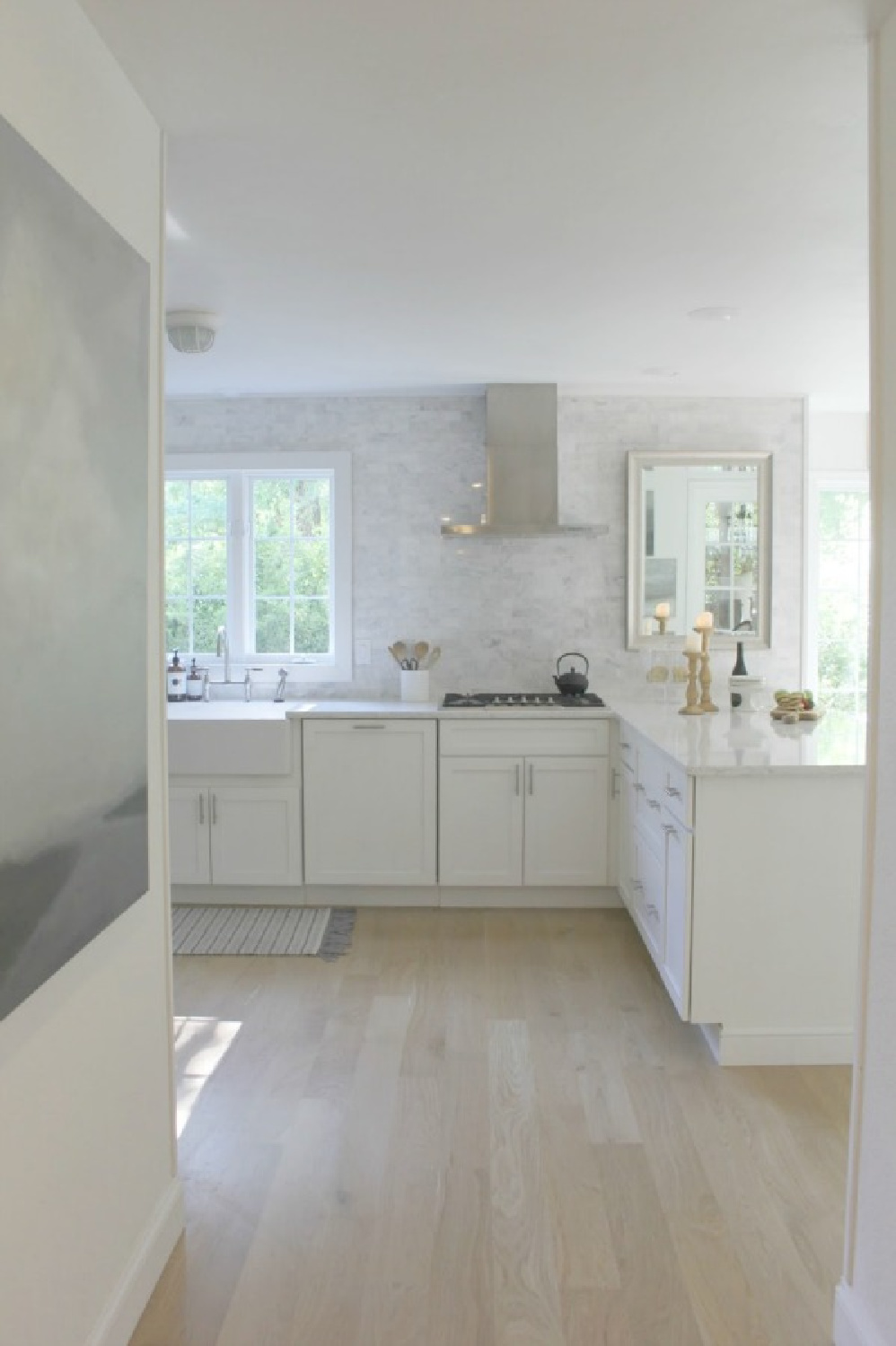
It didn’t bother me that the BM white I liked best appeared slightly different room to room.
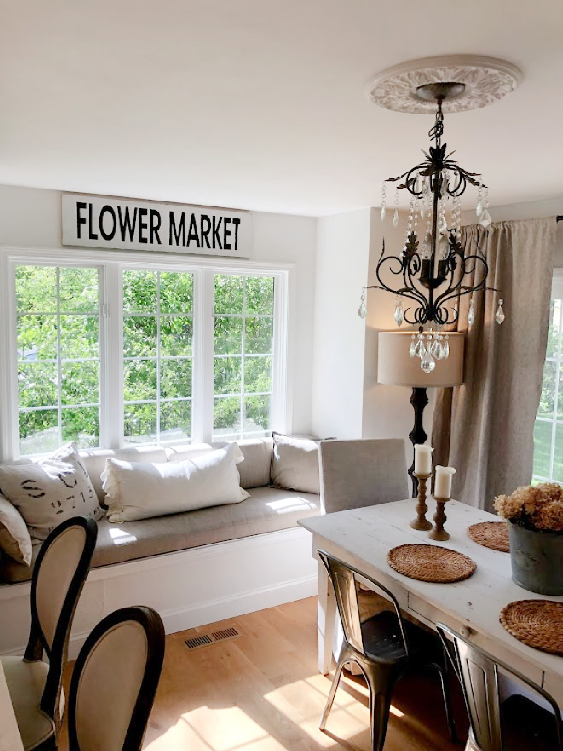
The important part was finding a white that met my criteria: felt modern and clean, didn’t look dingy, and had plenty of cool undertones so it wouldn’t look yellow at any time of day.
Let’s explore more advice for landing on the white with qualities that enhance your own space.
Am I Even Qualified for Paint Color Consultation?
Long before I became a writer or a blogger, in 1987, my husband and I began re-decorating homes. So I have a history and love affair with carefully choosing colors, patterns, and textures for interiors.
In addition to my experience decorating, designing, remodeling, and renovating homes for myself and others, I have also studied color theory, painted as an artist, and culled expert advice from professionals in the field.
Additionally, I have catalogued the best tips and paint color intelligence from in demand designers, artists, and analysts working in the industry.
Personal Tips for Choosing the Best White Paint Color
With decades of experience painting walls, objects, and canvases, I am most experienced with a neutral color palette and have a trained eye for whites in particular.
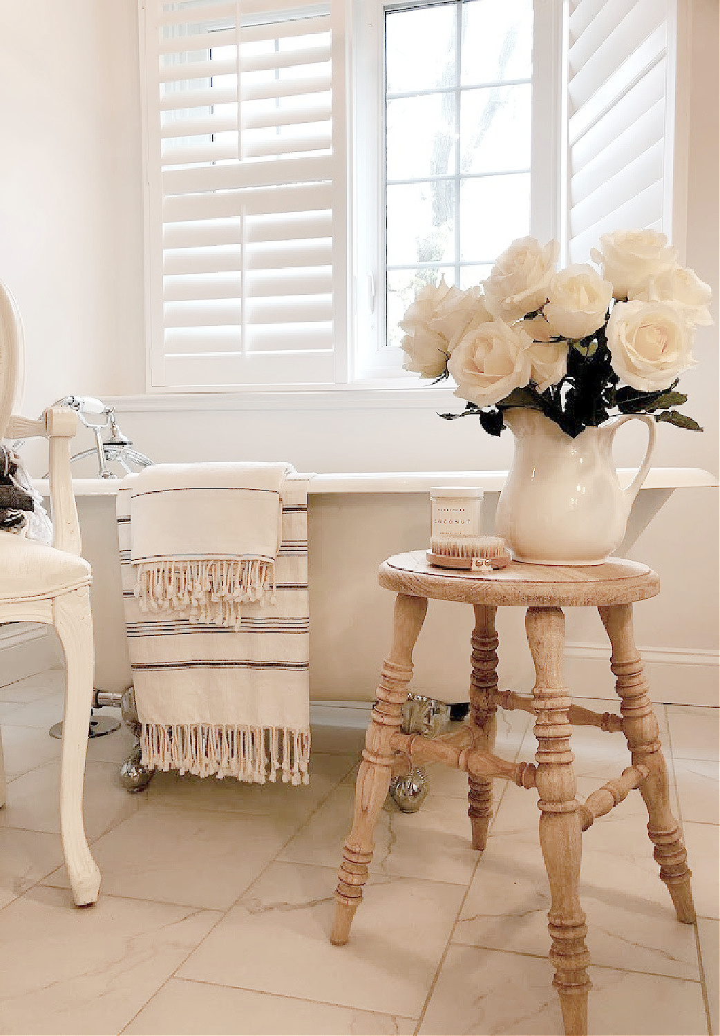
It is imperative to remember that there are not just a few good white paints floating around.
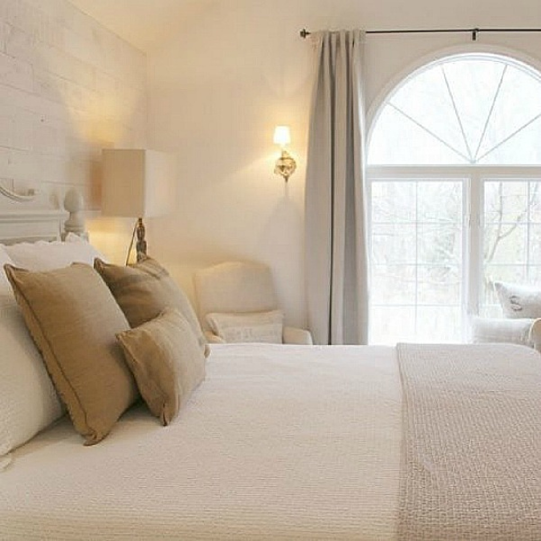
In fact, there are endless variations with varying pigments, LRV, and temperature.
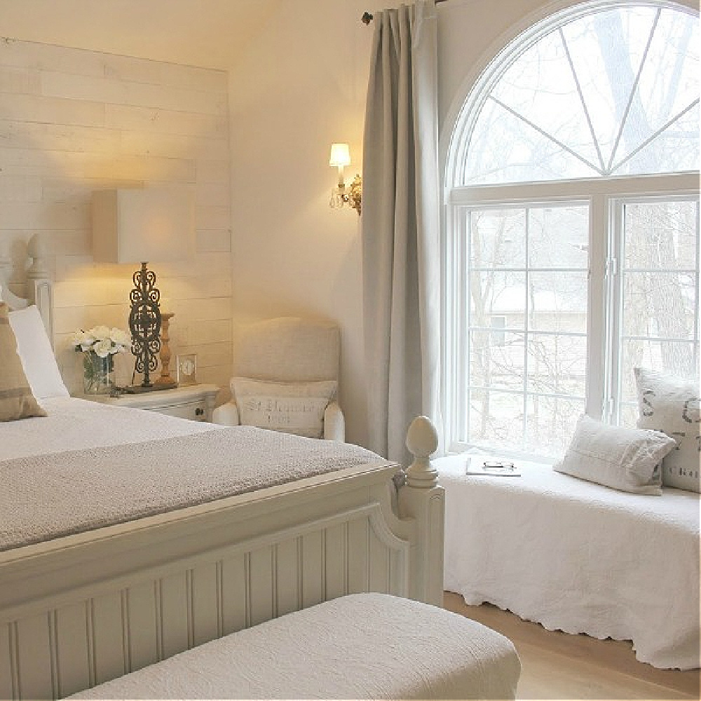
One of the most common questions I am asked all of the time is a version of: WHAT WHITE COLOR WILL MATCH WITH _________ AND _____________?
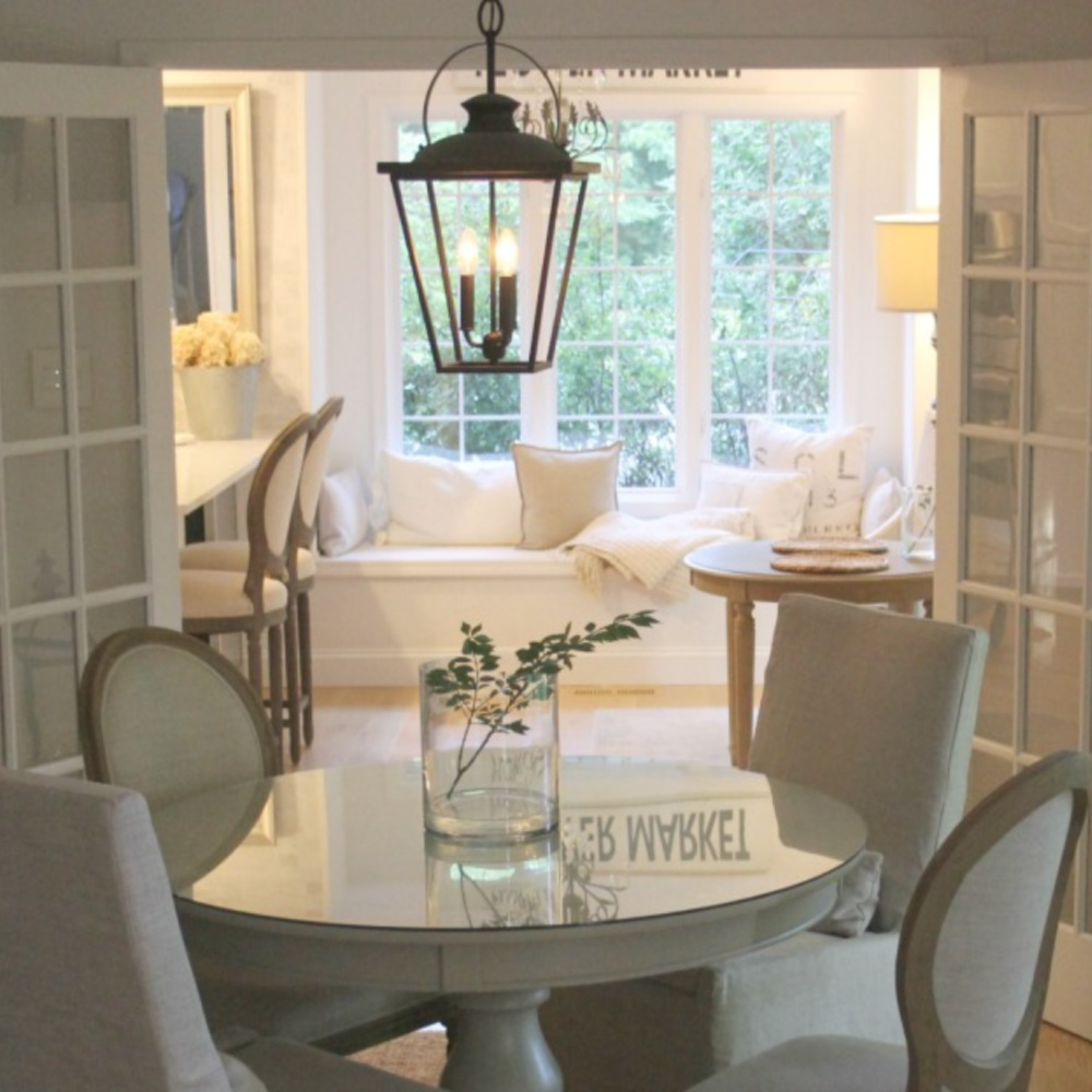
Most homeowners have little experience thinking about the beauty of a mix of whites living together.
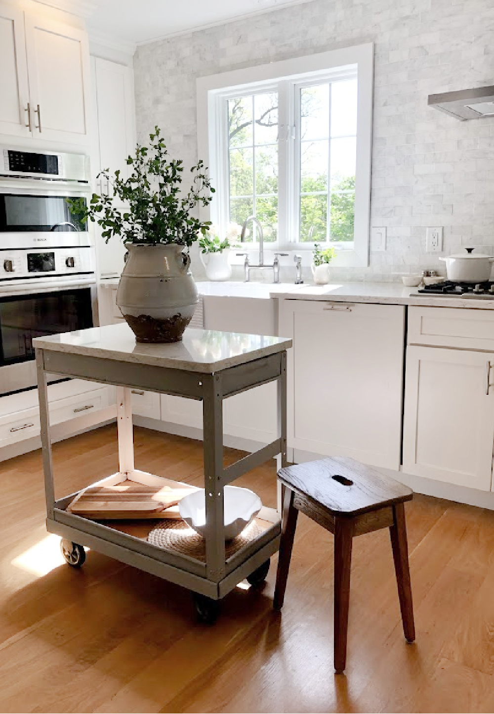
Rather, they think the main goal is “matching” so that all of the whites (walls, cabinets, fabrics, trim, furniture) are the same white. But matching is NOT the objective and can leave the composition flat and uninteresting. To arrive at a pleasing, sophisticated, welcoming overall mood, it’s better to lean into concepts of harmony and balance as opposed to matching.
1. Whites Interact With Natural Light & Geographical Location
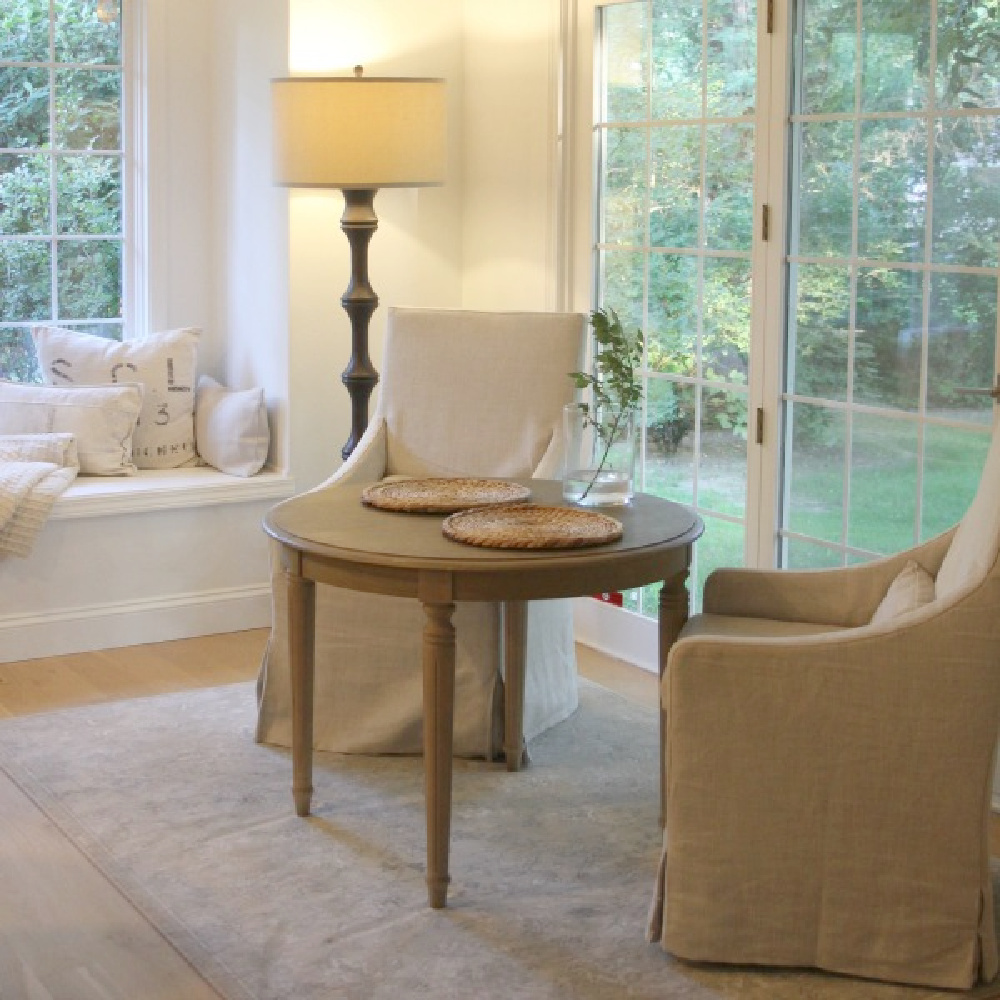
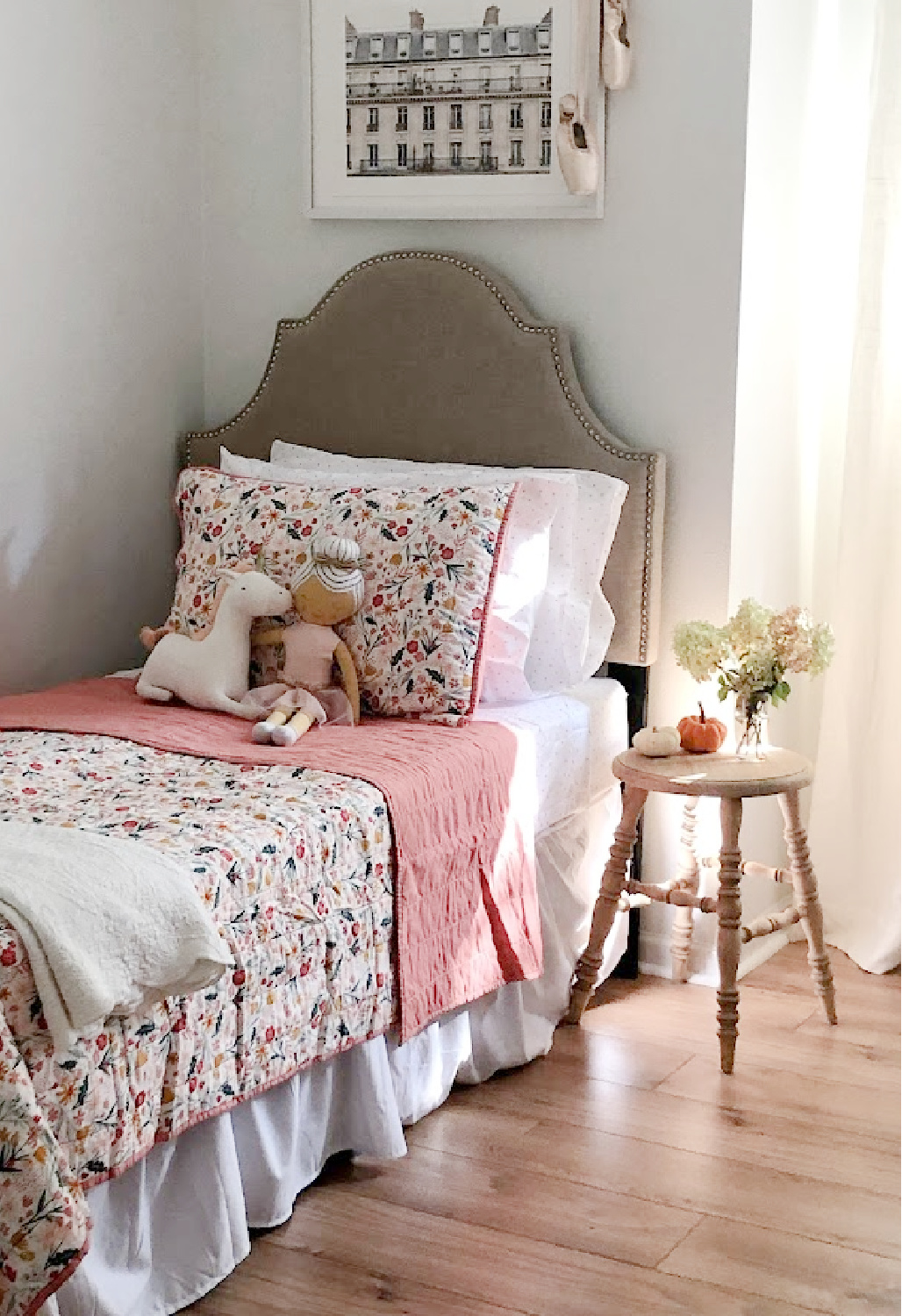
Since I live in Northern Illinois where the light is wholly different from the light in the Southwest, white paint colors here take on a particular quality as a result of the light. I like the contrast of BM OC-151 with warmer linen colors, sunlight and golden tones from light wood.
2. A Wildly Popular White Paint May Not Be the Right White
There are certain bestselling whites that work for a ton of spaces across the country, but they aren’t guaranteed to be the most flattering to your home. I had never heard of OC-151 and started with samples of BM Decorators White, White Dove, and SW Alabaster.
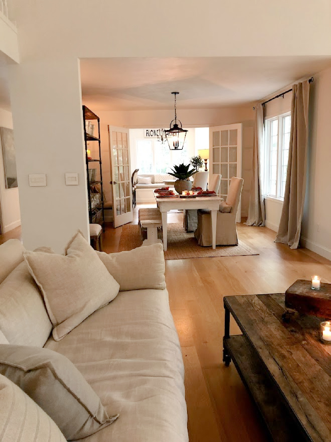
As soon as I sampled this color with the most boring name (sample Benjamin Moore White right here), it was the only choice that immediately felt right. To choose the BEST WHITE, don’t become obsessed with just one color you see in an image or on Pinterest and assume it will be perfect without trying a sample.
Why?
First, professional photography for print or web often involves editing. Second, your room’s location and lighting are unique. Third, often a lot of folks experience an emotional reaction to the mere NAME of a paint color which doesn’t mean a thing.
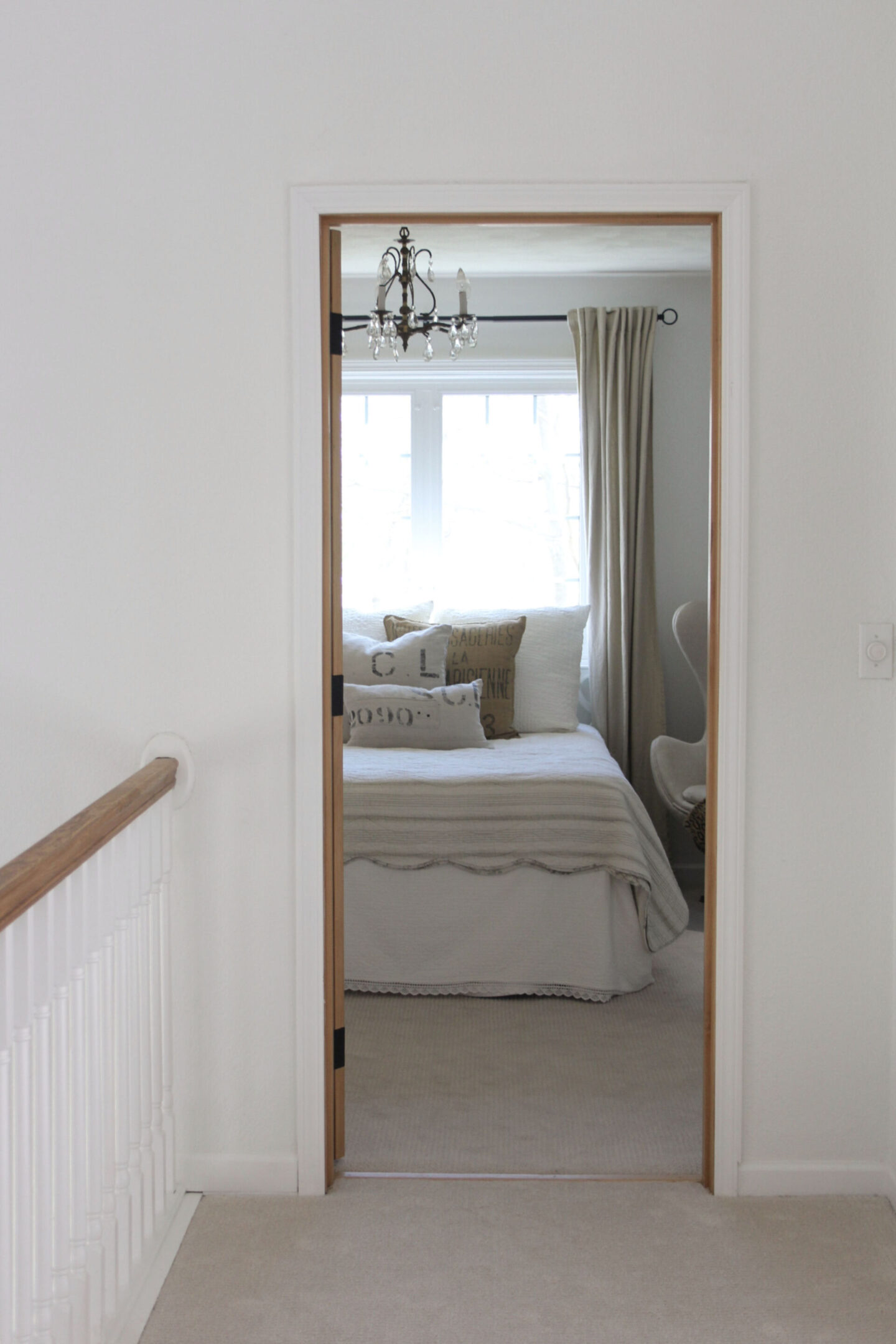
3. Sample This Benjamin Moore White With Other Whites
Begin with a handful of samples for your walls. You could also try Brilliant White OC-150, Sherwin-Williams SW Extra White, and BM Chantilly Lace.
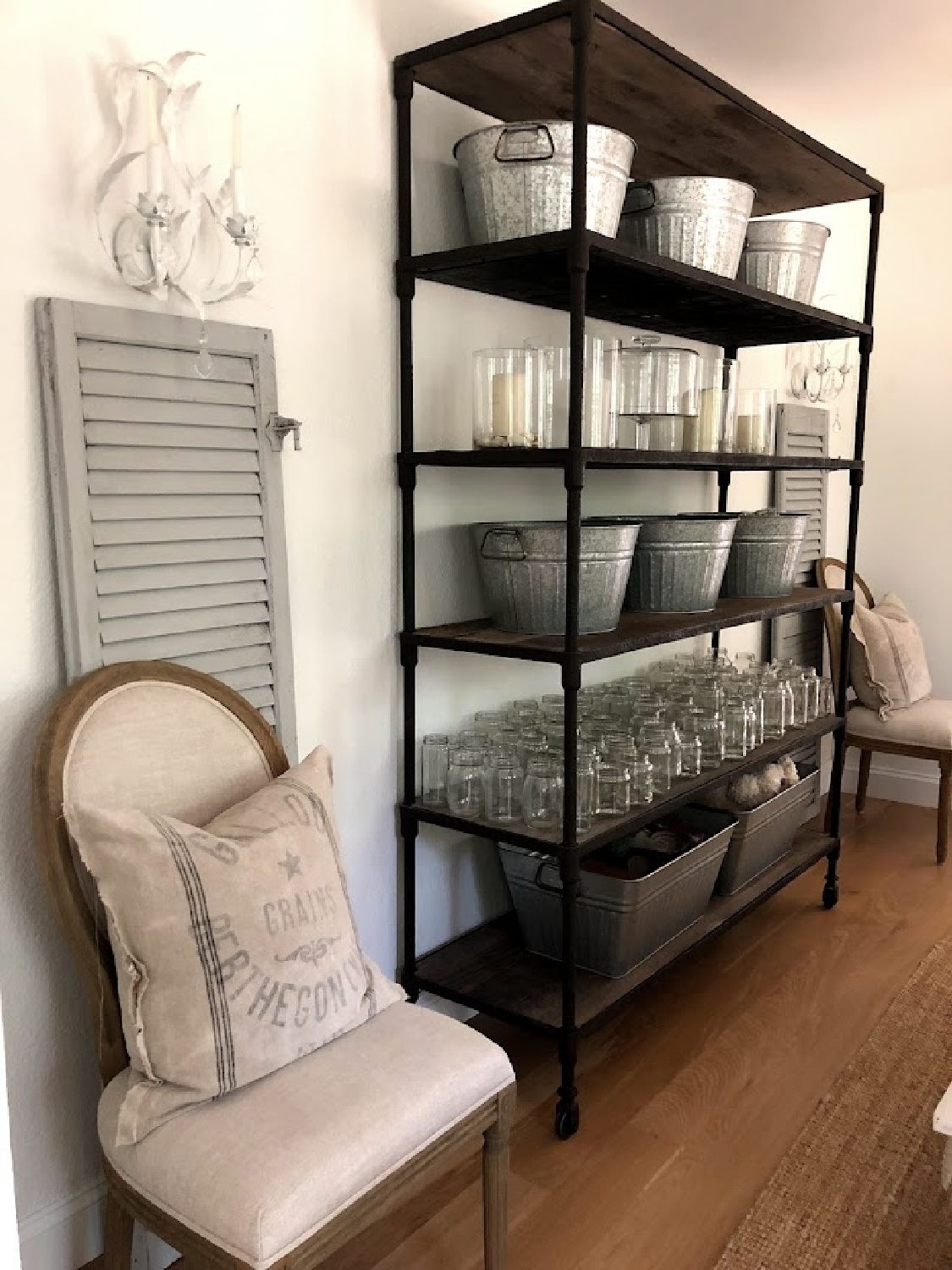
You’ll begin to notice the subtle differences and see the influence of undertones.
In our own home (we’re on our 6th whole house DIY renovation), I first selected about five different bright clean white contenders.
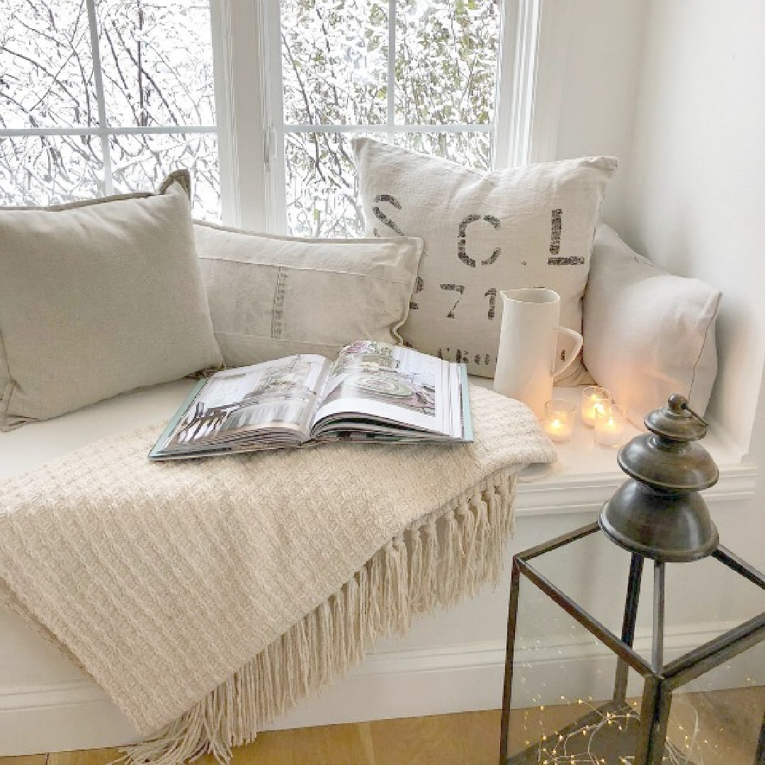
4. Analyze the White Paint Samples
After viewing the samples in different rooms throughout the home at different times of day, I scrutinized. I took time to notice how the white changed or didn’t change throughout the day.
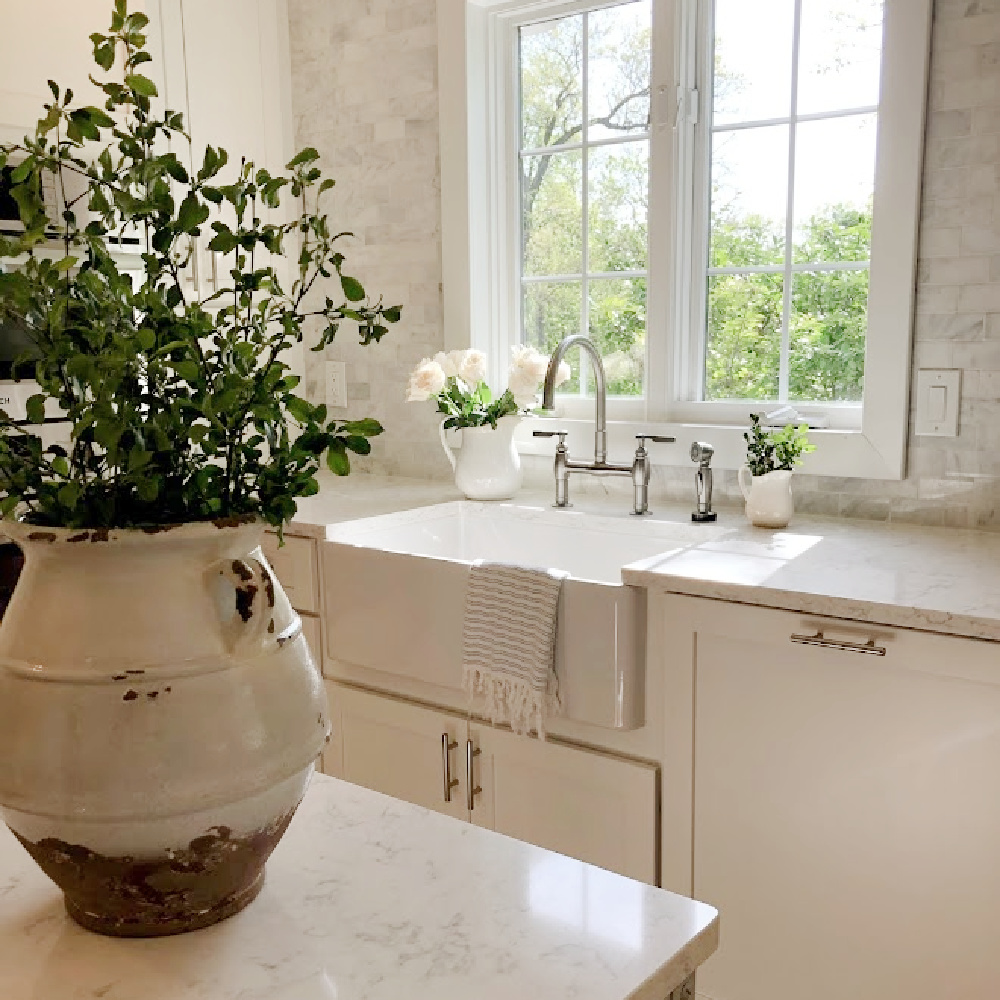
5. Undertones in White Paint
All whites have subtle undertones of grey, pink, yellow, brown, blue, etc. which influence the white’s temperature and perception in varying light.
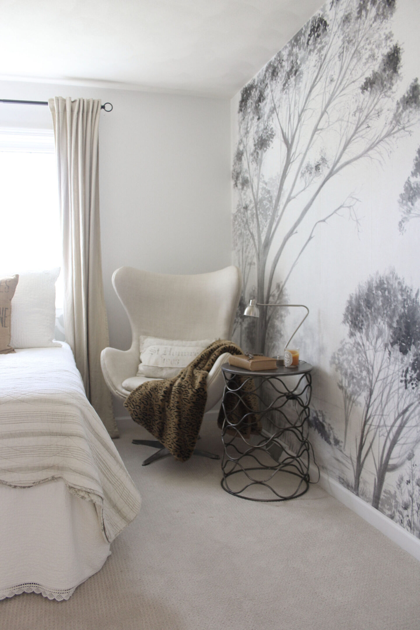
Even your age can come into play as far as perceiving color. Did you know as we age, the lens of the eye gradually yellows?
This yellowing lens will influence perception of colors. The lens will likely absorb and scatter blue light so that it is trickier to notice nuances in shades of purple, green or blue.
6. Why I Ultimately Chose This BM Neutral
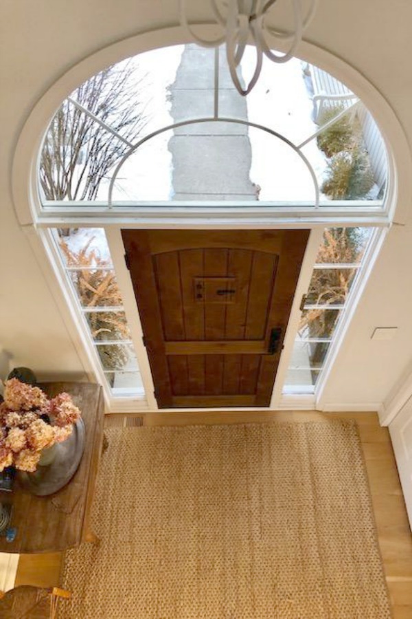
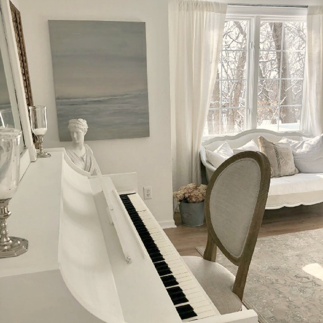
I can imagine that this white could be too stark for certain interiors, but in ours, it took on a cool, modern, gallery-like, slightly monastic and ethereal feel. You can see the snow outside in this image I snapped and how it reads much colder than the paint color.
Will the Right White Stand the Test of Time?
We painted all the walls, trim, and ceilings in our North-South exposure home (which receives intense yellow sunlight) BENJAMIN MOORE White OC-151. Seven years later when we put the home on the market, we still loved it and had no plans to change it. Trends come and go, but when you stick to classics and listen to what a home’s architecture and lighting are whispering, you’re saving yourself a lot of time and money in the long haul.
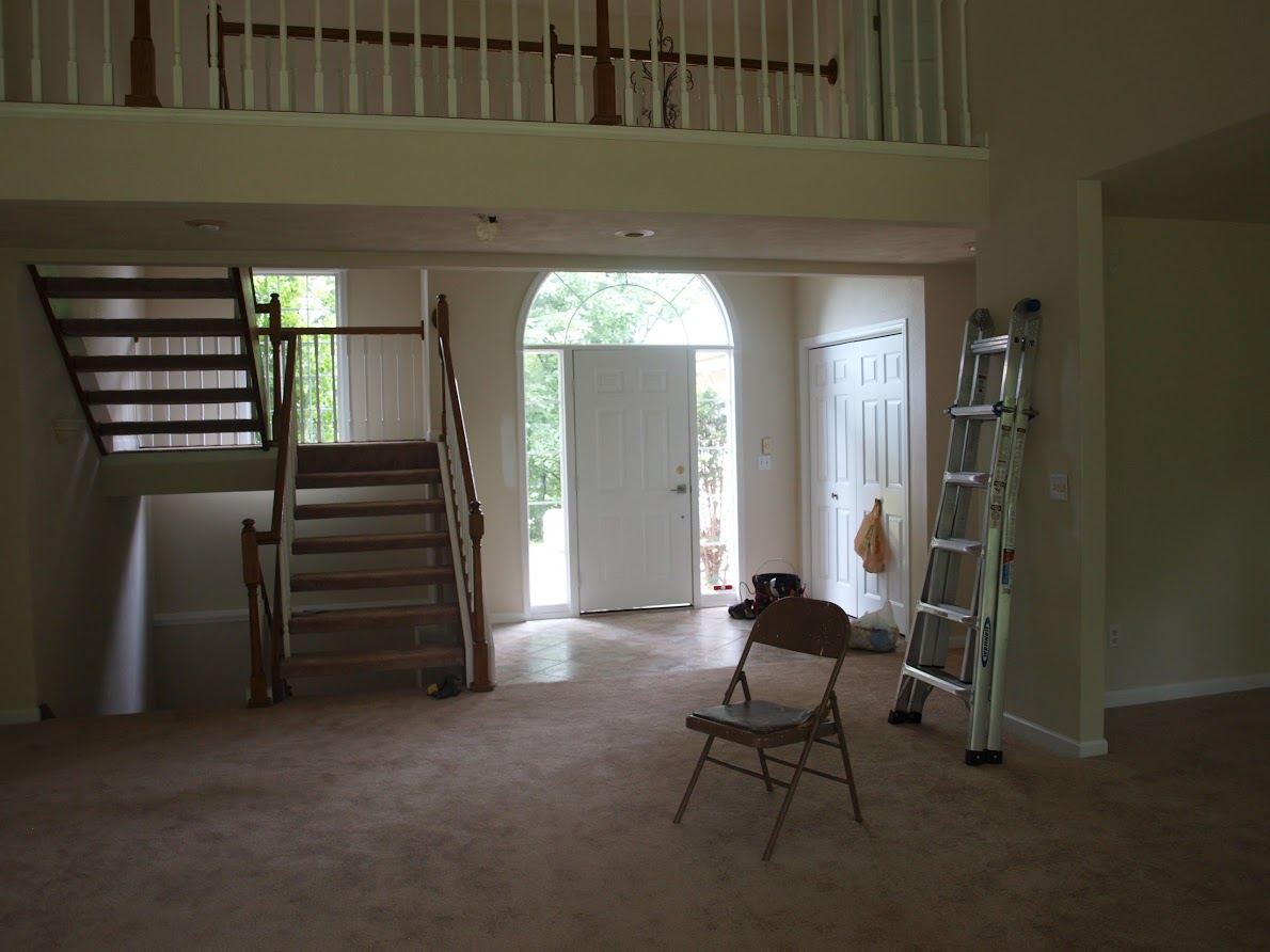
What a transformation when we painted over yellow walls!
The minimal simplicity of the name of this Benjamin Moore white means there’s no chance we’ll forget the color’s name!
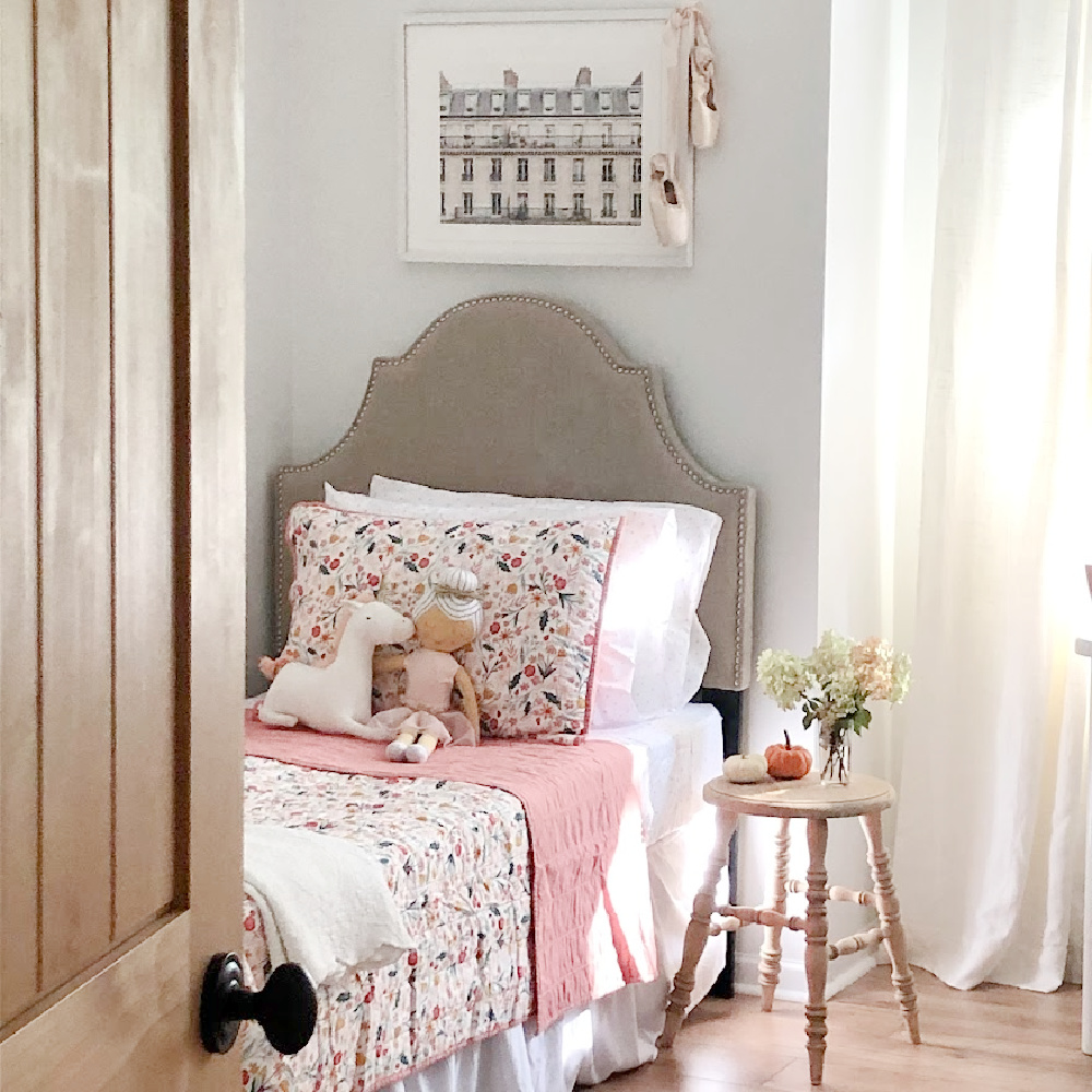
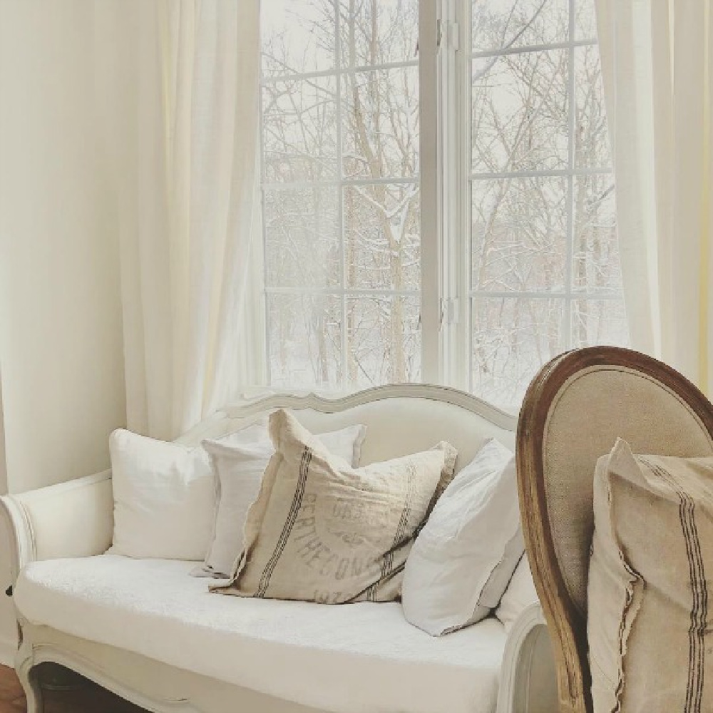
7. Choose the Most Flattering White Rather than a Trending Color
BM OC-151 White does not seem to be internet popular as it is cool white and perhaps not as gentle as white paints I chose for other homes.
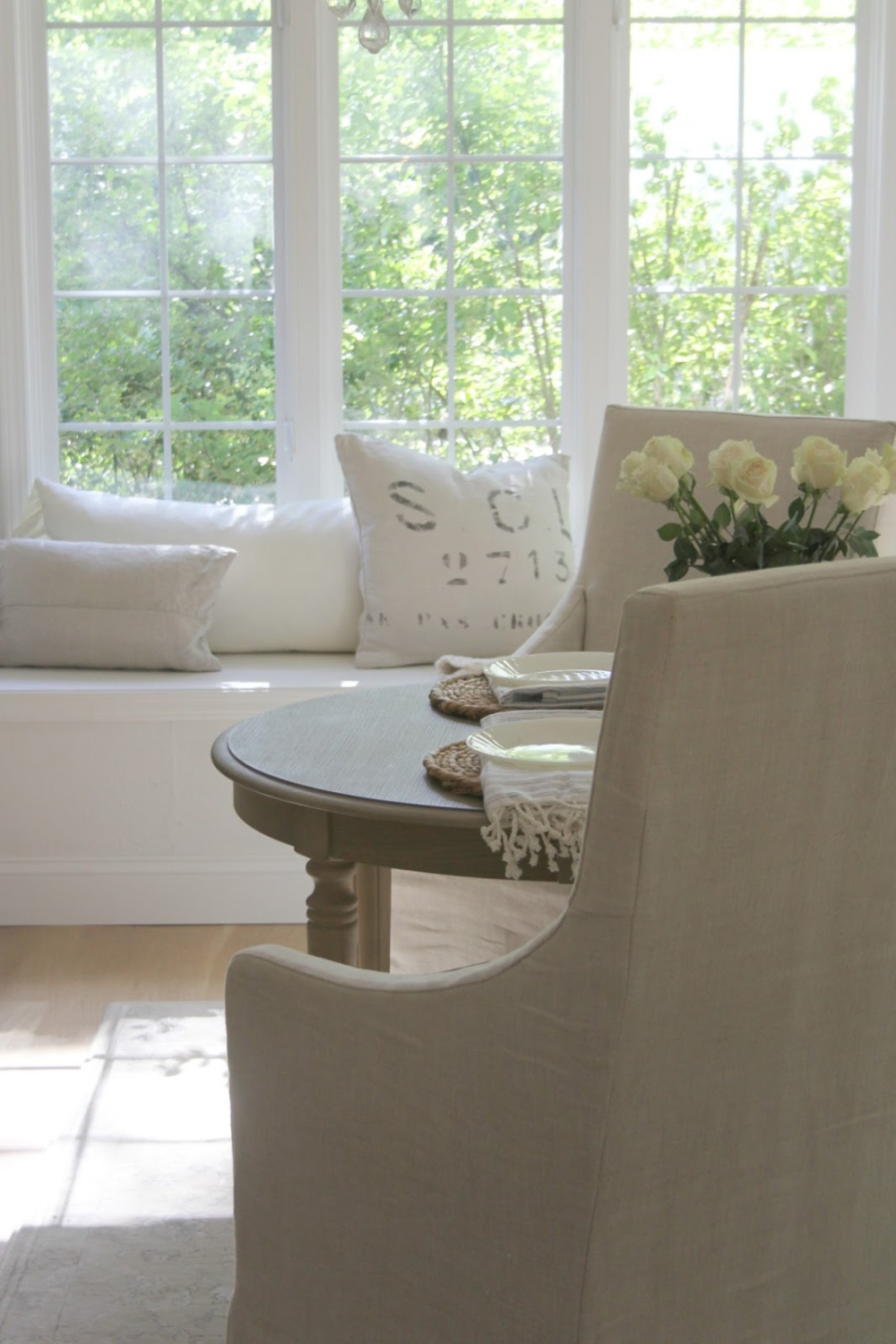
8. More White Hues to Consider
BENJAMIN MOORE White Dove remains a favorite of mine for vintage furniture and what I chose to paint my family piano.
9. Viewing Image Galleries Online Helps
While there are paint color experts who may advise against stalking Pinterest and blogs for paint color ideas, I have my own opinion (however biased it is as a blogger!).
Collecting images of beautiful white painted rooms online or in shelter magazines (where the paint color name is provided) can be far more helpful for securing initial samples than deliberating over teeny pieces of cardstock under fluorescent lighting at the paint counter.
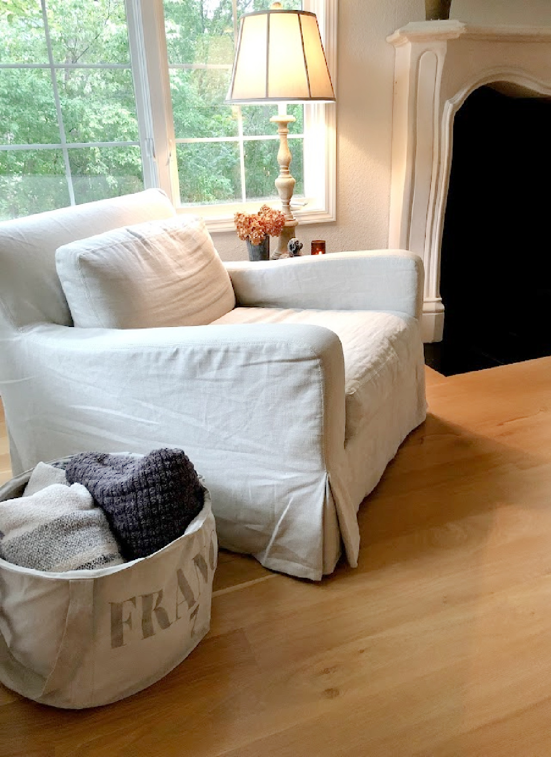
If you can’t wait for peel and stick paint samples to arrive in the mail and want to rush out to a paint store or big box paint counter for paint pots immediately…

Ever considered painting wood cabinets to brighten up your kitchen, bath, or laundry room?
Here’s a tutorial.
10. Pinterest for Paint Color Search
I have a Pinterest board HERE and white paint favorites HERE devoted to paint colors so you’ll score ideas.
BONUS TIP: Create your own Pinterest board devoted solely to white paint colors.
You can truly make Pinterest work FOR you instead of the other way around!
The pinnable graphic below includes favorite white paint colors and neutrals I like to use.
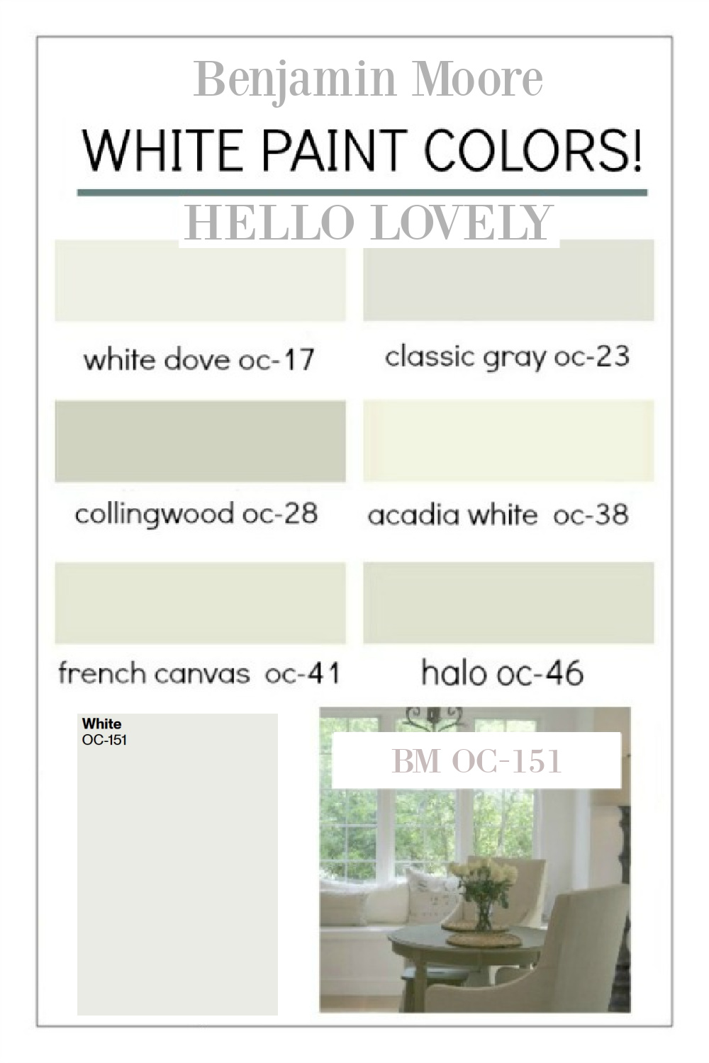
Pin this post for future reference!
Paint Color Selection Advice from Remodelista
Color and design experts at Remodelista offer helpful and highly researched help for choosing smart white paint colors.
A few highlights I found particularly pertinent:
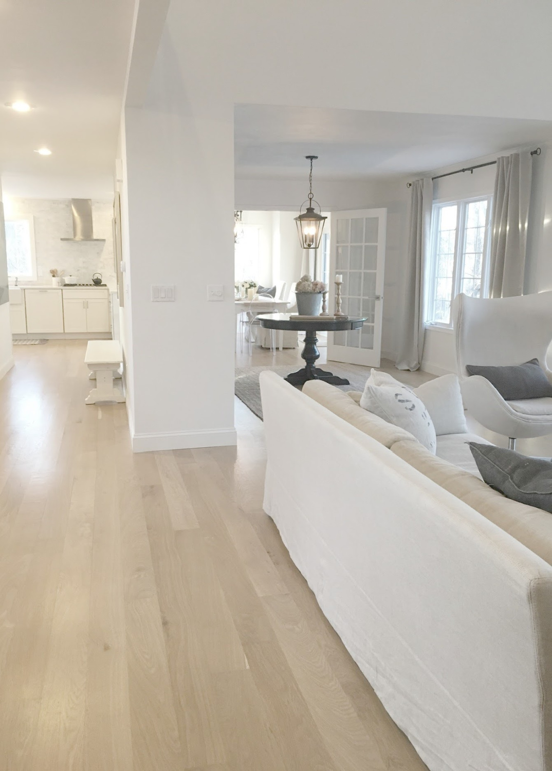
1. Notice Nuance
Start noticing varying nuances of white paint colors (is it cool, warm, bluish, pinkish?).
2. Assess Natural Light
If a room receives plentiful natural light, experts at Remodelista recommend a pure white; while a lack of natural light should steer you toward more pigmented whites.
3. Pay Attention to Interior Designer Favs
While they advise beginning your search with a handful of samples then whittling down possibilities, should you get stuck, turn to paint color picks from interior designers.
Curious about what interior designers recommend? Make sure to to READ THIS!
If you’re wondering about what experts say is trending, you’ll find that info HERE.
Peace to you right where you are.
-michele
I independently selected products in this post—if you buy from one of my links, I may earn a commission.
Thanks for shopping RIGHT HERE to keep decor inspiration flowing on Hello Lovely!
Hello Lovely is a participant in the Amazon Services LLC Associates Program, an affiliate advertising program designed to provide a means for sites to earn fees by linking to Amazon.com and affiliated sites.

















I agree with the Benjamin Moore white- oc 151..I love it and for my home it is the whitest of whites….so clean, crips and fresh..I actually came across your blog looking for BM colors that would go with OC-151. But my entire home is white..It’s the only thing that always looks clean to me…as odd as that may seem…
Author
Yay! I love meeting fans of white and this particular one. Not odd to me all. Freshly fallen snow is how I always felt living with OC-151. Especially that first snow when everything is blanketed with a clean fresh slate, and the sky suddenly takes on a fresher perspective. Clean slates. Blank canvases with no mistakes on them. Pure light, boldly proclaiming purity. 🙂
How do you think OC 141 would look on exterior trim with Amherst Gray on exterior siding?
Author
I think if you want that cool bright white look for an exterior you should choose a softer version with a lower LRV since OC-151 could look too blinding. I love Amherst Gray for shutters – maybe consider Balboa Mist – I have a whole post devoted to it. Even though it isn’t a “white” paint, it is cool and in natural light will be subdued. Otherwise, I would say Simply White is safer for the exterior.
OC 151 I meant
Author
🙂