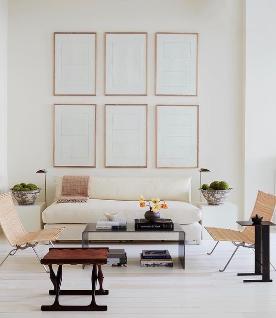
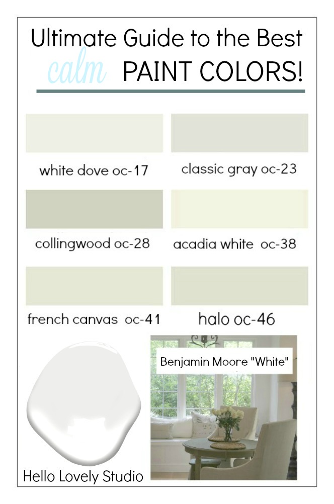
16 Amazing Serene Paint Colors Interior Designers Use for a Soothing Vibe includes gently calming hues, tranquil muted pastels, and comforting versatile neutrals that contribute to an overall Zen-like mood.
Let’s face it, the paint color you choose for walls, ceilings, and trim is critical to arrive at that anchoring backdrop for the rest of a room’s decor.
16 Amazing Serene Paint Colors Interior Designers Use for a Soothing Vibe
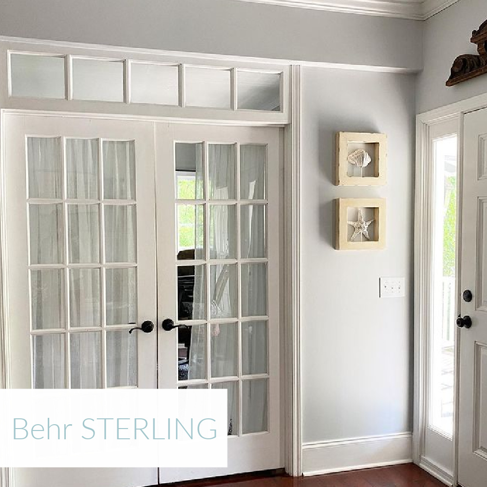
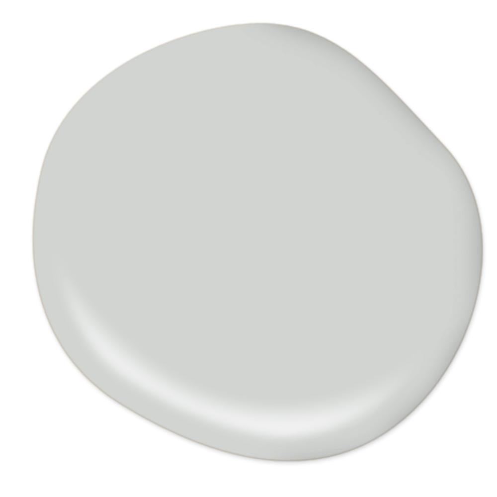
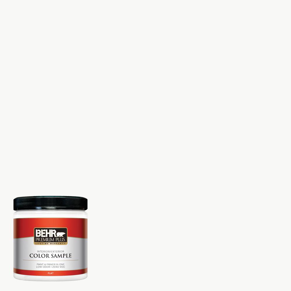
1. BEHR Sterling
I’m not just waxing poetic. Behr Sterling is the perfect atmospheric pale blue-grey gentle color on the door and upper walls of our laundry room.
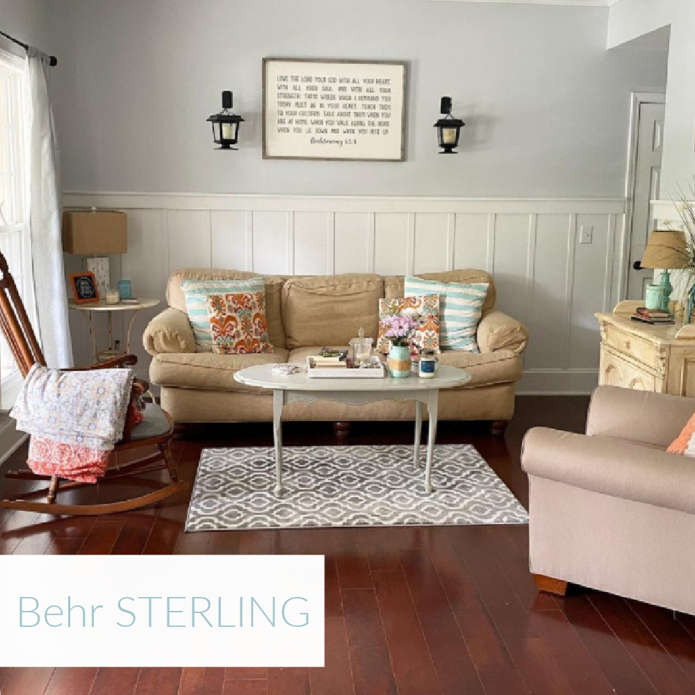
Lord have mercy, I rolled on no less than 10 grey possibilities, cringing each time! I actually used Behr Sterling at full strength on the door and then at 50% for the walls, combining it with this warm white:

Serene Paint Colors: Make Sure to Try Samples
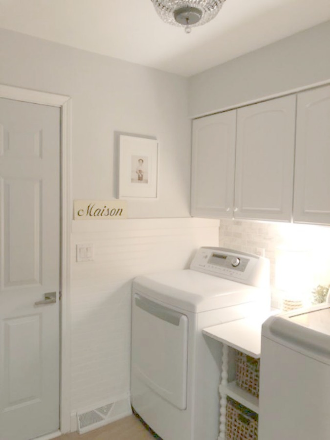
Keep in mind the paint swatches you see here and even the paint in the can is not a good indication of how the color will present in your particular room. I highly recommend buying samples. My door painted Sterling actually looks more like this:
or even this:
BTW. Before I painted the room, my sister was over to help with plans for our lower level, and as we brainstormed brilliant ideas for improvement while still lingering in the laundry room, she suddenly said “I have to be honest, I had no idea how bad it feels to be in here.”
Paint color truly matters so I am always listening to designers’ viewpoints.
Paint is the Easiest Way to Transform a Space
The paint color change you make may just be the most transforming element of all if you aren’t able to demo and start over. (I’m alllllways for skipping demo and remodeling).
Where were we?
What paint colors do interior designers rely on time and time again? And what sets these particular serene colors apart from the pack?
2. BEHR Ultra-Pure White
We painted our interiors Benjamin Moore White OC-151 but since that confuses more readers and paint counter employees than I care to imagine, here’s that color’s twin:
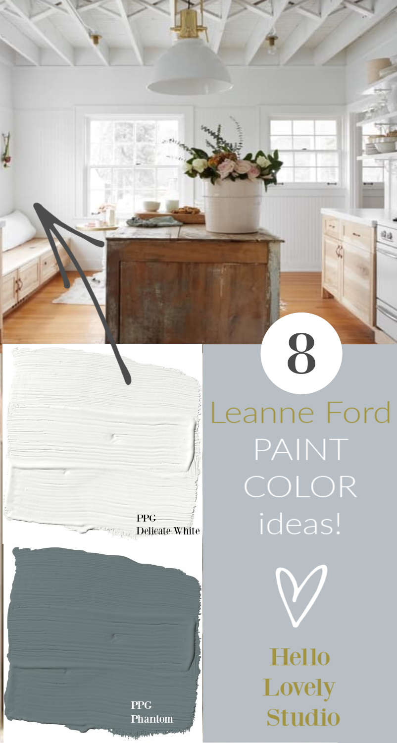
It’s also one of designer Leanne Ford’s go-to, favorite bright whites to use since she can pull it right off the shelf at Home Depot.
BONUS #1: Paint sample pots ship FREE from Home Depot so def use my links! BONUS #2: You can snag this white paint right off the shelf at Home Depot since it’s a base to mix other whites!
3. FARROW & BALL Strong White
While Charlotte Reiss of Vivi et Margot may be re-painting her charming French farmhouse interiors, I’m still admiring the brilliance of her use of this calm white.
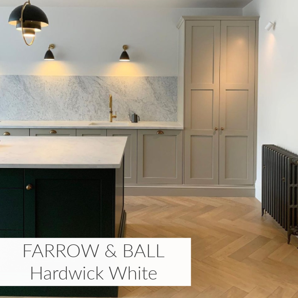
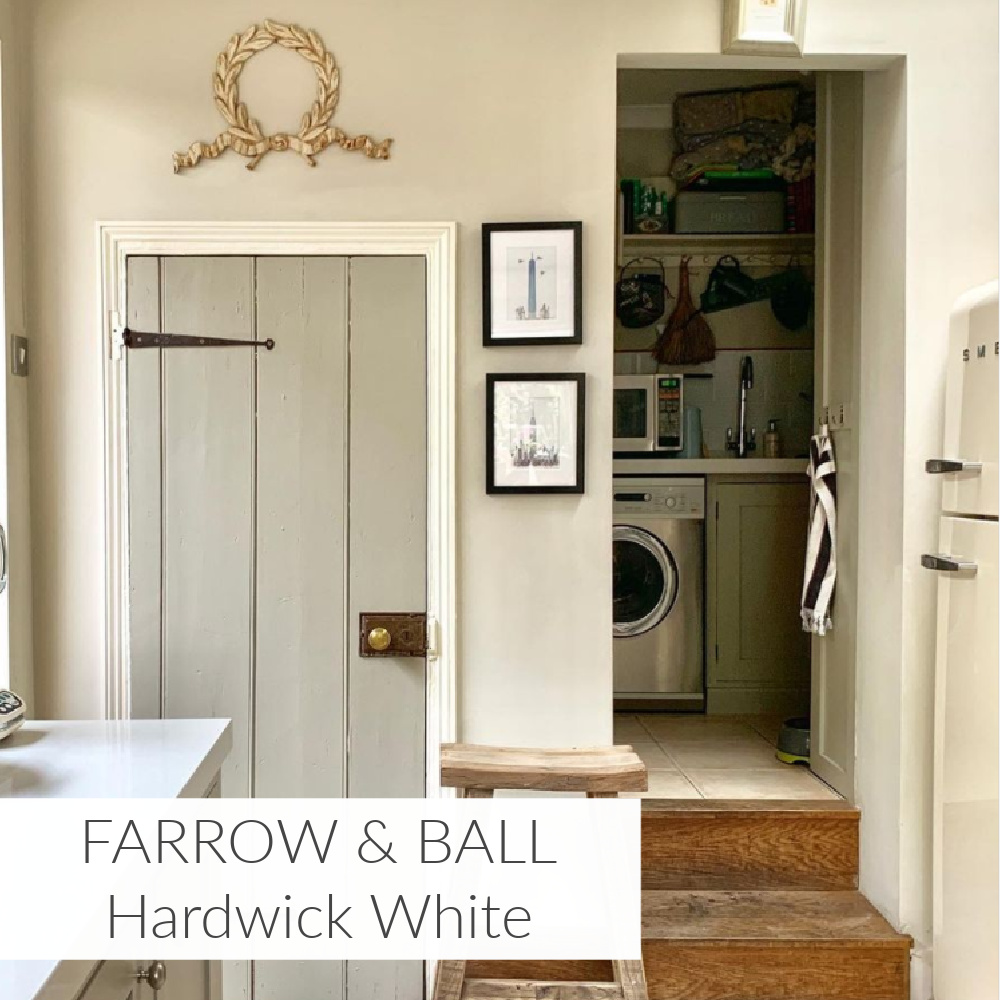
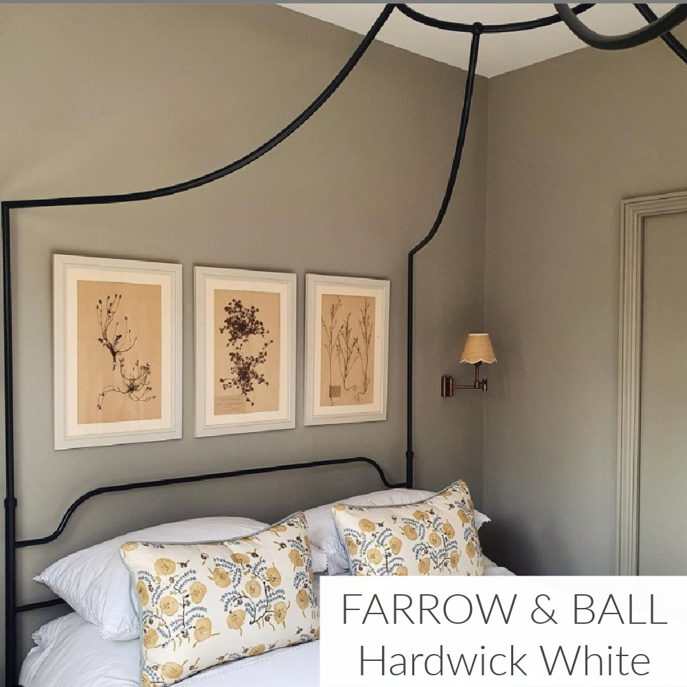
4. FARROW & WHITE Hardwick White
Here’s a warm white you may readily dismiss since it doesn’t appear white or even strike you as particularly restful. However, I have used this beautiful hue on outdoor furniture and various found objects so keep an open mind.
BONUS: You can order sample pots of Farrow & Ball’s sophisticated range from Anthropologie!

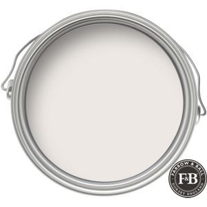
5. FARROW & BALL Wimborne White
WIMBORNE WHITE…Farrow & Ball. This just off white is named after the market town of Wimborne in Dorset and home to Farrow & Ball. Only a shade away from a pure white, the addition of the smallest amount of warm yellow pigment creates a very versatile shade which is just a little softer than All White.

Brooke Giannetti of Giannetti Home creates a serene mood in the lovely spaces she designs with colors crafted in Dorset, England by Farrow & Ball. Her artful experienced eye is one we can trust!
If you dig in designer Brooke’s archives on Velvet and Linen, you’ll discover she favors Wimborne White...

…and also Pointing.
6. FARROW & BALL Pointing

POINTING…is named after the colour of lime pointing used in traditional brickwork. One of our Red Based Neutrals, Pointing has a warm undertone to it which creates the prettiest of spaces when used on walls and always softens the feel of a room alongside strong, traditional colors.

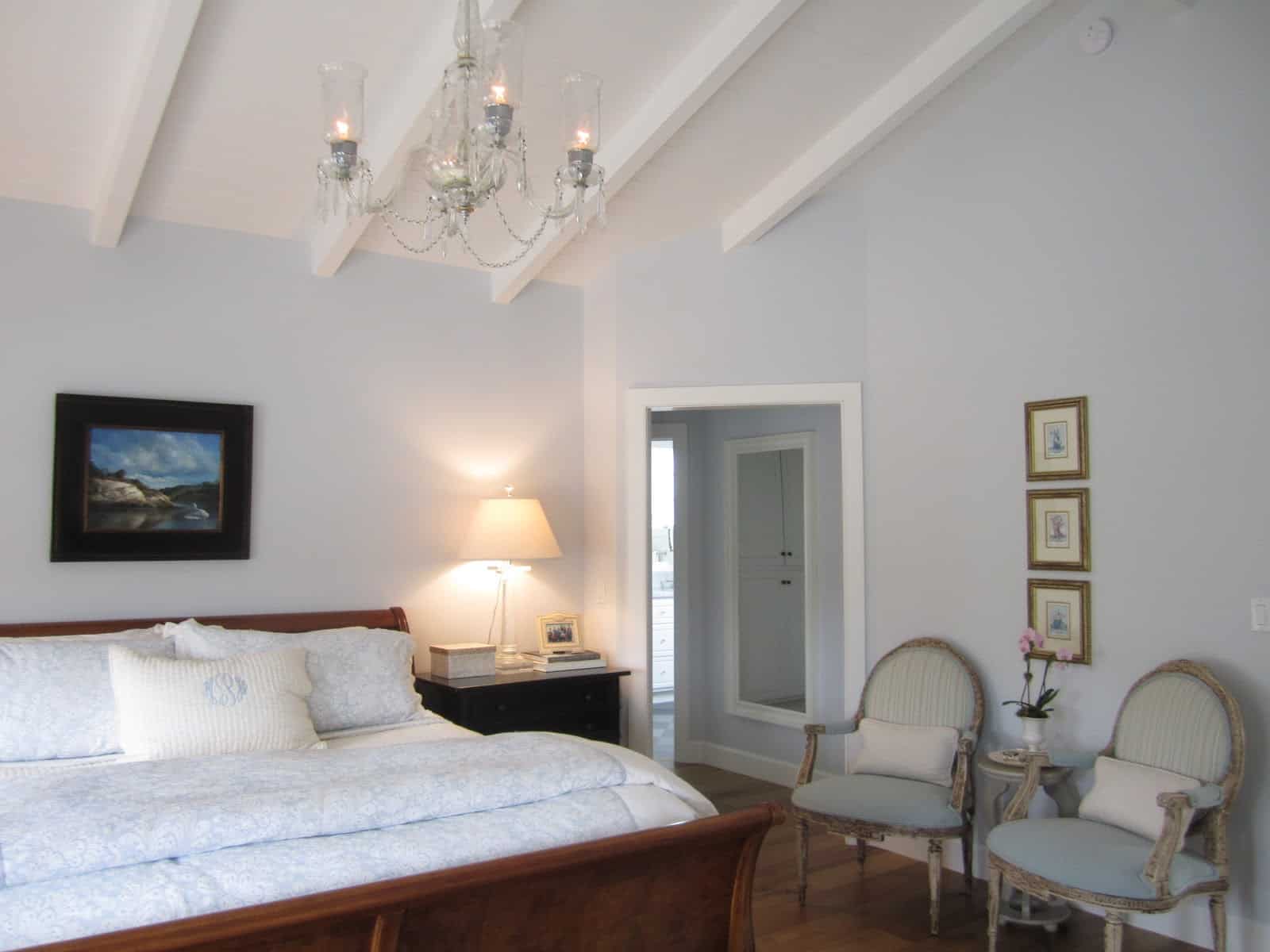
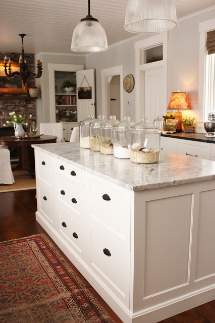
6. BENJAMIN MOORE Cape May Cobblestone

If you research interior design favorite paint colors to achieve tranquility, CAPE MAY COBBLESTONE from Benjamin Moore will keep popping up. The color is a classic, elegant gray to achieve spaciousness. It’s ideal for small bedrooms and areas like hallways and mudrooms.

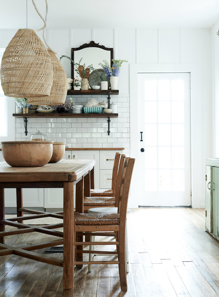
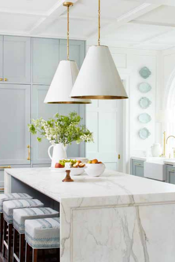
Modern Farmhouse Finds


7. FARROW & BALL Ball Green
Designer Greet Lefèvre of Lefèvre Interiors and Belgian Pearls loves to use Ball Green by Farrow & Ball to achieve a tranquil look for a space.

BALL GREEN… This muted green is a tribute to Richard Ball, the paint pioneer who first founded the company in Dorset, England with John Farrow. It has a magical quality of appearing almost silver in candlelight, so is great for use in dining rooms.


Greet also favors:
8. FARROW & BALL’s Stony Ground

STONY GROUND…This strong neutral is one of their most popular wallpaper background colours, so they added it to the paint collection.
9. BENJAMIN MOORE Alaskan Husky


Sherry of Design Indulgence:
“I once used Benjamin Moore Alaskan Husky for a gender neutral nursery and fell in love with it’s gray blue tones……It would be a pretty dining room or bedroom wall color mixed with creams and maybe a little gray sprinkled in!”

10. BENJAMIN MOORE Edgecomb Gray

Elizabeth of Pretty Pink Tulips:
“My favorite tranquil paint color for walls is “Edgecomb Gray” by Benjamin Moore; it’s a perfect greige and super soothing.”

EDGECOMB GRAY…A go-to gray that’s timeless with a modern edge, this earthy, organic neutral is soft and stylish, creating a setting that feels distinctly personal.

11. BENJAMIN MOORE Hollingsworth Green

Amy of Maison Decor loves this timelessly classic color for calm elegance.

HOLLINGSWORTH GREEN..Steeped in tradition, the refined, elegant colors of the Historical Collection deliver timeless color that can be used in traditional as well as contemporary spaces. Unveiled in 1976 to celebrate the US bicentennial, a collection of 191 colors inspired by America’s historic landmarks.

12. BENJAMIN MOORE Glass Slipper
Mary Ann of Classic Casual Home:
“One of my favorite tranquil colors for bedrooms is Benjamin Moore – Glass Slipper.”

GLASS SLIPPER…Benjamin Moore calls it “timeless, elegant, Classic Colors guarantee beautiful, usable color all the time, every time.”

13. FARROW & BALL Light Blue

Megan Pflug of Megan Pflug Designs
“I love Farrow & Ball Light Blue–its looks more like a green but I find it very tranquil. In general, I love colors that visually, you can’t easily name. I think wall color looks best when the color formulas are complex.”

LIGHT BLUE…This silvery blue was so named because it was the lightest blue Farrow & Ball made in its first collection of colours.
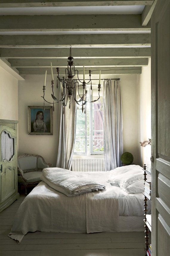
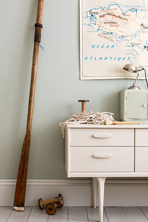
As for Hello Lovely, my picks for the best tranquil paint colors include quietly whispering blue-greys and muted grey-greens impossible to immediately describe. They’re atmospheric colors with an heir of mystery.
14. BENJAMIN MOORE Horizon

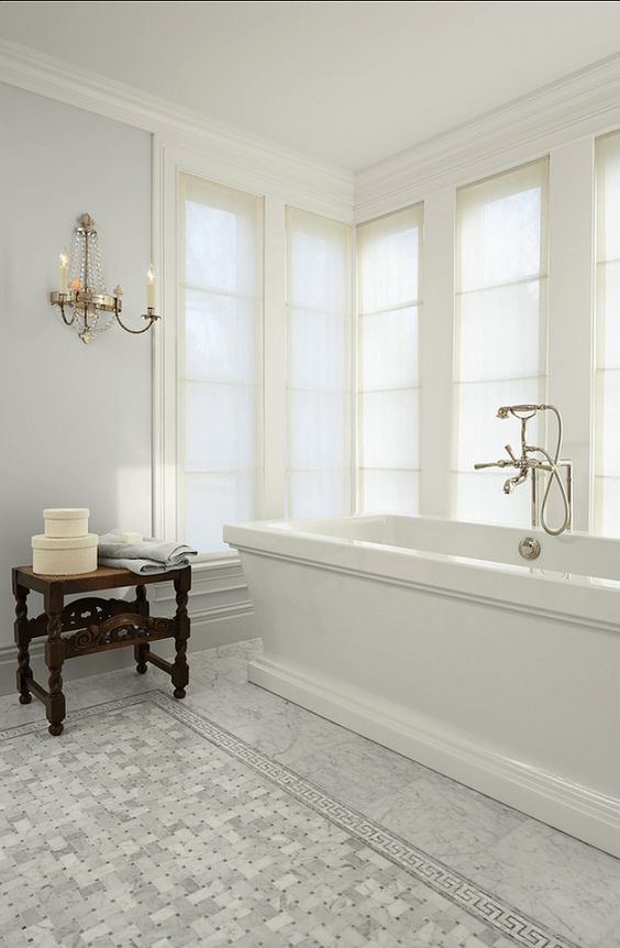
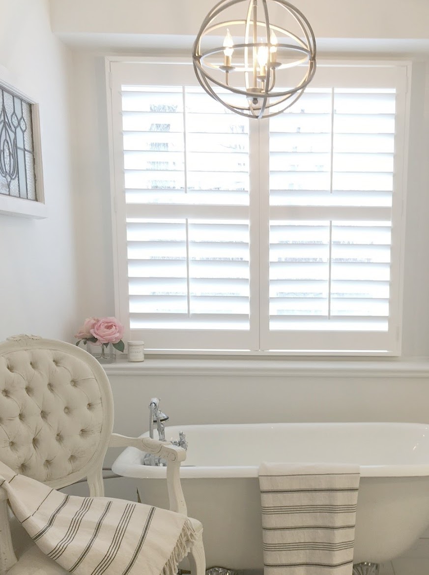
15. BENJAMIN MOORE Classic Gray

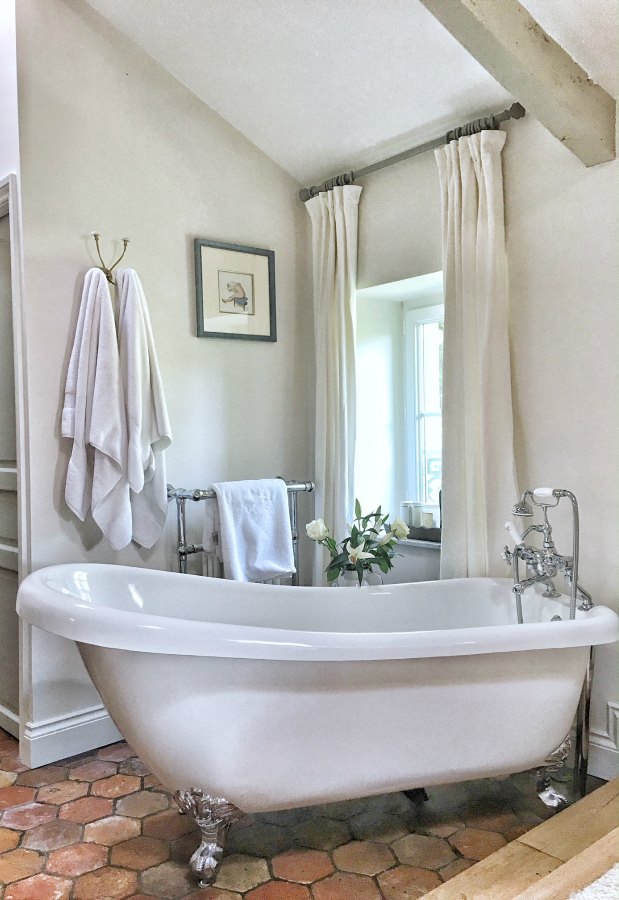
We used Benjamin Moore Classic Gray for walls in a new bathroom we built at the fixer upper:
16. BENJAMIN MOORE Revere Pewter

And I love Benjamin Moore Revere Pewter, which I diluted with water to create a glaze for a stool and furniture in our bedroom.
REVERE PEWTER…Benjamin Moore. A light gray with warm undertones, this classic shade creates a unifying look that calms and restores. A great transitional color, it’s perfect for an open floor plan.
Easiest way to see if a color is right? Order samples to be delivered to your door with Samplize (a peel and stick sheet of “paint” to stick on your wall and easily move around to other walls!).
HOW ABOUT YOU? Have a calming paint color you rely on to create a peaceful vibe?
For more ideas for choosing the right white paint colors, read this story.
For expert advice from a wall finish expert, here’s help from Segreto Finishes.
And check out these smart tips for DIY painting like a pro.
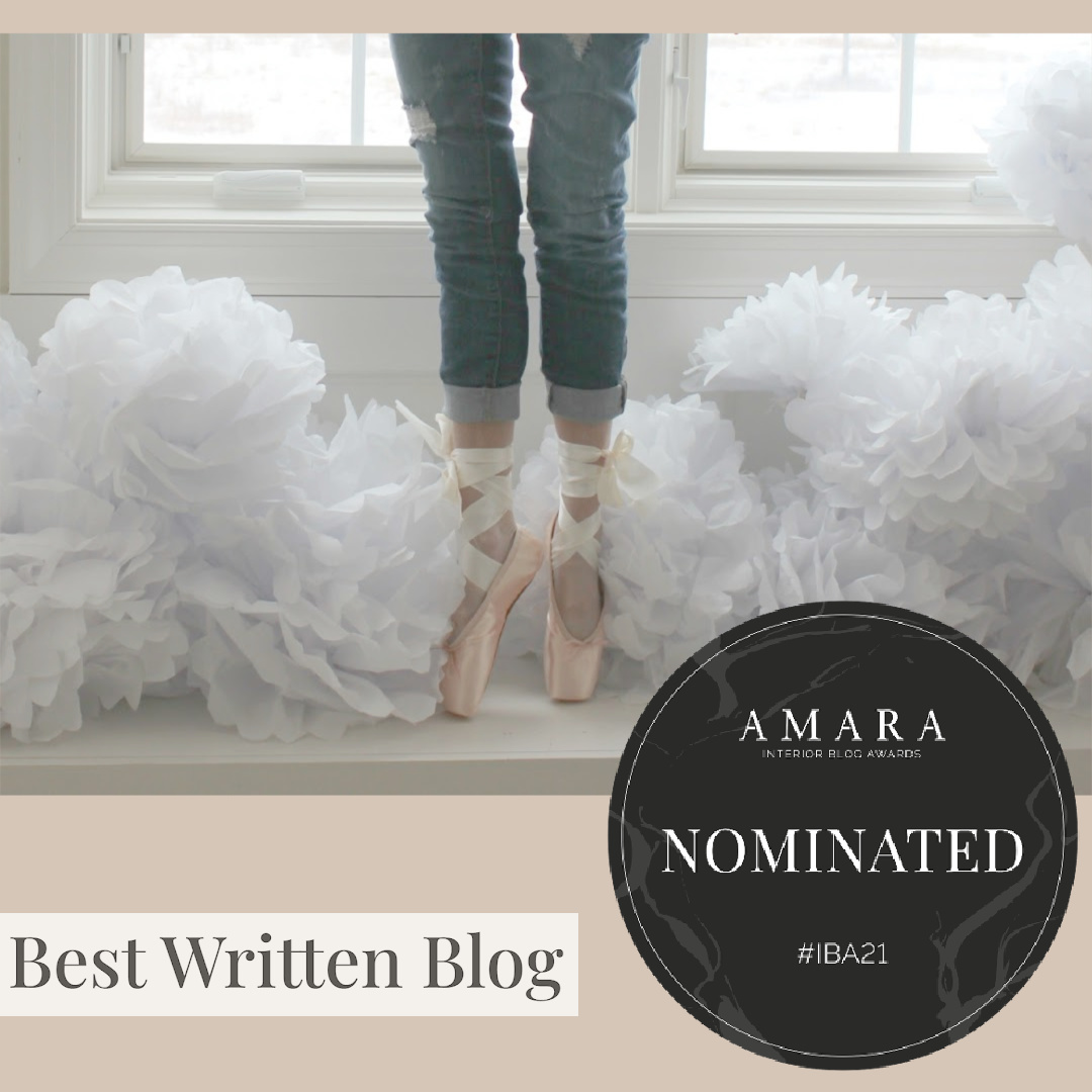
So honored to be nominated for BEST WRITTEN BLOG! Tap image below to go to Amara’s voting page.
I independently selected products in this post—if you buy from one of my links, I may earn a commission.
Peace to you right where you are.
-michele
Shop for items you already intended to buy on Amazon RIGHT HERE, and also find home decor here to keep decor inspiration flowing on Hello Lovely!
Hello Lovely is a participant in the Amazon Services LLC Associates Program, an affiliate advertising program designed to provide a means for sites to earn fees by linking to Amazon.com and affiliated sites.


As a former decorator I have TONS of paint fans. But it’s much more difficult to find the perfect color for our own home compared to when I did paint consults for clients. 😉
Favorite serene colors? In the master BR I used Valspar Seashell Gray. It’s a very light gray that would appear almost white were it not for the pure white trim in the room. It has very very light undertones of greige. That room has a lot of light from west and north facing windows as well as eastern light coming in from the door in the morning. So Seashell Gray works great if you want a clean, slightly warm, but not a yellow or pink undertone white.
I’m also quite happy with Pittsburgh Paint’s Evening Mist in a guest bedroom with east and north facing light. It is a mere hint of blueish gray that again, takes you just a click off of white. It doesn’t read girly or boyish ..just a fresh, serene color for a bedroom. It would look great in a bath too.
Our east and south exposure laundry room has a gorgeous color too. It’s Pittsburgh Paint French Gray Linen. It is a soft greenish gray that looks stunning with bright white appliances and trim. Sort of a mid-range color that gives a little more oomph to a room where there’s lots of natural light but you still don’t want a highly saturated tone. I’d be careful using this in a room with less light because it could read very green.
I believe, as you know too, not only does the lighting in the room factor in (both natural and artificial) but also whatever else one has in the room such as furniture, accent colors, etc. The most gorgeous wall paint in someone’s home could look awful with my own furnishings.
Paint is so much fun to pick because there are so many options out there today! In some areas of the country one cannot get certain brands of paint (eg. our Home Depot closed so Behr paint is unavailable) but with the great computerized color matching at most stores, we can get the color of our dreams in any good quality paint. I’m leaning towards some of the Farrow & Ball colors too for my next big project…..or maybe even a couple of Glidden colors or Nautica or….. 😉
The world is our color oyster!
Author
I’m pretty excited that Home Depot now ships the Behr paint color samples for free – so I linked to the Behr colors I know and love…click and paint delivered! I am in the throes of getting the paint color just right for my little space so it was a perfect time to write about it. I have a keen eye for paint colors and seeing undertones as you do, but in a room with no light…it really is a different animal completely so it took longer than I expected. Wish me luck, and thank you so much for including this designer wisdom which is bound to inspire others as it always inspires me. Happy holiday to you, friend.
Thank you Michele! This is an awesome resource! It’s so difficult to choose the perfect paint color. I love all these neutrals. They allow the art to really pop! Happy Friday 😊
Author
Happy weekend, Holly! Thank goodness it’s here – can’t wait to finish painting and feathering my little laundry room. 🙂