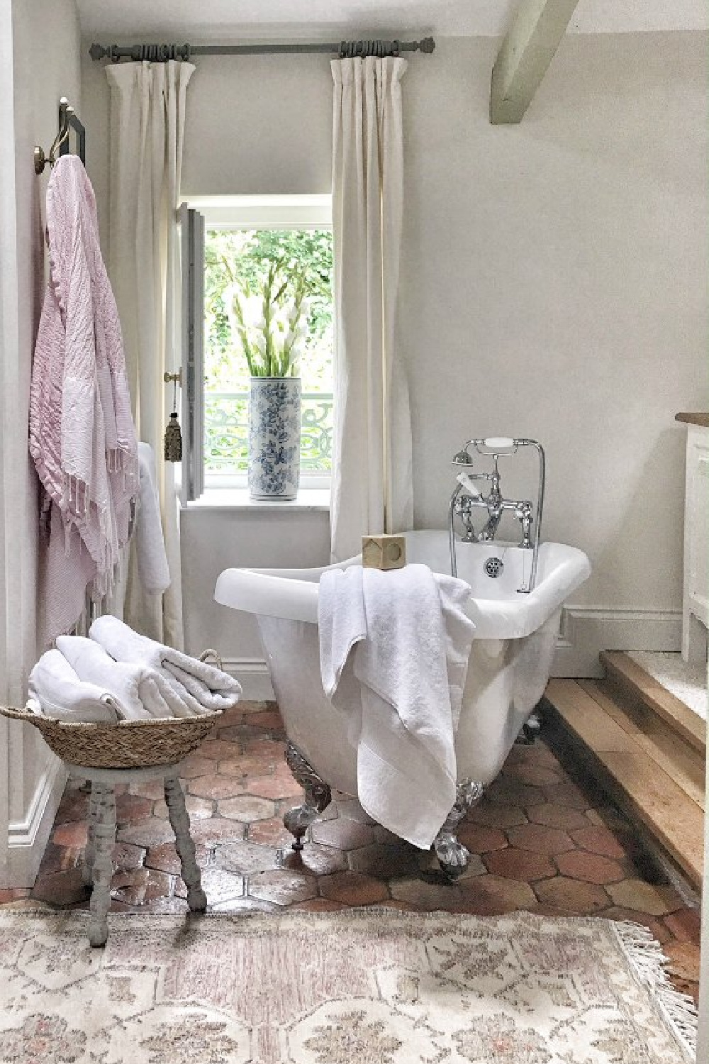
Why on earth are we ever returning to a discussion of the best white colors and what designers recommend? It’s not solely because my own paintbrush is forever drippy and busy painting another surface white. Rather, people are frequently mobile. There are always folks: moving to new homes, redecorating, reimagining their interiors, and repainting. Those good people covet suggestions from pros for colors to sample, and I am here for them. So let’s peek at a few neutral hues my interior designer friends most favor.
White Colors: Designers Reveal Favorite Paints
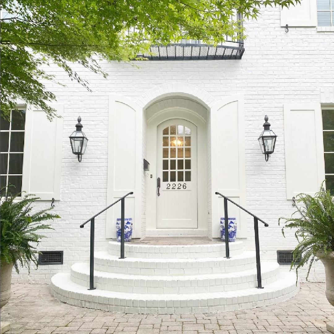
If you’re in the market for the right white color, it’s important to take your time. These ideas from designers who work with neutrals all the time will give you a place to start. I must have tried 10 different whites before I found this cool, bright one to transform our last home:
This post contains affiliate links which I hope you will use since they won’t cost you a penny extra yet may earn this blog a small commission.
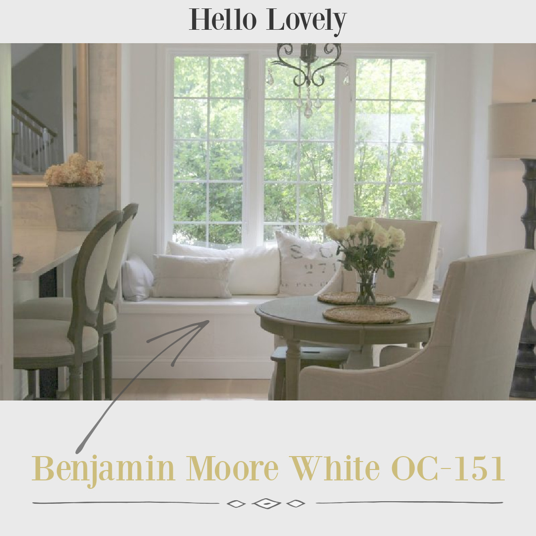
But the perfect white in a particular setting can be all wrong in the next.
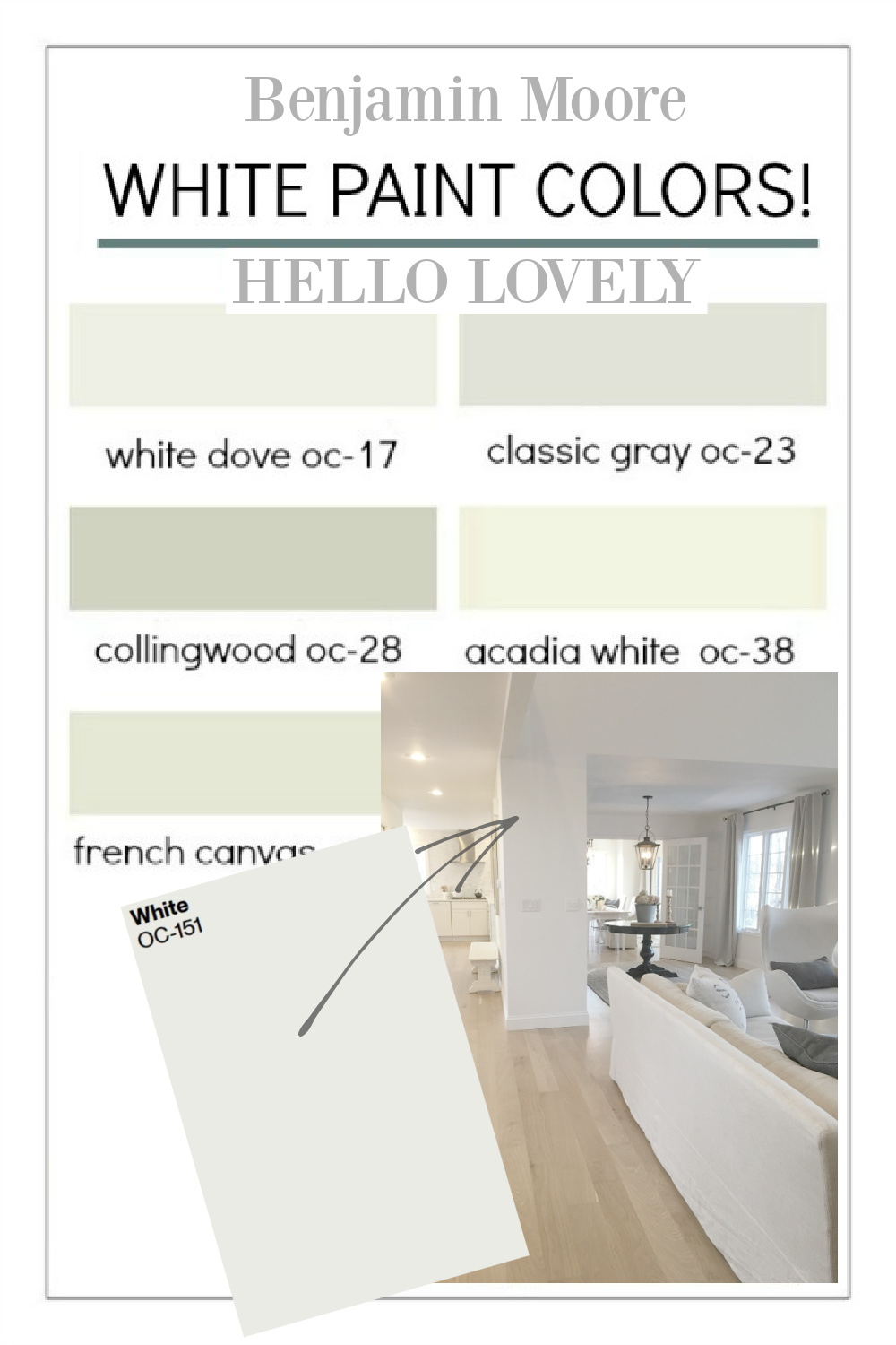
What a relief when I found a white with the right undertones (blue in this case) that seem to neutralize strong yellow sunlight.
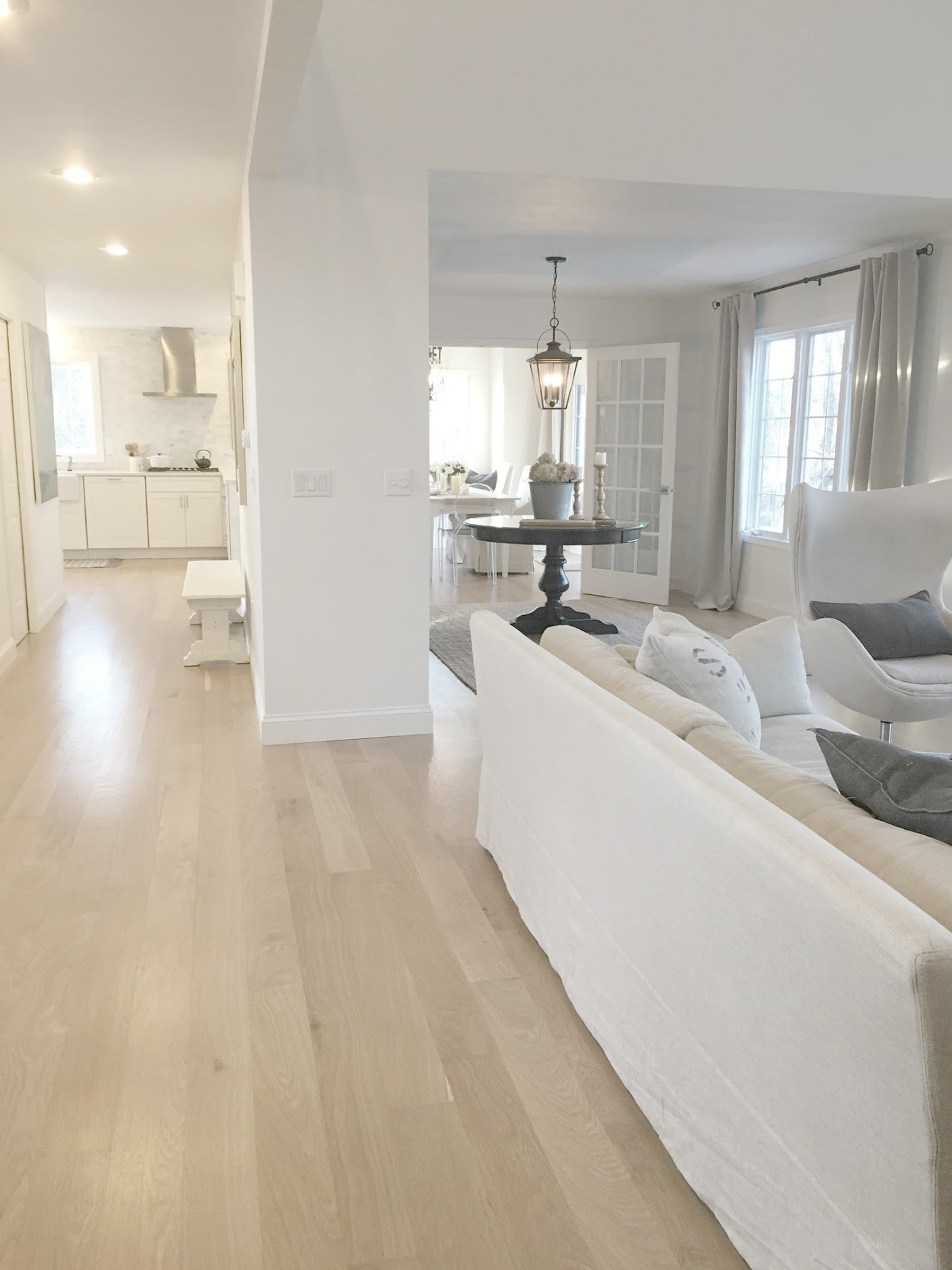
But guess what? When we moved into a different home a year ago, that white looked harsh and silly.

So don’t despair if you are having trouble settling on the best white or neutral for your interiors. It’s a process.
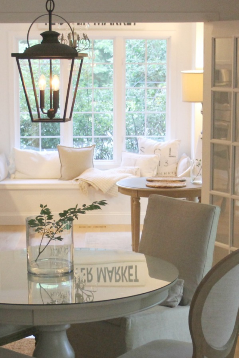
We’ll pick the brains of my designer pals and score all sorts of ideas and paints to sample.

Lauren DeLoach’s Fav is Sherwin-Williams Alabaster
Lauren DeLoach of Lauren Deloach Interiors was gracious enough to share design secrets behind my favorite showhouse kitchen (Southeastern Designer Showhouse 2017) including paint colors!
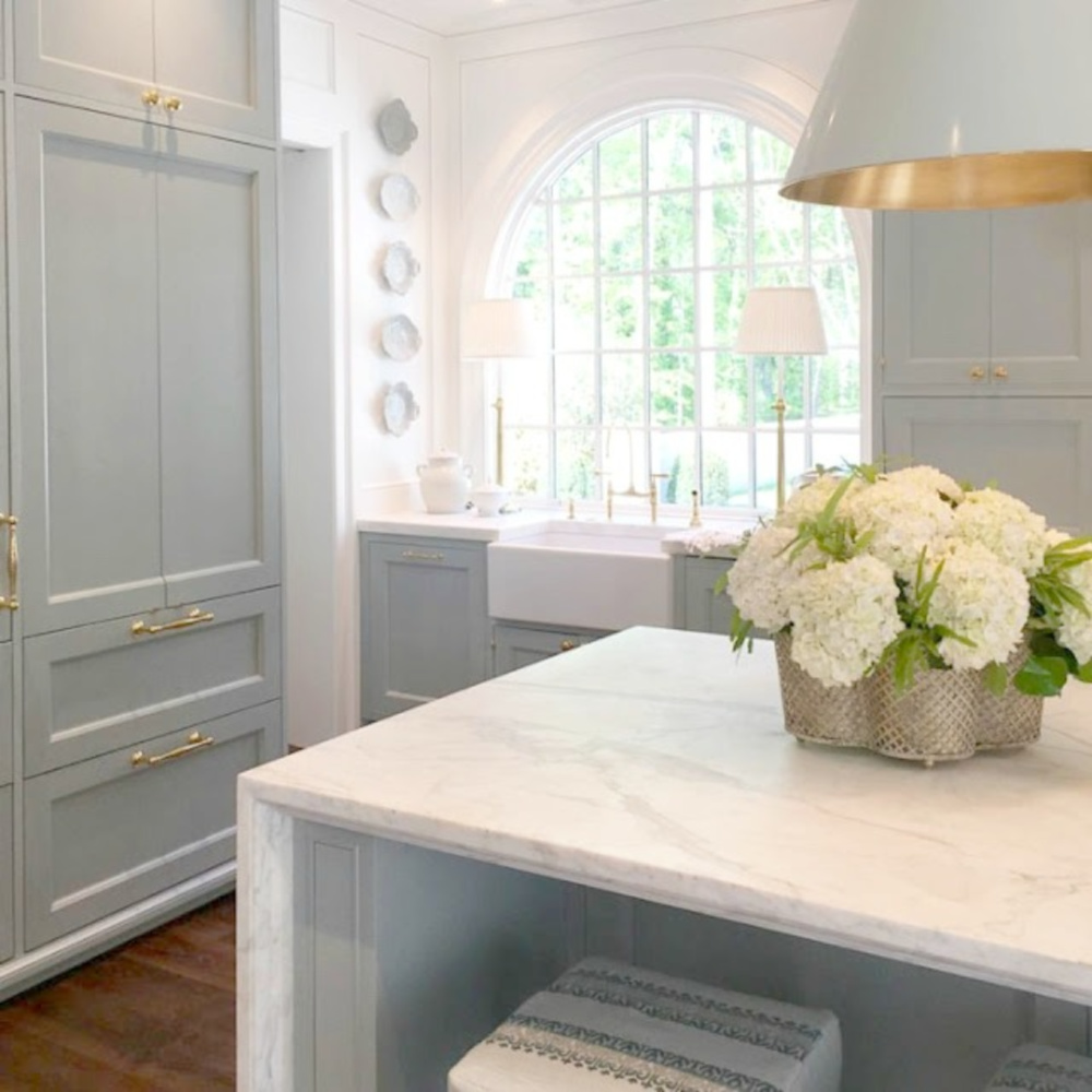
I know it can be confusing to see the paint color swatch (below) and notice that it looks much lighter in photos online. Photography editing, the time of day an image is snapped, and all sorts of other influences can converge. So definitely sample first!
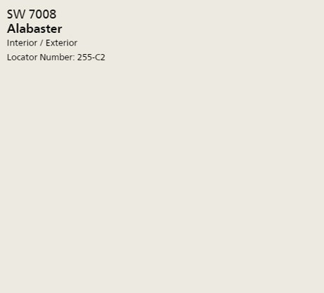
Joanna Gaines Also Loves SW 7008
1. SHERWIN-WILLIAMS Alabaster
Magnolia & HGTV’s Fixer Upper star has often turned to SHERWIN WILLIAMS Alabaster. In fact, it’s the white paint color throughout her own home (at least it started out that color). Let’s peek at what Alabaster looks like in a variety of environments.
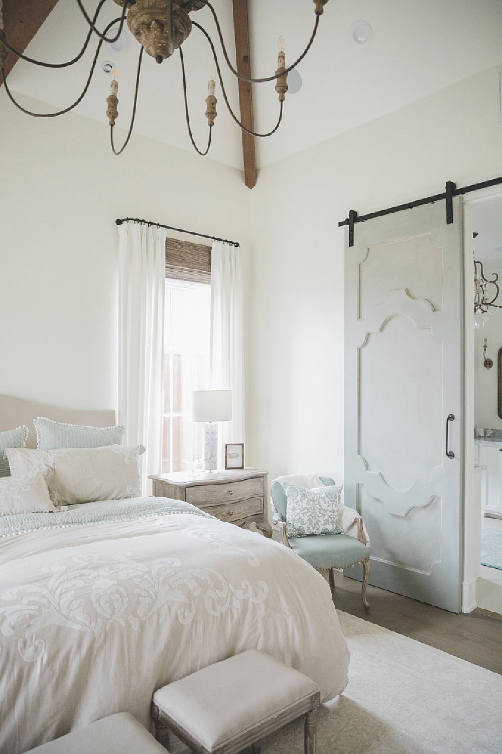
Here it is in a sunny French country bedroom in Texas:
and in that showhouse kitchen in Atlanta:
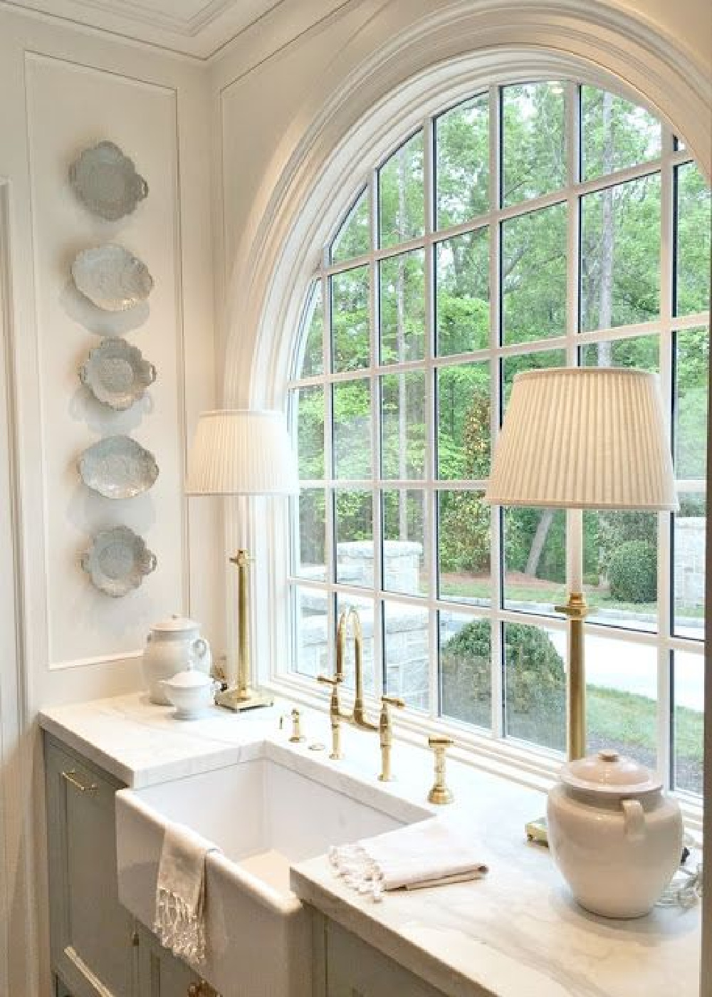
Oh that light blue and warm white kitchen!
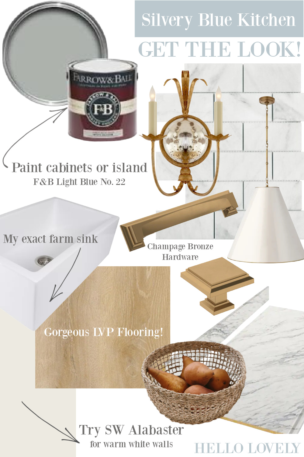
With a light reflectance value (LRV) of 82, Alabaster is going to reflect a lot of light in the room. And it’s a warm white that won’t look yellow.
Sherwin-Williams says this soft, warm but balanced white is called for “When you want the brightness of a white without sacrificing a warm coziness…And turn up the peaceful.”
2. Shiplap JG22 (KILZ)
This is another Joanna color, and of course it’s called Shiplap! So similar to Alabaster, doncha think?
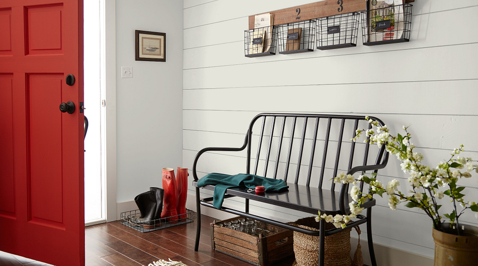
For subtle contrast, you could use this for walls with bright white trim.
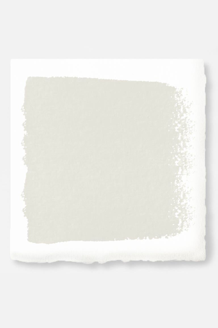
Farrow & Ball Strong White No. 2001: Charlotte Reiss of Vivi et Margot
Although Charlotte will soon move to a new home in France, the interiors in her French farmhouse near Bordeaux (we toured it right here) were painted Farrow & Ball pale neutrals. (If your jam in country French, you’ll want to discover her French wares at Vivi et Margot!)
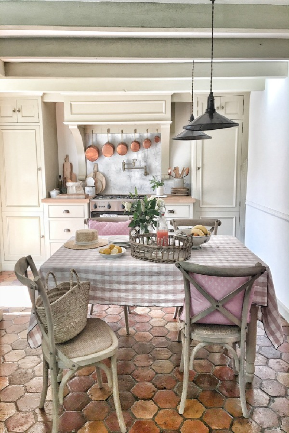
Here’s what the Farrow & Ball say about this grey based white:
“This cool white is both strong by name and strong by nature. The palest of our Contemporary Neutrals, the subtle urban feel of its light grey undertones add a contemporary twist to period homes, while staying in keeping with modern properties. Pair with Skimming Stone, Elephant’s Breath and Dove Tale in any combination for an effortlessly cohesive scheme.” – Farrow & Ball
F&B Pointing & White Tie: Greet Lefèvre
We can trust this seasoned designer’s keen eye for style and color. Her own home takes my breath away, so I’m all ears about paint colors this designer favors.
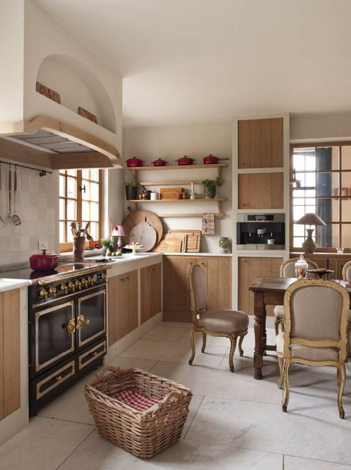
Here’s what Greet told me:
“It is hard to name a favorite white! Using the right color of white is dependent upon the room that has to be painted. Is it a small or a large room? Is there a lot of light coming in or not? Another factor….fabrics to be used in the room for curtains and upholstery. But I often turn to FARROW & BALL Pointing No. 2003 or White Tie No. 2002.” – Greet Lefèvre of Lefèvre Interiors & author of Belgian Pearls

“This fresh and uncomplicated white is named after the colour of lime pointing used in traditional brickwork. One of our Red Based Neutrals, Pointing has a warm undertone to it which creates the prettiest of spaces when used on walls and always softens the feel of a room alongside strong, traditional colours.”
– Farrow & Ball
Warm and delicate, Pointing feels elegant to me even when used in a casual room like this:
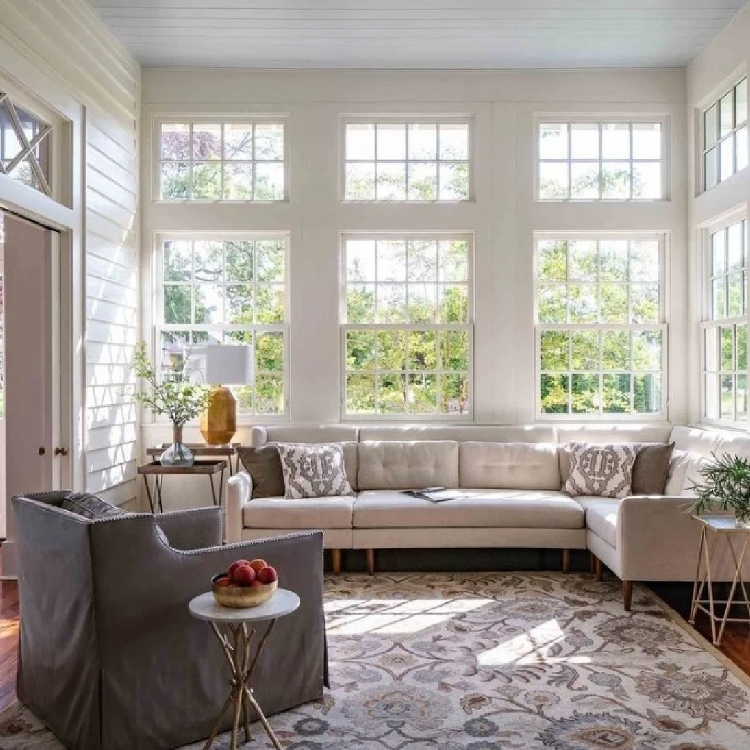
Another warm white from F&B is named for historic starched cotton used for white tie jackets:

– Farrow & Ball
Easiest way to see if a color is right? Order samples to be delivered to your door with Samplize (a peel and stick sheet of “paint” to stick on your wall and easily move around to other walls!).
Megan Pflug’s Favorite White Might Not Strike You as White
Here’s what the lovely interior designer Megan Pflug revealed:
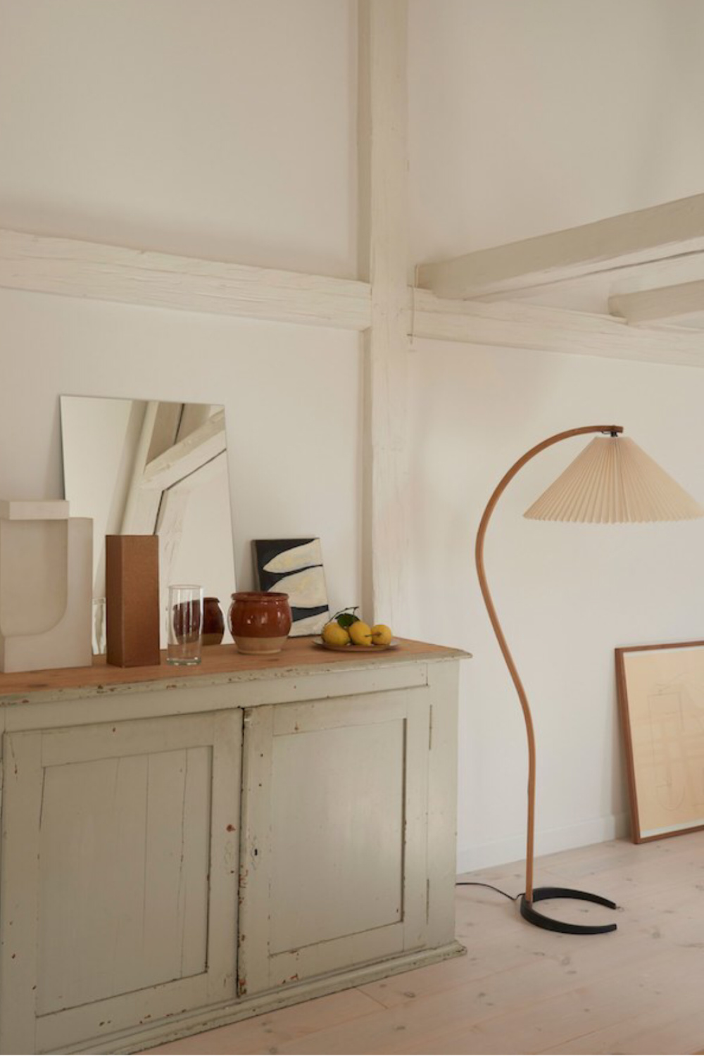
“My favorite “white” wall color is Farrow and ball Ammonite. It is a fantastic changeable color. It looks more like a stone material than a flat wall color. Its a great alternative to a standard white.” – Megan Pflug

– Farrow & Ball
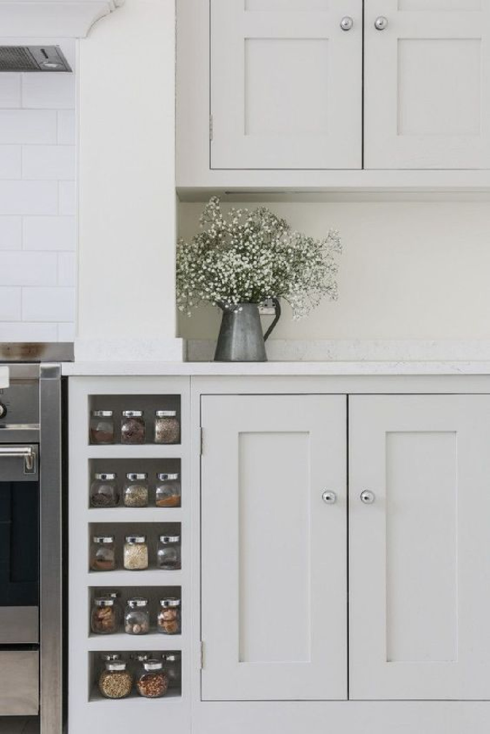
It’s an amazing color I have used as well, and while classic, it can also read very modern.
BM Simply White: Amy Chalmers of Maison Decor
Who can forget her charming French country green kitchen with the sweetest little checkered curtains! Amy’s home was featured in one of my favorite country decorating books mentioned here.
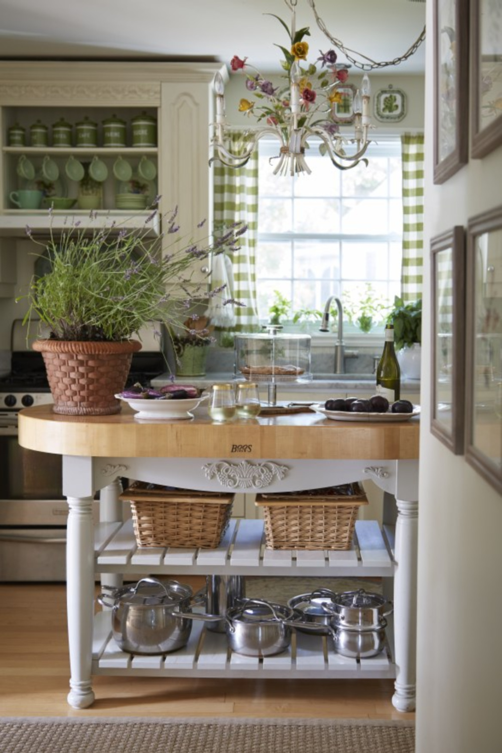
Amy Chalmers authors the fabulous Maison Decor and has been inspiring us for more than a decade with her ever-evolving design career. Here’s the color she told me is a fav:

– Benjamin Moore
Benjamin Moore White Dove: Designer ALL TIME FAVORITE?
Three of my favorite designers named OC-17 as their top favorite!

Once you use it, it becomes easy to understand why Benjamin Moore’s WHITE DOVE reigns supreme! The brand even calls this clean and classic white “unerring.”
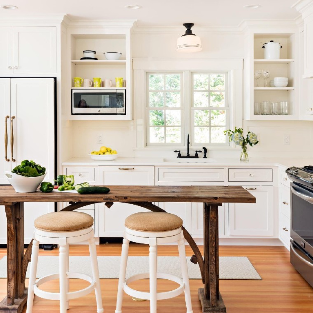
Unerring? I know that’s a lofty generalization. But it’s one of those whites that doesn’t change a lot over the course of the day. While I have heard a report that it was too dingy looking in a certain setting, it seems to work for folks in different parts of the country and with various lighting conditions.

Isn’t it nice with BM Pale Oak? Pale Oak is similar to BM White Sand which was what I had our entire French house painted years ago.

Sherry Hart of Design Indulgence, Elizabeth of Pretty Pink Tulips and Mary Ann of Classic Casual Home all named BENJAMIN MOORE White Dove as their go-to off white hue.

This paint’s LRV of 83.16 make it superbly light and right for trim and cabinets.
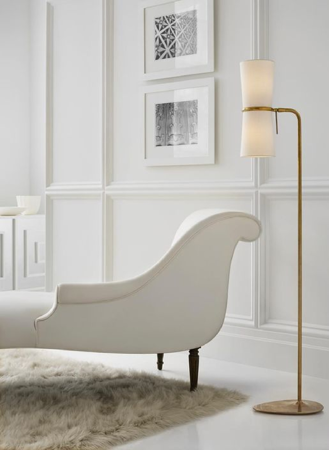
Crazy about that floor lamp (above)? Me too! It’s a Clarkson floor lamp HERE.
Designer Lisa Furey Painted Everything BM OC-151
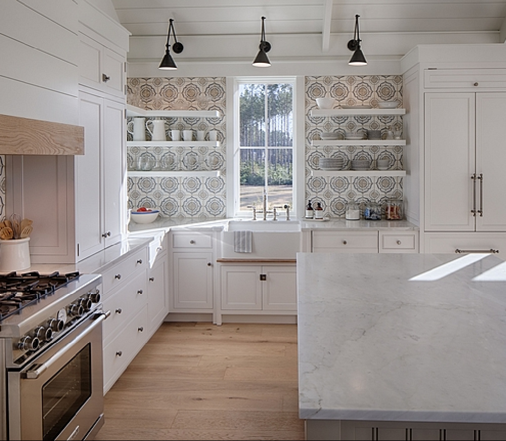
A favorite project by Lisa Furey Interiors is HERE, and what was so interesting was how both the interior and exterior were covered in the same cool white I chose for our former home: BENJAMIN MOORE White OC-151.
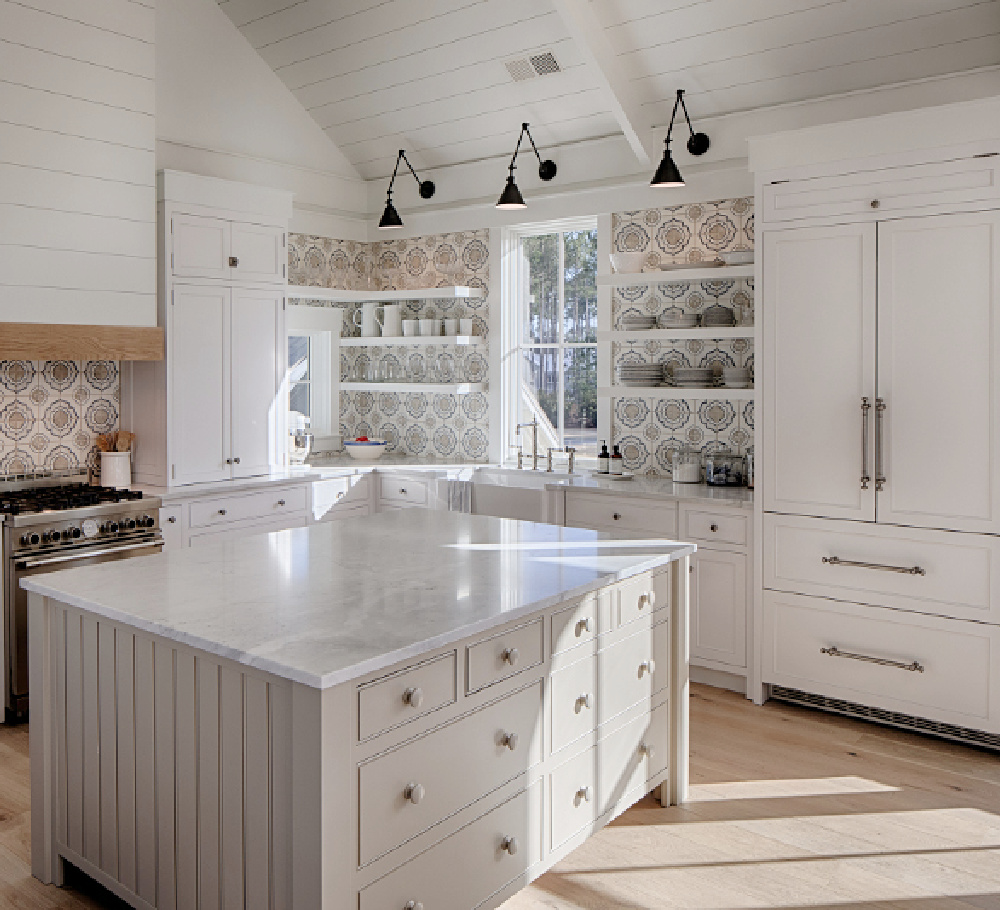
Lisa’s coastal meets modern farmhouse kitchen even found itself on the cover of a lovely shelter magazine!
See OC-151 White in Our Home
I recently wrote exhaustively about that color RIGHT HERE.
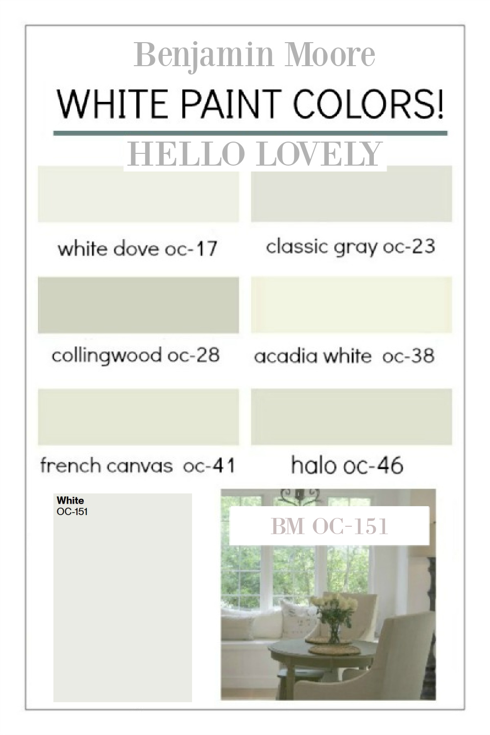
I never tired of this white, and its coolness was nicely balanced with all of the warm Belgian linen upholstery.
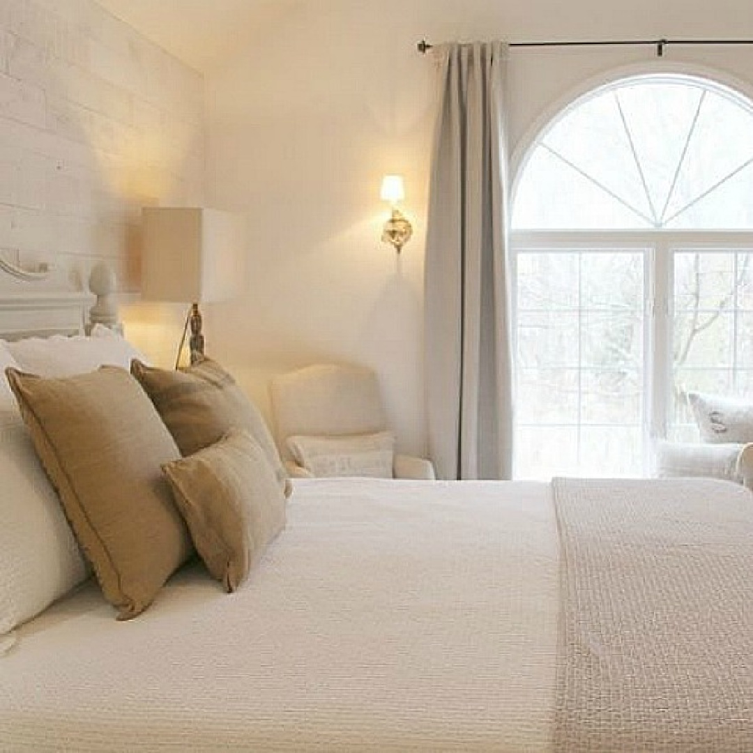
While you may hear advice to choose cool whites to complement cool colored furnishings, you get to decide what is peaceful to your eye.

There are no design police or rules about such things!
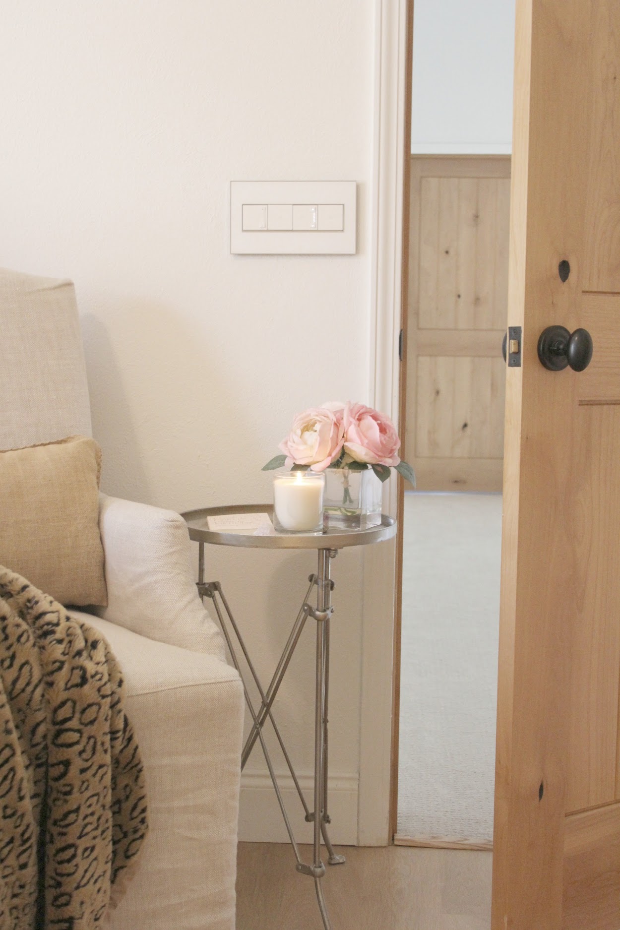
More Photos & Inspiration: BM White OC-151
You’ll notice the color looks different depending on the season and time of day…
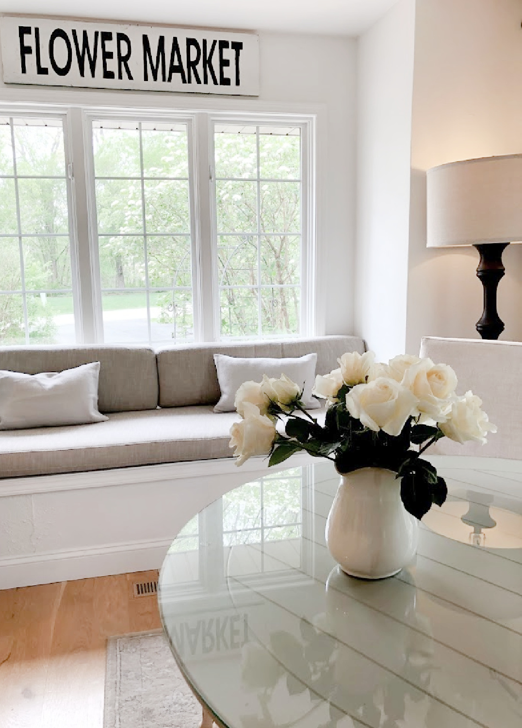
which is a great reminder to sample a handful of whites you think may work and then notice how their appearance changes depending on the hour of day.
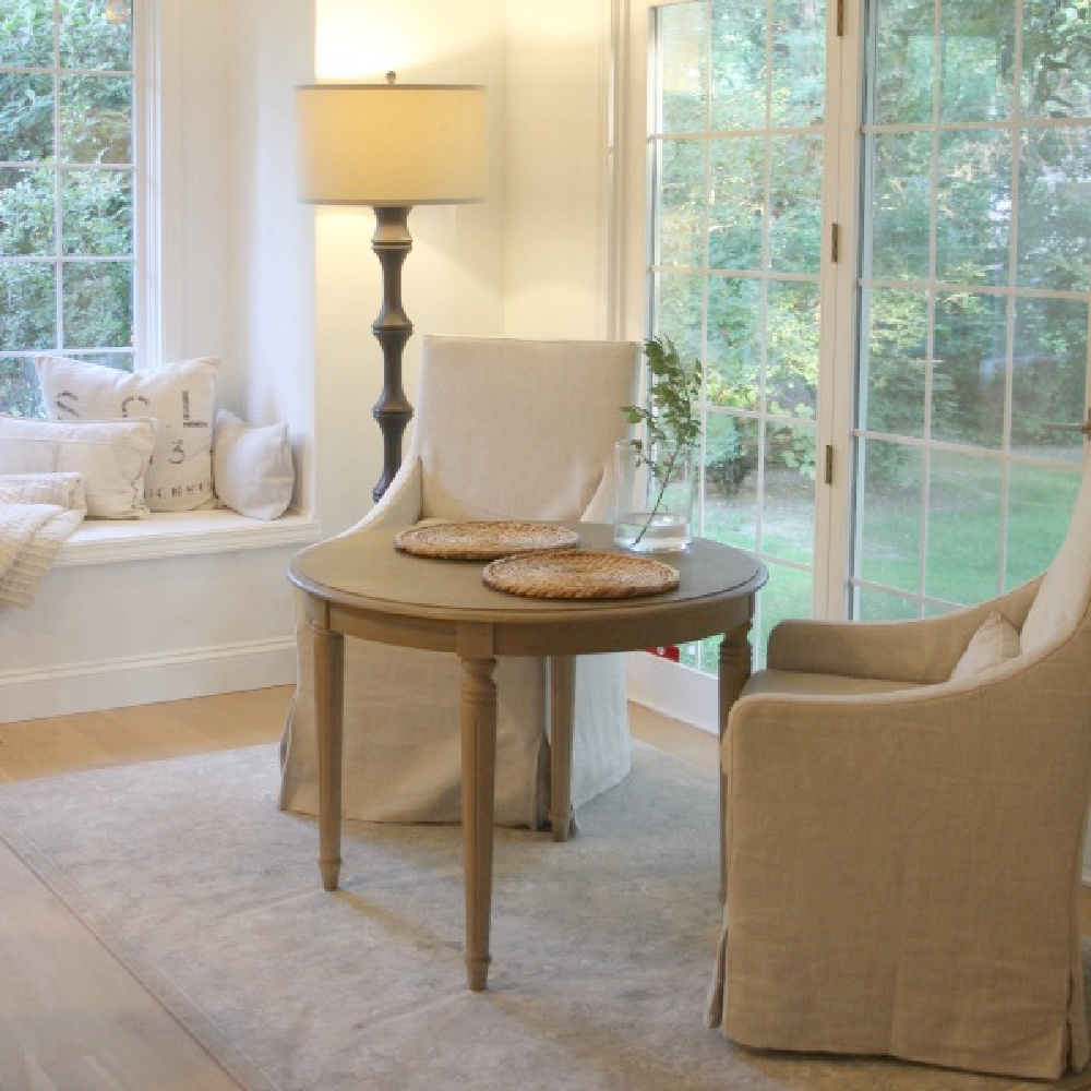
Since we renovated this whole house ourselves, I wanted to make the painting and future touchups as easy as possible.
So I used this white on walls (flat), trim (semigloss), and ceilings (flat) in various sheens.
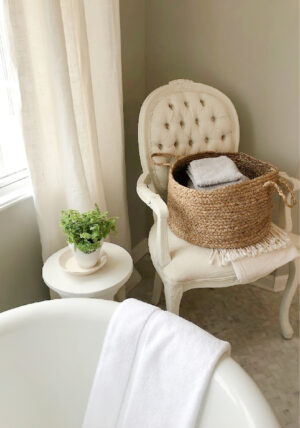
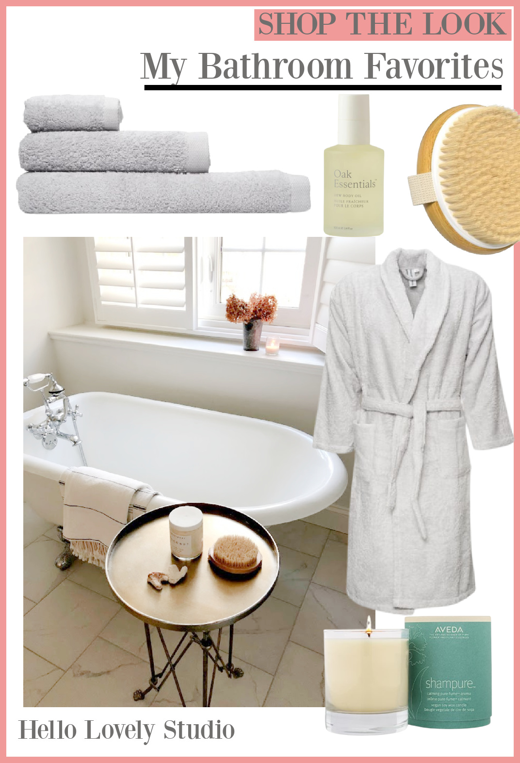
It’s the color in our bath as seen below as well:
How to Choose the Best White
I hope these designer favorites narrow down a few trusted colors so you have a place to start as far as samples.
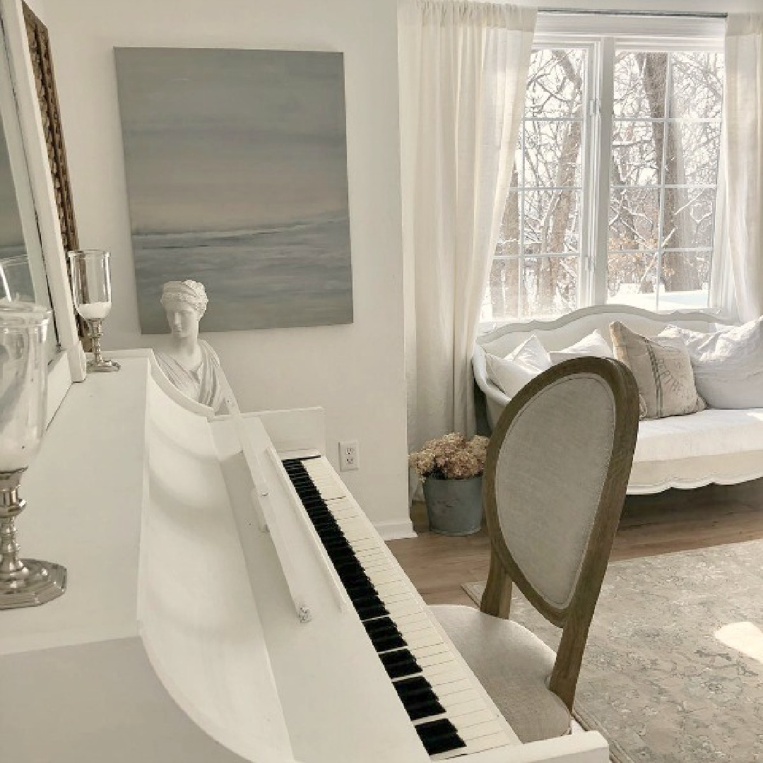
Try at least three samples, and don’t fret if you’re not sold on any of them.
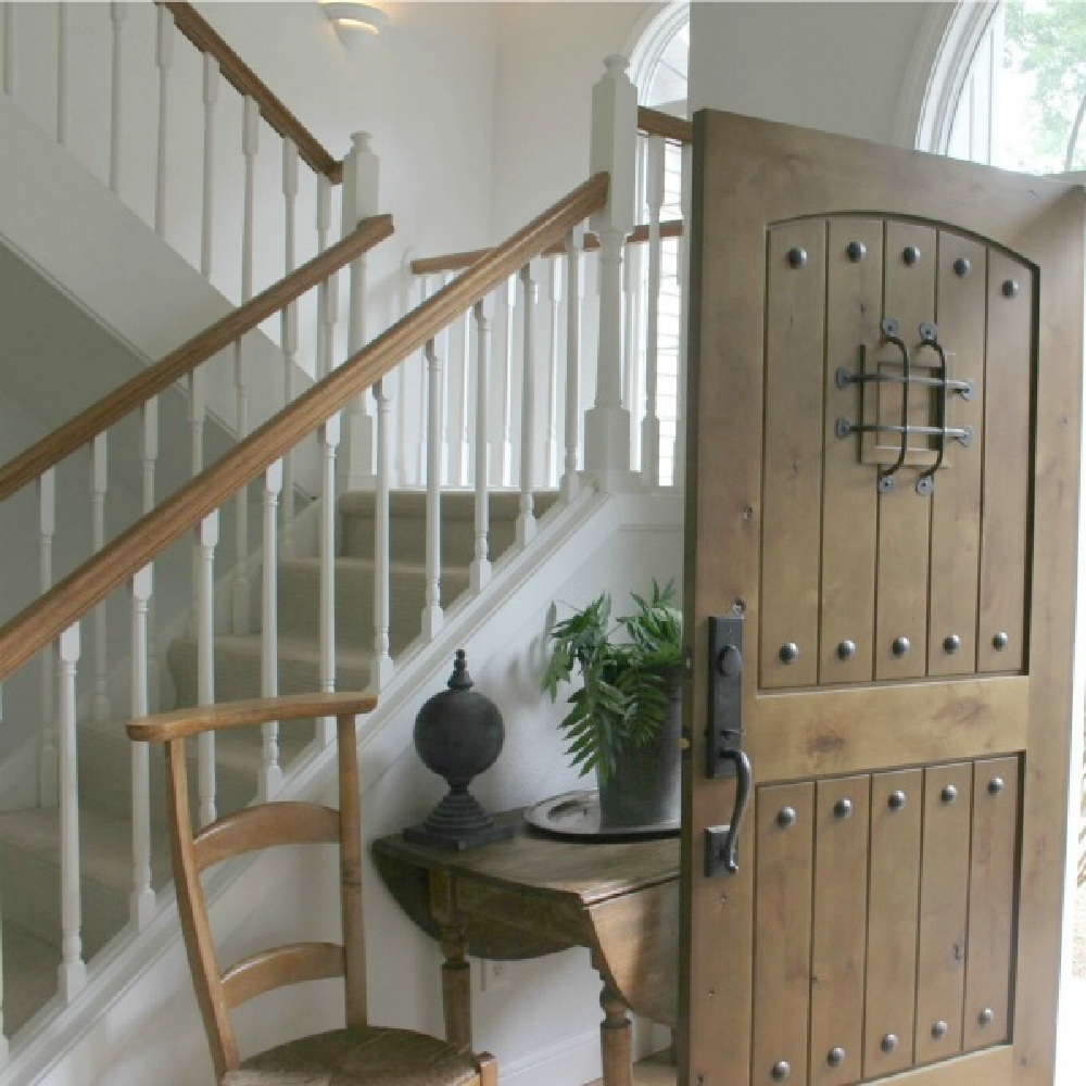
You’ll begin to notice what you like and don’t like and have a better understanding of temperature and undertones.
A family member who visited our former home said she thought the white I chose looked very light blue, and she wasn’t a fan. I didn’t perceive the cool blue undertones as intensely, but it makes sense I would be drawn to this white since I love blue!

So just a reminder that YOUR eye is YOUR eye. Please yourself. Ignore trends and listen to your home’s architecture. Try to not get distracted by a paint color’s name either when sampling different swatches. Sometimes the best white will not even have “white” in the name!
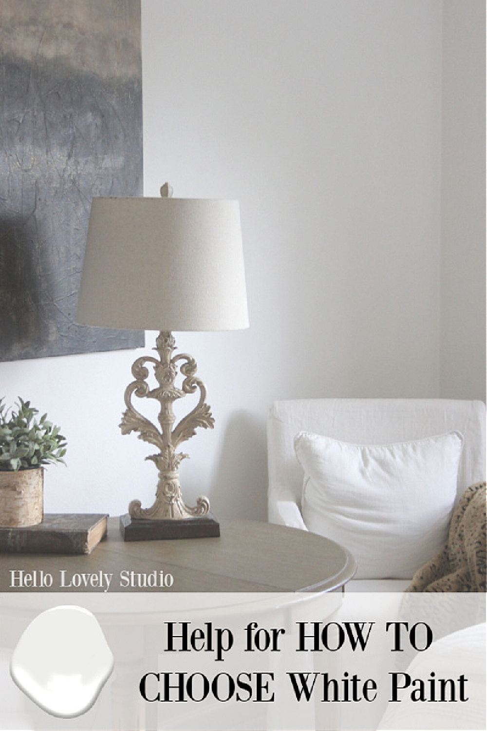
Finally, if you decide to buy sample pots, try to paint a large section. If you’re painting over a dark color, it’ll take a few coats to get a true idea.
I hope these ideas ease your mind!
You can always leave a comment for further clarification or email me with specific questions.

This post about HOW TO CHOOSE WHITE PAINT may also be helpful.
These Designers Always Choose Wisely!
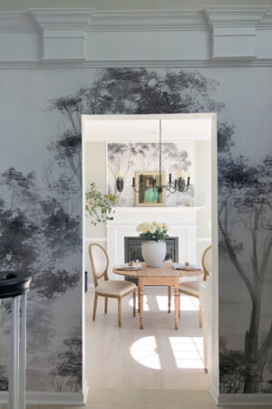
I enjoy learning from Nate & Jeremiah’s work, and their commitment to timeless interiors always inspires. Did you see this episode? (The mural they chose for the kitchen!)
Peace to you right where you are.
-michele
I independently selected products in this post—if you buy from one of my links, I may earn a commission.
Thanks for shopping RIGHT HERE to keep decor inspiration flowing on Hello Lovely!
Hello Lovely is a participant in the Amazon Services LLC Associates Program, an affiliate advertising program designed to provide a means for sites to earn fees by linking to Amazon.com and affiliated sites.
