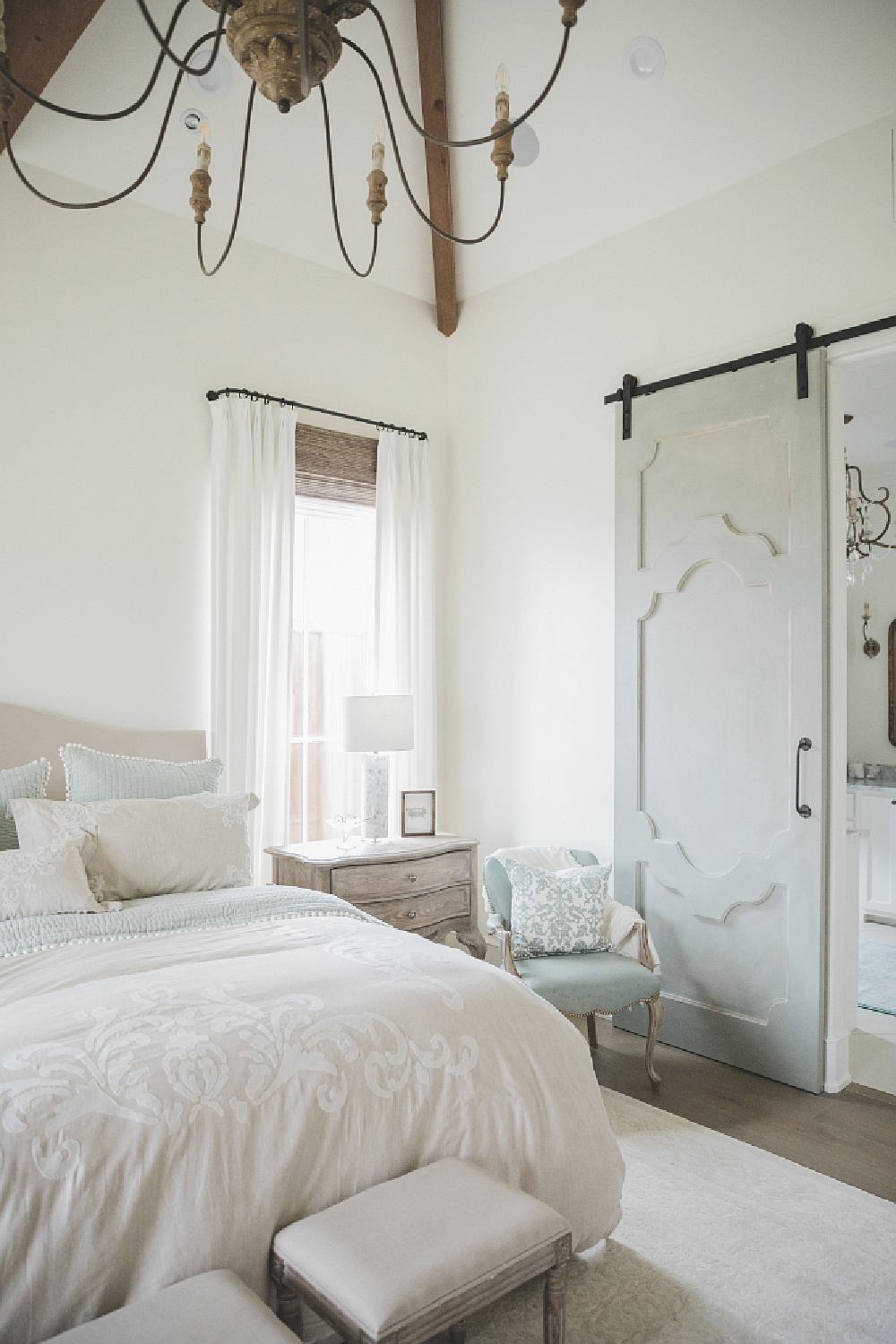
Calm Bedroom Colors provides the guidance you need to narrow down a few tranquil paint colors to sample. See a photo gallery and host of possibilities from designers and homeowners who supplied exact paint colors. Which of these tones will elevate your decorating scheme?
Affiliate links follow and won’t cost you a penny extra when you use them yet may earn this blog a small commission.
Calm Bedroom Colors for a Tranquil Retreat
Time to consider a range of serene paint colors that feel restful. From gentle whites to soft blacks, these are picks from designers across the web. BTW. Don’t let anyone talk you out of painting your bedroom white if you’re leaning toward it. A love for white doesn’t mean you’re dull and unadventurous. It’s a vibe, kittens. There are folks who think white paint is white paint, and those cats are wrong. Need yer girl to set them straight? Leave their email address in a comment – hahaha.
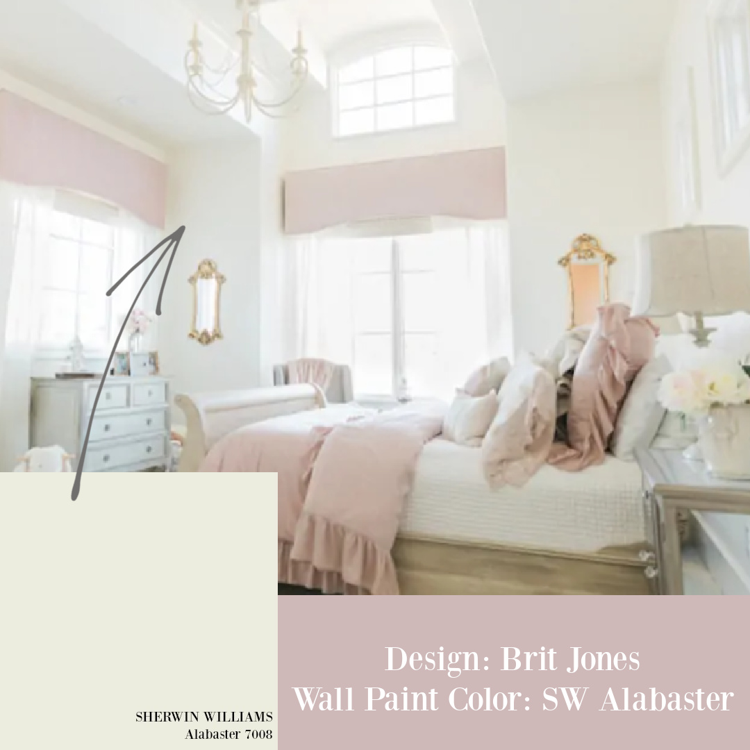
Sherwin Williams Alabaster
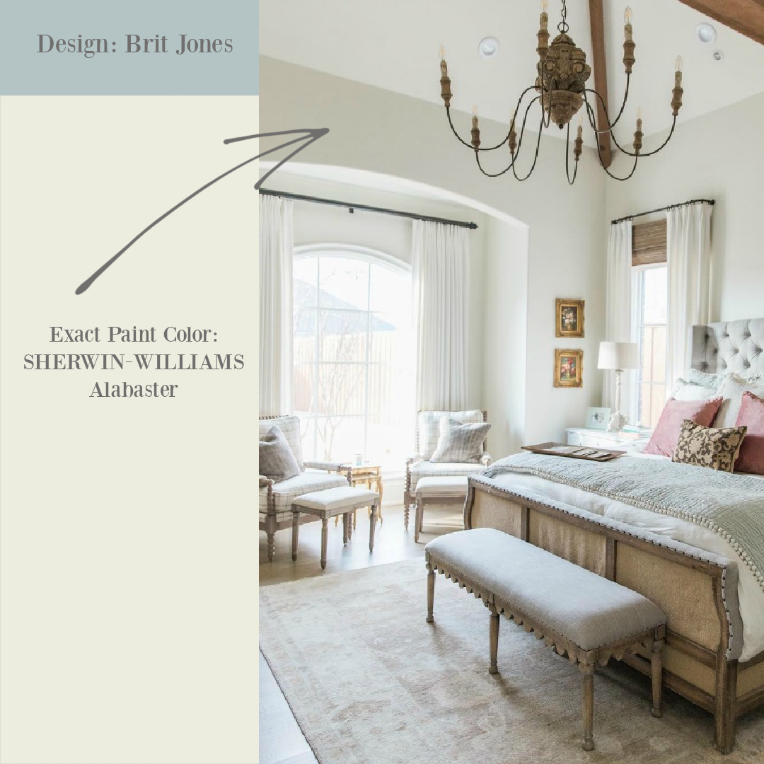
Sherwin-Williams Alabaster is a creamy white that soared in popularity a couple years back when Joanna Gaines used it liberally. It propelled it to the top of the heap for modern farmhouse enthusiasts.
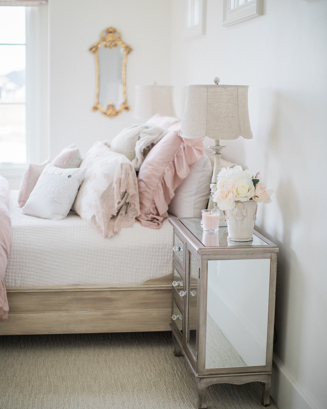
However, the fact Alabaster is a common bedroom paint color need not steer you from it. In fact, let its popularity pique your curiosity.
Alabaster remains in demand as a best paint color for a long list of designers.
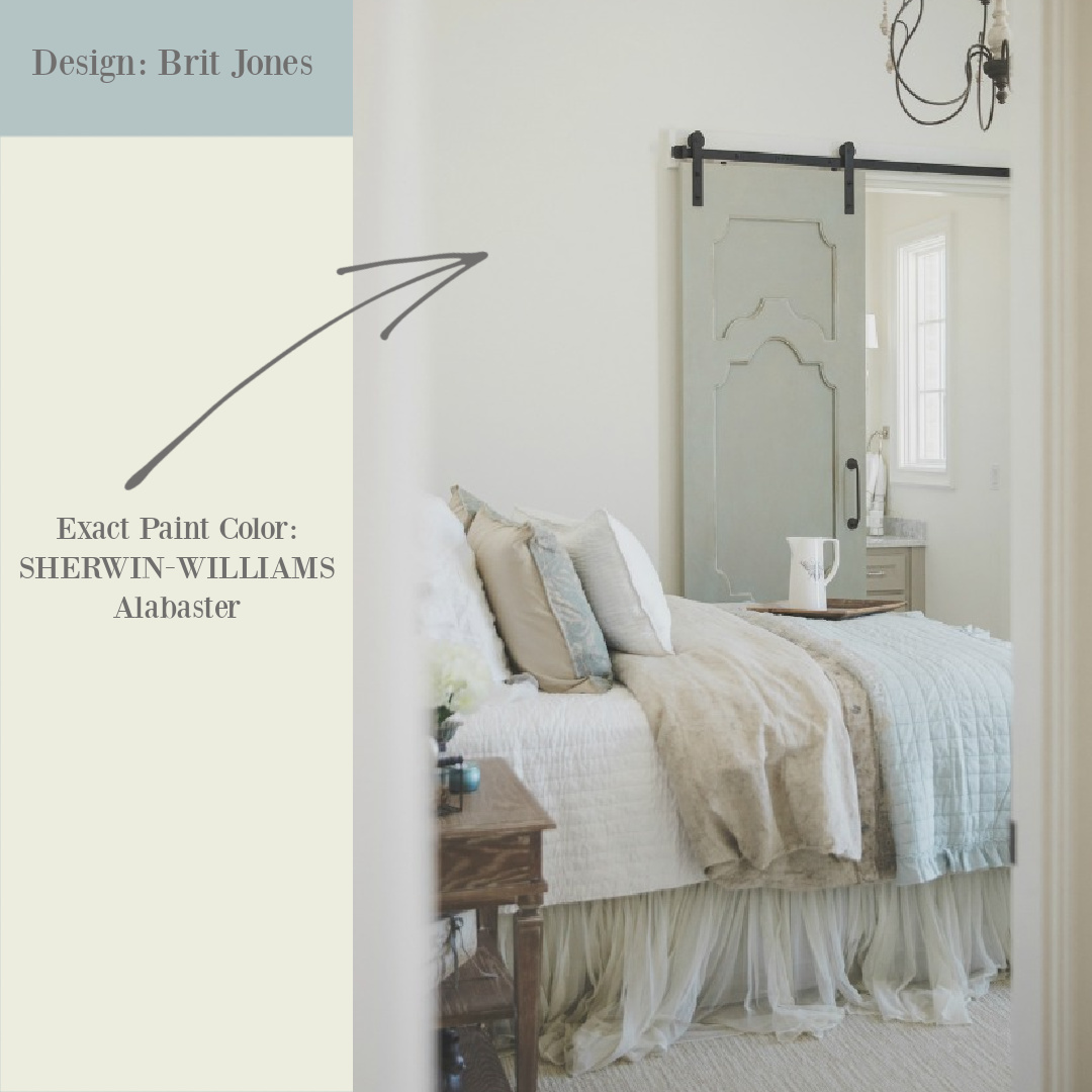
We have toured gorgeous Country French bedrooms in designer Brit Jones’ own home including bedrooms painted this creamy white.
Will Alabaster Be Too Yellow?
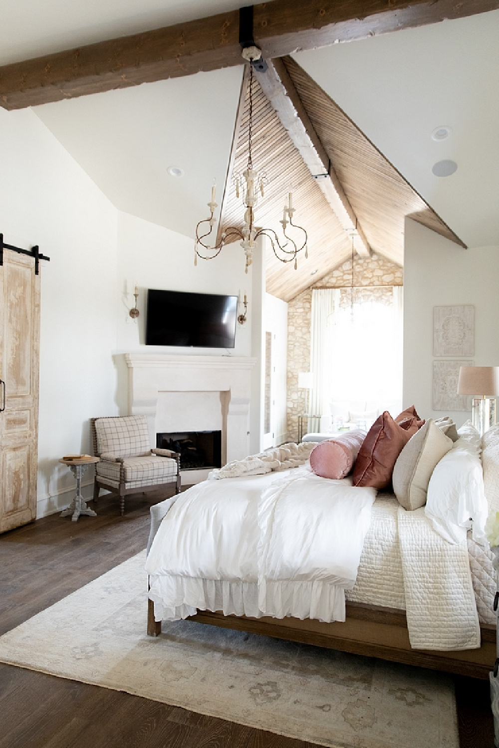
Warm whites can be tricky when they are warmed by yellow undertones. Is Alabaster yellowish? The tones in Alabaster are grey and beige – so it isn’t yellowy.
However, a crisp cool white next to it will affect how you perceive it overall. Everything is relative, and it may appear beige in certain spaces.
How Alabaster interacts with sunlight is also something to consider. In this photo below, Alabaster appears slightly yellow to me:
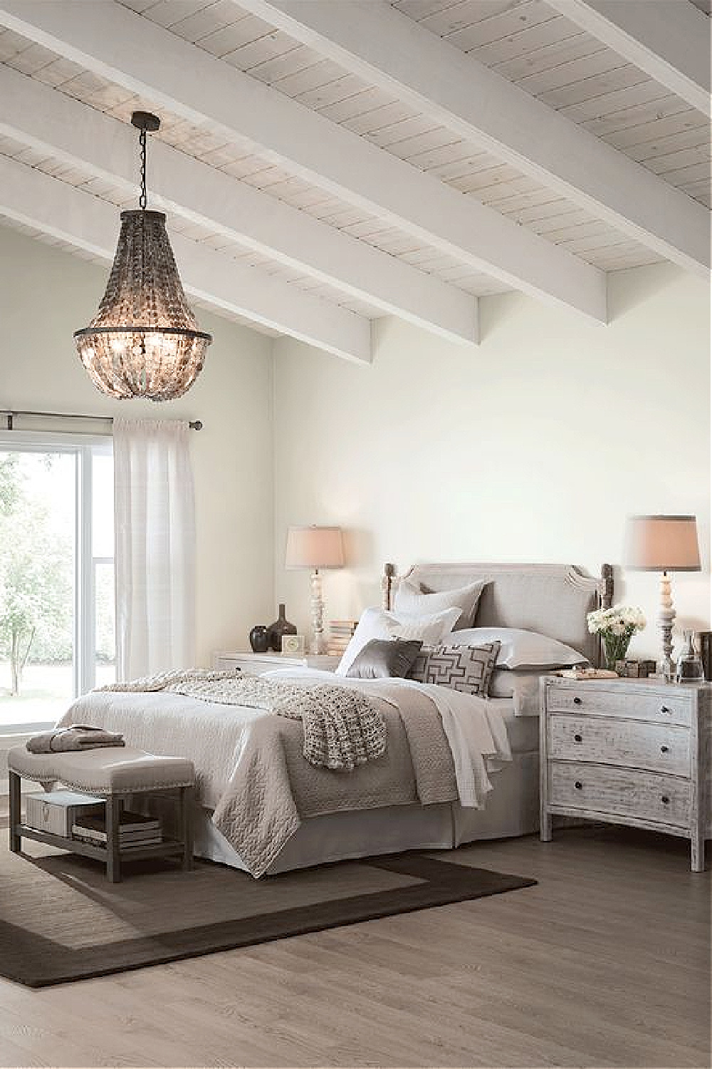
That’s why it can be extra helpful to research a color online to see it in a variety of contexts with various lighting conditions.
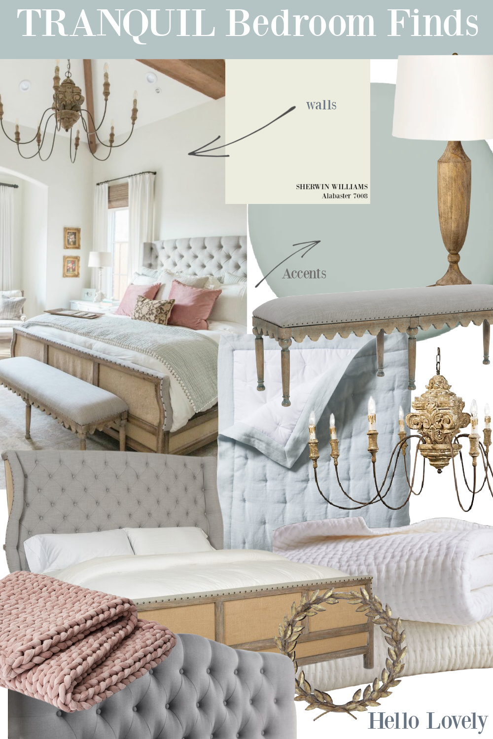
I also find it helpful to see a color with surrounding colors which influence perception.
For example, here’s a tranquil bedroom with Alabaster paired with SW Accessible Beige painted paneling:
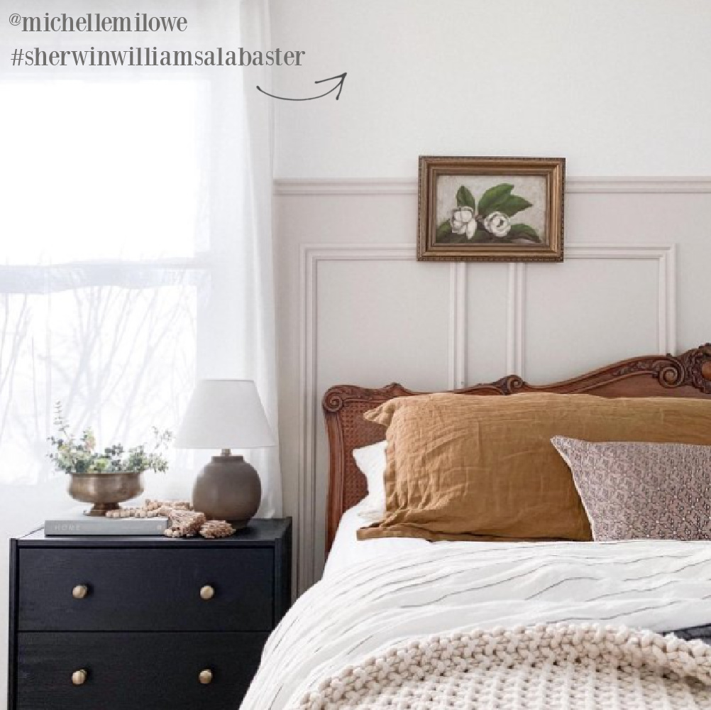
Isn’t Alabaster glorious with the blush pink hints of that contrasting neutral? Here’s another helpful example where Alabaster meets wallpaper and Austere Gray:
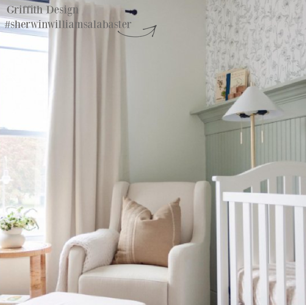
Notice how the same wall color can take on various qualities depending on surrounding colors and lighting!
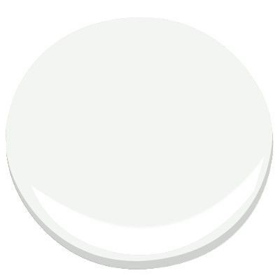
Valspar Salute
This next soothing wall color was chosen as the perfect color for walls throughout our Arizona vacation getaway.
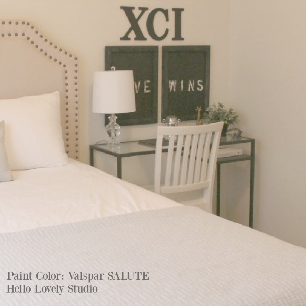
This white with green hints worked exceedingly well with the intense yellow sunlight.
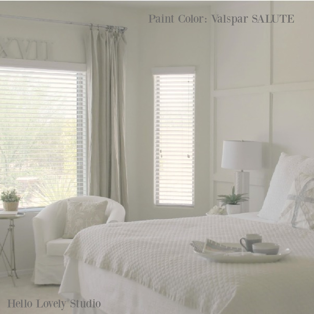
What was special about this particular calm and light neautral? (Believe me, I totally understand the challenge of finding the RIGHT white!)
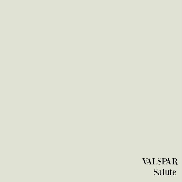
Soft Green-Greys in Bedroom
Lighter shades and pastels with soft green (or green for an entire room) can add serenity and may be the best bedroom paint color for your space. You can introduce soft greens for trim, doors, furnishings, draperies, and accessories. Here’s a bedroom where the warmth of rustic wood is softened with green, creating a restful cocoon:
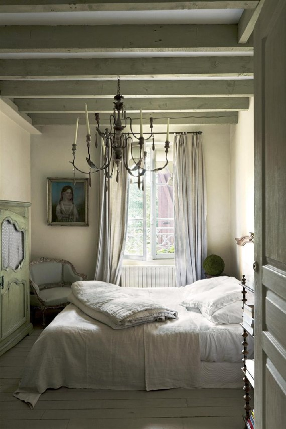
Another designer trick for creating cozy with soft green-blue-grays is by painting walls, ceiling and trim the same color. Very often the trim is crisp white and pops. Here’s Farrow & Ball Pigeon in a tranquil bedroom:
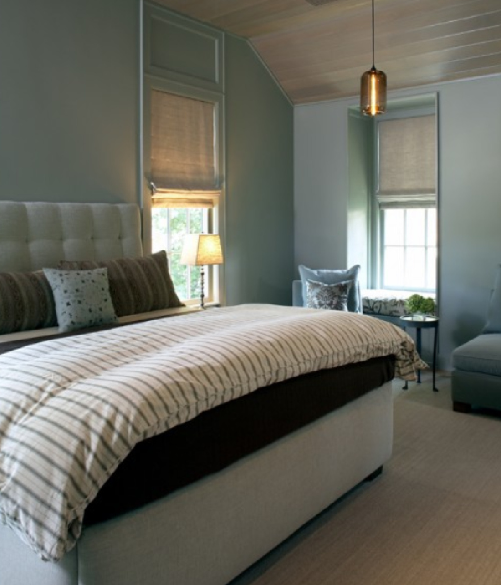
I’m a huge fan of light greys (especially after moving into our new home which was freshly painted with assorted greige hues.)
Benjamin Moore White OC-151
What constitutes “soothing bedroom” for some folks is not necessarily tranquil for all types.
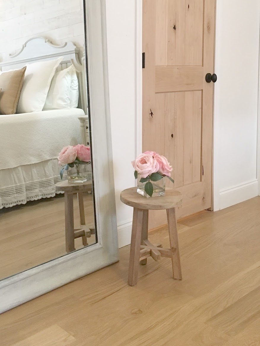
The bright white chosen for our Chicagoland European country inspired cottage here may not make sense for your own bedroom.
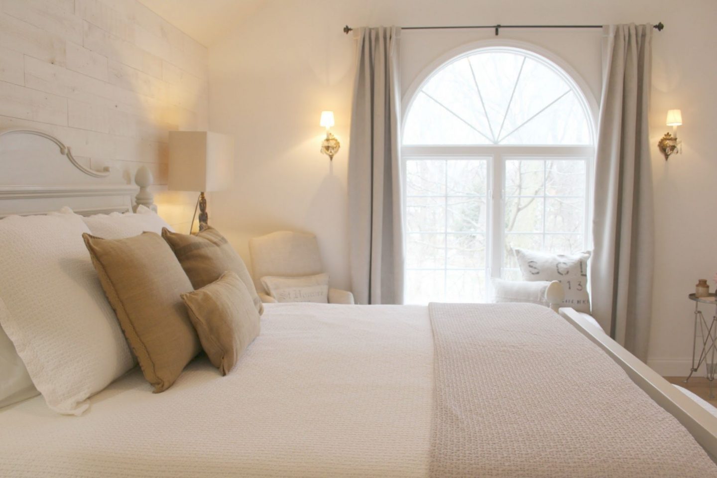
However, Benjamin Moore White OC-151 struck just the right amount of calm and quiet for us since it feels like pure snowy delight!
Here’s a bright, cool, white that I would liken to a gallery white. It was perfect for our setting in the woods – the green foliage outside all of the windows definitely influenced this choice.

I’m not the only one crazy about OC-151! Leanne Ford is a huge fan, and so is designer Lisa Furey who loves this white so much she painted both interiors and exterior in the color.
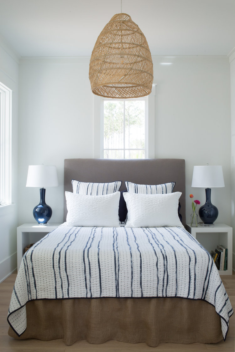
Isn’t this crisp cool white gorgeous with navy blue?
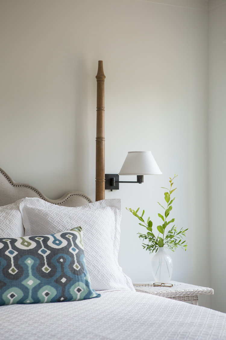
Also, don’t get hung up on “matching your whites.” Bright cool whites look amazing with warmer whites and greige-y whites. In fact, layering whites is one way to get an evolved, more sophisticated result.
Farrow & Ball All White
Here’s a white similar to OC-150 from Farrow & Ball if you want to eliminate blue undertones.
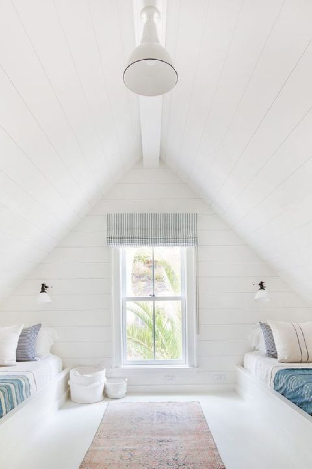
All White contains no other pigment except for white, creating a soft color without the cold blue undertones of a brilliant white.
It feels modern and plays nicely with F&B’s Skimming Stone and Strong White when you want a cozy color story with a little edge.

This white is amazing when you’re after a clean and almost graphic finish with contrasting strong tones like Pitch Black and St Giles Blue.
Sherwin Williams Rainwashed
For many folks, “tranquil bedrooms” are equated with soft ethereal blue paint colors, and who can blame them?
Here is a blue-green option you may want to sample. Just look how it forms a blissful canopy in this showhouse bedroom in Atlanta.
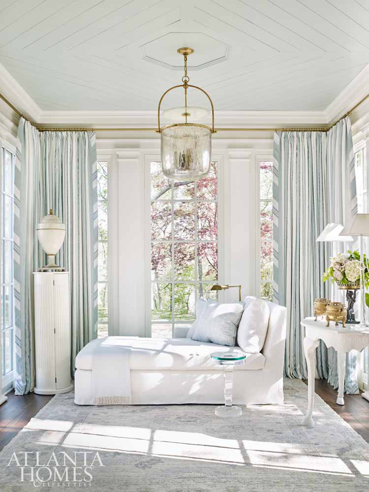
I have always loved the blue on the walls of this showhouse bedroom which are covered in grasscloth wallpaper (Ainsworth Noah).
What blue paint could approach its mood and beauty?
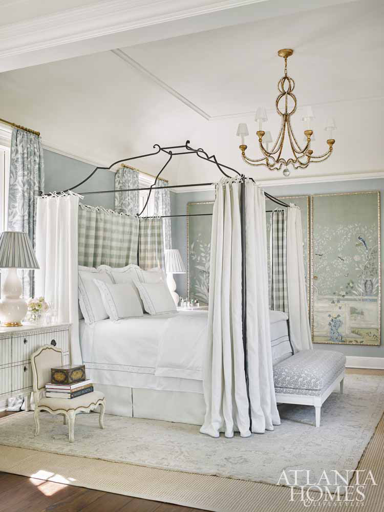
Here are some contenders to approach that heavenly hue of this blue bedroom wallpaper:
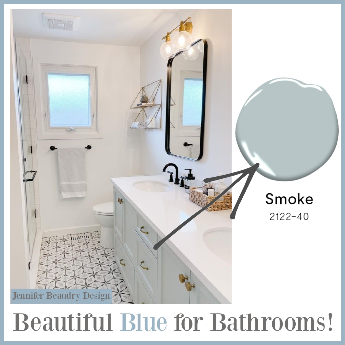
Benjamin Moore Smoke
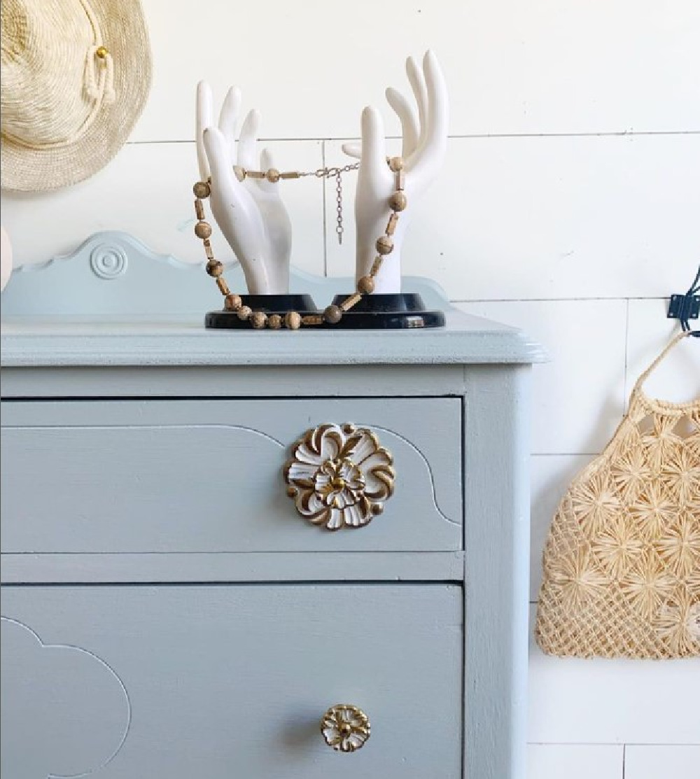
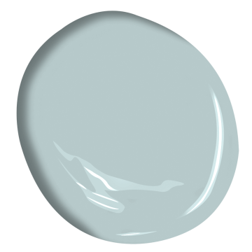
If you love wearing chambray colors, this may be a tranquil color for a master bedroom or blue bedroom to consider:

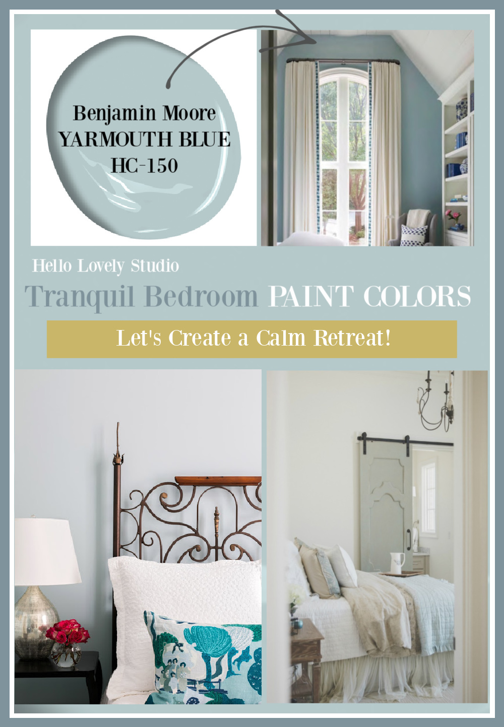
BM Yarmouth Blue
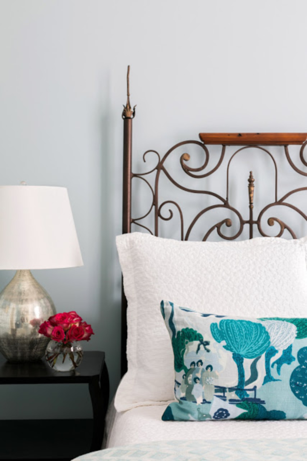
Here’s another sophisticated blue that feels timeless and dreamy:
The best way to know if it’s the right blue for your own primary, guest, or master bedroom? Order samples with Samplize and have them delivered straight to your door.
Sample it! Here’s the best way to select the right shade for your particular space:
If you have Northern exposure or limited natural light in your bedroom, this blue may read more like this:
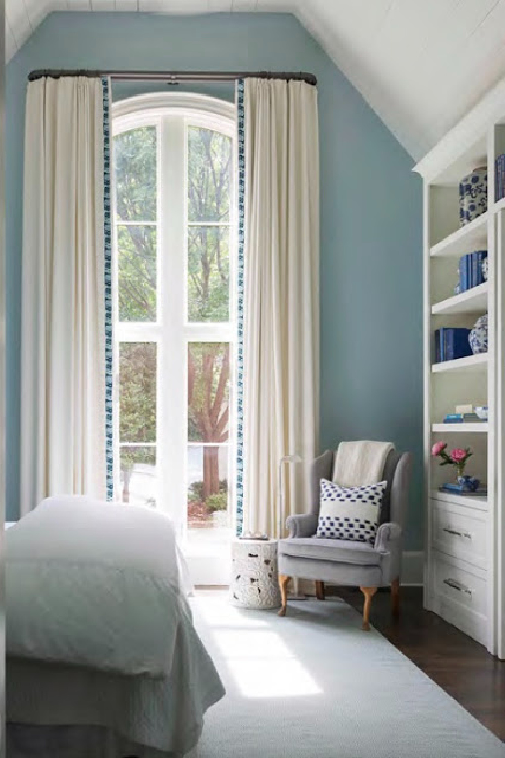

BM Revere Pewter
I love this warm greige and used it as a glaze for the furniture in my own former bedroom which received minimal natural light.
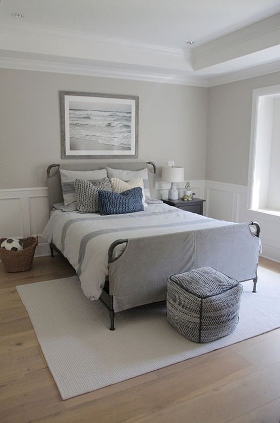
Isn’t it fabulous with crisp white?
If you’re also pairing Revere Pewter with warm wood tones, here’s an example of how it looks:
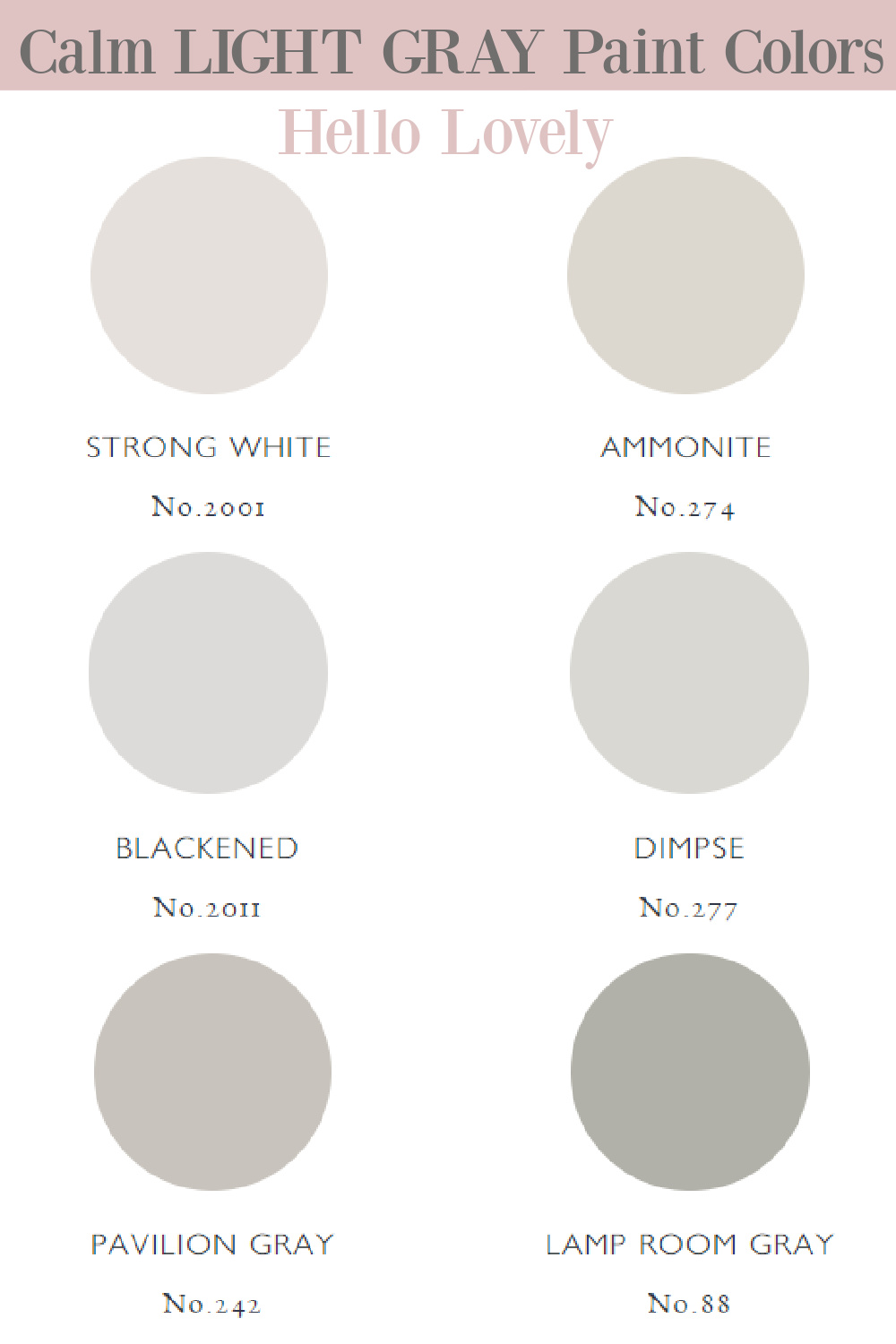
Farrow & Ball Strong White
I love it when designers share paint names, and Charlotte Reiss of Vivi et Margot gave us the full scoop in our tour of her farmhouse in France.
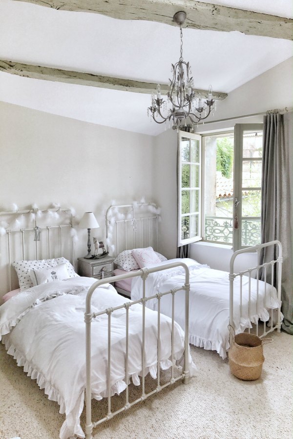
Here’s what F&B say about how it makes a space feel:
“This cool white is both strong by name and strong by nature. One of our Contemporary Neutrals, the subtle urban feel of its light grey undertones add a contemporary twist to period homes, while staying in keeping with modern properties.
Pair with Skimming Stone, Elephant’s Breath and All White in any combination for an effortlessly cohesive scheme.“
In this particular French farmhouse, Charlotte chose this color for contrasting trim with Strong White:

Isn’t it an interesting combo that creates a timelessly tranquil vibe?
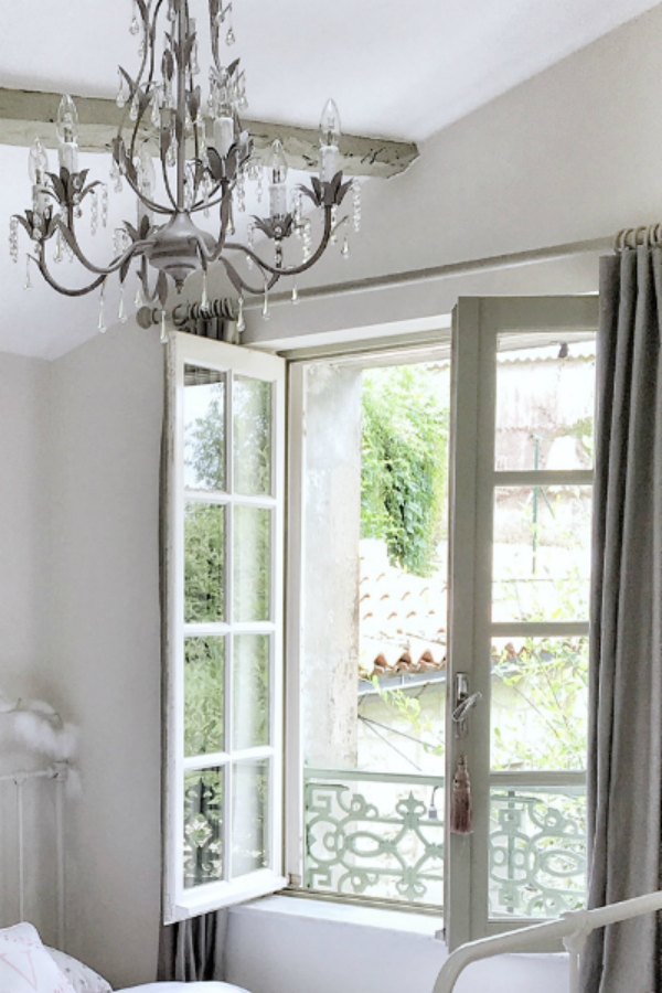
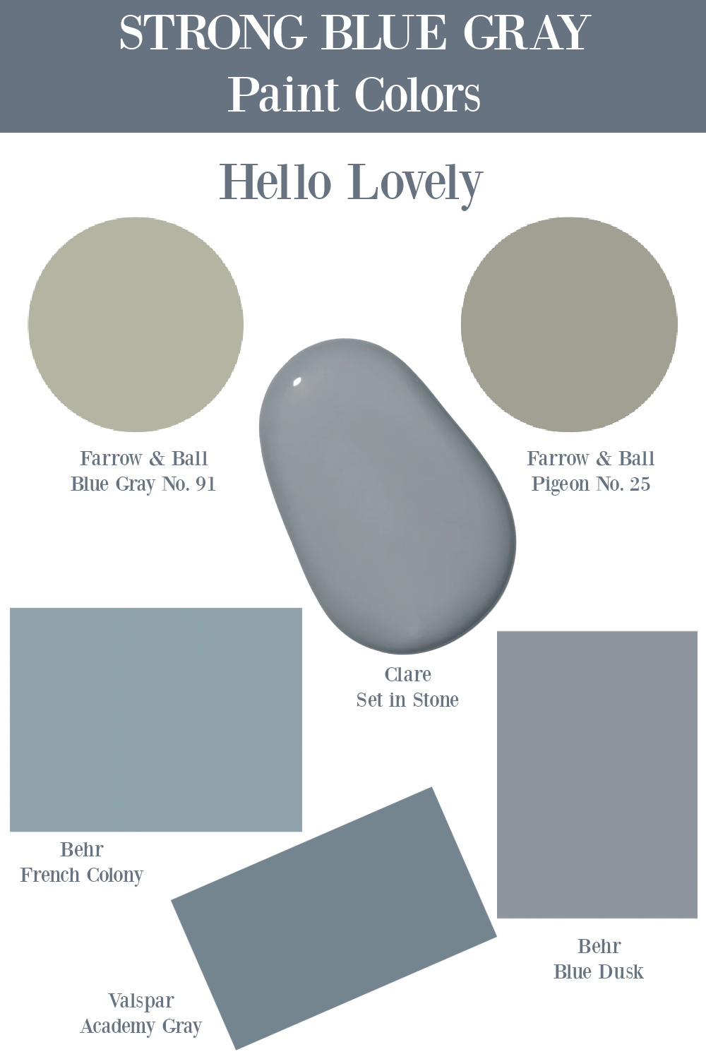
Here are more ideas for strong grays you could pair with Strong White:
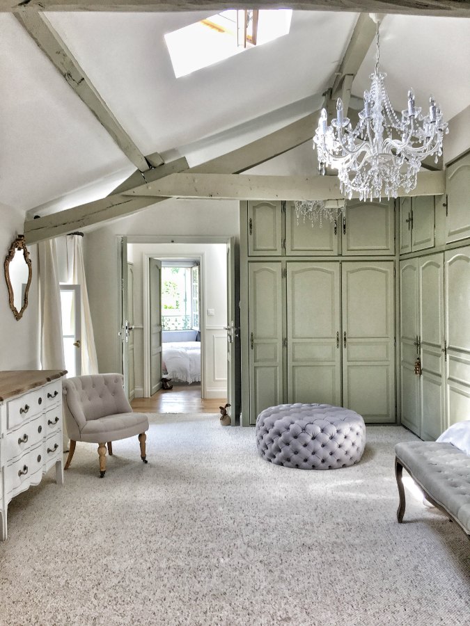
In this dressing area, you can see how the green undertones in French Gray bring an organic feel to cabinetry.
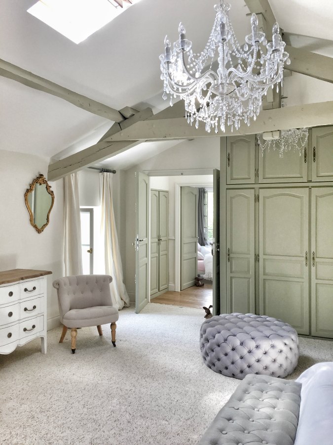
You can also see how much cooler Strong White is with this contrast from French Gray.
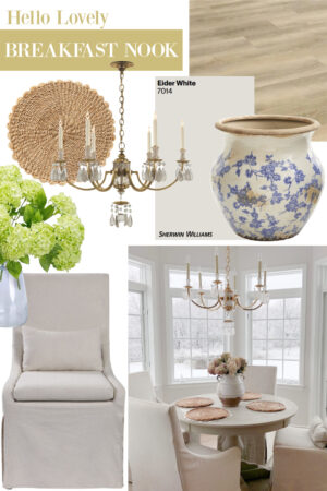
Sherwin Williams Eider White
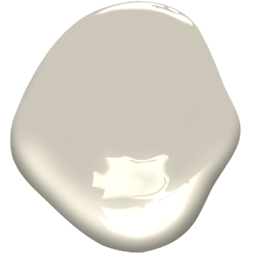
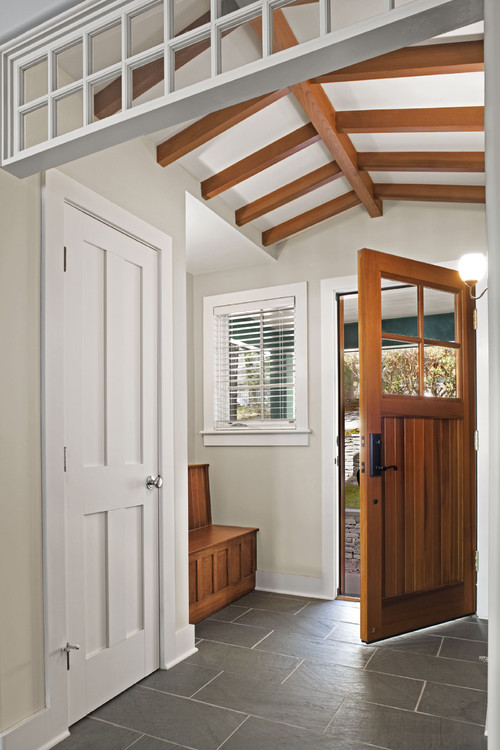
Here is a pretty gray white that I am actually living with at the moment in our kitchen. While I’m not sure it will remain the same, I love it for bedrooms.
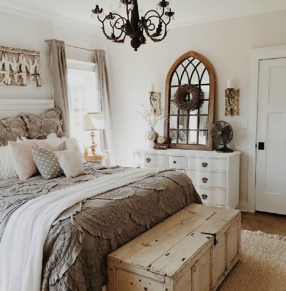
This white is reminiscent of BM Ballet White, a lovely color my mom used throughout her former home.
If you like SW Repose Gray or Agreeable Gray, then here’s a white for you – it’s very similar.

Isn’t Eider White amazing with this unique color story above in the showhouse?
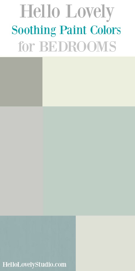
Benjamin Moore Iron Mountain
Soothing wall colors for a tranquil bedroom need not be pastels to make the space feel calm.
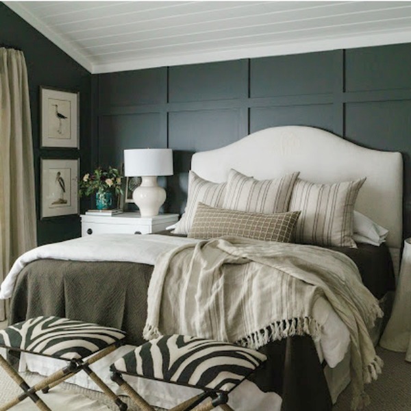
This bold atmospheric chameleon of a deep bronze transformed a designer’s own bedroom!
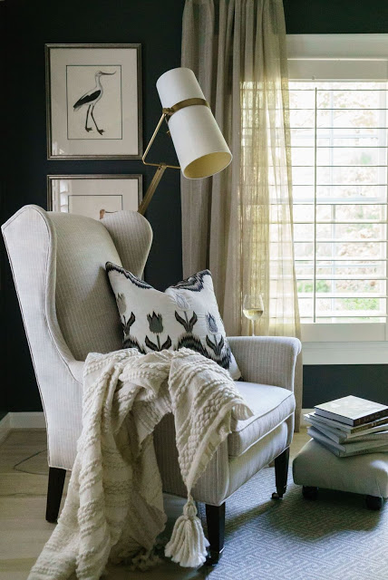
Would you, could you get used to a vibe this rich in a bedroom retreat?
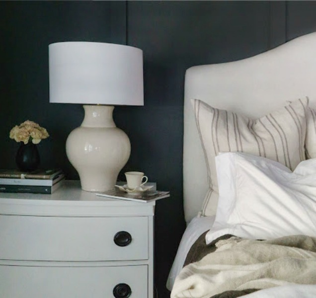
Bear in mind, a color like this can look brown if you’re just viewing a swatch of it. Even the first wet coat may have you feeling nervous…but colors tend to darken as they dry. Give it a chance.
Farrow & Ball Railings
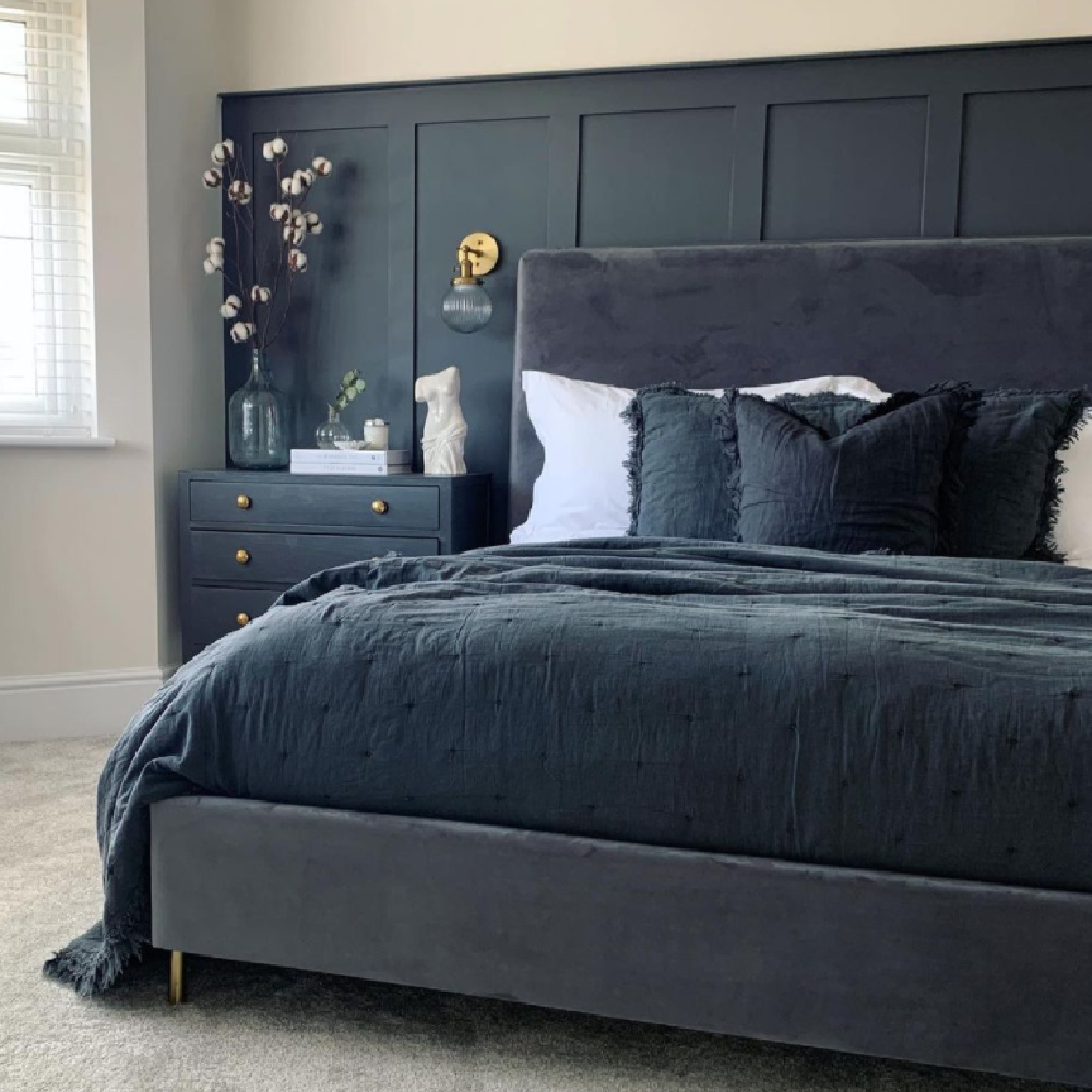
Dark and moody can be soothing indeed, and if you’re seeking a soft black with a heap of depth and character, F&B’s Railings may be it.
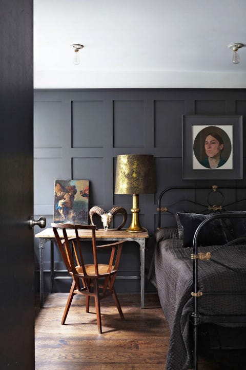
Good heavens, just look at what happens when you pair it with gold tones!
One of the most memorable homes I can recall where Railings plays a starring role is Drew’s Regency style honeymoon house in Hollywood (of Property Brothers fame).
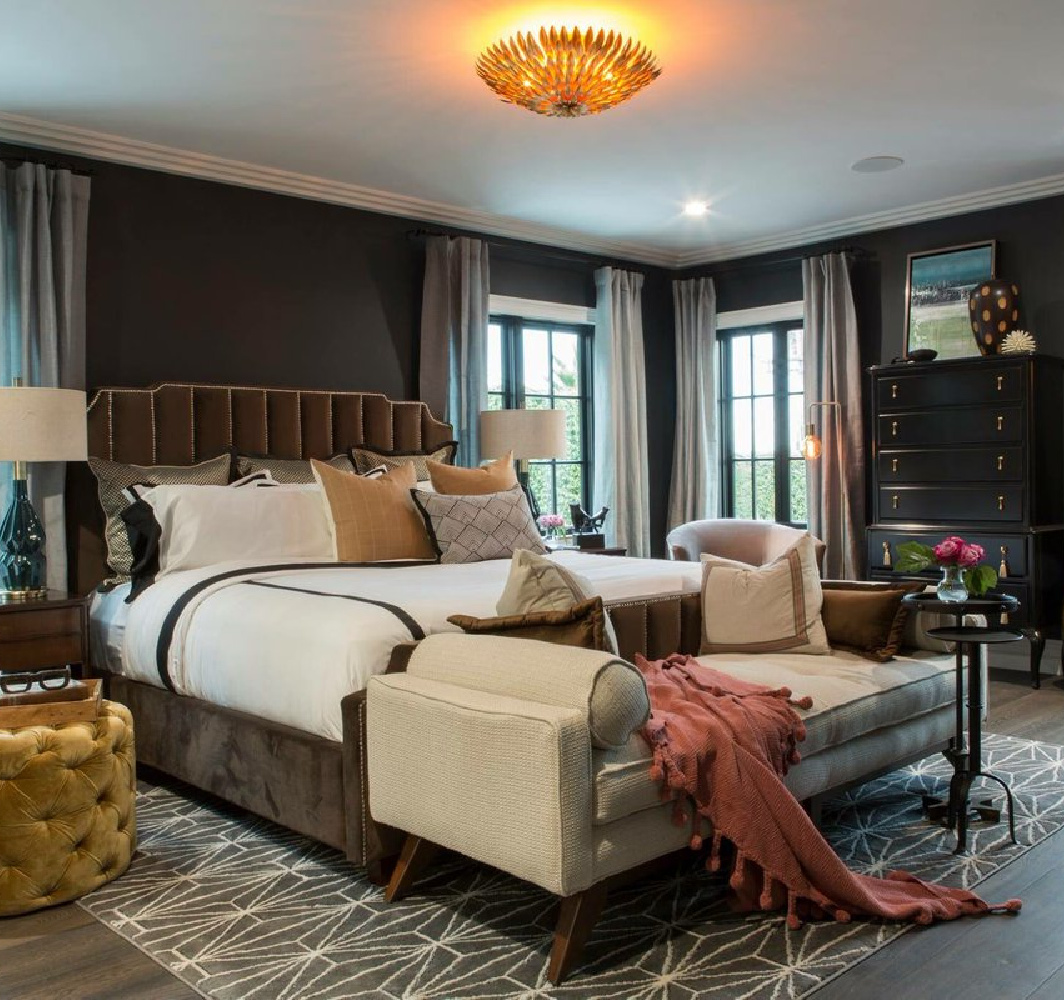
Railings is amazing for applied trim and panels like this:
and trim and cabinetry like this:
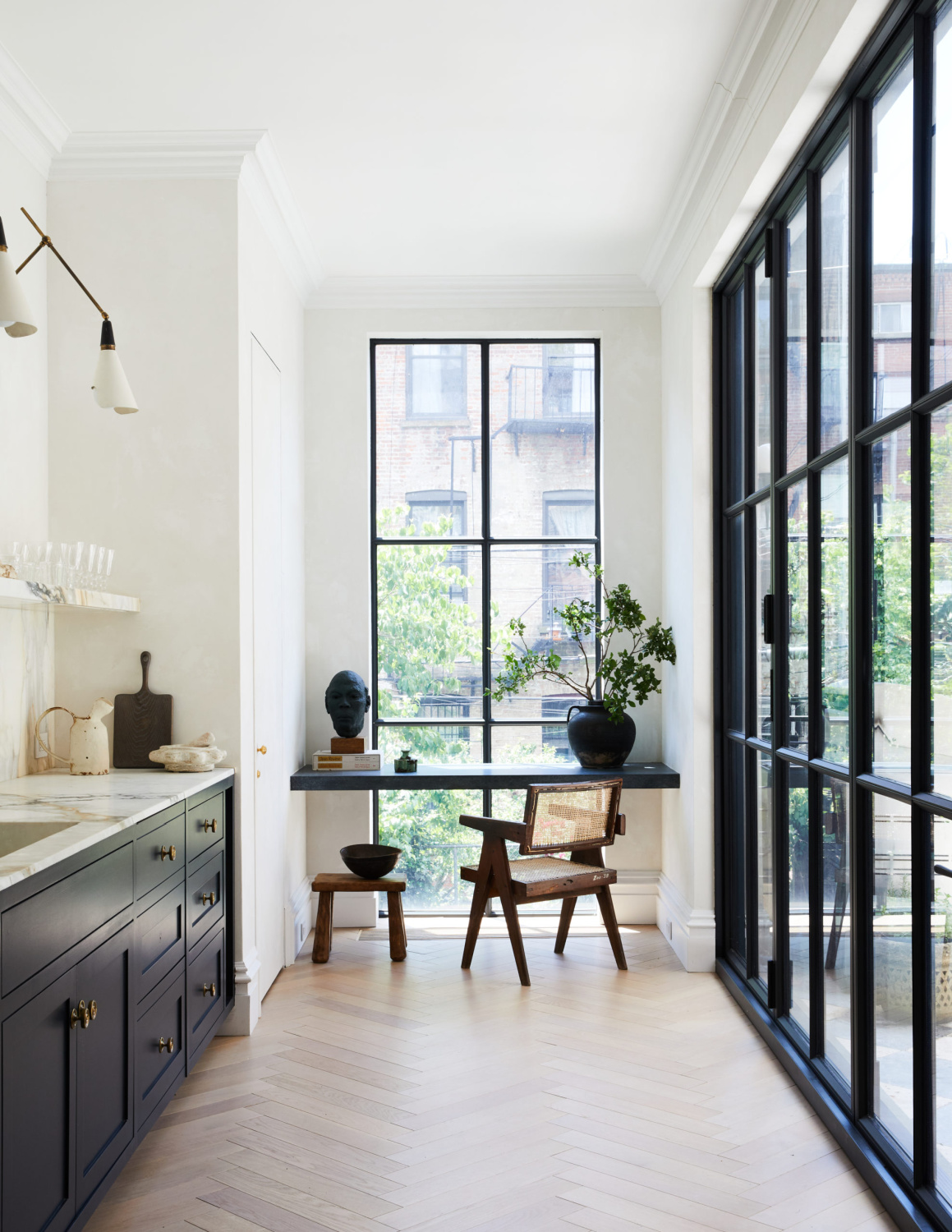
Here are a few more wise tips from a pro for creating a relaxing bedroom retreat:
Thanks so much for considering these relaxing options! I’m always here to listen to your questions or concerns, so do leave a comment.
Pssst. If you have narrowed your search to white paint colors, this story about choosing the right white paint may help. When it’s the perfect warm white you’re after, here’s inspiration for warm white paint colors.

Peace to you right where you are.
-michele
Thanks for shopping RIGHT HERE to keep decor inspiration flowing on Hello Lovely!
Hello Lovely is a participant in the Amazon Services LLC Associates Program, an affiliate advertising program designed to provide a means for sites to earn fees by linking to Amazon.com and affiliated sites.
