Why do certain paint colors emerge as bestsellers? Sometimes it is because a stylemaker or person known for having impeccable taste with a huge social media platform endorses a color. Other times, it’s more random like maybe the color has a name that resonates in a particular cultural season. But often, it’s because the paint color tends to work across various lighting conditions for different people. It’s trustworthy. We’ll look at some tried and true popular black paint colors to get you started with blacks to sample.
Popular Black Paint Colors (For Good Reason!)
If you have been searching for a black paint for kitchen cabinets, walls, deck, vintage furniture, a shelf, or an accessory, then you know. Even when you think it’ll be simple, there are a ton of choices. Here’s how you can narrow down the list for trusty ebony tones to sample.
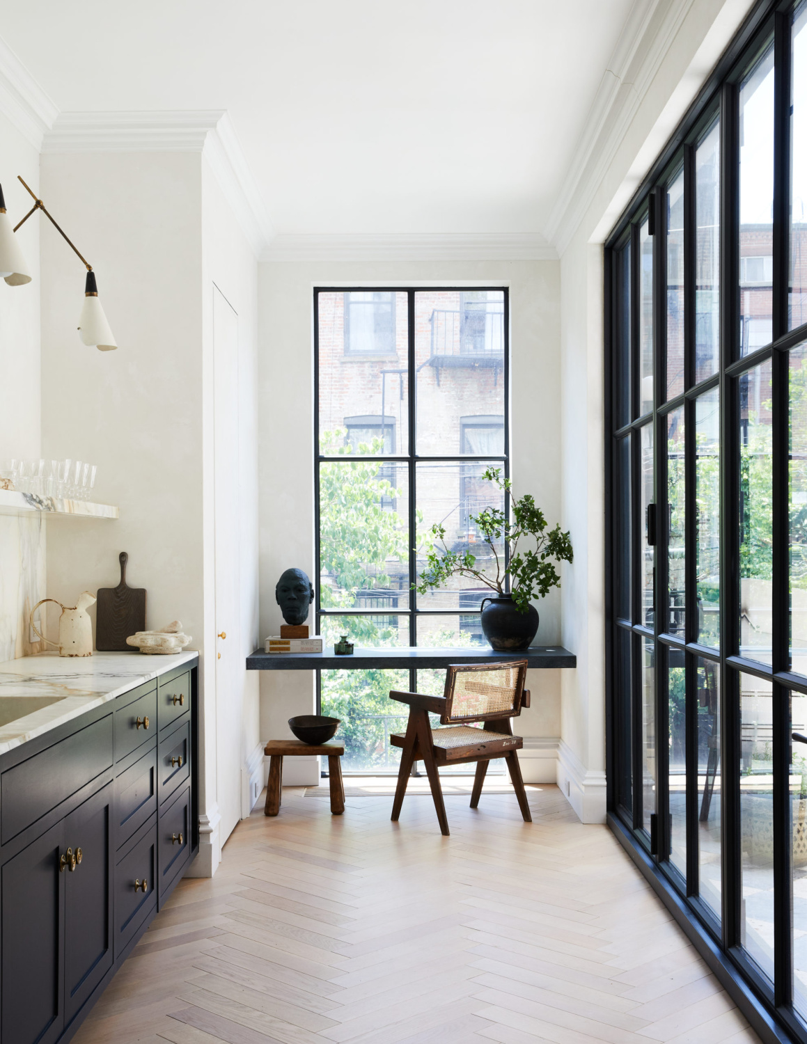
Farrow & Ball RAILINGS No. 31
SAMPLE Railings RIGHT HERE. Here’s a color I have had success with. I love Railings when you need a soft, off-black with navy. When you are viewing photos online, you won’t necessarily see the blue undertones. That’s why you should sample. When the light hits it, it may surprise you.

The other thing I feel like a lot of folks forget is that the same color is going to look different during the day versus at night. Is the color going on furniture in a room you typically use at night? If so, make sure to view a sample of it in that space at night. Also, even though you think you want a true black, an inky black may charm you.
Remember how the Property Brothers Drew Scott used it in his Hollywood Regency style home including the kitchen?
If you want to see more of Railings, see it in glimpses in this video (and there may or may not be a scene with Drew in a freestanding tub painted black…):
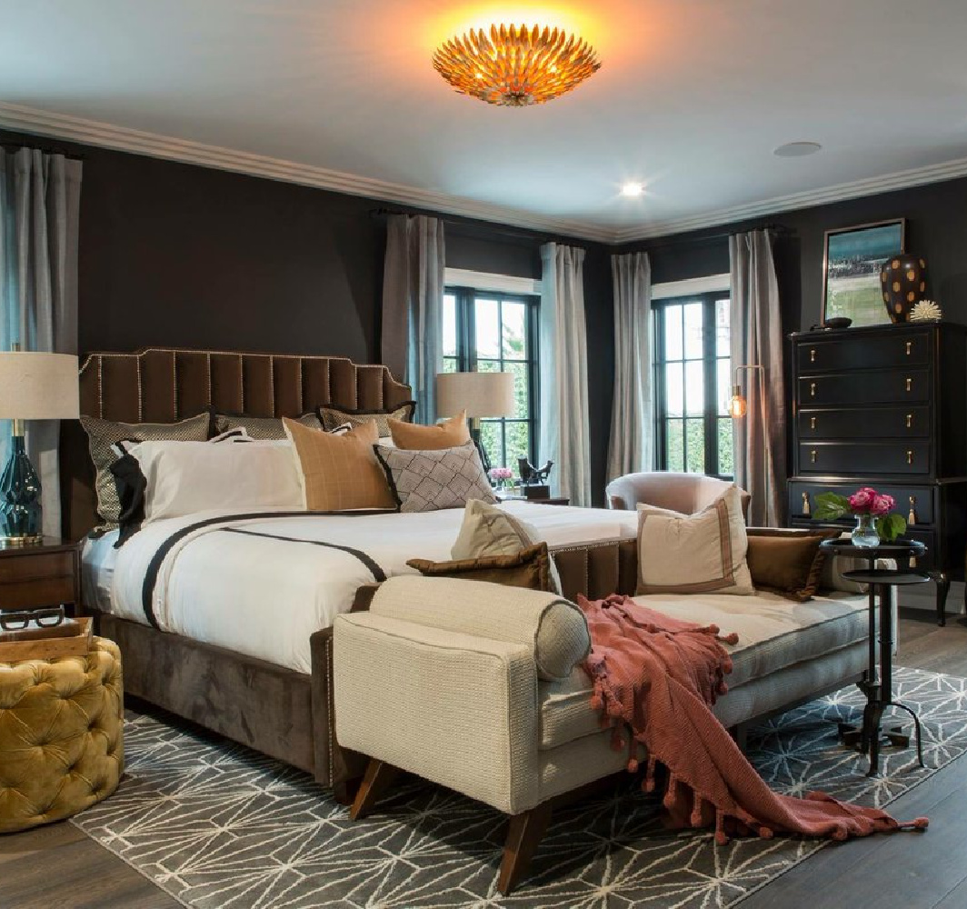
Painting a room black is not unheard of, but it is truly a commitment since painting over it aint a barrel of laughs. Drew and Linda were going for a chic cocoon look, and again, you should think about what time of day a room is used to determine whether it makes sense:
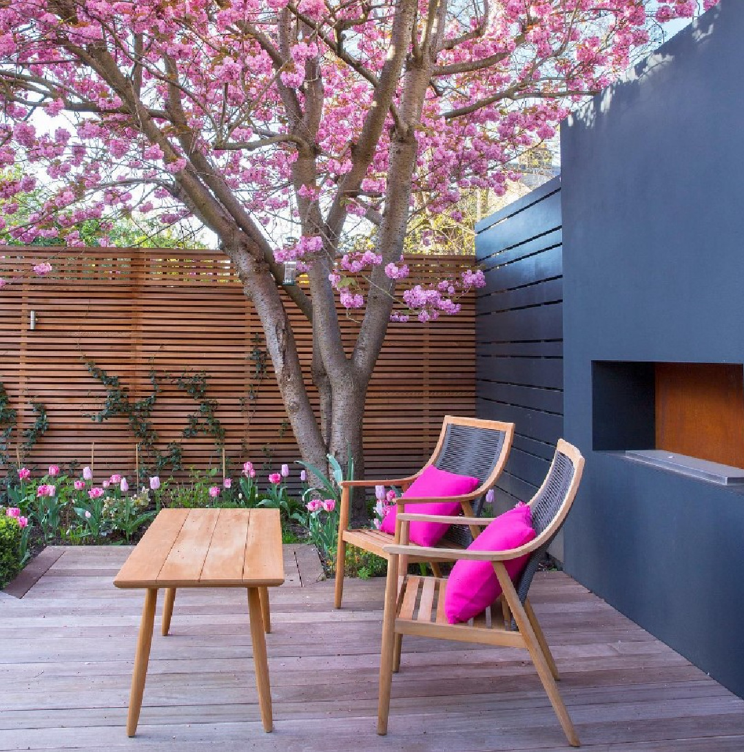
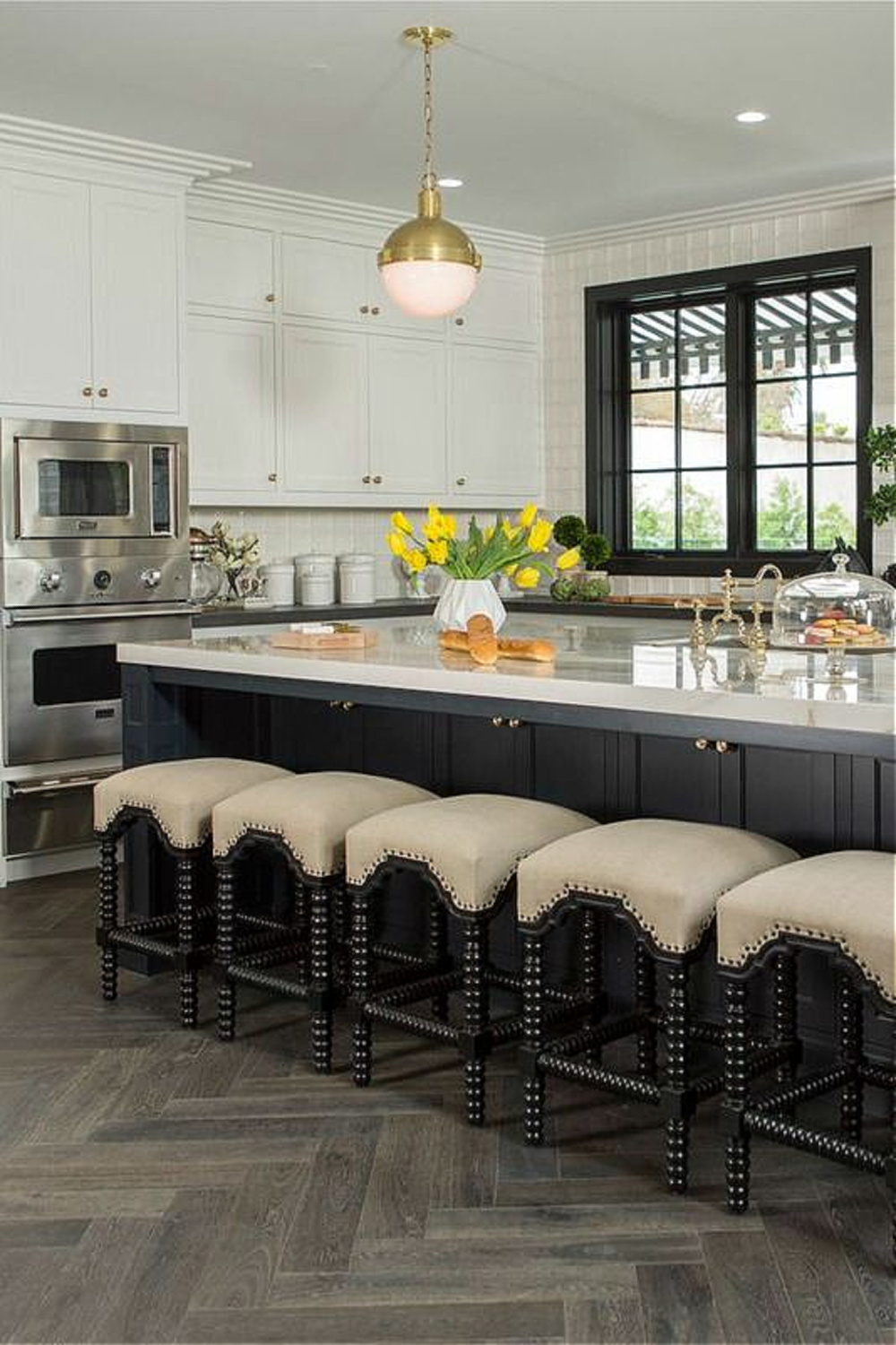
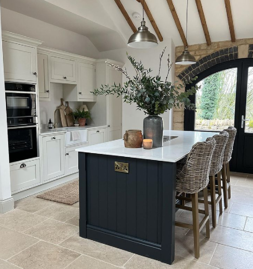
Black endures as a common color for kitchen islands and window trim. Sometimes what you want is high contrast.
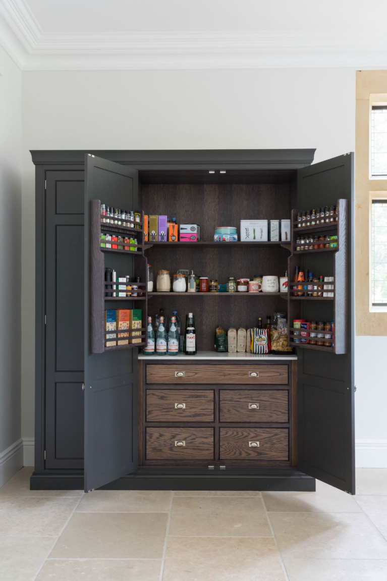
It can also make sense to paint a freestanding pantry or cabinet in a contrasting color when you’re after a more custom, unique, or unfitted look for a kitchen.
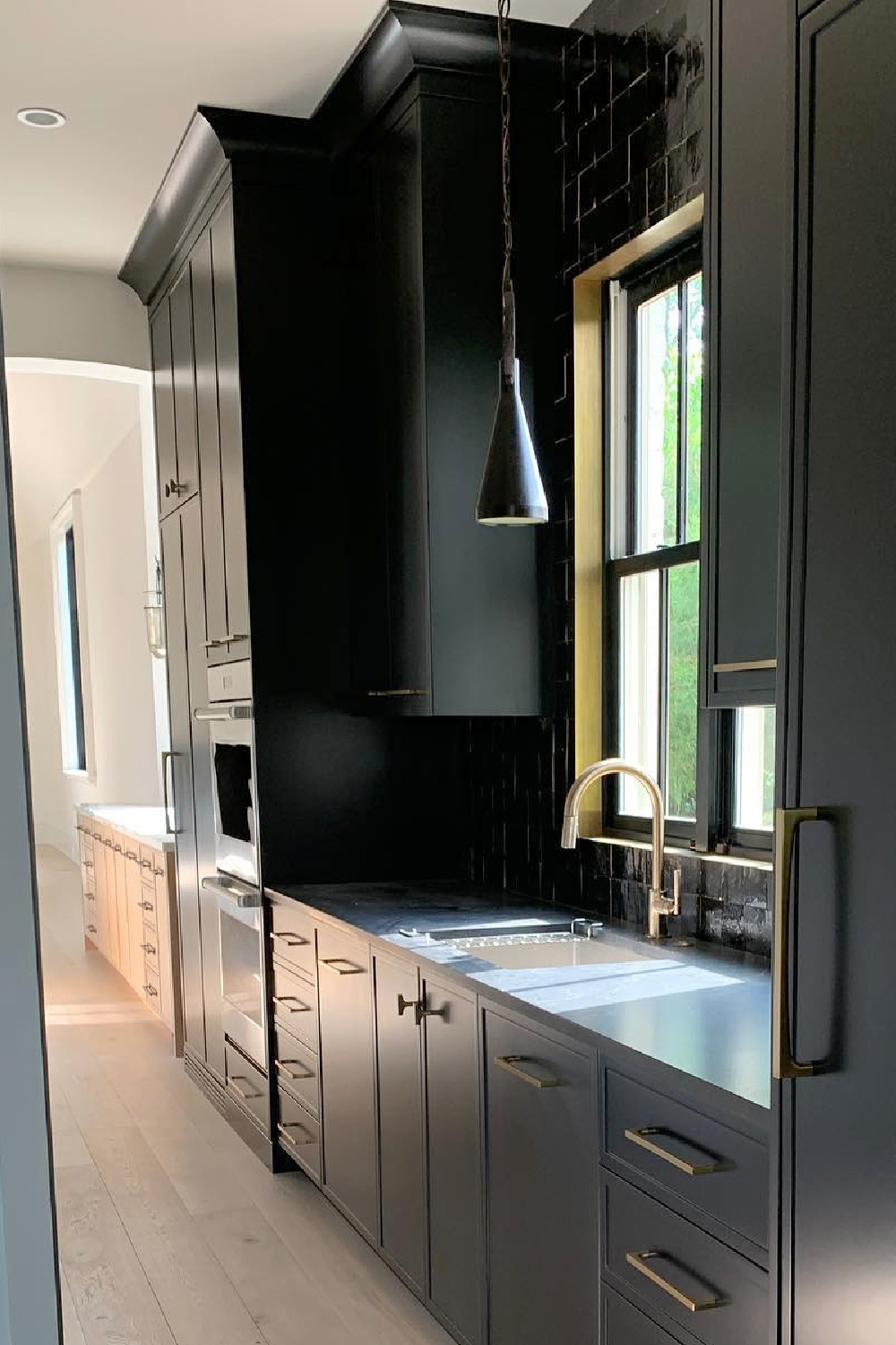
Dark colors are going to be weightier in the space and can be used for balance of any number of things.
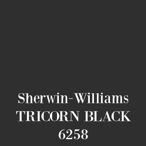
Sherwin-Williams TRICORN BLACK 6258
SAMPLE Tricorn Black RIGHT HERE. For a true black, Tricorn Black has sort of a legendary following as a designer favorite.
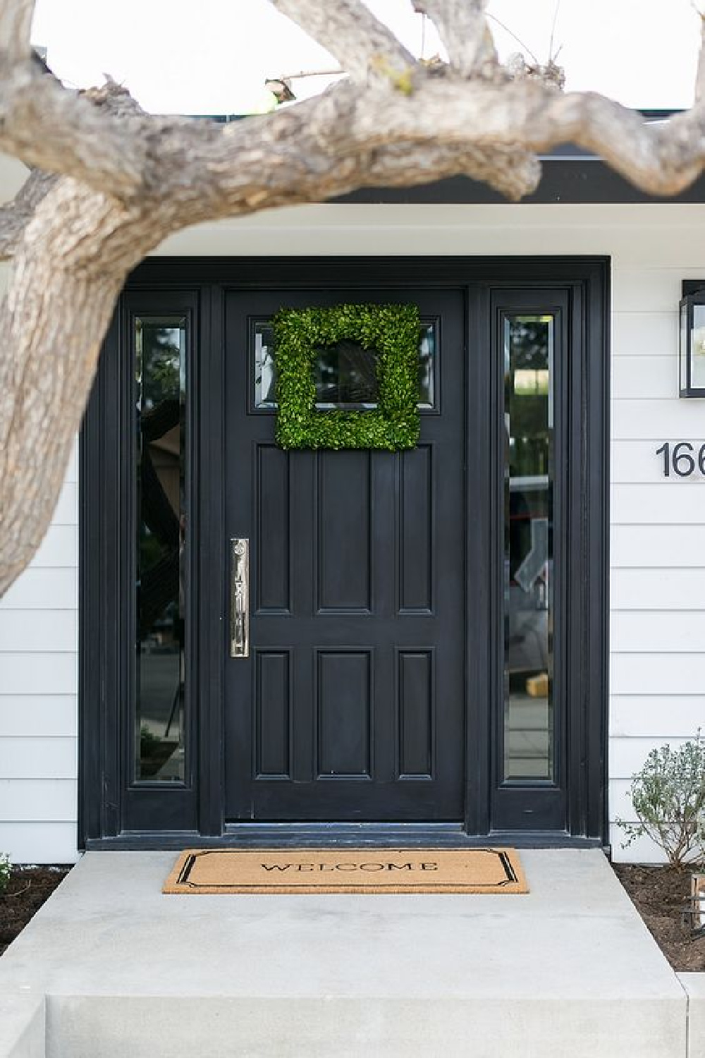
Quite a few front doors and shutters across the web seem to be painted Tricorn Black so it does appear to be trustworthy. It’s wise to order a peel and stick sample or get a sample pot so you can live with it for a few days before committing to the tone.
Oh so many ways to use black if you love traditional style. An old vintage piano? Boom. Laundry room cabinetry that has seen better days? Yep.
The key is to know yourself well first. If you have lived with black and loved it, then use that data. If you haven’t, approach it as an experiment. Find something to paint black and live with it to notice how it works in the space. How do you respond to it? Will you tire of it?
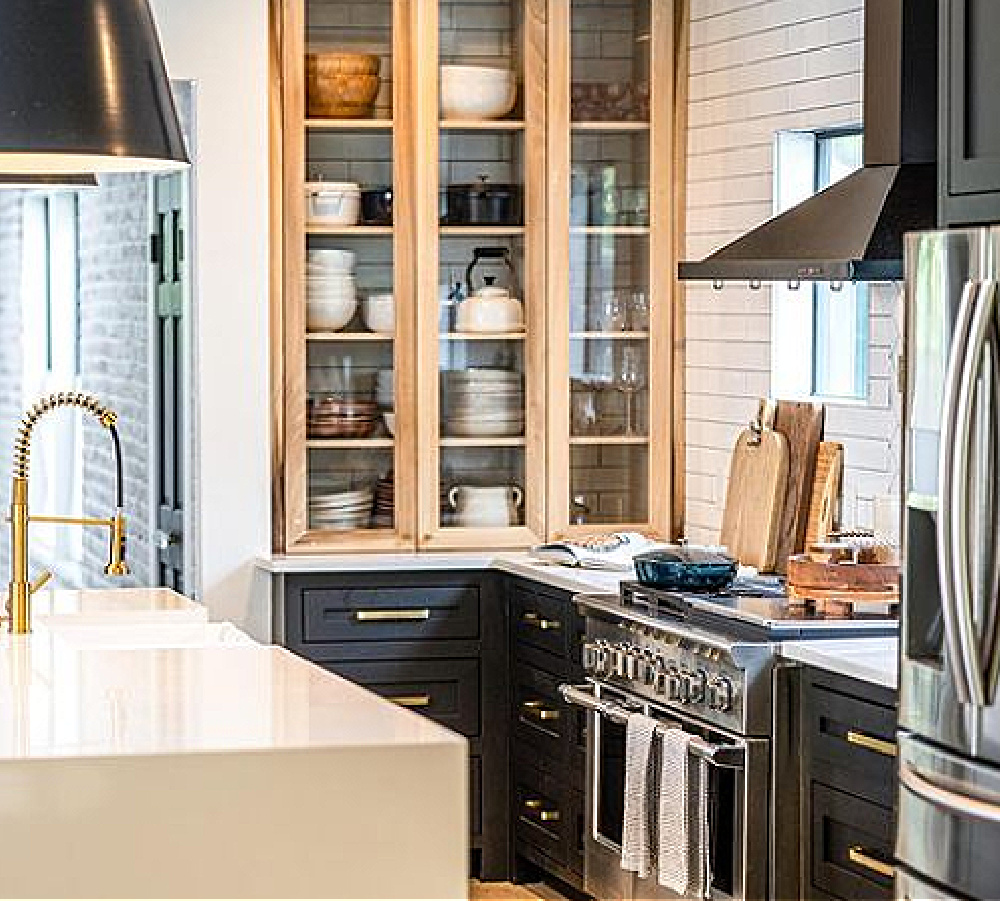
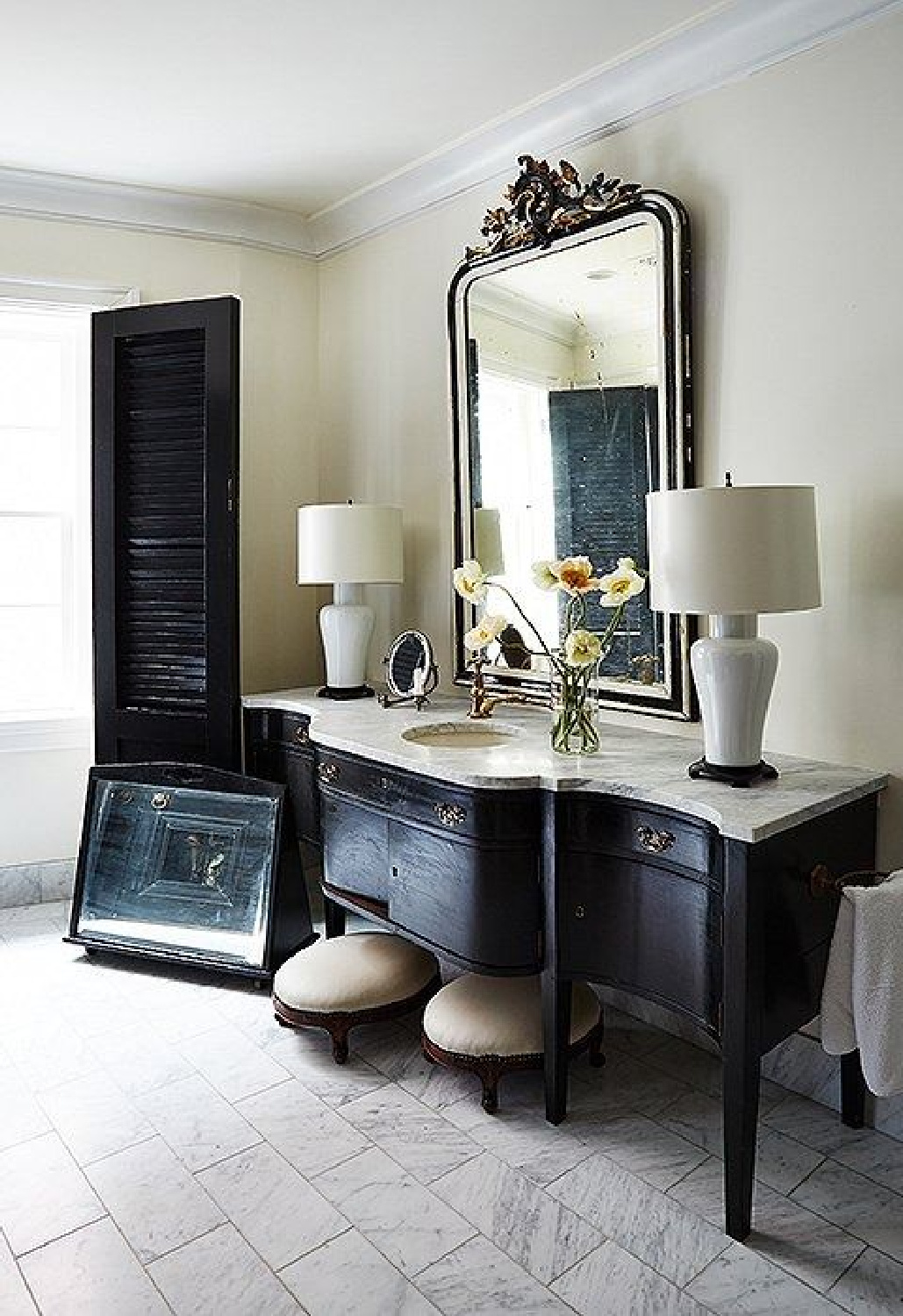
Here’s a bath vanity in designer Darryl Carter’s own home. The black seems reminiscent of Tricorn Black:
Isn’t it gorgeous? Find a few more black contenders to sample:
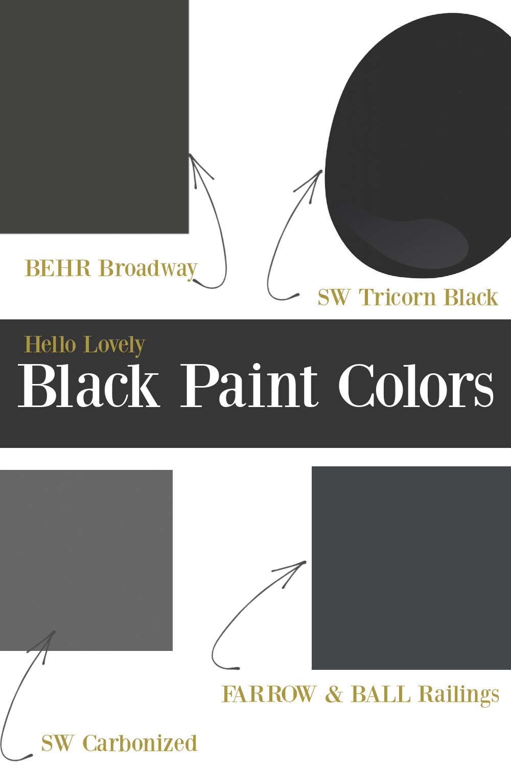
How will you decide on the best black? The easiest, non-messy way is to order samples delivered to your door with Samplize. They are peel and stick sheets of “paint” to stick on the wall and easily move around to other walls.

Sherwin-Williams URBANE BRONZE 7048
SAMPLE Urbane Bronze RIGHT HERE. There’s a strength and boldness with this shade. Black paint colors suggestive of warm metals can definitely be suggestive of timelessness. Here’s a great example:
Where could you use Urbane Bronze? It can certainly cozy up a media space. Also, home offices seem to lend themselves to moody deep tones these days.
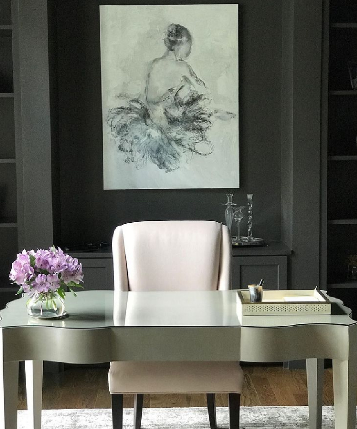
Downright elegant, yes? A powder room is sometimes ideal for a dark and dramatic paint.
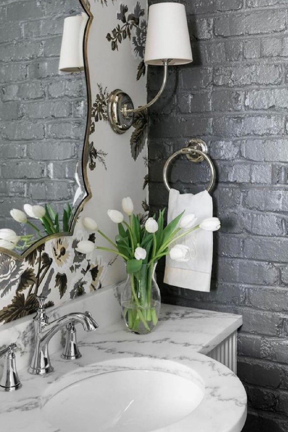
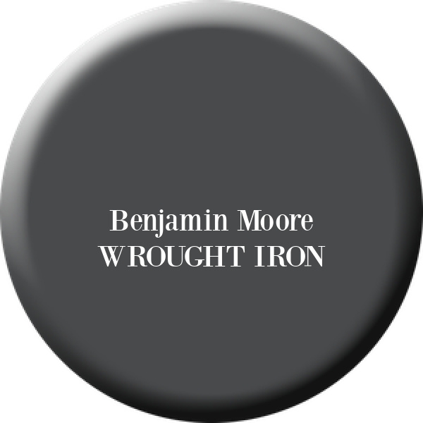
BM Wrought Iron
SAMPLE Wrought Iron RIGHT HERE. Here’s another metallic black that may be just right if you’re updating window trim or doors.
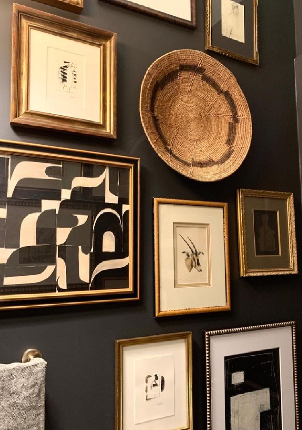
I loved how Sherry Hart used it for a gallery wall in a powder room. So many of us settle for boring white boxes when we could essentially create an art gallery quite easily.
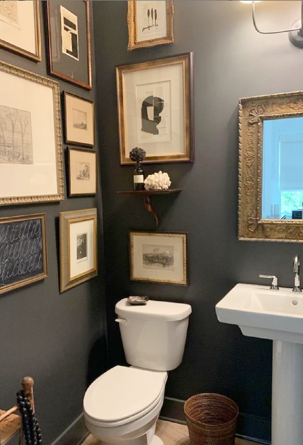
Bonus inspiration is how the designer displayed a woven basket with the framed art…
PIN THIS POST to save for future reference!
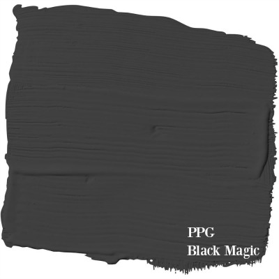
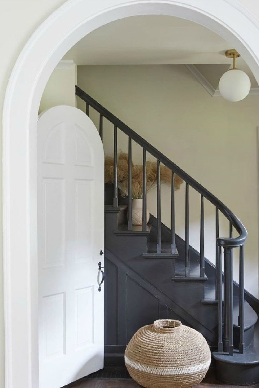
Wrought Iron reminds me of a PPG color Leanne Ford uses called Black Magic:
See more of Leanne Ford’s favorites in THIS.
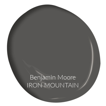
How is the Benjamin Moore paint color Wrought Iron different from Iron Mountain (which designer Sherry Hart has used with great success including her infamous ORC bedroom makeover)?
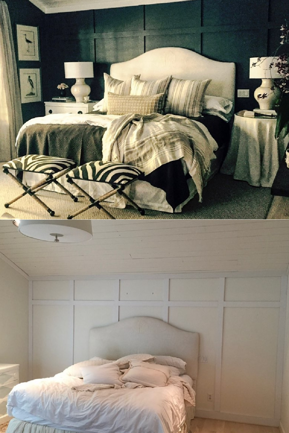
You can see more brown undertones emerge from Iron Mountain when you compare it to Wrought Iron.
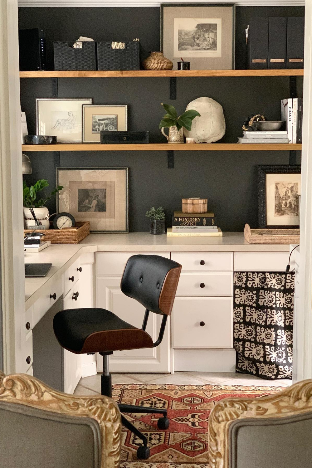
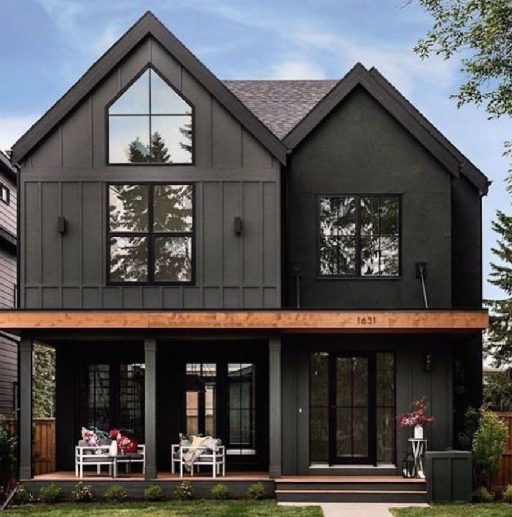
No idea what the exact paint color name is for the home below, but it certainly seems to be in the family of Iron Mountain black-browns:
Slightly darker, yet still very close to Iron Mountain’s black-brown color is this one:
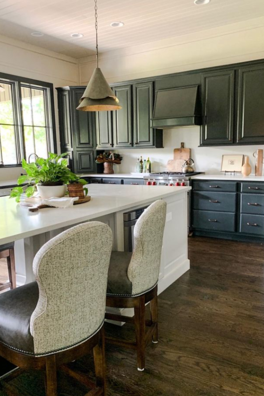

Ideas for a Soft Black With Brown or Blue Undertones
My own personal favorite soft black to use? It was actually discontinued! Of course it was discontinued! It was an HGTV Home Sherwin Williams color called Carbonized. Its formula may still be in the computer at your paint counter, but no worries if not.
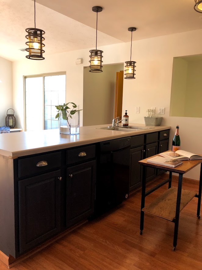
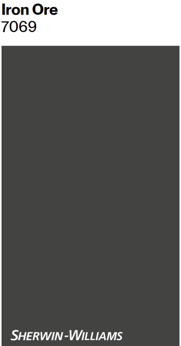
You can see how close Iron Ore is in this side by side:
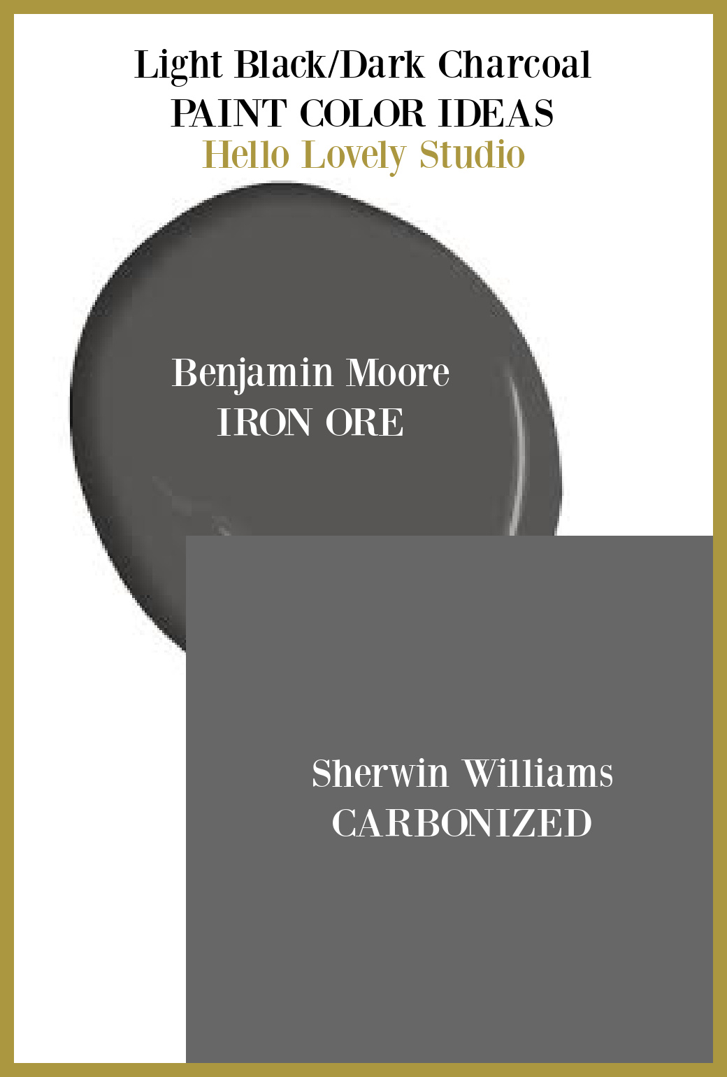
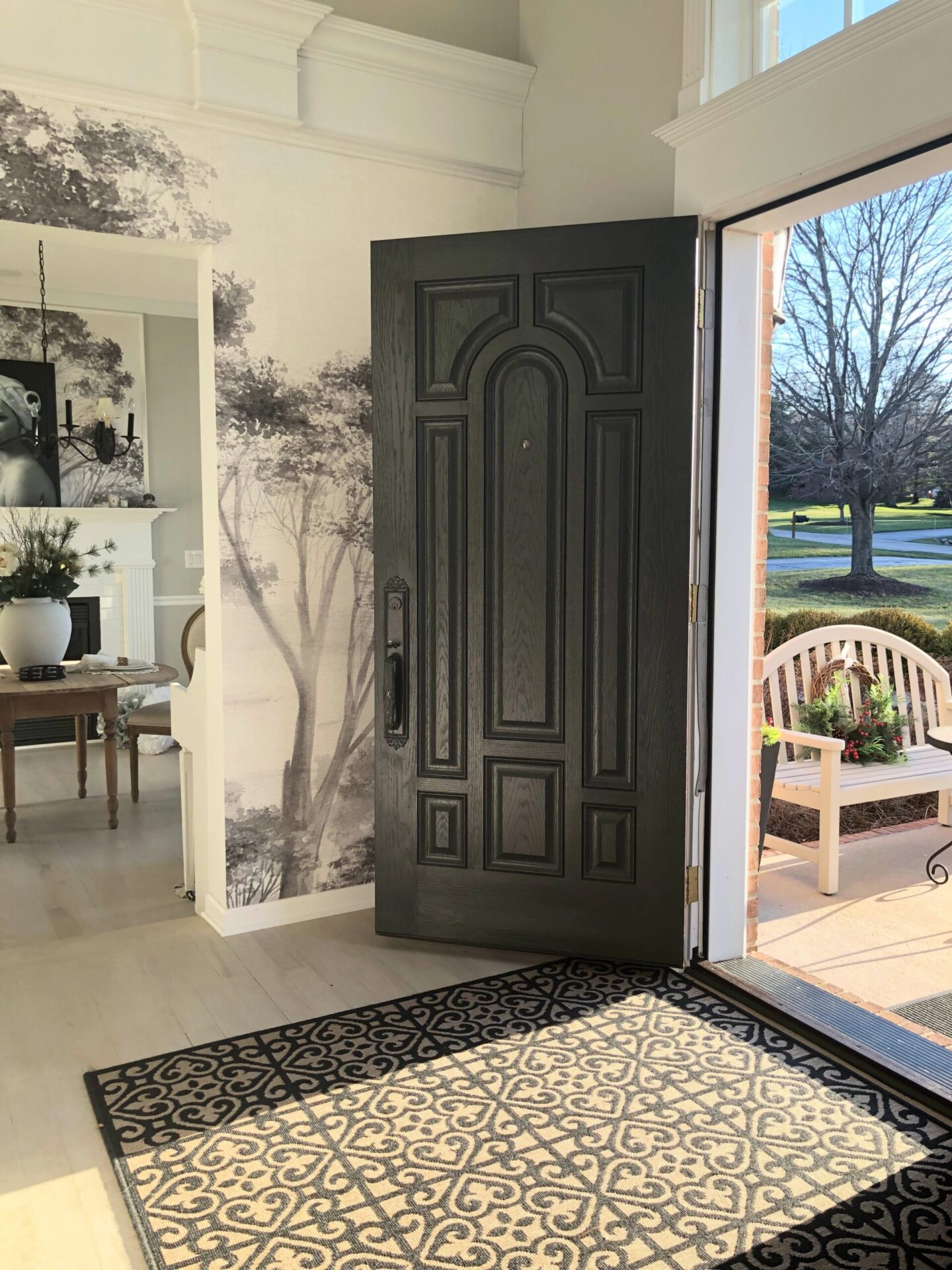
Right? So my new favorite is Iron Ore since it is interchangeable with my old favorite which is no longer available. Here it is on our front doors and the stair hand rail in our home:
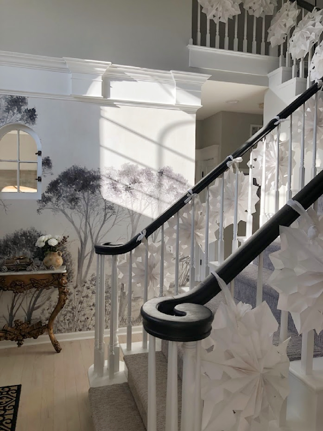
You can also visit my Instagram where I have reel videos showing it in various light.
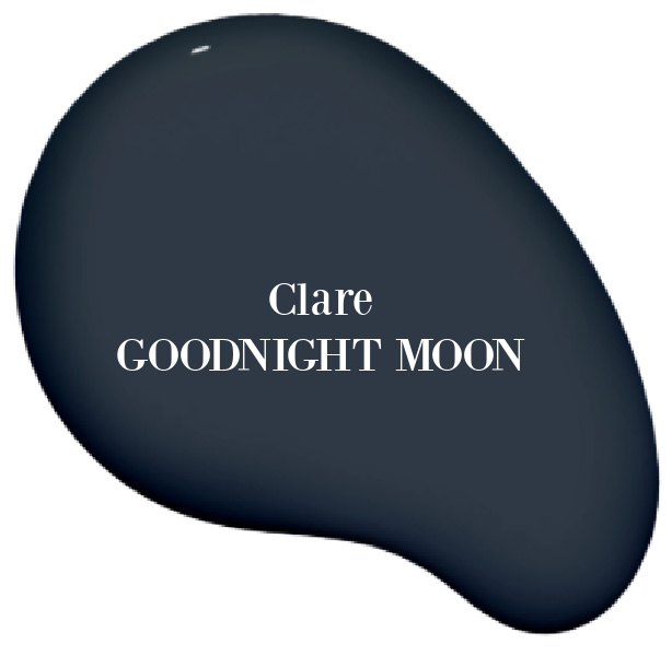
Clare GOODNIGHT MOON
But what if brown-blacks and those muddy grays are not your jam? Moody blues and greens are so all the rage at the moment. Maybe sample a deep blue-black such as…
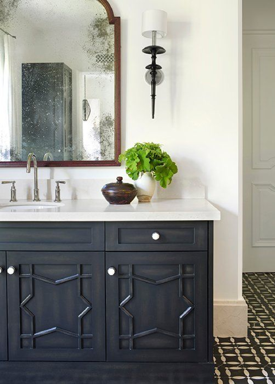
I’m a fan of paint colors from CLARE, and even though we’re not sure of the exact color on this bath vanity below, you could get this look with the help of Goodnight Moon.
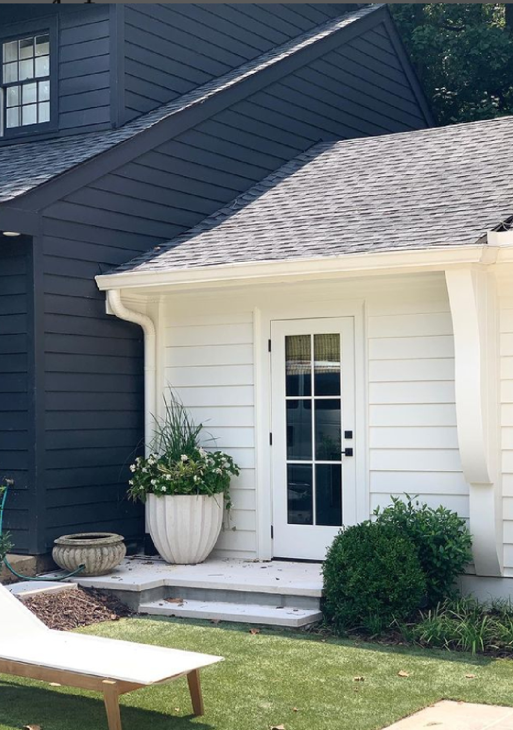
While I’m unsure of which black paint color is on this gorgeous exterior by Ladisic Fine Homes, at least in natural light, you can see the blue undertones coming through:
Clare BLACKEST
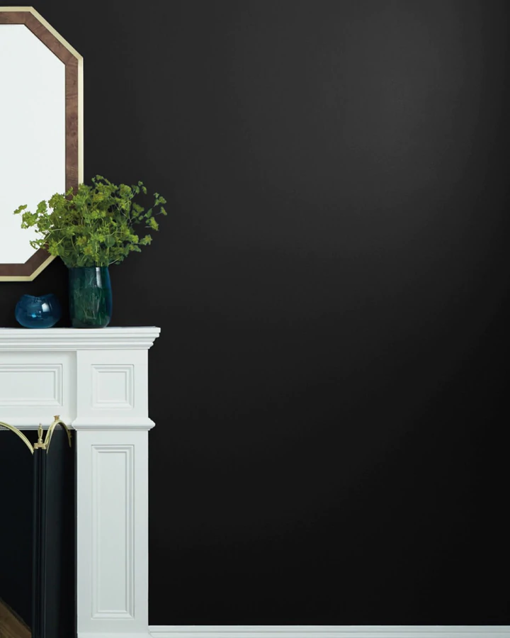
Where oh where would you use a rich dramatic very black color that reflects no light? Here’s the description of Blackest:
“Chic. Modern. Dramatic. Our blackest black might seem edgy, but when paired with the perfect light, it has the power to make a space pop.” – CLARE
For starters, you may have a little niche where a pop of black makes sense to create high contrast. Here’s a moment that suddenly shot up the style scale in a wee workspace:
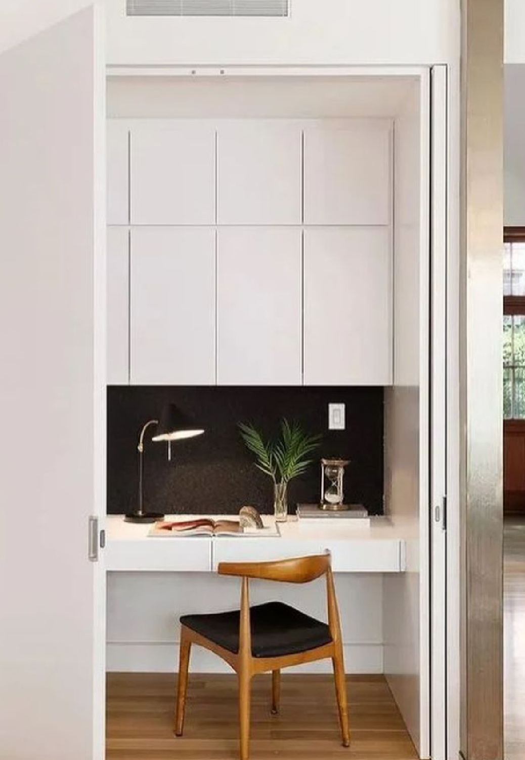
Designer Sherry Hart painted a pantry with a bold black, and this is a smart way to try a color that seems daunting.
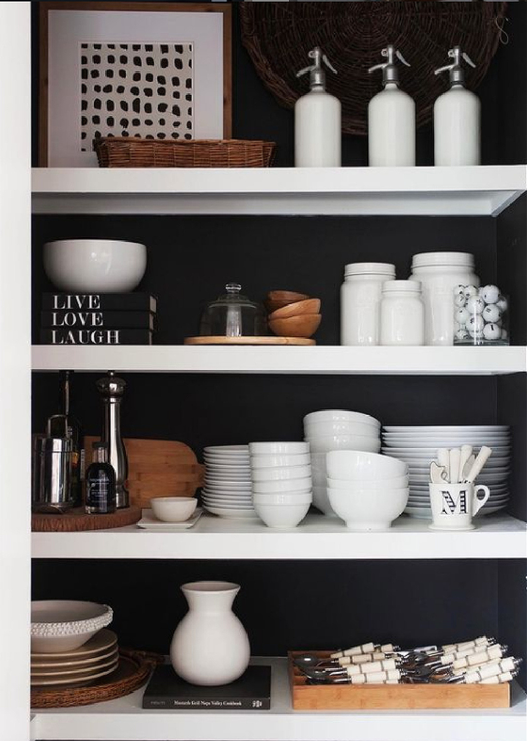
After living with the color in a small area, who knows? Maybe you’ll decide to go big in another room. Black can be chic, doncha know…
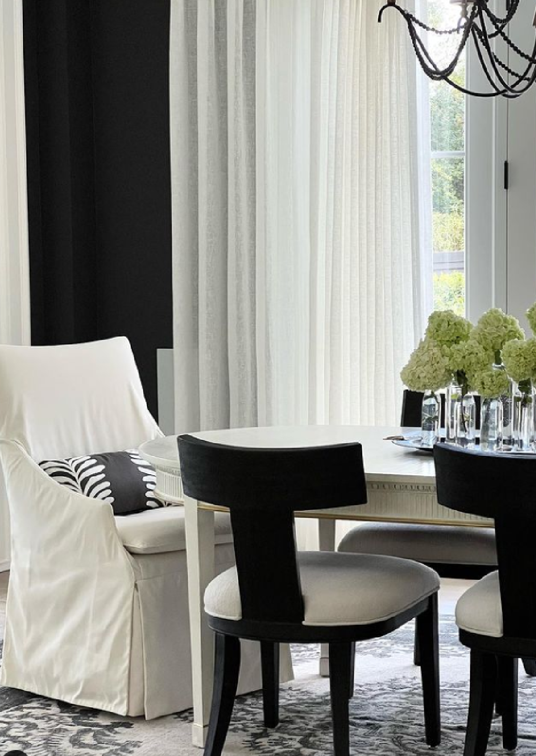

I can imagine there are lighting situations where the warmth of the yellow sun may warm a cool, very dark black.
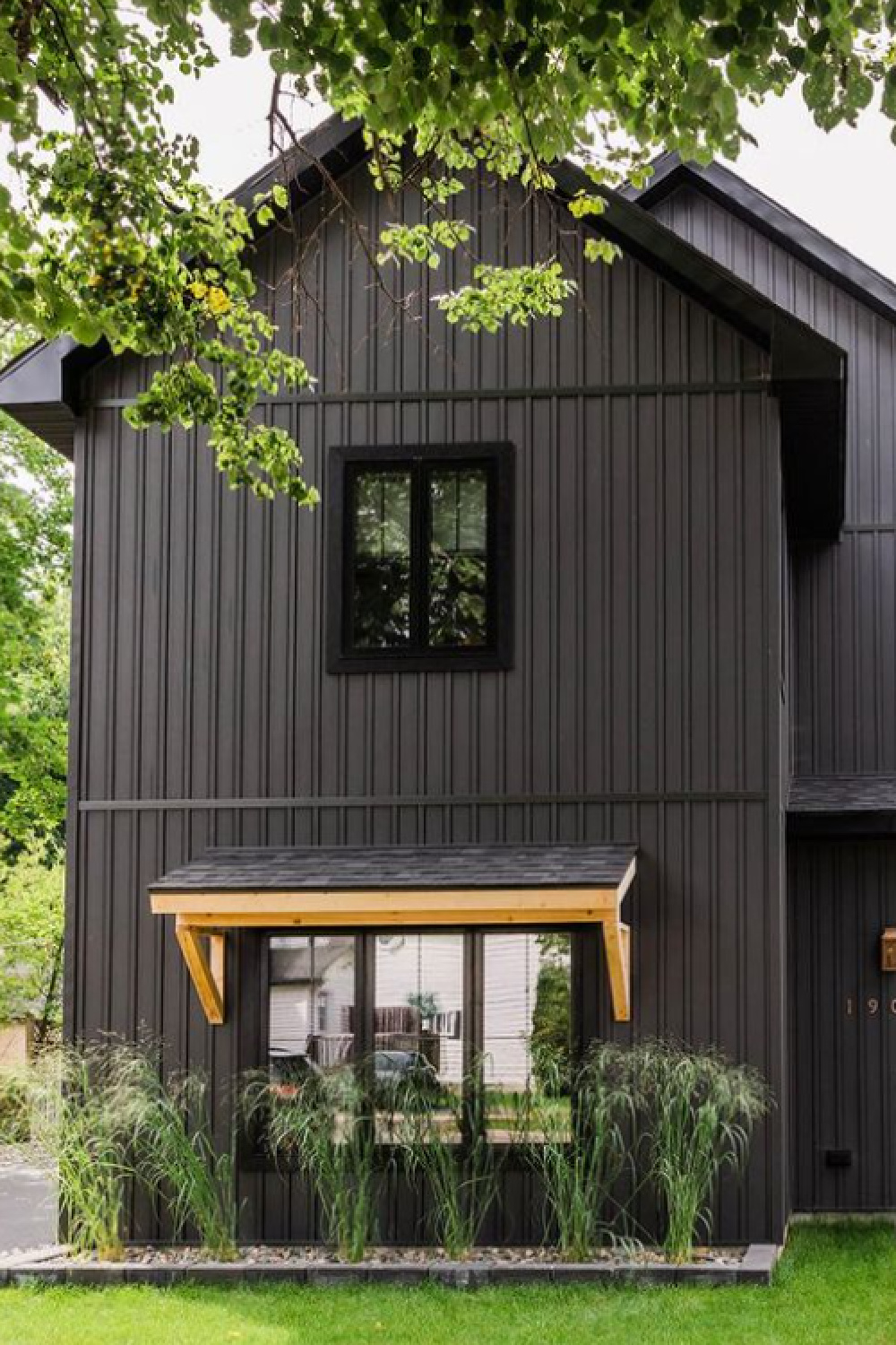
Not yet sure of precise paint colors used for the exteriors above and below, but an argument can be made for how black makes a striking backdrop for the lush foliage:
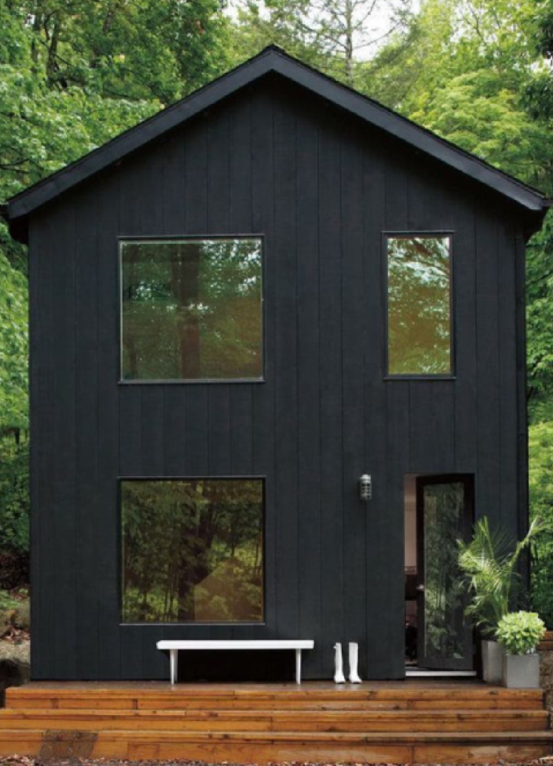
Wow!

Peace to you right where you are.
-michele
I independently selected products in this post—if you buy from one of my links, I may earn a commission.
Thanks for shopping RIGHT HERE to keep decor inspiration flowing on Hello Lovely!
Hello Lovely is a participant in the Amazon Services LLC Associates Program, an affiliate advertising program designed to provide a means for sites to earn fees by linking to Amazon.com and affiliated sites.
