If you are sprucing up things around your home this summer, maybe these gray-blue paint deas will help. Below you’ll find a handful of Pretty Gray-Blue Paint Colors for a Tranquil Mood. These understated, hazy, cool but not too cool paint colors are endorsed by happy home decorators along with interior designers and are worth a peek.
I independently selected products in this post—if you buy from one of my links, I may earn a commission.
Which Gray-Blue Paint Will Work for You?
Is Gray Blue Timeless or Trendy?
I’m a fan of these paint colors that feel timeless, slightly European inspired, and a great alternative to cool, modern grey colors.
You’ll see an assortment of colors used on walls, trim, built-ins, windows, shiplap, cabinets, and more. It’s silly to think that grey colors are out of style since they are colors straight from nature, and nature is never going to fall from favor. I also blogged about light gray favorites here.
Choosing Gray-Blue Colors to Sample
The thing is, even when you decide to use a blue-grey color, there are a host of choices. We’ll keep the focus today on beautiful chalky blue greys which can vary widely depending on your lighting situation. In Northern exposure rooms, the color may read too cool and dreary, in Southern light or rooms with strong sunlight, the paint color may be perceived as too blue.

So make sure to sample at least three colors before buying paint.
Blue-Gray for Exteriors
If you’re choosing color for an exterior, windows, front door, or exterior trim, make sure to sample and watch the color throughout the day with the changing light. Sunlight washes out a color so you’ll definitely be aware of undertones within a particular color. If there are strong blue undertones in a paint, the color in natural light may appear very green.
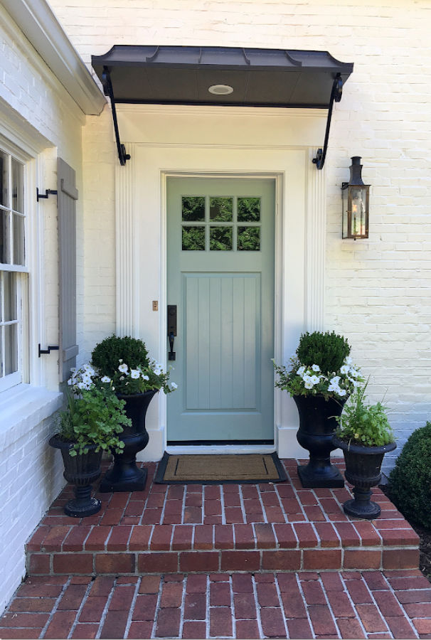
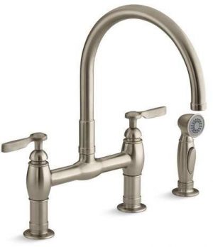
1. BENJAMIN MOORE Boothbay Gray
While Benjamin Moore calls this color a fresh steely gray with hints of blue, to my eyes it looks like a blue color in person. I used it on the exterior trim and porch of our tiny house and love how gentle it is without being cloying like a kids room blue.
Boothbay Gray has a light reflectance value (LRV) of 43.26, which means it will reflect back 43.26% of light into the space.
When I have used Boothbay Gray in areas with plenty of light, it appears more like this:

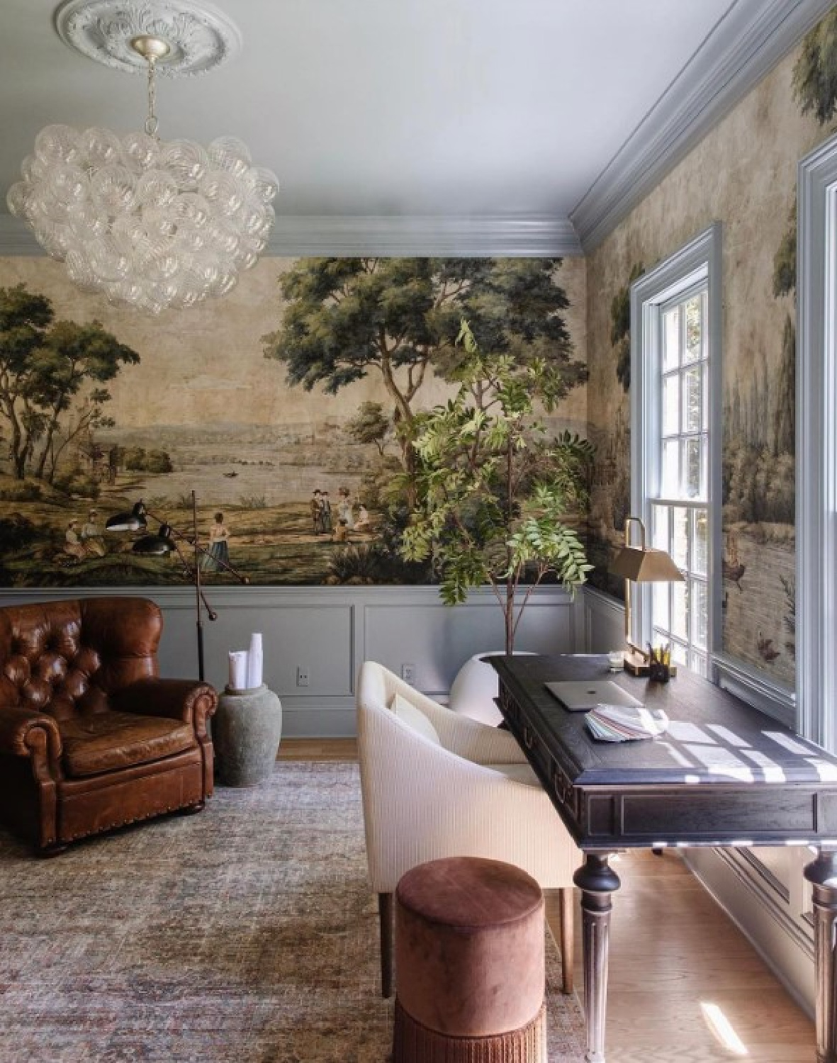
2. Farrow & Ball Pavilion Gray 242
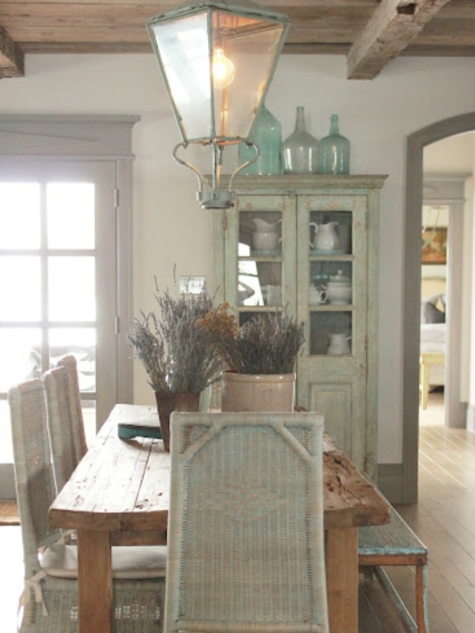
When I think of a perfect, soft, quiet, light blue gray paint color, a couple of my all-time favorite homes spring to mind. First, Brooke and Steve Giannetti’s Patina Farm. Even though they light grey they used was custom, they indicated it’s close to Pavilion Gray.

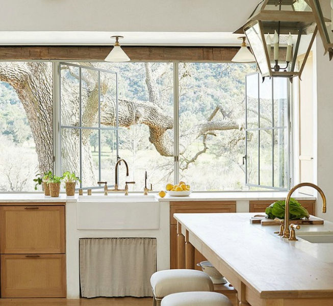
They paired creamy plaster-like walls in this European country farmhouse in Ojai with steel framed doors and windows painted out in a soft grey.
While so many modern farmhouse designs incorporate a more austere look of black painted steel for windows and doors, this peaceful hushed hue captures an elegance that feels Nordic and more unique.
History of Farrow & Ball Pavilion Gray 242
“This classic mid grey was originally created for a bespoke pavilion, but is also reminiscent of an elegant 18th century Swedish colour. One of the Architectural Neutrals, the subtle blue undertones of Pavilion Gray add a contemporary touch and sense of spaciousness.”

I love the color so much, I used it for the cabinets in our kitchen at the Georgian, although I mixed it at a lower saturation (66%) for a lighter effect.
If you feel confused about how the same color feels different across different contexts, don’t be concerned. This is just reality and why it’s important to sample first.

Pavilion Gray as a Nordic Color
Here’s another favorite home of mine (Desiree Ashworth’s unforgettable custom French cottage with its Gustavian design details), and soft blue-grey trim similar to Pavilion Gray imparts an ethereal, rich mood.
Don’t you love it when you see trim in colors beyond white!?!

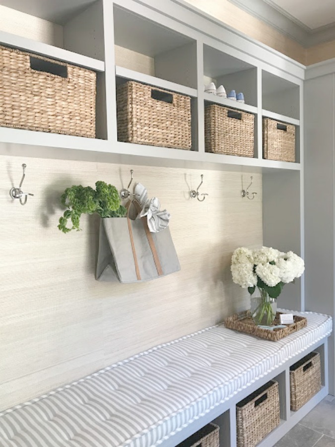
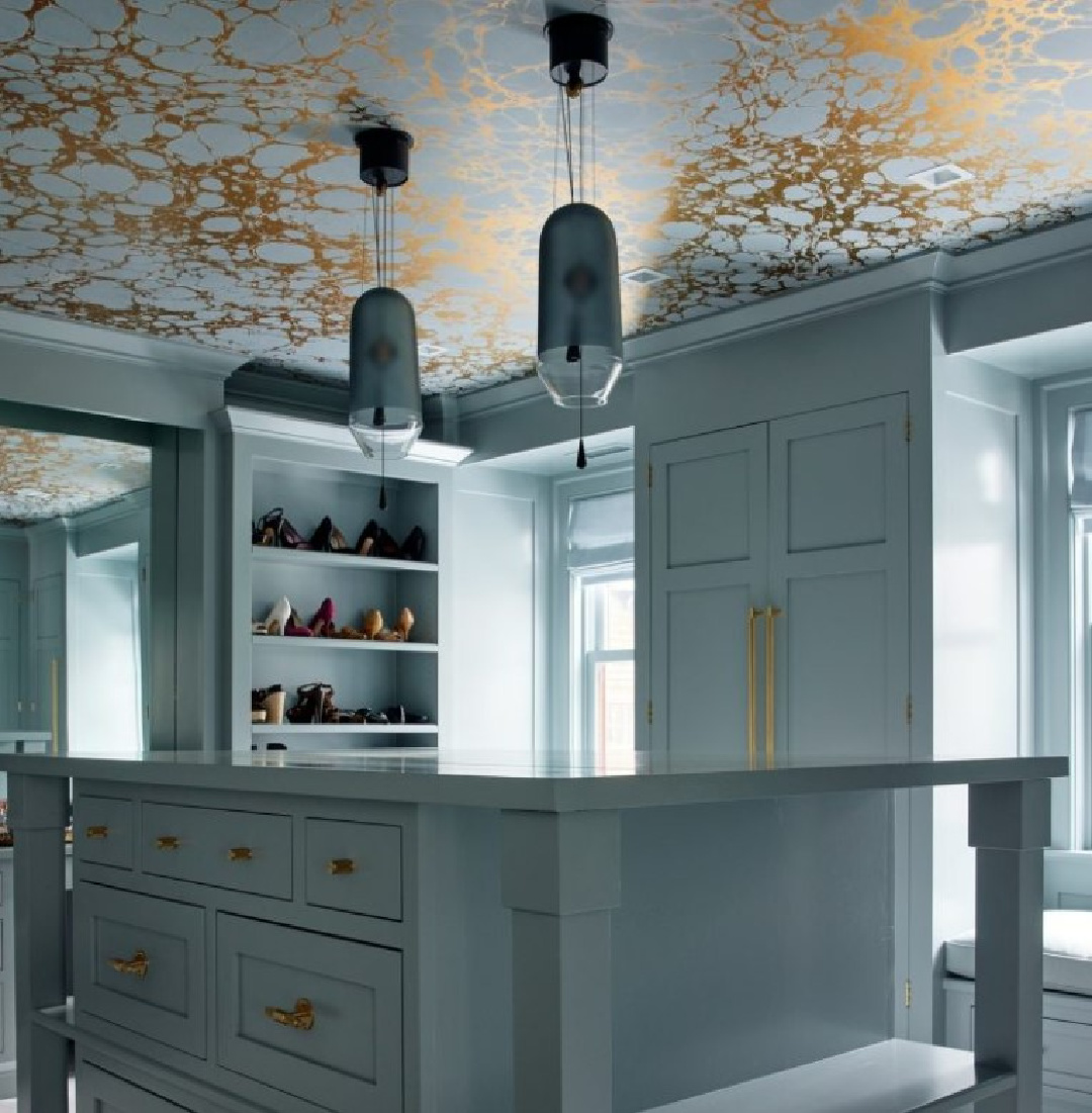
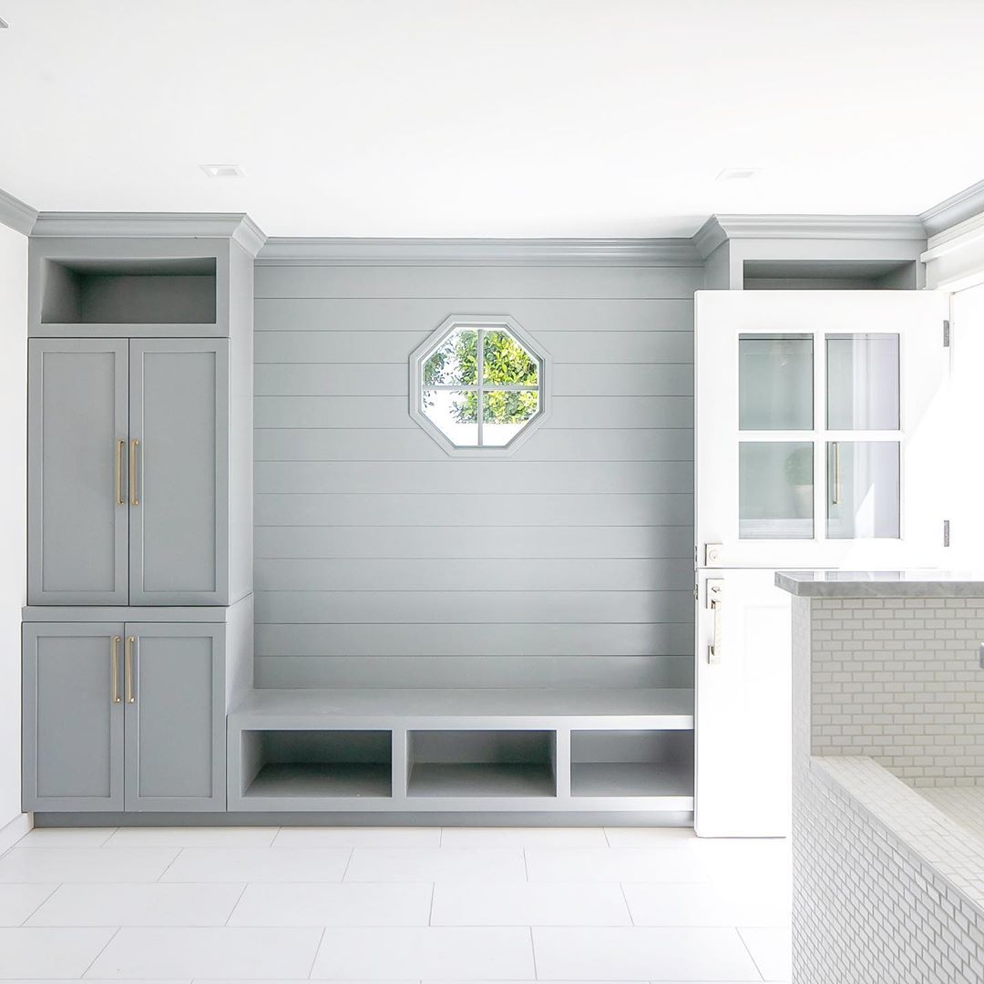
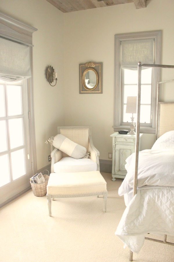
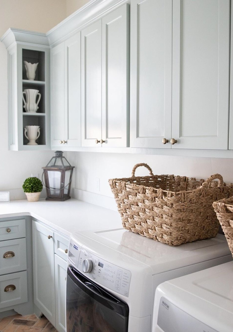
3. Benjamin Moore Silver Mist
Okay, full disclosure. There’s a color from Benjamin Moore called Silver Mist and a color from Sherwin-Williams called Silvermist. They are similar. We know that this mud room is one of the two, but go ahead and study both!
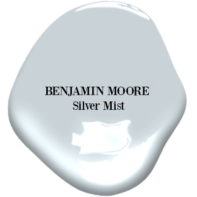
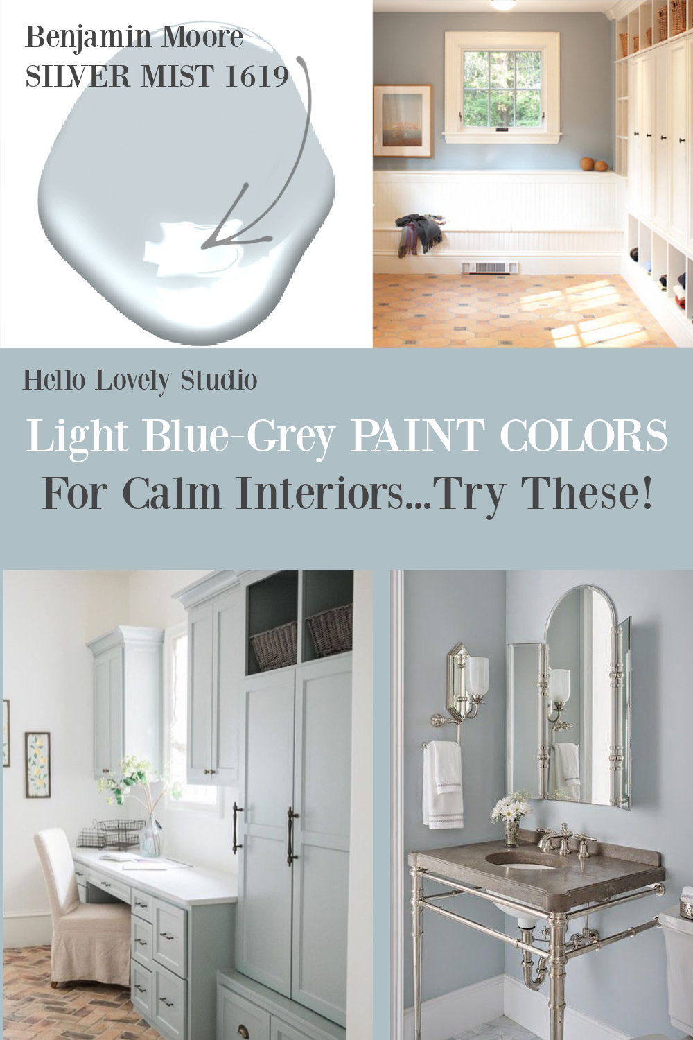
Benjamin Moore Silver Mist 1619 “A silvery shimmer characterizes this very pale shade of whisper-soft blue. Delicate and light, it relies on a generous amount of gray to achieve its misty quality.”
To see more soft, romantic pastels like the one above, GO HERE.
4. Benjamin Moore Silver Gray 2131-60

Benjamin Moore Silver Gray
“This color is part of Color Preview. A collection of bold, saturated colors that brings spaces to life for those looking to illuminate their world with pure, extraordinary color. A great complement to Classic Colors, Color Preview offers a collection of 1,232 hues that excite and inspire with pure, deep, clear colors that create striking combinations.”


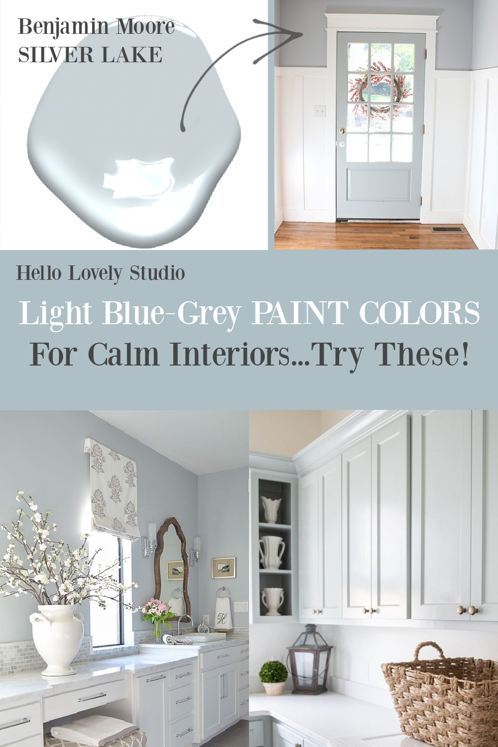
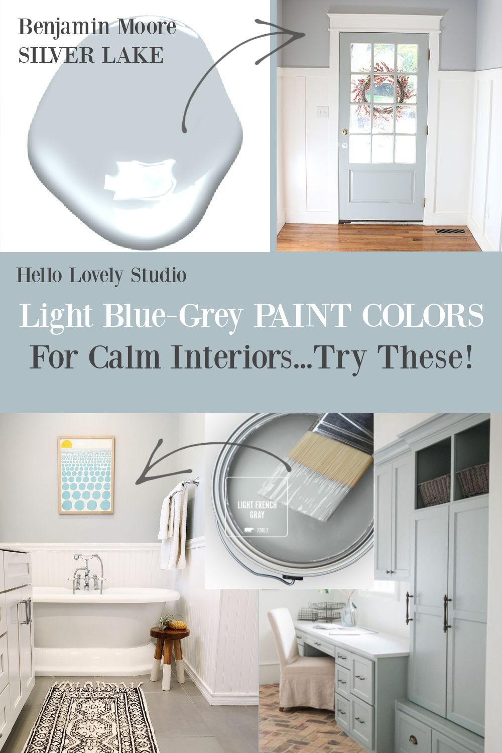
5. Benjamin Moore Silver Lake 1598

Benjamin Moore Silver Lake 1598
“This color is part of the Classic Color Collection. Surround yourself with your color favorites. These timeless, elegant, Classic Colors guarantee beautiful, usable color all the time, every time. A collection of 1,680 inspired hues that consumers and professionals have enjoyed for years, the colors in this palette are as timeless as they are forward.”


Easiest way to see if a paint color will work? Order samples with Samplize and have them delivered straight to your door.
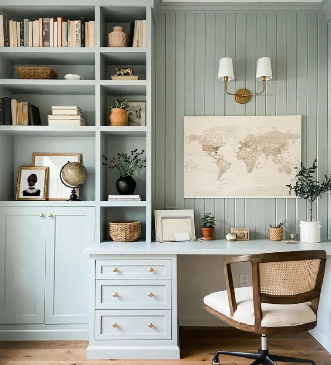
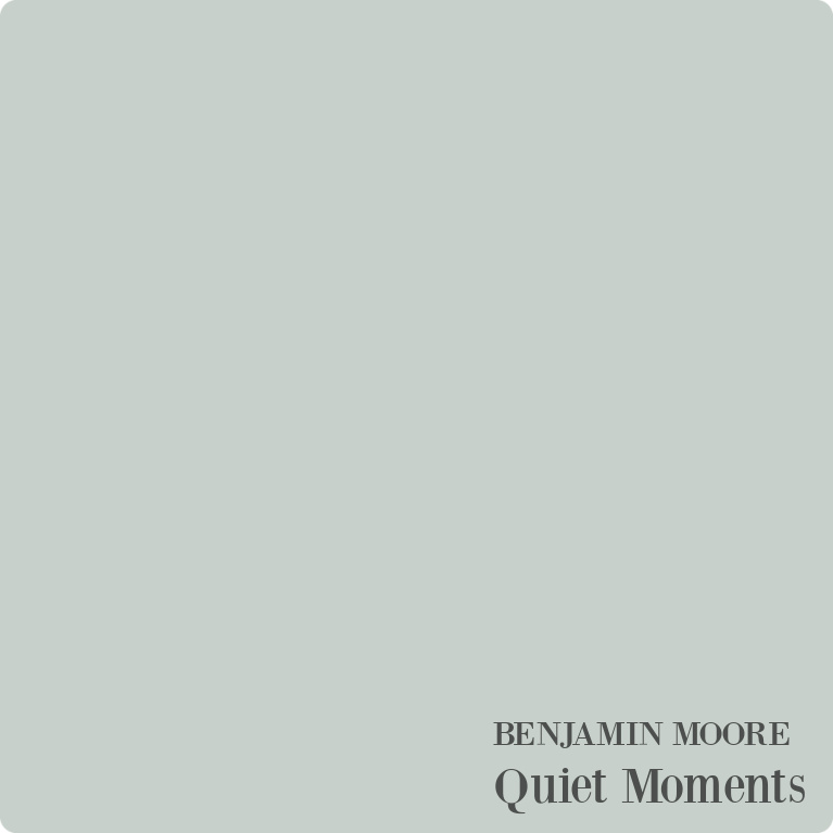
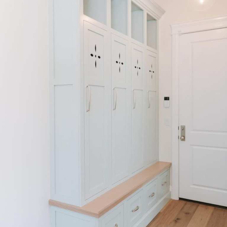
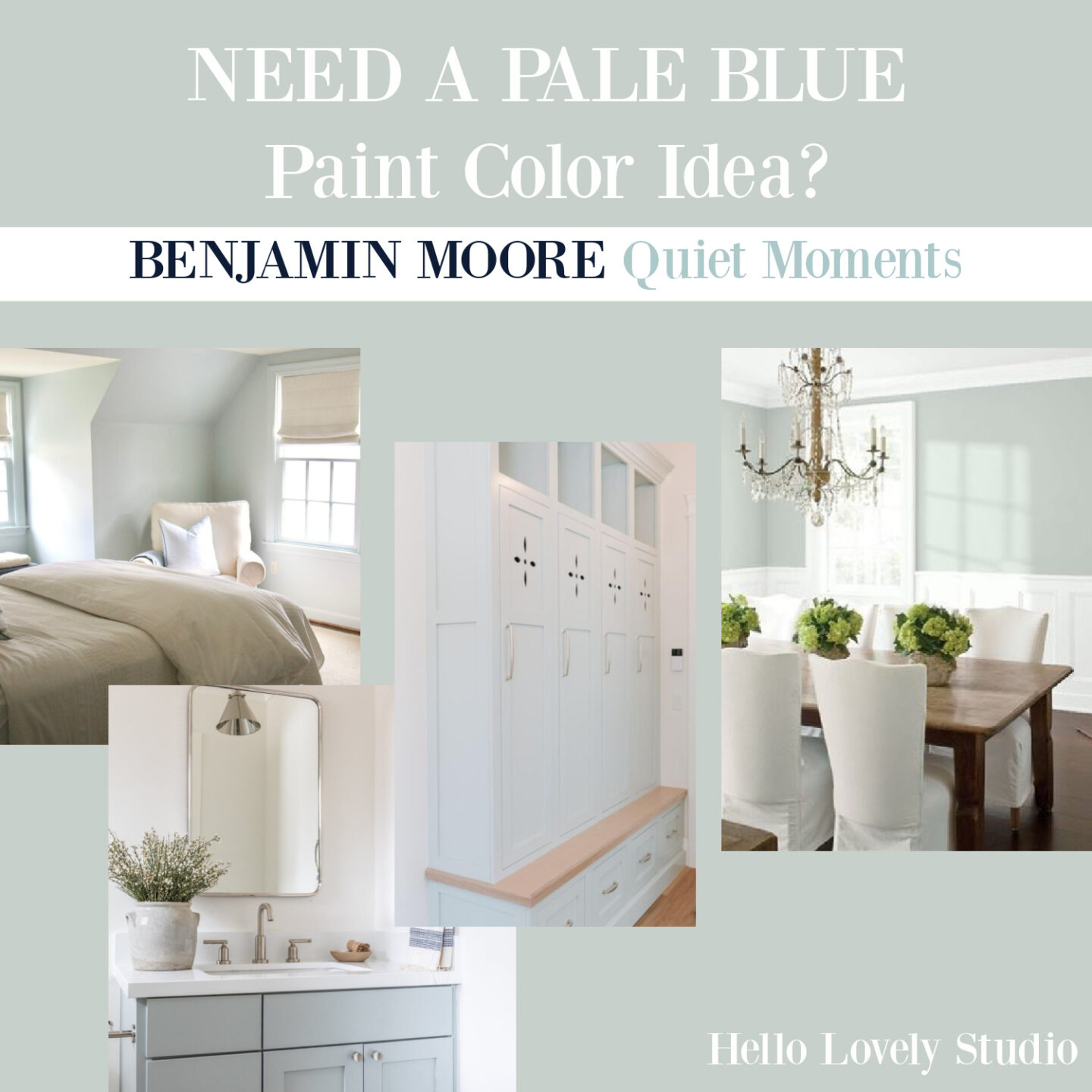
6. Benjamin Moore Quiet Moments 1563
What if you like your gray-blue with a bit of green and an aqua mood?
Well then, you may find this calm color calming. Find a bunch more info on it in THIS.
I hope these color ideas give you a place to start in your search for the perfect gray-blue for your particular project.
Gray-Blue Mood: A Few Lovely Finds
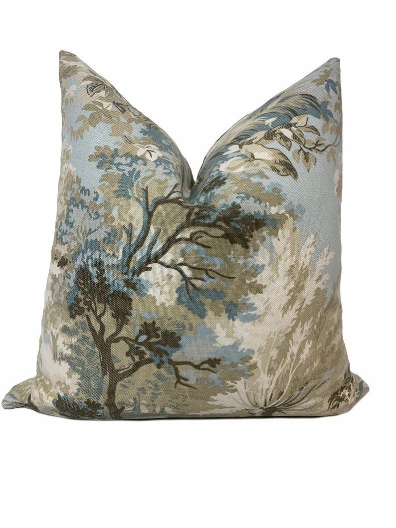
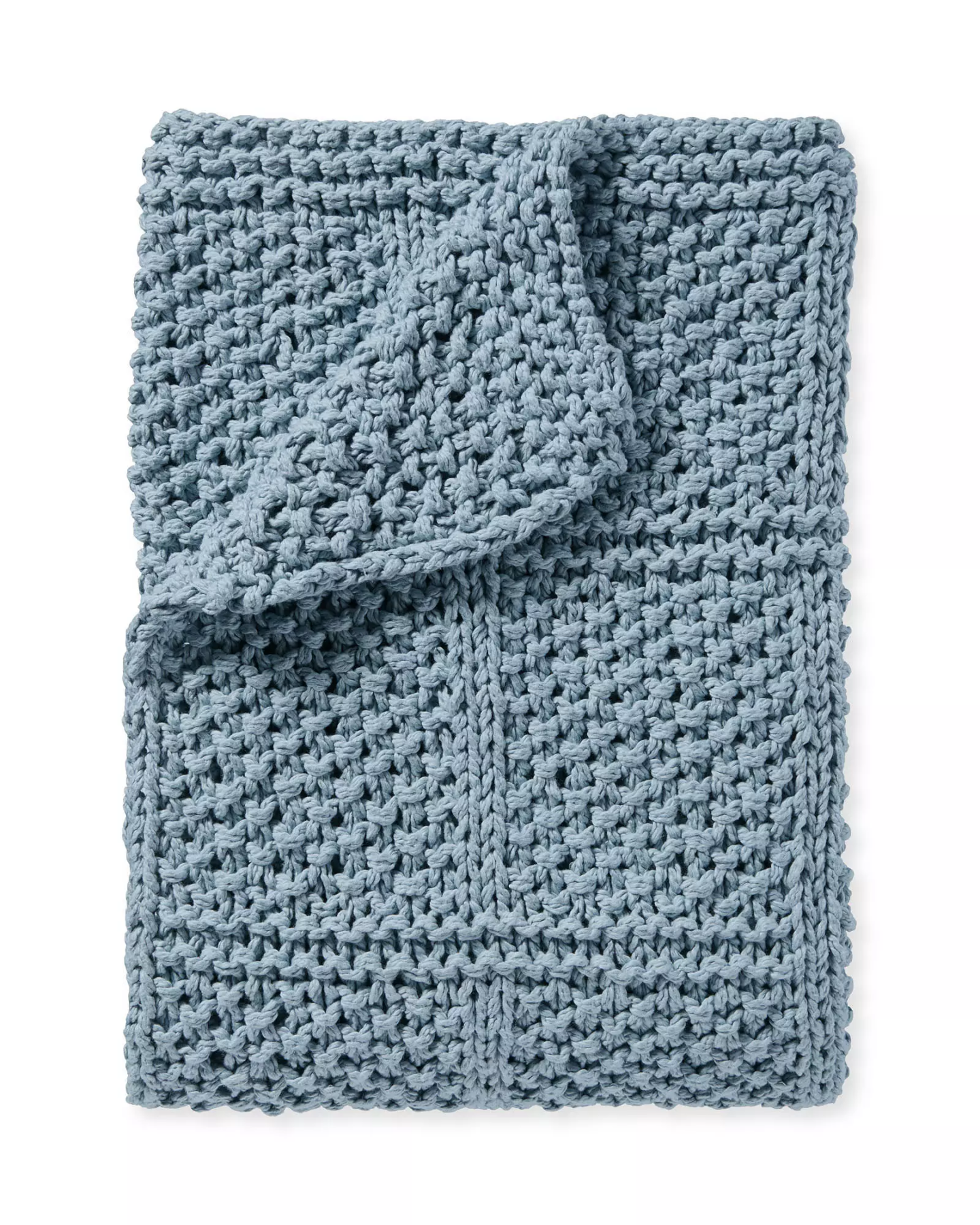

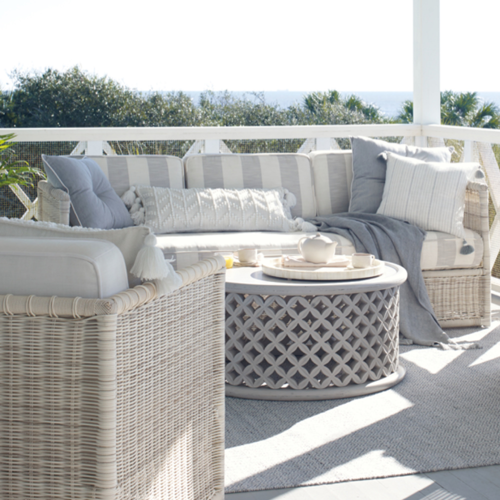
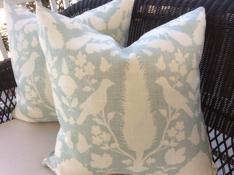


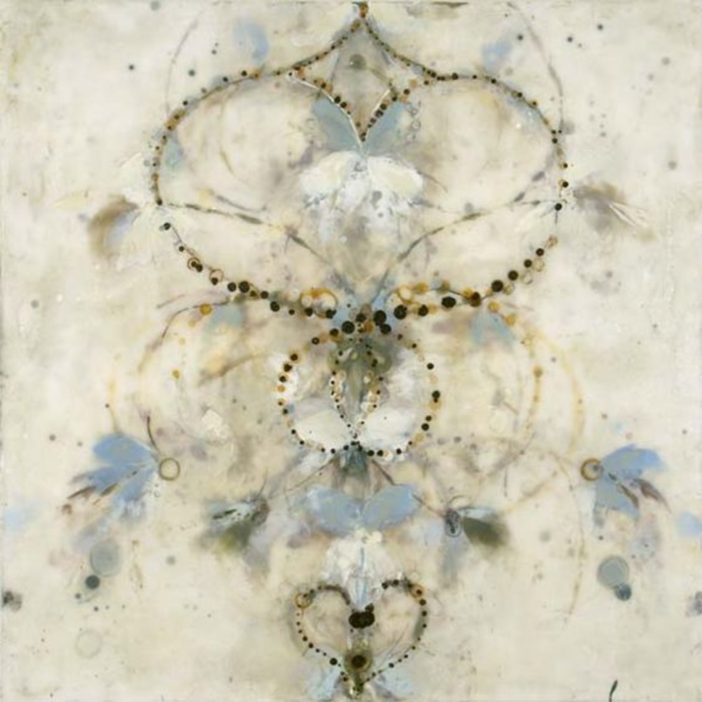
For me, Betsy Eby’s ethereal encaustic paintings come to mind when I consider the dreamiest of blue greys.
How does this color affect you? Do you decorate with it in your home?


Find More Inspiration for Paint Colors
For more stories with paint color ideas, see:
Peace to you right where you are.
-michele
I independently selected products in this post—if you buy from one of my links, I may earn a commission.
Thanks for shopping RIGHT HERE to keep decor inspiration flowing on Hello Lovely!
Hello Lovely is a participant in the Amazon Services LLC Associates Program, an affiliate advertising program designed to provide a means for sites to earn fees by linking to Amazon.com and affiliated sites.


I painted my living room Sherwin-Williams Silvermist and LOVE it.
I would say it is Blue/Green/Gray. You think it is blue until you put blue next to it and it becomes green.
I highly recommend it and will use it in my next house. Looks great with all my Swedish furniture and aqua accessories.
Author
Oooooh – sounds amazing. Thank you for this endorsement – helps us all so much! Drives me nuts that BM and SW both have Silver Mist and Silvermist to confuse us! 🙂 I mentioned you in today’s post before I even saw your comment. 🙂