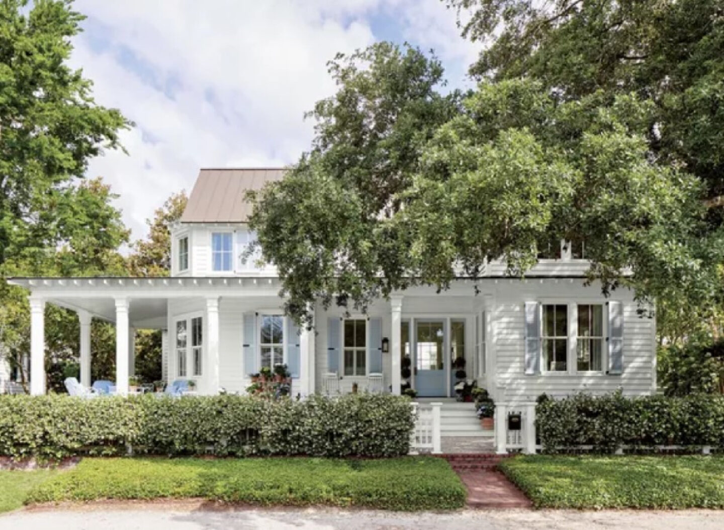
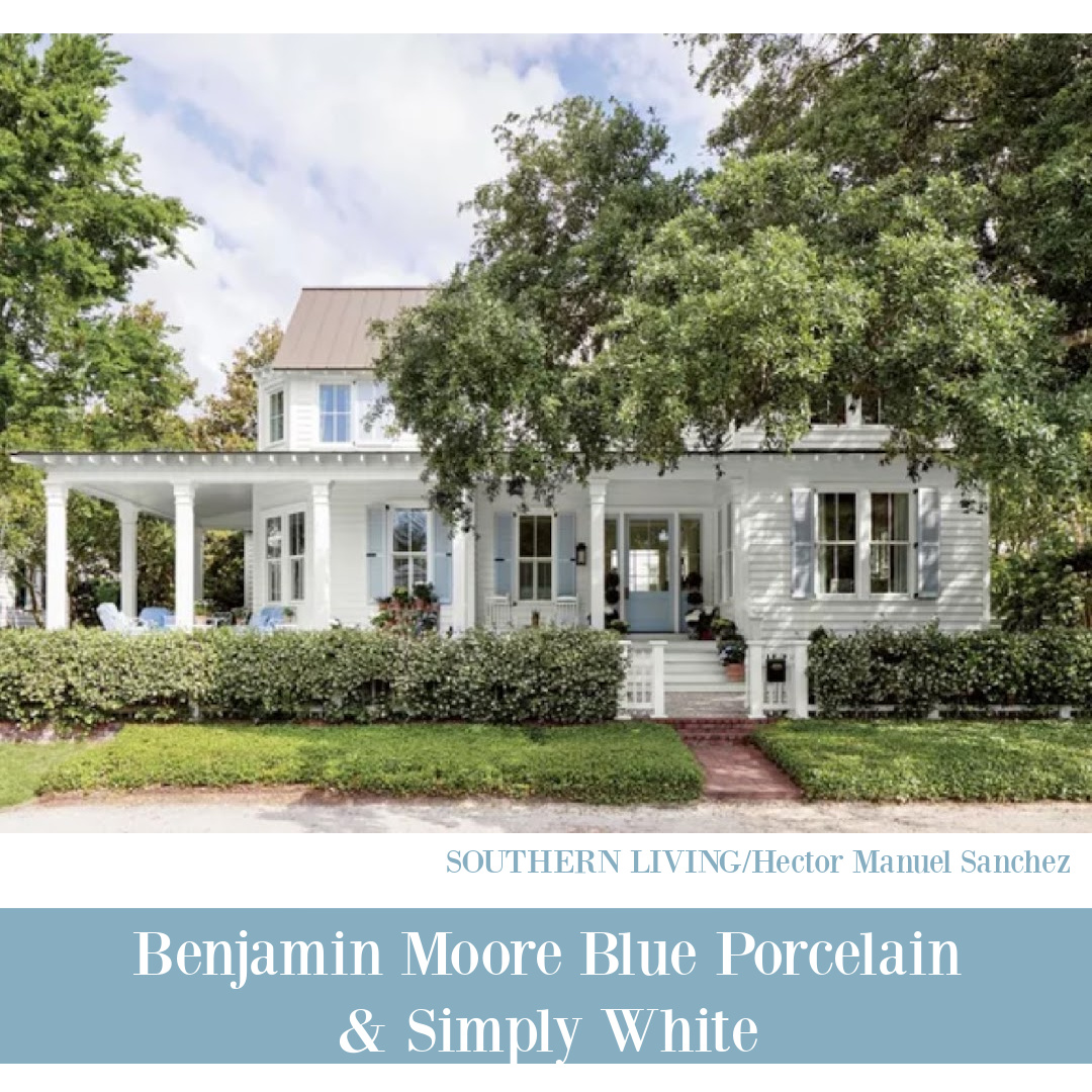
Certain homes just capture Southern charm and breezy summer nostalgia freshly. These cheerful paint colors in Julia Berolzheimer’s Charleston home (interior design by Torrance Mitchell and architecture by Beau Clowney) may inspire your own color stories. The front porch! Blue shutters! Dreamy pink bathroom! Room for one more exclamation!?! Try these paint ideas on for size and enjoy soaking up the sunny, classic, tropical mood.
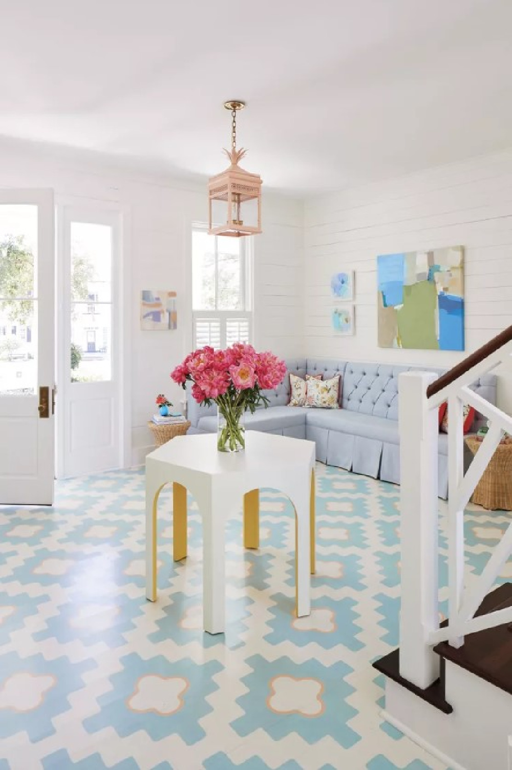
Cheerful Paint Colors in a Coastal Home
Julia Berolzheimer home in Southern Living – Design: Torrance Mitchell Designs; Architect: Beau Clowney; Photography: Hector Manuel Sanchez; Styling: Lizzie Cullen Cox
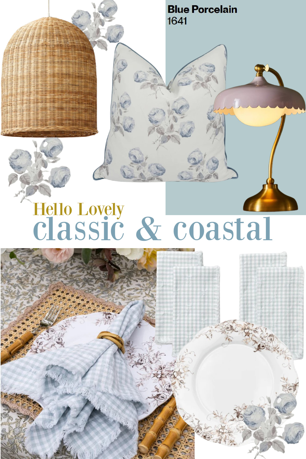
Benjamin Moore Blue Porcelain 1641
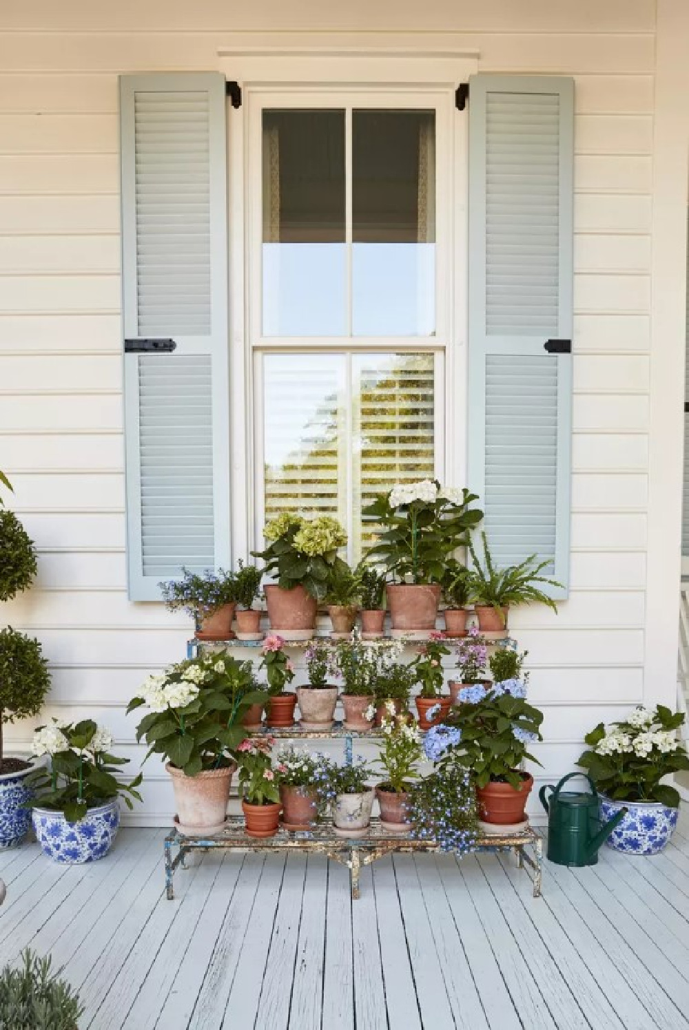
Of Blue Porcelain, Benjamin Moore says “This blue is darkened slightly by a touch of gray, resulting in a lovely, serene hue.” And the gray undertones seem to make all the difference! You know how easily bright blues can be all wrong! But Porcelain Blue is just right for these shutters and porch!
The light reflectance value (LRV) of BM 1641 is 54.9 which is a little surprising since it doesn’t come off as a mid-range blue to me on this home.
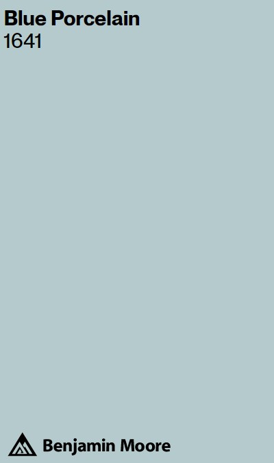
I think all of the natural light works magic with it, and it’s worth noting that you should definitely sample this before being sold on it for your project.
It appears to be painted on the porch floor and ceiling as well, though I am wondering if it was mixed at a lower saturation since it appears lighter. See this story about perfect haint blue paint colors.
Sometimes photography and editing will influence how a paint color is perceived. Add to that how the time of day a photo is snapped affects the perception!
But do bear in mind that if a color is just a little too much, you can always sample it at a lower saturation to arrive at the perfect custom version of the paint color for you and your needs.
Blue Porcelain is going to match with these BM colors: Cloud White, Ivory Porcelain, White Dove, and Templeton Gray.
Farrow & Ball Parma Gray 27
Is this the prettiest blue traditional style kitchen you’ve ever laid eyes on? Deep Charleston sighhhhhhh. The shiplap, the island feel, the tropical pendants, the La Cornue range, and that pantry!
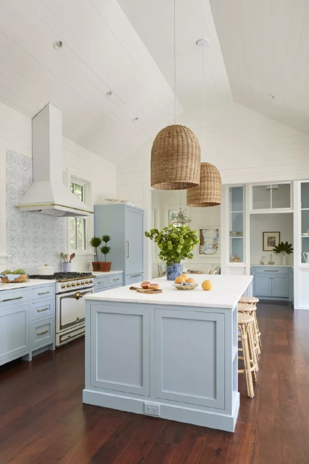
I feel like a broken record on this subject of blue paint colors, but it bears repeating. Look at colors with “gray” in them when you’re after the perfect blue. Here’s a perfect example. No. 27 Farrow & Ball’s Parma Gray is the paint color on cabinets in this kitchen!

Of Parma Gray, Farrow & Ball says this clean and crisp hue reads “as a cool blue.” and “creates the perfect period feel when contrasted with Wimborne White.” Julia Berolzheimer called on Olivia Brock of Torrance Mitchell Designs to create this stunning space for her young family, and doesn’t the blue feel youthful and happy?
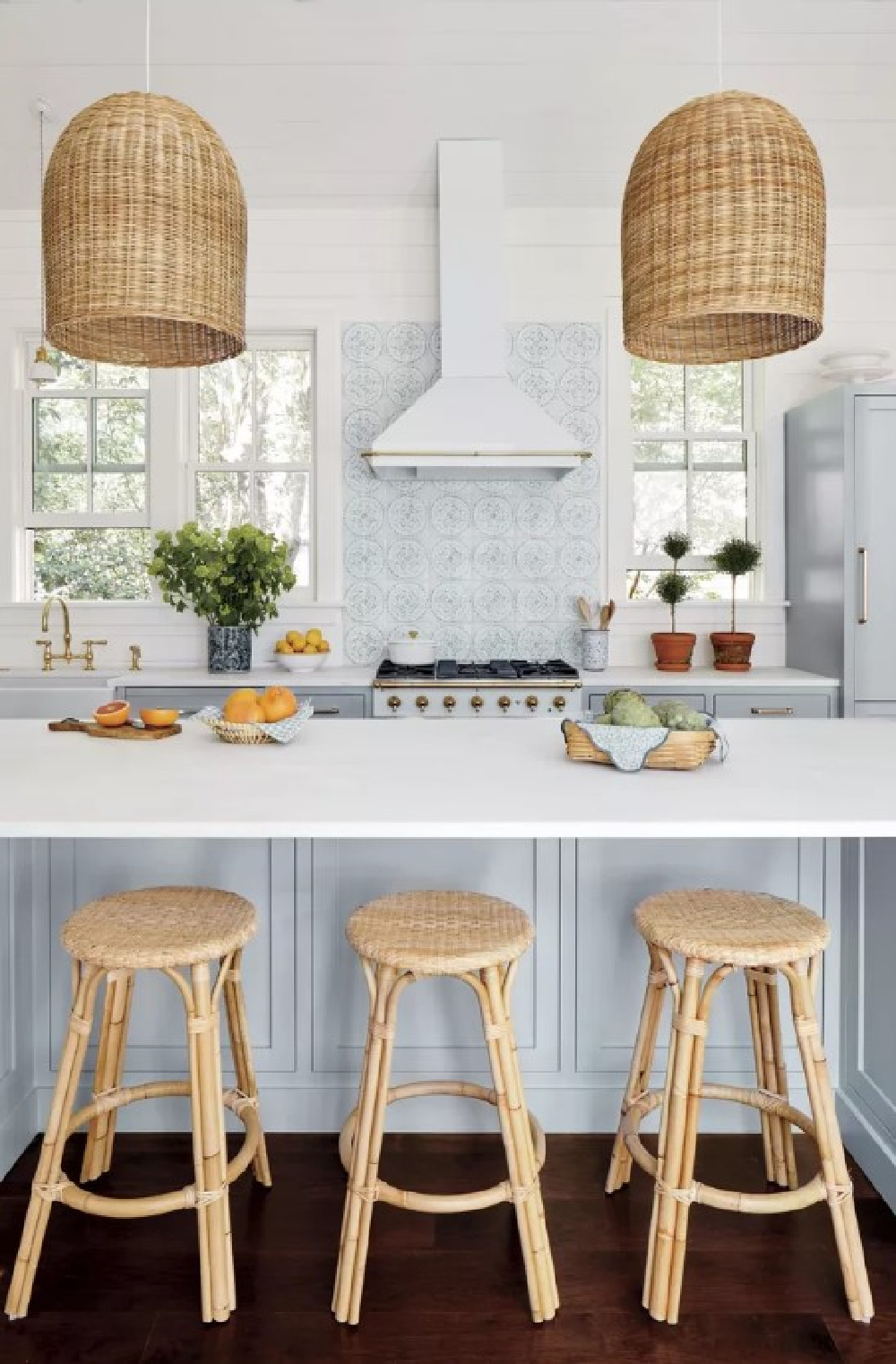
The natural materials and touches of warmth play so well with Parma Gray cabinetry.
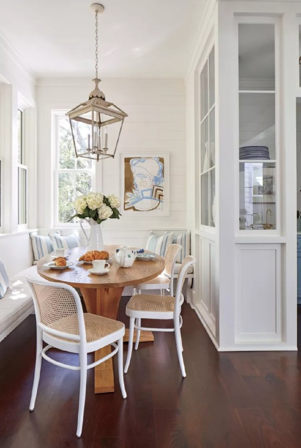
Would you dare place a lantern of this scale in a cozy breakfast nook?
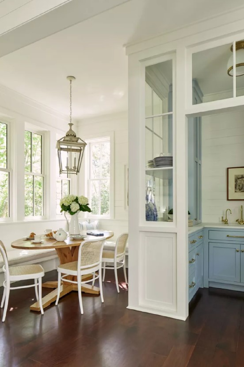
Because it’s working for me! So is the custom oval table and open concept pantry which feels like a dream!
But what color white is on the kitchen walls, ceiling, trim, window and throughout the interiors in this Charleston home painted?
Benjamin Moore Simply White 2143-70
It’s this white paint color that is widely popular with designers and homeowners for its gentle warmth.
Benjamin Moore says of Simply White: “The slightest hint of warmth makes this clean, crisp white a favorite to use anywhere in the home.”
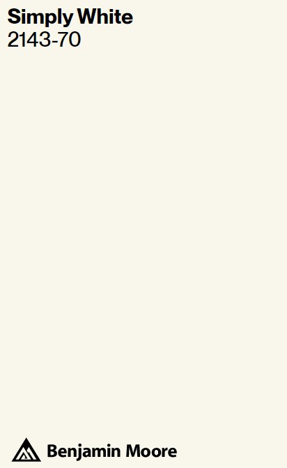
This white paint color is also known as OC-117 and reflects a ton of light. The LRV is 89.52, which means it’s going to reflect almost 90% of light.
Simply White was also used on the exterior of this home, and you begin to see how repeating the same color becomes important when you see areas of the property such as the courtyard:
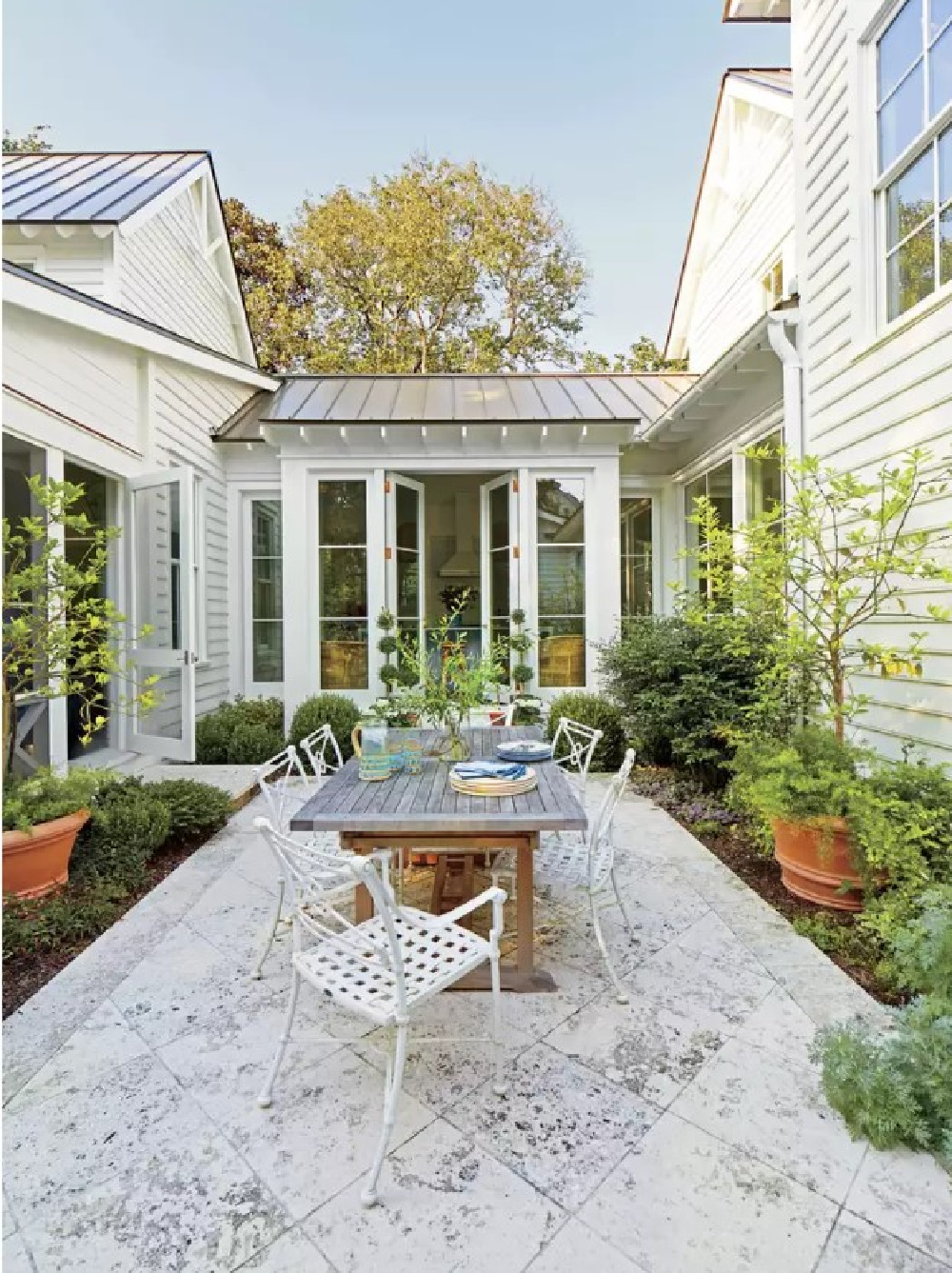
The exterior color becomes a focal point from interior rooms with such a configuration. Simply White matches with these other BM colors:
Moonlight White, Old Prairie, Camouflage, Olive Branch, Alligator Green, and Sage.
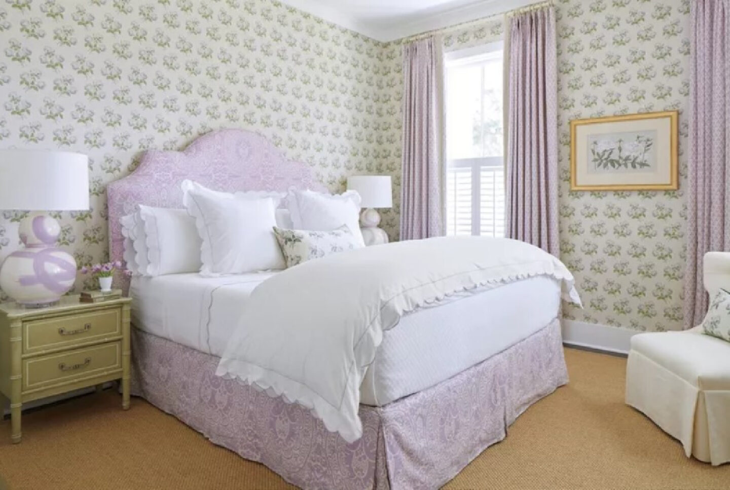
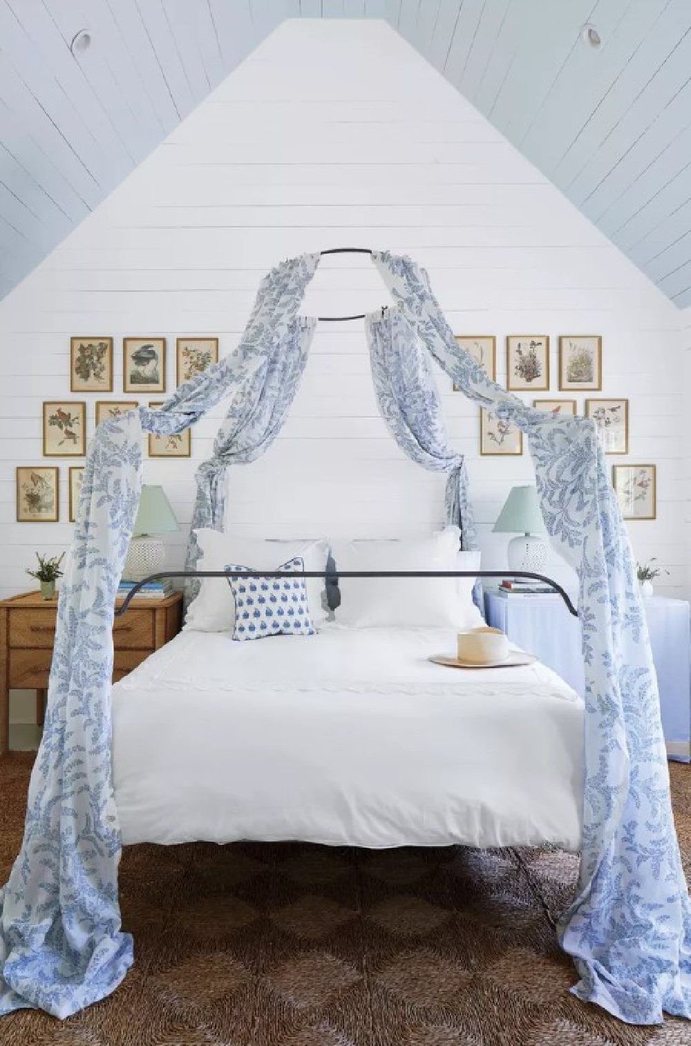
Torrance Mitchell chose Boxwood Chintz (Colefax & Fowler) for the primary bedroom, and you’ll note the wallpaper’s background is more of an antique white. So many homeowners believe they must match their whites precisely, and if you study the contrasts within this room, it may illustrate how designers do NOT get matchy.
Notice the white baseboard trim, the bright white bedding, and the ceiling meeting the creamy white of the floral wallcovering.
Farrow & Ball Pink Ground
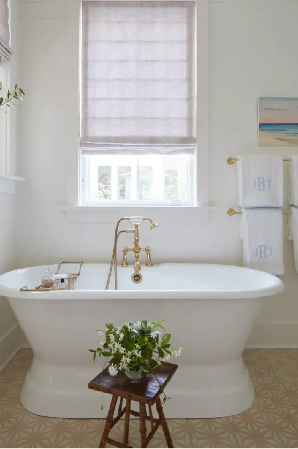
Ready for the most romantic bath with a French accent?
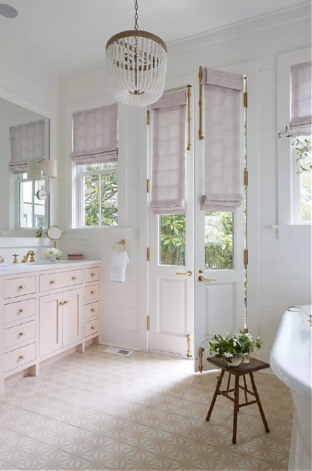
Ahhhhhh! Pink Ground 202 is described by Farrow & Ball as a dusty blush pink. It started out as a delicate wallpaper background which prompted customers to request it for a paint color.
Its yellow undertones result in a warm soothing mood that isn’t too sweet or precious. Farrow & Ball suggest pairing it with warm whites rather than bright whites.
Are you ready for the commitment of pink cement tiles somewhere in your home? You have to hand it to folks who are willing to be bold and embrace happy colors they will be living with for a very long time. It’s an honorable way to make a house a home and distinctively yours.
Understated & Classic Tropical Paint Colors
Isn’t it refreshing to see hushed tropical paint colors as opposed to bright, sugary sweet, vibrantly loud iterations?
I love the idea of a haint blue ceiling in a guest room! Keep those ghosts far from guests! Hahahaha. (By the way, after that haint blue post where I joked I would pity the ghosts who would haunt my house since I would have little patience for their antics? Something totally spooky was spoken loudly and unprompted over a bluetooth speaker from the other room this week. Serves me right. Where’s my shopping list for haint blues…)
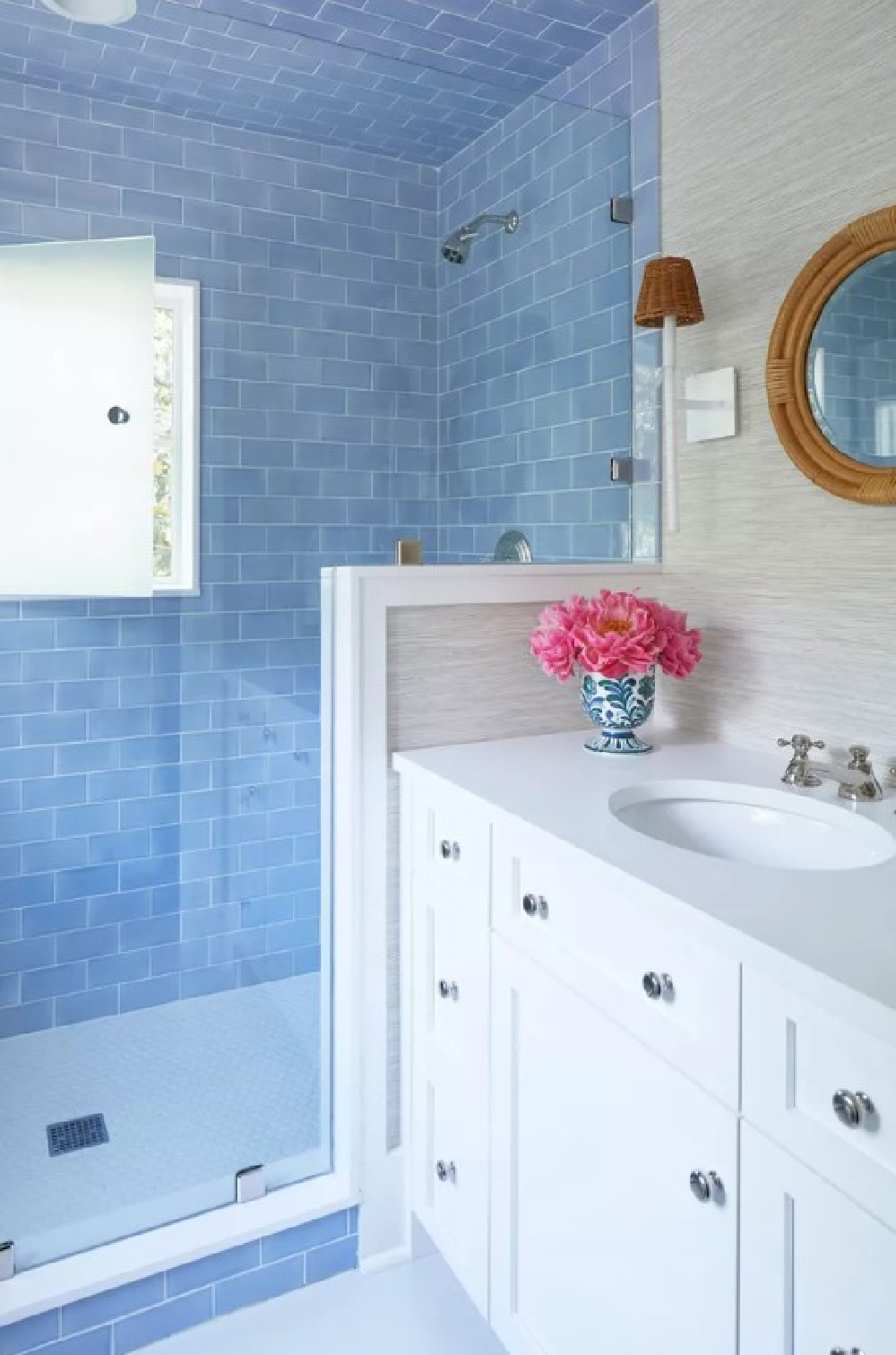
What a gorgeous way to celebrate a tropical blue color in a bath! And raise your pretty hand if you need a screen porch with a fireplace in your life…
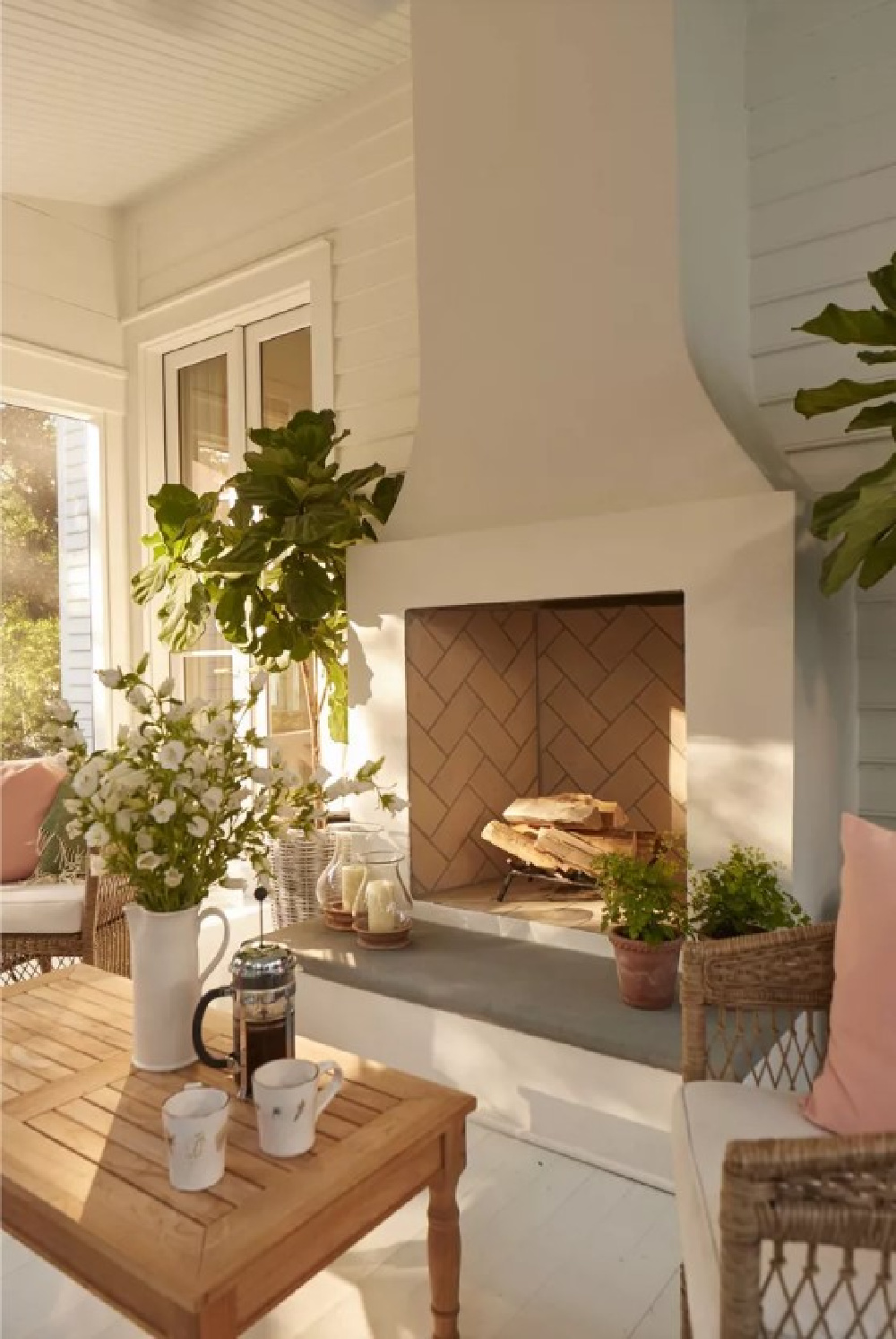
Has anyone converted their builder-grade deck into a screen porch? A friend wants to know. 🙂
See glimpses of Julia’s home in this:
See more Charleston goodness in THIS and THIS.

Peace to you right where you are.
-michele
I independently selected products in this post—if you buy from one of my links, I may earn a commission.
Thanks for shopping RIGHT HERE to keep decor inspiration flowing on Hello Lovely!
Hello Lovely is a participant in the Amazon Services LLC Associates Program, an affiliate advertising program designed to provide a means for sites to earn fees by linking to Amazon.com and affiliated sites.


