White Kitchen Cabinet Paint Colors Favored by Designers brings together an eclectic inspiration gallery of lovely kitchen photos with beautiful cabinetry, classic design features, and timeless architectural elements. White kitchens are a non-negotiable for plenty of homeowners who admire a clean, light, bright scheme to stand the test of time. (Even more inspiring white kitchens to explore if you love warm whites here.)
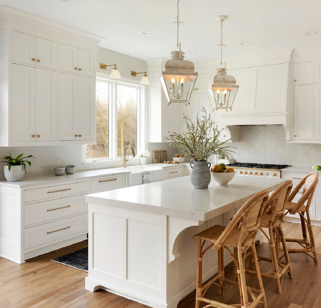
Which White Kitchen Cabinet Paint Colors Do Designers Favor?
Even when you decide it’s a white kitchen you desire, the decision likely marks only the beginning of the journey. The perfect white for your kitchen design requires a bit of thought and research.
Will a warm white, a cool white, a greyed white, or an off white be the best white paint for your project? Make sure to review plenty of images and sample at least a handful of paint colors before deciding. This post may help you narrow down some tried and true white kitchen cabinet colors designers tend to rely upon time and time again.
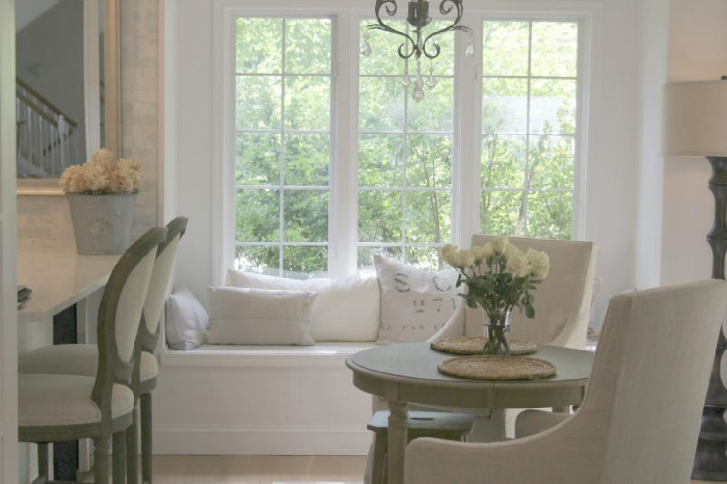
How Does Knowing Designer Favorite Paints Help?
While a lot of folks think a neutral paint color is a neutral paint color or that all whites are pretty interchangeable, it’s not true! Each white hue has gradations, undertones, and formulaic color combos that influence the paint color’s LRV (light reflectance value).
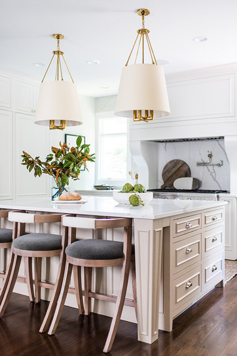
Viewing lots of images can be helpful. Even though the way a particular color presents in an image may appear far different in your own kitchen (due to post-editing and time of day photos were snapped), it provides a starting point to sample a few promising contenders.
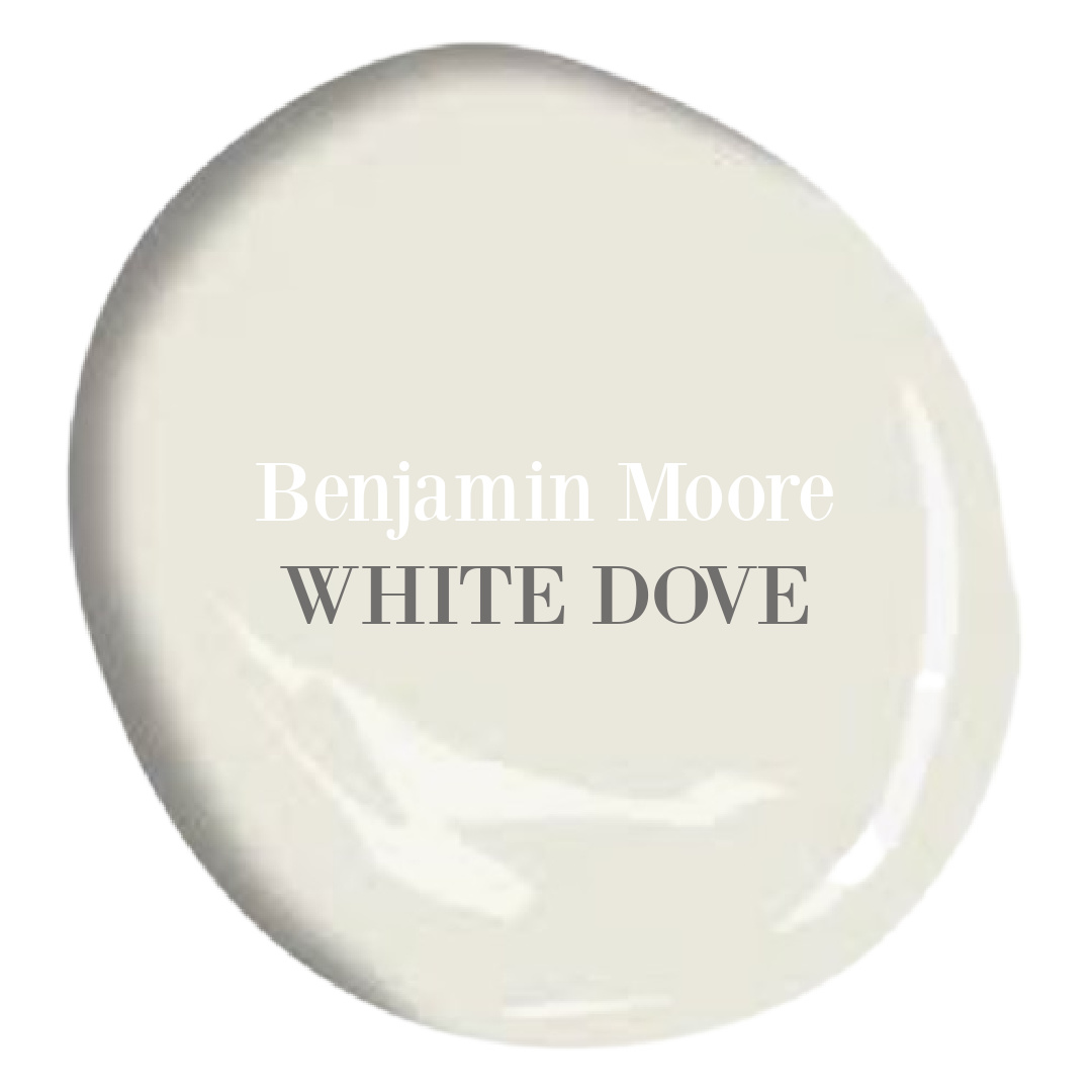
BM White Dove OC-17
I’m going to make your quest a ton easier in one fell swoop. Start with a sample of WHITE DOVE which is an off white that is WILDLY adored. There’s a chance it won’t be your best option, but using it as a reference will help you analyze what you’re after by knowing what isn’t working.
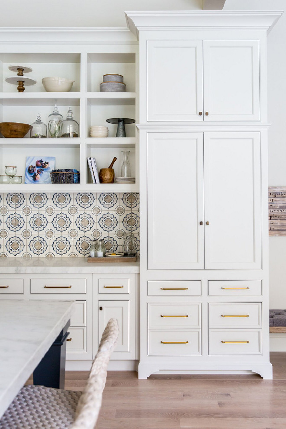
For example, I tend to like White Dove for vintage furniture pieces I paint. But if I am after a more modern look in a kitchen, I might reach for Chantilly Lace instead. Benjamin Moore says unerring style defines White Dove as a clean and classic white, and the rest of the planet seems to agree.
The light reflectance value of this off white is 83.16 – it will reflect some serious light. Should you also paint the walls, ceiling, and trim the same color? You totally can. To decide whether a monochromatic look is for you, keep viewing images (dig into my archives and search “white kitchen”) to see what your eye prefers. When there is subtle contrast for walls and cabinets, it can be beautiful. And when there’s a more fluid, seamless sea of white, it can also be gorgeous.
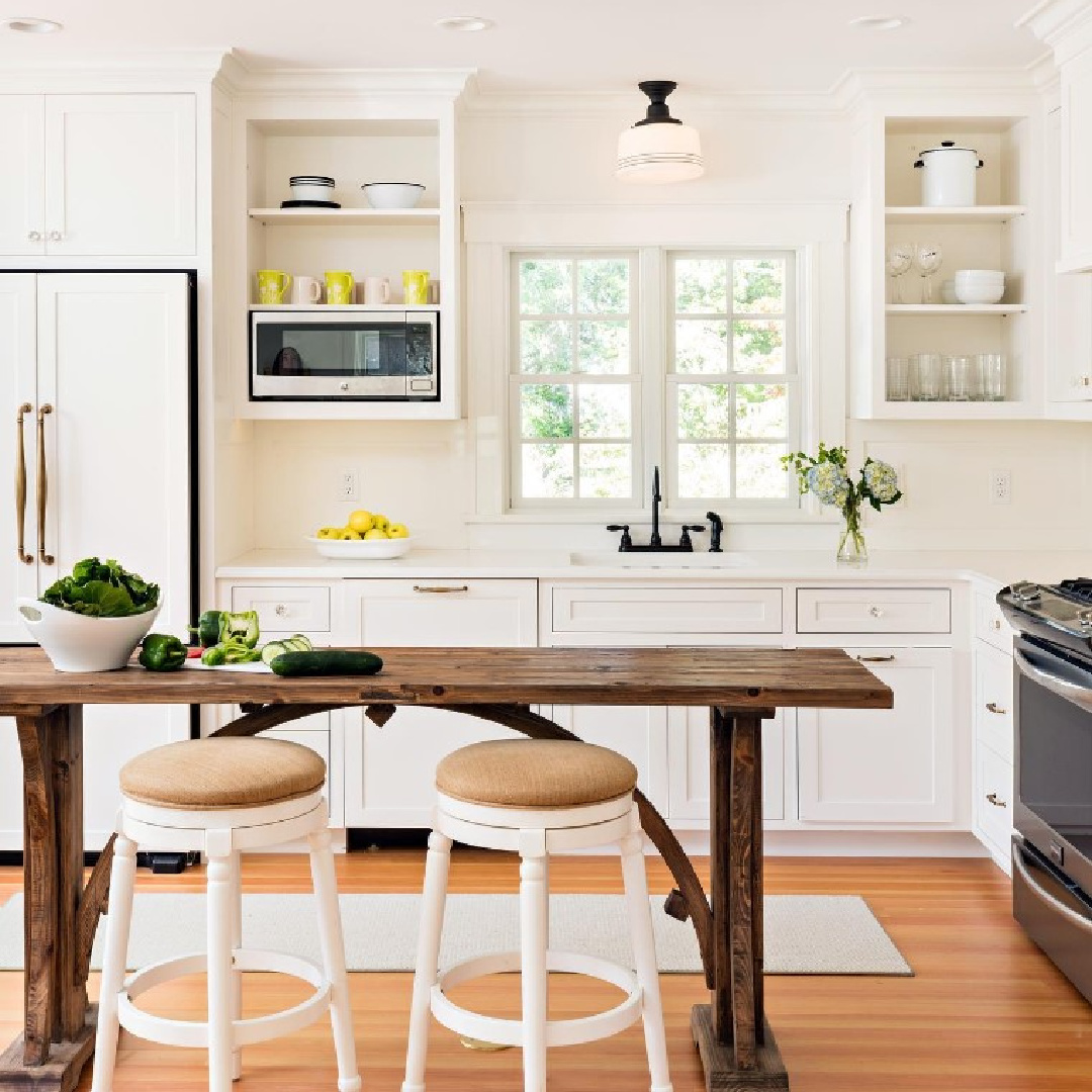
So what you’re doing as you study and expand images is NOTICING any pattern where you respond positively. If you’re after a tranquil mood, which photos elicit that response in you? Now note the contrast level between walls/cabinetry/ceiling/trim. Low contrast? High contrast? Almost no contrast at all?
Try These Colors That Work Well With White Dove
Beautiful on cabinetry, try these three beautiful neutrals in combination with it for accents, interior trim, exterior details, and walls. Balboa Mist OC-27, Kendall Charcoal HC-166, and Revere Pewter HC-172 are colors to consider.
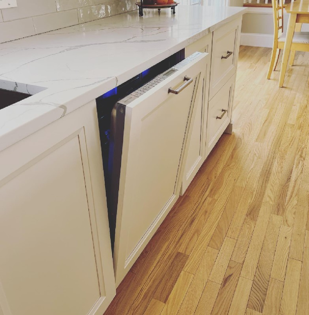
Freakouts are Common With Kitchen Designs!
A word of caution. Even when you are confident you have found the right white and neutral colors for your project and feel energized by the plan, doubt can creep in as each layer of the design begins to take shape.
This is truly a normal response. After all, you’re investing a lot of time, energy, and funds into a project that needs to serve you well for years. But you probably don’t yet have enough data to justifiably freak out. (I’m not talking about how appliances and fixtures look or fit into the space…addressing paint colors mainly here!).
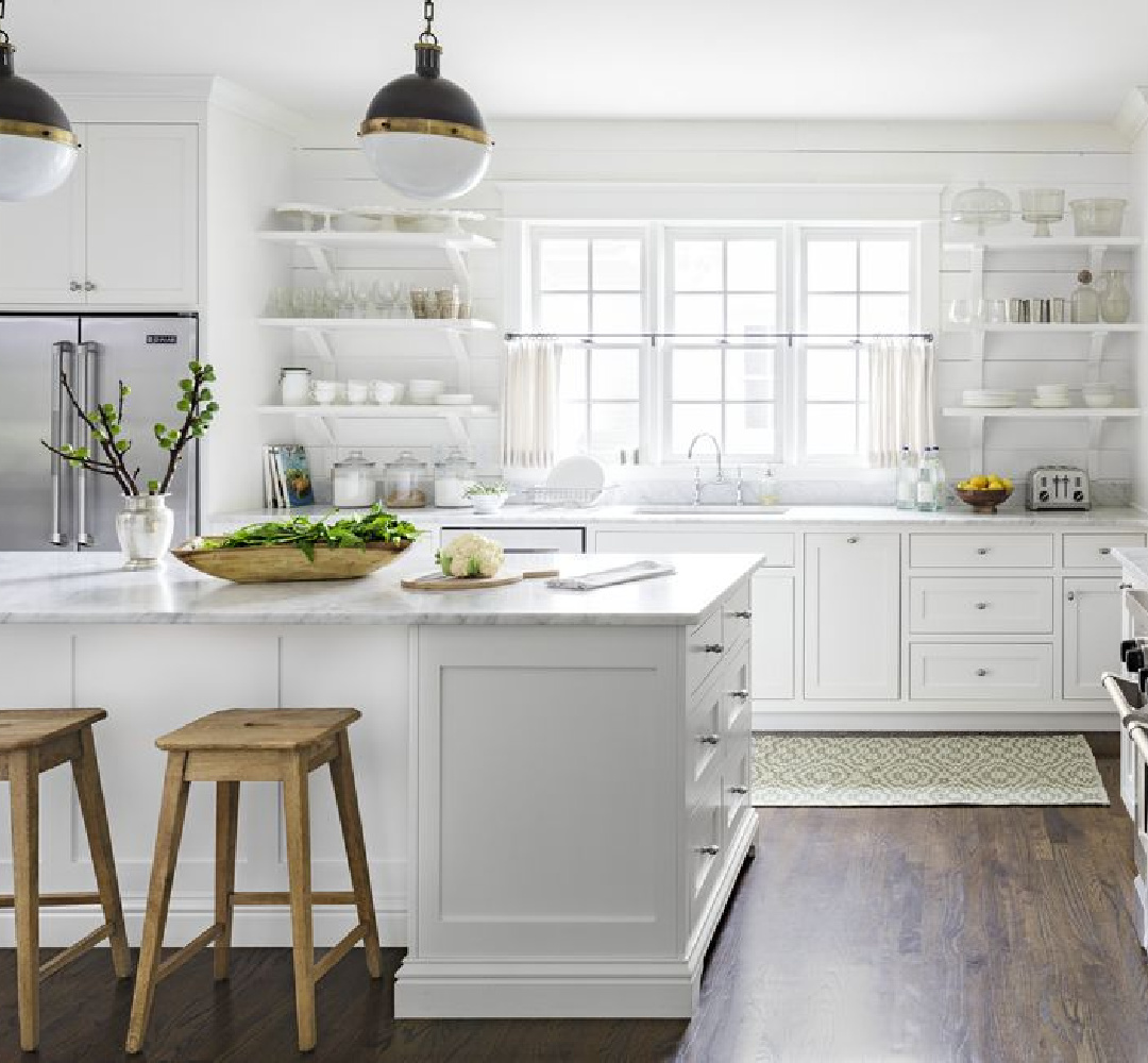
Just know that when there is just one layer, you honestly cannot assess how the end result will look. All of your attention, for example, may go to just one thing before all of the pieces are there.
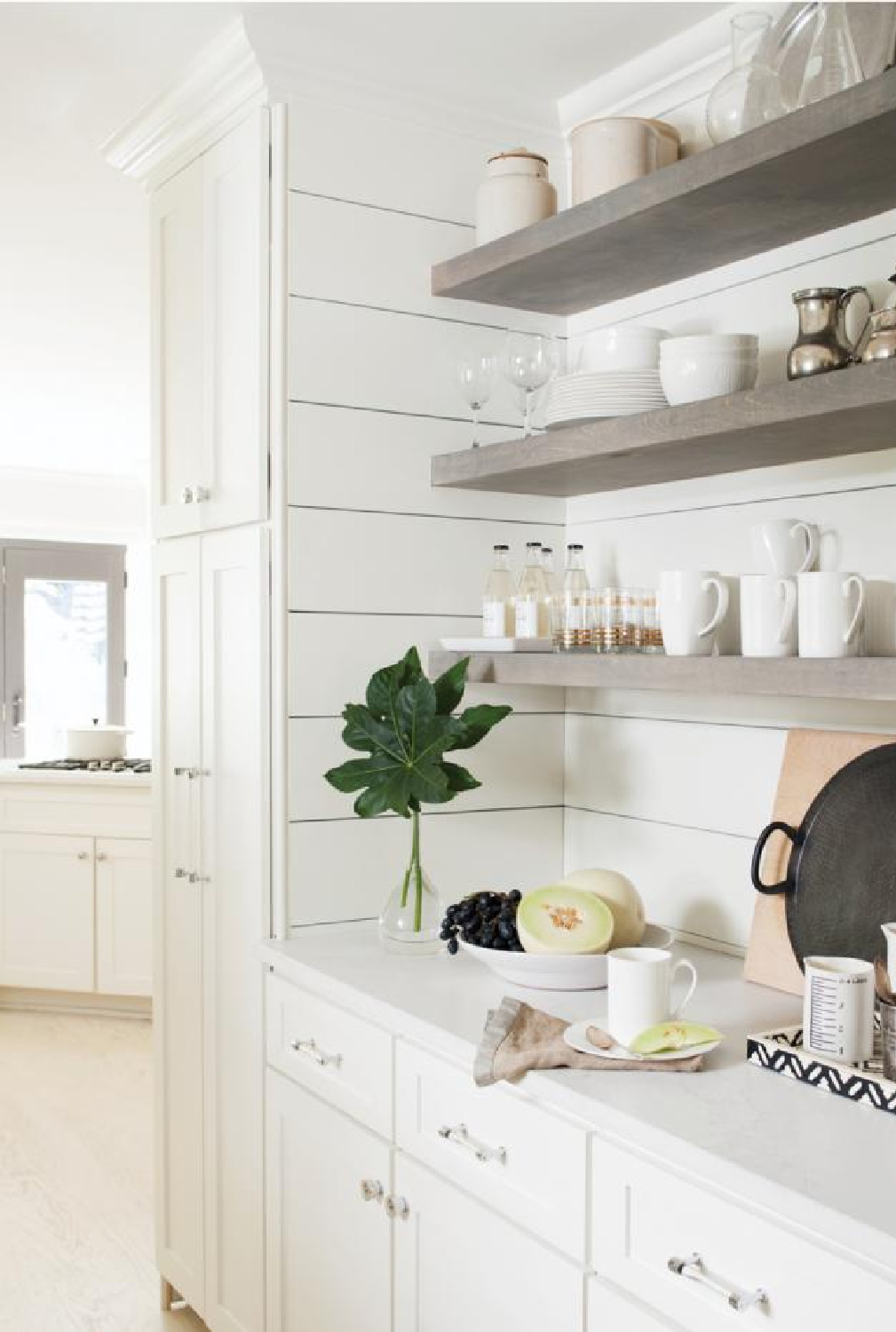
I speak from experience as a real life renovator who has freaked out prematurely more times than I can say. The thing is, I now anticipate the freakouts and because of experience have learned to trust that all will be well as the layering proceeds. When you invest time into the thoughtfulness of the design before a single decision is made, it will serve you later.
Easiest way to see if a paint color will work? Order samples with Samplize and have them delivered straight to your door.
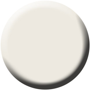
BM Chantilly Lace OC-65
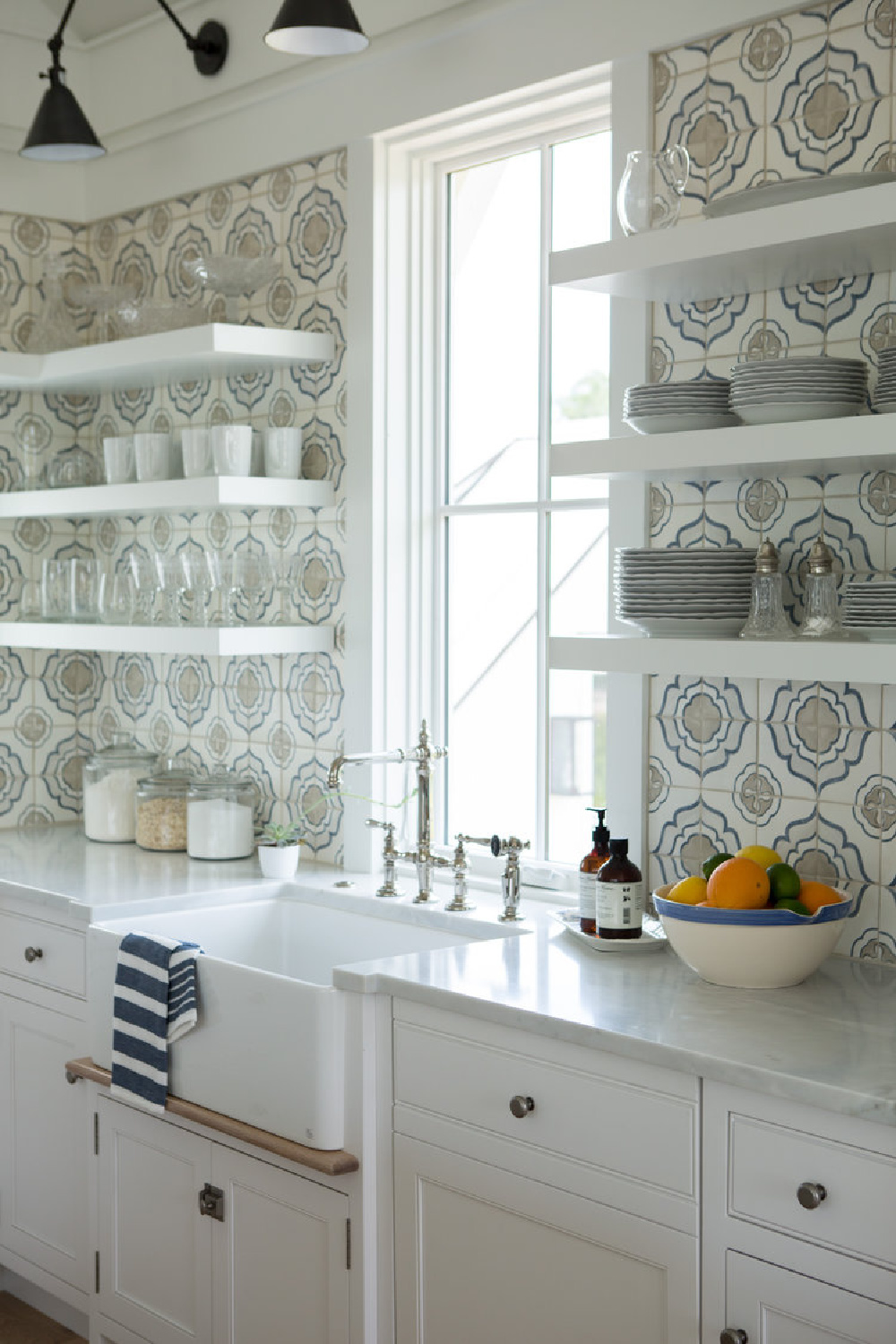
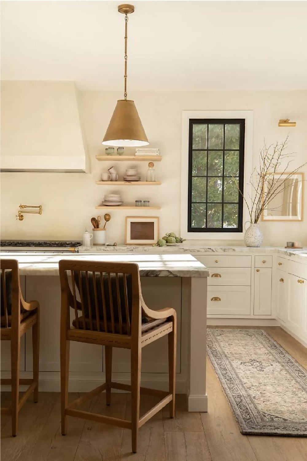
Chantilly Lace is a brighter white than White Dove and may be a great choice for your cabinets. Two kitchens that spring to mind right away? My friend Loi Thai’s gorgeous classic kitchen (Tone on Tone)…
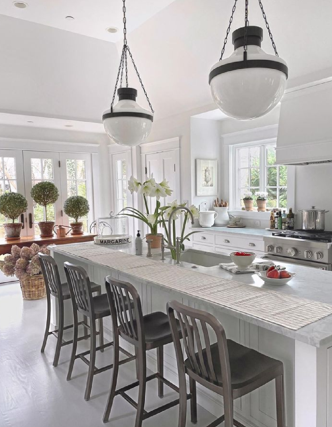
and Erin Fetherston’s California modern farmhouse interiors where the color plays a starring role:
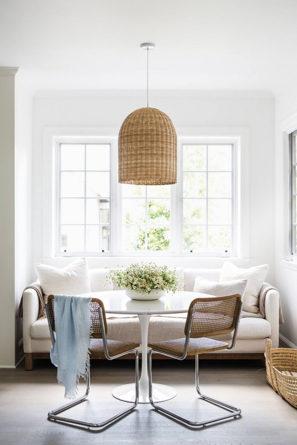
I have noticed a pattern of Chantilly Lace being favored by minimalists, modernists, and Midcentury Modern fans while White Dove is the number one choice of vintage lovers and traditionalists.
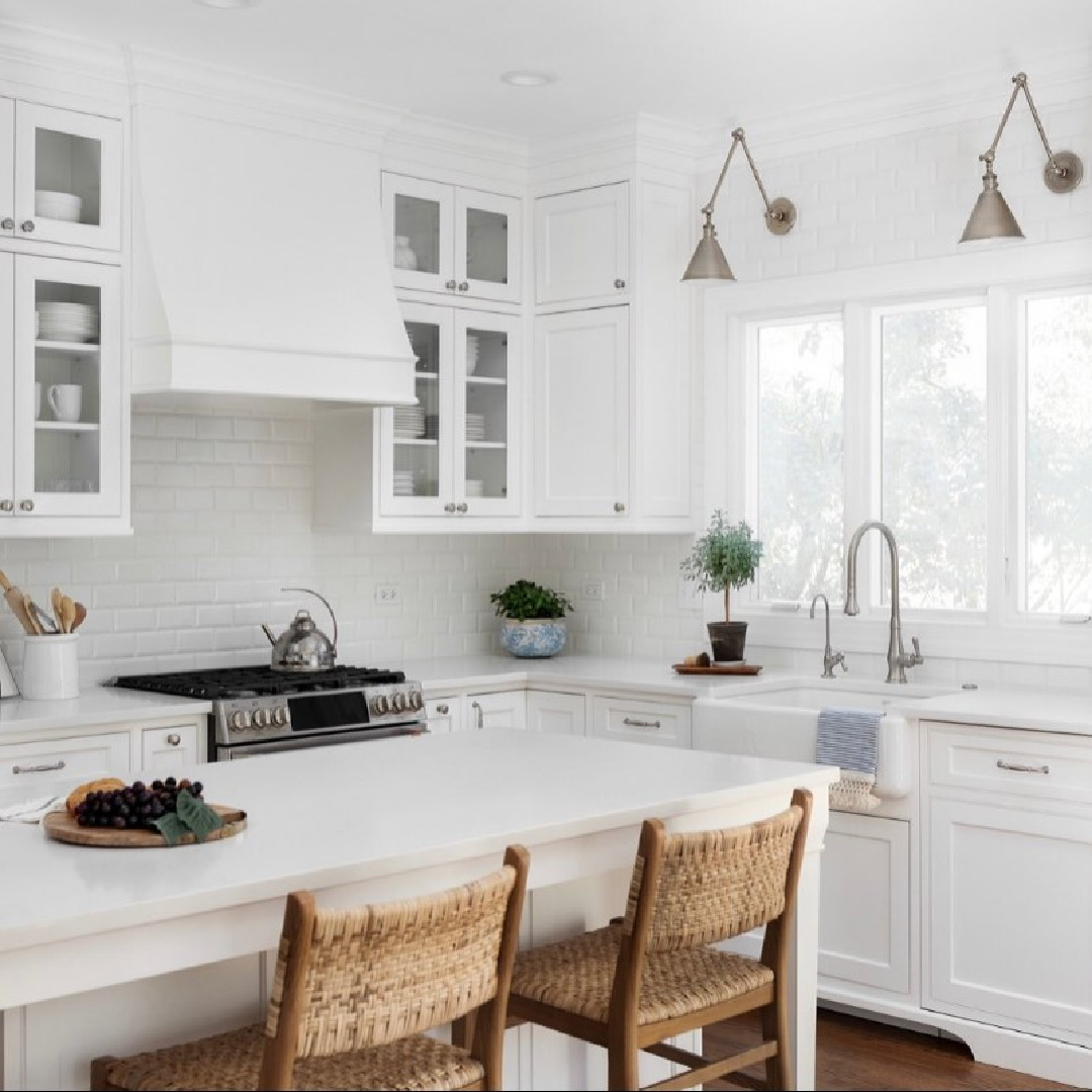
Of course there are plenty of exceptions, and your home and its unique lighting may cast its own vote!
In terms of whites, Chantilly Lace is a very crisp and bright off white. It is also known as 2121-70 and considered a classic go-to white eliciting images of fresh cotton and pure silk. 90.04
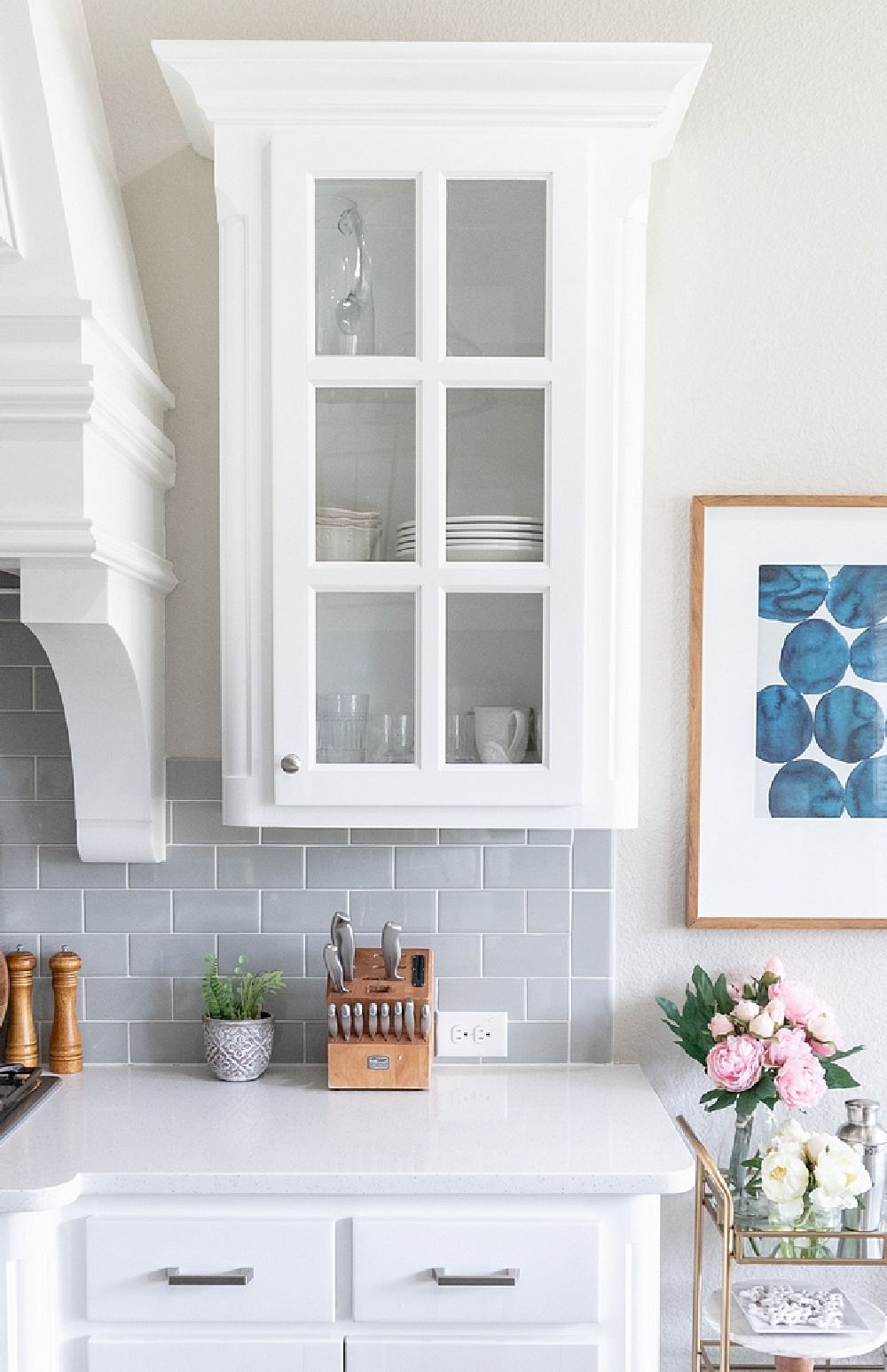
We often see Chantilly Lace combined with light and medium greys, and don’t avoid grey because you think it’s too common a pairing. There are good reasons such pairings are repeated, and there are a million additional ways to add personality and distinction to your design.
Ideas for Other BM Colors Coordinating with Chantilly Lace
Ice Mist 2123-70 is similar to this white so take a peek. Horizon OC-53 is a muted grey-white that works great coordinating with Chantilly Lace, and a lot of designers are crazy about it. It has this atmospheric, ethereal factor you may be after.
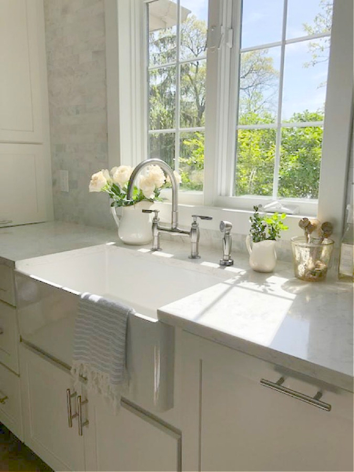
Additional BM whites that match Chantilly Lace are Benjamin Moore White OC-151 and BM Brilliant White OC-150. OC-151 is the white that was perfect for walls, trim, and ceiling in our former kitchen because of its very cool blue undertones. You can see it in Lisa Furey’s kitchen on cabinets, walls, and everywhere in this beautiful coastal property:
I found BM White (LRV is 83.56) not terribly different than primer. With our strong yellow sunlight, I needed serious undertones to cut through it.
Sherwin-Williams SW Alabaster 7008
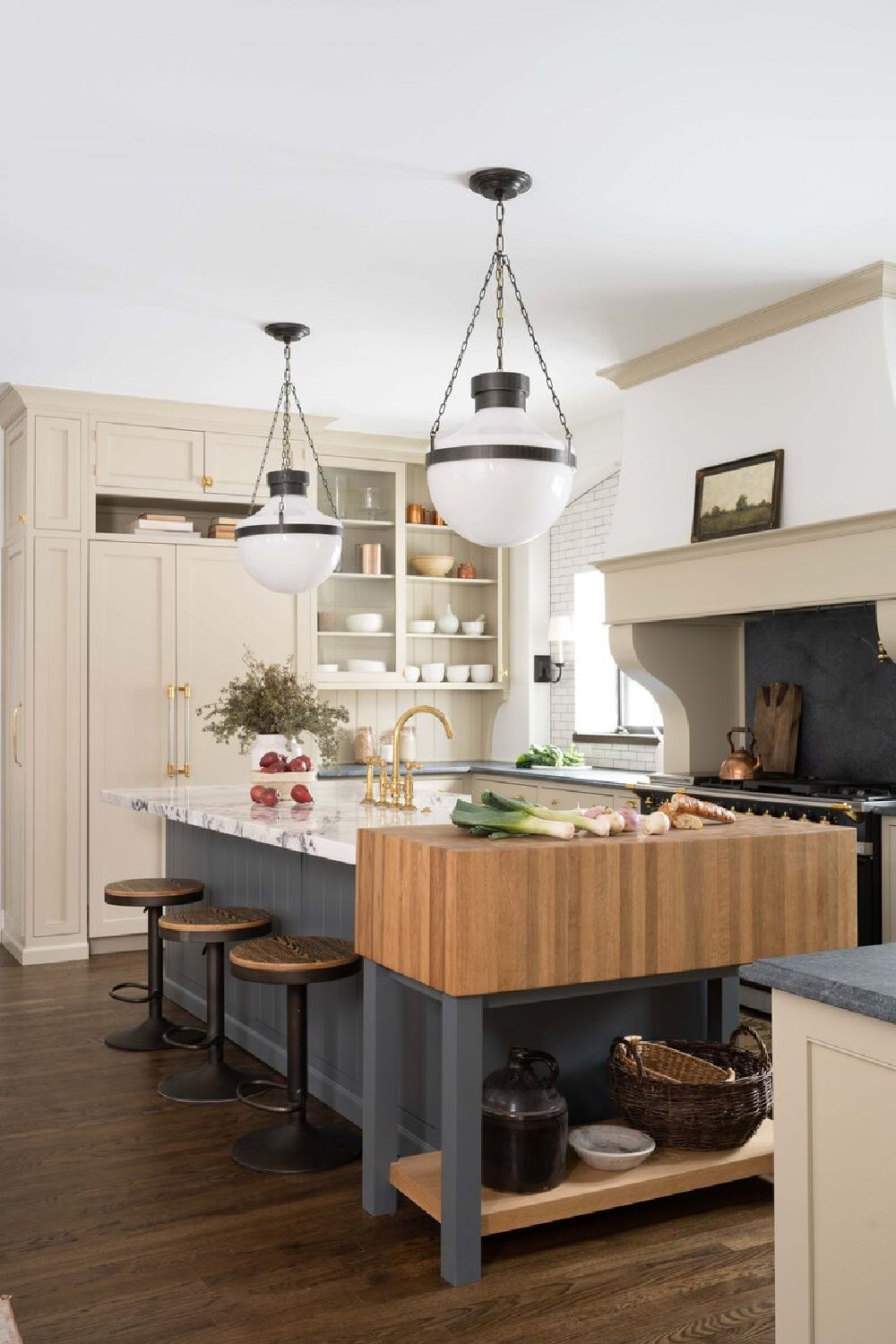
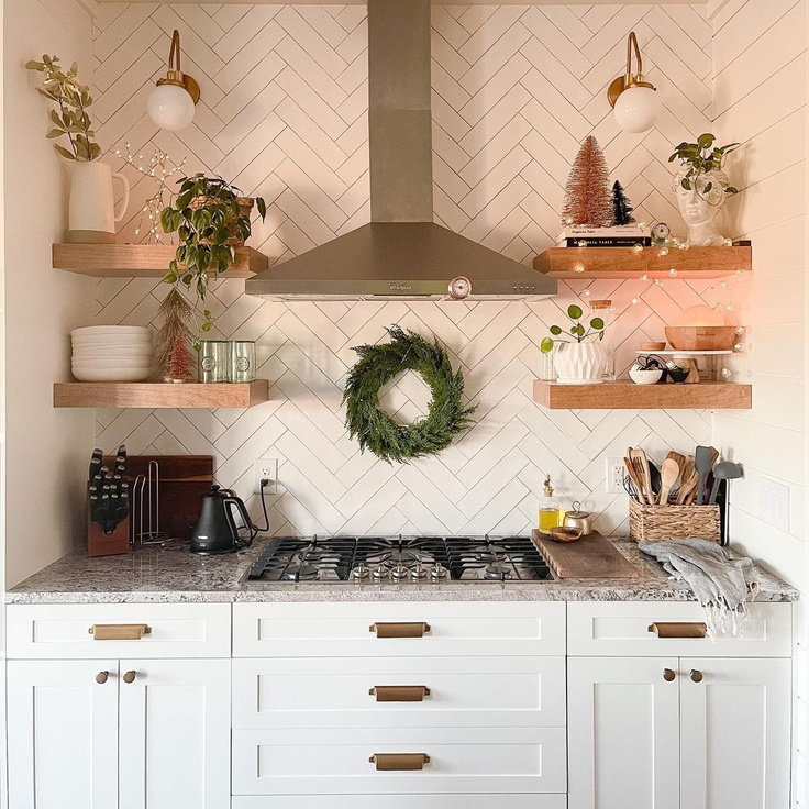
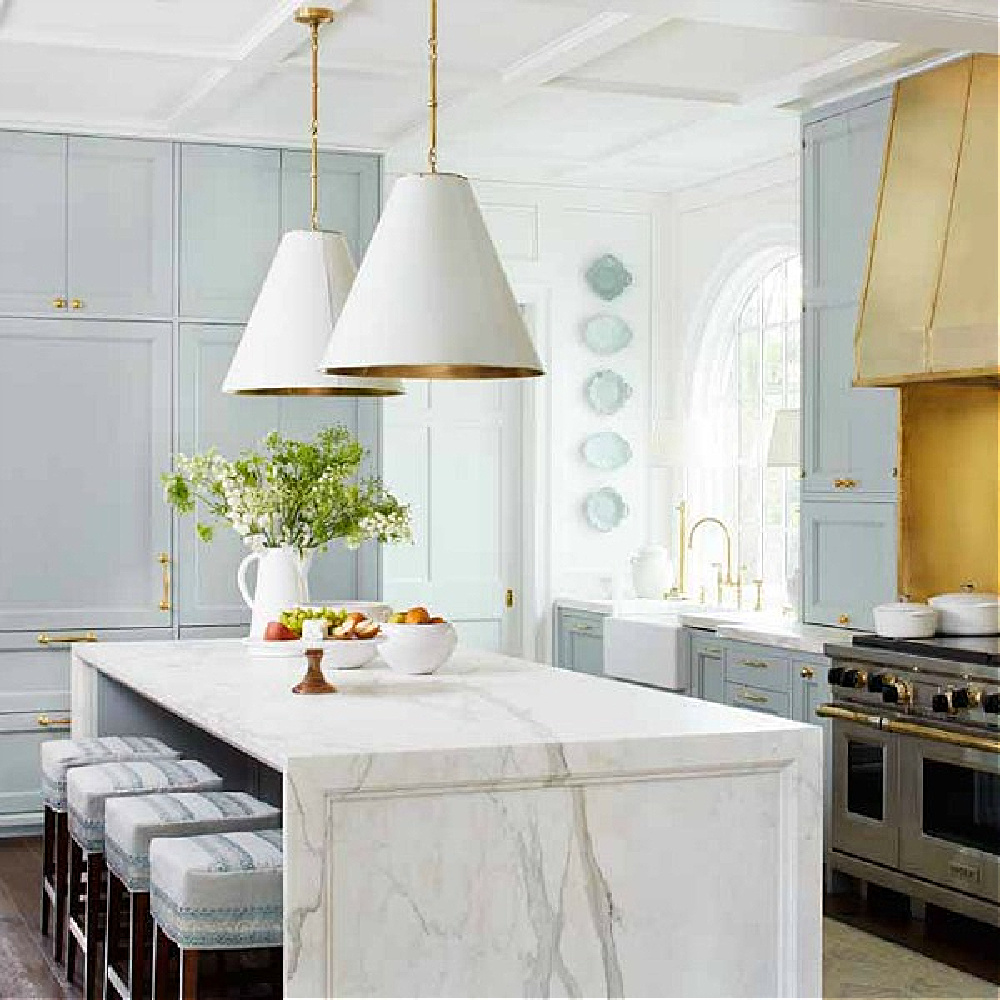
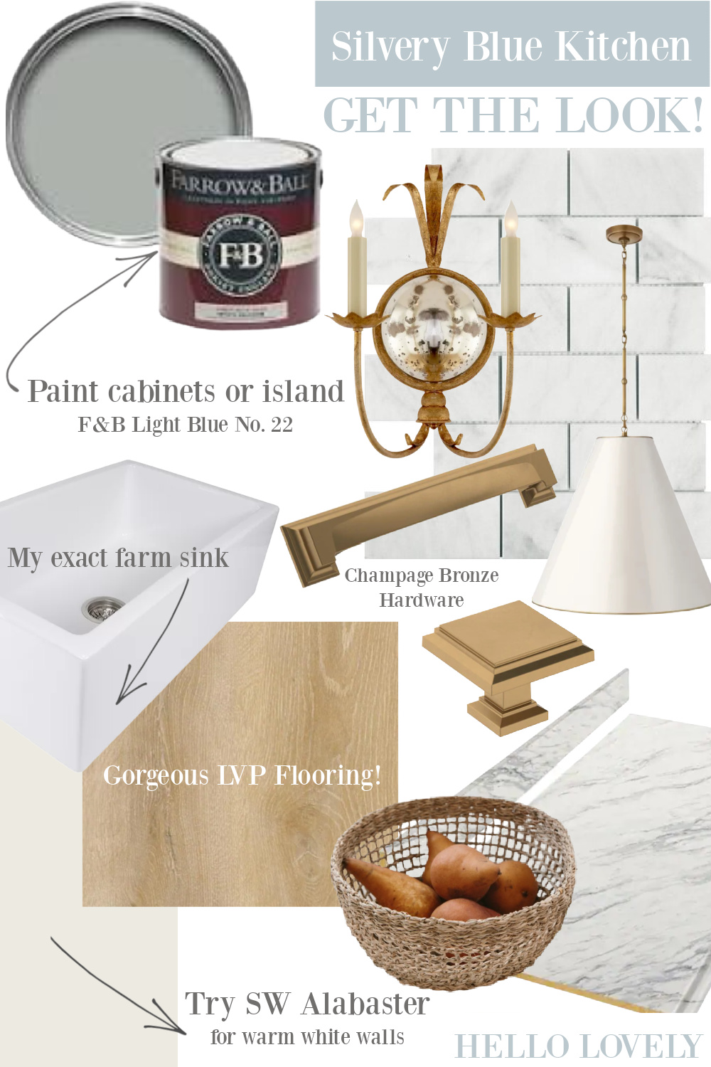
If the kitchen at the very beginning of this post at top stole your heart, then maybe you’ll want to sample Alabaster 7008.
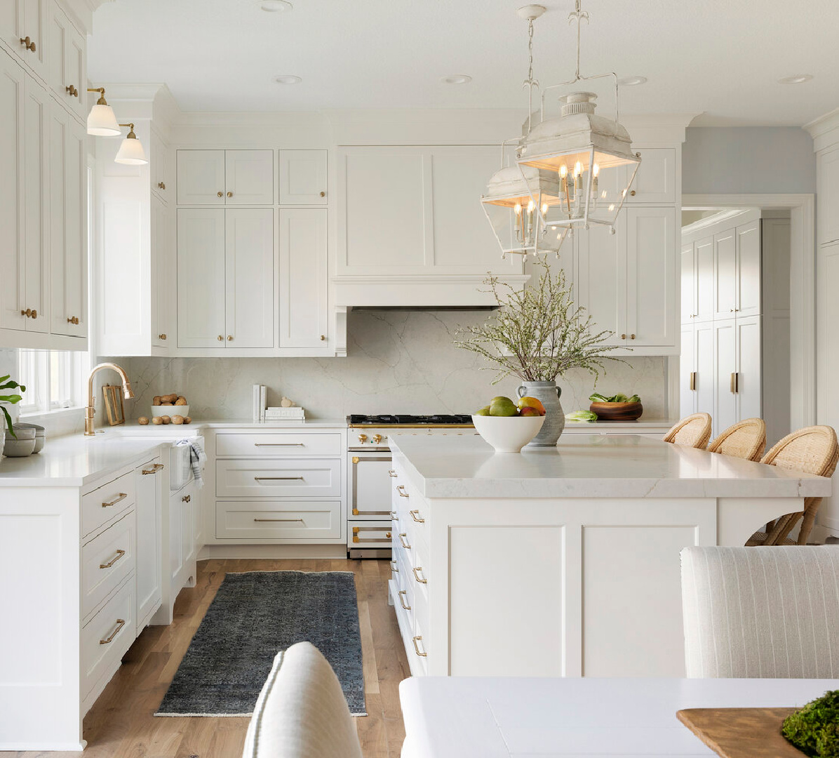
About this Sherwin-Williams white, the brand says it will satisfy “When you want the brightness of a white without sacrificing a warm coziness.”
Sherwin-Williams also calls this warm white a: “soft, warm but balanced white” to “turn up the peaceful.”
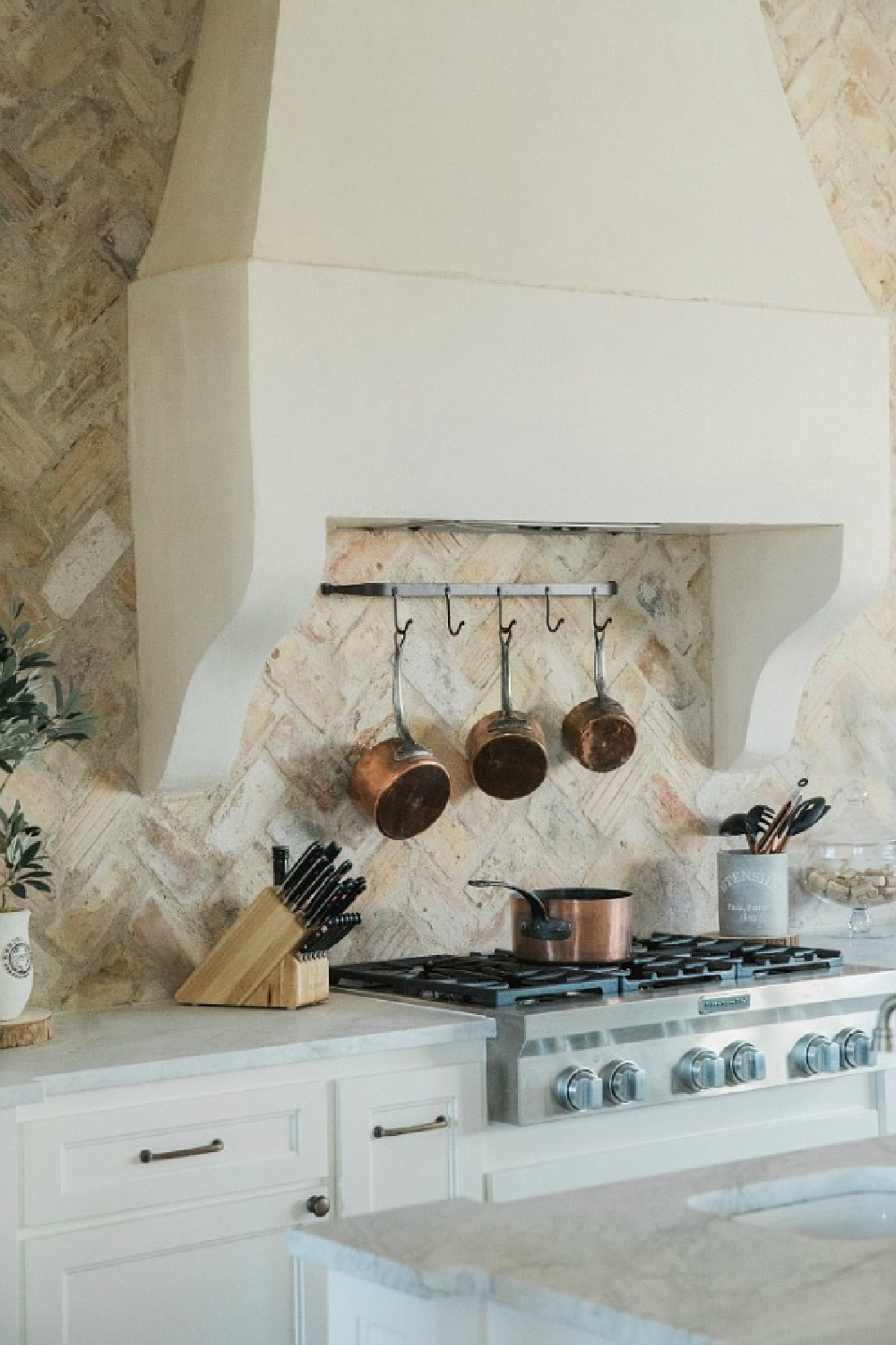
Peaceful is an accurate description, and you can see how this warm white played a key role throughout the interiors of a new build in Texas by Brittany Jones that only looks Old World:
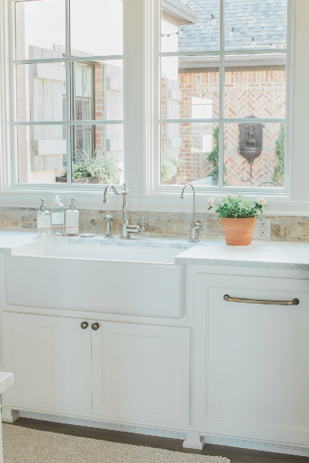
Just an incredible combination of warm and rustic with the Chicago brick backsplash and cool white marble.
What Coordinating Colors Work Well With Alabaster and What Doesn’t?
Peek at SW Townshall Tan 7690 and SW Dakota Wheat 9023, and know that lots of colors work dreamily with it. So much so that I think we all lost count of how many kitchens designed by Joanna Gaines featured this color! Alabaster was used on the walls and trim of this showhouse in Atlanta (2017), but the post-editing likely makes it appear much brighter.
Alabaster is often fitting for farmhouse, country, vintage style, French country, and Old World kitchen styles. However, it may be too creamy or appear yellowish in certain lighting conditions which is why it’s so important to sample it first.
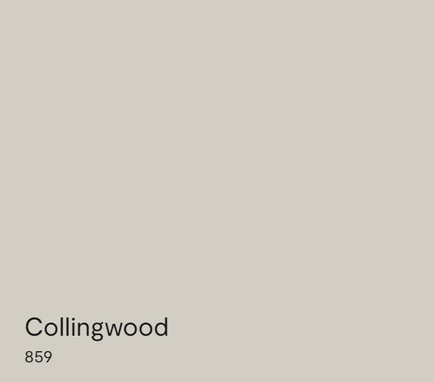
BM Collingwood
Also known as OC-28, Collingwood is a gorgeous, sophisticated white Benjamin Moore calls “A widely appealing shade of gray with lightly cool undertones.”
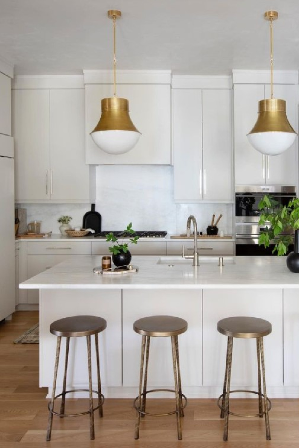
It’s one of those atmospheric neutral whites that can appear slightly warm despite the cool undertones. Is it grey? Putty? Stone-like? That mystery about this color and the difficulty pinning it down to one or several things is what makes it all the more appealing.
The LRV for Collingwood is 61.52 which means it is a lighter color reflecting a fair amount of light in the room. Yet it isn’t as light as a highly reflective white such as Chantilly Lace which has an LRV of 92.
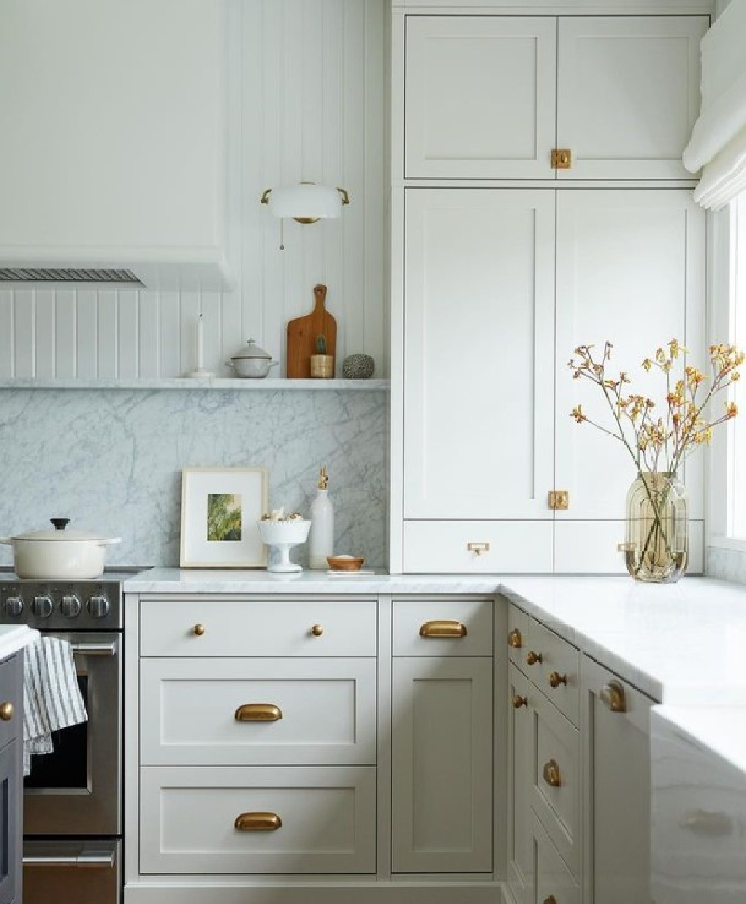
I also love the combination of the warm Collingwood with cooler walls and marble counters! A lot of folks freak out when they must decide on a coordinating white countertop material to harmonize with their white cabinetry.
However, if you view enough images online, you’ll notice the variations are endless. Mixing whites (warm with cool, light grey counter with warm white cupboards, etc.) isn’t just okay, it’s also gorgeous and sophisticated. I’m wary of the word “match” these days and prefer thinking about harmony and relationships instead.
Which Colors Look Great with Collingwood?
As far as complementary light neutrals to contrast lightly, see Icicle OC-60, which is a warm white that works well with Collingwood. Also consider BM White Dove OC-17. A taupe hue such as River Reflections 1552 and the deeply sophisticated blue-gray Gentleman’s Gray 2062-20 both harmonize with it too.
Is a Light Grey Color The Best White for Your Kitchen?
Don’t forget about all of the colors with “white” missing from their name which may be great options for your kitchen cabinets. I wanted to keep things light, muted, and neutral in our kitchen, and a tweaked grey was best.
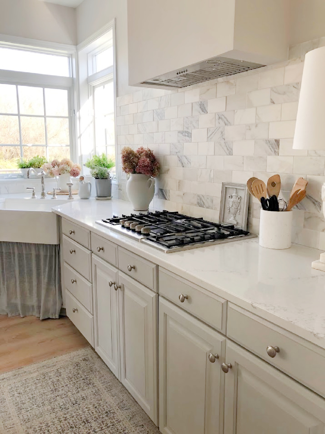
At full strength, it is too dark grey, but lightened up was felt just right. With sunlight, the cabinets often appear light blue…just what I was after. The kitchen’s design began with the countertop material (Viatera Muse), and then the bright white choice helped narrow down options for the cabinet color.
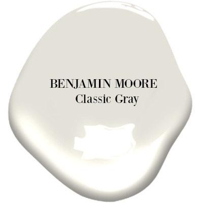
Benjamin Moore CLASSIC GRAY
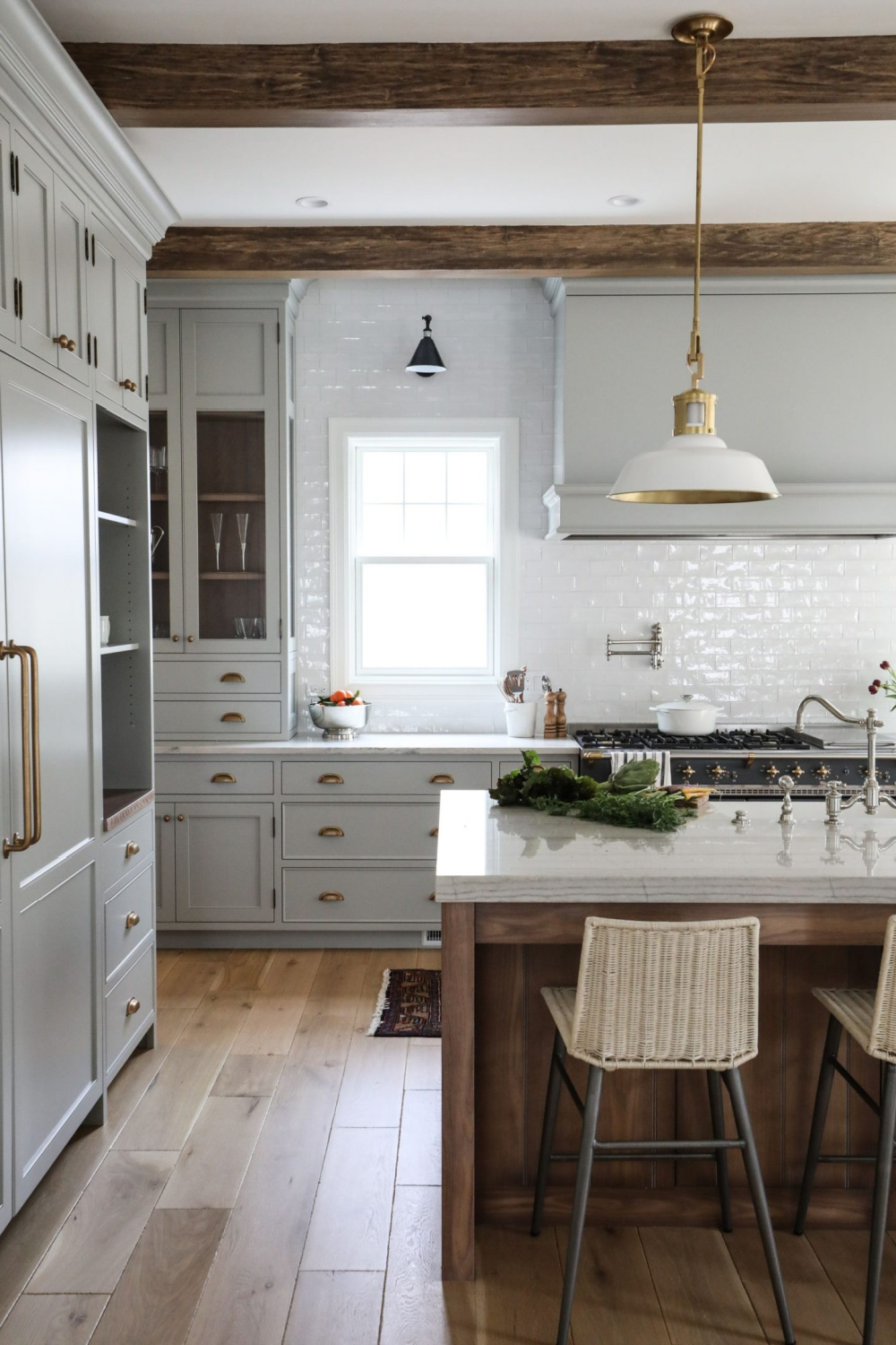
Here’s another grey color painted cabinet possibility. BM Classic Gray is very similar to the custom color I mixed for our kitchen. Classic Gray is an incredible greyed-white I have used with great success.
Farrow & Ball Lamp Room Gray is another beautiful option for a neutral:
How to Choose the Best White When You’re Nervous About a Mistake
I personally don’t find choosing the best white to be a cake walk. Every project is different. So many choices! Sometimes you know a sample is wrong immediately. Other times, it’s a mystery. When it comes to paint for cabinetry? A tall order since nobody plans to re-paint in a year!
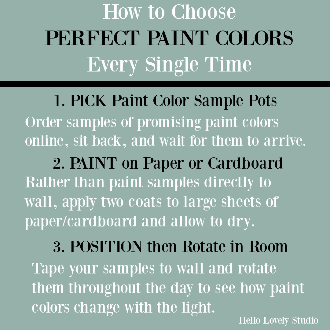
If you’re a DIY type, one of the best ways to give yourself some reassurance is to paint the color you’re leaning toward on just one piece of furniture or an extra door front. Live with it, see how the color changes through the day as the light changes, and then decide whether it’s the one.
It’s also easy to score curb-side finds and FB Marketplace bargains should you need an old piece for experimentation.
If you paint the island first, this may also give you an idea of whether you might want a two-tone design for your kitchen. For example, a warm white or light putty or muted grey on the island with crisp white cabinets for uppers.
More Kitchen Resources to Consider
Ready to order samples of a few of these? Go here to Samplize to have them delivered directly to your door.
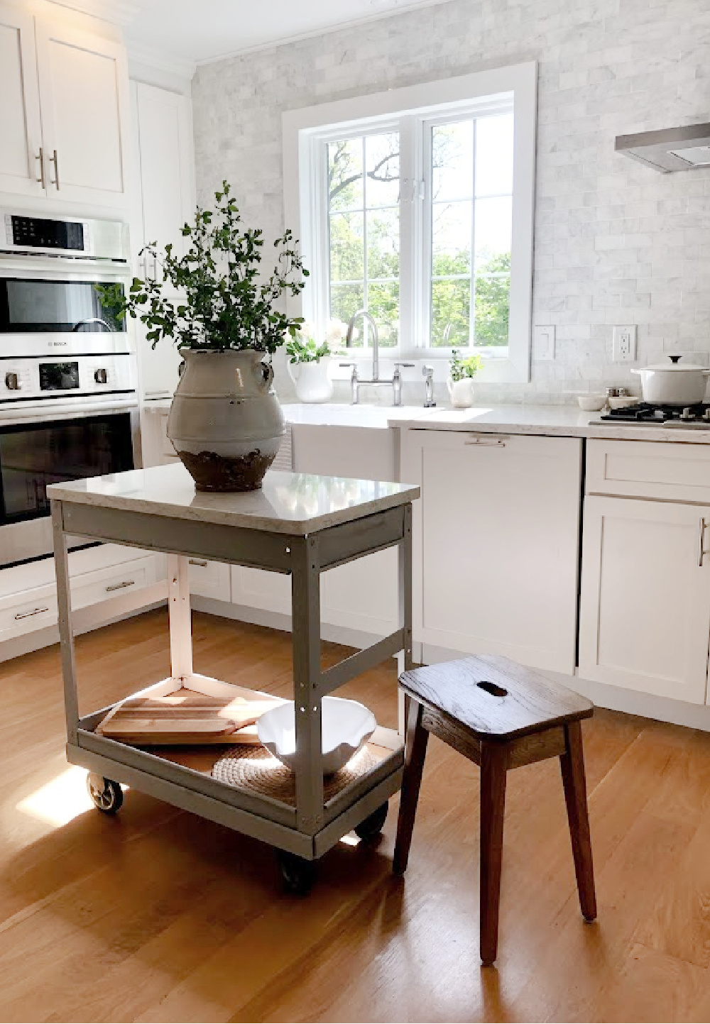
If you love neutrals and white, please peek at these decorating resources that may appeal:
Peace to you right where you are.
-michele
I independently selected products in this post—if you buy from one of my links, I may earn a commission.
Thanks for shopping RIGHT HERE to keep decor inspiration flowing on Hello Lovely!
Hello Lovely is a participant in the Amazon Services LLC Associates Program, an affiliate advertising program designed to provide a means for sites to earn fees by linking to Amazon.com and affiliated sites.
