Quieter, Gentler, European Country Color Stories highlights a collection of dreamy interiors to inspire. Many feature rustic details, all are gently elegant, and a lovely subdued palette seems to connect them. We explored trending paint colors recently, and while the prospect of saturated colors can be a fun diversion now and then, my tolerance for bold colors remains low. Give me whispery, faded from time, soothing, natural neutrals that aren’t vying for attention and leave plenty of oxygen in the room. (Fine. I know that isn’t the science, but I can’t breathe when things get too moody or dark.) Let me breathe in sunny settings with airy backdrops where my senses are soothed, not challenged or assaulted. This English country cottage for example! I hope these European country inspired glimpses soothe you too.
Quieter, Gentler, European Country Color Stories
These European countryside interiors with gentle color palettes are from homes both grand and tiny.
Some are rustic cottages, and others are elegant manors. Many mix modern and Old World.
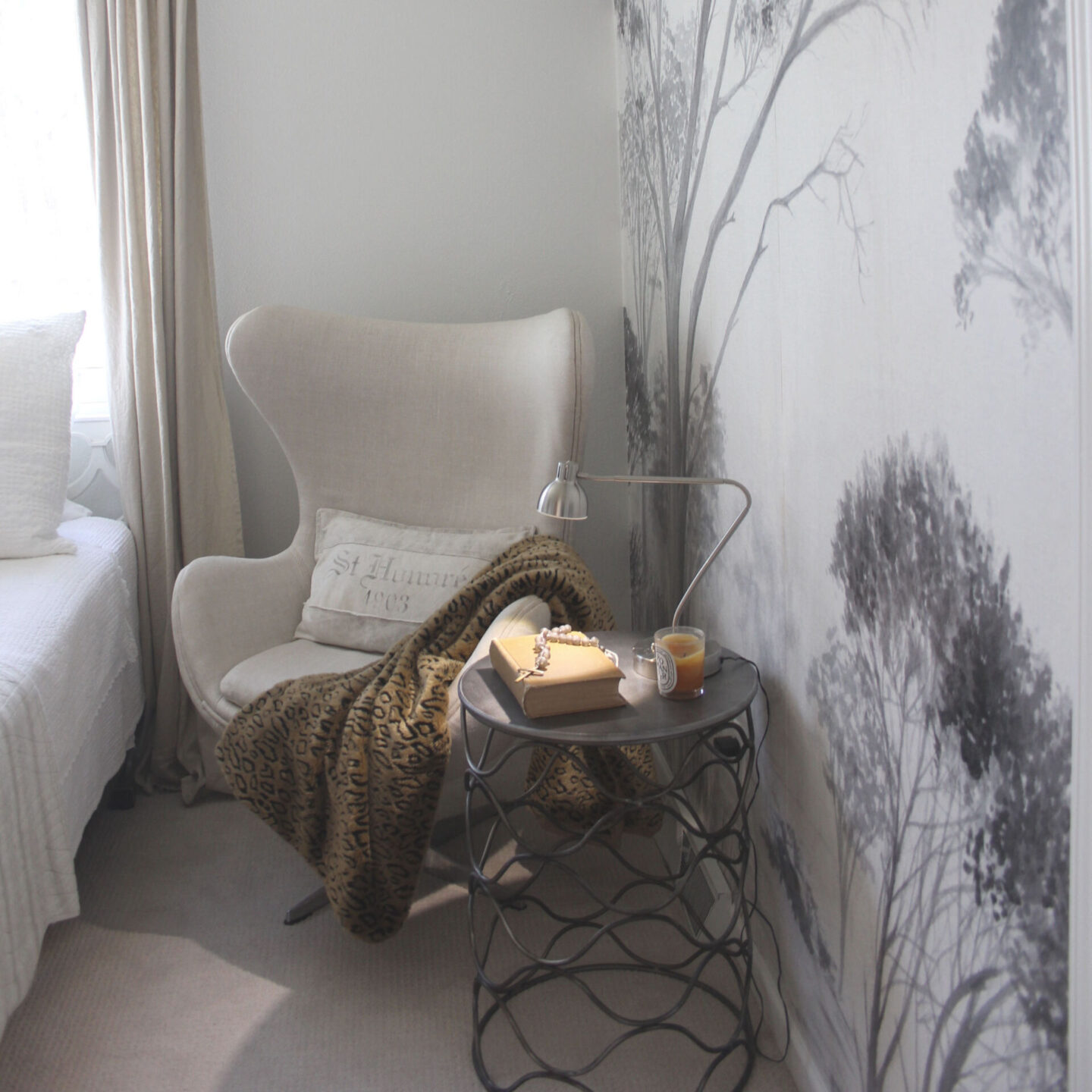
What stands out? Timeless loveliness. Followers of my FB page fell hard for this space:
And understandably so!
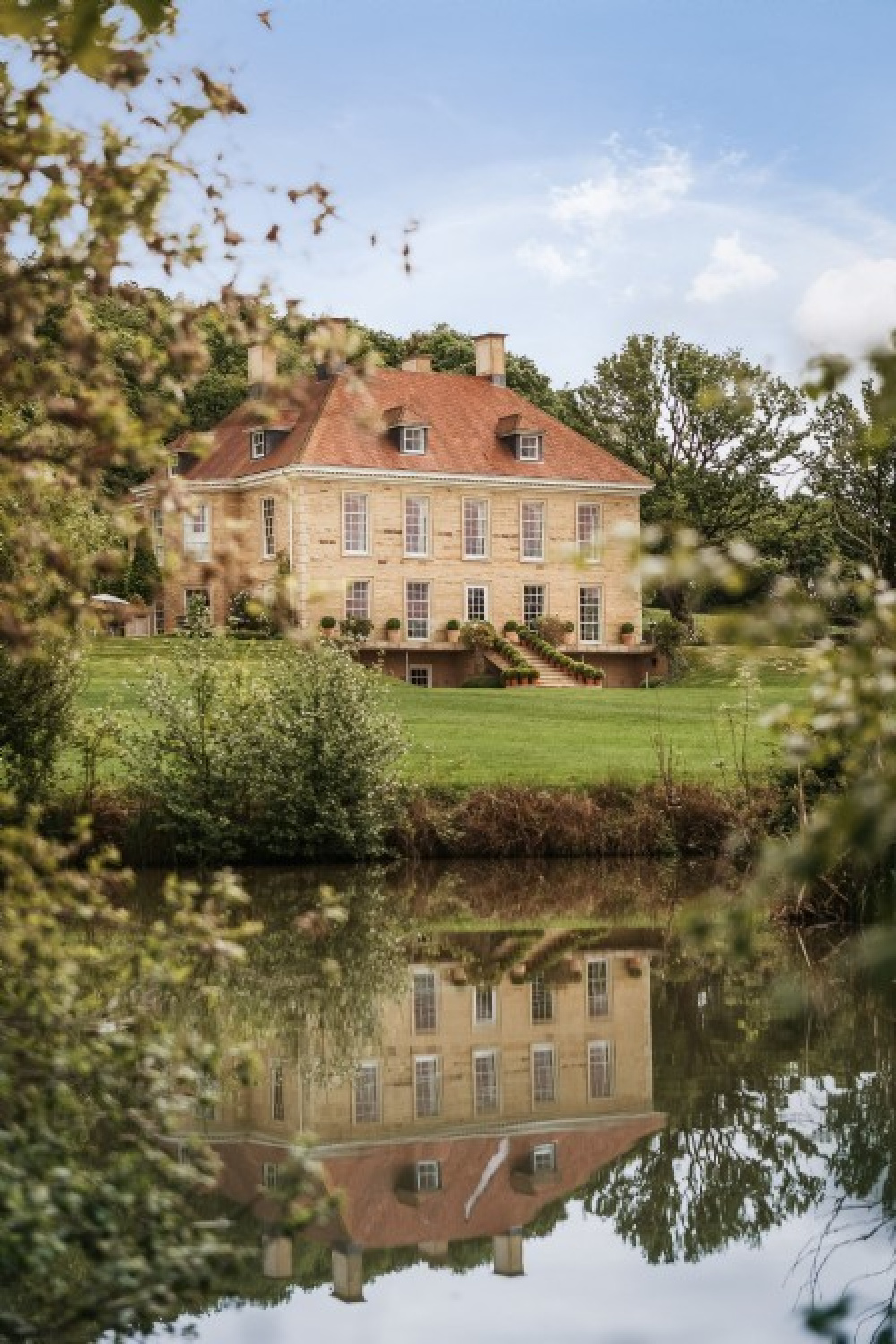
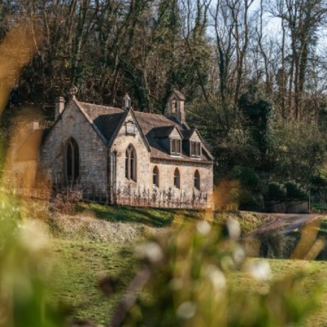
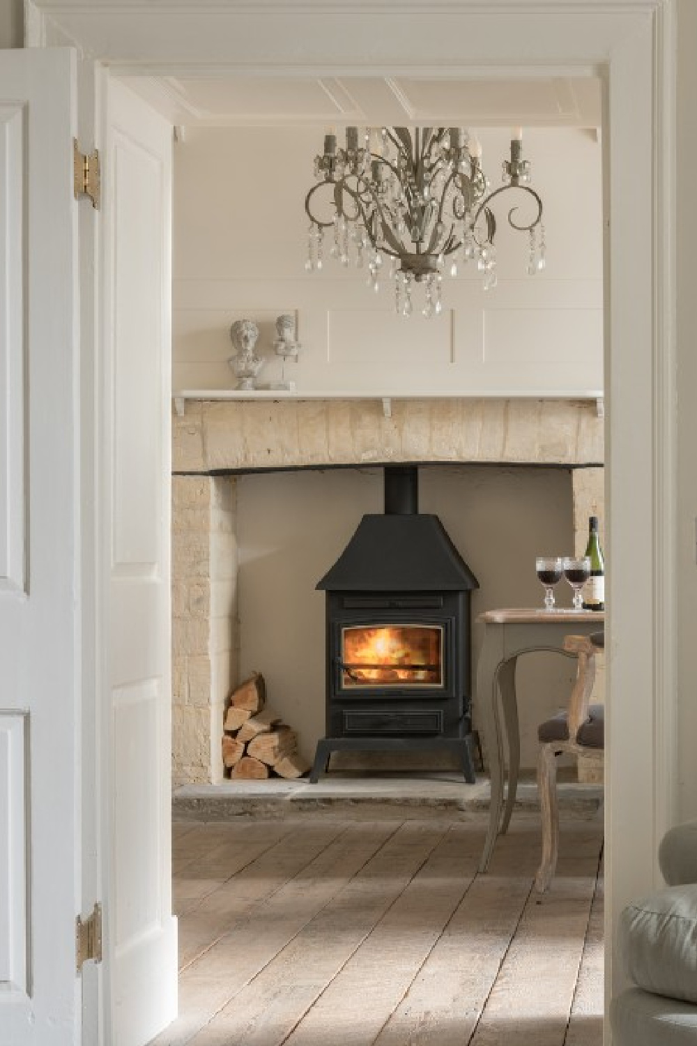
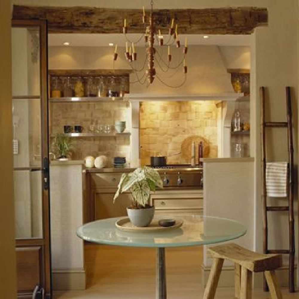
I Remain Obsessed with Cotswold Cottage Holiday Rentals!
Don’t we need to stay here?
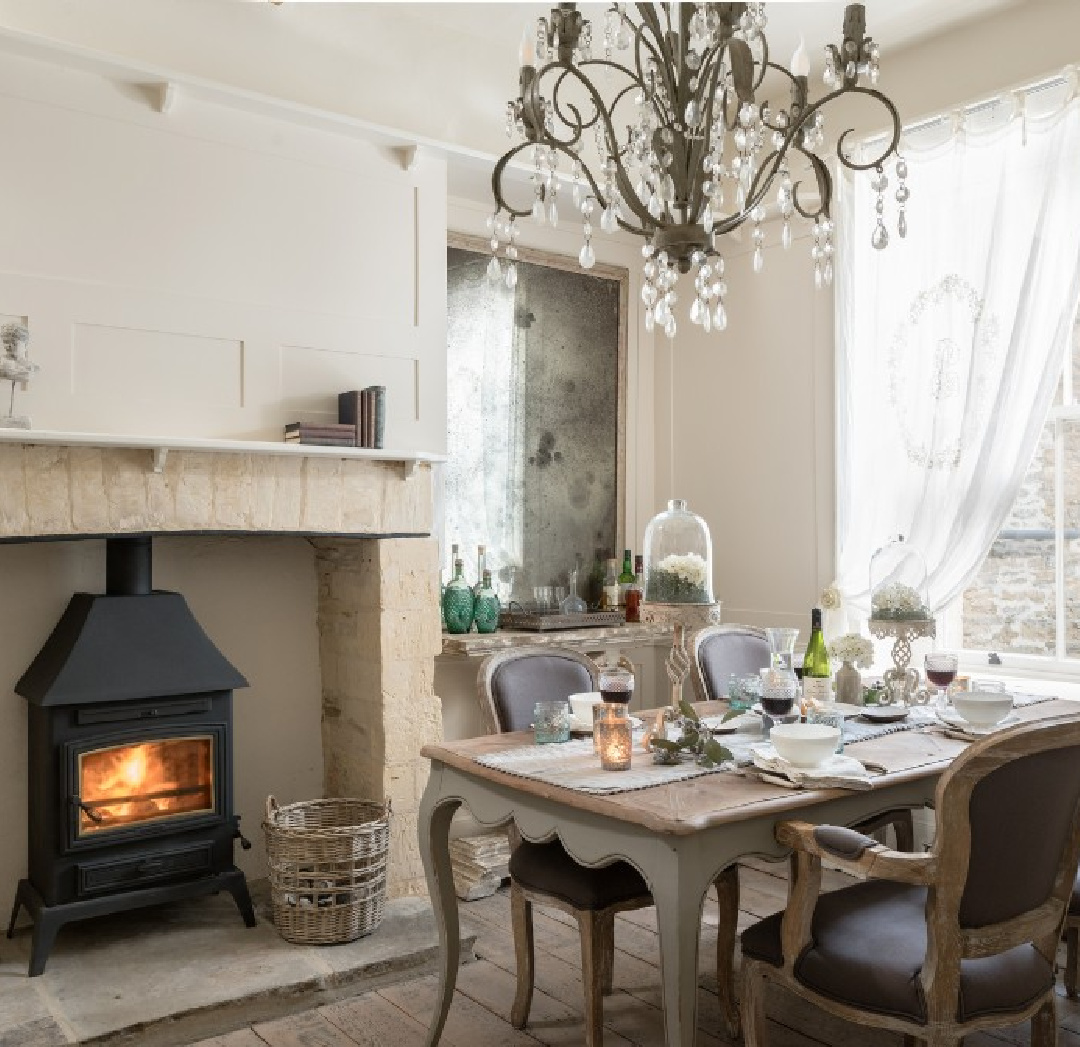
There are so many lovely alternatives, I wonder how one even chooses a cottage for vacation.
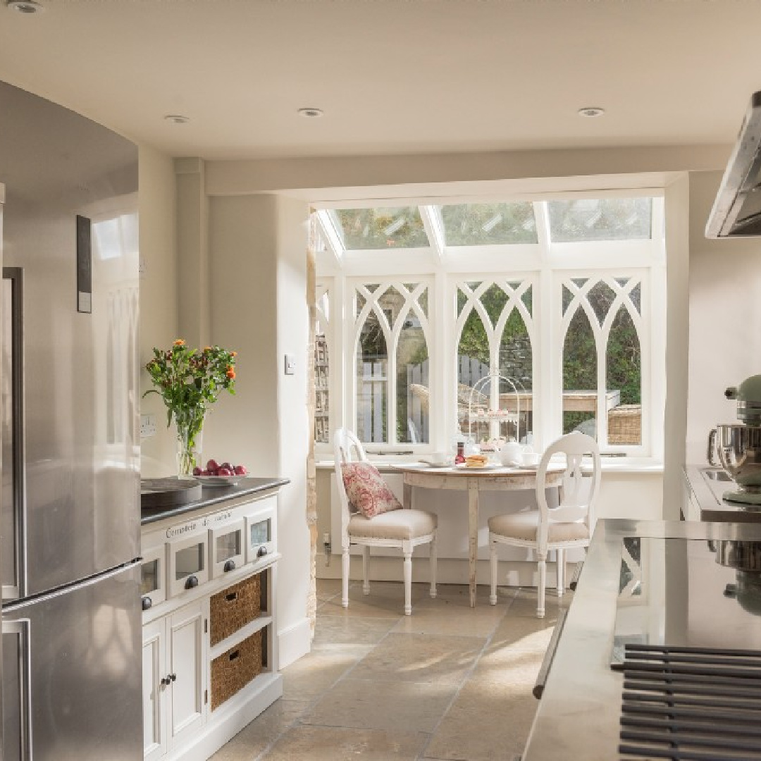
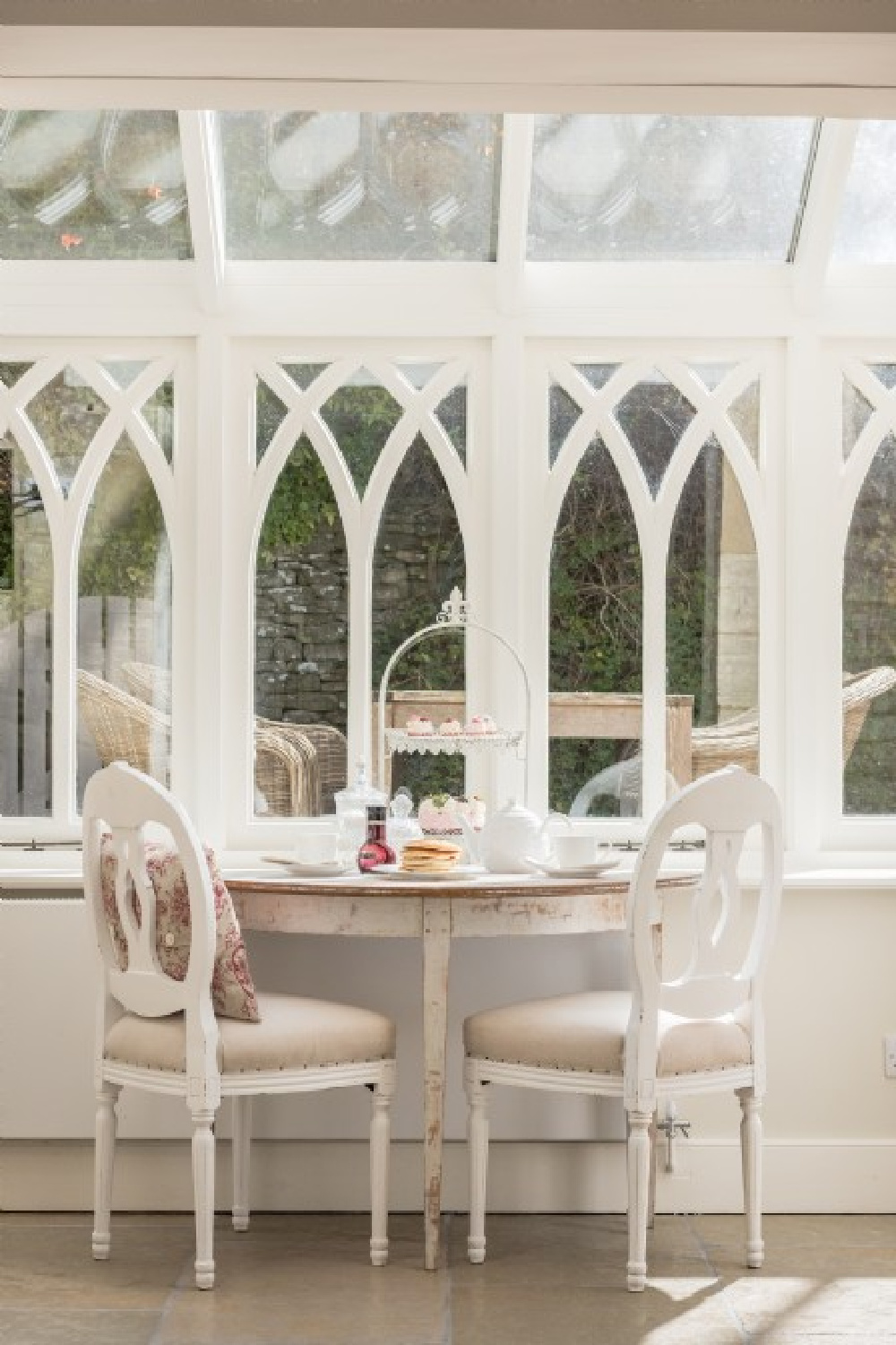
And I bet it is hard to say goodbye and return home when the breakfast nook in the kitchen is this lovely:
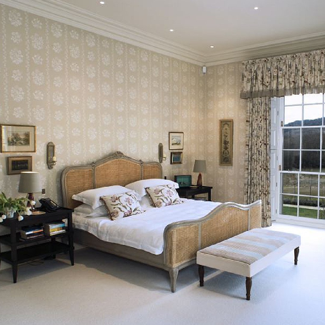
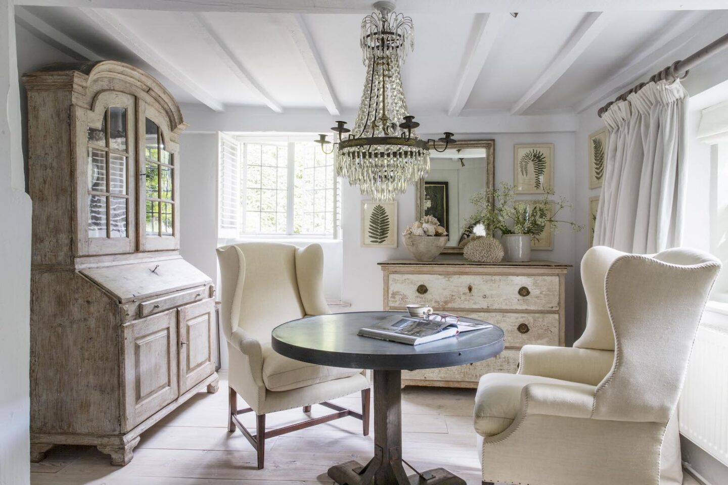
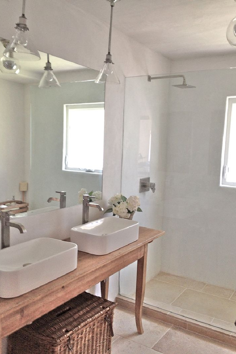
Anton & K’s Beautiful Home With Swedish Antiques
A single image can say so much, yes? I wish this was a holiday rental!
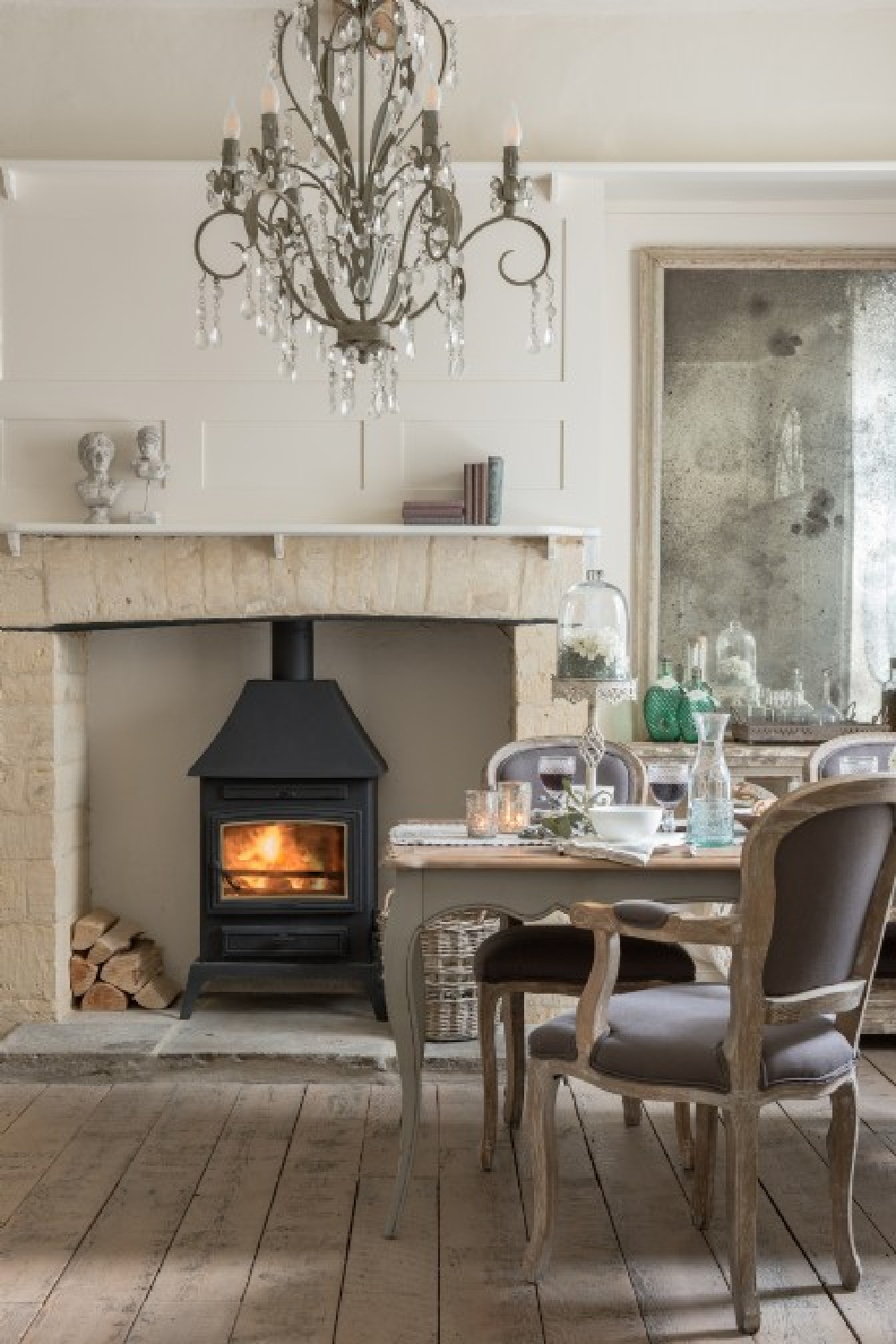
Yet we’re hardly settling if we end up here:
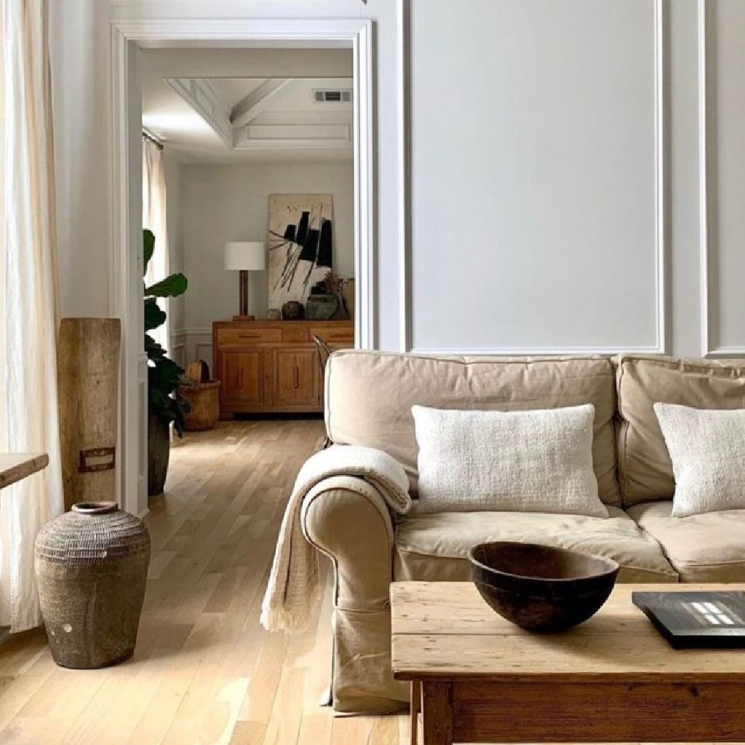
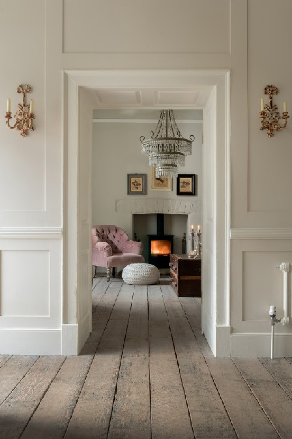
Sophisticated Simplicity
I have learned so much about the color stories that feel most comforting to me by observing the work the Giannettis do for clients and their own properties.
There is always a gentle quality to the palettes, and colors come from natural materials such as limestone and white oak.
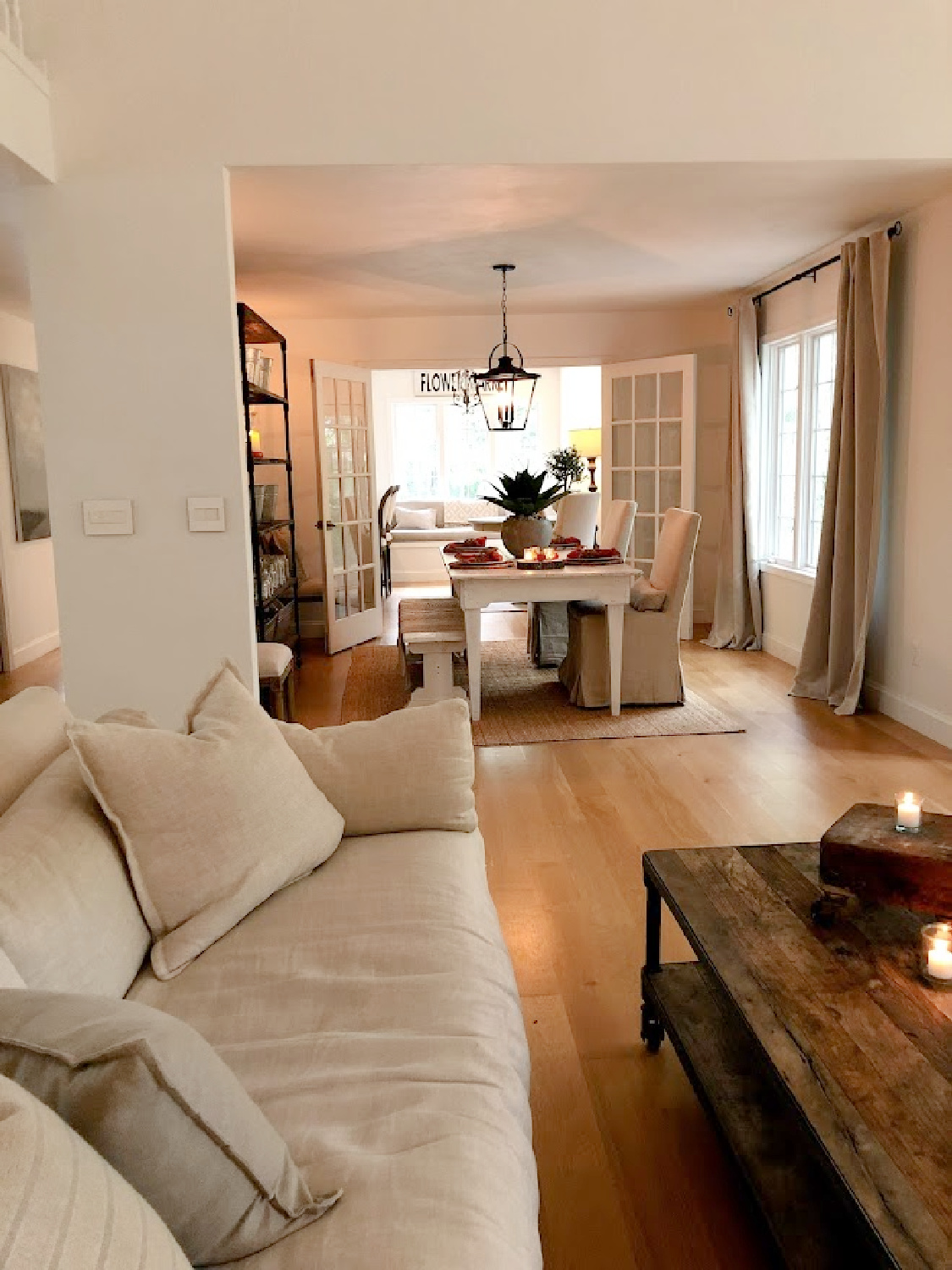
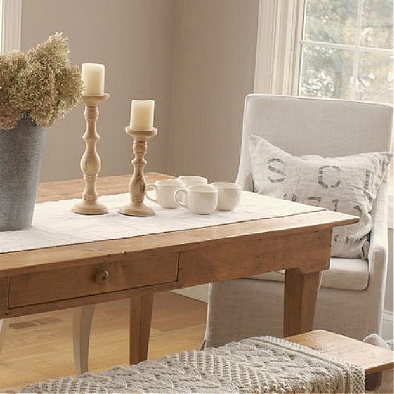
The cozy dining area with all its low contrast and chalky pale colors has me dreaming of what we could do with our lower level here at the Georgian someday.
Right now, it is a blank canvas, flooded with light as it has full exposure and French doors leading to our backyard.
The possibilities inspired by color stories here are exciting to consider.
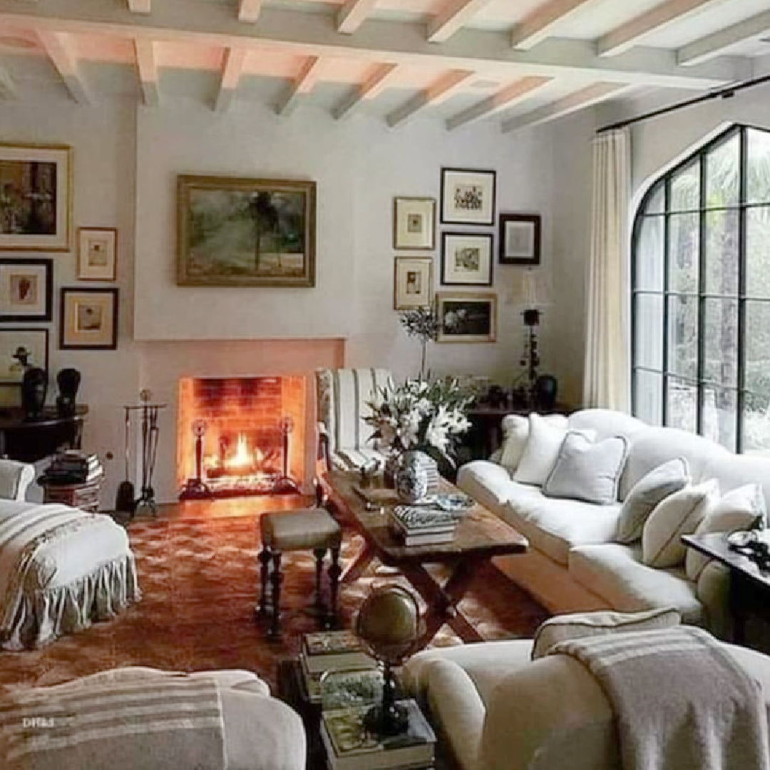
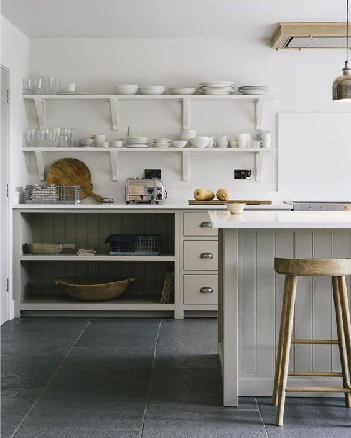
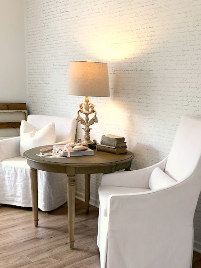
Understated Colors & Unfussy Design Finishes
Have you watched deVOL’s television show yet?
I have been too absorbed in my own renovation projects and day to day small business work to indulge yet, but it’s on my list!
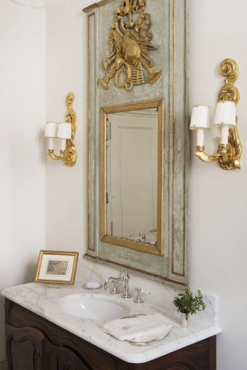
Ooooh, I would love a dusty rose velvet moment in a space with such a gentle backdrop colorwise.
I found a similar gilded mirror like this one in a bath by Brooke Giannetti and have yet to hang it as I can’t decide!
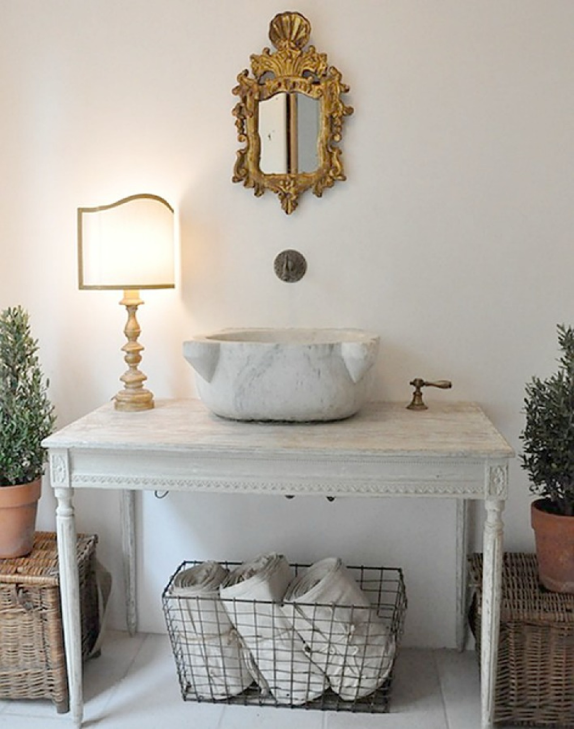
It looks good everywhere, and we know how I like to take my own sweet time!
Pamela Pierce’s eye for color has kept me enchanted for many years. There’s always so much depth and soul in her designs.
French Country Romantic Color Stories
What magic comes when soft lavender accents join the gentle neutrals.
Considering a gentle lavender in your own home? Check out this story which mentions an icy color called New Age.
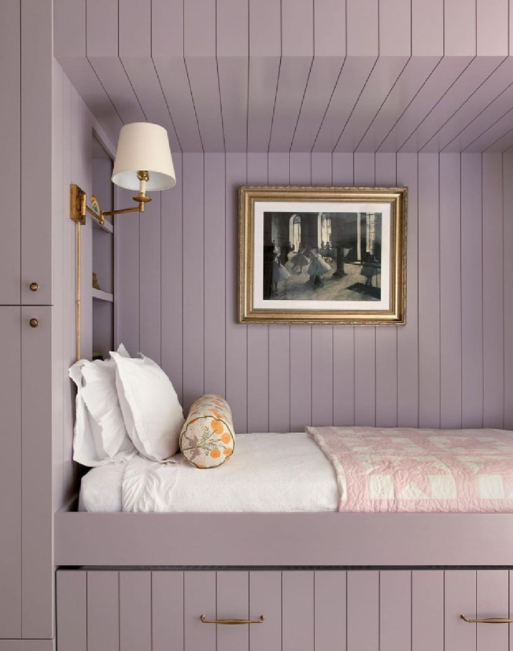
Tone on tone is boring? Mais non.
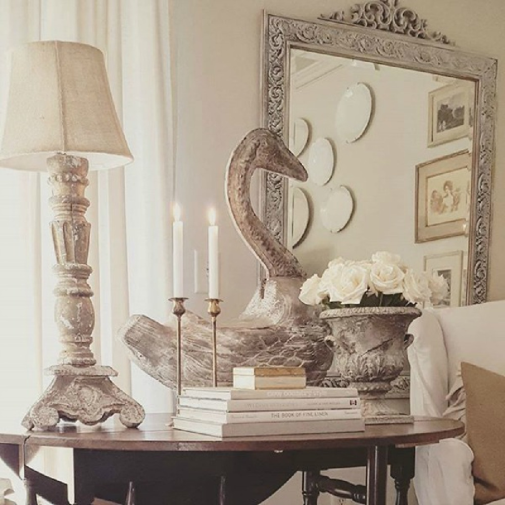
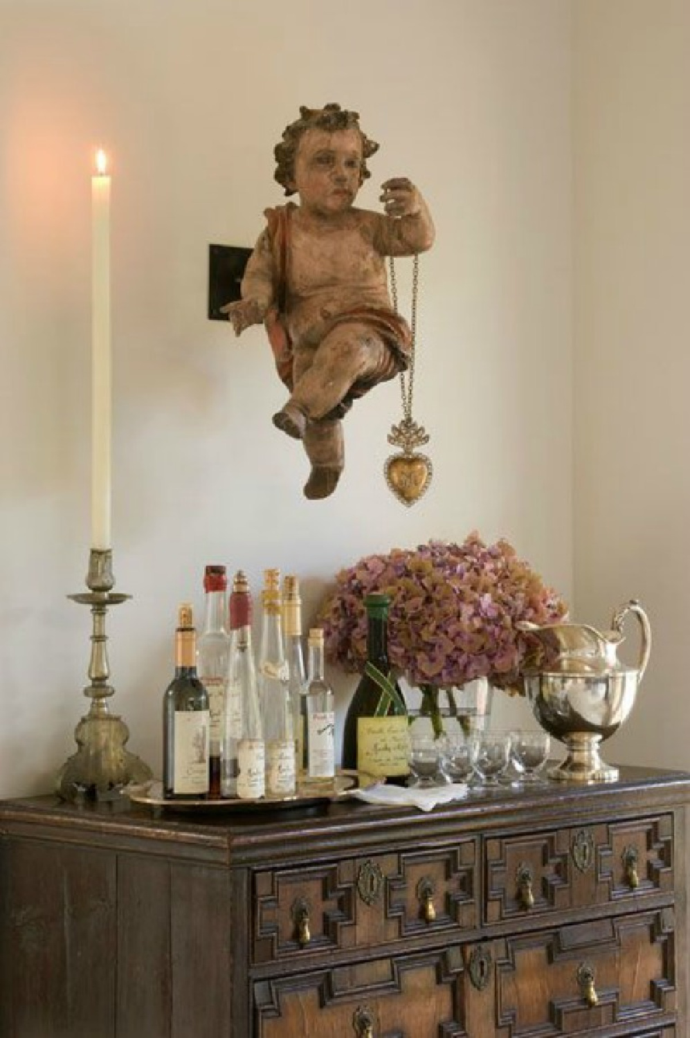
When Gold Joins the Mix
I’m not sure I understood gilded touches and the beauty of living with tumbled brass and gold tones until this past year.
I feel right at home with it now, and I’m no longer afraid of mixing metals. Someday, I’ll do a whole post on the gilded iron chandelier in the kitchen which inspired everything else.
Don’t you love it when you have a clear guidepost to jumpstart the whole color story?
When Intuition & Self-Awareness Guide Your Color Stories
When you’re after a design plan that feels like home and a reflection of your sensibilities, trusting your intuition becomes critical.
You may not know everything you need or want, but you probably have clear ideas about what you DON’T want.
That’s great information to help you narrow down the direction.
Trusting your gut is far different than attaching to ideas of perfection. It is about pleasing yourself and letting go of ideas about how others might assess your design.
Even “mistakes” can be easily forgiven when you decorate with the proper plenty-generous-to-yourself mindset. If a color combination I end up with feels a little “off” or quirky, I’ll sometimes think “how very French of me.”
Similarly, you can adopt a playful spirit when it comes to scale if the quirky surprise of it all makes you smile. There are a million interpretations of gentle, neutral colorstories and Euro-influenced country style. Here are some ideas that may appeal…beginning with a fantasy home with modern Euro style:
I independently selected products in this post—if you buy from one of my links, I may earn a commission.
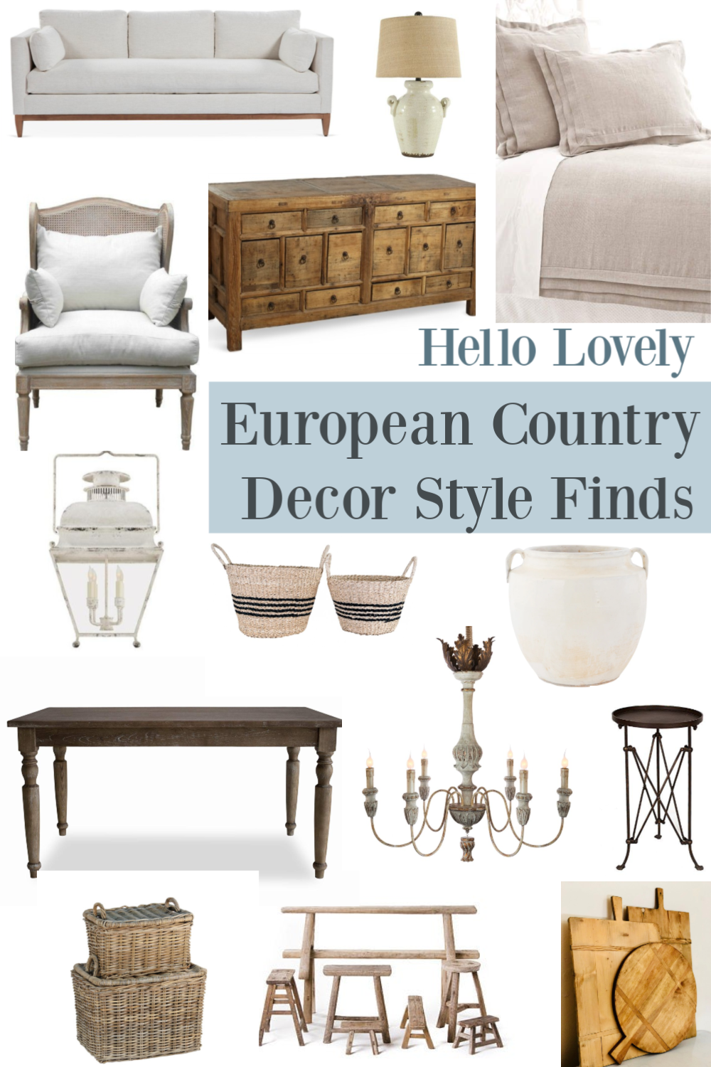
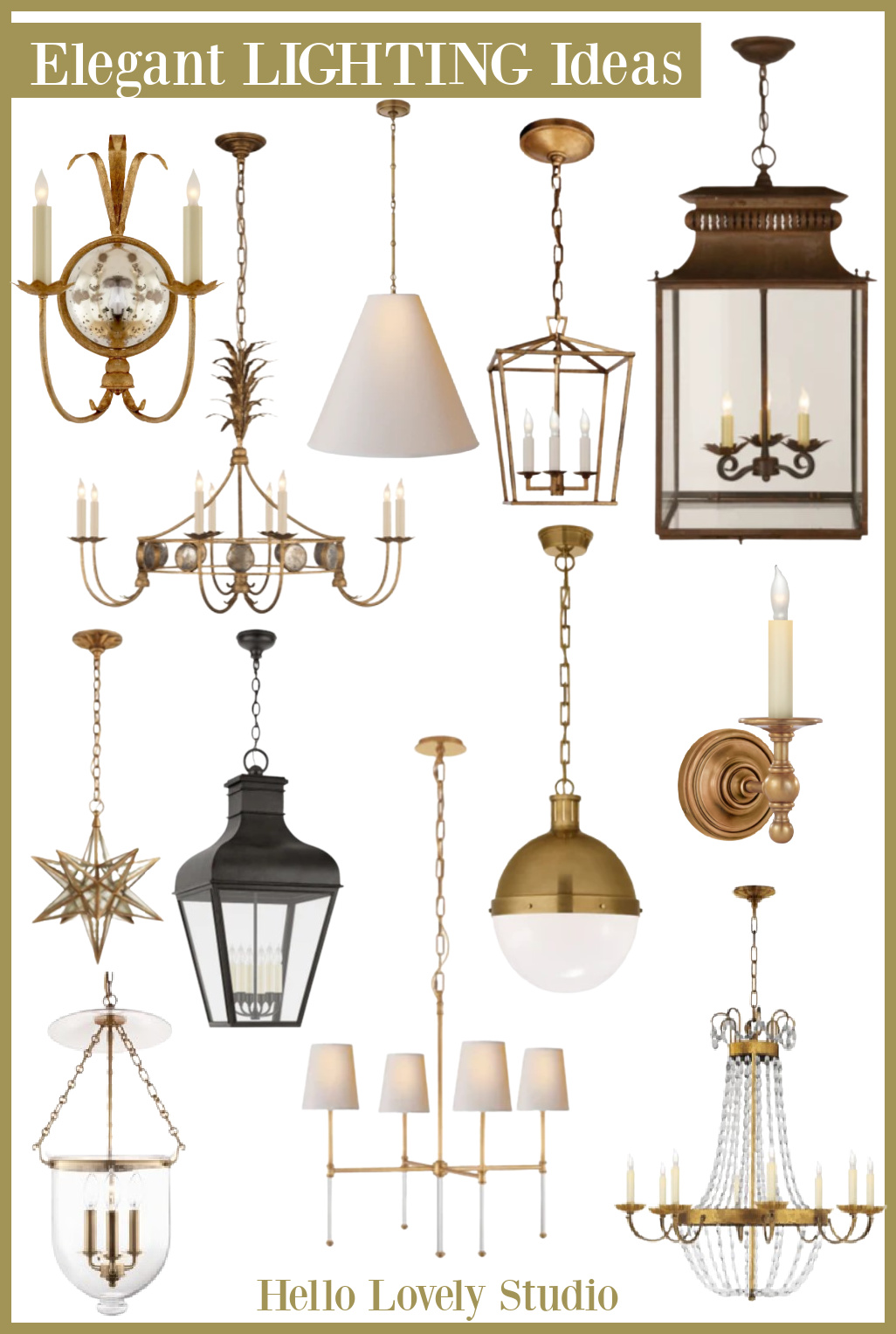
Euro Country Inspired Finds
Gwyneth found reclaimed materials and antiques from Chateau Domingue. But when the budget is less bougie, we still have FB Marketplace, Goodwill eBay, and mom’s basement for vintage and antique pieces!
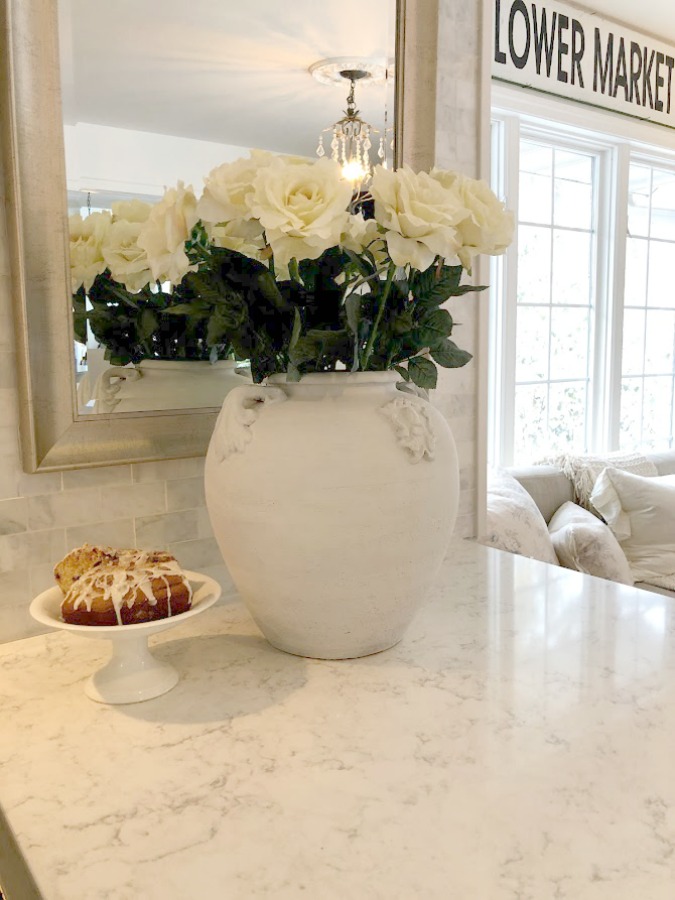
Chalky, Warm, & Muddy Greens
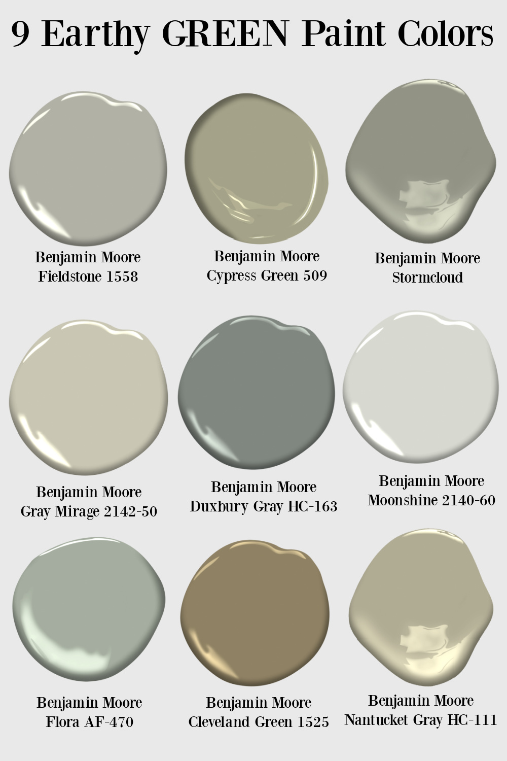
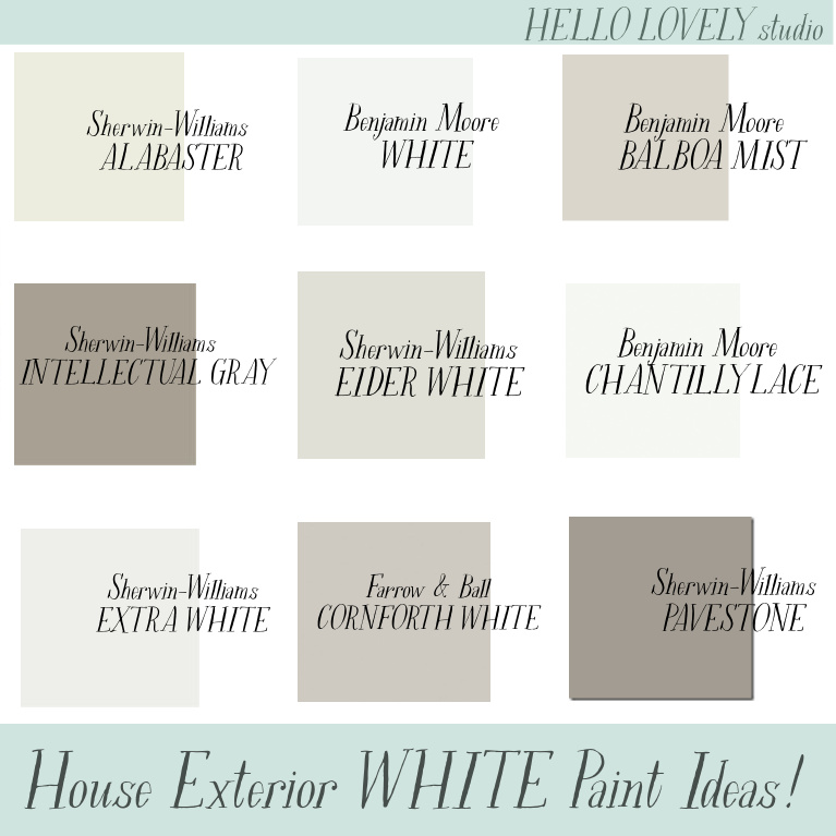
Neutral Paint Colors to Sample
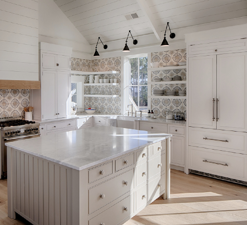
Sometimes just the name of a paint color will entice me enough to sample it…ever tried Pashmina?
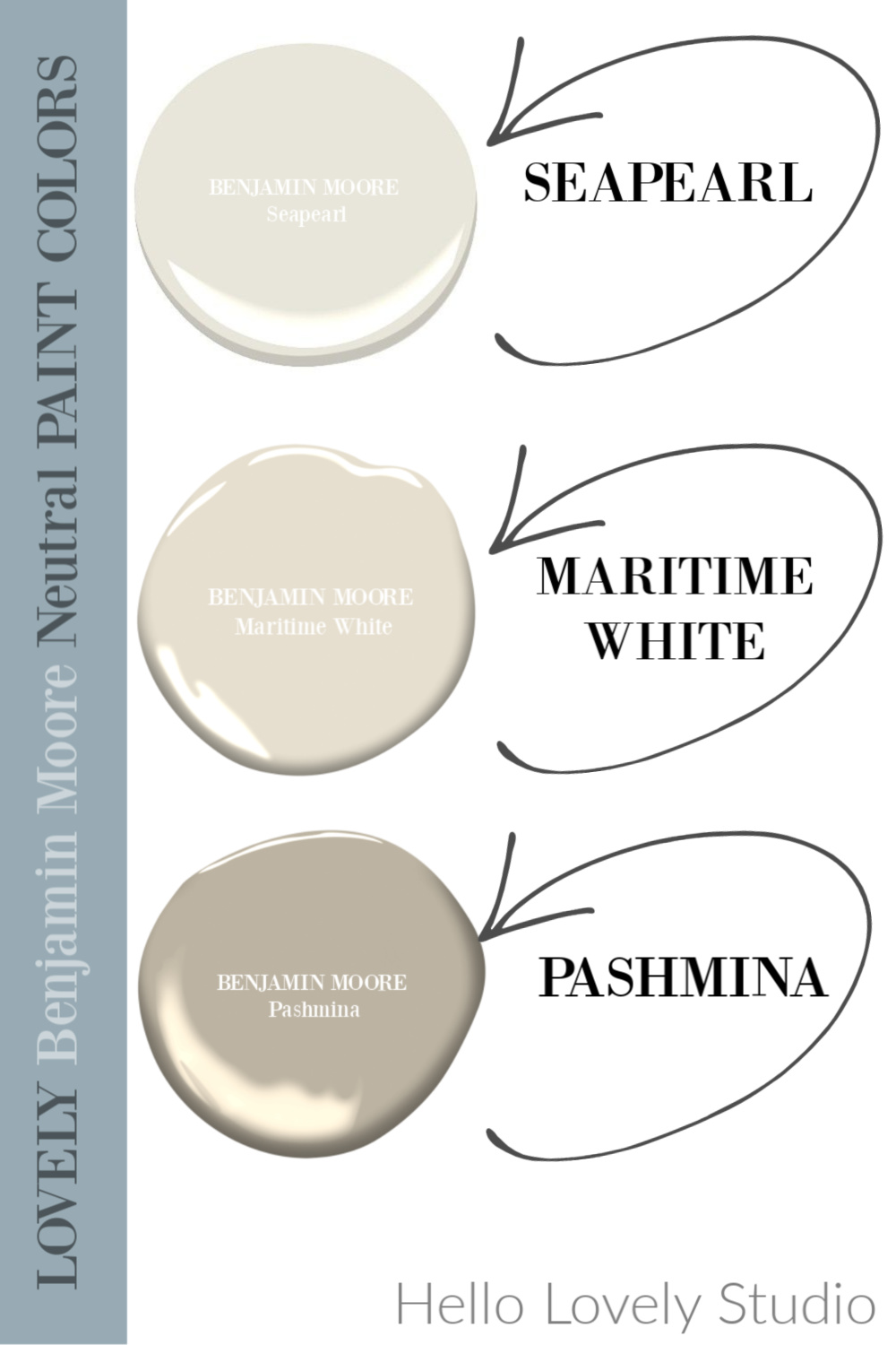
Here it is looking subtle on an island in a beautiful Palmetto Bluff cottage:
More Natural Colors to Try Inside or Out
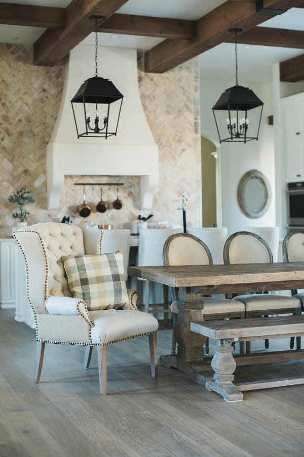
Add a Bit of Contrast With Metals, Iron or Black
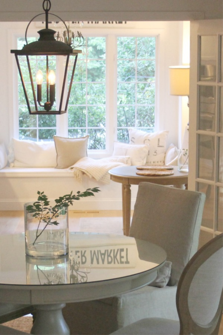
Remembering My Breakfast Nook in Our French Country Home
When we first built our French home, I had all of the interiors painted Benjamin Moore White Sand. After a couple of years, I wanted a change in the kitchen and after seeing this color at Dream Home Chicago, knew I would love it: Benjamin Moore Ashley Gray.
Our kitchen was HUGE so there was a sea of warm white cabinetry and quartz grounding the complex grey.
Living with that color story of warm golden wood tones with cooler greys sold me! In our present home, I love the rich mix of warm neutrals with cool white as well as warm gold with cool grey.
Hope this collection of gentle color stories and random inspired an idea or two to enhance your own plans. I love hearing from you…let me know what state you are commenting from!
Peace to you right where you are.
-michele
I independently selected products in this post—if you buy from one of my links, I may earn a commission.
Thanks for shopping RIGHT HERE to keep decor inspiration flowing on Hello Lovely!
Hello Lovely is a participant in the Amazon Services LLC Associates Program, an affiliate advertising program designed to provide a means for sites to earn fees by linking to Amazon.com and affiliated sites.


From the great state of Alabamy! Haha! I also recently found a small gilded mirror @ a thrift store for $3 and immediately thought of the Gianetti’s master bedroom where they hung one over the bed. I’m considering swapping out our small cross for the mirror over our master bed as well, but like you, I also like to take my sweet little time figuring out where to put things. So alas, the mirror remains unhung @ the moment! And I agree TOTALLY with you on mixing metals. So much more interesting than being matchy matchy! Throughout our home I’ve used polished nickel (one of my favs!) brushed nickel, brushed bronze, vibrant brushed bronze, matte black, and chrome all with oil rubbed bronze door hardware. And within one room I’ve mixed several finishes which I think is so inviting. Three years later, I’m so glad I did and thoroughly enjoy all of them! I say the more the merrier!
Author
Thanks for reading, Alabama! What a find, Amy! Makes me want to head to the thrift store immediately. Hahahaha. Oh, polished nickel. Once you live with it, you just fall in love with it, don’t you think? Just got the new polished nickel bath faucets in mail and can’t wait until it’s time to install them. Re-doing this bath may kill us, and every single step of the way, we wonder if it will look right when it’s done since we take it layer by layer. I honestly could not even picture this one done because I have visual spatial limitations, and the shape of the room is beyond quirky and undesirable. Some days we think: let’s stay forever and others we’re like “if we pack now…” We’re too old for surprises and hiccups! 🙂 The mixing of metals is a subtle way to keep things feeling collected rather than done at once or like a showroom. 🙂
I can’t wait to see the bathroom once it’s completed & so happy you love polished nickel as well. Can’t wait to see the fixtures you picked out. Y’all are masters @ this and ones who persevere through all the mess to the end! And your reward will be not only a fantastical new bathroom to enjoy, but a great sense of accomplishment for all your hard work & time invested!! Carry on!! 🤗
Author
Oh, I hope it comes together, Amy. Thanks for those affirmations. It is one thing to decorate a room you can style pretty for a blog and quite another to create a bath where function comes first and you hope it looks okay in the end! For example, I prefer sconces to light the sides of the face, but we don’t have enough space on the wall. Our priority is plenty of ADEQUATE light rather than PERFECTLY FLATTERING lighting from gorgeous fixtures. The area on the ceiling where I may have been able to install a pretty chandelier? Husband needs the existing huge speaker there to remain. Bath remodels entail safety, constraints from what was already there, and livability rather than trappings. And I’m a dreamer who prefers not to compromise! Hahaha. Such compromises are annoying when you’re in the arena and vulnerable to judgment and criticism as a blogger. 🙂
Hahaha! I’m sure all your compromises will be honored and the room will turn out better than you could have imagined EVEN with all the constraints you had to deal with. But I do feel your pain and can only imagine the dilemmas you’re having to face…ugh! But I tell ya…no one would have better insight to battle thru and come out shining on the other side than you!! I’m confident you will have a happy & lovely looking ending to all this!
Author
Thanks, Amy. I am soaking in all of the encouragement – it really does help to feel less alone. 🙂