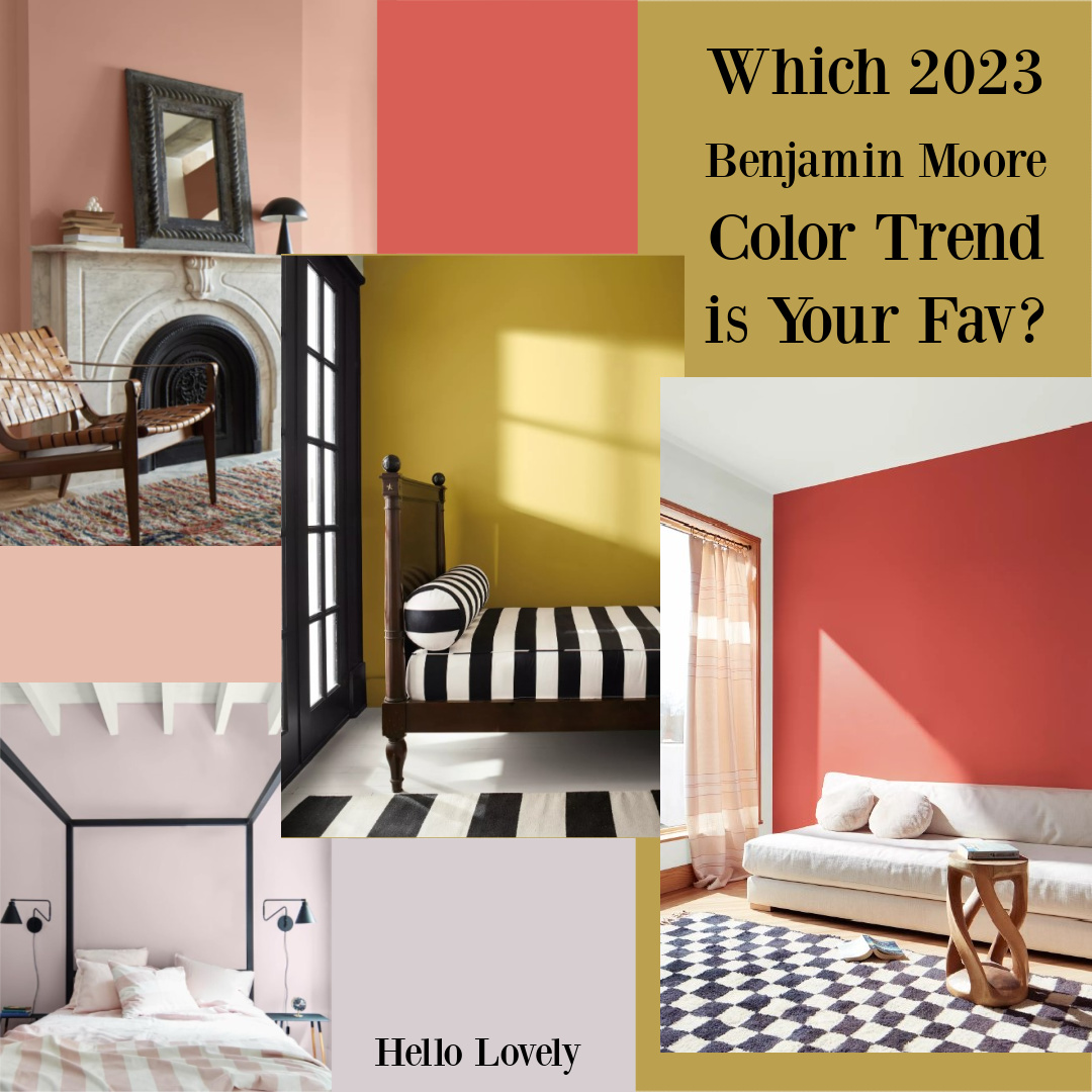
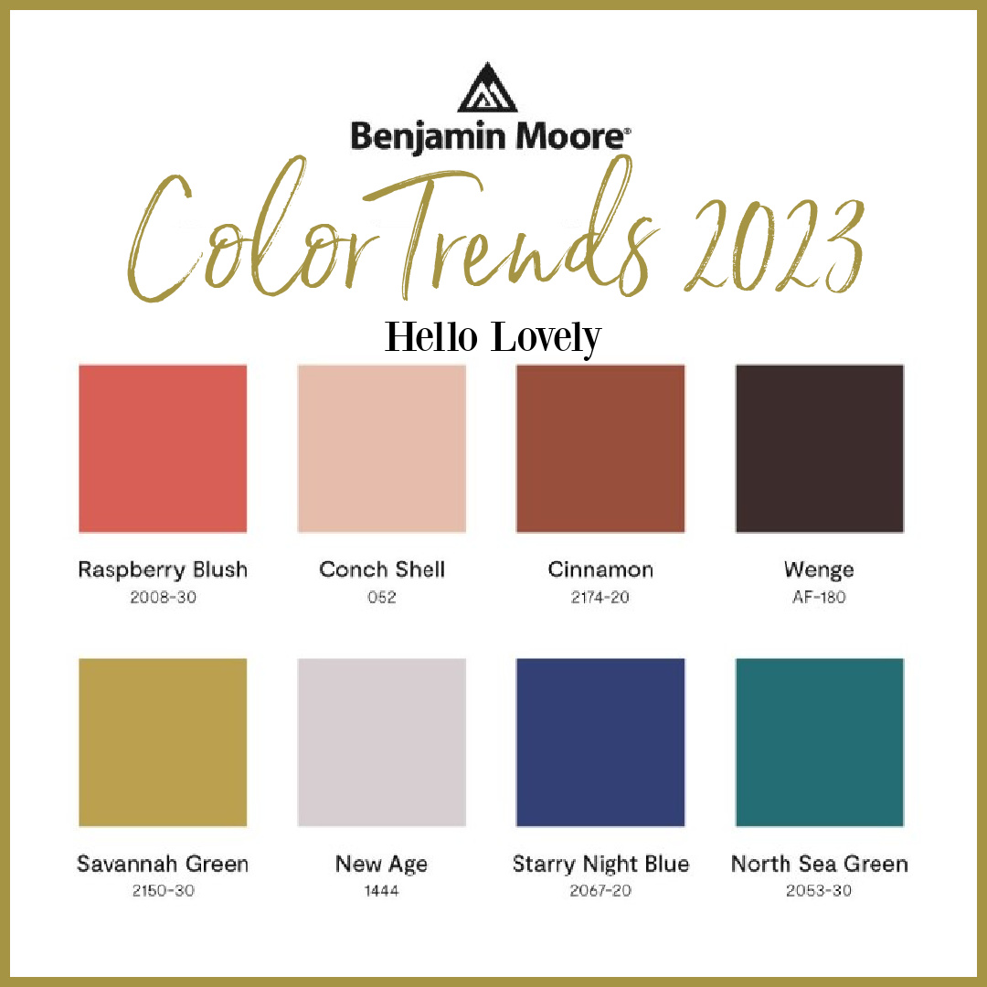
These 2023 Paint Color Trends from Benjamin Moore feature a rather unexpected palette of hues said to be unapologetic and confident. We’ll look at four colors in depth and explore their potential to enhance spaces at home. Am I reaching for any of these colors at the moment? While I’m all about natural, soothing, timeless neutrals, for the right project, two of them hold my interest. Will you be reaching for them?
I independently selected products in this post—if you buy from one of my links, I may earn a commission.
2023 Paint Color Trends from Benjamin Moore
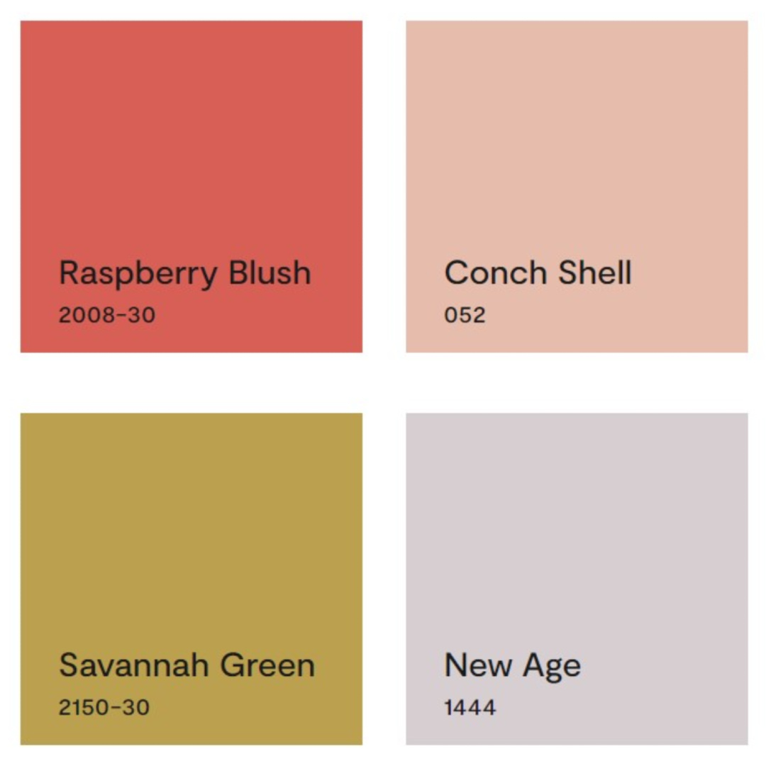
Benjamin Moore’s 2023 Color of the Year: RASPBERRY BLUSH
“Never a backdrop, Raspberry Blush is the definition of charismatic color. This unapologetic shade of red orange had us thinking: bold, bolder, boldest. This sentiment flows through the rest of the palette as we immerse ourselves in hues that make a statement. Inspired by an artist’s desire to communicate through color, shape, and sound, Color Trends 2023 was built to envelop you in vivacious color.” – BENJAMIN MOORE
Does it surprise you that this bold appetizing hue is in the number one spot?
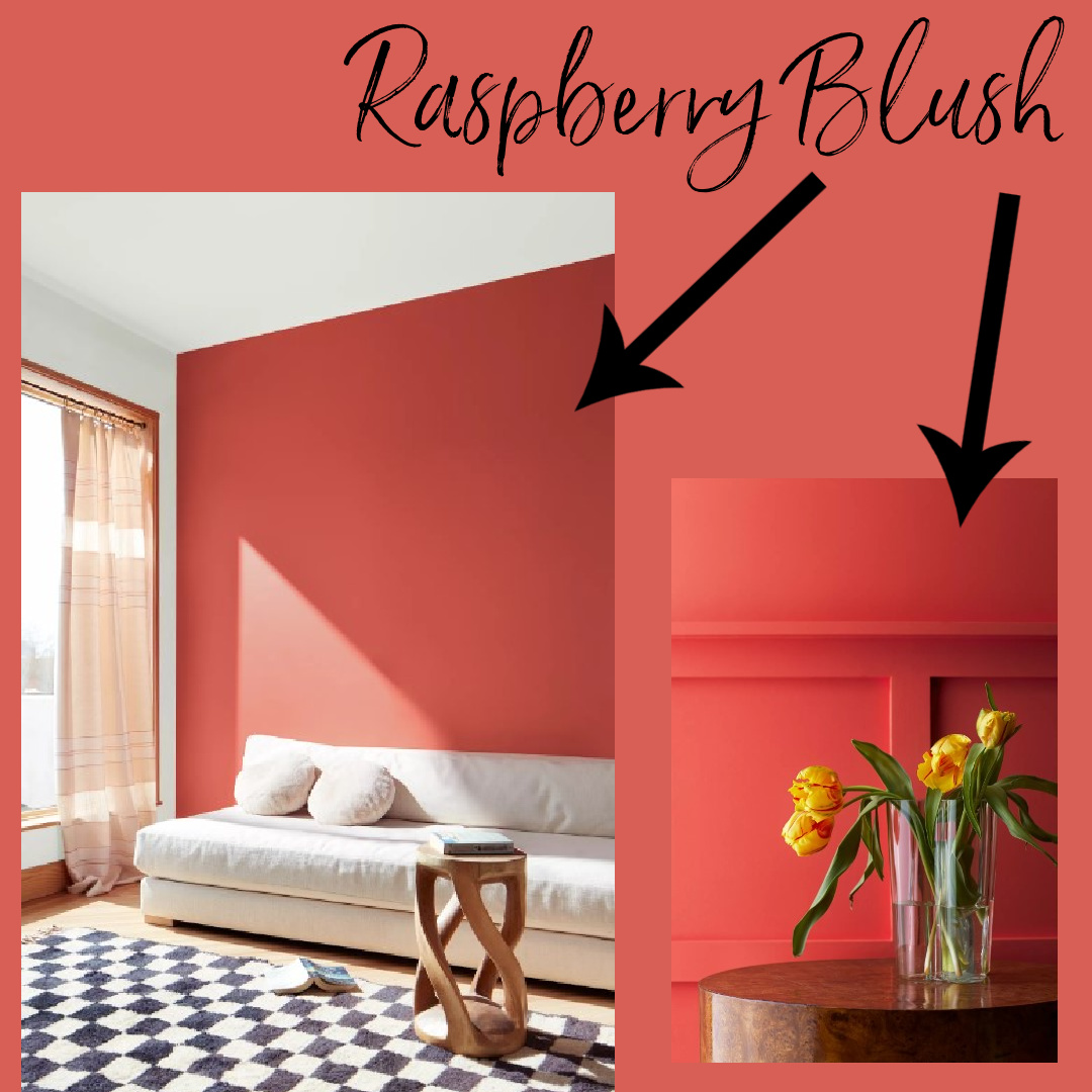
With a light reflectance value (LRV) of 21.12, this richly saturated coral feels very Marie Antoinette blushed cheeks in the parlor with French pastries to me.
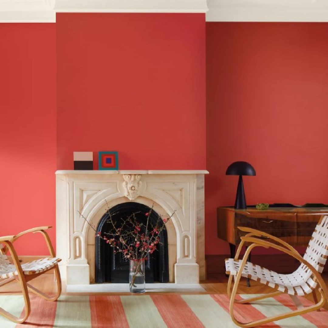
It has been described as “tart” which I think is fair.
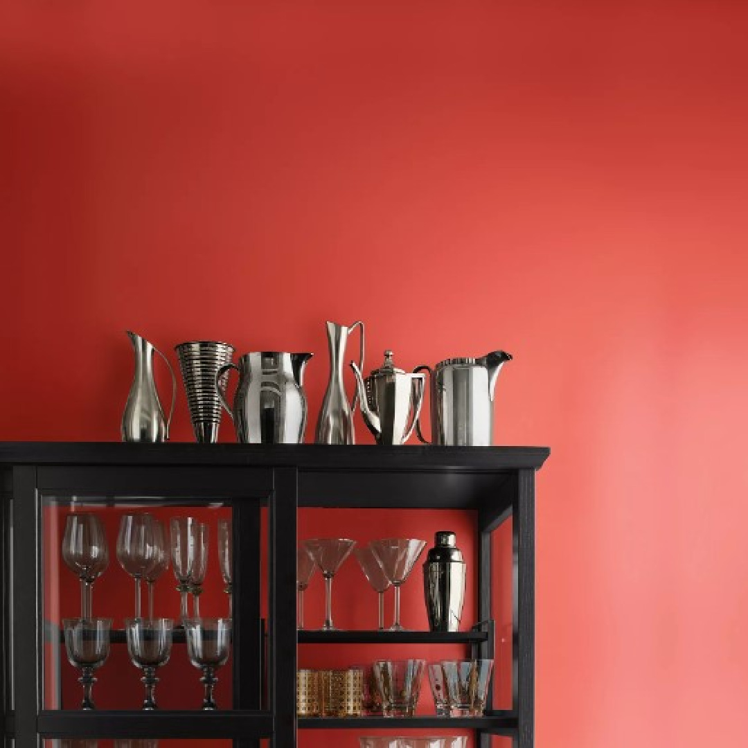
It takes on even more of a Parisian look when paired with black.
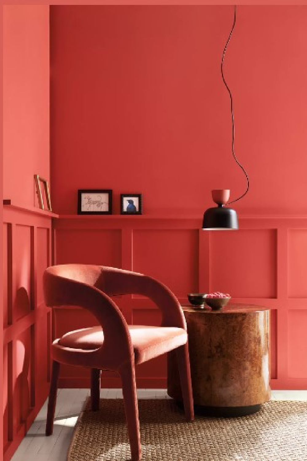
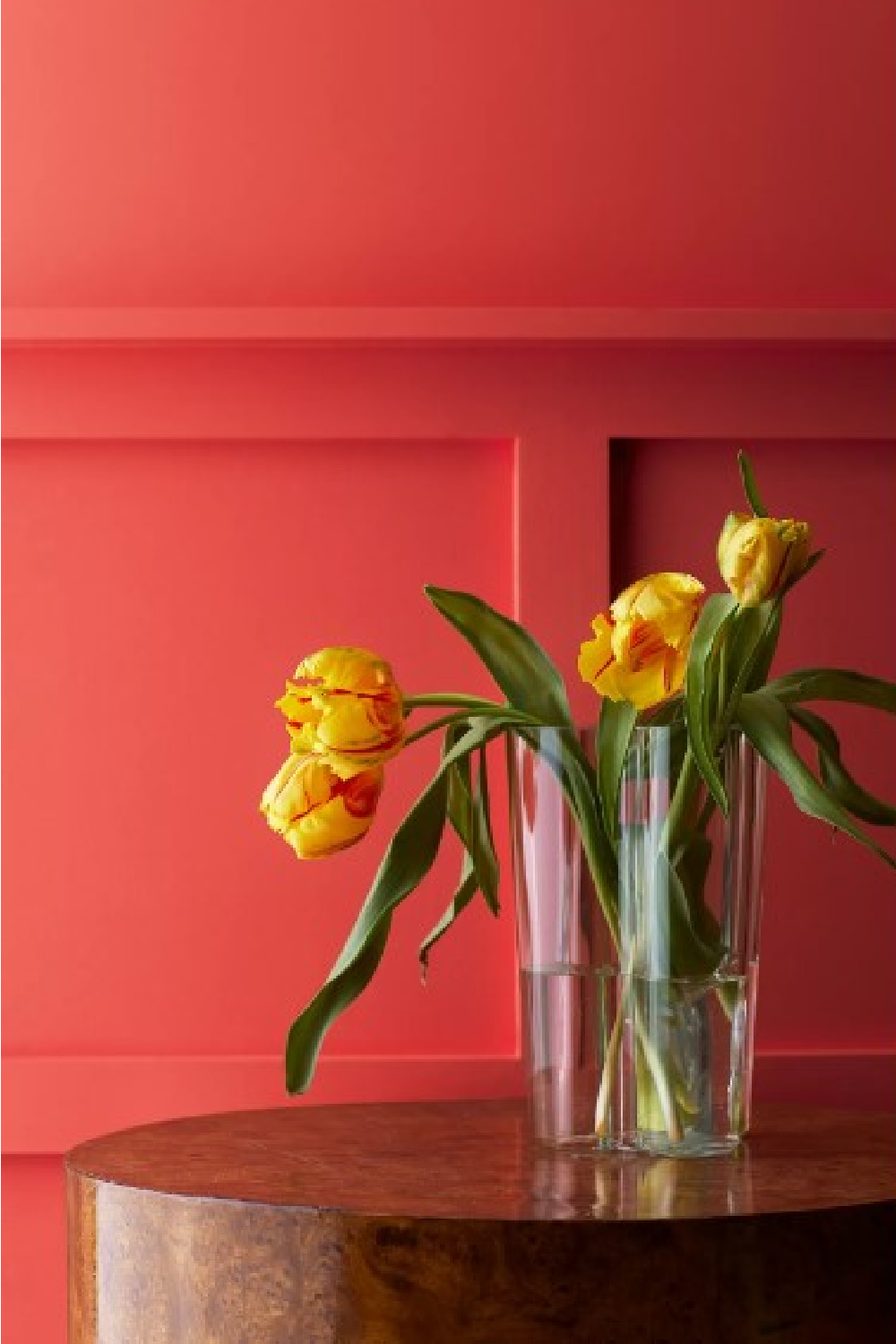
It strikes me as more moody than energetic. This red takes on a more tropical, juicy, delicious flavor when you see it with yellow tulips:
Pantone Color of 2023: Viva Magenta
Does Raspberry Blush bring to mind the boldness of Pantone’s color of the year?
Here’s the hue Pantone says “vibrates with vim and vigor.” Rooted in nature, it is from the red family and reflects strength. Viva Magenta is brave and fearless, and a pulsating color whose exuberance promotes a joyous and optimistic celebration, writing a new narrative.
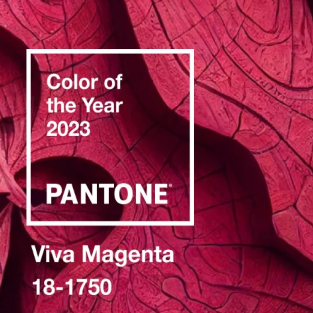
While I can see the passion, beauty, and strength in Viva Magenta, I’m not sure I can get behind its usefulness. A color should be livable as well as lovable, and reds (even pink-y reds) are tricky for me to live with.
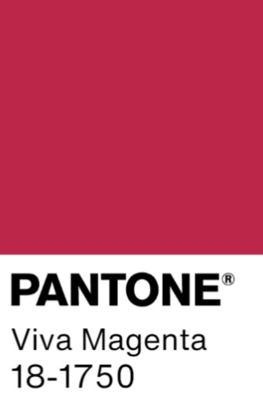
I can imagine it as an accent wall in a kids room if magenta is the favorite color or a powder bath, but for living spaces?
Is Bold the New Black?
Laurie Pressman, vice president of the Pantone Color Institute, told Veranda the desire for bold color in interiors is not arbitrary. “People are using colors in clever ways…It’s all about our desire for creative expression.” She explains that as folks better understand how their surroundings influence mental health, color becomes a tool to creatively enhance “their feelings of joyfulness and well-being.”
You may remember last year’s trending colors seemed to be all about BLUE (periwinkles and azures and beyond) and reflected a yearning for hopefulness and clarity. Years of uncertainty will birth a such a yearning.
This year’s reds with their bold confidence and charisma suggest something different emerging in the culture’s consciousness. New confidence that there is essentially no such thing as certainty? Bold entry into a new worlds of dynamism, spice, and wide awake acceptance?
Conch Shell 052
“A gentle pink reminiscent of sepia tone, this dusty hue brings to mind thoughts of sunsets captured by a vintage film camera.
Conch Shell may bring a blush to your space, but this hue is not shy. It has a light reflectance value (LRV) of 54.99.
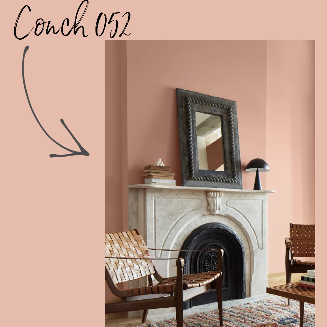
This comforting color balances out the bold vibes of this palette, appearing almost neutral alongside such striking shades.” – BENJAMIN MOORE
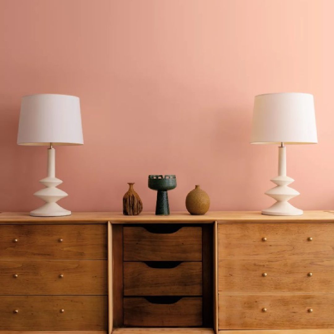
Of the eight trending colors from 2023’s palette, this is the color that stood out to me as a personal favorite. There’s a dustiness to it.
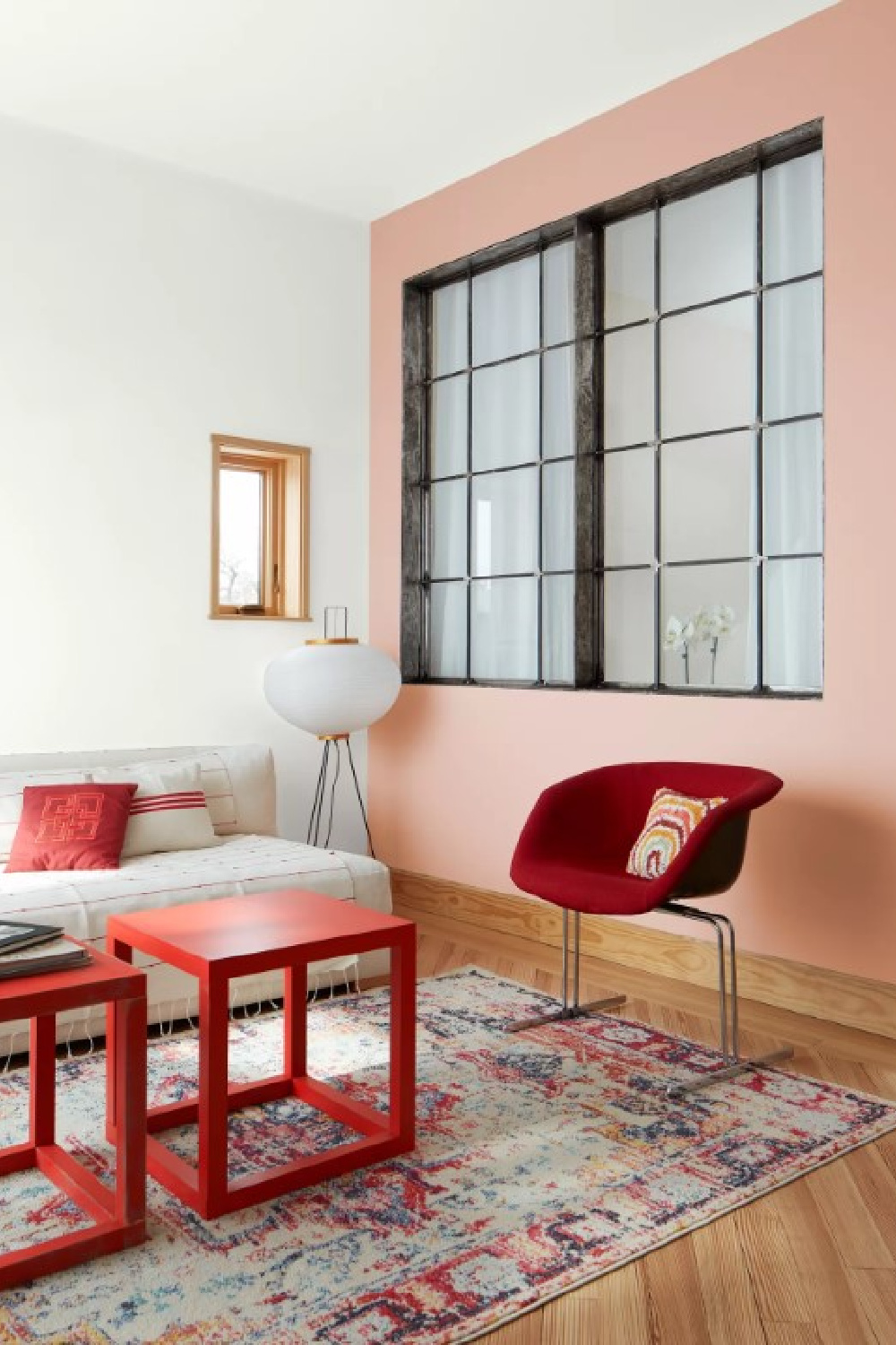
It reminds me of those gorgeous European pinks, and look what Bayberry Moon did with it!
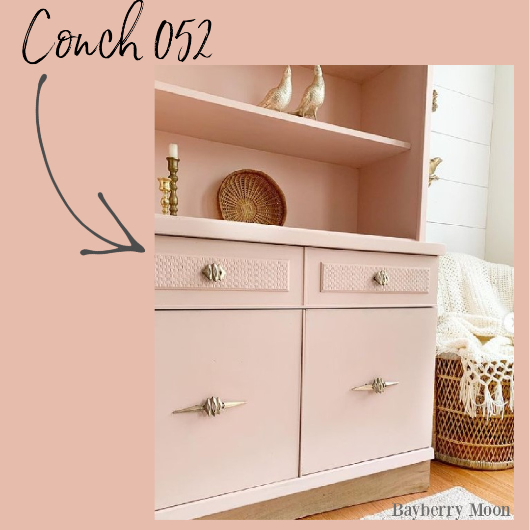
Loving Conch Shell 052 with the gold toned accents!
Savannah Green 2150-30
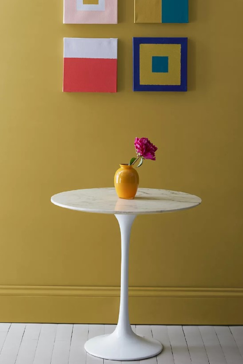
“A rich ochre, yellow and green undertones balance out this unique hue.
Similar to gold leaf for your walls, Savannah Green is a statement-making shade that plays well with neutrals and saturated hues.
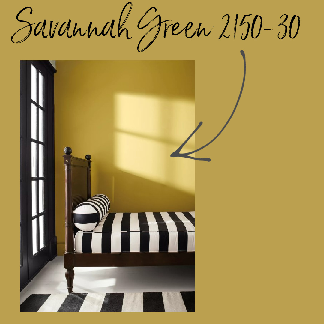
Offering both whimsy and drama, explore higher sheens for a lustrous take on this sprightly hue.” – BENJAMIN MOORE
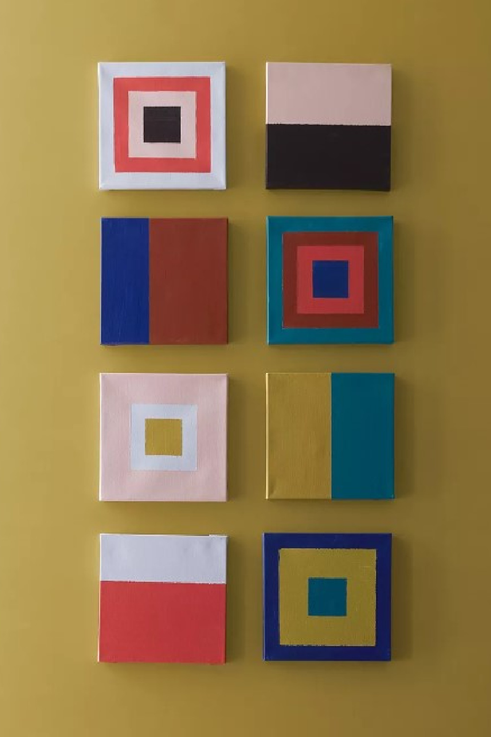
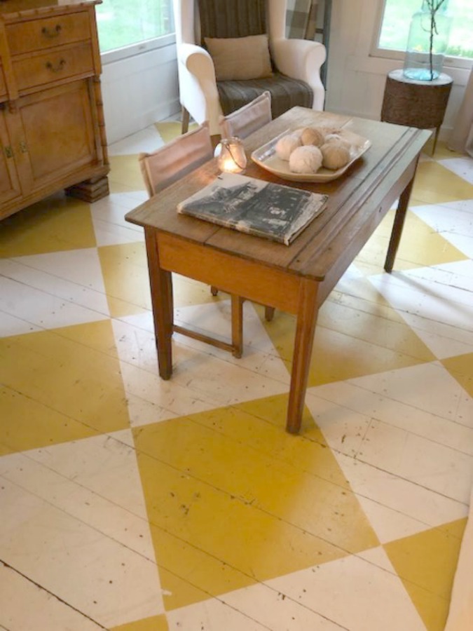
The LRV for Savannah Green is 34.67, and it’s one of those colors that is difficult to describe.
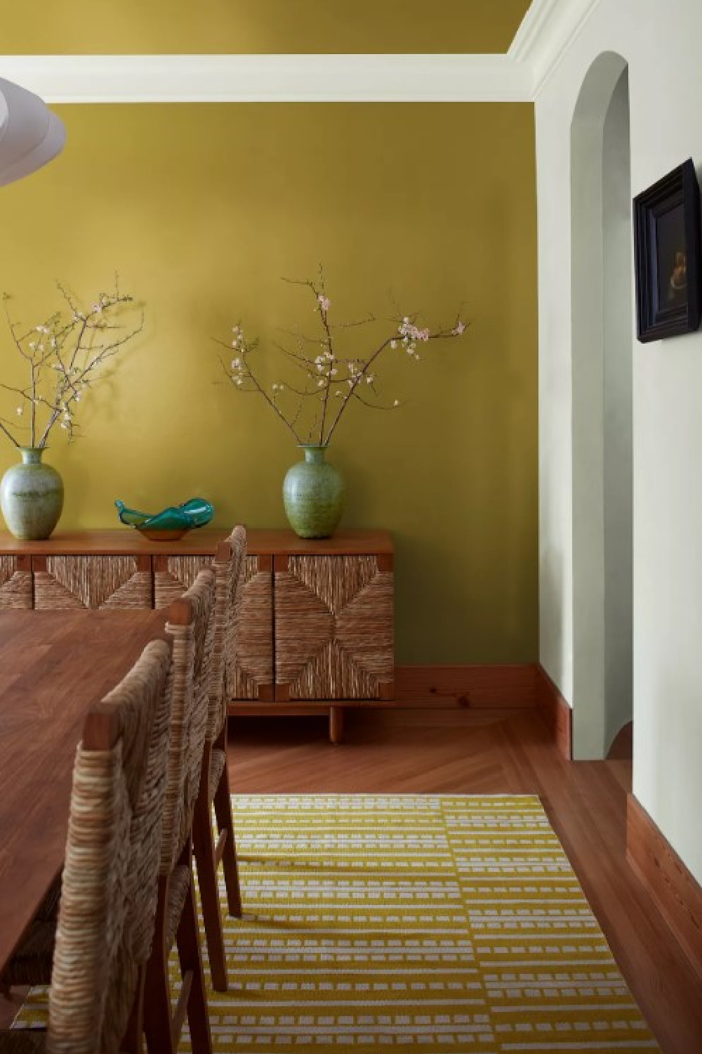
Does it feel like gold leaf to you? Citrusy? Sophisticated?
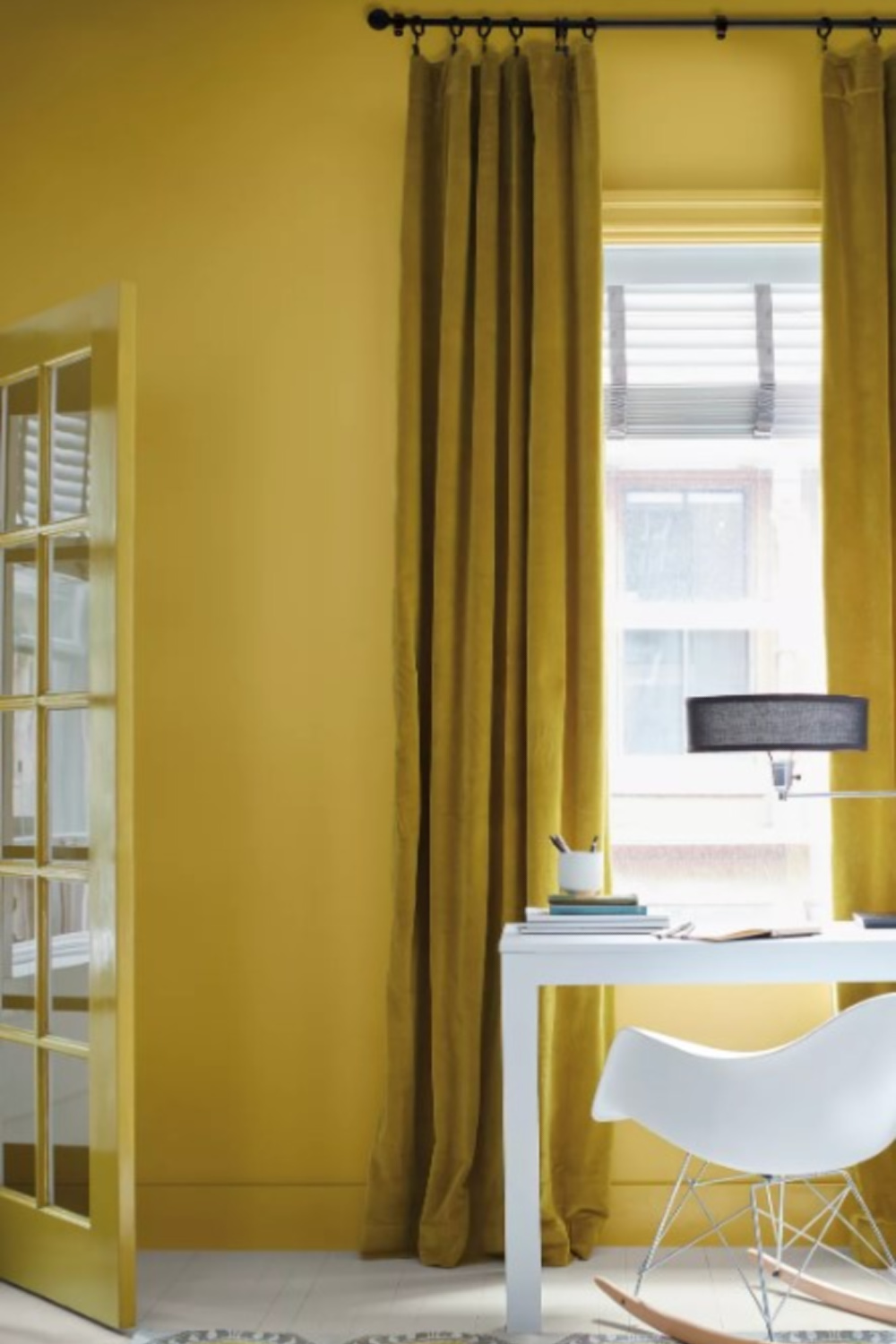
Maybe it reminds you of the 60s or a Midcentury kind of color? I think I like it best in this context:
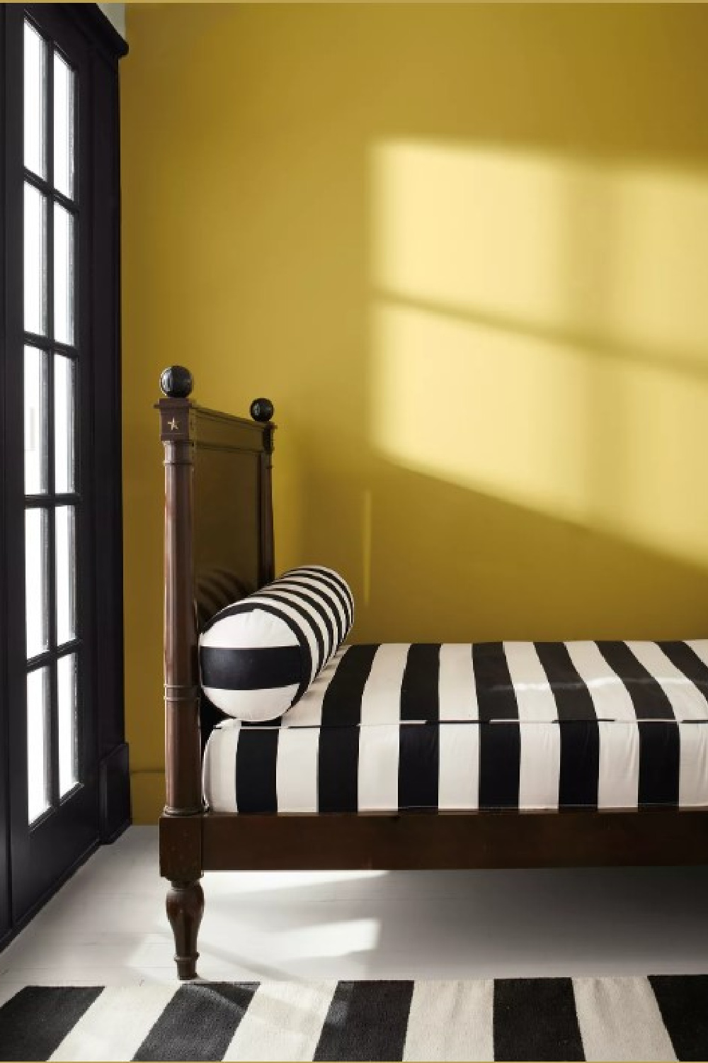
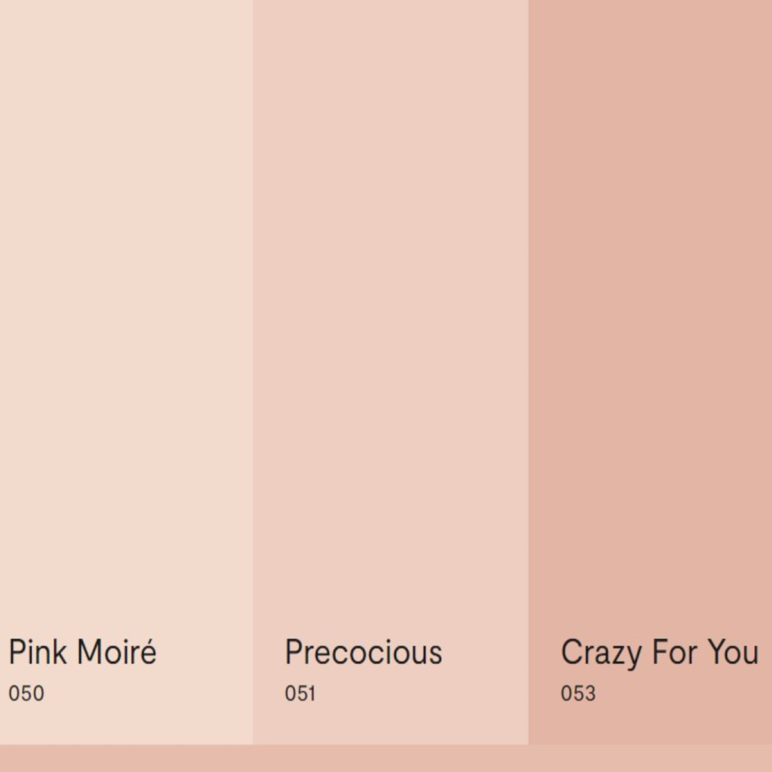
But I can also imagine Savannah Green feeling very fresh and organic paired with one of Benjamin Moore’s pinks that match Conch:
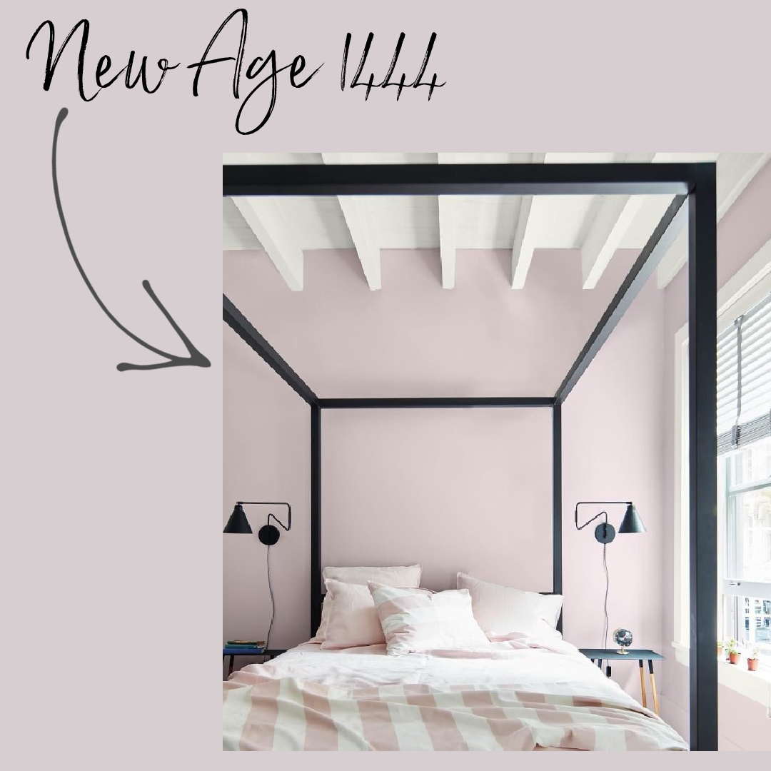
New Age 1444
With an LRV of 63.28, New Age is a light purple that seems livable and not reserved for a girly room.
“Soft and ethereal, this light purple is grounded by a drop of gray.
It emanates a soft spiritual sensibility, leaning into the softer side of our Color Trends 2023 palette.
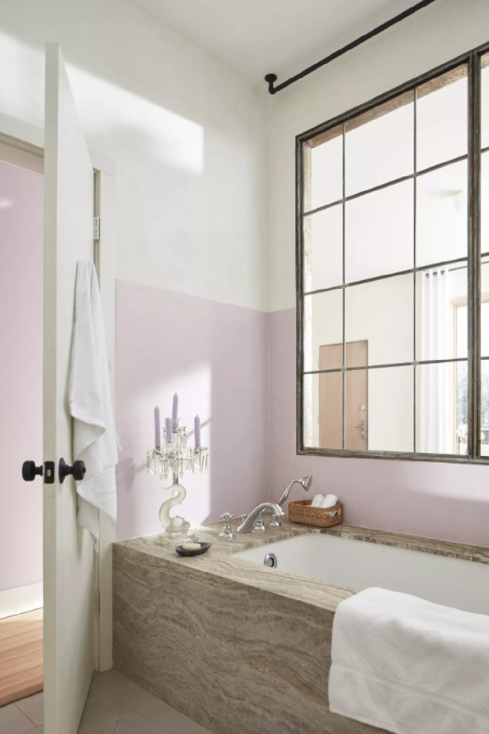
Appearing both gray and lavender, depending on the lighting, infuse a touch of color into any space with this engaging hue.” – BENJAMIN MOORE
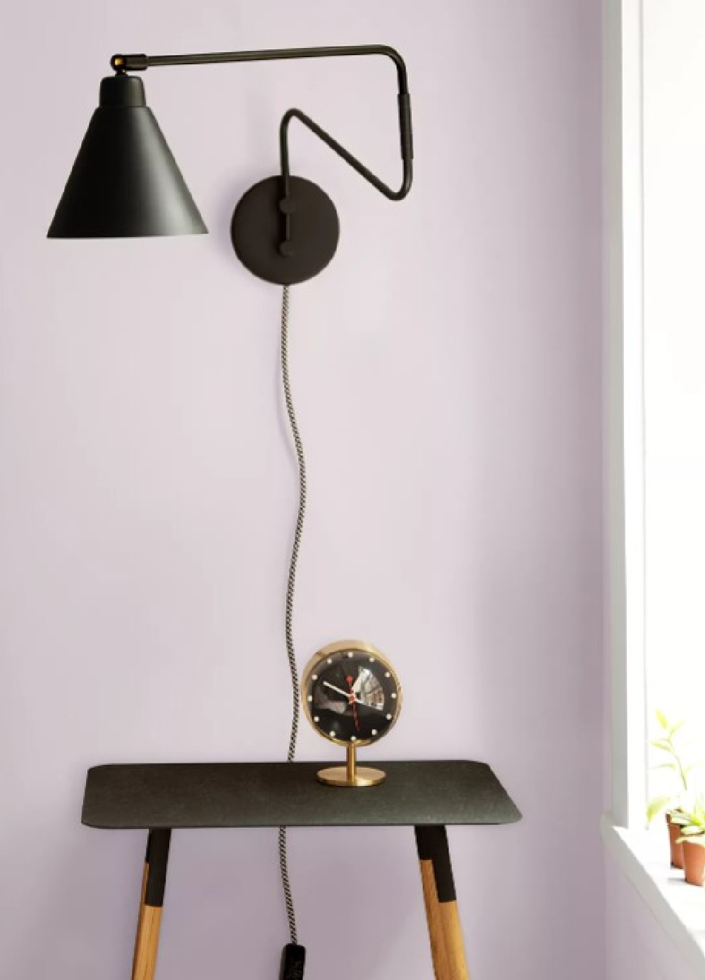
Where could you use it?
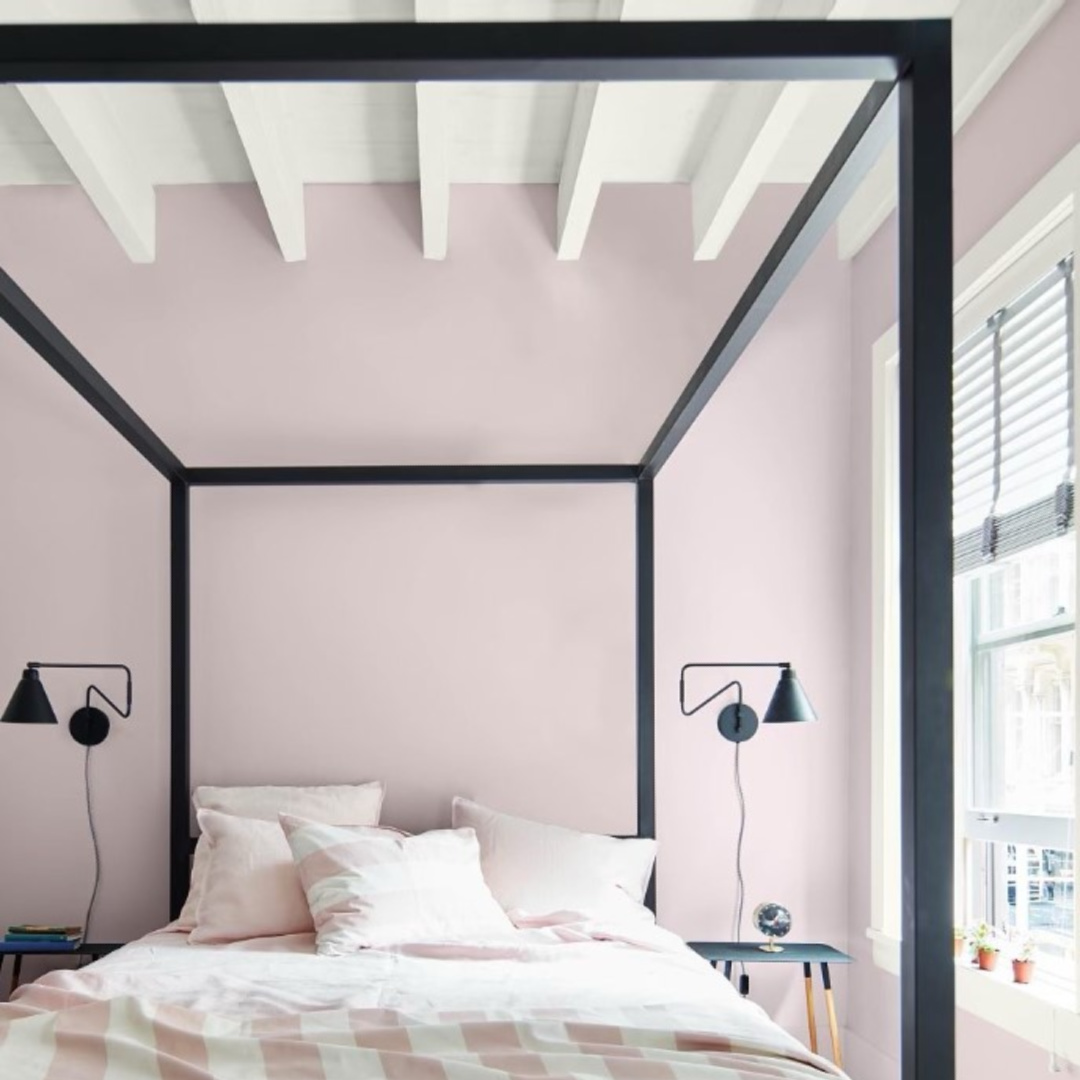
Benjamin Moore suggests pairing it with a bright white ceiling or painting “feign-scoting” on a lower wall to imitate paneling.
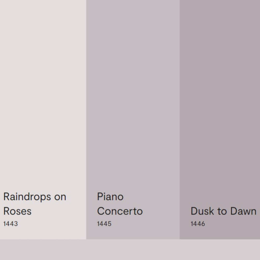
I think it could be very restful and interesting in a bedroom or French inspired bath. For a modern, youthful riff on it, you could create an ombre effect with other BM lavenders such as those above.
Who is Choosing Trending Paint Colors?
Pantone is sort of a household name associated with color experts, and they draw from color psychology and consulting.
Obviously paint brands take the intersection of deep understanding of color theory and consumer behavior very seriously.
These paint companies are devoted to understanding the needs and desires of their customers, and product development is an enterprise relying upon analysis from color experts and listening to consumers.
Experts in color integrate knowledge gained from trends data and cues from cultural trends in order to forecast colors customers will want to load on their paintbrushes.

So Will Neutrals & Whites Fall From Popularity?
It depends who you ask!
Andrea Magno of Benjamin Moore thinks the time is ripe in 2023 for colors that nudge us out of our comfort zone.
After all, a color like Raspberry Blush and other boldly saturated colors are a bit unexpected after years of neutrals and muted tones.
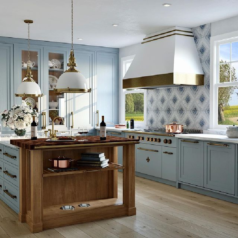
Magno told Real Simple, “A lot of times, particularly with neutrals, the walls become the backdrop and it’s the other elements that take center stage.
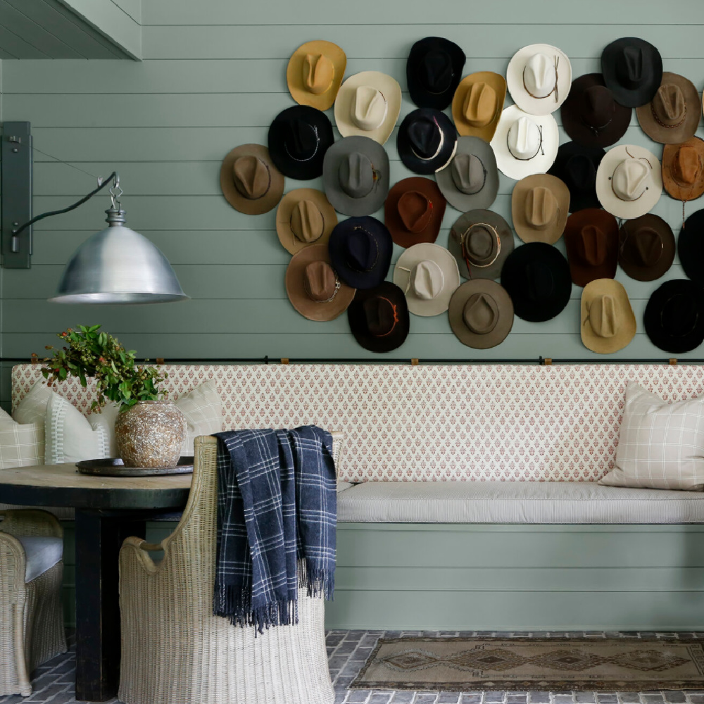
Here, we’re kind of changing the conversation, and we’re saying ‘the walls are going to be the star.'”
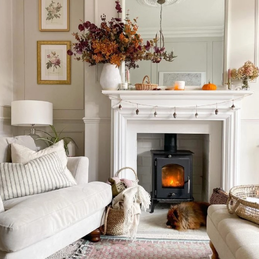
Do Bold or Subdued Colors Comfort You More?
Does this resonate with your experience?
What if your walls aren’t what you care to emphasize? Or what if “the unexpected” feels unwanted with continued uncertainty?
Another paint company chose a subdued white paint color as their 2023 color of the year.
Blank Canvas is BEHR’sr 2023 Color of the Year
In a recent survey Behr conducted, 92% of American homeowners expressed a desire for home to be a place they can completely unwind. 57% preferred a minimalist space.
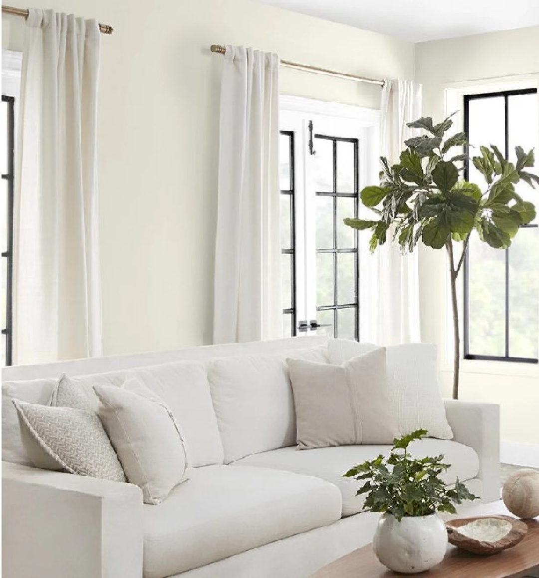
Concerning the choice of Blank Canvas as Behr’s color of the year, Erika Woelfel (an expert at Behr), told Domino, “We know that people are looking for rejuvenation…They’re creating at-home yoga studios, meditation spaces, and spalike bathrooms.”
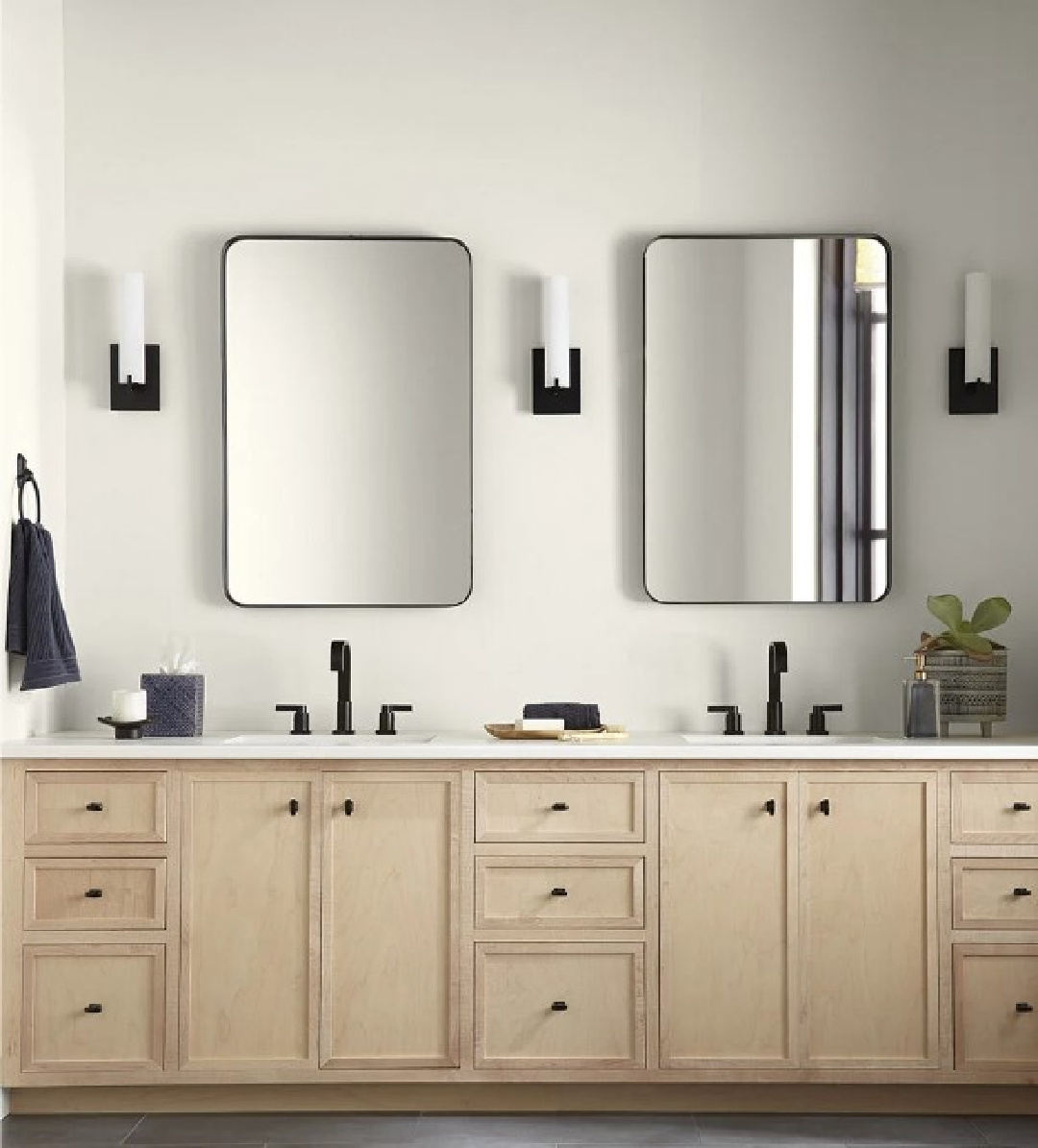
Blank Canvas has brown undertones which feel very NOW, according to Home Depot’s Sarah Fishburne. With a discerning eye turned toward trends, she says the company is seeing a shift away from cool whites to more complex ones.
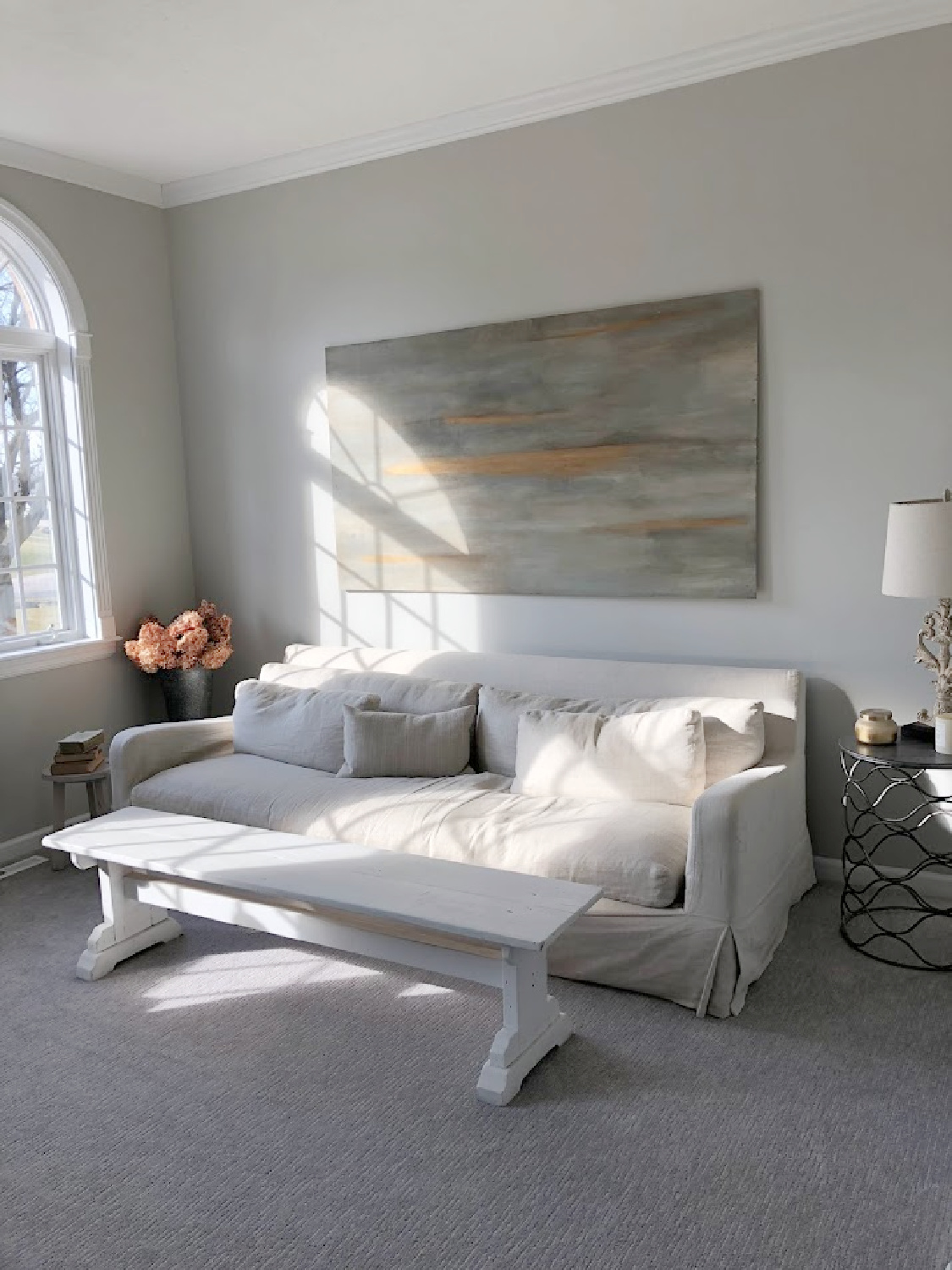
Are You Shifting Away from Cool White Paint Colors?
And I must concur with this analysis! After living with bright gallery-like cool white walls throughout our former home for seven years, I am now living with complex paint formulas, mostly in the greige family (above) but also with complex putty-like whites:
Easiest way to see if a color is right? Order samples to be delivered to your door with Samplize (a peel and stick sheet of “paint” to stick on your wall and easily move around to other walls!).
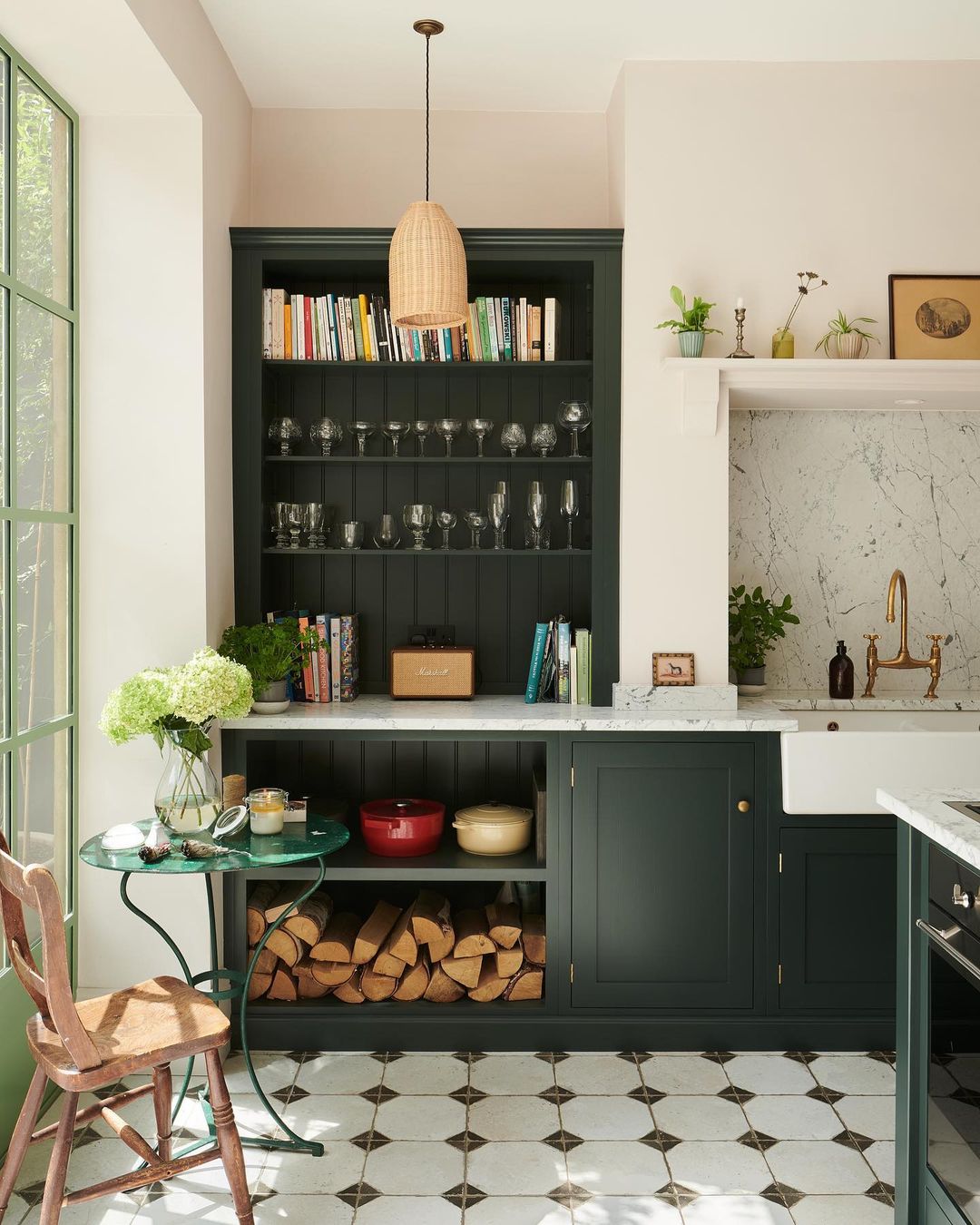
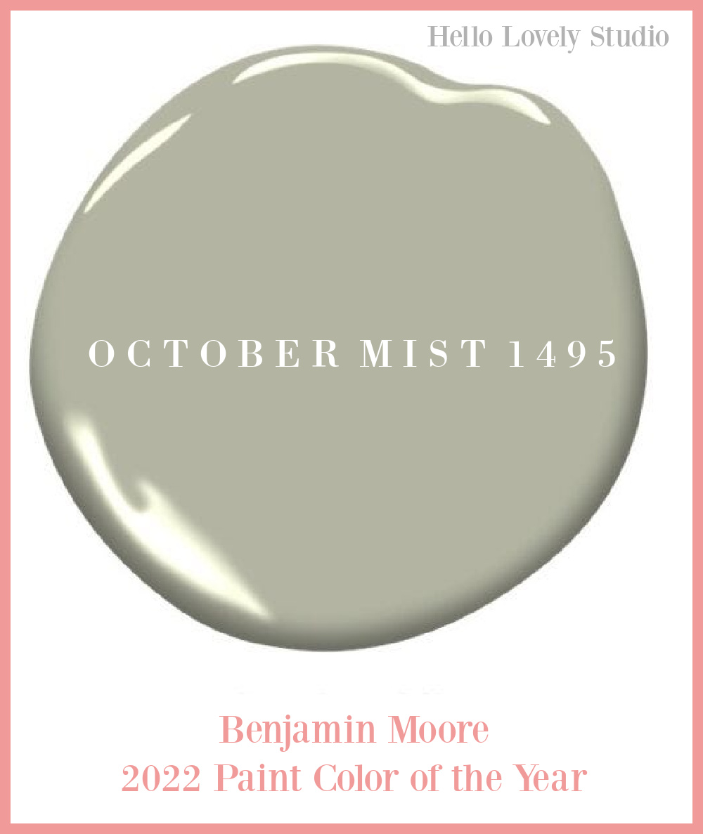
Last year’s BM colors were so soft and nurturant! October Mist – was their color of the year for 2022.
And here are a few more earthy green options:
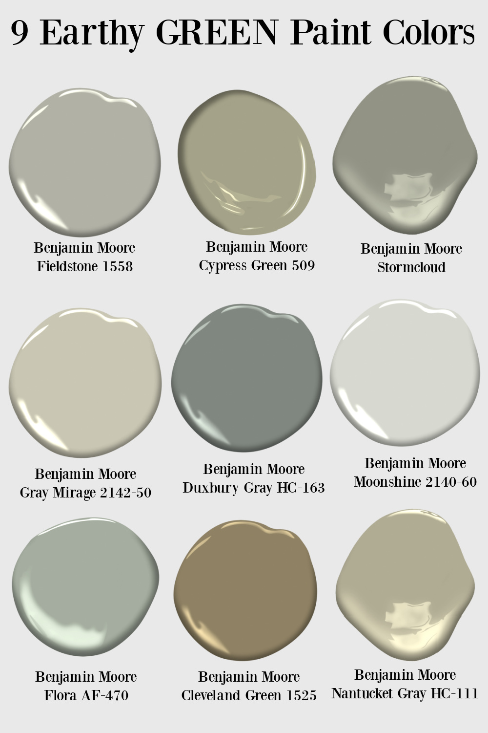
Also see THESE STORIES with more paint color ideas…you never know what may inspire you!
Peace to you right where you are.
-michele
Shop for items you already intended to buy on Amazon RIGHT HERE, and also find home decor here to keep decor inspiration flowing on Hello Lovely!
Hello Lovely is a participant in the Amazon Services LLC Associates Program, an affiliate advertising program designed to provide a means for sites to earn fees by linking to Amazon.com and affiliated sites.
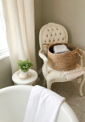
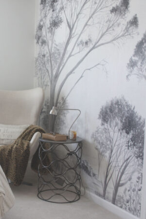





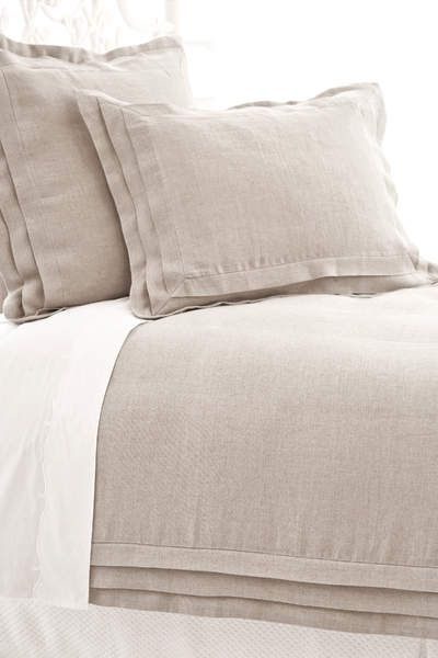

I love color, and enjoy seeing all the new ones available each year, but personally I like a soft neutral tone. I just finished painting my interior rooms in SW Natural Tan. It reminds me of Irish cream, velvety and warm, not stark and cold like I find most whites to be, and not in-your-face bright like the colors shown above. It’s something I will be able to live with for some time. At my age, I don’t want to be painting every time new colors are introduced! That was for my younger days.
Author
I hear you. Just thinking about painting a room makes me feel tired! I will look at Natural Tan because I can’t get enough of those soft neutrals that bring calm. Thanks so much for being here on the journey and taking the time to comment. Have a lovely weekend. xox
I prefer a neutral soft home environment and very much enjoy receiving your emails each morning.
Author
Thanks so much for reading and casting your vote! 🙂 I need things calm, gentle, and muted at home so the trending palettes that come and go are just an interesting parade to watch. Have a wonderful weekend.