If you are sprucing up things around your home, maybe these ideas will help. Today, we’ll consider a handful of Gorgeous Light Blue Grey Paint Colors for Calm Interiors. These quieter, sophisticated paint colors have earned accolades from happy home decorators as well as designers and are worth contemplating.
I independently selected products in this post—if you buy from one of my links, I may earn a commission.
6 Gorgeous Light Blue Grey Paint Colors for Calm Interiors
Raise your hand if you love a timeless blue grey color for interior walls or decor accents! I’m a raving fan.
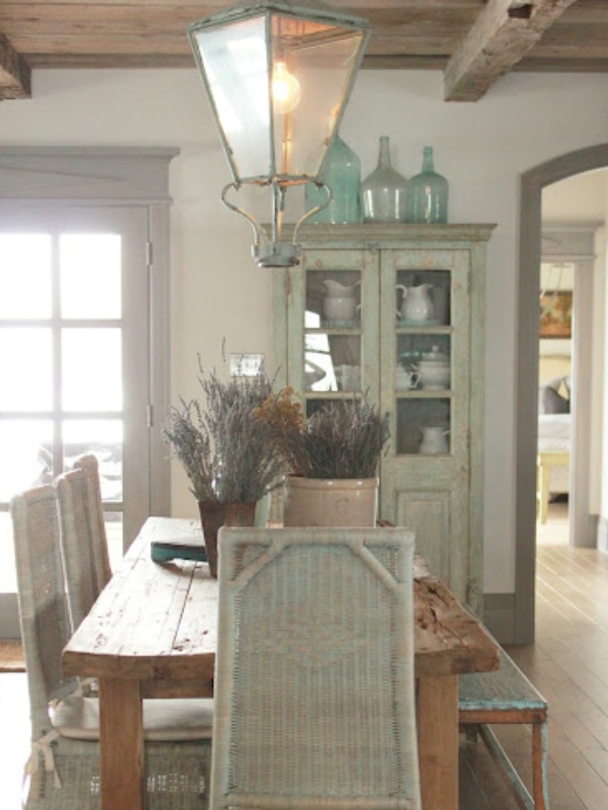
Grey paint colors are timeless (no matter what you may see from trend reports) and popular with fans of neutral calm palettes, and I previously blogged about designer favorite greys here.
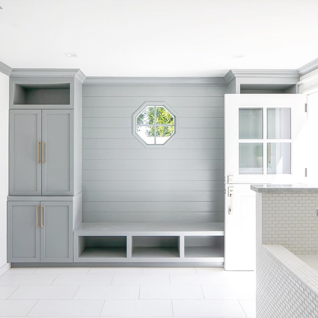
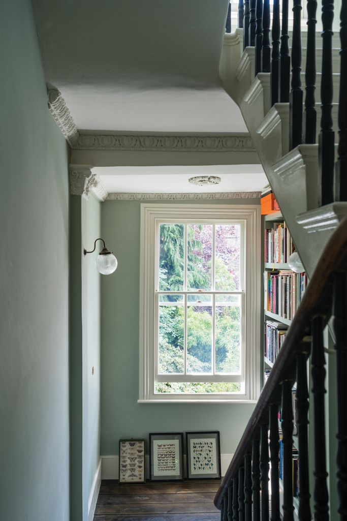
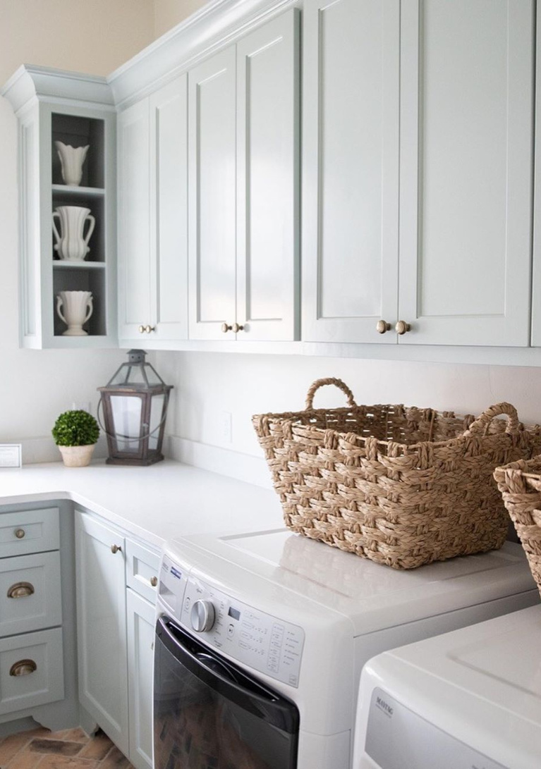
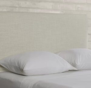
Blue Grey Painted Shiplap in Mud Room
However, today, we will narrow the focus to beautiful chalky blue greys which can be tricky to get right. When too cool and blue, the color runs the risk of baby nursery blue, and too warm can read muddy green or taupe.

The homeowner’s favorite color was blue in Southeastern Designer Showhouse 2017 (above), and I’m a huge admirer of how the hue was repeated throughout the sophisticated and timeless interiors.
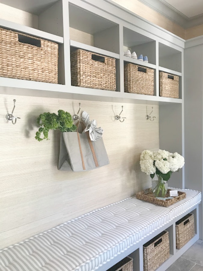
To get the look of the woven grasscloth wallcovering above, direct your gaze to the blue or grey paint color swatches with “silver” in the name.
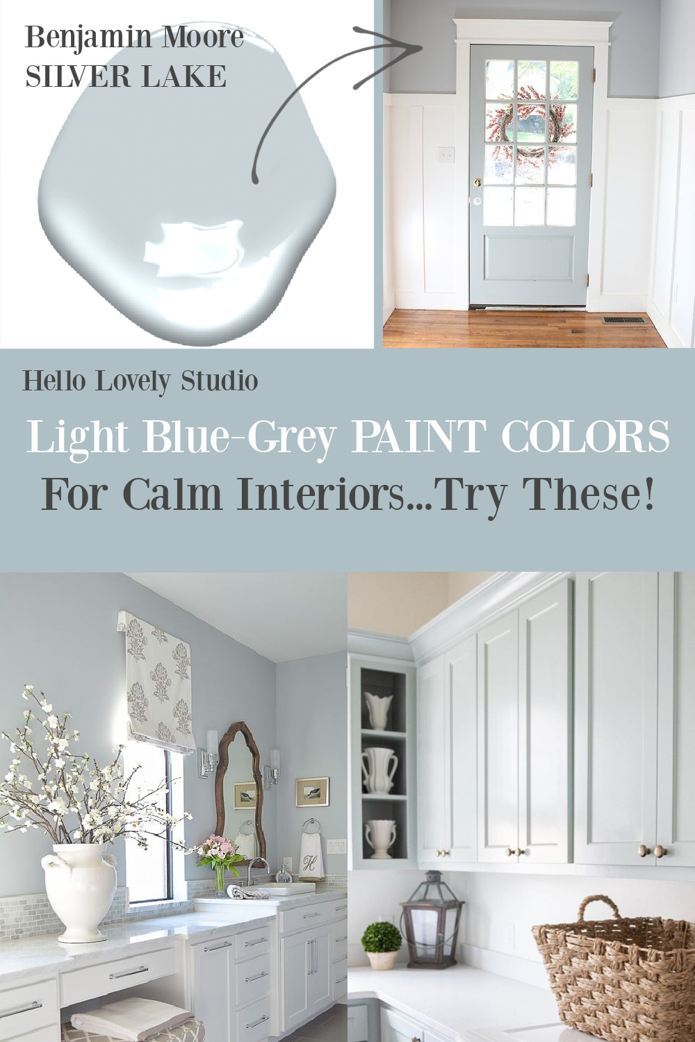
Soft Blue-Green-Gray on a Front Door
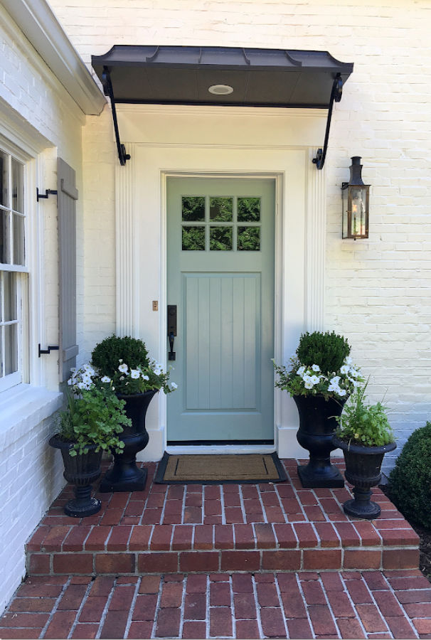
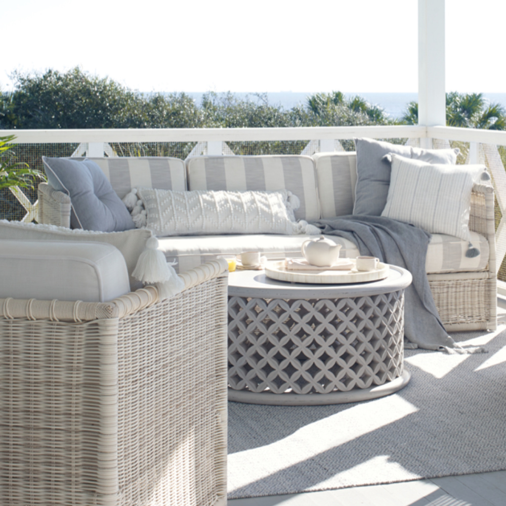
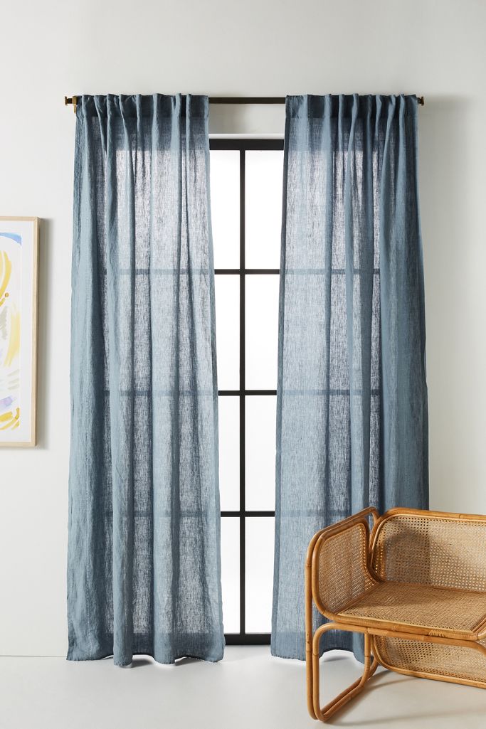
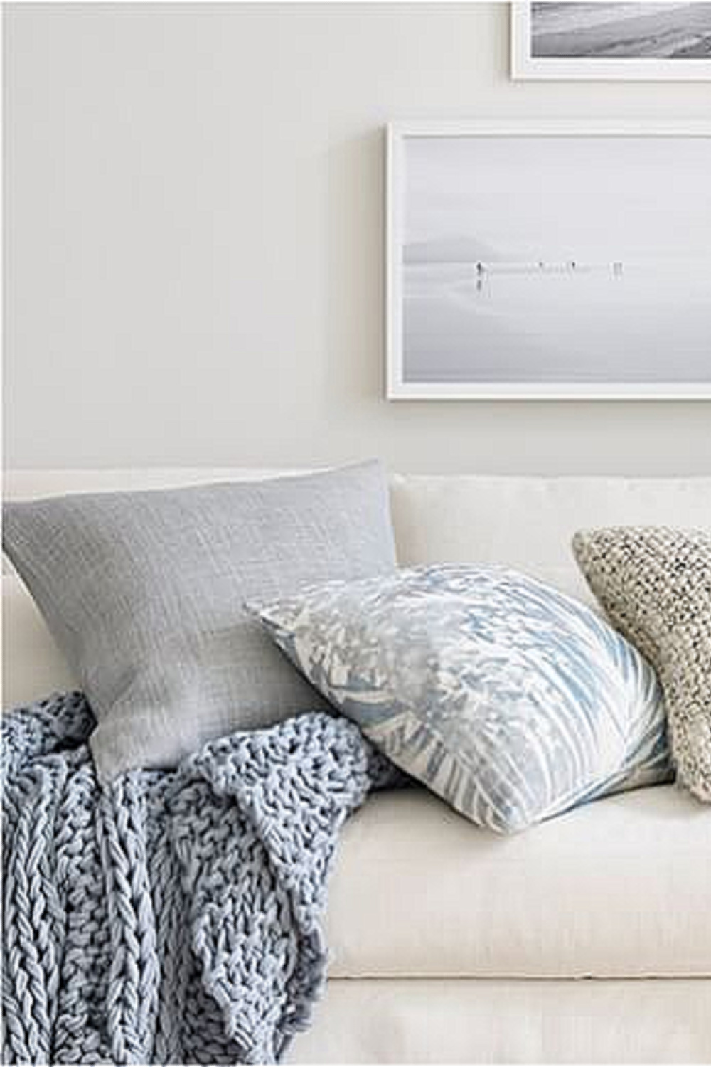
Blue greys bring to mind colors of the sea and are perfect when you’re after a coastal feel.
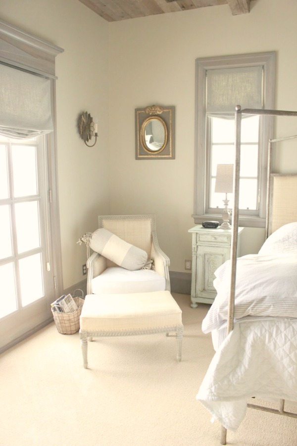
When I think of a perfect, soft, quiet, light blue gray paint color, a couple of my all-time favorite homes spring to mind, First, Brooke and Steve Giannetti’s Patina Farm.
They painted their home’s steel framed doors and windows a custom paint color similar to Farrow & Ball’s Pavilion Gray.
While so many other modern farmhouse designs incorporate a more austere look of black painted steel, it was such a lovely calm color choice for interiors graced with peacefully hushed colors.
Second, Desiree Ashworth’s unforgettable custom French cottage with its Gustavian design details and soft blue-grey trim has such an ethereal, unique vibe.
So let’s start out with a beautiful chalky light blue grey similar to the custom color used at Patina Farm.
1. Farrow & Ball Pavilion Gray 242

Farrow & Ball Pavilion Gray 242
“This classic mid grey was originally created for a bespoke pavilion, but is also reminiscent of an elegant 18th century Swedish colour. One of the Architectural Neutrals, the subtle blue undertones of Pavilion Gray add a contemporary touch and sense of spaciousness.”


2. Farrow & Ball Blue Gray 91


Farrow & Ball Blue Gray 91
“With its subtle mix of blue, green and black pigments, Blue Gray creates the most relaxed of rooms that feel as if they have always been there. It is a cooler, more weathered version of French Gray and has the same almost magical quality of gently shifting between blue and grey depending on the light and time of day.”


3. Benjamin Moore Silver Mist
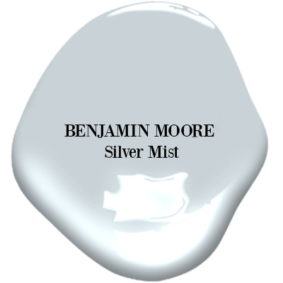
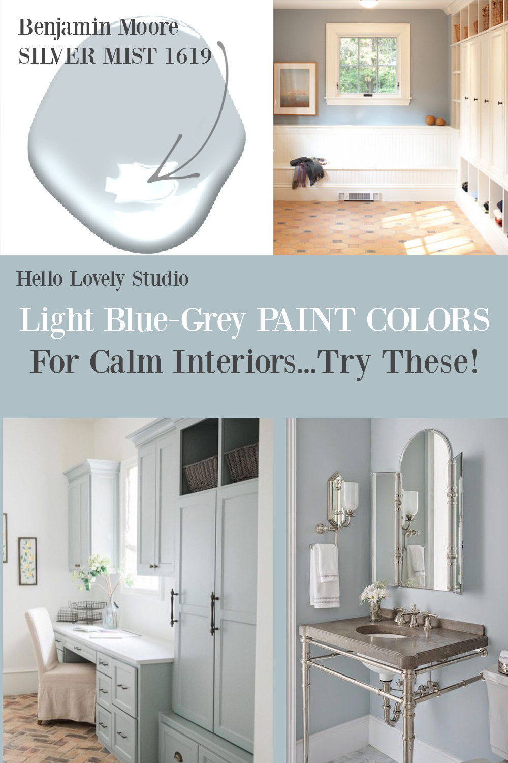
Benjamin Moore Silver Mist 1619 “A silvery shimmer characterizes this very pale shade of whisper-soft blue. Delicate and light, it relies on a generous amount of gray to achieve its misty quality.”
To see more soft, romantic pastels like the one above, GO HERE.
4. Benjamin Moore Silver Gray 2131-60

Benjamin Moore Silver Gray
“This color is part of Color Preview. A collection of bold, saturated colors that brings spaces to life for those looking to illuminate their world with pure, extraordinary color. A great complement to Classic Colors, Color Preview offers a collection of 1,232 hues that excite and inspire with pure, deep, clear colors that create striking combinations.”


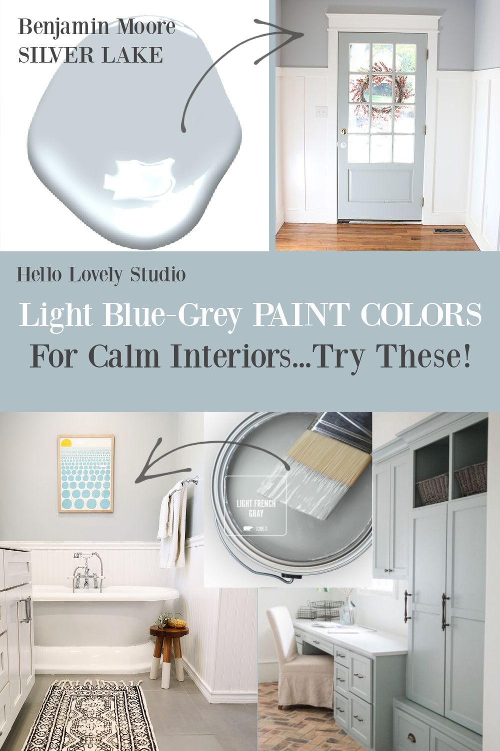
5. Benjamin Moore Silver Lake 1598

Benjamin Moore Silver Lake 1598
“This color is part of the Classic Color Collection. Surround yourself with your color favorites. These timeless, elegant, Classic Colors guarantee beautiful, usable color all the time, every time. A collection of 1,680 inspired hues that consumers and professionals have enjoyed for years, the colors in this palette are as timeless as they are forward.”


Easiest way to see if a paint color will work? Order samples with Samplize and have them delivered straight to your door.
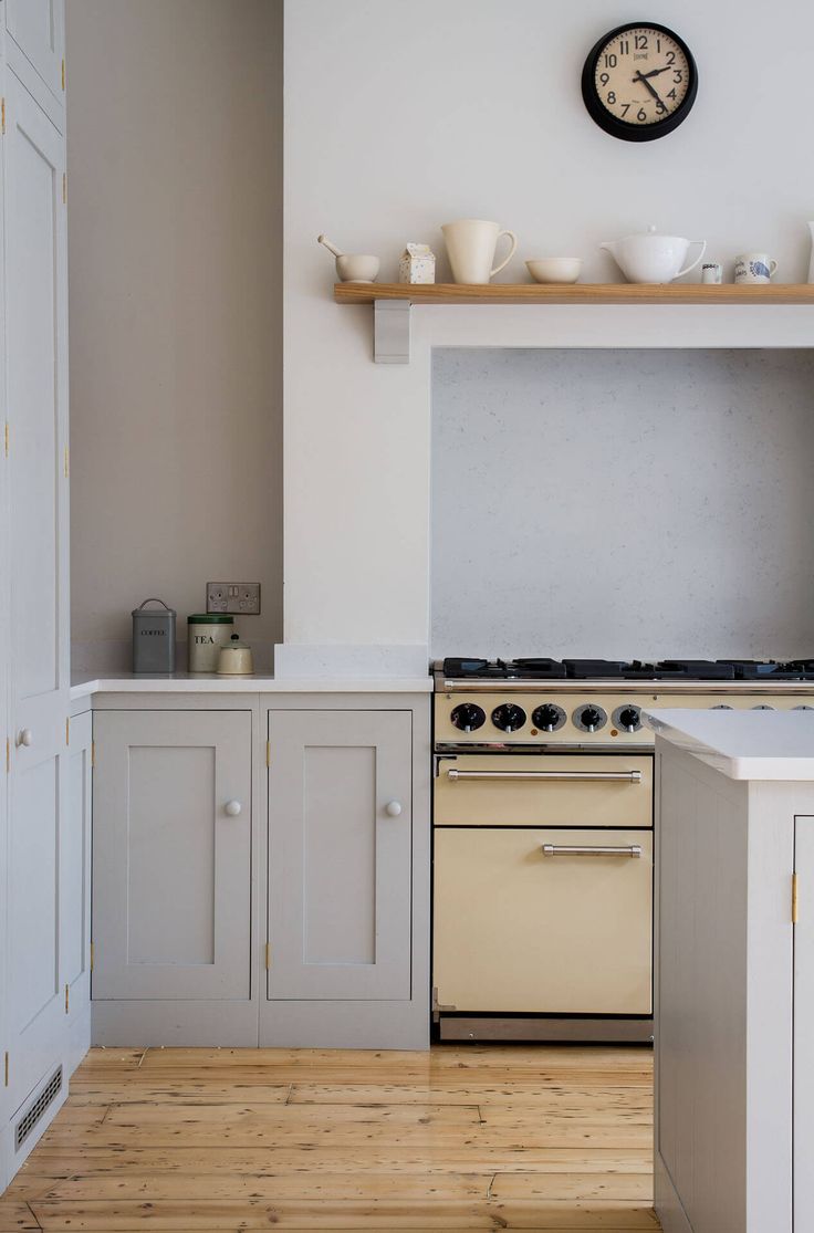
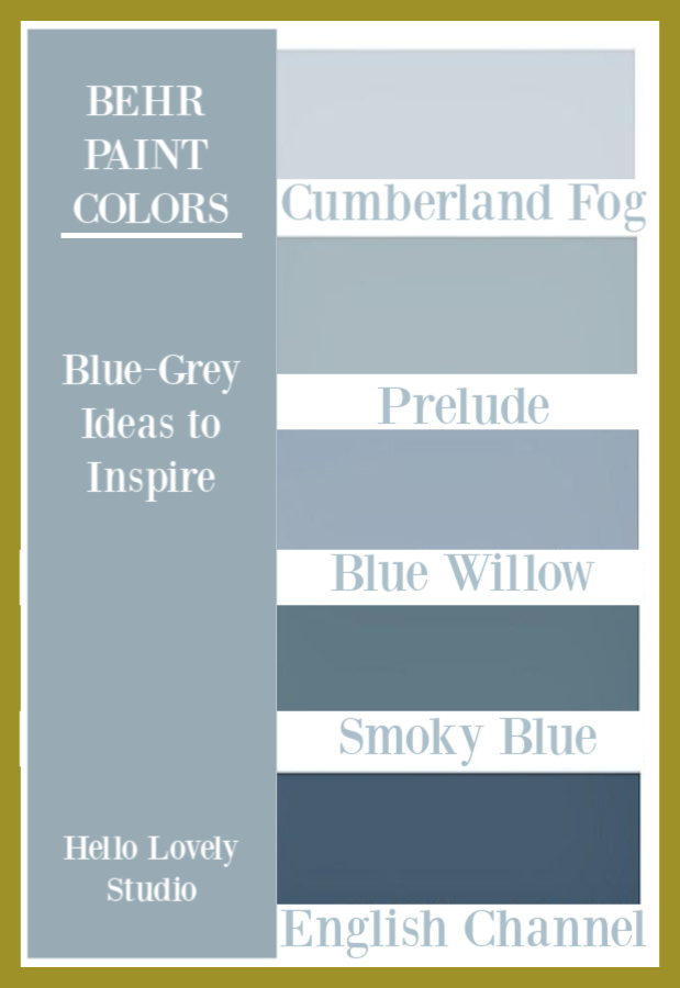
6. Behr Light French Gray

More Pretty Blue Gray Paint Options
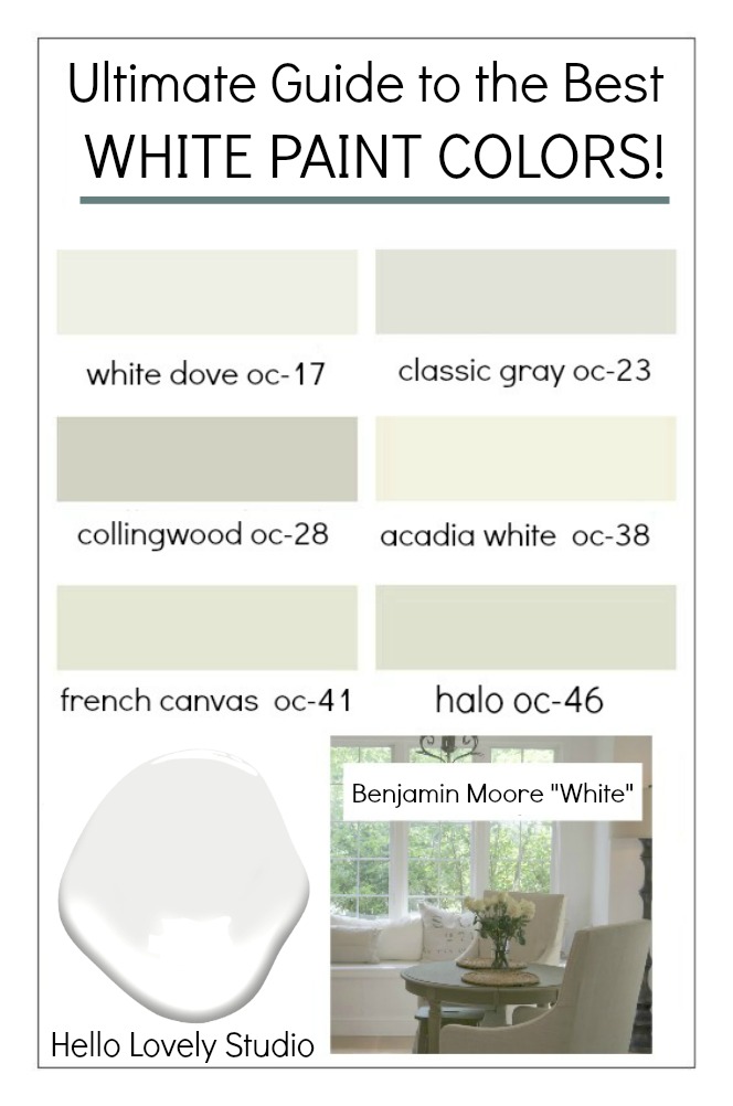
Best White Paint Colors
More Blue Grey Color Inspiration


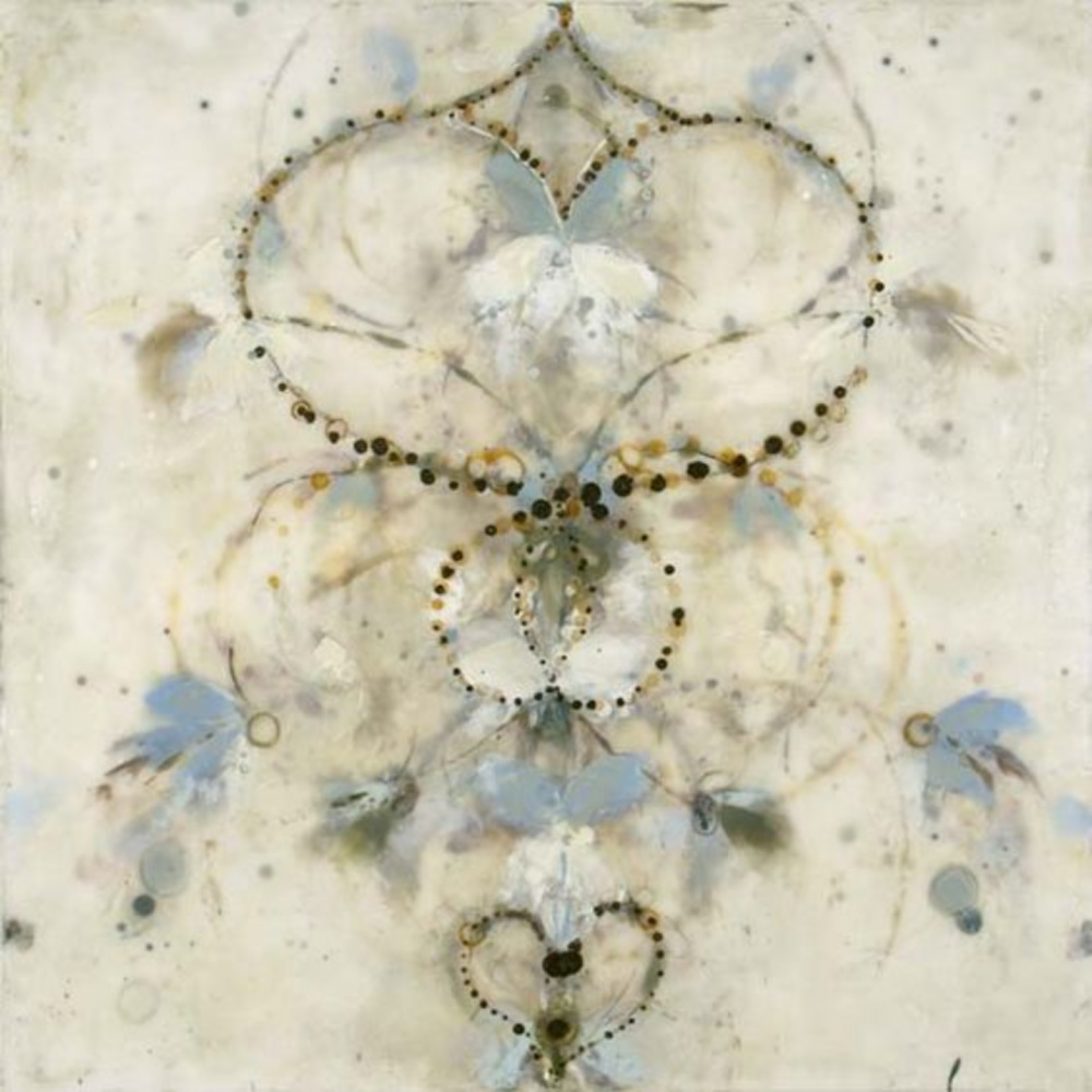
For me, Betsy Eby’s ethereal encaustic paintings come to mind when I consider the dreamiest of blue greys.
How does this color affect you? Do you decorate with it in your home?


For more stories with paint color ideas, see:

Peace to you right where you are.
-michele
Shop for items you already intended to buy on Amazon RIGHT HERE, and also find home decor here to keep decor inspiration flowing on Hello Lovely!
Hello Lovely is a participant in the Amazon Services LLC Associates Program, an affiliate advertising program designed to provide a means for sites to earn fees by linking to Amazon.com and affiliated sites.


Author
Thanks for the feedback and for reading.
Such a great, soothing color! Love this idea for an interior that you can style with a lot of different decor options!
Author
Which soothing color do you like in the post – so many options!?!
Here we get to know about 6 gorgeous light blue grey paint colors for calm interiors information in detail. It helps us to decide that which one is best among its types. I enjoyed reading this article and would suggest others it as well. Thank you for this article! This is really very informative for us.
Author
Thanks for reading.
Good share. Thanks for sharing. I look forward to reading your next post. My husband and I were excited to visit our local boston house painters to try out their new products. We have a coupon available to use in this store and consider to do our painting project this month. Keep posting!
Author
Keep visiting for more inspiration. 🙂
Wow, well done, very helpful. Light blue grey is such a nice and comforting colour, i think it’s great for decorating with porcelain bathroom fixtures. I’m getting into painting my house near waltham ma and absolutely use this color for my bathroom and living room. Thank for sharing, I highly appreciate your post and blog
Author
🙂
Is the number @ the end of the paint color name important in order to get the correct color or is just the brand and color name enough without the number?! Just curious! I’ve always been a little confused about this! 🤪Ha!
Author
I think the numbers are more important on the brand’s end and not the consumer’s. Great question that I should research further!
Ok, thanks so much, Michele.
Author
You bet 🙂
Your note about blue greys being tricky—too cool veers nursery, too warm turns muddy—really resonated. That specific tension is exactly what makes finding the right one feel like such a victory.
Author
so tricky 🙂