After white, it’s my favorite color. But you won’t find much of it in my current home. The reason for that? My approach to decor is an intuitive one. I listen to what the house wants to be and then help it get there. But oh, how I admire the use of Timeless and Tranquil Blues in design including this beautifully traditional Victorian in the UK by Imperfect Interiors.

These affiliate links won’t cost you a penny extra and will earn this blog a small commission so please do use them.
Timeless and Tranquil Blues in a Victorian Home
Interior Design: Beth Dadswell of Imperfect Interiors Photography: Chris Snook
This spacious five bedroom, three bathroom Victorian house was originally tired, dated, and in need of a total overhaul. The ancient electrics, plumbing and heating were replaced and reinstated in a traditional style better suited to the period of the house. Contemporary colors were introduced throughout on walls, fabrics, tiles & accessories, adding relaxed grandeur to this lovely family house.
You may recall we toured another English home by Imperfect Interiors which included the kitchen below…find it RIGHT HERE.
Imperfect Interiors
“By mixing ‘imperfect’ mid-century furniture with more traditional pieces, the inexpensive with the unusual, I can transform your home into an inspiring space that is totally unique and full of character.”
~Imperfect Interiors
A designer who embraces, values, and welcomes the imperfection of objects and finishes is a lovely treasure indeed!
Another Bathroom

Entry & Staircase


5 Gorgeous Light Blue Grey Paint Colors for Calm Interiors
This beautiful home is an example of how a subtle repetition of timeless and tranquil blues can be effective and interesting. There is a sense of freedom and dare I say “imperfect” approach to introducing teal, navy, slate, and aqua blues. The result is a home that feels as though it has evolved.
Another project incorporating my favorite soft, quiet, light blue gray paint colors is Brooke and Steve Giannetti’s Patina Farm. The Giannettis painted their steel framed doors and windows with a custom paint color similar to Farrow & Ball’s Pavilion Gray. While so many other modern farmhouse designs call for black painted steel, it was such a lovely calm color choice for interiors graced with peacefully hushed colors.
So let’s start out with a beautiful chalky light blue grey similar to the custom color used at Paina Farm.
1. Farrow & Ball Pavilion Gray 242

Farrow & Ball Pavilion Gray 242
“This classic mid grey was originally created for a bespoke pavilion, but is also reminiscent of an elegant 18th century Swedish colour. One of the Architectural Neutrals, the subtle blue undertones of Pavilion Gray add a contemporary touch and sense of spaciousness. Combine with Dimpse, Blackened or Manor House Gray in any combination for a scheme that is perfect for the modern family home.”
2. Farrow & Ball Blue Gray 91

Farrow & Ball Blue Gray 91
“With its subtle mix of blue, green and black pigments, Blue Gray creates the most relaxed of rooms that feel as if they have always been there. It is a cooler, more weathered version of French Gray and has the same almost magical quality of gently shifting between blue and grey depending on the light and time of day.”
3. Farrow & Ball Lamp Room Gray 88
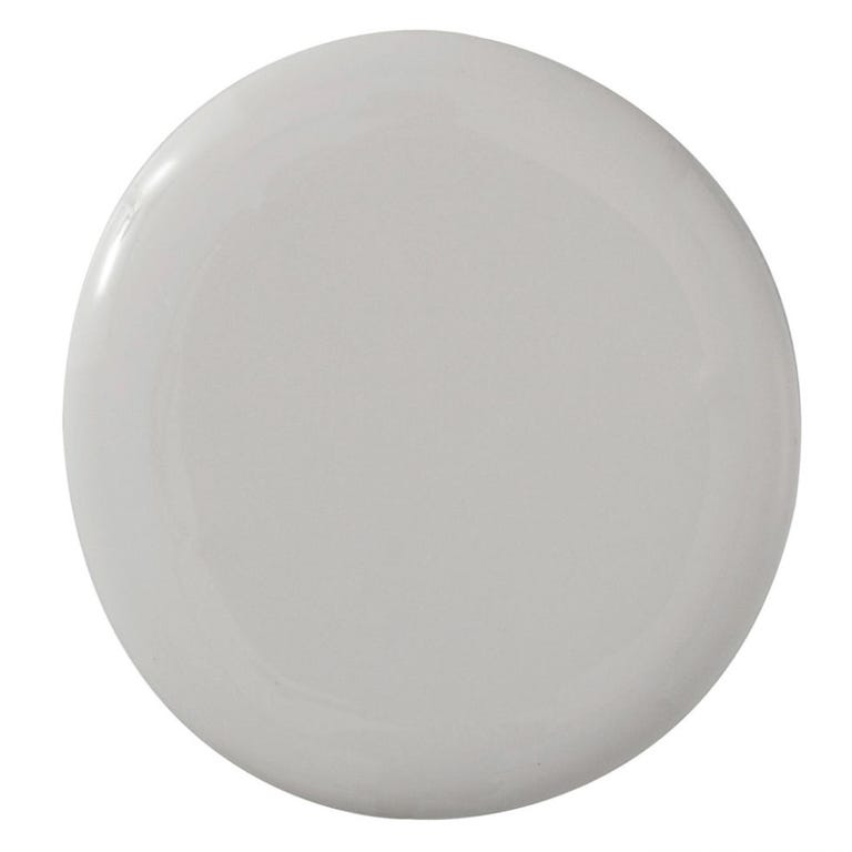
Farrow & Ball Lamp Room Gray 88
“Our most traditional blue grey was originally created when a white room had been stained by the trimming of lamp wicks. Lamp Room Gray creates a softer more lived in finish than Pavilion Gray, while retaining a sense of timelessness. It is surprisingly strong when used in smaller rooms but softens in larger, well lit spaces.”
4. Benjamin Moore Silver Gray 2131-60

Benjamin Moore Silver Gray
“This color is part of Color Preview. A collection of bold, saturated colors that brings spaces to life for those looking to illuminate their world with pure, extraordinary color. A great complement to Classic Colors, Color Preview offers a collection of 1,232 hues that excite and inspire with pure, deep, clear colors that create striking combinations.”
5. Benjamin Moore Silver Lake 1598

Benjamin Moore Silver Lake 1598
“This color is part of the Classic Color Collection. Surround yourself with your color favorites. These timeless, elegant, Classic Colors guarantee beautiful, usable color all the time, every time. A collection of 1,680 inspired hues that consumers and professionals have enjoyed for years, the colors in this palette are as timeless as they are forward.”
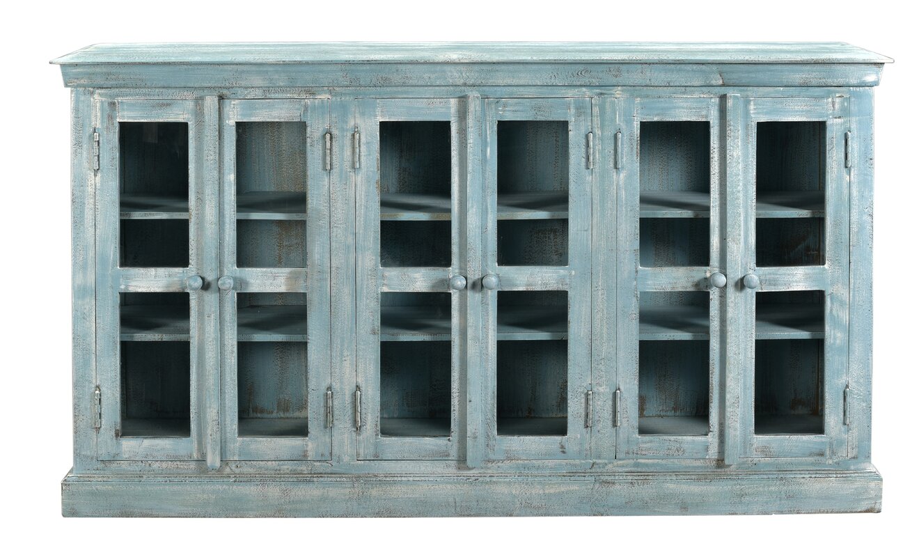
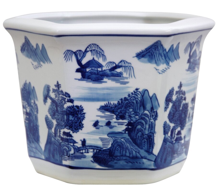
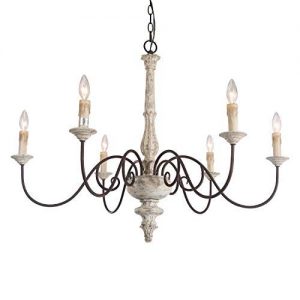
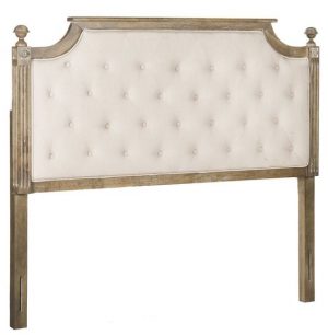
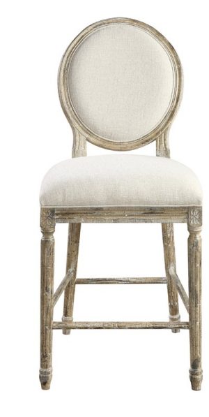
Pretty Blue & Grey Decor Finds
Affiliate links follow and won’t cost you extra yet may earn me a small commission.
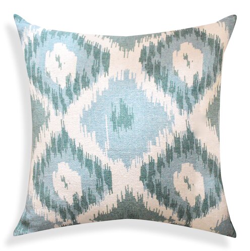
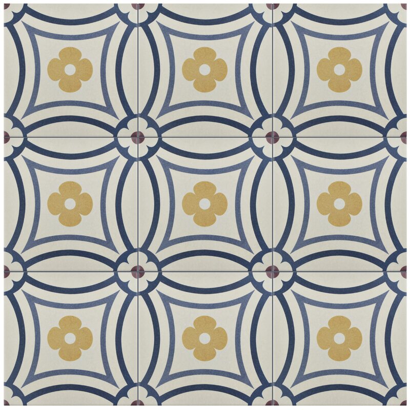
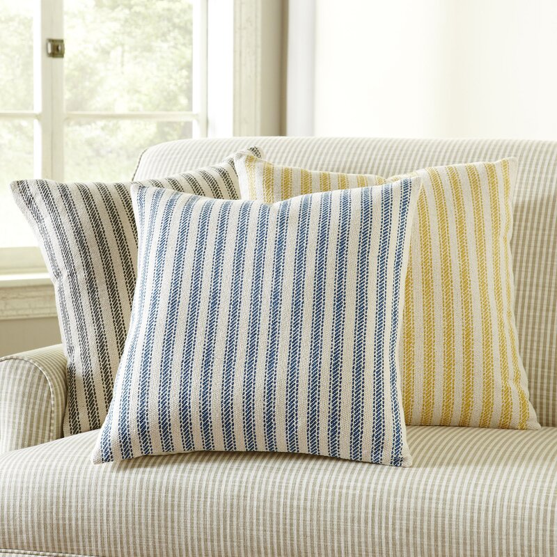
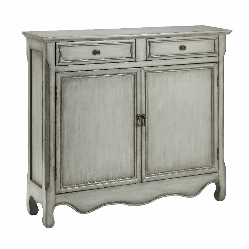
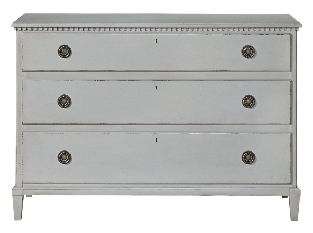
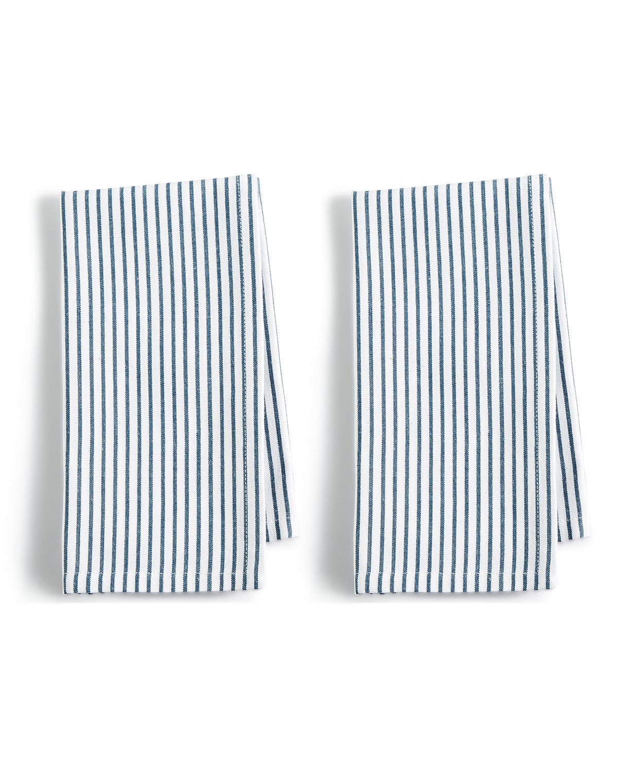
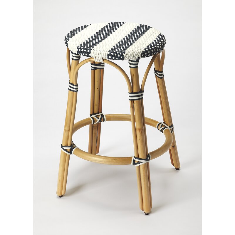
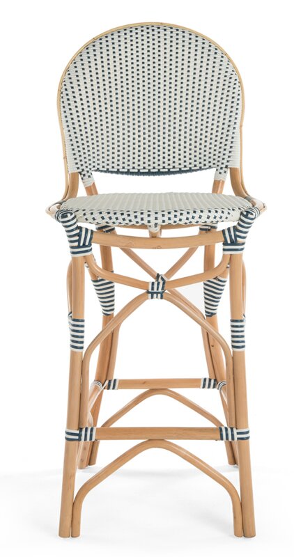
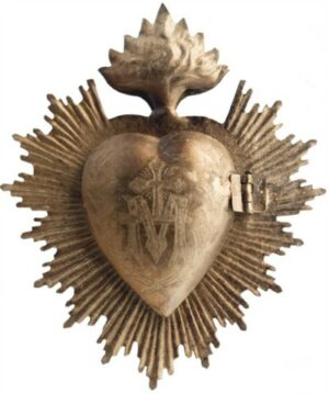
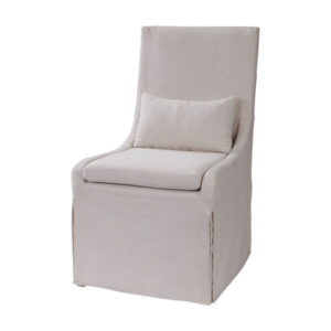
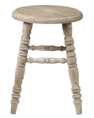
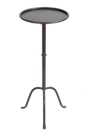
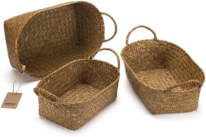
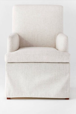
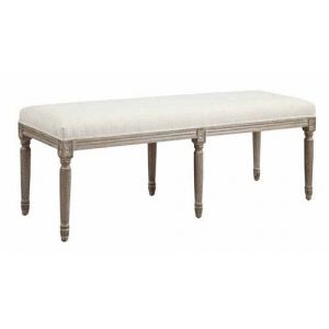
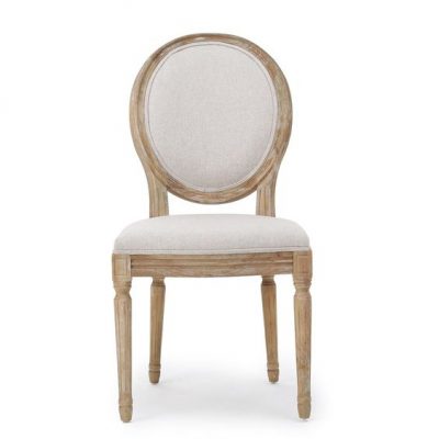
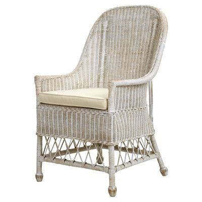
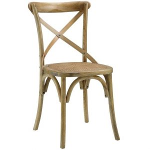
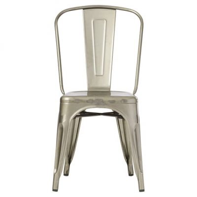
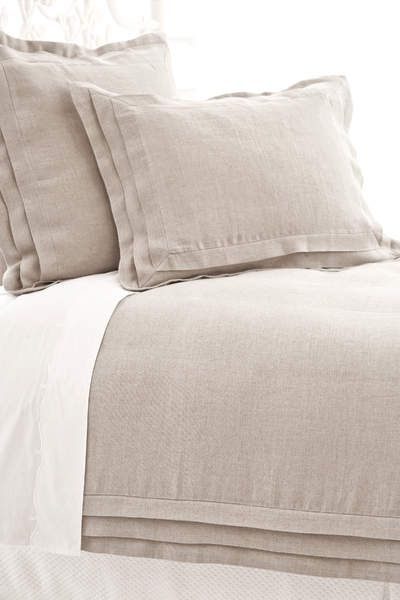
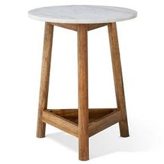
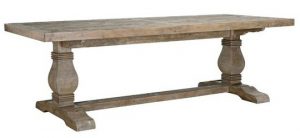
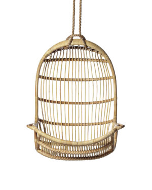
Parisian style in one fell swoop for any kitchen island that needs chic seating.
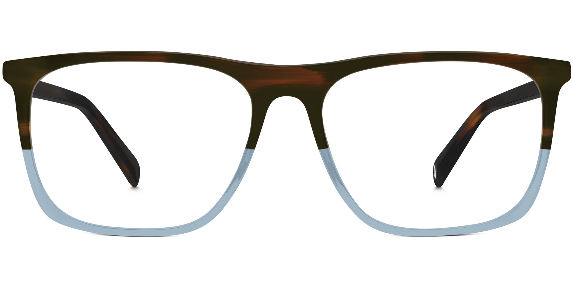
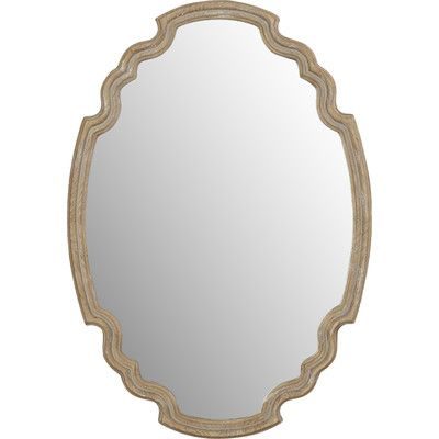
What do you think of blue frames? Are you bold enough for them?

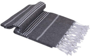
Such an easy way to add an accent color in the bath.
Visit Imperfect Interiors
DO VISIT Imperfect Interiors to see more inspiring design projects!
The most visited post this week was THIS ONE, and do take a peek if you missed it.
I independently selected products in this post—if you buy from one of my links, I may earn a commission.
Peace to you right where you are.
-michele
Shop for items you already intended to buy on Amazon RIGHT HERE, and also find home decor here to keep decor inspiration flowing on Hello Lovely!
Hello Lovely is a participant in the Amazon Services LLC Associates Program, an affiliate advertising program designed to provide a means for sites to earn fees by linking to Amazon.com and affiliated sites.





I love these blues!!! The claw foot tub and fireplace in the master bath is speaking my language 💗. Thanks for the beautiful inspiration, Michele!
Author
That tub just takes my breath away – the designer was genius in how she used blue as a repetition in a very non-contrived, sophisticated manner! 🙂
Hi Michelle, I love your hallway. Where are your tiles from?
Thank you,
Louise
Author
Hi Louise. If you are referring to the lovely tiles in this Victorian home – it doesn’t belong to me, it was designed by Imperfect Interiors. You’ll have to click the link in the post to go to the site for the designer’s contact info. Thanks for reading!
Hi
Love your website!
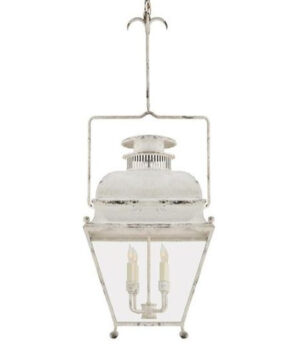
Where is the light from in the hallway?
The box glass lantern.
Thanks
Claire
Author
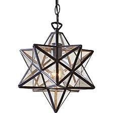
Hi Claire. This home spotlighted does not belong to me – it’s a home designed by Imperfect Interiors in the UK. As far as that hallway pendant, you might be able to locate the source from the designer here: http://www.imperfectinteriors.co.uk or see similar geometric lights like this one: https://rstyle.me/+Wiy4yPUlP6pBLurbjeNZUQ