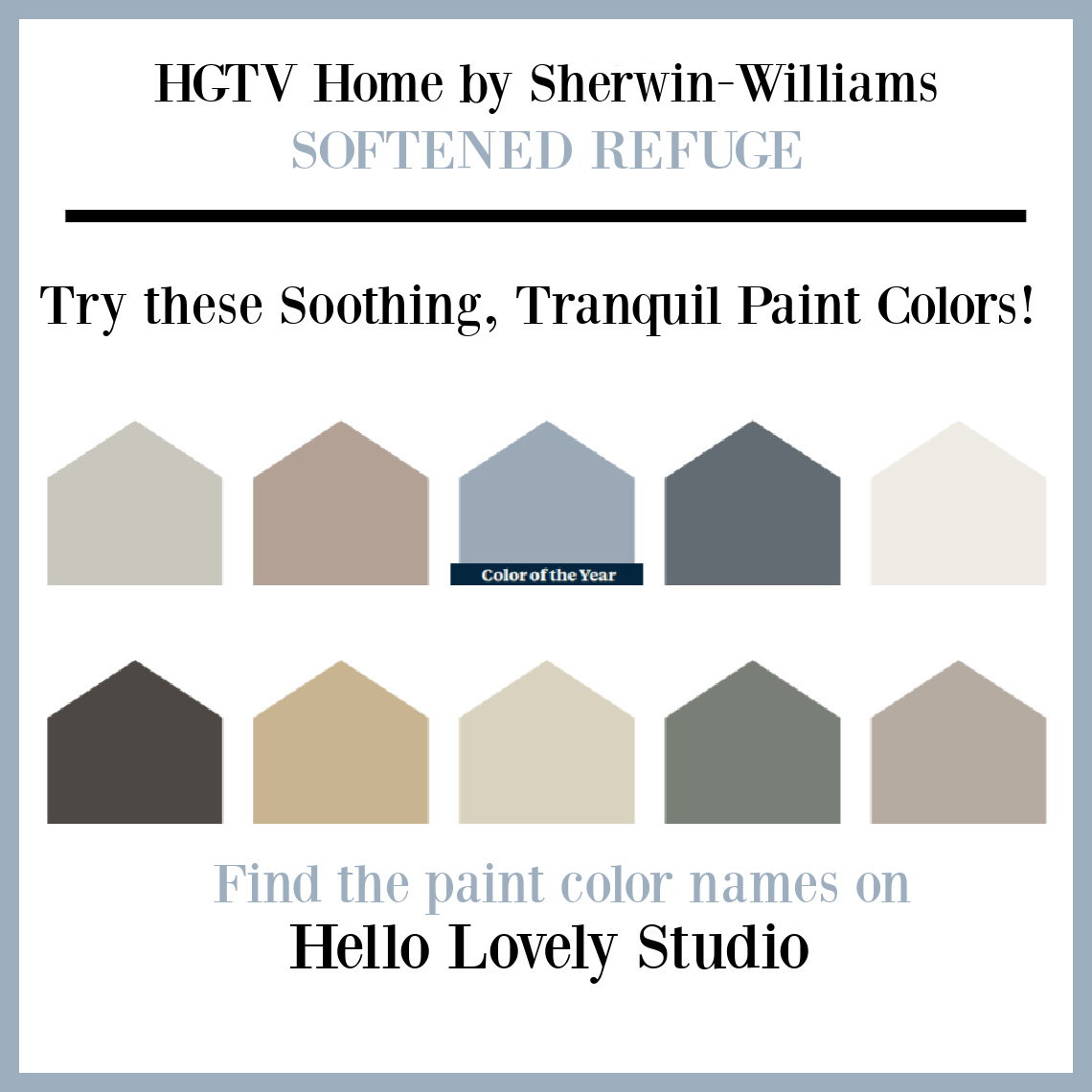
If soft and simple balanced hues designed to promote peacefulness are calling your name, this 2022 Color Collection of the Year from HGTV Home by Sherwin-Williams will appeal. There’s something different about this particular collection. Every single color seems accessible, sensible, and safe in the sense that you won’t easily tire of it. We typically see some wacky colors in these trendy lineups (not unlike an avant garde get-up on the catwalk). So what a pleasant way to start the new year! Let’s discover my top three favorites from the collection in Tranquil Paint Colors: SOFTENED REFUGE HGTV Home by Sherwin-Williams.
What comes to mind when you hear “softened refuge?”
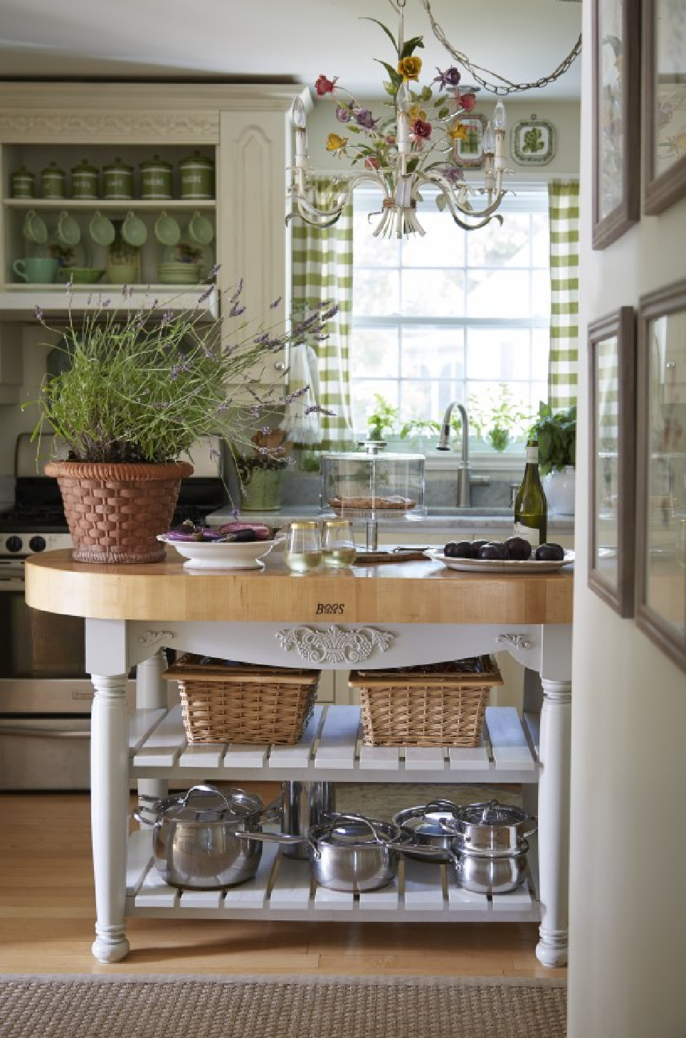
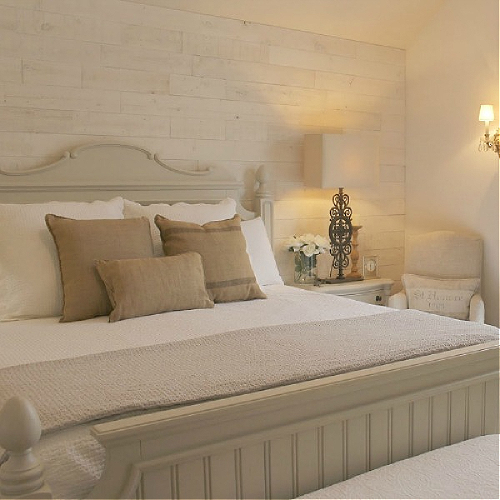
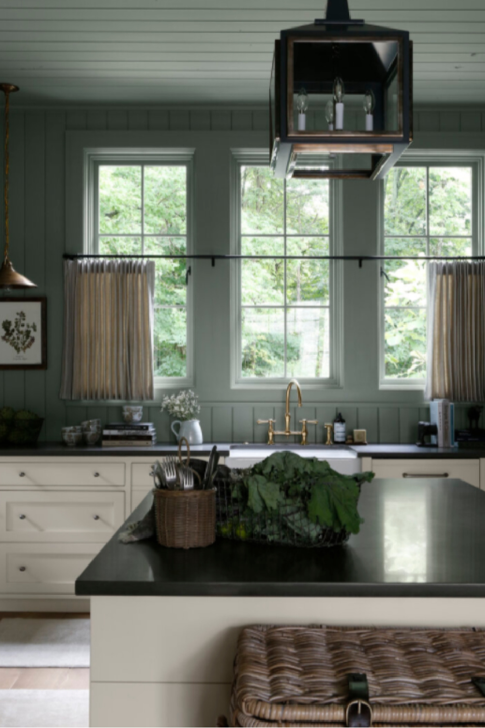
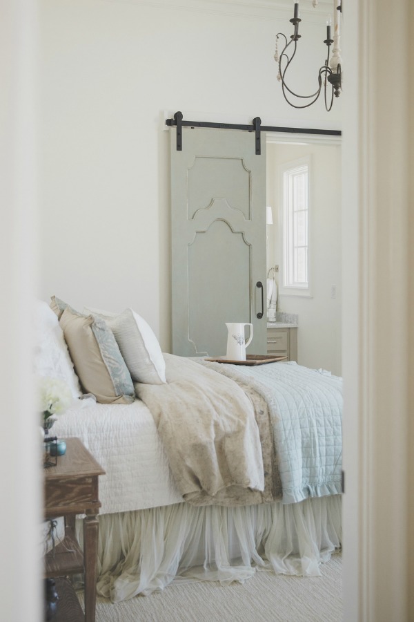
Because it’s just the mood I want to set in my own home. I think of a gorgeous kitchen with charming gingham curtains like the one Amy Chalmers created (above) for her family with its collected treasures and peaceful green accents.
Paint colors that feel comforting to you can make all the difference.
Tranquil Paint Colors: Softened Refuge HGTV Home by Sherwin-Williams
A softened refuge need not be precious or frilly. Lord knows my house is filled with rough around the edges pieces that have withstood time, rambunctious kids, parties, and neglect.
You’ll find these 10 tranquil paint colors to create a sanctuary mood exclusively at Lowe’s, and sampling them is easy.
Why bother with trending paint colors?
What I appreciate about the collection is how they do not feel trendy at all. Who has time to be re-painting rooms as new and en vogue color crushes emerge from fashion runways or TikTok? We also looked at trending colors for 2022 RIGHT HERE.
Give me earthy, timeless, classic colors that feel gentle and soothing so home can feel like like a retreat.
And give me a gentle landing so that when the strong winds of life-y life blow, there is sheltering calm from the storm.

Need Soothing Sherwin-Williams Paint Color Ideas?
I can’t help but notice that while soothing, these paint colors are also the type of sophisticated tones that aren’t easy to name…mirroring the uncertainty in our post-pandemic world and the 2020s!
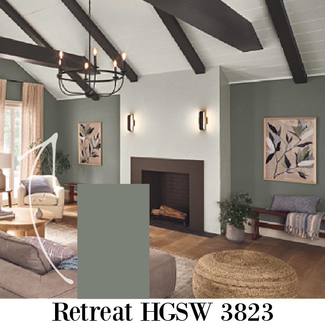
Like naturally calm greens? Sherwin-Williams RETREAT
Retreat might not initially strike you as a green paint color when you see it in that infographic with the collection, but aren’t those muddied colors always the best?
Can’t quite pigeonhole the color? That color is probably a friend of mine.
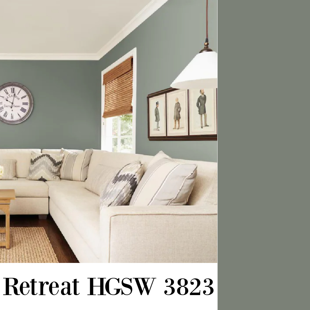
Here is how HGTV Home by Sherwin-Williams describes the restful shade of green:
“A sophisticated organic green, Retreat is rooted in nature and brings a calming influence to shared spaces.”

Does Retreat remind you of SW Acacia Haze?
A SW Green Similar to RETREAT

Remember this video I showed you with the April Tomlinson-designed home tour?
Well, I can’t stop thinking about that Acacia Haze green she used in this home. (Click play and watch it – you’ll thank me!).
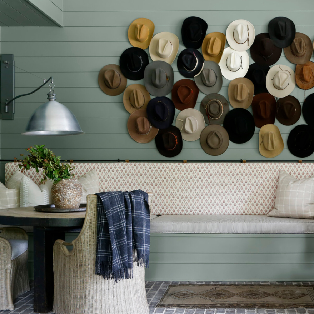
Isn’t it inspiring with the gorgeous millwork?
Find more ideas for beautiful green paint colors RIGHT HERE as well as HERE.
So many designs feature boarded walls these days (that’s what Rita Konig calls them…I took her interior design course recently).
Easiest way to see if a paint color will work? Order samples with Samplize and have them delivered straight to your door.
How Do Paint Colors Reflect Modern Culture?
I think it’s another example (like the SOFTENED REFUGE collection) of a design response to so many folks aching, angst-ing, and healing in the 2020s.

The warmth of wood and earthy tones feels more comforting than cool modern greys of pre-pandemic years.
I would love to hear about your experience if you sample these greens side by side! Do tell!
Love a Tranquil Blue? HGSW 3355 Aleutian: Washed Indigo Blue
I alluded to Aleutian in that post about 2022 trends (see what I did there?), and it’s pretty dreamy considering Sherwin-Williams crowned it COLOR OF THE YEAR:
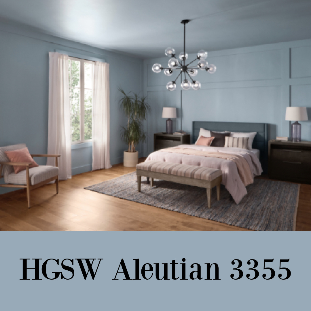
They say of this blue:
“Create space for refuge with this perfectly balanced washed indigo that sets a restful tone. Because it’s grounded in both warm and cool tones, it brings relaxation to any room.”

I feel like it could be amazing in a country kitchen or mud room as a soothing, slightly coastal, slightly French inspired happy blue sky moment.

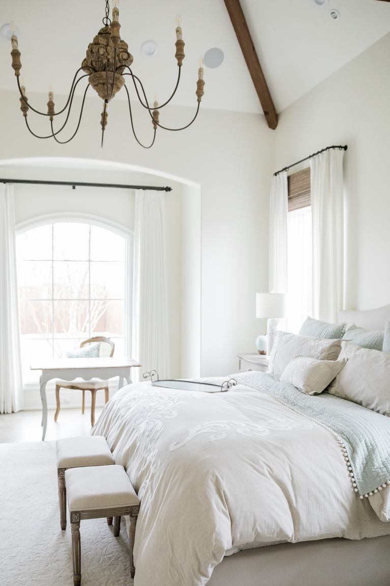
What Warm White Paint Feels Comforting? SW Alabaster
By now, you know this tried and true creamy white used often by Joanna Gaines and interior designers everywhere.

It made the cut for this collection, maybe because it plays so nicely with the neighboring peaceful paint colors on the list.
But I have to tell you a lesson about it I just learned.
Why Sample Paint Colors First?
Sample it first! And then maybe try a gallon rather than a bunch of gallons all at once. Because I thought this color would work well in the entry of the home we’re renovating since my favorite bright whites were too cold. But NO, FRIEND. It looks yellow when the afternoon sun hits it.
Time to try some other options without the yellow undertones. In fact, I may even go in a very different direction and stay with the original color: Sherwin-Williams Repose Gray. I’m trying to listen to what the house wants, and it obviously has reservations about warm tones I thought would be swell.
You just never know what a paint color will look like in your unique space so don’t think it’s a one and done deal even for paint color experts (that would be…moi).
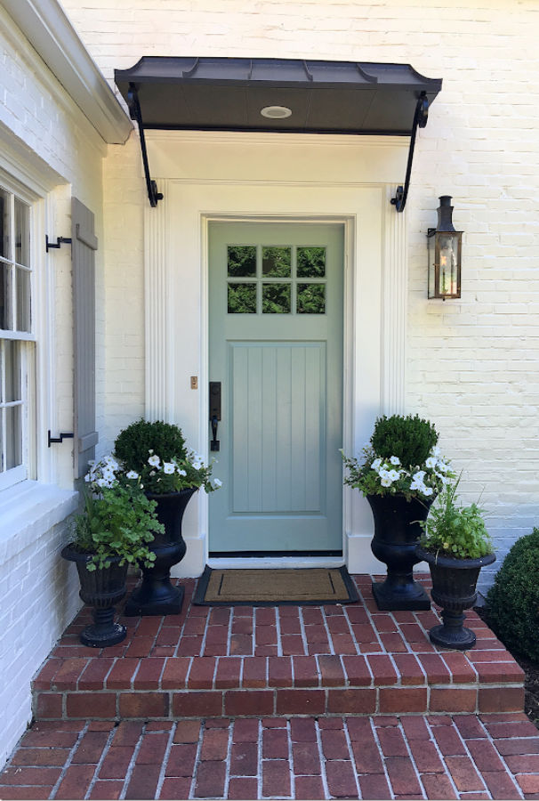
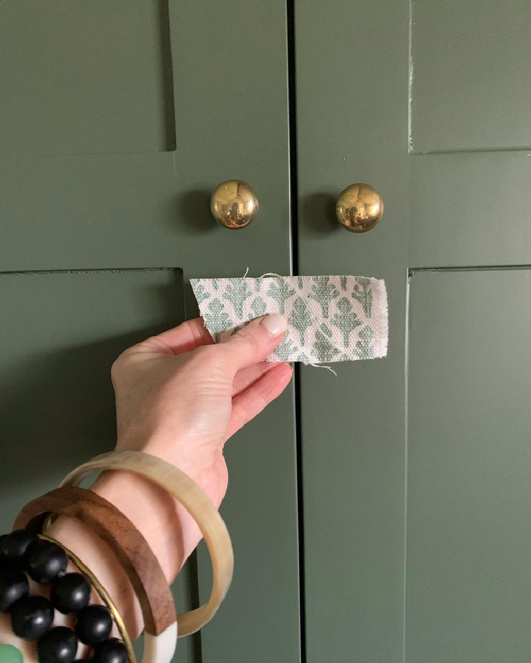
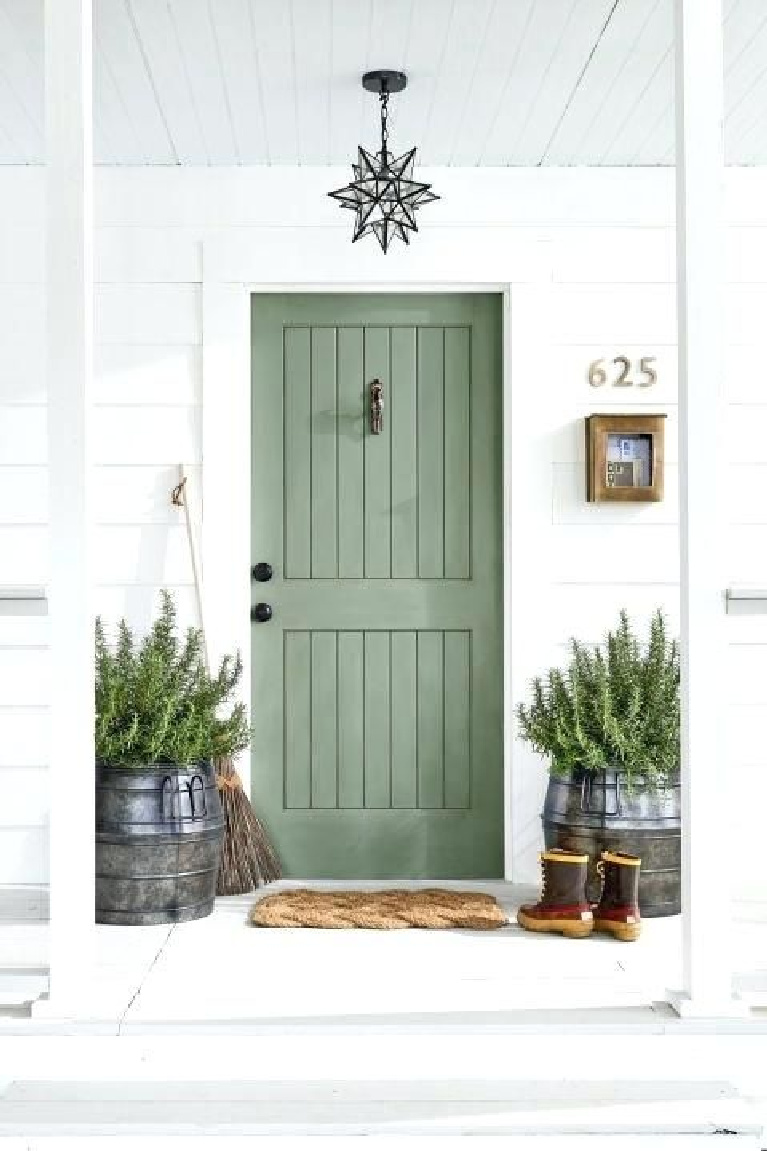
Need a few more paint color ideas? Here’s a SW Moody Green: Rosemary

Finding Lovely showed us just how chic and neutral Rosemary can live when it is mixed at 50% as she did for a son’s beautiful bedroom.
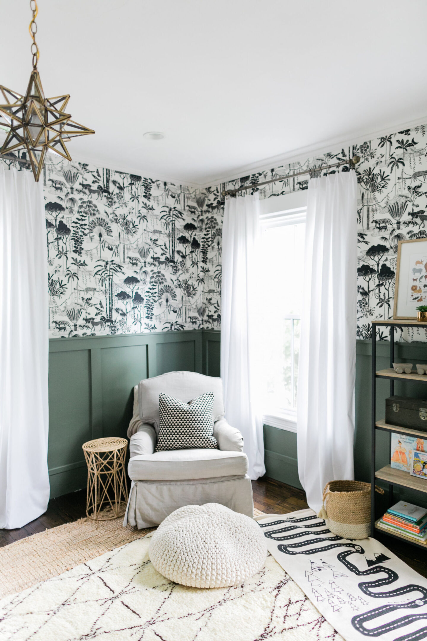
And don’t you feel grateful that folks take the time to take these close-ups to truly capture a green like this?
In other news, my beautiful rosemary plants in the kitchen which have been flourishing forever just gave up the ghost. Boo. I hope I have more luck with a potted tree which came to live with me after more than 20 years in my husband’s office!
I am giving it so much love and talking to it like a freak. Here is Rosemary on a door flanked by rosemary:
How are you holding up? Could your refuge use some softening?
Dig into my archives and discover inspiring treasure while supporting this blog and business in one fell swoop.

I’m so grateful you’re here with me on the journey at the dawn of this, the 13th year of greeting interiors (both literal and figurative ones) with a gentle
HELLO LOVELY.
Peace to you right where you are.
-michele
Shop for items you already intended to buy on Amazon RIGHT HERE, and also find home decor here to keep decor inspiration flowing on Hello Lovely!
Hello Lovely is a participant in the Amazon Services LLC Associates Program, an affiliate advertising program designed to provide a means for sites to earn fees by linking to Amazon.com and affiliated sites.


The rosemary color is beautiful! Am liking the photo of the Rosemary colored door flanked by rosemary plants. For some reason, mine give up after a few years, despite careful pruning and whispered endearments. Great for my local nursery, not so much for my plants. Oh well… 🙂
Author
I’m wondering if I overwatered or if they were just like – it’s too cold, we’re outta here! Thanks for reading. 🙂
Beautiful post.
Author
Thanks so much for taking time for kindness. Peace to you.
I love this article and the colours how restful relaxing pea?refuel and timeless perfect for the rime we are in
Author
I think these colors are just right too for the season in which we find ourselves! Thanks so much for taking the time to visit and comment. 🙂
Hi Michelle,
Been following your blogs just because I love French style decorating and your came up on interest, and those photos?!! Love them!
Somehow I get excited everytime your blog show up on my interest page and then somehow Intuitively clicked on it without knowing it’s yours, but because the page looks like something I would be interested in reading all the way through! Haha.
But good job in all your blogs! Keep them coming!
Your new sub, Follower,
Charity
Author
Thanks so much for taking the time to introduce yourself and these sweet comments. I’m so glad you are finding inspiration and content you love – so happy to have you here! Happy weekend.