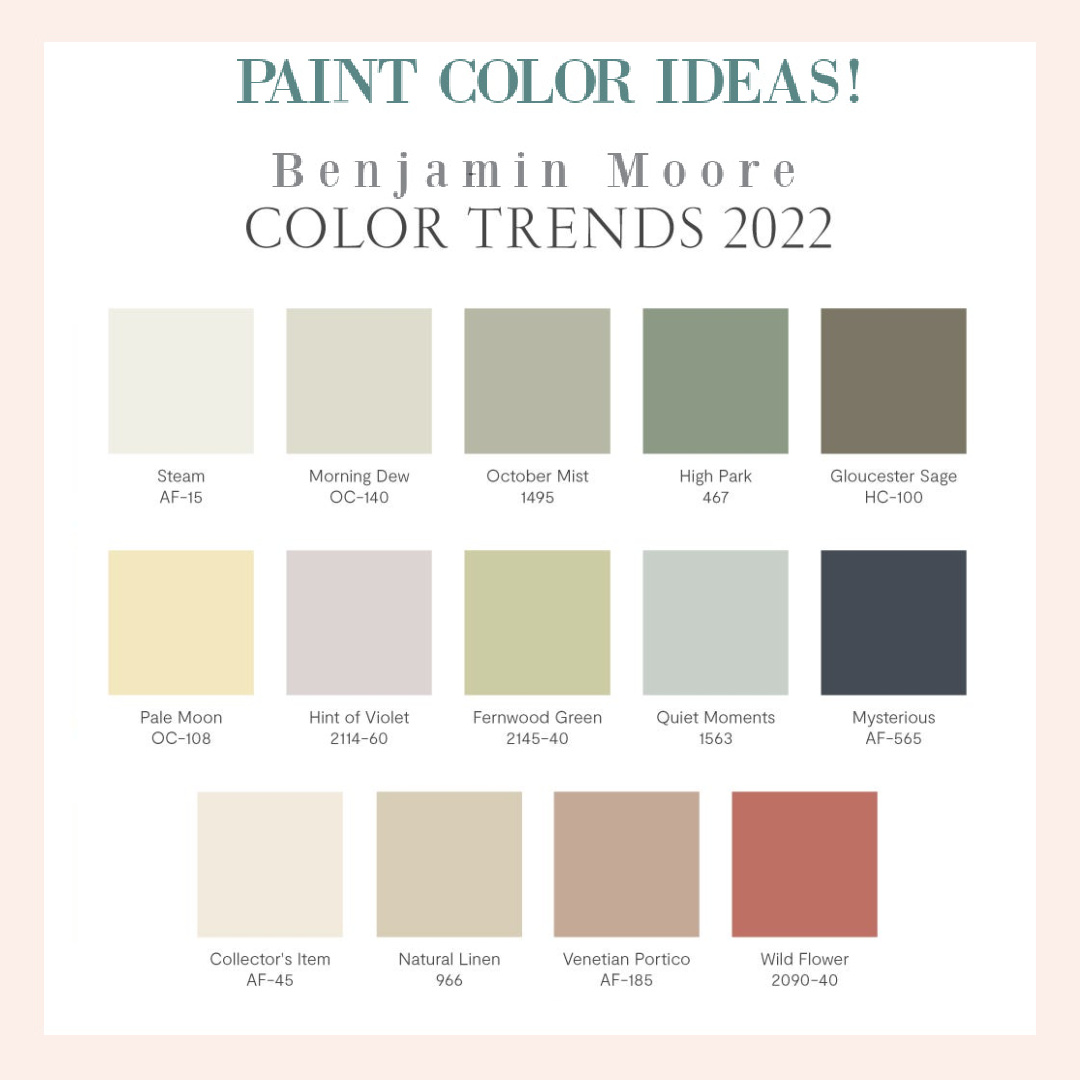
Even though we’re all about timeless paint colors for walls here at Hello Lovely, it’s smart to keep an eye on what is trending. After all, typically those hues homeowners choose at any even given time will parallel cultural patterns, values and consciousness. It does appear that soothing, earthy tones are still thriving. Let’s look at a few understated neutrals which are favorites of mine in Paint Color Ideas: Which Neutrals Are Trending in 2022?
Do PIN THIS POST to save for future reference and also to support this blog. 🙂
I independently selected products in this post—if you buy from one of my links, I may earn a commission.
Paint Color Ideas: Which Understated Neutrals Are Trending?
Benjamin Moore 2022 Color of the Year: October Mist 1495
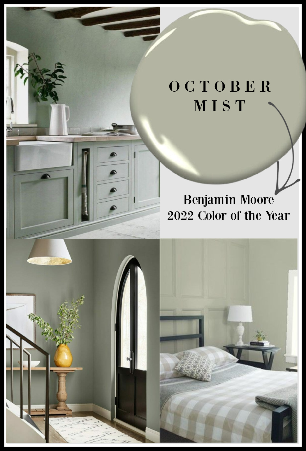
Let’s start with the big announcement: COLOR OF THE YEAR IS: OCTOBER MIST!
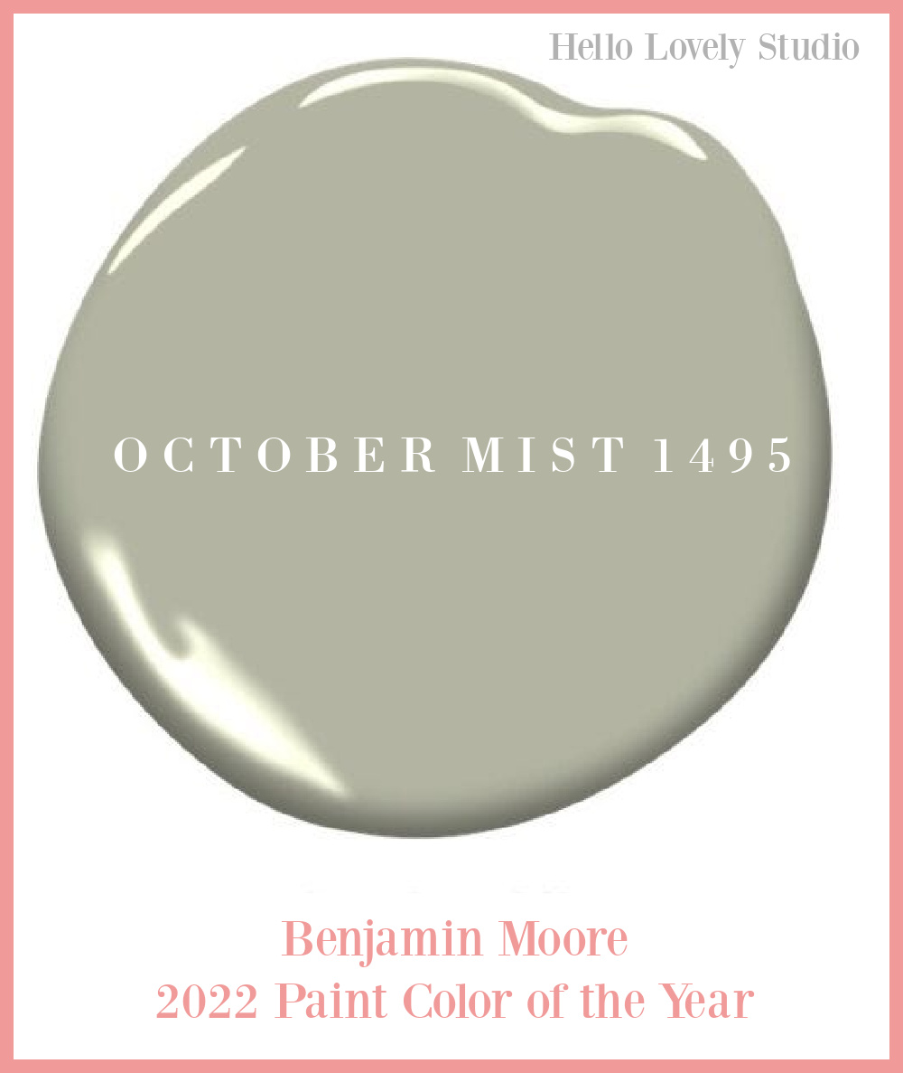
From Benjamin Moore: “Evocative of the stem of a flower, this gently shaded sage anchors and uplifts.”
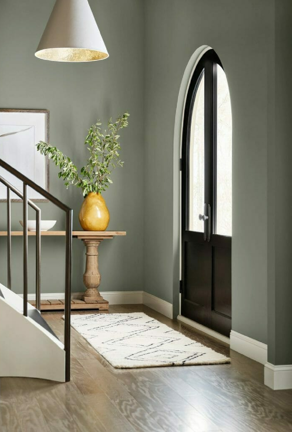
I’m dying to try it. I haven’t lived with sage green since 2004 when I painted our bedroom an earthy, slightly more gray than October Mist shade. I was ready to move on from it after a couple of years, but it was extremely calming.
Another lovely color that made the 2022 list is…
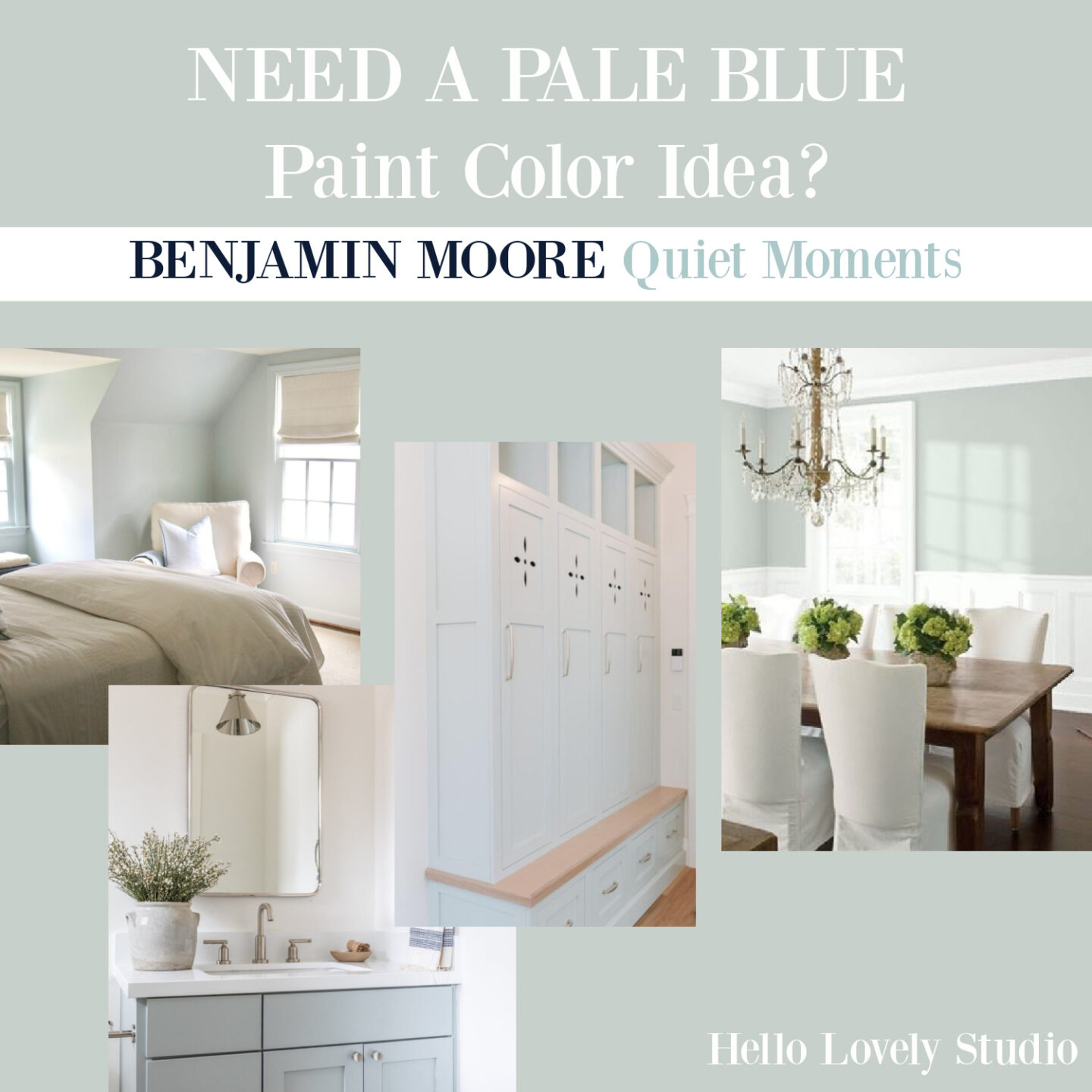
Quiet Moments
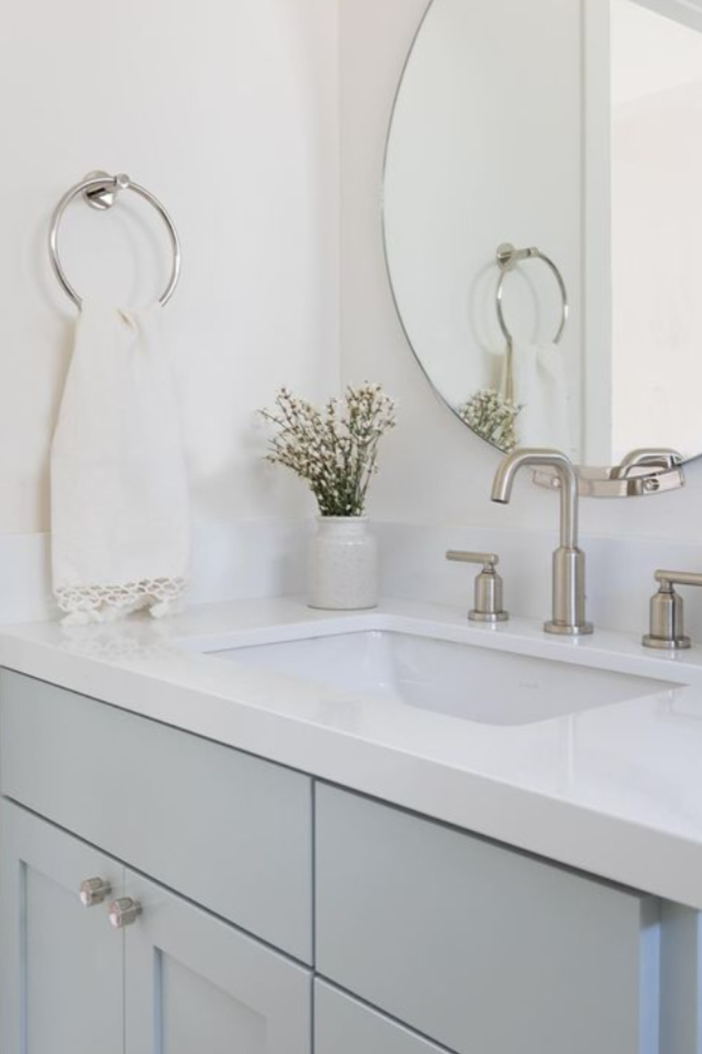
We have looked closely at this hue RIGHT HERE.
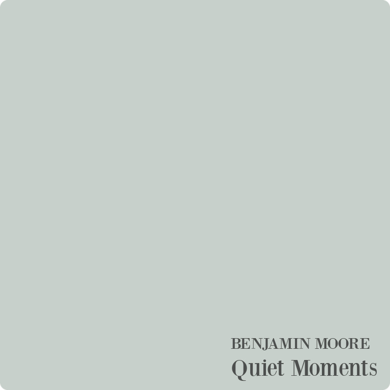
It reminds me of a Glidden color I used quite a bit in the early 2000s called Nurture. Is it too pastel for your space? The only way to know is to sample it and watch it through the day.
How many shades of khaki are there in the world of neutral paint colors? Too many to count, but I do like the name chosen for this one from the 2022 paint colors:
Natural Linen 966
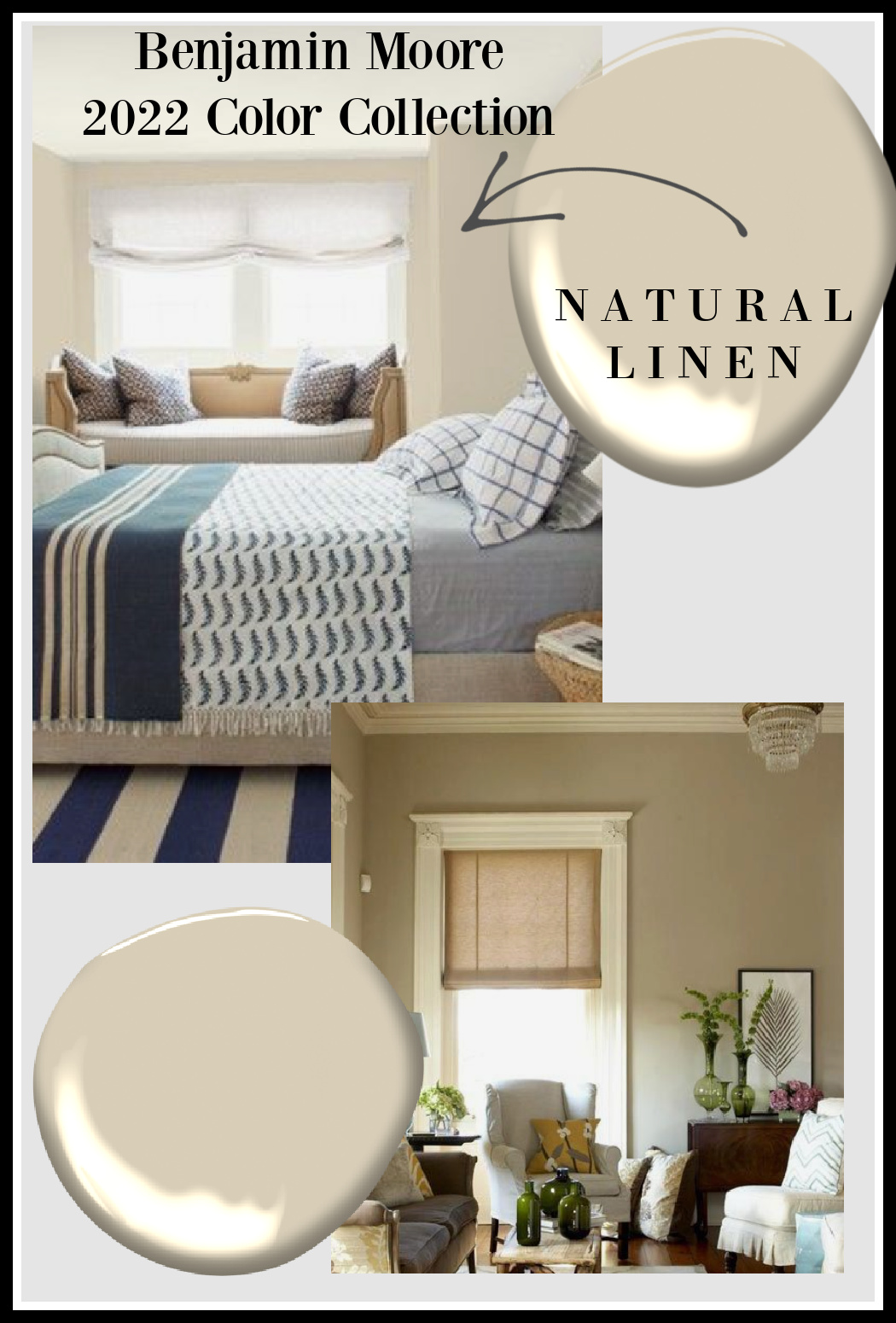
Sometimes a room needs a warm hug of a creamy stone/putty/linen, and it does look amazing with navy.
More Benjamin Moore Understated Neutral Colors to Try
The three paint colors above were my favs from the 2022 collection, and here’s a bunch from last year’s collection that are timelessly lovely:
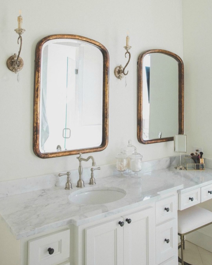
Atrium White
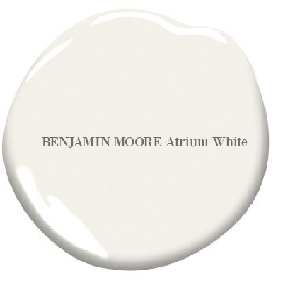
Benjamin Moore’s Atrium White is a sophisticated off-white paint color for timeless and tranquil interiors.
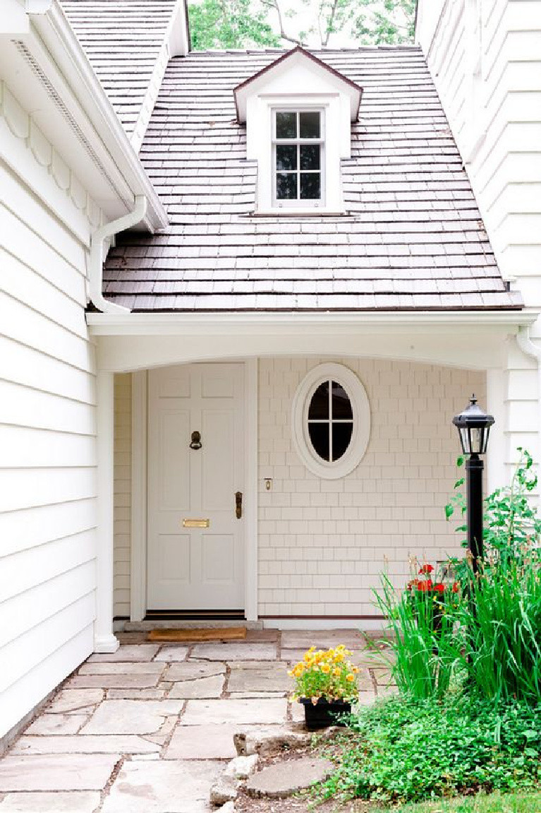
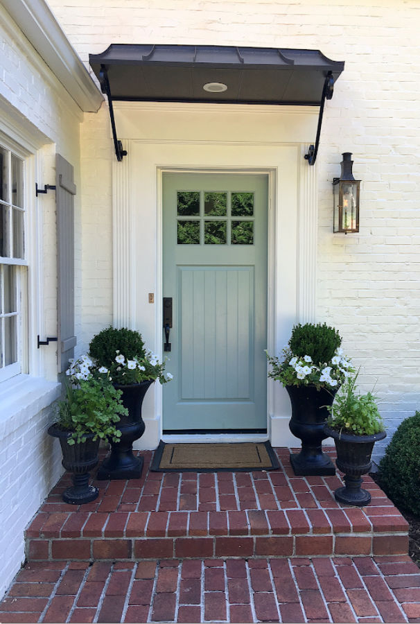
It’s funny, but I don’t see too many white doors in my neck of the woods…and you?
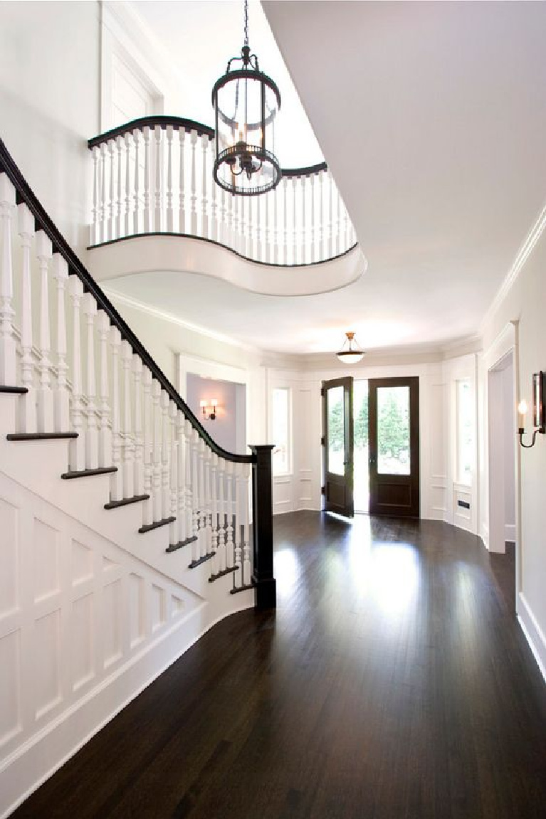
Easiest way to see if a paint color will work? Order samples with Samplize and have them delivered straight to your door.
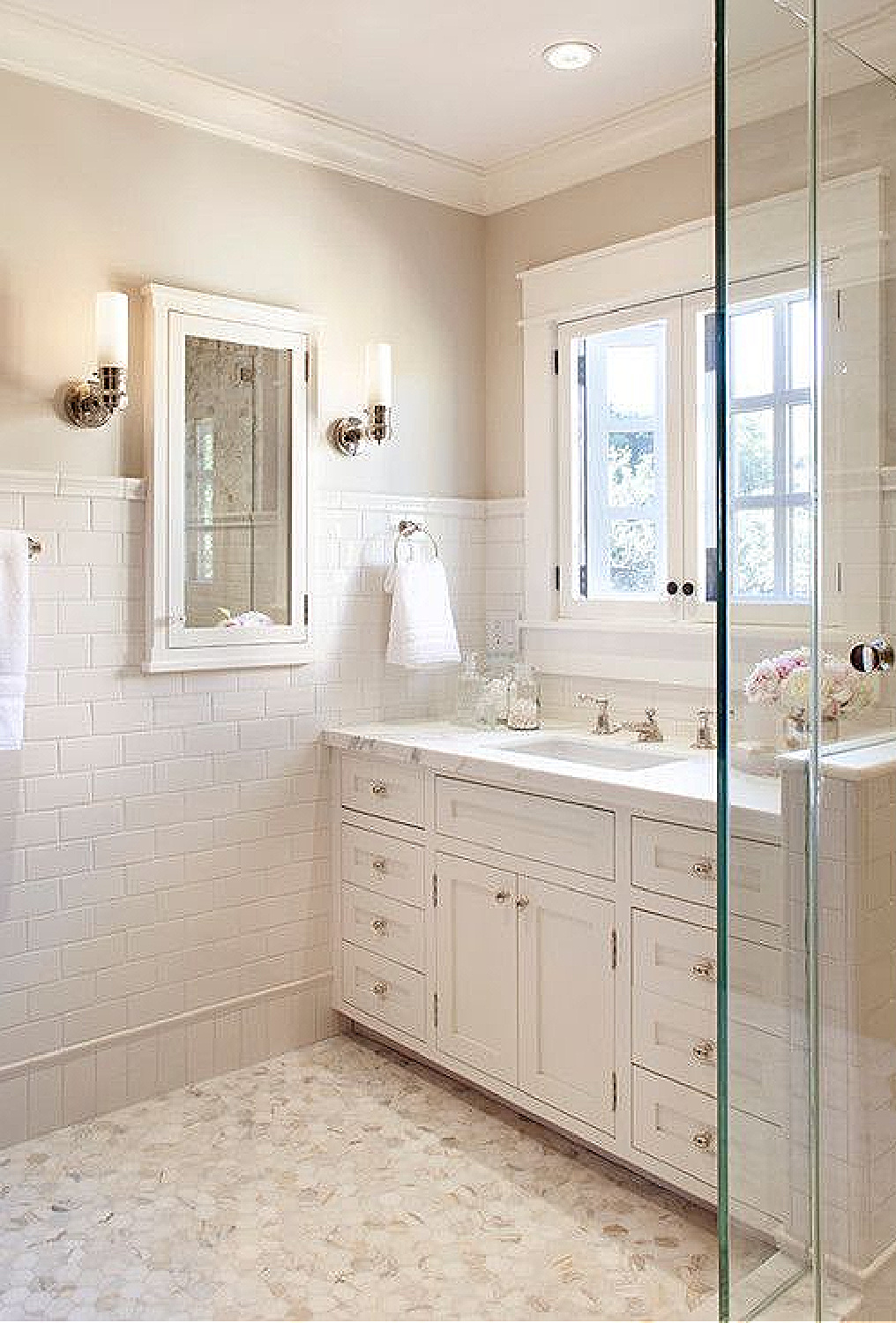
Make sure you see THIS and THIS for more inspiring white paint color ideas!
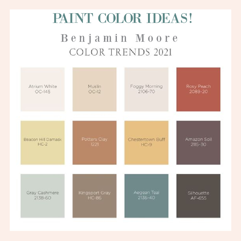
Did you try any of these paint colors above that made the cut last year? I think it is better when the color doesn’t have a word like “gray” or “green” in the name because it can be so misleading. Gray cashmere looks green and atmospheric to me!
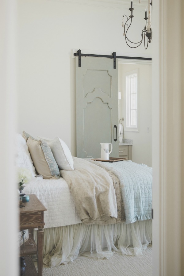
Gray Cashmere
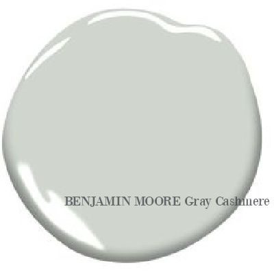
I might call it “soothing cashmere” so as not to scare anyone away who thinks a grey color would be too cold or boring.
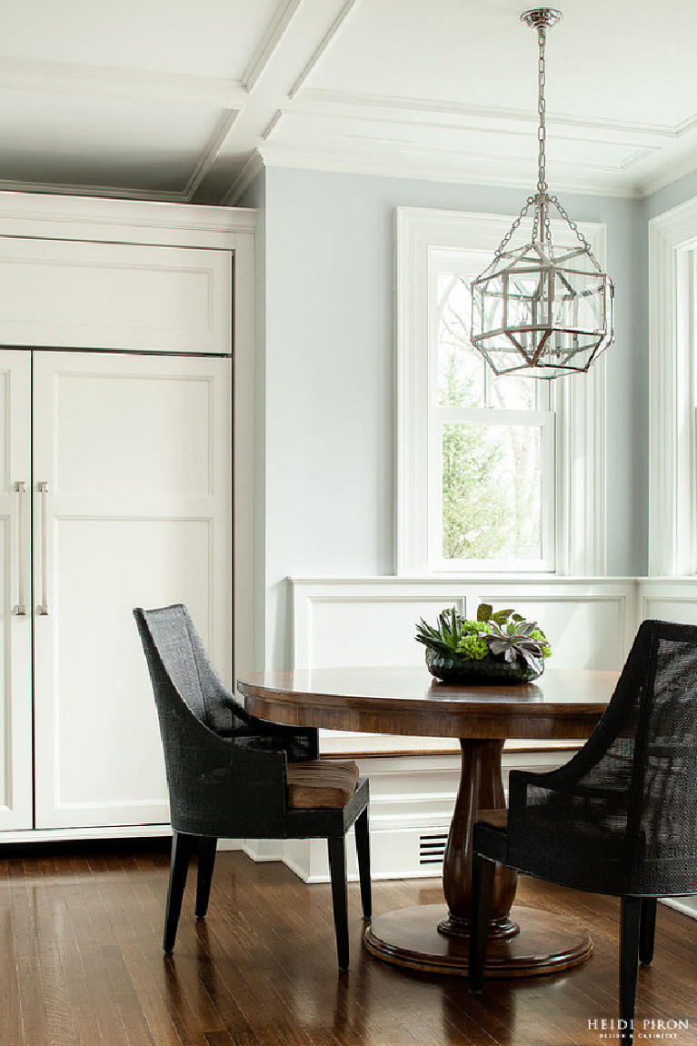
Foggy Morning
A touch of pink is so beautiful in white paint colors, and here you can see it as an undertone in Foggy Morning.
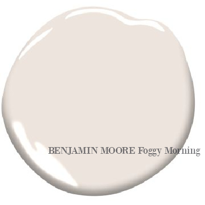
Benjamin Moore describes Foggy Morning as: “Smoky, light, and delicate, foggy morning suggests an early morning walk through woods shrouded in a blanket of dew.”
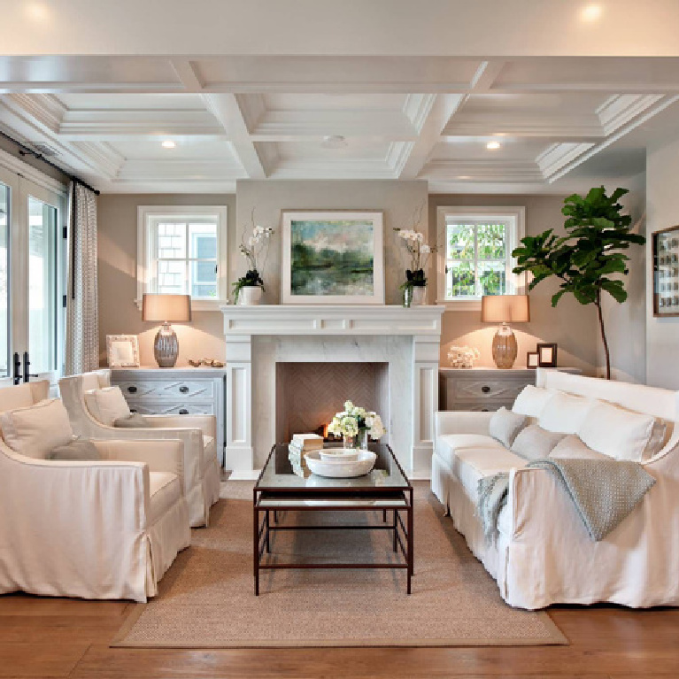
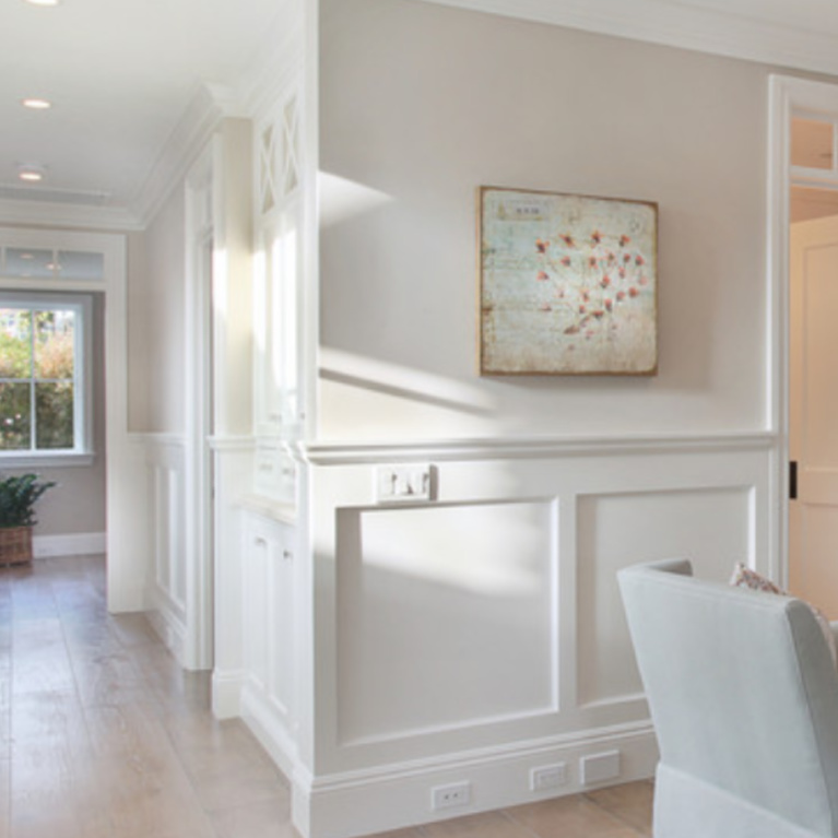
Score more grey paint color inspiration in THIS and also THIS.
Benjamin Moore’s Color of the Year for 2021
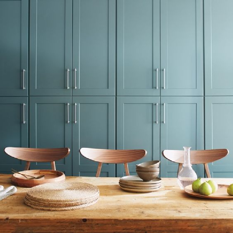
Aegean Teal
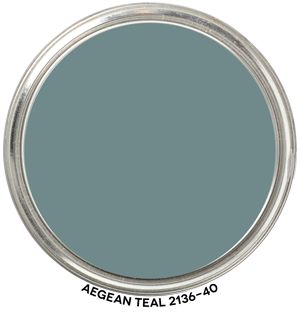
Here’s a very atmospheric, European inspired blue-green with grey undertones. BM calls Aegean Teal 2136-40 an intriguing midtone that creates natural harmony.
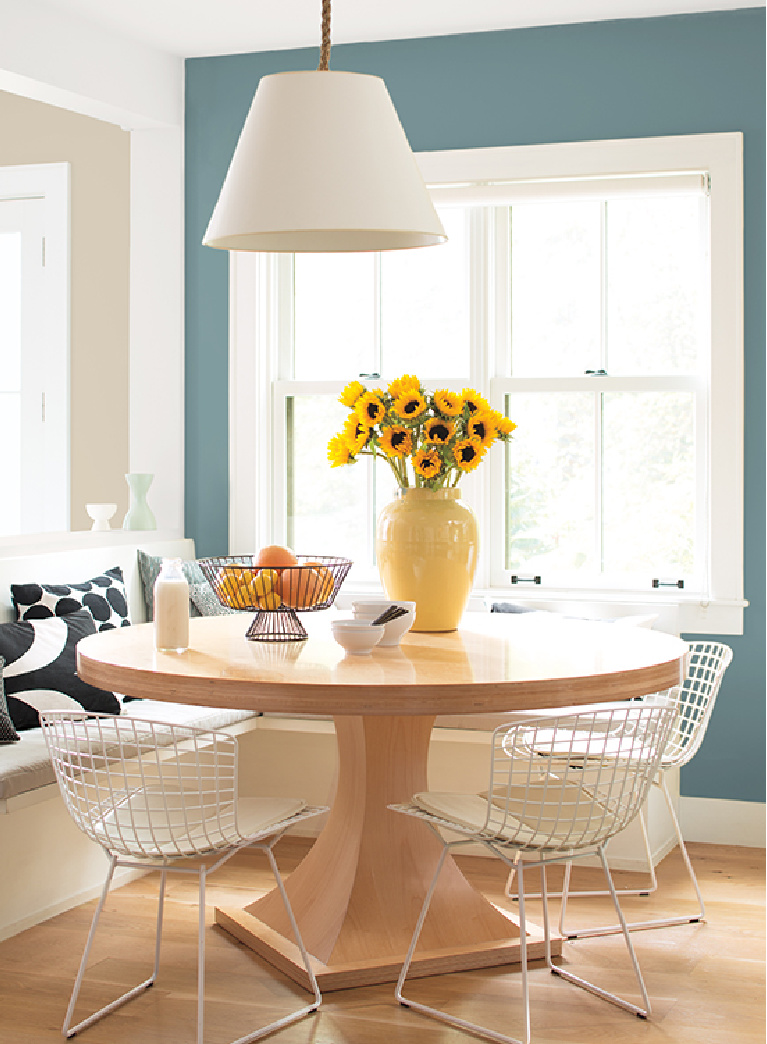
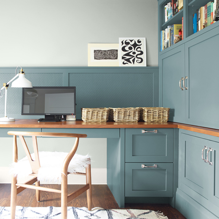
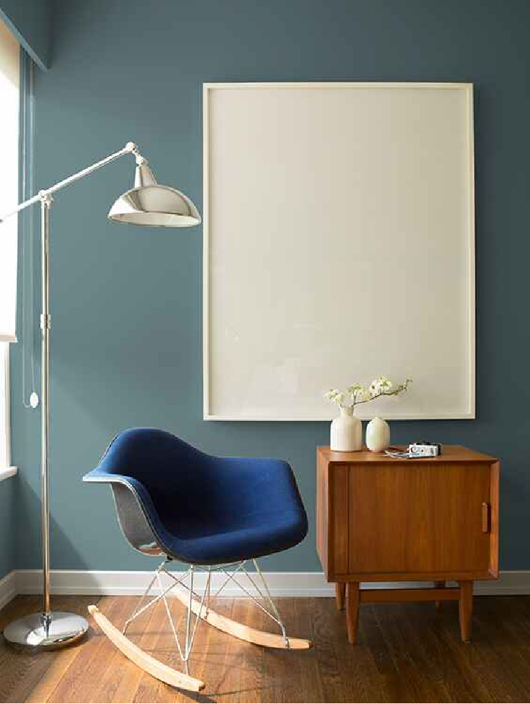
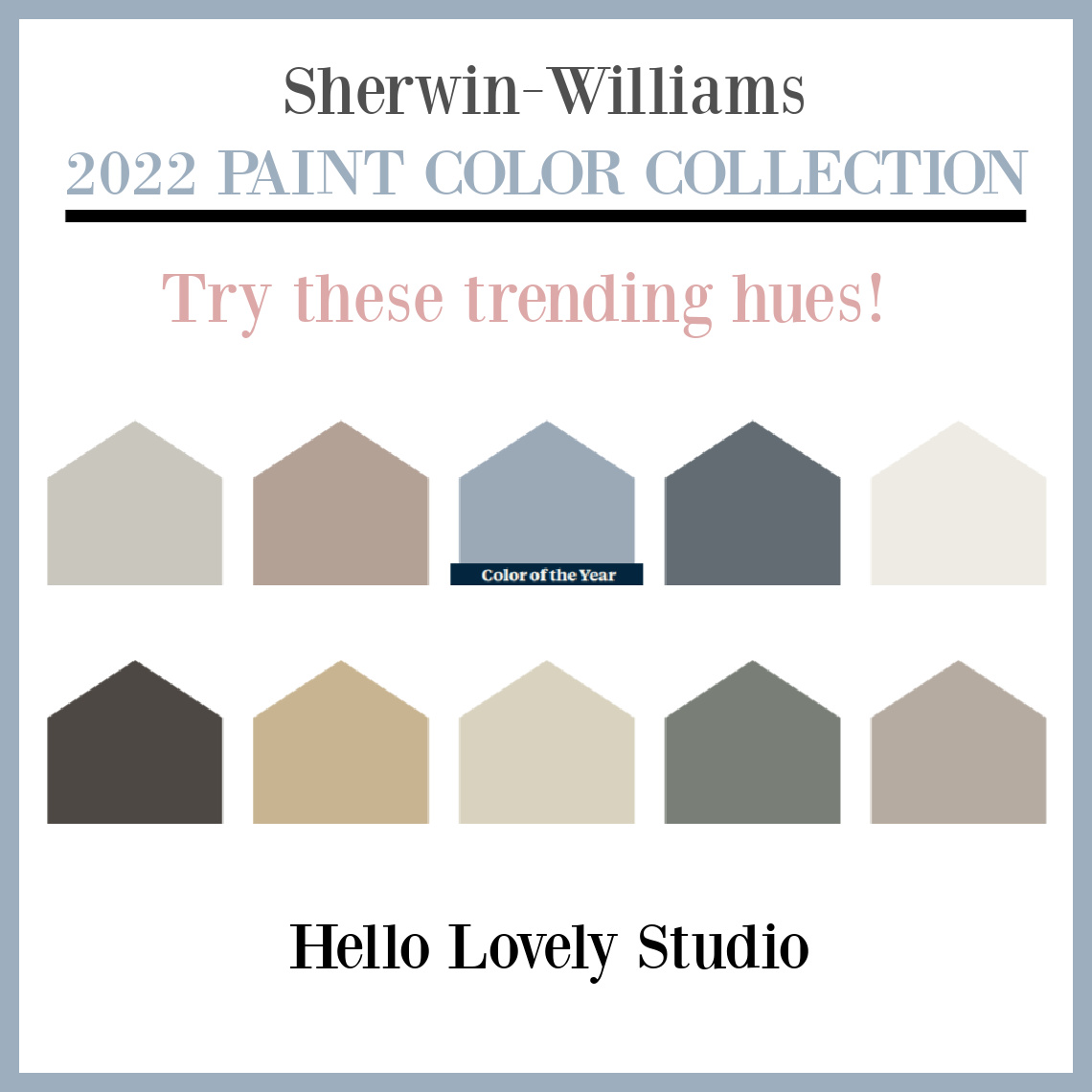
2022 Sherwin Williams Color Collection
Sherwin-Williams picked ALEUTIAN as their color of the year. Isn’t it gorgeous?
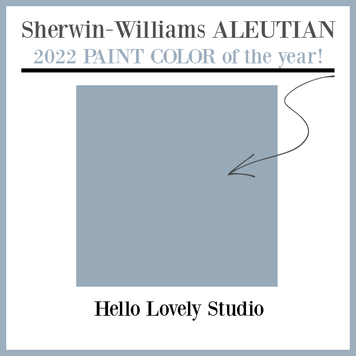
Curious about the rest of the picks for 2022? Keep reading!
Gorgeous Behr Colors to Try
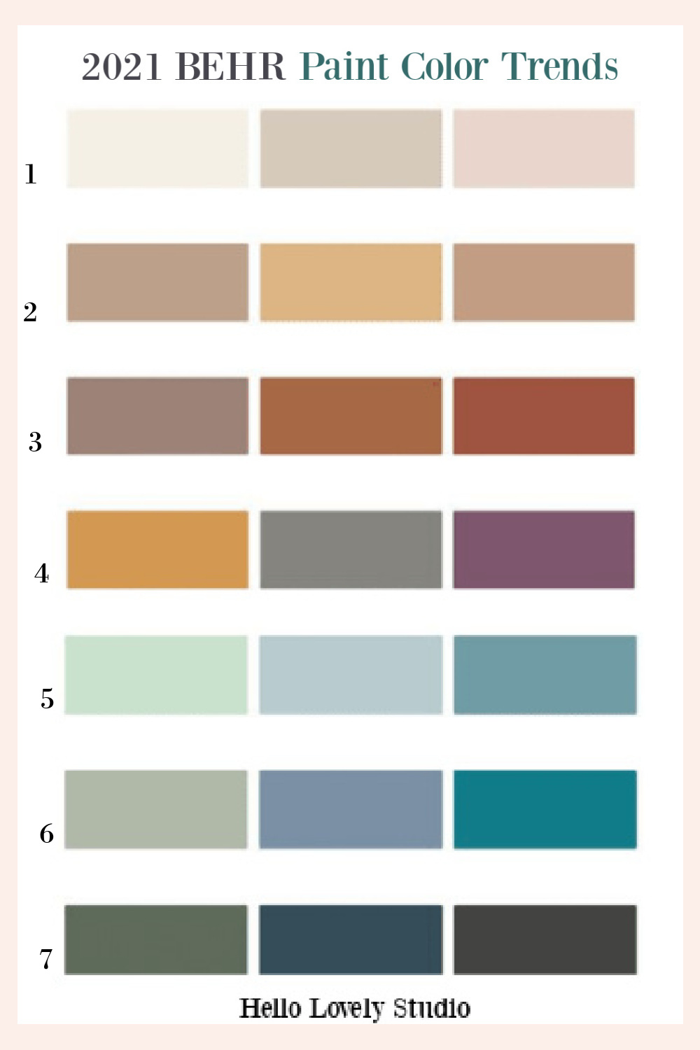
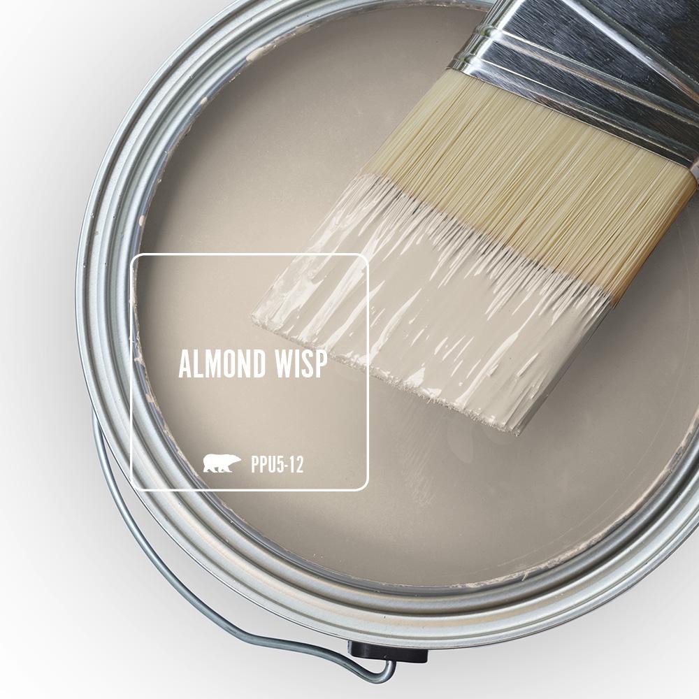
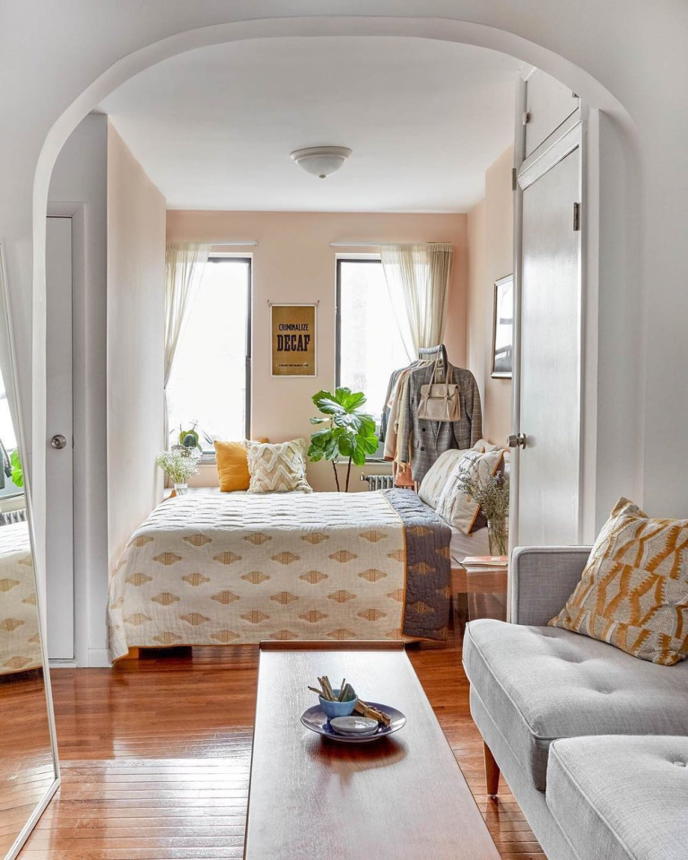
Almond Wisp
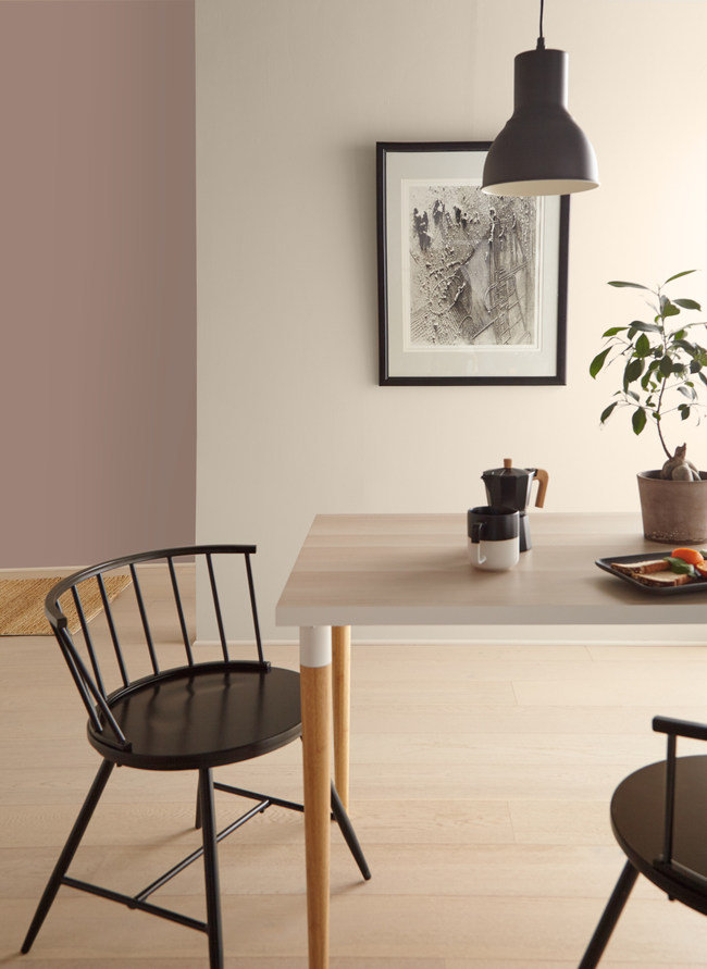
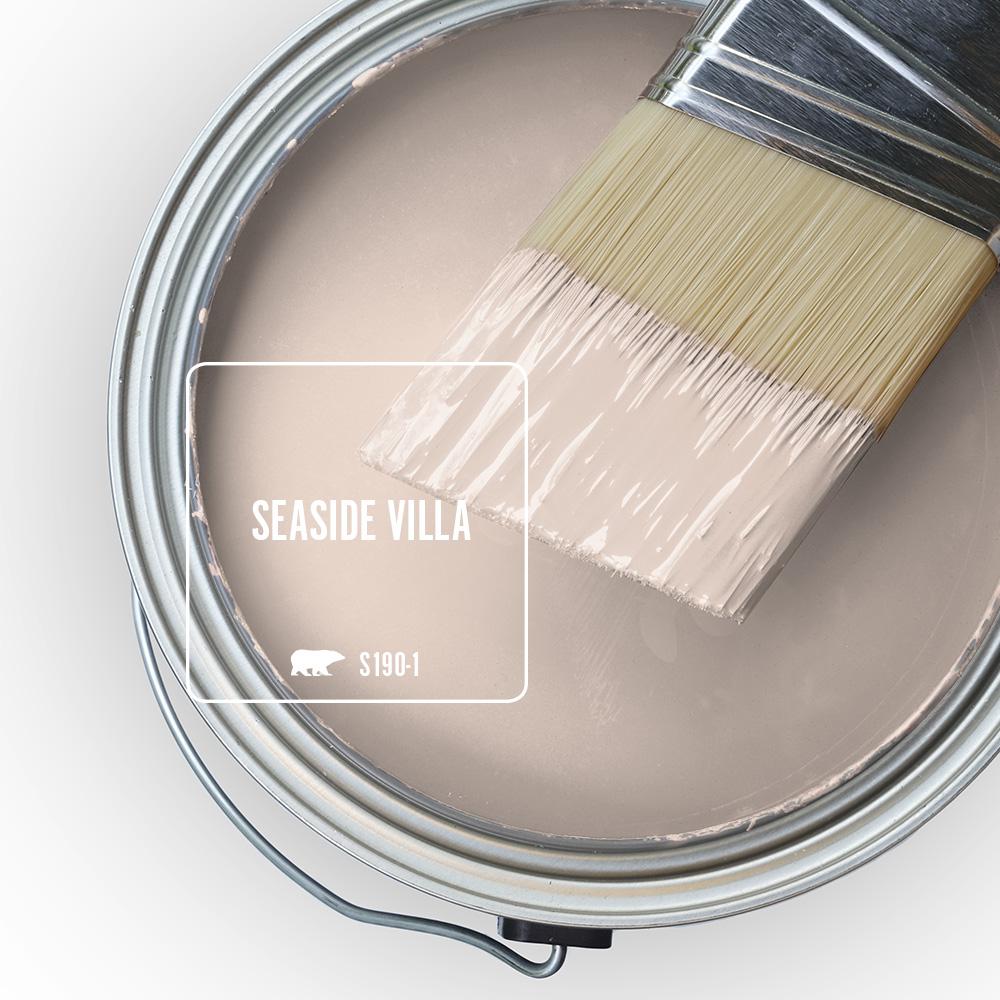
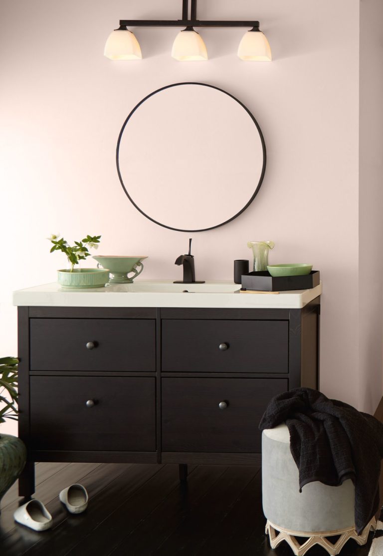
Seaside Villa
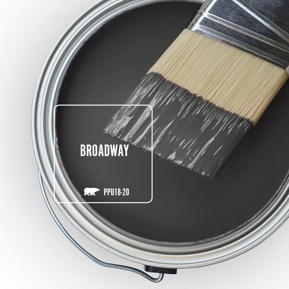
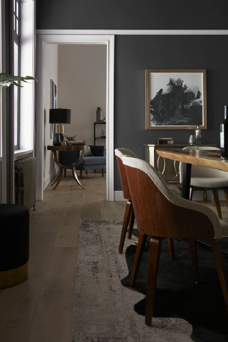
Broadway
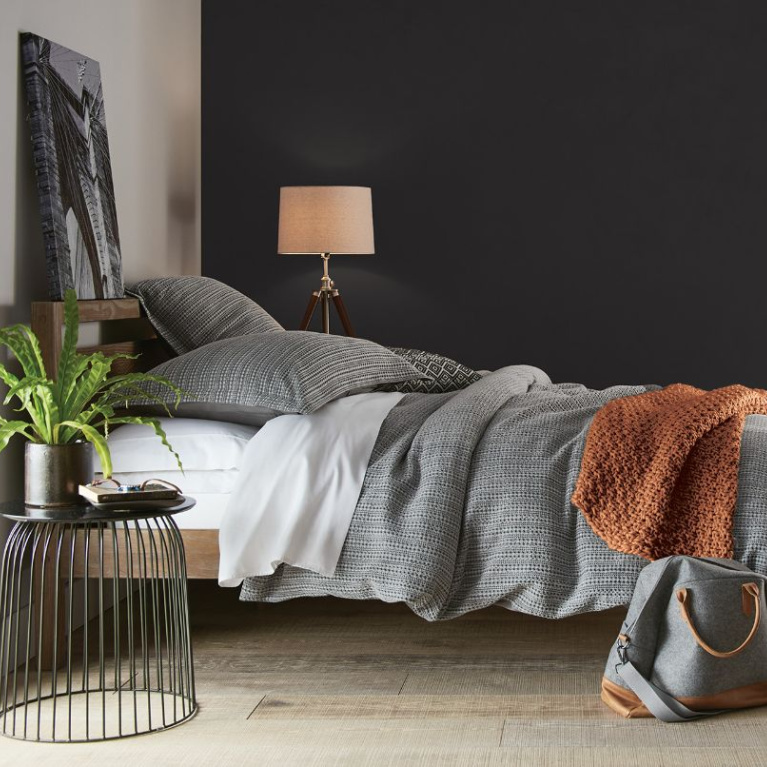
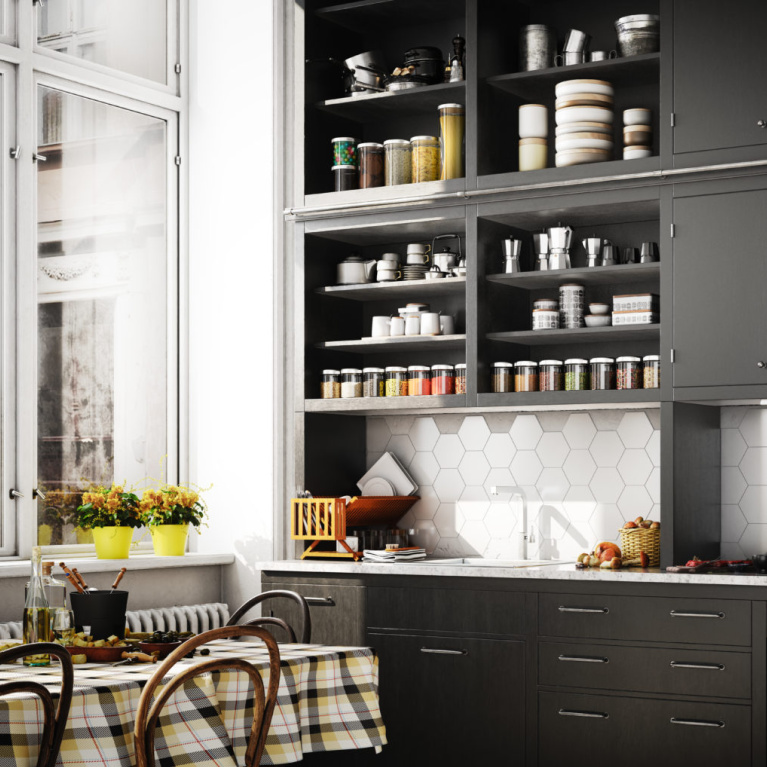
Sherwin-Williams Paint Color Ideas for 2022
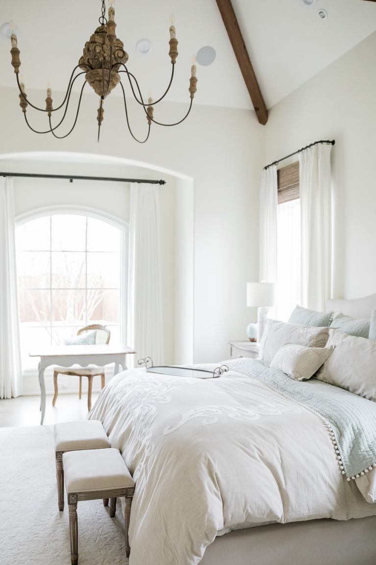
Alabaster

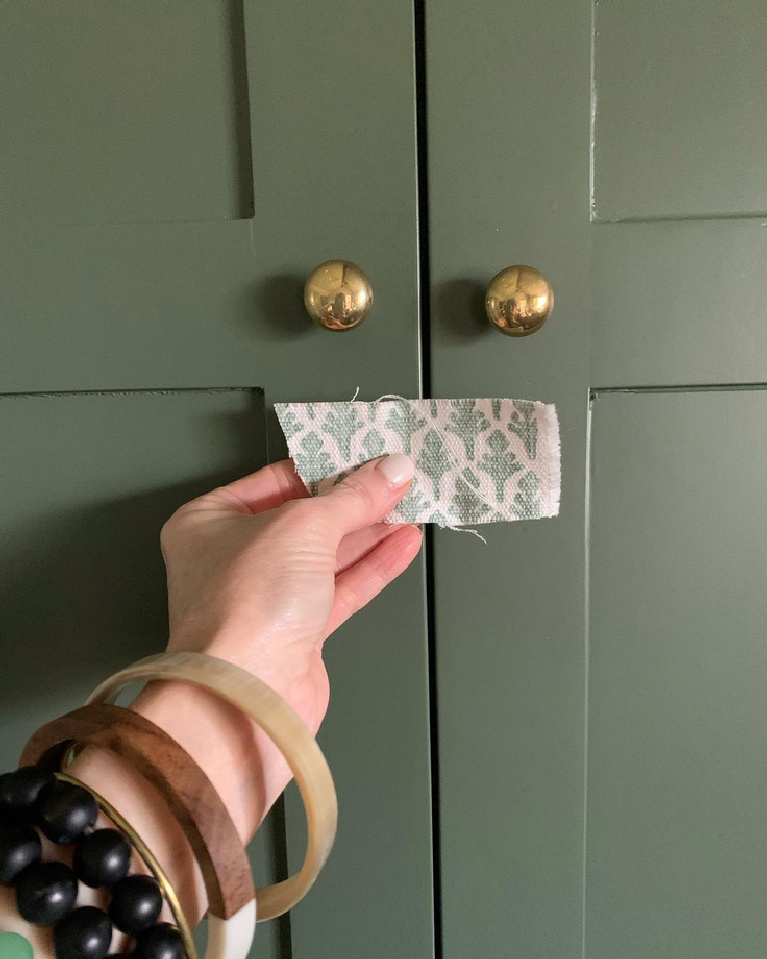
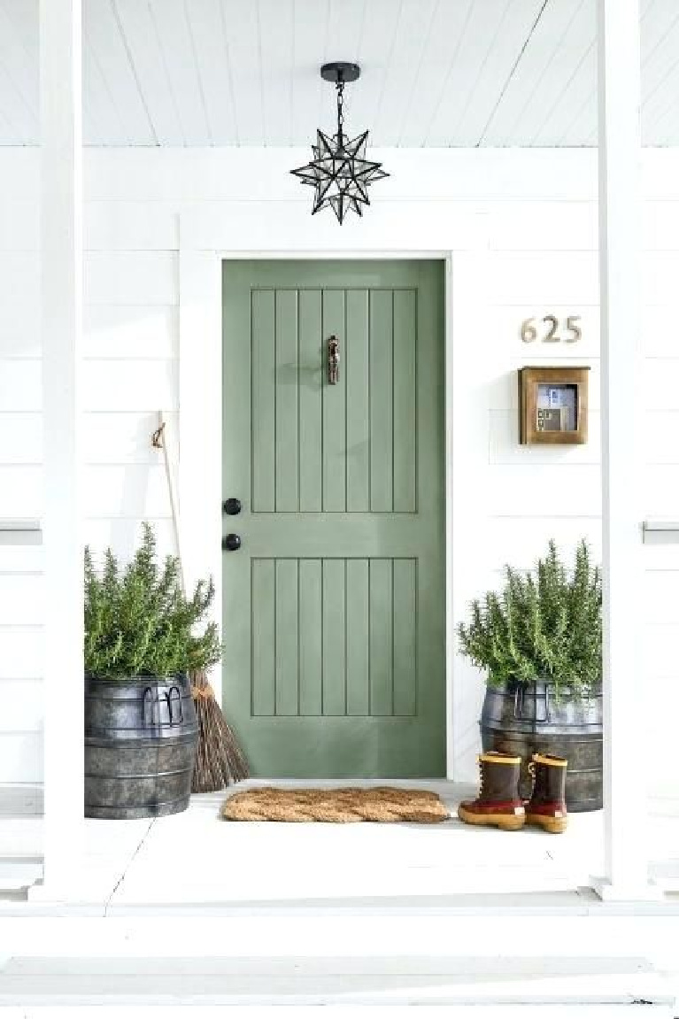
A Trending Green from 2021: SW Rosemary

Finding Lovely showed us just how chic and neutral Rosemary can live when it is mixed at 50% as she did for a son’s beautiful bedroom.
The French seem to know their way around understated, sophisticated neutrals best, and since we don’t often get tours of stylish suburban apartments outside of Paris, this one caught my attention. Let me know what you think!
I independently selected products in this post—if you buy from one of my links, I may earn a commission.
Peace to you right where you are.
-michele
Shop for items you already intended to buy on Amazon RIGHT HERE, and also find home decor here to keep decor inspiration flowing on Hello Lovely!
Hello Lovely is a participant in the Amazon Services LLC Associates Program, an affiliate advertising program designed to provide a means for sites to earn fees by linking to Amazon.com and affiliated sites.









Love this color post. I’m definitely a nature girl who likes variety. I want my home to be a place of harmony, and of excitement, as you go from room to room. Too many similar colors is too much for me, as is too much variety. I’m sure we each have a mix that is pleasing to our unique perspective and that’s what makes life interesting to me. I love going into a home with special touches, that shows me who the owner is. This post was a good example of that and the video was so much fun to watch. Thank you, Michele!
Author
Such great food for thought! I wonder if visitors to my home may think ‘where are the travel souvenirs and the personality?’ because there is such a lack of color and so much spareness and room to breathe. I also wonder if so much white space is a reflection of my love for mystery and my spirit of unknowing. Even when we think we have a plan in mind and even what we think of as ‘unfinished’ is bound to reveal so much about our inner lives. 🙂
I don’t think they’d question the lack of souvenirs. LOL I think they would say, “Here’s a girl, who wants tranquility… and maybe has a love of mystery.” <3 Michele, I loved the Leia Sfez video. I watched it three times trying not to miss anything. Once with sound, once without sound and once without sound and with closed caption.
Author
Hahaha – you’re so kind to me. And you have excellent taste! 🙂
Love the Rosemary green as green is my fave color! Also loved this video too…so many interesting ideas about fashion & decor! She & her daughter have inspired me to try & paint my own art! Haha! I love both their pieces displayed in their apt! Thx for finding & sharing such awesome videos! Also, I loved the one about the girl who loved ice and listened to the ice noises!! So cool!
Author
I was hoping this post would delight some lovers of green – I find that rosemary hue to be uplifting and energizing even though I don’t think I have any green ‘moments’ in my decor here. Fashion is so interesting right now that most of us are staying at home and at the very least are veiled behind masks. I think it’s an artful expression (as makeup is for me) where our moods can dictate what we throw on as much as the weather does. Creating your own art is so satisfying! Keep me posted on any masterpieces that may happen for you. 🙂
I loved the colors and pics and thought how can I use some of those colors. Unfortunately it is hard for me to visualize because I noticed all the pictures had white trim and my home has dark ornate old world trim, which I can’t bring myself to painting white. I also have original dark hardwood flooring throughout. I real liked the greens and wondered how that would look against the dark trim without making my home feel dark.
Author
I hear you! A couple of homes ago, I had oak trim throughout and wanted low contrast so I opted for a very warm white with yellow undertones. If you’re after contrast, a cool grey can be stunning with a warm wood tone – a very modern take for traditional woodwork. A green (like the rosemary color in the post) could be absolutely stunning with your wood trim! Such a natural combination, don’t you think? Just look outdoors and notice the trees! There are so many other factors that come into play as far as whether it will make the room too dark. Does the room receive lots of natural light? Is the room mostly used at night (i.e. for TV watching where a dim space is desirable)? The best way to get closer to the right color is by trying samples and noticing how the color changes throughout the day. Let me know if you have further questions – always happy to brainstorm with you.
We have B. Moore Atrium White on all our trim throughout the house. It looks good with every color wall and is just warm enough, so does not look sterile. Supposedly has some pink in it but I do not see that anywhere in our house. I am going to save this post…thanks so much for the great information!
Author
Thank YOU for letting us all know – you would be surprised how many folks read through comments to get ideas for paint colors! i will definitely be checking out Atrium White! 🙂