Tranquil Blue Paint Colors & Glorious Timeless Interior Design directs our gaze toward simplicity, blue, and timelessness. We’ll consider sophisticated simplicity from Suzanne Kasler, peek at a different flavor of simplicity in the UK, identify a few paint colors imparting calm, and then parade a few lovely finds.
These affiliate links won’t cost you a penny extra and will earn this blog a small commission so please do use them.
Tranquil Blue Paint Colors & Timeless Interior Design Ideas
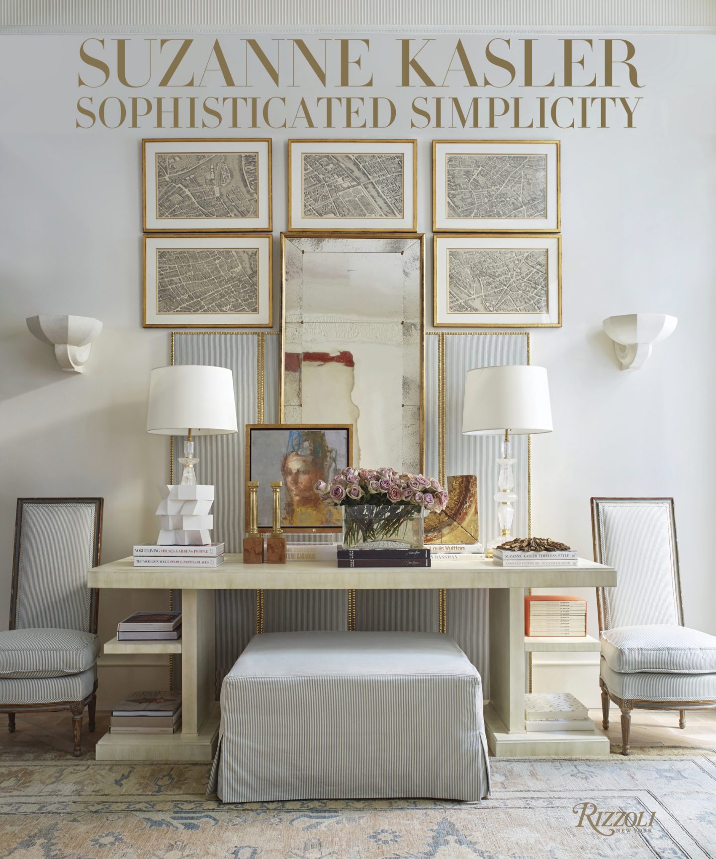
Timeless Interior Design With Sophistication
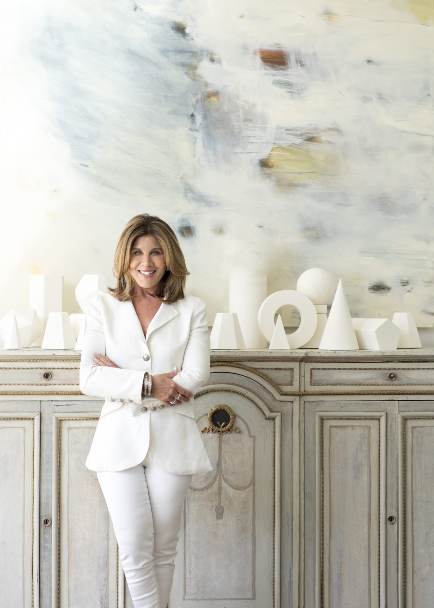
Kasler’s Use of Color
I am always curious about an interior designer’s approach to color, and here’s what Suzanne Kasler notes about using coral throughout a project in Buckhead project (on p.75 of the book):
“You can sequence color strategically throughout a house, but it doesn’t have to be obvious. The subtle reference to coral shows up in room after room in different guises–in the pattern of a curtain fabric, as pillows, in a bouquet, as cording. In the rooms that are mostly shades of bone and neutral, the coral color really stands out.” – SUZANNE KASLER

And of course, I’m all ears when it comes to the designer’s philosophy about white decor…here’s her take:
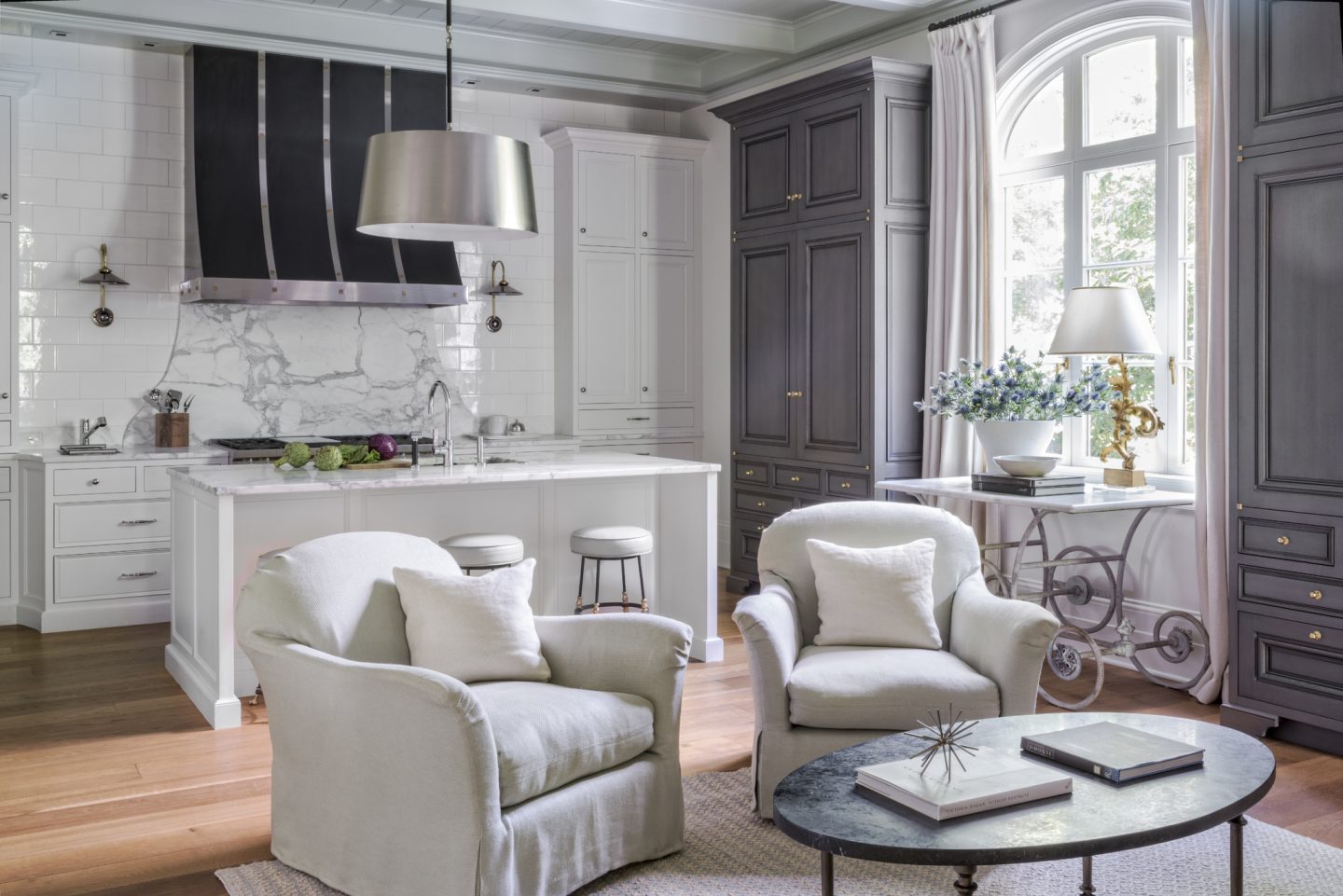
“When you do a house in neutrals and whites, one of the prettiest ways to make the rooms come alive is to play texture off texture.” -SUZANNE KASLER
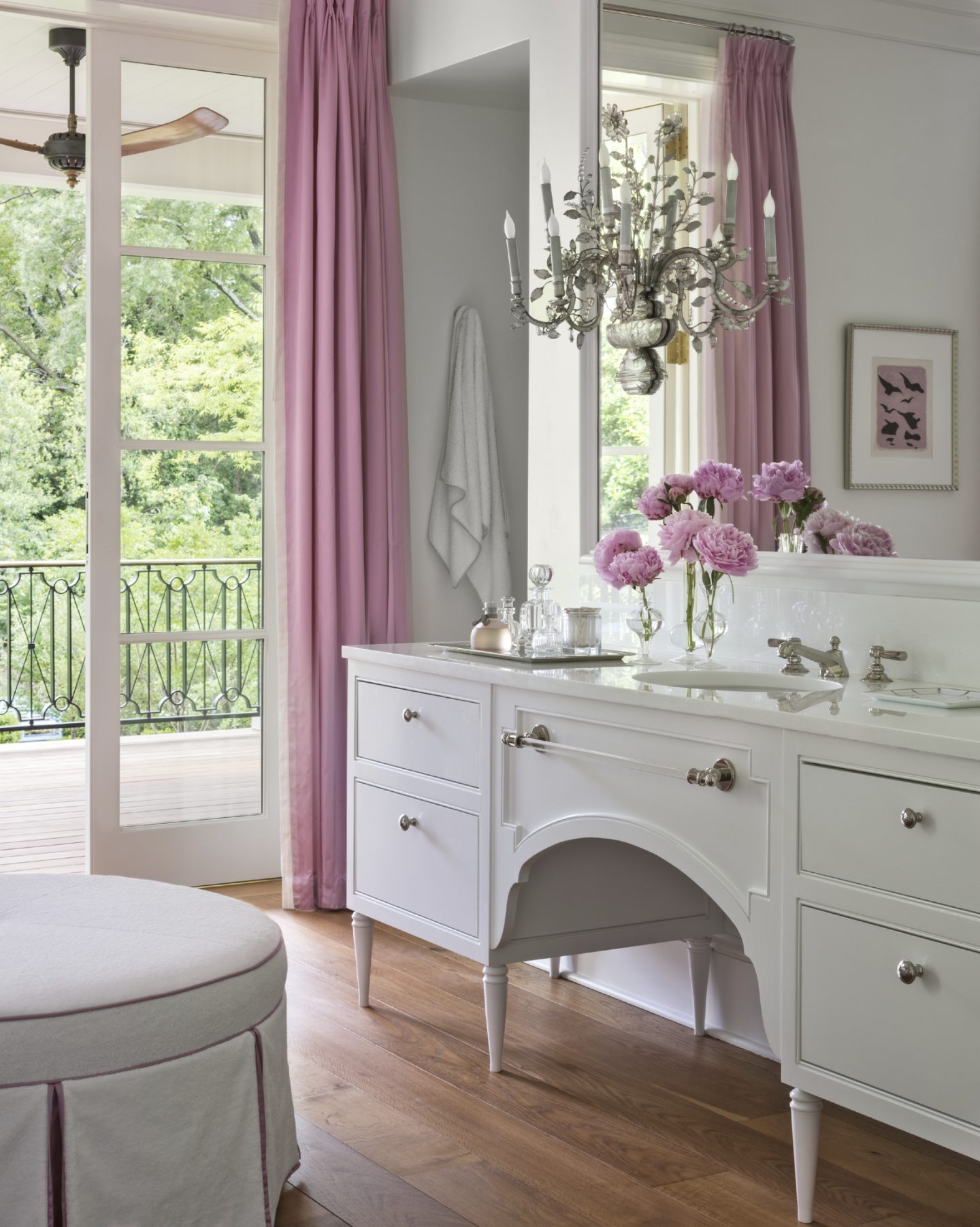
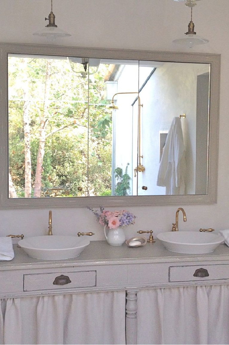
About the custom vanity for her client’s bath (below), Kasler also adds:
“We lacquered it white and found the most stunning, overscale, vintage Baguès sconces and dressed the room in pink taffeta curtains.”
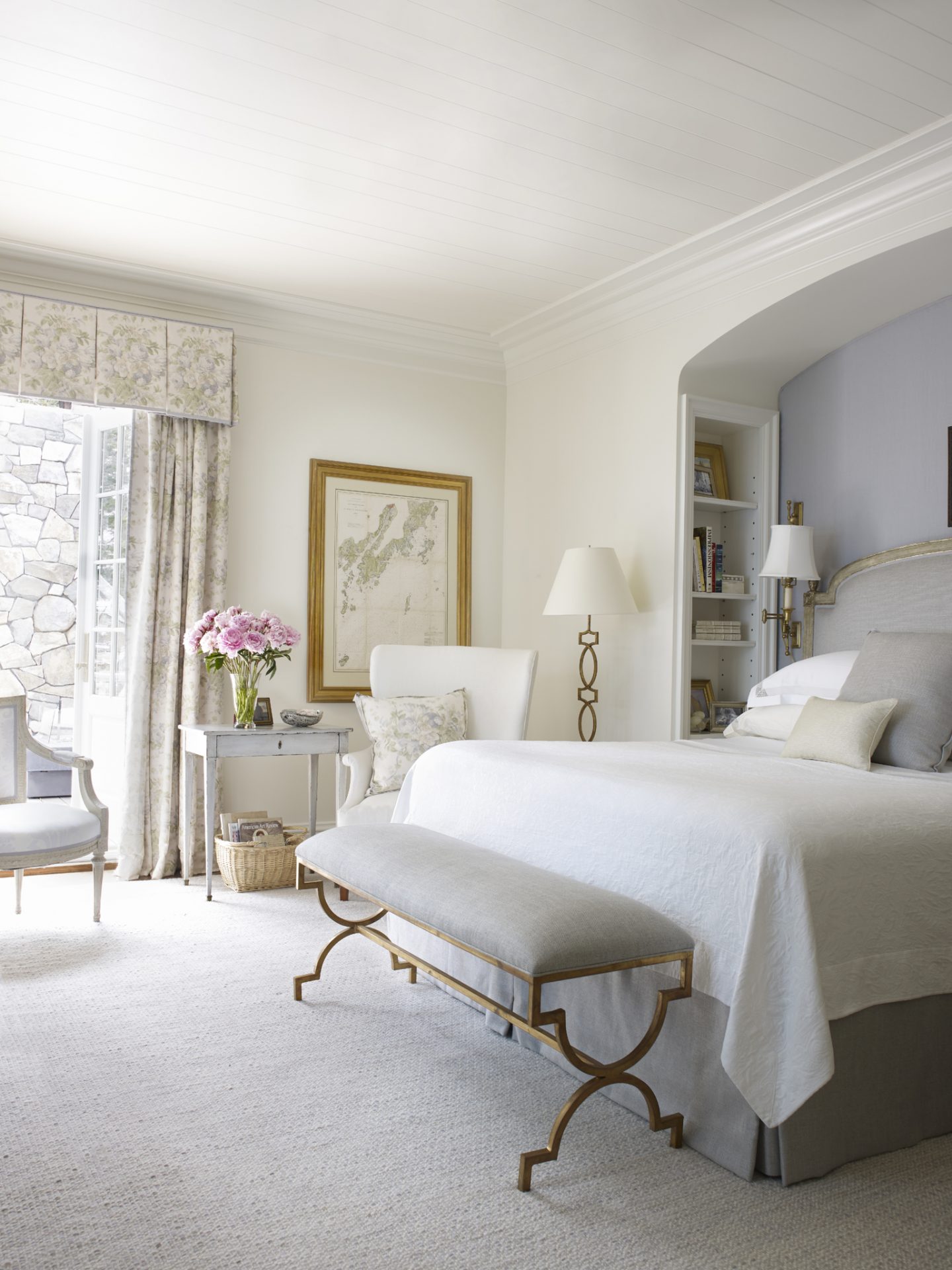
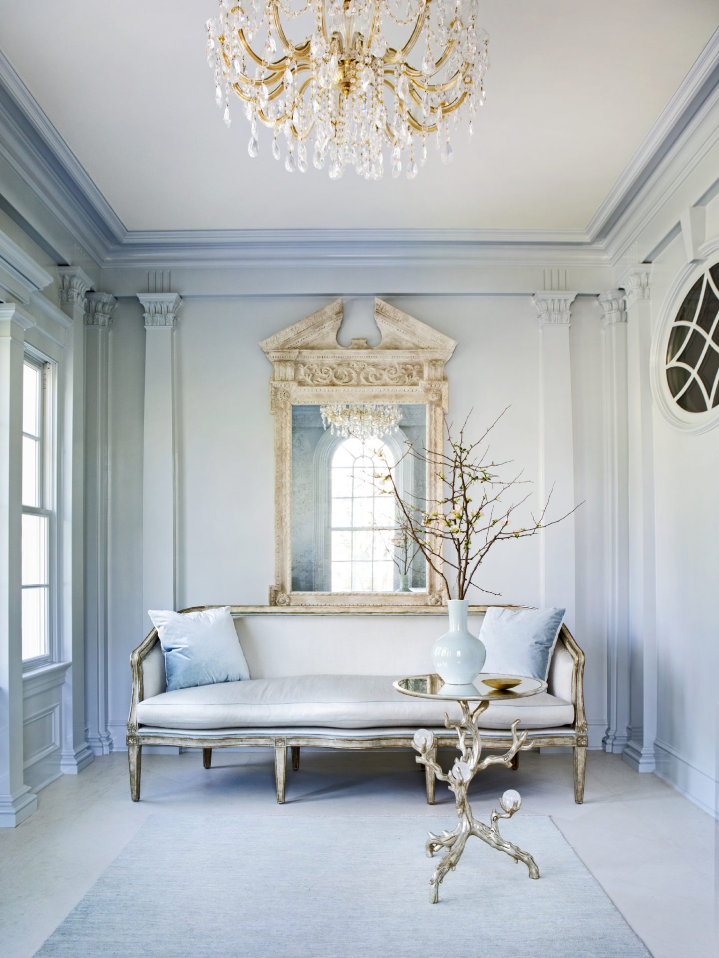
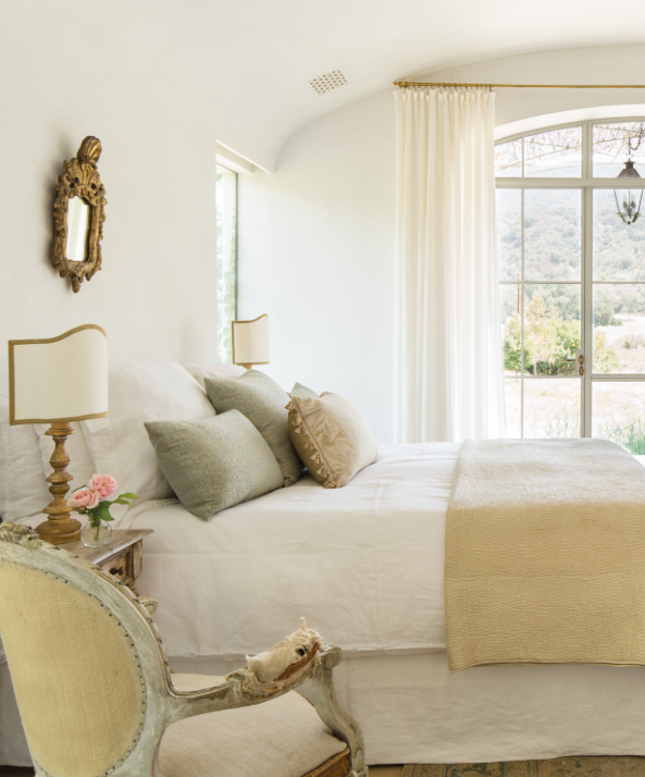
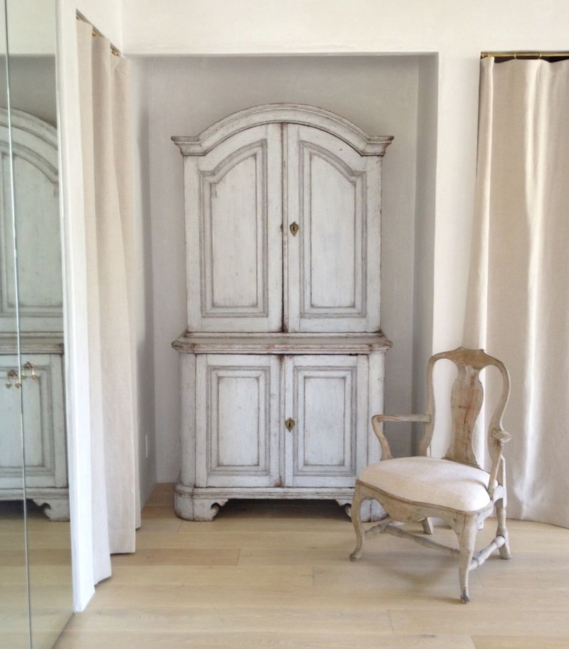
Suzanne Kasler’s Glorious Sense of Color
I’m crazy about the understated, ethereal, pale blues in the art and painted cupboard in this image from her book! Isn’t it inspiring!?!
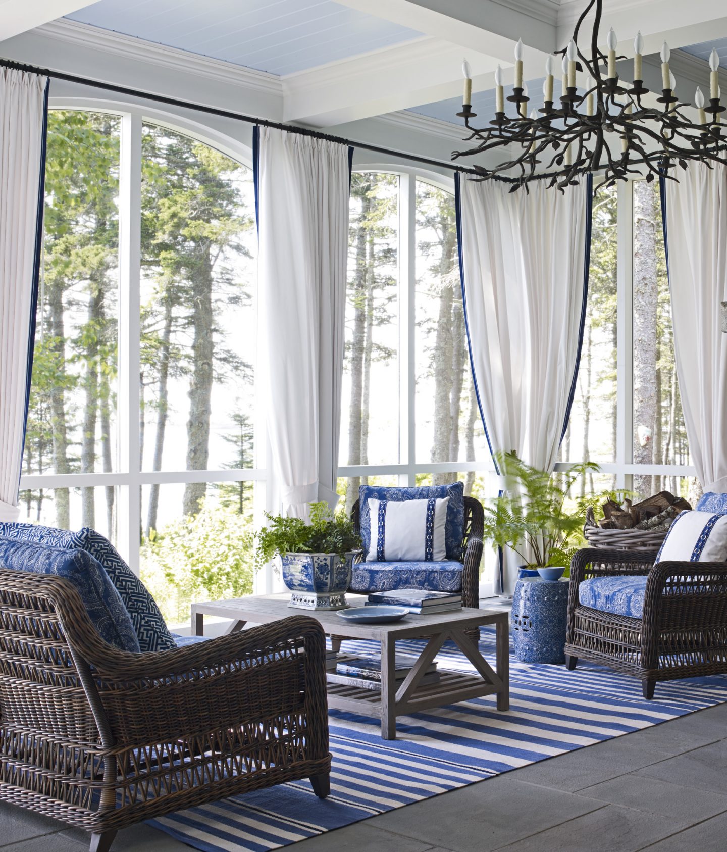
Here’s another space designed by Kasler with heavenly blues.
Timeless Interior Design With Wabi Sabi
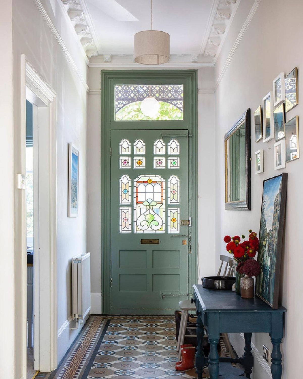
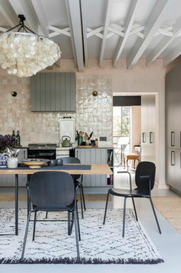
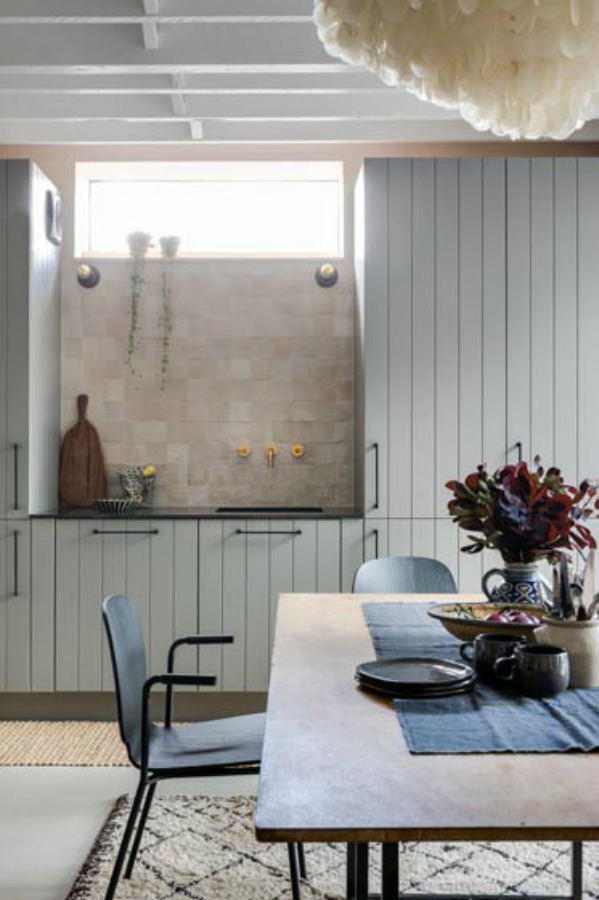
Previously, we visited this spacious five bedroom, three bathroom Victorian home ( Beth Dadswell of Imperfect Interiors & Photography: Chris Snook). It’s such a lovely example of a traditional and humble as well as imperfect approach to timeless interiors.
Originally, the Victorian home was dated with ancient electrics, plumbing and heating. Contemporary paint and fabric colors were certainly key to adding relaxed grandeur to this timeless house.
The Interior Designer’s Imperfect Mix
“By mixing ‘imperfect’ mid-century furniture with more traditional pieces, the inexpensive with the unusual, I can transform your home into an inspiring space that is totally unique and full of character.” ~Imperfect Interiors
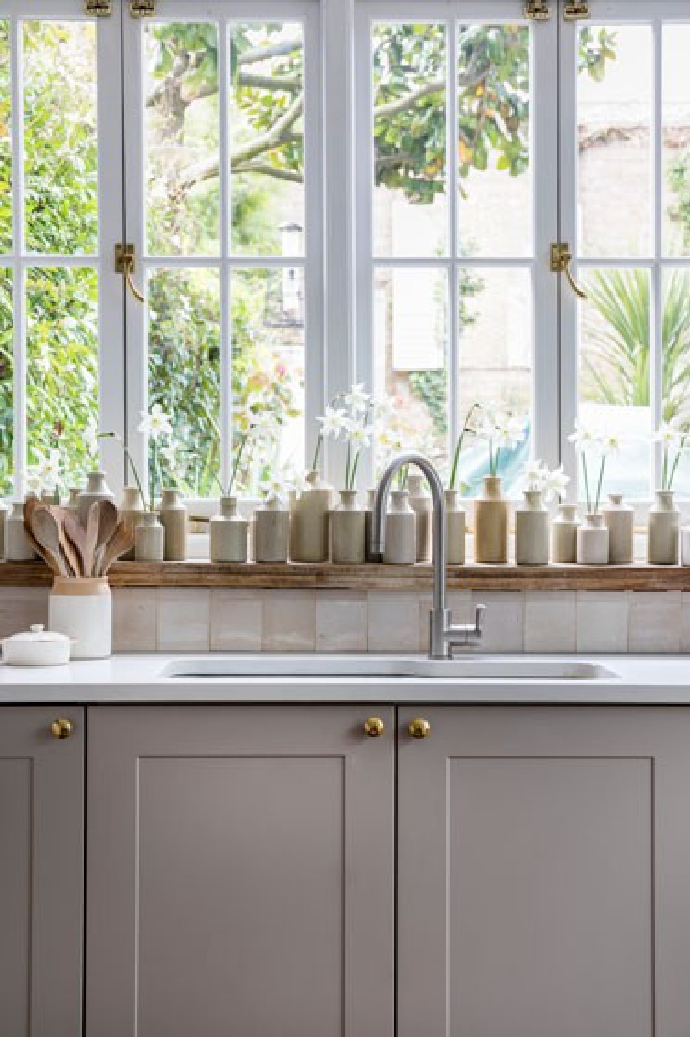
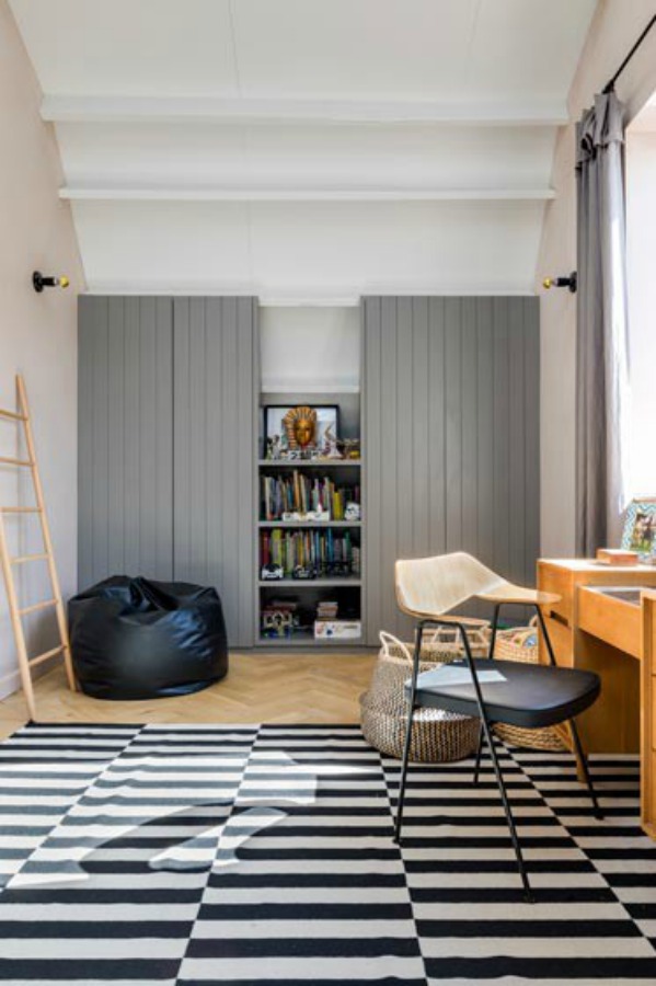
You may recall we toured another English home by Imperfect Interiors which included the kitchen below…find it RIGHT HERE.
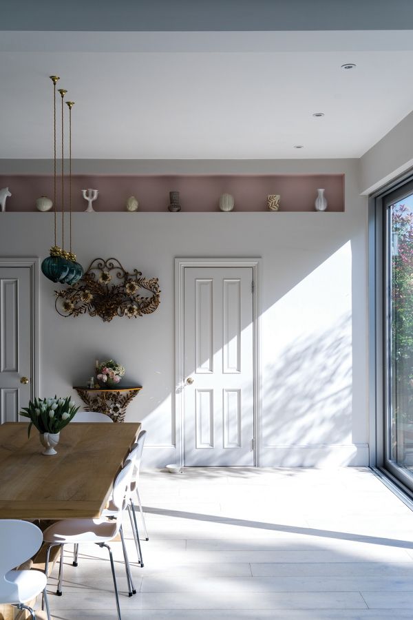
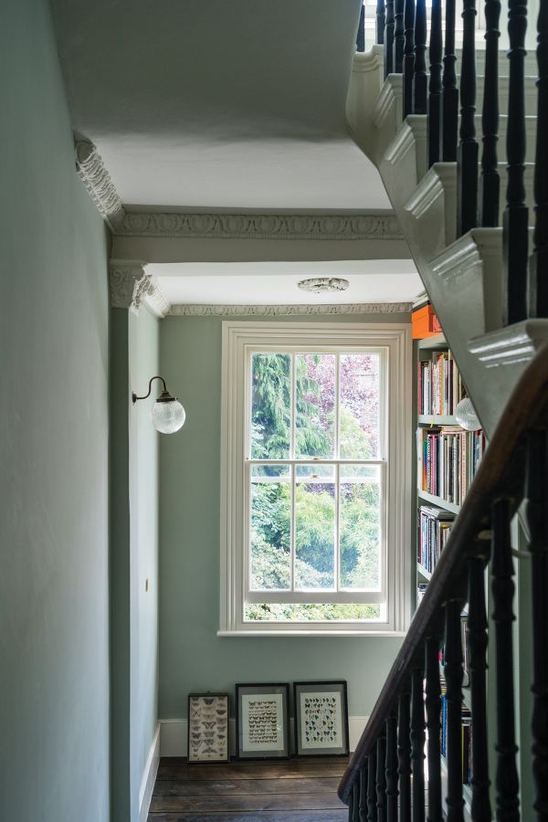
Shades of Blue in a Traditional Home
This beautiful Victorian home with traditional style is an example of how a subtle repetition of timeless and tranquil blues can be calming and also interesting.
There is indeed a sense of ease and effortlessness within the mix of teal, navy, slate, and aqua blues. The home feels as though it has evolved over time.
Grey Blue with Warm Beige
Coo Black With Soft Grey Blue
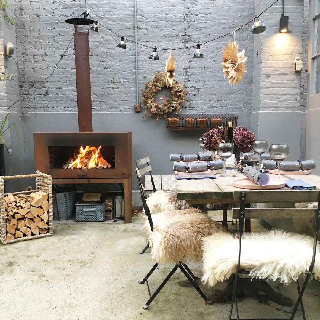
Grey Blue Painted Brick
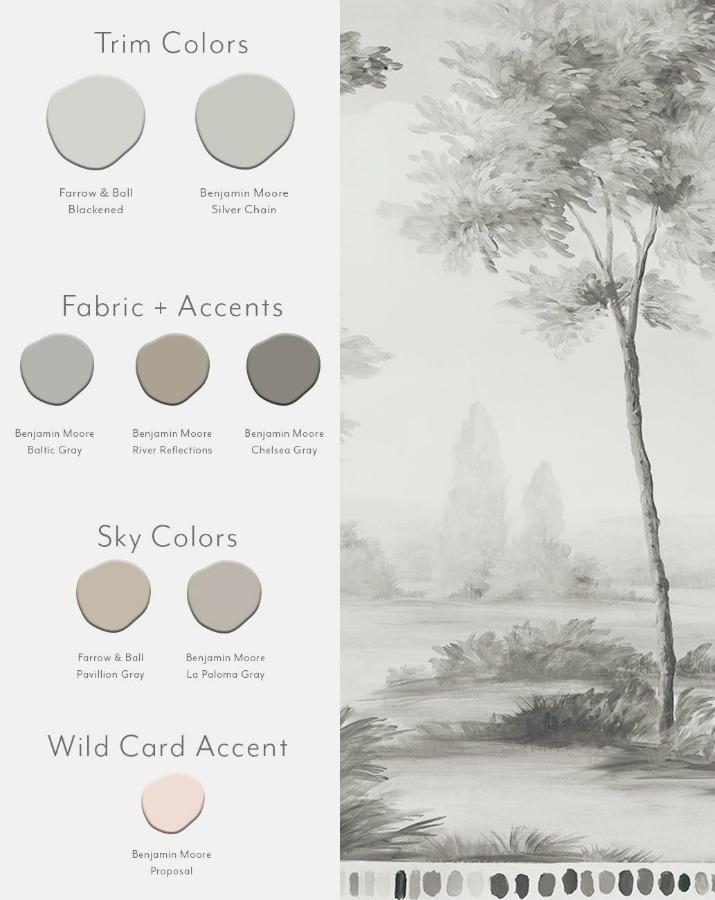
Mural Wallpaper With Soft Grays
4 Calm Light Blue Grey Paint Color Ideas
Another project incorporating soft, quiet, light blue gray paint colors that springs to mind is Brooke and Steve Giannetti’s Patina Farm.
The Giannettis painted steel framed doors and windows with a custom paint color similar to Farrow & Ball’s Pavilion Gray…SEE also THIS STORY for Gray-White colors from F&B!
While so many new home designs call for black painted steel, it was refreshing to see this calm color as well as a peacefully hushed palette.
First, here’s that beautiful chalky light blue grey similar to the custom color used at Paina Farm.
1. Farrow & Ball Pavilion Gray 242

Buy a sample pot of: Farrow & Ball Pavilion Gray 242
“This classic mid grey was originally created for a bespoke pavilion, but is also reminiscent of an elegant 18th century Swedish colour. One of the Architectural Neutrals, the subtle blue undertones of Pavilion Gray add a contemporary touch and sense of spaciousness. Combine with Dimpse, Blackened or Manor House Gray in any combination for a scheme that is perfect for the modern family home.” – Farrow & Ball
2. Farrow & Ball Blue Gray 91


“With its subtle mix of blue, green and black pigments, Blue Gray creates the most relaxed of rooms that feel as if they have always been there. It is a cooler, more weathered version of French Gray and has the same almost magical quality of gently shifting between blue and grey depending on the light and time of day.” – Farrow & Ball

3. Benjamin Moore Silver Gray 2131-60

“This color is part of Color Preview. A collection of bold, saturated colors that brings spaces to life for those looking to illuminate their world with pure, extraordinary color. A great complement to Classic Colors, Color Preview offers a collection of 1,232 hues that excite and inspire with pure, deep, clear colors that create striking combinations.” – Benjamin Moore

4. Benjamin Moore Silver Lake 1598

“This color is part of the Classic Color Collection. Surround yourself with your color favorites. These timeless, elegant, Classic Colors guarantee beautiful, usable color all the time, every time. A collection of 1,680 inspired hues that consumers and professionals have enjoyed for years, the colors in this palette are as timeless as they are forward.” – Benjamin Moore

Easiest way to see if a paint color will work? Order samples with Samplize and have them delivered straight to your door.
One More Classic
Before sharing lovely finds, any Judy Garland fans in the audience? You just may enjoy (as I did!) this glimpse of her through the lens of the fabulous Renee Zellweger.
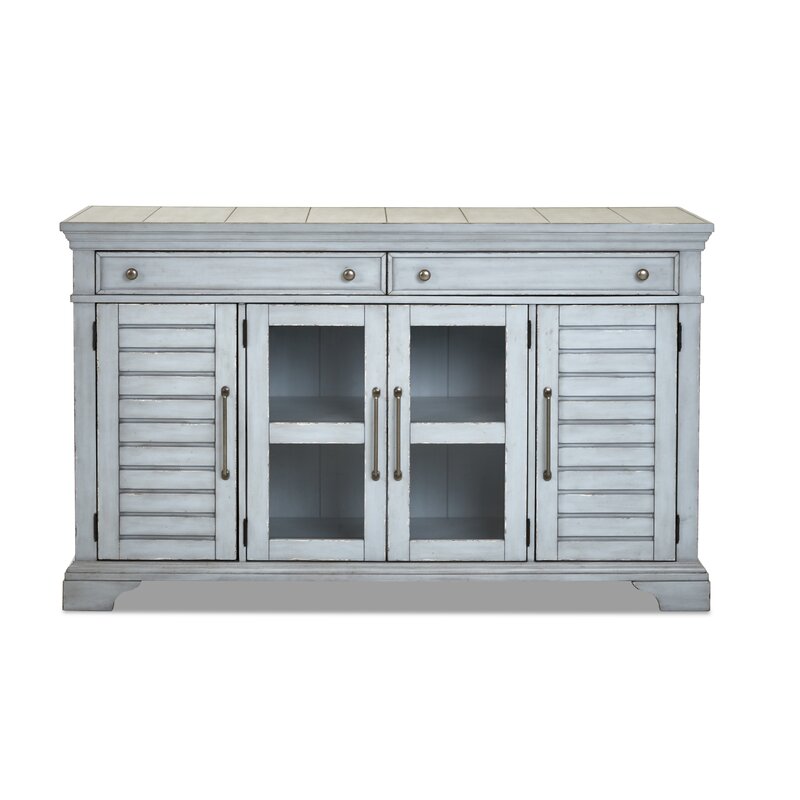
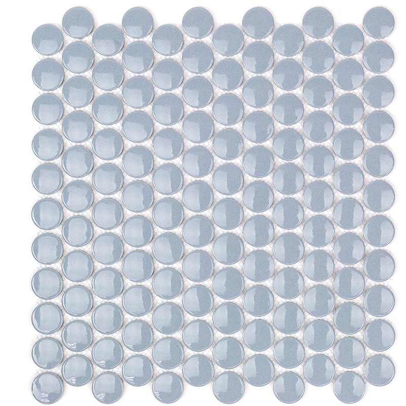
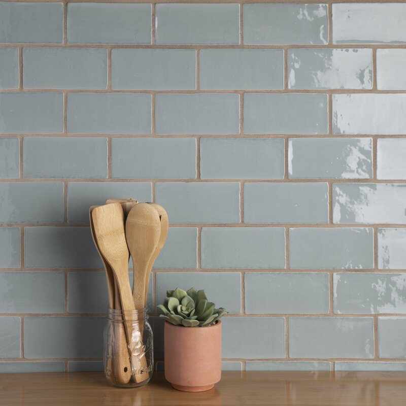
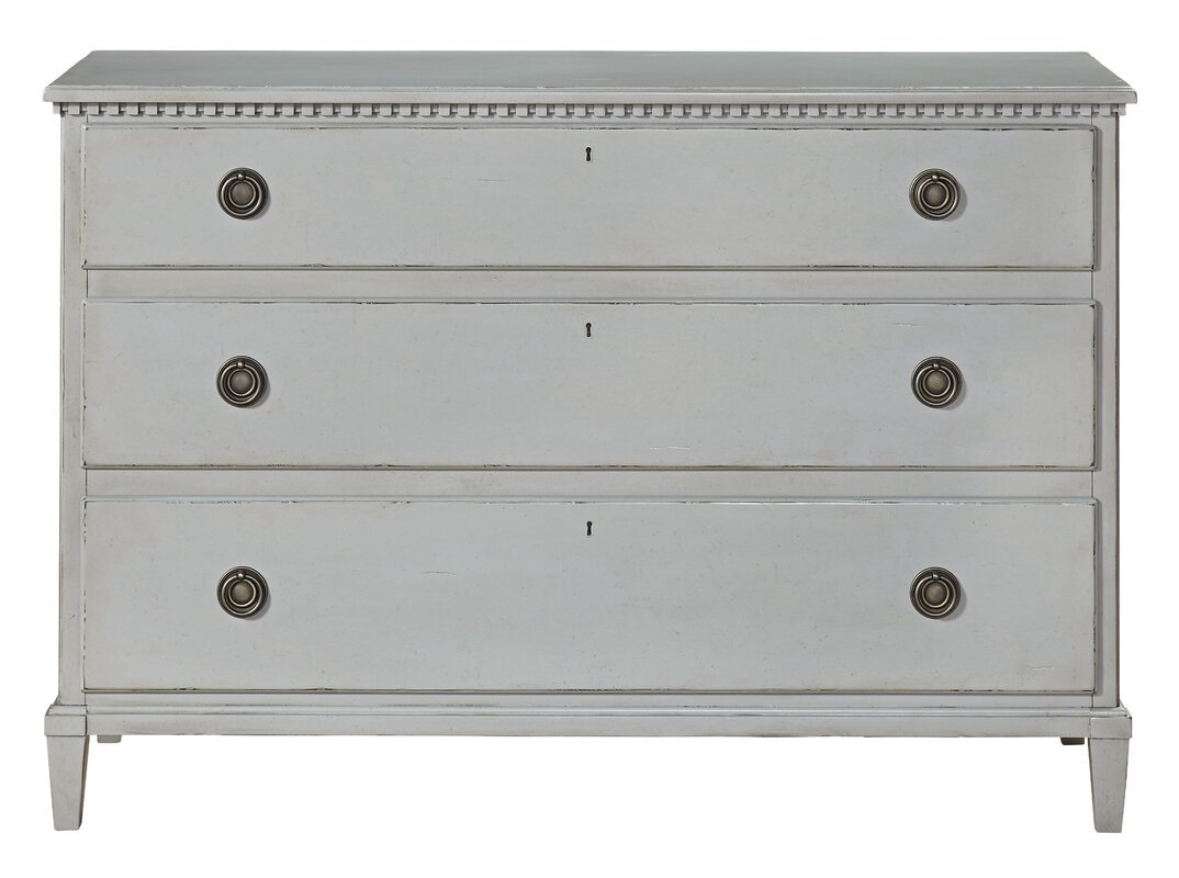
Lovely Finds & Decor With Blue & Grey
Affiliate links follow and won’t cost you extra yet may earn me a small commission.
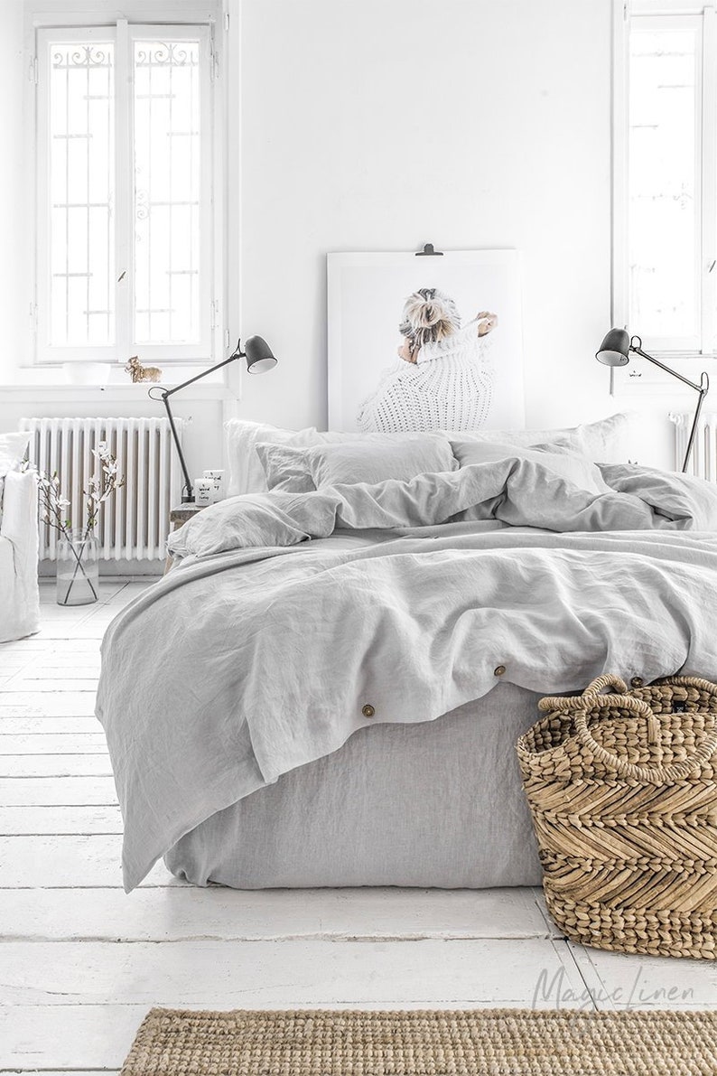
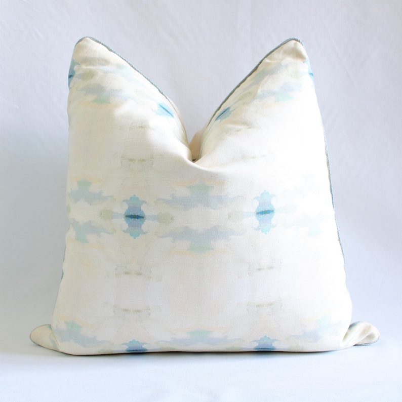
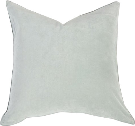
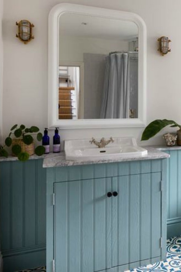
What do you think of blue frames? Are you bold enough for them?

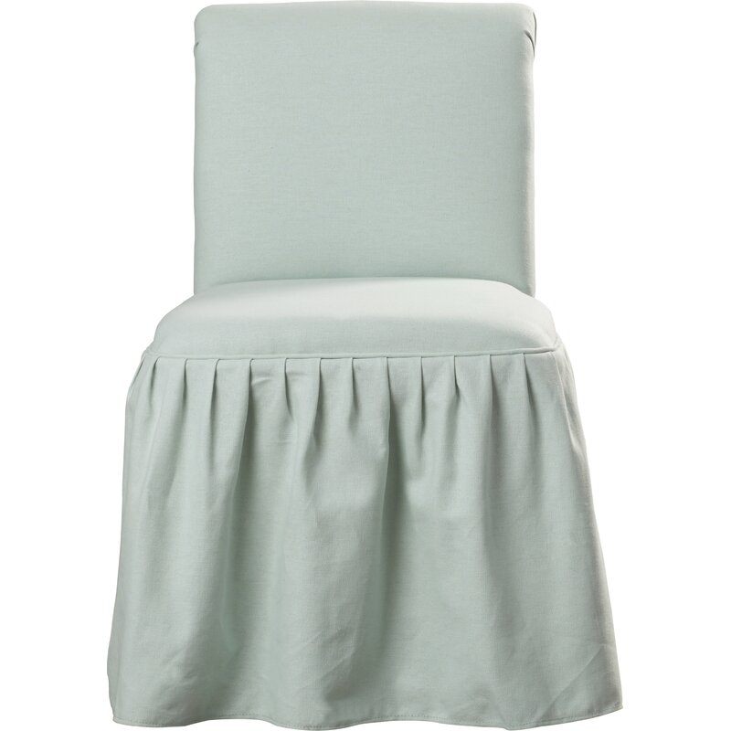
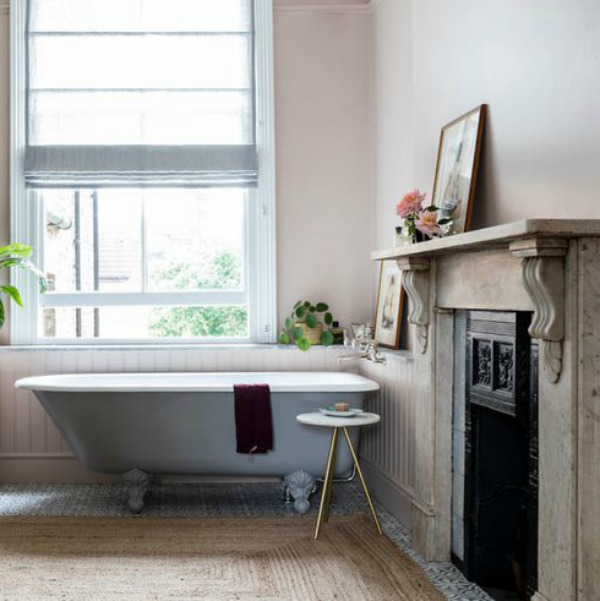
Such an easy way to add a pretty blue accent color in the bath.

Do consult my Pinterest for even more lovely paint color ideas!
I independently selected products in this post—if you buy from one of my links, I may earn a commission.
Peace to you right where you are.
-michele
Shop for items you already intended to buy on Amazon RIGHT HERE, and also find home decor here to keep decor inspiration flowing on Hello Lovely!
Hello Lovely is a participant in the Amazon Services LLC Associates Program, an affiliate advertising program designed to provide a means for sites to earn fees by linking to Amazon.com and affiliated sites.


Hi Michele,
I love that barely there blue color especially in a bedroom. Suzanne Kasler’s rooms are always such a treat to see too. She usually manages to surprise us with something unexpected! Have a lovely weekend my friend 🙂
Author
Oooooh, yes, and now I’m thinking ‘barely blue’ would be an amazing post of inspiring rooms where that quiet faded hue takes our breath away. I know you must be so busy preparing for your show! Thinking of you and cheering you on across the miles. 🙂
Suzanne Kasler’s rooms always appeal to me. She has a simplicity about her rooms. They are not over decorated but always complete, if that makes sense. 🤔 Always elegant and classic. When it comes to home decor, I’m a neutral girl, through & through.
Enjoy your weekend,
~Joanna
Author
Thanks, Joanna. It’s already off to a great start, and I hope yours will bring joy and wonder. I agree about her lovely style – and I like to think her Midwestern upbringing was a strong influence on her sensibilities. 🙂
Yes, I have blue glasses frames. Mine are from See but I also have some from Warby Parker which were half the price. My favorite blue/gray paint for interiors is Sherwin-Williams Silvermist.
Author
I’m ready for blue frames – anything with color really since these crystal ones are impossible to find with my blind eyes when I set them down! Thanks for the paint recommendation – I will pick up a sample. 🙂
I’m in love with all of these colors, especially Blue Gray 91 by Farrow & Ball! I’m getting my new home painted in two weeks, and I still have not decided on a color, but I’m seriously considering Blue Gray 91 now…but my home has less natural light and my home decor is a more modern. Do you think this color would still look good in my home?
Author
Thanks for reading – always try at least three samples on the wall of a color you’re considering!