Even though I’m local, I missed the memo that designer Kate Marker’s home hit the market! I hope you’ll spread the word should you know someone ready for a turnkey property loved and transformed by Kate. It’s a 1926 home with 9,210 square feet on ten acres not far from me in Barrington. She painstakingly renovated this entire house during pandemic season. (Can we even imagine the stress of such an undertaking during earth’s shutdowns with supply chain chaos?) While searching for real estate for myself late last night, these photos and the listing popped up! (Obviously I didn’t set a maximum sales price for my search, and it’s too spendy for me, kittycats.) What a beautiful fantasy home with her unfussy, serene, modern fresh style. But are there down to earth lessons inside this dream home for us?
160 N. Buckley Rd., Barrington, IL 60010 is listed with @morrison_home_team and @thedawnmckennagroup; Interior Design: @katemarkerinteriors; Architect: Patrick Fortelka
Down to Earth Design Ideas Inspired by Kate Marker’s Home
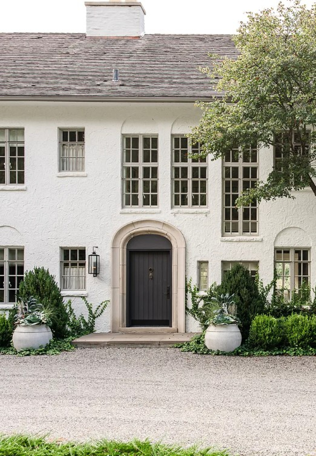
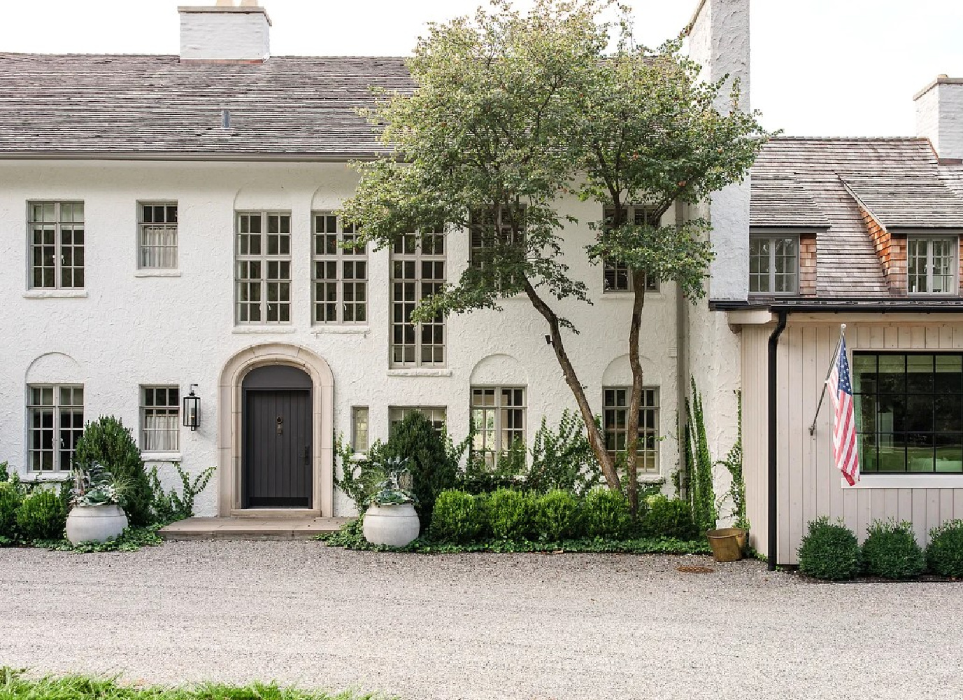
Psst. It’s not your average historic home that happens to be on the market. The walls are cement and 17″ deep!
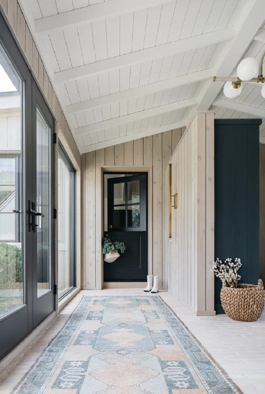
Covered with stucco, I love the understated façade with light grey trim around windows and unfussy landscaping that feels so appropriate for a country house.
I independently selected products in this post—if you buy from one of my links, I may earn a commission.
Not that it lacks drama!
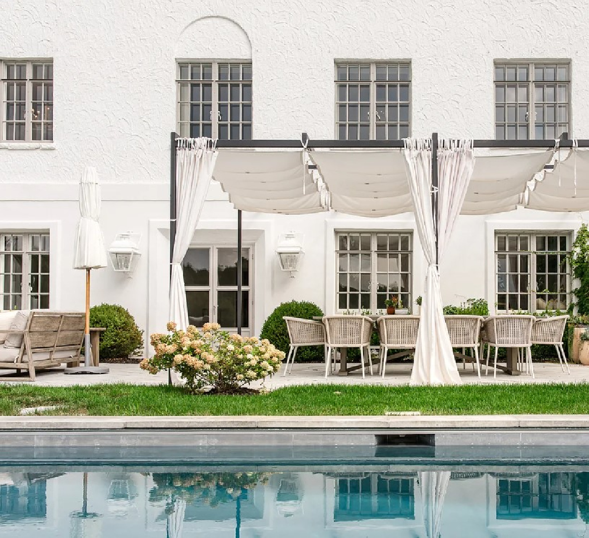
The saltwater pool and patio areas are impressive and party-ready. But that doesn’t mean there aren’t a host of realistic ideas inspired by this Midwest fantasy.
Outdoor Firepit
Here in the heartland, it’s firepit season. It truly can be as simple as a few outdoor chairs and a simple firepit for s’mores, sipping, and settling around a cozy fire.
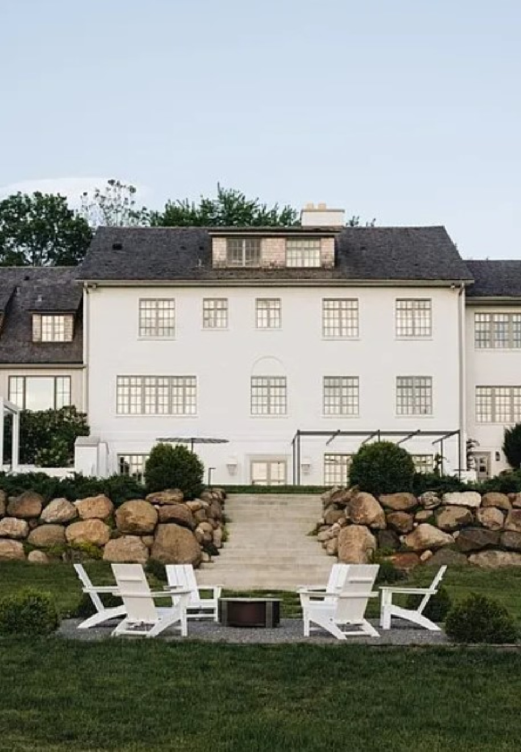
You can find a set of 4 Adirondack style chairs for a friendly price HERE. Here’s the exact firepit I have on my own patio. We have used it far more often than I imagined.
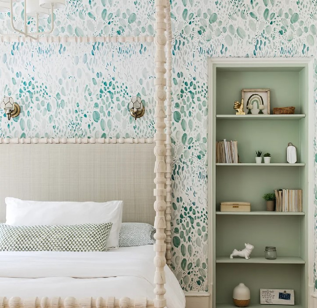
Kate’s White Paint Color for Walls
But isn’t white paint just white paint? Sweet Cozy Moses, no. Consult my archives, s’il vous plait! Here’s the color on these walls:

It always helps to have a place to start as far as sampling for white paint, and why not start with a designer pick?
You could also try sampling Benjamin Moore Simply White and White Dove since they are also trustworthy favorites of this designer for her projects.
And if you love what you’re seeing in terms of furniture, textiles, and art, you’re in luck.
They hail from Kate Marker Home where you’re bound to find a treasure or ten.
I shopped KMH not long ago when a friend set up a wedding registry there. In fact, I met Kate at a party years ago at that friend’s family home.
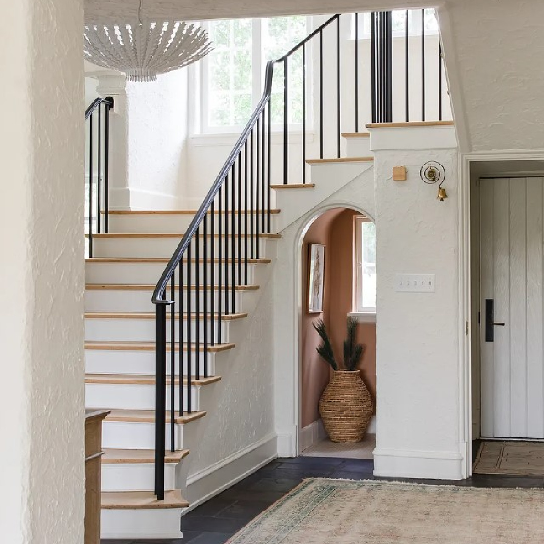
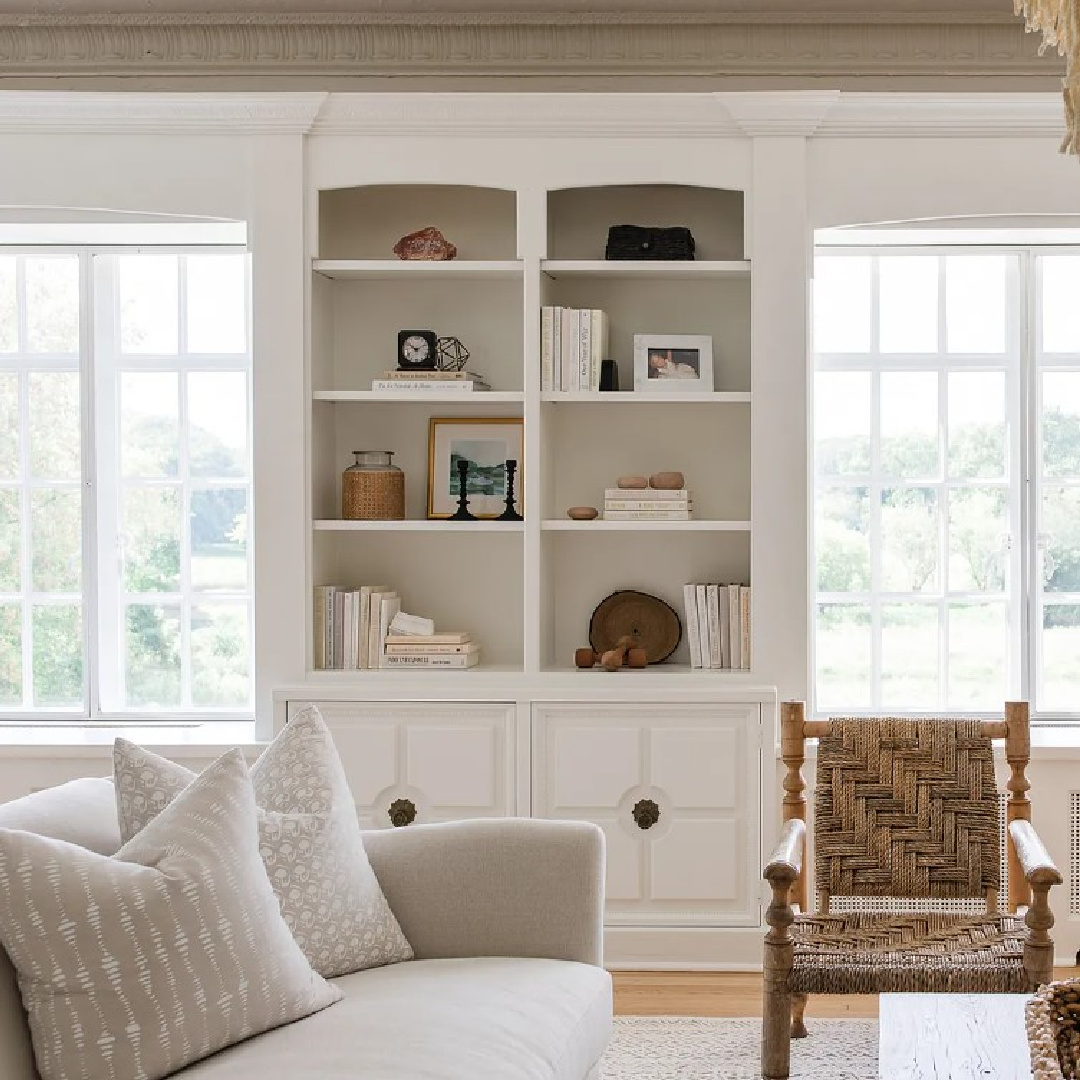
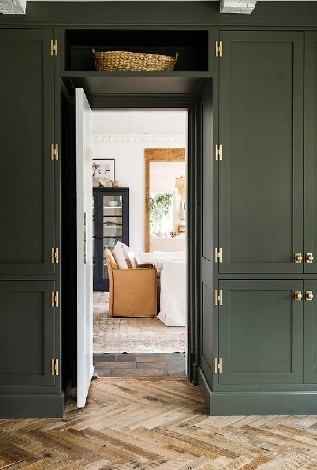
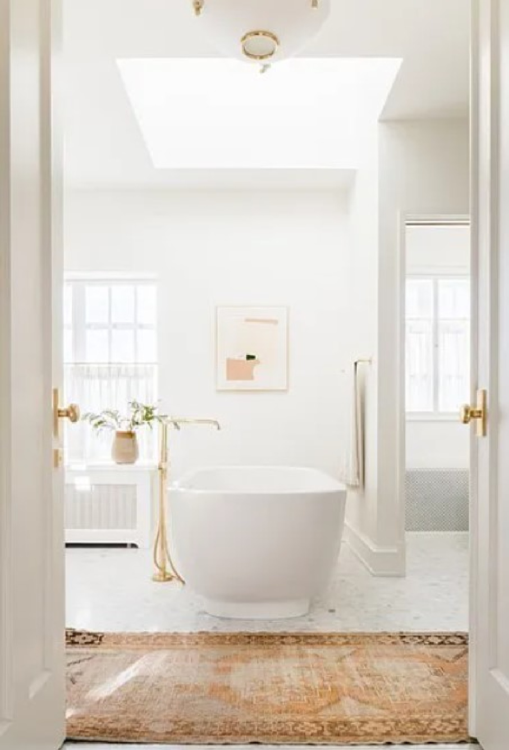
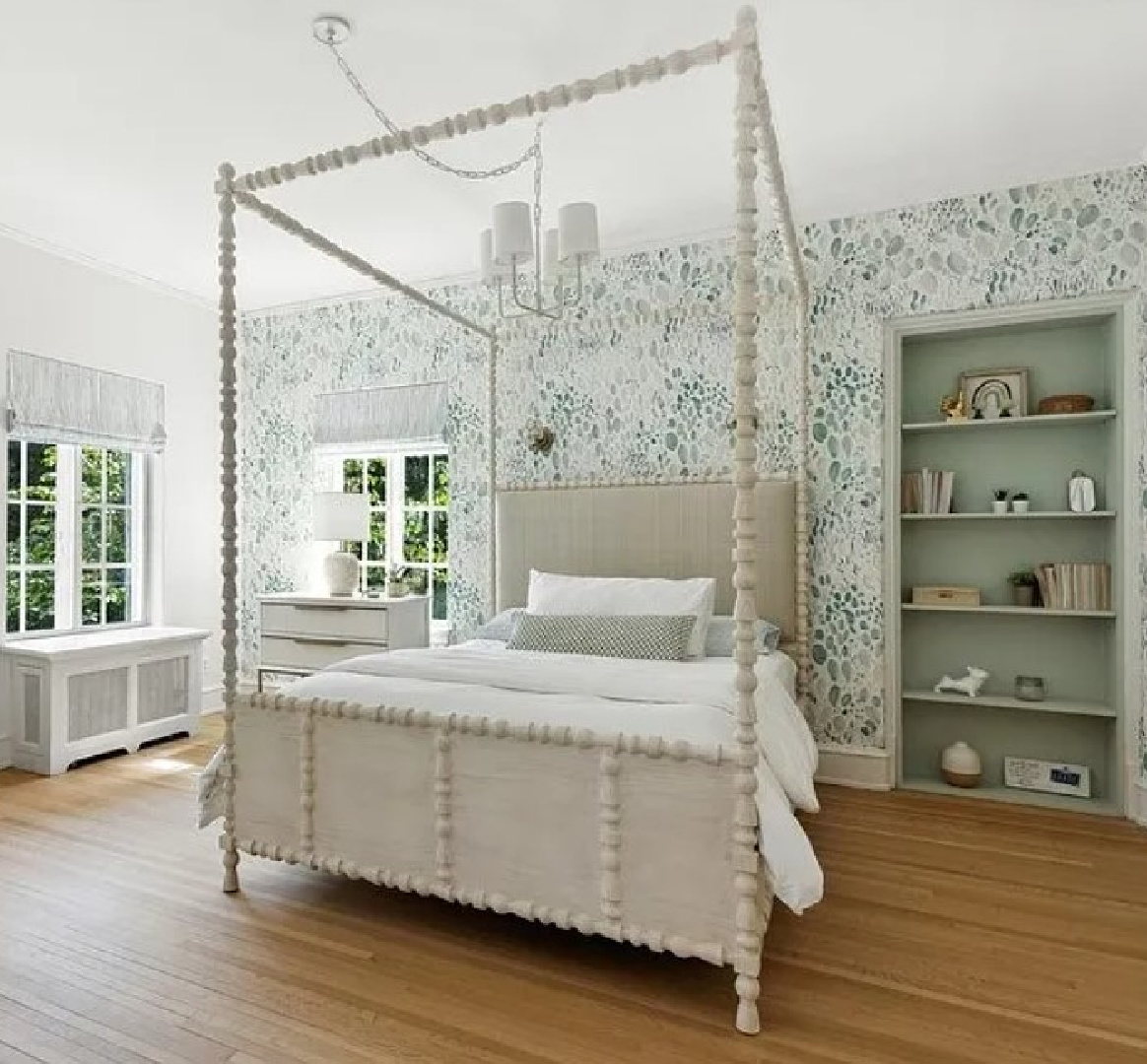
A fantasy item we can’t score? Those original built-ins in the family room!
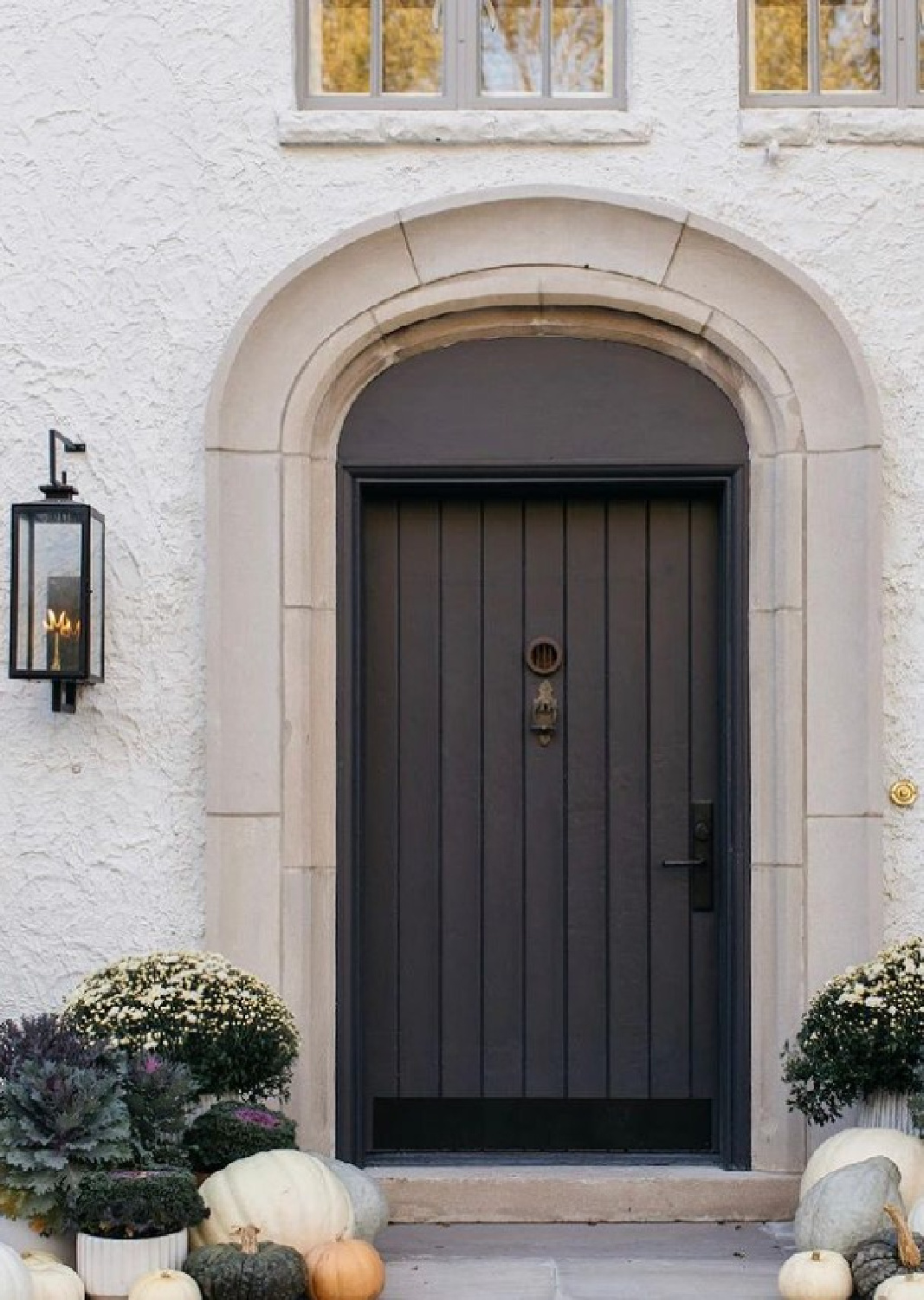
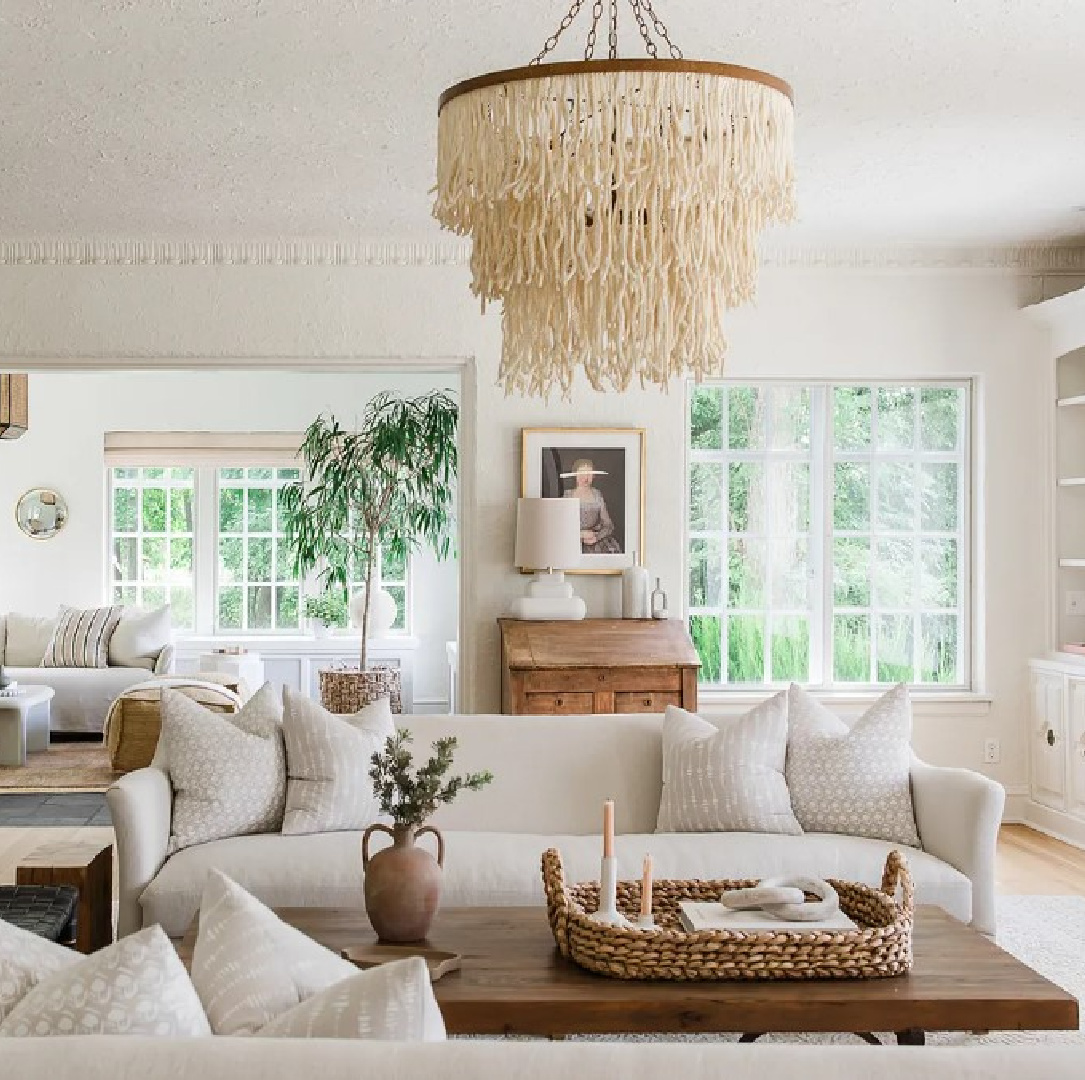
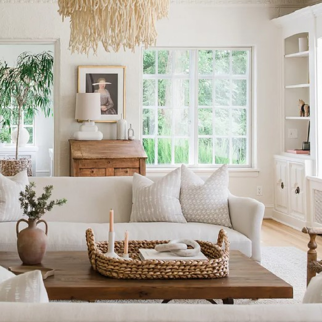
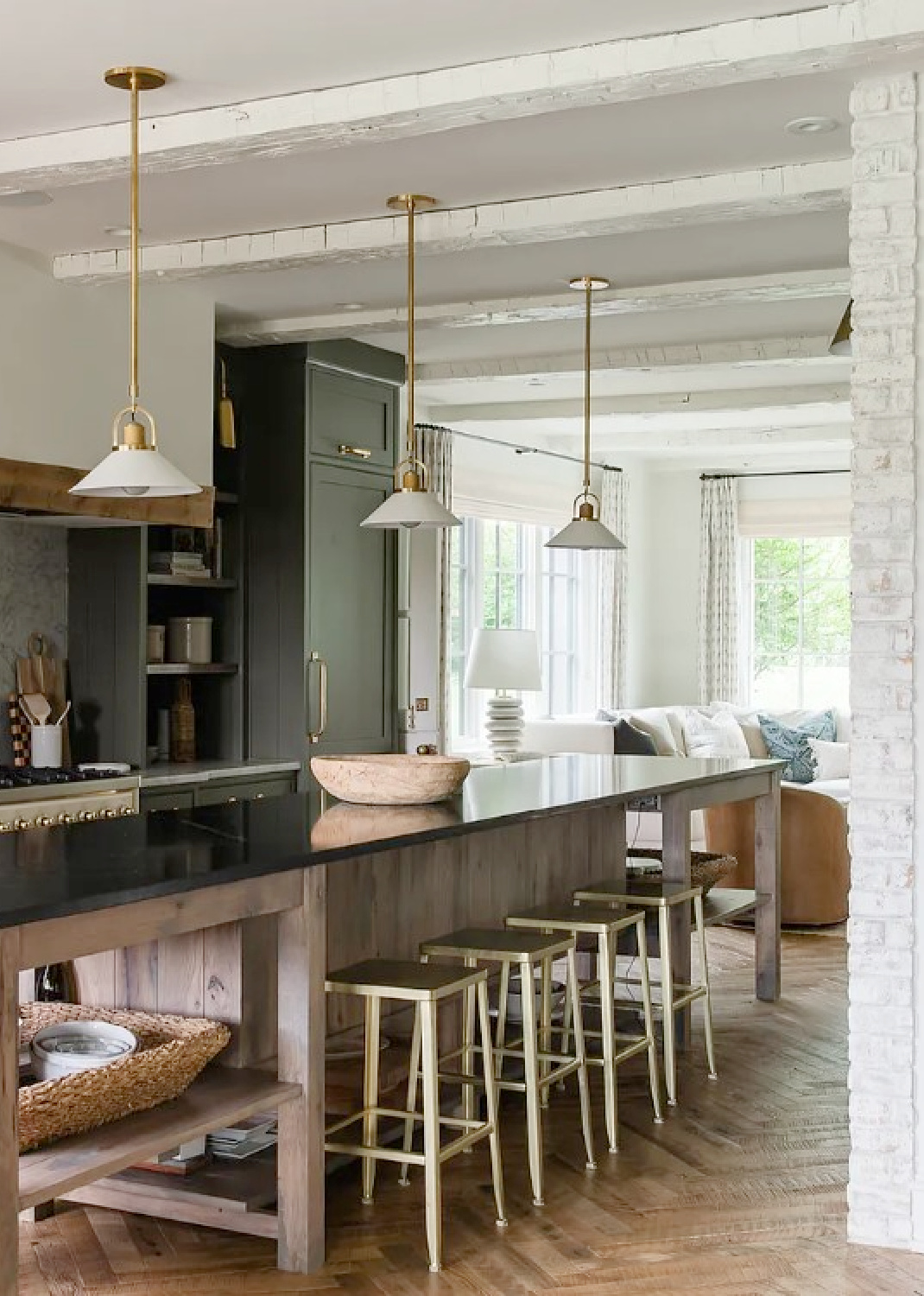
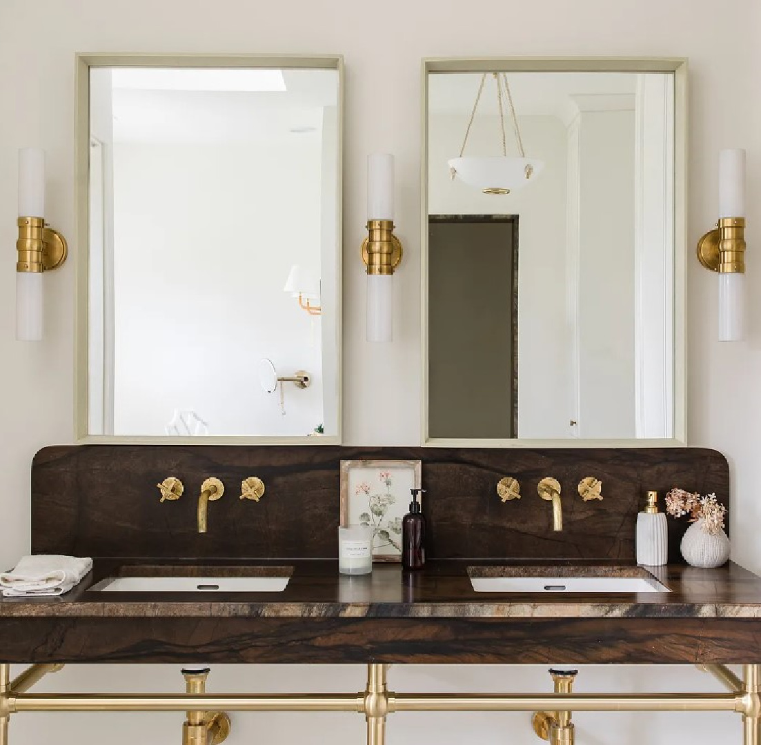
Unique Light Fixtures in Kate Marker’s Mansion
Kate went bold baby, bold with her lighting in this home renovation.
I recognize several of the lights as Hudson Valley Lighting fixtures.
Lighting is one of those design elements that doesn’t always convey as powerful in photos. You can’t see close-up details from patina or a living finish like unlacquered brass or gilded iron.
But once you live with quality-made (or artisan handmade!) fixtures, you’ll get it. It’s not as if you have to upgrade every light in the house. If your budget is strictly down to earth, watch for a sale and start with one.
You’ll be able to judge for yourself whether the high end quality is for you or not.
I’m so crazy about the beautiful lighting I scored for our current home that I will probably take it with me if ever we sell!
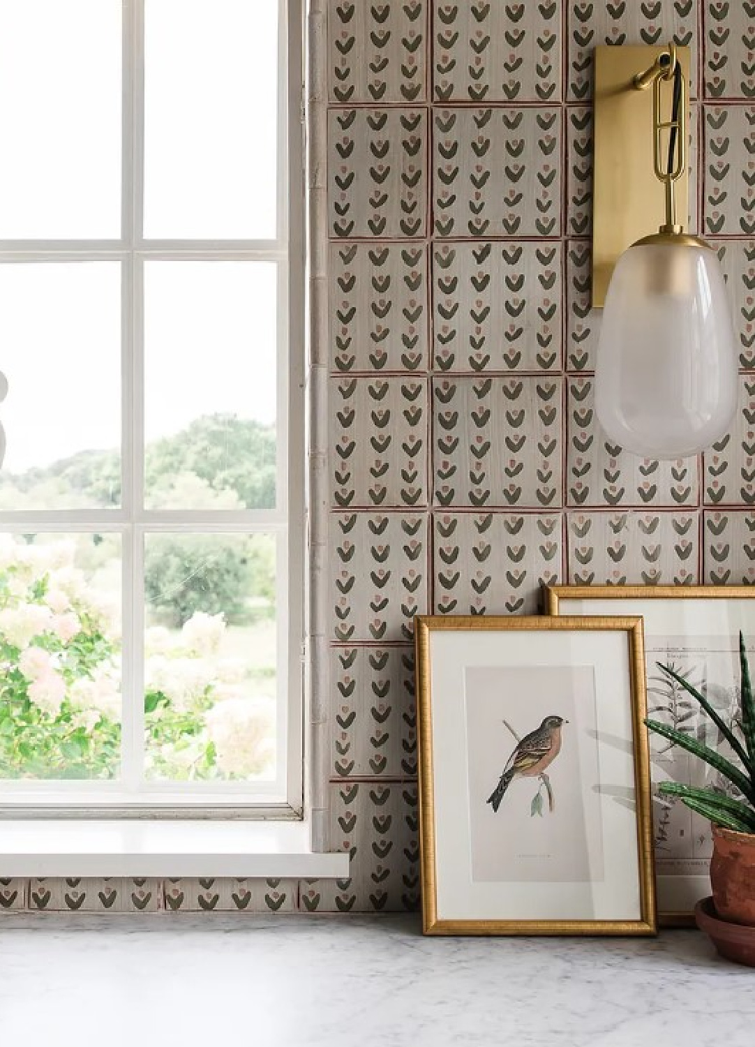
Use Statement Tile in a Special Spot
We American decorators tend to get stuck in certain design-ruts such as the idea that we must choose one backsplash tile for a kitchen.
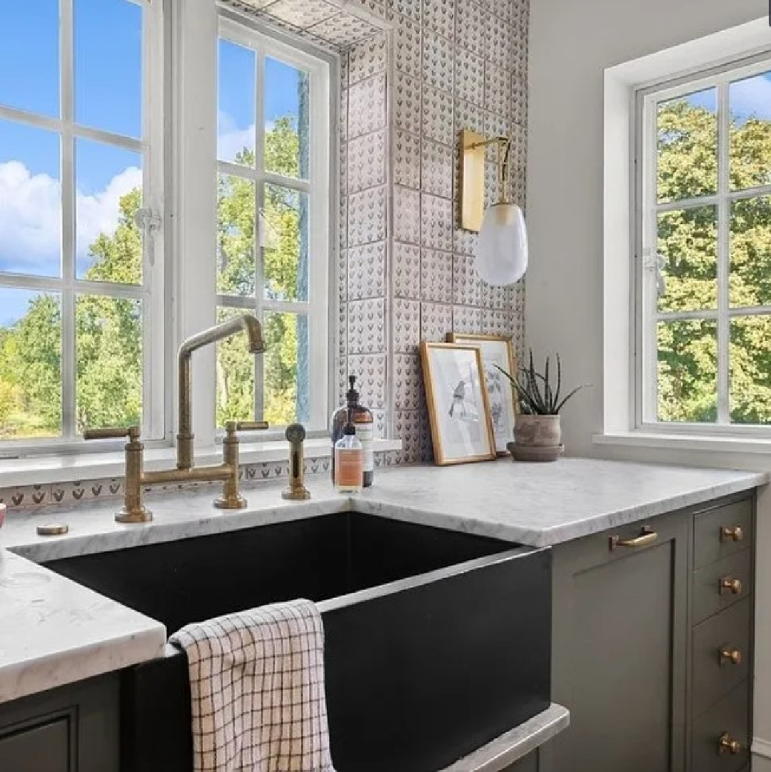
This gorgeous handmade terracotta tile designed by Kate with The Fine Line Chicago is proof that you can use a lovely pattern in a section of the kitchen but not everywhere.
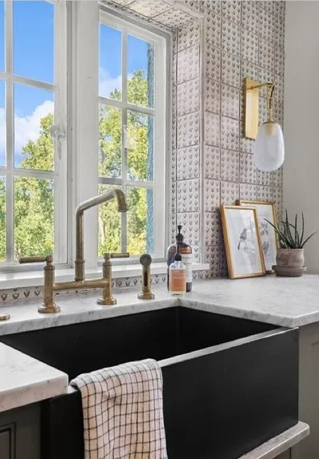
BTW. If you love this tile pattern but you have no use for tile, it is also available as fabric! Kate’s Leo textile and more tile and wallpaper goodness can be found here.
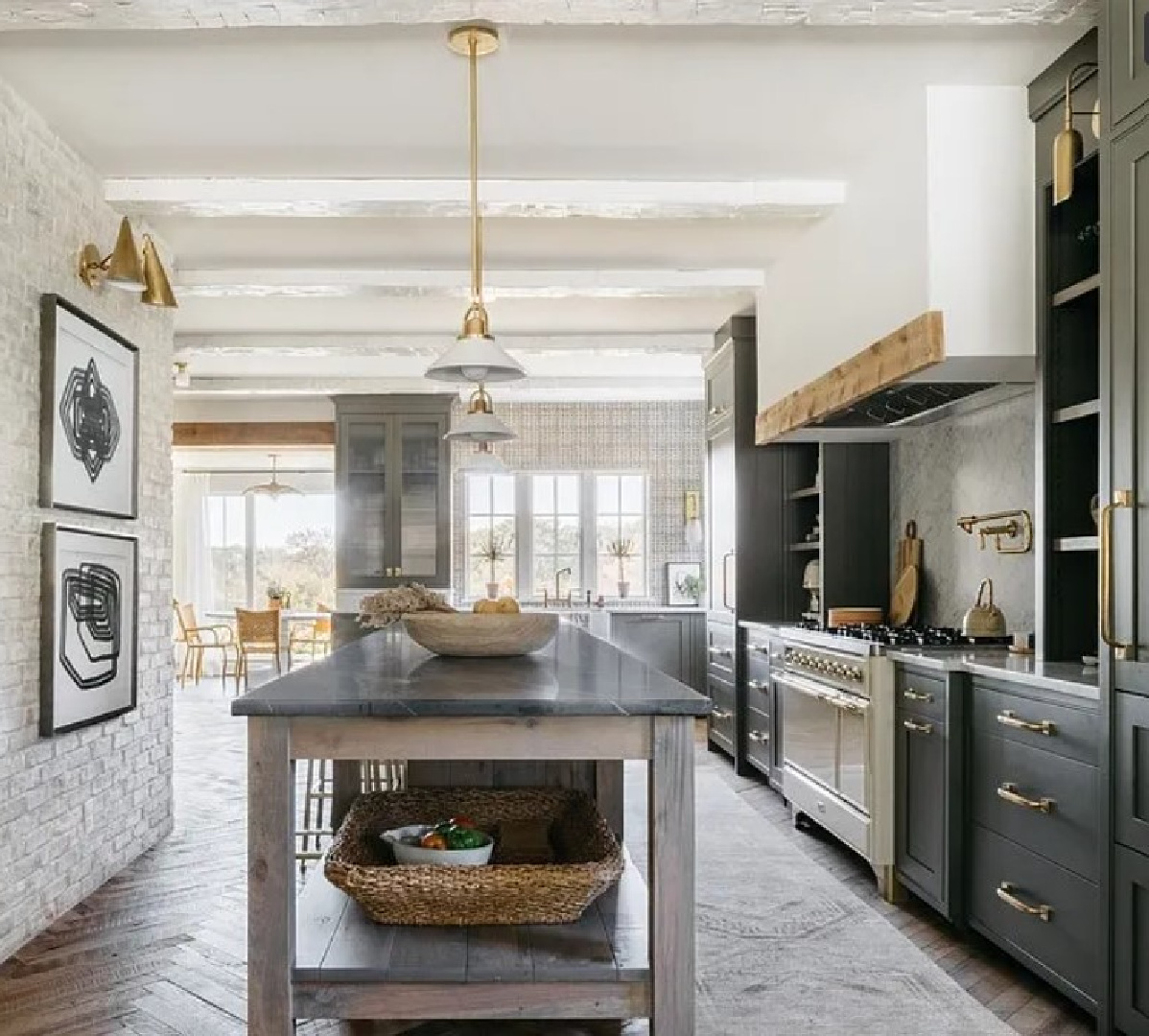
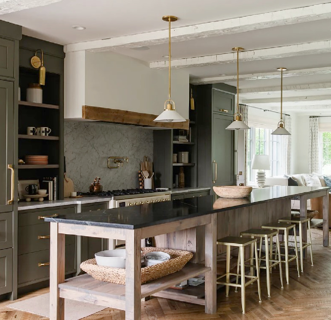
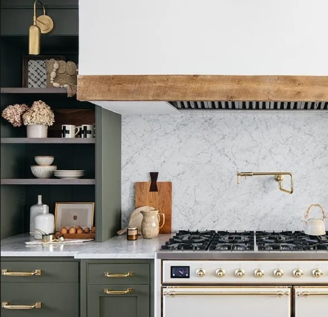
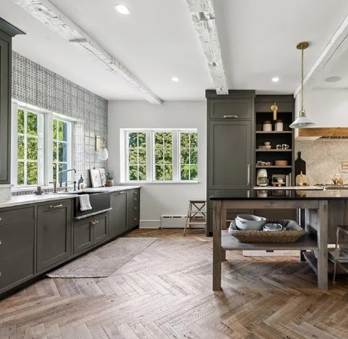
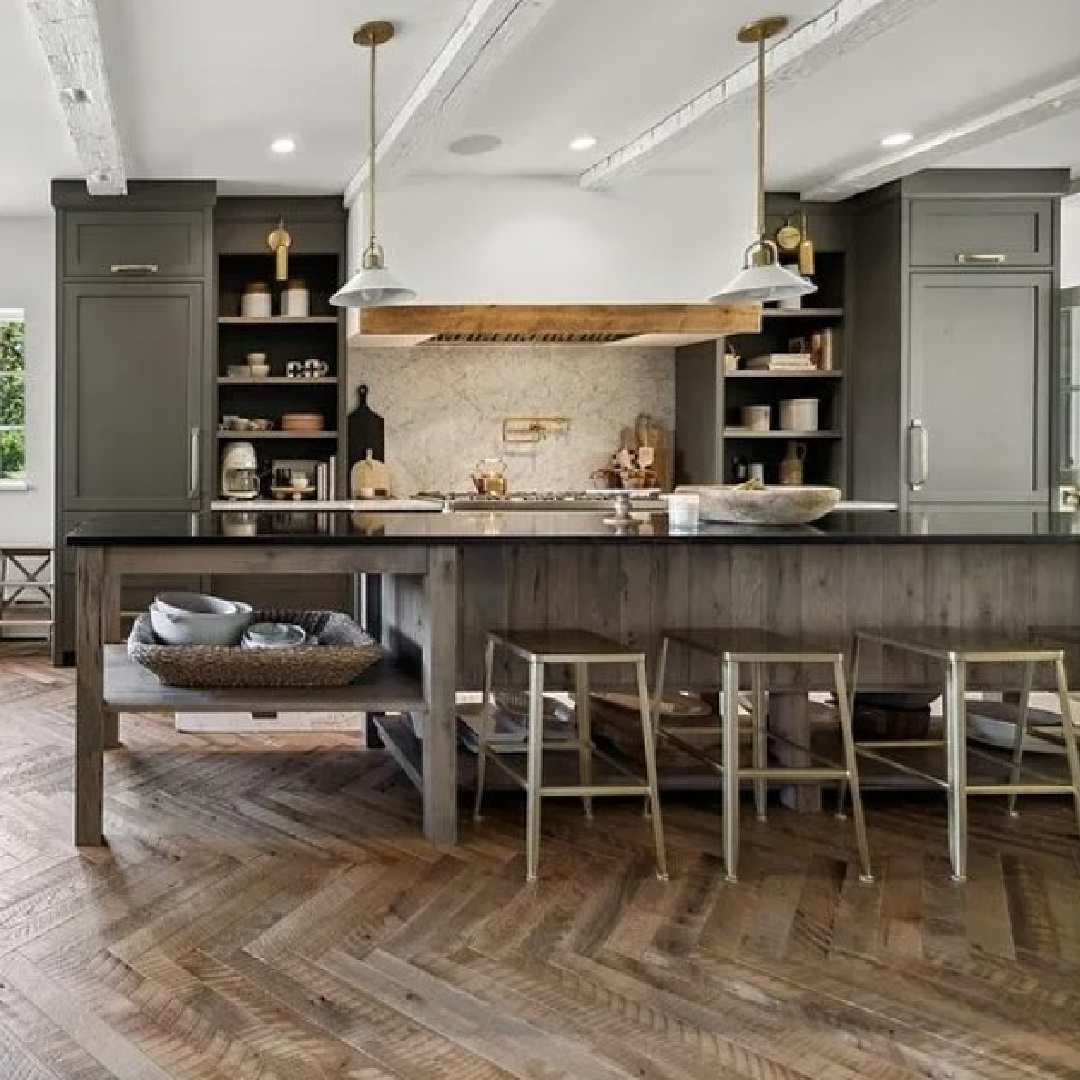
Try the Deep Green in Kate Marker’s Kitchen
If you have been admiring the gorgeous green color in this home’s kitchen…
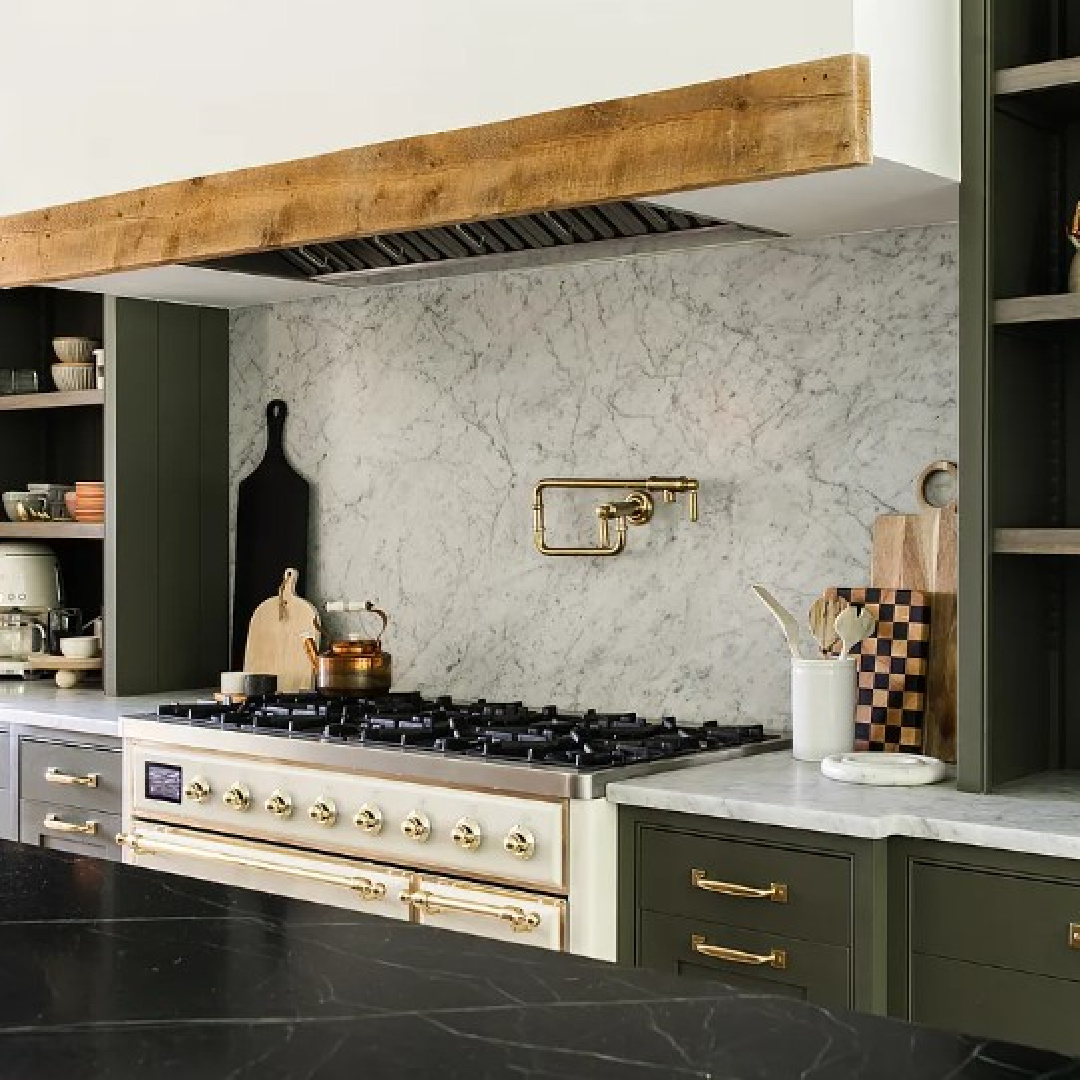
Say hello to Benjamin Moore Dark Olive:
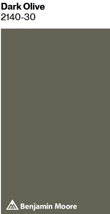
It is a deep dark bold green that feels rich and lively.
Two of our bathrooms here at the Georgian were painted this color when we took ownership, and it had a rich, sophisticated look that was perfect with travertine tones in those spaces.
Of course I had to paint over those walls in a warm peachy beige to stay on course with the rest of my design plans, but I hold deep respect for this hue!
It feels so European inspired, yes? See more ideas for dark green HERE. Even if you aren’t blessed with beautiful cabinetry…maybe that is a blessing in disguise since you won’t feel bad about giving them some love with paint!
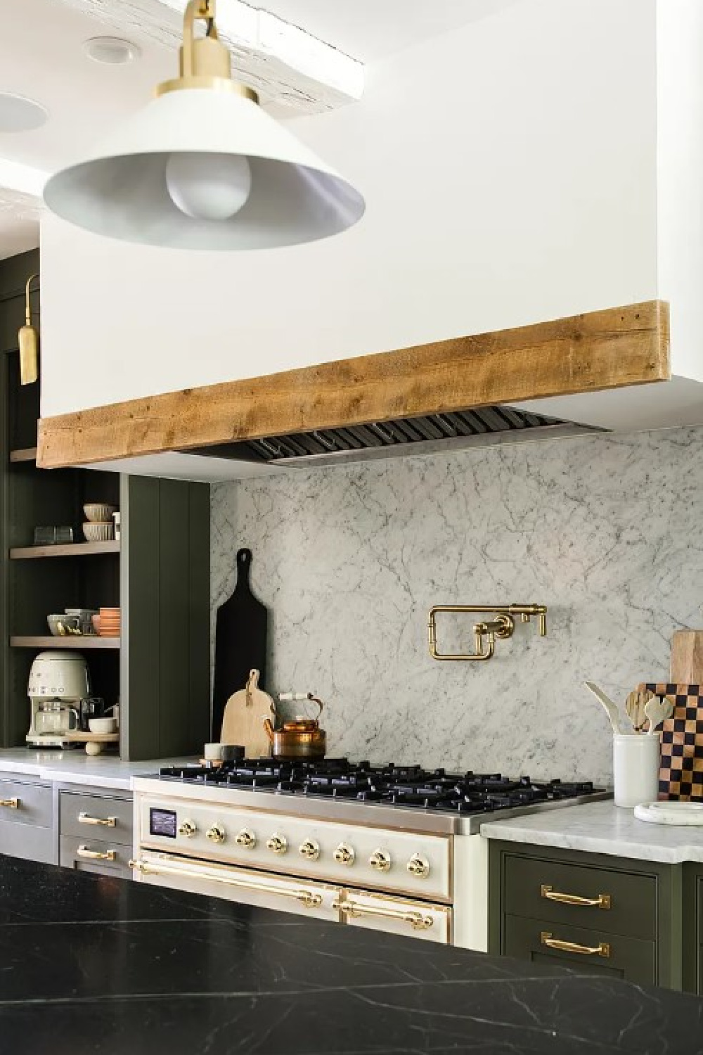
Isn’t that striking olive amazing with the creamy dream Ilve range and unlacquered brass hardware?
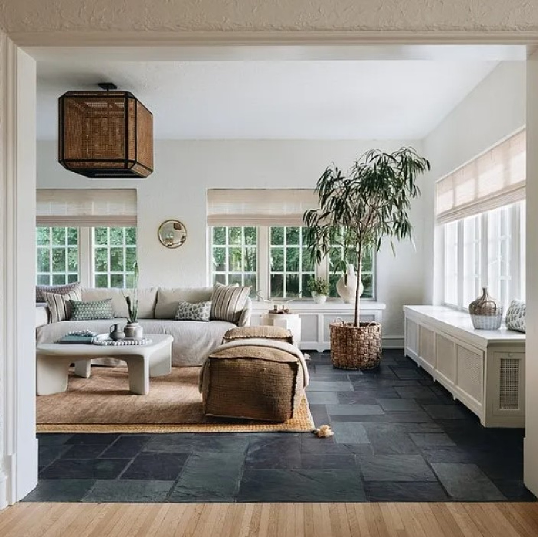
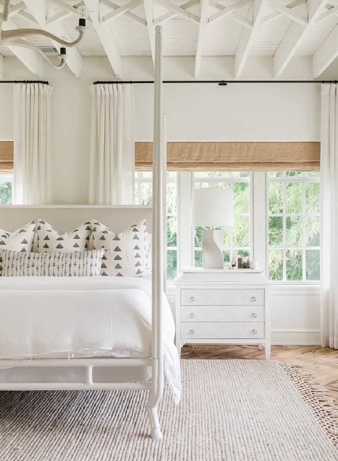
Add a Variety of Shapes to Your Space
I recall Kate Marker commenting on her math whiz background, and the best designers understand a little somethin’ somethin’ about geometry.
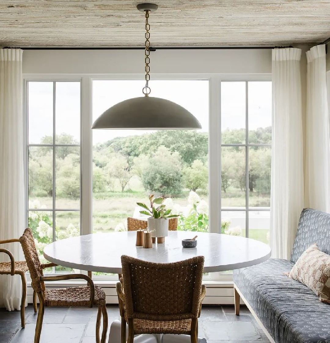
Notice the oval table and round pendant above in the breakfast nook. With all of the straight lines from the windows and bluestone tile, it’s pleasing to the eye to see curves. Even the chairs have gently curved arms and tops.
Even simpler small moves like baskets and bowls can introduce a round shape to a room.
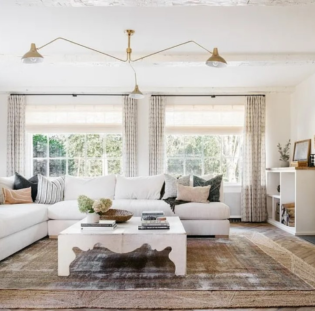
This cocktail table above has a curvy whimsical detail (along with that playful ceiling fixture) that also breaks up the monotony of the inevitable squares and rectangles.
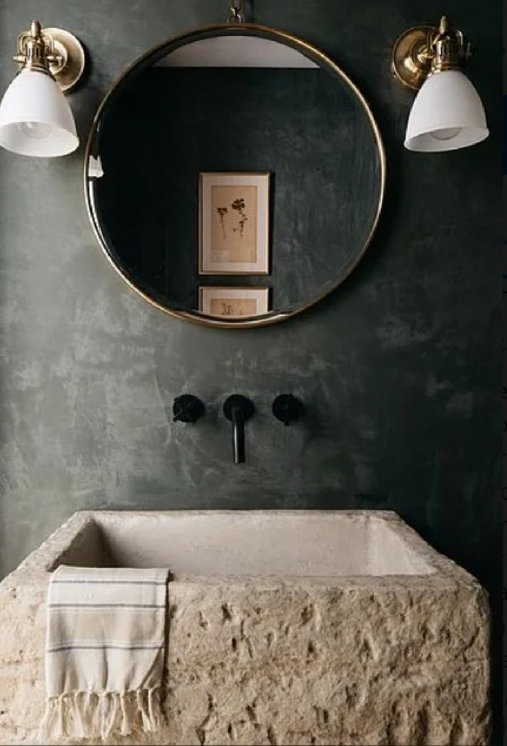
A round mirror and round sconces in a powder room (above) soften a space with a rugged stone sink and rustic plaster walls.
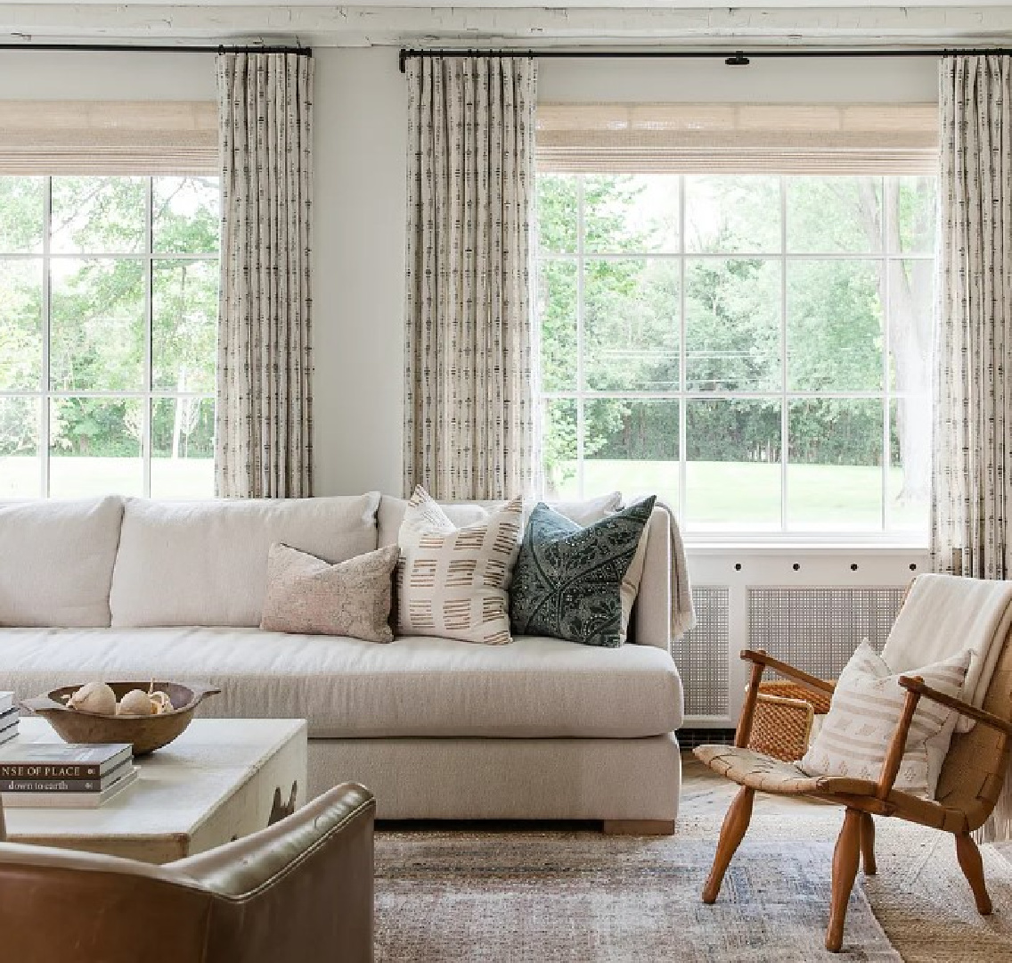
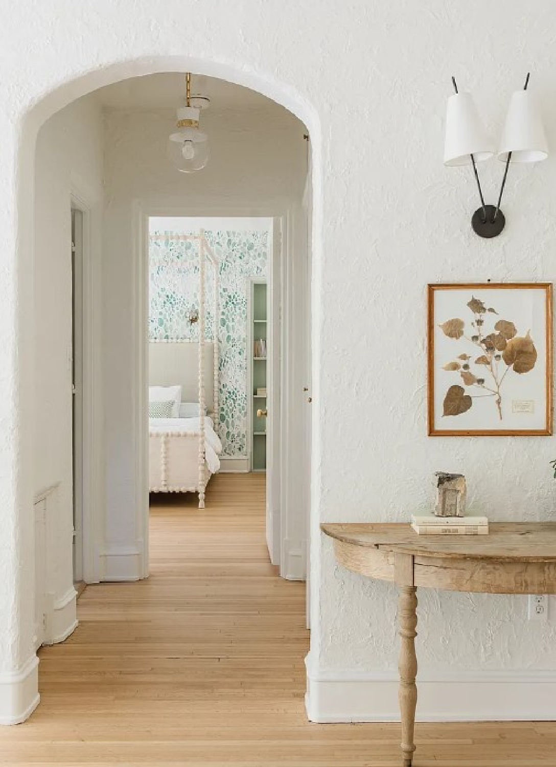
Embrace a Simpler Aesthetic Style
BTW. Are you trying to guess at the architectural style of this 1920s home when it was built way back when?
The style of this home is Arts and Crafts.
Familiar with this architecture and aesthetic movement?
It advocated for the handmade and the use of traditional techniques, celebrating the craftsmanship of artisans. Arts & Crafts embraced beautiful and functional objects that were both aesthetically pleasing and well-crafted.
Simplicity, honesty in materials, and a rejection of excessive ornamentation were core tenets of the movement. So if these spaces feel rather spare and minimal, it is certainly in keeping with the original ideals.
Furniture, textiles, ceramics, and architecture often featured clean lines, natural materials, and a focus on functionality.
By the 1920s when this home was under construction, the Arts and Crafts movement had already made a significant impact on American design and culture.
It had influenced various aspects of daily life, including home furnishings, architecture, and decorative arts.
But you know how tastes tend to shift like a pendulum!
Art Deco with its opulence and glamour was on its heels.
Incorporate Craftsmanship, Simplicity & Natural Materials into Your Design Schemes
As I mentioned at the beginning, there’s no chance I’ll be moving into a $5 million Arts & Crafts mansion. But that doesn’t mean I can’t put into practice the values of that movement and architectural style.

Keep an eye open for: handmade, handcrafted, bespoke, natural materials, and those design elements that are not mass-produced. It is becoming increasingly more difficult to live up to the ideals of Arts & Crafts, yet even baby steps (make it yourself!) can make a difference.
Peace to you right where you are.
-michele
Thanks for shopping RIGHT HERE to keep decor inspiration flowing on Hello Lovely!
Hello Lovely is a participant in the Amazon Services LLC Associates Program, an affiliate advertising program designed to provide a means for sites to earn fees by linking to Amazon.com and affiliated sites.


