HOW TO CHOOSE THE BEST WHITE PAINT COLOR is one of my favorite topics, and one for which I am consulted every single day! 7 Warm White Paint Colors to Consider goes beyond simply throwing a bunch of warm white paint color possibilities at you. In addition to color names, I’ll also help you think critically about the process of selecting the appropriate white for YOUR particular space.
This post contains affiliate links which I hope you will use since they won’t cost you a penny extra yet may earn this blog a small commission.
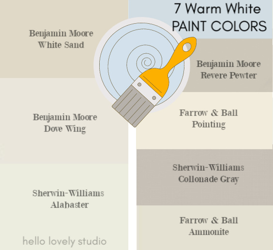
Warm White Paint Colors: Gorgeous, Tried & True!
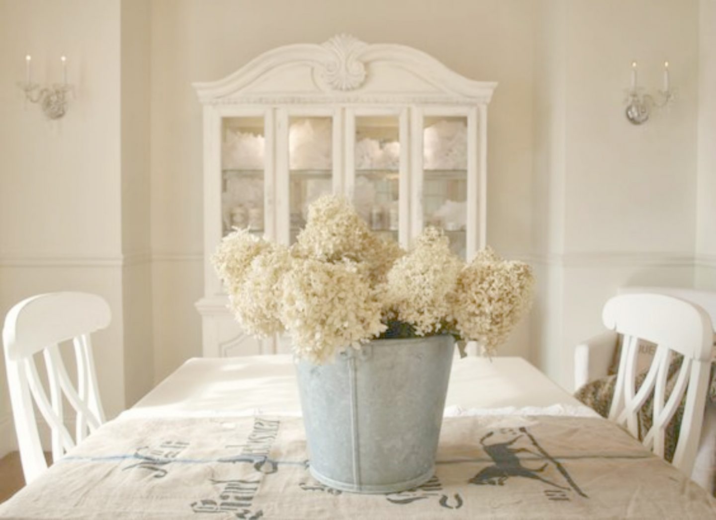
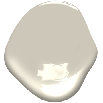
1. BENJAMIN MOORE White Sand
A Personal Favorite Warm White
This warm white is one I discovered when searching for the best shade of white for our prior home: a European country inspired manor home on the edge of a lush forest.
Since I’m not a huge fan of living with brown undertones, I didn’t want a color that made me think of cocoa.

I was after a soft, gentle, beachy white reminiscent of seaside vacations.
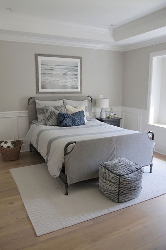
The color I fell for was BENJAMIN MOORE White Sand and was used in every room except for our sons’ bedrooms.
If you’re a fan of Belgian linen, there’s a fair chance you’ll also like BENJAMIN MOORE White Sand.

Living With Tone on Tone
Tone on tone isn’t everyone’s cup of tea, yet this color story worked wonders in a spaces we wanted to feel serene, peaceful, and also warm.
After a couple of years, I got the itch to change the paint color and bring a bit more contrast to the kitchen. We chose Benjamin Moore Ashley Gray (below) for more depth.
Our kitchen received a ton of natural sunlight so Ashley Gray was not too dark – it might actually read “purply-charcoal” and not “warm white” in a poorly lit space.
So don’t get too wooed by any one particular paint color when you see a photo – sample a handful!
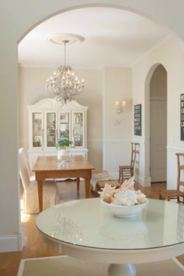
White Sand in Another Home
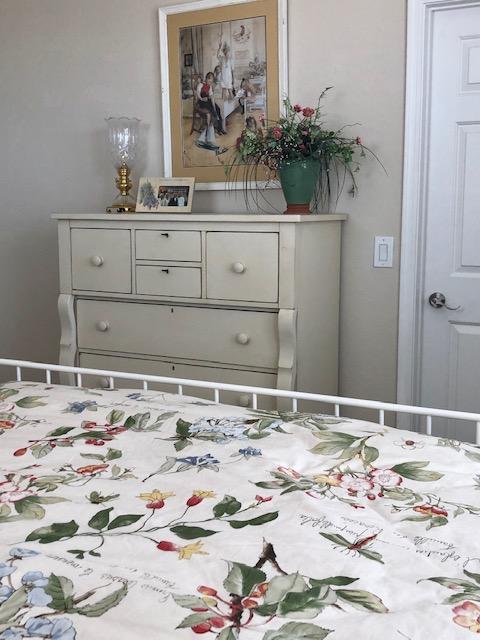
We’ll journey from Chicagoland to the Southwest, where my mom loves BENJAMIN MOORE White Sand as well.
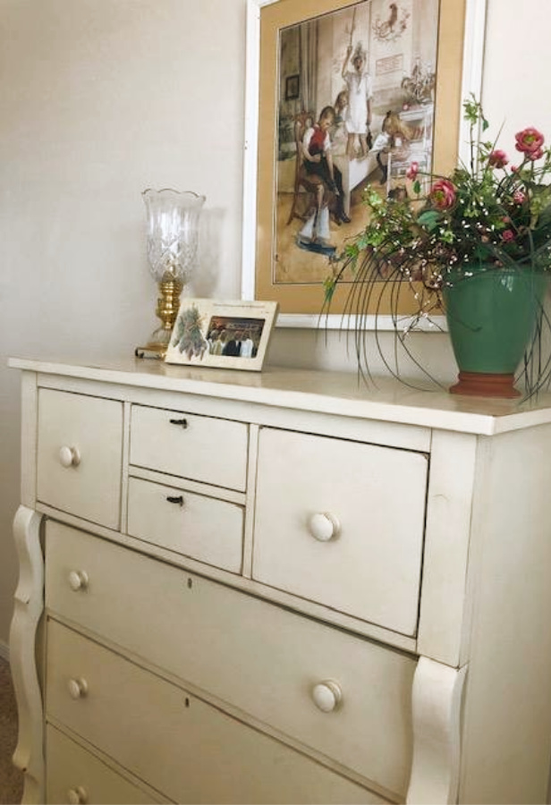
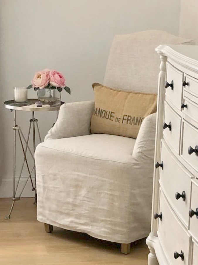
What’s helpful is seeing the same paint color in different rooms with different exposures. Here it is in a bedroom with Southern exposure and antique white dresser:
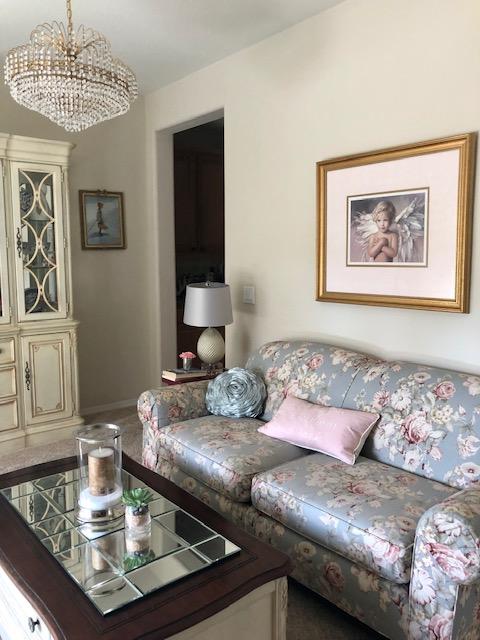
Warm White in a Living Room With Blue Grey
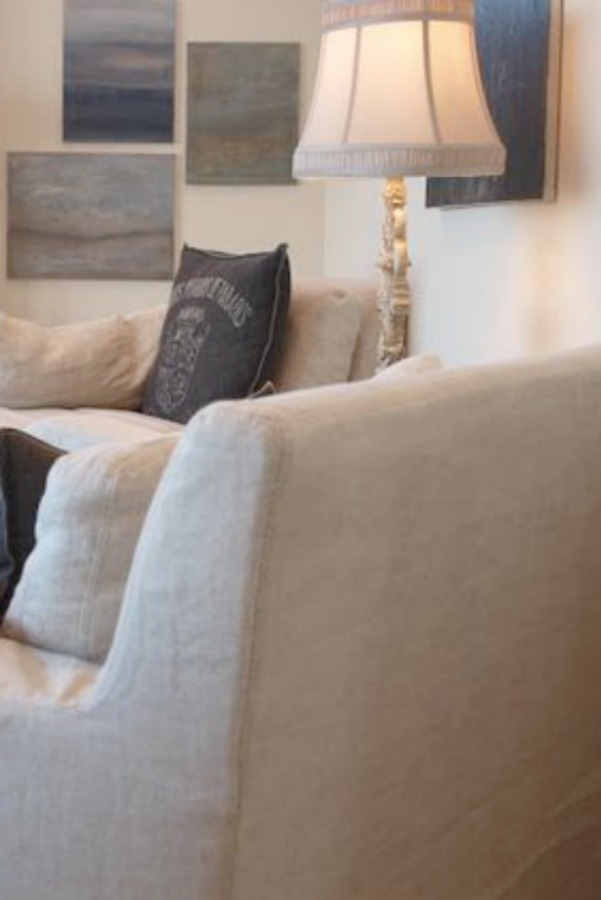
In this living room, you can see how Benjamin Moore White Sand works with a cool blue grey, soft pink, and gilded frames as well as antique white hutch.
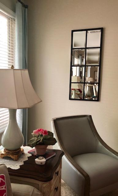
Warm White in Family Room With Northern Exposure
In the family room with North facing windows and light turquoise and teal accents, Benjamin Moore White Sand feels more like a natural linen hue.
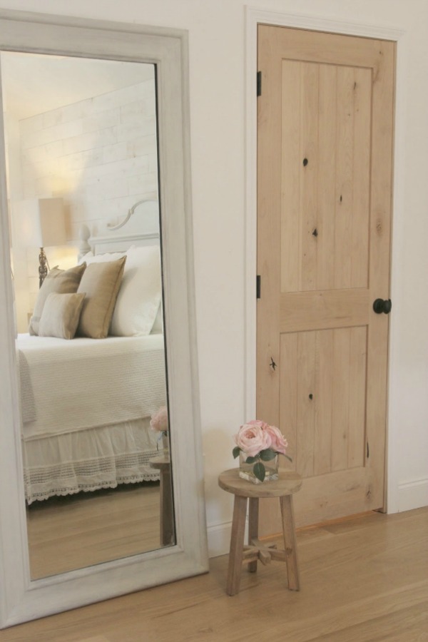
In a bedroom, White Sand offers a gentle contrast with white French country furnishings.

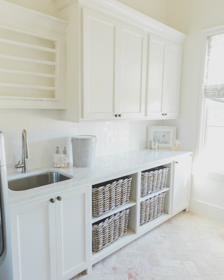
2. SHERWIN WILLIAMS Alabaster
Beautiful Warm White Paint in a Showhouse
Sherwin Williams Alabaster has a cult following with both designers and decor freaks lauding it. Who can forget how this beautiful warm white canvassed the 2017 Southeastern Designer Showhouse?


ALABASTER…Sherwin Williams named this the 2016 Color of the Year.
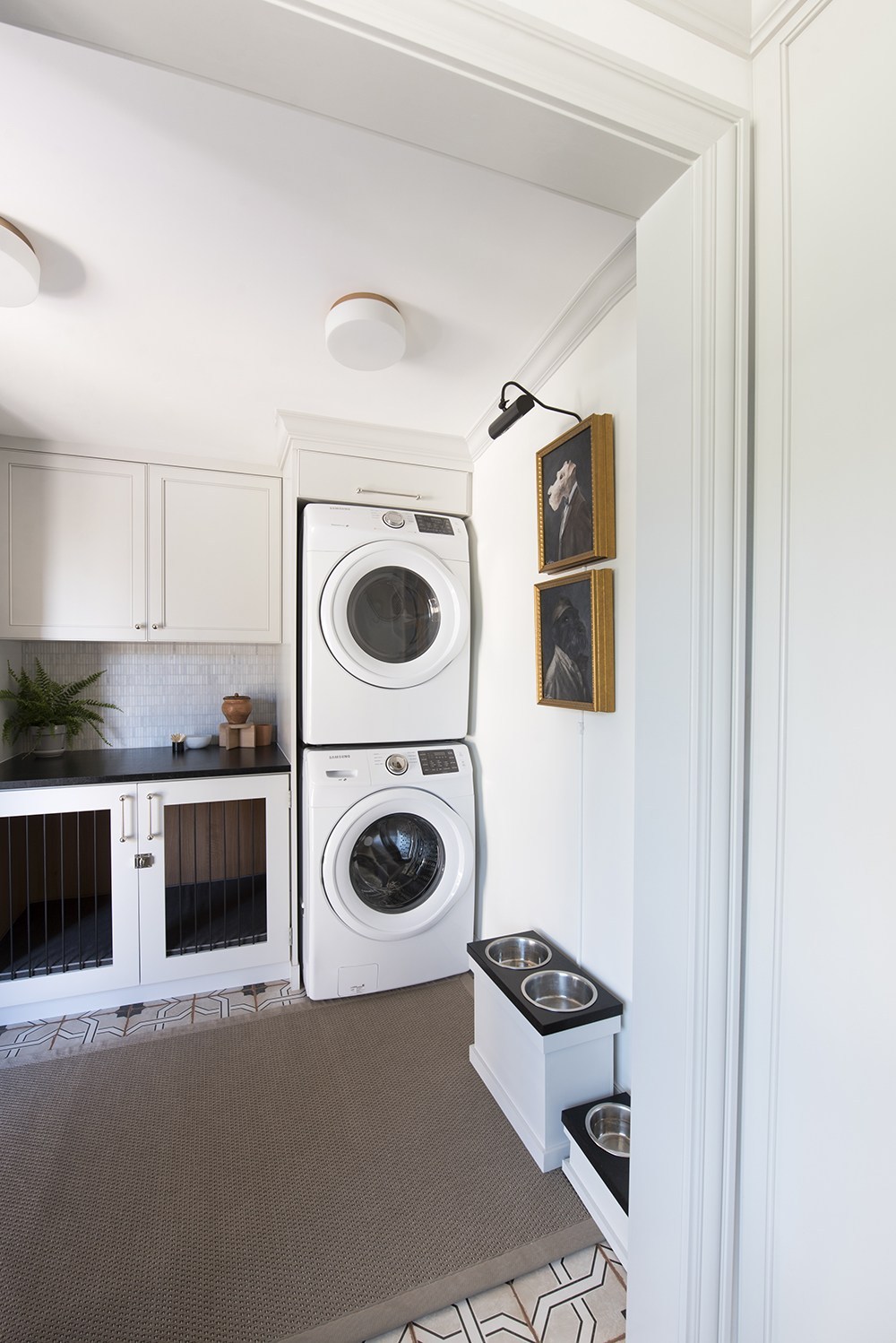
SW Alabaster in Laundry Room
In a blogger’s One Room Challenge space (a pet palace laundry area!), Sherwin Williams Alabaster was the white chosen. Custom kennels occupy pretty space under the counter!
Great Room With Warm White Paint Color
Sherwin Williams Alabaster Bedroom
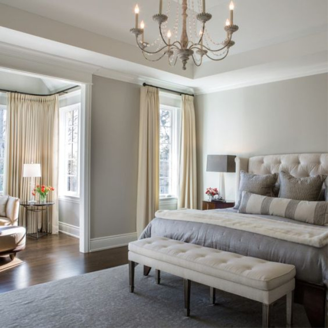
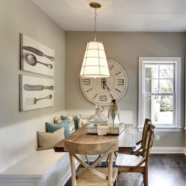
3. BENJAMIN MOORE Revere Pewter
Revere Pewter for Trim & Furniture
For me, Benjamin Moore Revere Pewter is reminiscent of soft natural linen or gentle garden stone.
This paint color works wonders in a variety of spaces and was used to refresh my tired, antique white bedroom furniture.
Easiest way to see if a paint color will work? Order samples with Samplize and have them delivered straight to your door.
The furniture now feels light, fresh, and more timeless.
But let’s see how it looks on walls.
Revere Pewter Paint in Bedroom
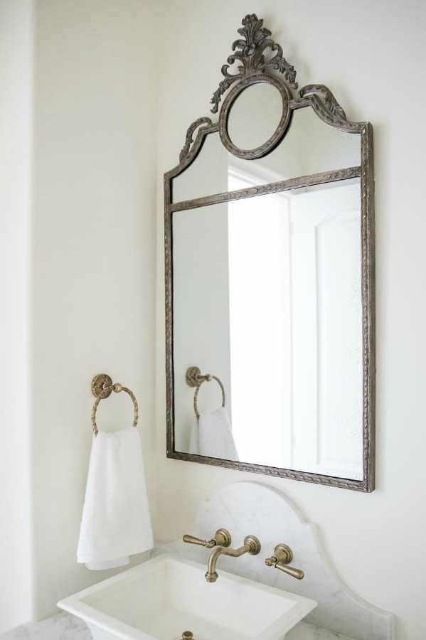
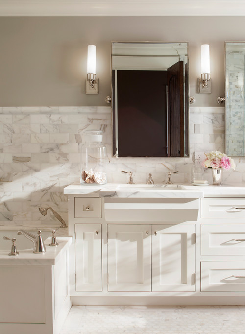
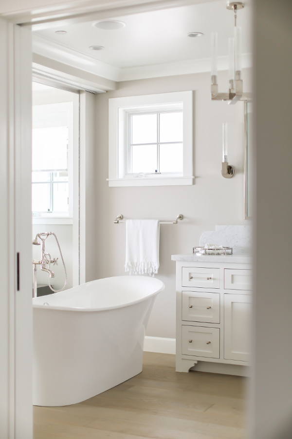
Revere Pewter in Bathroom
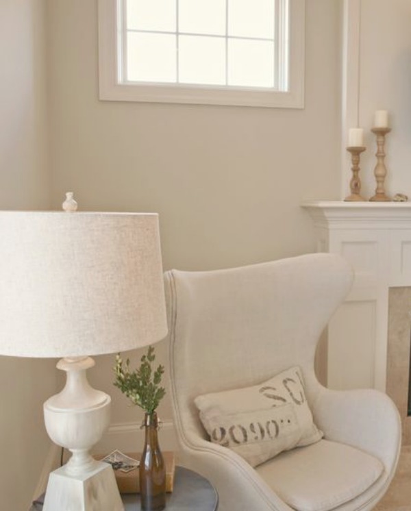
Warm White & Natural Lovely Things!


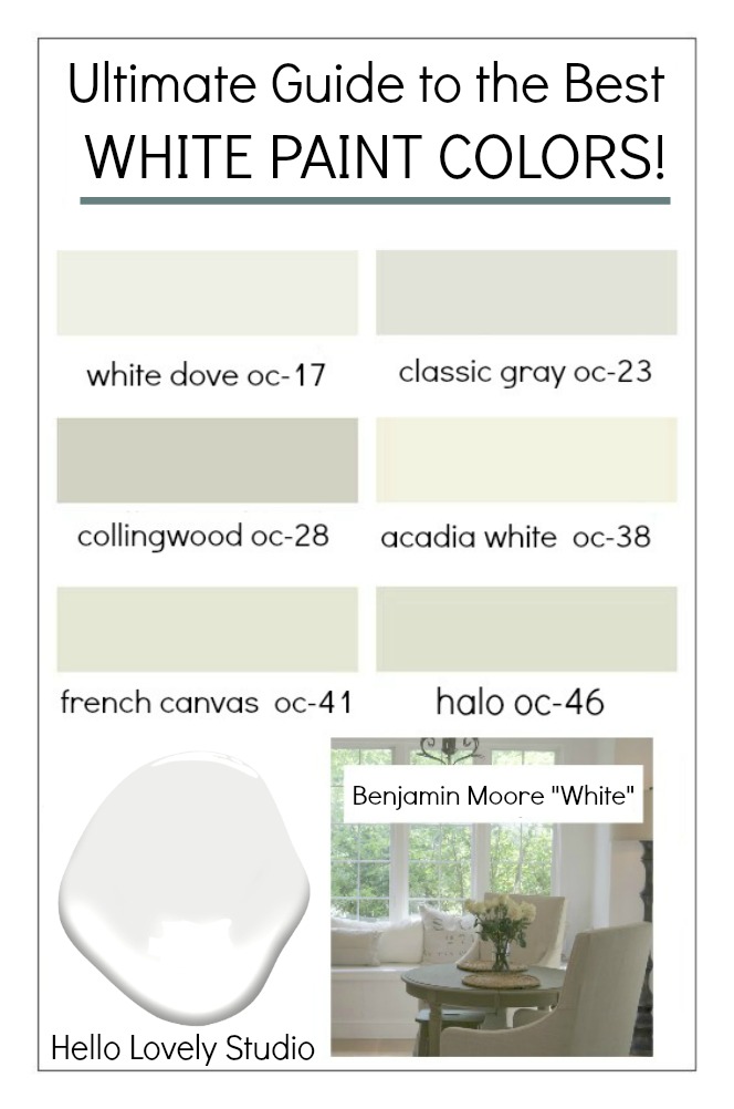
How to Choose the BEST Warm White Paint Color
1. Try Multiple Samples
Bear in mind that the perfect white paint color for a particular space may be completely wrong for another space. The light in Northern Illinois where I reside is quite different from other regions like the Southwest where we bought a second home.
So as you search for a just right white, don’t forget YOU’LL FIRST SELECT A HANDFUL OF OPTIONS and then SAMPLE THEM in your unique space TO BE SURE.
2. Understand Warm vs. Cool Whites
If you understand the difference between a warm and a cool white, you’ll have an easier time sifting through the possibilities.
Warm whites tend to have warm undertones of green, brown, etc. Cool whites may have blue and grey undertones.
Sometimes it is helpful to clarify what is even meant by warm vs. cool white paint.
For example, in our current home, almost all of the walls are painted a very cool and bright white (Benjamin Moore “White”). This cool white might be all wrong in a different home since it was chosen to counter the harsh yellow light we receive here.
The cool white tempers the color and mood and because of the yellow sunlight, it does not read too sterile or blue.
3. Search Online for Ideas
While plenty of paint color experts advise against searching online and Pinterest for the best warm white, I find it helpful to begin the search by viewing photos online where the paint color name is provided. It truly beats standing in a big box store under fluorescent lighting, anxiously studying cardstock swatches.
Have a Pinterest board devoted to your favorite white paint colors yet? Create a devoted board and PIN THIS POST there to have a handy list of paint names you can refer to when you head to the paint store to buy samples (I’m sure I don’t have to remind you to bring your phone).
4. Consider Objects & Amount of Natural Light
Make sure you take into account the temperature of the objects and furnishings in the room you’ll be painting. If they are mostly cool, in most cases you’ll want to lean towards cool whites. Are they warm? Then a warm white is likely the wise direction to head.
Does your space receive a lot of natural daylight? You’ll probably want to stay in the more pure white zone with minimal undertones. However, if light is limited, a warm white with more pigment is probably your friend.
More Warm White Paint Colors
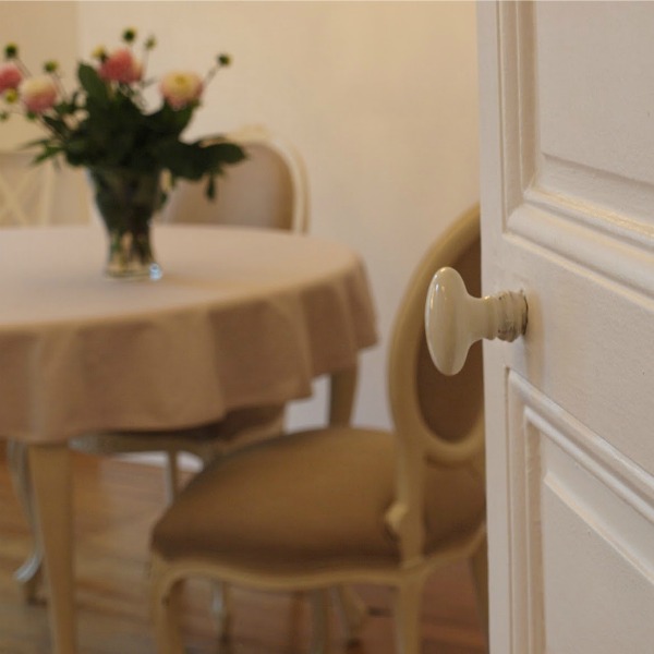
Here is a white we used for trim and doors in our prior French Country home.
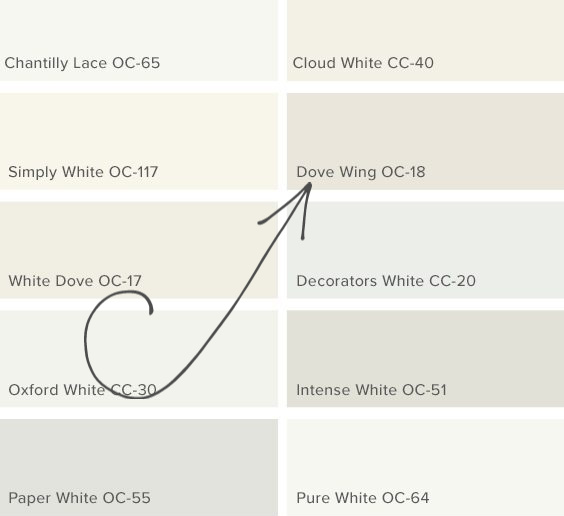
4. BENJAMIN MOORE Dove Wing
5. SW Collonade Gray
Her’s a gorgeous greyed white used by Melissa Morgan Design called SW Colonnade Gray. YES, A WHITE COLOR MAY HAVE GRAY IN THE NAME!

6. FARROW & BALL Pointing
Designer Greet Lefevre of Belgian Pearls shared this when I asked for her fav:
“It is hard to name a favorite white as using the right color of white is dependent upon the room that has to be painted. Is it a small or a large room? Is there a lot of light coming in or not? Another factor….fabrics to be used in the room for curtains and upholstery. But I often turn to FARROW & BALL Pointing White“


7. FARROW & BALL Ammonite
Megan Pflug notes: “My favorite white wall color is FARROW & BALL Ammonite. It is a fantastic changeable color. It looks more like a stone material than a flat wall color. Its a great alternative to a standard white.”

AMMONITE is named after the treasured fossils often found on the Dorset coast. It has a fantastically understated quality…neither too warm nor too cool, its subtle grey tone creates a hushed and calming feel in homes both old and new.

Hope this helps, and for related stories see these:
Peace to you right where you are.
-michele
Shop for items you already intended to buy on Amazon RIGHT HERE, and also find home decor here to keep decor inspiration flowing on Hello Lovely!
Hello Lovely is a participant in the Amazon Services LLC Associates Program, an affiliate advertising program designed to provide a means for sites to earn fees by linking to Amazon.com and affiliated sites.


Oh the beauty and head-scratching aspects of white paints! 😉
I am currently “researching” a white for my LR. At the present it is a light gray ( former home owner color) but I’m hoping to go yet a little lighter. We have brilliant sunshine (if it’s a sunny day) all day long in that room, with light coming into the room from east, south and west—-it is a west facing room with a huge picture window.
As a former decorator myself, I can easily see undertones but the trouble is knowing my furniture has warm white undertones and yet not wanting to enhance that aspect of the color. Ugh! You’d think having paint fans from nearly every paint company is helpful…but it’s more confusing! Haha!
One day I’ll be certain of the white I want and the next day I’ve changed my mind. My friend said “You may just have to pick one and just do it!” She may be right. 😉 I once read that designer Tricia Foley used about 20 different whites in one room. Still they all do have to “play nicely” together. 🙂
To say I’m obsessed with all the beautiful whites is saying it mildly. One thing I realized (after painting my office in a warm white) is that what worked so beautifully for our former home doesn’t look so lovely here. Some day the warm white will go to a cooler white like the rest of the rooms. 🙂
Maybe my perfect white will be a custom mixed color….I’ve been known to do that with paints on several occasions.
Love your posts about white paint!
Author
I am feeling your pain. What you’re doing is what the artist does: playing with light – trying to get the most out of it and giving it as much help as you can. The light is so dramatically yellow here that it wasn’t terribly challenging to figure out what I needed for the effect I wanted. But I also know I’m lucky I found a white that works in all rooms with their different exposures. I remember reading that same thing about Tricia Foley and other white loving designers who use various shades of white together. It has certainly been true for me. An artist friend taught me to combine creams and whites, and things have never been the same. I love wearing ivory and bright white together – and don’t get me started on natural linen with white. I don’t do as much thinking about paint as doing. I buy paint and march home to slop it on the wall immediately! I live for that sort of thing. But I can also walk into someone else’s home and choose colors without much sampling. Years of experience – I know you get it!
So right Michele! 🙂 I really loved doing paint consultations for my clients….but for my own home?……It always seems so much more “work”. Haha!
You mentioned cream and white together and natural linen and white. Oh yes! Love those combos too! In fact my sofa and loveseat sport a similar combo. The original fabric is very close to natural linen (I believe they called it “oyster”.) But along the way the cushions wore out, we got indoor dogs that shed 😉 and I chose to do “faux” slipcovers with natural light cotton duck fabric on the backs and seats. The arms and front panel are still the original ivory. The combo of the two “whites” is quite lovely and I make my own custom throw pillows to change out with my whims and/or the seasons. However like I mentioned in the original post, I’m not keen on playing up the yellow undertones of the fabric, hence the struggle to find the perfect white paint. 😉
I’m in the Upper Midwest too so our afternoon light is be very yellowy like your location. That’s why I think I’ll be re-reading your post about cool whites 🙂
Your posts are so much fun to read, especially the ones that reflect French style (a personal favorite) and of course…..whites! 😀
Author
By faux slipcover, do you mean you simply drape fabric over them without tucking? I love that style so much. It says ‘vacation house’ or ‘undone pretty’ in such an unfussy way. I’m gearing up to do a post on cool whites – introducing my favorite light grey-whites and discussing how they can work well with warm objects and surroundings. You need to start a blog with the sole focus of paint color consultation with your expertise…watch it rack up the traffic! 🙂
Hi, Michelle. Appreciate your blog. I live in south Texas, where summers are 9 months long and brutally hot. Winters last only from Thankgiving to Easter, but we get plenty of freezes. I’m re-doing my RV with an eye to visually expand the space with white paint and white slipcovers. In winter I plan to add rugs, lots of red, orange & gold and to use a warm bulb. In summer, to replace the hot colors & light bulb with a soft teal. But first, I have to paint. I’ve considered Alabaster for the walls & Simply White for the trim, which is more dramatic and decorative than is usually seen in RVs. I’m making the slipcovers out of “Winter” white cotton canvas. The floors are of weathered gray vinyl plank, and I’ll leave them bare in summer. My exposure in all rooms is southern (parked against a tall privacy fence). Here’s what’s making me the most nervous:
I want a subtle contrast between walls and trim & considering Alabaster for the walls & Simply White for the trim. Will that be too eye-stopping in a small space? Will the warmish Alabaster make it feel hotter? On the other hand, I don’t want a glare, either.
I’m very sorry the floor is grey, as I’m trying to pretend it’s just another neutral, but know it will affect my paint colors. When was shopping in Seattle for an apartment, blundered into one freshly painted–walls and trim–battleship gray, because that’s what decorators said was the next big color. Gray! to match suicidally constant chill, gray skies & drizzle! Couldn’t get out of there fast enough! Thinking of painting the floor a tiny shade darker than the walls. (My husband would NOT agree.)
Am I making mountains out of molehills? Please speak reason to me, Michele.
Author
You are absolutely delightful, Jude. I am loving every minute of your commentary as a kindred spirit who takes her white paint colors as seriously as you do. What I wouldn’t give for a hot Texas summer! I’m serious. I love the heat and remain only in the North for the man I love (but that won’t stop me from boarding a plane to the Southwest tomorrow night…TRUE! Hello, lovely Arizona! Get me outta here!!!) I sort of love Alabaster or a color like it for that Southern exposure you speak of. I used Valspar Salute (which is quite similar I think) throughout our Arizona home – have you peeked at those posts at all? I could never snag decent pictures since they always looked overexposed with all the light. Salute has green undertones which worked really well with the intense Southern light pouring into that home. I adored how it worked with the Behr Classic Silver I painted the cabinets. The sunlight plus that Classic Silver added up to a gorgeously warm blue-grey. You would never choose this color if you simply looked at the swatch at Home Depot or even glanced at the paint can since it seems too cool…but sunlight does magical things. We sold that beautiful home, and I do miss the palette of linen, pale blue-grey, warm white, and alabaster. I’ll never tire of it. Are you against trying a few different whites by buying small samples and watching them change through the day? That is the smart way to choose. But I like your idea of warm (but not antique) white on the walls, brighter for trim and slipcovers. You’re not gonna believe this, but just before I turned on the computer, I was daydreaming about decorating a vintage camper…how fun! Keep me posted and feel free to fire away more questions. 🙂
Hi Michele. I’m looking into BM White Sand for exterior of a Spanish Mediterranean looking house. Do you think White Sand would work with a red roof and dark bronze window exterior trims. Front of house is west facing, so I get lots of sun in the afternoon. I sample painted Manchester Tan but see it didn’t work well with the red roof as I see the green in MT. Do you think White Sand is a good choice for west sun facing house. I’ve also looked at BM Olympic Mountain (less yellowish tone than White Sand). Please help.
Author
If you like Olympic Mountain AND White Sand, you might try sampling Ballet White – it’s going to read light with western exposure, but it’s also going to change throughout the day. So when you sample, do look at it at different times of day. It’s going to be a personal preference as far as the pairing with red roof – I find warm whites very earthy (reminiscent of sand and stone) and beautiful with red clay. The bronze trims sound beautiful.
Michele,
I so enjoy your posts. Your homes …just lovely. 😊
I could use some direction. We are trying to refresh our Tuscan home…travertine and Brazilian cherry floors must remain. Cost prohibitive to replace now. Northern exposure family room/kitchen but very light filled with lots of windows. Yet that northern light is blue.. . Sherwin Williams Panda White was suggested to pick up undertones in travertine. The cherry wood floors are south exposure but dark most of the day from large trees and porch. Use Panda here or something else? And what Sherwin Williams trim throughout?
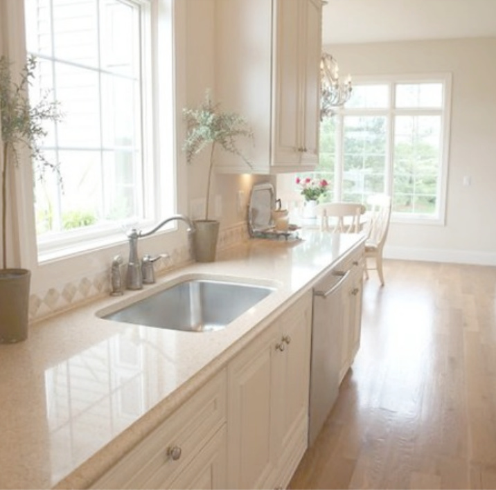
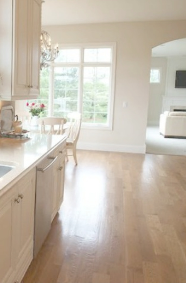
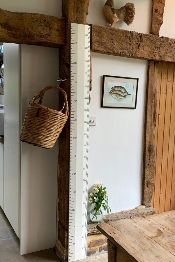
Lastly..what is the name of the beautiful counter in the first picture above -creamy kitchen?
Thank you so much. I am driving painters nuts but just want to make best decision.
Author
If you are driving the painters crazy, you are my type of human! It’s your house, and you’ll be living with it so it’s worth agonizing over it! I like Panda but I think I like Shoji White a little more for the lighting and design elements you supplied. It is slightly more taupe. For trim, I would probably start by sampling Alabaster since it’s such a trustworthy sort of designer favorite that works so often.
The counter is in my former French country kitchen (which had travertine accented backsplash) and is Silestone Ivory Coast quartz. Beautiful with travertine and warm whites and one of those uniformly consistent patterned quartzes that isn’t trying to mimic any sort of natural stone or granite. I liked its beachy quality. Feel free to reach out with anything else, and best to you as you refresh!
I am building a home now in Florida. I am painting the upstairs ( main living area) alabaster and I am painting the guest suite (downstairs) which is off the pool SW sea salt. Please let me know what color you painted the trim, ceilings, and bathroom vanities with the alabaster walls.
Author
I wish I knew! If you are referring to the French country house by Brit Jones – you might be able to direct message her on Instagram. I have seen White Dove (Benjamin Moore) pair nicely with Alabaster. In our prior French home with BM White Sand, the trim was painted BM Dove Wing (a greyed off white).
Hi,
I am looking for a warm white for my kitchen cupboards . Do you think white sand is a good choice and if so what color would you paint the walls? My kitchen is large with a lot of natural light.
Author
Ooooh – you’re going to love today’s post with putty paint colors since in essence, you’ll probably want to consider the “warm white-ness” of the mushroom/putty/stone/greige range of hues. https://www.hellolovelystudio.com/2020/09/perfect-putty-paint-colors-for-kitchens-beyond.html I love White Sand, and you could go with a brighter white on the walls (Benjamin Moore White Dove for a timeless look or Behr Ultra Pure White for a more modern/gallery look). I think seeing the kitchens in the Putty Paint Color post will inspire some ideas for you.
Thank you ..what about Jute for the cupboards and light on the walls… ugg I am stuck I have darker counters and darker floors … or white sand for cupboards and either white dove for walls or BM fossil
Author
Keep in mind that the color you pick for the cabinets is really the tough part – you’ll easily be able to arrive at the right color for the walls AFTER. So don’t stress yourself out about choosing too many options at once. If you think Jute is the one – get a sample and paint out a piece of wood or something that you can live with and notice with the counters and floors over a couple days. If it seems right then you’ll be all set with that big decision. Then you can move on to the wall color. I know it’s hard to not get ahead of yourself, but walls are sooooooo much easier to change than cupboards and counters and floors! 🙂
Thank you ! it is big job
Author
It is – and so easy to become overwhelmed with all the labor involved. Wishing you peace.
Michelle,
I am new to paint and am learning so much from you. Wow. We have an east west facing house. We are just now throwing out old stinky carpet for a nice laminate flooring. It’s pretty but has a green undertone. I would categorize it as a taupe or light brown. I want a paint that can help neutralize that green undertone . I am in California. Weather is generally spectacular. Lots of sun and heat. I am in the country and have a ” red” dining room and mellow yellow kitchen/fam room now and looking for either a light grey or version of white for living room. We have beautiful molding and trim with lots of windows and I have never thought of NOT highlighting them with white ( they are white currently). I have thought of soft chamois or creamy or … modern gray, balboa mist or something in a light gray. What are your thoughts? I have dark brown leather furniture and wood furniture in that room. Thank you SO much. Sheryl
Author
Hi Sheryl. Love the idea of Balboa Mist for the walls and a soft white like White Dove for trim with the light conditions and flooring you have described. Something very fresh/modern happens when you pair a light grey with warmth (like the taupe-ish flooring and Cali sunlight).
Hello! I love your blog and your down to earth advice. I love warm whites/creams and have a large great room that faces south/west with lots of windows, 20 ft ceilings, and sunlight. I had my custom cabinets painted SW Dover White and the walls SW Whole Wheat. I am remodeling and want to brighten up the walls but will not change my cabinet color. My ceilings and trim are also Dover White but don’t look as creamy. My color scheme will be creams, possibly tans or warm grays and a grayed down blue or teal. I am also looking at BM White Sand for walls but don’t know if that’s too warm and will it match Dover White….HELP!!!!
Author
I love the sound of the color palette you are moving toward! I’m thinking start with a sample of SW Canvas Tan since it will match Dover White for sure and is perhaps a bit more saturated than BM White Sand. To give yourself another option with an entirely different feel, maybe try a sample of BM Stonington Gray. While it is considered a medium and not light grey, with all that sunlight you receive, it could be the just right gray hue. What I love about using this color is the subtle blue undertone which softens it. For a third sample to try, maybe SW Repose Gray. Let us know what you decide. 🙂
Hello! Would white sand painted walls work with light terra cotta tiles and natural oak flooring? Also, what off white paint would work for kitchen cabinets in that scenario? SW Creamy or BM white dove? I am more confused than ever LOL
Author
Hahahaha – sometimes too many choices can overwhelm, and there are certainly are a lot of possibilities mentioned here! Yes, indeed BM White Sand can be beautiful with light terracotta tiles and natural oak. Since I lived with a great big house with that color throughout, it is marvelous with oak. That home was flooded with natural light, so if your own home has dim interiors, Ballet White might be more appropriate. You can’t go wrong with BM White Dove for kitchen cabinets if you’re going for a fresh look with a white that is not likely to look too different at different times of day. If you click on “MY HOME” in the menu at the top of my blog, you can see photos of my kitchen cabinets which are close to BM White Dove. I happen to be painting woodwork at a new project with this color, and it can look a bit warm when stark white is next to it, but it’s very soft and lovely with all the other tones. Let me know if you have further questions as I’m always happy to help and love discussing paint color.
THANK YOU!!
Author
🙂
Hi Michelle! I’m battling the delightful decisions of whites! My painter is ready for a decision and I’m not sure I’m quite ready to pull the trigger. HELP! I live in the great state of sweet home Alabama with west facing home. A lot of light beaming from the east. I’m leaning towards- soft chamois, dove wing, or oyster white for walls and would love a contrast on trim. Also, the ceiling would I do wall color at 75% lighter? I home does have travertine tile in kitchen and bathrooms if that sways decision in any way. I hope this comment finds you well and in a timely manner. Thanks again for all your hard “leg” work with your post!
Author
It’s a big decision, and I’m happy to help. I love Soft Chamois because it is very similar to White Sand and Ballet White which I have used often in spaces with abundant natural light. Dove Wing would be a lovely color for trim as would White Dove. As for the ceiling, I like crisp bright white so that is a subjective matter. In my own home, because the sunlight is so yellow, I need to counter it with a very cool white. Travertine’s warmth will be just lovely with the palette you’re leaning into. Always a pleasure to brainstorm with you, and thanks so much for spending time here supporting my small business! Best of luck!
After having started with whites with a gray undertone I realized that we need more of a cream white. And with the primer on the walls that tends more grey white, that is clear. We have dark wood floors with a reddish undertone. Our kitchen cabinets are similar to SW Alabaster color. We have big wide arches delineating the dining area, kitchen, and back room. Hubby is raring to paint! I picked BM Chantilly Lace which is too white first, and then went to BM Marshmallow but now am fearful it might be too yellow. So…settled on BM Simply white for walls in kitchen and dining, ceiling to be Chantilly Lace. This is the darkest part of the room(s) with little natural light except what comes in from kitchen window and a side fence door. Am considering BM Limewhite for back room. Does this sound workable? Is BM Chantilly Lace too white for the ceiling?
Author
I think you’re choosing wisely with a keen eye – eliminating what doesn’t work is a great way to arrive at what does. I love Chantilly Lace for ceilings, and don’t feel it’s too white. I can see why Simply White is calling your name since it does have more of that warm yellow undertone and gets you away from the grey.
I painted whole house interior White Sand w White Dove ceiling and trim. Also did kitchen cabinets White Dove & island BM Hale Navy. I LOVE the paints. It’s so much lighter & brighter. We face north – especially in kitchen so I obsessed about what paint would work in there as well as rest of house. I also didn’t want gray but my daughter’s bedroom is BM Balboa Mist and it’s beautiful. This post was one that was a big influence on my choice of White Sand so thank you so much!!!
Author
Yay! Your interiors and the color palette sound beautiful. I miss my White Sand rooms and loved living with it. Thanks so much for reading and letting us know what worked. 🙂
Hi! Our living room was painted gray by the former owners, and I don’t like it because it’s such a cold color. Also, our decorations are from Morocco where we used to live, and they all have warm undertones which clash with the gray walls. Our living room faces north but has lots of windows on three sides – east, north, and west. We are surrounded by trees, so the room is bright during the day but doesn’t receive much direct light until the winter when the leaves are gone. My goal is bright and warm during the day and cozy and warm at night. I was also originally looking for colors that made us think of the Sahara or the last washes of a sunset (lighter versions of both), but when I tried those types of colors, they all looked pink, orange, or brown, especially at night. The French Canvas that looks gorgeous in our interior bathroom looks almost gray/white with direct light. We have now tried 8 colors and don’t like any of them! That’s why I was intrigued by your White Sand pictures because that’s exactly the color I want, although I realize our lighting is different. Also, we currently have one dark gray brick wall (used to be an exterior wall) and white paneling on the bottom of the three walls with windows. So my question is – based on what I’ve told you, do you think the White Sand would work? Or another color? And should all the walls and paneling be the same color, or is there another color that should/could go with it? Thank you!
Author
Always happy to offer ideas! I think White Sand may be a contender even though your natural light situation is different from our sunny former home. I say this since my parents opted to paint all their interiors White Sand and love it even in dim rooms. That said, it has green and brown undertones so if you’re allergic to muddy colors (I personally love em…bring it on), it may not please you. I would paint the paneling as well. I think what you’re looking for is some atmospheric warmth for the walls. A color that doesn’t shout “I’m beige” or “I’m the exact color of concrete.” In my experience, atmospheric color is muddy or chalky and most importantly, hard to describe since two people may not agree on what the color is. You didn’t say if your furniture pieces are solid or printed upholstery. Because one thing that comes to mind is how amazing light grey walls work with warm gold upholstery and accessories. I find that combination so chic. Stonington Gray is what I would reach for in that regard. Bear in mind that if you try a sample of White Sand on the wall and it seems a little dark, you can have it mixed at a different saturation (i.e. 40%). Finally, think about what time of day you will likely be spending the most time in the room…make sure you view the sample in the room at that time. If the color is less than perfect at a time you won’t be hanging out in there, not such a big deal.
Hi! Thanks for sharing your design/color insights in this forum! We have a mid century ranch we are renovating on a mountain in New Mexico…the entire front of house is floor to ceiling windows with vaulted wood clad ceiling beams in orangey oak-y stained mahogany (which will remain) flooring will be vinyl wood plank in dark brownish with slight gray veining. It will be open concept with front of house allowing sunshine and hallway, kitchen and dining getting less light. We also have a brick wall fireplace made of pinkish sandstone in living area. I would like to play down the beams and pink in fireplace wall.The grout lines in brick are in a cement like color. Color selection is not strong suit for me, although I am learning. (Kudos to you!) I was at first thinking of bringing out cement color in grout with grays but with the existing wood believed I might be making mistake. Thoughts on White Sand, White Down, or White Dove or some other suggestions? Thank you SO very much.
Author
Sounds like an amazing project, and I’d love to hear more about the location since we’re exploring retirement possibilities, and NM is on the list. White Sand is a great place to start as far as samples. It is wonderful with natural light but also lovely with less light. I find it has a natural vibe whereas a brighter white like White Dove may impart a more modern, even gallery-like mood. You’ll also have more contrast with the beams if you go with White Dove, but maybe that is what you’re after? If you’re looking at empty rooms right now, you’re attention is likely going straight to certain details like the fireplace grout. However, they won’t stand out when the room is furnished and painted. So I wouldn’t worry about pulling out the grey. Feel free to keep the questions and discussion going. 🙂
I love BM White dove on trim and doors but I did not like white dove on walls during daytime. It was dull with grey showing through. However, at night the room was beautiful.
Author
Thank you so much for sharing this – such a testament to the fact we need to sample several white colors and watch them through the day.
What trim color do you use with White Sand?
Author
In our previous home, the trim was painted Benjamin Moore Dove Wing. If that white looks not quite right in your particular lighting, I would suggest White Dove. Hope this helps, and feel free to bring more questions.
Hello. Considering White Sand as a colour to replace Shaker Beige walls in our living room and dining room. Still have Shaker Beige in adjacent areas and will have to live with them for now and I think White Sand would work. I do like the Ballet White which is on the same strip but is it the same colour only lighter. It does seem a bit more grey but not sure. Would appreciate any advice.
Author
I think White Sand is a wonderful color to use alongside Shaker Beige. Ballet White is a color I have also used, and it may come down to how much contrast you want with trim. Ballet White has not looked grey to my eye. Will the trim be white? Do you like higher or low contrast? With white trim, Ballet White will provide lower contrast than White Sand. Feel free to keep the discussion going.
Thank you so much. Trim and baseboards are Cloud White and I do like the contrast against the Shaker Beige but want something lighter and less yellow peachy which it can go at times. I did try Edgecomb Gray which looks more tan in my living room but in my bedrooms Edgecomb is the nice light greige colour but does not seem to go with the Shaker Beige and also want something a bit less gray so maybe White Sand might be the answer. Do you think Ballet White would be okay with the adjacent Shaker Beige if I find White Sand too dark. Really appreciate all of your help.
Author
Yes. I think if you are drawn to White Sand you’ll like Ballet White which is a more subdued version. 🙂
I went with White Sand and it is beautiful so thank you so much for the pictures and advice. Would Cloud White work as a ceiling and trim colour.
Author
Yes – I think Cloud White would work in a similar way that Dove Wing worked in our home since it appears to have the same undertones.
Hello. I feel like I’m going crazy trying to pick a color for a guest room. It has three large windows, two of which face east and one that faces south. That said the room is dark because of heavy trees. The room now is a cream color with red and white buffalo check side panels and cream top up bottom down blinds at half mast. The room has a red, gold, green and navy quilt and wall hanging I made. I’m changing to thick white sheers with no side panels. I’ve narrowed the wall color down to Danse du soleil(gold), Chantilly lace(white) or Blue nova. I originally wanted white but I got so confused with all the whites I don’t know where to to. My kitchen was just repainted Ballet White for the second time so I do love whites.
Any and all suggestions welcomed.
Author
Since the room needs more light, maybe consider Chantilly Lace for the walls and either the gold or blue color you like for an accent wall the bed goes on. I think a cool white rather than a warm one since it will be affected by the surrounding trees (a warm white with green undertones may look green rather than white in the room).
Thanks so much for your advice. I especially appreciate the thoughts on a warm white having green undertones in the room.
I’m going to paint poster boards with Chantilly Lace and BW White and the Danse Du Soliel and move them around the room. I went back and reread your other bogs on white and that’s where I found the BM White.
I so appreciate your blogs. They’re a bright spot in any day.
Author
I’m so happy to help in any way and appreciate your kind words. Keep us posted about the progress of the room – it is always fun to hear about the choices and what worked and didn’t work! Have a fabulous week!
Hi! I am looking at wall colors to repaint our family room/kitchen area and am curious about your thoughts. We have Benjamin Moore Swiss Coffee cabinets and Viaterra Minuet countertops in the kitchen, dark brown hardwood floors, and a dark brown sofa in the family room area. I want to lighten up the space to make it feel bright and airy and am curious your thoughts on a wall color that would be complementary to the space. I am considering BM soft chamois or BM white sand but wanted to see your thoughts and if those colors would be too light with the brown couch. Thank you!
Author
Hi there. I love White Sand with brown as I used this combination in my husband’s office in a prior home where there were leather club chairs and a fireplace. The only way I think it would be too light or washed out is if the room receives a ton of sunlight. It sounds like the room doesn’t so let me know if I’m wrong. I don’t think you want any jarringly different color from the light tones of the kitchen if the family room is nearby. White Sand and Soft Chamois are very close so it might be wise to sample both in case your particular space/lighting draws out varying undertones. The wonderful thing I loved about White Sand was how well it worked with all of the natural linen I love so if you are adding natural linen pillows – it really works well as a calming repetitive tone.
Hi! My bathroom countertops are Calacatta Novus and came in with a strong beige gray base when I was expecting a white gray base with taupe and gray veining. I had planned white walls because the flooring is a marble look tile with gray veining. I am confused if I should do a warm or cool paint on the walls now!! Gray Mist is coordinating with the countertops but I am not sold yet. And what trim and door color if I do go with the Gray Mist? I love warm whites though against the wood cabinetry! Help please LOL
Author
I totally understand your dilemma. What complicates matters is probably that bathroom lighting is unique – often lacking natural light and depending on where sconces are, the same paint color can look different than it does elsewhere in the house. Here’s what I would do. I like the direction you are going with warm gray for walls. Let the quartz counter color be your guide and for now, ignore the floor. You can always bring in a rug with all of the neutrals to help it make sense. If Gray Mist is good – paint a large swatch to be sure. If it seems too dark or too warm, consider having a sample mixed at 50% and looking at that. You could also just start your search over and buy a few samples of greys that work with the quartz and go from there. It truly is a process! Hope this helps.
I definitely needed this post, Michelle! Not sure if you knew, but we bought a new (1920’s) home in our same neighborhood and we are on the home stretch with renovations and hope to be settled in May. I have been going crazy with white paint colors! I will miss all of my dark woodwork and creamy walls here at the yellow brick home, but the light in our new home is phenonmenal and all the trim was painted white years ago so we will be sticking with all white walls and trim. Of course I have so many antiques, artwork and textiles with creamy and linen tones, bright white won’t work, but I also don’t want it to be a yellow-cream. I am trying to find an antique white and have looked at about 100 samples and tried about 10 paint samples on the wall. I love alabaster but I thought it would be too white as a backdrop for all my vintage treasures and creamy painted funiture, but after seeing some of these pictures and looking at the decor and furnishings in the room I think it might work after all. We also sanded the floors and are leaving the natural, so I need to find something that coordintes with the light floors without looking to cold. I will be stalking your blog for ideas!
Author
So exciting, Amber!!! I wonder if you would like BM Linen White. There are just certain whites that seem to be more at home with vintage things, don’t you think? I have a wet paintbrush in my hand almost every single day, and today I did use a creamy warm white with an antique feel – it’s from Behr and called Cream in My Coffee. I used it to warm up the base of an upholstered bench we have owned for years. Thinking of you as you enter the homestretch! We are also inching our way to the finish line. Within a few weeks, our bedroom/bath will be done and then I’ll tackle the family room which simply needs refreshing and no construction or demo. So excited for you to have the light you need for photos and styling and living and seeing! 🙂
Nice post! You have written useful and practical information.