Hang on to yer hats, lovers of tone on tone and all-white serene decor bliss! While 15 Intoxicating Design Ideas for Spring Color to Bloom may not compel you to paste your bedroom walls with turquoise and poppy red, they just may render you tipsy with cheer and ignite that winter weary imagination!
This post contains affiliate links which I hope you will use since they won’t cost you a penny extra yet may earn this blog a small commission.
Allergic to strong colors? You have options. Skip this and get your hygge on HERE. Or. Drink down this vibrant design liqueur for a sweet buzz of what lies beyond your comfort zone…it’s where all the growth happens after all!
15 Intoxicating Design Ideas for Spring Color to Bloom!
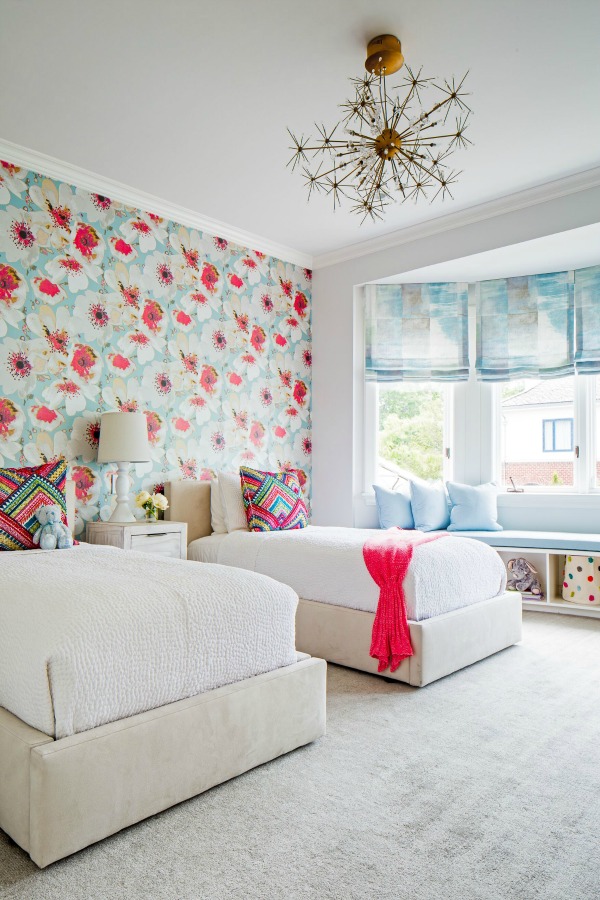
Design Idea No. 1: Pair turquoise with hot pink.
It’s a killer color combo when you’re going for cheerful, happy, spring color, and isn’t it easy as cherry pie to see how you could dial down the color quotient in the gorgeous designer children’s bedroom above?
What a dream to awaken in a space so thoughtfully layered with loveliness.
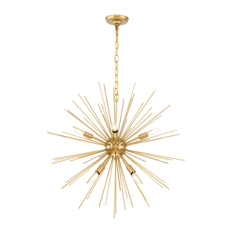
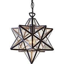
Gold is such a good friend to Caribbean blues, oui? And with so many lovely starry Sputniks out there, who can choose? This one comes with a pretty price tag too.
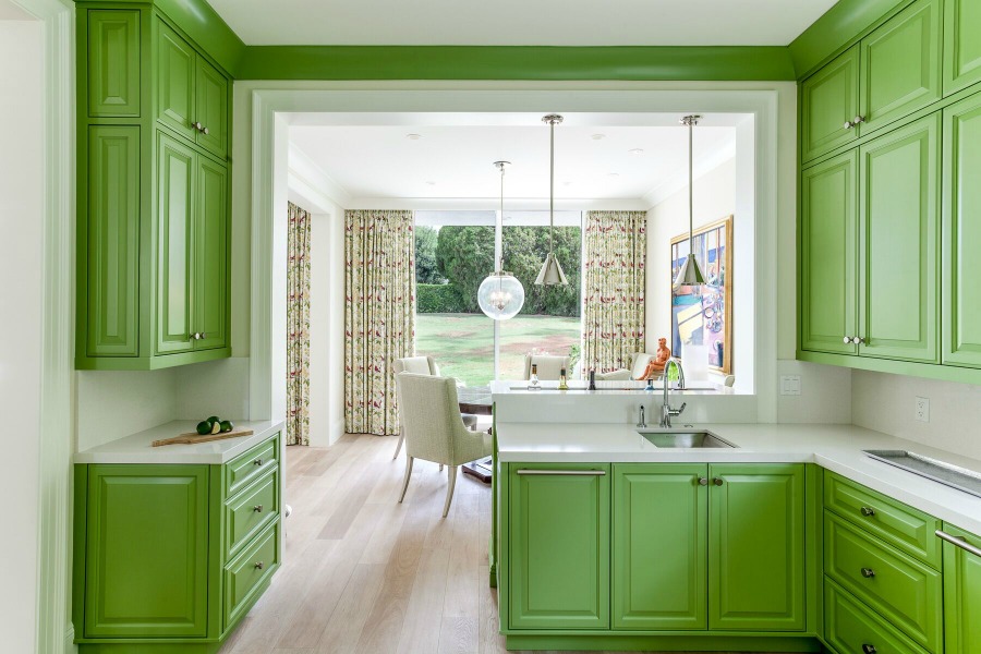
Design Idea No. 2: Spring for fresh green apple goodness with grand or subtle strokes.
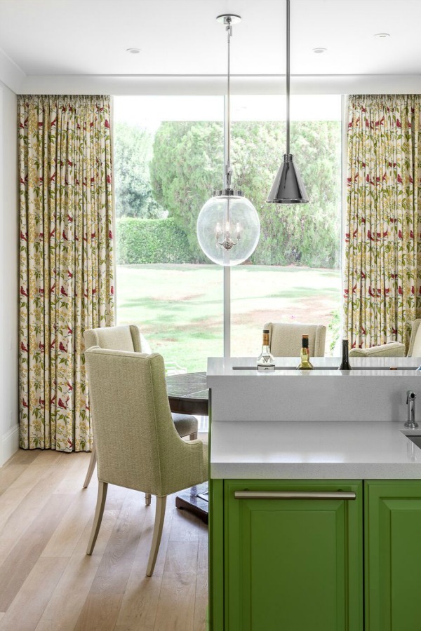
The appetizing green apple hue on kitchen cabinets in this classic kitchen conjures up all sorts of happy propositions. Imagine what a sweet backdrop such a kitchen creates for family memories. Consider how decorating the chic space for the holidays would be extra simple with touches of persimmon. And how about its powers as color therapy should a grey winter impose?
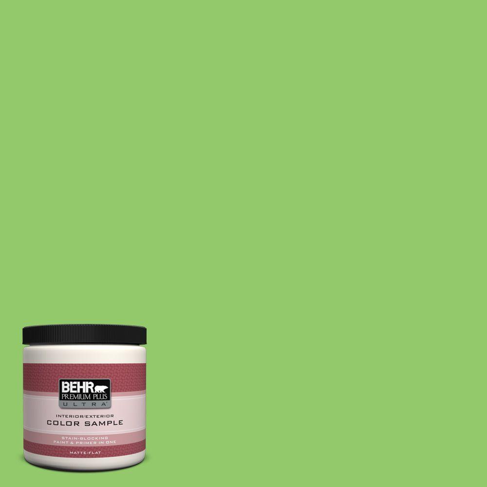
Here’s a pretty spring green paint color if you have an inexpensive furniture piece or even a canvas to try out the shade.
I do believe in painting cabinets, and I did so myself when we inherited a sorry, builder’s special kitchen with that second house we bought in Arizona. Painting the kitchen cabinets and bathroom vanity a blue-grey shade, brought personality and customization to a cookie cutter design feature.
Design Idea No. 3: Let the sun shine in!
Bright spring color looks so fresh with light, bright cool white walls and ample natural sunlight bathing the space with warmth.
15 Intoxicating Design Ideas for Spring Color to Bloom…certainly lovely indeed! Interior design inspiration: bold colorful classic interiors.
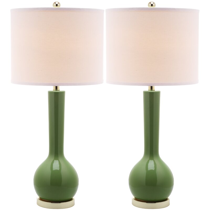
If you’re after just a pop of pretty fern green, a pair of these may tingle the jingles.
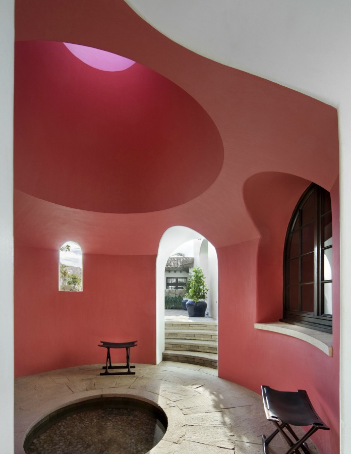
Design Idea No. 4: Think beyond ‘nursery pinks’ to sophisticated and sultry shades of rose.
There are truly innovative adventures with pink in designland, and whether your space is a boring blank box or as architecturally imaginative as this one, there’s a pink paint color to enhance it.
15 Intoxicating Design Ideas for Spring Color to Bloom…certainly lovely indeed! Interior design inspiration: bold colorful classic interiors.
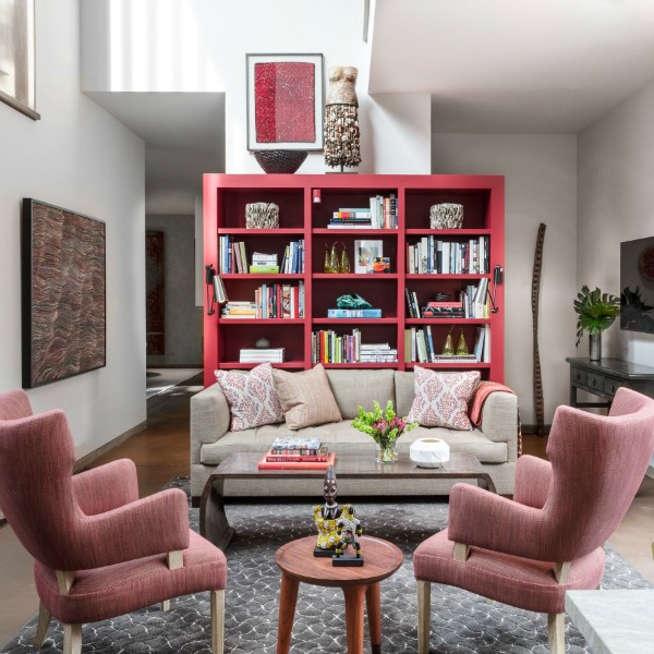
Design Idea No. 5: Mix up pinks like a maestro mixmaster!
So much more interest was created in this cozy yet chic designed space by varying accents of blush, rose, and lipstick pretty pinks.
Design Idea No. 6: Go for the bold…and the delicious.
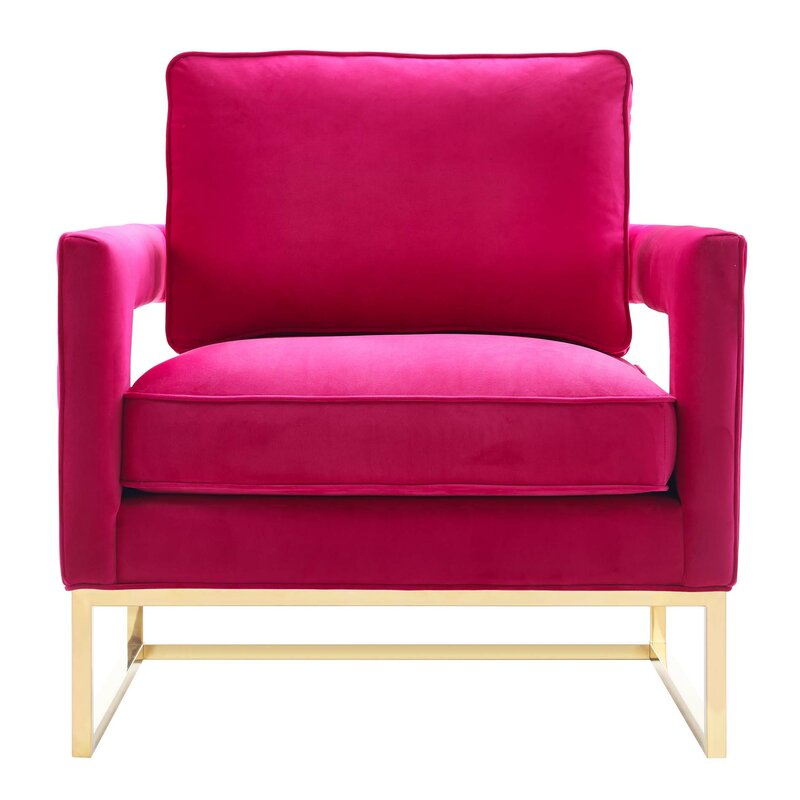
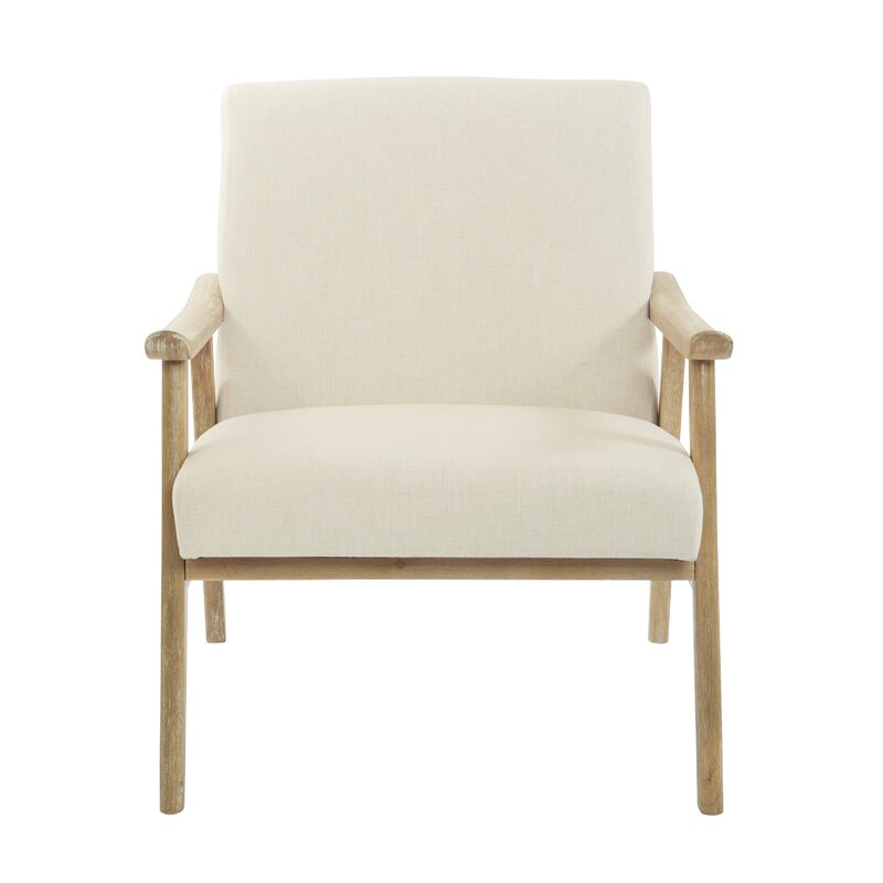
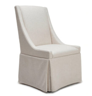
I have had a crush on this modern style chair since spotting a white linen upholstered version in Erin Fetherston’s modern Cali farmhouse style abode. Imagine introducing this yummy hue to a ho hum space and watching the room suddenly become a ‘salon.’ Ha!
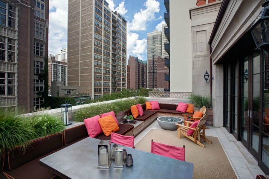
Design Idea No. 7: Be cool with tangerine and raspberry sherbet.
Maybe, just maybe, the blogger is hungry. Or maybe designer Cari Giannoulias is on to something with her pillow pairings and breezily pretty director style chairs.
15 Intoxicating Design Ideas for Spring Color to Bloom…certainly lovely indeed! Interior design inspiration: bold colorful classic interiors.
By the by, were you already in the know about folding Adirondack style chairs? Perhaps this woodland fairy needs to venture out of the woods more often because she had no idea they existed or could be snagged on sale for $56…
pssst.
I just said ‘by the by,’ and there’s nothing you can do about it.
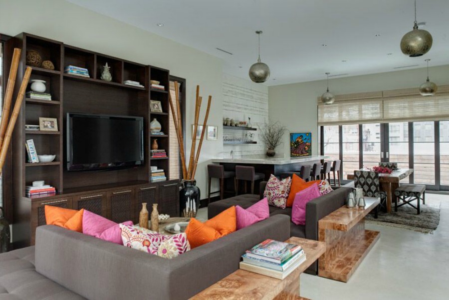
Design Idea No. 8: Let petal power rev your engine.
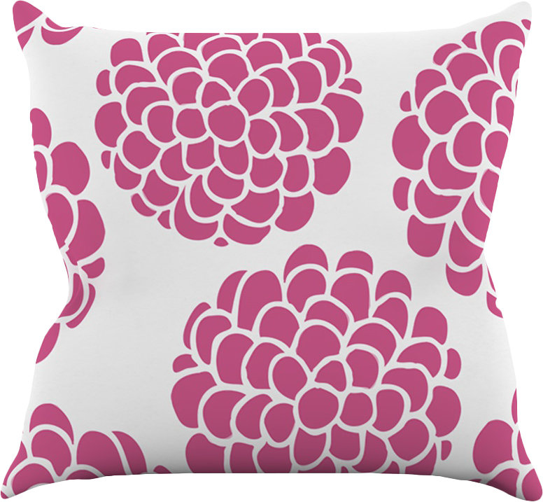
Which is to say. Brighten and enliven your spaces with florals in traditional as well as alternative fashions. And also…
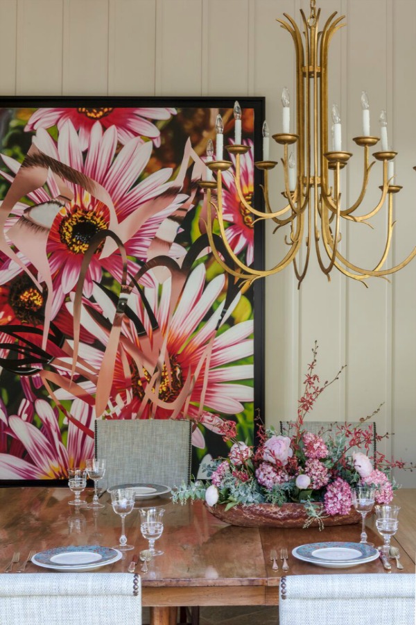
15 Intoxicating Design Ideas for Spring Color to Bloom…certainly lovely indeed! Interior design inspiration: bold colorful classic interiors.
Say it with flowers!
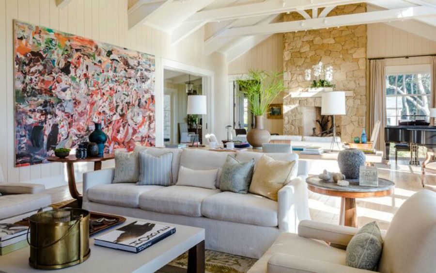
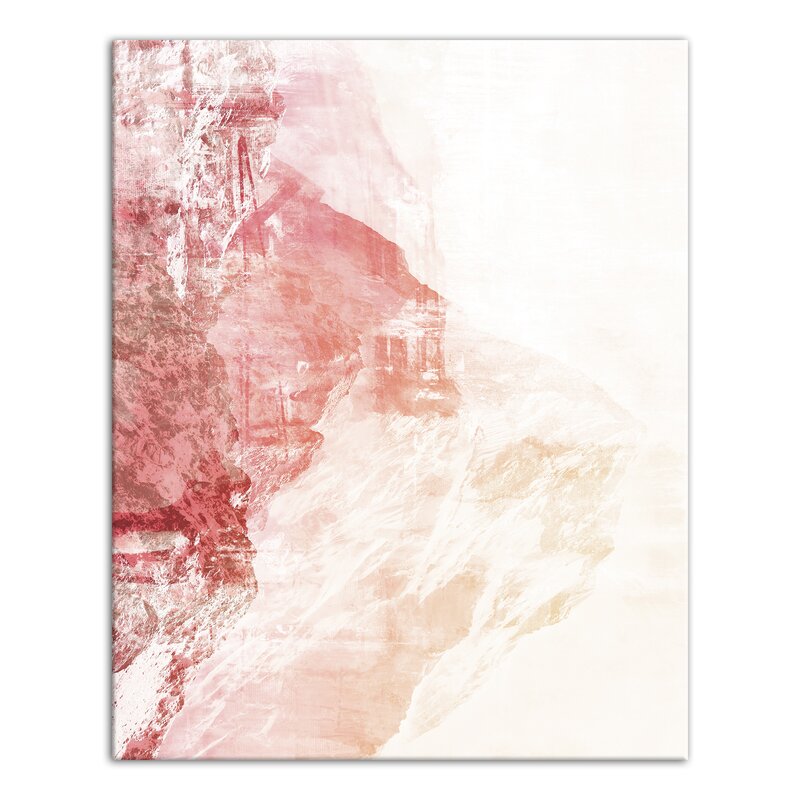
Design Idea No. 9: Fall for an abstract painting that gives your heart wings.
Choosing art is one of those more magical things in life because there aren’t any rules, and the supply is ample.
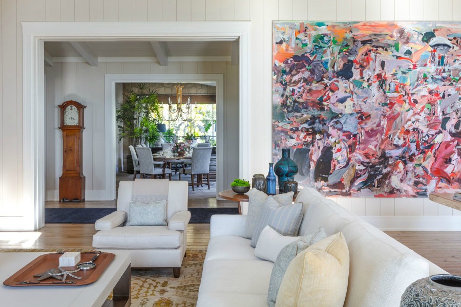
If creating art for your home is what gives your heart wings, explore spring colors that make you feel hopeful and at peace.
15 Intoxicating Design Ideas for Spring Color to Bloom…certainly lovely indeed! Interior design inspiration: bold colorful classic interiors.
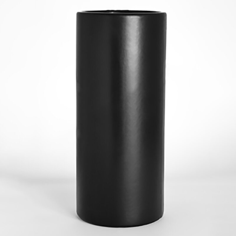
Design Idea No. 10: Invite ebony to come play with spring color.
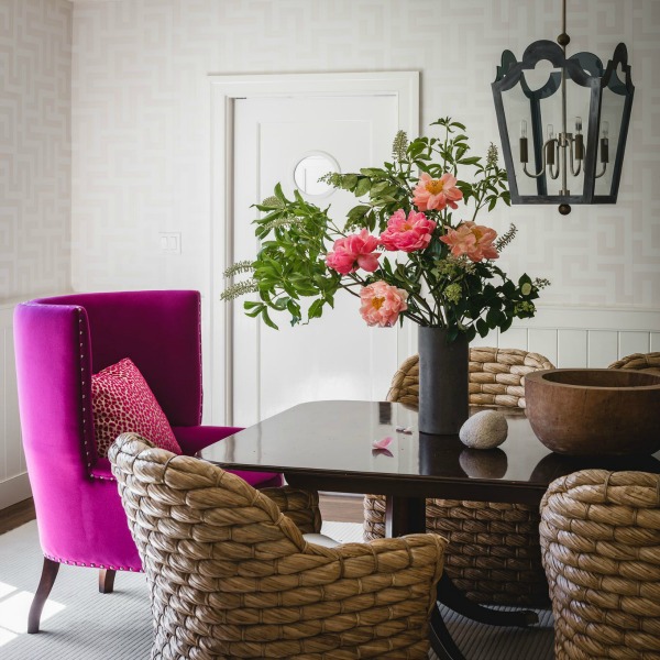
Here’s a George Oliver designed ceramic vase to display blooming colors in an understated yet fresh way…
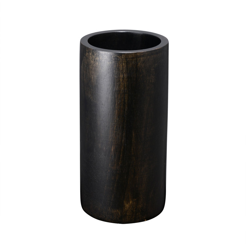
And a lower priced yet attractive and organic alternative is this wood cylinder receptacle…
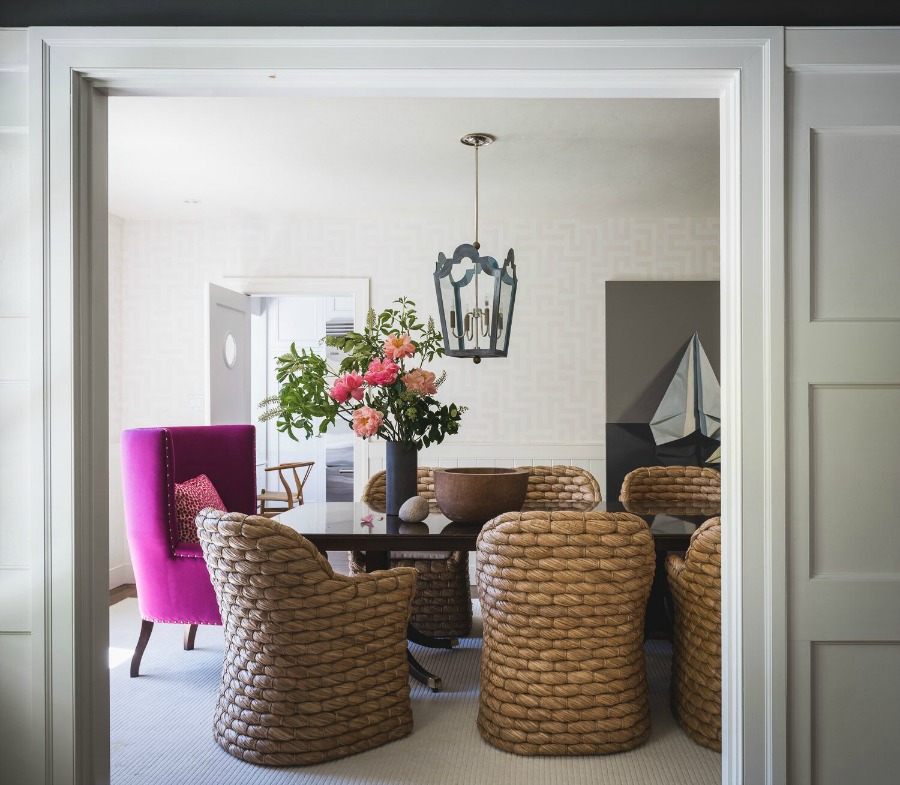
15 Intoxicating Design Ideas for Spring Color to Bloom…certainly lovely indeed! Interior design inspiration: bold colorful classic interiors.
Design Idea No. 11: Say ‘bonjour, lovely’ to chartreuse in the kitchen.
Is it more yellow or more green? And what does the psychology underpinning chartreuse even mean? I found a suggestion here:
“Choosing chartreuse in some form probably suggests a person with an open personality. Open minded, imaginative with many interests. Variety in work and life is very important.”
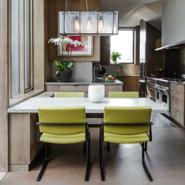
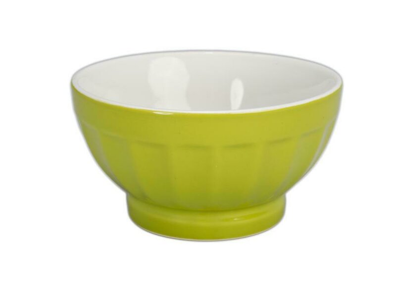
Hmmmmm. Are you open-minded enough for these kitchen-y essentials?
Chartreuse can be such a sophisticated accent, oui?
Design Idea No. 12: Go a step further with a bit of tropical blue.
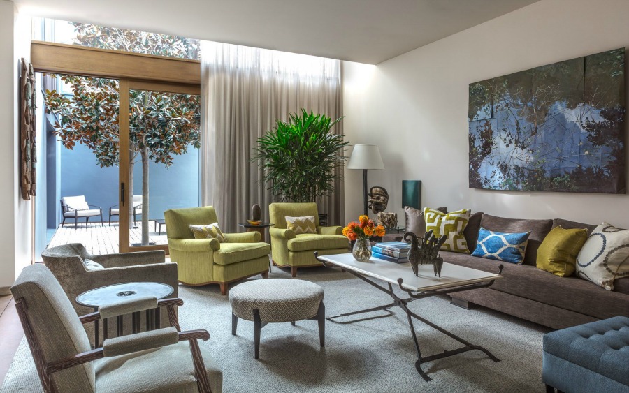
15 Intoxicating Design Ideas for Spring Color to Bloom…certainly lovely indeed! Interior design inspiration: bold colorful classic interiors.
Design Idea No. 13: Fly a peacock blue freak flag proudly for dramatic yet classic bragging rights.
Know what a family of peafowl is called? Meet me at the finish line, and I’ll tell ya. (Peafowl because only the males are peacocks, doncha know.) Here’s a sweet primer of peacock blue paint color picks from designers you might want to take for a whirl.
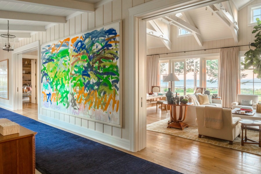
If it’s a deep blue paint color you’re after, here’s a winner.

Have a niche to showcase your favorite peacock blue shade?
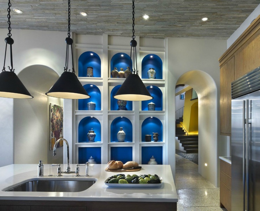
15 Intoxicating Design Ideas for Spring Color to Bloom…certainly lovely indeed! Interior design inspiration: bold colorful classic interiors.
And a bold predominantly blue floral accent like this (for indoors or out) will easily freshen a lounge chair.
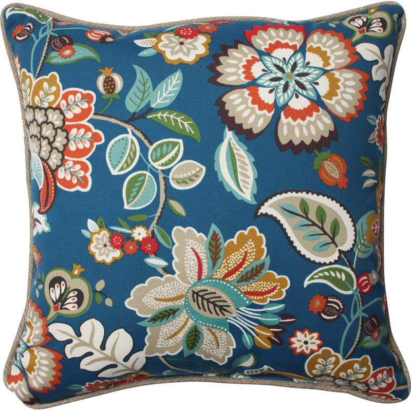
Did someone say lounge chair?
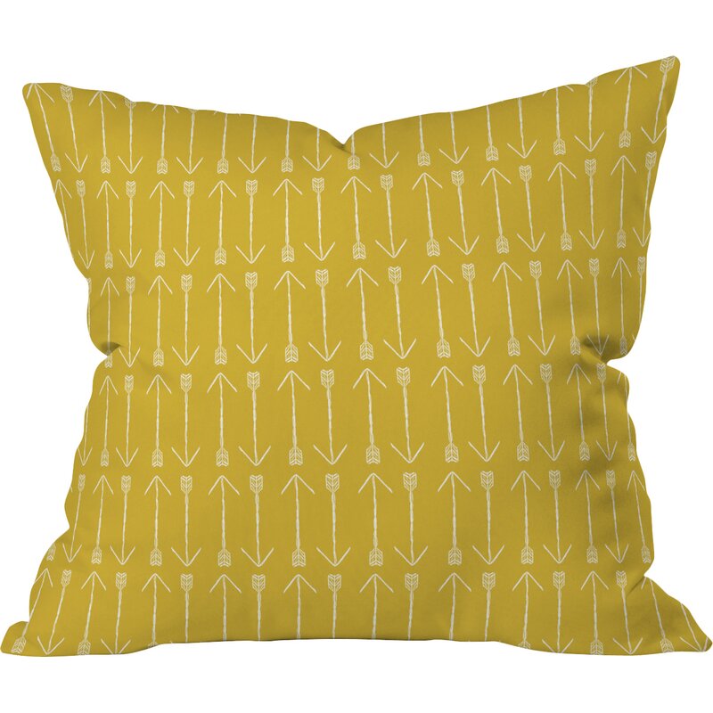
Design Idea No. 14: Be well aware REBEL YELLOW is having a moment.
Word on the street is this bold mustard yellow has seen a major surge in popularity on Pinterest in 2019.
But hello? Yellow doesn’t have to be just mellow or just about the YELL.
I personally love the tasty stuff on my Chicago dog with a big ol’ pickle.
…And also how it’s used tastefully in this otherwise neutral lounge-y space below with these sexy chairs. Who can resist a swivel?
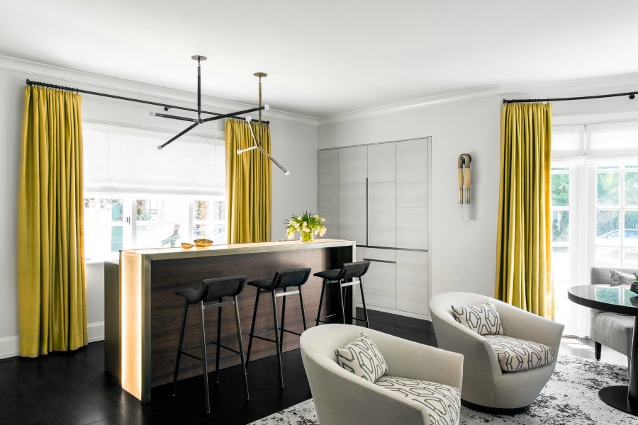
15 Intoxicating Design Ideas for Spring Color to Bloom…certainly lovely indeed! Interior design inspiration: bold colorful classic interiors.
Accents are a très easy way to try on spring color, and here’s one that’s a little tribal, a little whimsical, and very now in terms of color story.
Design Idea No. 15: The only prescription for a trending bold yellow in spring? More hot-hot-hot mustard.
Let’s join the revolution by pinning the mustard here!
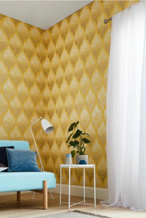
15 Intoxicating Design Ideas for Spring Color to Bloom…certainly lovely indeed! Interior design inspiration: bold colorful classic interiors.
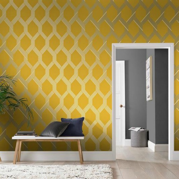
Hung Out With This Birdie in London…
***family of peafowl=a bevy
There’s a blizzard here, friends, and I’m happy to be inside dreaming of spring colors! How bout you?
I independently selected products in this post—if you buy from one of my links, I may earn a commission.
Peace to you right where you are.
-michele
Shop for items you already intended to buy on Amazon RIGHT HERE, and also find home decor here to keep decor inspiration flowing on Hello Lovely!
Hello Lovely is a participant in the Amazon Services LLC Associates Program, an affiliate advertising program designed to provide a means for sites to earn fees by linking to Amazon.com and affiliated sites.









Yes, I am dreaming of spring colors as well! It snowed yesterday and my kids were off from school. As nice and cozy as that is, I am so ready for spring!
Shelley
Author
Hahaha, at this rate, all of these kids are going to be in school til the 4th of July! Happy dreaming, friend. xox
Well I must say #8 Petal Power reeved my engine today, as I am in need of a little Spring in my mood and perhaps my step as the wintertime blues are in full swing. Spring and all it brings will be very welcome around here.
Author
I have been calling the situation ‘snow prison’ because it feels more like a barricade lately than lighthearted cabin fever. More colorful springtime magic on the way in posts! 🙂
I’m love those fuscia chairs! The paintings are so happy too. Just six more weeks of winter right? We can do this!
Author
Aren’t they dangerously sexy? Counting down the days, lovely one – happy almost love day!
Wow! That is a flash of color! I’m a neutral person, as far as decor goes. White & cream spaces get my heart every time. Even my garden is green & white with an occasional color thrown in the mix – mauve Wisteria, red rose bush and Rhododendrons. I enjoy a colourful garden in someone else’s yard but not mine. I aim for Serenity in my environment. My oldest daughter was on the other end of the spectrum. Every room was painted a bright red, yellow or green. I think it was about the time she turned forty, bought a new, bigger home and turned to mostly neutral – white walls, grey furniture with touches of turquoise. Perhaps, with a busy family & job she requires the restful oasis of her home.
I bought two floral tops a couple of days ago. I think I needed a touch of spring in my wardrobe. Stepping out!
Author
Thanks for hanging in there with all this colorful stimulation – I know you come to be soothed by tonal bliss! Good for you getting your springtime in gear – I need to do the same! 🙂