You’re going to fall for these lovely Farrow & Ball Paint Favorites! We’re picking up where we left off as the colorfest of inspiration to help you choose hues for your home continues. New to Farrow & Ball colors? They can be trusted for their timeless appeal, sophisticated flavor, and historical significance. Bet you’ll find one or seven to sample, and don’t miss Part 1 right here.
I independently selected products in this post—if you buy from one of my links, I may earn a commission.
9 Farrow & Ball Paint Favorites
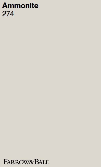
Ammonite 274
I love it when I can tell you about direct experience with Farrow & Ball favorites, and Ammonite is glorious and endlessly versatile.
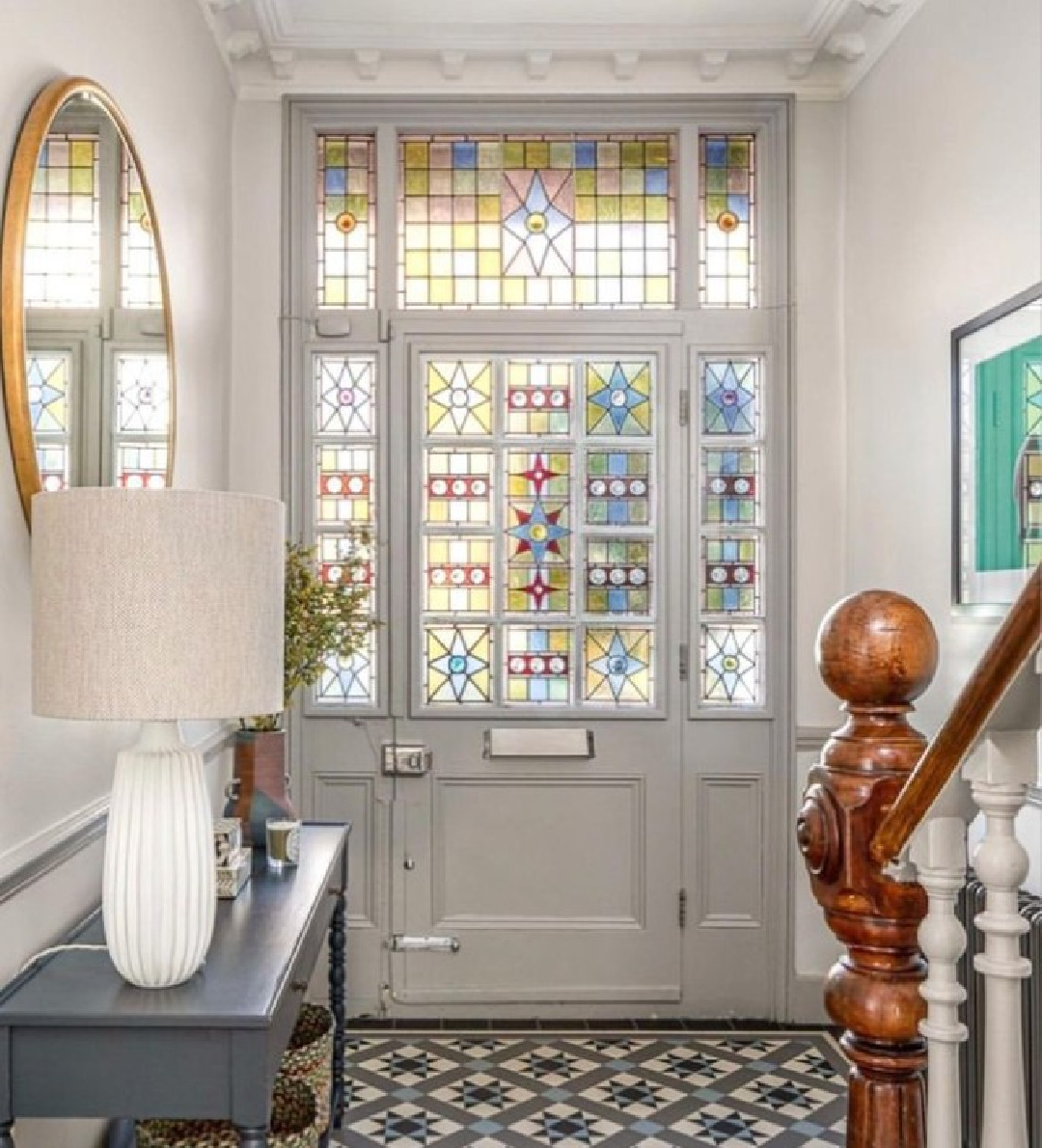
“Ammonite is named after the treasured fossils often found on the Dorset coast. It has a fantastically understated quality, and sits effortlessly with our Relaxed Neutrals.
Neither too warm nor too cool, its subtle grey tone creates a hushed and calming feel in homes both old and new. Try pairing with All White to accent its light grey feel.” -F&B
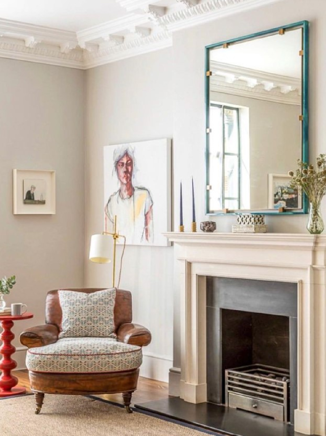
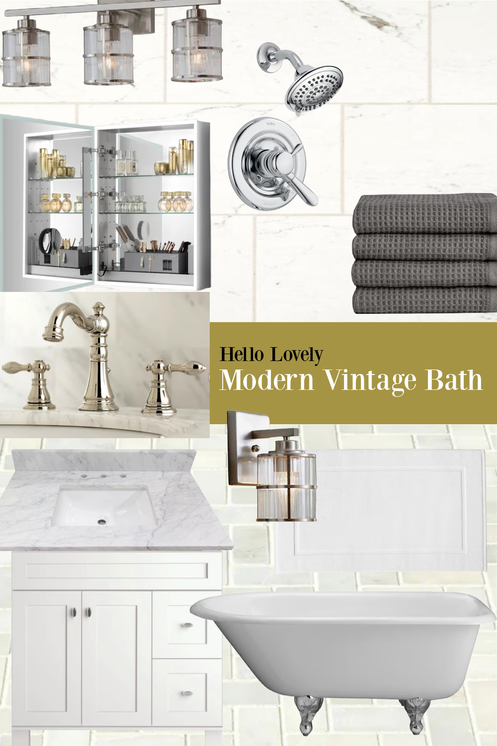
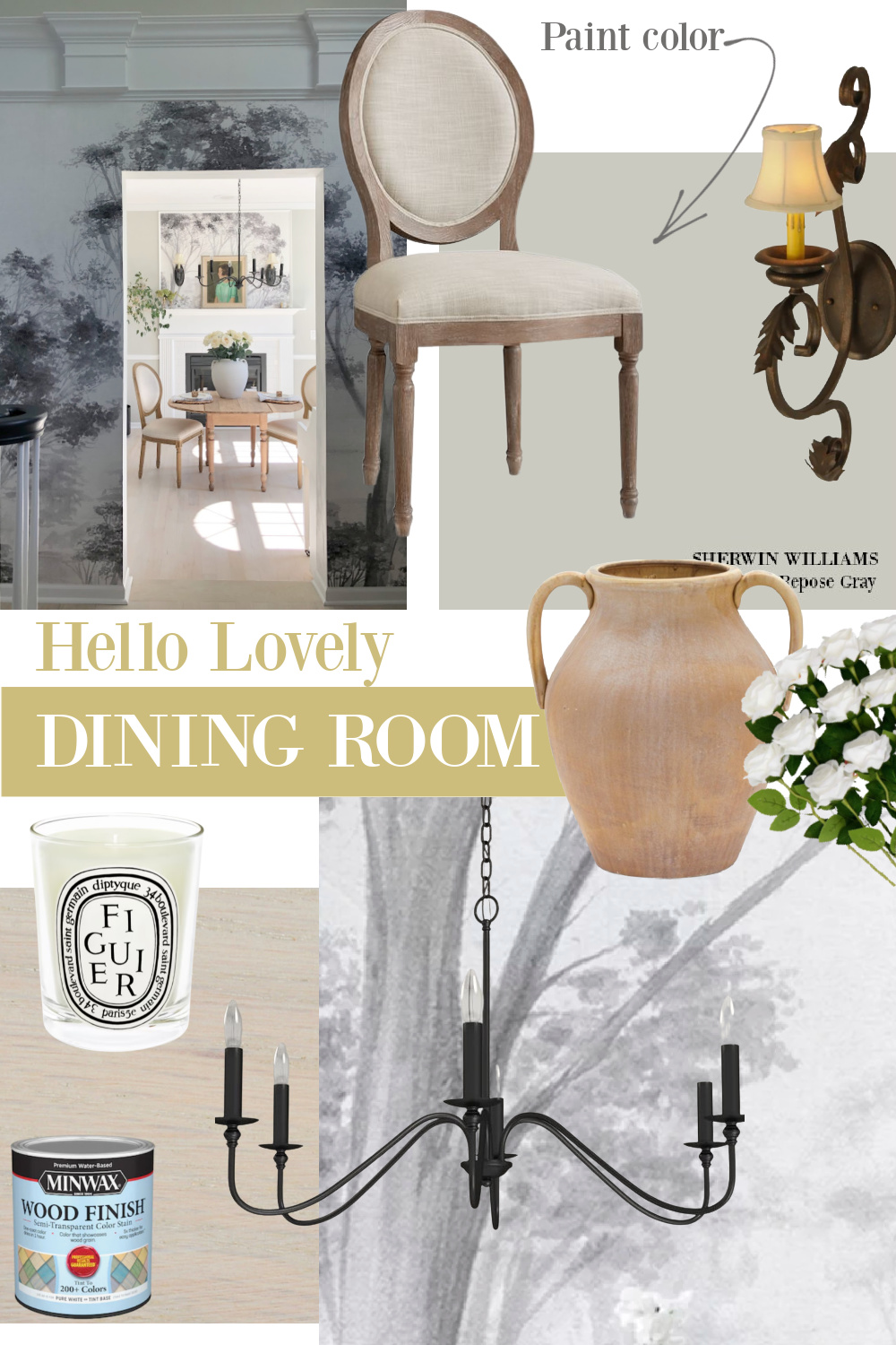
Hushed and calming are perfect descriptors of Ammonite. I find it calmer and more natural than Sherwin-Williams Repose Gray (which is the main color in our current home and what I painted our newly renovated bath – see mood board below), more calming than SW Agreeable Gray (the color my current bedrooms are painted), and more interesting than Benjamin Moore Classic Gray.
Here’s SW Repose Gray in my dining room:
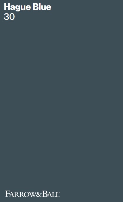
Hague Blue 30
What a classic color! And surely one of those hues you instantly recognize when you see gorgeous European inspired rooms and English libraries on Instagram.
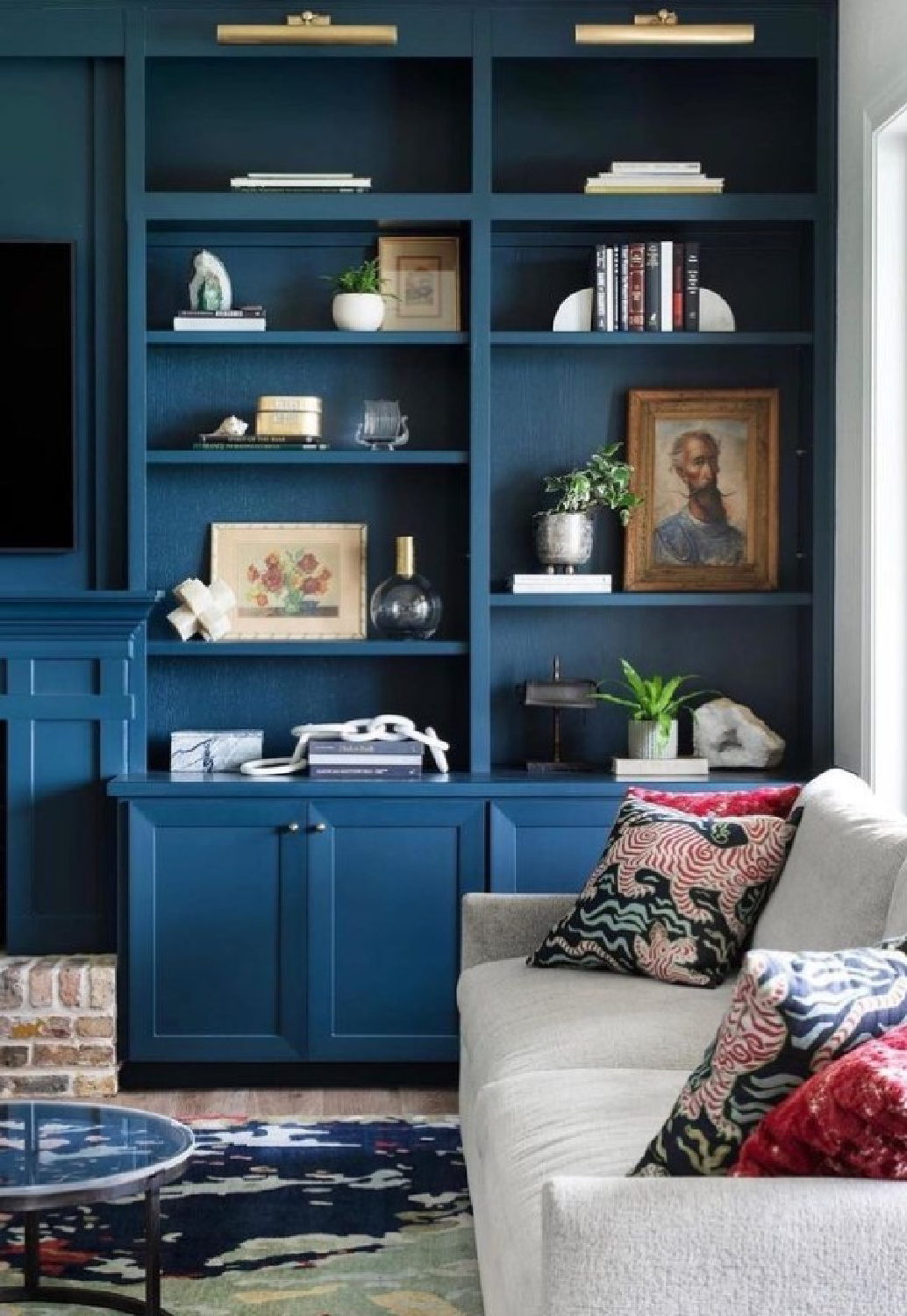
“This strong blue takes its name from the fantastically coloured woodwork much used by the Dutch, and still works wonderfully to ground skirtings or as an accent colour on the walls when teamed with Borrowed Light. The green undertones of this timeless, deep and dramatic blue means it sits as happily outside as it does in small dark rooms.” – F&B
For a similar striking tone with less green undertones, peek at Benjamin Moore Van Deusen Blue.
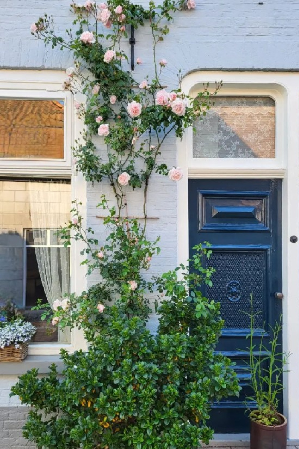
I talked a client into using Van Deusen Blue for a media room and bath, and it looks timelessly elegant!
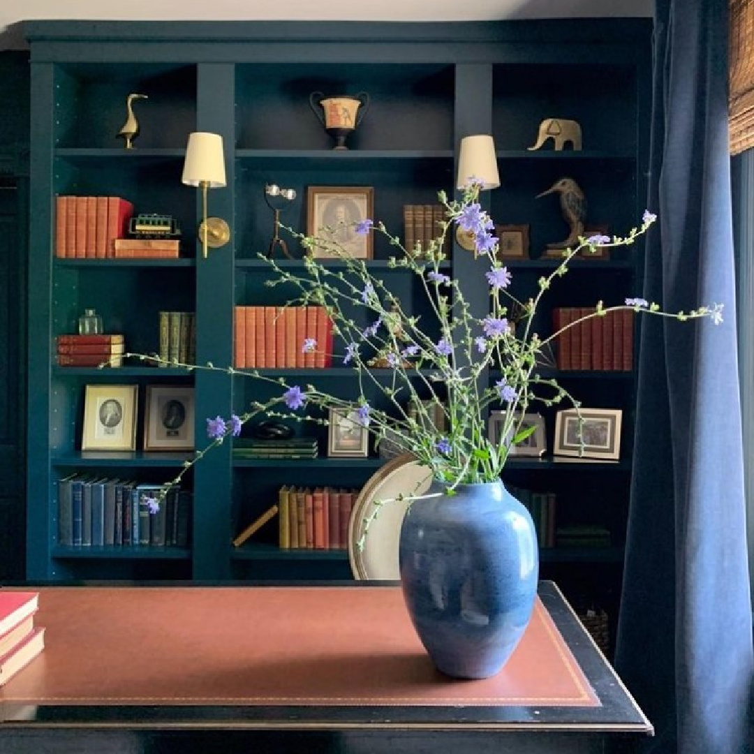
Do you have the guts to go tone on tone with Hague Blue?
Railings 31
I can’t write enough pretty words about Railings, and that says a lot since Hello Lovely is known for a passion for white and all white interiors. The thing is this is an alternative to a too austere black, and I have lived with it long enough to know it feels comforting and not cold.
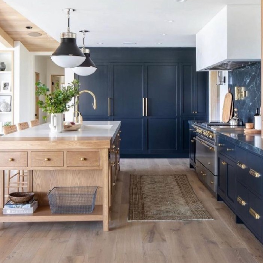
This color is nearly identical to what I painted our front doors, our stair railings, bath vanities, and kitchen cabinets (in a son’s condo). The actual paint color I chose was SW Carbonized because it had less of the blue undertones of Railings. But since I compared them side to side, I can tell you they almost matched.
“More blue than black, Railings is a softer alternative to black which is particularly suited to the ironwork it takes its name from. When used in Full Gloss on front doors it creates a handsome and commanding entrance, but becomes much more relaxed in feel in our Estate Eggshell finish. The bluer undertones of this dark hue transform rooms into dramatic and enveloping interior spaces.” – F&B
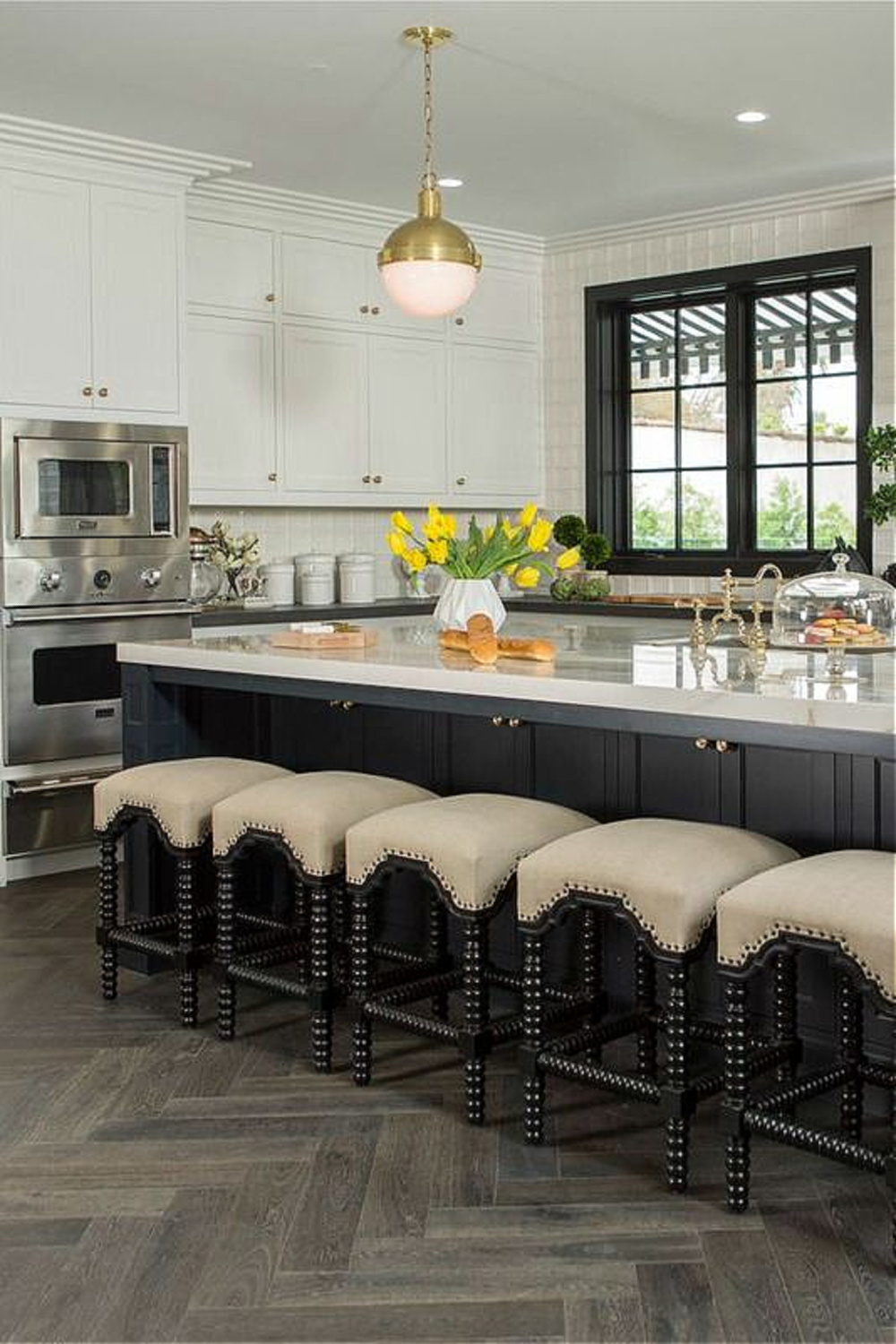
Drew Scott of Property Brothers fame loves Railings enough to use it in his own home on trim, bedroom walls, and kitchen cabinets. And Athena Calderone’s legendary kitchen that has broken the internet repeatedly? Railings.
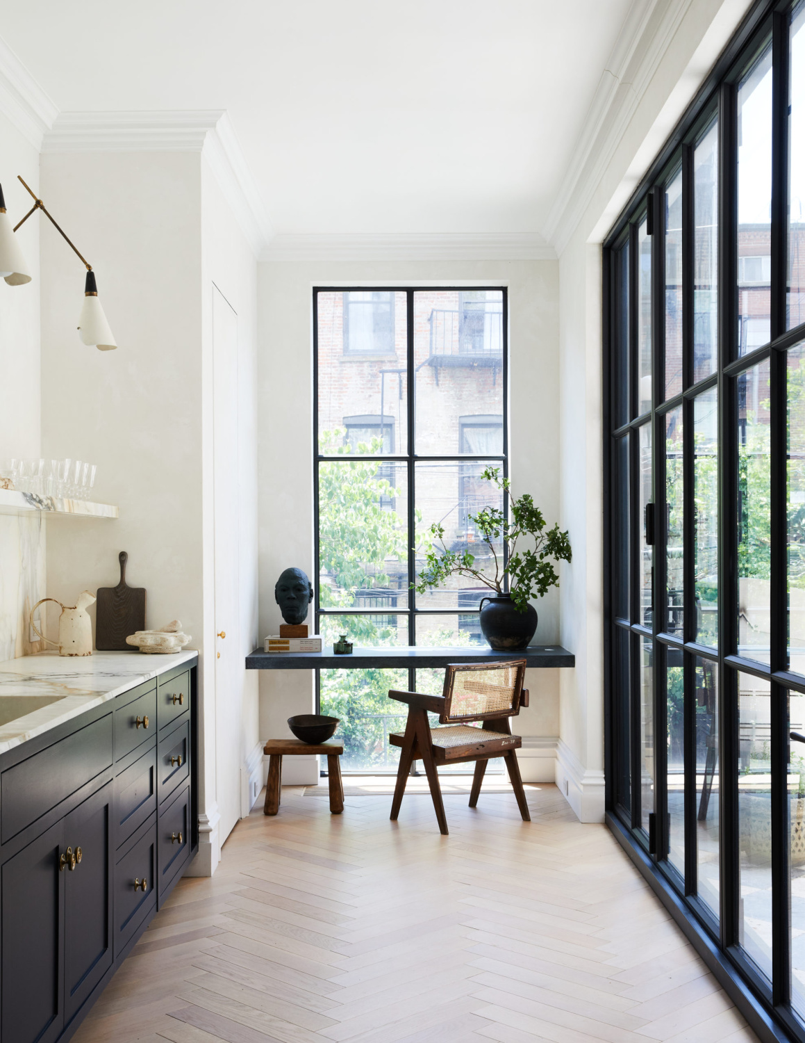
Benjamin Moore Wrought Iron and Cheating Heart are two more soft black/deep charcoal colors you could sample for a similar look.

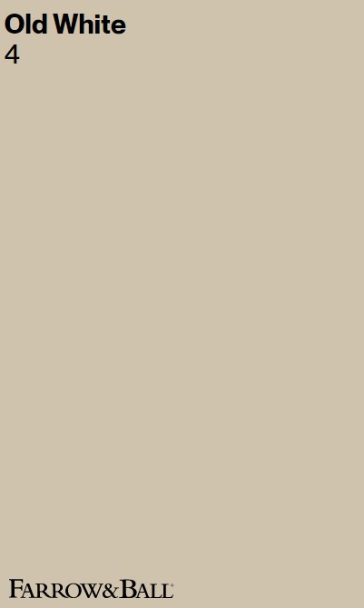
Old White 4
If you like Benjamin Moore Revere Pewter and Edgecomb Gray, then you’ll probably love Old White. It’s a moody gray-green that is also similar to my own bedroom’s color, Sherwin-Williams Agreeable Gray. The difference may be more green in Old White.
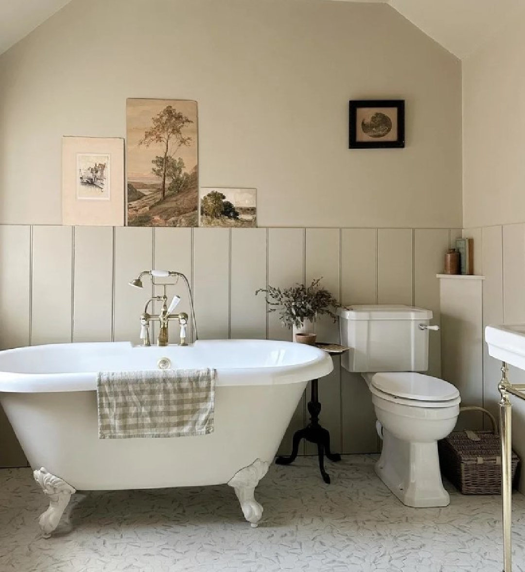
“This soft grey green simply earns its name by being the most historic of all our whites. One of our Traditional Neutrals, Old White can read as a subdued green, particularly in north facing rooms, but feels more of a classic grey in well lit spaces. It’s the most sophisticated of colours and feels just as at home in the drawing room of a historic house as it does in the kitchen of a modern family home.” -F&B
I shared this extreme makeover in a 1929 California home with you not long ago, and you’ll get a chance to see Farrow & Ball Old White up close and personal:
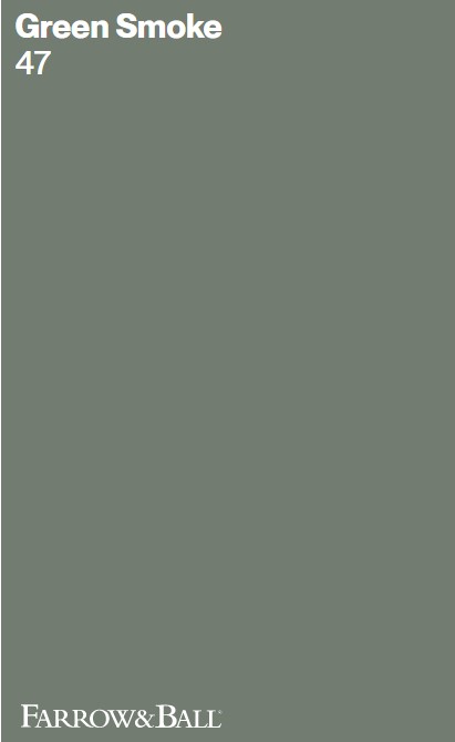
Green Smoke 47
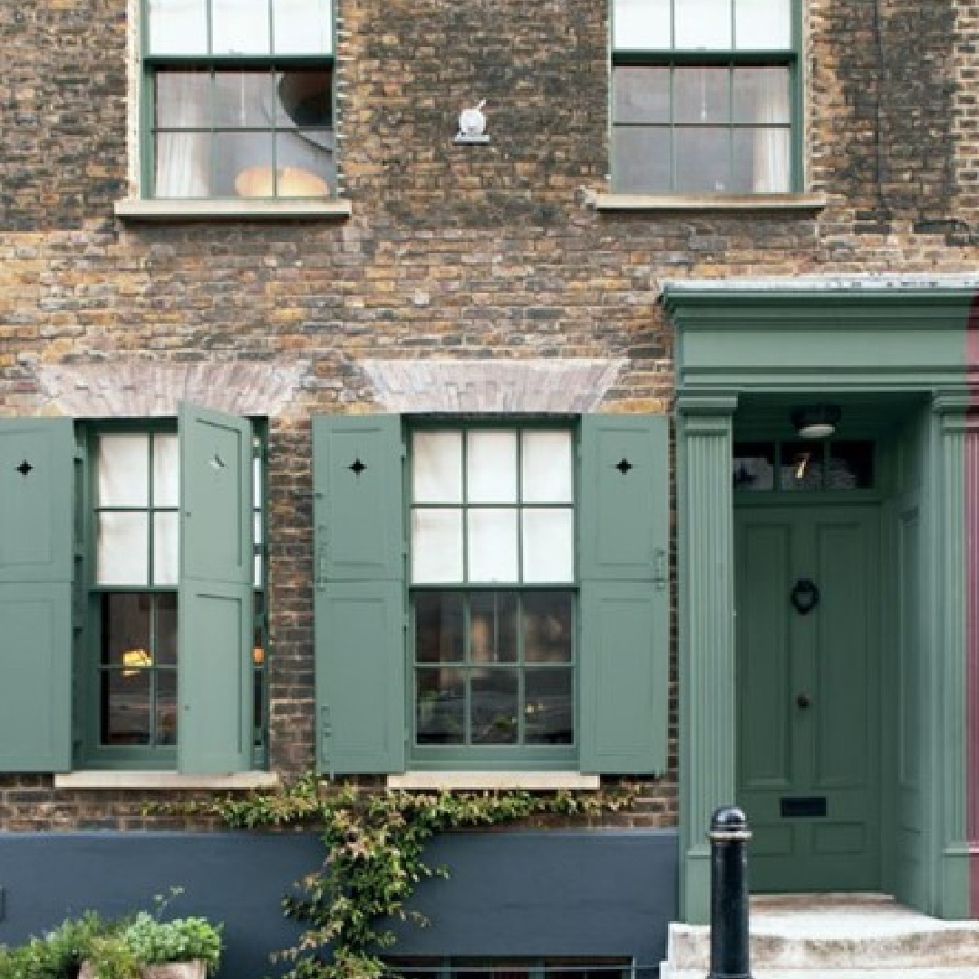
Similar to Sherwin-Williams Basil or Retreat, Green Smoke may strike you as jade, emerald, or dark olive depending on the lighting conditions and photography. That’s why you MUST sample a paint (preferably sample at least 3 similar colors!) in your own space before buying paint.
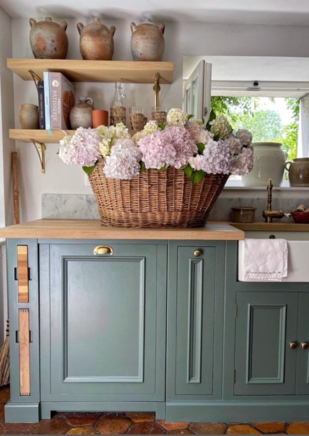
“A smoky green blue, this colour was popular in interiors during the late 19th century. It has an irresistibly inviting deepness and weathered familiarity when used in exterior situations, while evoking calm and serenity when used inside.” -F&B
While it is a deep, dark green, it will probably look more like the French kitchen from Vivi et Margot (above) when used outside where the yellow of natural sunlight interacts with it.
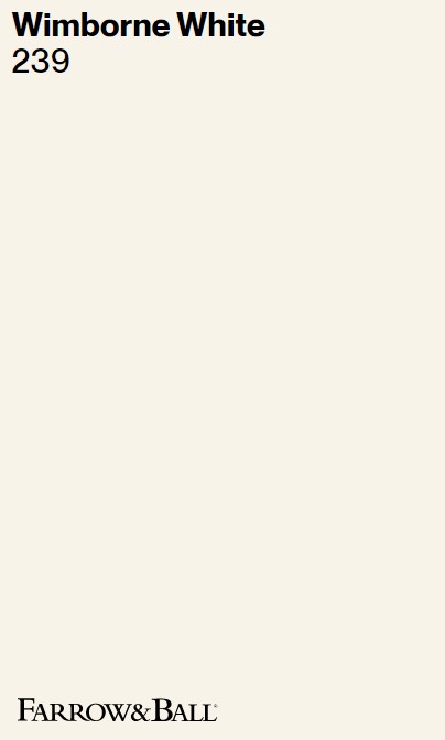
Wimborne White 239
Similar to BM Navajo White and Sherwin-Williams Dover White, Wimborne White is named after the market town of Wimborne in Dorset (the hometown of Farrow & Ball).
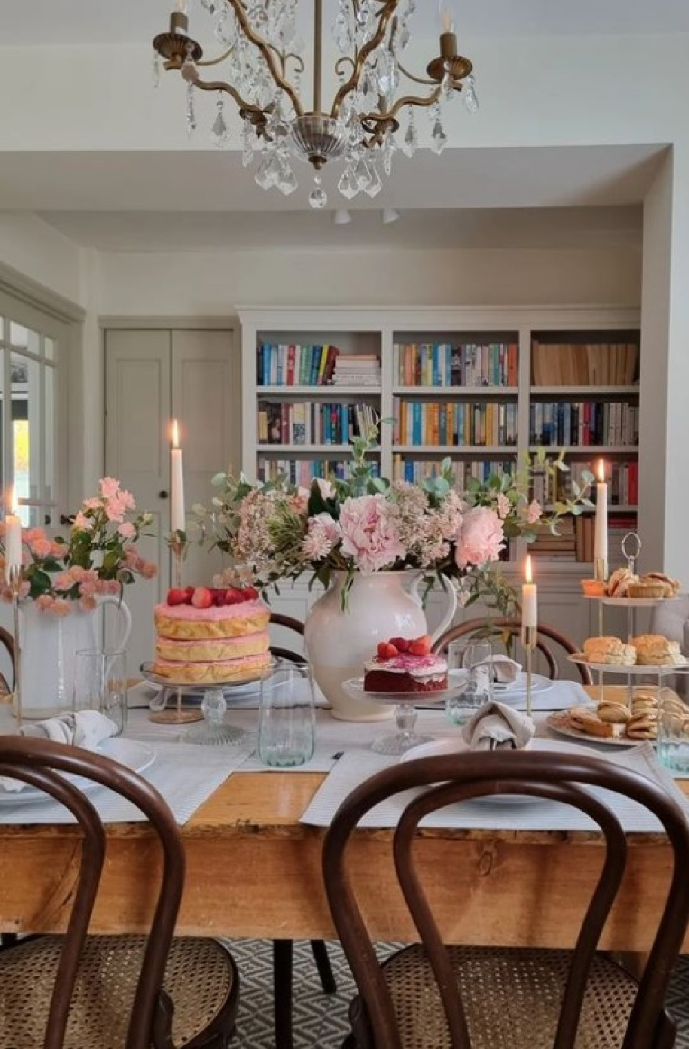
“Only a shade away from a pure white, the addition of the smallest amount of warm yellow pigment creates a very versatile shade which is just a little softer than All White.” -F&B
It’s such a classic off-white, yes?
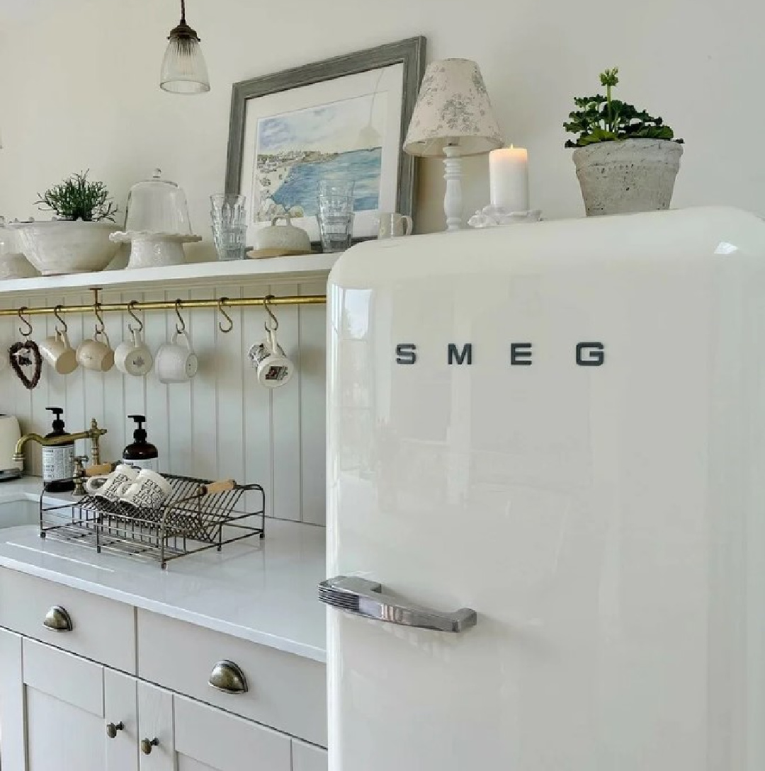
No wonder it is wildly popular with interior designers. This white also reminds me of SW Alabaster which can be such a great choice for a creamy white that won’t feel cold.
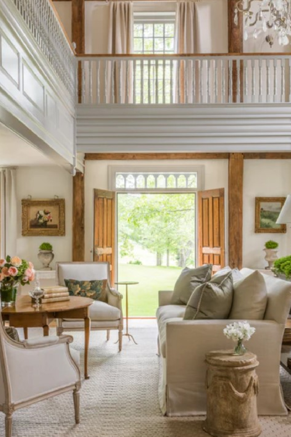

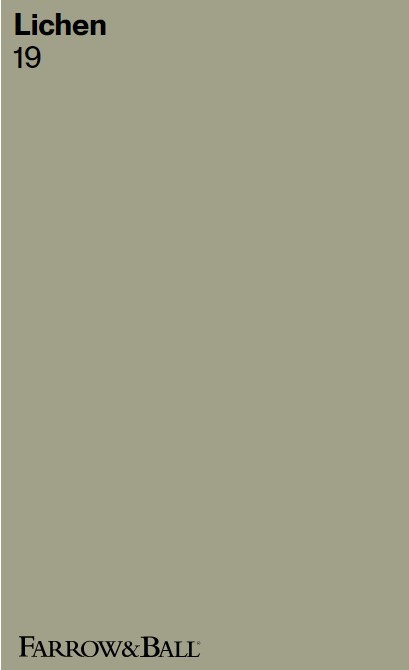
Lichen 19
“This calm and muted green is named after the ever changing, subtle colour of creeping algae which ages stone so beautifully. It has a quiet and subtle feel to it, due to its underlying blue tone, and is perfect for use in the garden where it feels totally at one with nature. It works wonderfully as a darker accent to Vert de Terre too.” -F&B
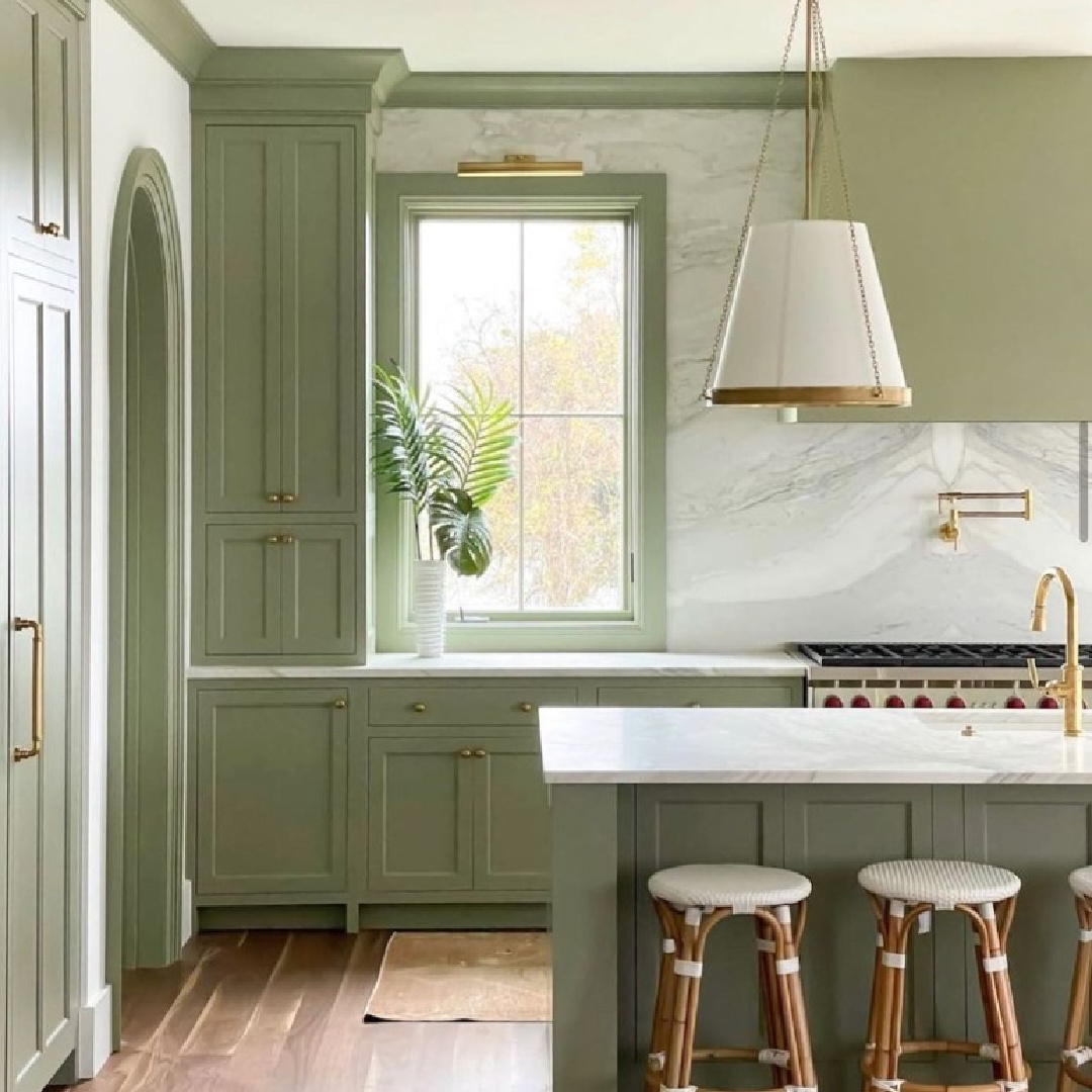
Reminiscent of Sherwin-Williams Evergreen Fog or Clary Sage, Lichen has such an organic feel, doesn’t it?
It would be incredible on a cottage exterior and blend so well with a wooded setting.

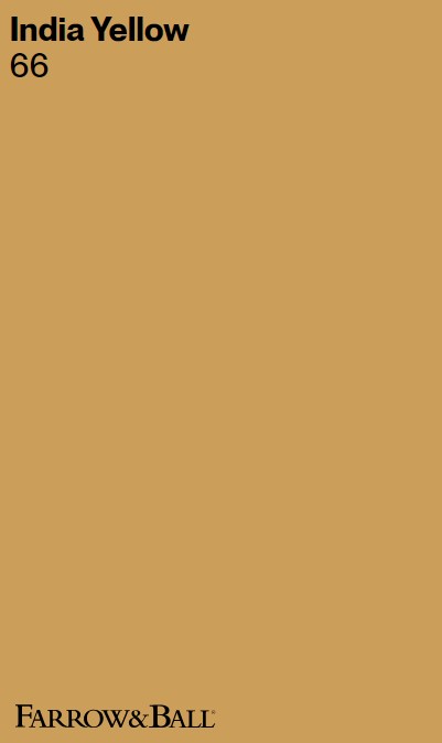
India Yellow 66
When you want to make a statement with a rich, saturated gold, maybe India Yellow is calling.
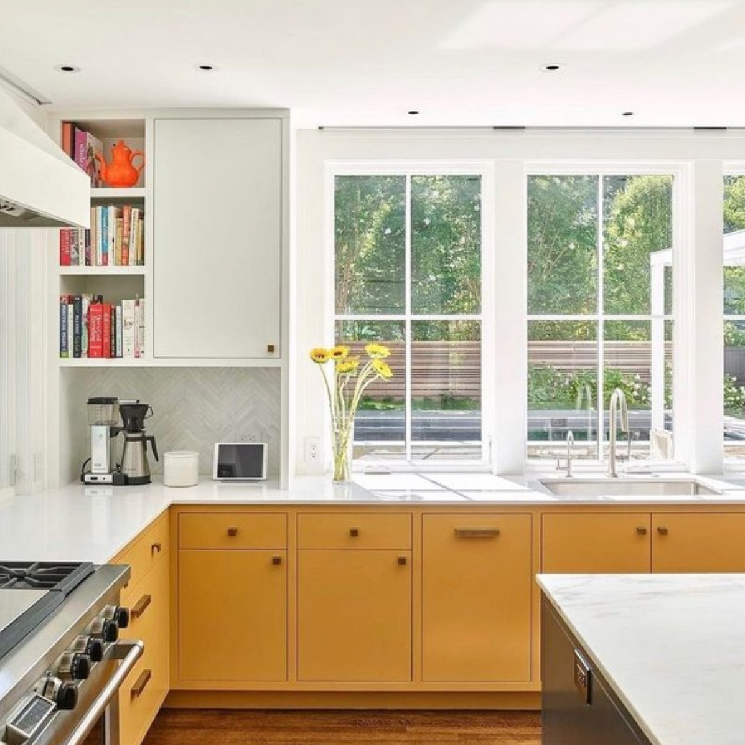
Similar to Benjamin Moore French Quarter Gold, this deep mustard paint color can be cozy when used with dark browns such as Tanner’s Brown.
Farrow & Ball recommends India Yellow to “be used in moderation in small rooms where its moody intensity may be a little overwhelming.”

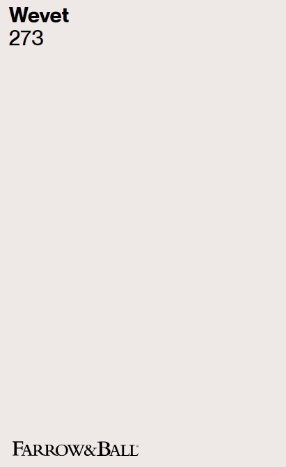
Wevet 273
Here’s a color that will never overwhelm! Wevet is similar to Benjamin Moore Balboa Mist or Calm, and was used throughout Drew’s Honeymoon House on Property Brothers.
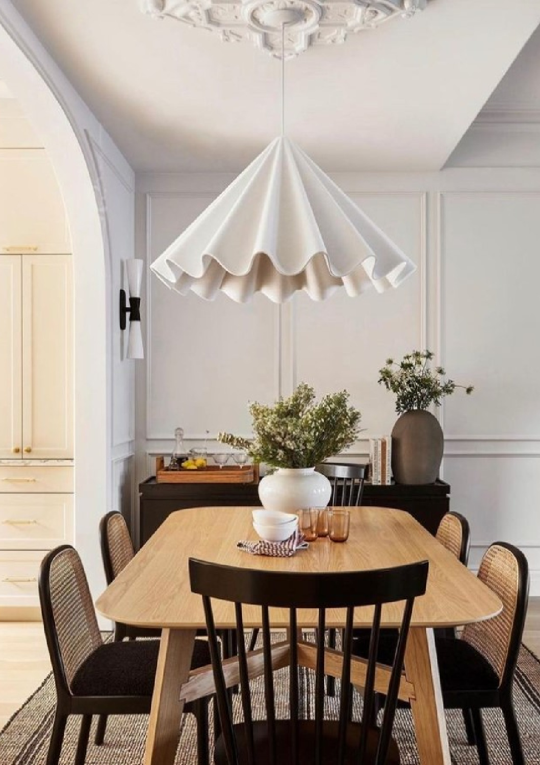
I consider Wevet a greyed-white, and Farrow & Ball says of it:
“This delicate white has a barely there and almost translucent feel to it, and so shares its name with the old Dorset term for a spider’s web. One of our Relaxed Neutrals, Wevet is clean, understated and incredibly easy to live with.
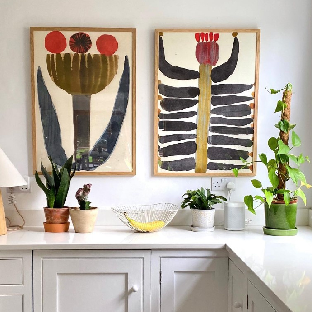
With its hint of grey, this hushed tone can be used as a wall colour for an understated, neutral space or on ceilings and woodwork when combined with cooler greys.”

Your Favorite Farrow & Ball Color?
Any favorites from this collection? It’s a toss up for me. I’m crazy for Pavilion Gray which I used on cabinets in our kitchen:
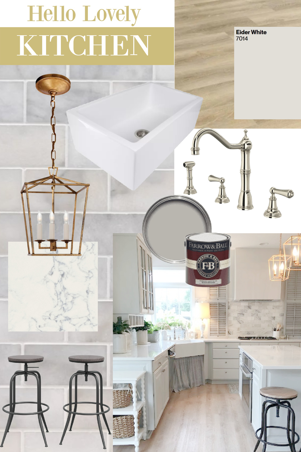
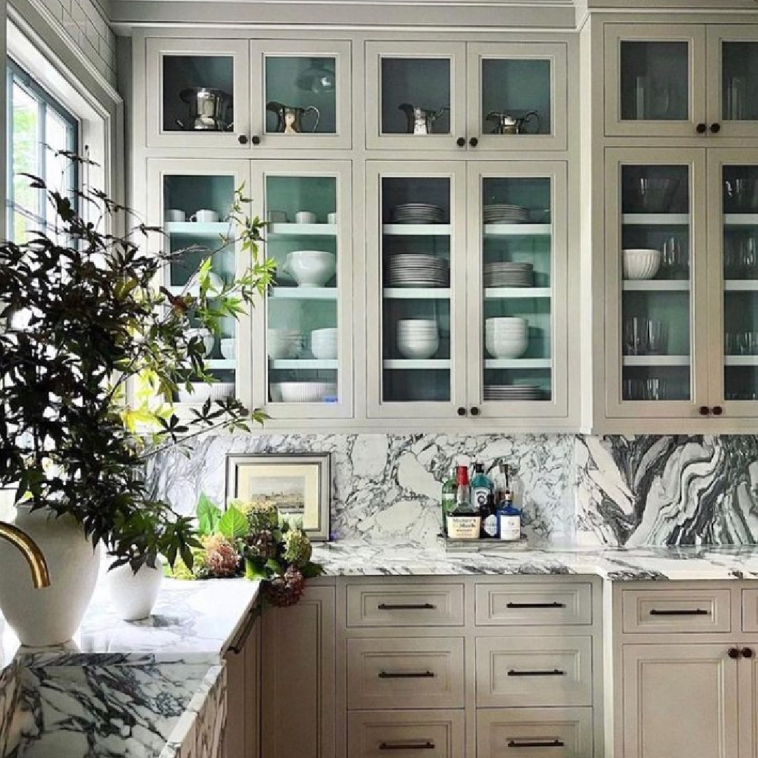
and Hardwick White shown on cabinets below:
Don’t forget to check out 10 more F&B colors in PART ONE!
Peace to you right where you are.
-michele
Thanks for shopping RIGHT HERE to keep decor inspiration flowing on Hello Lovely!
Hello Lovely is a participant in the Amazon Services LLC Associates Program, an affiliate advertising program designed to provide a means for sites to earn fees by linking to Amazon.com and affiliated sites.
