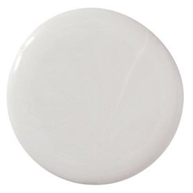
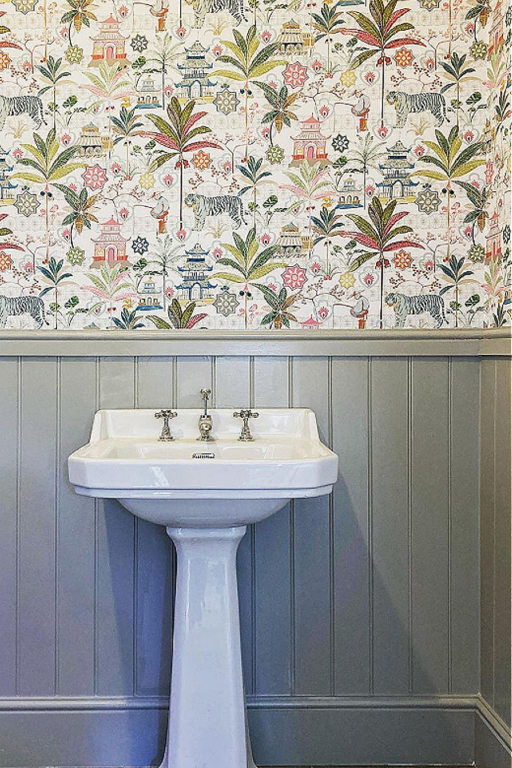
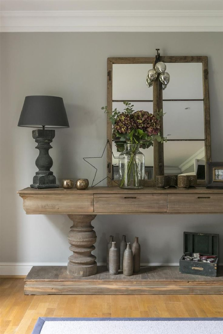
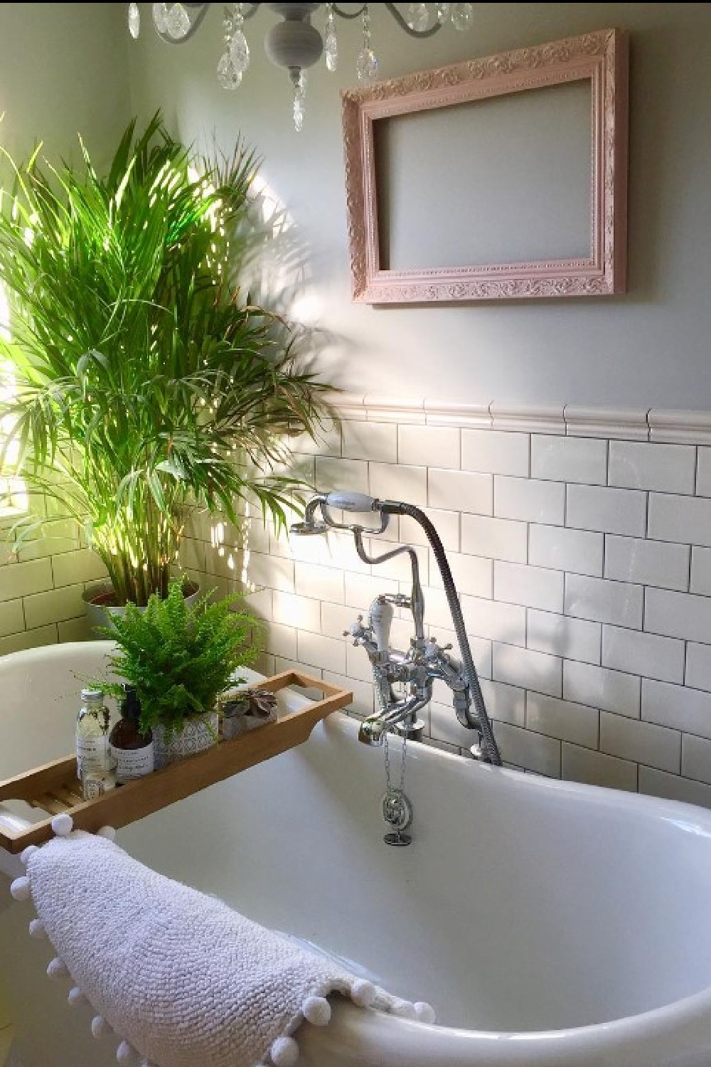
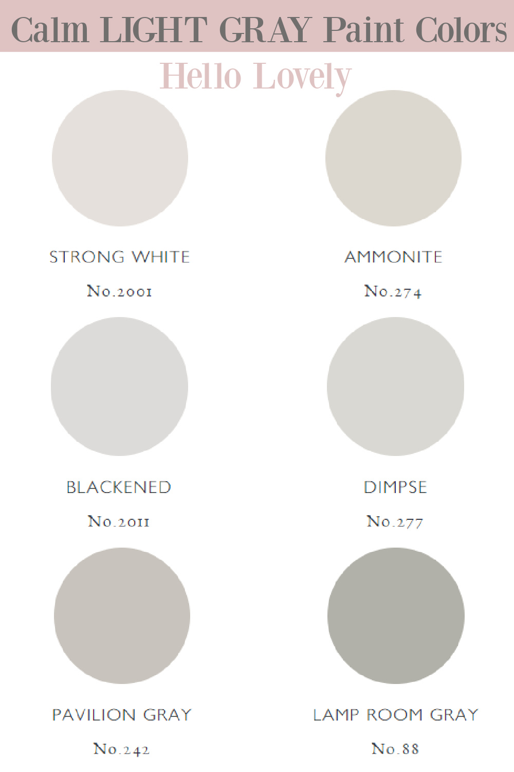
Don’t you love it when you fall in love with a paint color that you know will never bore you? I know it’s a subjective thing for sure. But that’s how I feel about Pavilion Gray by Farrow & Ball: An Amazing Paint Color for a Serene Silvery Mood. It’s one of those timeless greys that for me feels suggestive of age, beautiful Swedish antiques, and serene rooms in which I want to linger. Let’s take a closer look at how interior designers and homeowners are enjoying this gorgeous paint color.
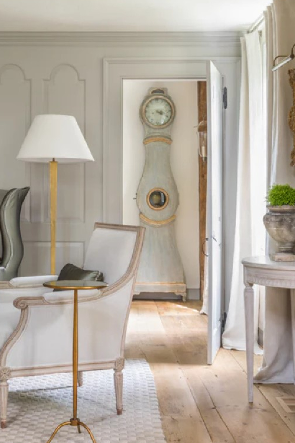
Pavilion Gray Paint Color: Serene Silvery Goodness
What is the Color Pavilion Gray Like?
“This classic mid grey was originally created for a bespoke pavilion, but is also reminiscent of an elegant 18th century Swedish colour. One of the Architectural Neutrals, the subtle blue undertones of Pavilion Gray add a contemporary touch and sense of spaciousness. Combine with Dimpse, Blackened or Manor House Gray in any combination for a scheme that is perfect for the modern family home.” – FARROW & BALL
Where am I Using Pavilion Gray Paint Color in My Home?
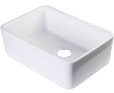
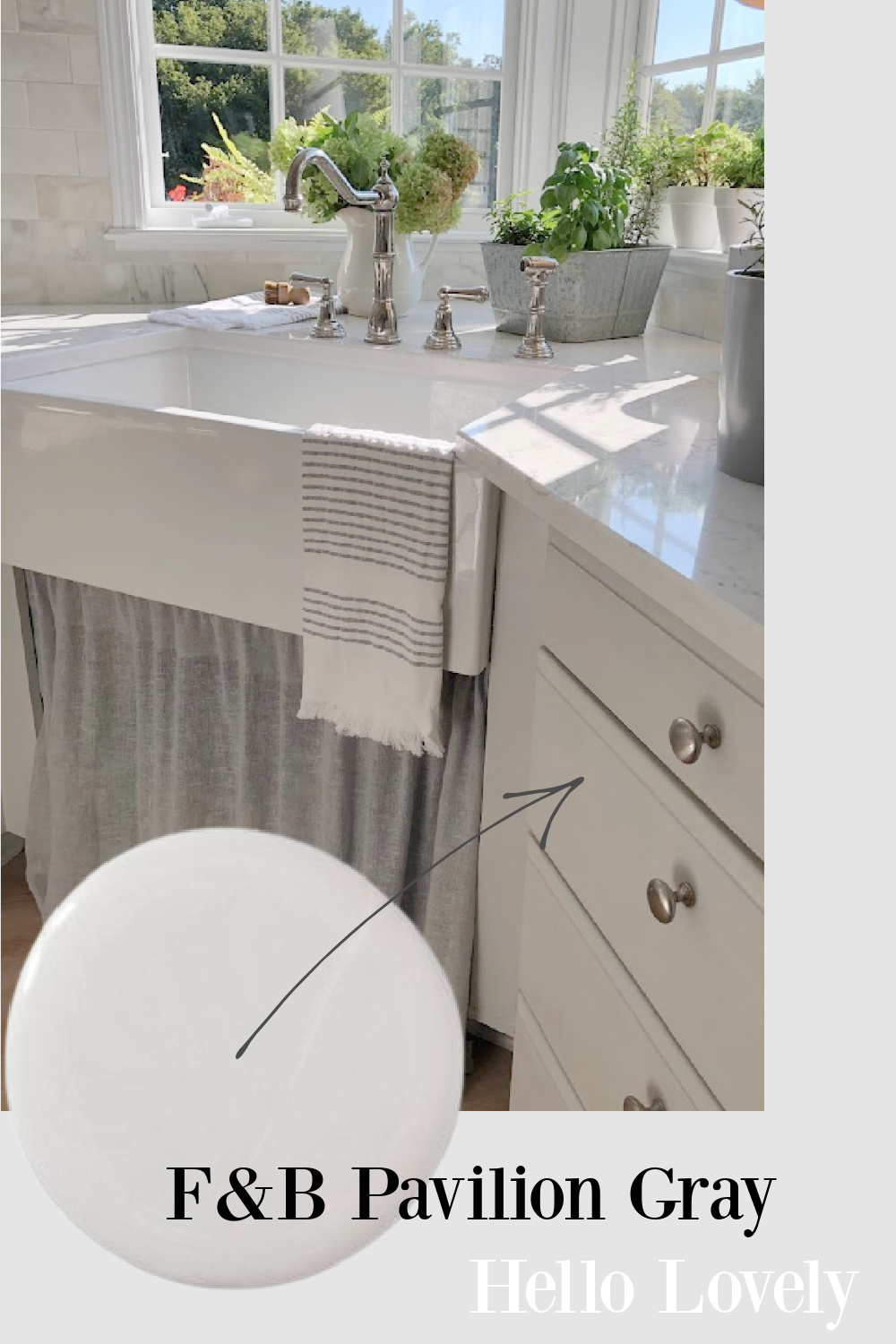
I shared our new sink the other day and then a few peeks of how the kitchen renovation is progressing. We need to install the window treatments, unpack boxes, and decorate, but it’s almost there. And I mentioned that I hate to divulge the paint color name for the kitchen cabinets because there is always a chance I will change my mind!

When you are the painter, you can indeed be that fickle! In fact, I haven’t yet sealed or waxed the cabinets so I can be sure I have the color right. At this moment, the color is Pavilion Gray at 66%!
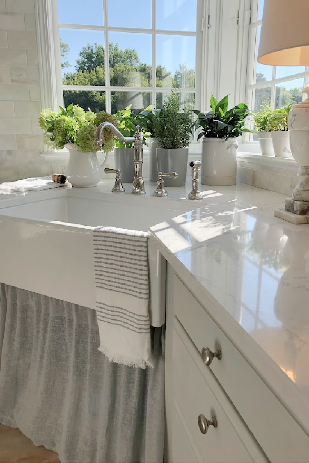
I found the full strength of Pavilion Gray a little too dark for this kitchen so I mixed 2/3 of it with the white paint color used on all of the trim (Sherwin-Williams Emerald Urethane Trim Enamel in Satin). Hence, it’s a custom light grey that I plan to call HELLO LOVELY SWEDISH GREY. Who knows? Maybe it’ll be a thing! I’m down with starting a revolution.
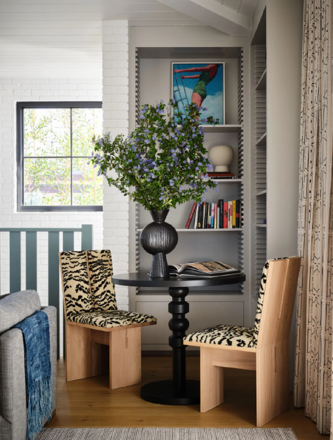
The reason a post like this is so important is that it clearly illustrates how the same paint color can appear different across settings. Sometimes it’s simply the way photos were edited. But there’s also the interplay with natural light and even the geographical location of the interior. In Glennon and Abby’s home above, the color feels taupe-ish and Parisian to me.
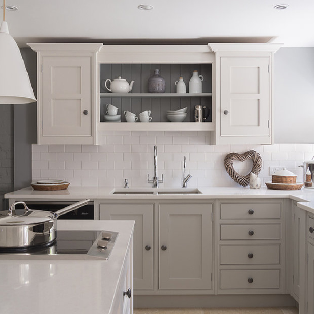
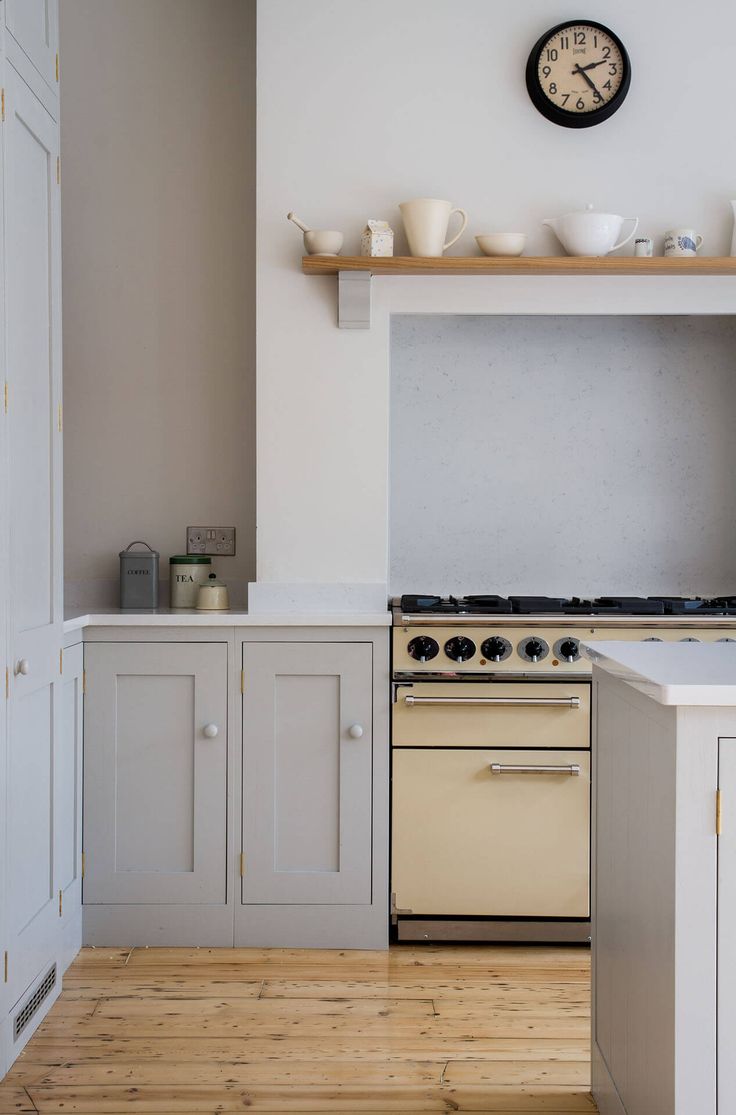
However, in this kitchen above, the gray looks like stone and putty-ish. Cabinets in my own kitchen to my eye appear light blue-grey–just the look I was going for and not at all like a warm limestone.
How to Know Whether This is the Right Grey Paint for You?
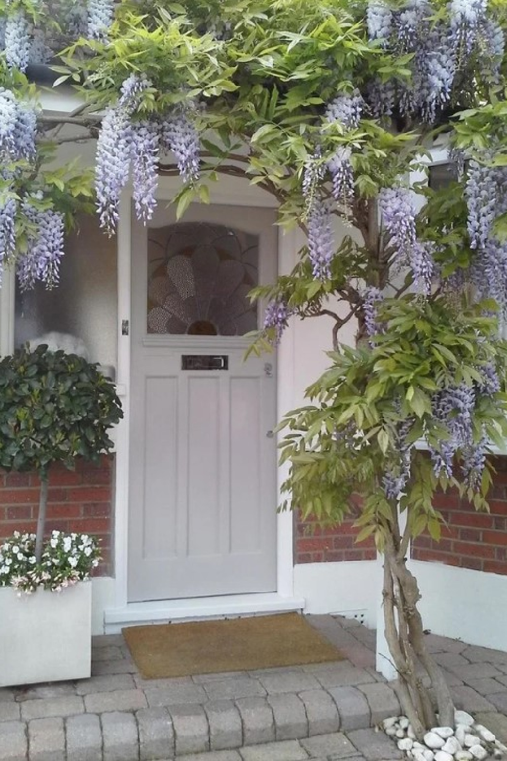
The thing is, Farrow & Ball Pavilion Gray indeed has subtle blue undertones so it makes sense I see the blue in it. If you use it on an exterior like the front door above, yellow sunlight may warm the color. Your best bet is to order a sample and live with it!
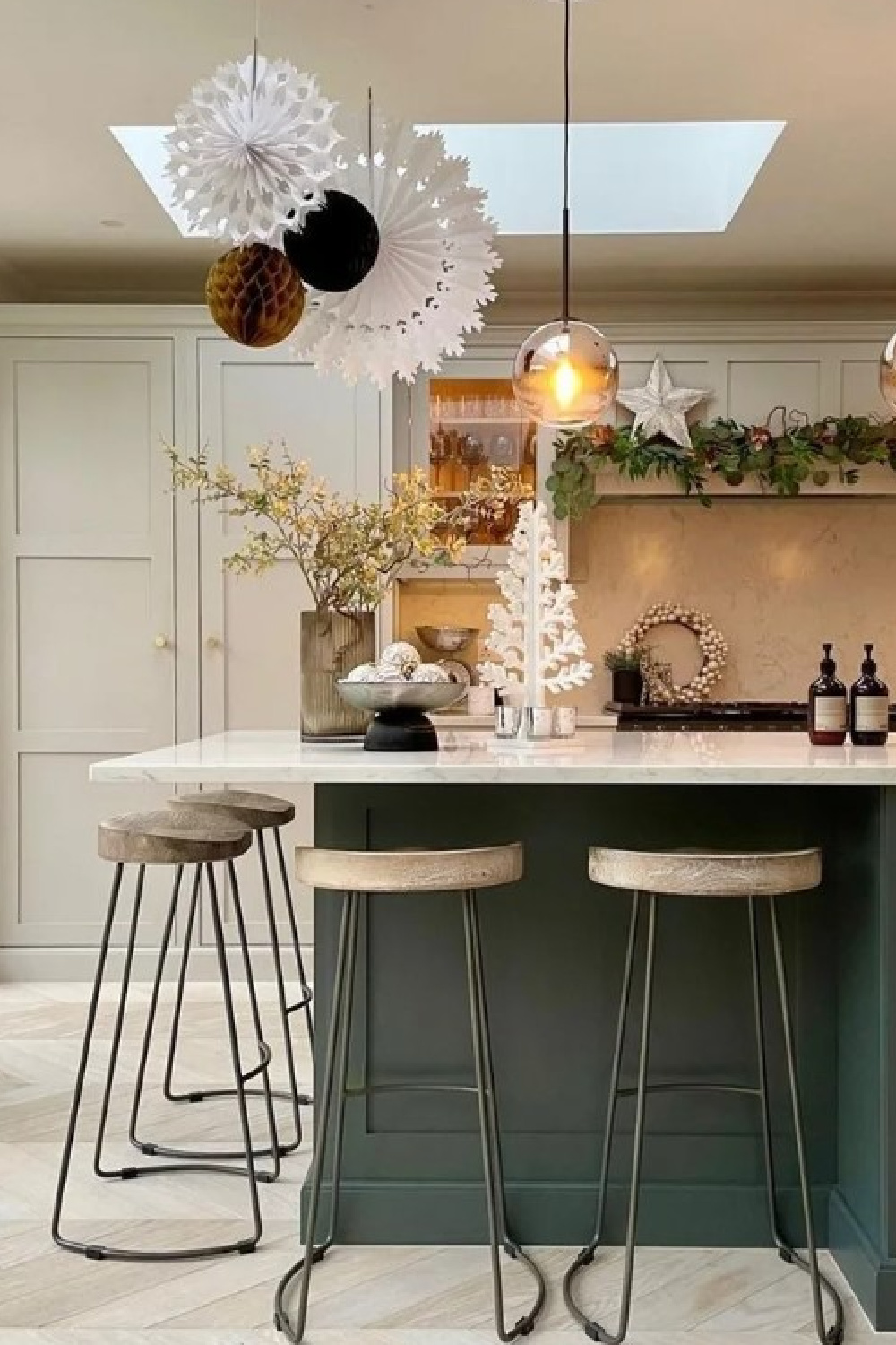
I’m crazy about how Gemma used it in her kitchen (above) with the dark painted island. The light floors look so amazing with Pavilion Gray!
How Does This Gray Look on Walls?
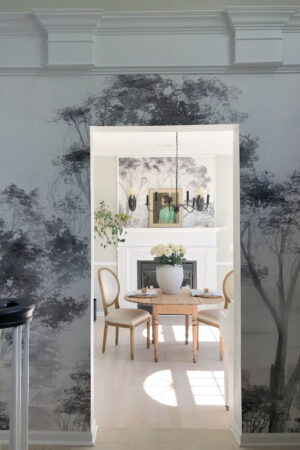
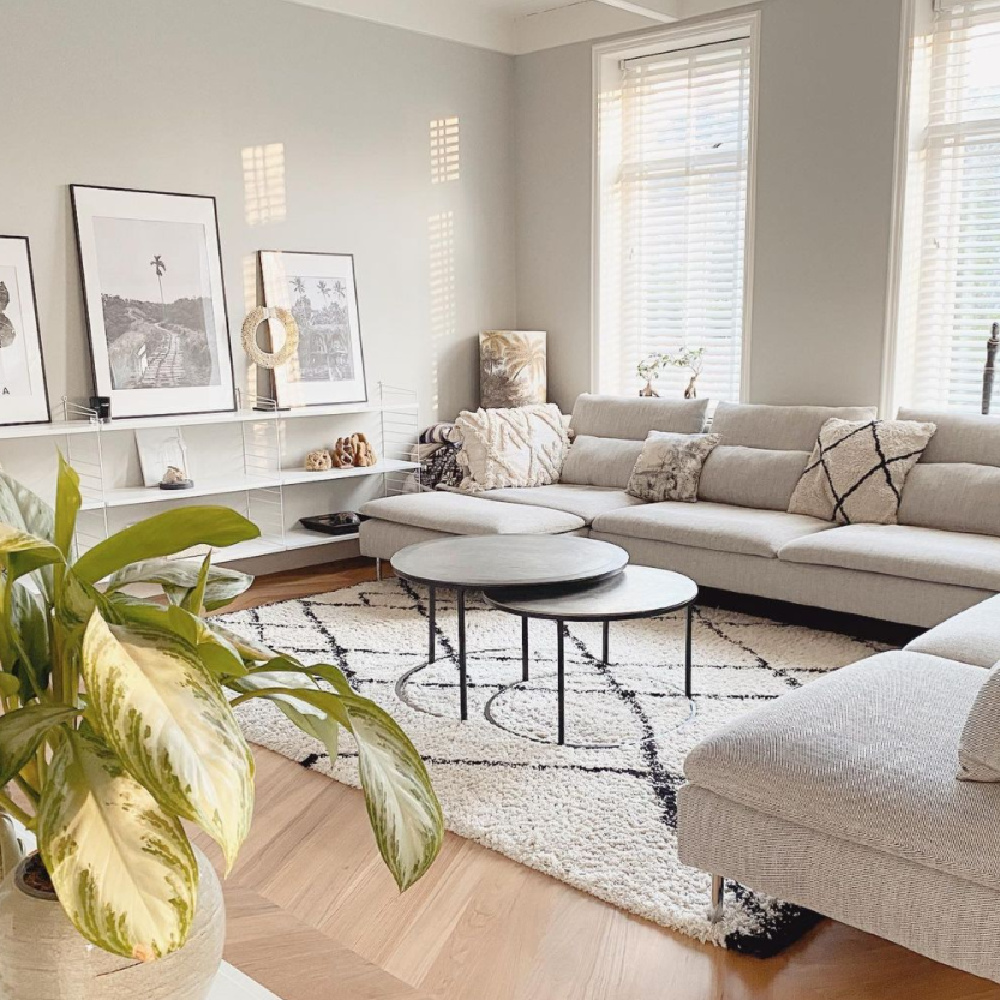
Who needs a lengthy discussion? It is perfect for interior walls. In fact, I sampled Pavilion Gray with the existing Sherwin-Williams Repose Gray in our dining room and entry, and they are almost identical. So I am essentially living with a lot of this color on the walls with bright white trim.
What Mood Does Pavilion Gray Create?
I think it’s so important to hear feedback from people living with a particular color like this. Since I did not have experience living with any grey walls before this house, I feel like I am particularly objective. And the thing is, I thought it would feel dreary or gloomy, but it doesn’t!!!
If you’re after a calm and serene mood, bet you’ll find it swell.
Why is that? Wondering why some grey paint colors can feel dingy or cold or ewwwww and others feel elegant, serene, and fresh?
Special Qualities of Pavilion Gray?
In a word, undertones. A top notch firm with a rich history like Farrow & Ball went to great lengths to get it right. What makes a grey like this so utterly successful is how it magically looks beautiful across a range of different spaces.
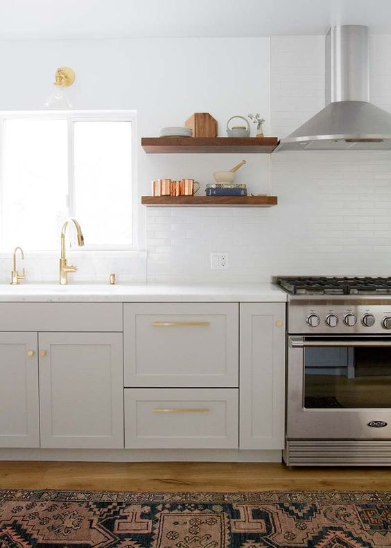
I think the reason I am drawn to this grey is because it reminds me of:
sterling silver,
my favorite timeless rooms,
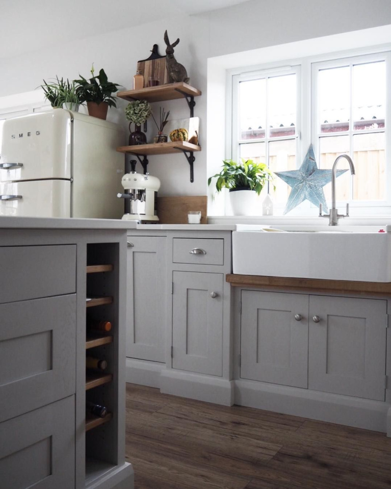
winter trees,
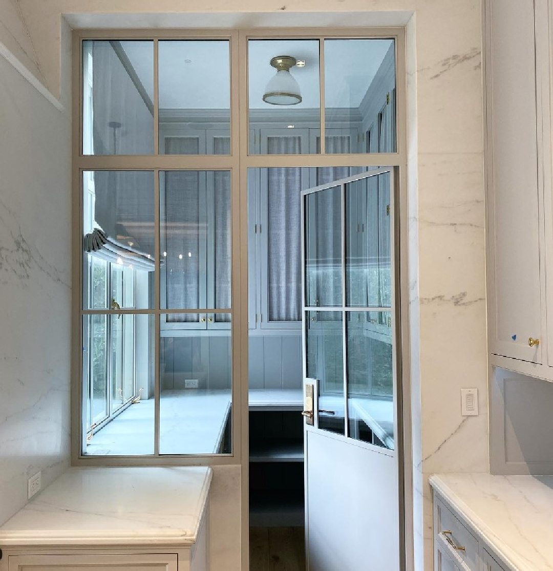
and the Giannettis and Patina Farm! Wait. A farm? Yep. The farm where I first learned about this grey paint color.
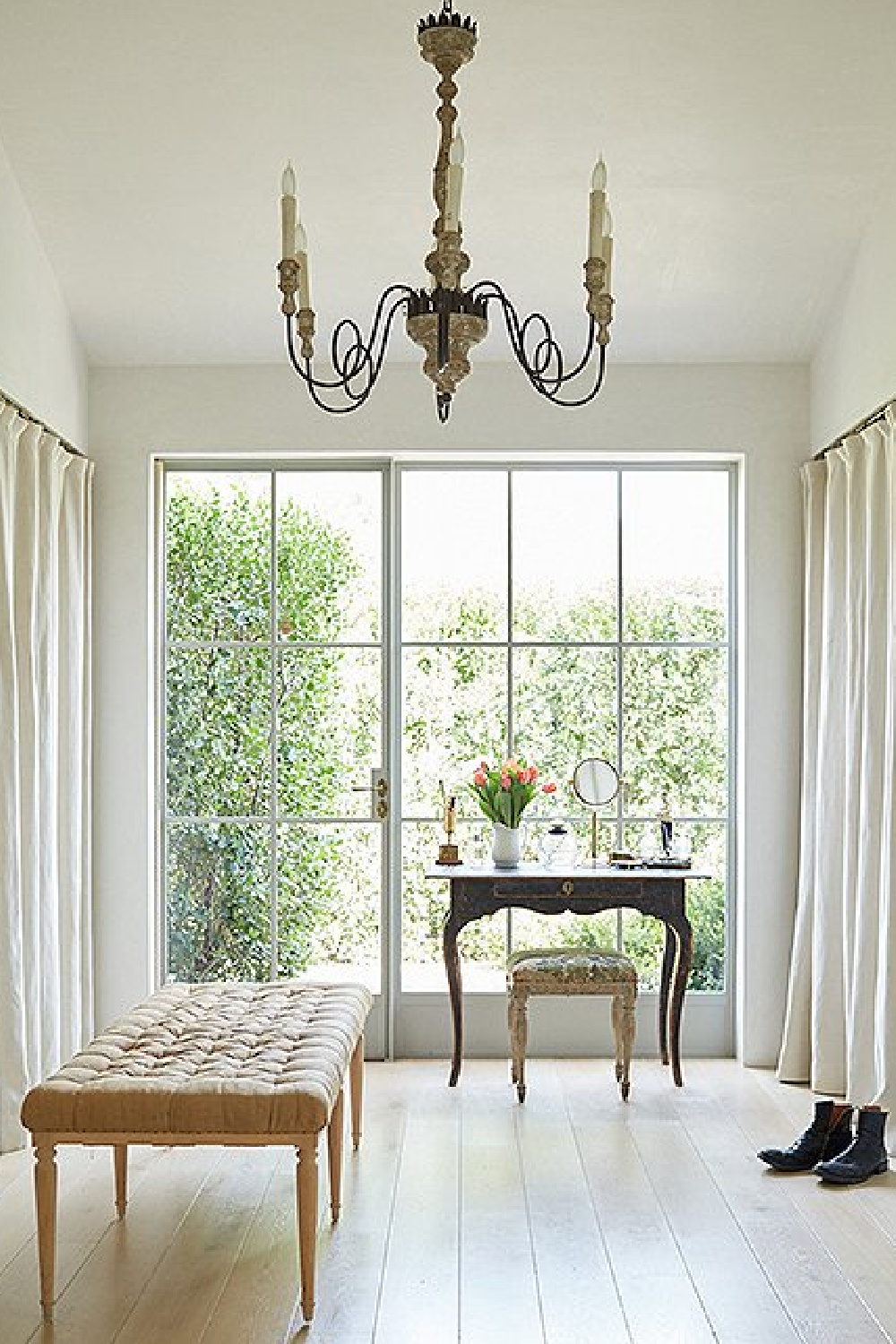
When Brooke and Steve Giannetti were building their modern farmhouse in Ojai years ago, they used a custom grey she mentioned was similar to Pavilion Gray. The Giannettis used that light grey color on steel doors and windows (above) and for exterior elements as well.
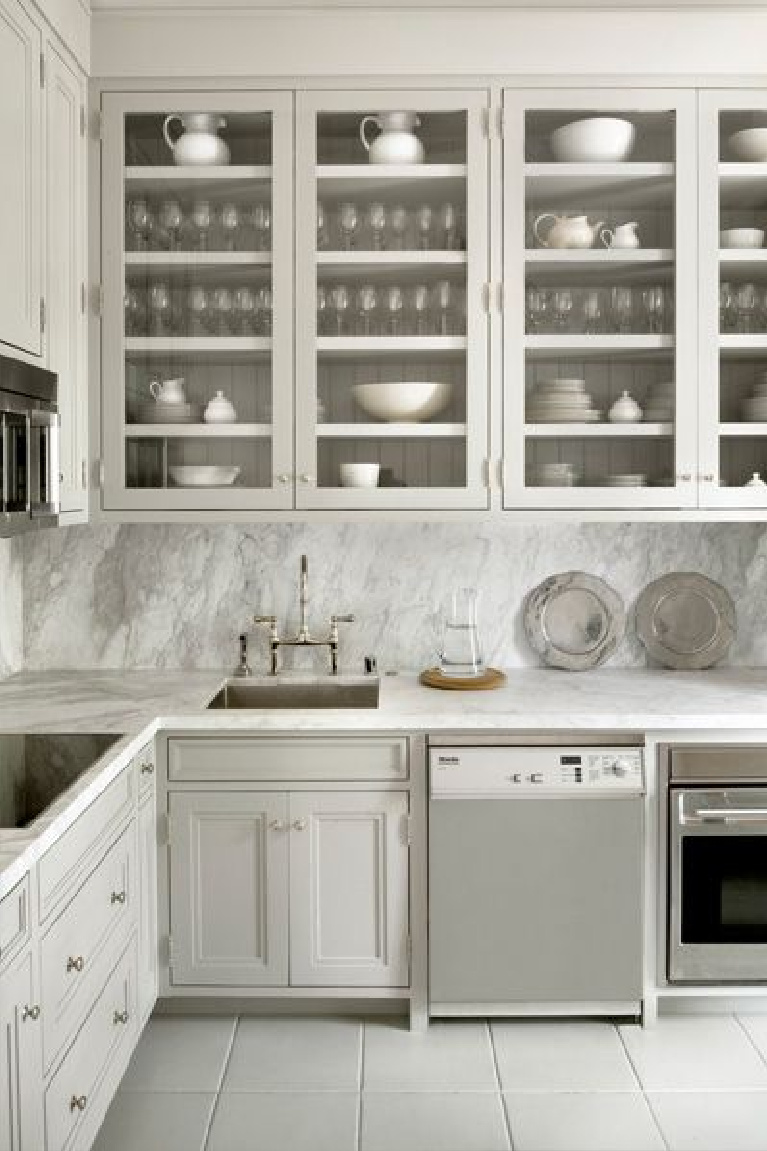
The color makes perfect sense given their passion for Swedish antiques and was enough of an endorsement for me!
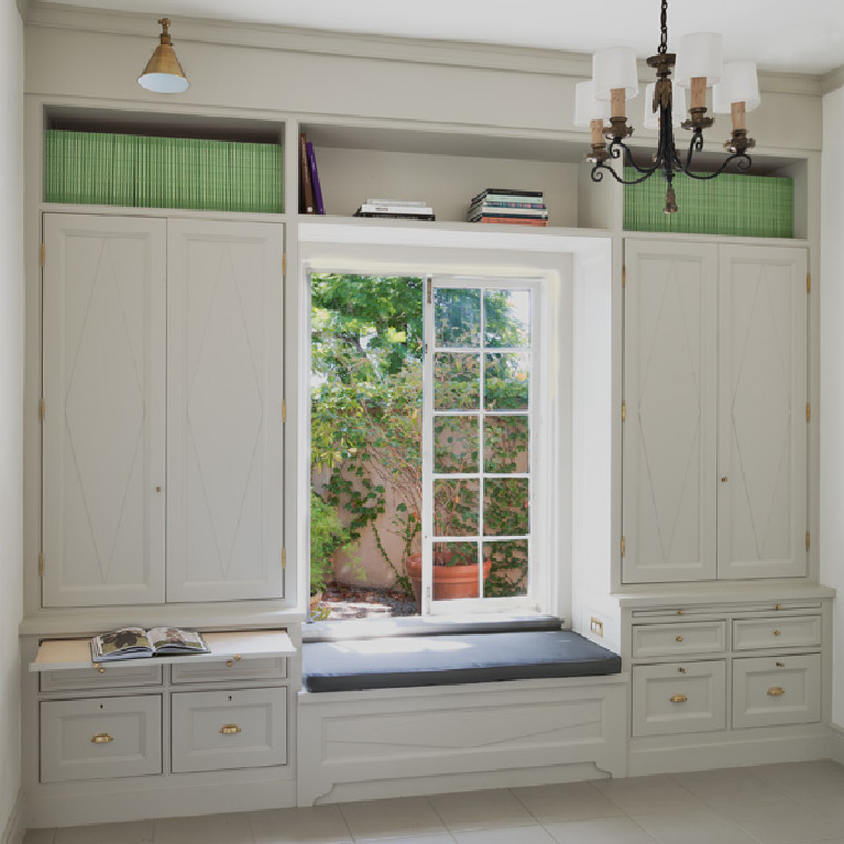
If you have a moment and wish to escape into a traditional and timeless English home, let yourself be soothed by this tour:
Here’s another gorgeous color from Farrow & Ball that can be beautiful for a timeless kitchen:
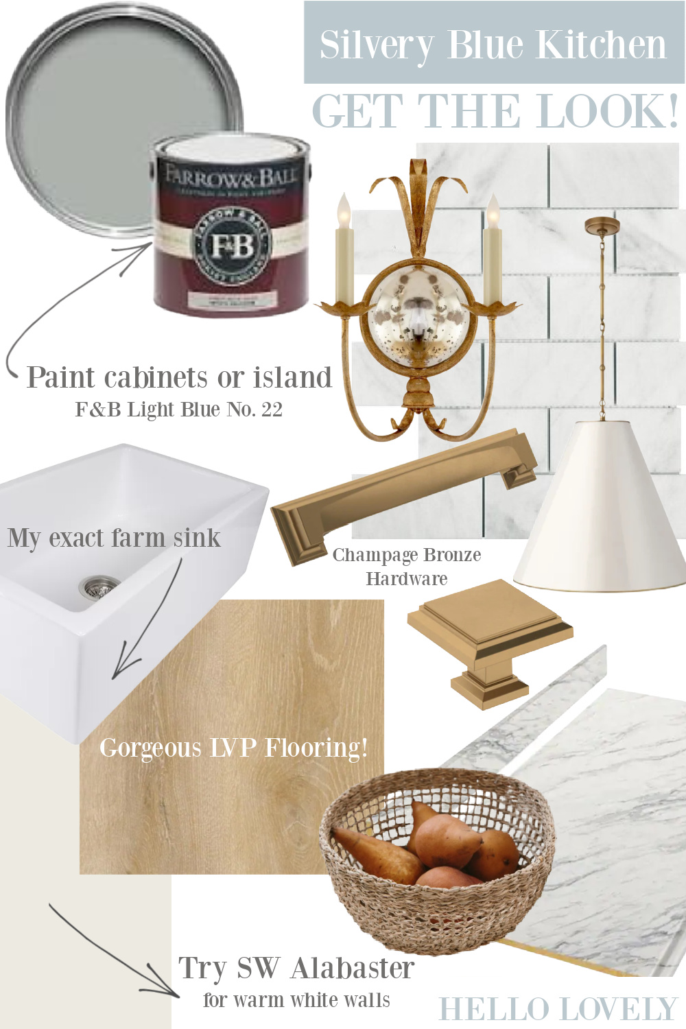
And here are a few more possibilities for you to sample:
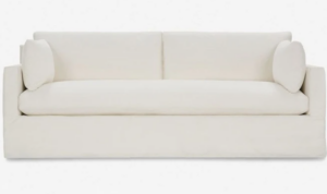
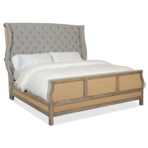
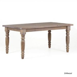
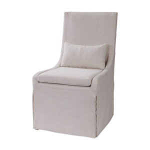
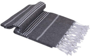
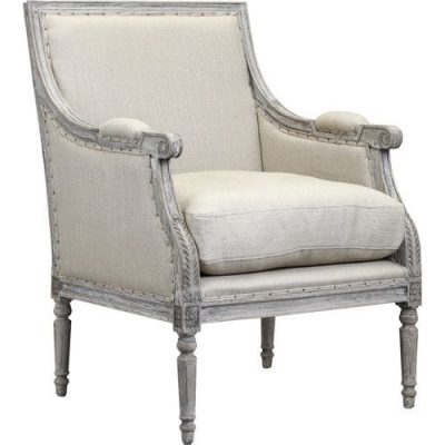
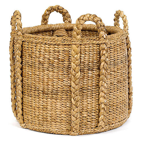
Ready to take Pavilion Gray for a spin?
I independently selected products in this post—if you buy from one of my links, I may earn a commission.
Peace to you right where you are.
-michele
Thanks for shopping RIGHT HERE to keep decor inspiration flowing on Hello Lovely!
Hello Lovely is a participant in the Amazon Services LLC Associates Program, an affiliate advertising program designed to provide a means for sites to earn fees by linking to Amazon.com and affiliated sites.
