10 Farrow & Ball Favorites gives you a taste of the beautiful layer of lovely you can bring to your interiors with paint. The 10 paint colors explored here are trusted by designers for good reason: they were thoughtfully formulated by the UK-based company known for sophistication. What makes F&B colors so timeless and trustworthy? Seeing is believing.
I independently selected products in this post—if you buy from one of my links, I may earn a commission.
Farrow & Ball Favorites: Glorious Timeless Sophistication
Farrow & Ball Cares About the Environment
Since F&B was founded in 1946 in Dorset, England, it has come a long way! 13 years ago, the company made the bold decision to move their entire range of oil based paints to eco-friendly water based finishes (with low volatile organic compounds). Their paint tins are recyclable, Farrow & Ball wallpapers are responsibly sourced, and both paper and paint are environmentally kind.
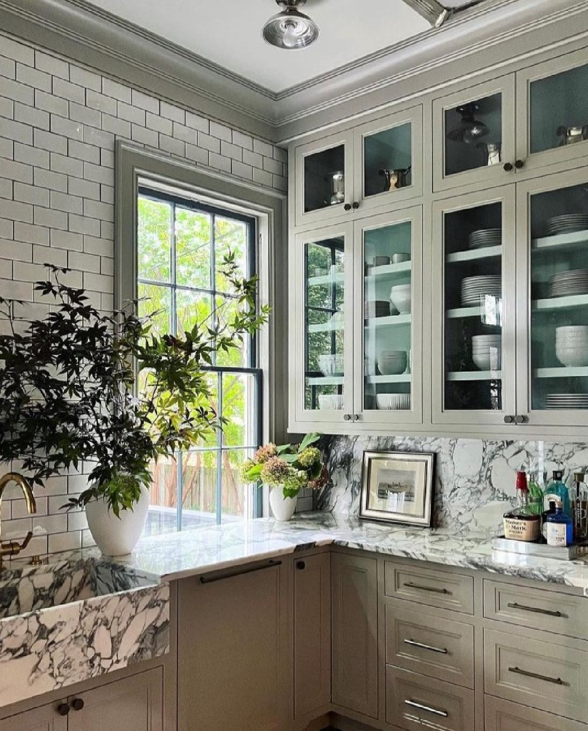
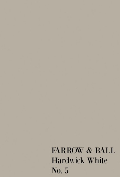
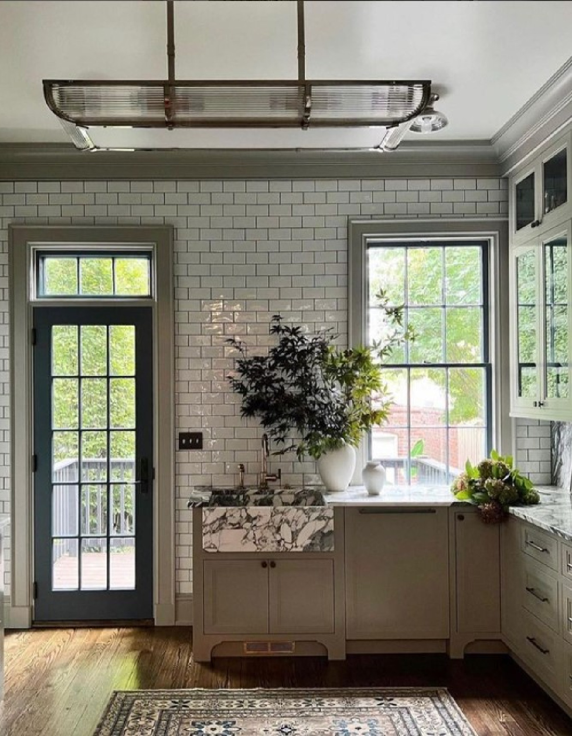
Hardwick White No. 5
“This traditional grey was originally created to touch up the old limewash at Hardwick Hall and doesn’t look very white to most, unless contrasted with strong shades like Off-Black. Less blue than Lamp Room Gray and with an unsurpassed depth of colour, Hardwick White’s rich and chalky hue sits just as well in a contemporary room as it does in a historic house.” -F&B
This particular Farrow & Ball color is also a favorite of mine since I have used it on outdoor furniture and as an exterior accent:
I also mixed Hardwick White 50/50 with Cornforth White to arrive at a gorgeous neutral greige and loved the combination for a hue reminiscent of natural stone.
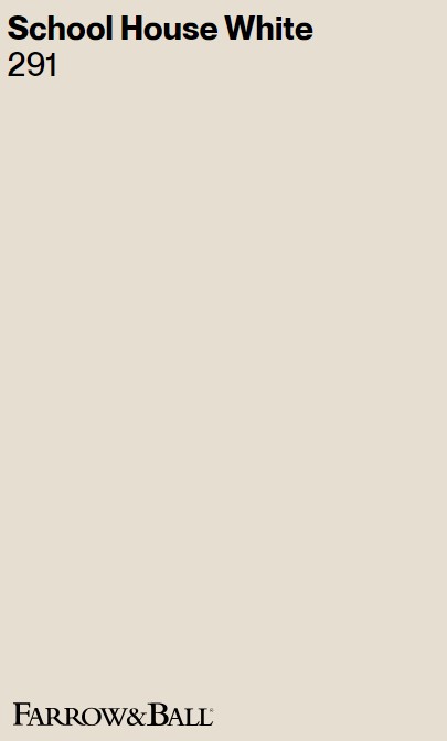
School House White No. 291
“This is the lightest colour in the Timeless Neutrals group including Shadow White, Shaded White and Drop Cloth – each created to look like white when used in deep shade. Pared back, timeless and familiar without the cool undertones of the Architectural Neutrals, this soft off white is reminiscent of the colour used in old school houses.” – F&B
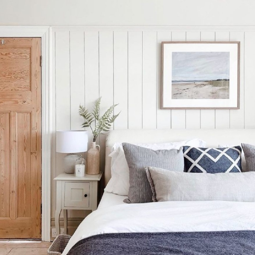
I love the bit of history included in the descriptions of these paint colors!
Don’t you love those complex and timeless neutrals that can’t easily be summed up in a single word?
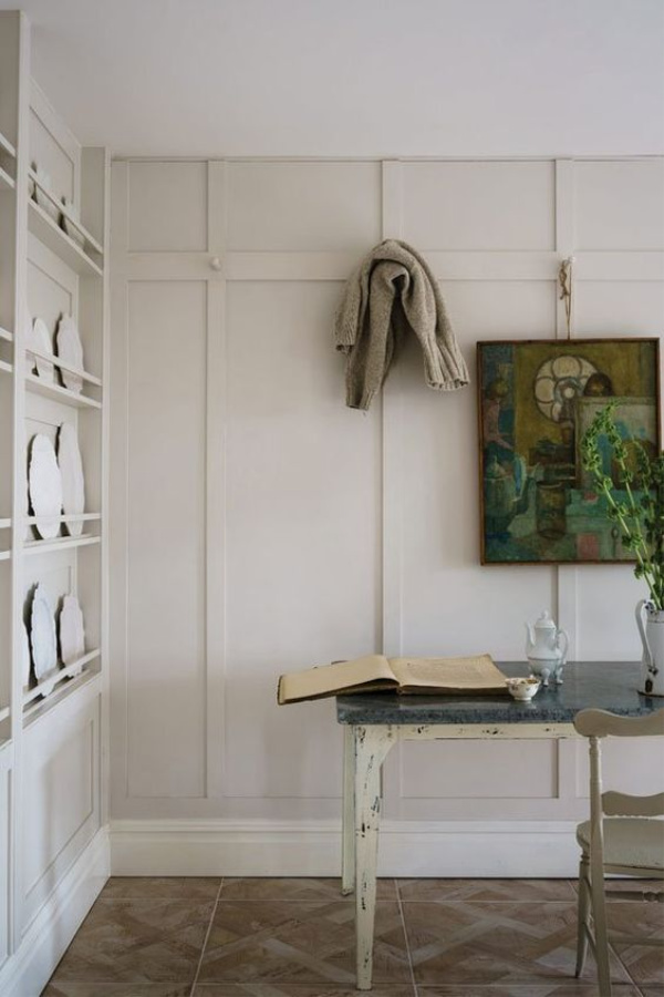
I personally adore living with complex neutrals and enjoying texture as a color? Wait…what? Designer Beth Webb makes a case for it here:
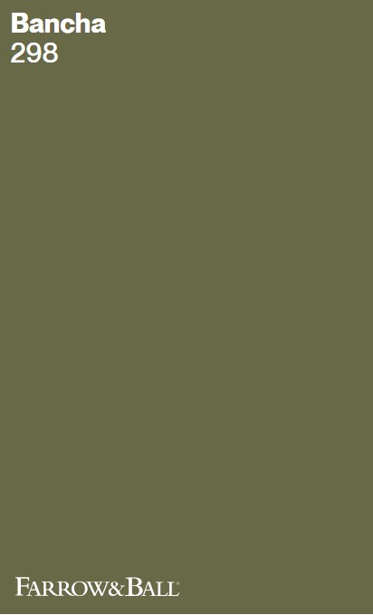
Bancha 298
“This mid-century modern green is a darker version of the much loved archive colour, Olive. Perfect for those who want to embrace stronger colour in the home, its sober tone creates rooms that feel calm and serene – especially when combined with soft pinks and browns. Named after Japanese tea leaves, Bancha, like a cup of green tea, provides a feeling of security.” – F&B
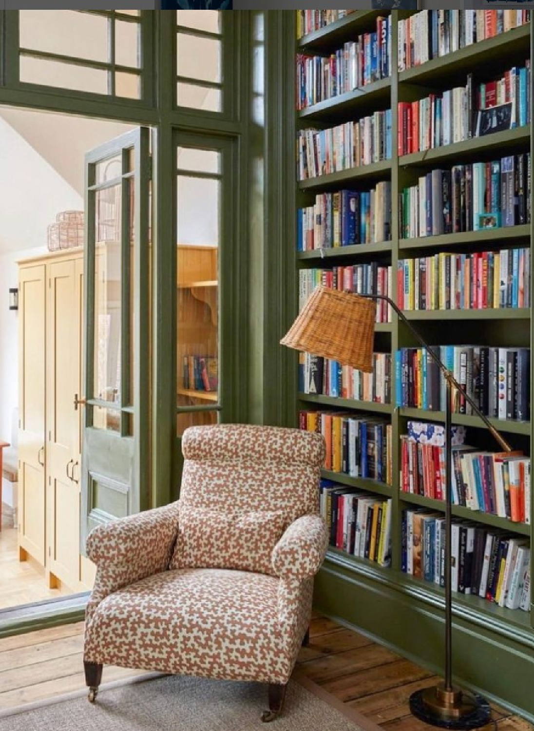
I brought back a sample of Farrow & Ball’s Bancha on a trip to London in 2018 so I can tell you about it firsthand. The midcentury description is spot on. If you have a cabinet or piece of furniture to paint in hopes of incorporating it into a MCM styled interior, Bancha is your best friend.
For reference, Bancha is a green similar to Benjamin Moore Dark Olive and Sherwin-Williams Ripe Olive.

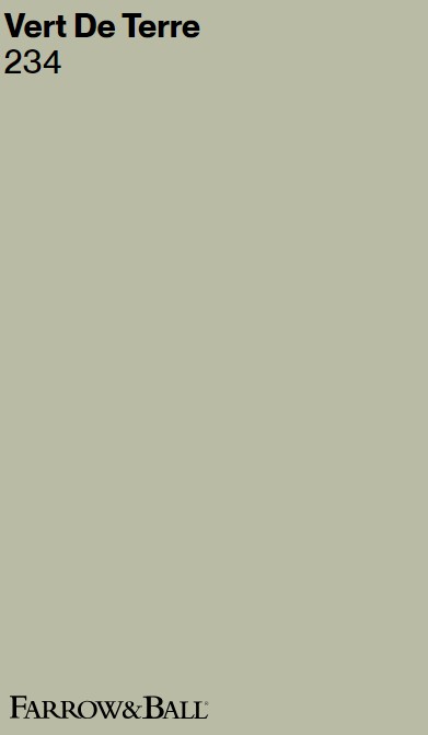
Vert De Terre 234
Am I the only one falling for this delicate aged green?
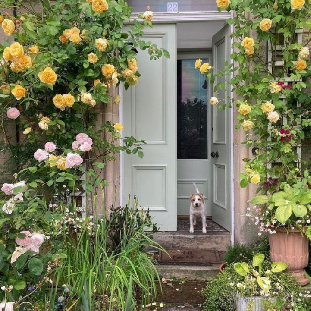
“This fresh and incredibly soft green is reminiscent of the pigment green earth. With its blue undertone it creates the softest of atmospheres, being less intense and cooler than Cooking Apple Green but fresher and less grey than Ball Green.” -F&B
I think it is those blue undertones in this green paint color that sizzle my bacon!
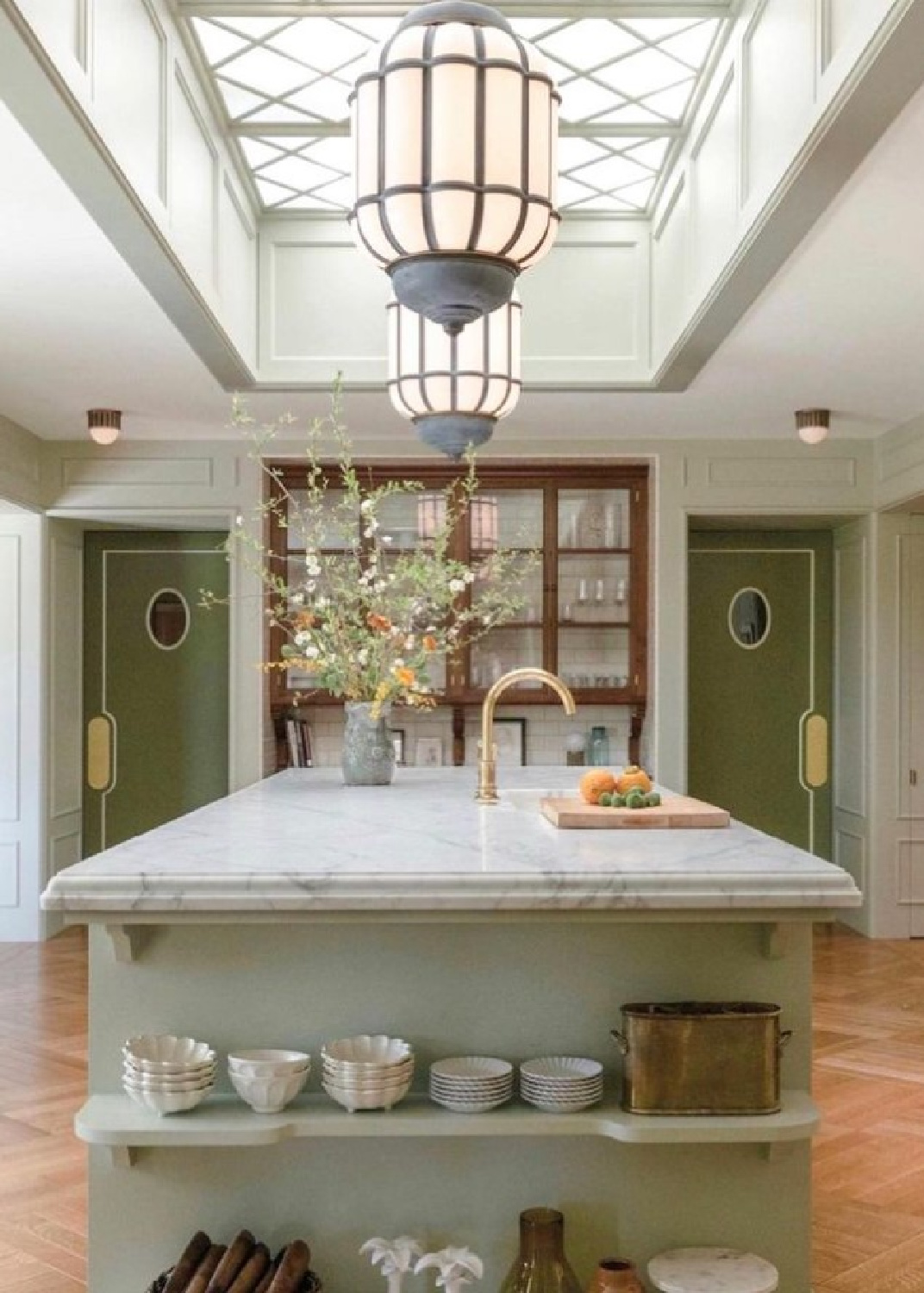
It has such a European country and French country vibe I love.

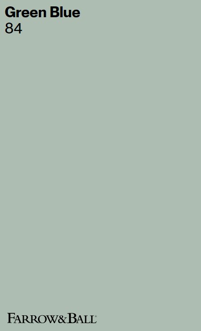
Green Blue 84
Another gorgeous green hue with blue in it?
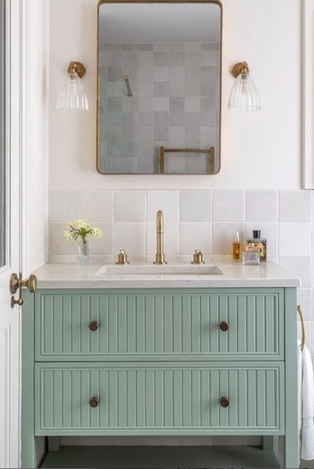
I love that Farrow & Ball felt no need to get clever or making the naming of this color complicated. Instead, in its sophisticated simplicity, it is GREEN BLUE. Period. The color is similar to Benjamin Moore Wythe Blue and Sherwin-Williams Quietude.
“This chameleon colour needs no other name, it is exactly what it says – sometimes blue and sometimes green depending on the changing light throughout the day. Green Blue is a great favourite for family bathrooms, as the soft green adds warmth while the light blue brings a certain freshness. Try pairing with Pale Powder walls as a lighter accent.” -F&B

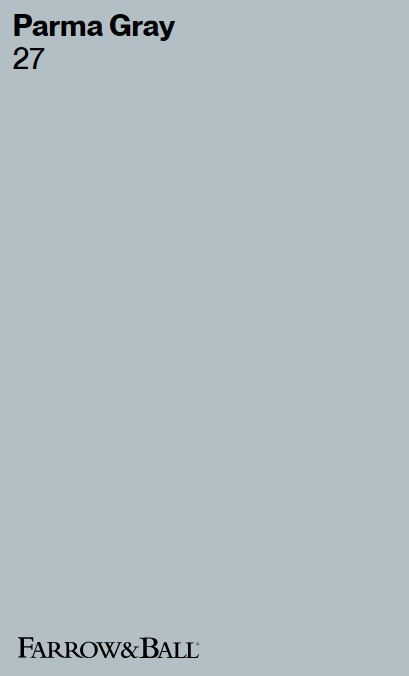
Parma Gray 27
Similar to Sherwin-Williams Tradewind and Benjamin Moore Smoke, Parma Gray is a cool blue and not a dreary gray!
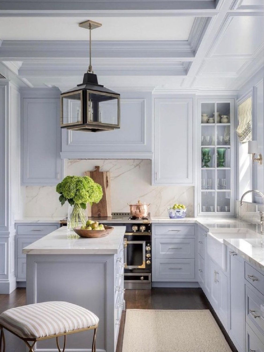
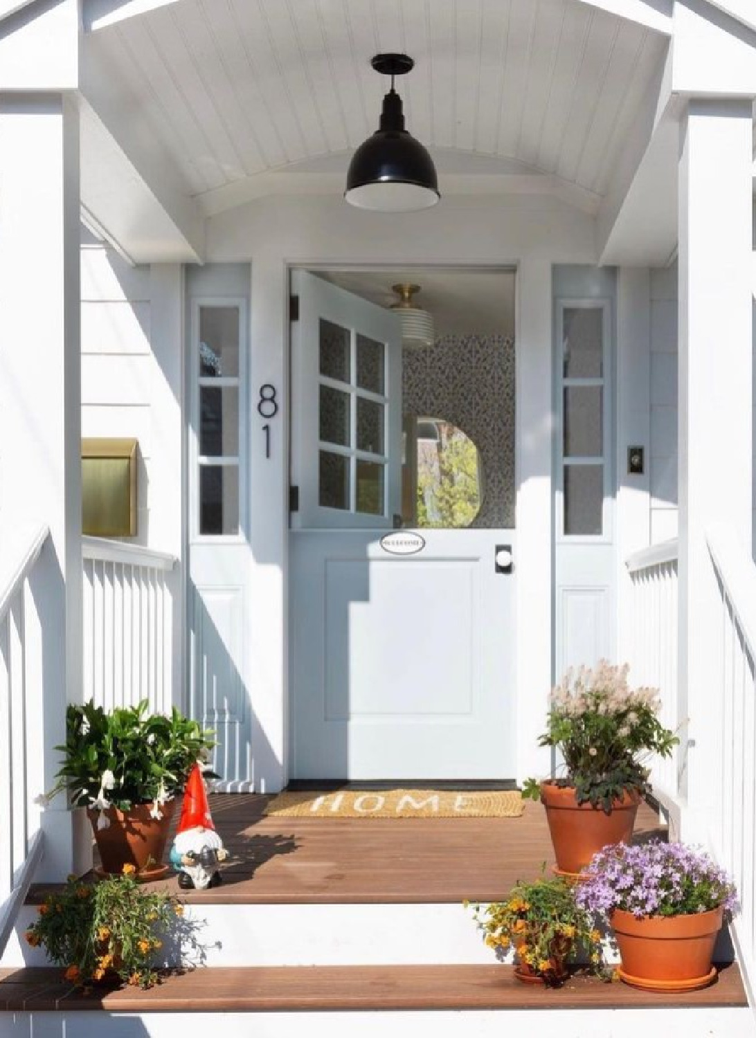
“Reading as a cool blue, Parma Gray is another colour attributed to the great colourist John Fowler. Used as the backdrop to numerous costume dramas, it creates the perfect period feel when contrasted with Wimborne White. Though its cool nature can feel quite formal when contrasted with a bright white, it is a firm favourite for those who prefer a clean and crisp finish.” – F&B
Now that you know about Parma Gray, I bet you’ll begin to see blue kitchens everywhere on your social feeds with cabinets painted this color!
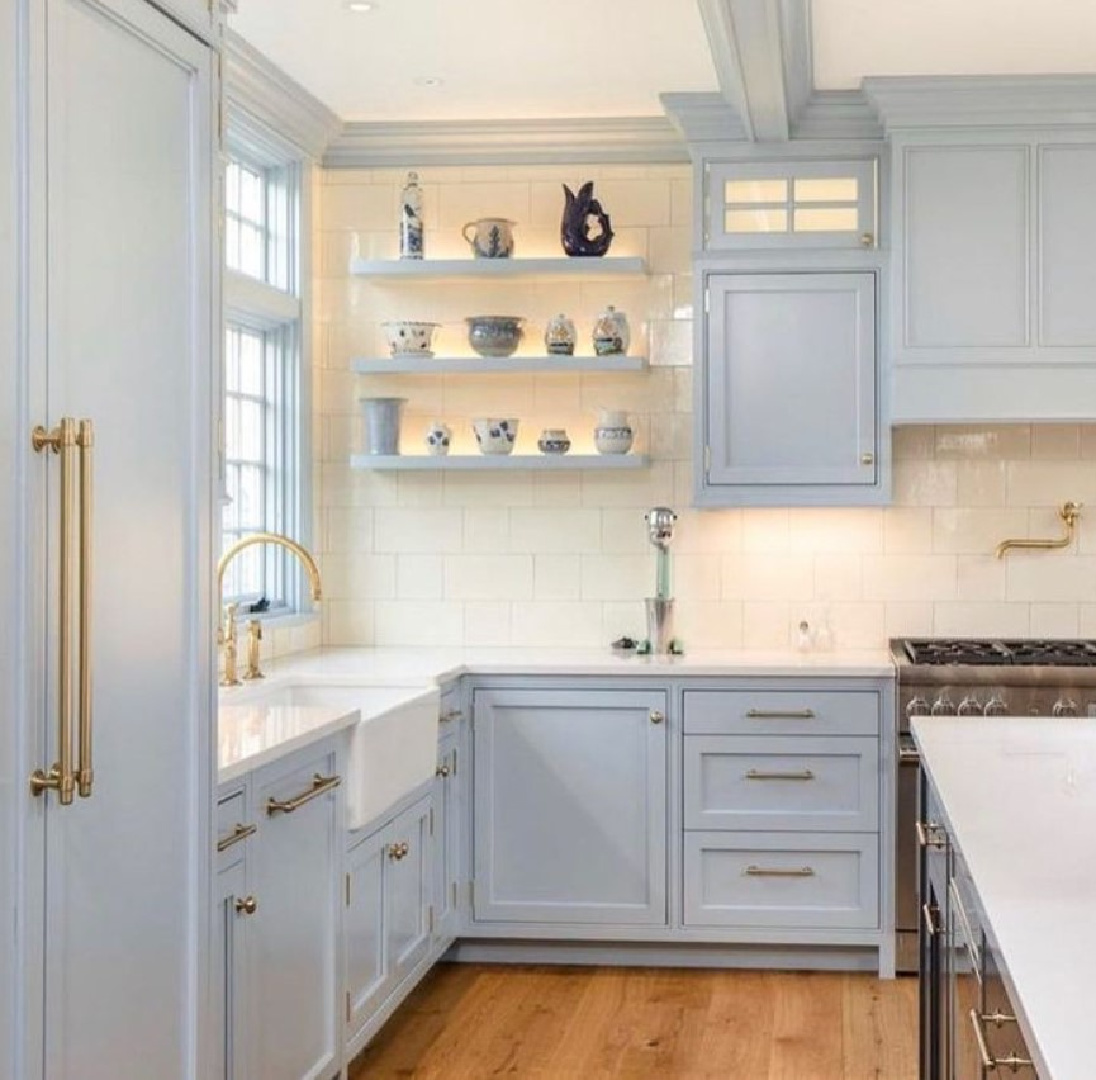
But where else could you use Parma Gray?

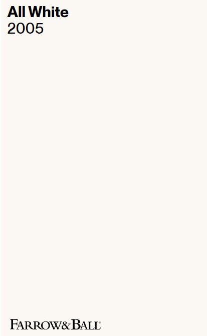
All White 2005
But what if the “color” you are after is actually a pure, clean, crisp white without the chilly blue undertones and sterile factor?
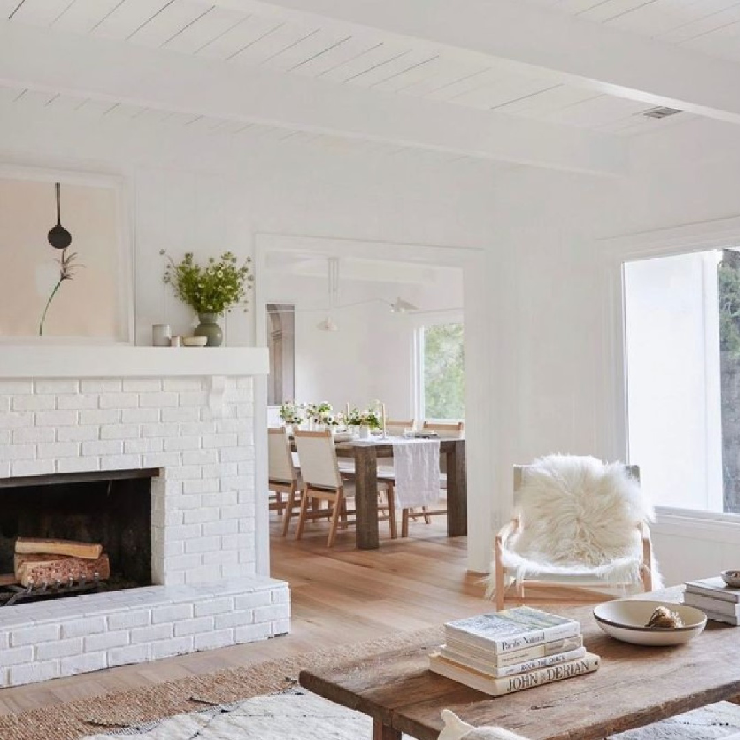
Well then, All White is up for the task!
“All White is exactly what it says! Unusually, it contains no other pigment except for white, creating the softest most sympathetic colour without the colder blue undertones of a brilliant white. One of our Architectural Neutrals, All White pairs seamlessly with Skimming Stone and Strong White for a warm scheme with a slight edge. For a clean and almost graphic finish, contrast with fresh, strong tones like Pitch Black.” – F&B
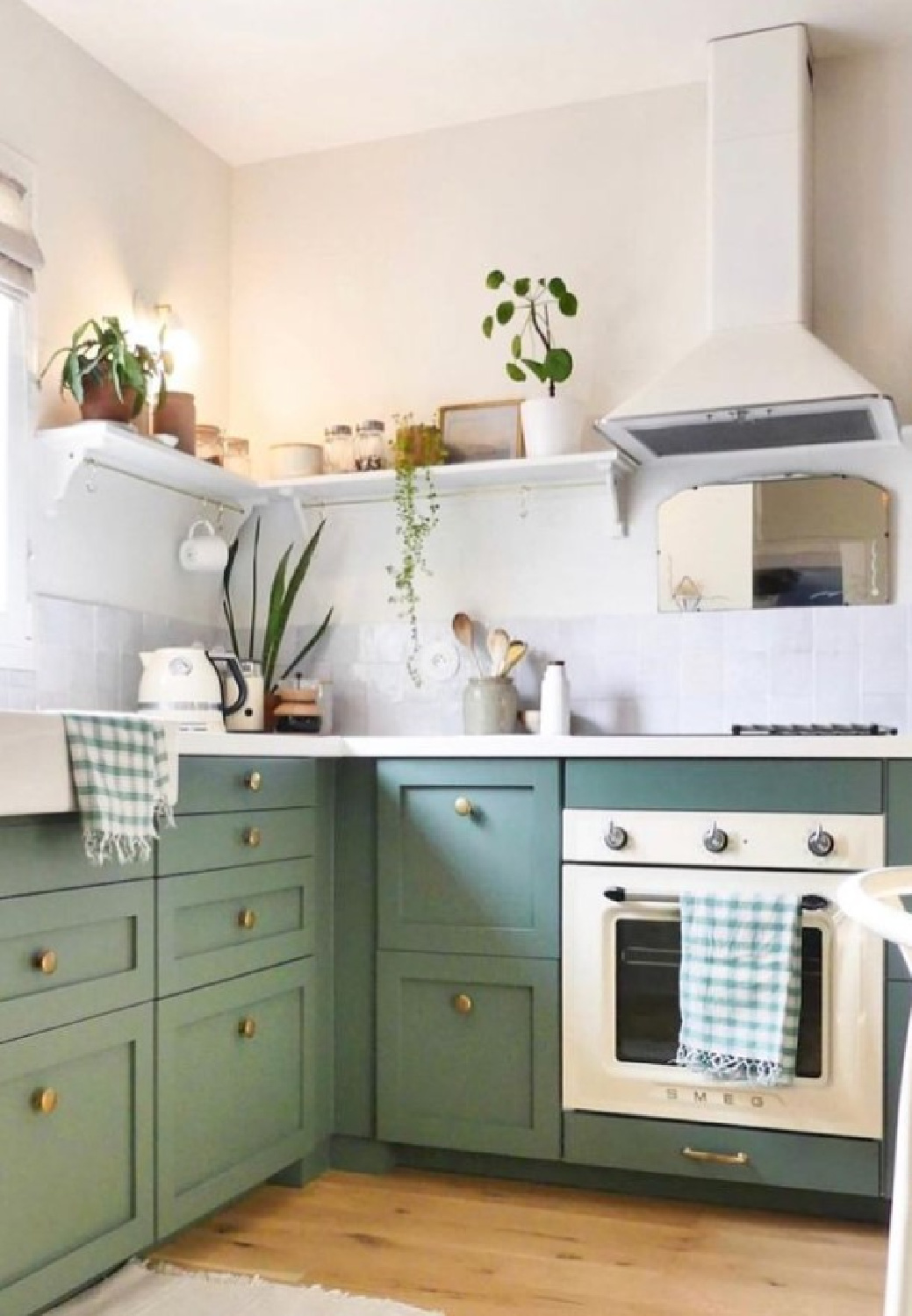
Need ideas for other whites similar to All White? Benjamin Moore Simply White and Swiss Coffee, Sherwin-Williams White Flour and Westhighland White.
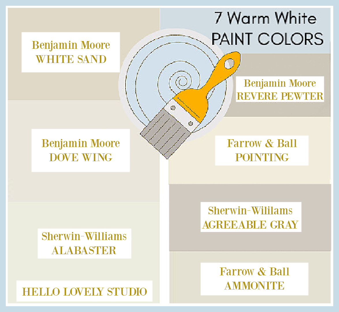
Need a warmer white?
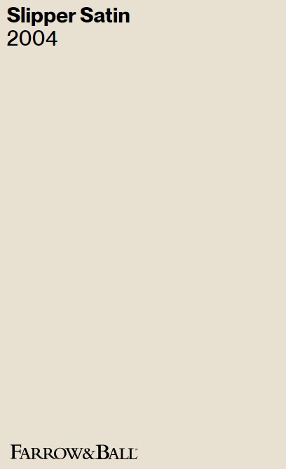
Slipper Satin 2004
Farrow & Ball calls this off white paint color “chalky” which instantly brings to mind more Scandinavian flavored tones and interiors like this:
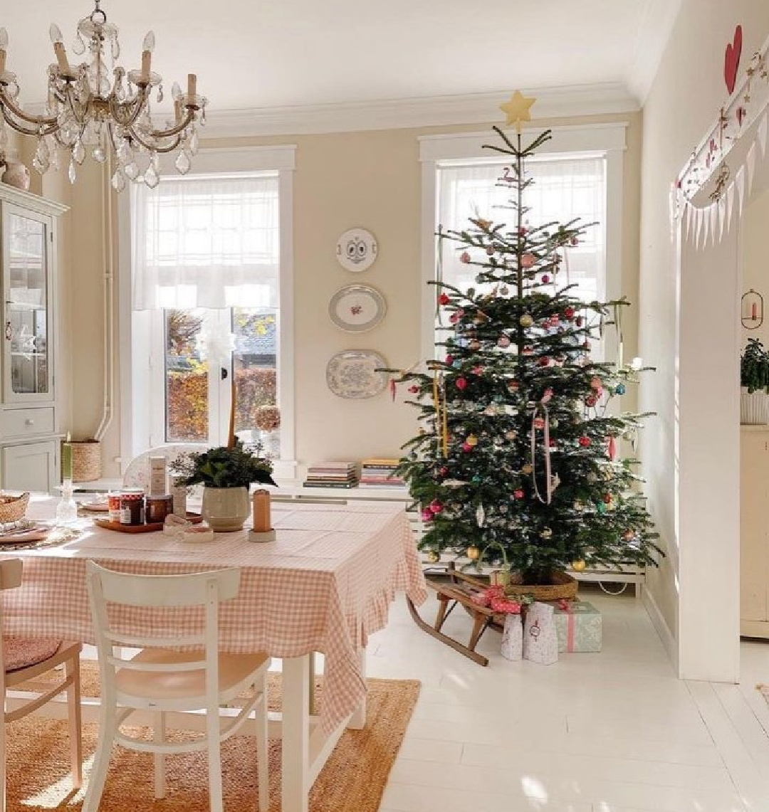
“This popular off white takes its name from the delicate colour of silk used in traditional ballet slippers. Without cool blue undertones, Slipper Satin often reads as a pale grey chalk which makes for a perfect neutral on walls with darker Old White woodwork. Pair with other shades from our Traditional Neutrals for a subtle and sophisticated scheme.” -F&B
If you’re loving the look of Slipper Satin, you may also want to sample Benjamin Moore Ballet White and Edgecomb Gray – both remind me of this gorgeous warm white.
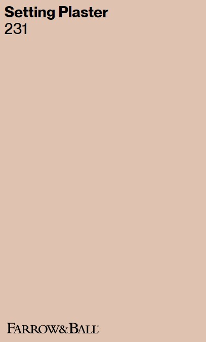
Setting Plaster 231
Love blushing walls or dusty pink everything?
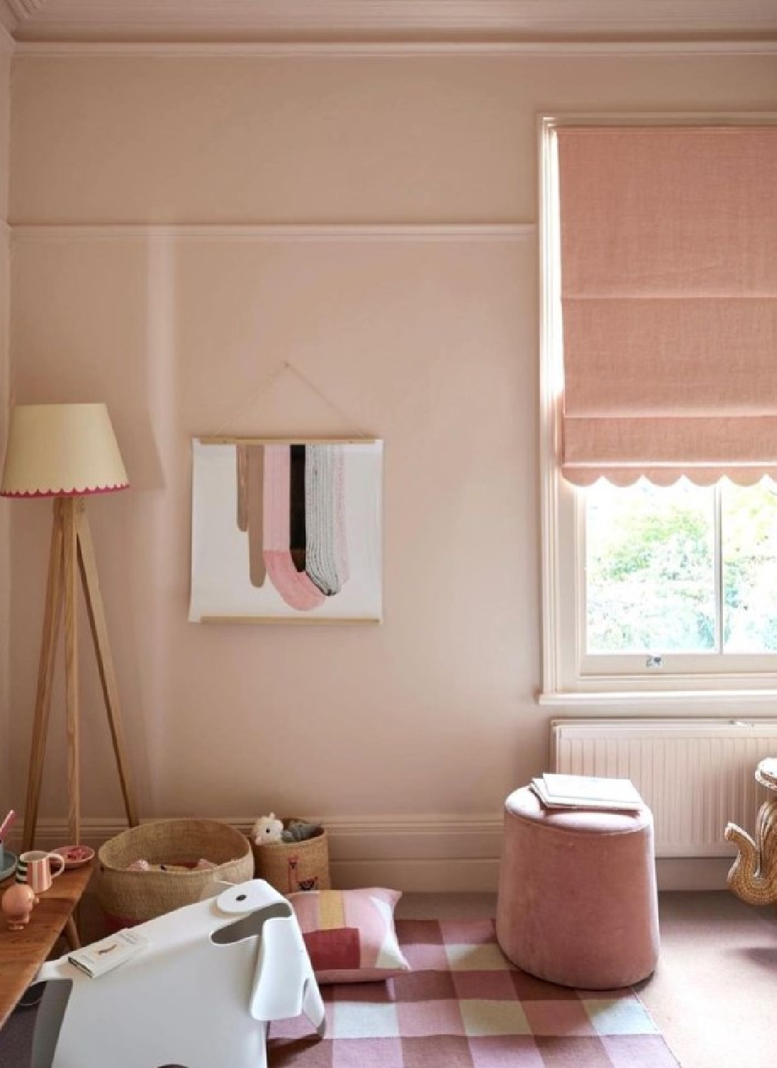
“This dusty pink is named after the blushing walls we often admire in newly plastered houses. It is definitely a pink in historic terms, but has a certain softness to it due to the inclusion of yellow pigment. Our timeless Setting Plaster creates a wonderful backdrop to antique furniture, and also works incredibly well when paired with Tanner’s Brown in a more contemporary home.” -F&B
Good luck finding a blush color with the same quality as Setting Plaster. It’s a legendary color for good reason. That said, I have been surprised by how many folks are stepping out of their comfort zones and using it in their homes! People are serious about creating a calm mood for bedrooms, play rooms, and more. Find more sophisticated pinks in THIS.
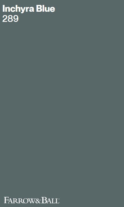
Inchyra Blue 298
This gorgeous teal is a little like Sherwin-Williams Smoky Blue, but it is truly in a league of its own in terms of its deep and dark moody mystique.
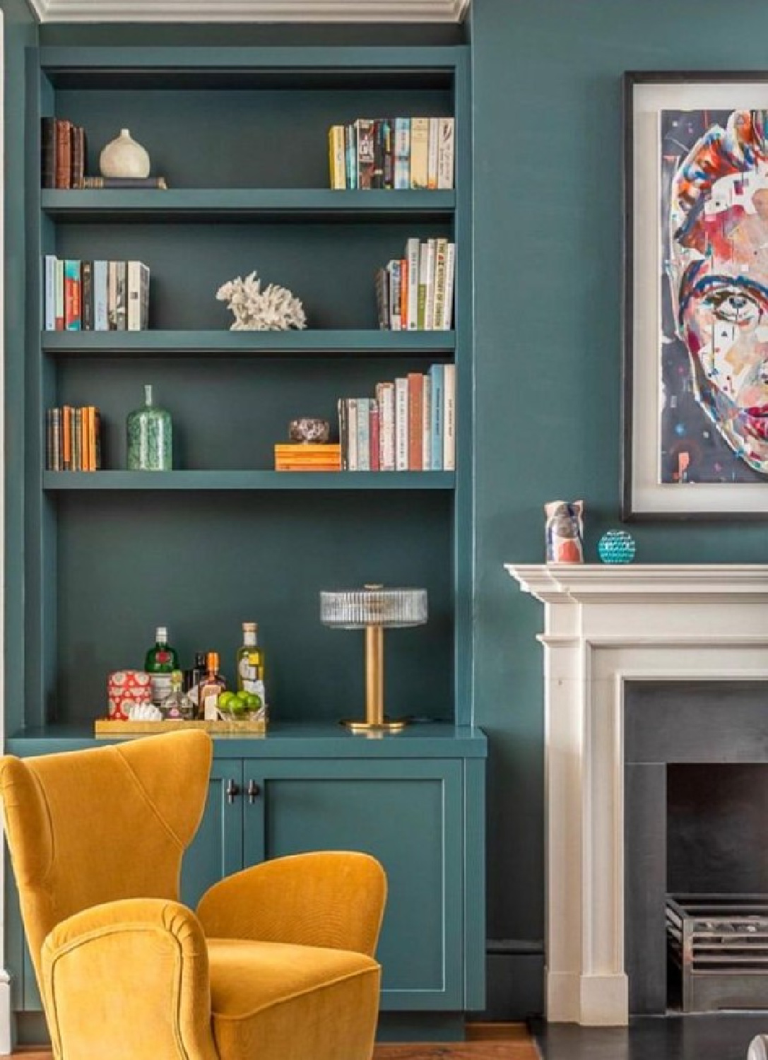
“This aged blue grey is inspired by the naturally dramatic Scottish skies that act as a backdrop for the classic Georgian Inchyra House. It can be found on the exterior doors of their very impressive byre or barn which nestles at the bottom of a rather grey and imposing brae (also known as a hill). This moody hue can read more grey, blue or even green depending on the light. A great alternative to charcoal, use it to inject a hint of colour into a super contemporary home or create a dark and intimate feel by combining it with Black Blue or Vardo.” – F&B
Don’t you love the idea of it on front doors!?!

Need More Ideas from Farrow & Ball Colors?
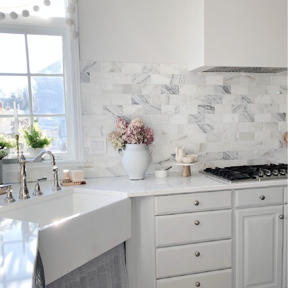
I have more to share so stay tuned for PART 2. And a personal favorite F&B color of mine? I’m crazy for both Pavilion Gray:
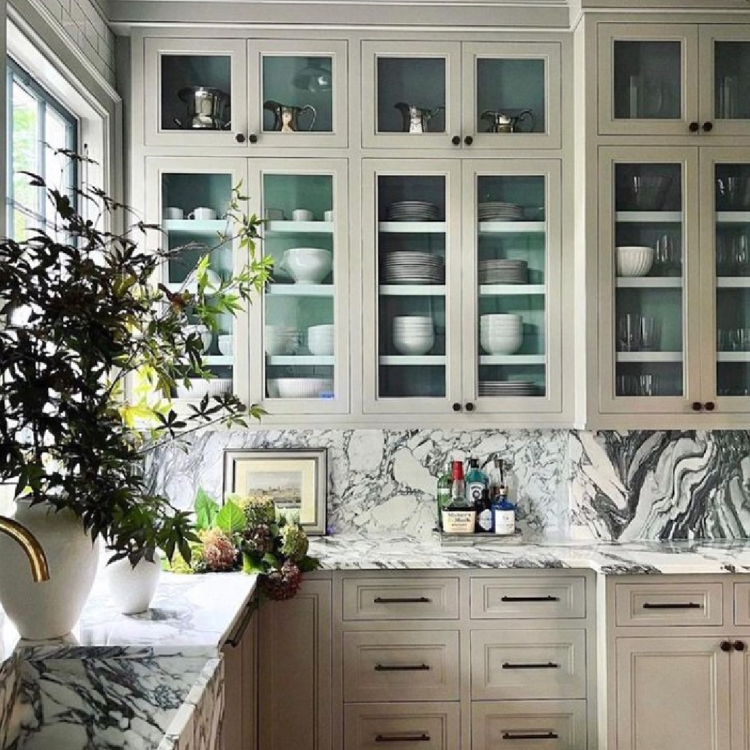
and Hardwick White shown on cabinets below:
Peace to you right where you are.
-michele
Thanks for shopping RIGHT HERE to keep decor inspiration flowing on Hello Lovely!
Hello Lovely is a participant in the Amazon Services LLC Associates Program, an affiliate advertising program designed to provide a means for sites to earn fees by linking to Amazon.com and affiliated sites.
