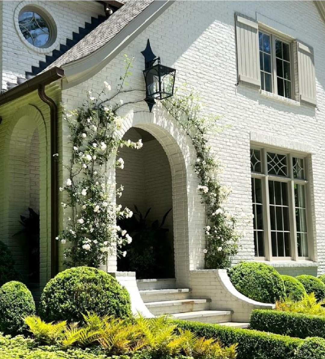
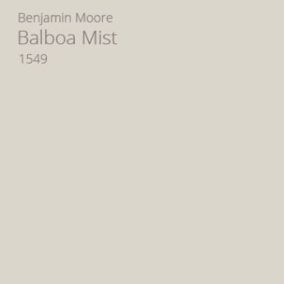
Benjamin Moore BALBOA MIST OC-27: Best White Exterior Color shares a photo gallery of white house exteriors where the exact paint color or educated guess is provided. Judging from the popularity of BM Balboa Mist (also known as BM 1549), this pale gray may be a safe bet when you’re after an off-white with grey undertones. Remember that natural light is going to wash out the color so that even if you want a white house, a gray color may be your best friend. In addition to Balboa Mist, find additional ideas to sample for exterior paint colors.
BM Balboa Mist + White Exterior Paint Ideas
Is Balboa Mist Warm or Cool?
Benjamin Moore calls this off white slightly warm, and even though it is a pale gray, there are other undertones which keep it from feeling cold or off-putting. For this reason, I think I should go ahead and get straight to responding to the question posed in the title: YES. I think it may be the perfect exterior color when you want an off-white that won’t be blinding, won’t feel joltingly sterile, and will feel gentle with a bit of warmth (even warmer when the sunlight hits it).
How Light Is Balboa Mist?
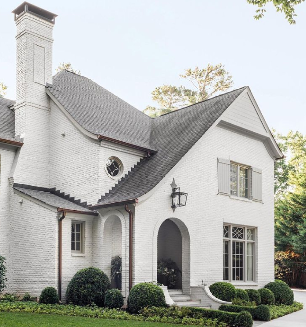
The light reflectance value (LRV) of this paint color is 65.53. LRV is the percentage of visible or usable light reflected from a paint surface. That means, this color will reflect 65.53%. Brighter whites have LRVs in the 80s, but this off-white color is still on the lighter end of the spectrum.
BM 1549 is a Designer Favorite Exterior Paint Color
What a gift when a favorite designer shares the name of her favorite paint colors for projects!
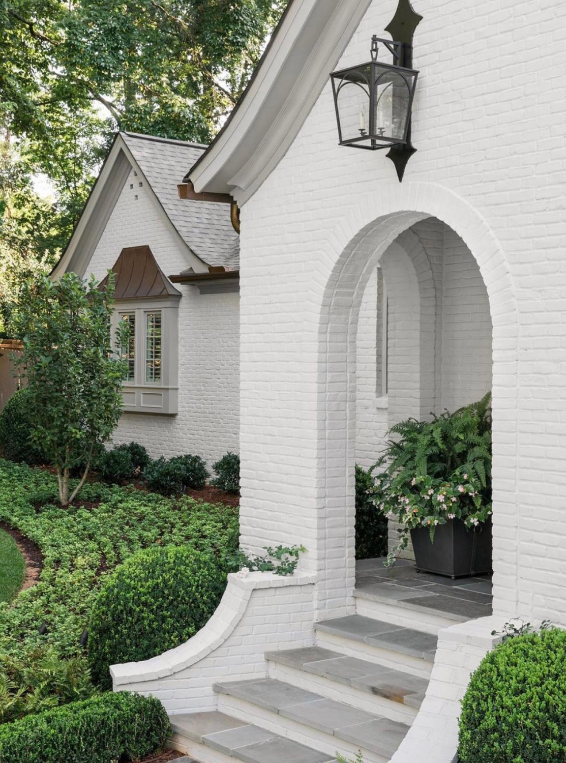
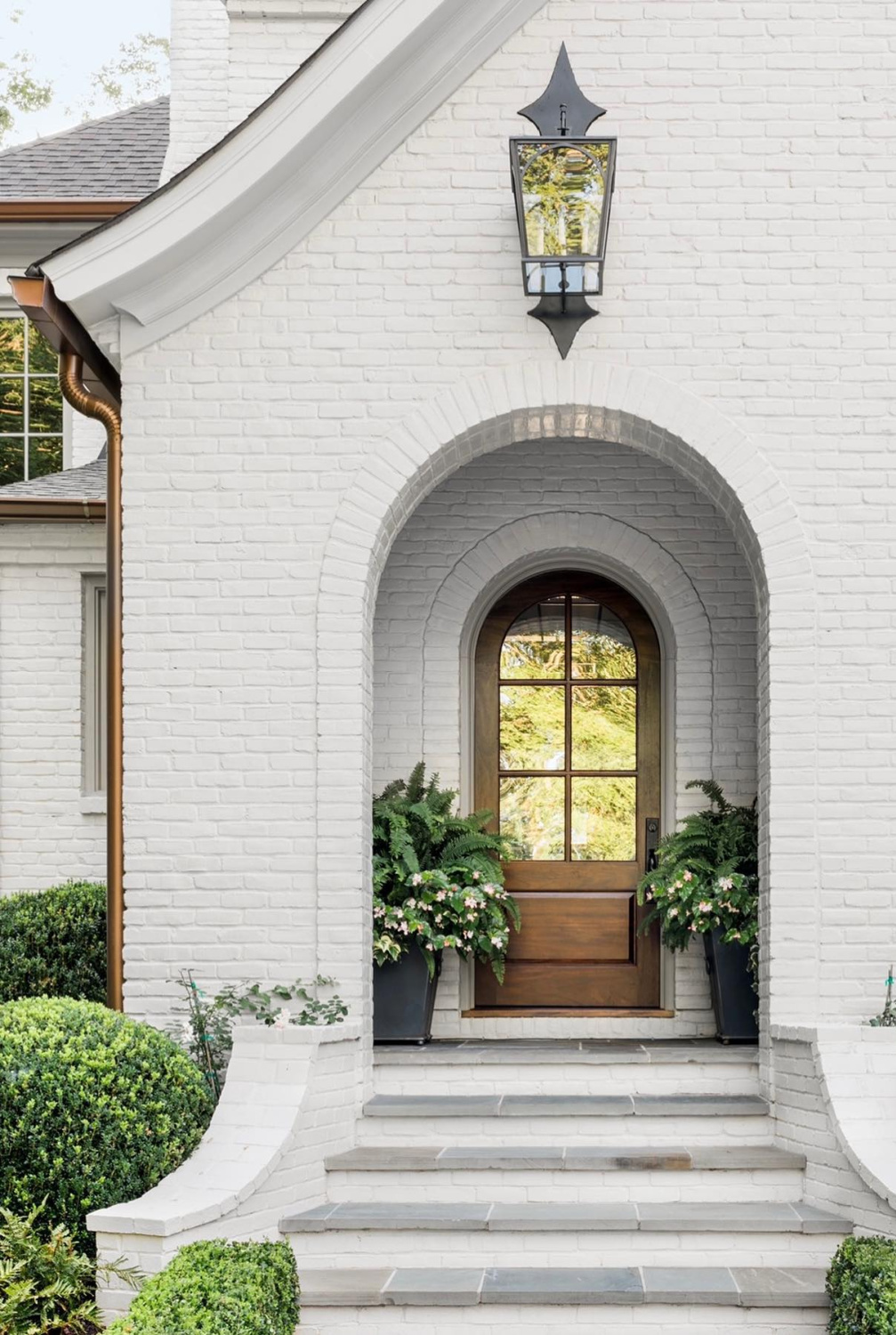
Atlanta-based interior designer Sherry Hart loves this color for her clients, and it’s easy to understand why. It looks great on a variety of different homes in different settings. For this renovation of a Tudor in Atlanta by Ladisic Fine Homes, the greyed-white harmonizes with a darker gray for trim as well as warm coppery accents and dark iron.
Here’s another home exterior with the color paired with grey trim:
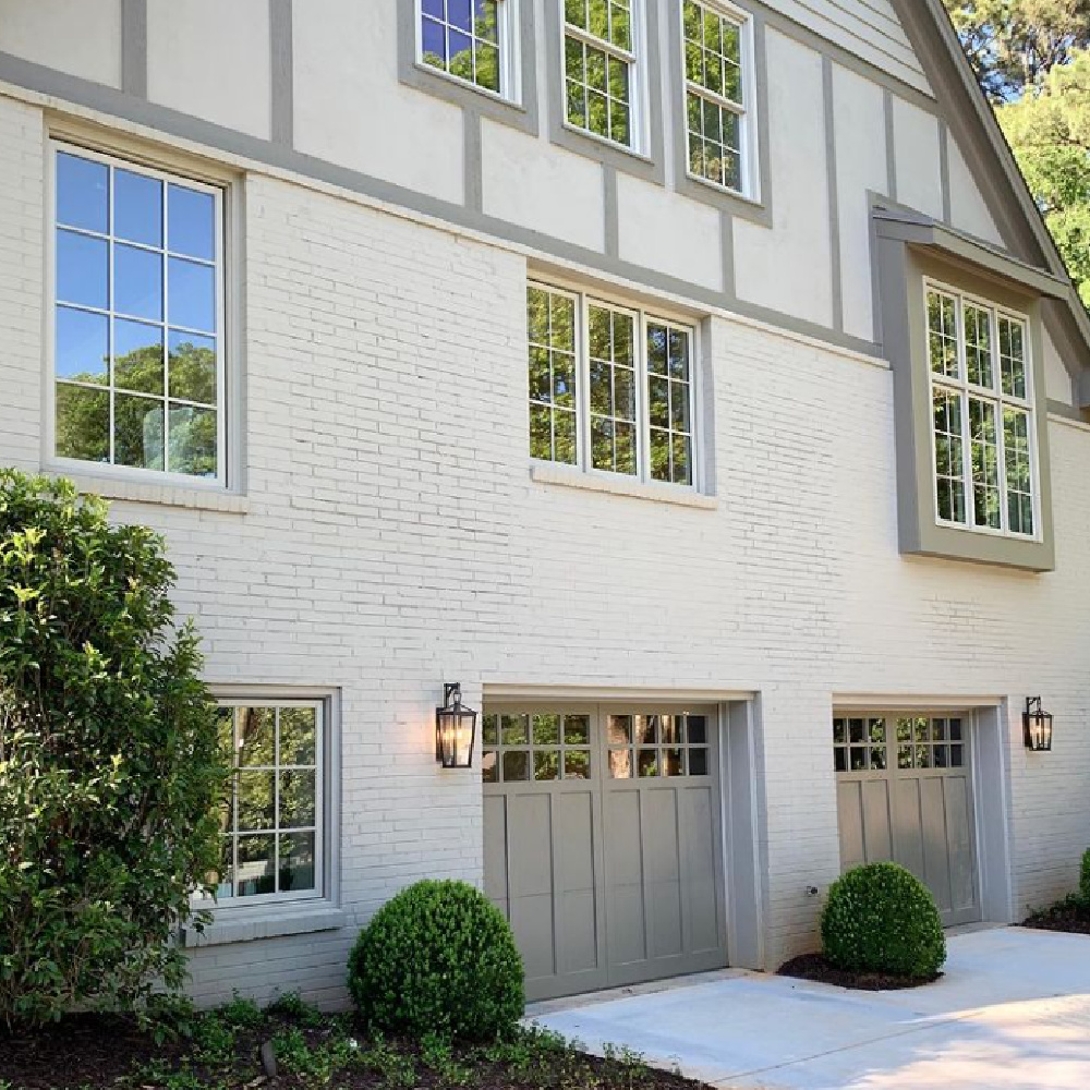
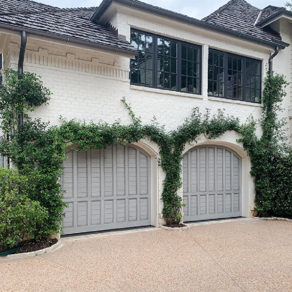
For this home, we also know the cool gray exterior color of garage doors (BM Coventry Gray):
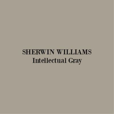
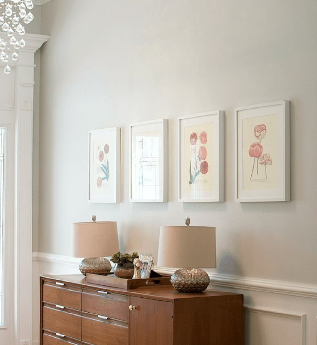
And here’s a gorgeous use of BM Balboa Mist with a color from the Sherwin-Williams line. SW Intellectual Gray is a color that feels taupe-ish and very Parisian to me:
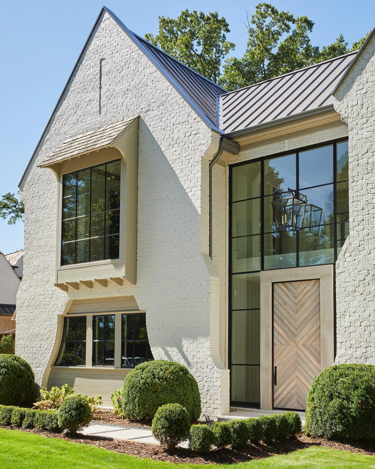
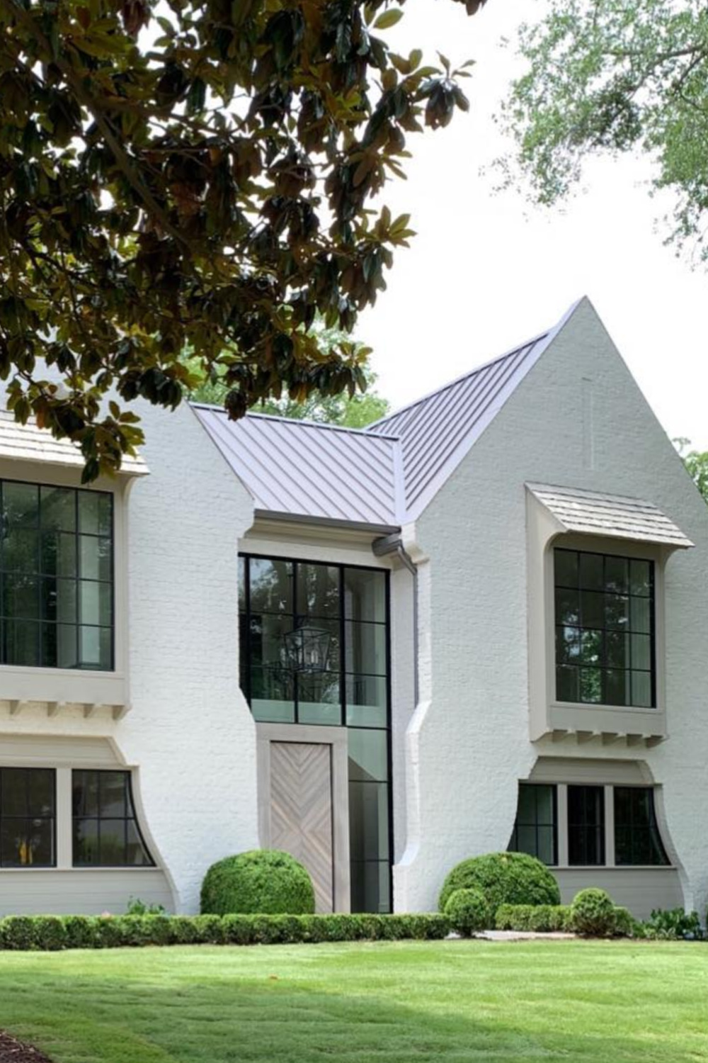
I find it so helpful to see multiple photos of a color in different lighting, don’t you?
Because there are always lighting changes throughout the day that affect the perception of a given color.
Can You Sample Balboa Mist in a Non-messy Way?
Easiest way to see if a paint color will work? Order samples with Samplize and have them delivered straight to your door.
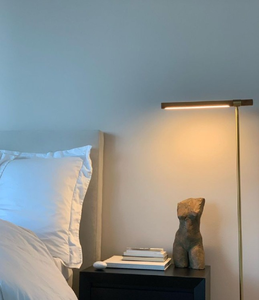
Want to see this hue in two different interiors with high and low lighting conditions?
Here it is with dim light in a bedroom:
For a color from Benjamin Moore quite similar to Balboa Mist, check out Athena 858.
What Colors Work Well With Balboa Mist?
In addition to the designer-picked accent colors above (Amazing Gray, Coventry Gray, Intellectual Gray), Benjamin Moore suggests the following:
Cloud Cover OC-25, Rock Gray 1615, Flint AF-560, and Barista AF-175)
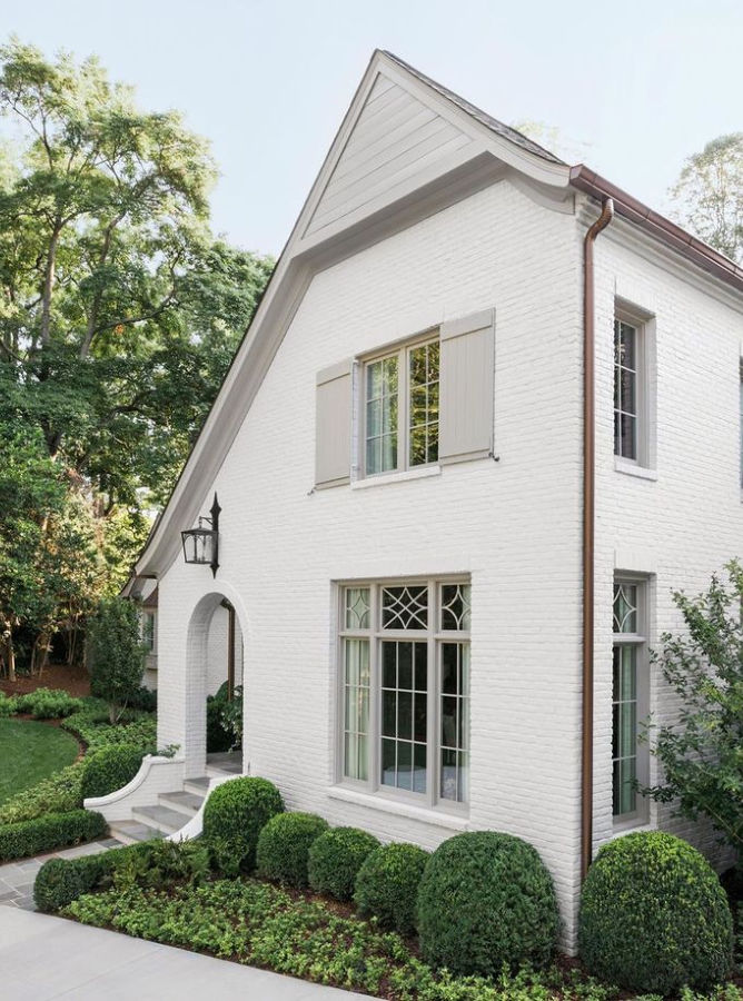
If you need a suggestion for a lighter exterior trim color to contrast with Balboa Mist, this designer paired it with BM White Dove:
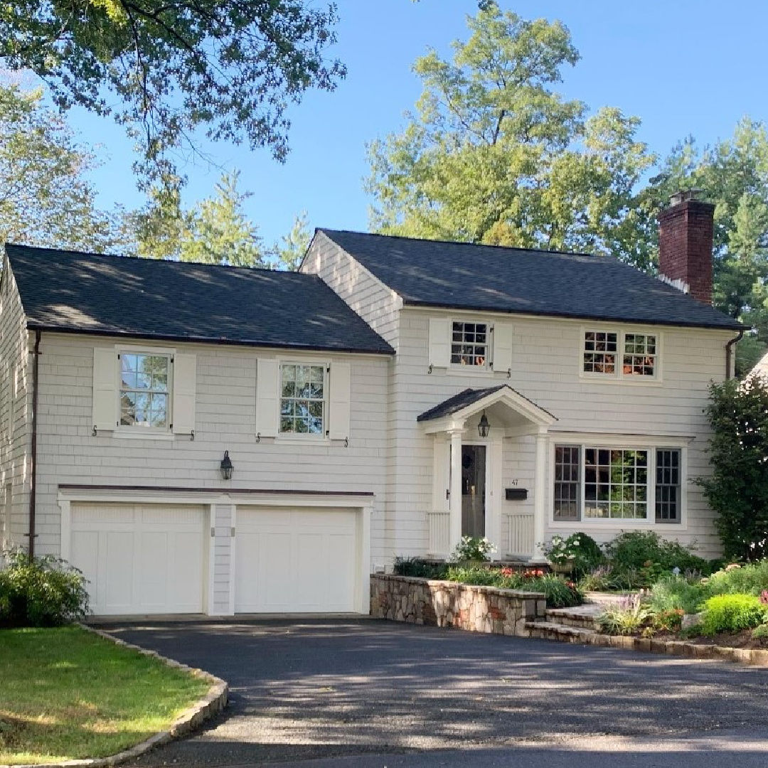
White Exterior Paint Color Ideas Gallery
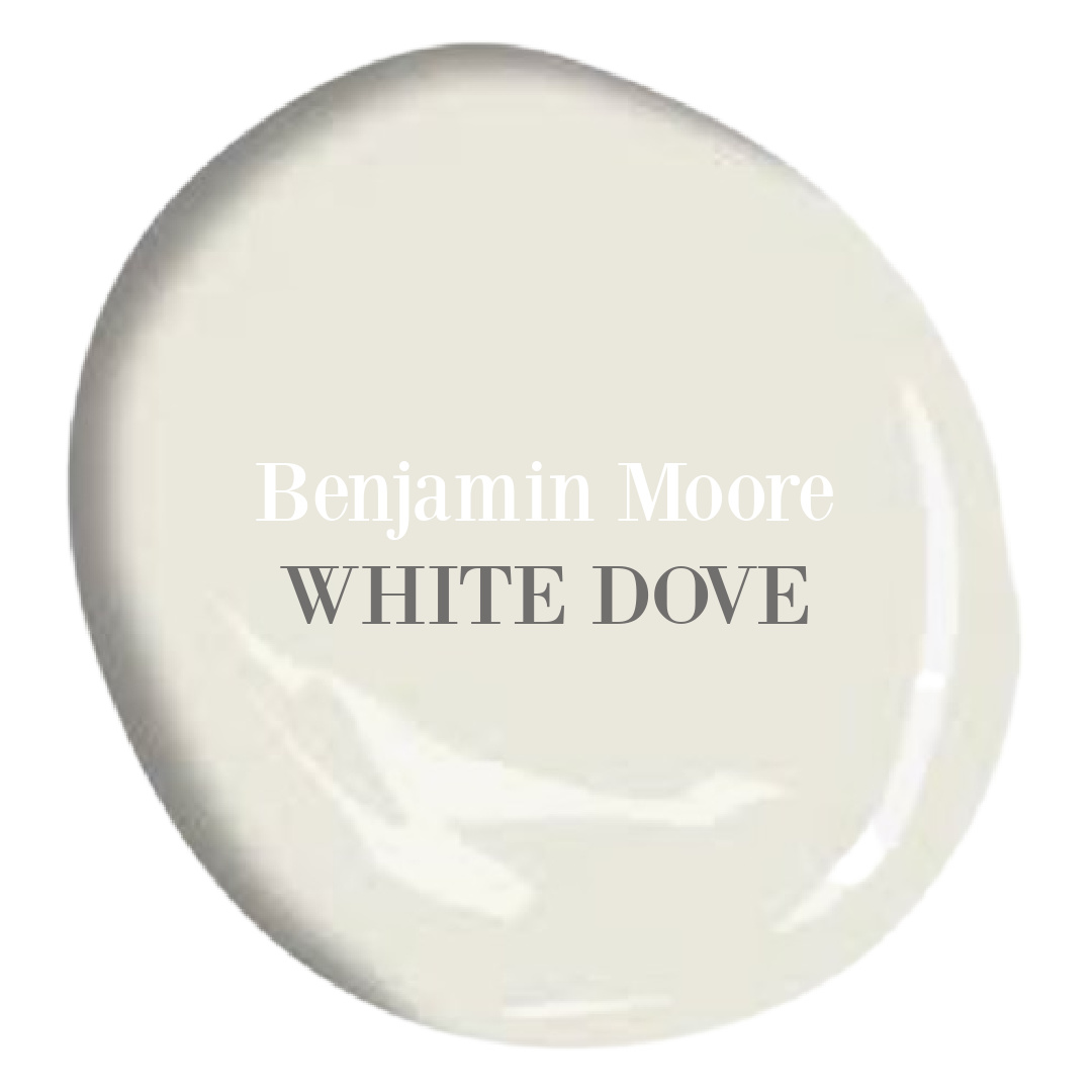
BM White Dove
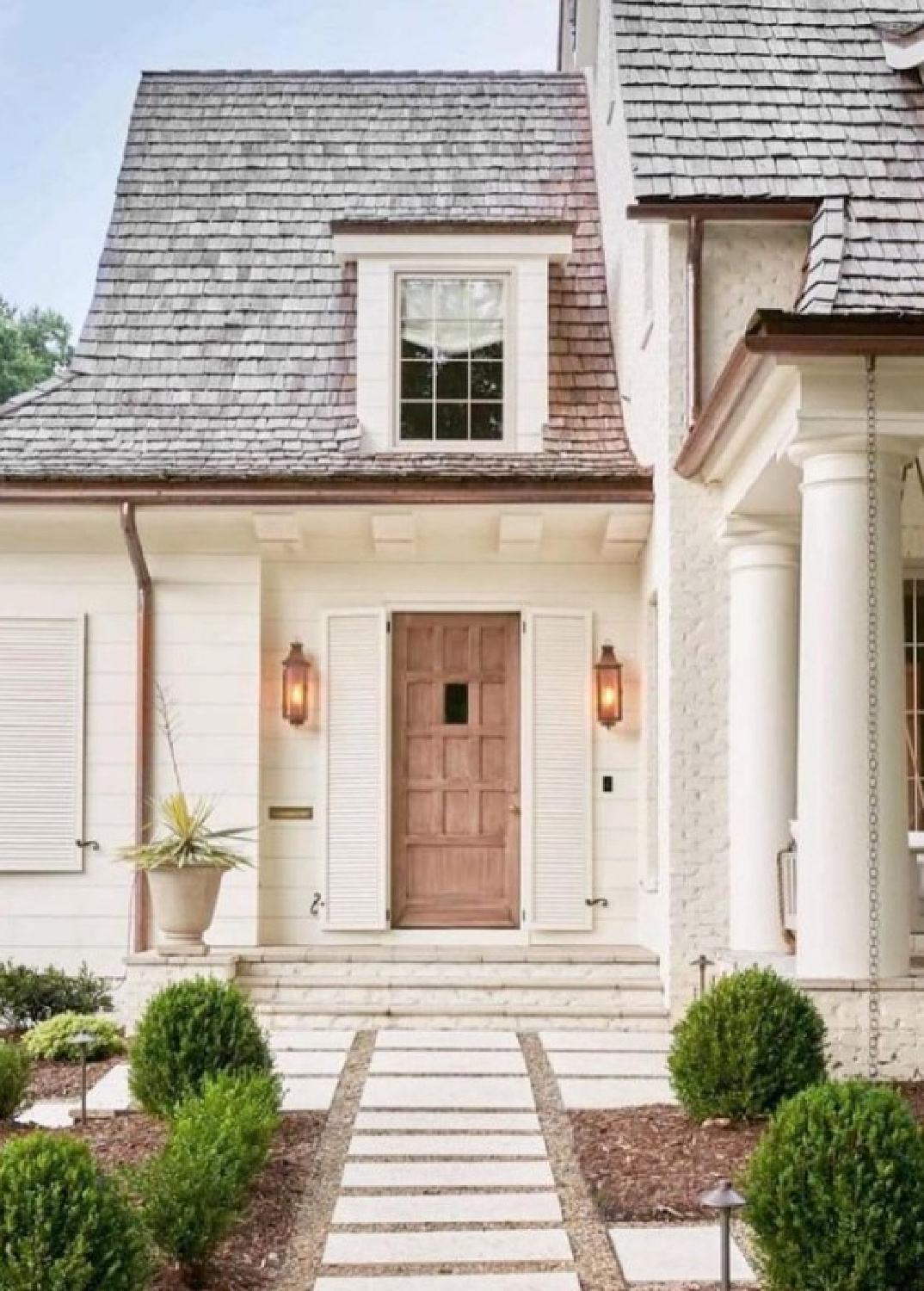
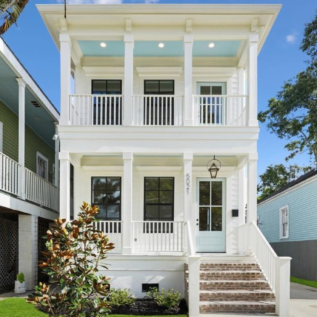
White Dove is an excellent paint color choice for a white home exterior (snag a sample right here) if you are going for a brighter effect like this:
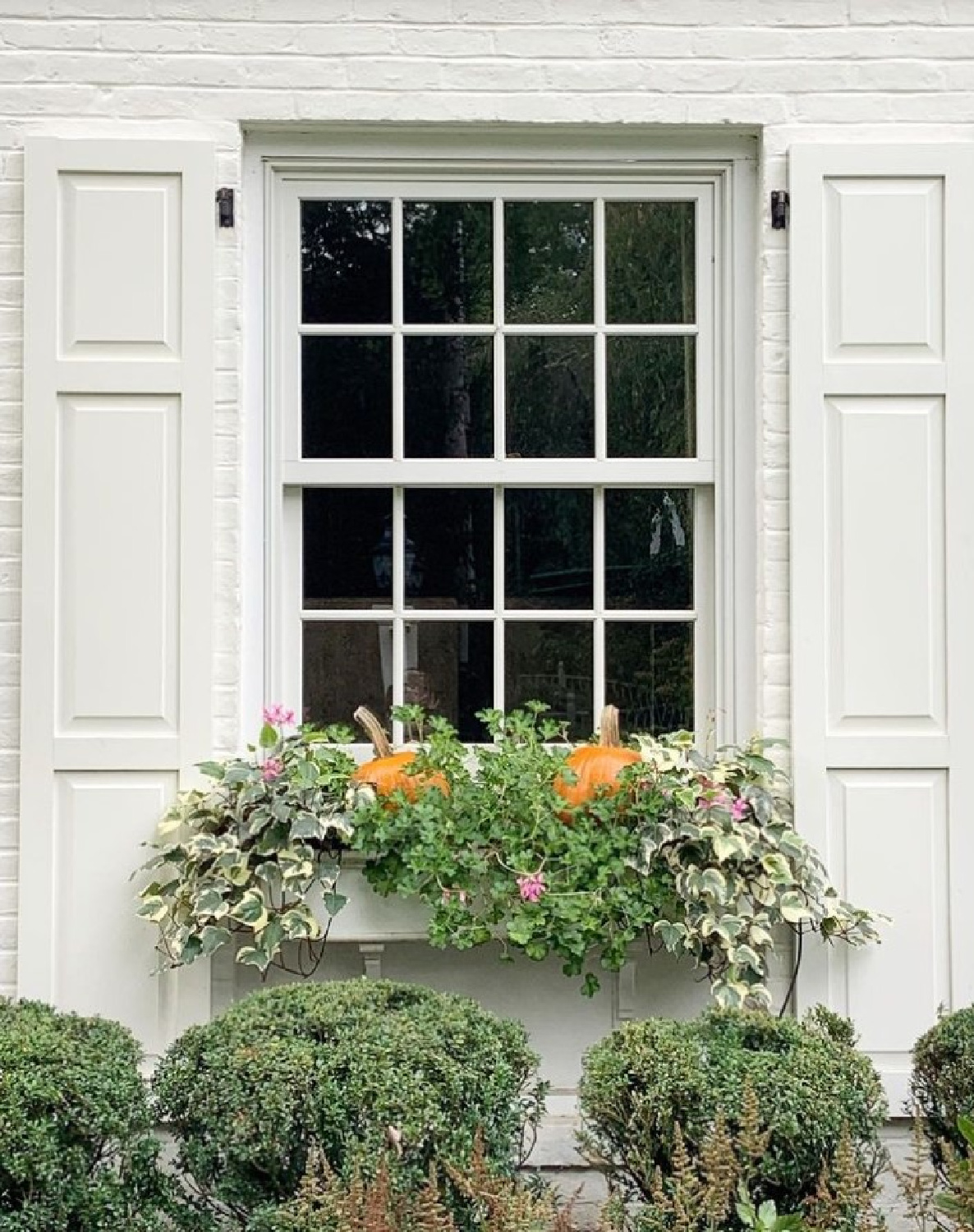
It’s not going to be a blinding sort of white, and I love it especially for traditional home interiors and exteriors.
In terms of White Dove for trim? You just can’t go wrong. I have used it so often for trim and doors and find it doesn’t change much throughout the day.
The same cannot be said for a lot of other whites. For example, our painter mixed up White Dove with Dove Wing, and oy! Dove Wing is much more grey and just wasn’t as fresh looking.
That said, Dove Wing may be a great choice for an exterior since the yellow sunlight will warm it. But it’s a shame the names of those whites are too easily mixed up! Choosing paint colors is nerve wracking enough.
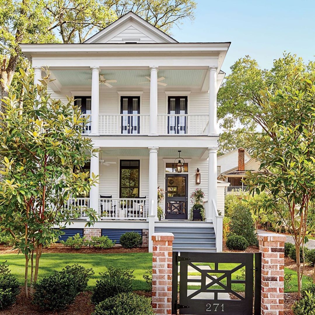
Another Benjamin Moore white I love for traditional and French country projects? BM Linen White. While I’m not sure of the exact hue on this Canadian home, it reminds me of how Linen White would convey:
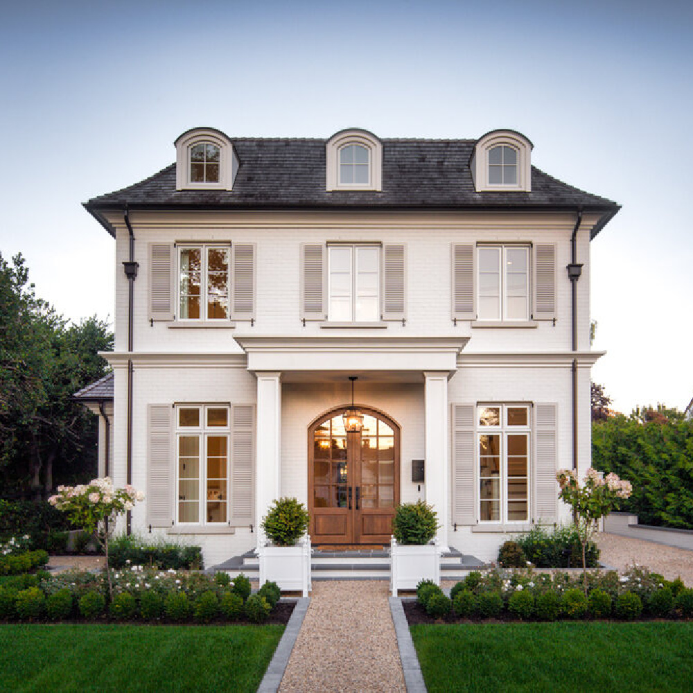
If you admire the contrasting shutter color above, you could pair Linen White with Benjamin Moore Revere Pewter (has a natural warm linen yet still taupe-y greige look) or even Sherwin Williams Repose Gray (a slightly warm gray with blue undertones that works in a variety of settings).
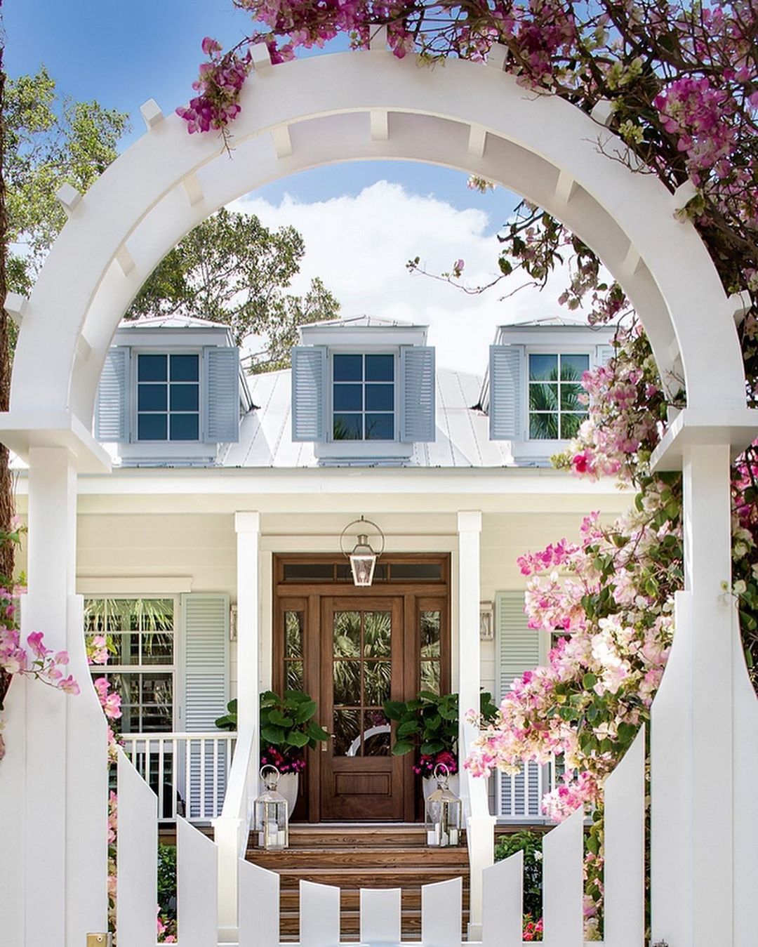
Benjamin Moore White OC-151
Not long after I chose OC-151 White for all of the interior walls, trim, and ceilings in our former home, I found this board and batten white cottage below online designed by Lisa Furey. She actually used that exact white on all of the exteriors and interiors. Benjamin Moore White OC-151 has blue undertones and feels like a bright modern white, perfect for modern farmhouse and coastal design styles.
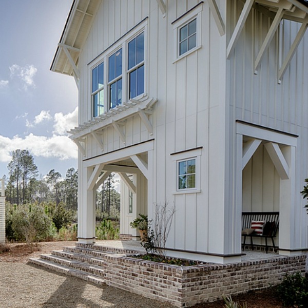
So just in case you wondered if you could use the same white inside and out? This designer did, and the cohesive feel can be wonderful. But there’s never a sure thing. Always sample at least three similar colors before pulling the trigger. What other whites could you try? Keep reading!
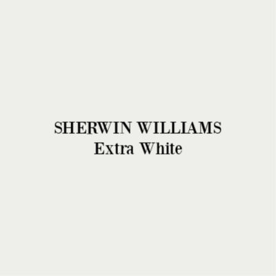
SW Extra White
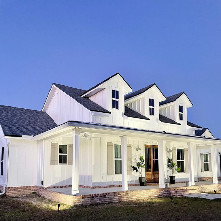
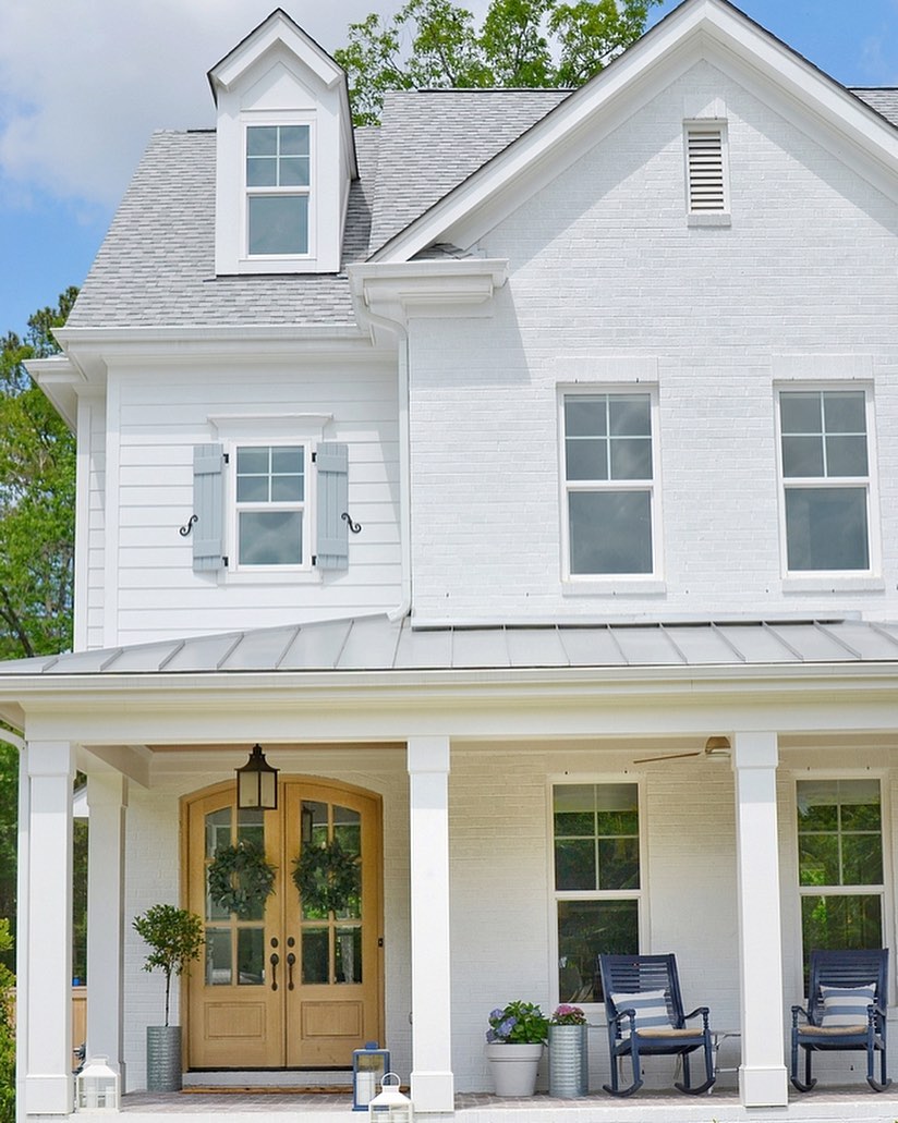
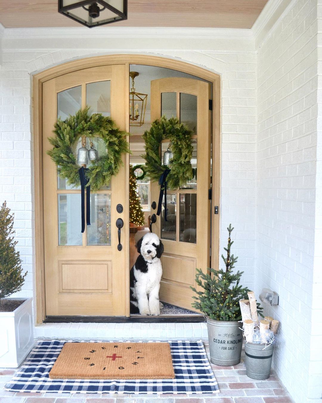
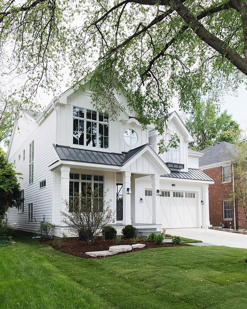
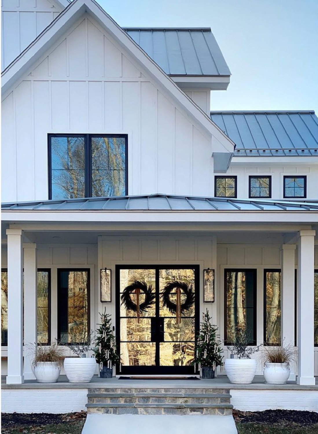
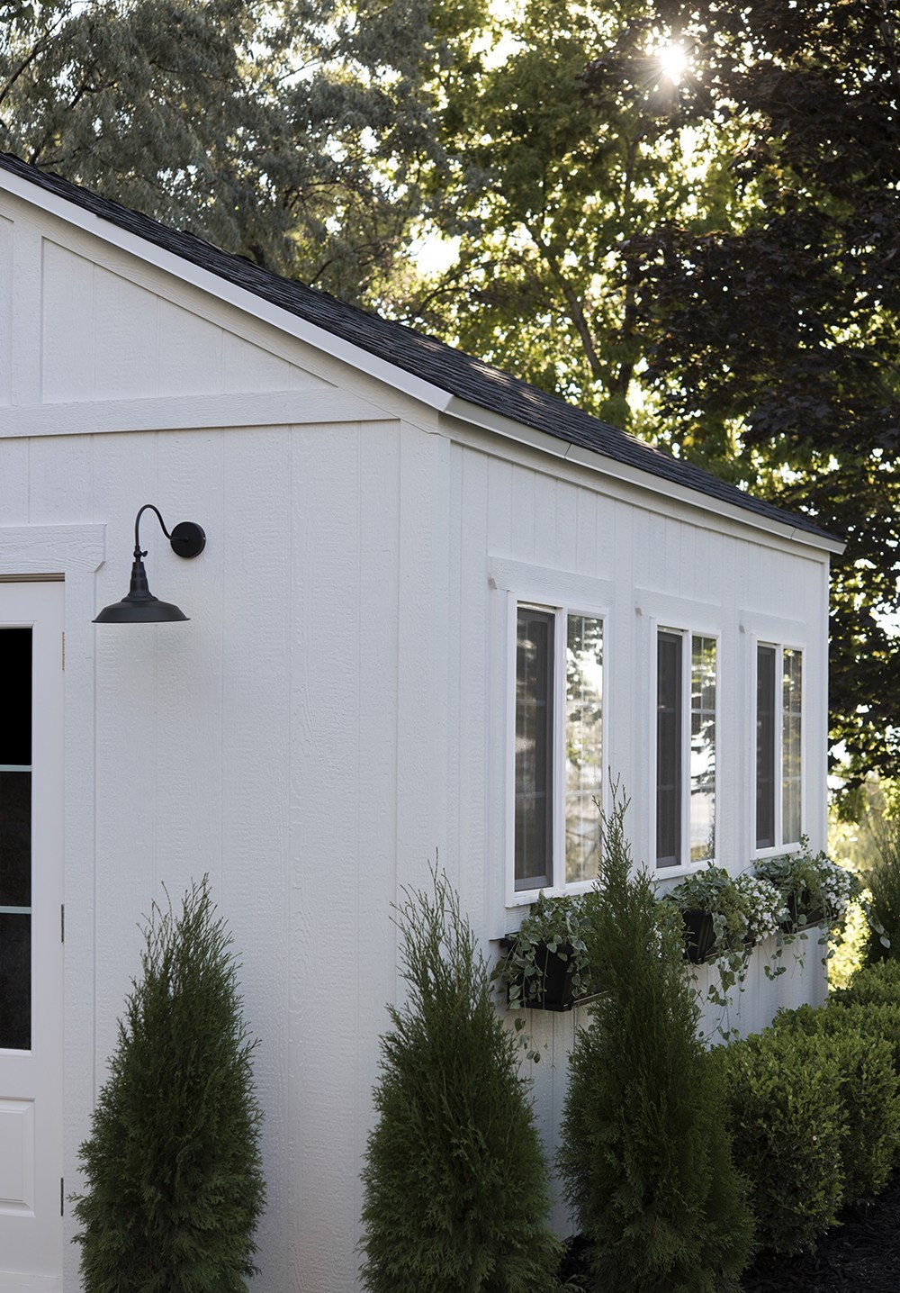
Similar to OC-151, here are more board and batten style homes with SW Extra White:
What do I look for when choosing the right white? Does it look too yellow? Am I seeing undertones in the white? How does the color change when the light washes it?
When you’re comparing whites, you can definitely note the light reflectance value (LRV) number to compare them too.
The higher the number, the more light it reflects, and the lighter the color.
Years ago, interior designers always recommended choosing paint colors for walls in the 50’s – the mid range for LRV. However, in recent years, homeowners have preferred lighter colors and lots more light reflectance inside and out.
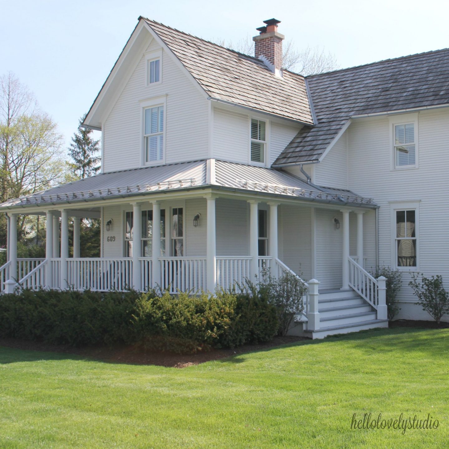
And since we have a board and batten theme happening…I imagine this color be very similar if not exactly Extra White:
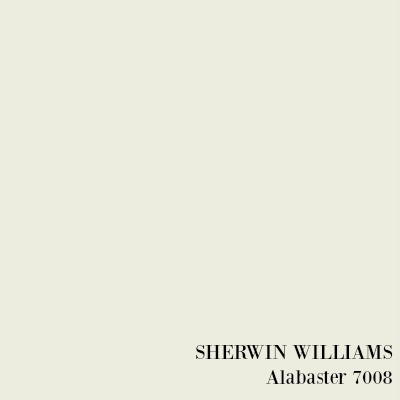
Sherwin-Williams Alabaster
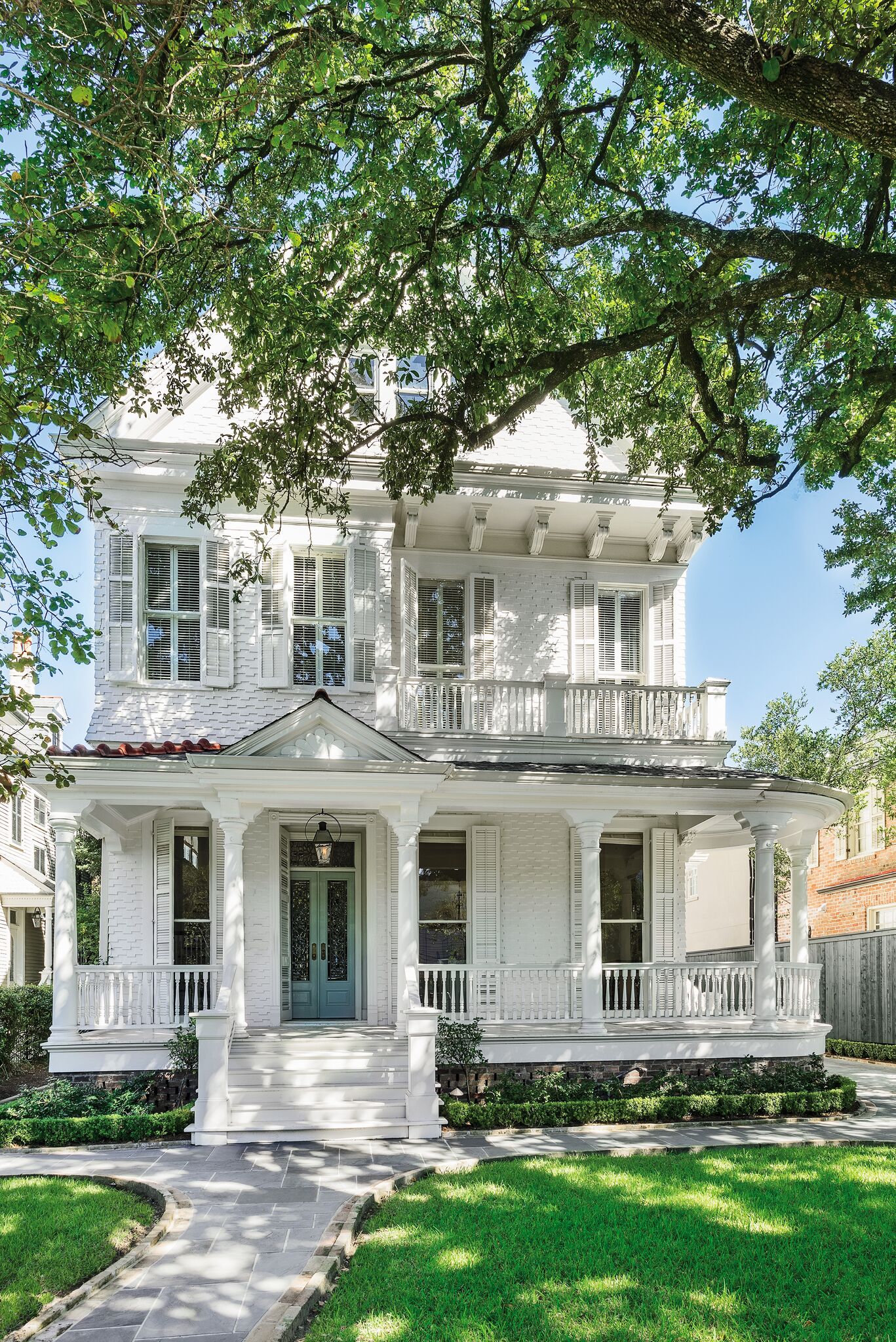
Alabaster is one of those warm whites that exploded on the scene a few years back (at the dawn of HGTV’s Fixer Upper) when Joanna Gaines used it on countless country interiors.
It’s also fabulous for exteriors when you’re after a creamy, not too bright but plenty light, white for your home’s siding or brick.
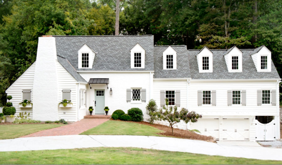
I love the color story for this stunning Atlanta project where a deep gray was chosen for shutters…
and this gorgeous, cheery yet sophisticated hue Wythe Blue is on the front door:
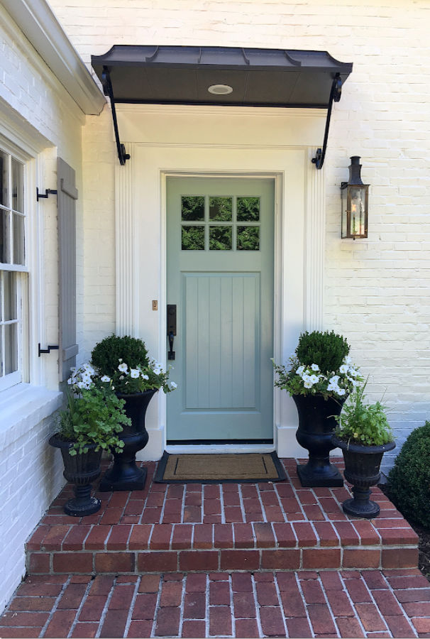
The front door is one of those curb appeal ingredients that deserves thoughtful consideration. That said, the color you choose for the exterior door and shutters doesn’t have to be a forever sort of decision. Have fun with it. Try a new color on a whim or for a particular season.

Alabaster is also a great choice for trim:
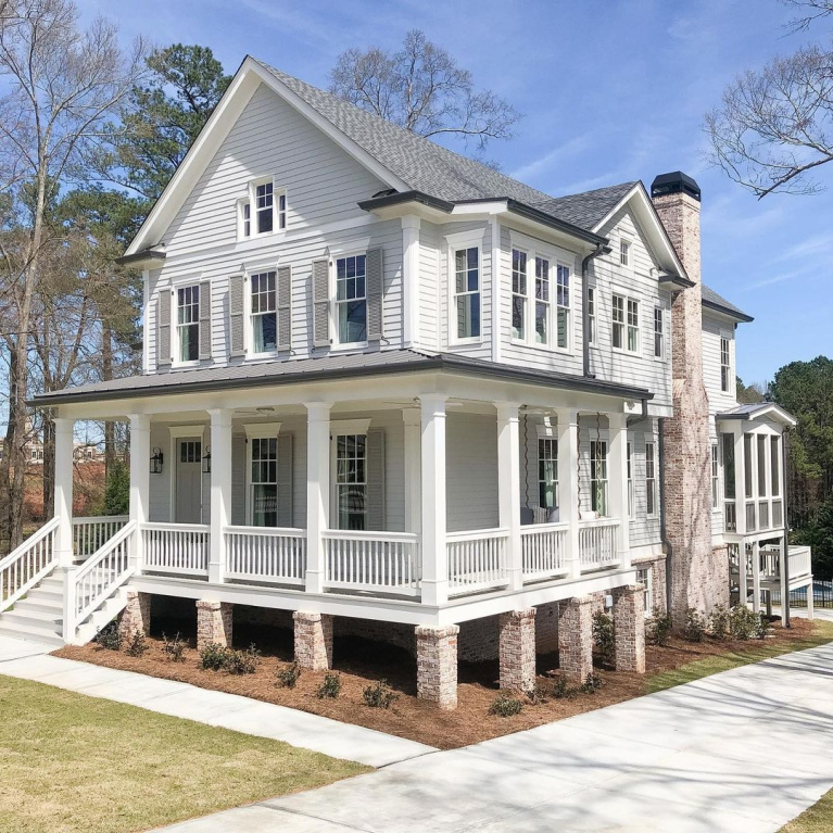
While I don’t know the exact white paint color used on this brick home in my neck of the woods, it reminds me of Alabaster:
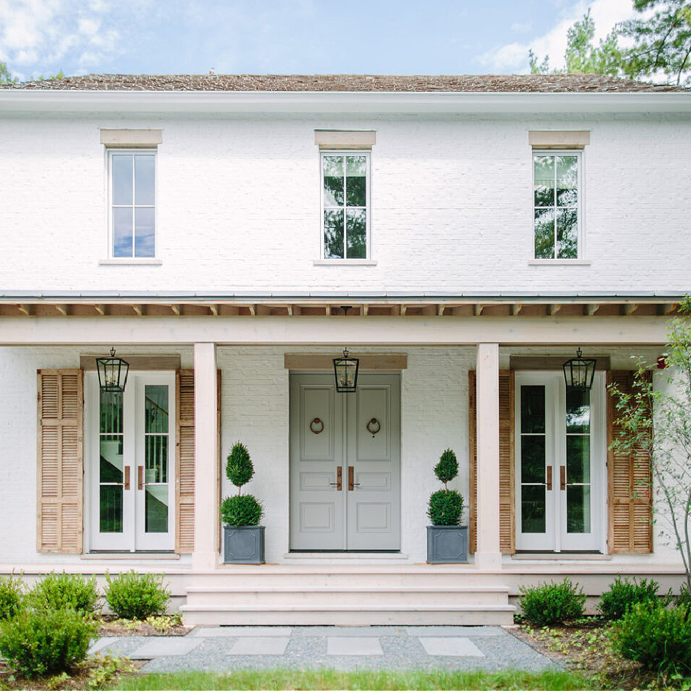

Benjamin Moore Simply White
BM Simply White is another one of those wildly popular whites like SW Alabaster. Popular maybe because it seems to be one of those perfect paint colors that will work in a variety of contexts.
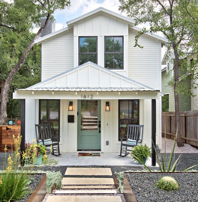
It seems perfect for modern farmhouse style home, but it also works for European inspired homes.
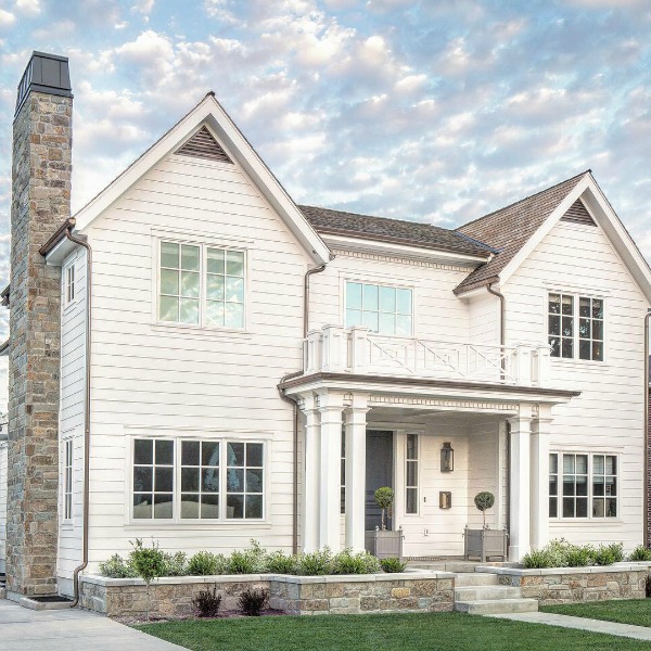
I’m suggesting that the homes above and below could be Simply White since that architect/builder tends to use it so much for interiors.
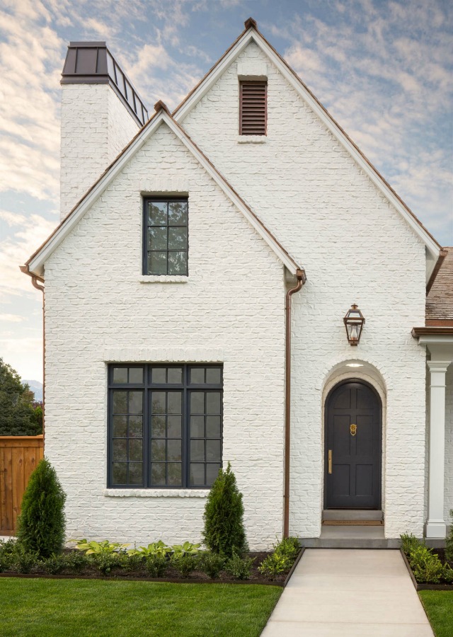
Just bear in mind, it’s going to look different, photo to photo, according to the time of day the photo was snapped, geographic location of home, and even editing.
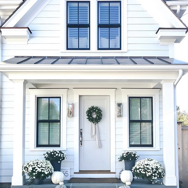
More Exterior White Paint Ideas
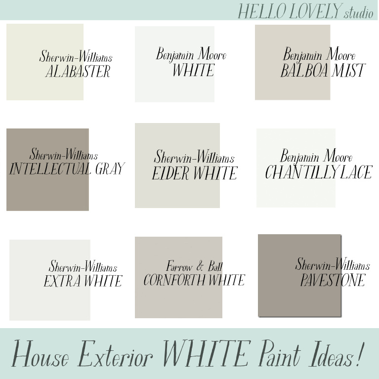
If you need a few more names of paint colors worth sampling, consider these:

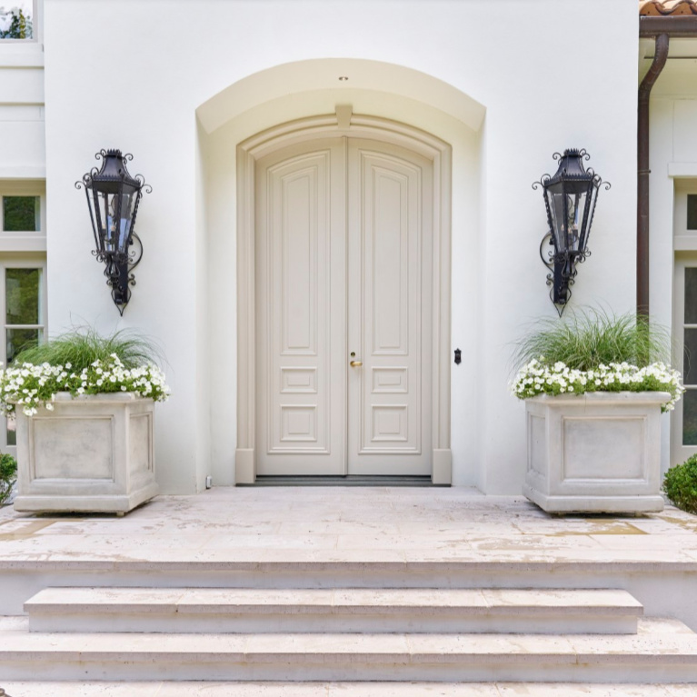
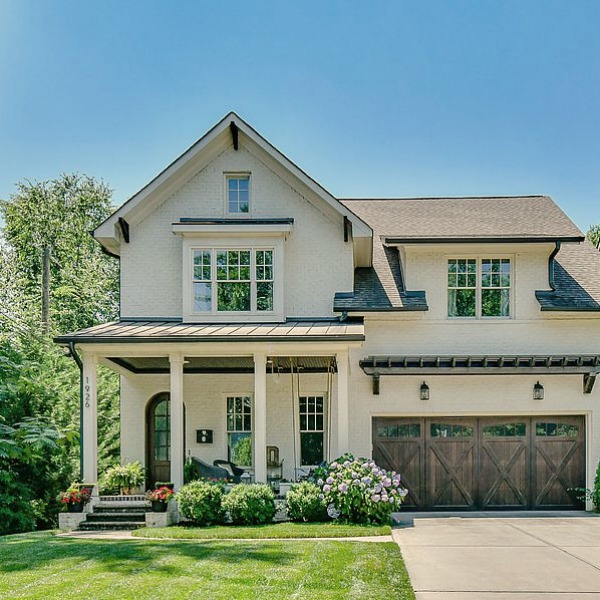
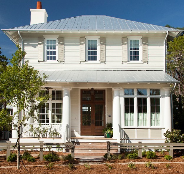

Our Former Home’s Paint Color for Exterior
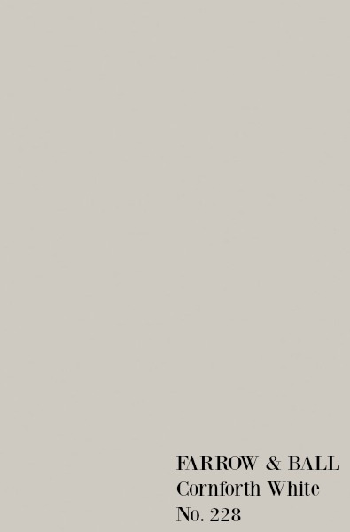
Our former home’s exterior color was perfect for my taste – not too warm, not too cool, and a nice contrast with the white trim. It was a soft greyed-white close similar to Farrow & Ball’s Cornforth White.
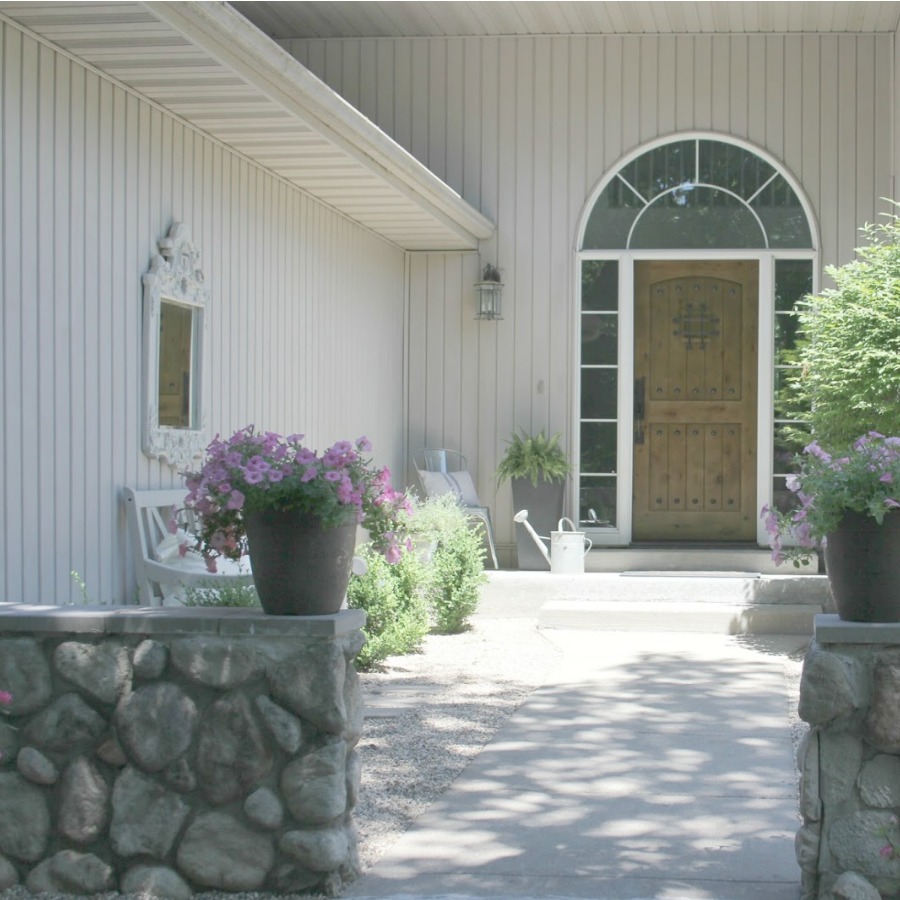
In fact, I got a nearly exact match when I mixed equal parts Cornforth White and Hardwick White.
Thanks so much for visiting – let me know if you have any questions. Pin this graphic for future reference!

Peace to you right where you are.
-michele
I independently selected products in this post—if you buy from one of my links, I may earn a commission.
Thanks for shopping RIGHT HERE to keep decor inspiration flowing on Hello Lovely!
Hello Lovely is a participant in the Amazon Services LLC Associates Program, an affiliate advertising program designed to provide a means for sites to earn fees by linking to Amazon.com and affiliated sites.





Fabulous, inspirational post! Appreciate your hard work.
Author
So happy to hear and so happy you’re here! Have a lovely weekend!
Thank you for all the detailed info. I live in sunny Florida in a 1930 VERY textured stucco house with terracotta tile roof. I was thinking a soft white for the exterior. I put large paint samples on the guest house, BM dove white and Swiss coffee, and SW pearly white. These are drastically different from the mud color currently on the whole exteriors. Wondering if these are just too white or just the drastic difference has me afraid! Any suggestions?
Author
I think when we want a white exterior it is tempting to stick to colors with “white” in the name or on swatches of whites. With the Florida sunshine, it may be a light grey that will give you the white you want. Did you sample Balboa Mist? Since it will get washed out and warmed by the sun, perhaps it will give you that timeless neutral look that seems appropriate to a 1930 home.
Amazing post and thank you for sharing this article.
Author
thanks for reading!