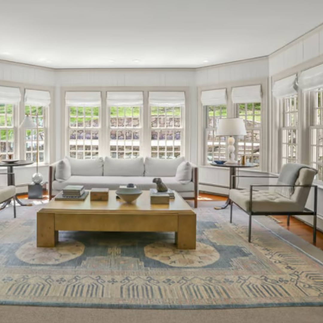
While someone else might gaze at these interiors and think OH, HOW NICE, MORE PLEASANT WHITE AND NEUTRALS on the walls and trim, I see A RAINBOW. I glimpse a spectrum of contrasts, undertones, nuance, and dynamic interplays with light. I guess that is why I never tire of living with neutrals at home. While I don’t yet know the exact paint colors chosen by the designer for this Connecticut farmhouse, I can guide you toward approximations to sample. Let’s explore all of the understated sophisticated neutral paint colors here and dig in!
Sophisticated Neutral Paint Colors: Timeless Farmhouse
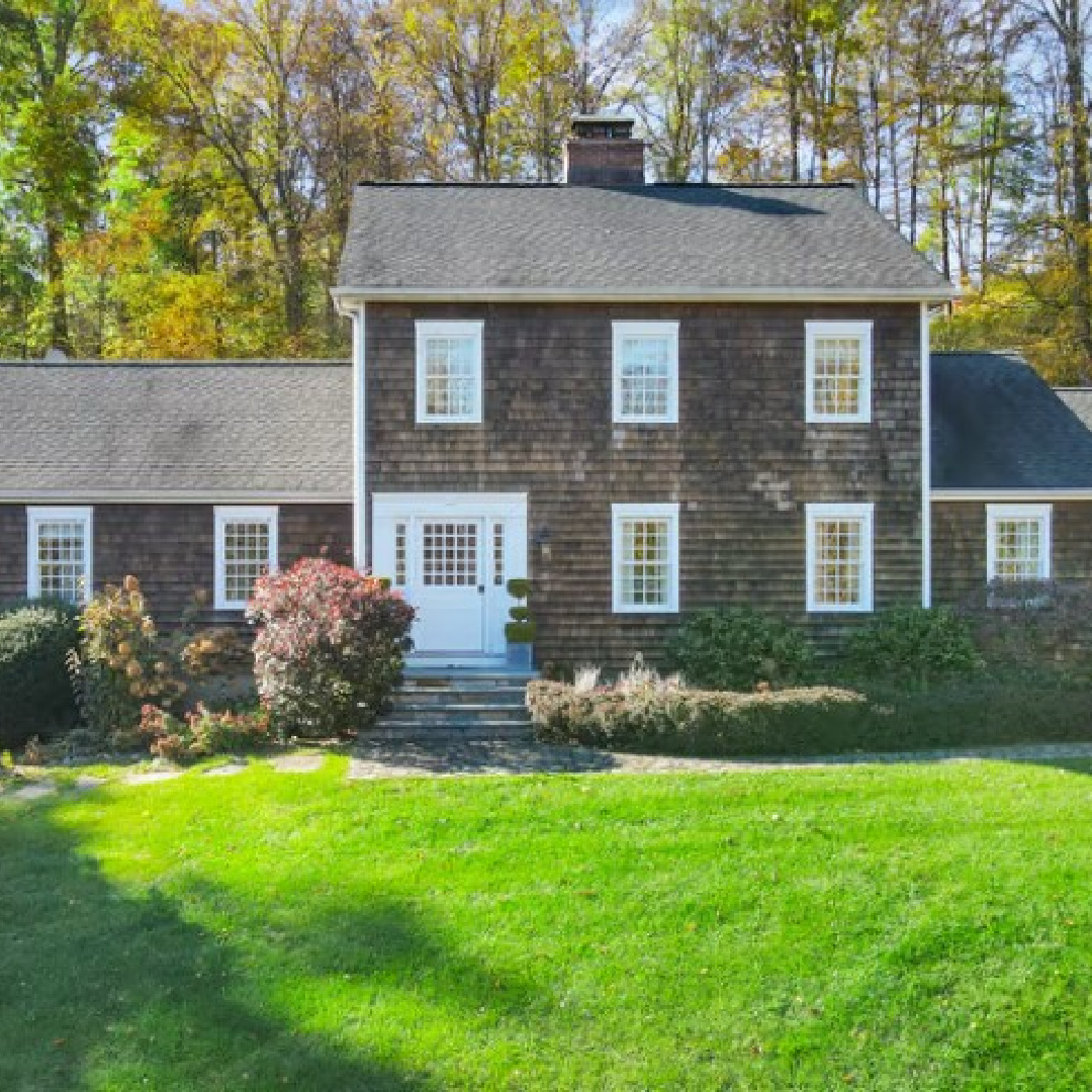
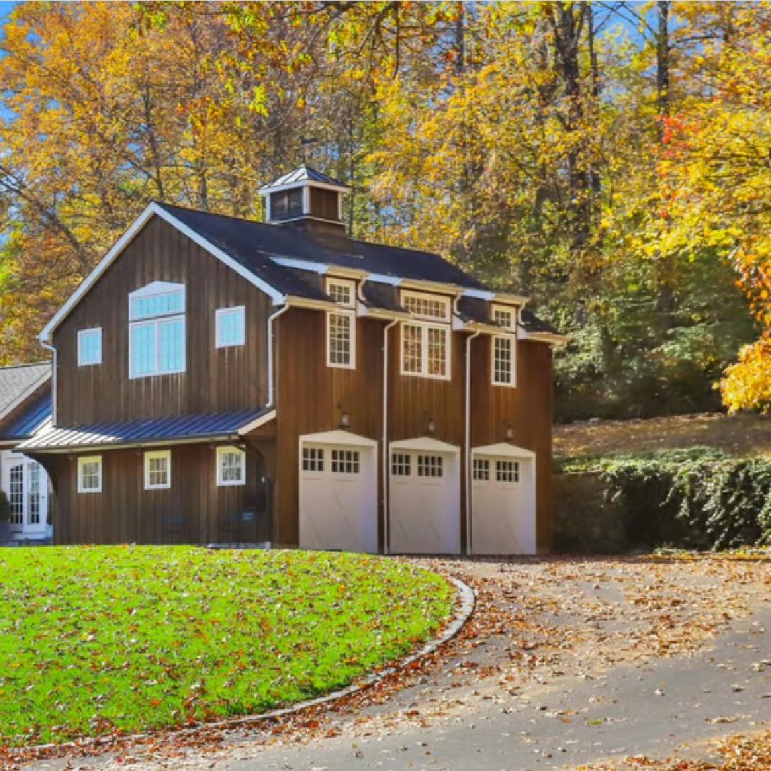
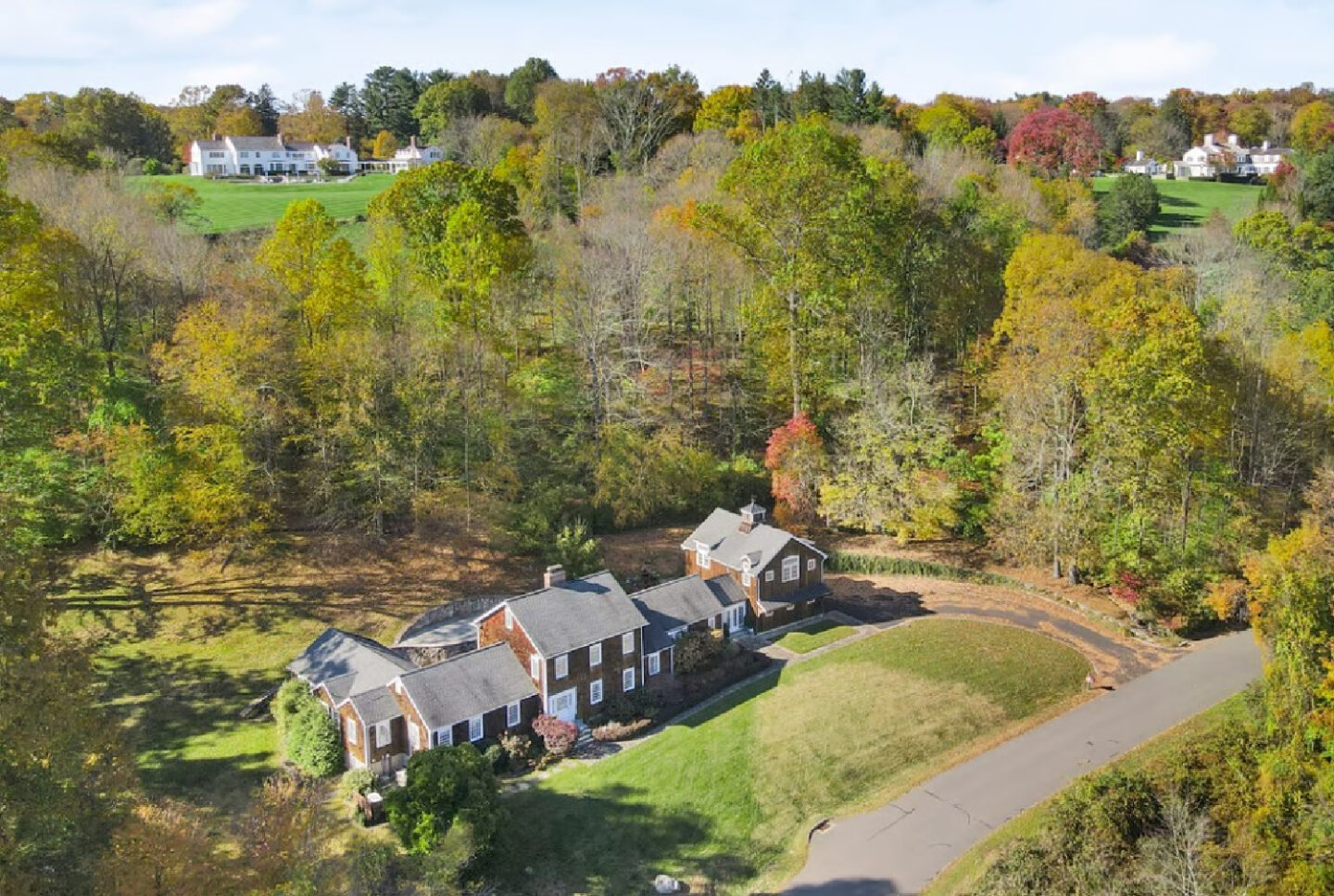
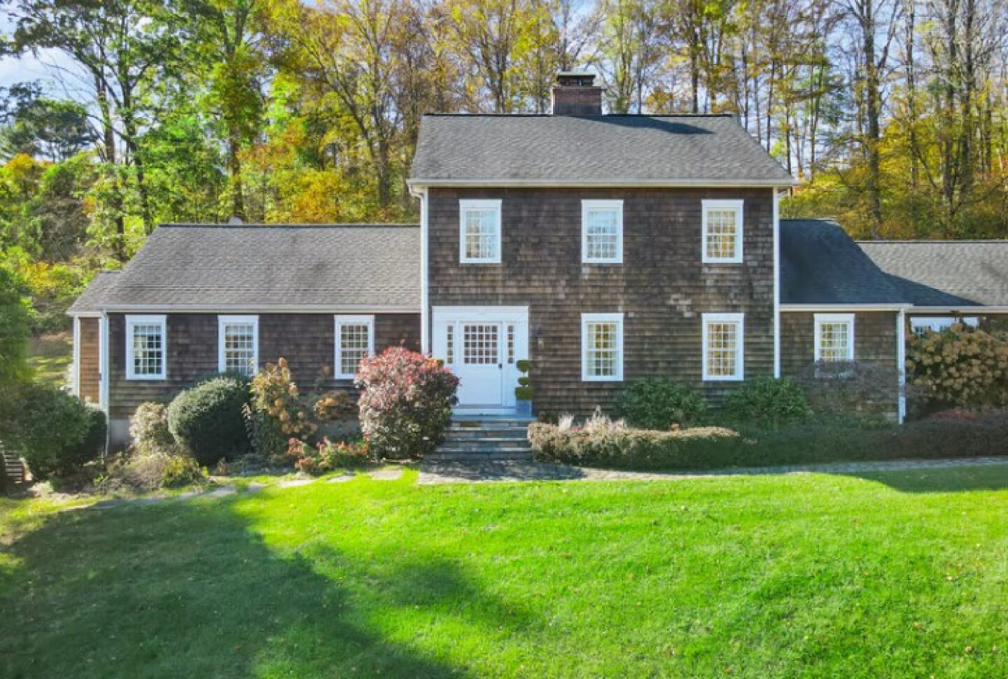
For a tour of this beautiful country house built in the 1950s and renovated a few years ago when it became a showhouse for OKL, see THIS.
I love this perspective shared in the images accompanying this home’s real estate listing when it came on the market in the Spring of 2022.
Paint Color Ideas for Walls: Look for Slightly Greyed Off-Whites
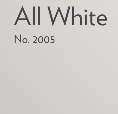
Wall Color Possibility: Farrow & Ball ALL WHITE No. 2005
It’s a clean neutral with minimal undertones and considered an architectural white.
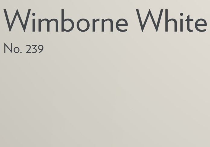
But if you’re after a slightly softer version of All White, check out:
WIMBORNE WHITE No. 239
This off-white is named after the market town of Wimborne in Dorset and home to Farrow & Ball. A shade away from a pure white, the addition of the smallest amount of warm yellow pigment creates a very versatile shade which is just a little softer than All White.
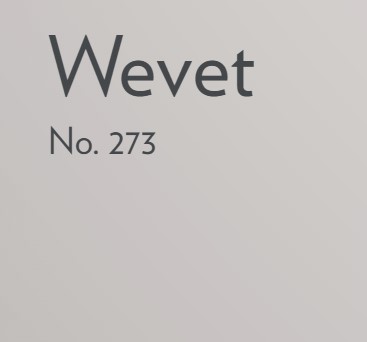
Wall Color Possibility: Farrow & Ball WEVET No. 273
Paint Color Ideas for Trim: Look at Understated Mid-Tone Neutrals
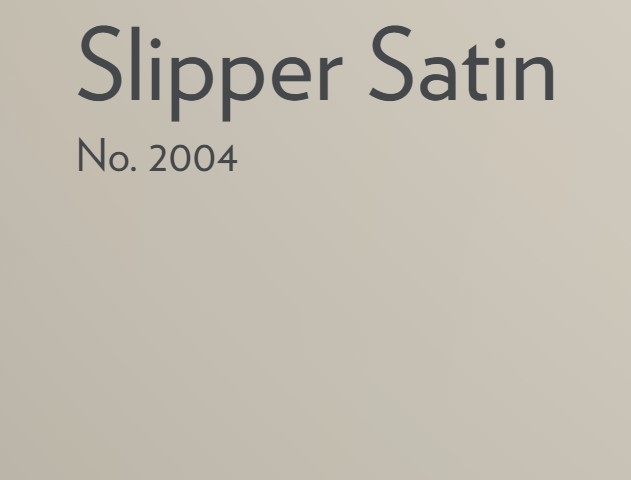
SLIPPER SATIN No. 2004
This Farrow & Ball popular off white gets its name from the delicate color of silk used in traditional ballet slippers. Without cool blue undertones, Slipper Satin often reads as a pale grey chalk which makes for a perfect neutral on walls. It is perfectly neutral when you’re after a subtle and sophisticated scheme.
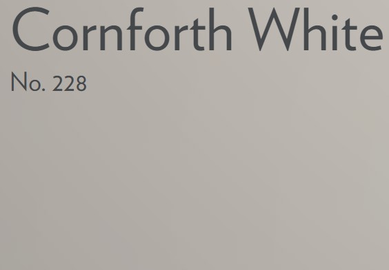
Farrow & Ball CORNFORTH WHITE No. 228
Here’s another possibility, and it’s a gorgeous neutral I have used with great success. In fact, my favorite way to use Cornforth White is to mix it with Hardwick White in a 50/50 combination for a unique, beautifully gentle hue.
AMMONITE No. 274
For a light grey neutral for trim that is a bit lighter than Cornforth White, you may want to sample Ammonite. When I have used Ammonite, it has appeared cooler than say Cornforth White. That could work well for you if you have strong sunlight. However, if your lighting situation is dim, you may not be as crazy about it.
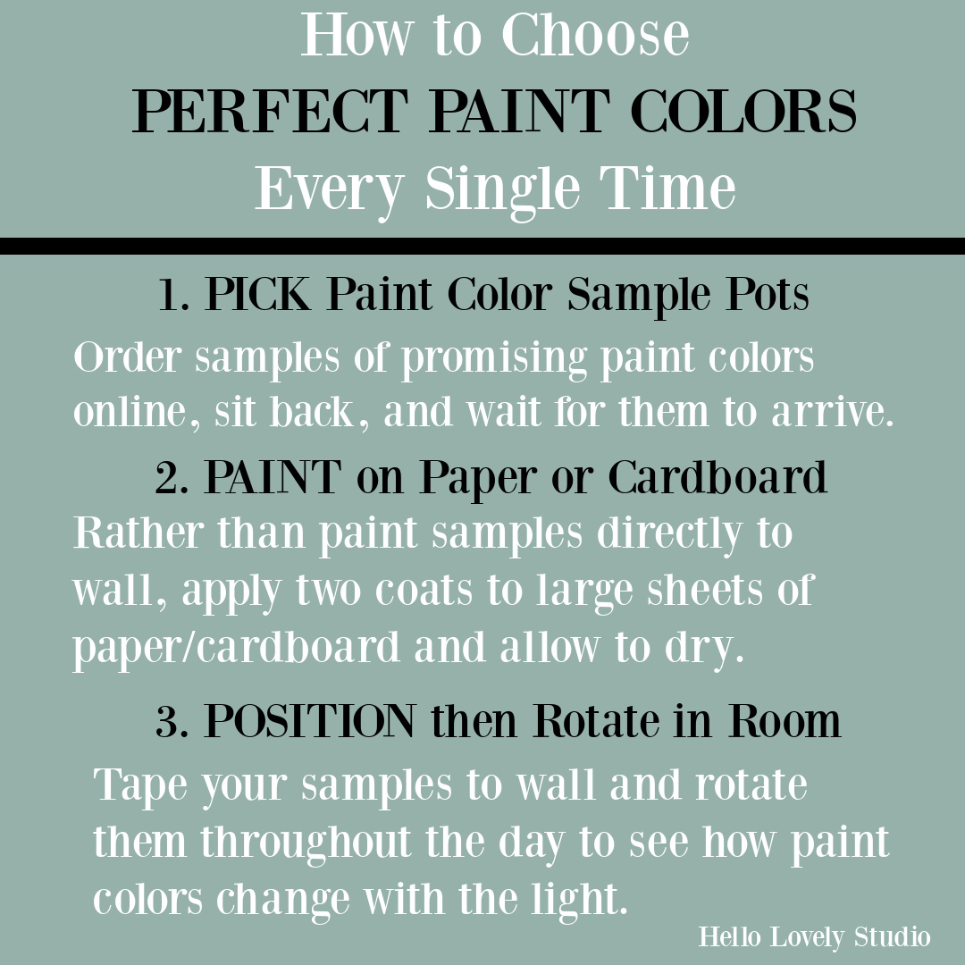
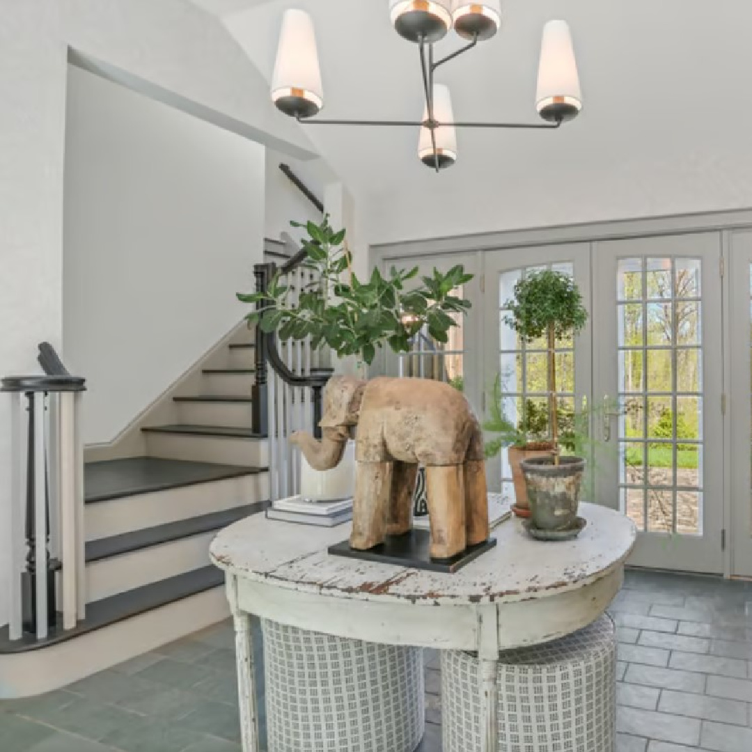
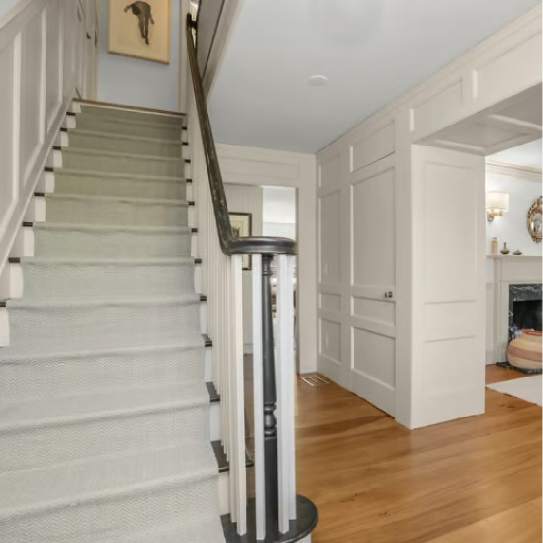
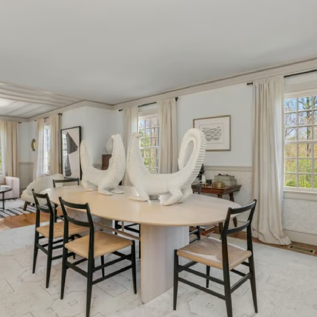
Bear in mind how natural light will interact with neutral paint colors and greys. What we’re seeing in an image like the one below is sunlight washing the colors with its warmth and yellow.
There is always editing and photography issues happening as well so you’re best bet is always to choose a handful of possibilities that are educated guesses and see them in your space with its unique lighting context.
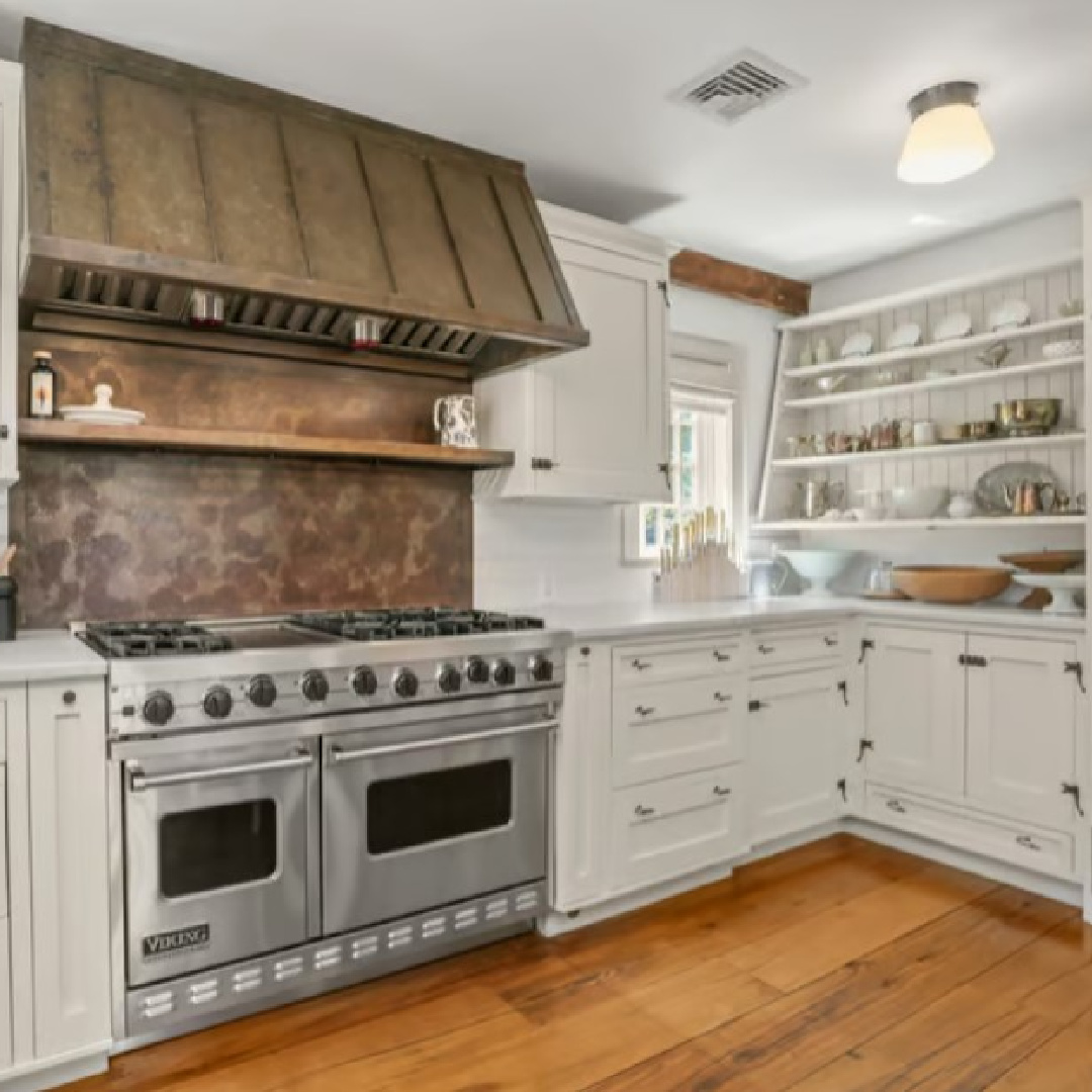
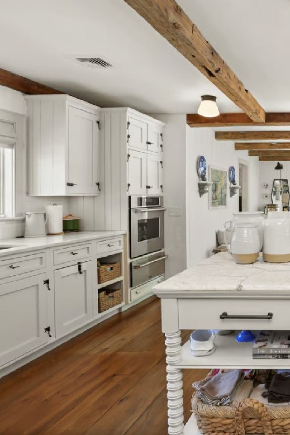
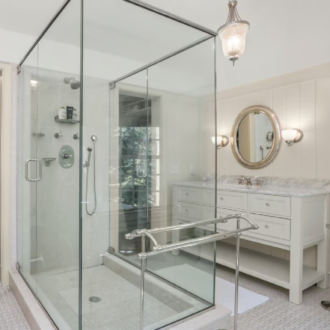
Paint Color Suggestions for Kitchen Cabinets
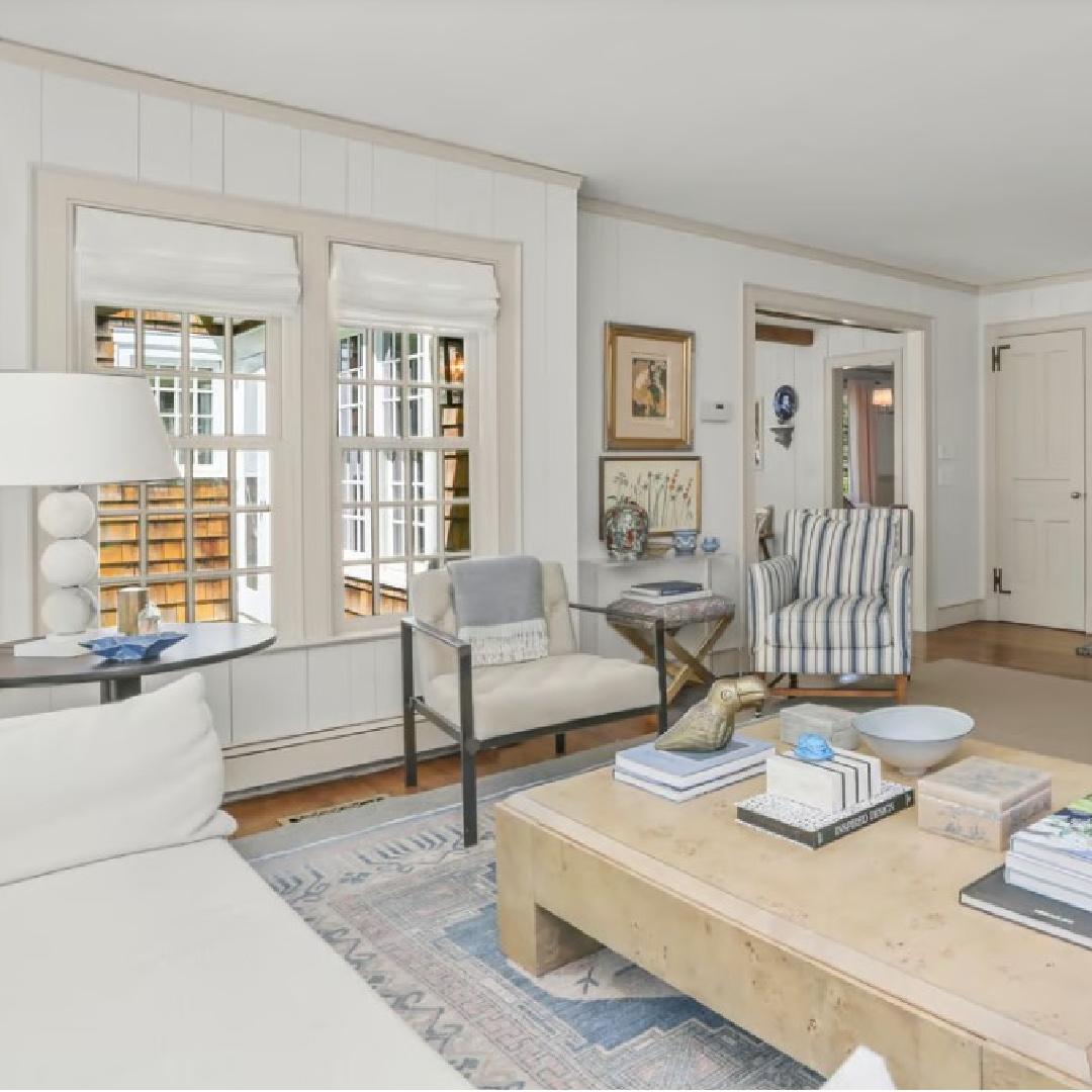
In some of the images where the natural light is washing out the color, the cabinets look very crisp white. However, they appear to be painted in the same color as the trim, so consider some of the suggestions shared above.
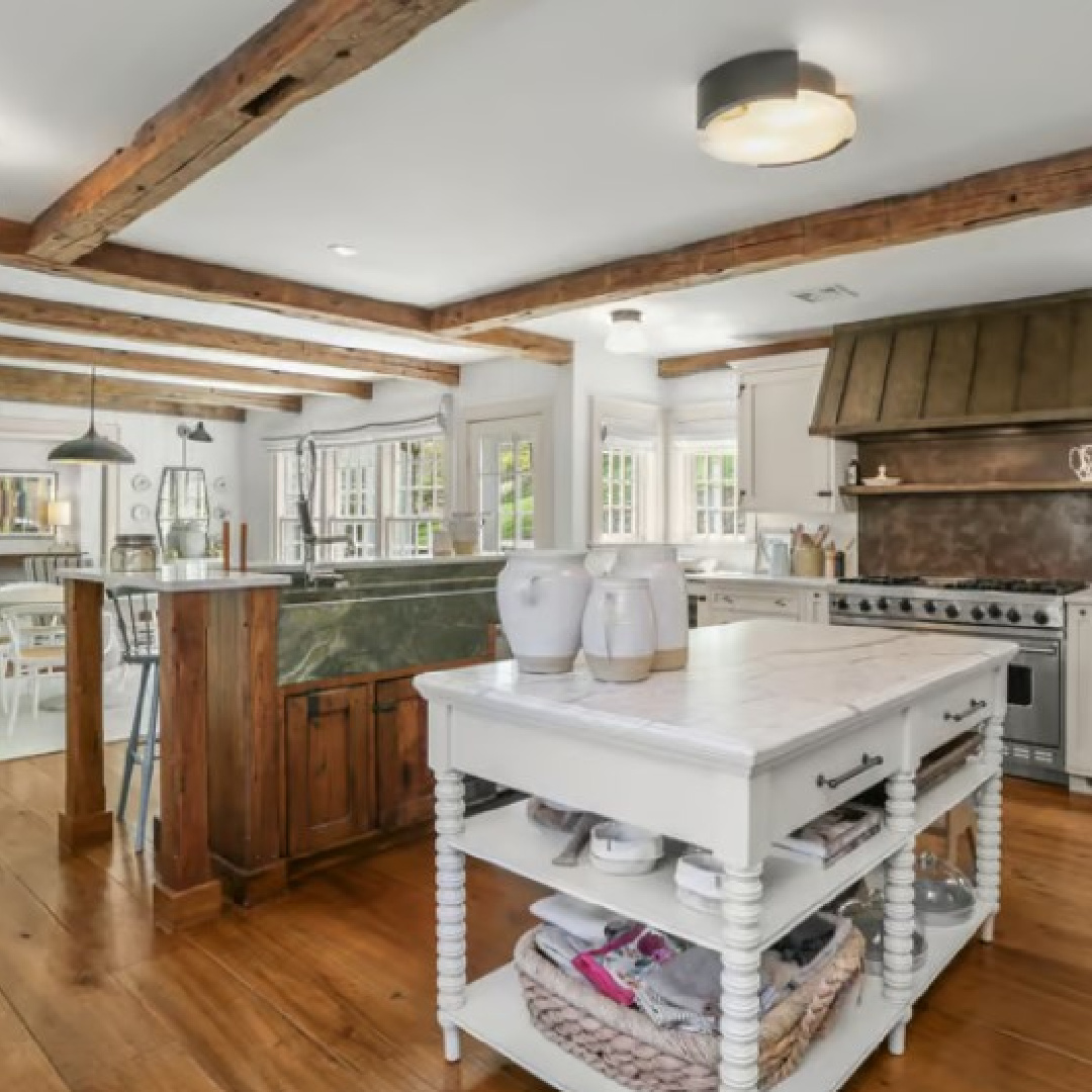
When you study and even expand the photos, you can begin to see that “white” cabinets are actually putty-ish greyed whites. By comparing the colors surrounding the cabinet/trim color, it can help to see the subtle undertones and begin to form an opinion.
An Uncommon Combination of Paint Colors for Wall & Trim
What is so interesting is how it is so common in contemporary American homes to see warm neutral colors on the walls and cool contrasting lighter colors for trim.
However, in this home’s color story, it’s the trim that offers the warmth.
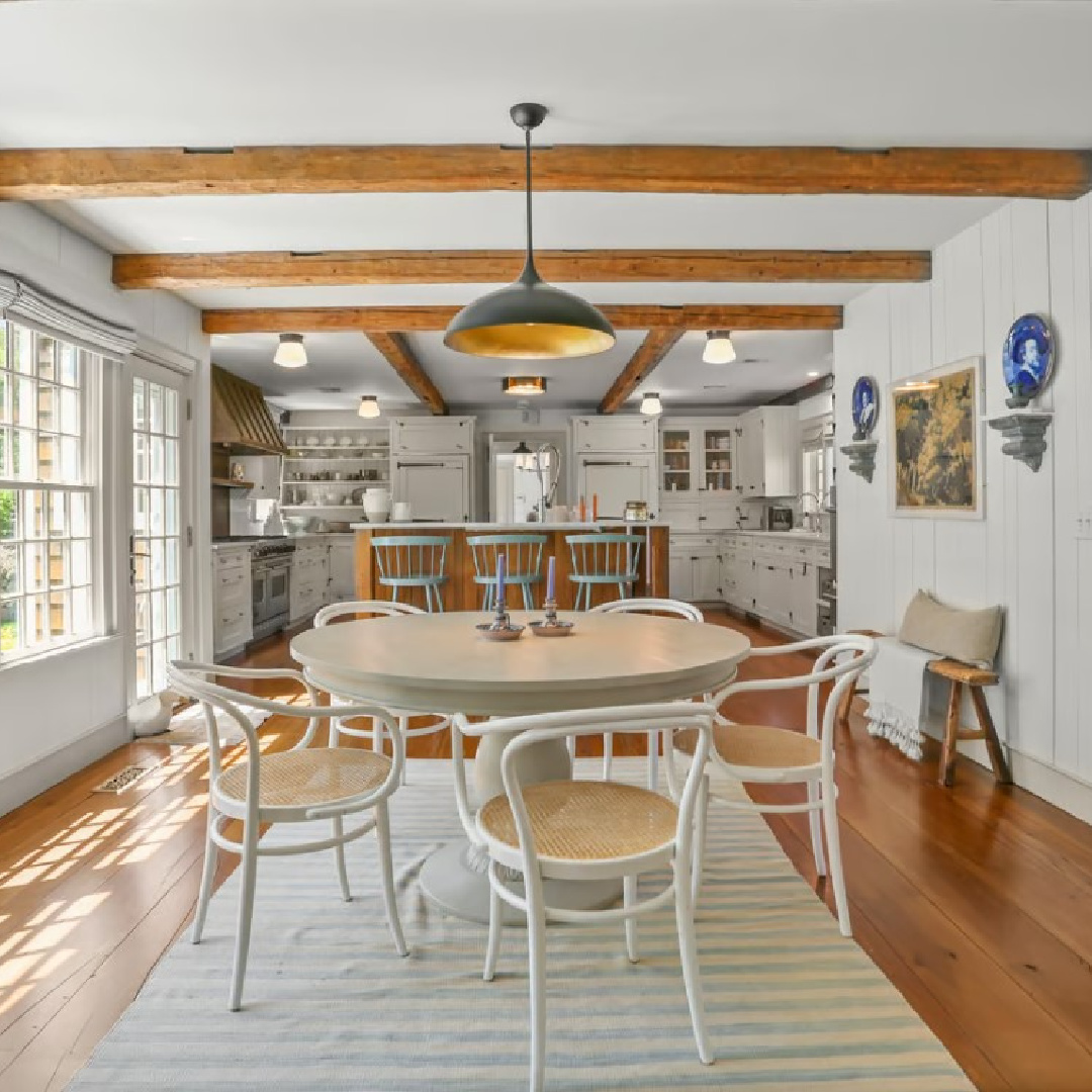
Walls are a cooler, subtle greyed white which is balanced by the surrounding warmth of wood beams, wood floors, and contrasting metals and black from lighting fixtures.
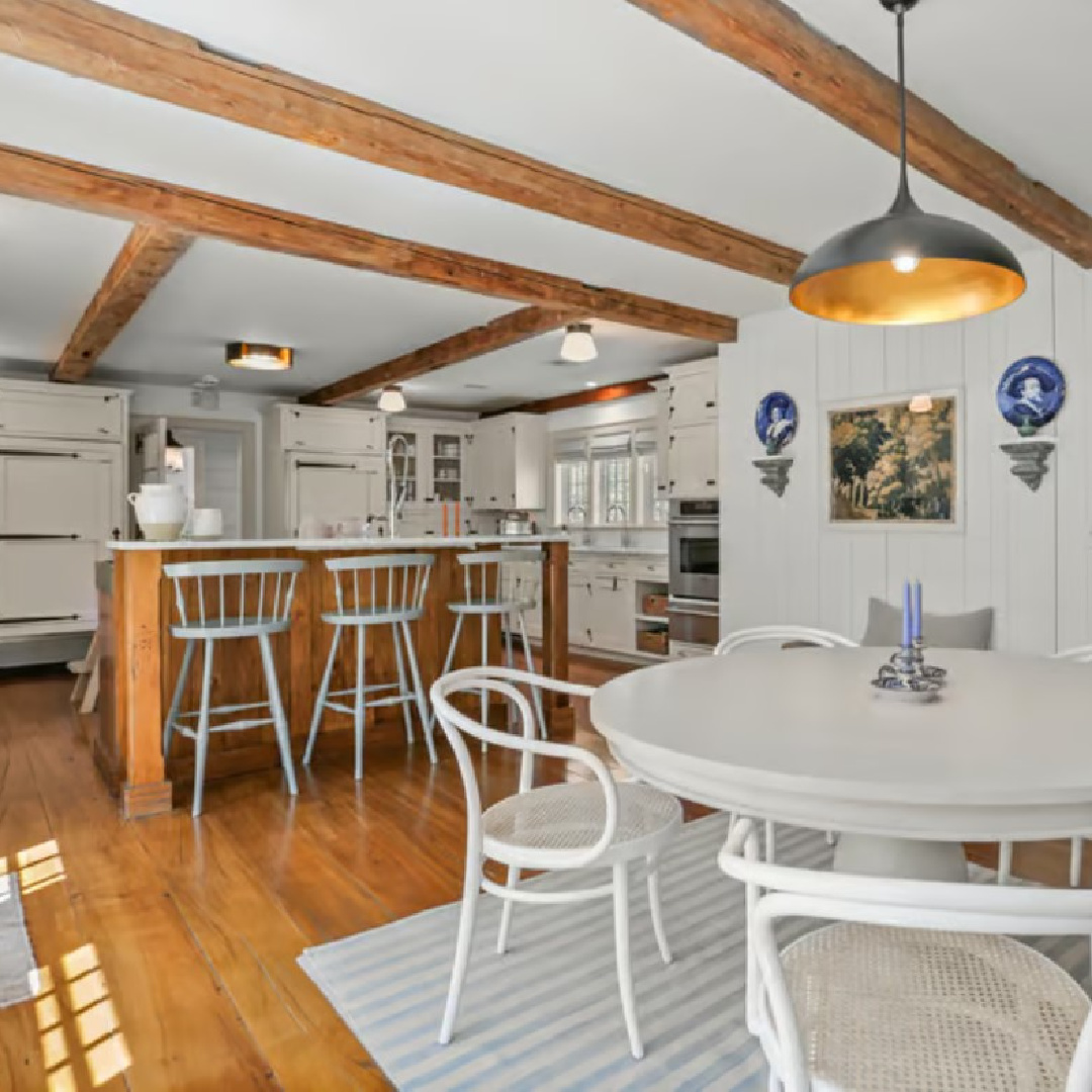
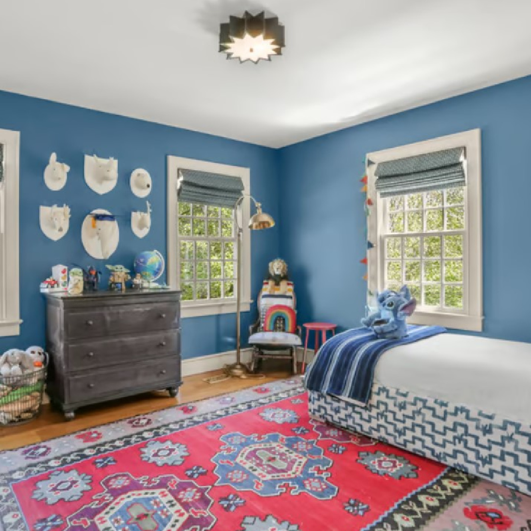
That same sweet contrast is echoed with cool blue in the kitchen. Notice how those bar stools in a cheerful cool blue sing with the golden brown warmth of the bar and flooring.
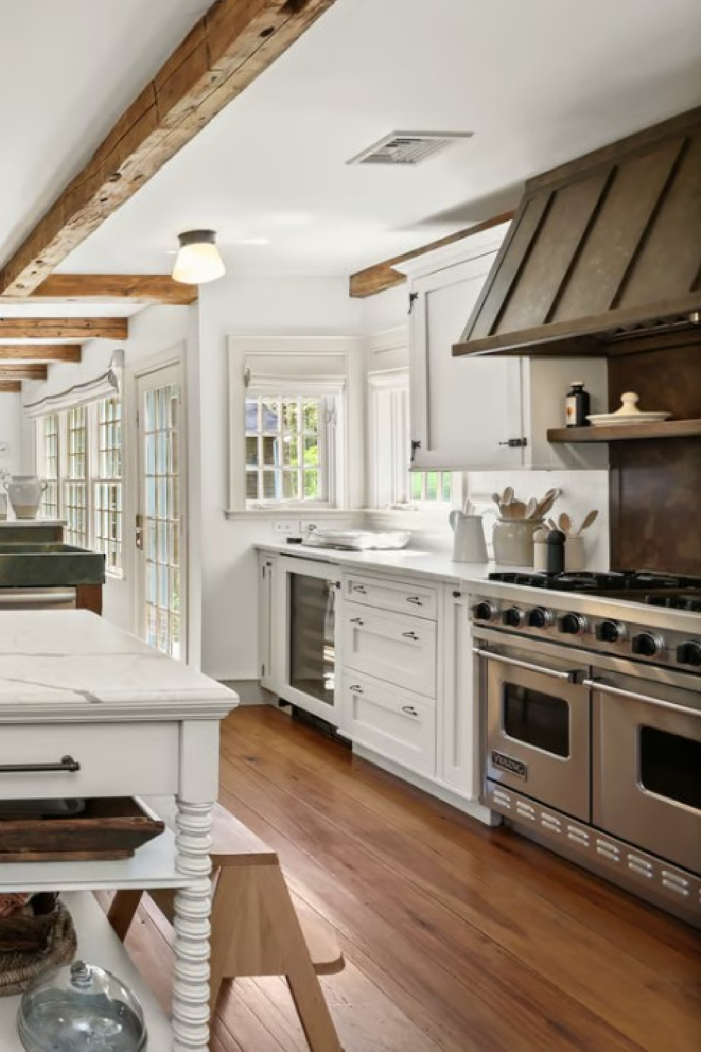
In the image above, the cabinetry and paneling appear quite cool grey! Such a great example of how the quality of a color will change throughout the day.
When you’re sampling a potential paint color, be sure to study it at different times of day.
Also consider the room’s function and when you will be spending time in that room. For example, in a den used primarily in the evenings for watching television, you’ll want to make sure you like how the color looks at night.
If you find that you love how a neutral paint color looks during the day in natural light but find that it seems all wrong when the sun goes down, you have options.
It is possible that there is a better color option out there for you. But it’s also possible that the artificial lighting sources in the space aren’t doing you any favors. Could you improve the lighting, adding more light or warmer (less bright cool white) bulbs?
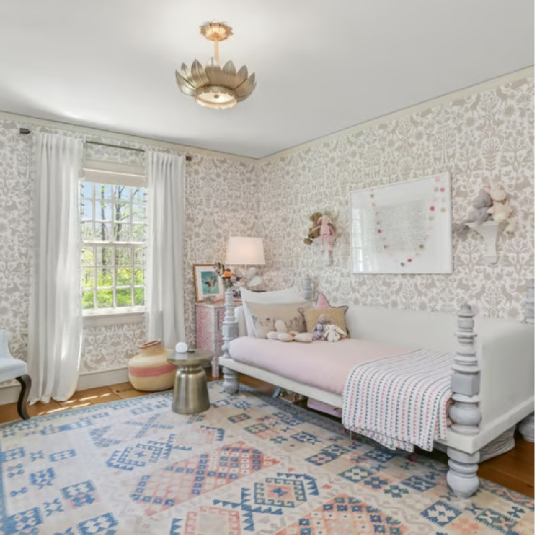
Need a Cheerful Blue Color in Your Life?
And then all of the sudden, a cool blue appears!
Need a suggestion for a happy slightly teal blue paint color for a bedroom?

For a more sophisticated blue-gray, consider Kittiwake.
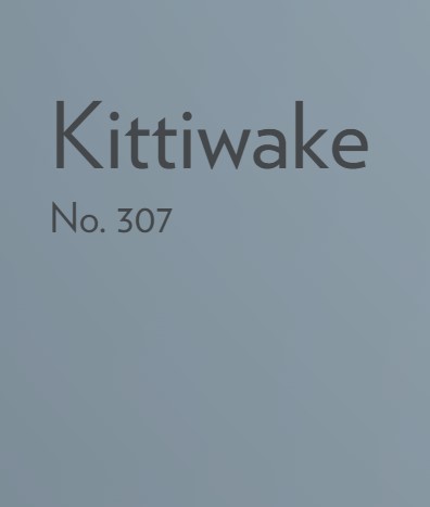
This F&B blue paint color is inspired by the wings of seabirds when seen in bright sunlight. Sitting between Parma Gray and Lulworth Blue, Kittiwake has a touch more black pigment creating a warmer, more relaxed feel.
My favorite part about the color story in this beautiful home is how there is subtle contrast throughout the interiors and all of the choices feel sophisticated. When a color feels atmospheric and is not quite grey, not quite putty, not quite off-white, and rather tricky to describe, it’s probably going to appeal to me!
Hope this helps you with your dreaming and scheming! I write about paint colors quite often. Find those posts HERE.
Peace to you right where you are.
-michele
I independently selected products in this post—if you buy from one of my links, I may earn a commission.
Thanks for shopping RIGHT HERE to keep decor inspiration flowing on Hello Lovely!
Hello Lovely is a participant in the Amazon Services LLC Associates Program, an affiliate advertising program designed to provide a means for sites to earn fees by linking to Amazon.com and affiliated sites.


