Sunlight is streaming inside the windows of our tone-on-tone snowy white kitchen, and I’m struck by how different the light is (and the white is!) now that the trees are bare. The greens and yellows of leafy trees outdoors truly affect the color and mood inside. We shall all be seeing a deluge of paint color trend reports for the new year, and I do enjoy the analyses of forecasters and marketers. But the reports rarely influence my choices which remain intentional and intuitive and rooted in timelessness. There is a love affair with white that endures whether design trends buck it or hail it ‘all the rage.’ The topic of white paint color options is anything but boring for someone like me who sees all those subtle undertones. Stunning White Paint Colors: Try These 6 Designer Favorites offers help for choosing a handful of colors to sample.
Stunning White Paint Colors: Try These 6 Designer Favorites
Colorful kitchens are everywhere at the moment. Green kitchens especially are having their day. And for good reason…it is a nurturing hue that brings calm and injects nature into a space. But white kitchens remain timeless and are the right choice for plenty of homeowners.
Homes With White Walls Are Not Boring
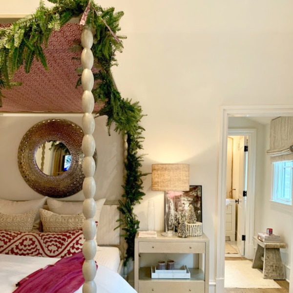
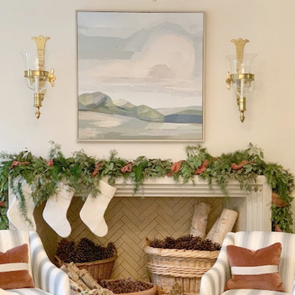
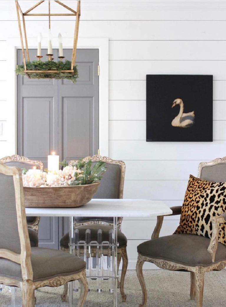
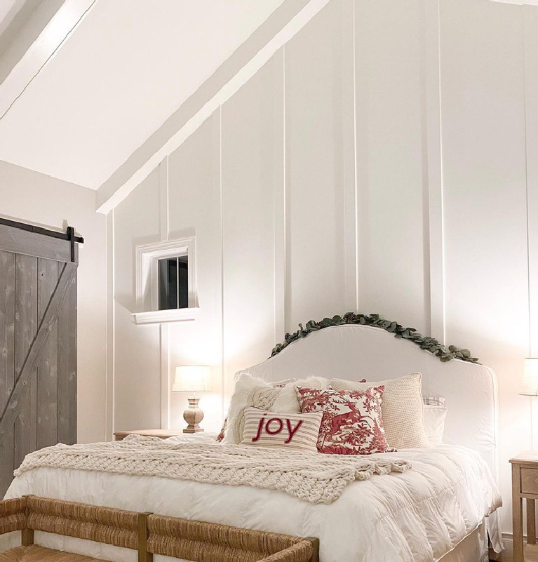
and in case you care for a #cozyondown pause with old fashioned Christmasy vibes…
I independently selected products in this post—if you buy from one of my links, I may earn a commission.
1. SHERWIN-WILLIAMS Shoji White SW 7042
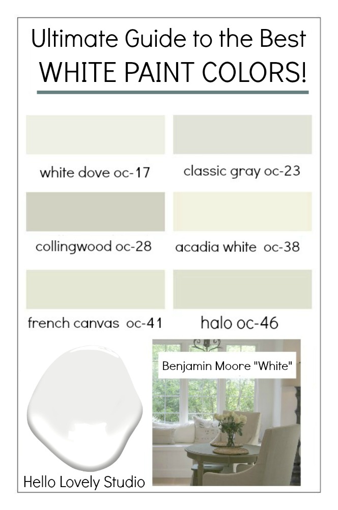
It helps to know the names of white paint colors designers reach for because we all need a place to start. If you have ever visited the paint department of a big box store and stood beneath those awful warehouse fluorescents, then you know it isn’t the ideal environment to choose color.
In fact, with my years of experience picking paint colors, I am convinced that looking at colors online is actually more helpful than discussing color at a paint shop. All the whites begin to look the same in the marketplace, yet as you’ll see here, we can distinguish them and view them in different light environments…so helpful.
For this designer showhouse, the white paint color used throughout the Atlanta manse was this first white option:

Here it is with abstract art and blue-greys.
Here’s another look at the wall color with additional natural light.
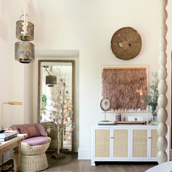
Here is Shoji White on the walls in the living room.
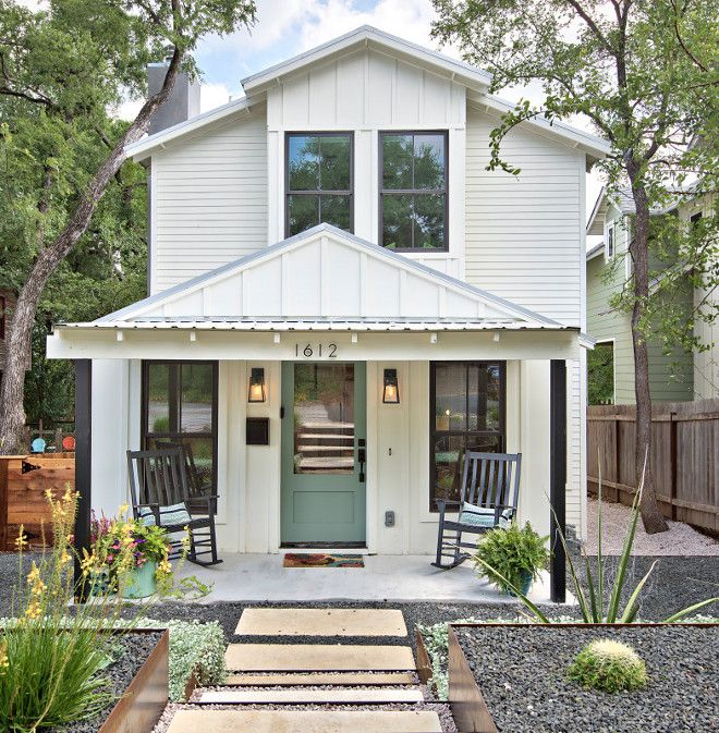
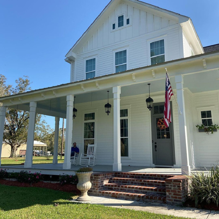
Shoji White Exteriors
To fully appreciate just how powerfully white paint can transform a home, consider this home’s BEFORE and AFTER…it is in my neck of the woods where you see this traditional style two-story exterior everywhere:
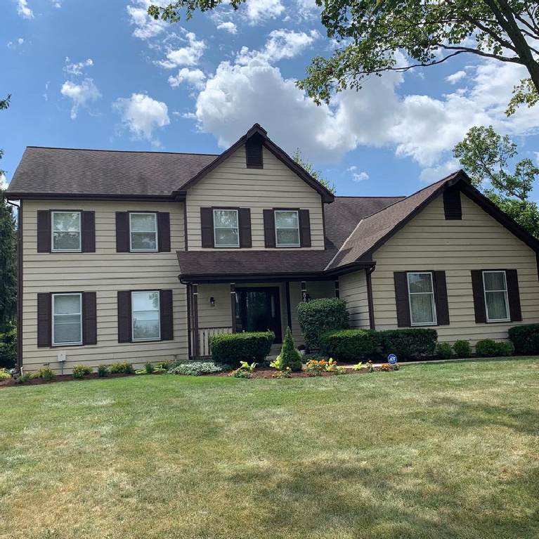
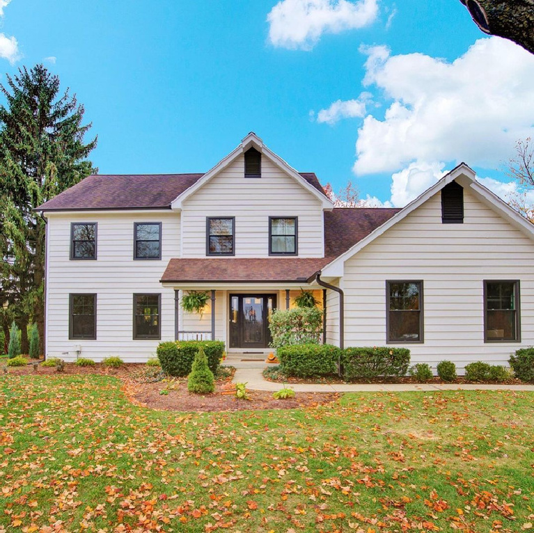
Here is the color on brick:
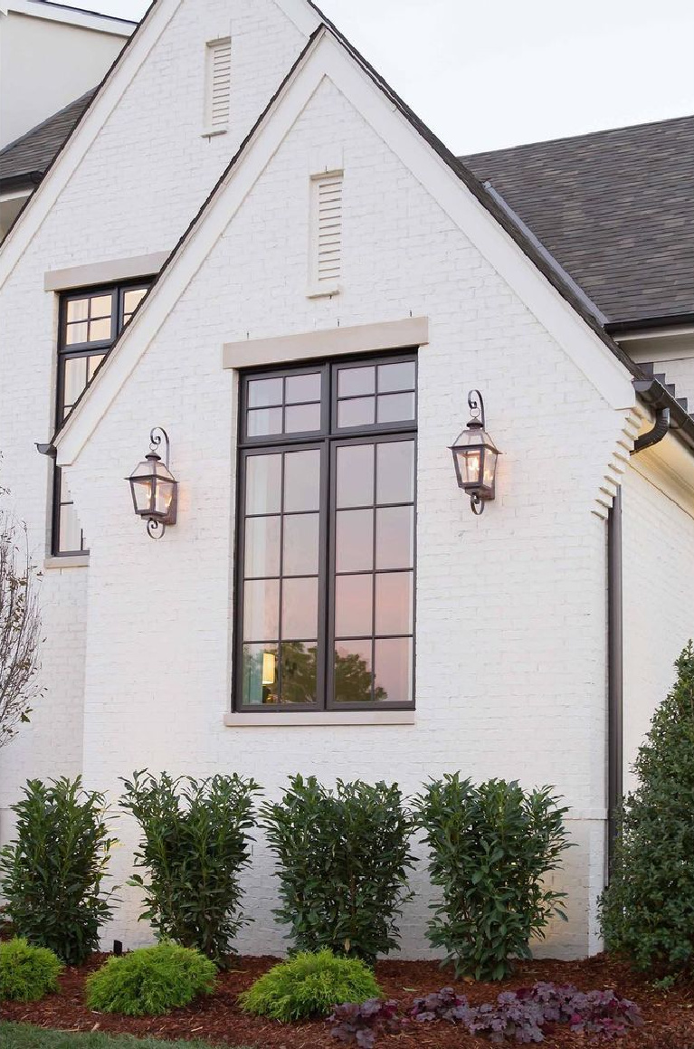
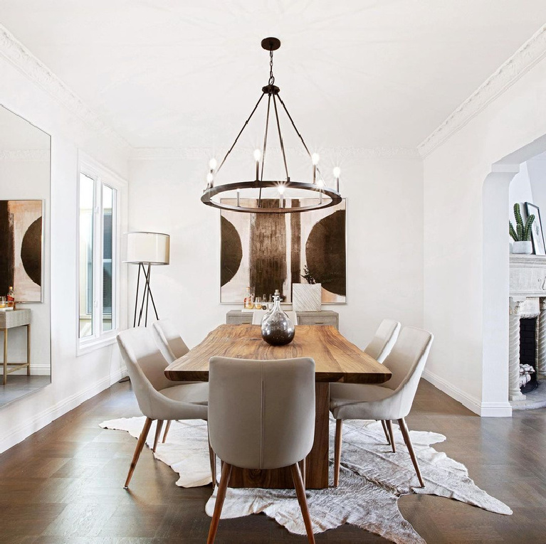
Do you love the contrast with black? (If you didn’t view the house tour video above of Lily Aldridge’s home, go back to view the effect of high contrast.)
Sometimes high contrast is what you’re after on the exterior…
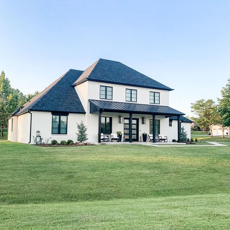
I’m still personally drawn to the tranquility created with low contrast whether it is inside nor outside.
Another wildly popular white paint color among designers? BENJAMIN MOORE Simply White.
2. BENJAMIN MOORE Simply White
Sometimes I wonder if the power of Simply White is as much about this paint color’s name.
A lot of folks reaching for white paint are after a pared-down, sophisticated simplicity. (BTW, I am still waiting for one of these household brands to hire me to name colors because I know about the power of language to elevate anything.)

To see a beautiful home with Simply White used as a standard color throughout, see THIS.
BM Simply White and shiplap seem to go together like a snow on a white picket fence.
Consider these interiors with Simply White walls and trim, and Pinterest has plenty of examples as well.
Black is not the only high contrast neutral to consider…
The Fox Group loves using this paint color in their work which so often includes magnificent paneled walls.
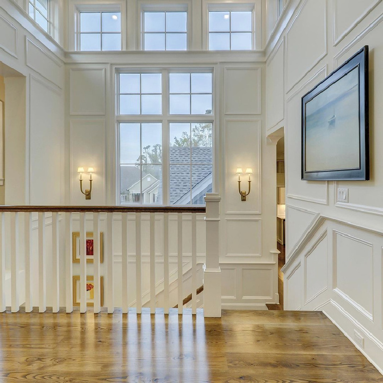
Can you imagine the consequences of choosing the wrong paint color in an area like this and the task of changing it?

If you are wondering how gold and brass tones work with the hue:
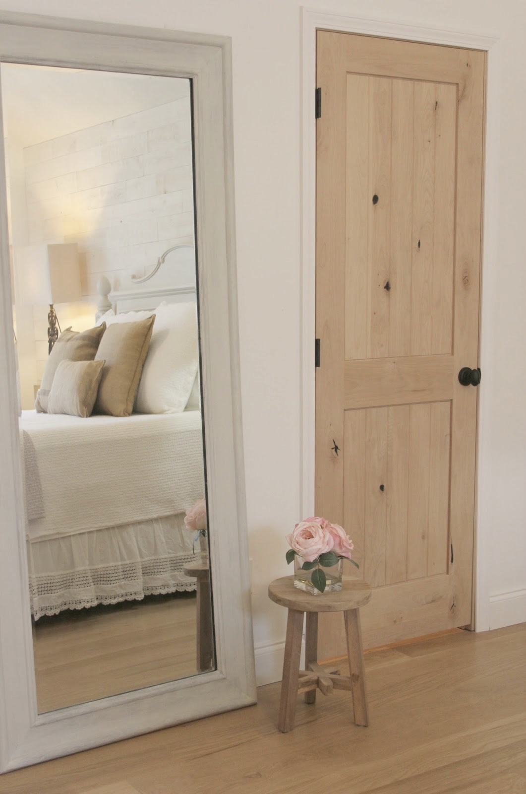
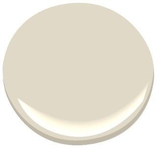
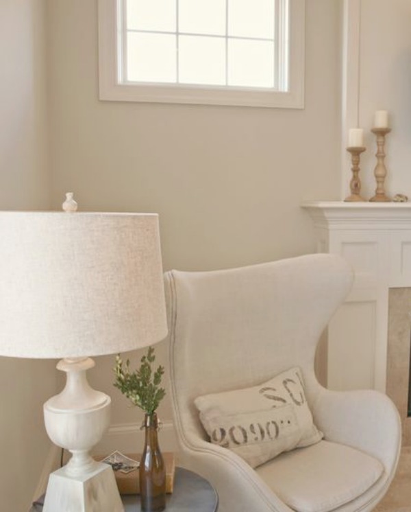
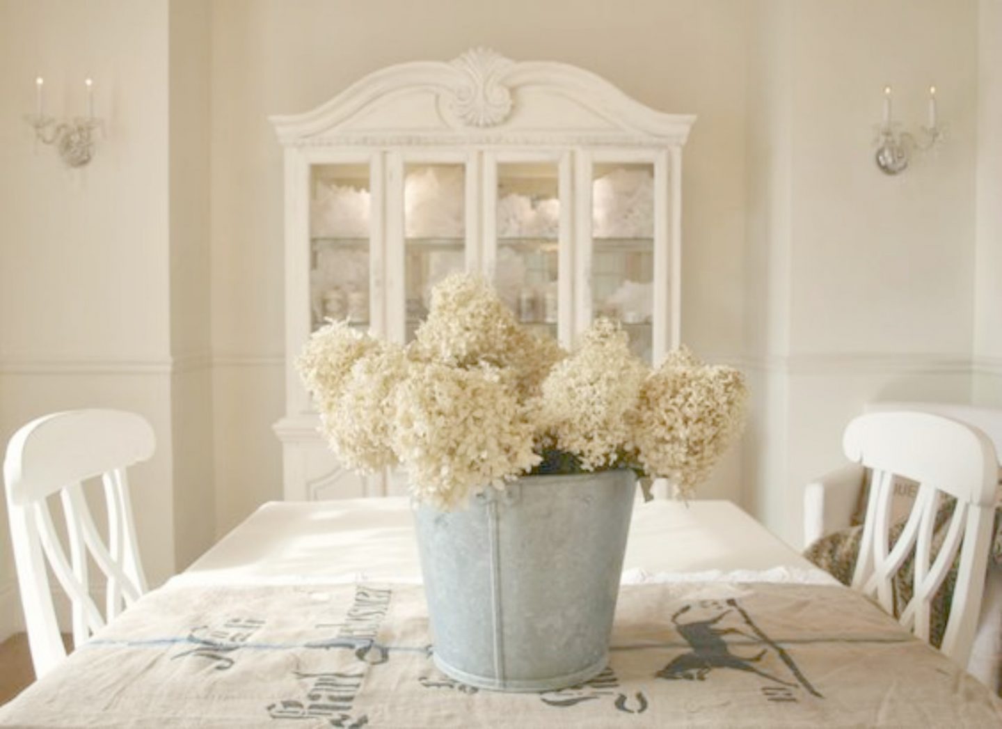
3. BENJAMIN MOORE White OC-150
In our home, we covered yellowed walls, ceilings, and trim with BENJAMIN MOORE White OC-150 (yep, that is the name of the color…White).
After trying out a handful of whites with unflattering undertones, this brilliant, clear, gallery-like white was the answer for modernizing dated interiors.
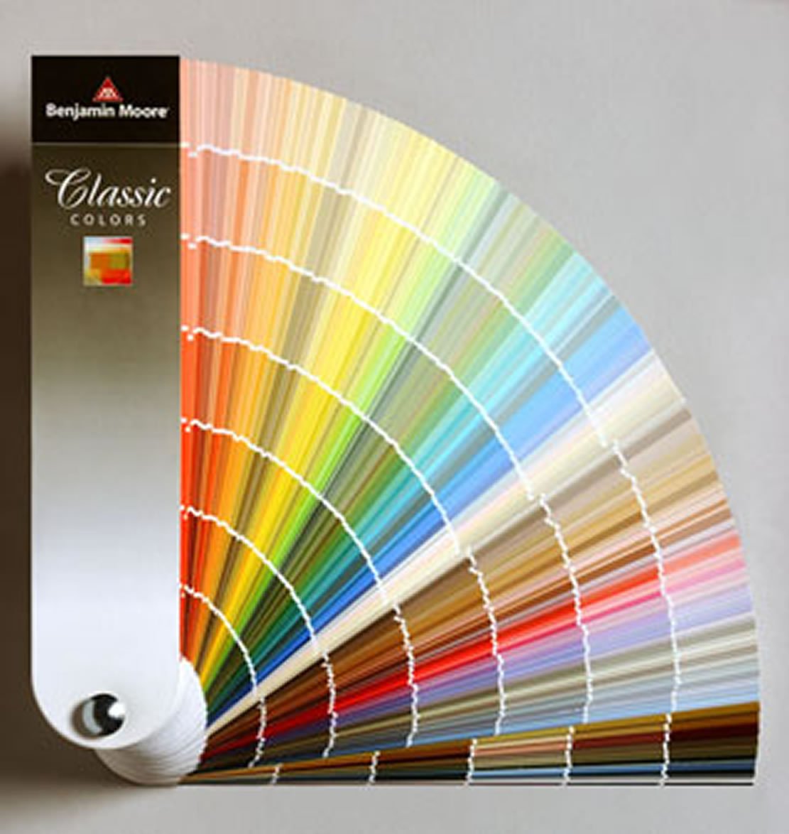
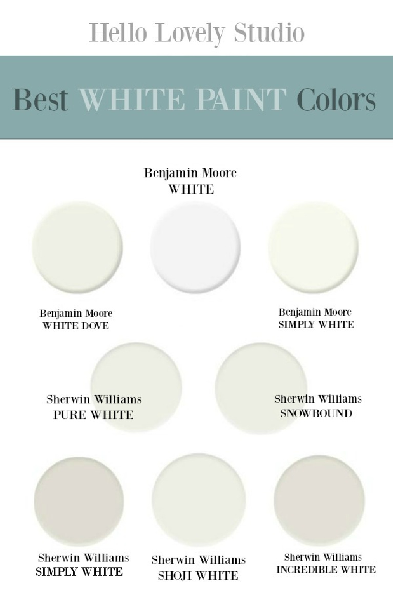
If you look at the Benjamin Moore White paint swatch in the infographic below, you can see how much more cooler and alabaster it is than the warm greys surrounding it.
We used flat for walls and a semigloss on the trim in the same white.
While it is certainly not always in order to paint trim the same white, we wanted ours to mostly disappear.
Our alder doors (left natural with no stain) contrast with the surrounding white door trim.
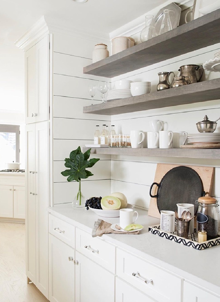
A favorite coastal cottage with interior design by Lisa Furey is painted inside and out with Benjamin Moore White as well.
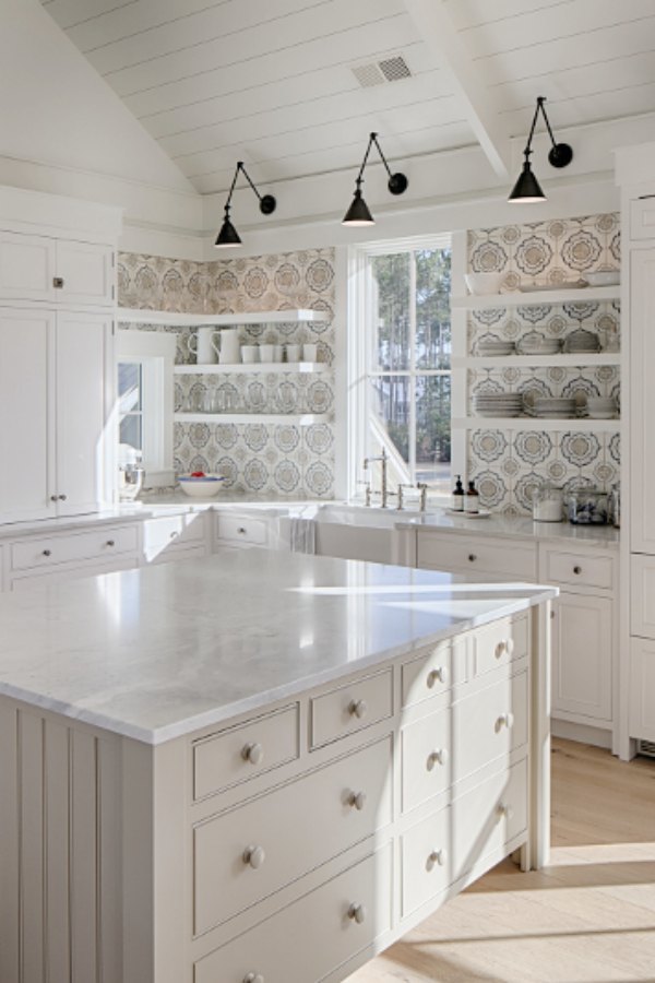
Isn’t that white coastal kitchen incredible!?!
Easiest way to see if a paint color will work? Order samples with Samplize and have them delivered straight to your door.
4. BENJAMIN MOORE White Dove
I’m sure you have heard of this tried and true white!
BENJAMIN MOORE White Dove is one of the most popular whites among designers for good reason.
It stays true throughout the day with changes in light and gets along so nicely with neighboring colors!

Along with a slew of designers and furniture painters, I have painted my fair share of wood cabinetry with White Dove.
Just look at how soothing and modern it can feel with blush pink:
Yet White Dove is perfect with vintage style:
Here is a handy little chart to PIN for future reference:
Do you have a Pinterest board reserved for paint colors? You need one!
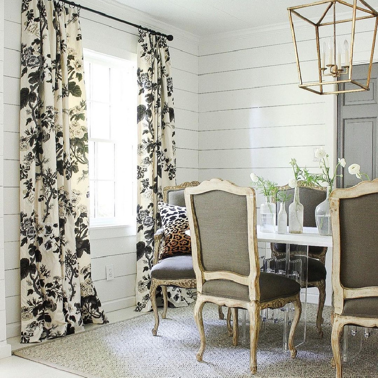
White Dove on shiplap is timeless and classic:
I love how designer Sherry Hart uses planked walls in a fresh manner. It doesn’t feel stuck in a modern farmhouse trendy box because of layering, elegant curves, and traditional nods.
Yet it may be the right choice for a modern space too:
5. BENJAMIN MOORE Chantilly Lace
Chantilly Lace is cooler than White Dove so it is often more appropriate when you’re after a more modern mood.

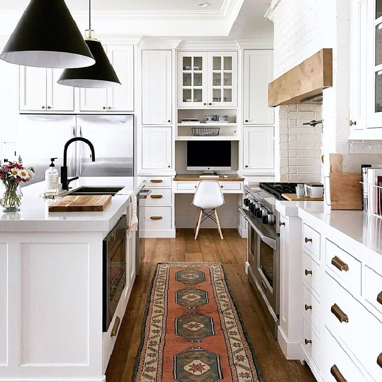
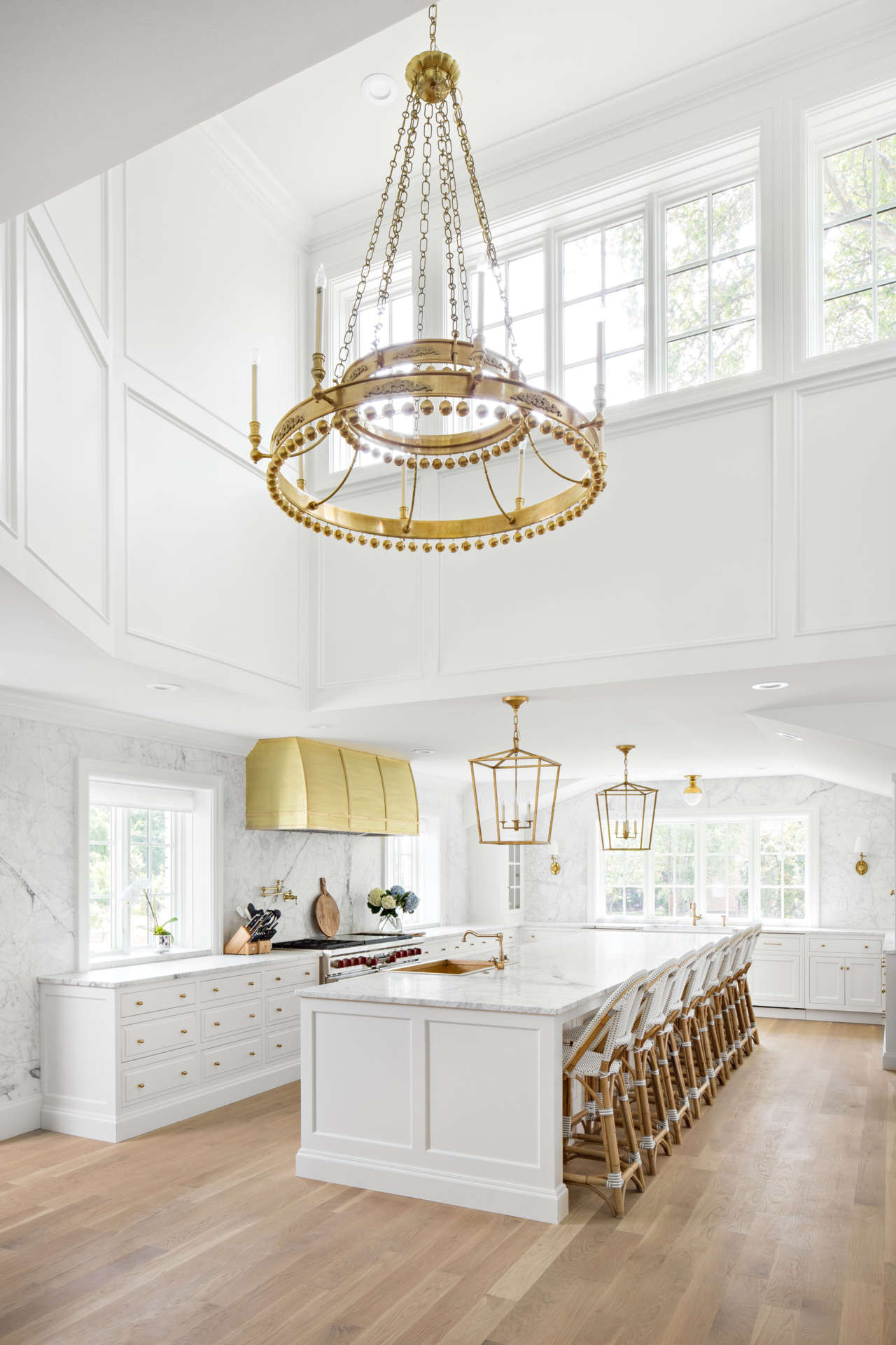
One of my favorite kitchens of all time incorporated this paint color with light grey and natural tones.
In the kitchen below, notice how the white painted ceiling offers texture without stealing all the thunder. If those wood planks were stained brown, the mood would change considerably.

I love this designer’s mood board for a kitchen she designed, incorporating Chantilly Lace for paint:
Brilliant, bright whites like Chantilly Lace work well in bathrooms, and what a difference to add a statement wall…

6. BENJAMIN MOORE White Sand
If you’re looking for a warm white that looks great with a cooler white for painted trim, consider this color.
We used it throughout our prior home as I loved how it looked in rooms with abundant natural light.
While we could have tweaked the saturation of White Sand for rooms which were more dim, we chose to keep it at full strength. I actually enjoyed this color in different lighting situations.
So please don’t think that choosing one color for the whole house means it will feel one note.

Where the exposure changes, so will the color.

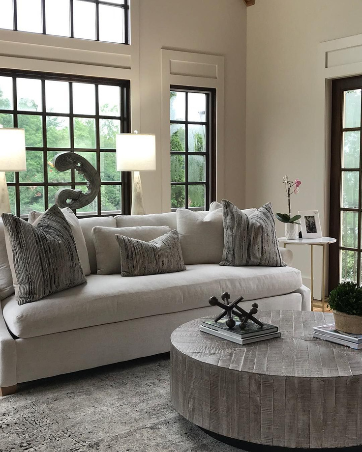
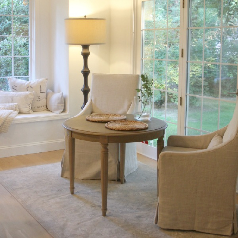
White Decor Favorites
I independently selected products in this post—if you buy from one of my links, I may earn a commission.
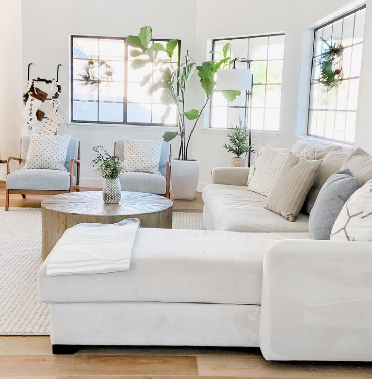
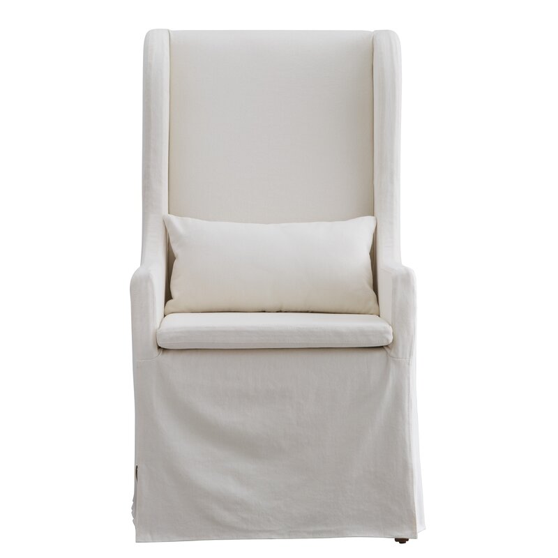
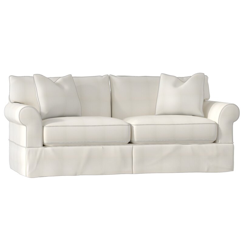
It can be tricky to find a white sofa that strikes the balance between unfussy yet not too casual.
If there is one thing you’ll hear again and again from designers about furniture arrangement? Get those pieces away from the wall!

Furniture behind furniture rather than furniture-lined walls is almost always a good idea.
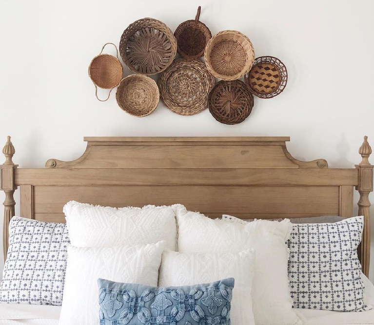
I love how restful a creamy wallpaper paired with wainscot or shiplap can feel in a bedroom. I wouldn’t ever tire of a pattern like this:

And aren’t these winged headboards a beautiful statement that is not too traditional yet not too contemporary?
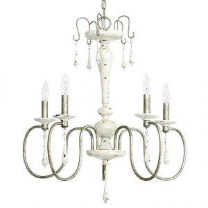
While we are seeing far less French style chandeliers in those little squares on Instagram, they can still be beautiful in the right space where something feminine is in order.
If you have yet to discover Serena & Lily, do visit them for coastal beauty and lessons in scale…

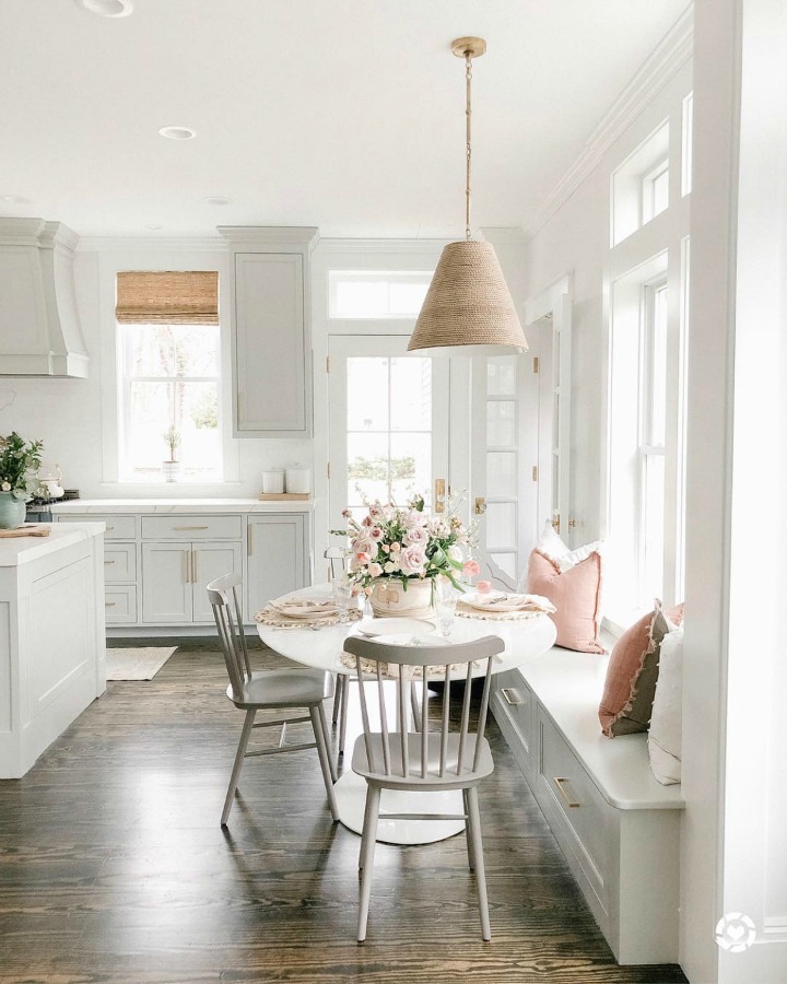
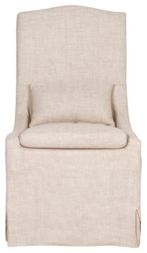
These Louis-style chairs in our kitchen still serve us so well, and the linen seats are showing some wear. Unlike a lot of folks, we actually don’t mind the wear and if we have to do a little repair, we welcome the mends.
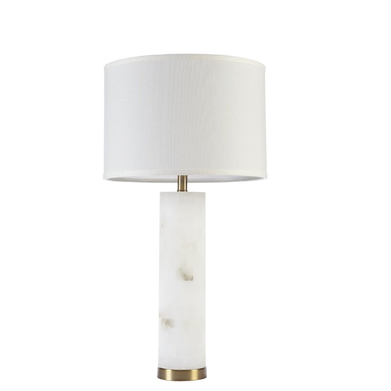
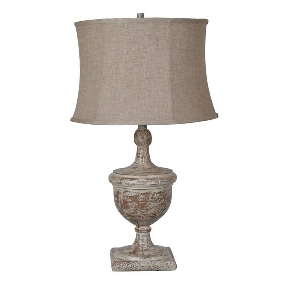
I love a white marble or marble look lamp, and we’re seeing them in kitchens so often now as that room becomes more of a living room.
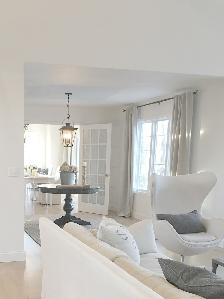
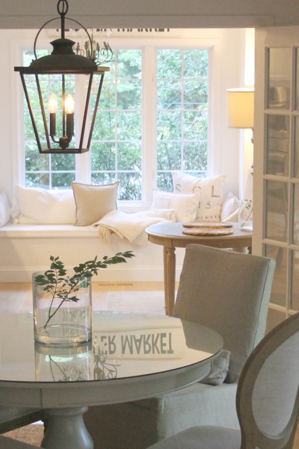
Decorating With White at Home
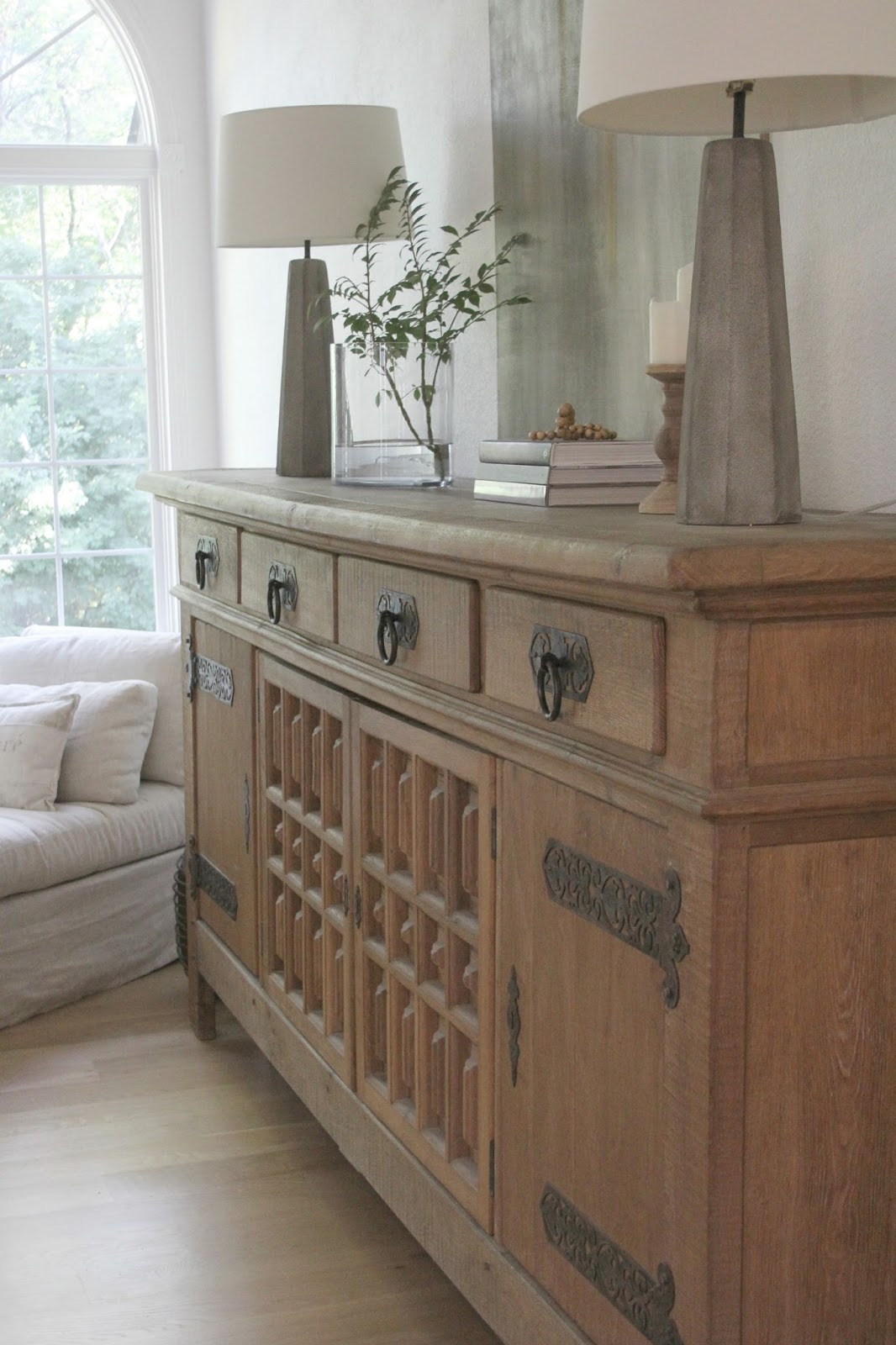
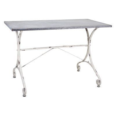
Should this rustic console table below be in stock, snap it up as it sells out quickly.
I independently selected products in this post—if you buy from one of my links, I may earn a commission.
Peace to you right where you are.
-michele
Shop for items you already intended to buy on Amazon RIGHT HERE, and also find home decor here to keep decor inspiration flowing on Hello Lovely!
Hello Lovely is a participant in the Amazon Services LLC Associates Program, an affiliate advertising program designed to provide a means for sites to earn fees by linking to Amazon.com and affiliated sites.


Every time I see one of your posts about whites, I simply must read it 🙂 Like you, for me, white never gets old.
My hubby and I recently renovated a house. It’s somewhat unique in that it’s an earth-sheltered house. Because all windows face south we knew there may be rooms that looked a little dark at certain times of the day. White was going to be our best option to keep it light and bright. The front of the house has stone cladding so we named the house Stone Cottage.
As I was looking for white paint colors I happened to stumble on a lovely white called Pebble White (a Nautica brand color). It has a wonderful clean look to it but now with my more ivory furniture in place, at various times of the day, it has a very pleasant hint of gray undertone. We used that color throughout the house on ceilings, walls and trim except for one room (the billiards room…yes, we inherited the table from the former owner 😉 ) which we painted Smooth Stone by Glidden. It is a very soft, light gray.
Kitchen cabinets were painted PPG’s color Fossil Stone. Floors were painted another PPG color White Rock. I didn’t go about searching for colors that referenced stone or rock, it just sort of turned out that way. 🙂
White just never gets old 🙂 And now with all the Christmas trees up, each tree’s unique color scheme works perfectly with the white background too….not to mention the snow on the ground outside the windows. 😉
Love your white home….it has inspired me on many occasions!
Author
Thanks so much for allowing us to come along the journey as you feather your new nest. Mixing shades of white is so smart – a lot of folks don’t know what they’re missing by keeping it all one note. I happen to love cream with bright whites. Happy decorating, friend. 🙂
Thank you for sharing at #ThursdayFavoriteThings. Pinned and shared. Have a lovely week. I hope to see you at next week’s party too!
Author
Awww thanks. See you Thursday, friend.