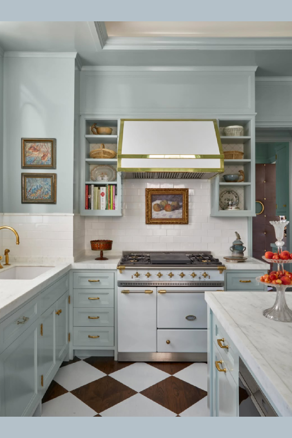
Let’s keep going with our quest for the right sort of blue kitchen for you with these paint color possibilities to sample. We’re not focusing on just light blue or navy here. Instead, get a feel for how different saturation levels and temperatures influence mood and the other design elements in the kitchen. We started this gallery of ideas HERE.
I’m also sprinkling ridiculous tweets, sarcastic quotes, one-off humor and the unexpected into this gallery. Why? Paint colors aint always the most tantalizing topic. Let’s stay awake! Times are hard…maybe a giggle will take the edge off your day.
Blue Kitchen Color Possibilities
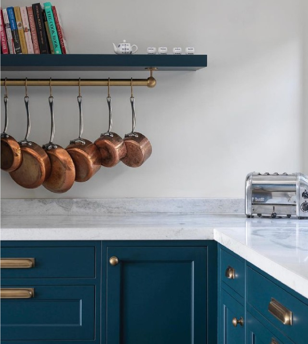
F&B Hague Blue 30
This is a popular deep teal color among designers, and it’s easy to see why.
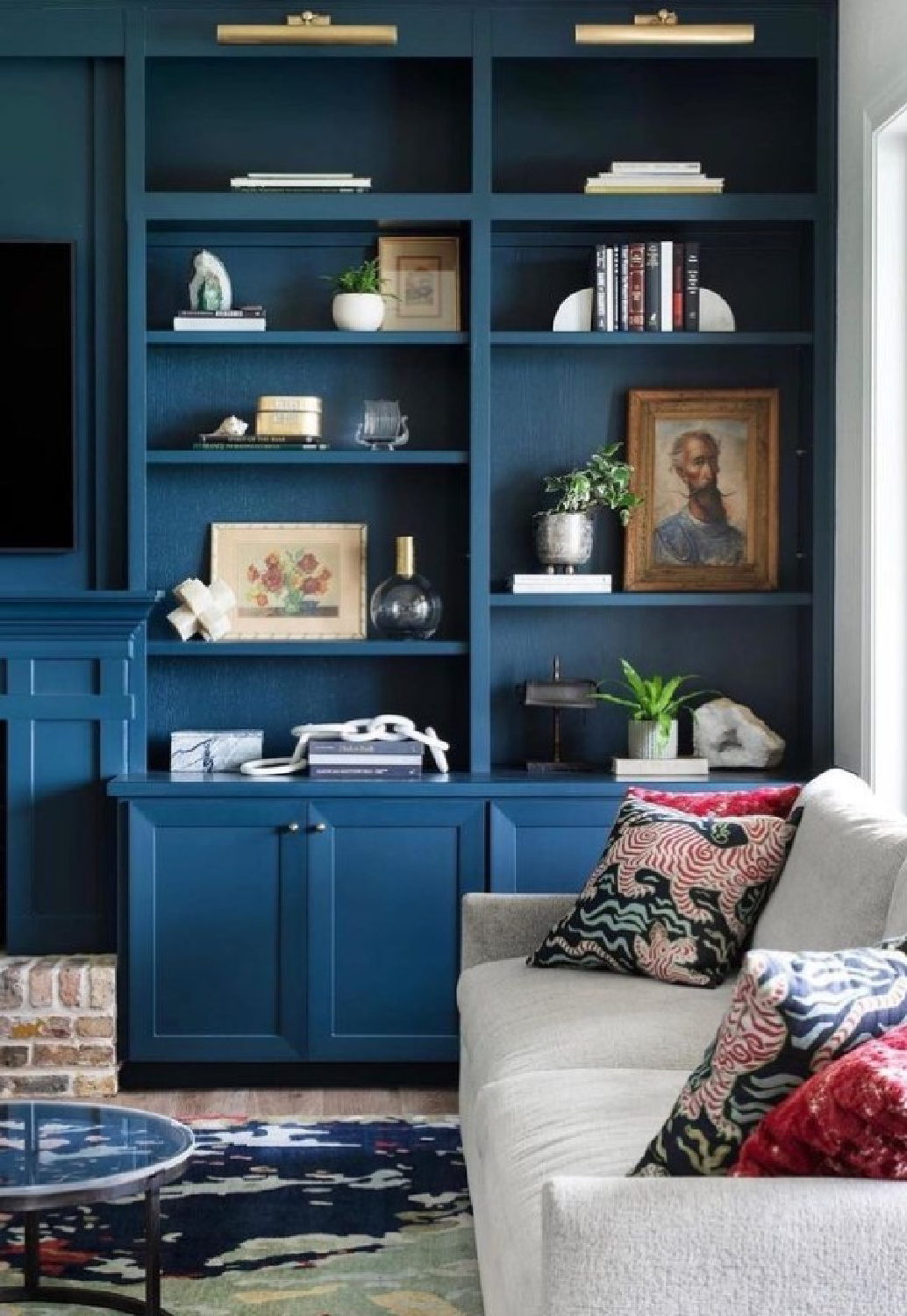
Rich and luxurious, this color is amazing on built-ins in a home office too.

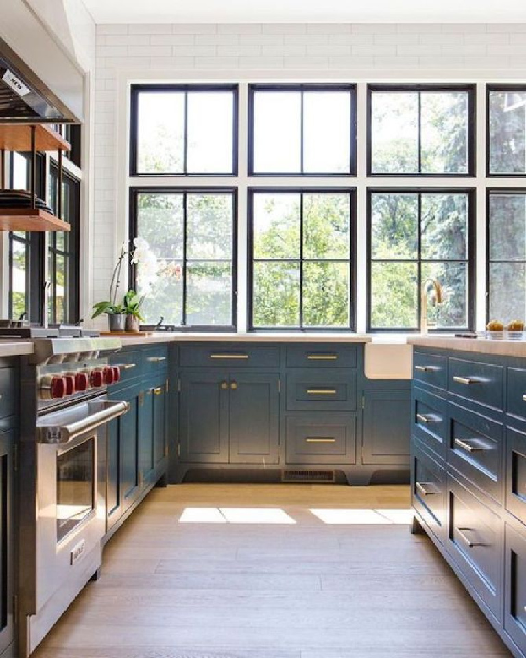
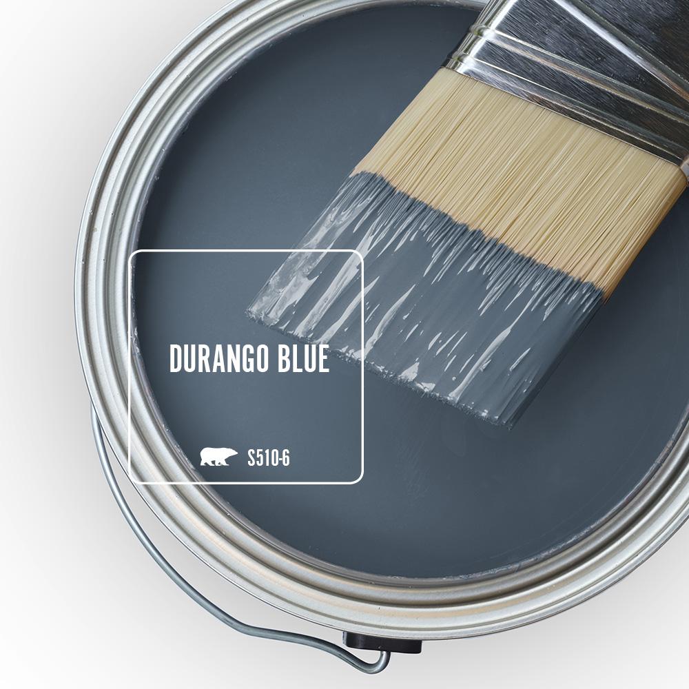
For a similar color from a different paint company:
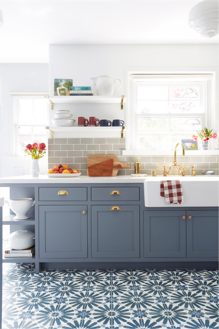
It’s one of those mid-range blues that could be amazing with brass or gold-toned hardware.
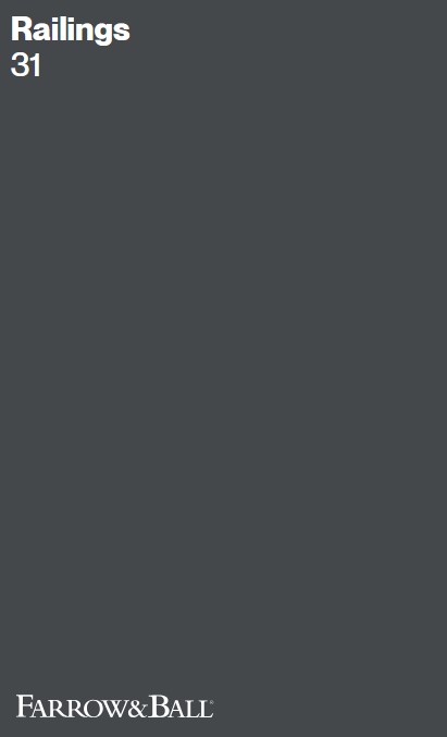
Farrow & Ball Railings
If you’d love a handsome deep dark blue that is nearly black…
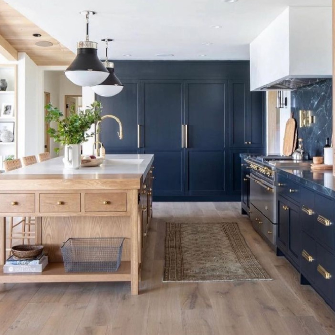
Farrow & Ball says Railings is “More blue than black, Railings is a softer alternative to black which is particularly suited to the ironwork it takes its name from. When used in Full Gloss on front doors it creates a handsome and commanding entrance. The bluer undertones of this dark hue transform rooms into dramatic and enveloping interior spaces.”
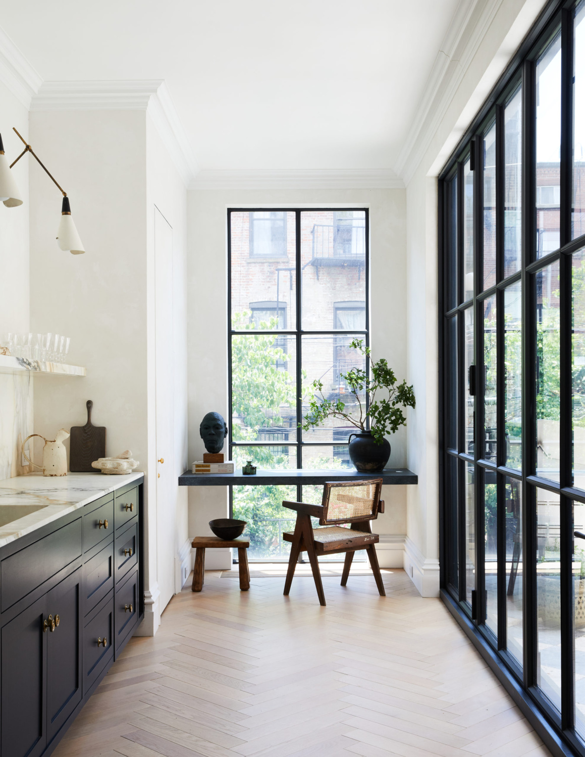
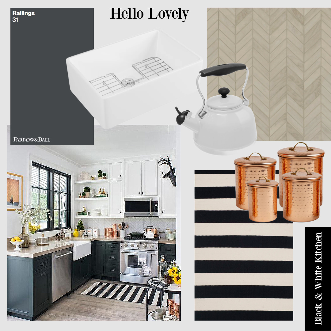
Here’s one of the more insta-famous kitchens with Railings (and for good reason!):
If your dream kitchen cabinets are dark and moody, here’s a similar color which may be worth a closer look.
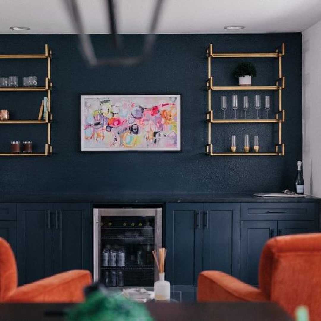
Sherwin-Williams Dark Night (tap swatch below) feels earthy and dramatic.
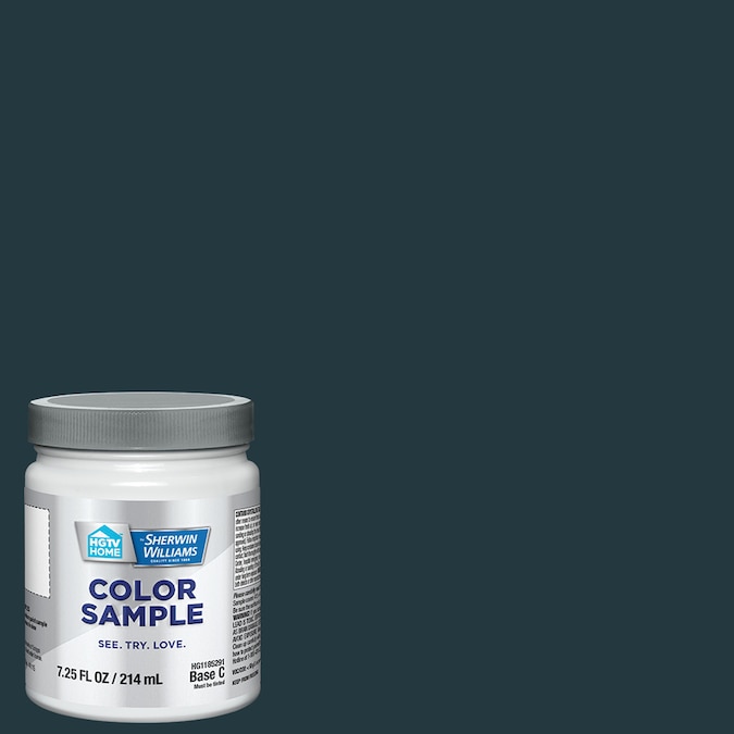
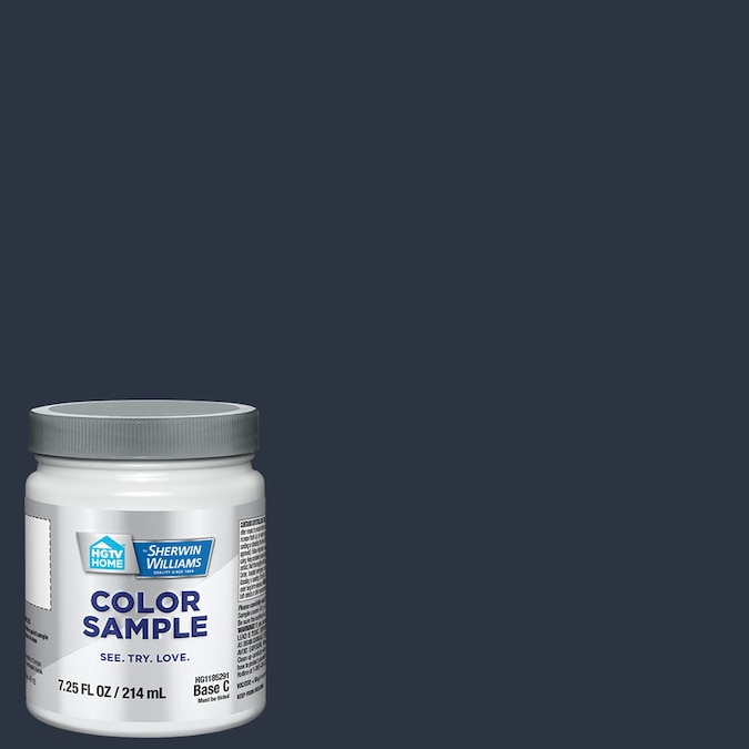
You can see the green undertones in Dark Night when you compare it to this midnight blue called SW Anchors Aweigh:
Farrow & Ball Down Pipe
Here’s a moody dark grey with blue undertones to consider. It could actually present as a slate blue depending on your lighting and context.
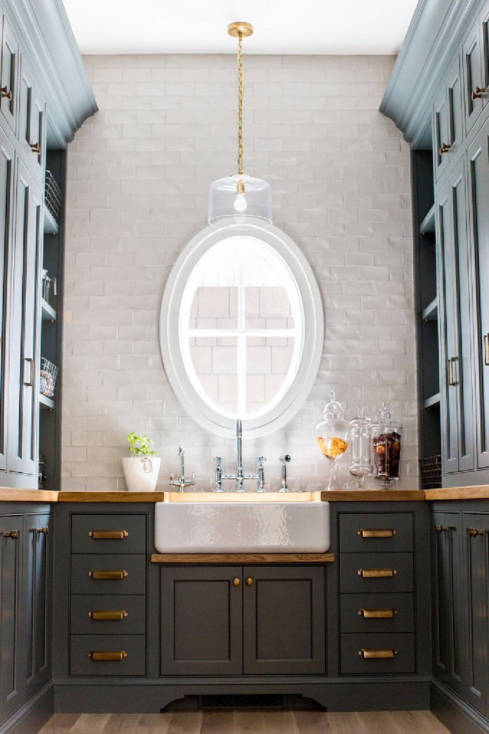

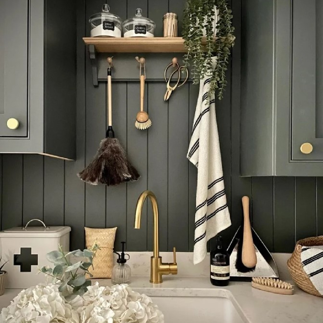
I love it when a backsplash has texture but the same tone as cabinets. This is especially attractive if cabinets are a shorter style or you’re going for a handsome clean look.

De Nimes No. 299 Farrow & Ball No. 299
Ohhhhhh, this blue feels so elegant and English country, yes?
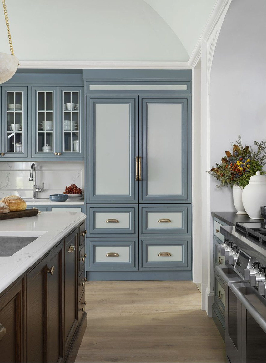
Even though Farrow & Ball calls it quietly elegant, I find it elegant period in this kitchen by Whittney Parkinson (Ladisic Fine Builders) in House Beautiful.
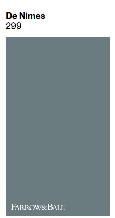
F&B sayd De Nimes 299 “feels wonderfully down to earth, so could be used on anything from a kitchen island to an airy drawing room. The exact shade is rooted in a regency palette but is inspired by the cloth of everyday workwear made in the French city Nîmes. Like denim, its blue hue is ultimately fashionable and yet always feels grounded.”
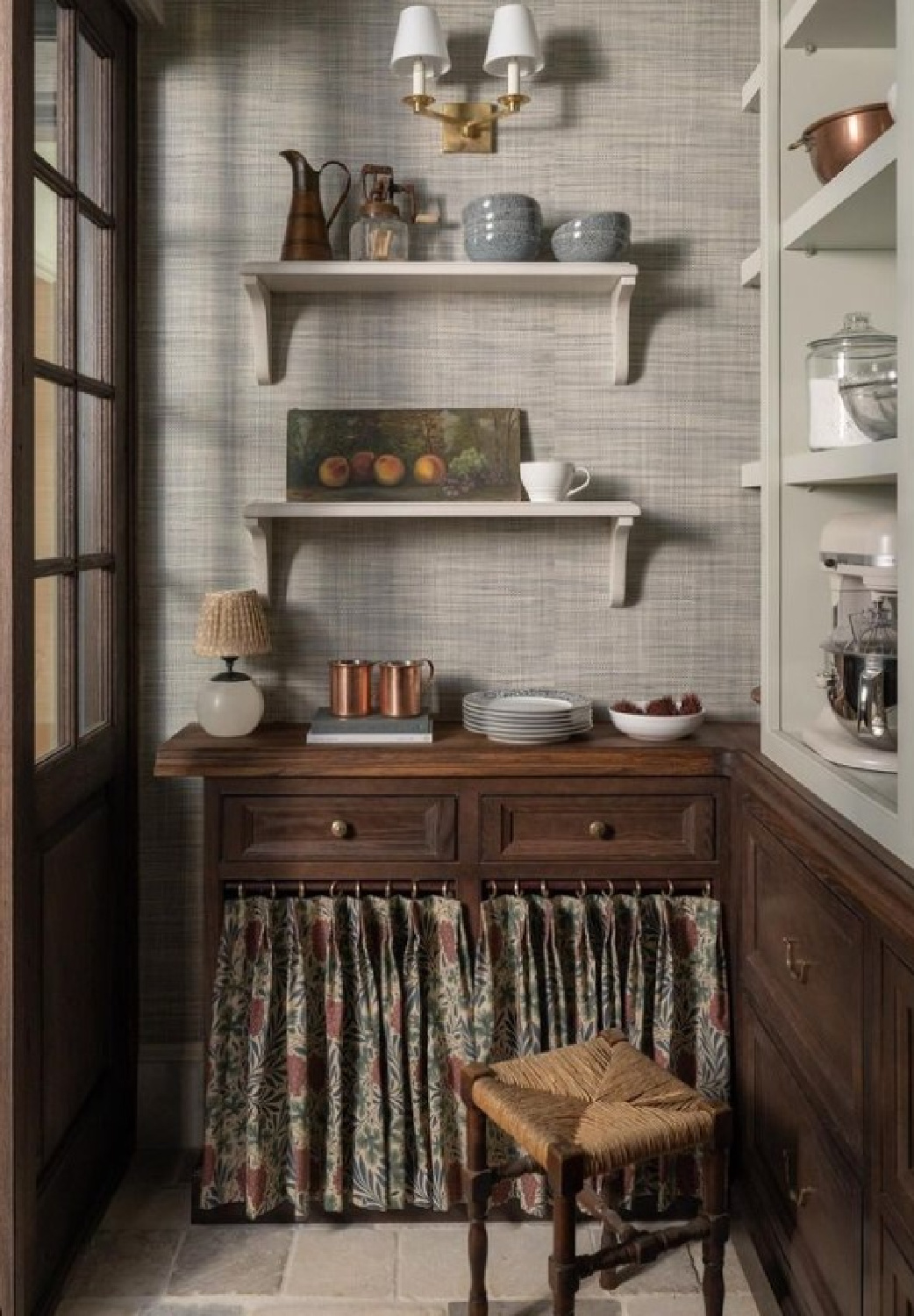
Love that! This scullery in that same kitchen stopped me in my tracks! Want to know the exact mysterious paint color?
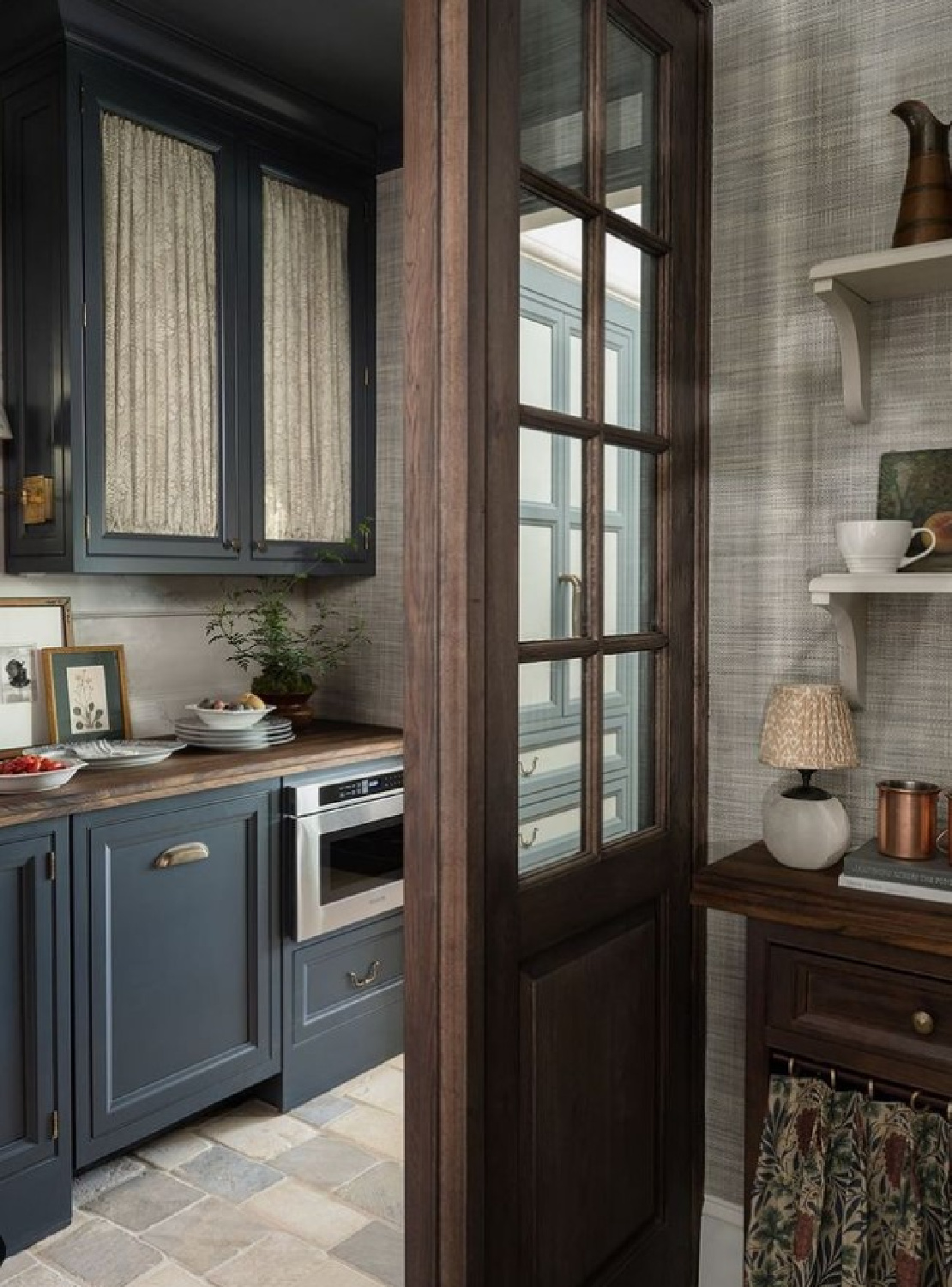
It is Farrow & Ball Hopper Head No. 305. Hopper Head is a classic charcoal that falls between Railings and Down Pipe (see those colors above).
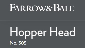
“Inspired by the attractively designed iron containers used to catch rainwater at the top of a downpipe,” Farrow & Ball say Hopper Head is “Ideal for creating inviting spaces…and can be used exclusively across walls, woodwork and the ceiling for a dramatic space.”
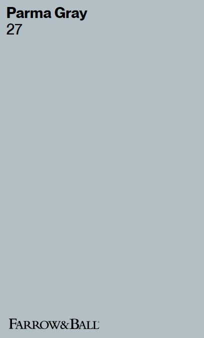
Farrow & Ball Parma Gray No. 27
What if you’re dreaming of a cool coastal blue that will make you feel happy no matter the weather outside? Believe it or not, that paint color may be so happy that it does not sound blue at all…
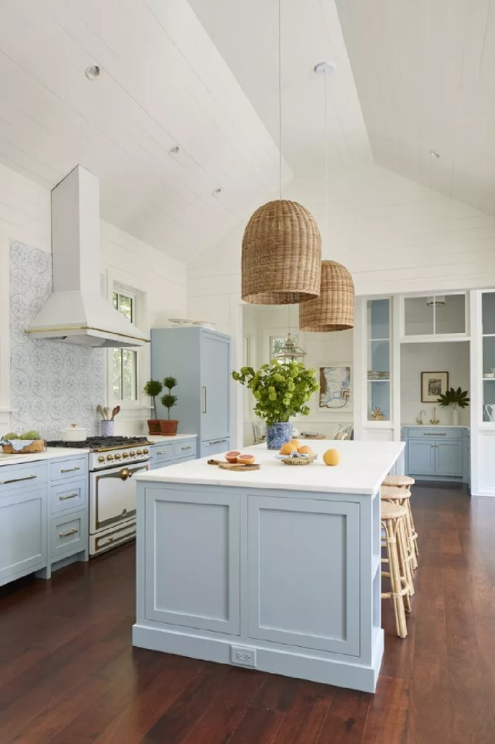
“Reading as a cool blue, Parma Gray is another colour attributed to the great colourist John Fowler. Used as the backdrop to numerous costume dramas, it creates the perfect period feel when contrasted with Wimborne White. Though its cool nature can feel quite formal when contrasted with a bright white, it is a firm favourite for those who prefer a clean and crisp finish.” – FARROW & BALL
Oh that whole Charleston house that is so instantly recognizable on the internet. Remember the colors used on the beautiful blue shutters outside?
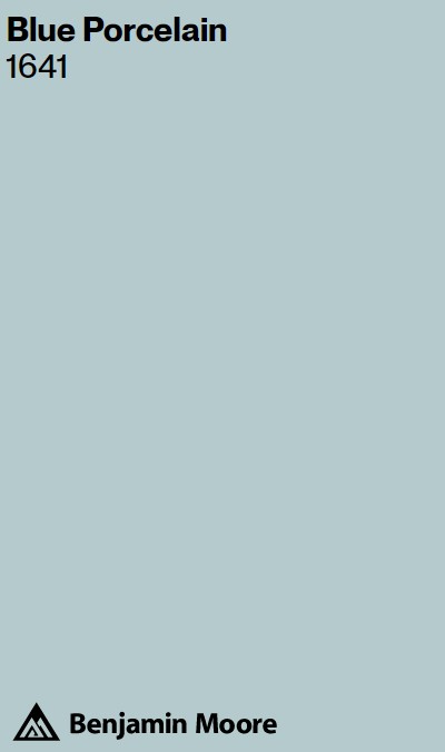

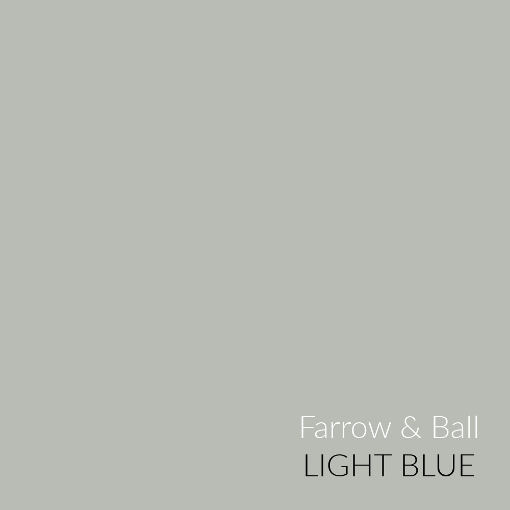
Farrow & Ball Light Blue
While Light Blue is described as silvery and can look that way in a lot of photography we see online, it reads more like a green in my own home.
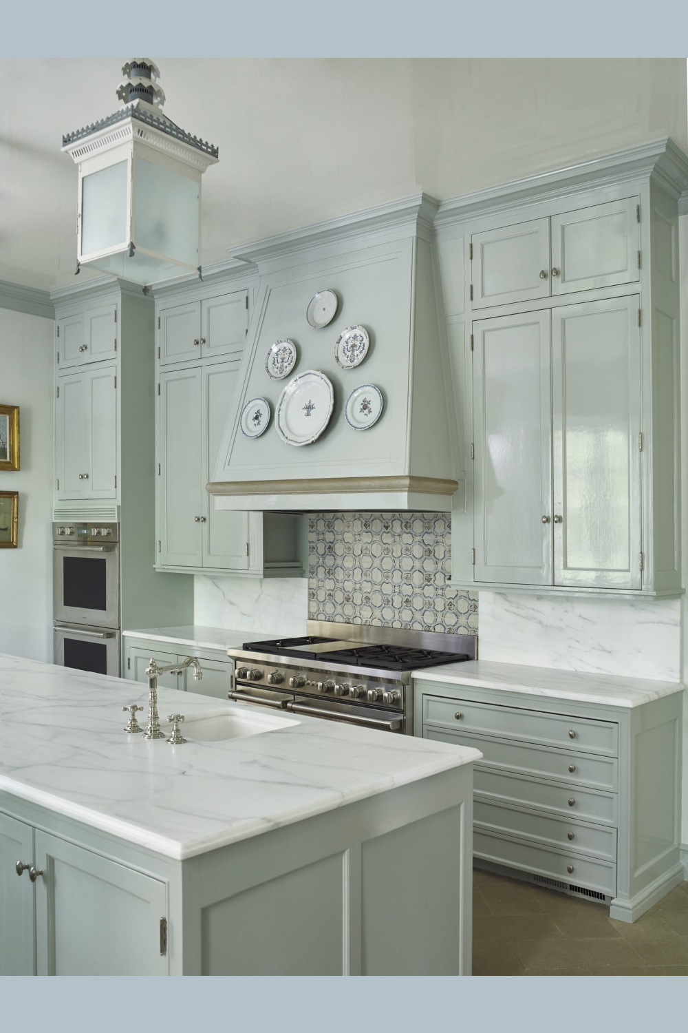
The amount of natural light your kitchen receives will definitely come into play.
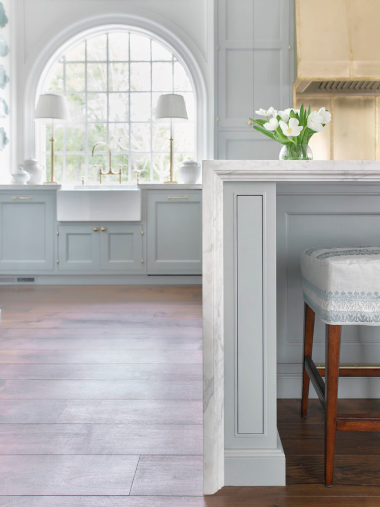
Easiest way to see if a paint color will work? Order samples with Samplize and have them delivered straight to your door.
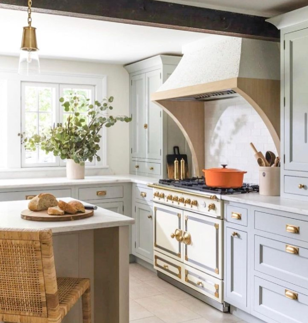
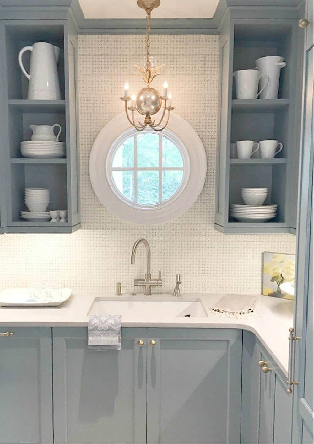
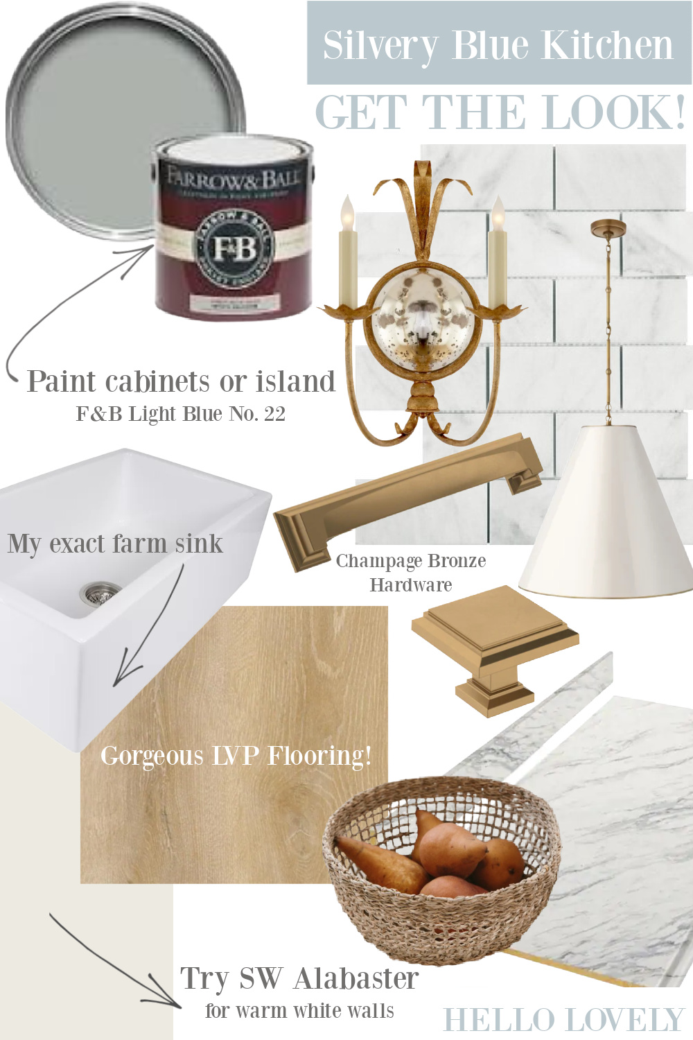
Thanks for entertaining this photo gallery of gorgeous blue kitchens and paint color ideas! Hope you found a few contenders, and go HERE for even more paint color ideas!
I independently selected products in this post—if you buy from one of my links, I may earn a commission.
Peace to you right where you are.
-michele
Thanks for shopping RIGHT HERE to keep decor inspiration flowing on Hello Lovely!
Hello Lovely is a participant in the Amazon Services LLC Associates Program, an affiliate advertising program designed to provide a means for sites to earn fees by linking to Amazon.com and affiliated sites.