You might say we have DIY renovated more than our fair share of kitchens over the decades! This will highlight a few more easy breezy kitchen decor boosts learned along the way as a serial cozy kitchen design freak.
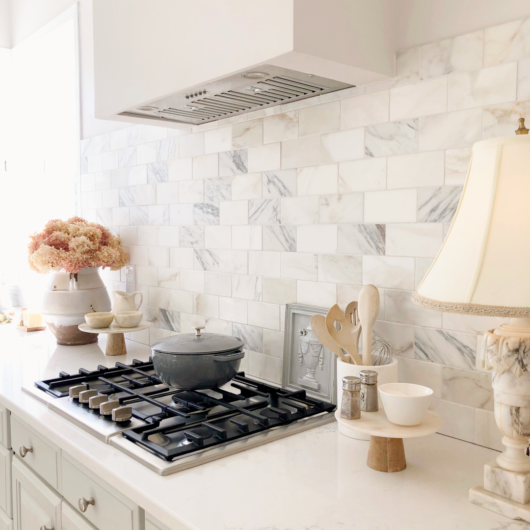
Ideas From Our Cozy & Easy Breezy Kitchen
Add Natural Materials
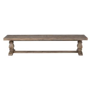
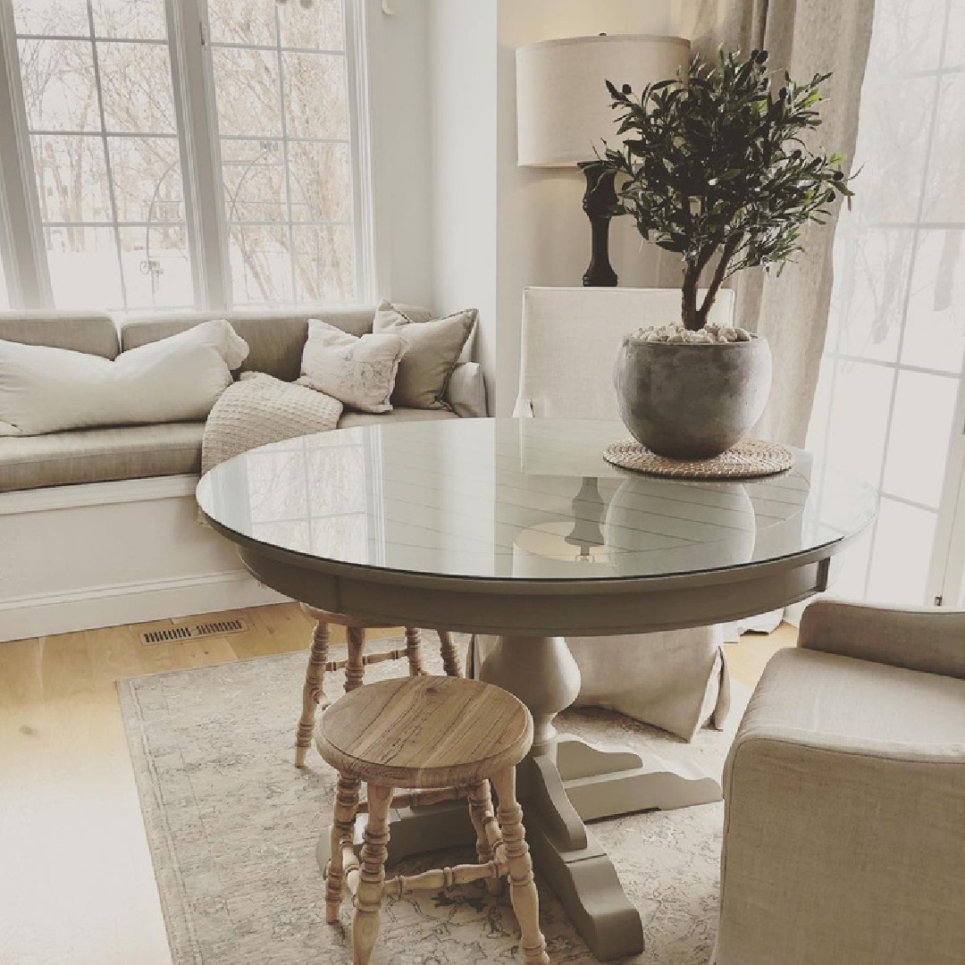
Think beyond pricey marble counters and backsplashes. Wood is a warm natural material that can cozy so many sterile spaces. My painted, handcrafted from antique barn wood bench has served us in multiple kitchens for nearly 30 years.
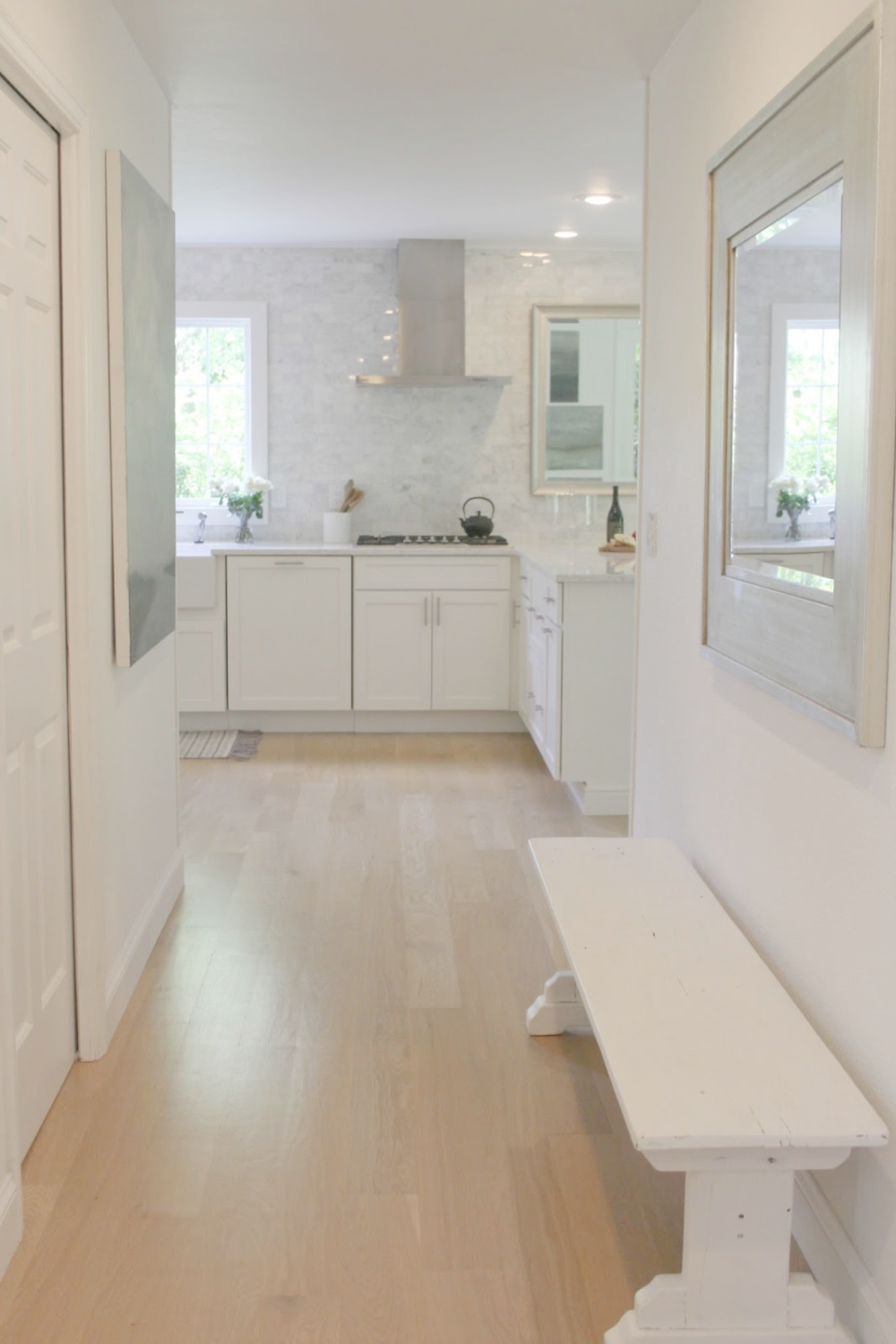
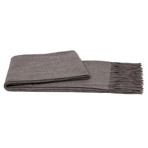
Wood benches can get even cozier than mine as pictured draped with a soft throw. For a season, I swapped out the long bench for a smaller antique one:
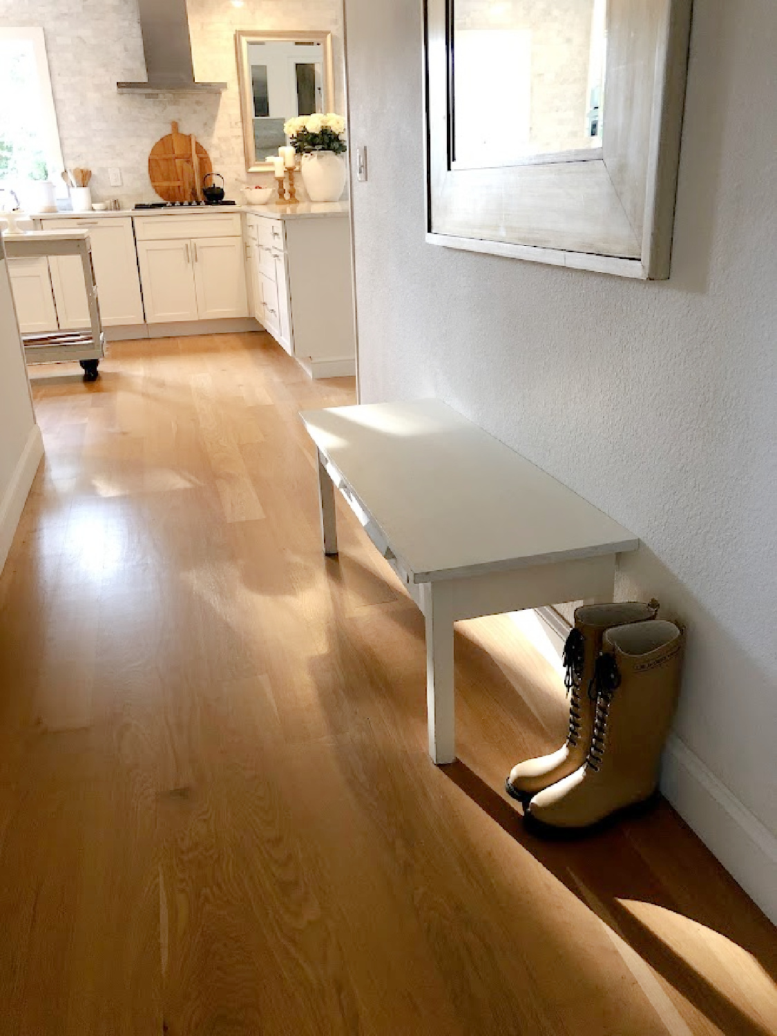
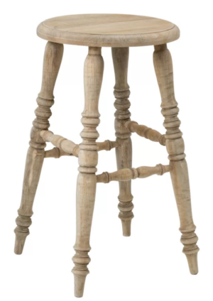
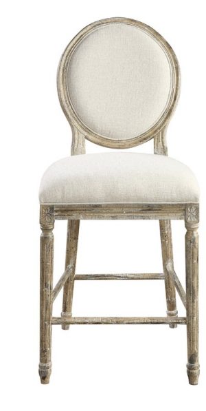
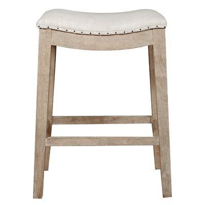
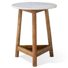
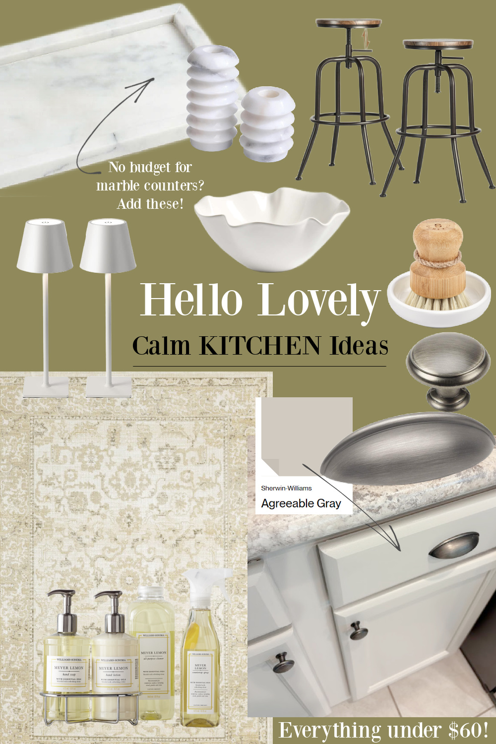
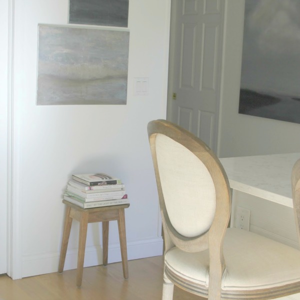
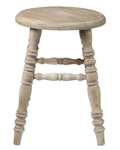
Even a simple wooden stool that feels homey and humble may work.
Bring Original Artwork Into the Utilitarian Space
I like living with beautiful art I can admire all the time. Don’t forget about the magic of original pieces (you can see a few of my original abstract paintings reflected in the mirror).
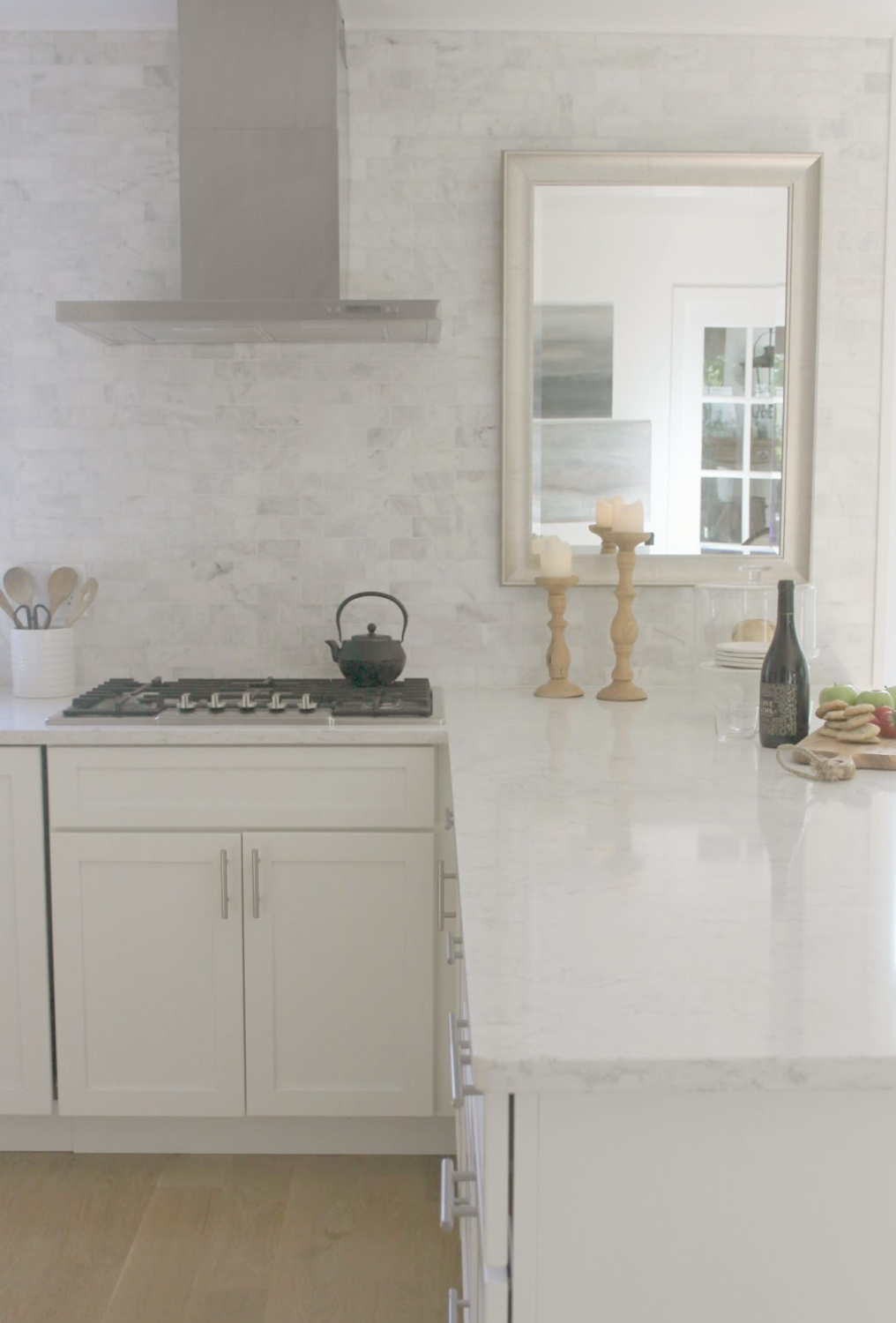
Have you noticed how professional stylists often display vintage canvas portraits casually on a kitchen shelf in a country kitchen? Try it. Now and then, someone will ask how I live with all the white and whether rooms truly look like this on a daily basis. The truth is, there is ALWAYS color cluttering the interiors. Food, clothing, art projects, etc. Even breakfast prep adds color:

Accent With a Favorite Color
If you inherited a kitchen where someone else made all the kitchen design choices, it’s easy to feel stuck thinking you must live with the existing color palette. How to personalize and customize it? I inherited a red painted backsplash 10 years ago when we bought a vacation getaway:
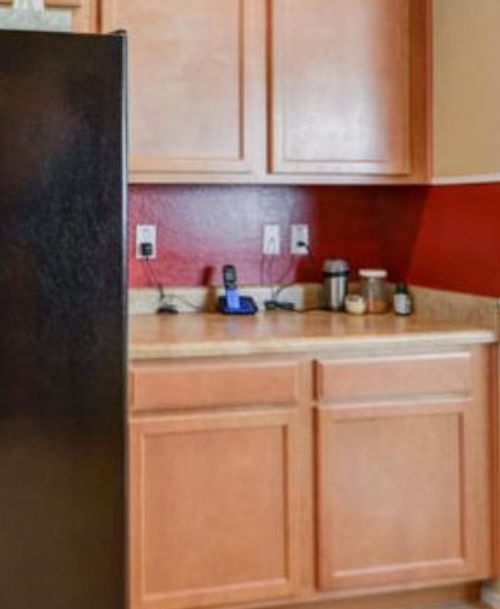
All of the colors were warm and just not us. I knew the right palette would work wonders.
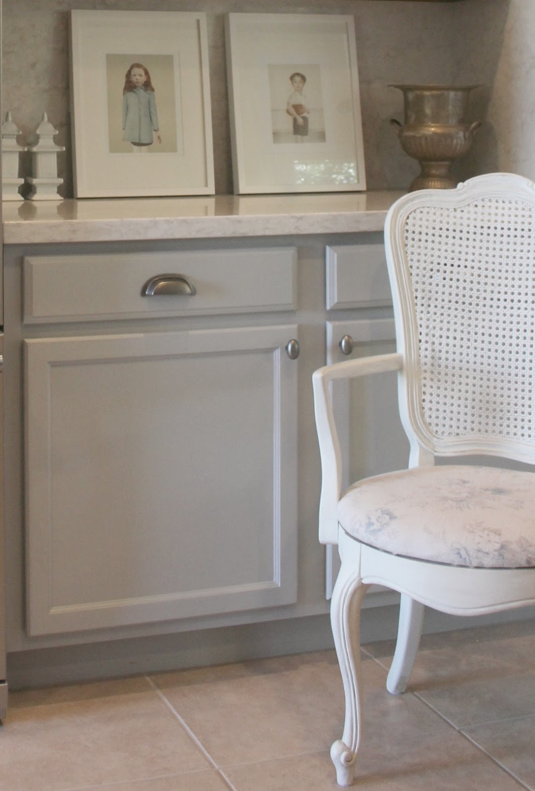
Am I suggesting you simply choose a favorite color and start painting your cabinets? I mean, it’s what I sometimes do. But at the very least, erase the things you can erase and begin to bring in objects or paint color samples that feel more like you.
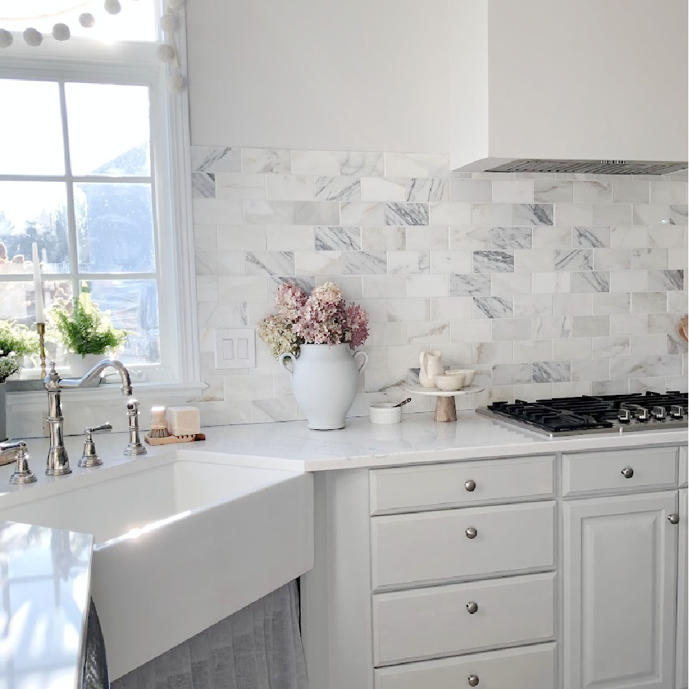
I always seem to inherit homes and kitchens from folks who love red…a color I cannot live with ever. Give me the red dress–I love ’em. But skip the cherry stained everything…which is what I confronted in our current Georgian home. What a difference to give them new life with pale sophisticated blue-grey.
There is a whole discipline of psychology devoted to color and its affect on human emotion, productivity, aggression, appetite, etc. Color matters for mood, well-being, resale and even as a functional matter since more reflective colors help you to see better and stay safe.
Paint the Trim
Here’s your permission slip to paint your trim. The thought of painting the trim throughout your whole home may feel daunting. It really is okay to begin with just one room.
It can be a scary decision to consider painting over stained wood trim. Unless you live in a historical home with one of a kind architectural moldings, it’s just trim. Realistically, new wood trim could replace it down the line if you grew to hate it. What I know is how dated wood trim (or trim painted the wrong hue) can deflate moods and be a distracting design element.
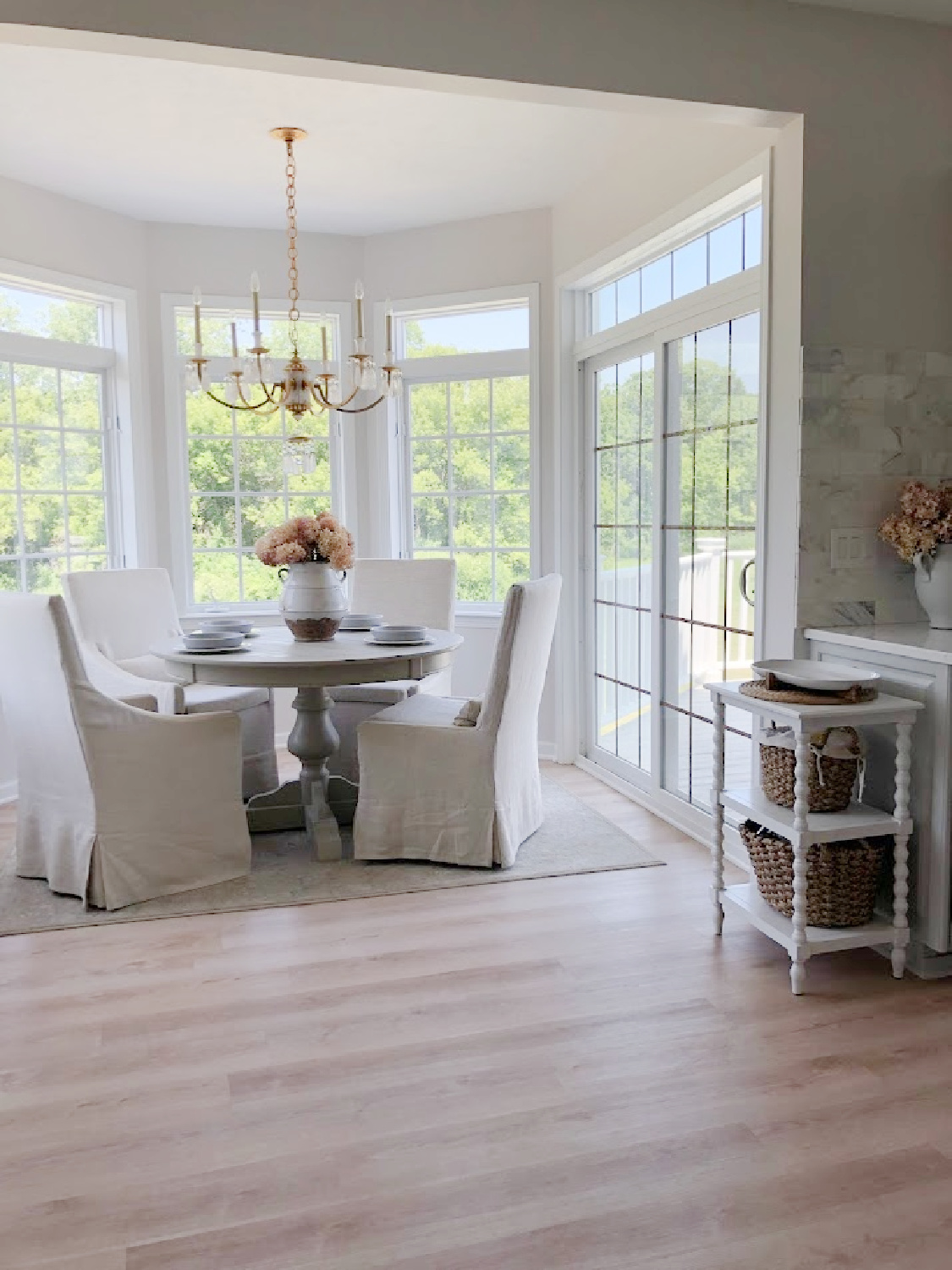
What I also know is just how many coats of primer and white enamel are needed to cover deep dark cherry stained everything. (See above breakfast nook turret which took weeks to transform.) Goodness.
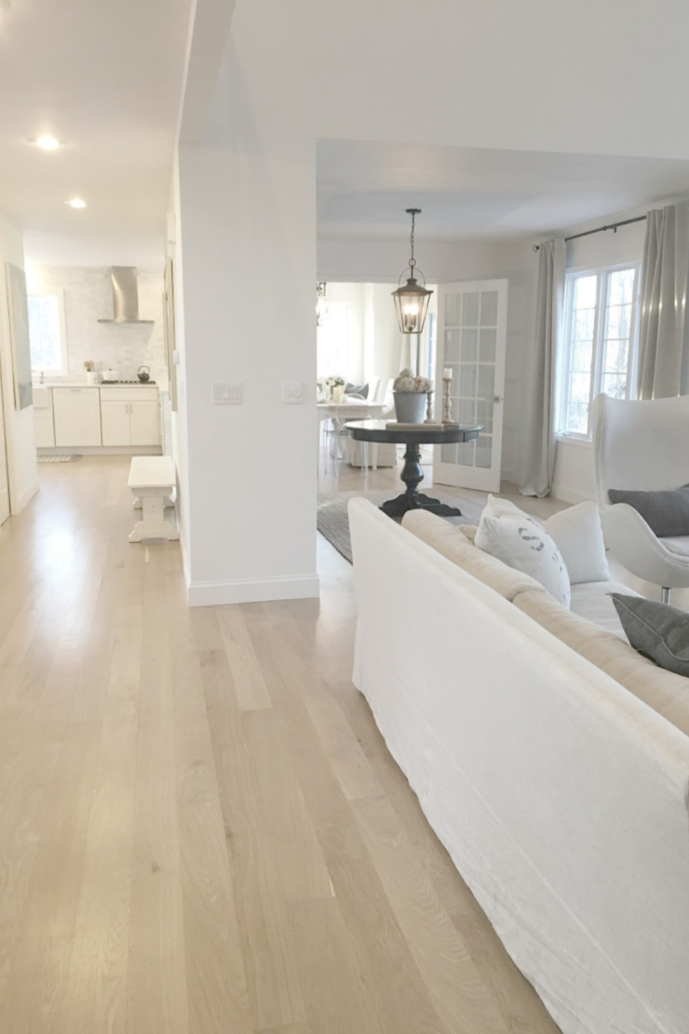
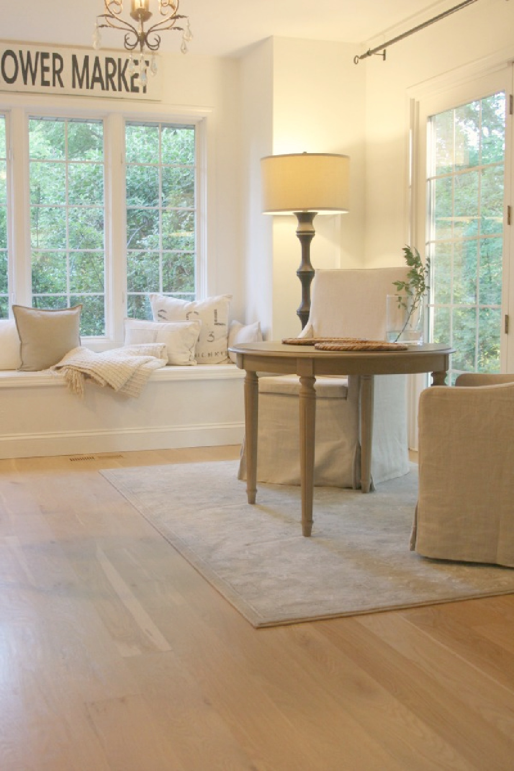
Color affects us in mysterious ways. Red-toned browns overwhelm my own senses. White oak flooring in our former home was left natural and glowed with golden warmth.
Get to know yourself and how color affects your emotions.
Color Truly Matters
For me, browns rarely bring me a feeling of safety or coziness, and this lesson comes years after living in a home with quality, costly oak trim. (I thought I might learn to appreciate it with time in a prior spec home we didn’t design).
Less visual types may hardly notice a trim’s tone. Practical, logical, left brain types who size up a room’s appeal based on other factors may call this discussion drivel. But then there are sensitive design freaks…
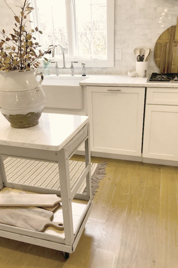
Take time to determine your response to trim colors when it subtly recedes or assertively emerges.

Be mindful too that painting over stained wood is generally not wise if your only motivation is to be on trend. If your eye loves stained wood, keep it!
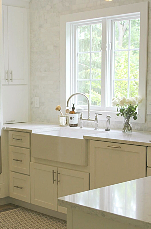
Choosing Trim Colors
Painted trim and the addition of trim around windows and doors itself falls in and out of favor. (The Giannettis along with other high end minimalist types sometimes skip trim altogether!). Your decision should support your personal style, taste, and comfort for what feels most like home.
Don’t forget there are all sorts of neutrals beyond white for trim.
Painting window trim, doors, and floors is a task which stirs up anxiety for many. Since it is still rather uncommon to deviate from either white or wood trim, don’t overlook the power of color. A calm trim color can help if there is a shortage of architectural interest or to enhance a not so great window.
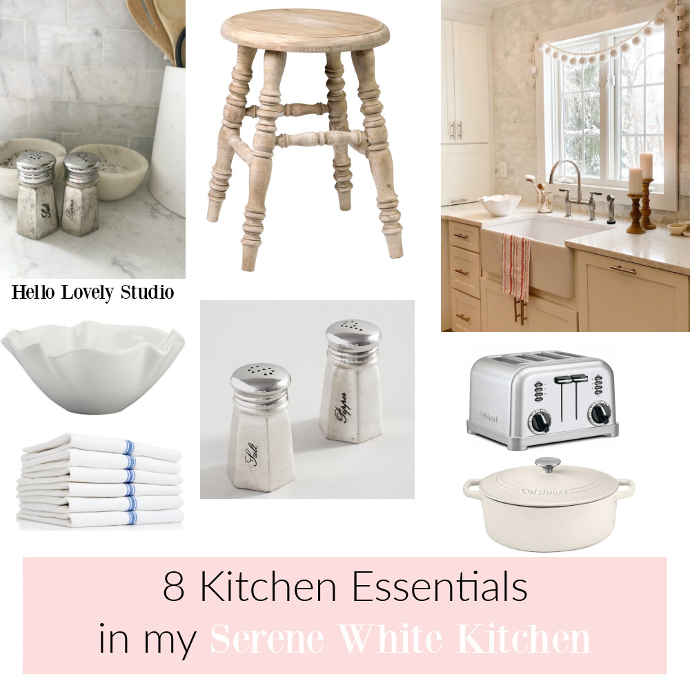
Peeks At Our Renovated Kitchens
Thanks for reading these ideas and adventuring ever deeper into calm with me.
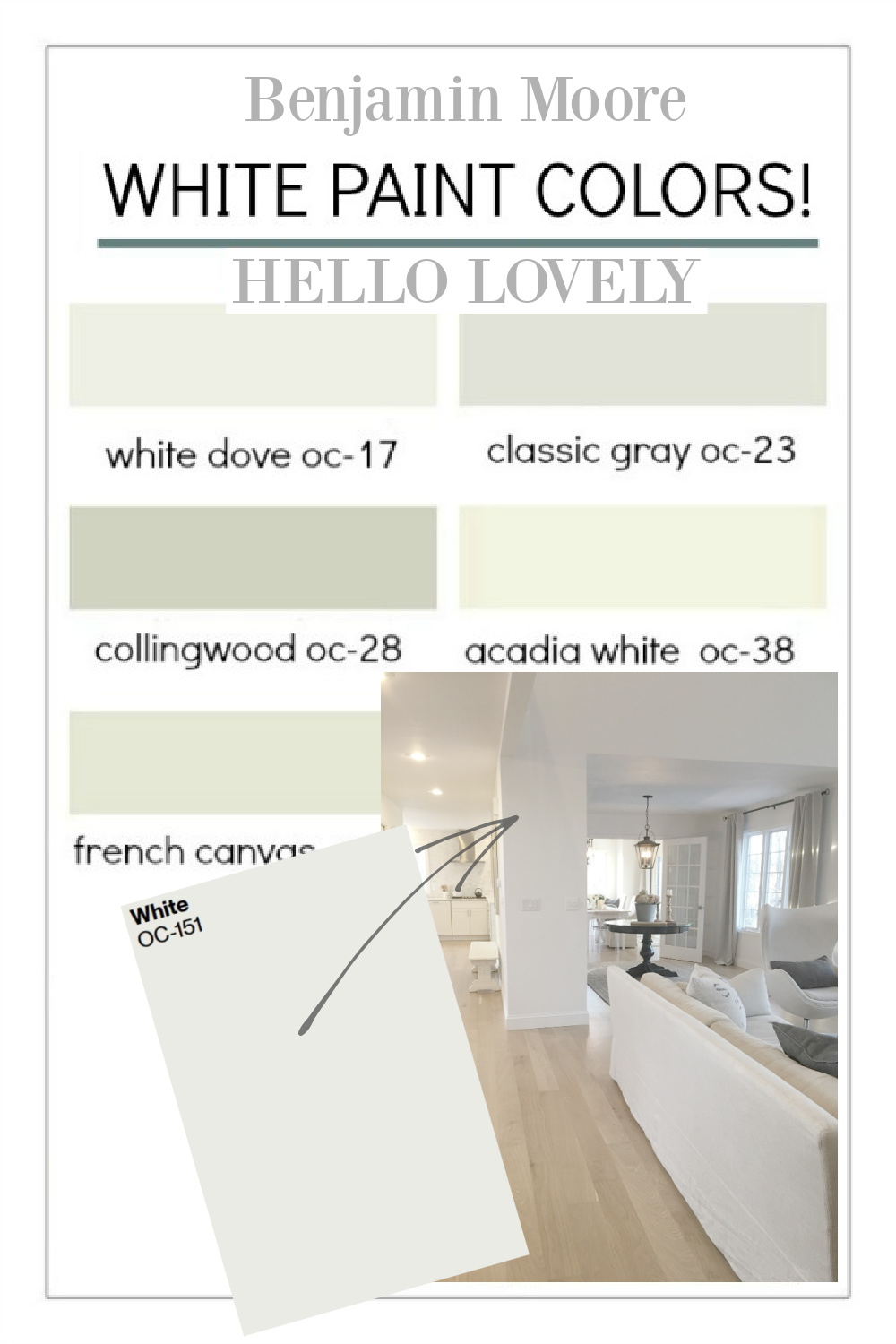
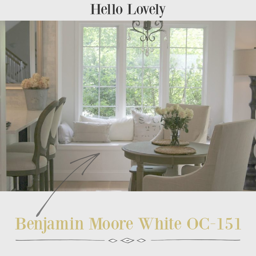
A Bright Crisp White to Consider: Benjamin Moore OC-151
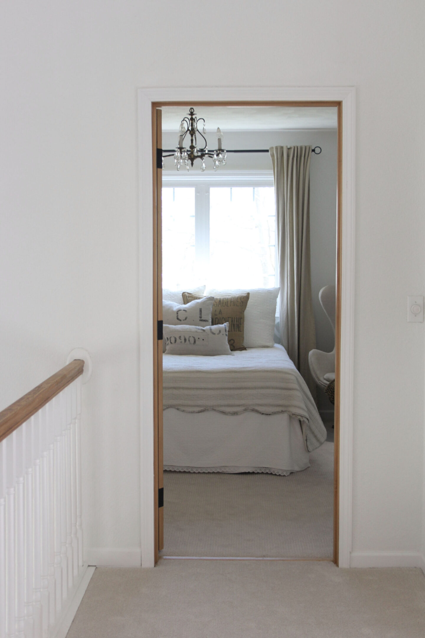
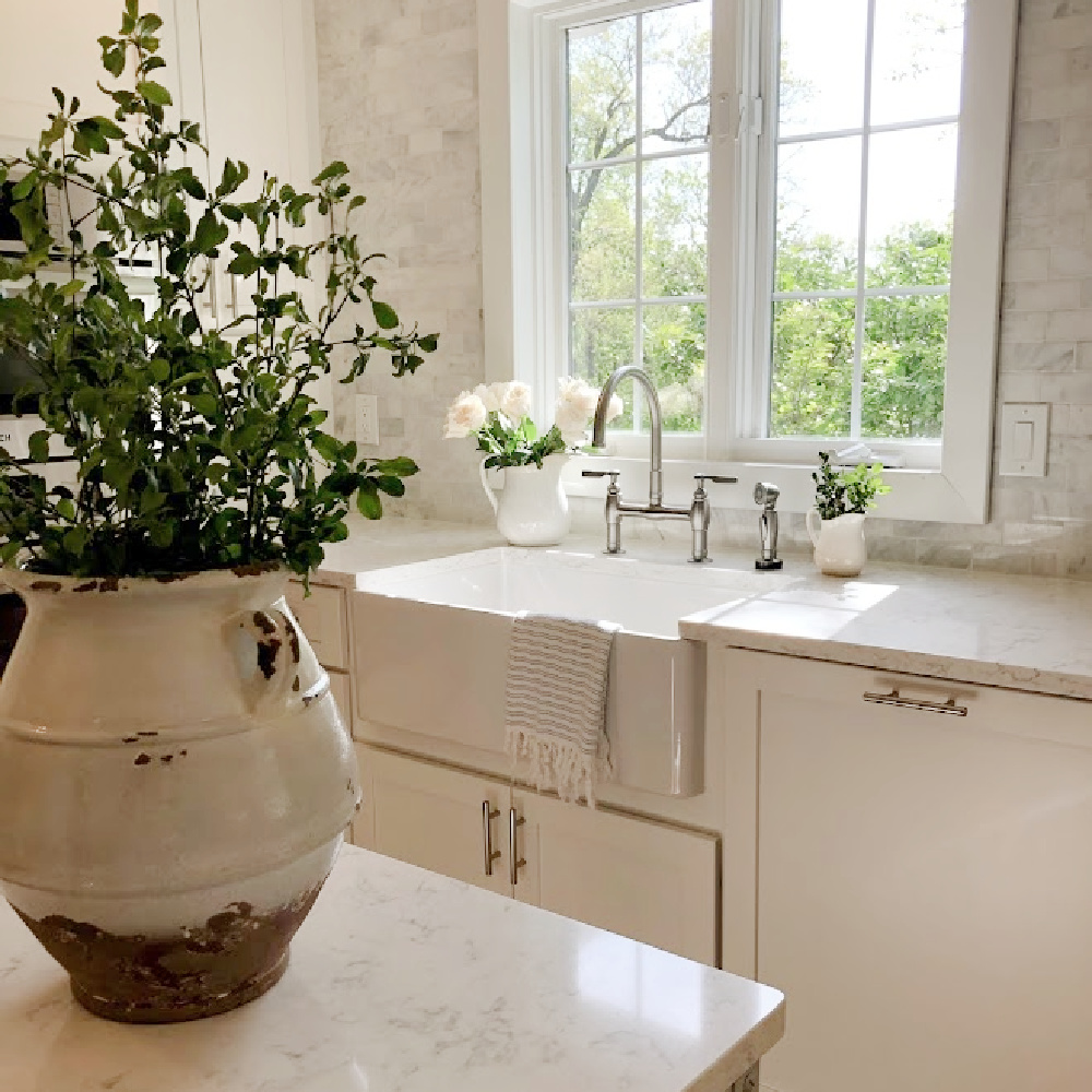
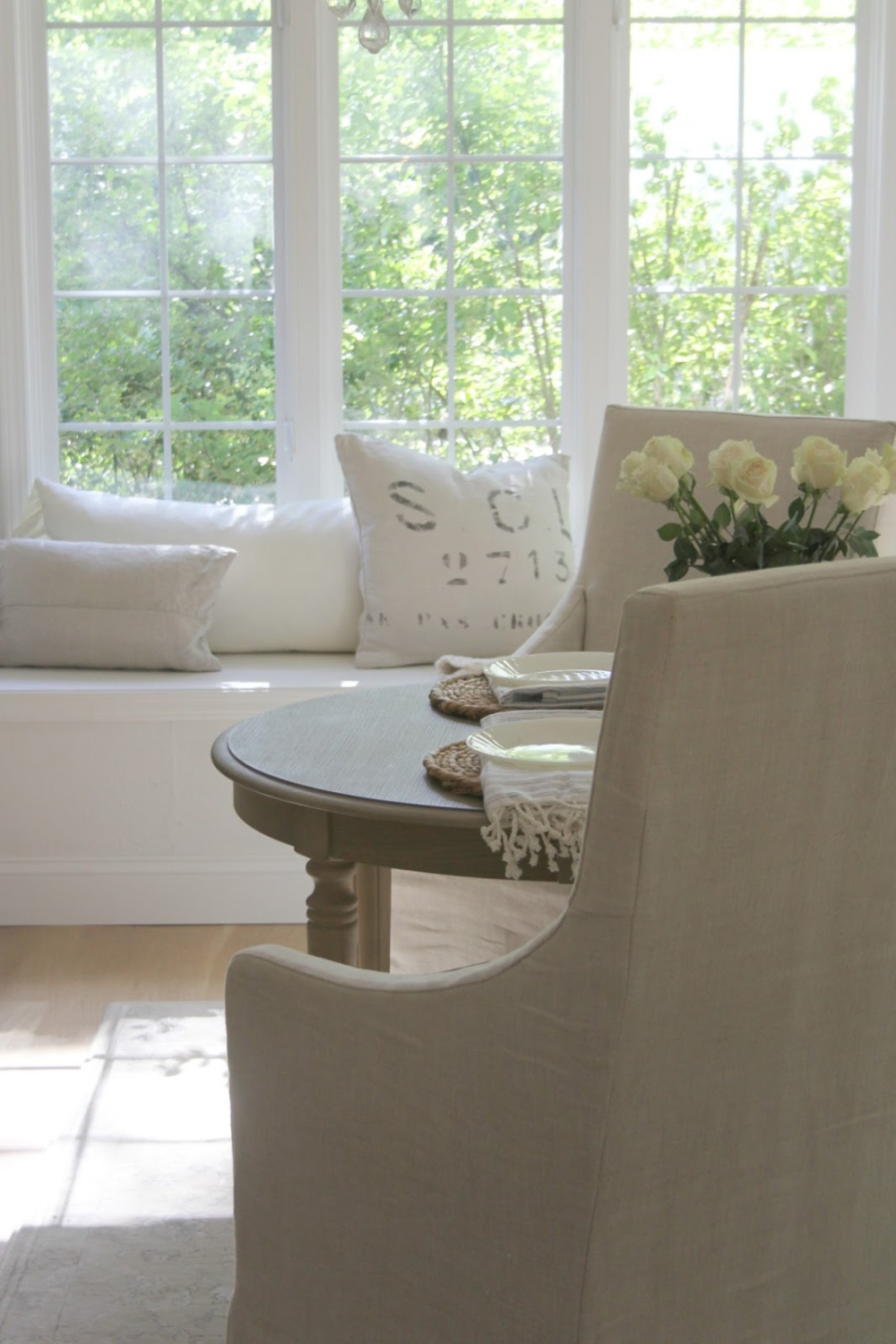
It may help to see BM White OC-151 on walls (flat), trim (semi-gloss), and ceilings (flat) in various sheens in bedrooms, kitchen, bath, and living room with different amounts of natural light and in different seasons.
How Bright and Reflective is OC-151?
The LRV (light reflectance value) is 83.56 so it is going to reflect lots of light in the room. Our home receives a fair amount of strong yellow sunlight, and I needed a white that would not pull yellow or creamy warmth.

Plentiful shades of white paint exist for good reason: they vary in terms of undertones, light reflectance (LRV), and temperature (cool or warm?).
REMEMBER: even after you find the best white paint for a particular room, it may look less than perfect in another part of the house or another home.
Why is that?
Your room’s unique lighting, exposure, lighting, furnishings, etc. impact perception of the color and the complete design picture. Rooms within your home vary in their exposure and window placement so the same color will vary.
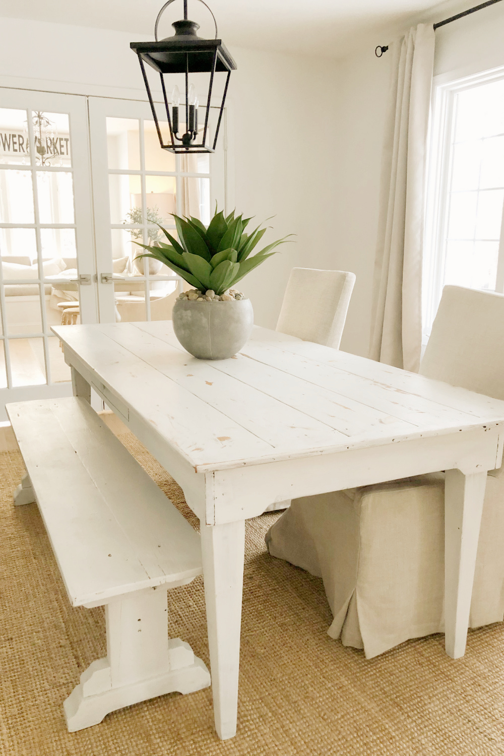
It didn’t bother me that the BM white I liked best appeared slightly different room to room.
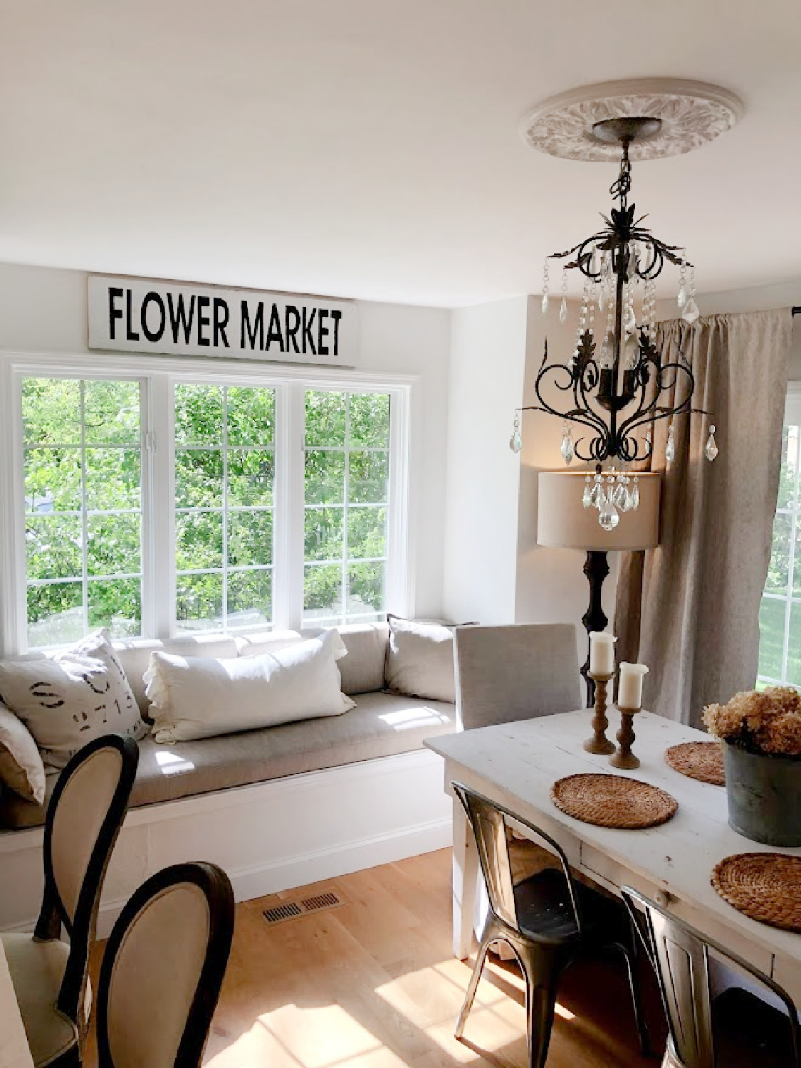
The important part was finding a white that felt modern and clean, didn’t look dingy, and had plenty of cool undertones so it wouldn’t turn yellow at any time of day.
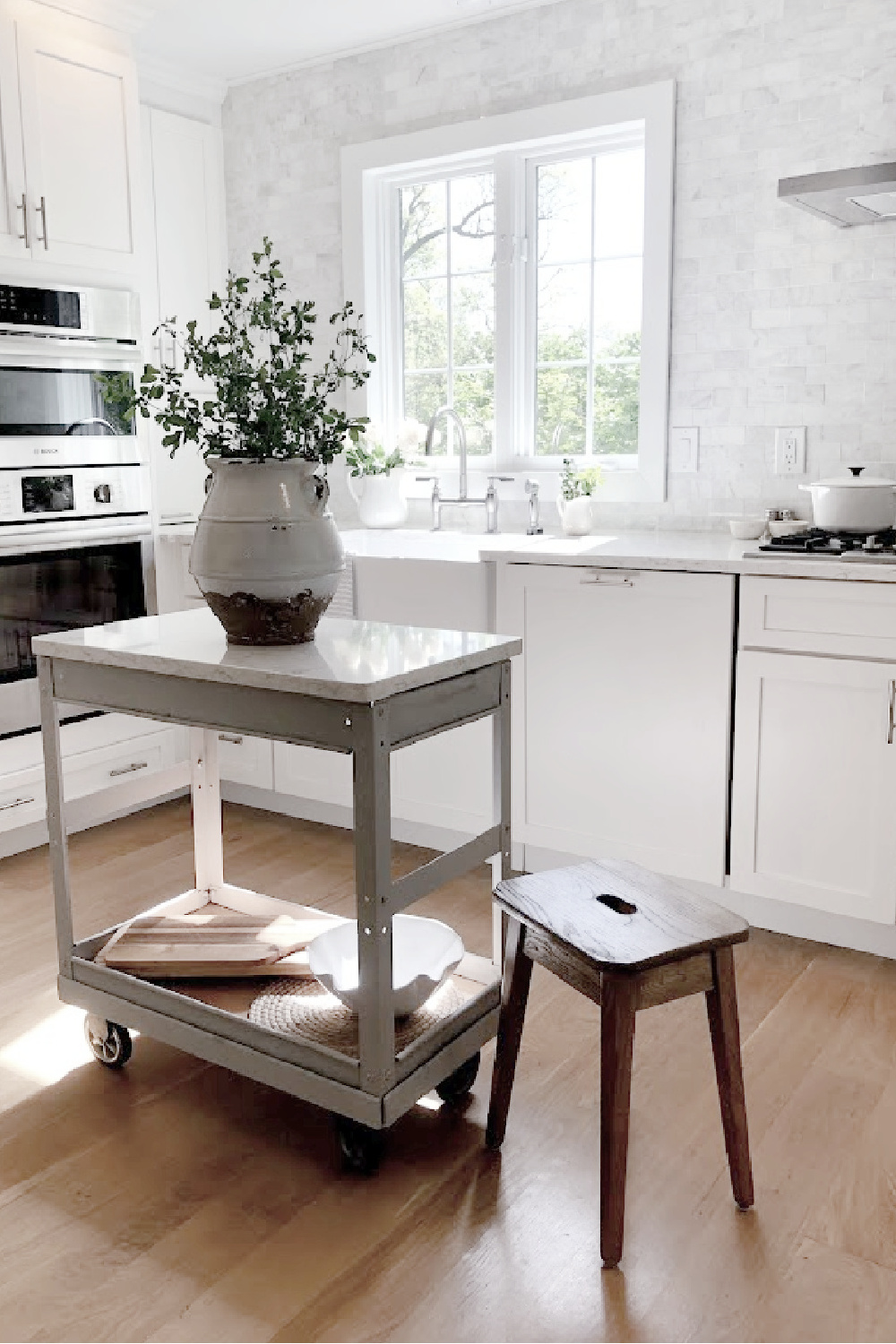
Let’s explore more advice for landing on the white with qualities that enhance your own space.
Paint Color Consultation?
Long before I became a writer, in 1987, my husband and I began redecorating homes. I have a history and love affair with curating colors, patterns, and textures for interiors.
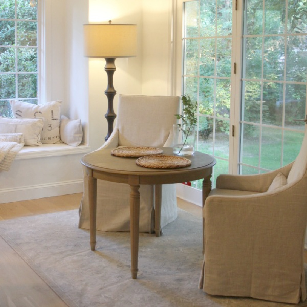
In addition to experience decorating, designing, remodeling, and renovating homes for myself and others, I have also studied color theory, painted as an artist, and culled expert advice from professionals in the field.
Additionally, I have catalogued the best tips and paint color intelligence from in demand designers, artists, and analysts working in the industry.
Choose the Best White Paint Color
With decades of experience painting walls, objects, and canvases, I am most experienced with a neutral color palette, with a trained eye for whites in particular.
Remember there are not just a few good white paints floating around.
In fact, there are endless variations with varying pigments, LRV, and temperature.
One of the most common questions I am asked all of the time is a version of: WHAT WHITE COLOR WILL MATCH WITH _________ AND _____________?
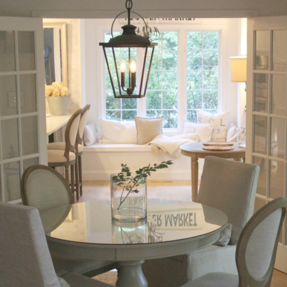
Most homeowners don’t realize how a mix of whites living together works well.
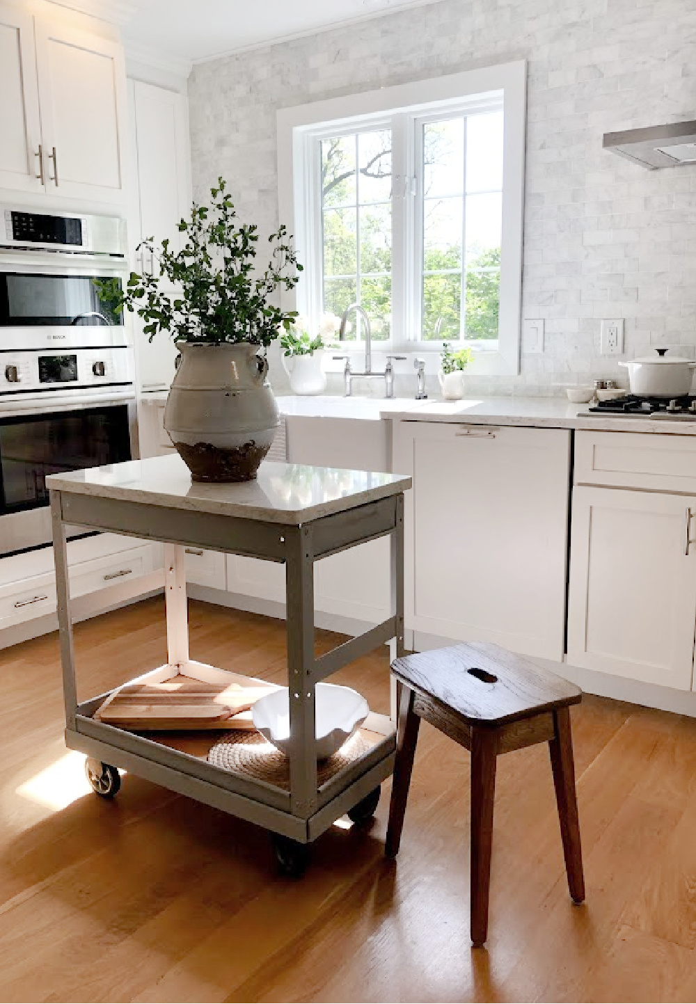
Rather, they imagine the main goal is “matching” for a singular look. Matching is hardly the objective and leaves a composition dull. To arrive at a pleasing, sophisticated, welcoming mix, lean into harmony and balance.
1. Whites Interact With Natural Light & Geographical Location
Since we live part time in Northern Illinois where the light is wholly different from the light in the Southwest, white paint colors here take on a particular quality.
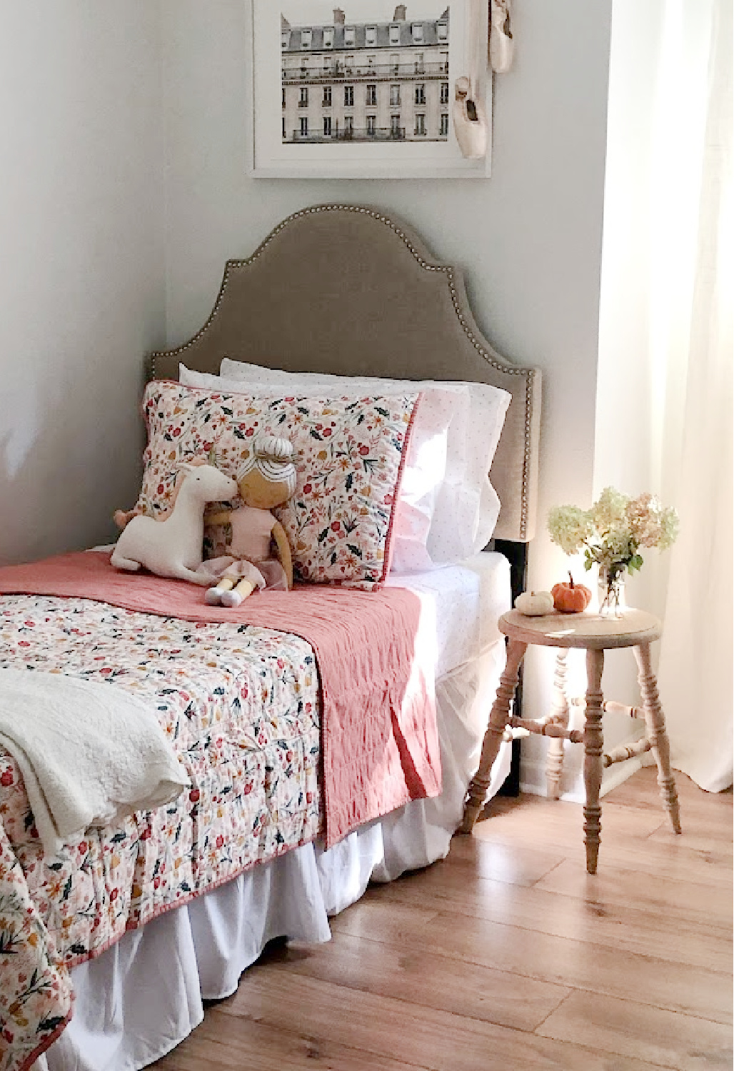
2. A Wildly Popular White Paint May Not Be the Right White
Certain bestselling whites work for a ton of spaces across the country, but they aren’t guaranteed to be the most flattering for your home. I had never heard of OC-151 and started with samples of BM Decorators White, White Dove, and SW Alabaster.
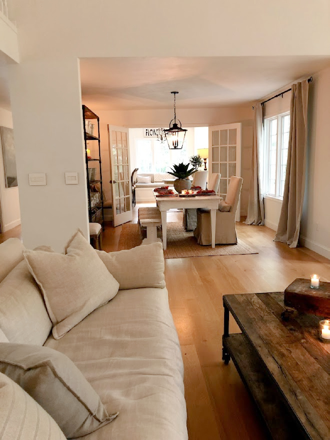
As soon as I sampled this color with the most boring name (sample Benjamin Moore White), it was the only choice to immediately feel right. To choose the BEST WHITE, don’t obsessed over just one color in an image or on Pinterest and assume it will be perfect without trying a sample.
Why?
First, professional photography for print or web often involves editing. Second, your room’s location and lighting are unique. Third, often a lot of folks experience an emotional reaction to the mere NAME of a paint color which doesn’t mean a thing.
3. Sample This BM White With Other Whites
Begin with a handful of samples for your walls. You could also try Brilliant White OC-150, Sherwin-Williams SW Extra White, and BM Chantilly Lace.
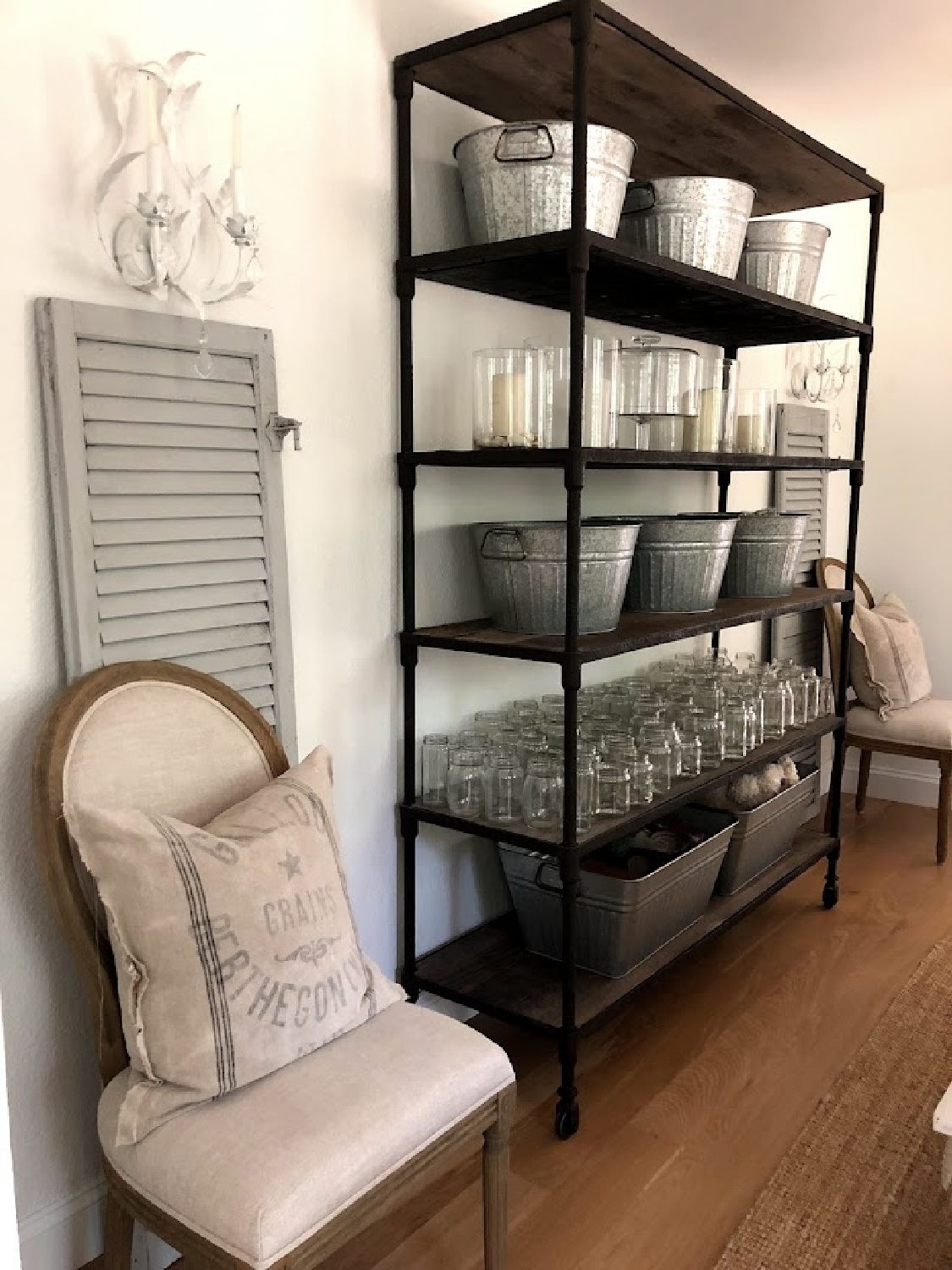
You’ll begin to notice subtle differences and see the influence of undertones. In our own home (we’re on our 6th whole house DIY renovation), I first selected about five different bright clean white contenders.
4. Analyze White Paint Samples
After viewing the samples in different rooms throughout the home at different times of day, I scrutinized. I took time to notice how the white changed or didn’t change throughout the day.
5. Undertones in White Paint
All whites have subtle undertones of grey, pink, yellow, brown, blue, etc. which influence the white’s temperature and perception in varying light.
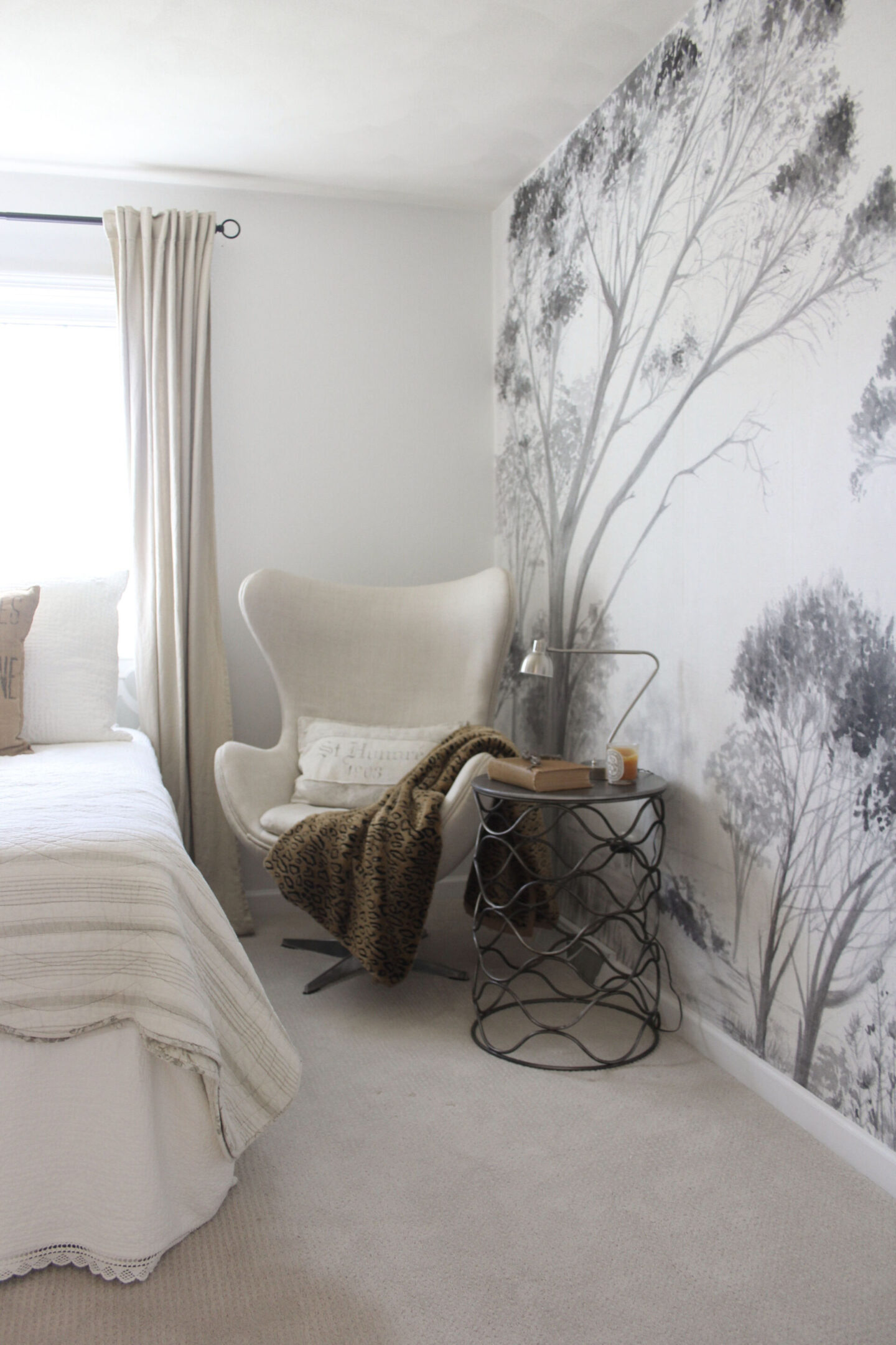
Even your age can come into play as far as perceiving color. Did you know as we age, the lens of the eye gradually yellows?
This yellowing lens will influence perception of colors. The lens will likely absorb and scatter blue light so that it is trickier to notice nuances in shades of purple, green or blue.
6. Why I Ultimately Chose This BM Neutral
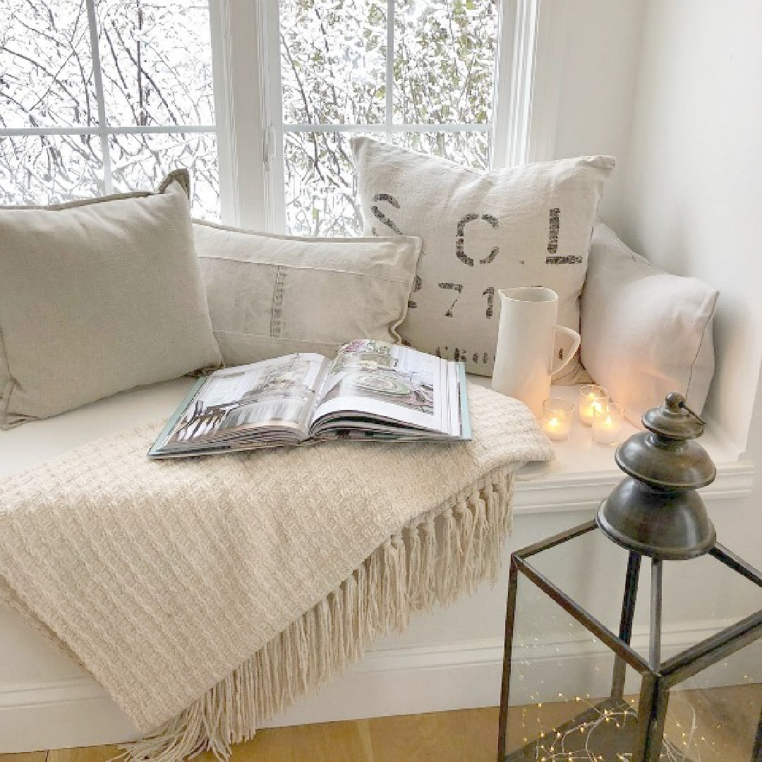
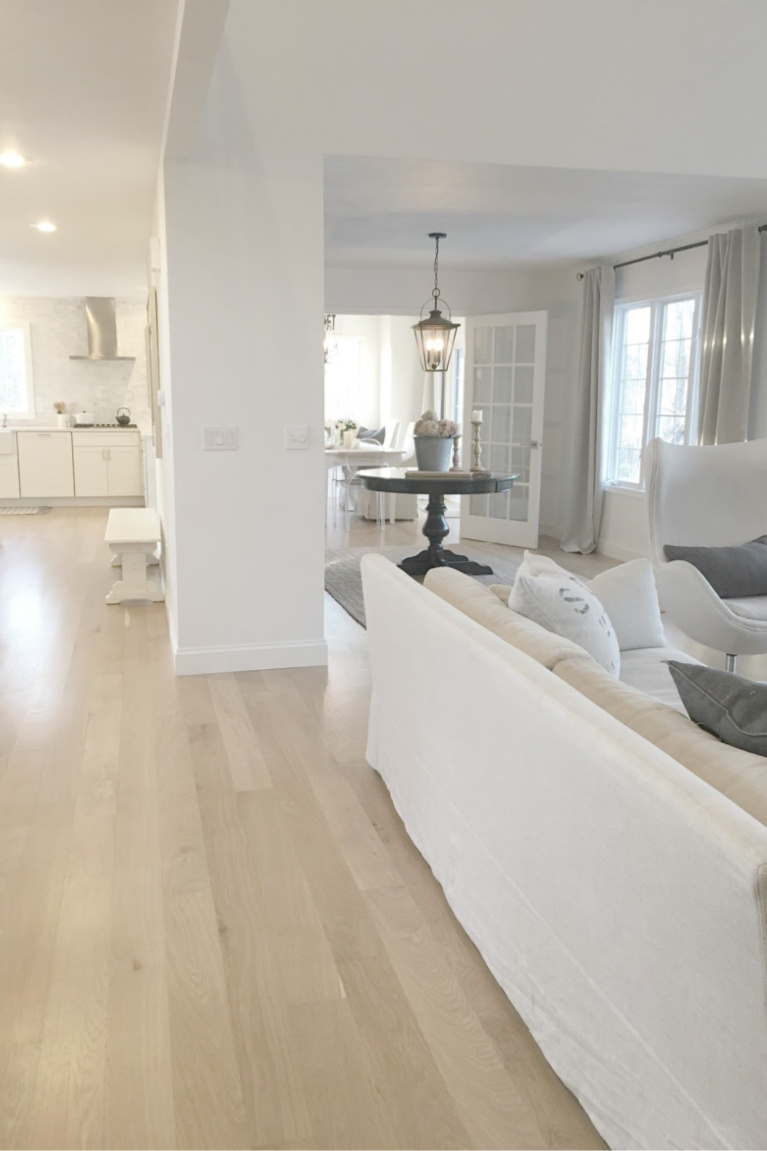
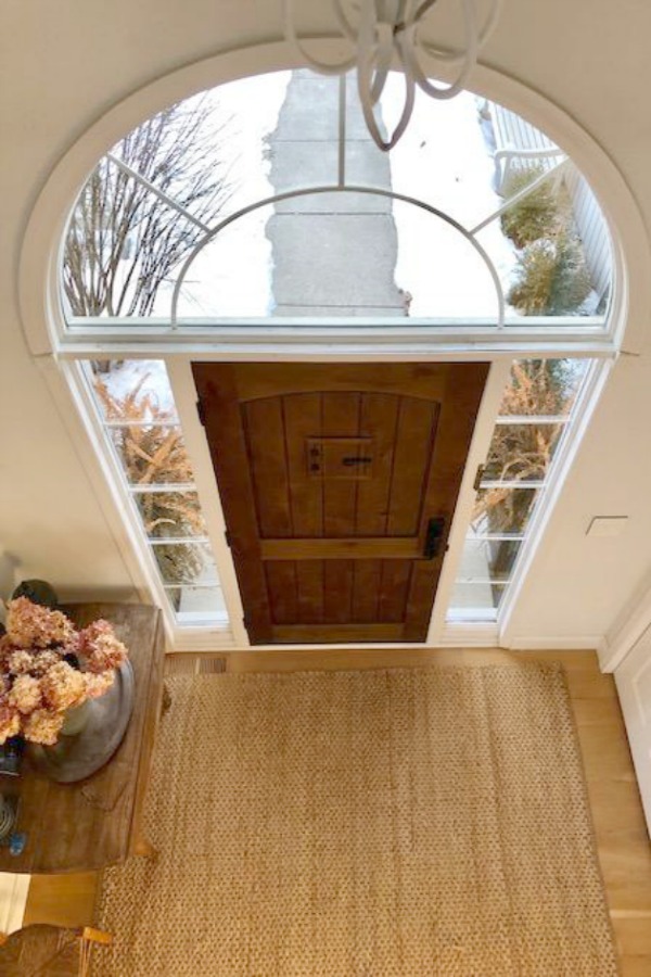
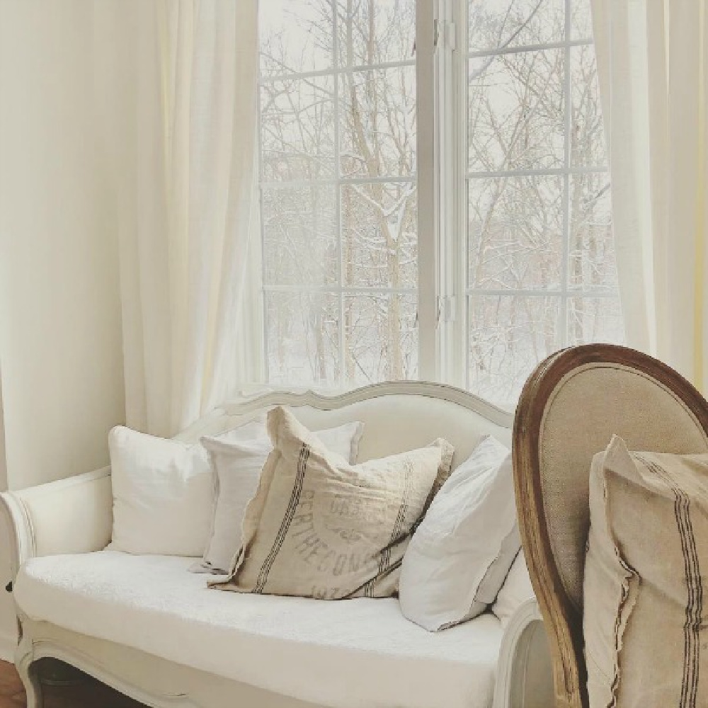
I can imagine that this white could be too stark for certain interiors, but in ours, it took on a cool, modern, gallery-like, slightly monastic and ethereal feel. You can see the snow outside in this image I snapped and how it reads much colder than the paint color.
Will the Right White Stand the Test of Time?
We painted all the walls, trim, and ceilings in our North-South exposure home (which receives intense yellow sunlight) BENJAMIN MOORE White OC-151. Seven years later when we put the home on the market, we still loved it and had no plans to change it. Trends come and go, but when you stick to classics and listen to what a home’s architecture and lighting are whispering, you’re saving yourself a lot of time and money in the long haul.
What a transformation when we painted over yellow walls!
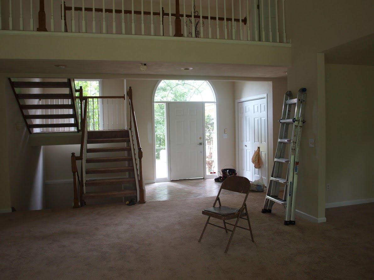
The minimal simplicity of the name of this Benjamin Moore white means there’s no chance we’ll forget the color’s name!
7. Choose the Most Flattering White Rather than a Trending One
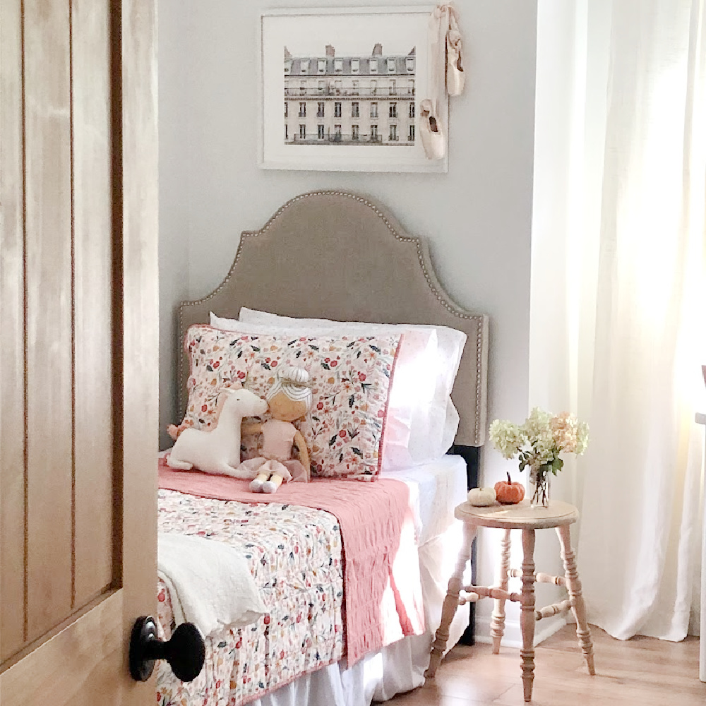
BM OC-151 White does not seem to be internet popular as it is cool white and perhaps not as gentle as white paints I chose for other homes.
8. More White Hues to Consider
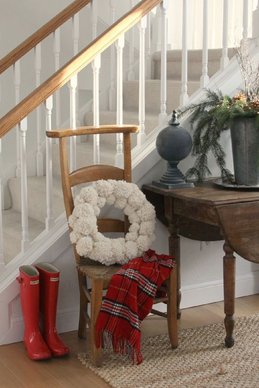
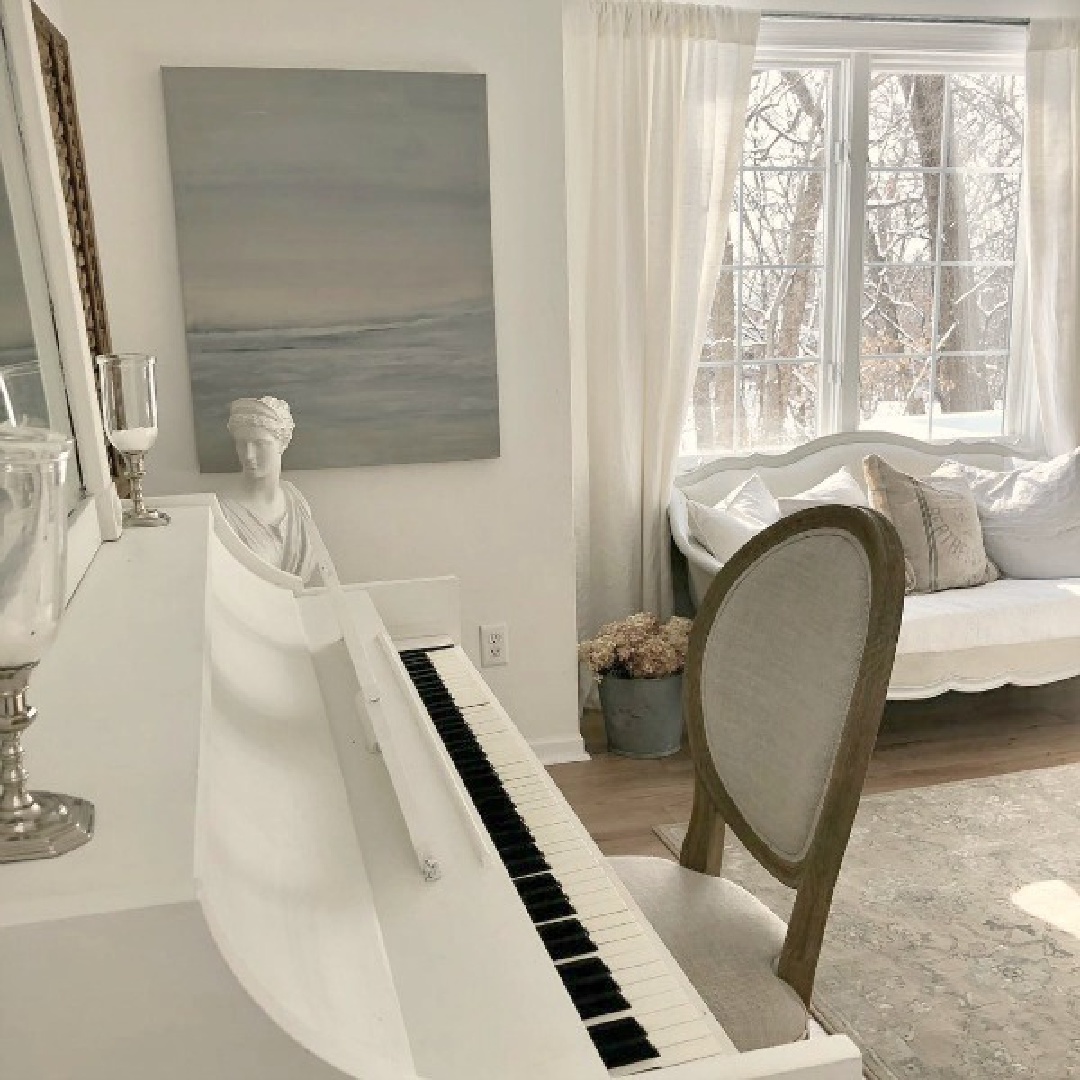
BENJAMIN MOORE White Dove remains a favorite of mine for vintage furniture and what I chose to paint my family piano.
9. Viewing Image Galleries Online Helps
While there are paint color experts who may advise against stalking Pinterest and blogs for paint color ideas, I have my own opinion (however biased it is as a blogger!).
Collecting images of beautiful white painted rooms online or in shelter magazines (where the paint color name is provided) can be far more helpful for securing initial samples than deliberating over teeny pieces of cardstock under fluorescent lighting at the paint counter.
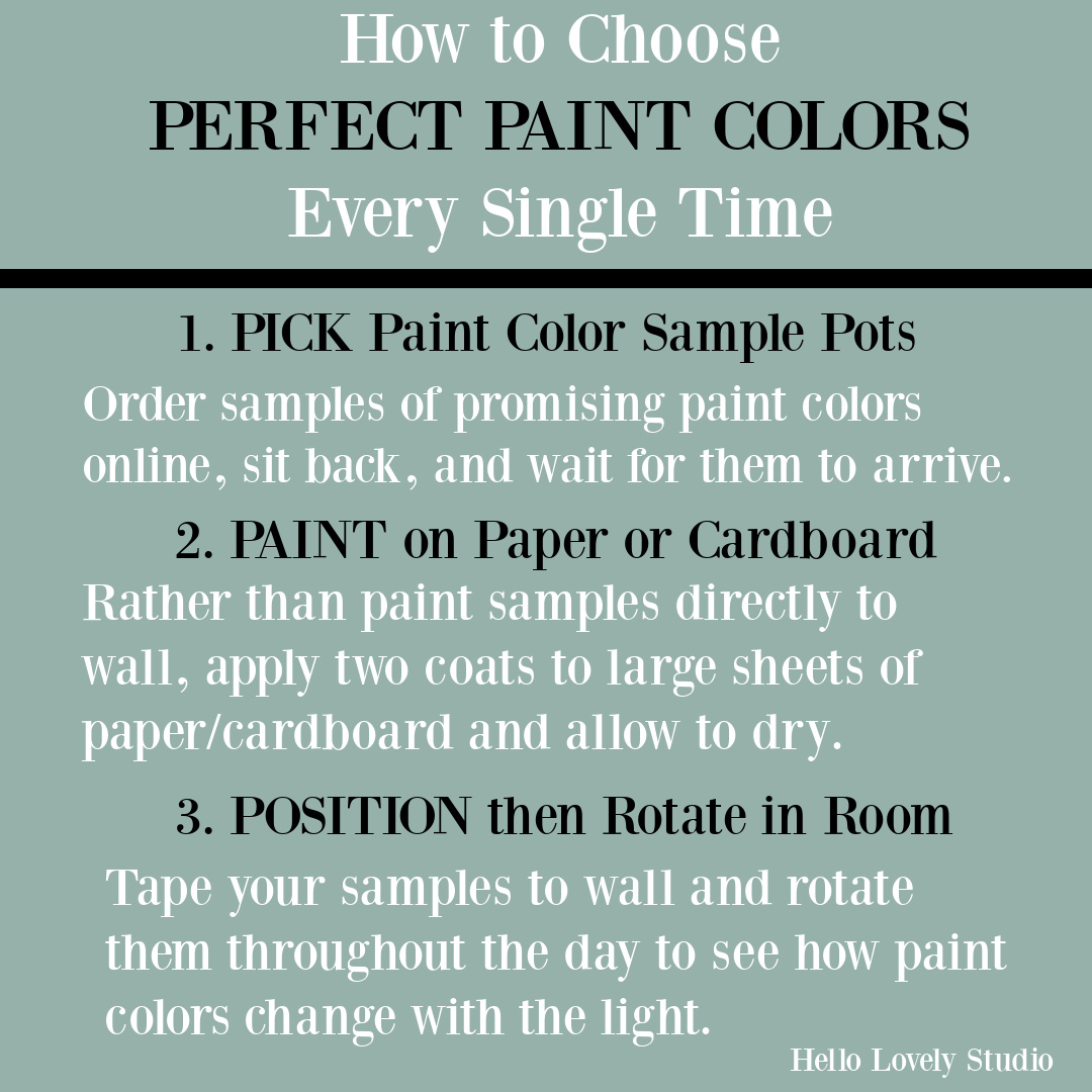
If you can’t wait for peel and stick paint samples to arrive in the mail and want to rush out to a paint store or big box paint counter for paint pots immediately…
Ever considered painting wood cabinets to brighten up your kitchen, bath, or laundry room?
Here’s a tutorial.
10. Pinterest for Paint Color Search
I have a Pinterest board HERE and white paint favorites HERE devoted to paint colors so you’ll score ideas.
FIND MORE TIPS IN PARTS ONE AND TWO.
Peace to you right where you are.
-michele
I independently selected products in this post—if you buy from one of my links, I may earn a commission.
Thanks for shopping RIGHT HERE to keep decor inspiration flowing on Hello Lovely!
Hello Lovely is a participant in the Amazon Services LLC Associates Program, an affiliate advertising program designed to provide a means for sites to earn fees by linking to Amazon.com and affiliated sites.