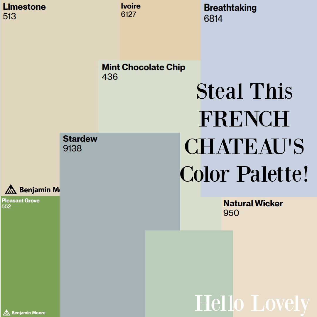
We’re picking up where we left off to explore the grand and lovely French Château Mireille. French Color Palette Inspired by this château will appeal if you dream of South of France romance and French inspired hues reminiscent of the sunny South of France countryside. However, it may also help locate the right French Green or European country neutral. (This home is also a vacation property and may be available via Haven In).
Part 2 – Country French Color Palette: Château Mireille idea.
Sherwin-Williams Ivoire SW 6127
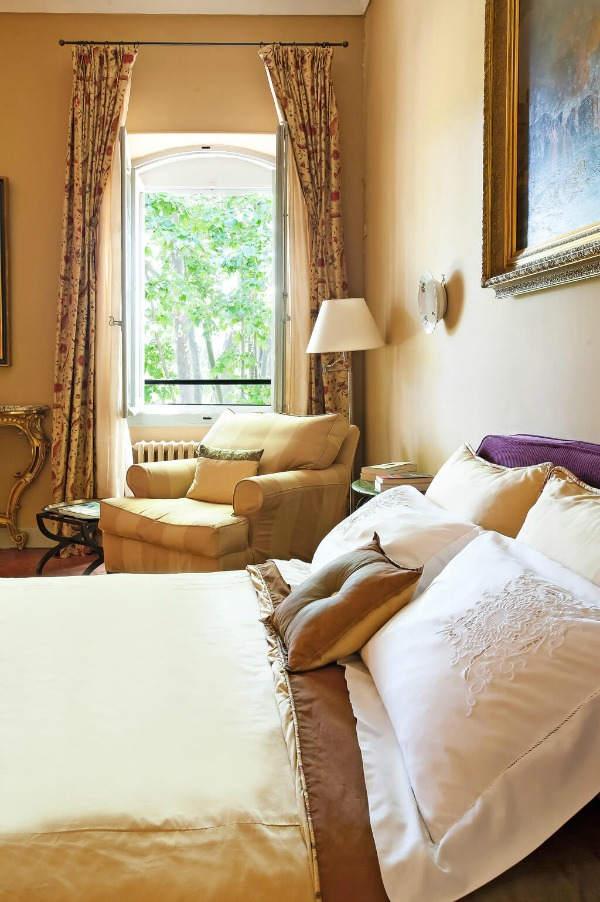
Yellow paint colors are tricky, and while I have painted several rooms sunny yellow over the years, I tire of it rather quickly. I find straw-colored yellows easier to live with, and they can feel like sunshine.
SW Ivoire is a beautiful, natural, warm gold that feels similar to the golden pigments we see throughout this home.
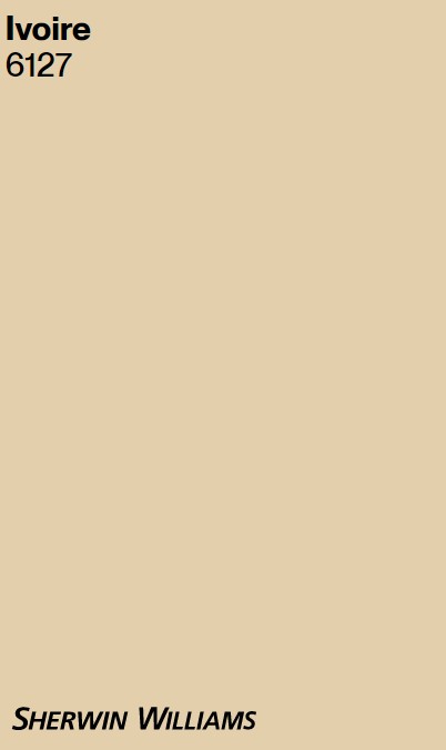

Ivoire feels suggestive of stone and the outdoors.
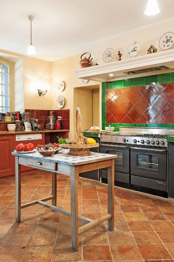
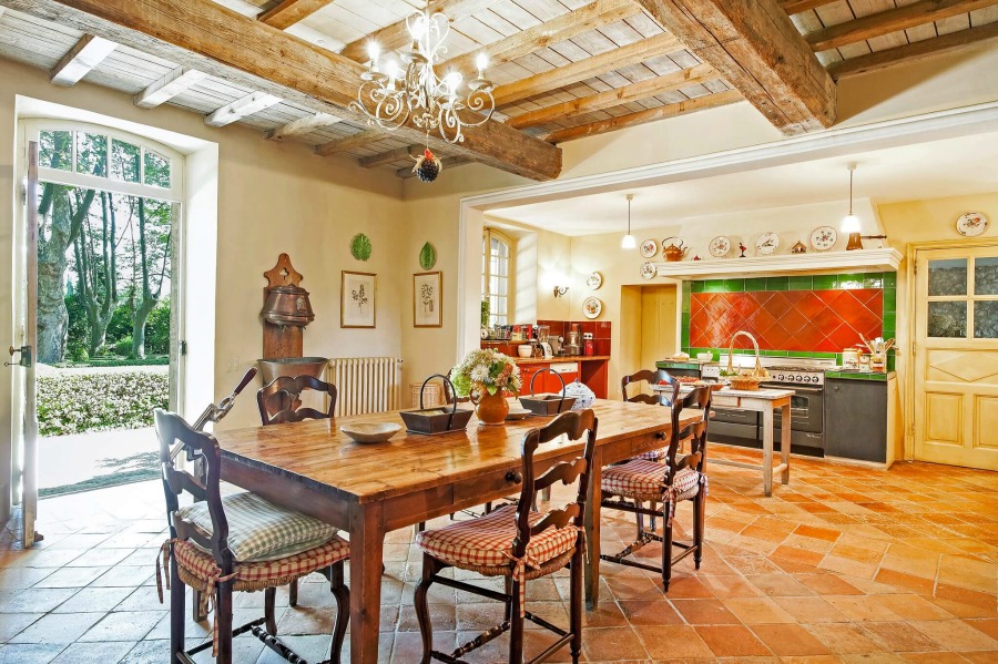
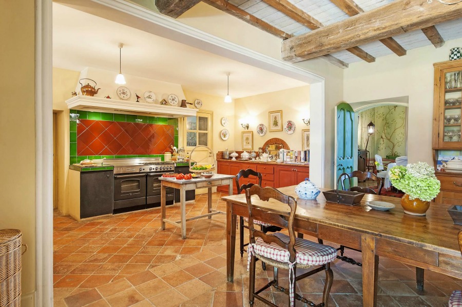
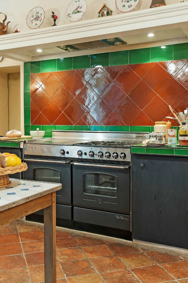
It feels very neutral in the chateau kitchen where a mix of terracotta, green, red, and warm browns converge.
Notice how in the next photo, the walls appear pale lemony yellow on the right of the image where the sun is hitting them as opposed to the goldenrod yellow color on the far left of the image.
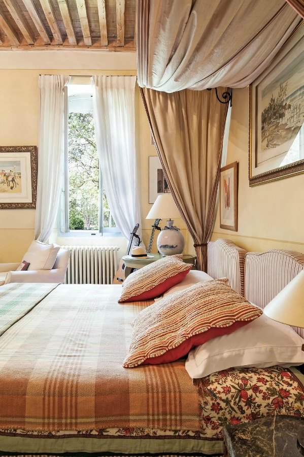
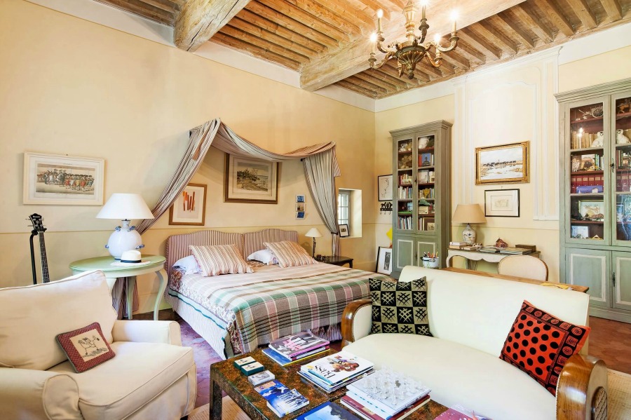
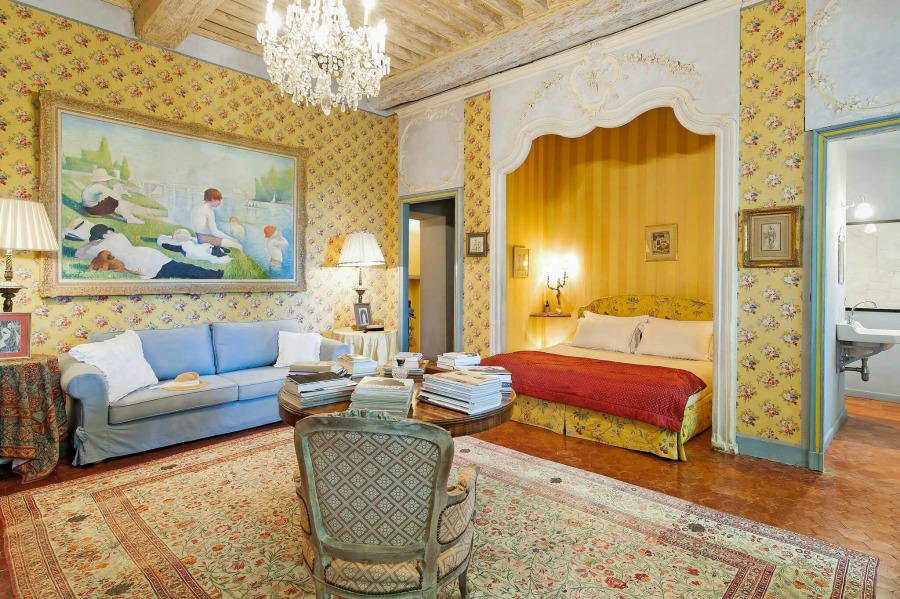
In a bedroom, three different golden colors plus what appears to be an ivory color adorn the walls. This method of adding architectural interest or a faux paneled look can be so charming.
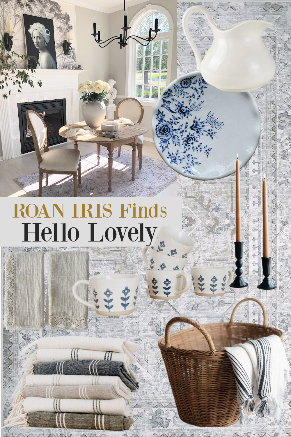
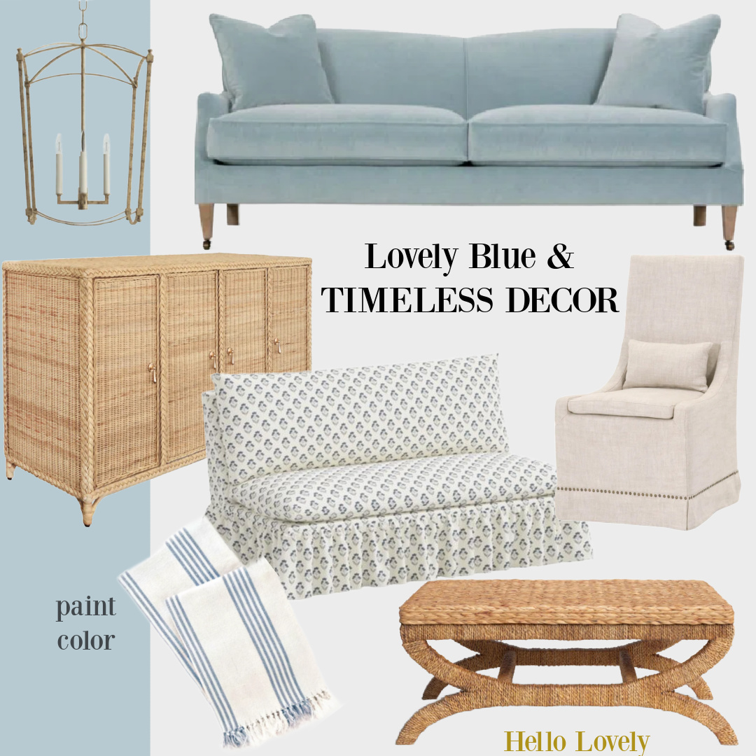
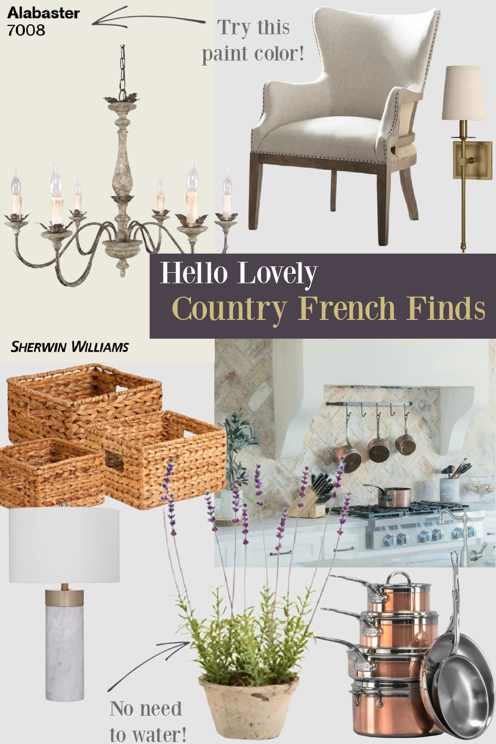
Lovely Timeless Decor for a Country French Color Palette
But you can see how peaceful things feel when the whole wall is solidly painted gold.
And isn’t the warm yellow-gold magnificent with the terracotta floors?
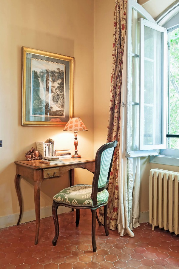
I love how those brown undertones in the golden color work with the brown-reds of the tile.
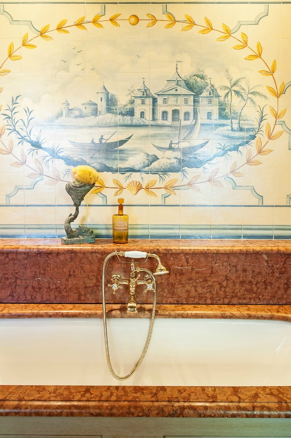
Green painted built-in cabinets also look stunning with the yellow washed walls. The gold walls in a bath feel like a subtle neutral with the other pale neutrals in the space.
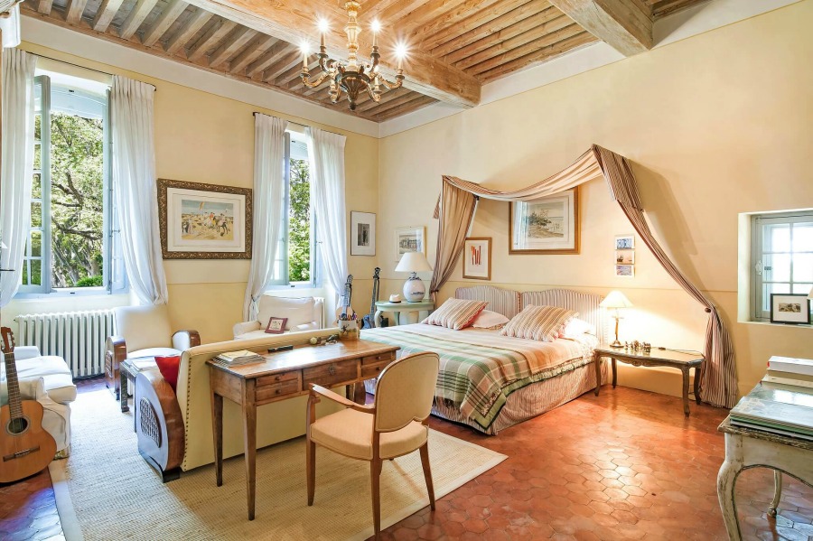
And I almost didn’t notice the blue or blue-green painted windows in this spacious bedroom above. There truly are many colors represented in this room!
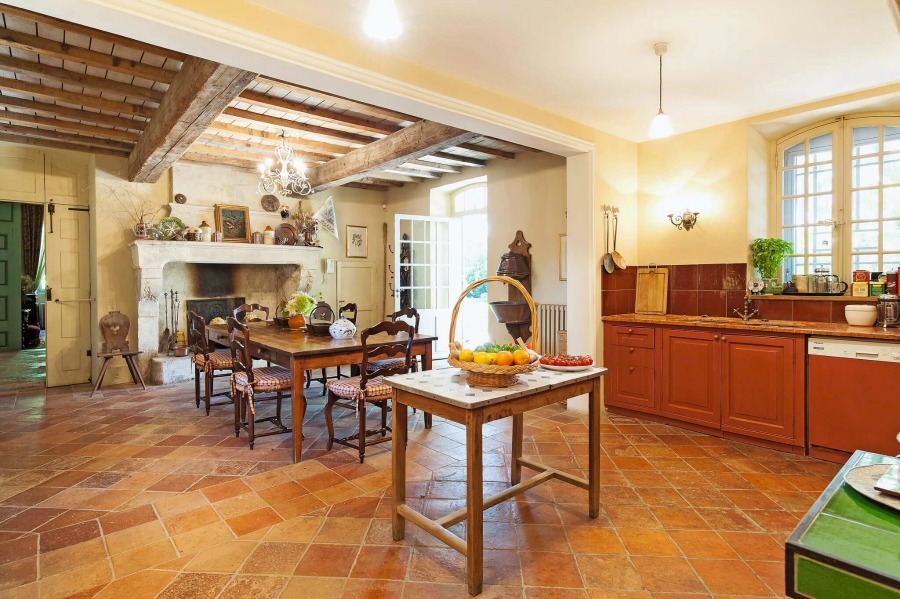
That goes for the kitchen too! Notice the terracotta painted cabinets and touches of green.

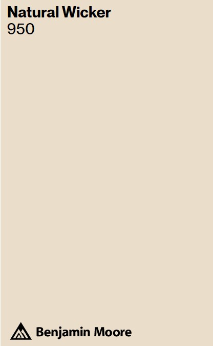
Benjamin Moore Natural Wicker BM 950
If you prefer less sunny and more putty tones (see THIS for ideas for putty colors for kitchen cabinets), you might like Natural Wicker BM 950.
It can be tricky to find a natural, neutral, stone color for a painted surface that feels organic and not showroom beige.
Again, you’ll want to sample a handful of colors before landing on the perfect one for your project.
Even when French color palette paint colors appear close or nearly identical online, they can vary in their undertones, light reflectance value (LRV…which is the percentage of light they reflect off the walls), and brightness.
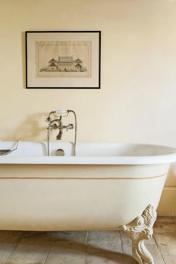
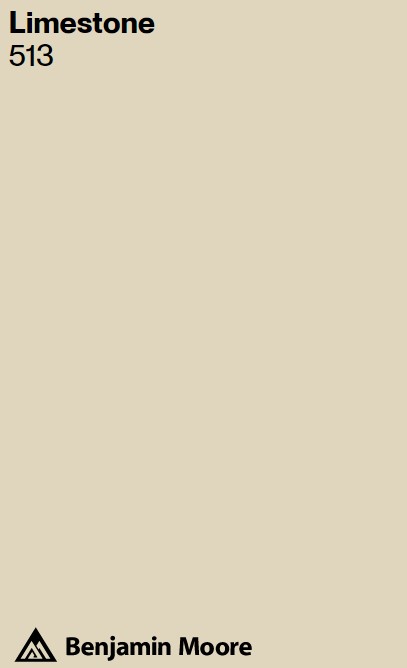
Similar to Natural Wicker, Benjamin Moore Limestone BM 513 may be a good choice if you’re drawn to all of the gorgeous, ancient French limestone throughout this beautiful historic chateau.
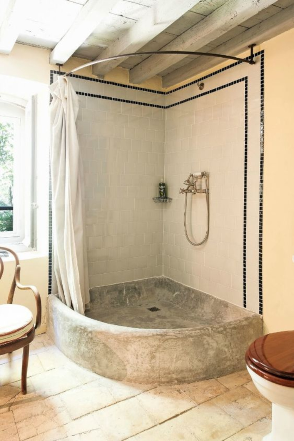
I love Limestone, and if it’s a bit too saturated for your needs, you could also look at BM White Sand which I used for the French country home we built in the early 2000s. Here’s a rustic bath with stone:
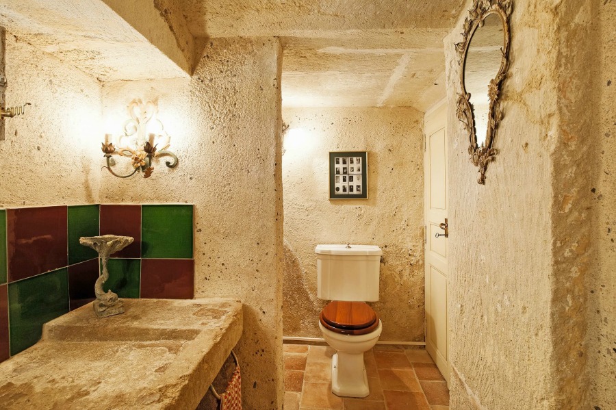
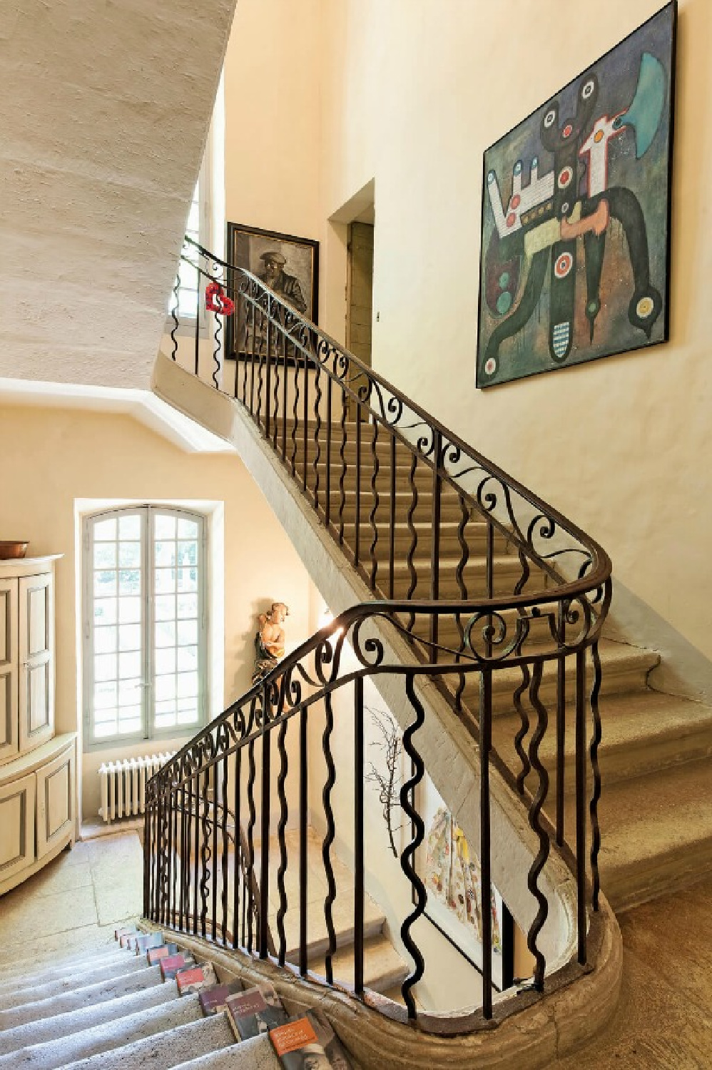
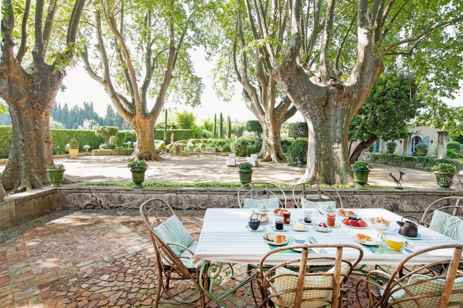
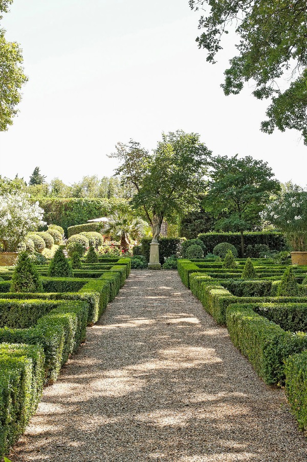
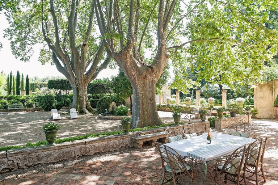
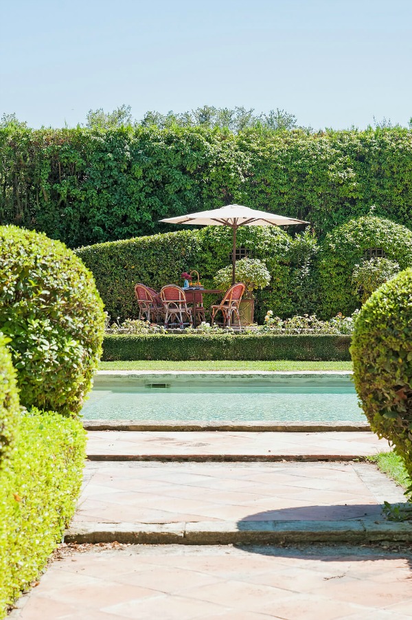
and here are glimpses of stone structures on the property amid the breathtaking gardens.
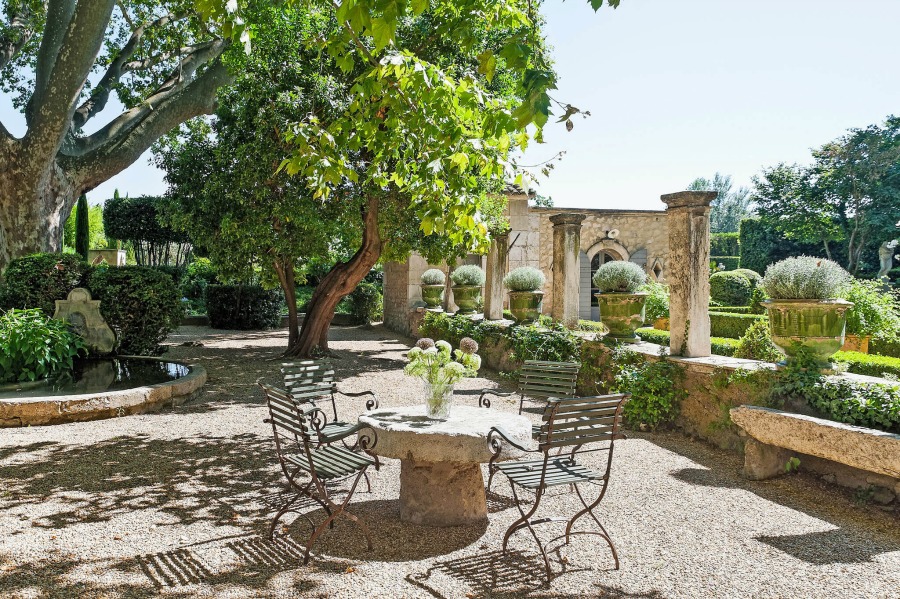
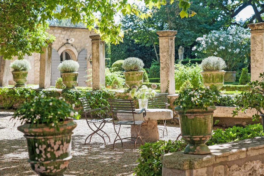
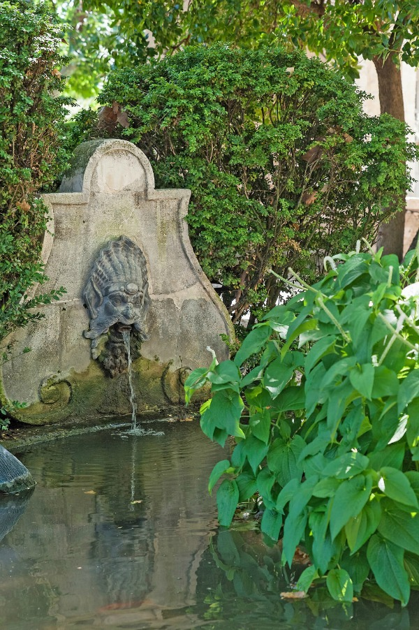
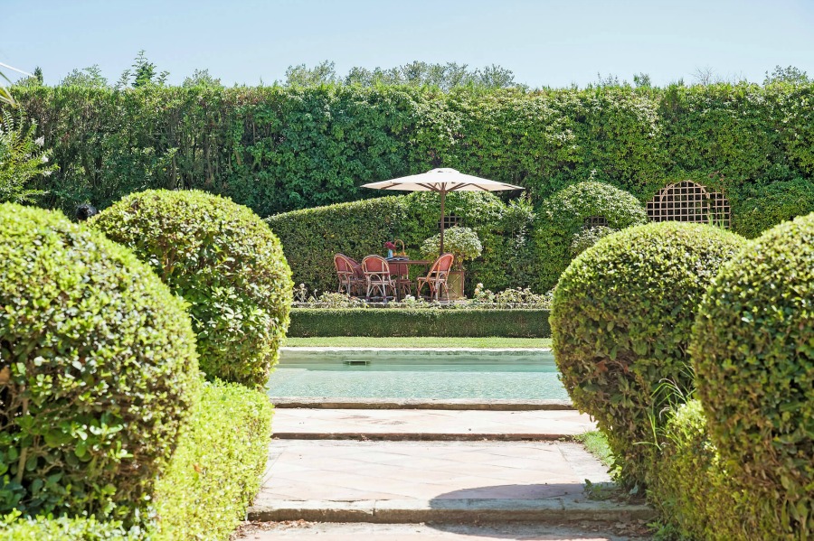

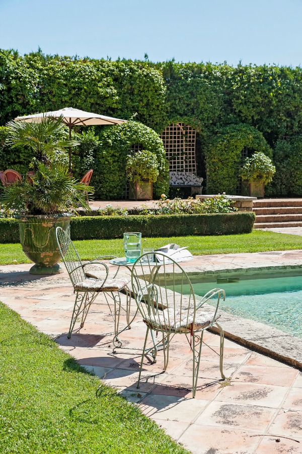
This one image below may inspire a whole French inspired color palette with its blue sky, lush green foliage, cool aqua water and glass, and pale stone.
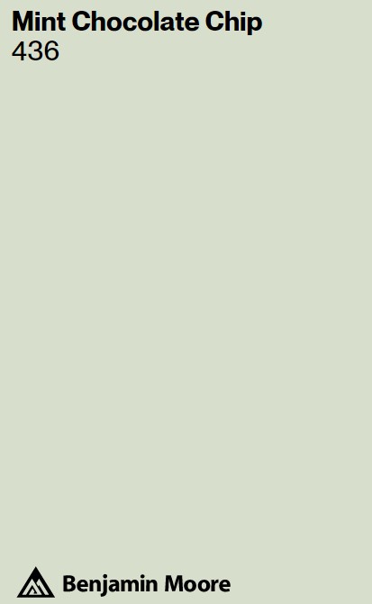
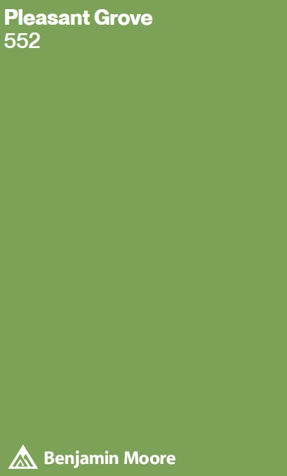
BM Mint Chocolate Chip
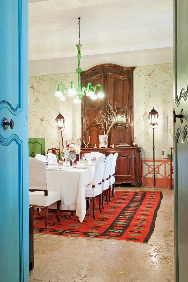
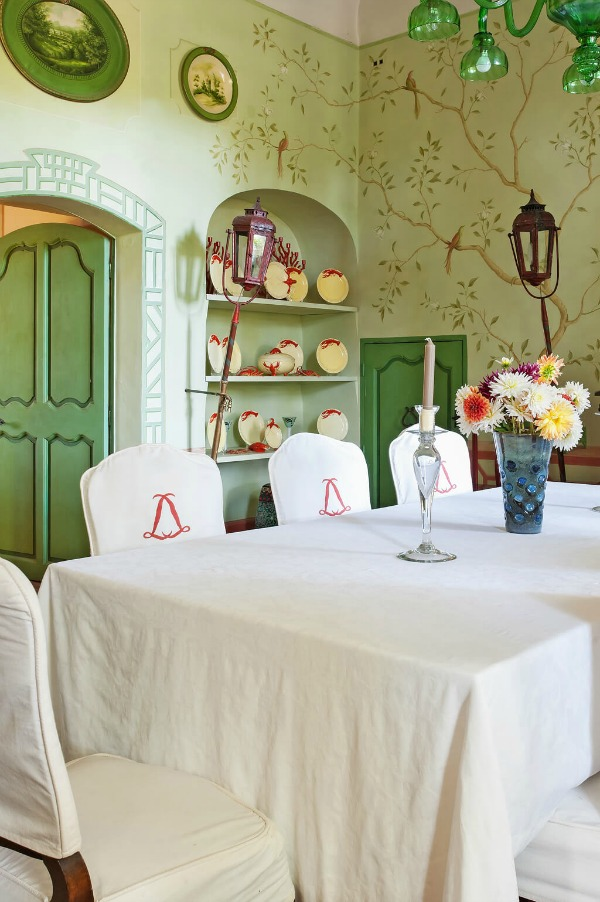
In a dining room, a whimsical and sweet painted mural with birds and branches sets a tone of relaxed country French charm.
If you admire the muted minty green which is the main color in the mural, I have a suggestion for you to sample.
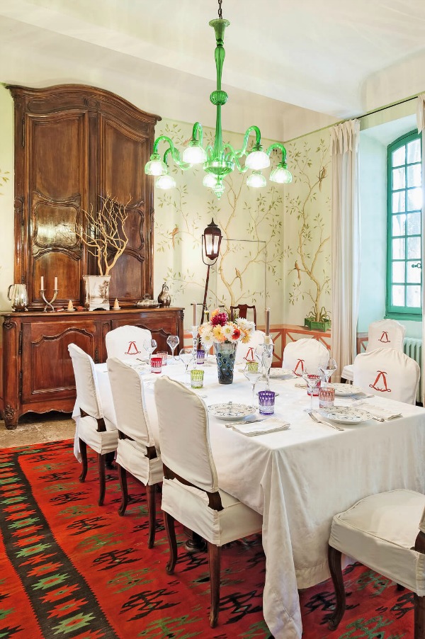
While BM Mint Chocolate Chip 436 may appear to have less yellow than the light green color in the mural, natural light is likely to add that bit of yellow.
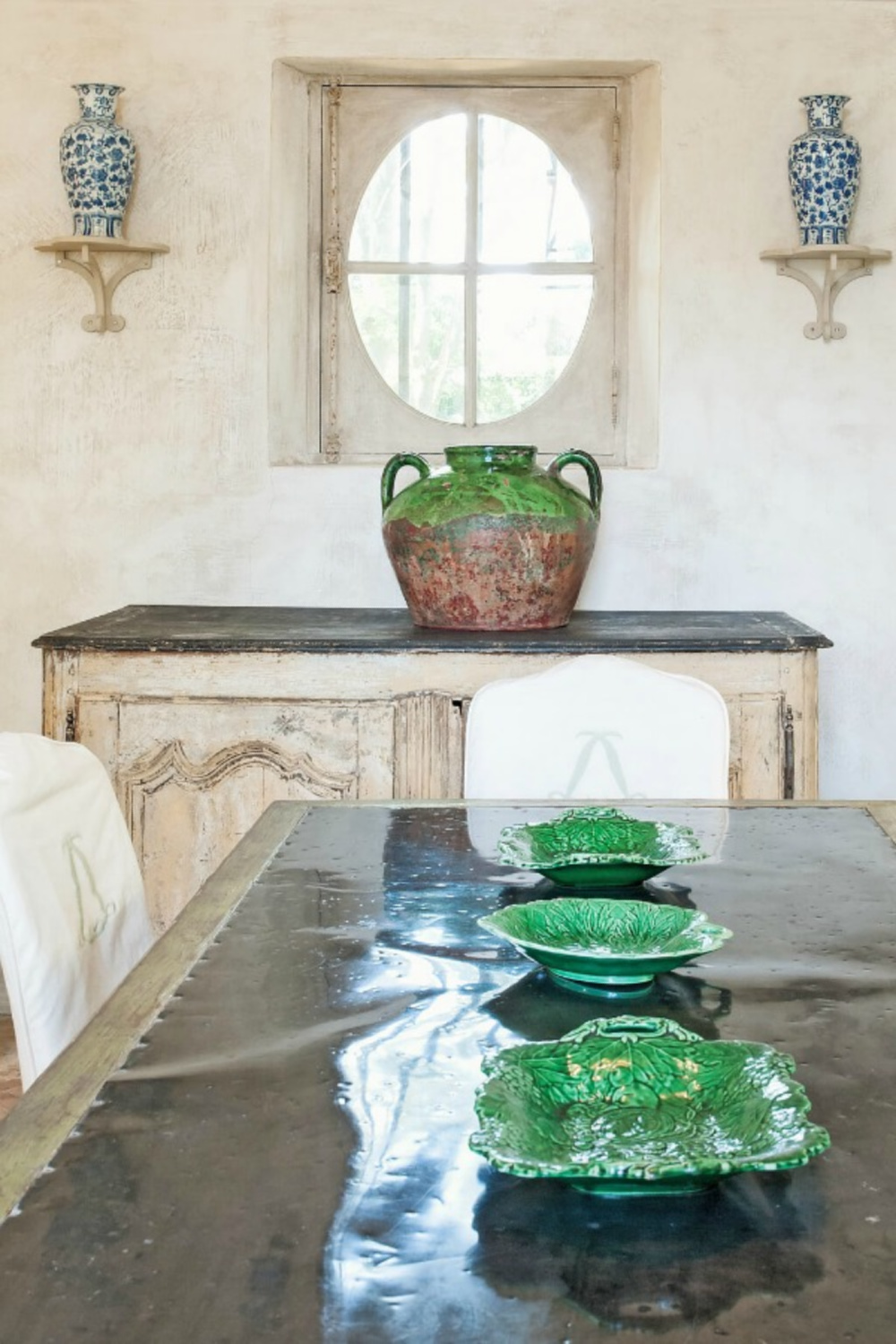
There are other reds and greens in this dining room as well.
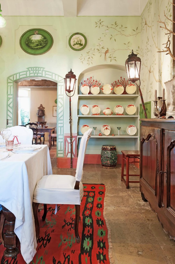
The reds are more coral as you can see on the baseboard molding:
And as for that bold green on the doors and wall accents? Here’s a lime green you may want to consider:
While bold, it’s one of those appetizing colors, yes?

Psst. Do visit and follow my FRENCH COUNTRY board HERE!
Here’s another moment where a bold lime green joins terracotta:
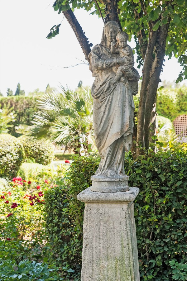
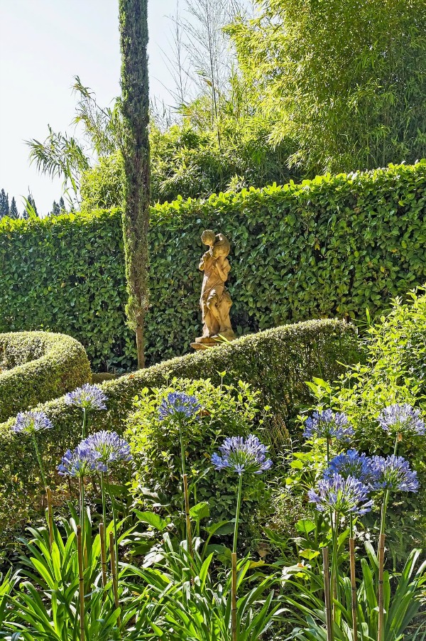
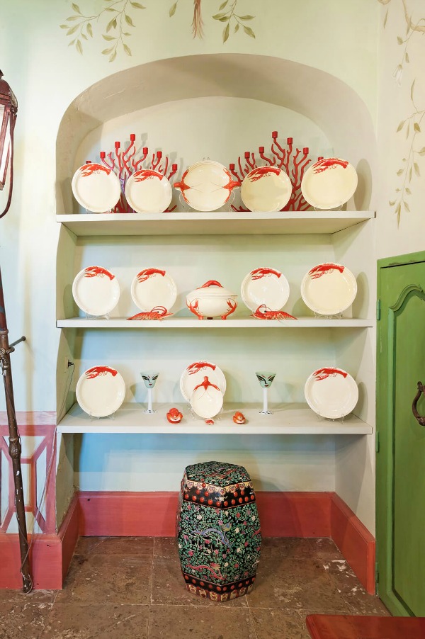
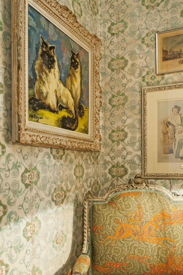
And here are a few more moments in this Provence chateau where patterns and color add personality, energy, and interest.
If you still have an appetite for more fantasy French interiors, do see this tour!
Peace to you right where you are.
-michele
I independently selected products in this post—if you buy from one of my links, I may earn a commission.
Thanks for shopping RIGHT HERE to keep decor inspiration flowing on Hello Lovely!
Hello Lovely is a participant in the Amazon Services LLC Associates Program, an affiliate advertising program designed to provide a means for sites to earn fees by linking to Amazon.com and affiliated sites.


I love the insightful quotes you share! Thank you and I love this colorful post!!!
Author
Yay! So happy to have you here and appreciate the support.