It is sort of silly when you think about how many different descriptions of “putty” or “mushroom” or “greige” there are in the design world. When you get right down to it, what most people call plain ol’ tan or cream is what I would probably call “natural linen” or “flax.” No matter what you call it, a warm white or light taupe shade for kitchen cabinets can yield a sophisticated look. But is it just a trend? We’ll discuss. Perfect Putty Paint Colors for Kitchens & Neutral Palettes aims to place inspiring designs on your radar as well as nine paint colors to consider.
Perfect Putty Paint Colors for Kitchens & Neutral Palettes
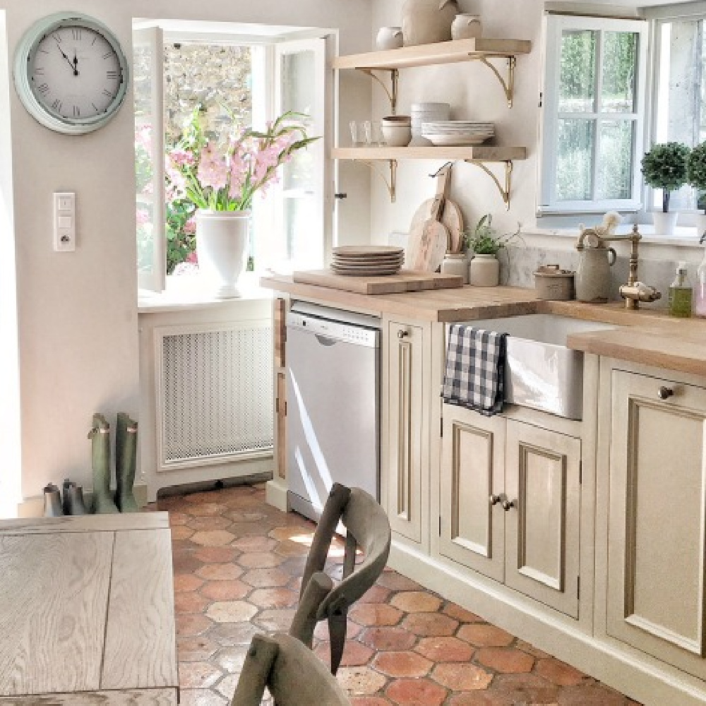
So many of my favorite design materials boast this understated neutral color! Think about it. Belgian linen, French limestone, driftwood, greyed oak, etc.
And just look how beautifully it marries with crisp, clear, bright whites:
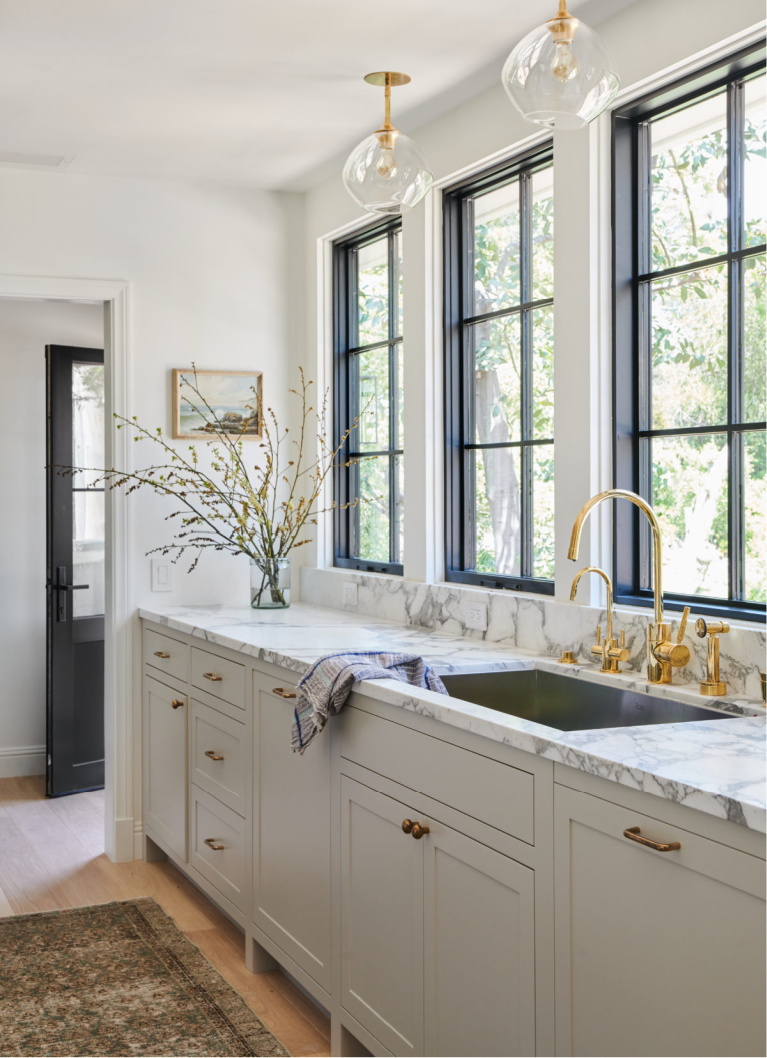
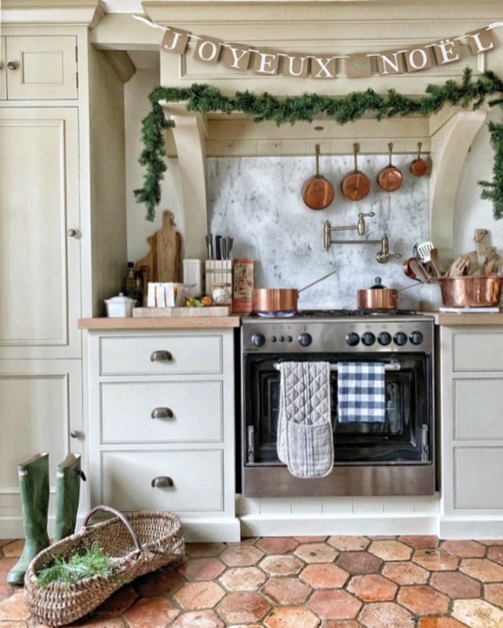
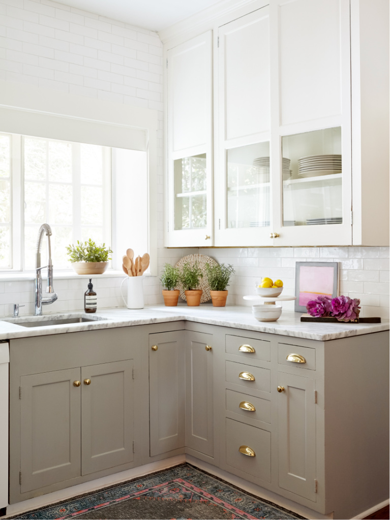
There probably isn’t a metal that won’t play nice with putty shades. In this next kitchen, you can see how lovely warm gold, copper, and black harmonize.
Contemporary & Traditional Kitchens With Putty
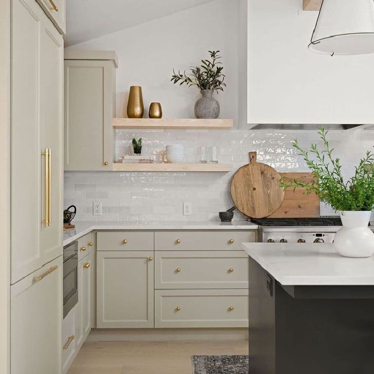
Greige and mushroom-toned kitchen cabinets need not read strictly traditional either. While this next kitchen has a sophisticated, contemporary mood, it also feels timeless and oh so elegant.
I receive so many emails requesting design advice for mixing whites, and it never fails to surprise me that most folks do not believe you can mix whites without matching them. So let’s clear that up:
MIX THOSE WHITES WITH ABANDON AND SURPRISE YOURSELF.
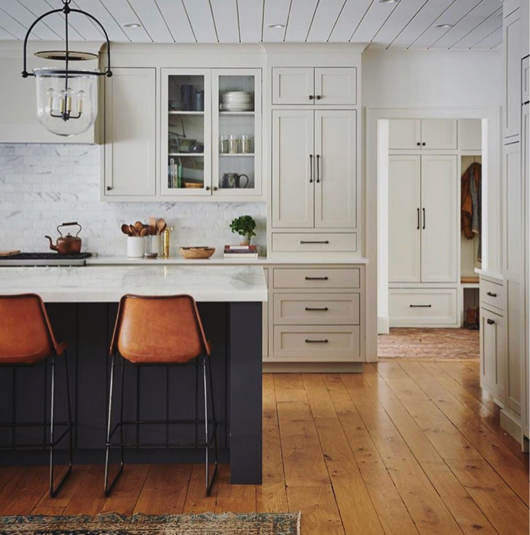
If this collection of impeccably designed kitchens proves anything at all, it is that INDEED bright whites and muddy or chalky whites elevate each other! If you have ever paired a natural linen skirt or cardigan with a crisp white shirt or t-shirt then surely you agree!
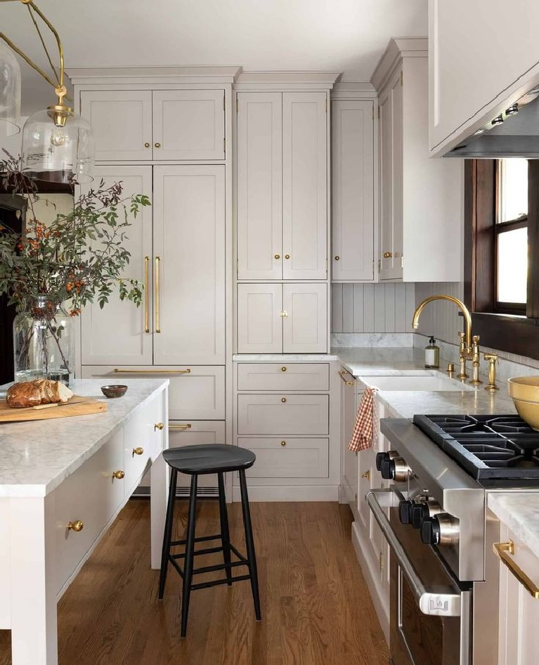
But are Putty Kitchen Cabinets Simply a Trend?
If you have hung around Hello Lovely for very long, I bet you already anticipated my response:
Nous ne nous soucions pas, kittycats. Round these parts, we don’t care if a particular color is having a moment. We are always after timelessness and understated elegance without the fuss. Such a look can be achieved with a flax tone today or a decade from now. We get to choose the palette that brings us the mood we’re after (tranquil? energizing? nostalgic? hopeful?).
Neutral Nirvana in the Kitchen
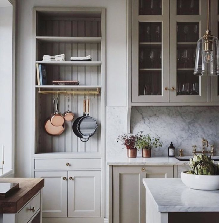
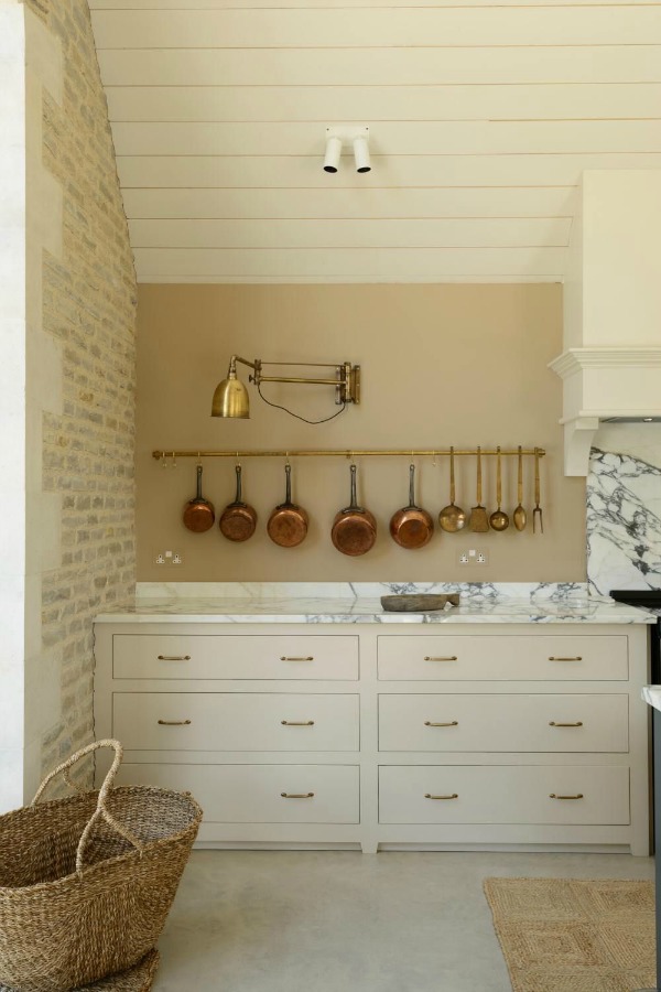
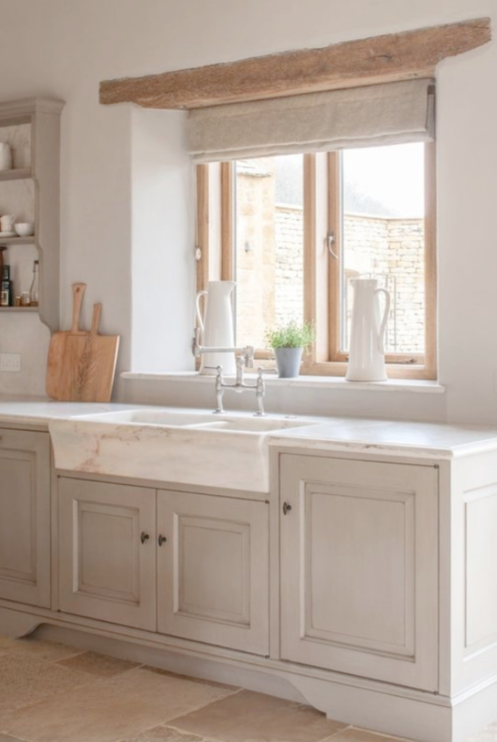
In this English kitchen below with bespoke kitchen cupboards by deVOL, the khaki color of the wall breaks up the marble’s alabaster white as well as creamy white stained planks of wood.
How would you describe the color of these cabinets? Oatmeal? Pale linen?
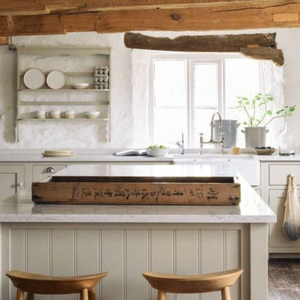
While shop owner and stylist Charlotte Reiss has since painted her kitchen cabinets (they are now Green Smoke), they began with Neptune Kitchen’s “Limestone” painted finish.
An Ultimate Tile to Pair With The Hue
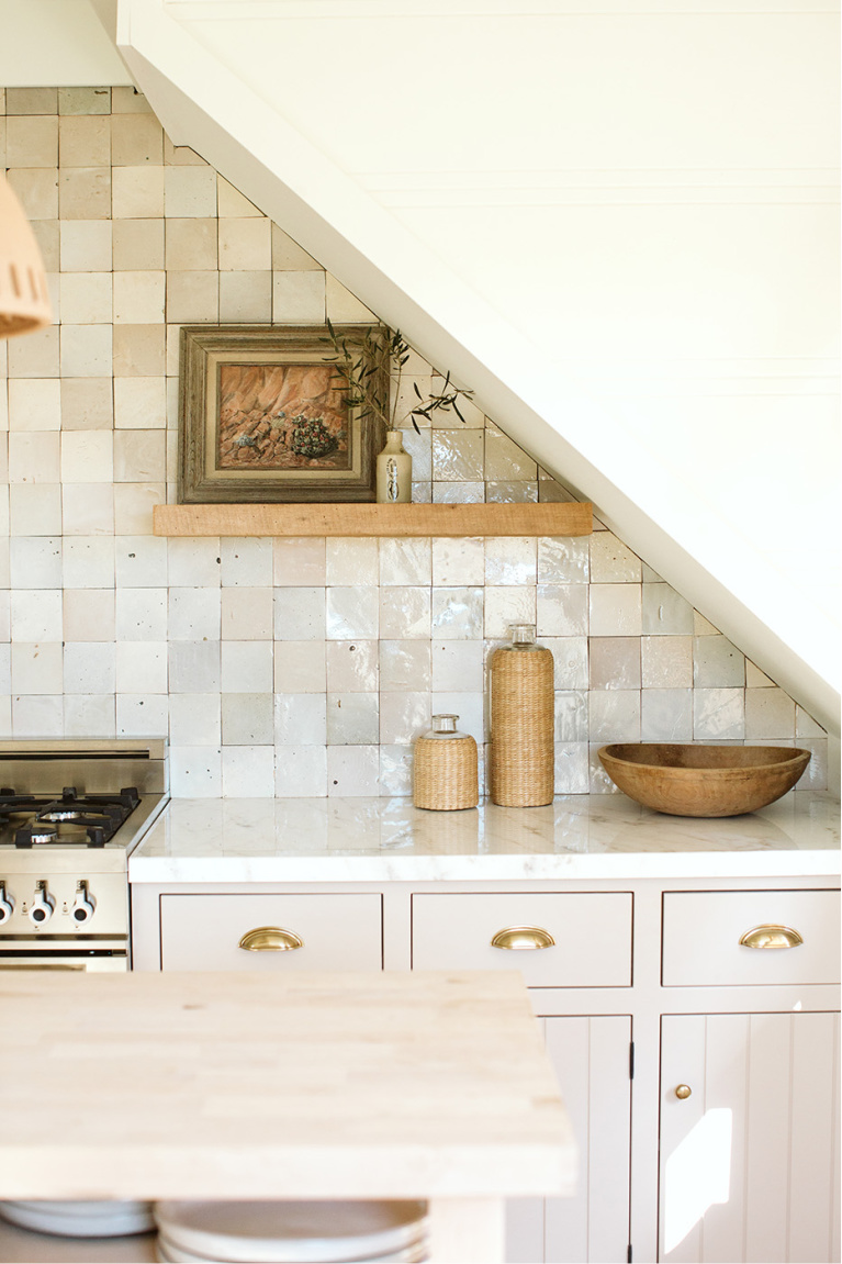
Is there a tile which timelessly and effortlessly complements putty kitchen cabinets any better than Zellige? (Don’t blame it for being trendy right now!)
Hand-glazed, traditional, and from the Fez region of Morocco, their appeal for me lies in their refusal to be perfect and their sexy texture.
Can You Paint Just the Base Cabinets Putty?
Even when you limit your mushroom or muted taupe to base cabinets in the kitchen, the results can be dazzling.
Also, don’t forget “washes” of putty tones or subtle stains and glazes. Glazing can beautifully finish wood furniture. (And sweet cozy Moses on a waffle cone, is “travertine” yet another description of our color du jour?)
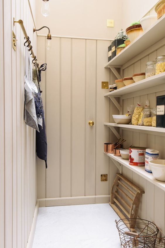
Pantry With Putty
I hope these kitchens varied with their design style and mood help you to conceptualize the range of possibilities even when you decide on this colorway.
Perfect Putty Paint Colors: Where to Begin?
The following putty paint colors (both subtle shades and mid-tones) may provide a good place to begin if you’re seeking the perfect shade for your own space. Why do you need 9 shades? Because your unique exposure, geographic location, and lighting will impact how these paints will ultimately present in the space.
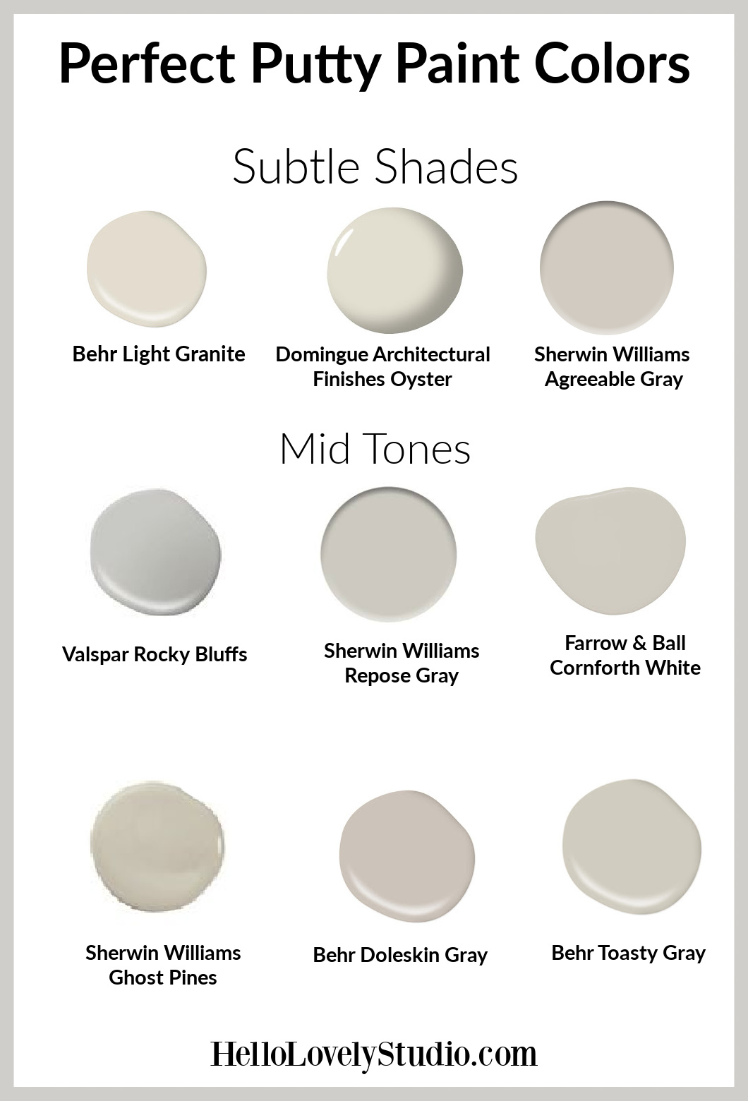
2. Domingue Architectural Finishes Oyster
3. Sherwin Williams Agreeable Gray
5. Sherwin Williams Repose Gray
6. Farrow & Ball Cornforth White
7. Sherwin Williams Ghost Pines
Easiest way to see if a paint color will work? Order samples with Samplize and have them delivered straight to your door.

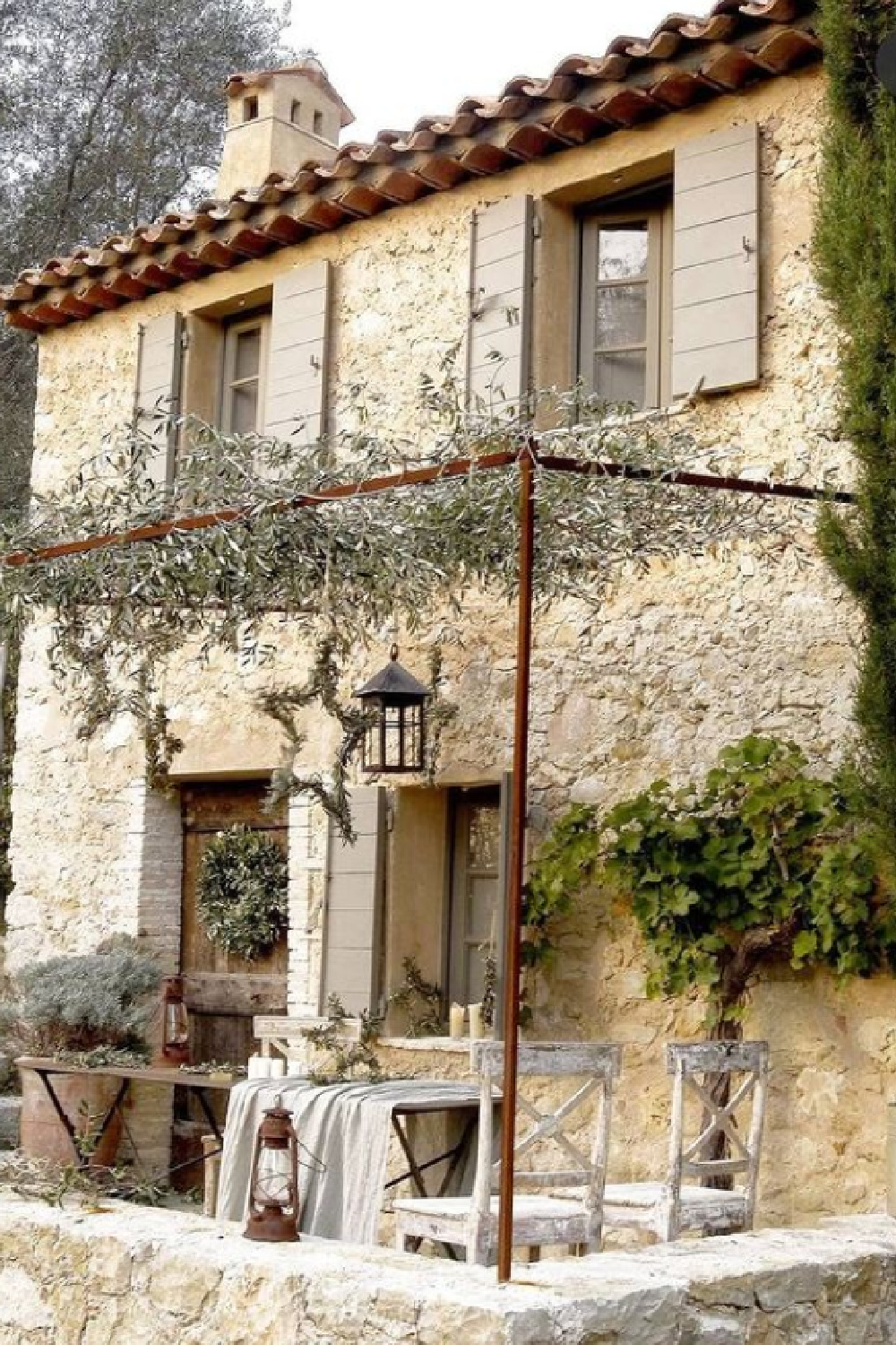
Like This Subtle Paint Color on Shutters?
Greige & Putty in My Own Home
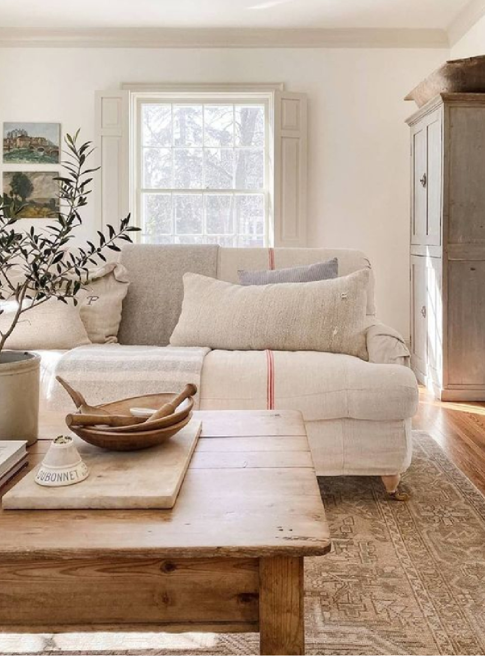
Let’s face it, I’m an unabashedly passionate cheerleader for this range of neutrals. From the stone color of my fireplace surround to the nubby upholstery of our living room furniture to the color of exterior siding on our home!
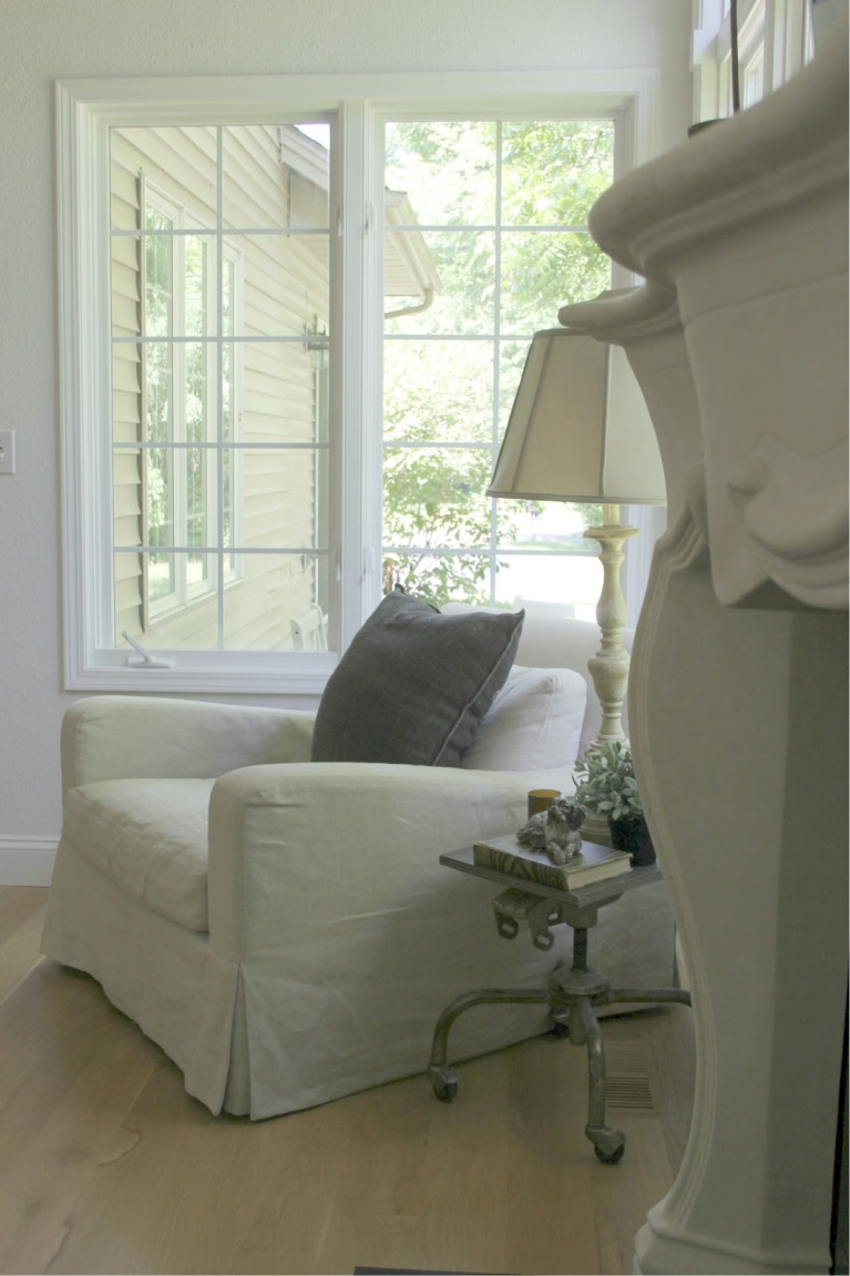
For me, there is an irresistible calm that is effortlessly achieved with low contrast, natural neutrals.
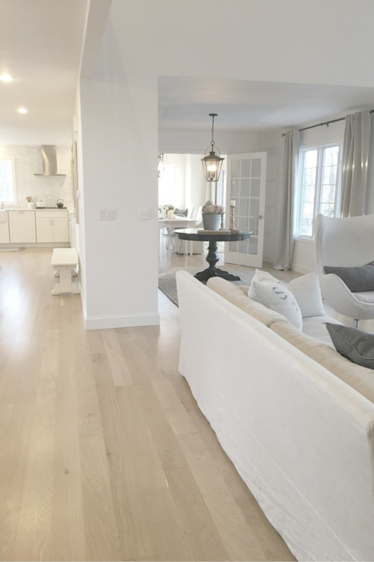
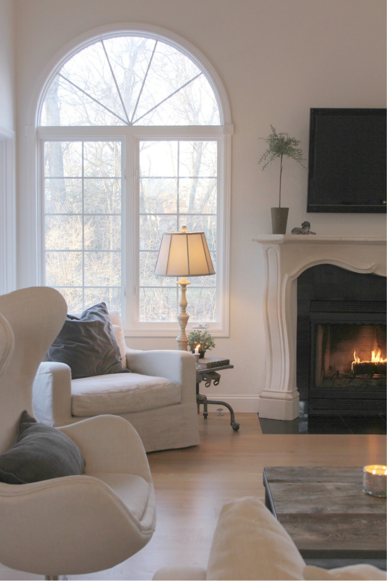
Stone & Natural Linen Neutral Color Palettes
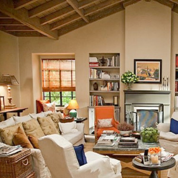
Bursts of saturated color can join the mix as you can see in this still from Meryl Streep’s character’s living room in the Nancy Meyers’ film “It’s Complicated.”
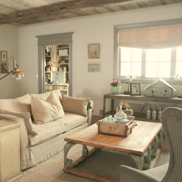
Introduce chalky blue-greys, rustic textures, and collected treasures to the tonal scheme, and the mood can shift into laid back luxe loveliness:
Soothing Shade of Paint for a Bedroom
In my bedroom, a light wash of Benjamin Moore Revere Pewter transformed furniture we lived with for years.
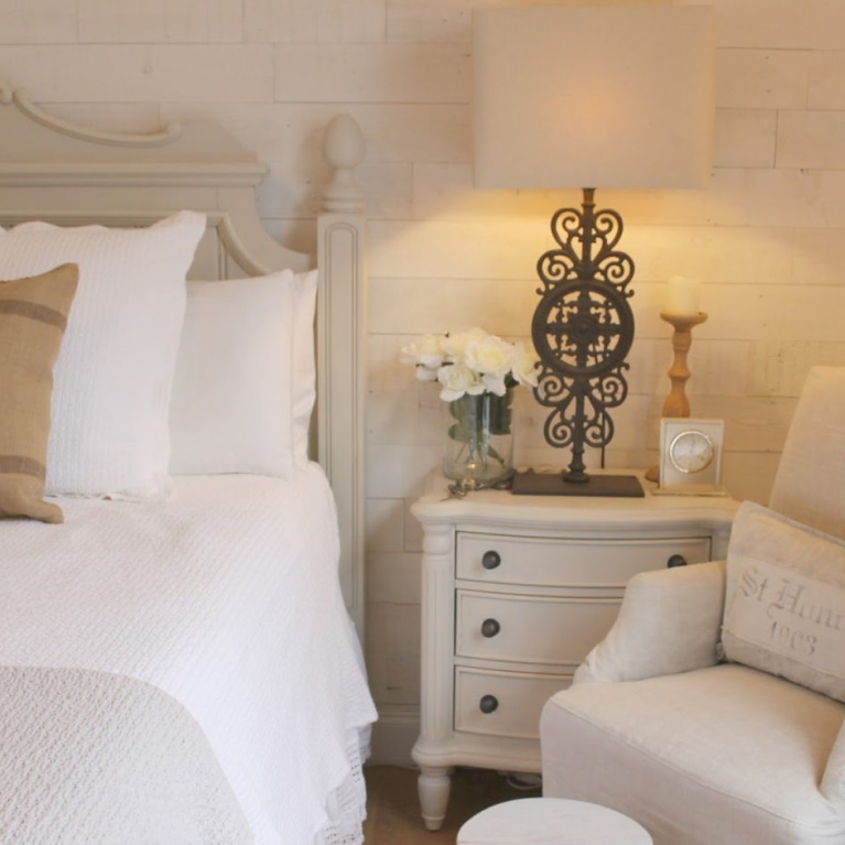
While another set of eyes might simply see a boring beige on beige scheme happening, in person, the mix of textures and hand-painted brushstrokes feels alive and less one note than the photos allow.
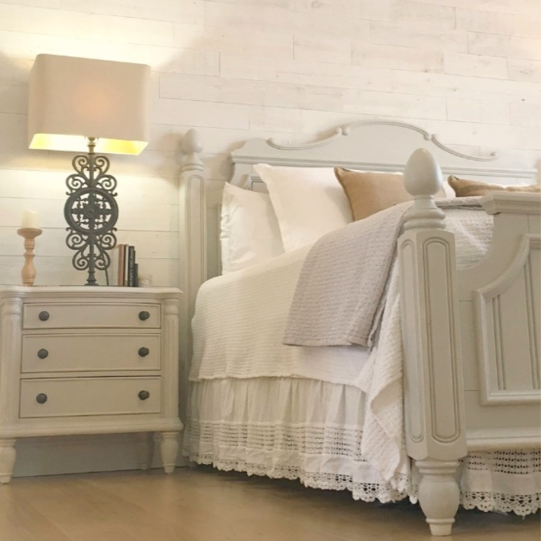
One temptation you MUST RESIST when seeking the perfect paint color for your space is becoming put off by the paint color’s NAME. The bedroom below is painted Farrow & Ball’s Strong White which might suggest a bright strong gallery white when it is essentially a calm greige.
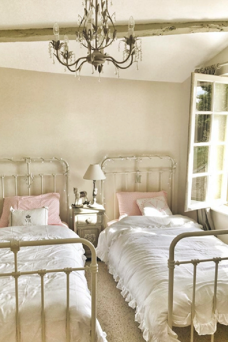
Aged Whites are Perfection
Once I began looking around for pretty examples of stone/putty/linen/greige/mushroom/quiet taupe, I quickly became overwhelmed since they are everywhere!
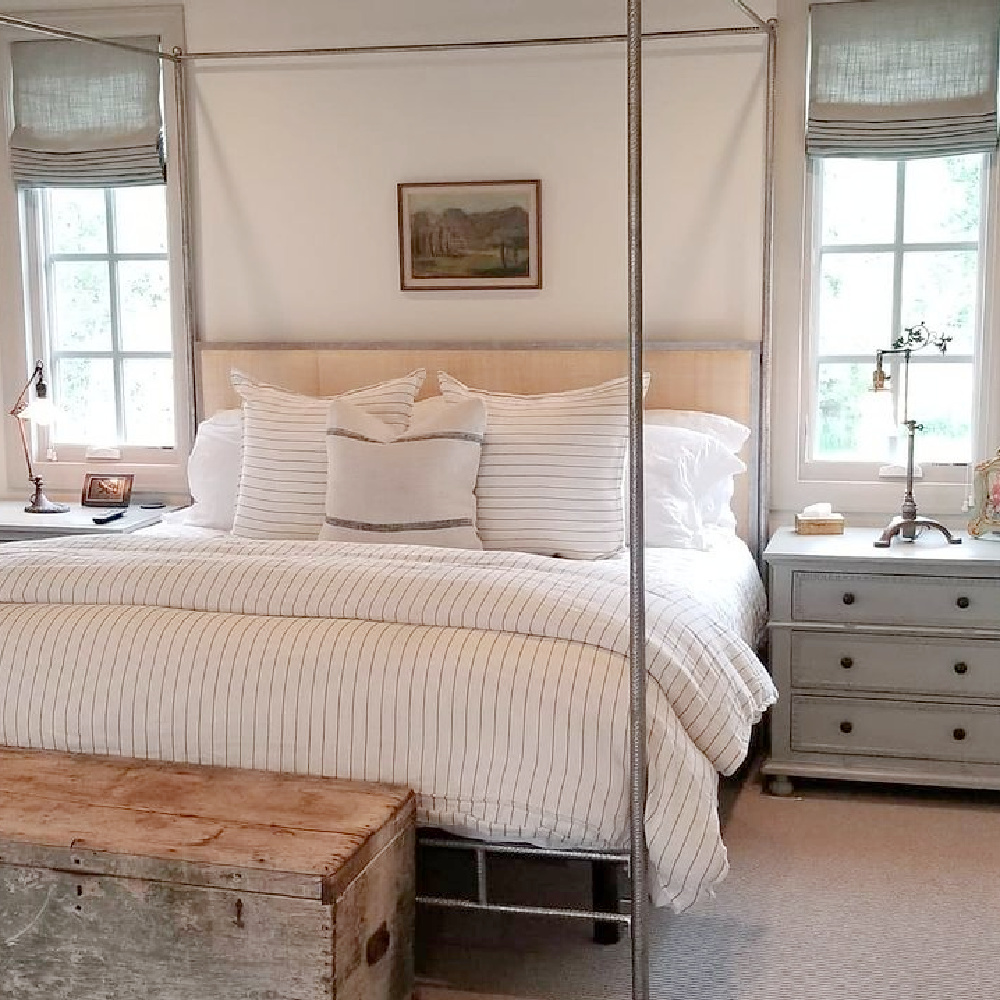
Aged whites which have mellowed but not yellowed are essentially THE perfect shade!
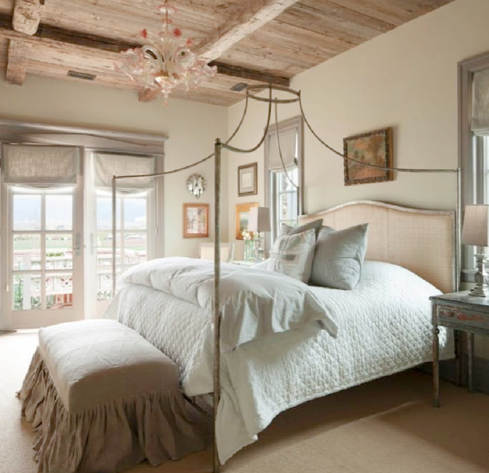
Let me know if you have a favorite paint color to share!

I independently selected products in this post—if you buy from one of my links, I may earn a commission.
Decor With Putty Power
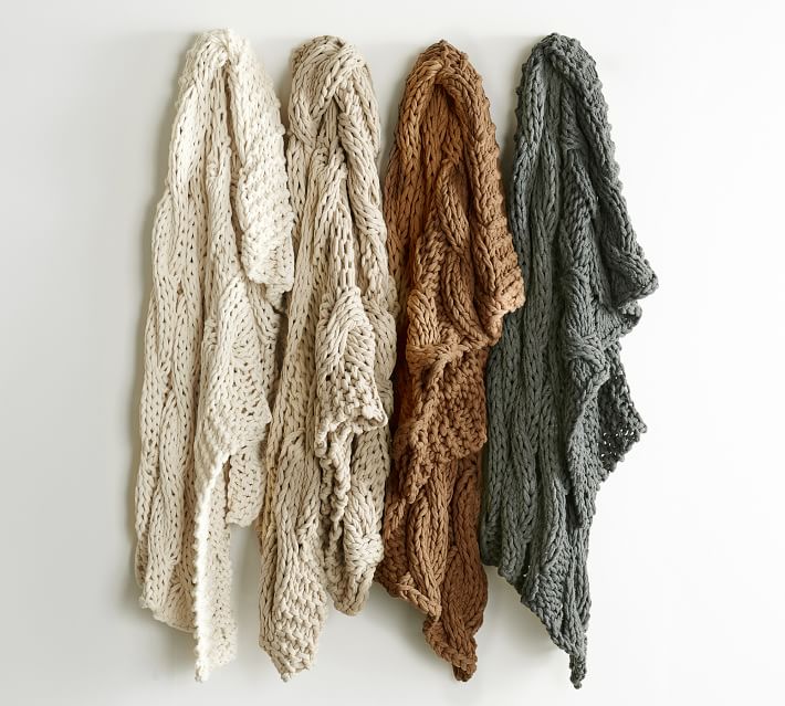
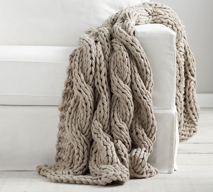
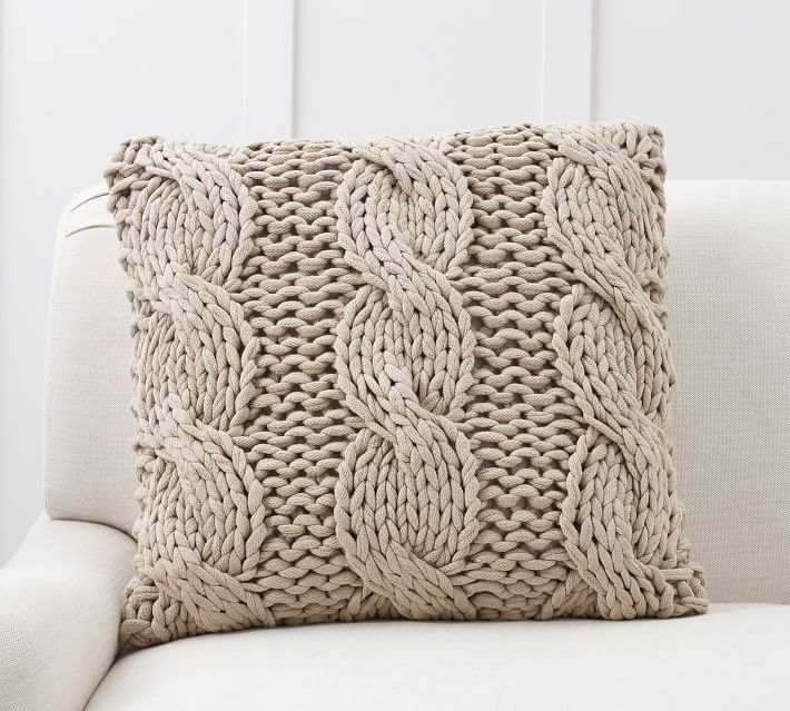
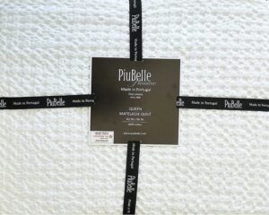
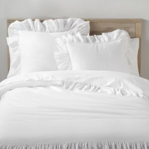
Cozy Texture
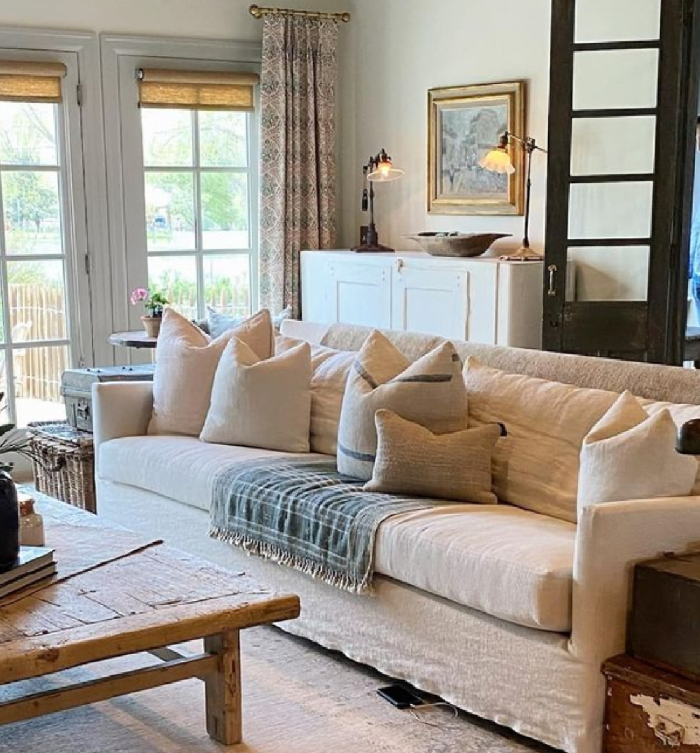
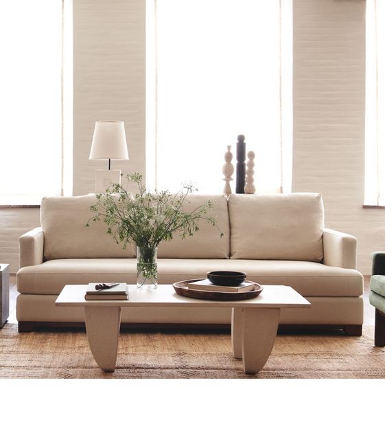
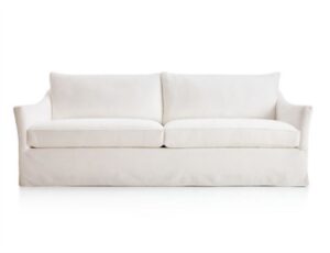
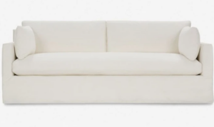
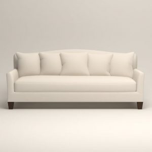
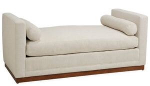
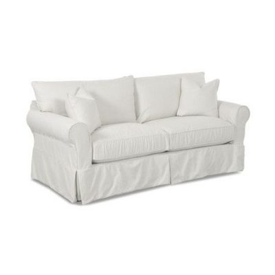
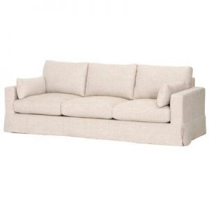
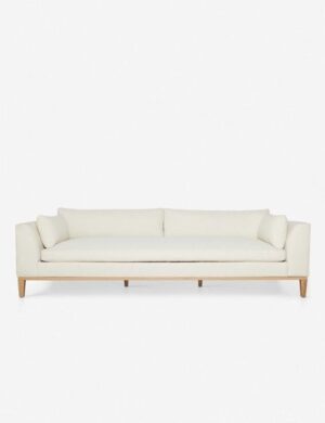
Sofa in a Putty Shade
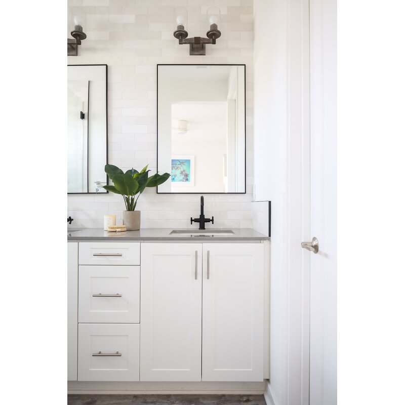
Tile Ideas
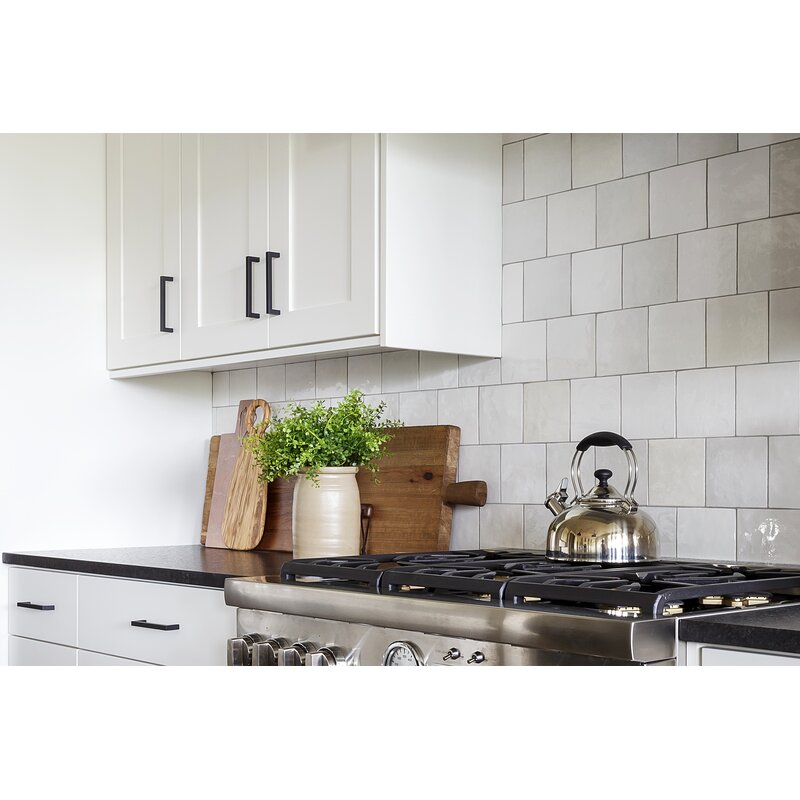
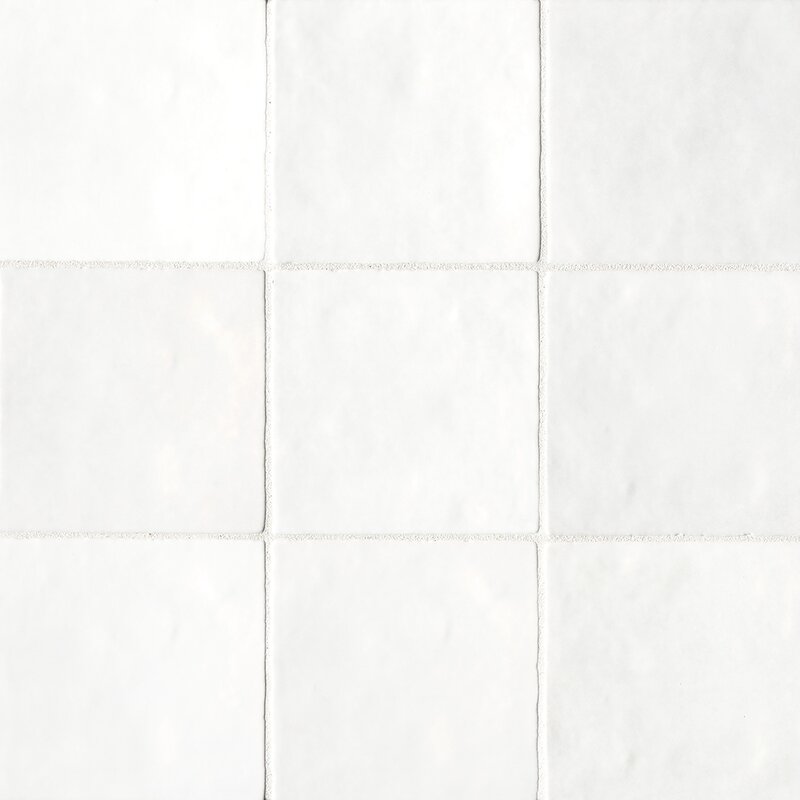
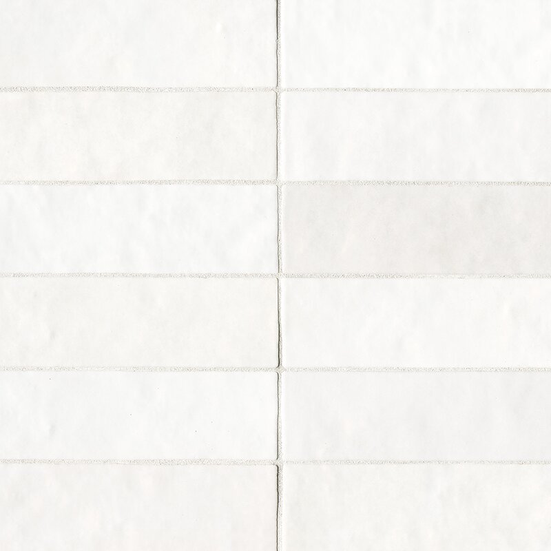
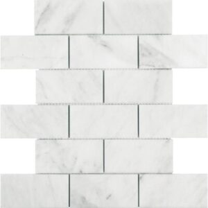
I mentioned Zellige tile earlier, and when it’s not in the budget, there are ceramic field tiles which only appear to be handmade. I personally would install this Cloe tile in a straight-stack (or stack-bond) pattern rather than subway or running bond.
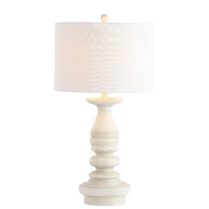
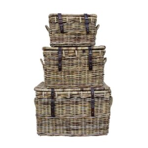
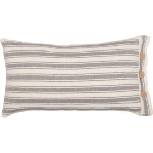
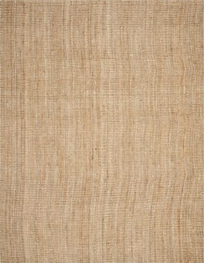
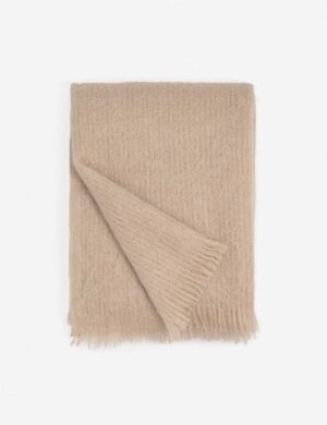
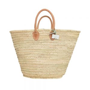
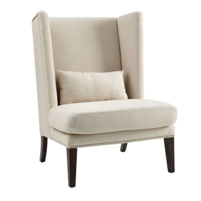
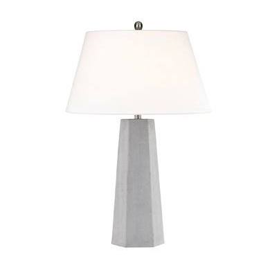
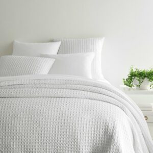
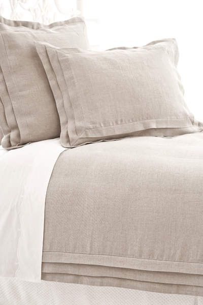
Cozy Mushroom Hued Finds

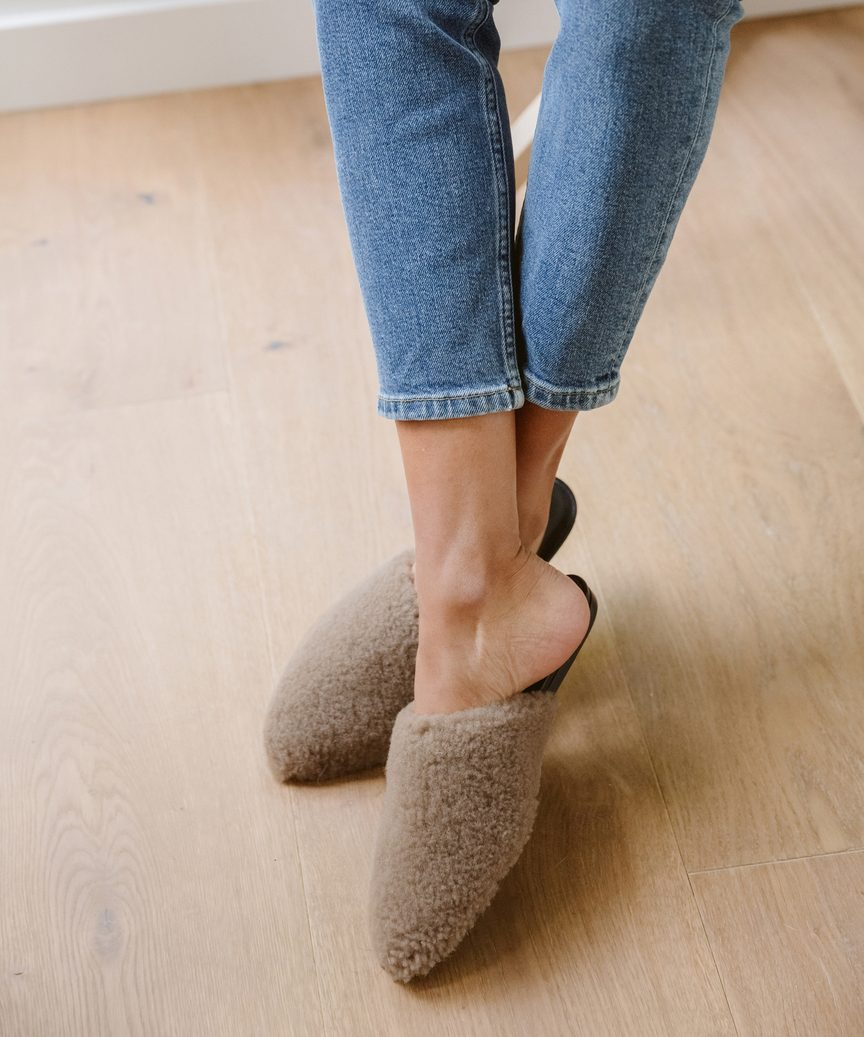
Lord have mercy do the synonyms for greige/putty ever cease? ACORN! Acorn, for corn’s sake is yet another name for you to tuck away.

I independently selected products in this post—if you buy from one of my links, I may earn a commission.
Peace to you right where you are.
-michele
Shop for items you already intended to buy on Amazon RIGHT HERE, and also find home decor here to keep decor inspiration flowing on Hello Lovely!
Hello Lovely is a participant in the Amazon Services LLC Associates Program, an affiliate advertising program designed to provide a means for sites to earn fees by linking to Amazon.com and affiliated sites.






I’m completely confused now….so many grey’s ..anyway I think the offer for everything is too much nowaday so you get easily jaded. Nice furniture, nice clothes, nice ….???? Less is more also we don’t need so much. But last but
not least I am still dreaming about a green kitchen. Take care, dear Michele
Author
I hear you with the overwhelm that can come with so many choices for everything. I guess I feel like that is why timeless is such a calming, smart and sensible design direction since the trends are irrelevant. The reason though we need so many choices for a single paint color is that the one that works for my home will probably not work for another. It truly takes at least a handful of options to land on the proper choice. I would be doing you a disservice if I offered you less than 9 options since you need to sample at least 3 to land on a winner. 🙂
Indeed I was overwhelmed with the offer but
this was not a reproach …wanted to say that for me 4 colors are the same as 7 and would make my
decision much easier.
Author
Ahhh – 🙂
I completely agree with you on using a range of whites/neutrals/putty’s together…the more the better! We used Edgecomb Gray for our kitchen cabinets and it’s the perfect putty color! Like you said the name can be deceiving because this color is more putty to me than gray. Shoji White is another shade that looks stone-like which we used on all our bedroom/bathroom walls, hallway & exterior. We added in dove white on shiplap in the kitchen/LR/foyer & all our trim work. As you said the low contrast of these shades is so calming. I truly believe all the compliments I’ve gotten has to do with the calming color scheme of these layers of different shades of white/putty more than anything! I share these colors because I remember how I labored over choosing what shades of white/putty to use… in case this might be helpful to someone else. We also went with travertine type neutral tiles in bathrooms instead of shiny subway tile. I’ve loved living in this calming color scheme; it’s timeless & I can’t imagine ever tiring of it.
Author
This is so helpful, Amy – I need to do a whole post devoted to Edgecomb Gray, and I know designers are crazy about Shjoji White. Great to hear your tip about going with warmer whites in the baths too. Natural stone in a bathroom is such a comforting, intelligent design choice for so many reasons, and when I think about how many homes built in the 90s have white matte ceramic square tiles…oy! They are such a nightmare to remove when you’re DIYers like me and my husband! Sending golden hours of changing leaves and cooling temps to you, friend.
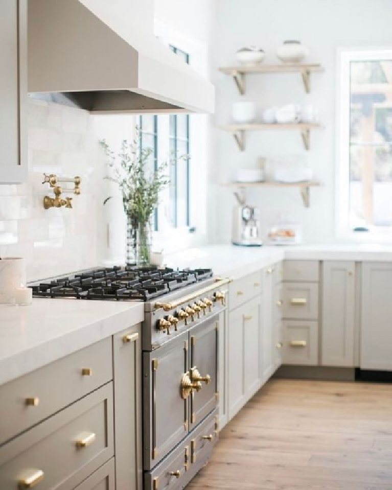
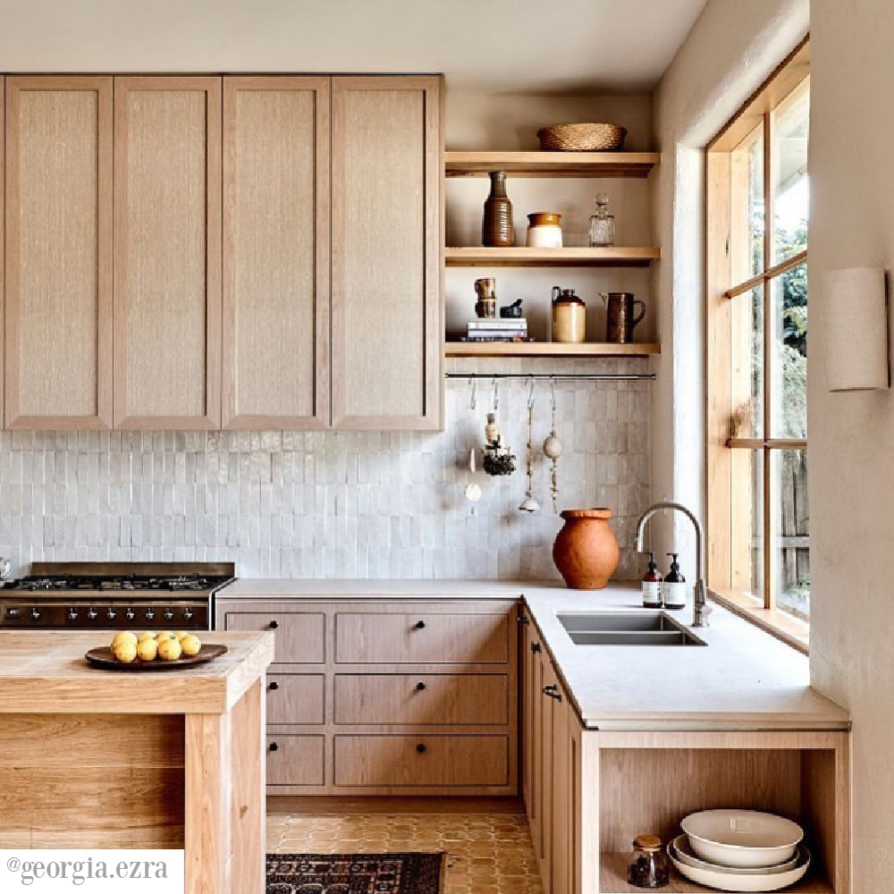
Can you provide the paint color in the first picture in this article where the oven is the main part of the picture? I love this color and am confused as to which color was used. Thanks.
Author
Hi there. I don’t have the exact putty color for this kitchen but have provided the designer’s info in the link below image. Sometimes designers are willing to share, and in most cases the color is custom which is why I offer suggestions to get the look. The thing is, the exact paint color is typically just the starting point since the same color will look completely different in someone else’s kitchen. 🙂
First I must say “thank you” for sharing all of the wonderfully inspirational
quotes. You’ve no idea how they manage to strike just the right chord in today’s world of chaos and confusion. I have just finished repainting our home inside & out. BM White Dove Exterior with SW Anew Gray B&B shutters. Large open great room in SW Creamy & Simply White trim. Several adjoining room are in Simply White walls & trim. Went “wild” with MB in BM Ashwood. A big change from the past colors and I am thrilled!
All is well with my soul…
Author
So happy to have you here, and I’m always all ears when it comes to hearing about the paint colors that are hitting the right notes in your home. I’ll keep bringing the encouraging word, hoping it will reach the right soul at just the right moment. With all the harmony happening in the world, the echo of a kind melody is surely needed. Thanks so much for adding beauty here today.
Another versatile color in this category is Benjamin Moore’s Edgecomb Gray. It’s a soft muted color that can appear both gray or beige depending on the light and it’s surroundings. We just had the inside of our Arizona home painted this color and so far I love it.
Author
Yay! That is a gorgeous color so many designers turn to again and again!. So happy to hear the location it works in too – always makes a difference. 🙂 Peace to you, friend.
You’ve reminded me WHY I love putty/n colors so much…they ARE the color of nen, limestone, & driftwood! We used 3 shades of white/putty throughout our entire home including the exterior & could NOT be more PLEASED every time I drive up & walk in the door! It’s amazing the difference a simple color scheme makes! I labored over my 3 choices, but now I realize I could not have chosen a wrong shade when it comes to white/natural/putty hues…just choose what you like & go with it! They all look great layered together. We used Edgecomb gray for all cabinets & interior doors (love this slight contrast for interest throughout house) against white dove (on shiplap & all trim) & Shoji white (on rest of walls& exterior).
Author
Ready to post a tour when you are – snap photos if you’re feelin saucy! 🙂 Subtle colors just make some of us swoon!
Oops…sorry for typos…*neutral colors, *linen, limestone, & driftwood
Author
I actually don’t ever cringe with errors (even grammatical ones). xox