While the architecture, elegance, and grandeur of a French château like Château Mireille may be impossible to emulate, the color story is within reach. Country French Color Palette Inspired by Château Mireille will appeal if dreamy South of France vibes and French inspired hues reminiscent of the sunny countryside beckon. However, it may also interest those seeking a just right French Green or moody Belgian neutral. (BTW, this home is a vacation property and may be available for vacation rentals via Haven In).
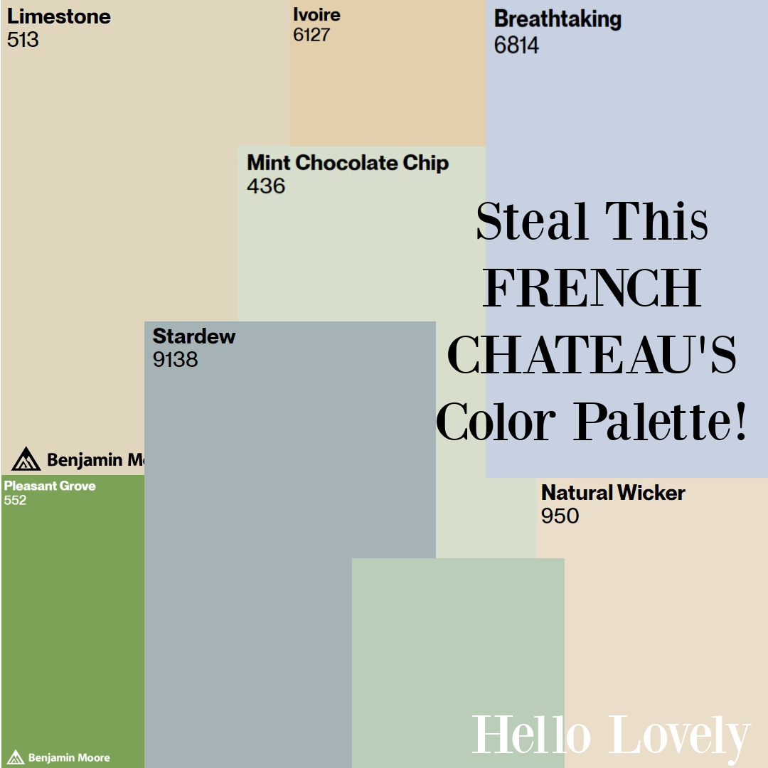
Country French Color Palette: Château Mireille
Pin This Paint Color Graphic to Save for Future Reference!
Location of French Chateau?
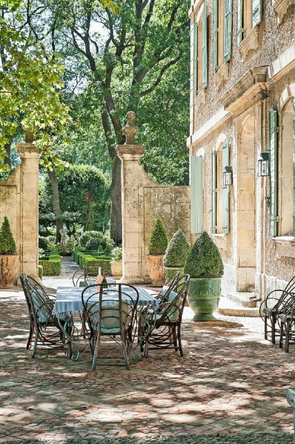
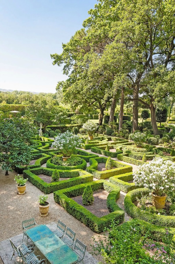
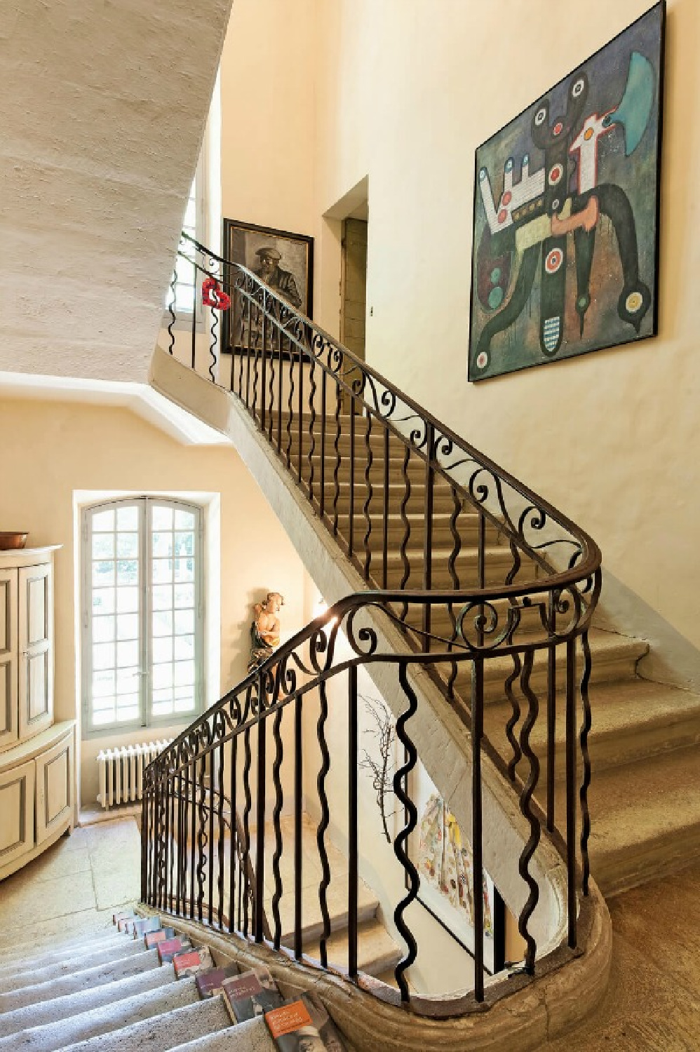
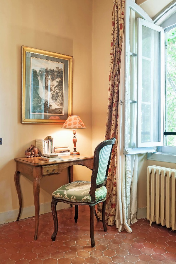
This luxurious and elegant 18th-century Provence manor (or bastide) is a villa just a 10 minute stroll from the charming village of St-Rémy-de-Provence.
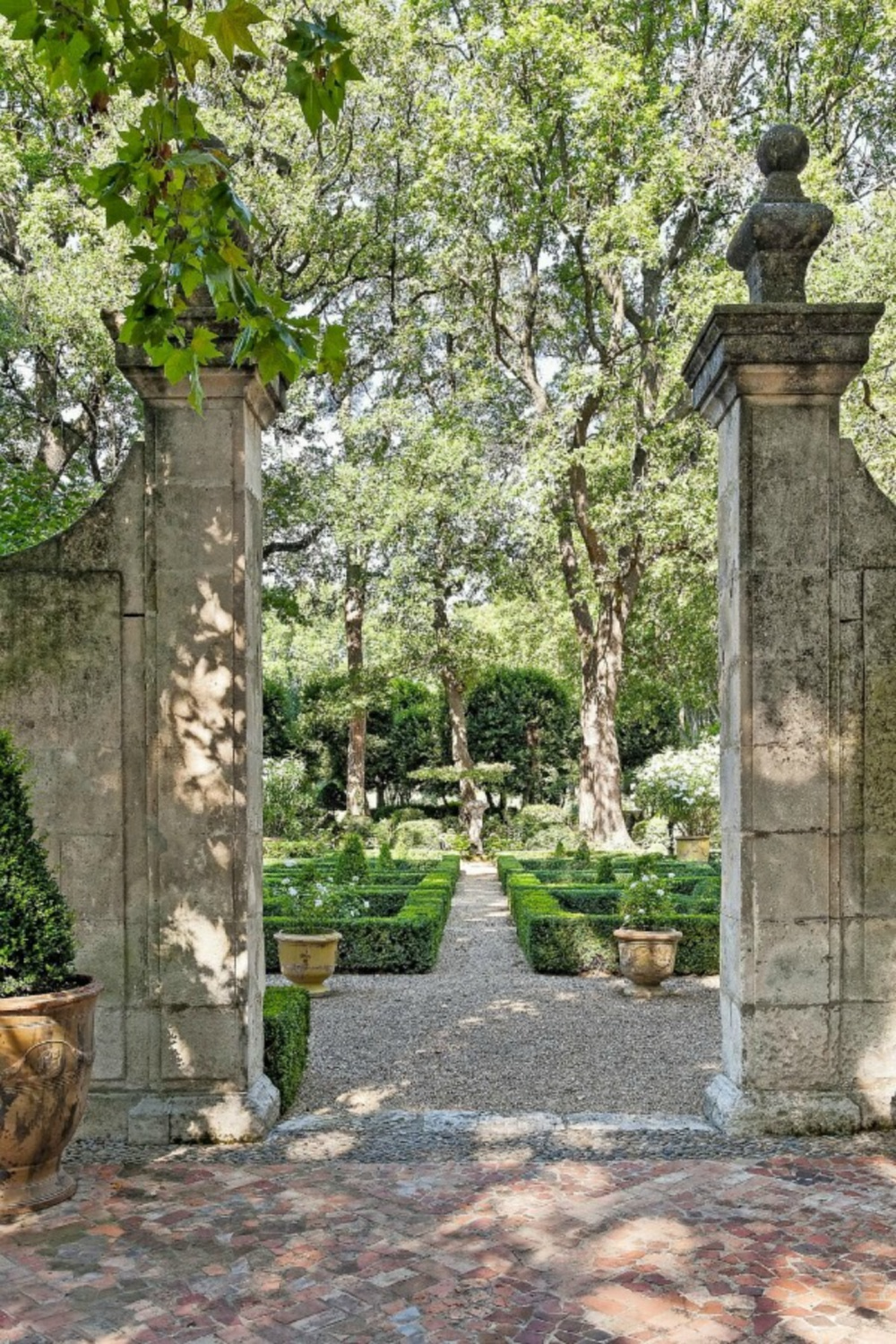
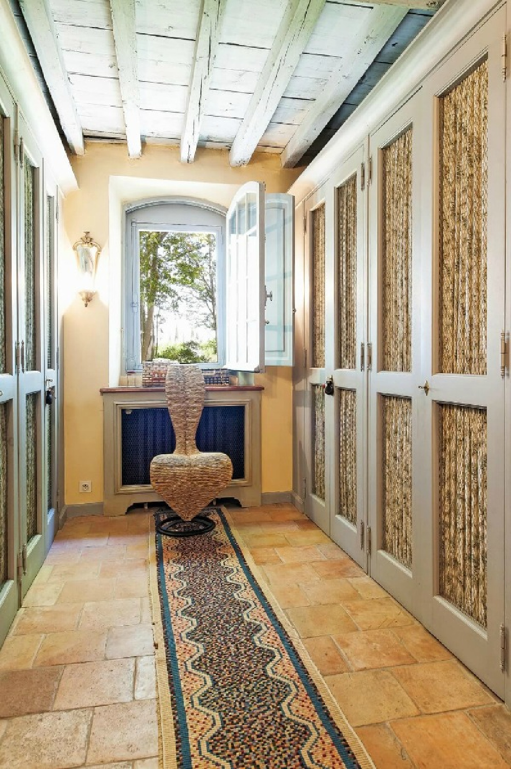
Inside and out, find French tradition and style.
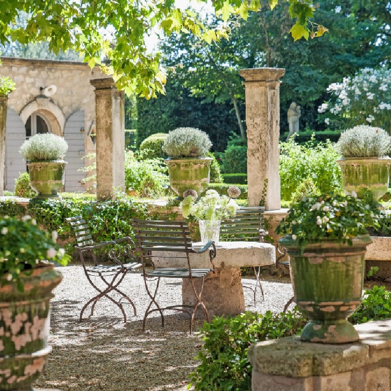
With seven breathtaking bedrooms, three floors, extensive grounds, and a live-in housekeeper, Château Mireille inspires with Old World and timeless Provençal charm in the South of France.

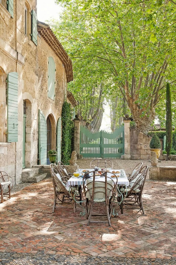
Country French Color Palette: Gorgeous French Green on Exterior
If you are smitten with the shade of green on the chateau’s shutters, you are not alone. It can be tricky to try to pin down the exact shade since lighting and photography editing influence how the true color is perceived.
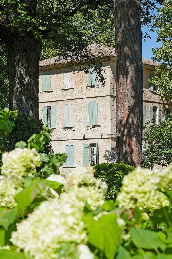
However, if we look to a soft natural jade green color wildly popular in France, there’s a good chance the exact green is TOLLENS Vert Olivier from Castorama.

Vert Olivier is bolder than what you might expect, and for good reason. On an exterior, it will appear lighter and more washed out so bear that in mind.
French Green Paint Color Ideas
Here are some ideas for similar green paint colors in the same spirit offered in the USA:
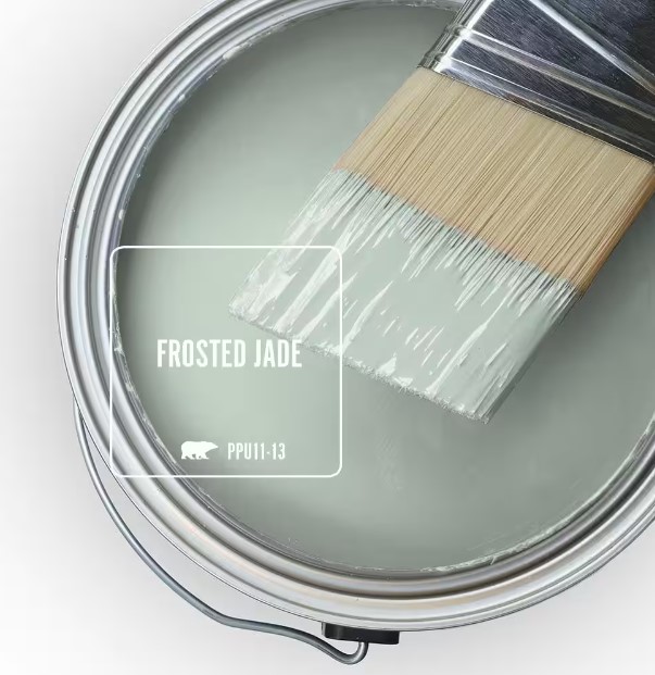
Frosted Jade (Behr) is very similar, if not with a touch more grey in the formula.
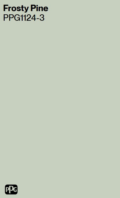

PPG Frosty Pine is also a gorgeous Frenchy green contender, and it’s a bit more on the sage side than the Tollens Vert Olivier.
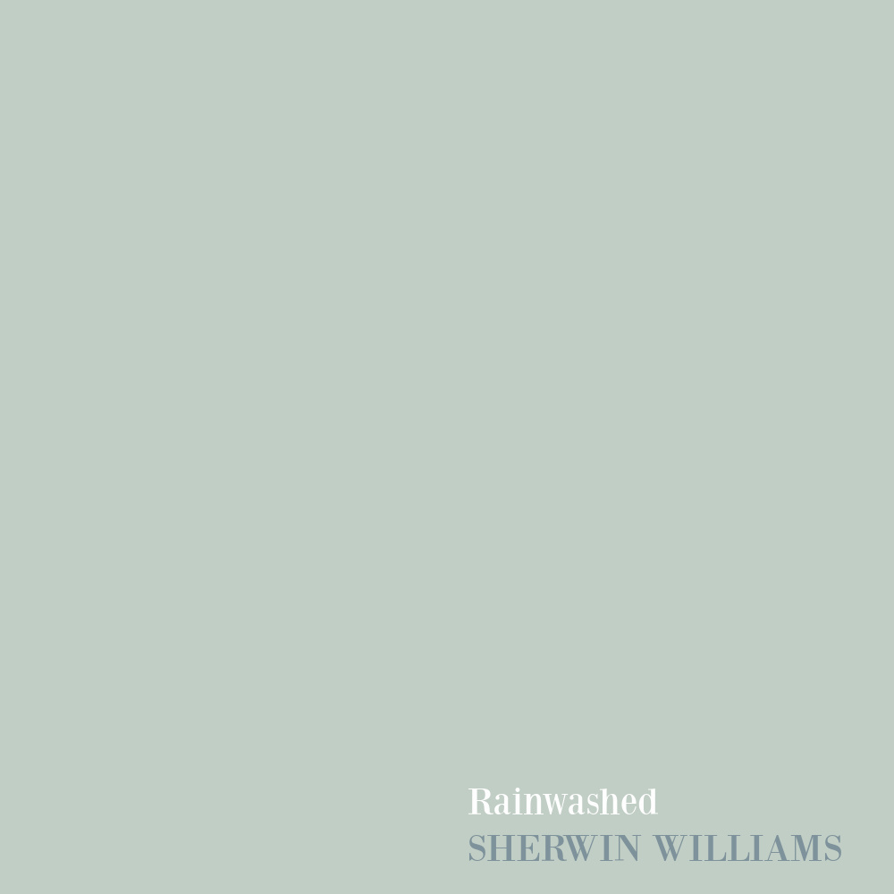
Another option from Sherwin-Williams is Rainwashed, a sophisticated and popular color with interior designers.
You will definitely want to sample a few of these greens as you’ll note differences in your unique lighting and because each color has varying undertones.
For more ideas for French greens, SEE THIS, and for sage green options, SEE THIS.
Sherwin-Williams Breathtaking SW 6814
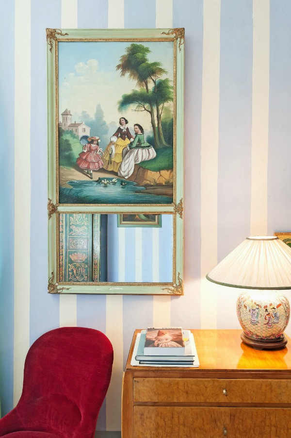
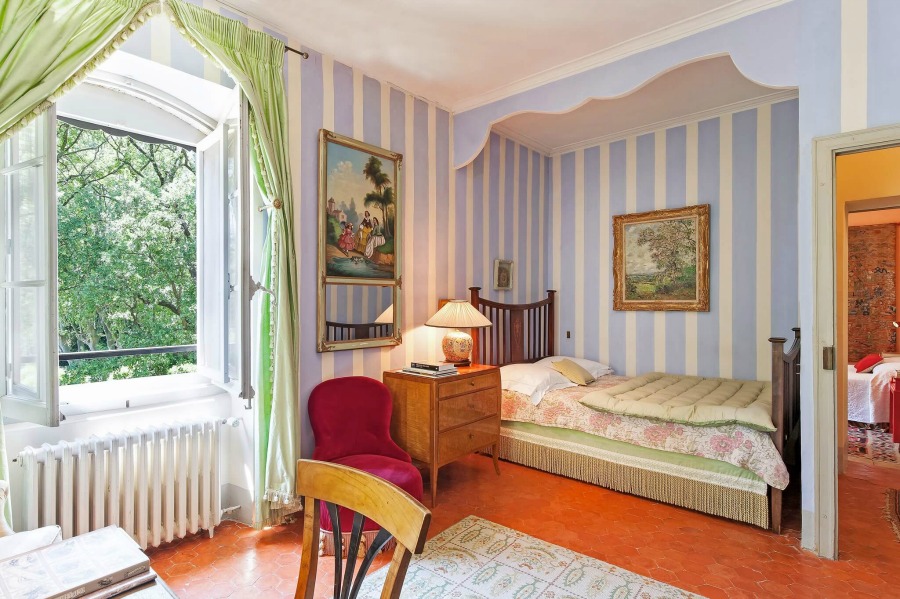
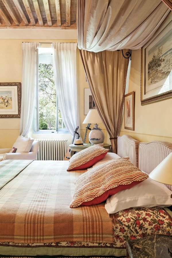
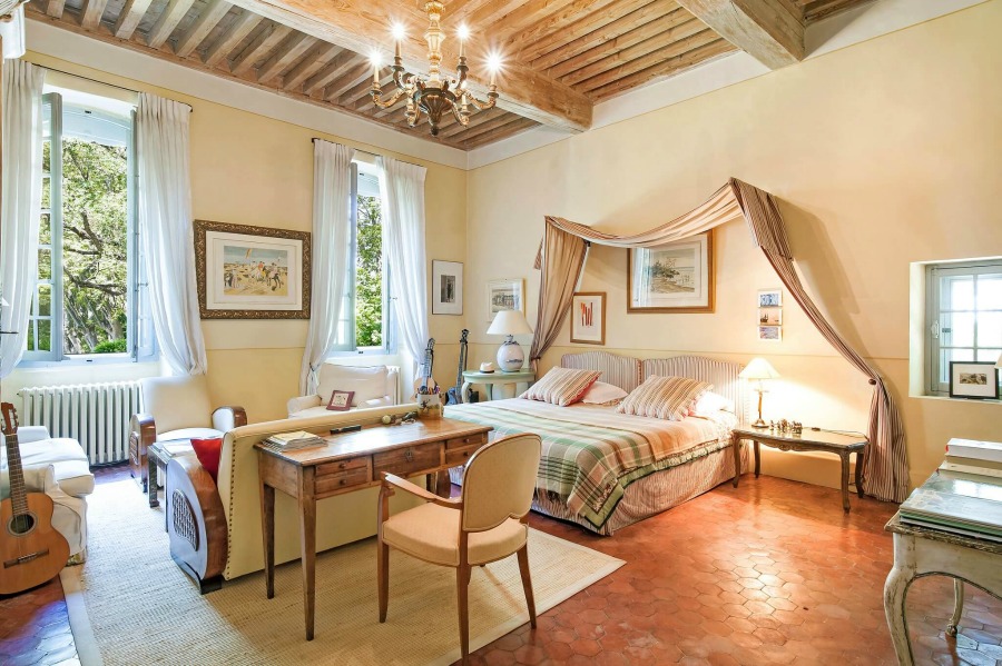
Here’s a French-inspired blue reminiscent of periwinkle blue, hyacinth blue, and even sky blue.
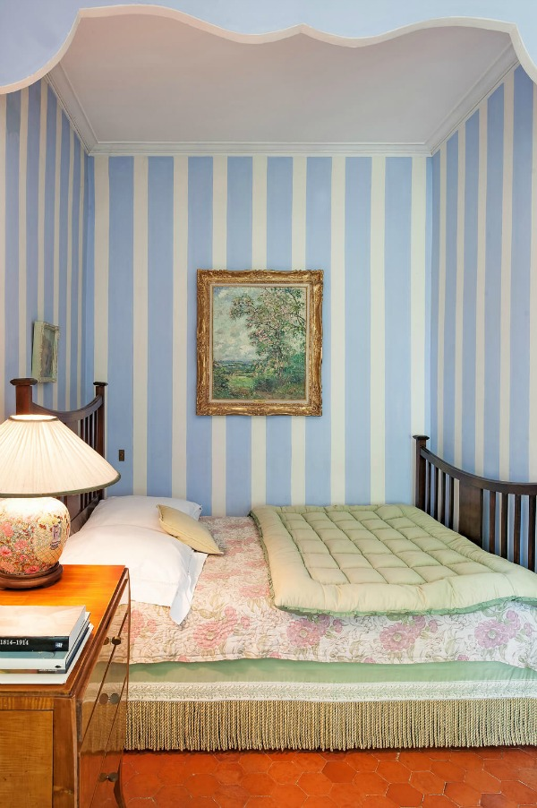
Sherwin-Williams Breathtaking SW 6814 is similar to the blue stripes in this bedroom in the chateau.

Here’s how the blue color looks painted solidly on the walls of a bedroom, and isn’t it fresh and surprisingly chic when surrounded by the warm red-brown tones?
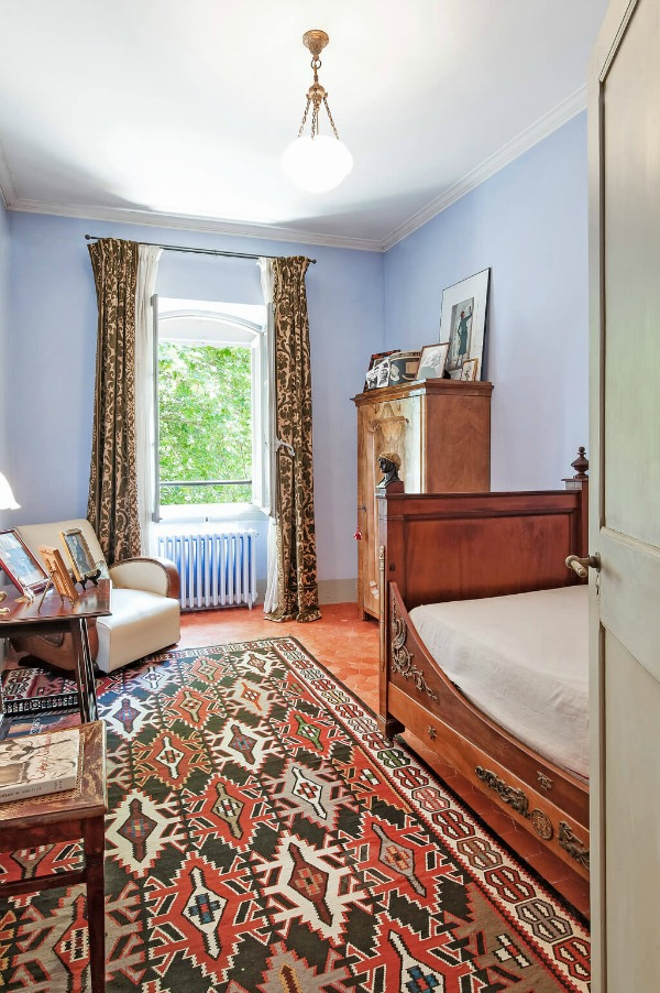
Breathtaking would be gorgeous in a bedroom or even a laundry room where there is limited or no natural light.
Cheerful blue paint colors are often overlooked for grownup bedrooms, but a guest bedroom may be the perfect opportunity to experiment with such a cool tone.
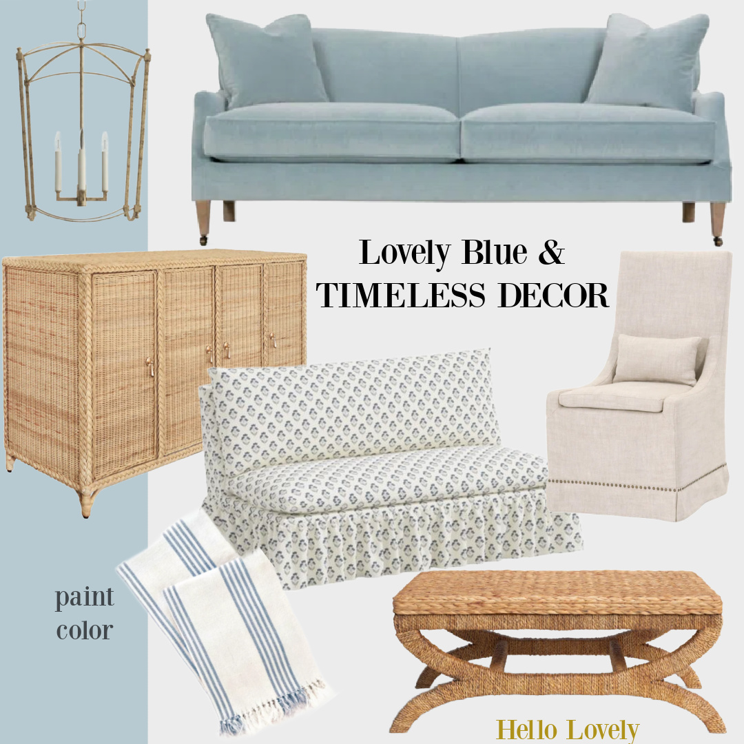
Gorgeous Blue Decor Ideas
Sherwin-Williams Stardew SW 9138
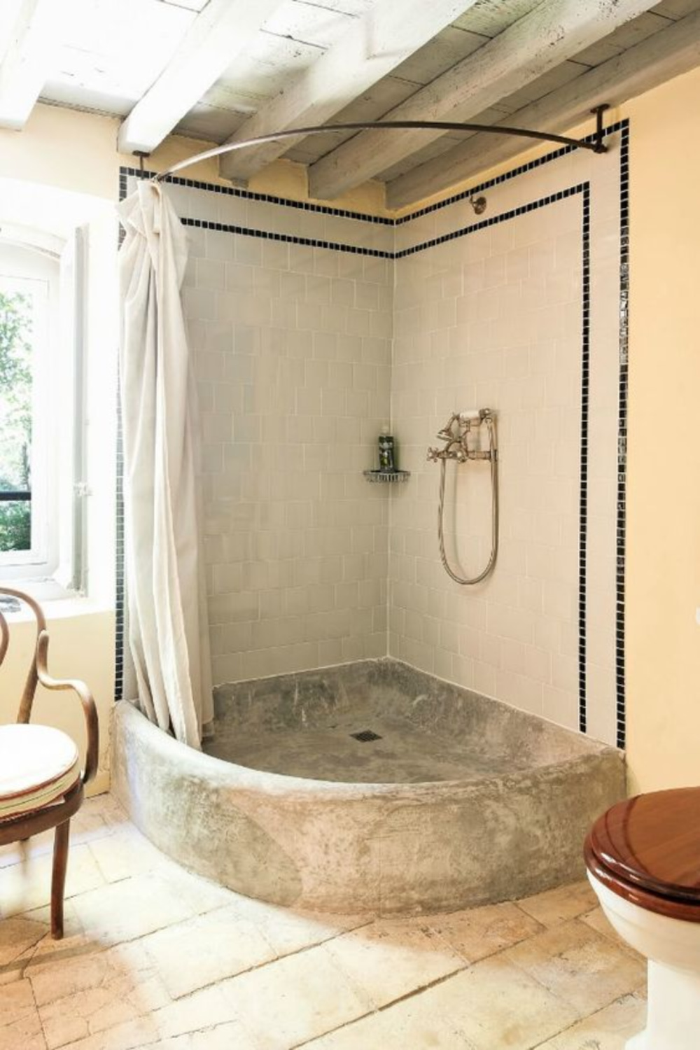
Here’s a gorgeous muted warm gray color with blue undertones in a bath, and here’s a similar paint color you could try: Stardew.
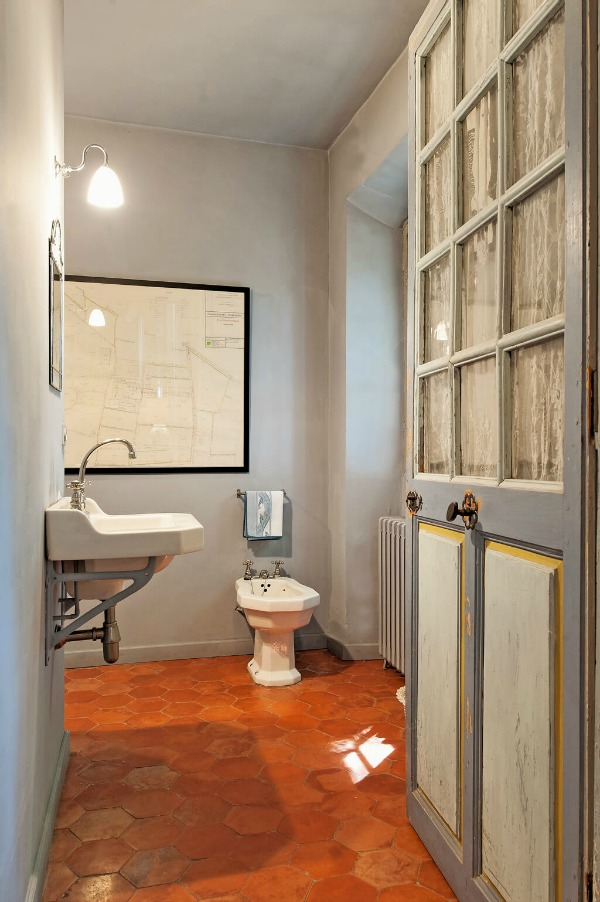
If you are using SW 9138 in a space that doesn’t get much sun, you may want to have it mixed at a lower saturation to get the effect you see above. (For example, have it mixed at 70%.)
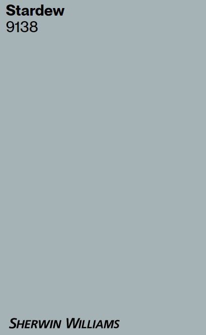
If this color will be used in a space where a lot of natural light streams in, be prepared for the color to appear more blue or blue-green. Sampling a few colors is always a great idea.
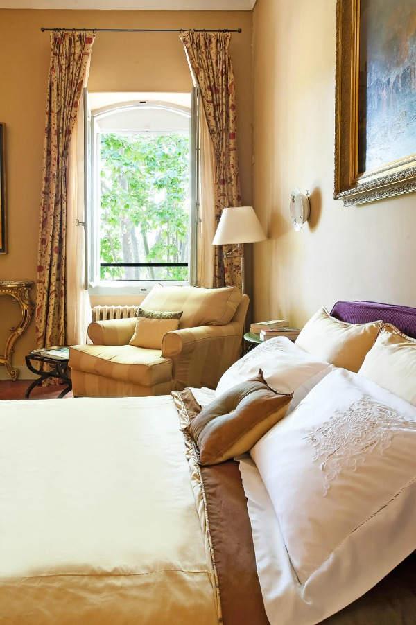
Sherwin-Williams Ivoire SW 6127
Yellow paint colors are tricky, and while I have painted several rooms sunny yellow over the years, I tire of it rather quickly. I find straw-colored yellows easier to live with, and they can feel like sunshine.
SW Ivoire is a beautiful, natural, warm gold that feels similar to the golden pigments we see throughout this home.
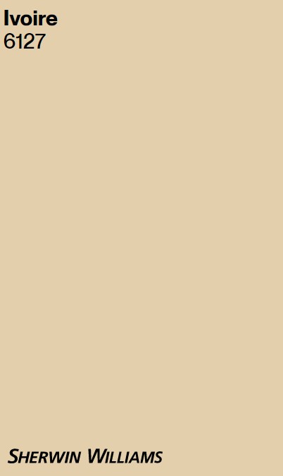
Ivoire feels suggestive of stone and the outdoors.
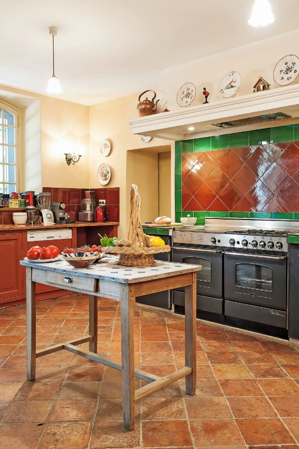
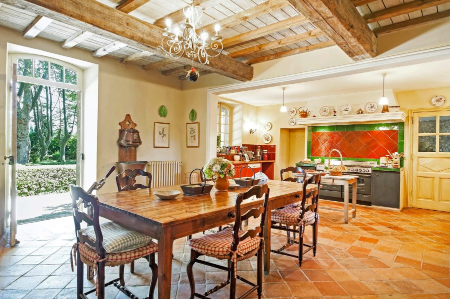
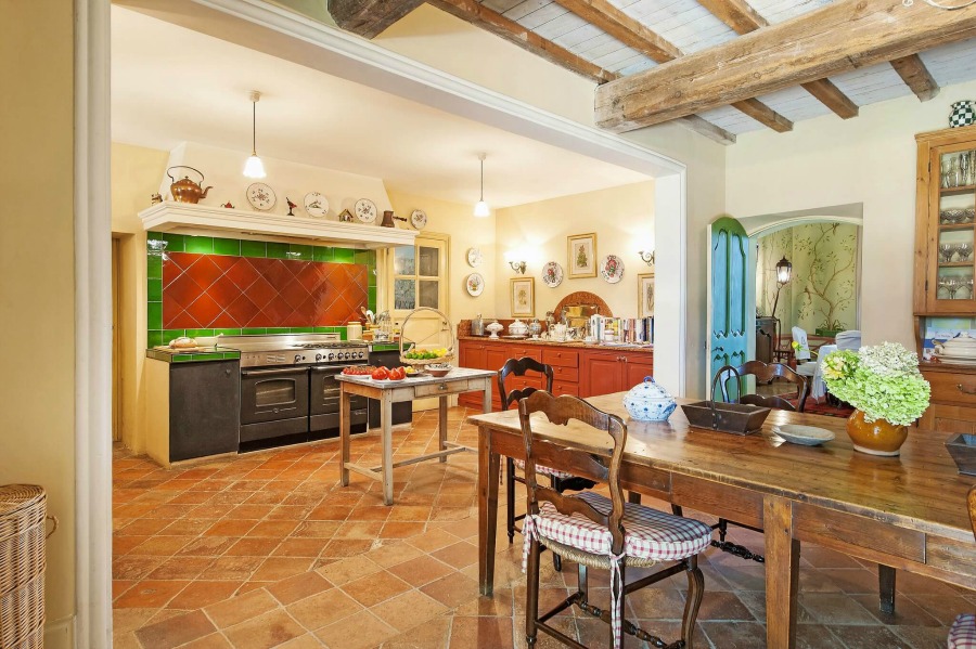
It feels very neutral in the chateau kitchen where a mix of terracotta, green, red, and warm browns converge.
Notice how in the next photo, the walls appear pale lemony yellow on the right of the image where the sun is hitting them as opposed to the goldenrod yellow color on the far left of the image.
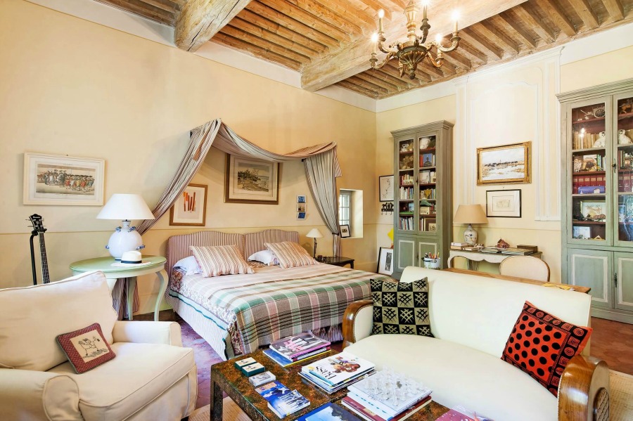
In a bedroom, three different golden colors plus what appears to be an ivory color adorn the walls. This method of adding architectural interest or a faux paneled look can be so charming.
But you can see how peaceful things feel when the whole wall is solidly painted gold.
Is it a Coastal French Look You’re After?
And isn’t the warm yellow-gold also magnificent with the terracotta floors?
I love how those brown undertones in the golden color work with the brown-reds of the tile.
Green painted built-in cabinets also look stunning with the yellow washed walls.

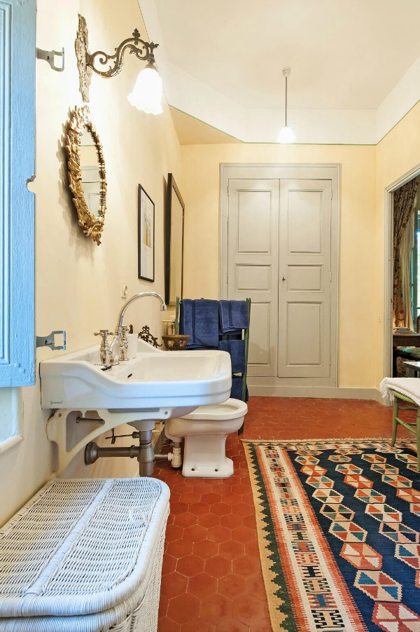
The gold walls in a bath feel like a subtle neutral with the other pale neutrals in the space.
And I almost didn’t notice the blue or blue-green painted windows in this spacious bedroom above. There truly are many colors represented in this room!
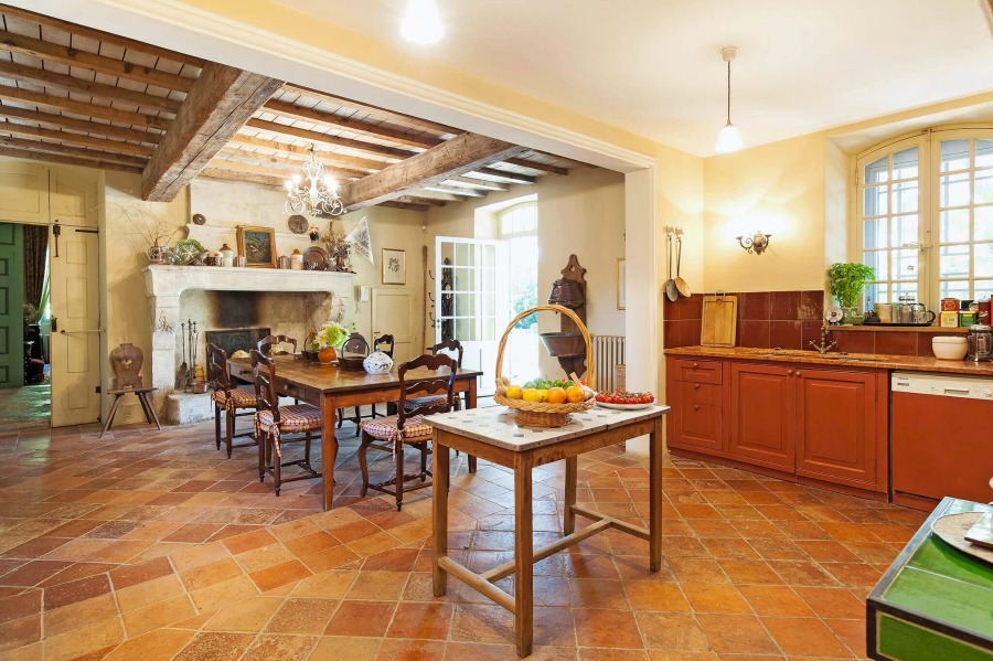
That goes for the kitchen too! Notice the terracotta painted cabinets and touches of green.
Find Part Two right here!
Peace to you right where you are.
-michele
I independently selected products in this post—if you buy from one of my links, I may earn a commission.
Thanks for shopping RIGHT HERE to keep decor inspiration flowing on Hello Lovely!
Hello Lovely is a participant in the Amazon Services LLC Associates Program, an affiliate advertising program designed to provide a means for sites to earn fees by linking to Amazon.com and affiliated sites.


