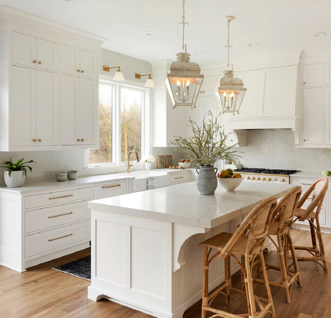
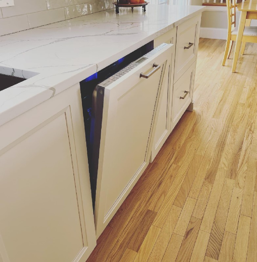
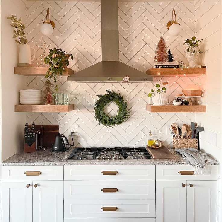
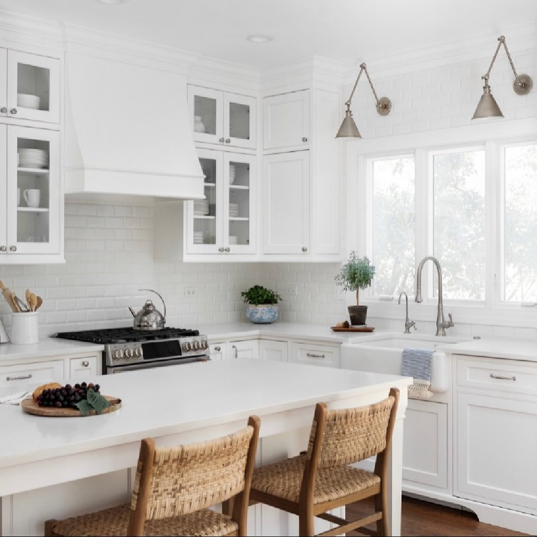
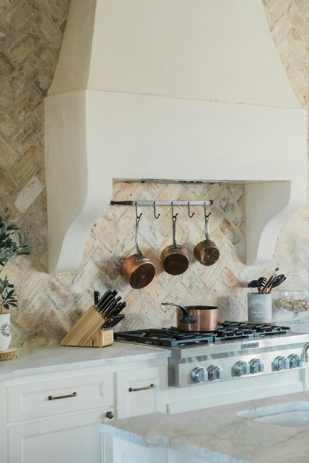
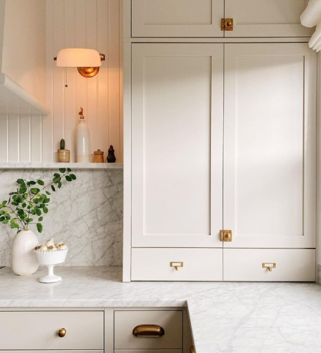
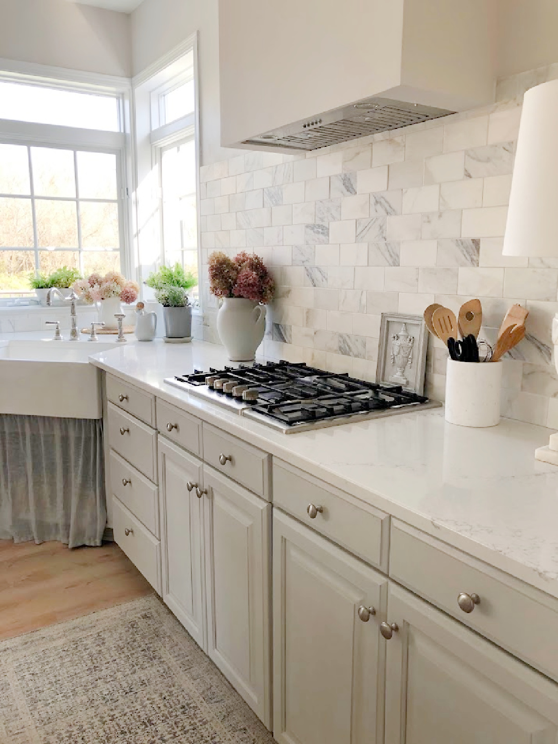
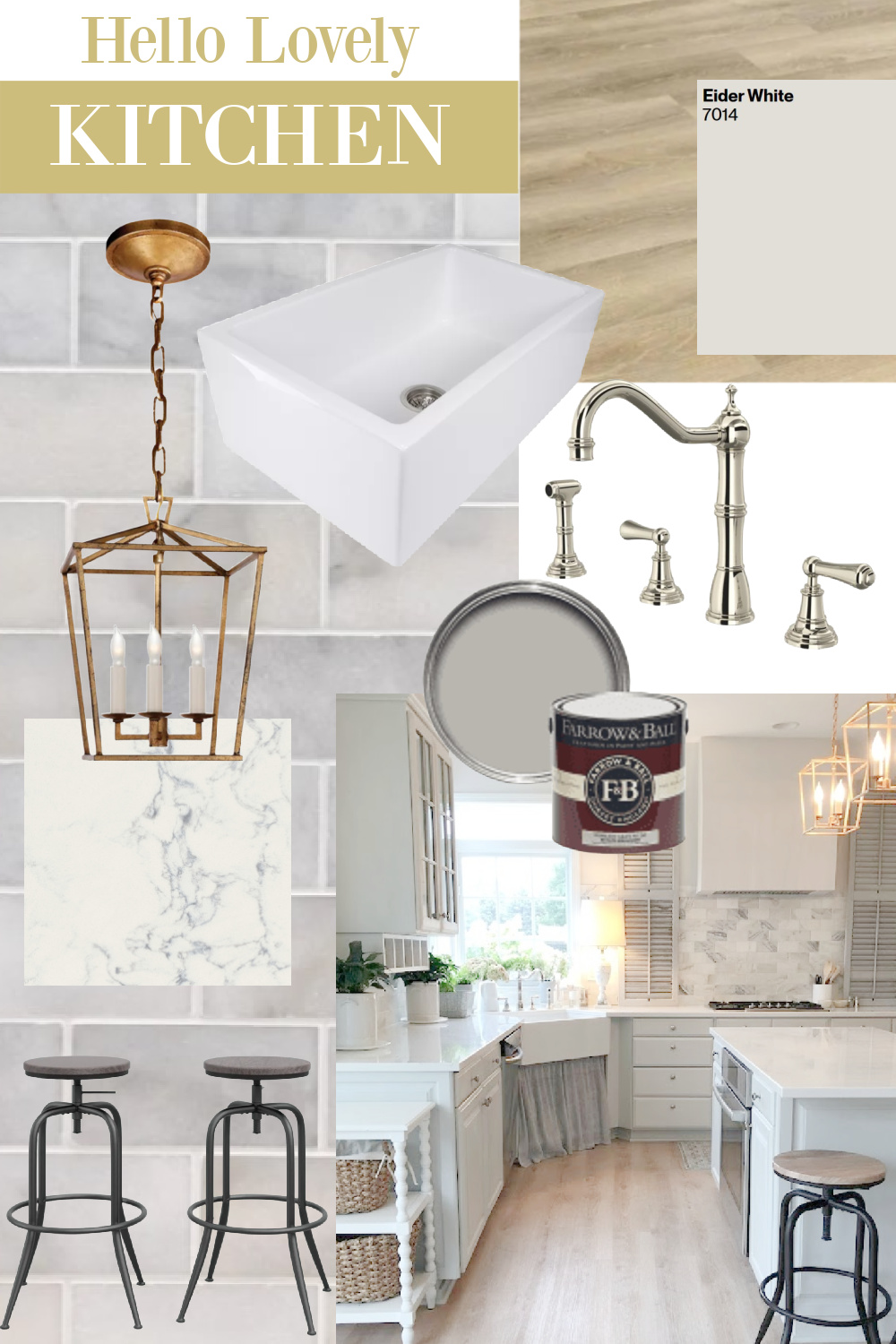
White Kitchen Cabinets White (Is There a Perfect White?) delivers eclectic inspiration for lovely white kitchens. While colorful kitchens may still be in vogue along with stained wood cabinets, white kitchens remain a non-negotiable for many. Is it too safe a choice? Only if you view safety as an undesirable trait. White cabinets may be the right choice for those who love rich color since neutrals have longevity and harmonize with seasonal accents. Even bold accent colors! BUT IS THERE A PERFECT WHITE PAINT COLOR? Consider sampling these 5.
White Kitchen Cabinets White: A Perfect White?
Why You Should Sample Multiple White Paints
Even if you have painted cabinets white in the past, if you live in a different space or are building from scratch, you truly are on a new journey! White paints have various undertones and different homes will vary in their exposure and lighting. The perfect white for your kitchen? Thorough sampling will get you there.
You are not likely to land the best paint color for your project with simple browsing on Pinterest. You’ll first need to determine whether it is a warm, cool, greyish, or off white that you’re after. It helps to view many photos online, but it isn’t as simple as learning the name of a color used in a particular kitchen and believe it will work for yours.
Do Designer-Endorsed Whites Help?
They do in that these favored whites provide a place to start in terms of sampling. Designers often become attached to a few favorites they find to be trustworthy. For example, maybe the color doesn’t change a lot over the course of the day as the light changes. Also, certain whites tend to work in a variety of lighting contexts.
Each white hue has gradations, undertones, and formulaic color combinations that influence the paint color’s LRV (light reflectance value). Here are 5 whites to consider and a gallery of photos to help you get a sense of them.
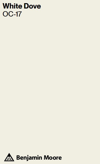
1. Benjamin Moore WHITE DOVE OC-17
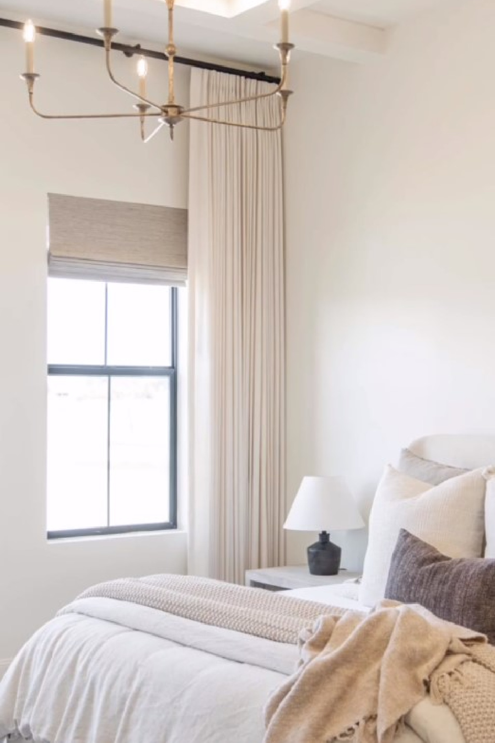
Many designers and homeowners turn to Benjamin Moore White Dove for painting cabinets off-white. I have used this shade for more than 30 years for trim, doors, walls, and cabinets.
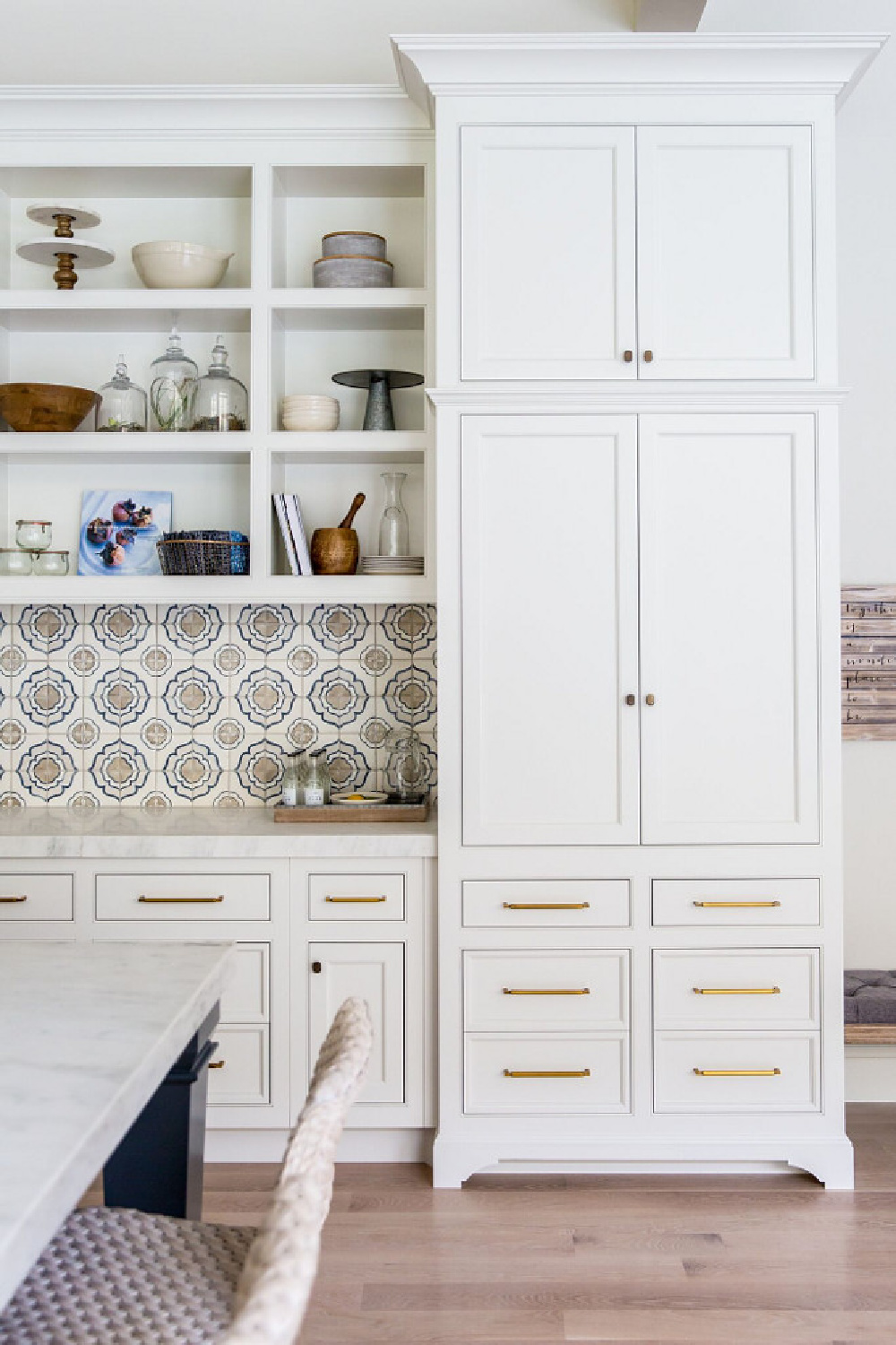
Not too warm, yet not sterile in mood. I especially like it for vintage pieces where I’m not after a “freshly modern” take on traditional style but want to preserve a feeling of age so it feels established. Don’t be fooled if this swatch looks tan on your screen:
Benjamin Moore calls this white a clean and classic white, and the rest of the planet seems to agree. What I hope you notice straight away is how different the swatch of White Dove appears from the cabinetry above and below it:
You truly can’t glance at a little swatch and know how it will be perceived in the unique light of your space. Sampling saves time, money, and headache.
The light reflectance value of this off white is 83.16 – it reflects some serious light. Should you also paint the walls, ceiling, and trim the same color? Sure! Here’s White Dove on walls:
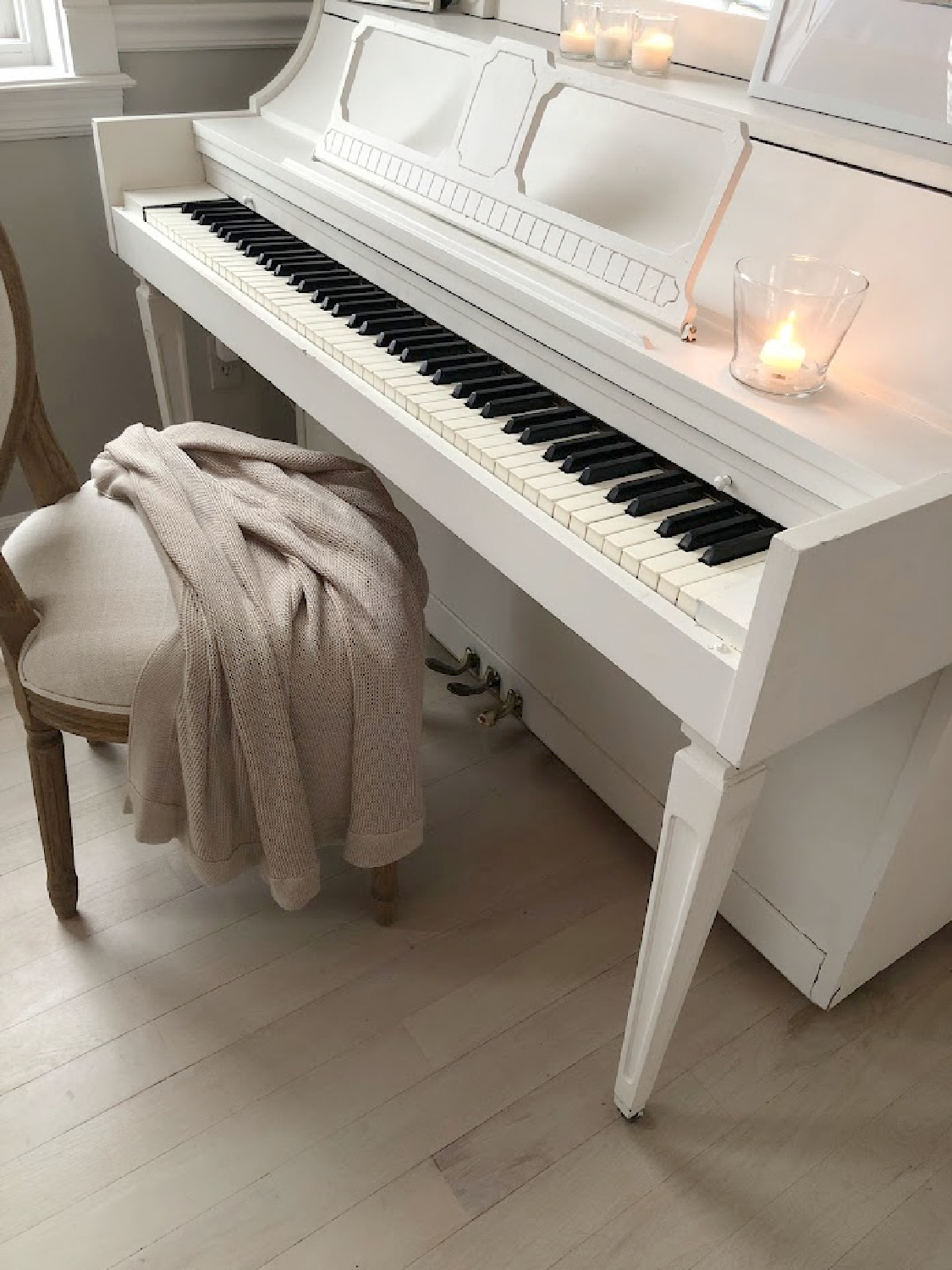
And here it is on my piano that I painted:
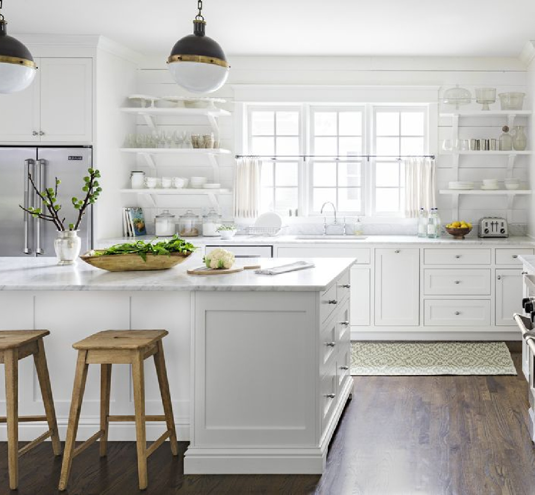
To decide whether a monochromatic look is for you, keep viewing images (dig into my archives and search “white kitchen”) to determine what your eye prefers. Subtle contrast for walls and cabinets can be beautiful. So can high contrast or almost none.
Learn What Catches Your Eye
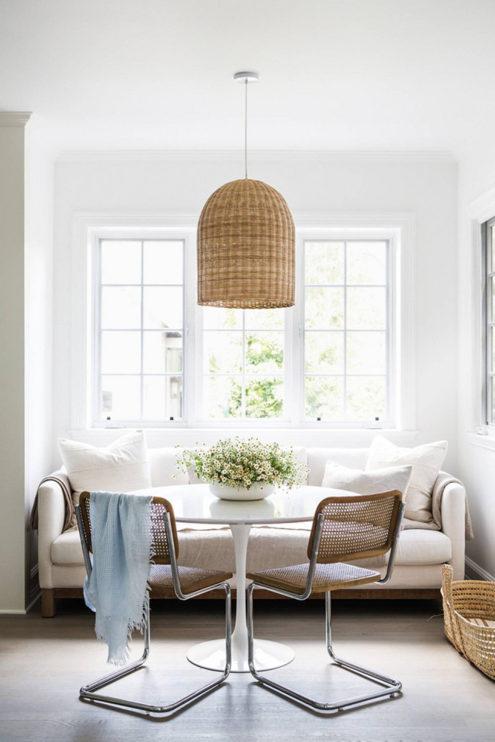
As you browse images (do expand them so you can see the details in the images), NOTICE a pattern of what you like. After a tranquil mood? Which kitchens evoke that mood for you?
Now look closer. Is the contrast level between walls/cabinetry/ceiling/trim low? Is it high? Or is there minimal contrast visible? If you’re working with a kitchen designer, pictures are worth a thousand words!
Which Colors Work Well With White Dove?
You could consider these three beautiful neutrals in combination with White Dove for accents, interior trim, exterior details, and walls:
Balboa Mist OC-27, Kendall Charcoal HC-166, and Revere Pewter HC-172
Easiest way to see if a paint color will work? Order samples with Samplize and have them delivered straight to your door.
2. Benjamin Moore CHANTILLY LACE OC-65
When you’re after a brighter white than White Dove, Chantilly Lace may be a great choice for your cabinetry. Here’s my friend Loi Thai’s gorgeous classic kitchen (Tone on Tone):

It’s not modern, yet it has a freshened feel. And here is Erin Fetherston’s California modern farmhouse where Chantilly Lace plays a starring role everywhere:
It does seem that Chantilly Lace is favored by minimalists, modernists, and Midcentury Modern fans while White Dove is maybe chosen more often by traditionalists.
No clue what your personal style is? Perfectly okay. Sample a variety of whites to see the differences when they are side by side. You’ll be surprised! In the end, it may be the lighting in your space that ultimately decides which white wins.

This white is a very crisp and bright off white also known as 2121-70. The brand calls it “a classic go-to white eliciting images of fresh cotton and pure silk.”
How light and bright is it? The LRV is 90.04! That is very pure white since light reflectance is from 0 to 100 with 100 being 100% of reflected light and 0 being the darkest black.
Which Paint Colors Go With Chantilly Lace?
Ice Mist 2123-70 is similar to Chantilly Lace so you may want to look closer at it. Horizon OC-53 is a quiet grey-white that coordinates with it too. Many designers are crazy about Horizon, and it has an atmospheric, ethereal factor you may like.
More Benjamin Moore whites to match Chantilly Lace? Benjamin Moore White OC-151 and BM Brilliant White OC-150.
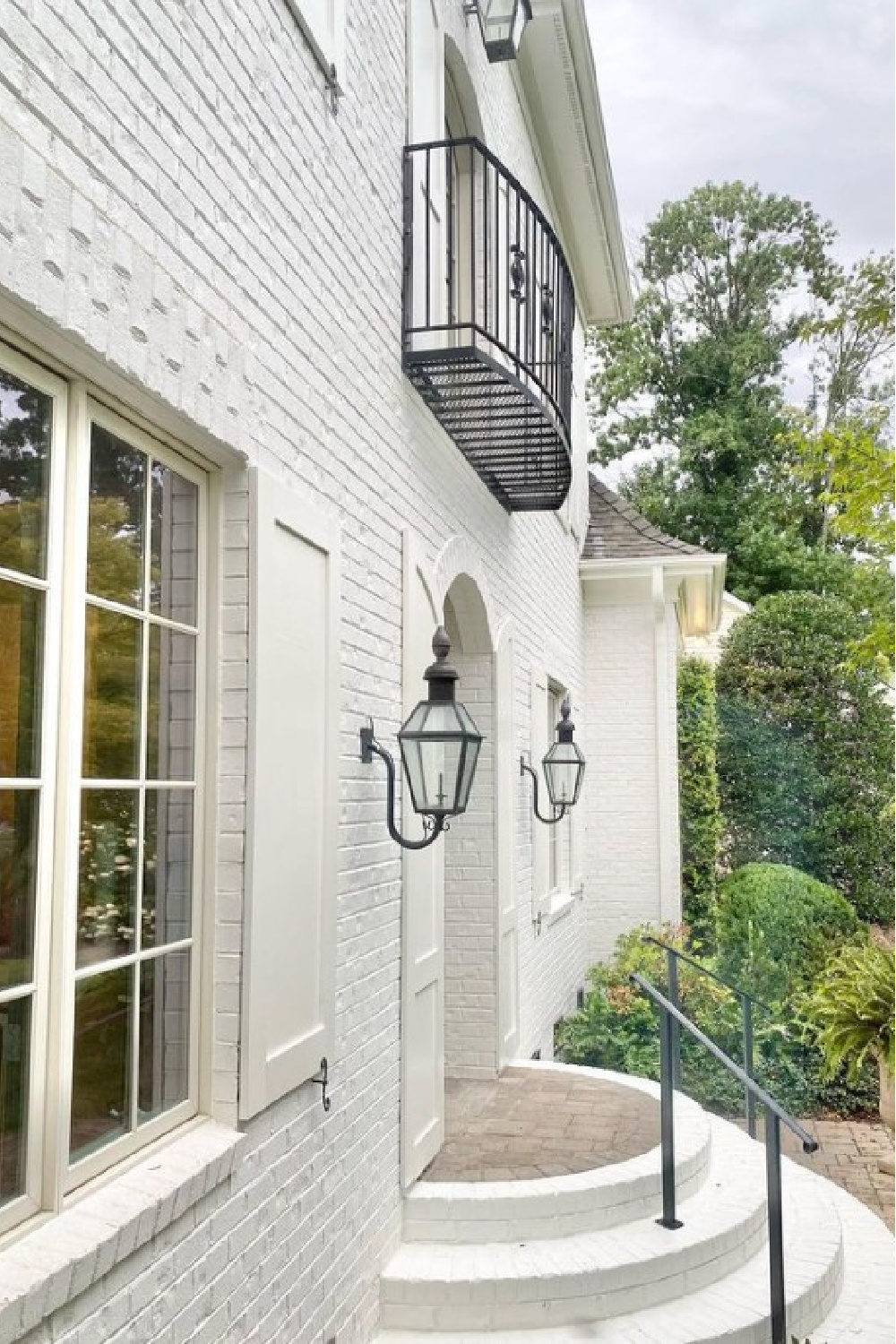
I share a bunch of photos of White OC-151 in THIS because of my familiarity with it. I used it for walls, trim, and ceilings in our former home because its very cool blue undertones worked well with the lighting there. You can see OC-151 in Lisa Furey’s kitchen on cabinets, walls, and even the exterior of this beautiful coastal property:
Let’s switch gears and peek at a warm white.
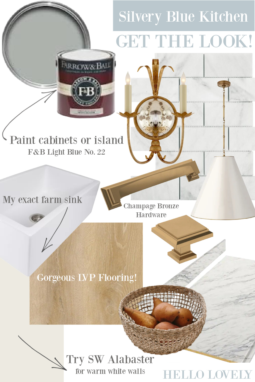
3. Sherwin-Williams SW Alabaster 7008
If you’re after a warmer white to feel calming and cozy, you may want to sample the wildly popular Sherwin Williams Alabaster 7008.
What is it like? Sherwin-Williams claims it will satisfy “When you want the brightness of a white without sacrificing a warm coziness.”
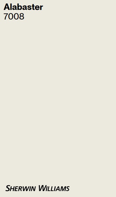
The brand also refers to Alabaster as “a soft, warm but balanced white to turn up the peaceful.”
I tend to agree that peaceful is an accurate description. If you dig in my archives and search “Brittany Jones” you’ll find that designer’s Texas home where Alabaster plays a starring role.
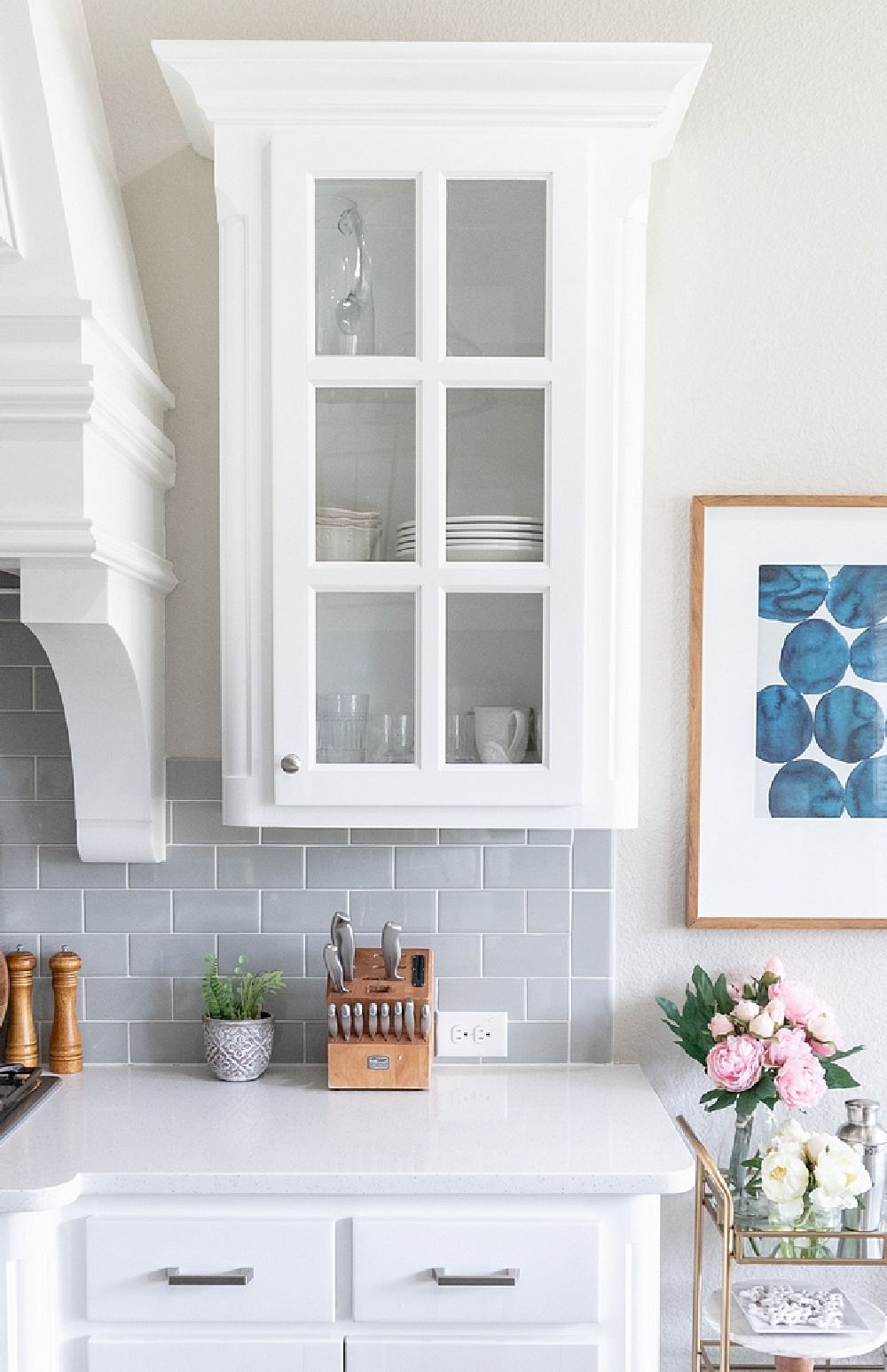
Look closely at how the cabinets above don’t “match” the white of the farm sink or the greyish-white Arabescato marble counters. Creating a beautiful white kitchen isn’t about matching whites. Mixing whites and neutrals keeps it all feeling authentic, custom, and layered with character. Even though differences are subtle, the look is prevented from falling flat.
Which Coordinating Colors Go With Alabaster and Which Don’t?
You may want to look at SW Townshall Tan 7690 as well as SW Dakota Wheat 9023. So many paint colors work well with Alabaster that I think we all lost count of how many kitchen designs by Joanna Gaines featured the white.
Alabaster is often fitting for farmhouse, country, vintage style, French country, and Old World kitchen styles. However, it may be too creamy or appear yellowish in certain lighting conditions which is why it’s so important to sample it first.
4. Benjamin Moore COLLINGWOOD
The first thing to note about this interesting white is how it doesn’t have “white” in the name. Also known as OC-28, Collingwood is a lovely, sophisticated white Benjamin Moore calls “A widely appealing shade of gray with lightly cool undertones.”
Why include it with whites when the brand calls it gray? It is versatile and chameleon-like. And as long as you see the above kitchen and think, “yep, that’s a white kitchen,” it could be a contender. It can appear slightly warm despite this hue’s cool undertones. Does it look grey? Putty? Stone-like? The mystery around this color and the fact it isn’t easy to pin down actually makes it a more appealing and sophisticated option.
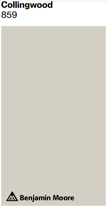
The LRV for Collingwood is 61.52 which means it is still at the lighter end of the spectrum, reflecting a fair amount of light. However, Collingwood reflects a lot less light than Chantilly Lace which has an LRV of 90.
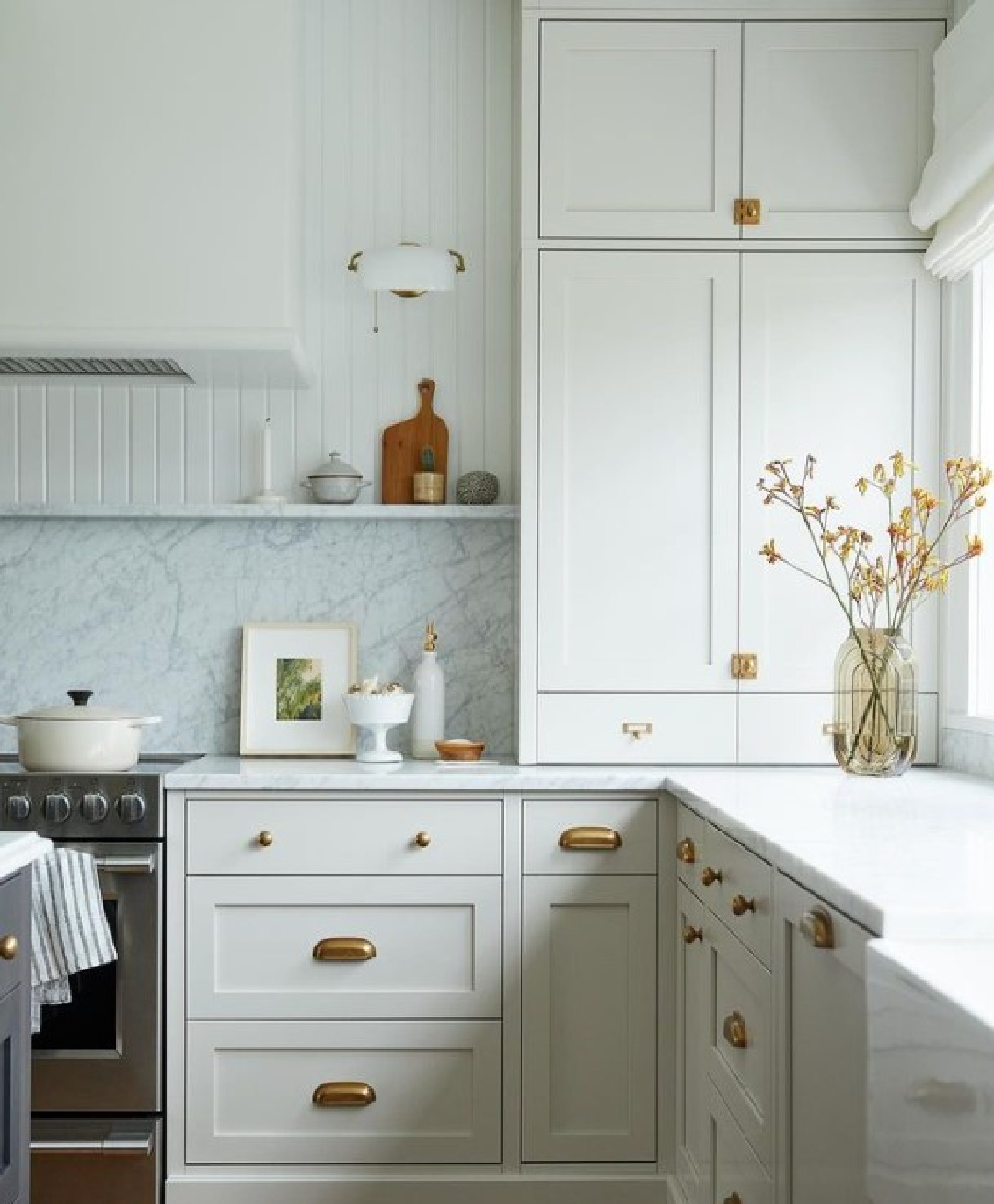
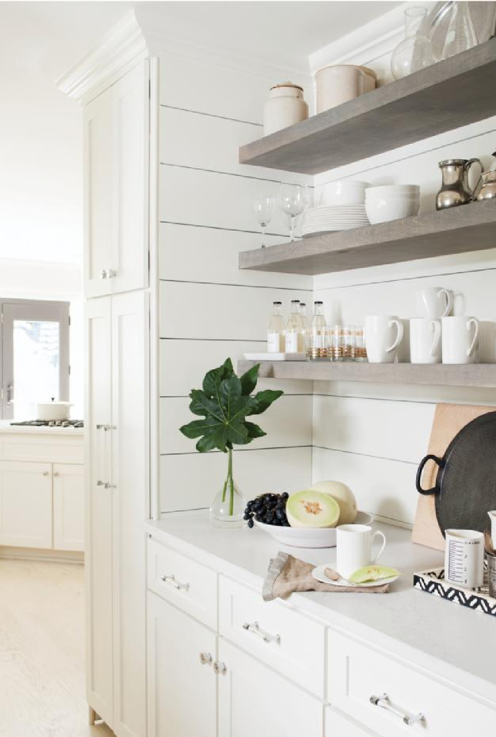
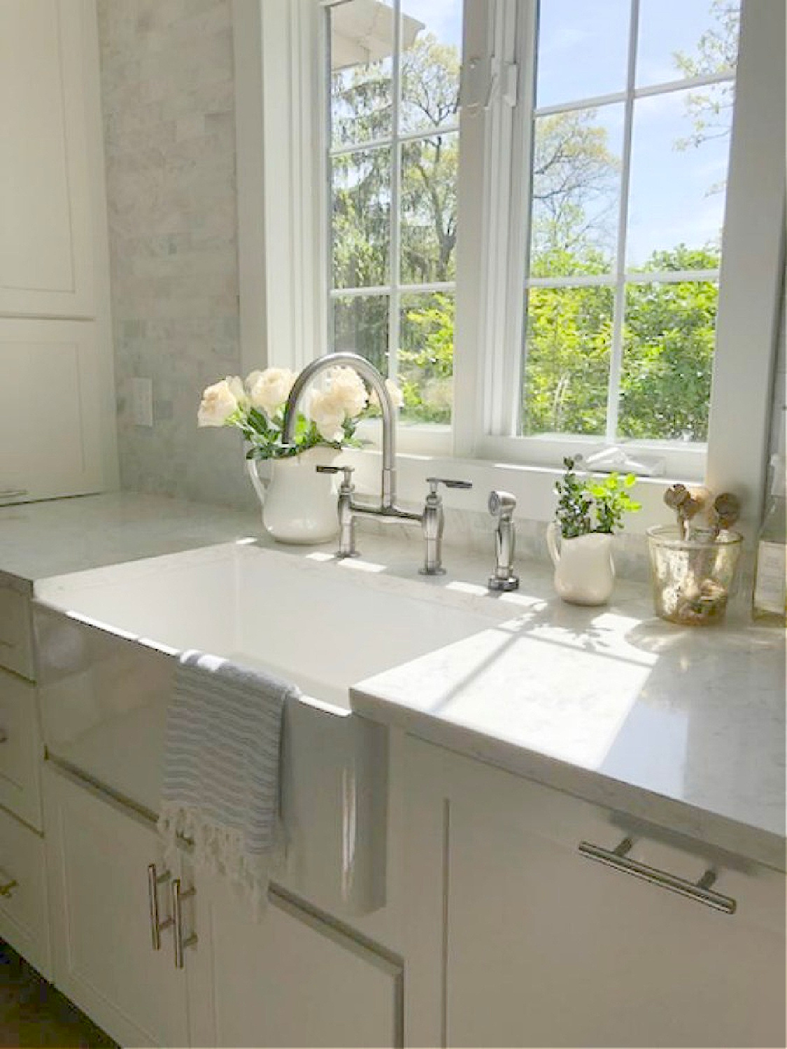
One of qualities I appreciate about Collingwood is the magic it works with cooler walls and marble counters. A lot of folks freak out when they have to choose a white countertop material that will work best with their white cabinetry. However, if you view enough images online, you’ll begin to see how the variations are endless.
Which Colors Look Great with Collingwood?
As far as complementary light neutrals to contrast lightly, see Icicle OC-60, which is a warm white that works well with Collingwood. Also consider BM White Dove OC-17. A taupe hue such as River Reflections 1552 and the deeply sophisticated blue-gray Gentleman’s Gray 2062-20 both harmonize with it too.
Is a Light Grey the Right White for Your Cabinets?
There are plenty more colors without “white” in their name that may be the right option for your kitchen cabinets. In my own home (a traditional Georgian), we wanted to keep things light, understated, and neutral in the kitchen. A custom light grey worked best.
At full strength, it was too dark. Since the kitchen receives plenty of natural light, the cabinets often appear light blue from the yellow sunny light…just what I was after. I didn’t choose the cabinet color until after the counters were installed, but I know this isn’t often possible.
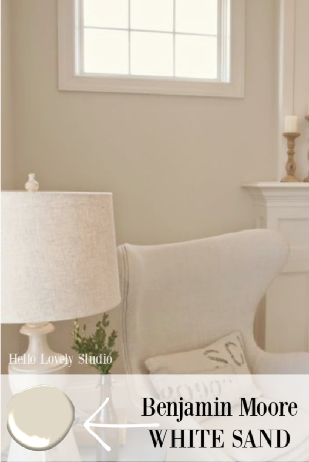
5. Benjamin Moore WHITE SAND 964
Here’s a color with which I have experience since I chose it for nearly all of the walls of a French country house we built. White Sand is warm and will look great with a range of countertops.
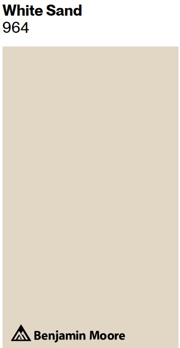
What I love about a color like White Sand for cabinets is how it is similar to the tone of a wood species such as white oak. It also reminds me of natural linen, and various whites for wall color, trim, and counters will work well.
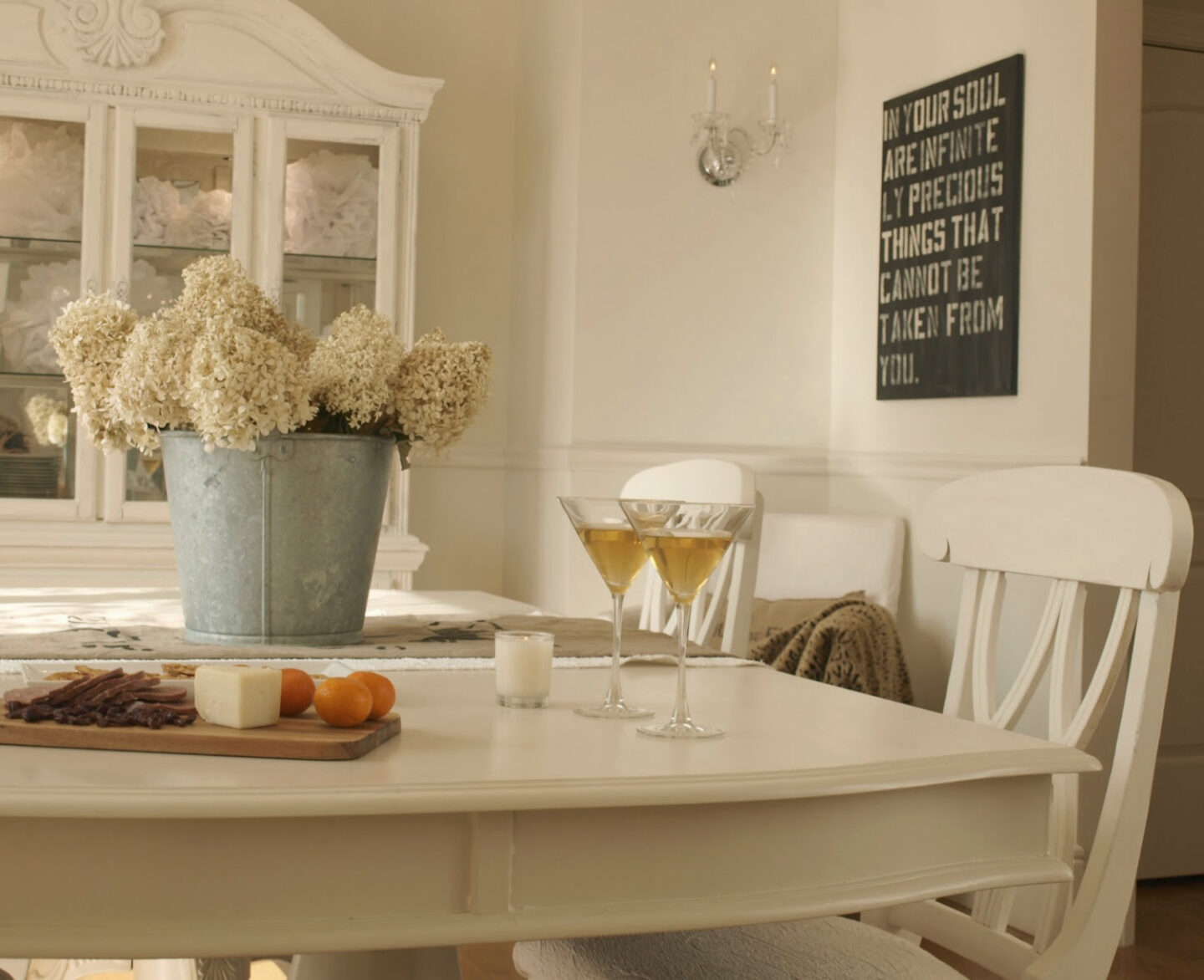
Here’s another shot of White Sand on walls in our dining room where the hutch and furniture is painted BM Whit Dove:
Is The Thought of Making a Mistake Paralyzing You?
A word of caution. Even when you feel confident you landed on the right white and other design elements for your kitchen design, second thoughts may surface as each layer takes shape. It’s very common to freak out. It’s a big investment. With the sea of choices you may think you chose poorly.
But you probably don’t yet have enough data to freak. (I don’t mean you shouldn’t lose your mind if appliances don’t fit…that’s a problem). Just bear in mind that when only a single layer is in place, you probably can’t assess the final look. When all your attention goes to the one thing before others are in place? Inaccurate assessments can happen. I’m a real life renovator where premature freakouts are routine along the journey.
Choosing the best white is never a cake walk since every project is different. Sometimes you’ll know a sample is wrong immediately. Other times, it’s a mystery. One thing that isn’t mysterious? Nobody likes re-painting when it’s wrong! So it pays to be thorough with sampling.
BONUS TIP for Choosing the Best White
BONUS TIP:
If a paint sample isn’t providing enough confidence to choose a cabinet color, paint a piece of cast-off furniture and live with it in the space. (It’s easy to score curb-side finds or a free FB Marketplace piece for experimentation.)
Ready to order samples of a few of these colors? Visit Samplize to get them delivered directly to your door.
Peace to you right where you are.
-michele
I independently selected products in this post—if you buy from one of my links, I may earn a commission.
Thanks for shopping RIGHT HERE to keep decor inspiration flowing on Hello Lovely!
Hello Lovely is a participant in the Amazon Services LLC Associates Program, an affiliate advertising program designed to provide a means for sites to earn fees by linking to Amazon.com and affiliated sites.


