If serene, quiet, understated, pale, modern European country timeless interior favorites appeal, you may be a fan of this divine source of inspiration! I cannot get enough of the designs, gardens, and decor schemes within HOUSE AND GARDEN magazine. Here are a few projects that are having their way with my imagination.
House and Garden UK: Timeless Interior Favorites
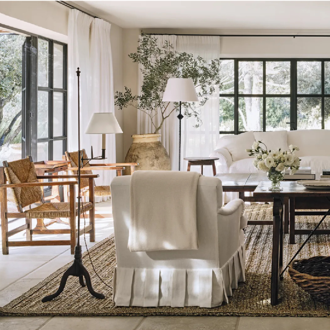
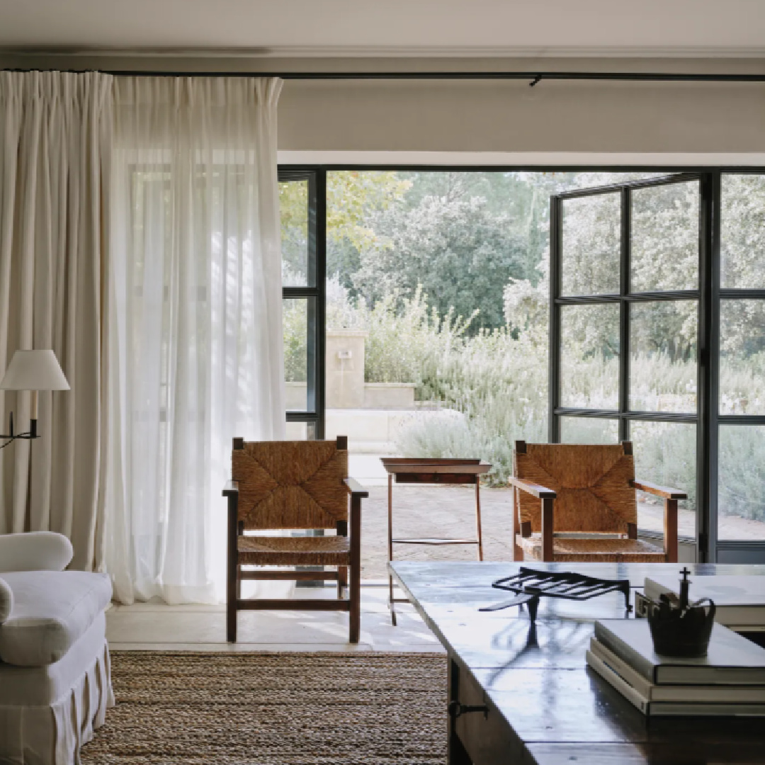
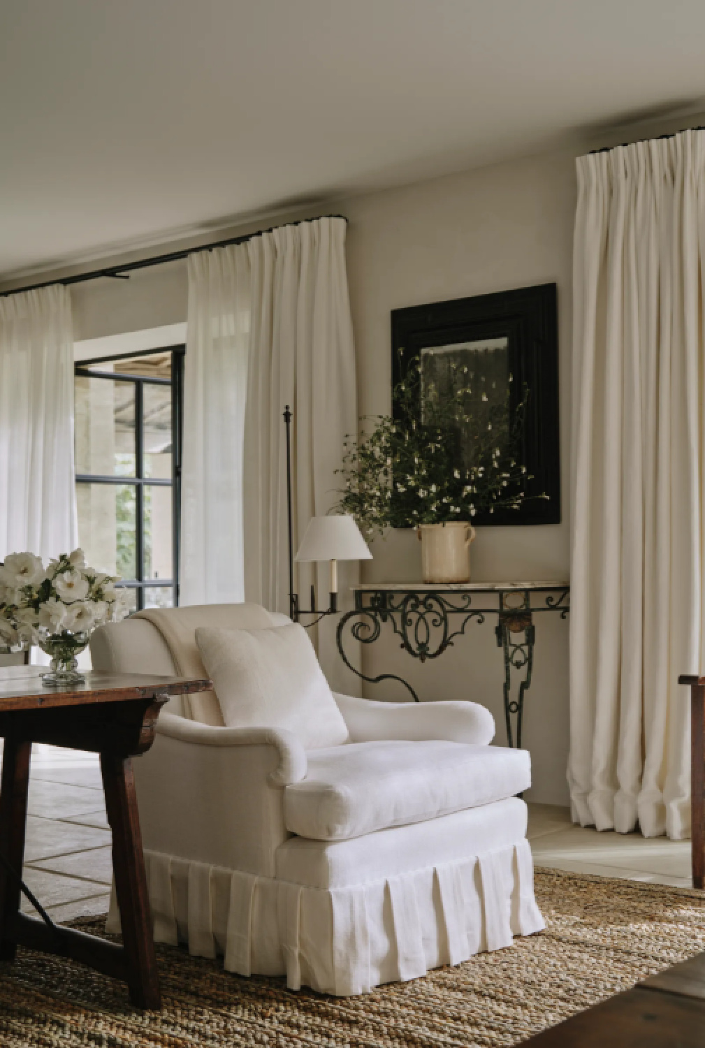
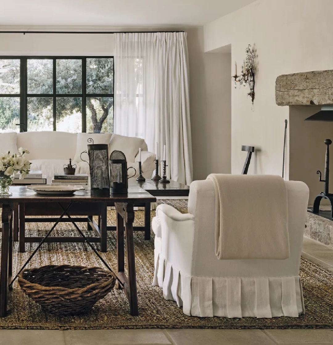
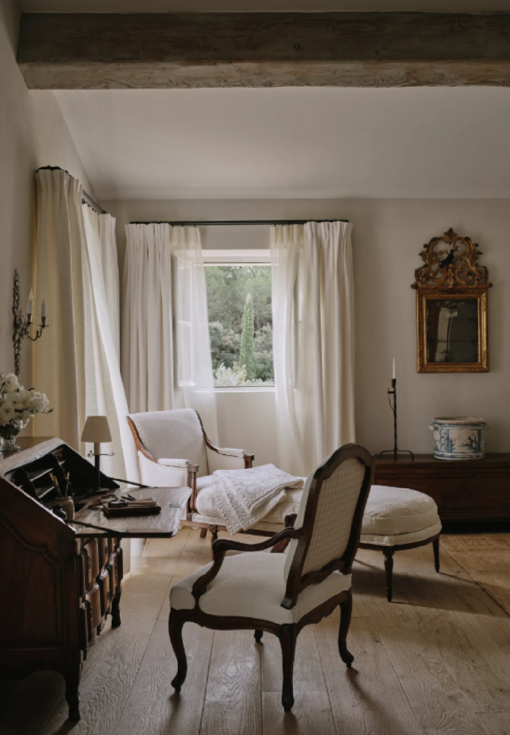
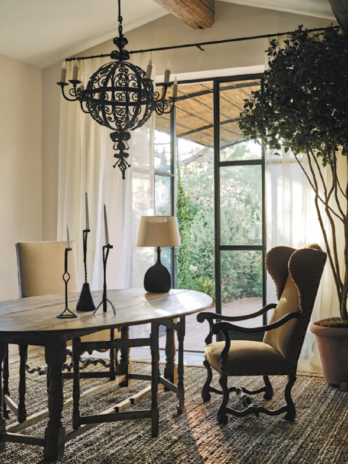
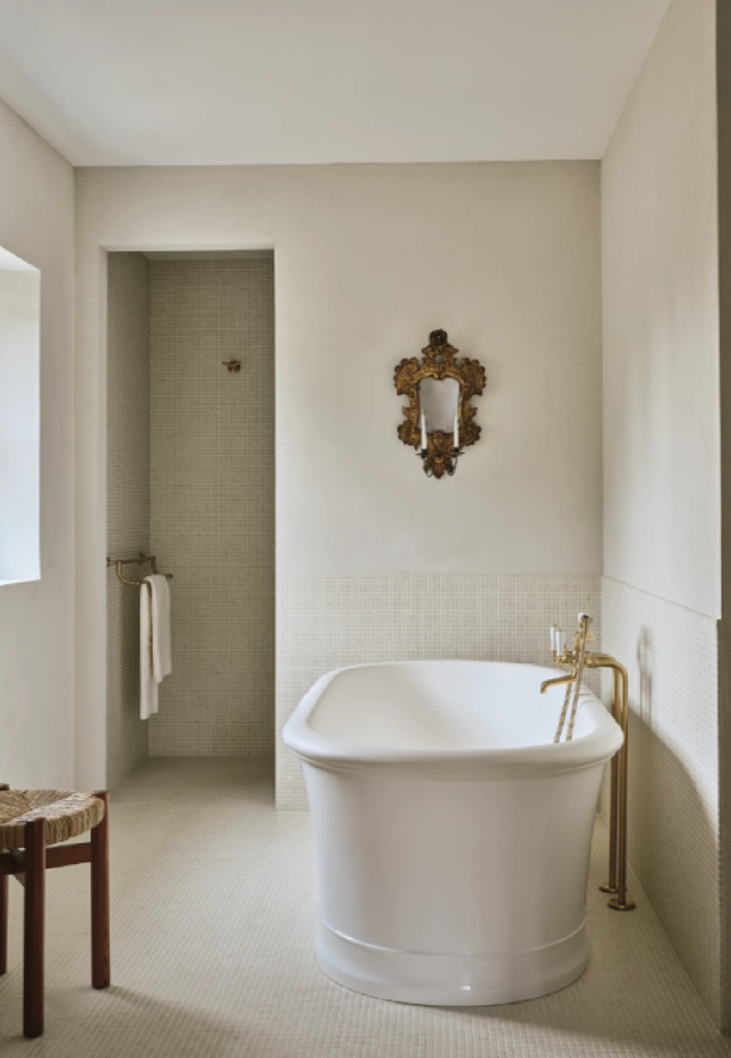
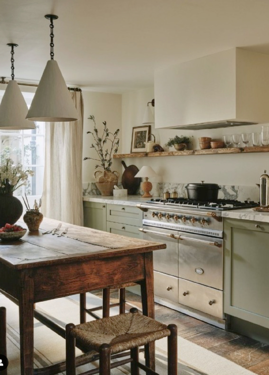
John Tanner Designed Provence Interiors
I love these John Tanner designed interiors for a Provence home featured in House and Garden magazine and photographed by Christopher Horwood.
To learn more about the finishes, materials, and textures chosen for the project, you’ll want to visit House and Garden.
While all of the white linen, white roses, and understated gestures may be too pale for the masses or folks who need color pops…
Bring on the ethereal quiet, baby.
Idea for a Plaster-Like Paint Color
Love the calm look of this Provence home? Need an idea for a warm ivory color that won’t read too yellow and won’t suggest an outdated antiqued white? The other day I mentioned I am currently at our snowbird house in Arizona, and here is the color on the walls, trim, and doors:
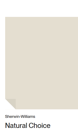
I have lived with it for months now, and I highly recommend it. In fact, I’m working on a local whole house project with a client who is using it extensively in their expansive Mediterranean style home. When you’re after sanctuary and love Old World plaster but need a budget friendly solution, boom.
Back to this beauty filled with natural warmth and textural beauty.
I could move right in and can almost smell the fresh Provence air through the screen.
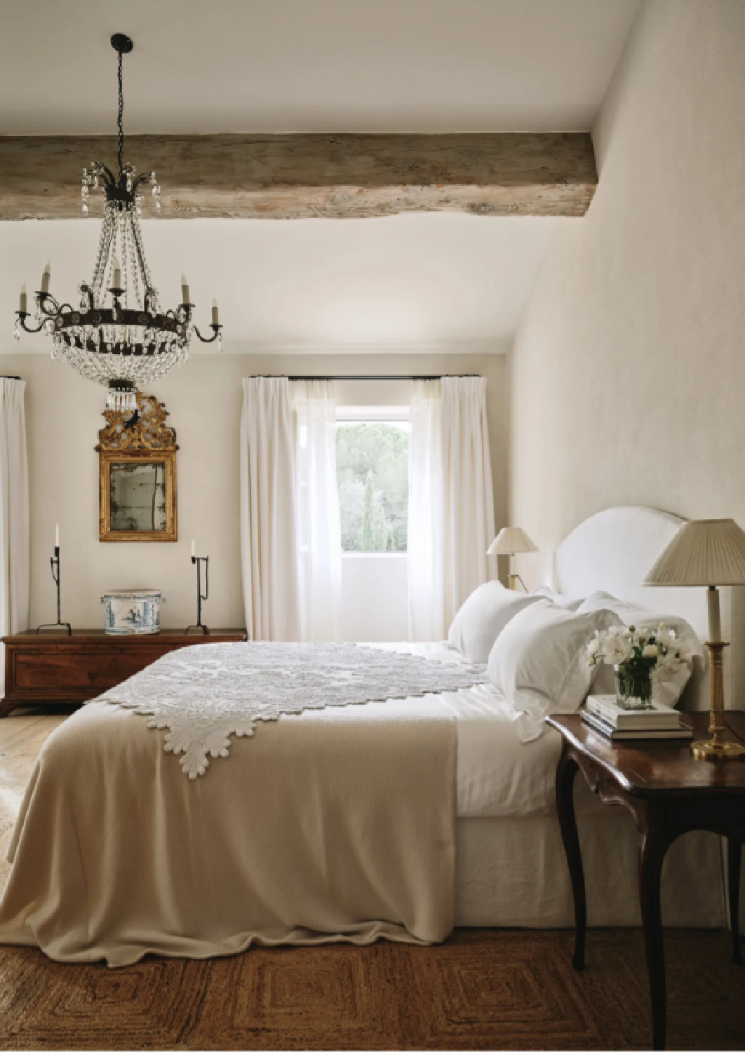
And you? Are you also soothed by the magic of the hushed spaces and French countryside beauty?
Let’s consider another project in House and Garden I can’t seem to shake from my consciousness. (Trying extra hard to not use the term ‘obsessed’ even when it fits.)

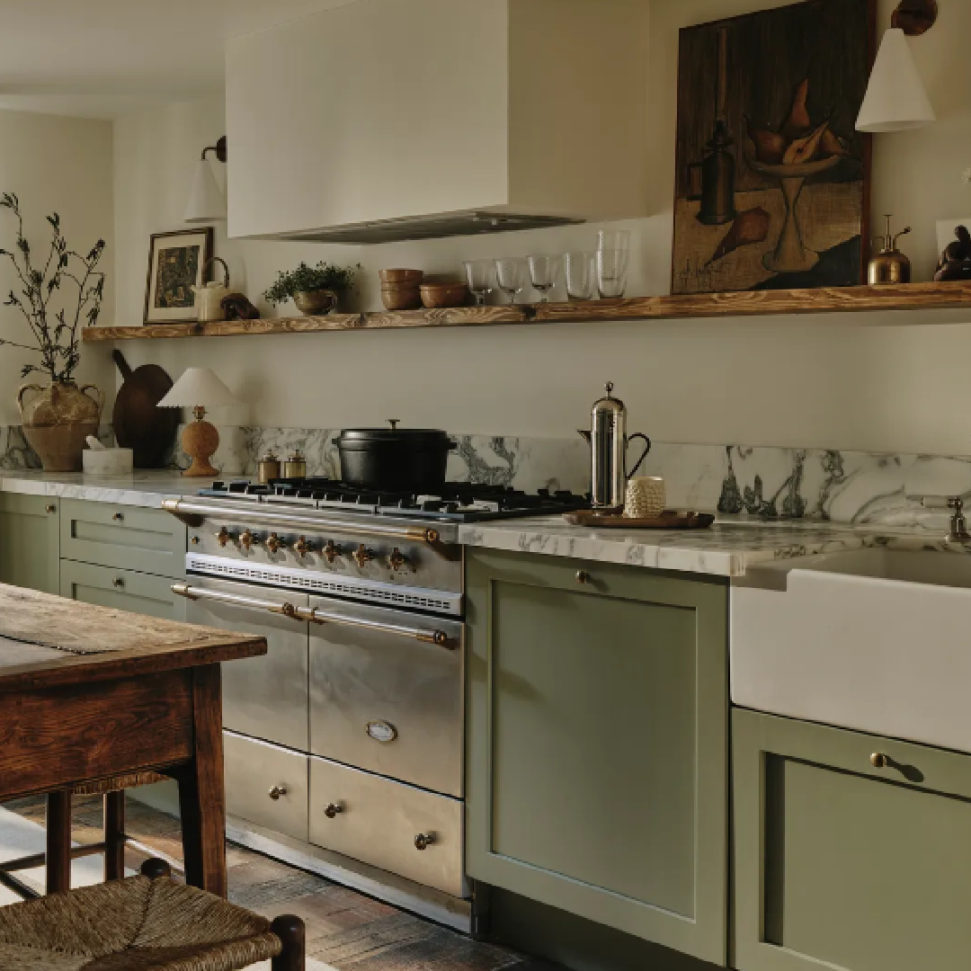
Rachael Gowdridge Designed Interiors at a Georgian
This townhouse in Clerkenwell with interior design by Rachael Gowdridge is absolutely stunning.
The incredible photography is once again by Christopher Horwood, and for me, they are these sublime visions of fine art.
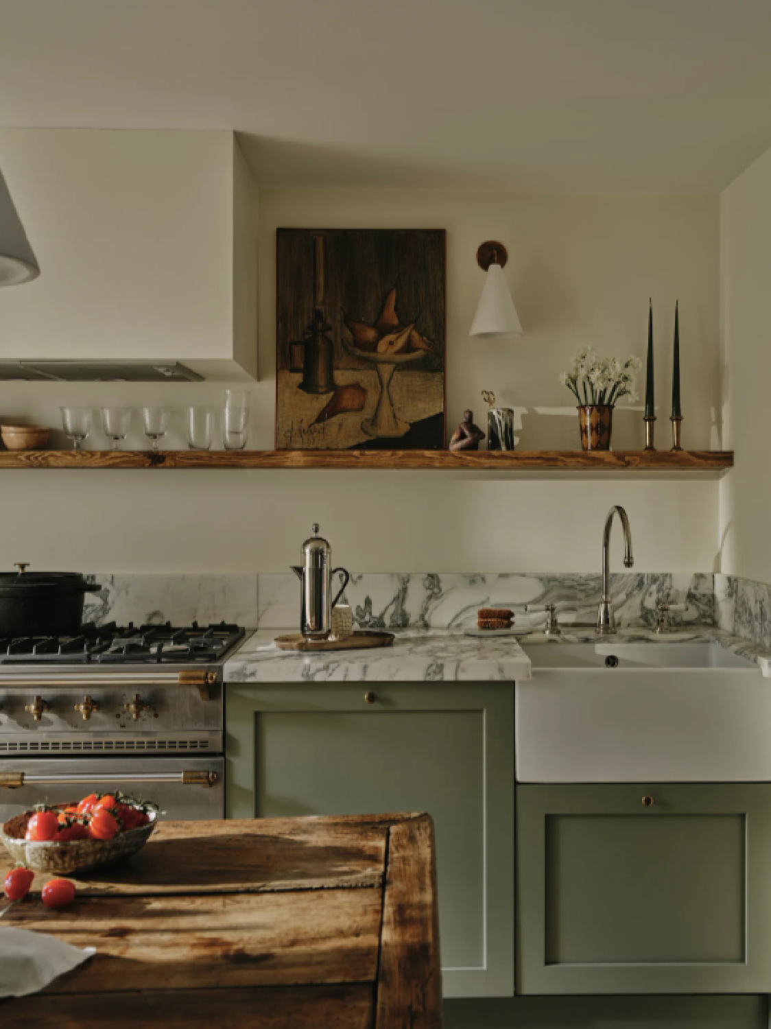
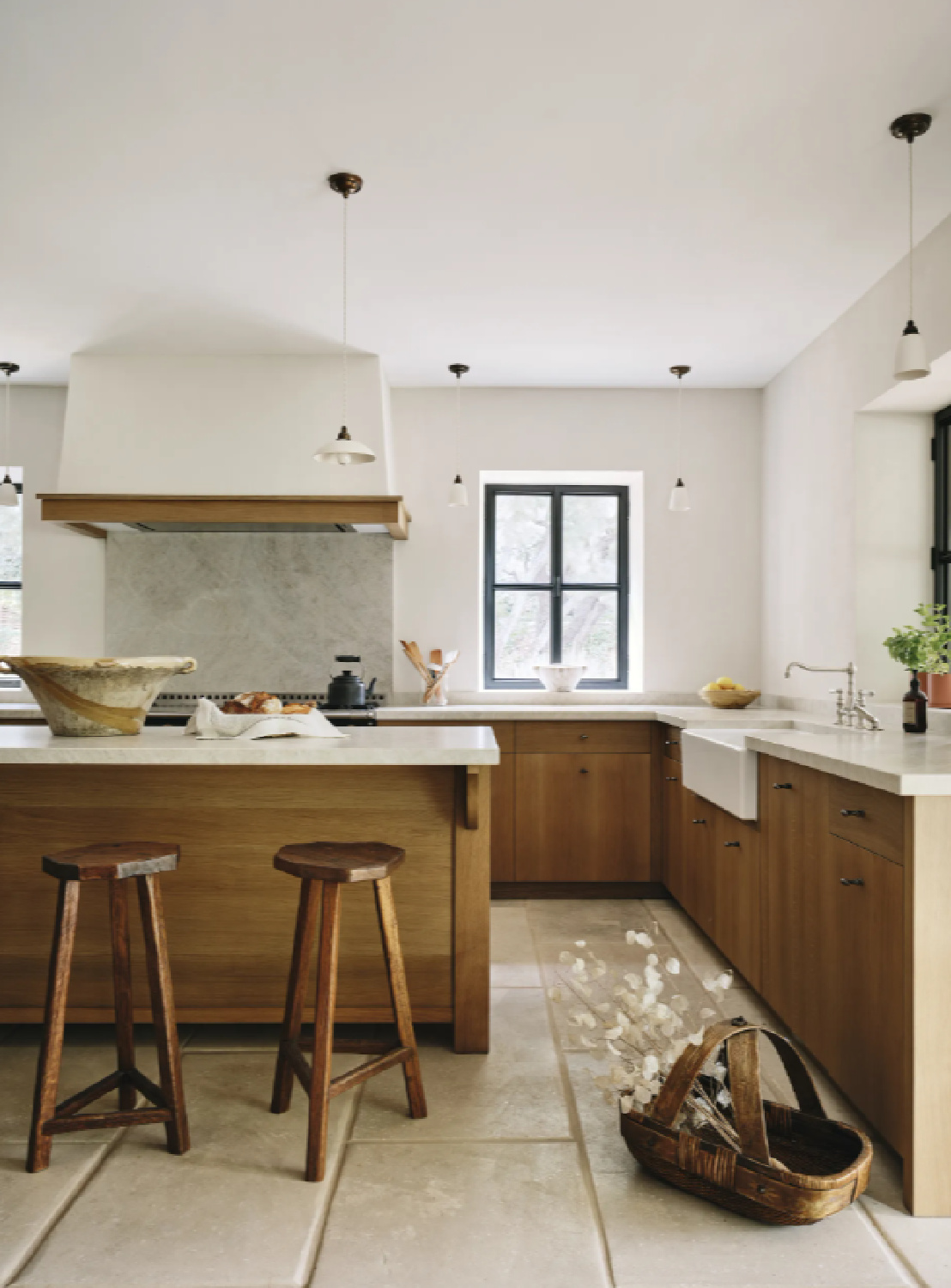
A bonus of this particular project? We are told the wall color in the exquisite kitchen!
Kitchen Wall Paint Color
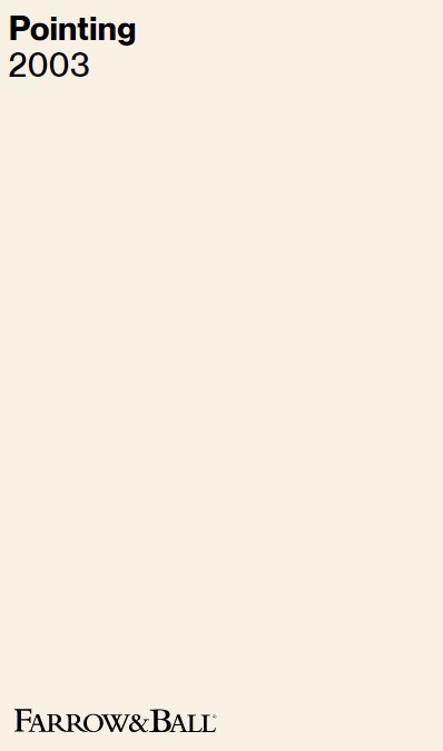
What a gift when designers are generous enough to share!
Of course, by now, we know better than to think painting our kitchen Pointing is going to give us this effect.

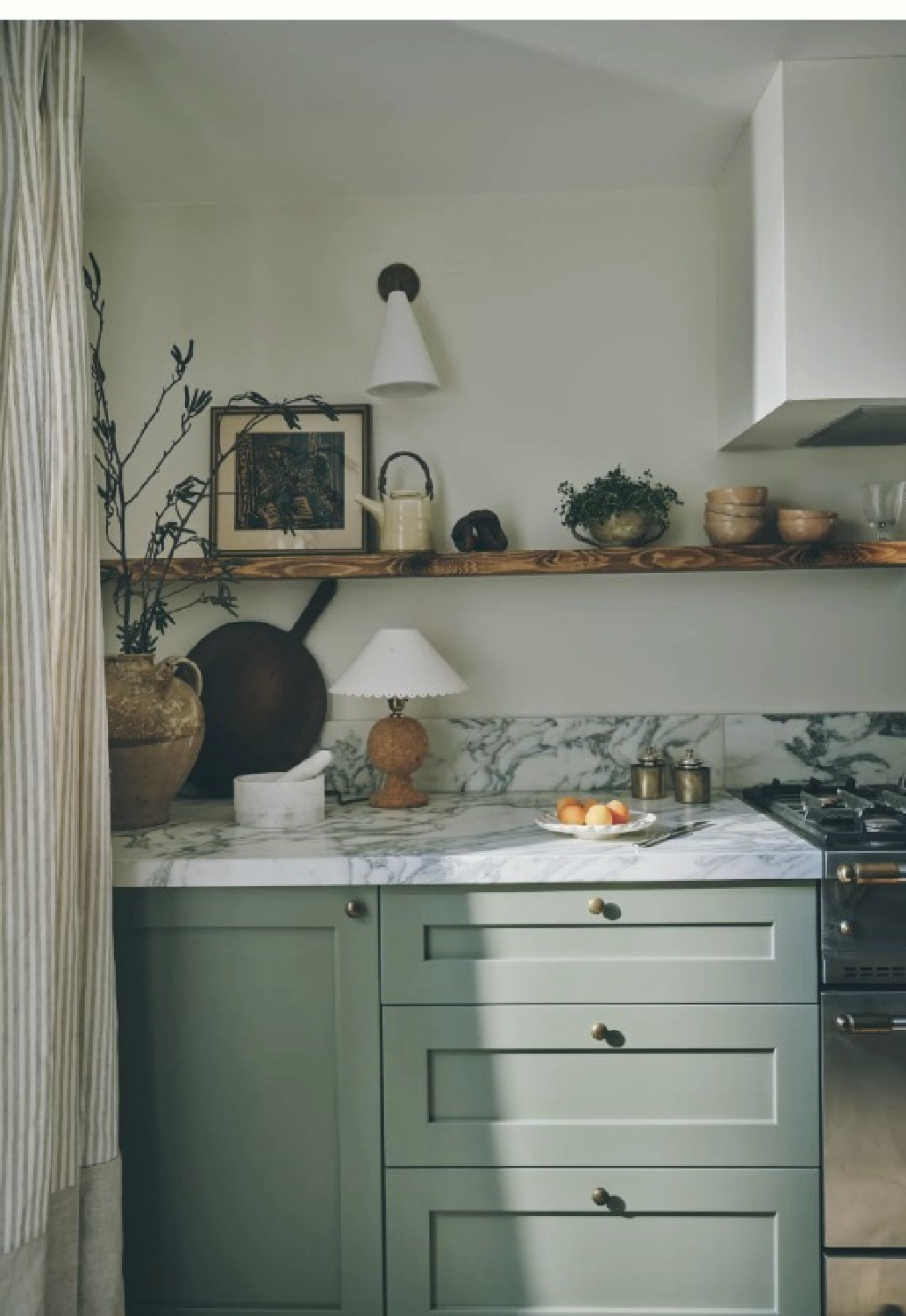
In fact, this color could be entirely too warm with strong yellow undertones for my own kitchen which receives abundant natural light.
Just a reminder to sample at least three colors in the space to thoroughly understand the nature of the color and its interaction in your unique environment.
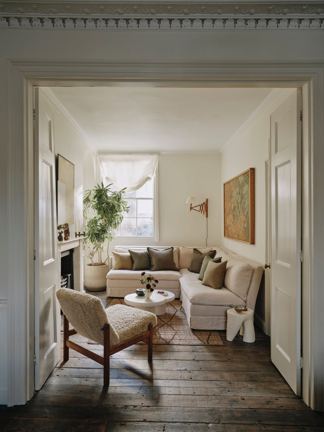
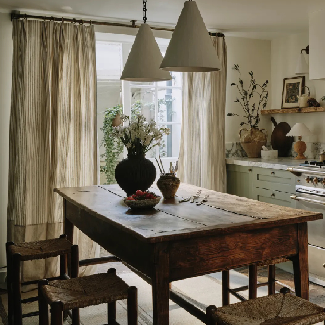
Are you familiar with the English “snug?” Because this sweet snug above feels just right for getting cozy.
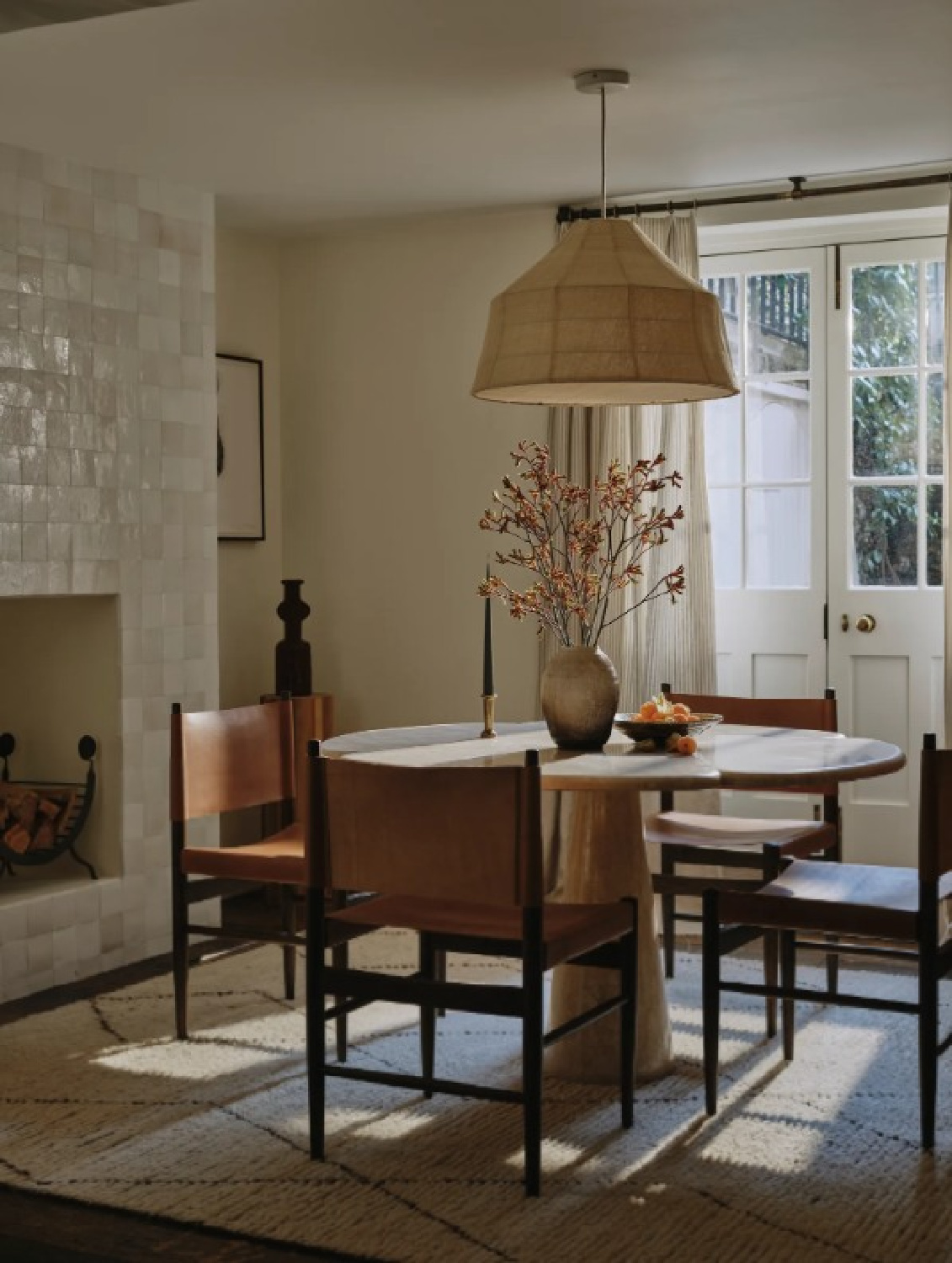
Isn’t the dining area with the drama of its Zellige-tiled fireplace the picture of quiet beauty?
Thanks for reading and joining the journey today. Wishing you the same measure of gentleness in your day and relationships as is conveyed by these designs.
Peace to you right where you are.
-michele
I independently selected products in this post—if you buy from one of my links, I may earn a commission.
Thanks for shopping RIGHT HERE to keep decor inspiration flowing on Hello Lovely!
Hello Lovely is a participant in the Amazon Services LLC Associates Program, an affiliate advertising program designed to provide a means for sites to earn fees by linking to Amazon.com and affiliated sites.


