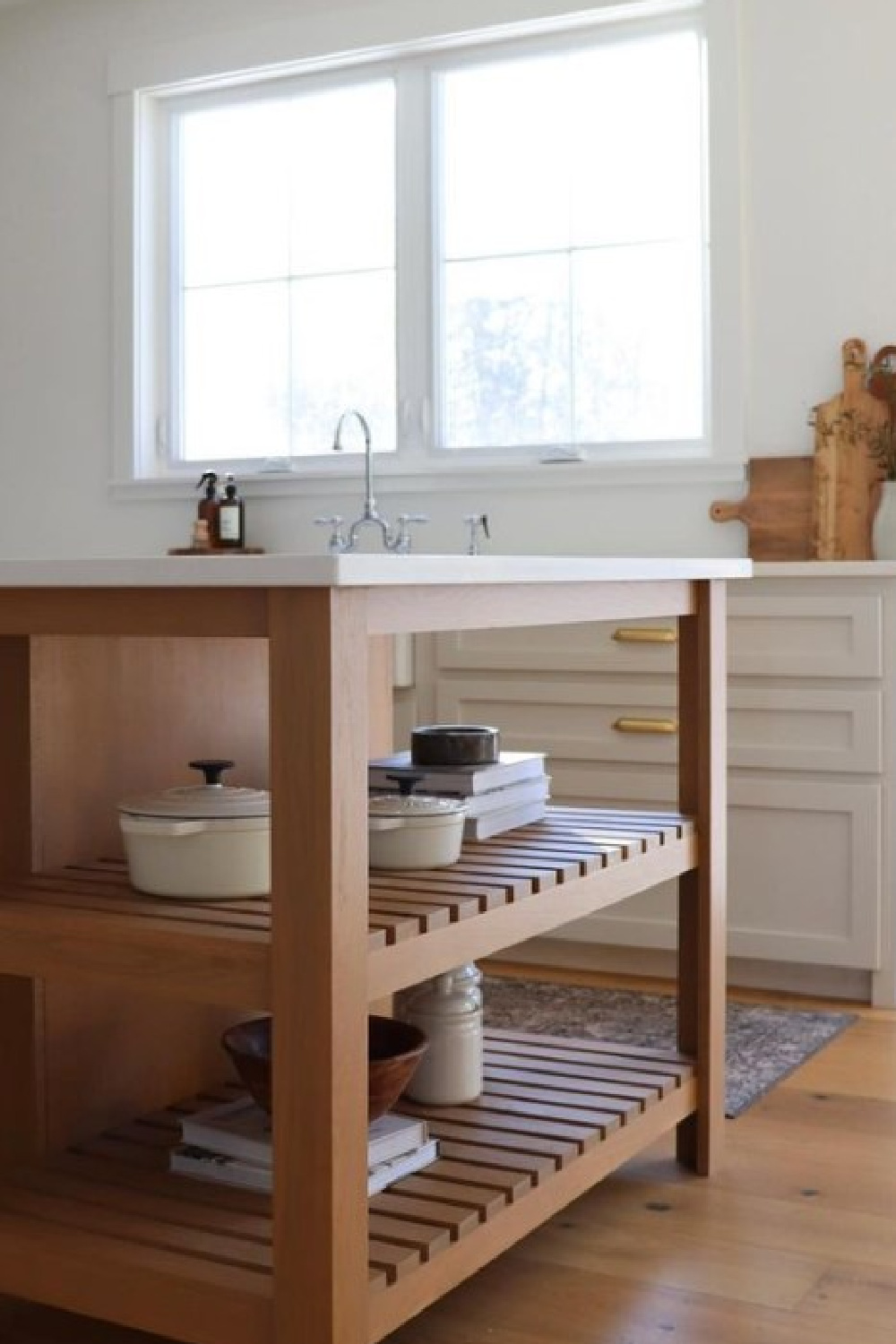
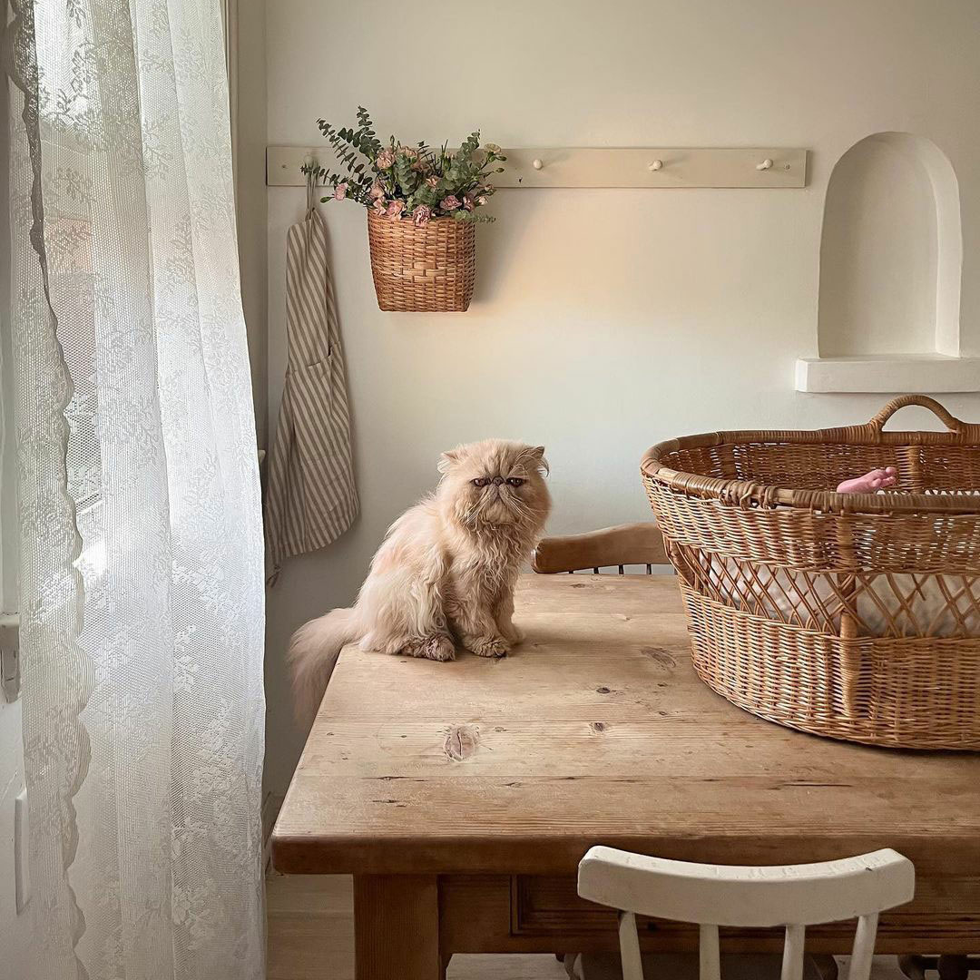
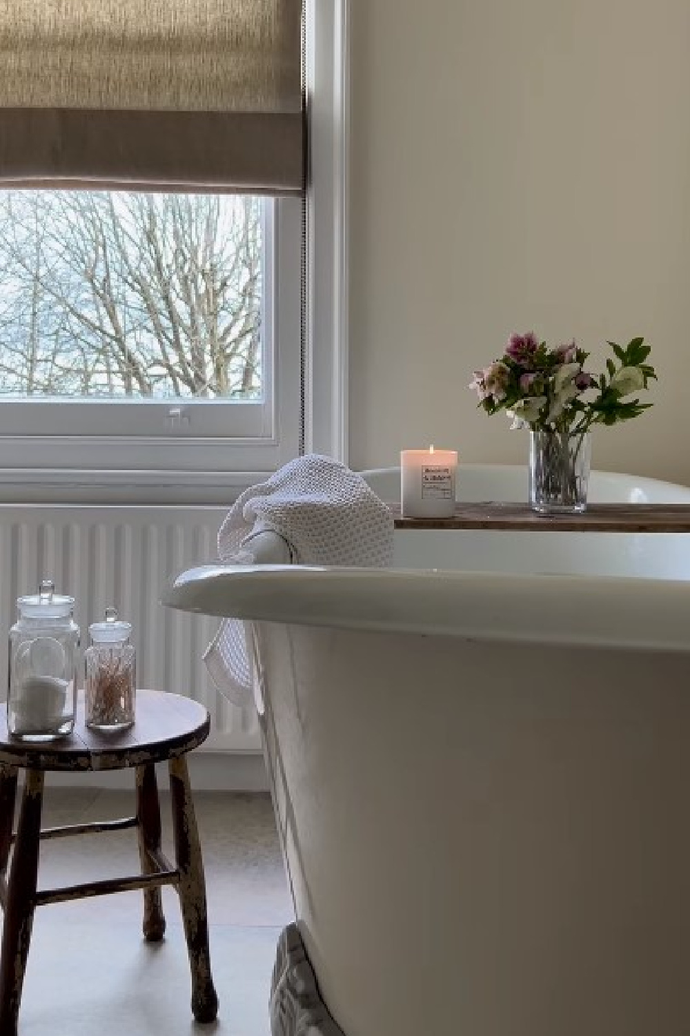
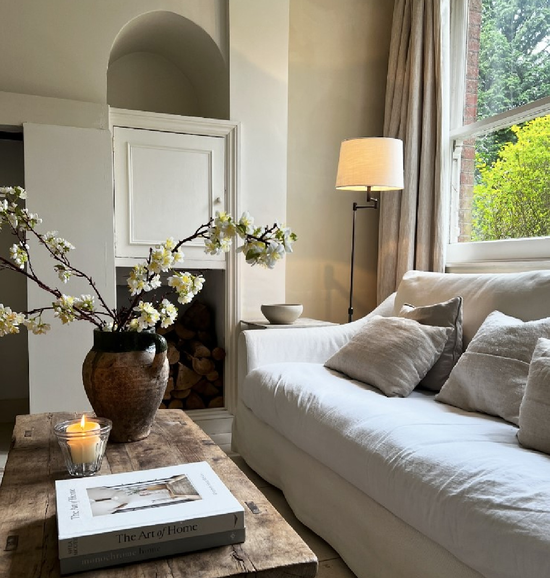
I’m noticing a pattern in this collection of inspiring European-inspired calm cottage interiors and moments. There’s an optimism that plenty of moodier traditional spaces (with multiple pattern mixes) trending on social feeds seem to lack.
Cozy Calm Cottage Interiors, Part Two
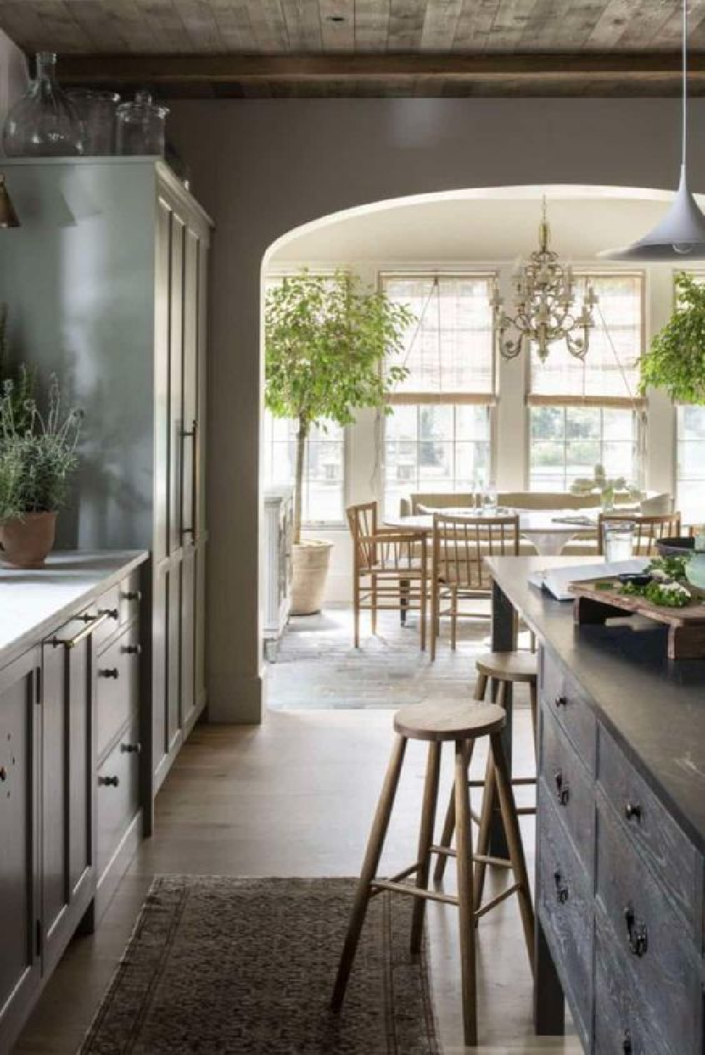
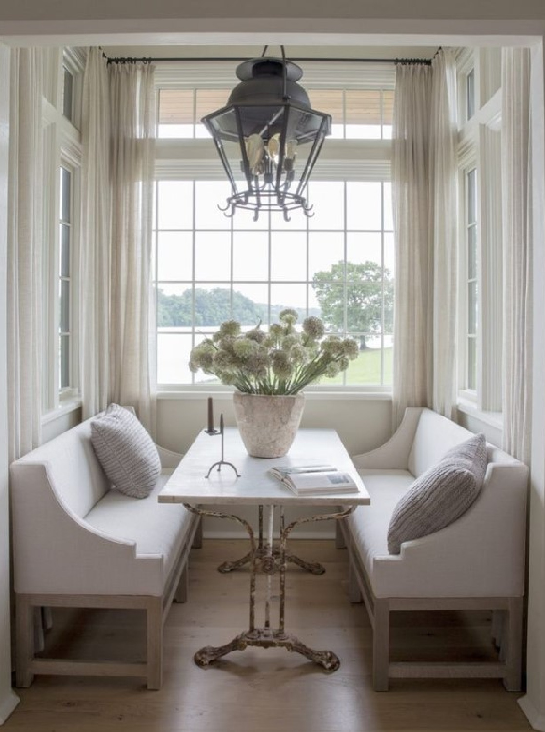
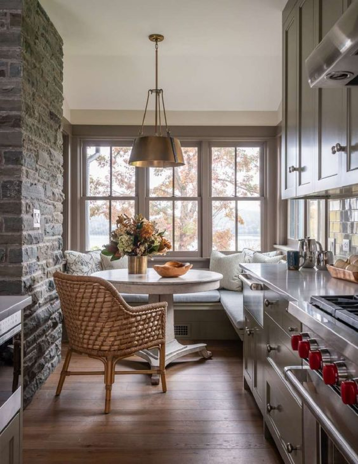
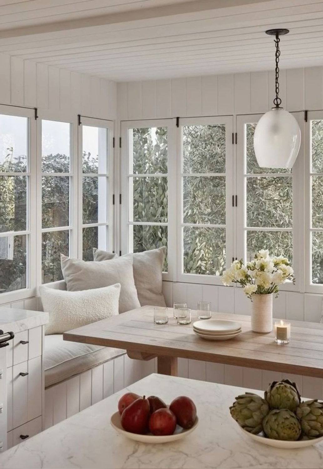
Not that patterns, prints, textures, and an eclectic mix of them with bespoke design and interest don’t belong or aren’t beautiful. But admiring a space full of bold personality and tension is different than creating a retreat from the stressful workday. This image above sort of feels like a bridge…on the kitchen side of the space, you can feel the rugged moody flavor with the wood ceiling. But the breakfast dining area is awash in light and breezy uplifting charm:
Earthy Elements for Rustic Character
Wood beams, patina from aged materials, varied textures from handmade tile and objects all contribute to a European country mood.
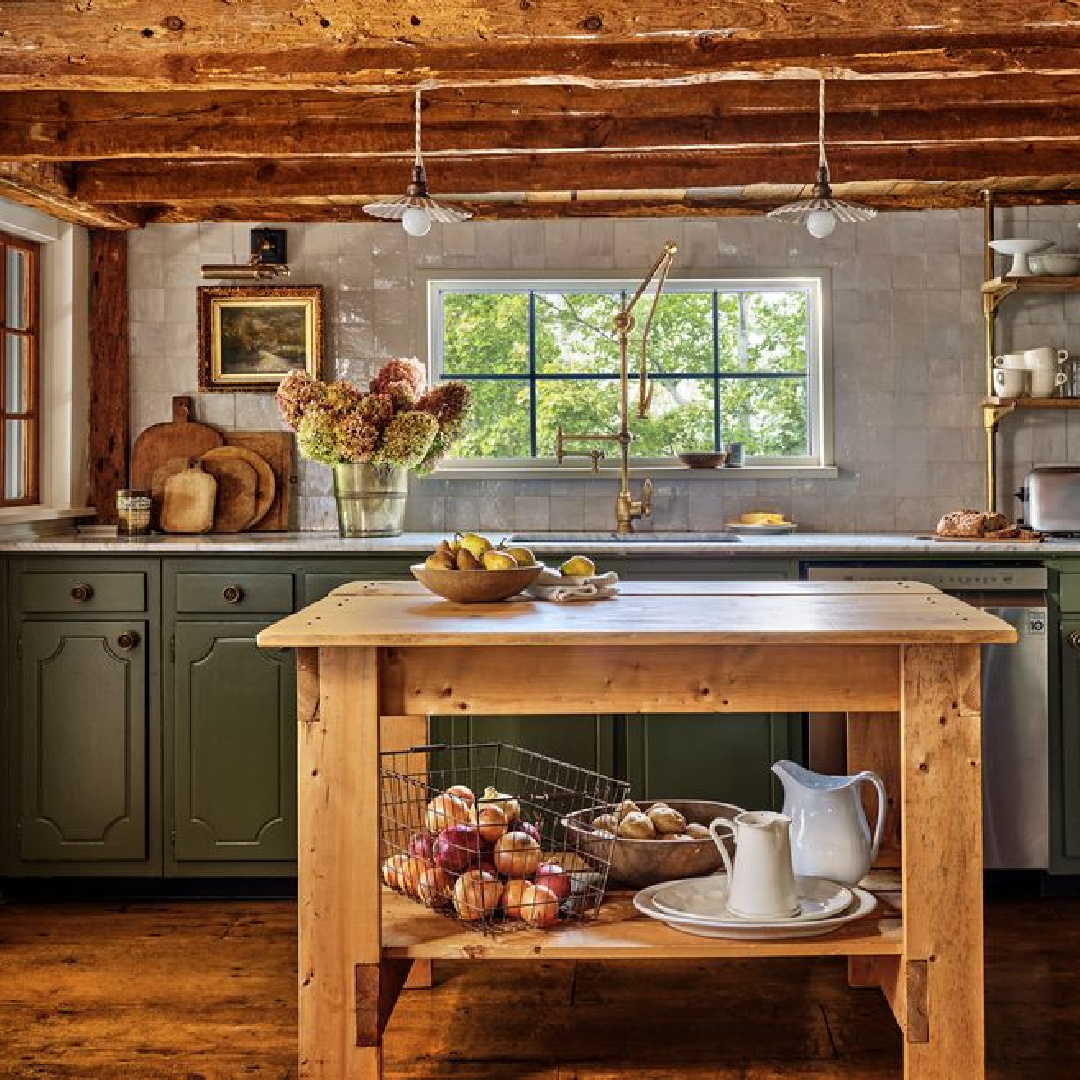
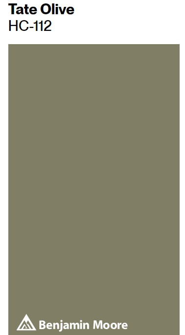
But what if you don’t have the budget or access to such resources? Color stories can help to create an identity. Olive greens, for example, can offer contrast and natural flavor. Mountain Olive is the color on the cabinets above, and here’s one of Behr’s trending colors this year:
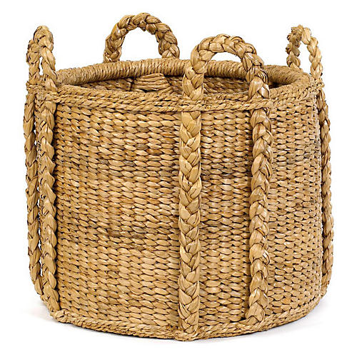
While the texture created from this collection of antique baskets is impressive, notice how the green-gray painted island also delivers earthy character:
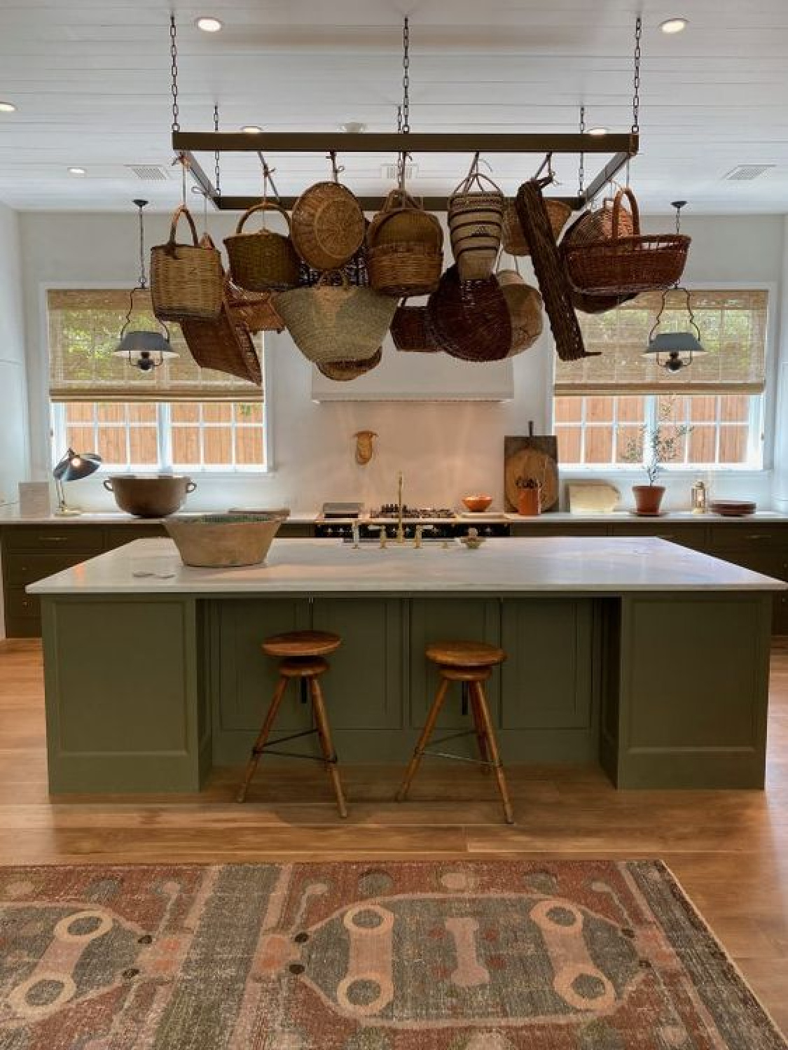
While I’m unsure of the exact color used below, it also reminds me of Gettysburg Gray:
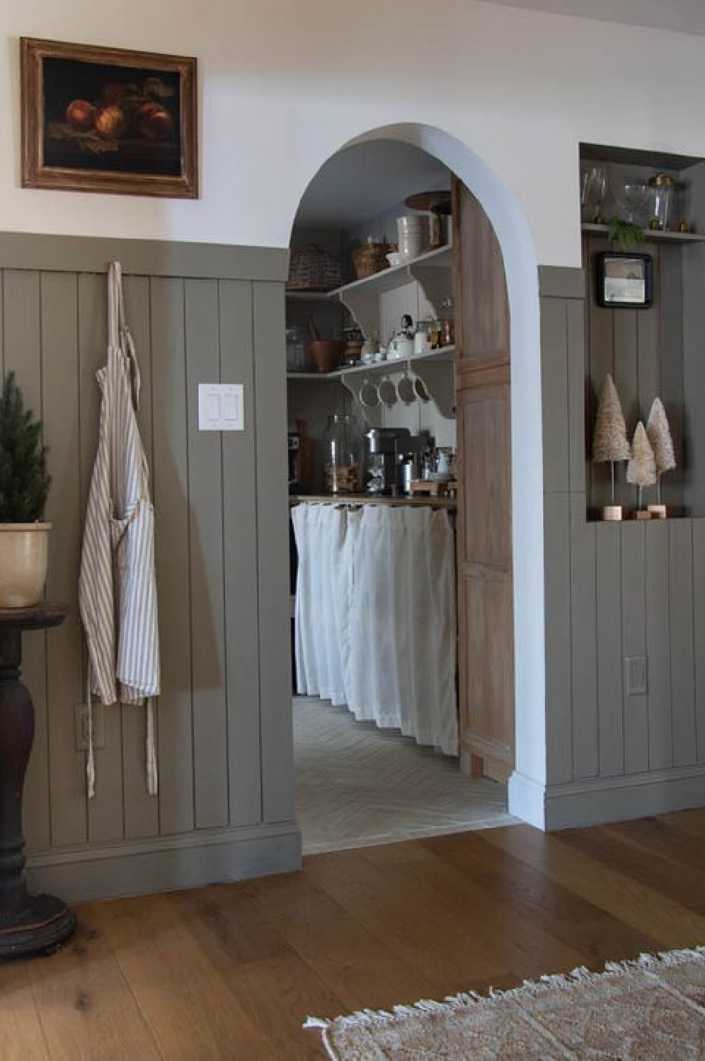

Sometimes a grey with green undertones will do the trick:
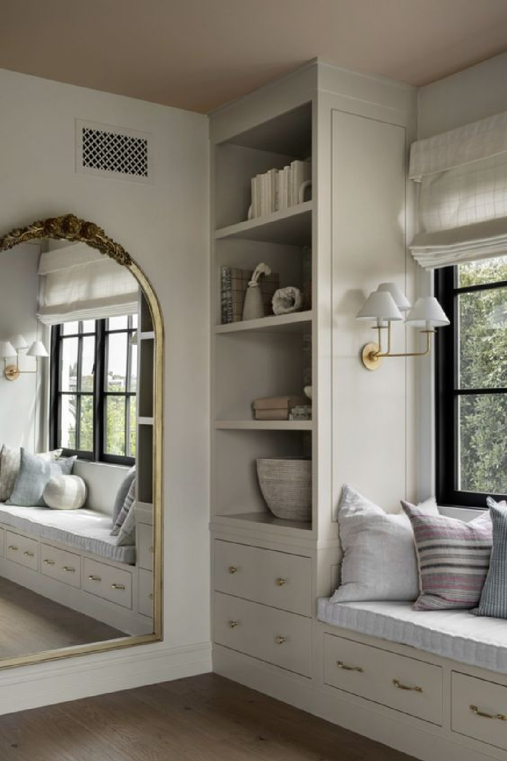
Elegant Textures
Even though the discussion is about cottage interiors, if a part of you is drawn to more formal design elements, maybe millwork with a traditional elegance will appeal. Will I ever recover after seeing this kitchen in all its heavenly paneled glory?
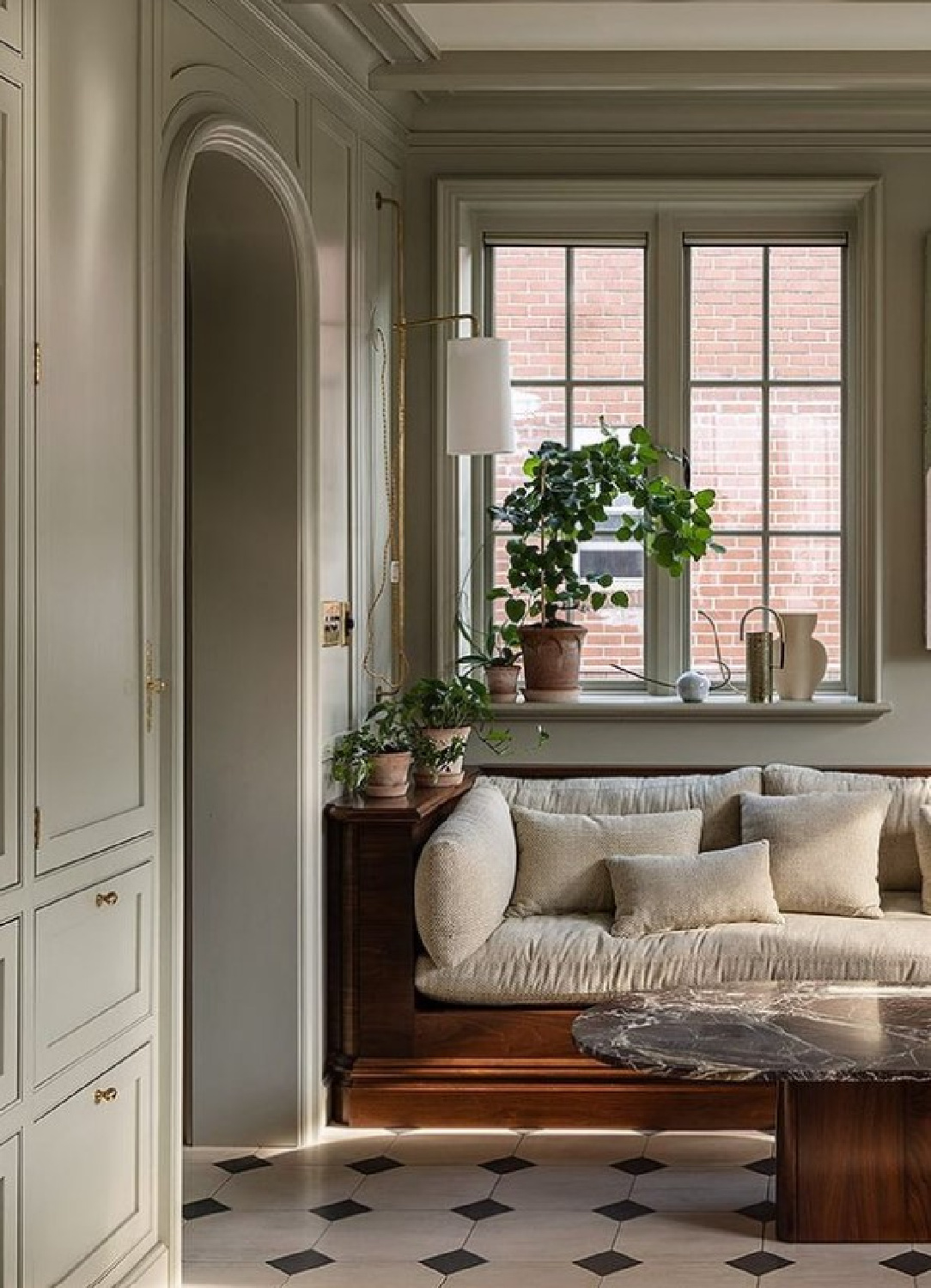
Not likely. Are you enamored with the combination of more rustic textures with elegant refined ones?
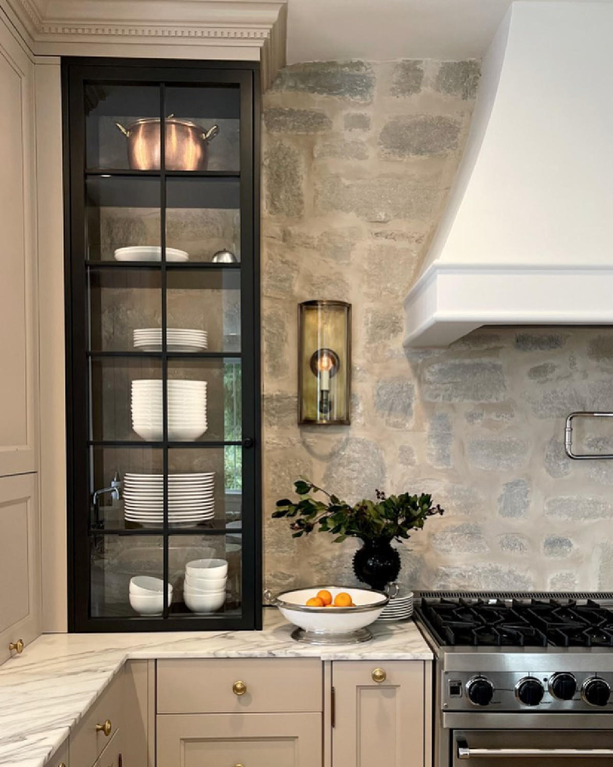
Followers of my Facebook page have been going nuts for this kitchen above which features some traditional Old World style cottage elements (natural stone, marble counters, beaded board, Shaker cabinets) with fancier ones (dentil molding, plaster range hood, etc.).
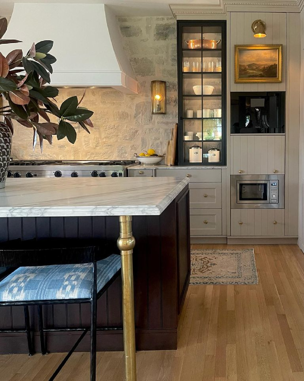
The placement of the microwave has my FB followers up in arms. The designer indicated it is mindfully there for her children to use for safety reasons, and it’s not strange at all to me since it is at the same level as an oven range. It is at the level where my own microwave resides.
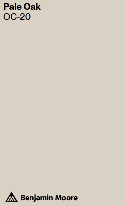
Psst. For a similar look to Jitney, though less fleshy and more grey-taupe similar to this gorgeous cozy moment:
Mixing Old & New
What’s the secret to arriving at an established, timeless, completed space that feels balanced and livable?
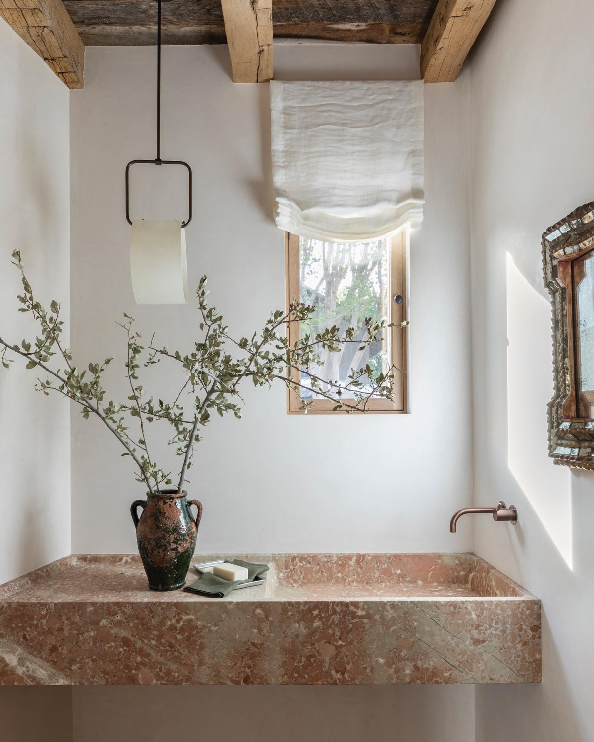
Some designers use old, natural, and rare materials in fresh ways which feel modern or edgy. This tension can be pleasing.
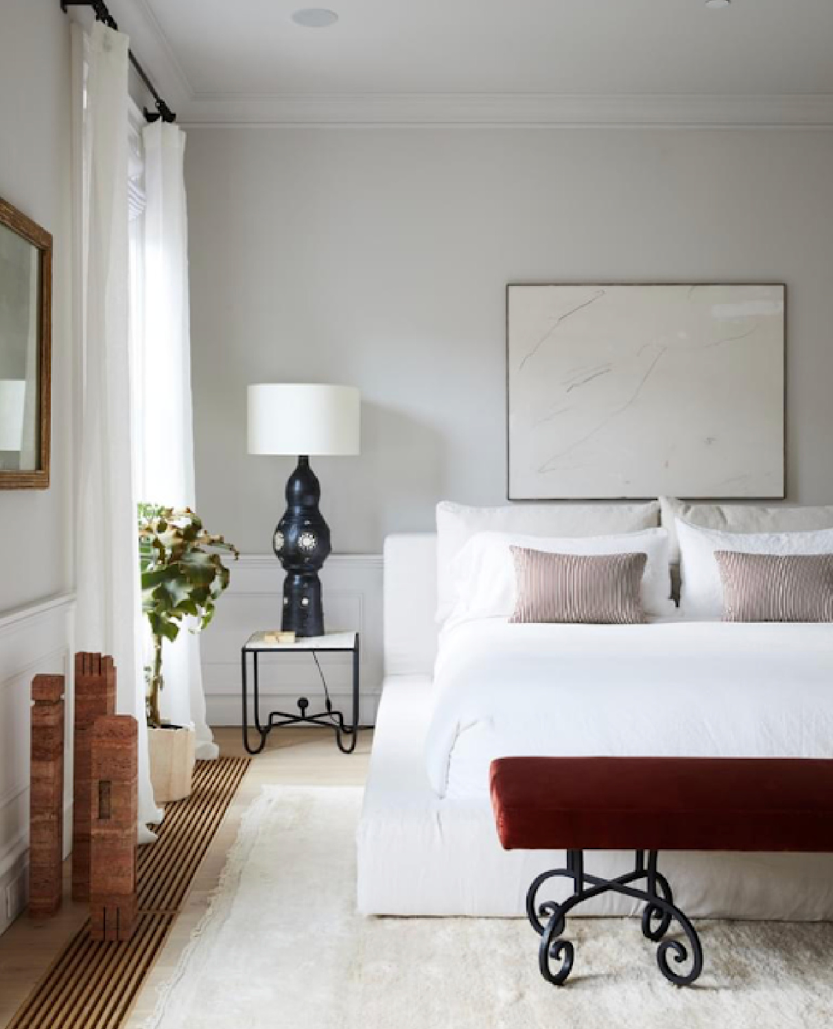
Sometimes is about restraint, quality, and interesting or surprising combinations.
Designers are masters at seeing what average observers overlooks This demands a particular sensitivity and artful eye to begin to know how to mix old with new. There isn’t a ratio or 1-2-3 tutorial to get there quickly.
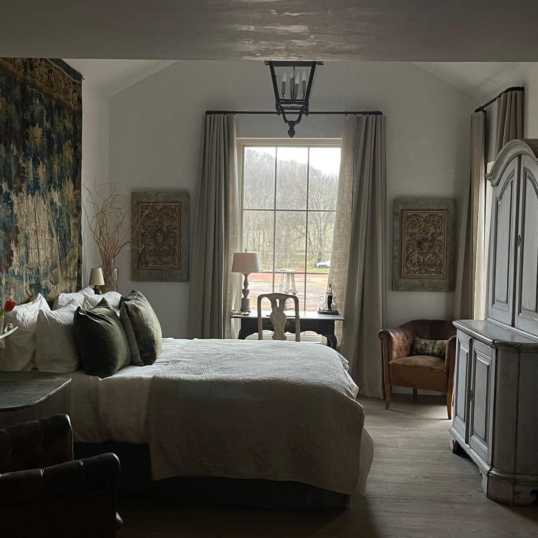
RESTRAINT can be everything! Psst. While the walls in the Giannetti’s Tennessee log cabin bedroom (above) are plastered or skim-coated with plaster, the walls remind me of SW Repose Gray. I did a thorough review of Repose Gray in this.
Repose Gray is on walls in our Georgian’s dining/music room, living room, and foyer:
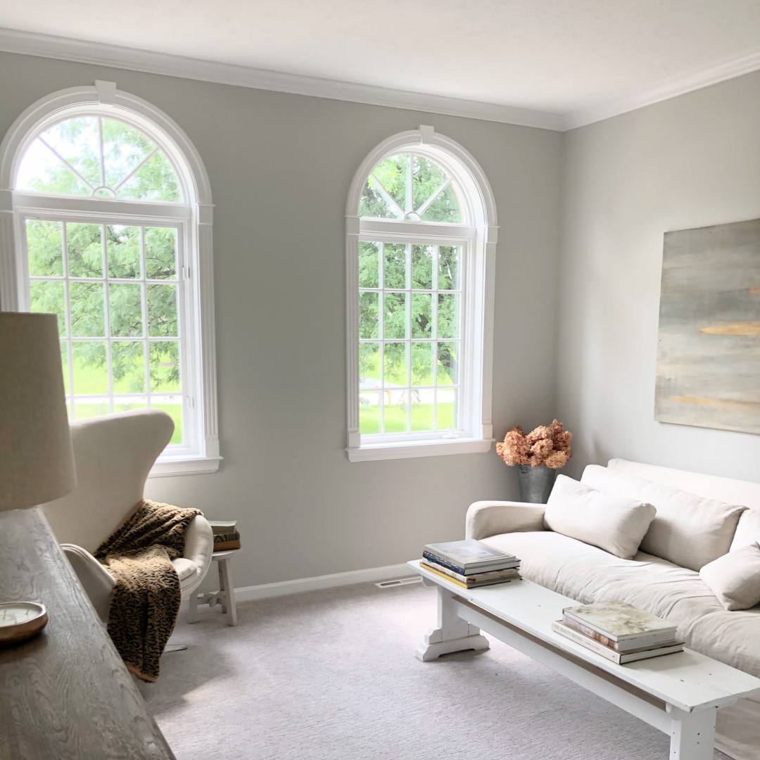
My little sitting room above would be way too boring for many of you, but it contains a mix of old and new. A wood console is built from reclaimed wood from Europe. The coffee table is a farm bench we have owned for 25 years. It was constructed with 1800s pine from a dismantled barn in the Midwest. The egg chair is a mid-century style and upholstered in a fine grade of Belgian linen. My lamps are new, the painting is by me and contemporary, and the room gets a modern lift from the wall color.
Trim Color Ideas
What if you’re after a very cool crisp bright white like the color on my trim above?

Bright White Trim Idea
I especially love OC-151 from Benjamin Moore. This is the white I covered the interiors of our former fixer with:
One thing it is not? Shy.
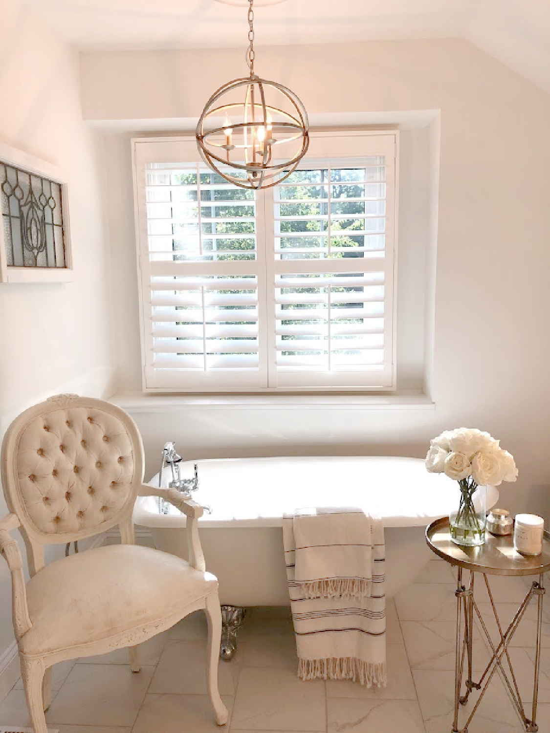
Here it is on ceiling and trim in the kitchen:
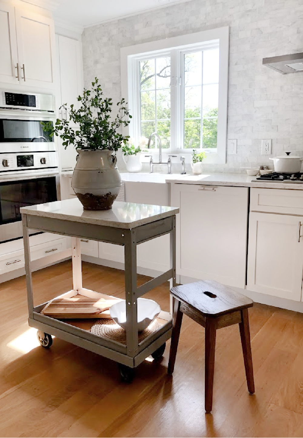
I went into more detail about BM White OC-151 in THIS STORY.
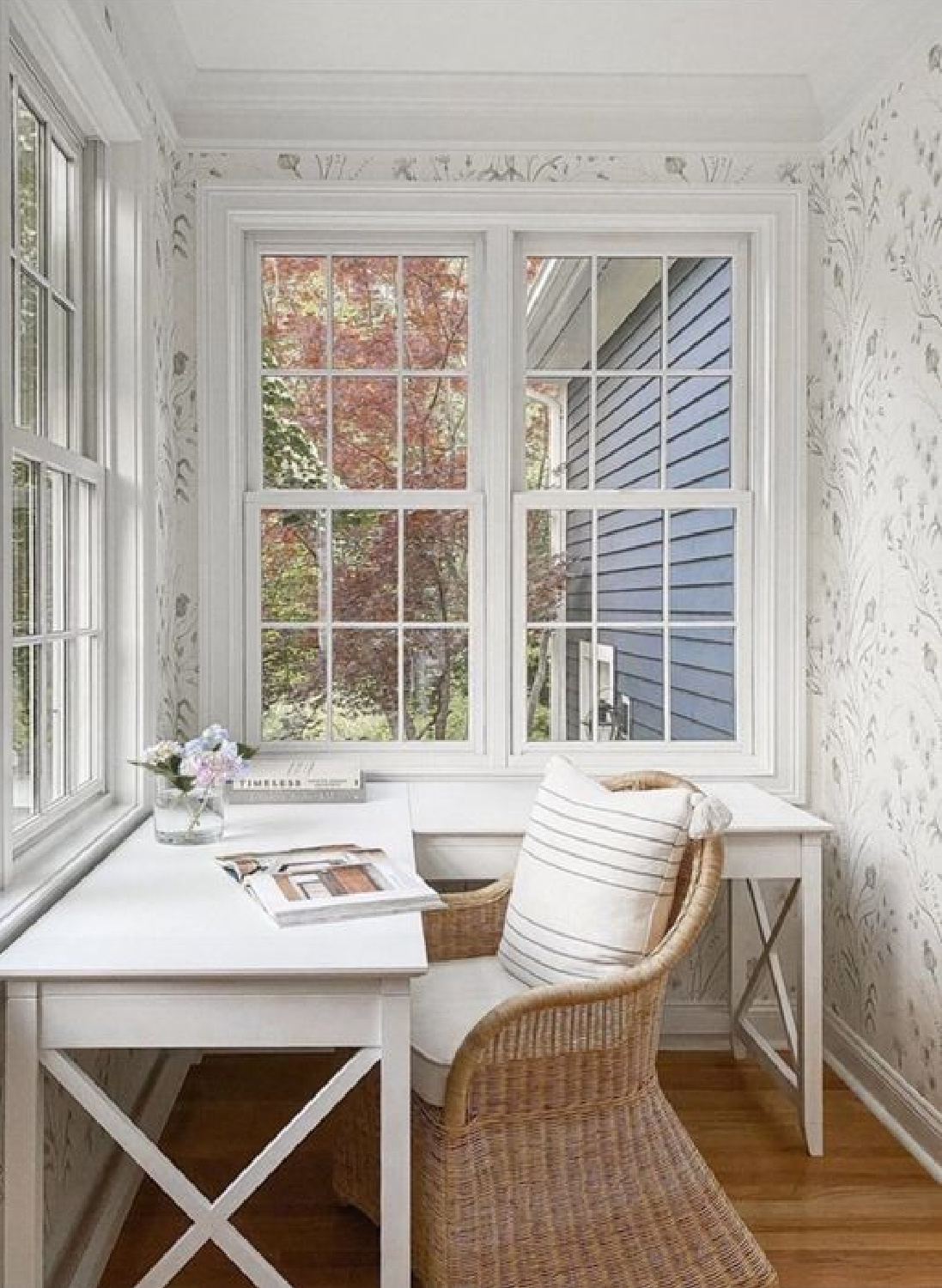
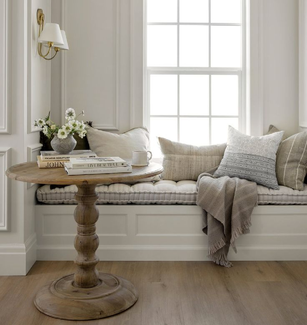
Here’s another photo of OC-151 in our former breakfast nook with window seat:
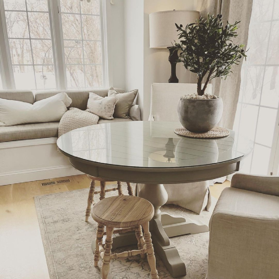
I used the same color for walls, ceilings, and trim in our former home (above). It is getting more common to see this done with colors beyond white.
Calm Cottage Looks With Soft or Low Contrast
I still do a fair amount of paint consulting for exteriors, and I often recommend that when you are deciding on siding and trim colors that you first drive around to collect data about what you prefer as far as contrast.
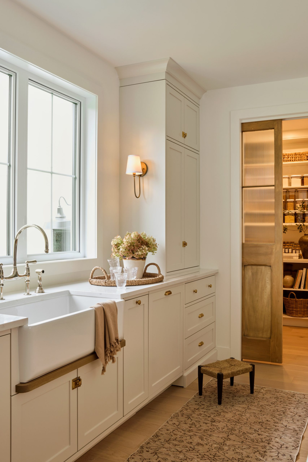
Once you know whether you are after low, high, or no contrast, the palette can begin to take shape. I tend to favor low contrast and find this to be calming.
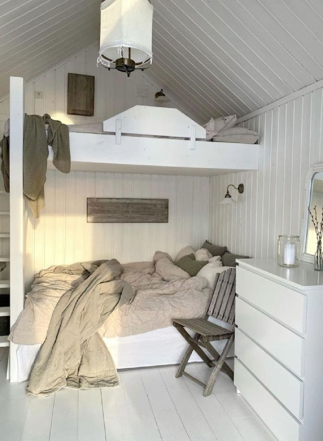
Some of my favorite cozy European country interiors use low and subtle contrast. Here’s a bunk area with painted wood floors and paneling:
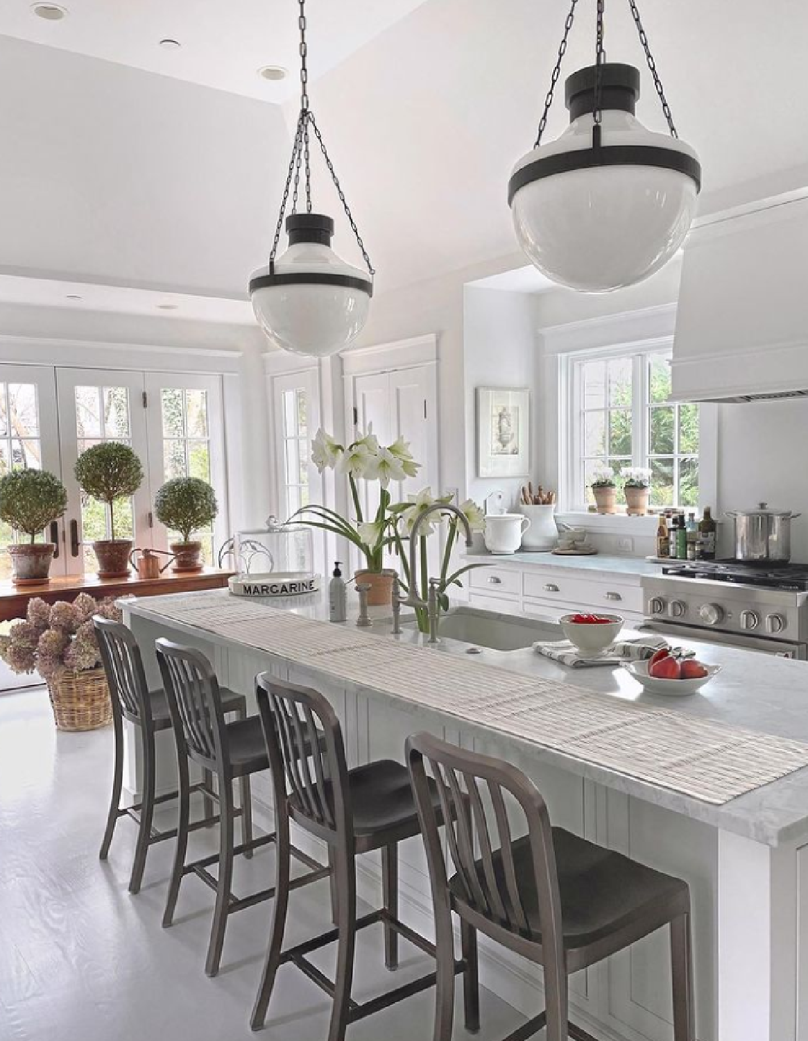
Here’s Shoreline on the floor of a gorgeous kitchen:

Say what you will about the blandness or vanilla-sedative of soft greyed neutrals, but with so much chaos beyond our walls, it can be good medicine.
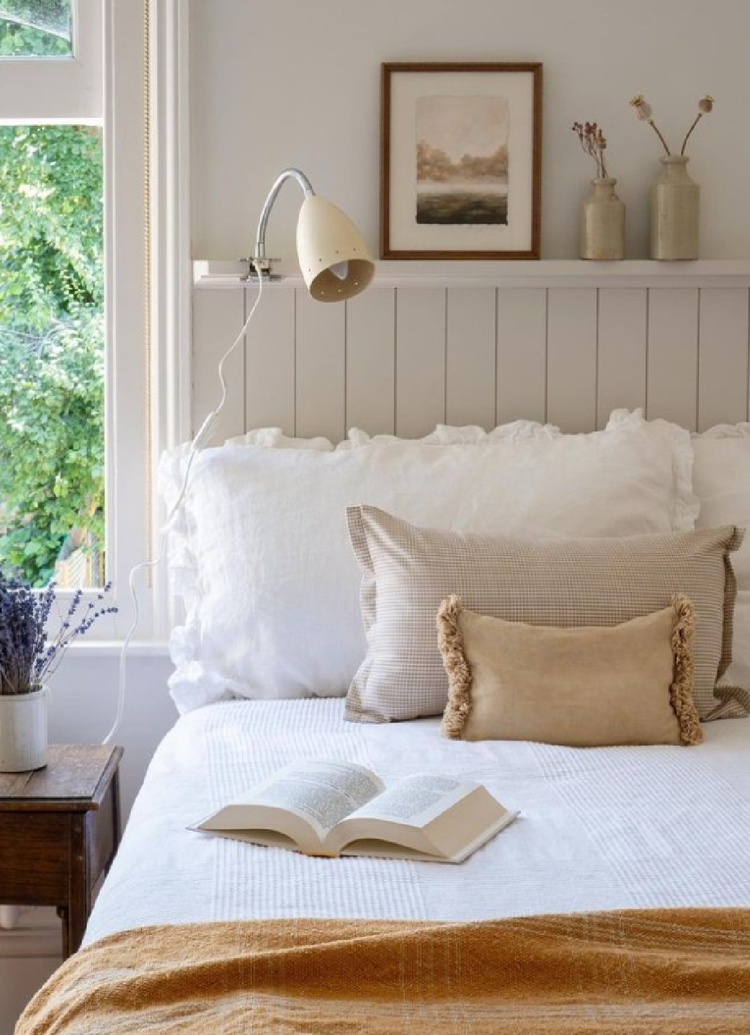
What a lovely tranquil color. Does it seem like a beautiful contender to sample? Wouldn’t it be lovely on a front door of an all white house?
Beyond Color Stories & Texture
So often it isn’t the paint colors that grab you when a room strikes you as warm and inviting.

And isn’t this mostly the goal? To create a mood with texture, interest, and comfort that evokes a feeling of tranquil sophistication? When rooms feel personal, collected, and evolved, they just feel more comfortable.
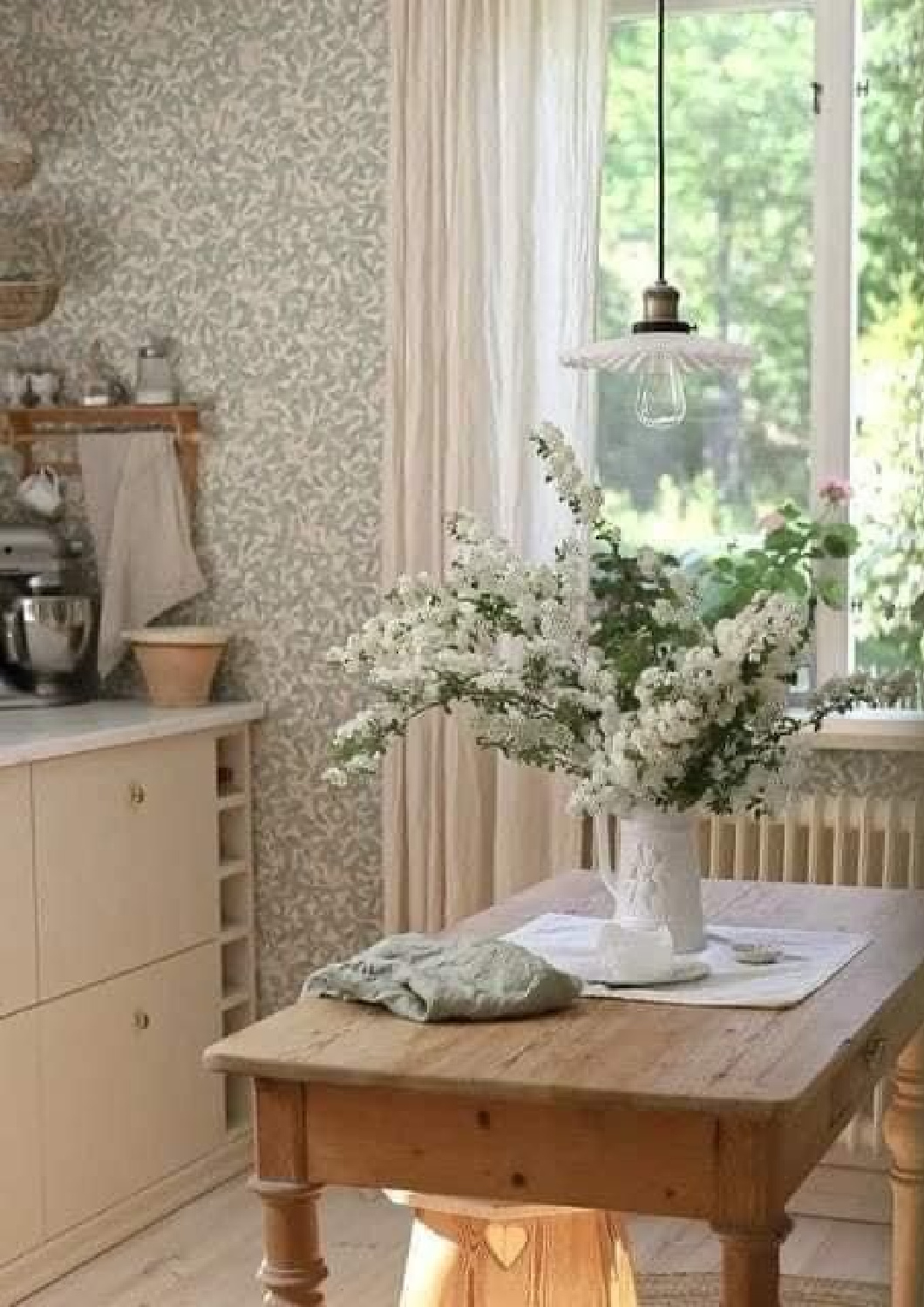
If you are a gardener, maybe it’s all about the fresh flowers and plants more than collections or art. For me, books are everywhere and in almost every room, they hint at how I tend to relax as well as my values which include personal and spiritual growth.
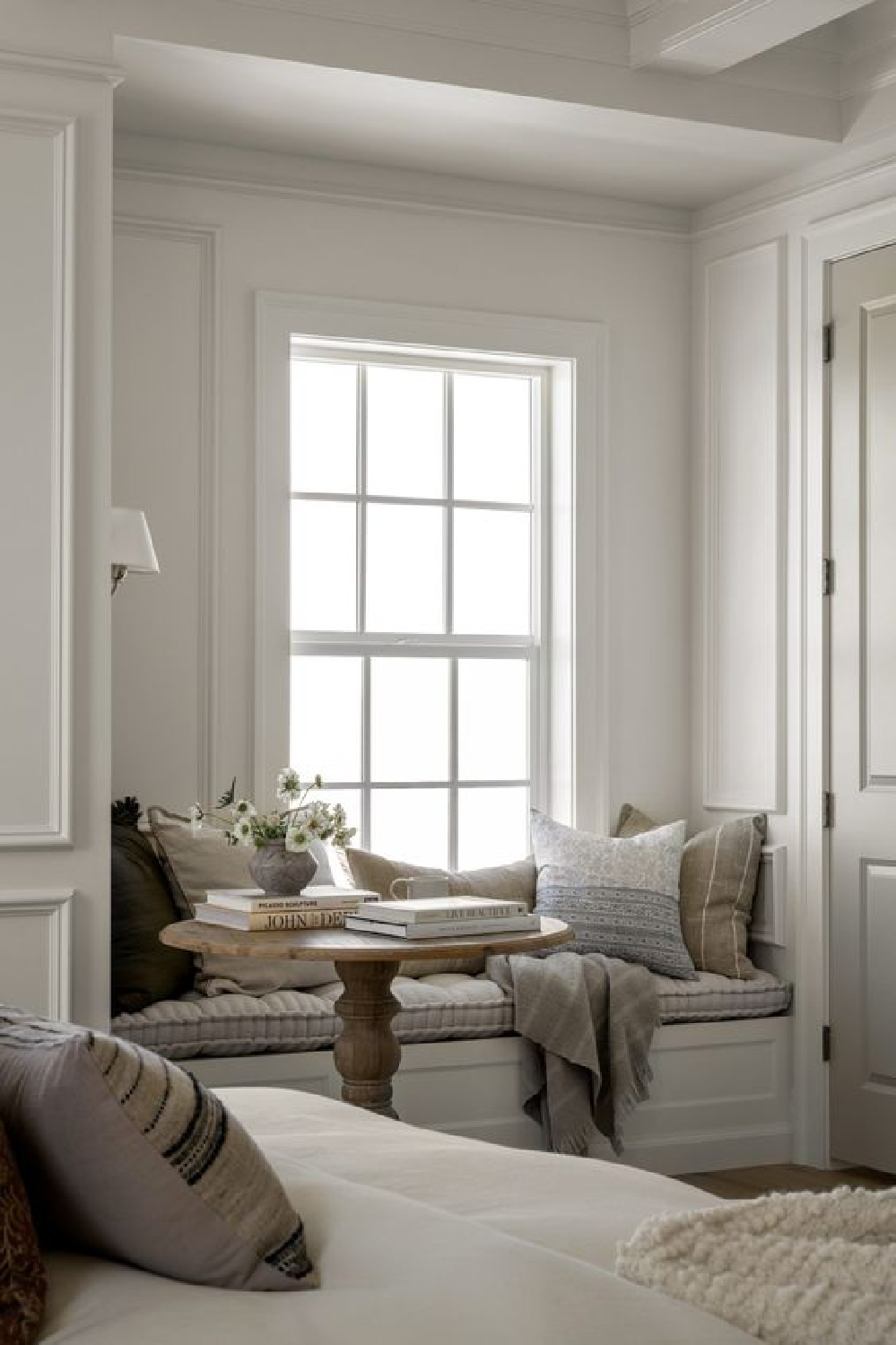
Even the simplicity and nostalgia of lace curtain sheers can crank up the cozy and speak to your unique sensibilities.

Is your thing candles? Of course we could devote an entire post to the power of candlelight…
Because candles go a long way and make every room magic at night.
Oh that the one below were lit!
How lucky are we to have access to the portfolios and feeds of an eclectic array of designers devoted to details?
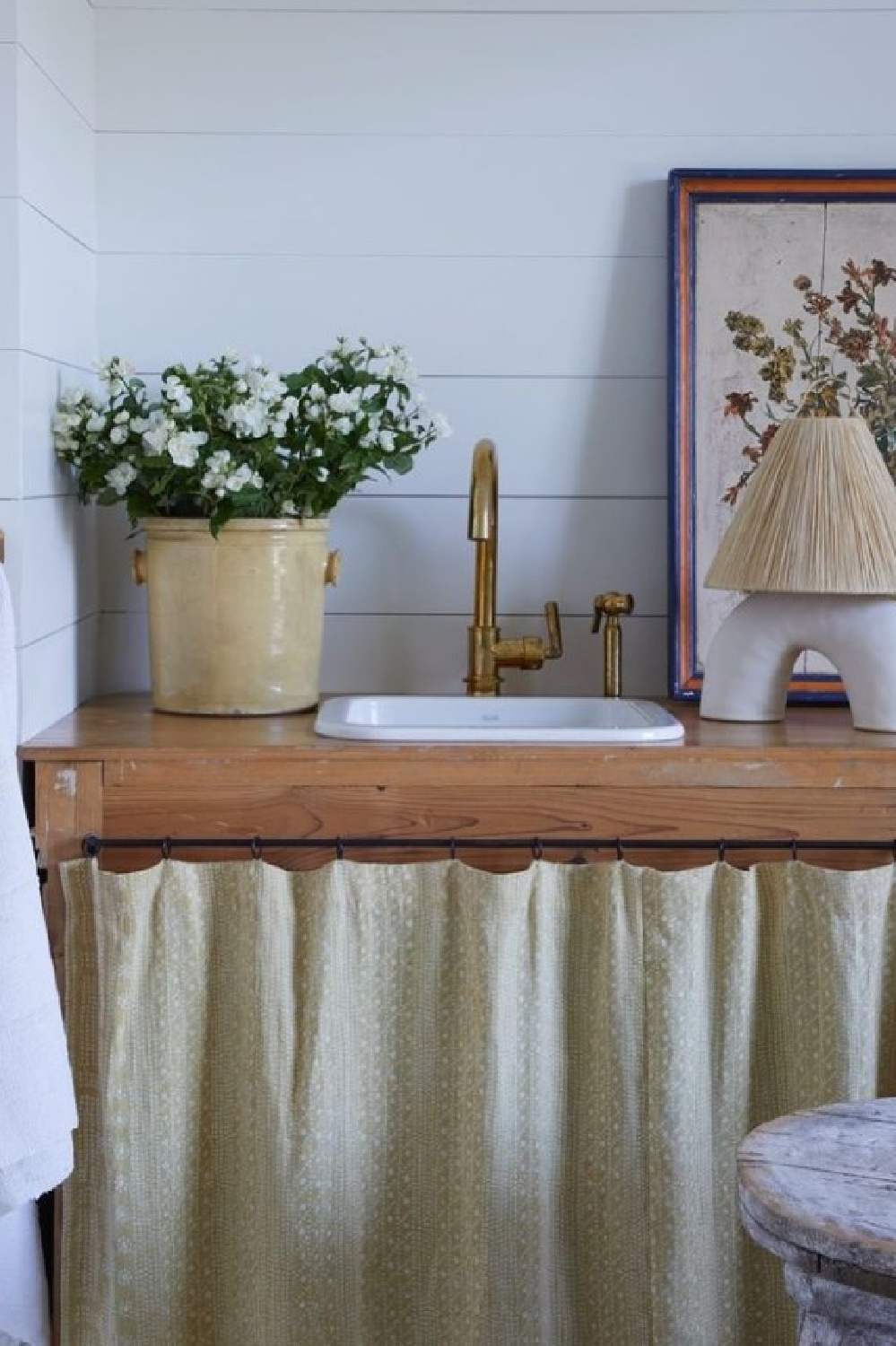
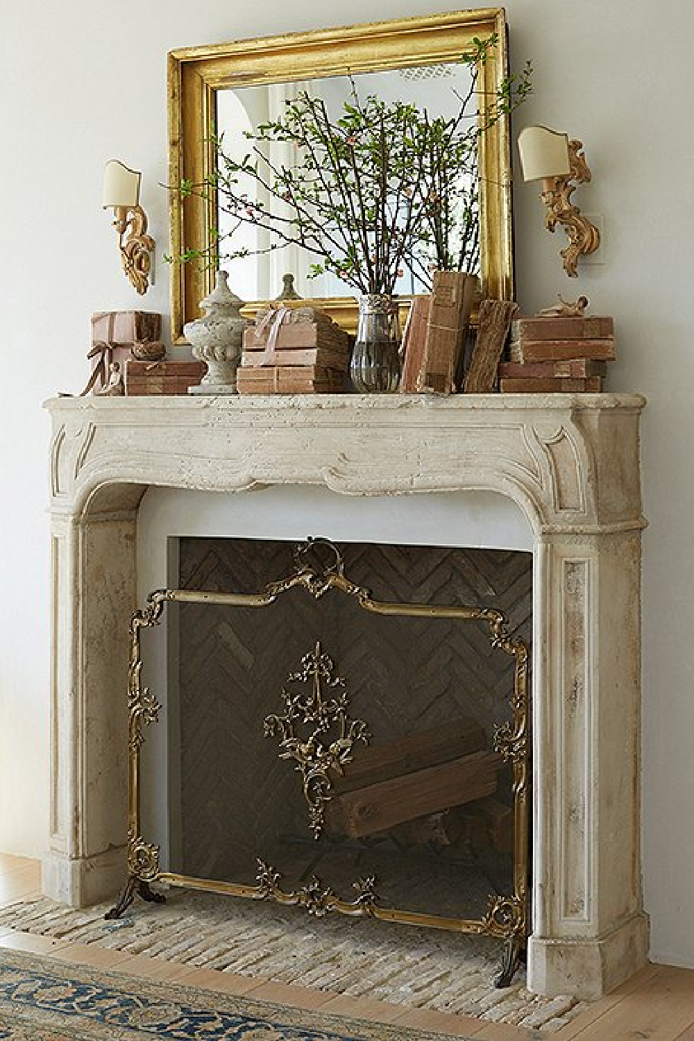
Glimpses of how they live with collections and treasures guide our own vignettes.

And watching real life renovators helps us expand our vision to see what a cozy nest can become…
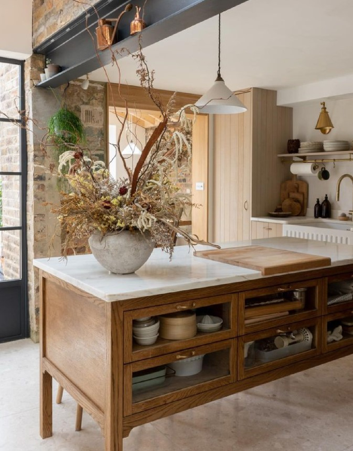
I hope these inspiring moments expand your vision to see the diversity and endless design opportunities awaiting.
Peace to you right where you are.
-michele
I independently selected products in this post—if you buy from one of my links, I may earn a commission.
Thanks for shopping RIGHT HERE to keep decor inspiration flowing on Hello Lovely!
Hello Lovely is a participant in the Amazon Services LLC Associates Program, an affiliate advertising program designed to provide a means for sites to earn fees by linking to Amazon.com and affiliated sites.
