It happens to all of us busily living in modern culture, feeding families, and managing time as best we can. The kitchen becomes cluttered, and it is tempting to dim the lights rather than address corners of chaos…ha! But SPRING has a way of shining its pretty light into those corners! How to bring calm to a kitchen? How to address the stuff of daily life, create adequate workspace, and help the space feel pretty and pleasant? Calm Spruce Ups for the Kitchen is a conversation to begin to creatively cast a net to capture kitchen calm.
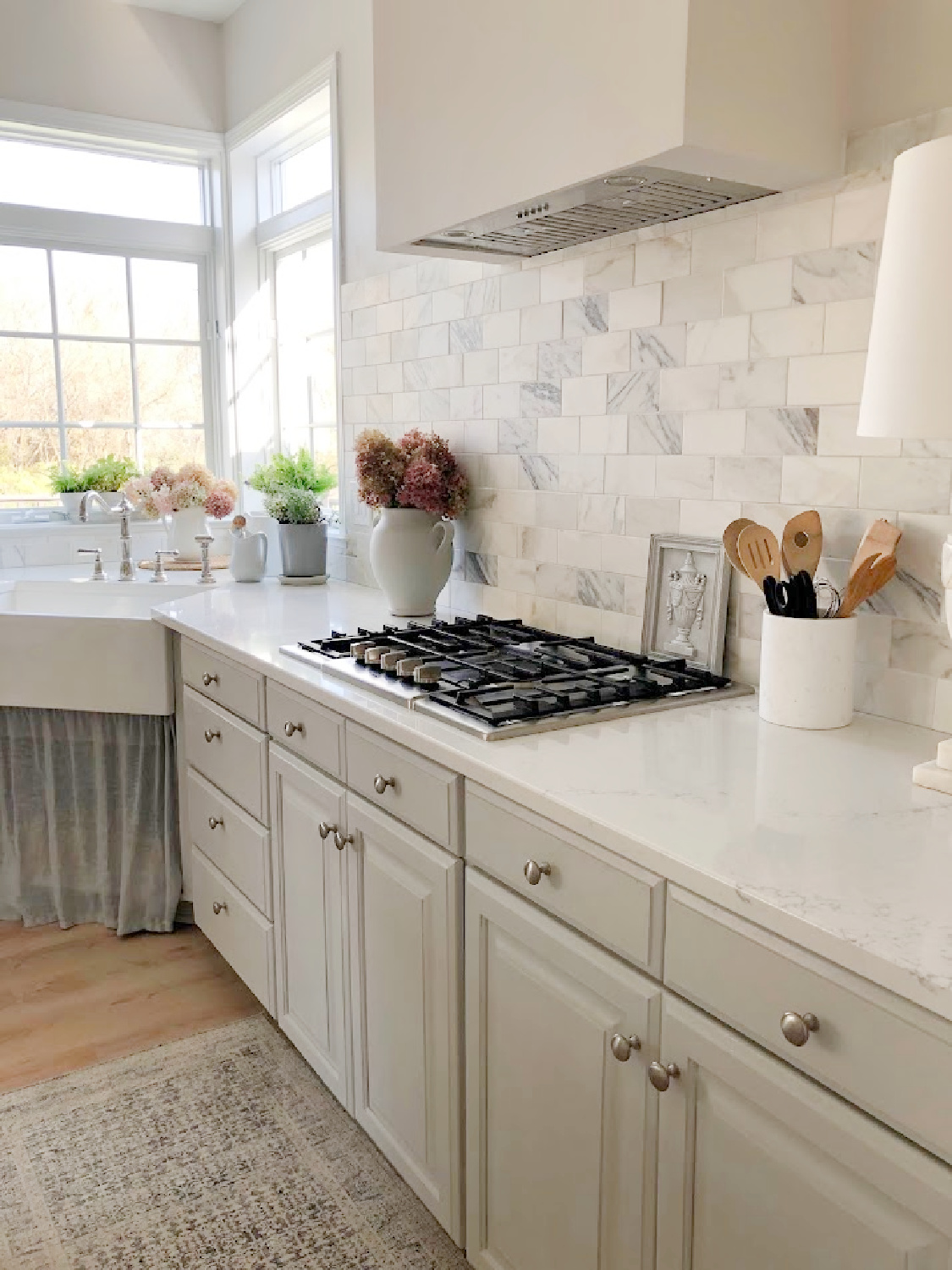
Calm Spruce Ups for the Kitchen
Over the decades and more than a dozen moves to different kitchens, I have learned it is truly possible to create a tranquil yet hard working workspace for meal prep, living, and connection.
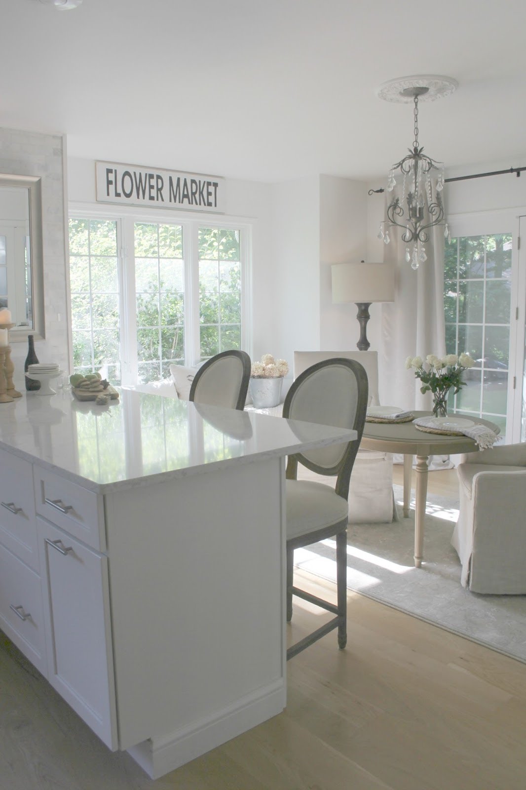
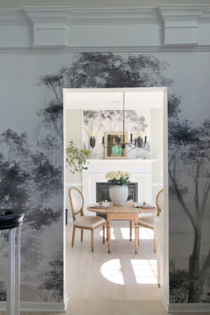
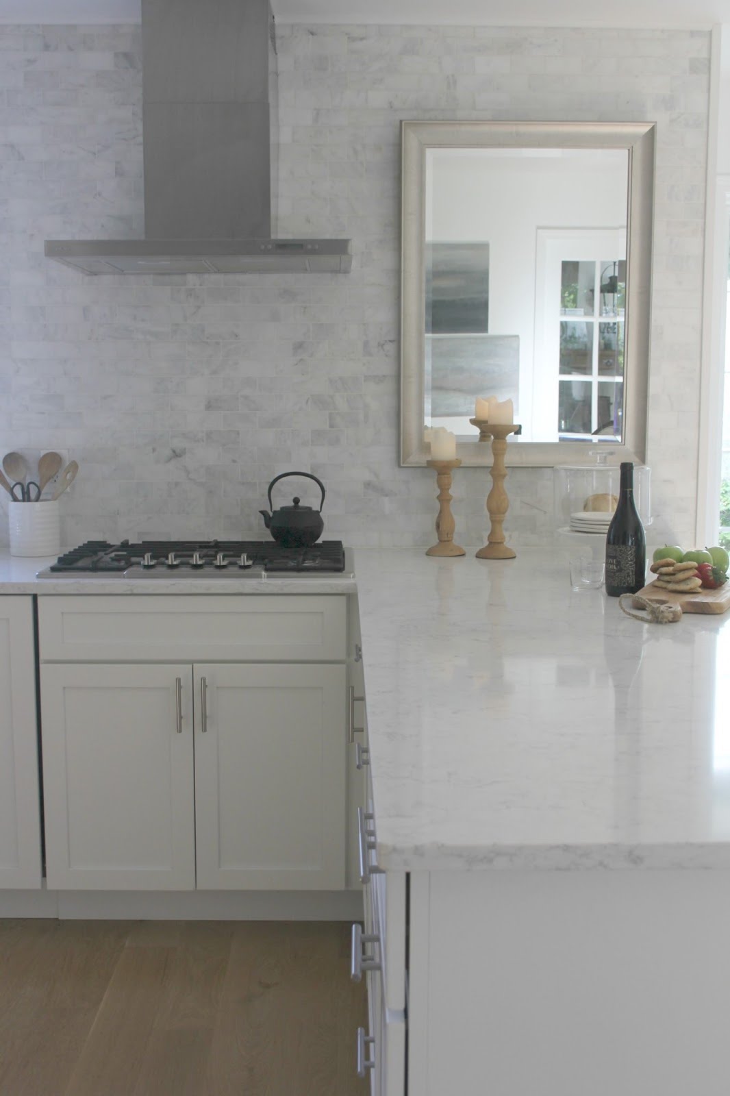
You’ll see images weaved into this post of the past three kitchens we renovated for ourselves.
No. 1: Clear & Scrub Kitchen Counters
I’m not just talking the talk. I began the sprucing with clearing the counters on Saturday. Although, it wasn’t a quick chore, I can’t tell you the level of gratification at the end!
While I worked, I had nature shows keeping me company on TV (think pot bellied little monkeys in Vietnam frolicking and devouring succulents). You could listen to music or a favorite podcast or the birds from an open window while decluttering.
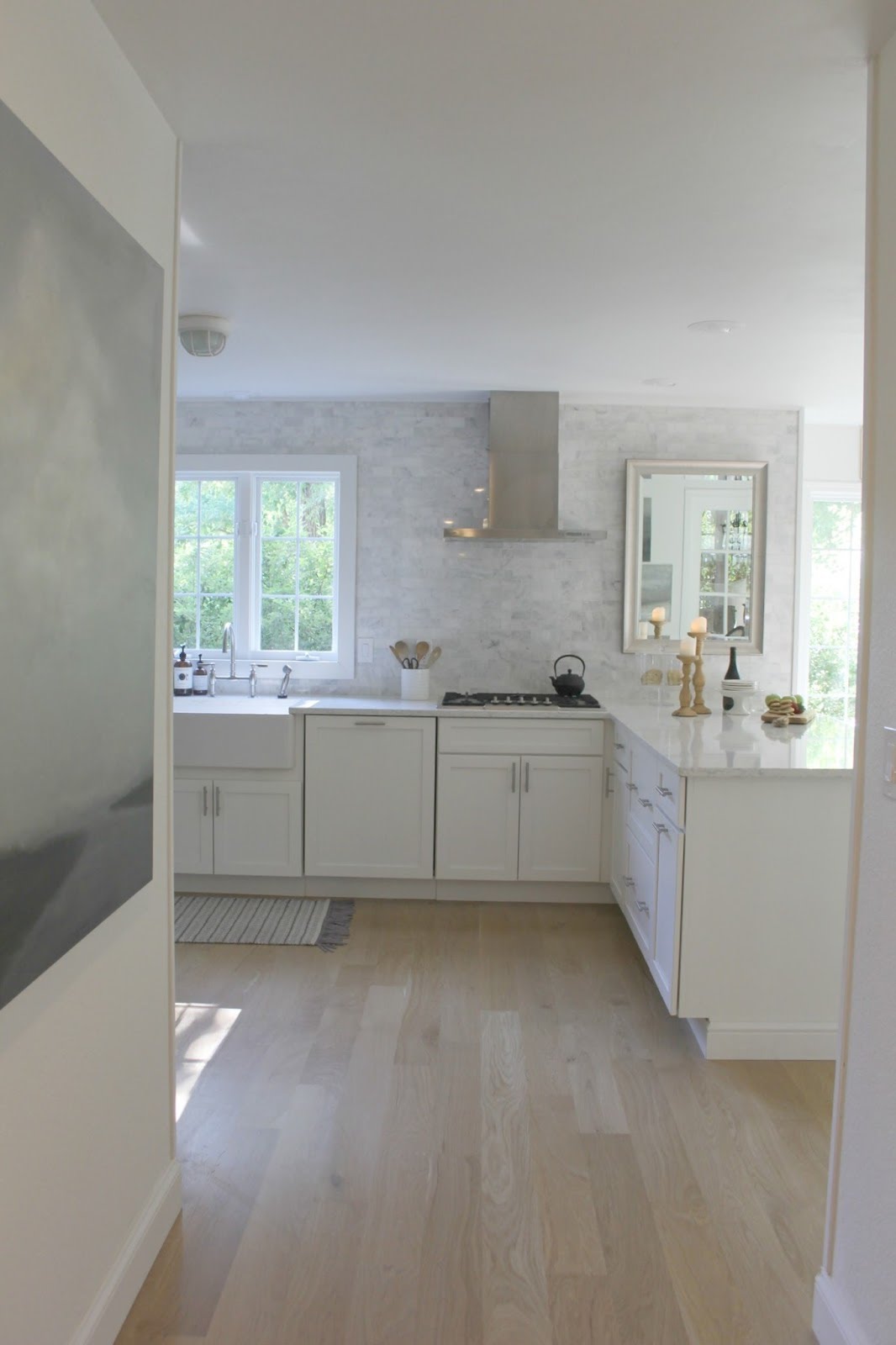
I moved everything on the counters to a kitchen table including plants, canisters, lamps, cutting boards, crocks, cooking utensils and decorative objects.
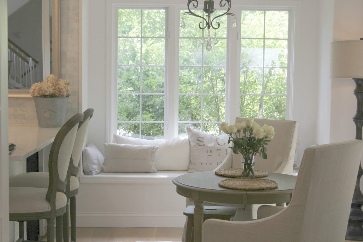
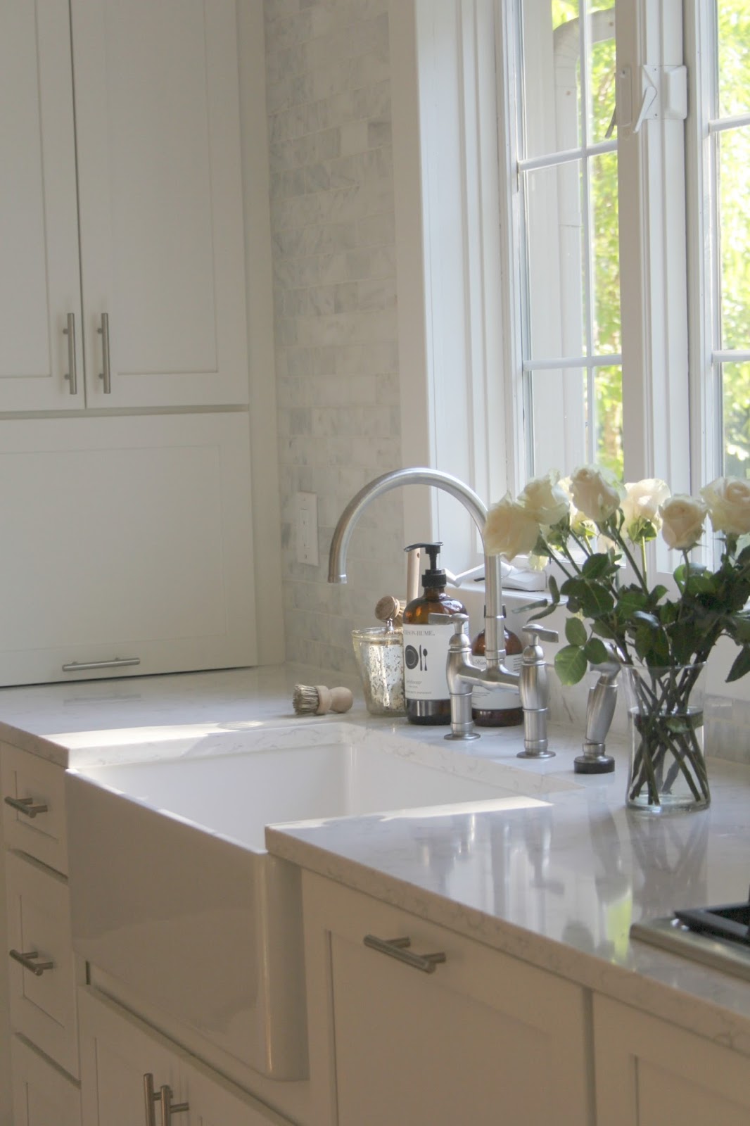
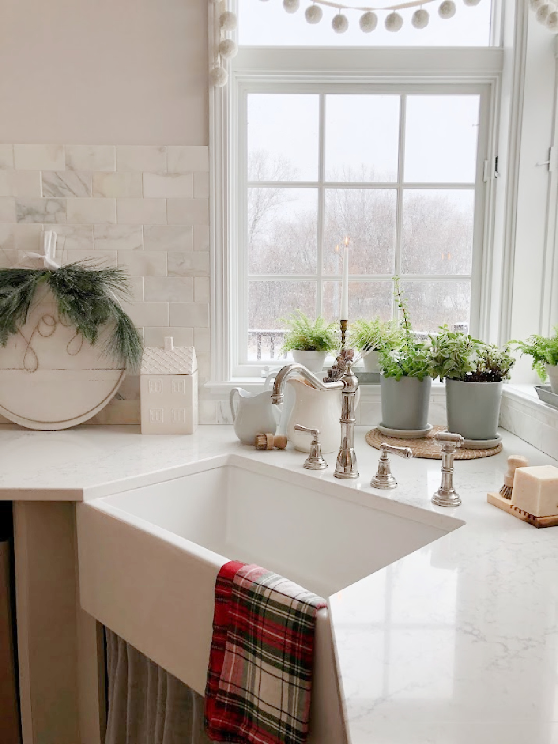
Then I started my cleaning near the sink. Houseplants had created a disaster on the window sills since moisture and wood are never a good match. I scrubbed the sills then used touch up paint to spruce them up.
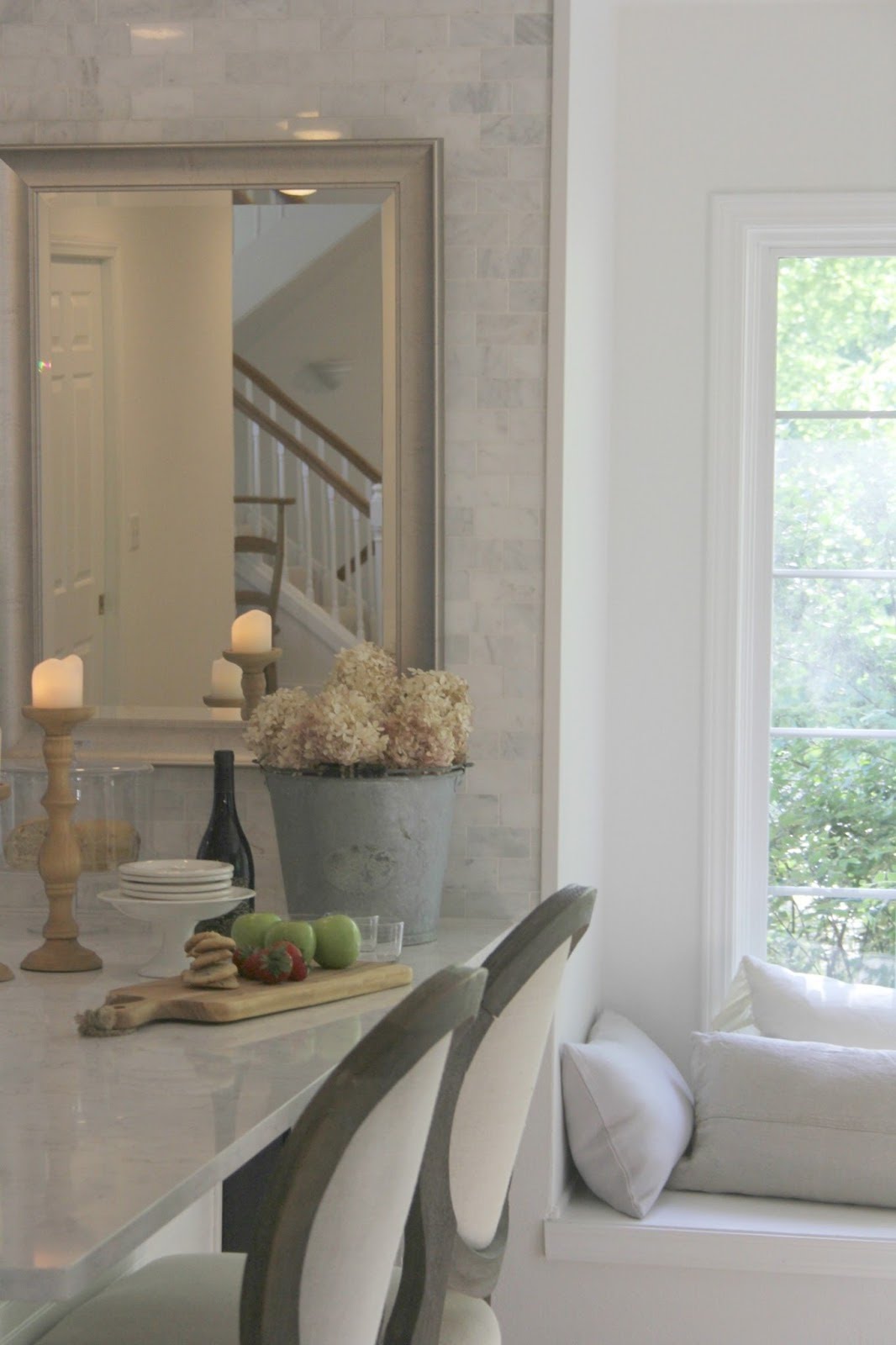
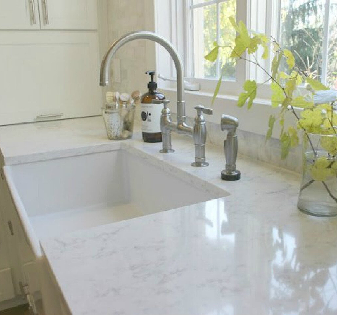
Thank goodness I didn’t wait longer to begin this kitchen spruce up. There were hardwater stains around the faucet and sink I addressed next with Iron Out and a Mr. Clean eraser. It felt so amazing to make those spots disappear and see my counters open and free of all clutter!
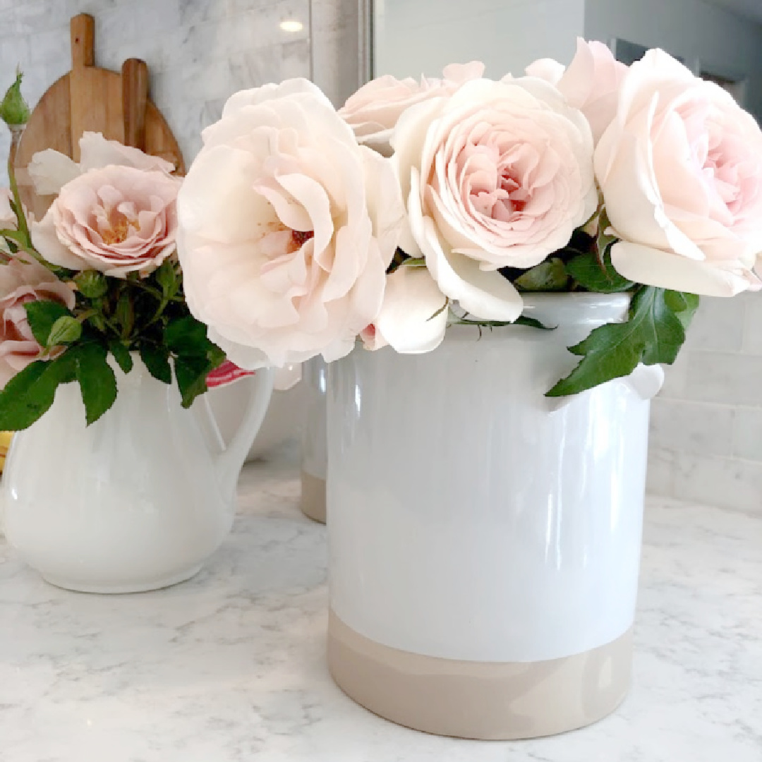
A part of me didn’t want to return any of my daily essentials to the tidy expanses! However, now I could see it all with fresh eyes and decide what and where essentials would return.
WHAT WILL YOU GAIN FROM COMPLETING THIS SPRUCEUP?
Objects living on the kitchen counters have an energy all their own which can drain yours. If you can keep them as free as possible, they will reward you with more workspace and beckon you to wipe them down more frequently. (Just gazing at a cluttery countertop can be exhausting to me personally.)
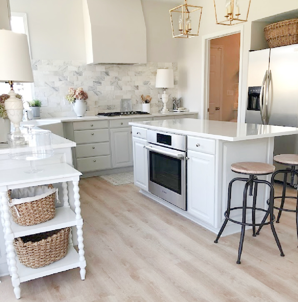
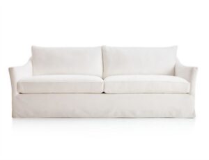
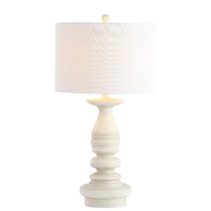
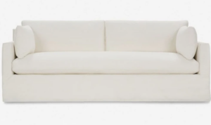
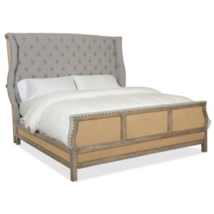
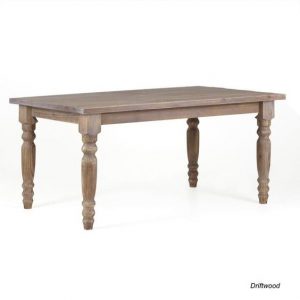
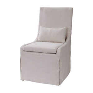
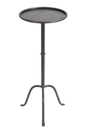
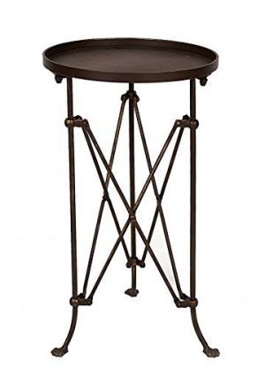
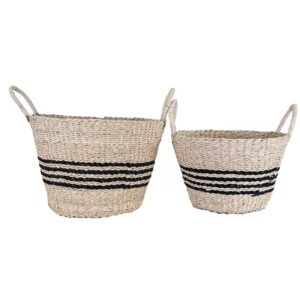
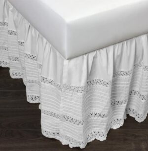
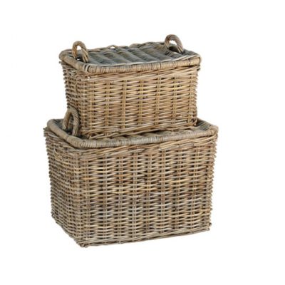
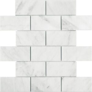
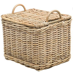
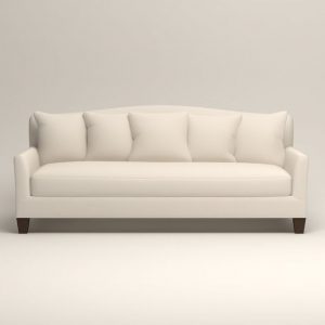
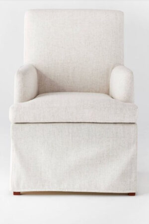
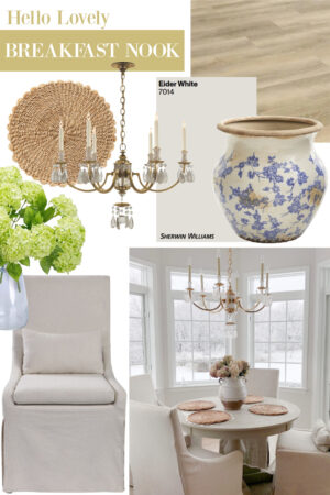
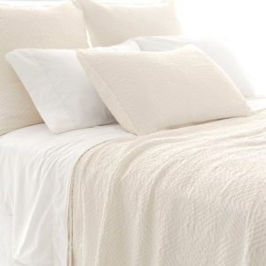
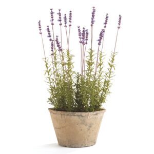
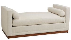
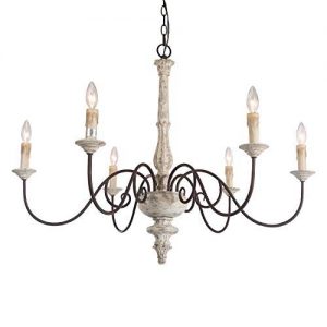
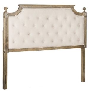
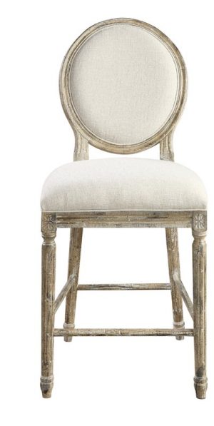
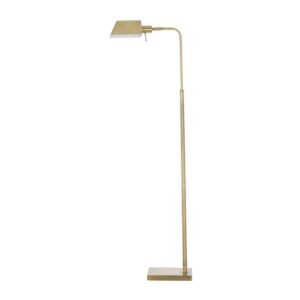
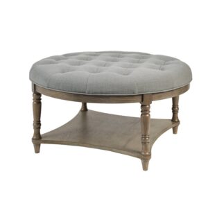
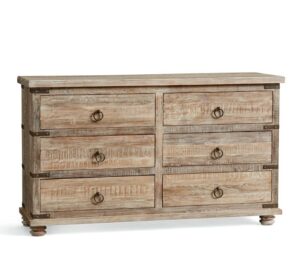
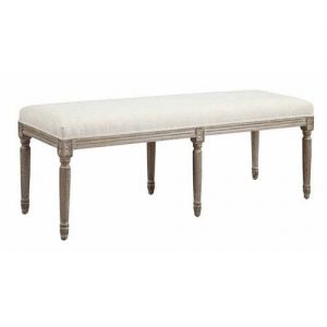
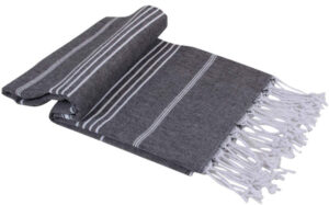
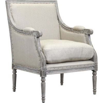
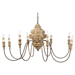
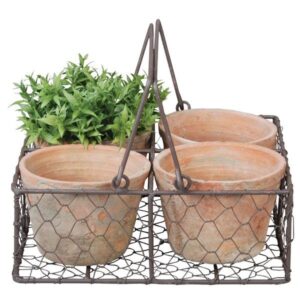
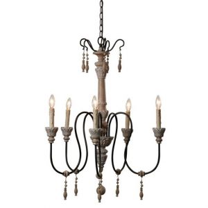
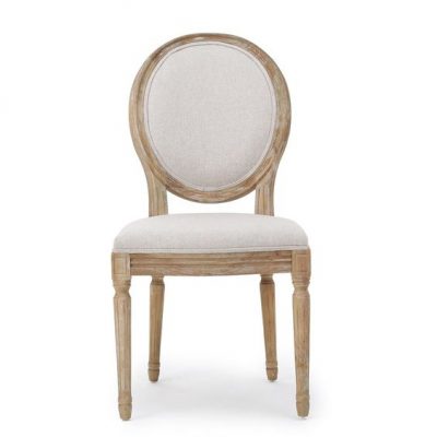
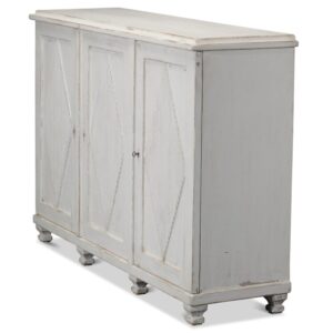
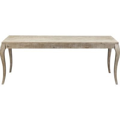
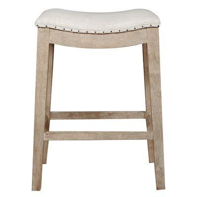
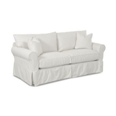
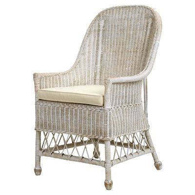
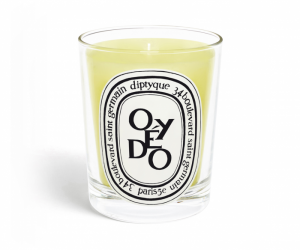
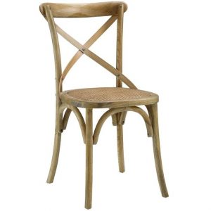
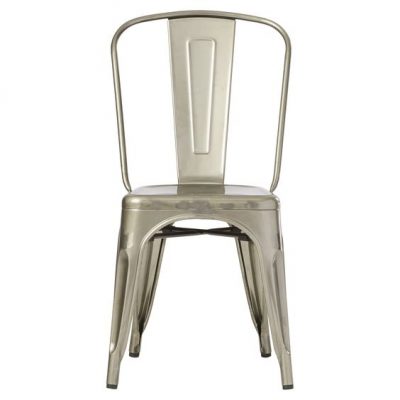
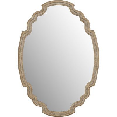
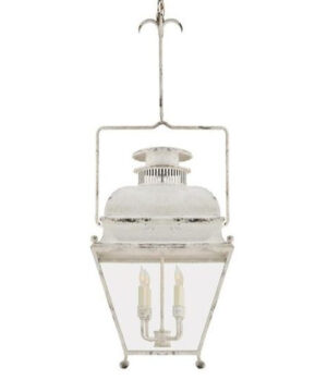
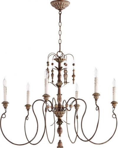
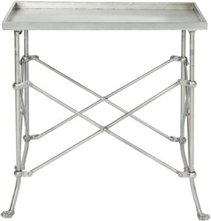
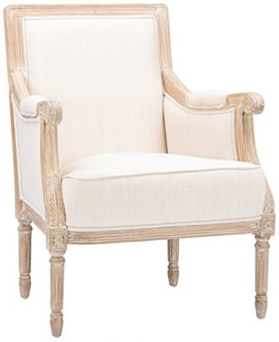
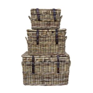
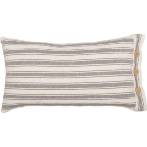
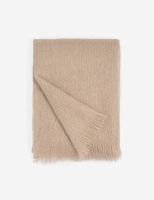
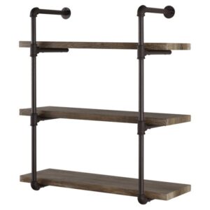
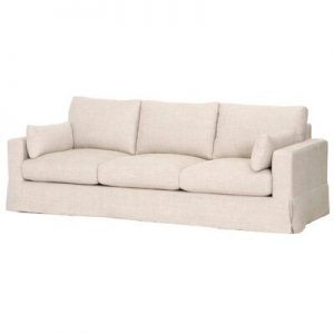
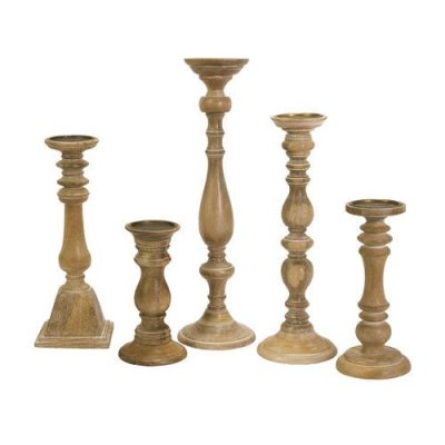
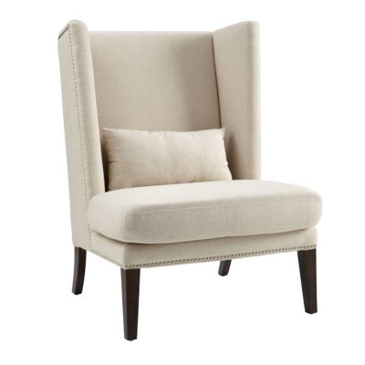
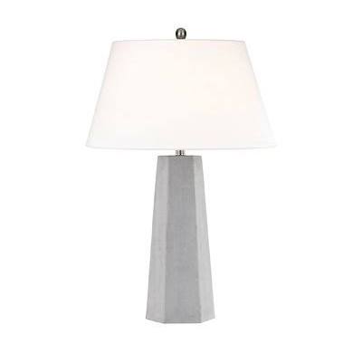
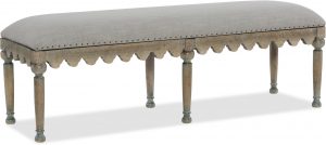
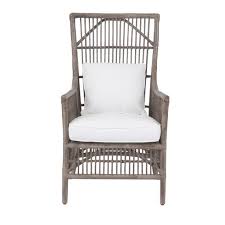
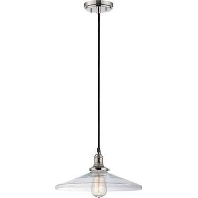
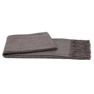
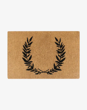
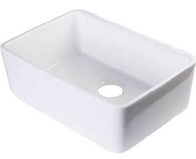
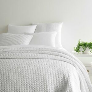
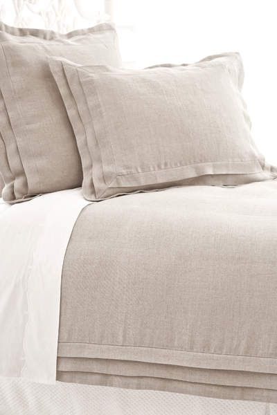
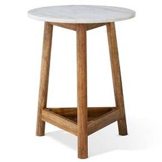
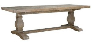
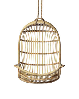
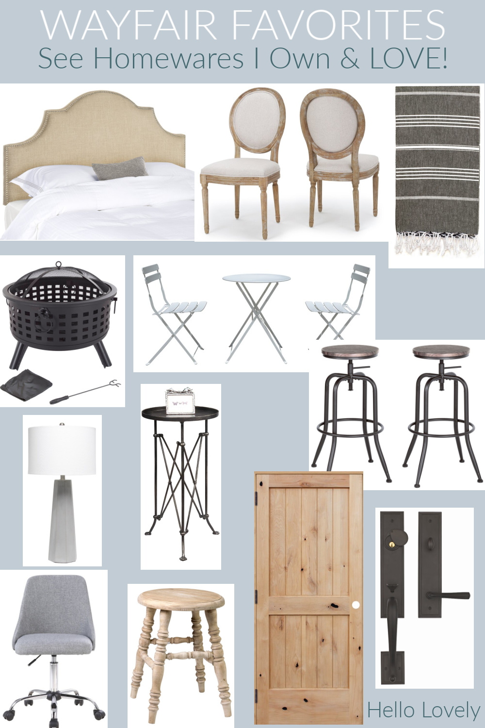
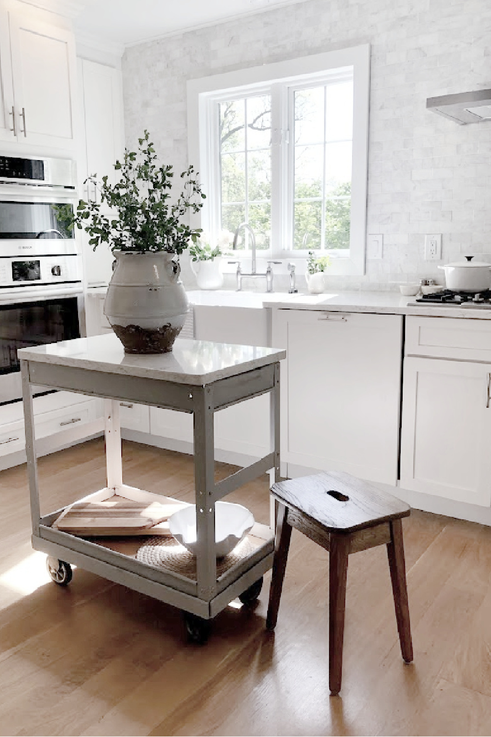
Before proceeding to the next spruceup, I’m sharing some finds, all of which I own because of sales and seasonal items (the round swivel counter stools are the exact ones we’re using in our current kitchen and on sale for $36 each).
No. 2: Add Beauty from Nature
If your kitchen is devoid of natural materials such as the warmth of wood, plants, stone, metals, rattan, etc., you may be unaware of the calming effects of organic material.
You don’t have to get a second mortgage to buy new counters. A simple bowl of green apples or lemons on a table or counter can be a lovely start.
If you don’t have a sunny spot, faux plants or a plain ol’ branch in a clear glass container can look chic and natural.
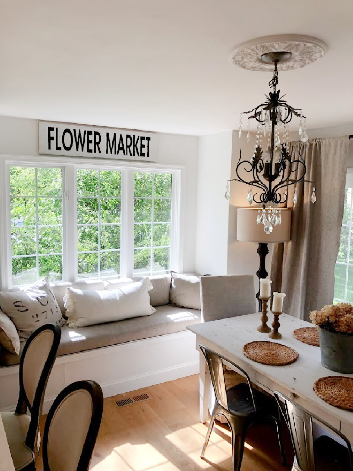
No need to stress about the perfect branch with buds or spring growth either. Even bare branches offer pleasing silhouettes, contrast, texture and warmth. Try it!
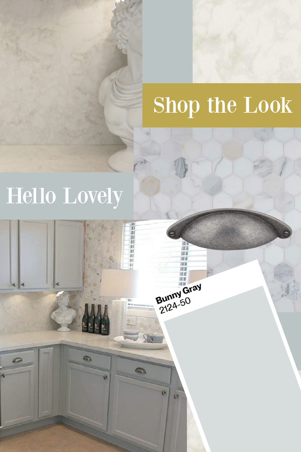
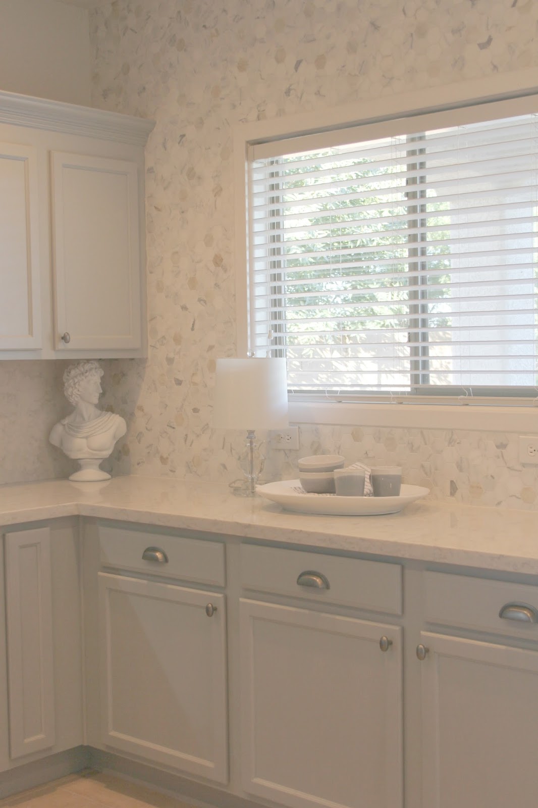
Bringing nature into the kitchen is especially important if there are a lot of synthetic design elements (vinyl cabinets, laminate countertops, etc.).
Calm Spruce Ups With Nods to Nature
There are inexpensive accessories made with stone, marble, woven textures and wood that will bring natural warmth and integrity from nature.
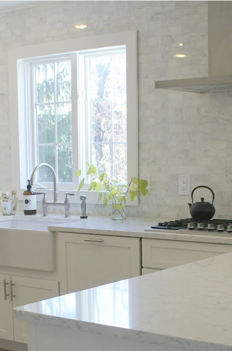
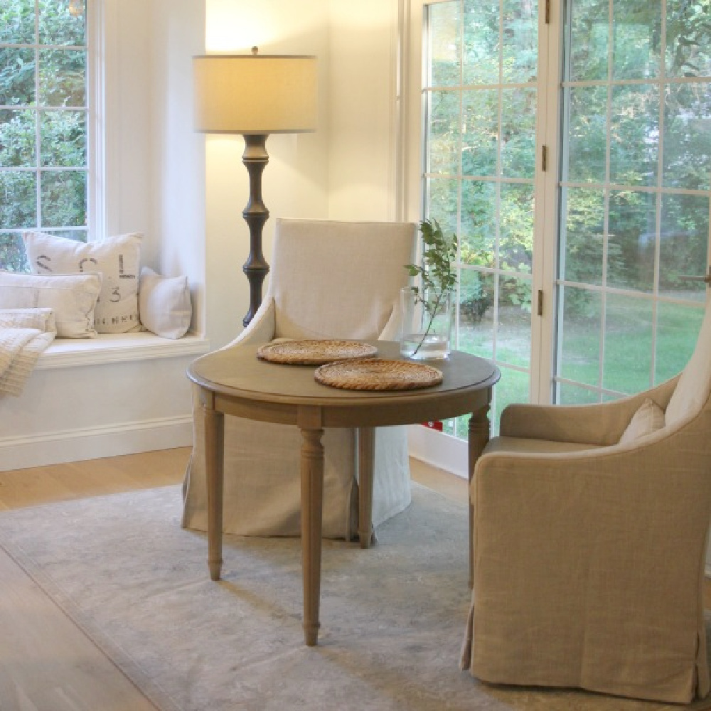
Even simple seagrass placemats bring a serene, simple, pared down look. They also function well and can extend the life of counters and tabletops with their protection.
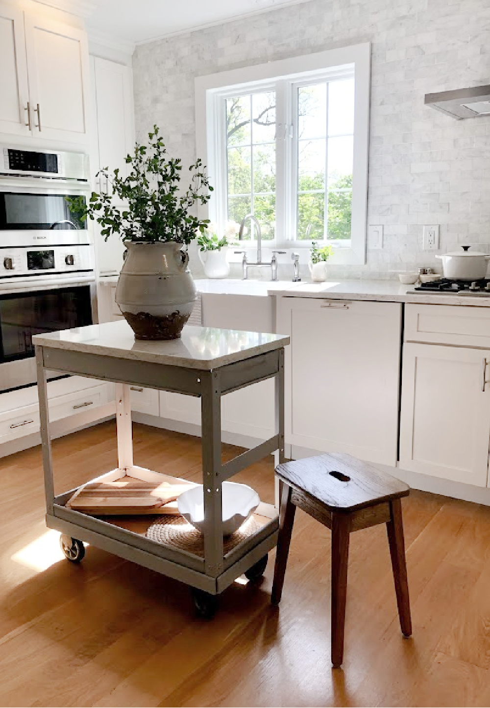
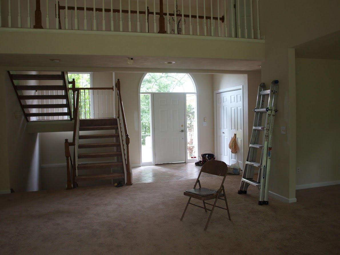
Another way to give vinyl cabinet doors new life and to fake the look of wood? Paint them. When we bought our former fixer upper, the kitchen’s existing cabinets were worn out, broken, warped, and vinyl:
Our former laundry area’s cabinetry was also vinyl, but since cabinets were in good shape, I simply painted them with chalk paint. What an easy DIY that made a huge difference!
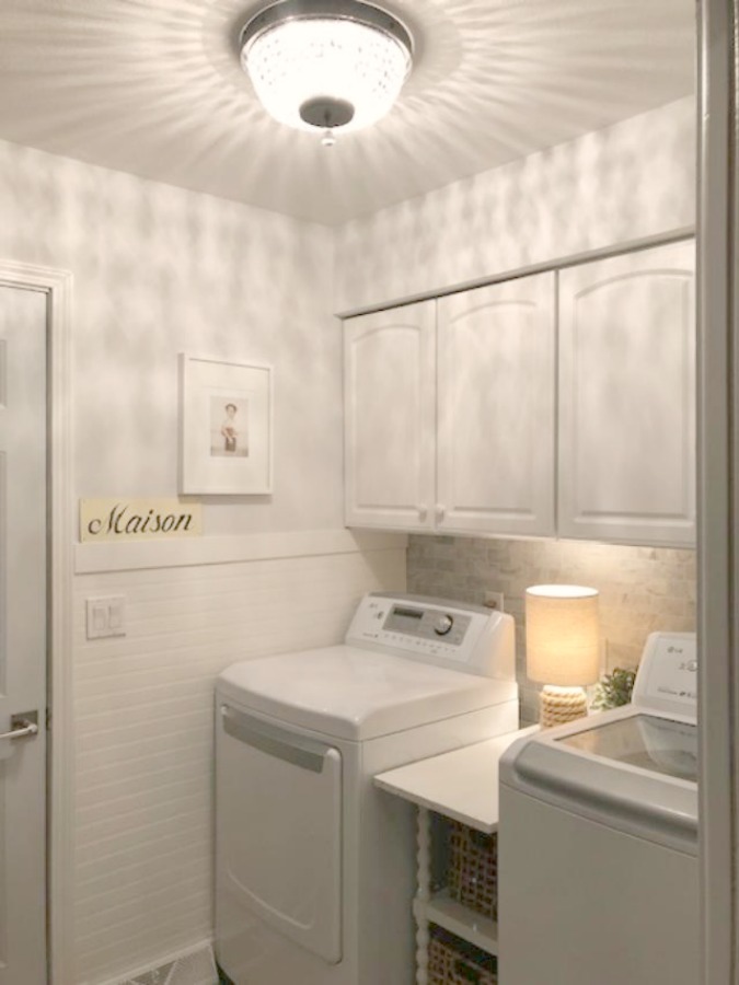
To create a more adhesive and matte look, I mixed a few tablespoons of plaster of Paris into ordinary flat latex paint, and you would never know they are not wood. Adding natural elements to that pass through space (real marble backsplash, wood beadboard, natural woven baskets) also paid off and made it a more pleasant space to pass through.

A good time to assess whether your kitchen could benefit from more nature is after the counters are clear and before you return everything back to them. Is there a good balance of natural elements? Do some of the fixtures feel overly artificial? Is there a lack integrity that could be balanced with more nature?
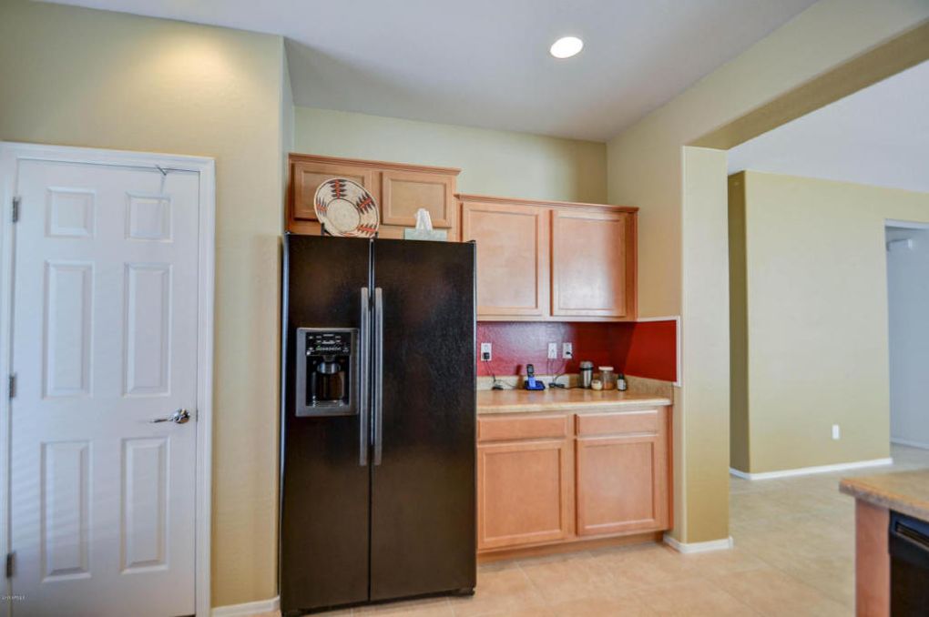
Could you swap out a plastic table for a wood or glass one? Have a sunny location plants could grow? Can plastic storage containers be upgraded to wood, glass, stone, or a natural fiber? If the floor is vinyl, is it possible to layer it with a woven cotton rug or simple jute runner?

WHAT YOU’LL GAIN FROM THIS MINDFUL CALMING SPRUCE UPS WORK
Here’s where I grow philosophical. We aren’t just living on the earth; we ARE the earth, so the things of it affect us at deep, subconscious levels. Natural elements are sustainable, age better, and unite us with planetary harmony and wholesomeness.
No. 3: Add Breezy Spare Simplicity
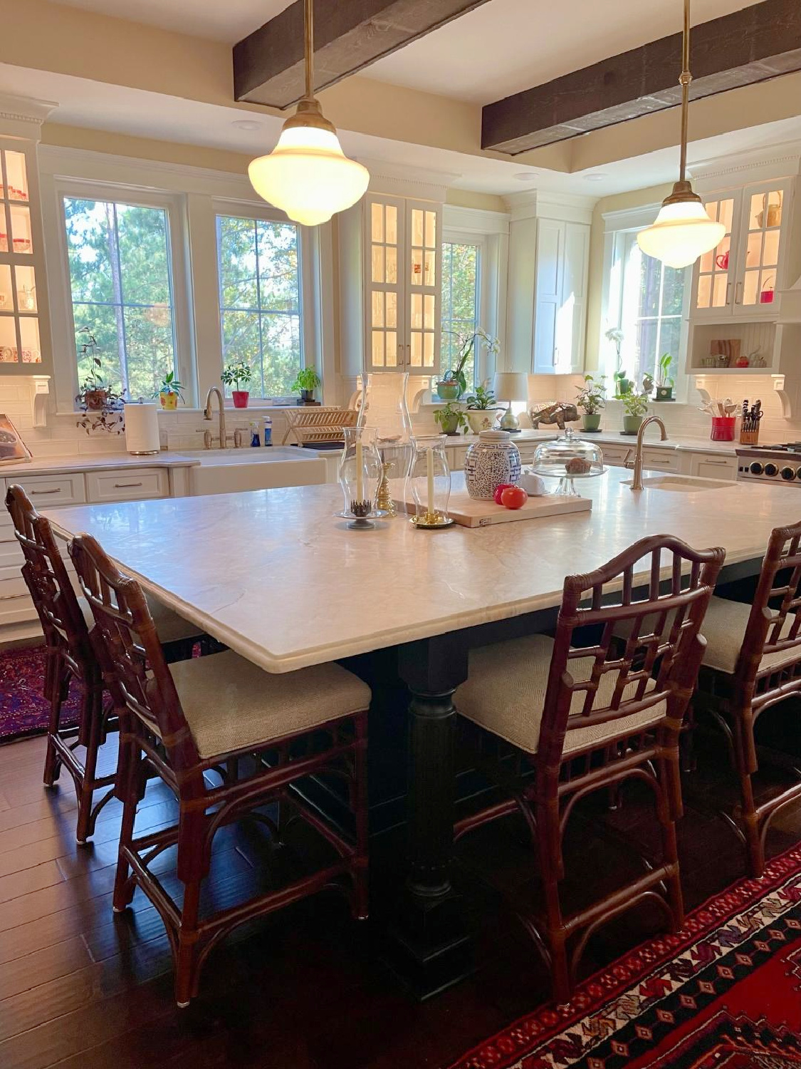
An airy feeling in the kitchen can happen in a number of ways, and if you tackle No. 1, then you know the power of subtraction in achieving a tranquil feel.
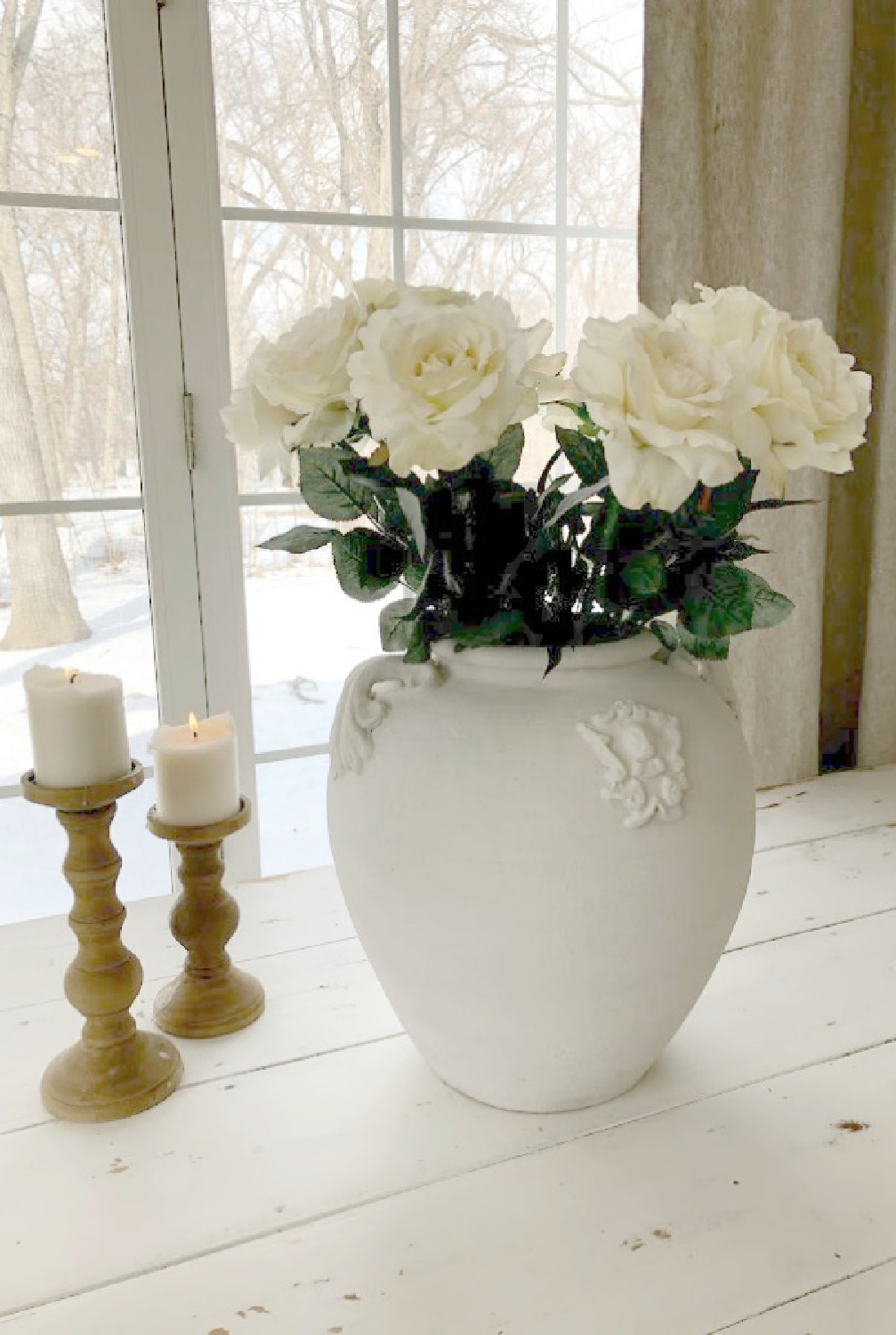
Color palette surely is another strategy to lighten up, and in most cases, pale and tranquil cooler tones do it effectively.
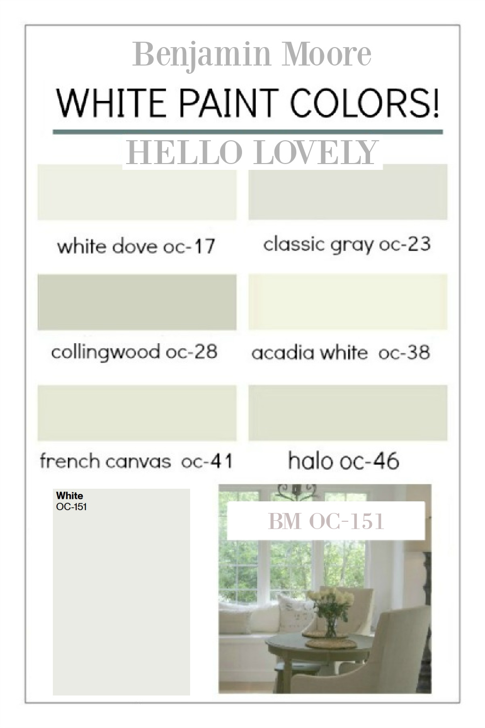
Dig into my archives for paint color ideas.
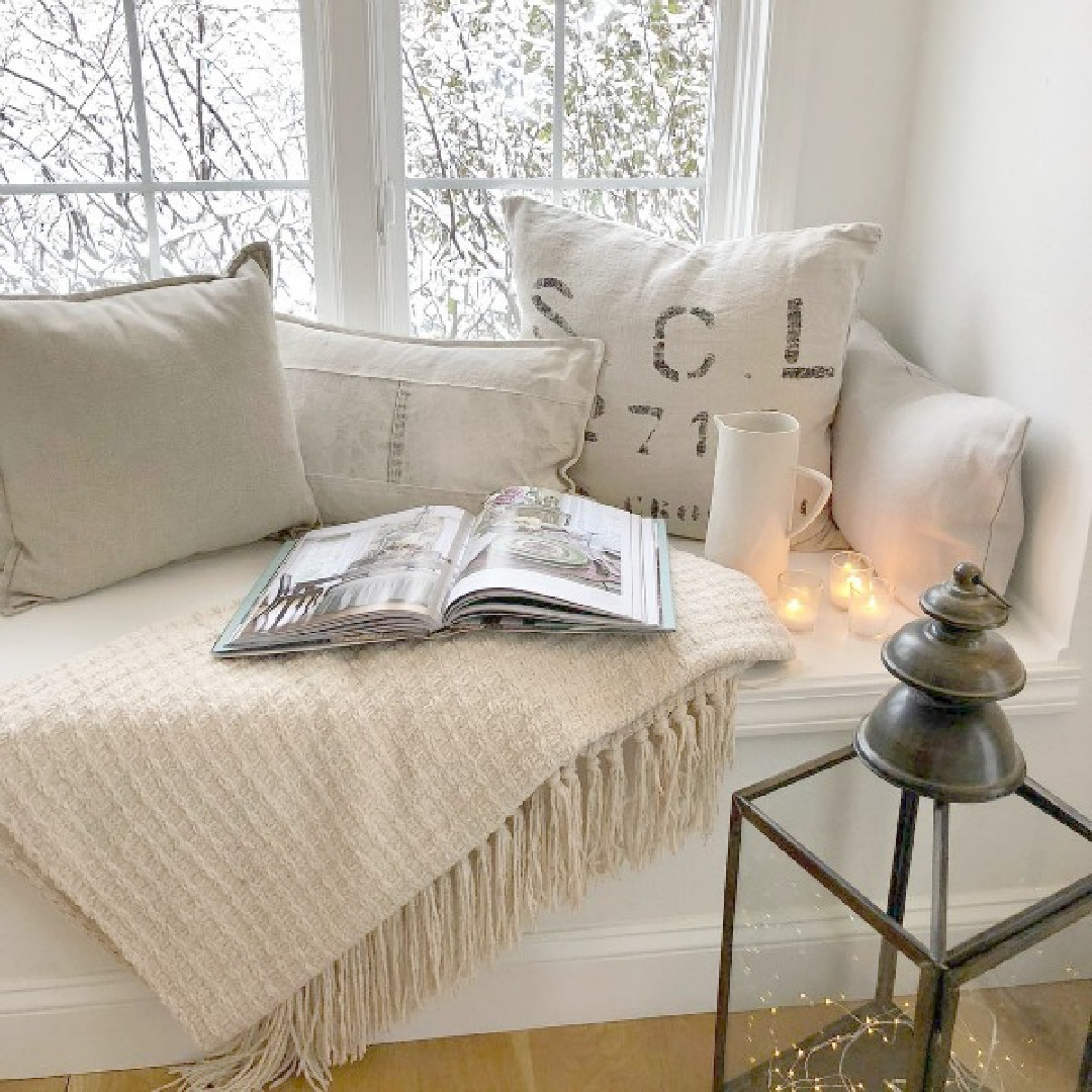
Think about visual weight. Dark stained woods often impart strong, rugged, formal, heavier mood factor.
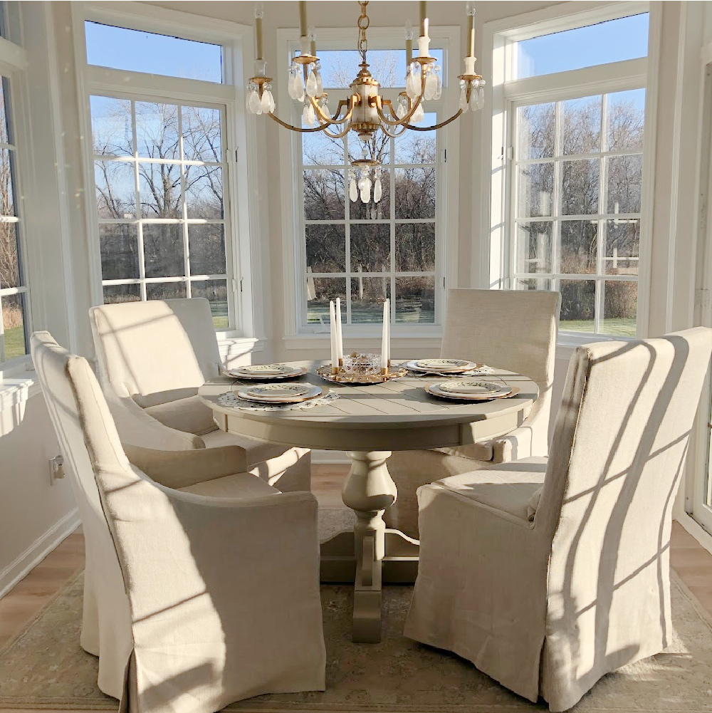
Subtracting them could make a significant difference. Whites, light woods, and softer shades lend themselves to more of an airy feel.

If you’re taking a long hard look at your kitchen and want to remove visual weight without renovation, you could start by assessing paint color, lighting, and windows.
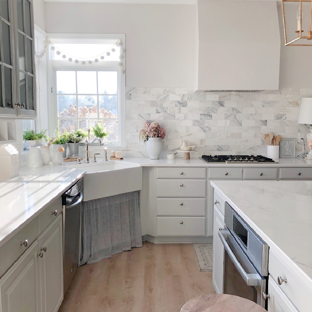
Address Paint Color, Lighting & Windows
First, decide which colors feel tranquil to you and try samples on the walls to see how they marry with other design elements. Tranquil light greys are timeless, and I love how they work with warm natural wood.
As for lighting, think beyond simply shopping for wispy or woven light fixtures. Rather, look for ways to infuse pleasing light into the space.
Can window treatments be removed for more natural light to stream in? Is there a fluorescent cloud fixture casting unflattering artificial light into the space?
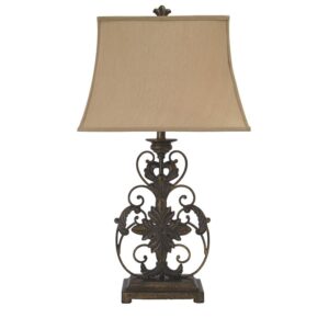
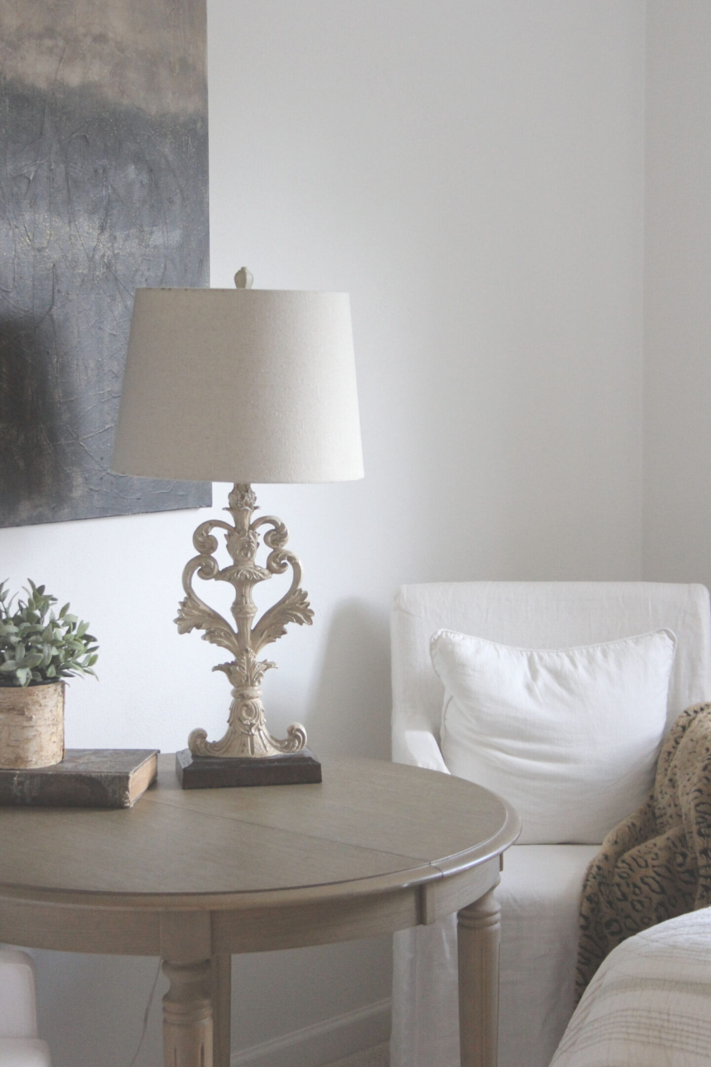
Would a table lamp on the counter or floor lamp in a corner bring a soft source of calm glowy ambience? Lamps in the kitchen don’t make sense for all kitchens, yet they are often overlooked in casual, country, more traditional spaces which…let’s face it…are more than spots to prepare food. Many of us LIVE LARGE in our kitchens.
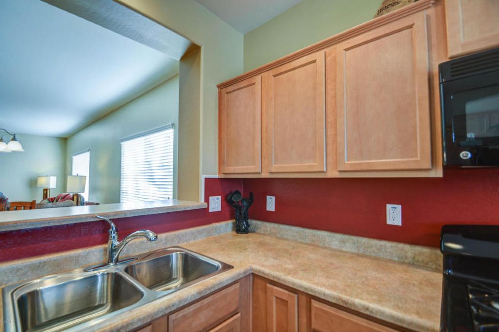
Thirdly, decide whether window coverings in your kitchen are helping or hurting. Removing them could eliminate more weight than you might imagine. If privacy must be addressed, consider whether a light filtering alternative will lighten things up.
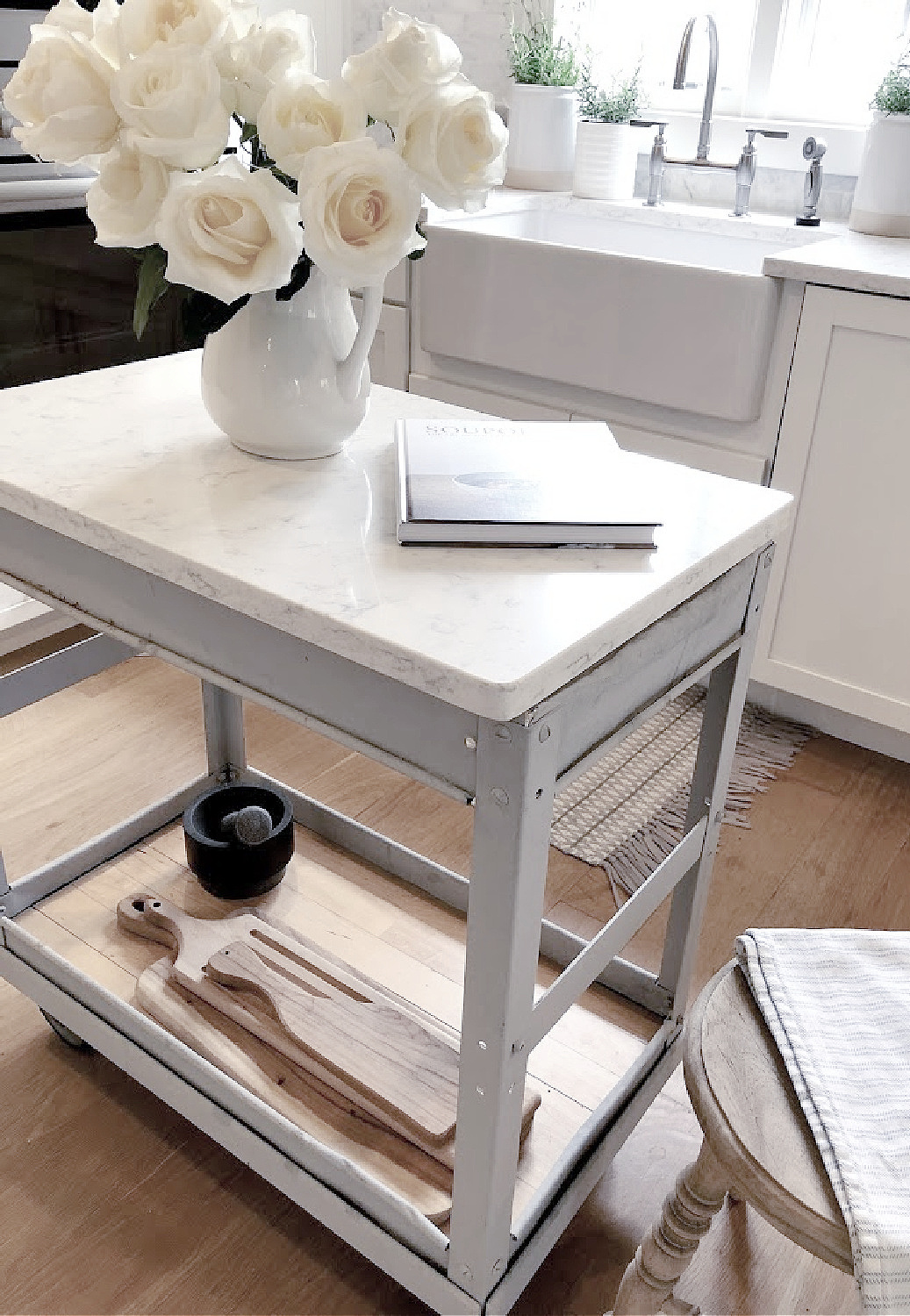
WHY THESE Calming Spruce Ups & TWEAKS MATTER
Life can be lifey with its stains and burdens. Maybe an airier space to prepare meals, happily bake, gather around the table, and breathe will help your spirit to be a bit more buoyant.
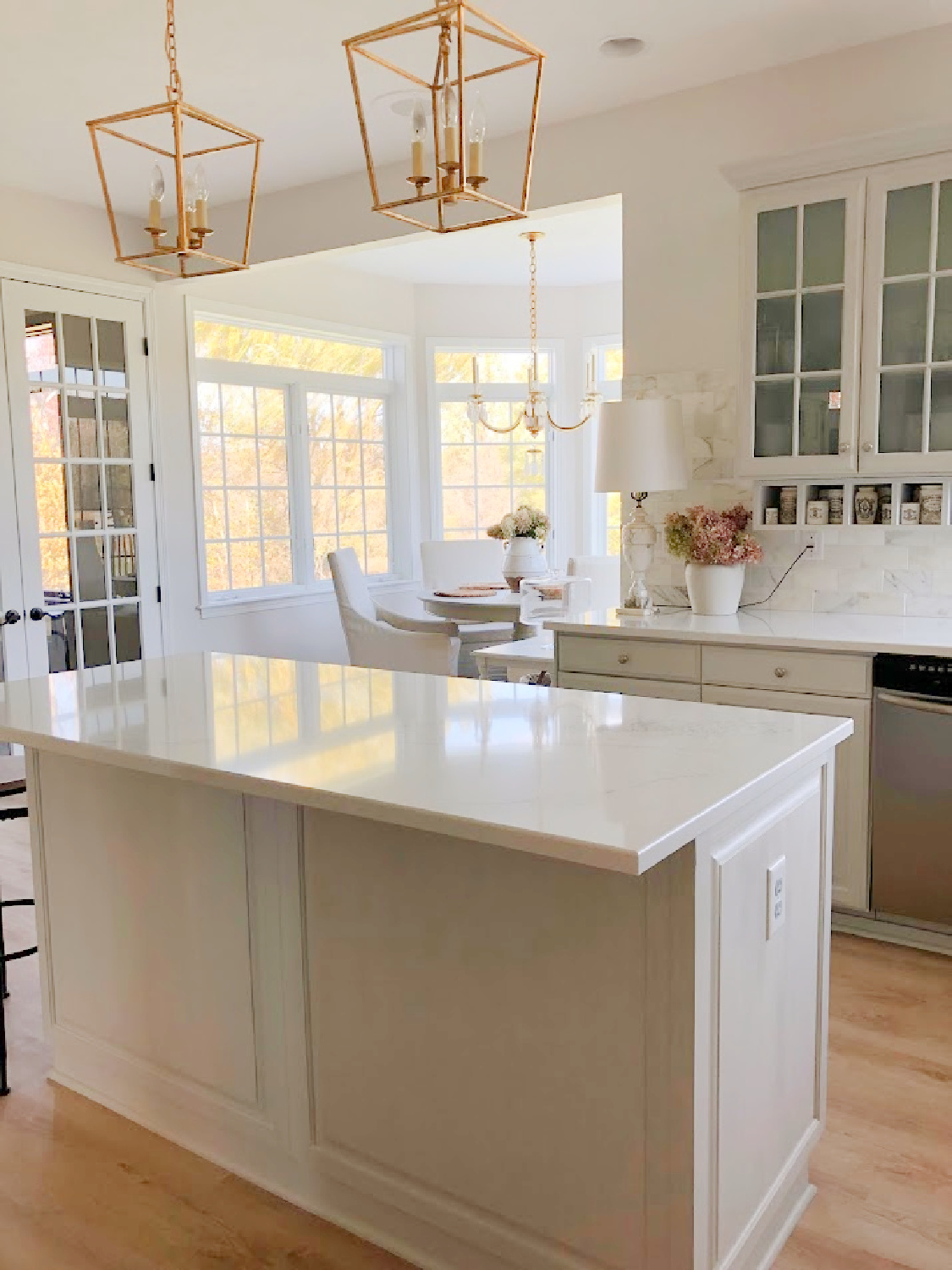
No. 4: Carve Out a Cozy Moment
When we mapped out a design plan for our current kitchen’s renovation, an important consideration was whether to keep the corner sink and windows.
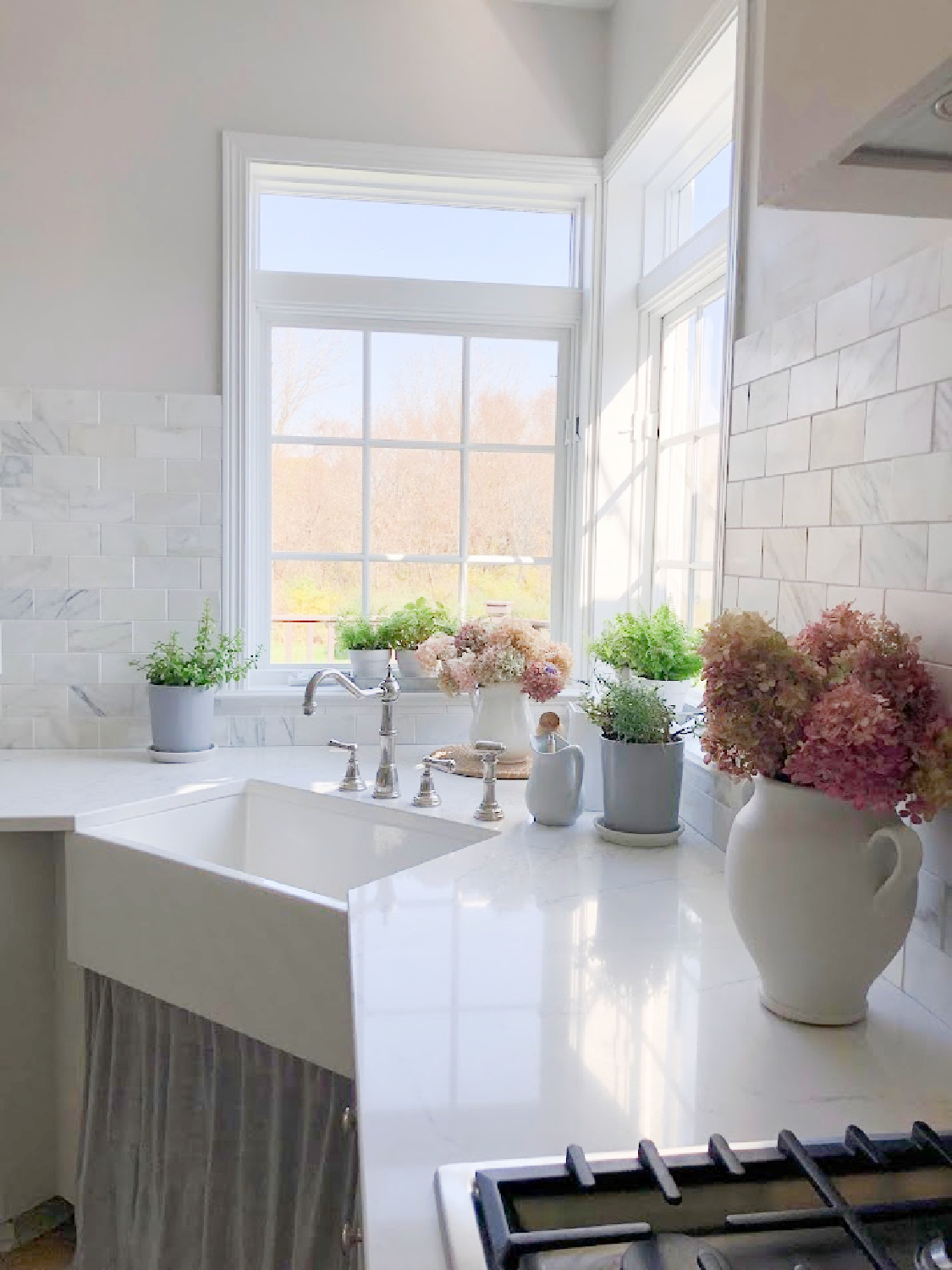
It wasn’t a small thing to leave that corner alone since it meant less design flexibility (and I’m not a fan of angled anything…I’m looking at your 1992 architecture!). However, leaving the windows and sink placement as is allowed daily naturewatching to remain. I prefer kitchen design plans featuring simple, clean lines rather than fussy bumpouts or angles or jogs in the line of cabinetry. Losing a window or two often makes way for a functional and beautiful new kitchen design, but in our case, it would have also meant the loss of deer sightings, chickadee in the hydrangea watching, and abundant sunlight at the sink.
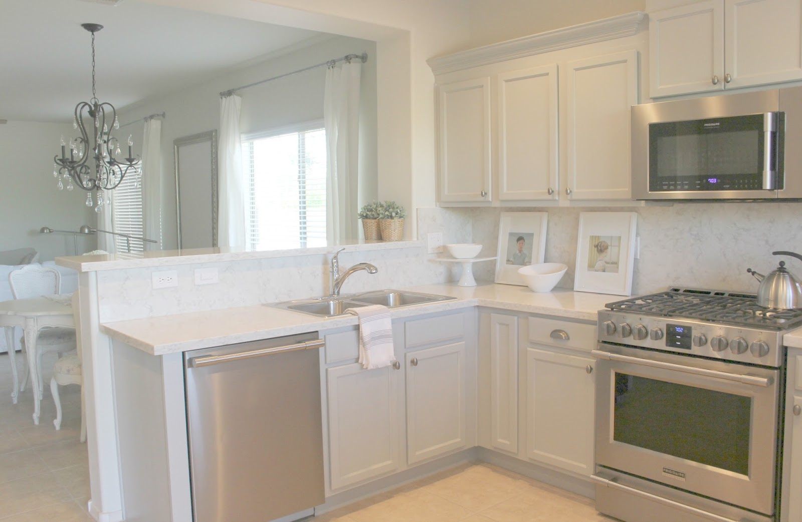
Is there a cozy moment in your kitchen or potential for one?
I already mentioned lamps which add cozy factor, but here are a few more ideas.
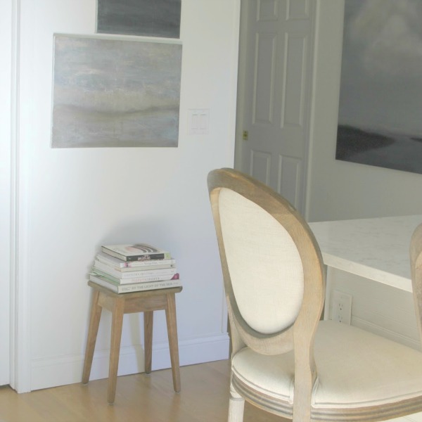
First, a visually pleasing vignette can often become a moment for cozy. Even a few cookbooks in a stack with a simple glass vase with branch or eucalyptus sprigs can be a start.
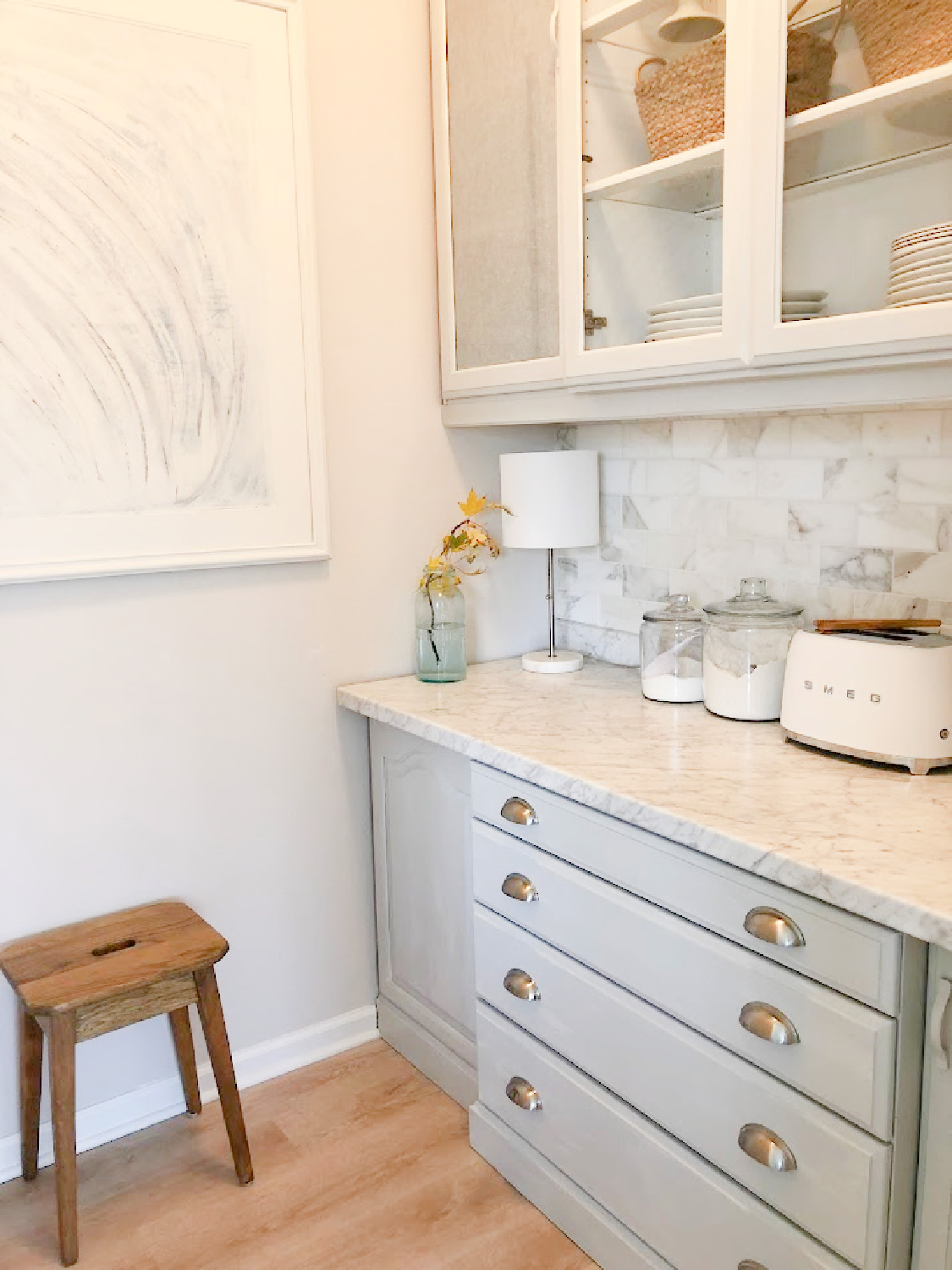
Second, vintage objects are often a way to bring warmth and character as well as cozy charm. Shop your house for treasures you may have forgotten about.
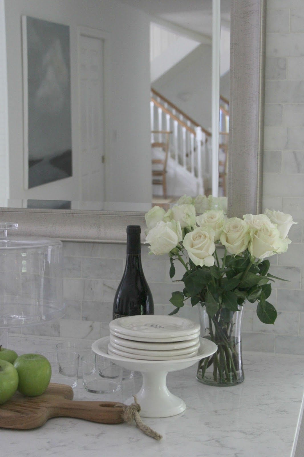
Thirdly, a cozy teapot and beautiful kitchen towels can work wonders.
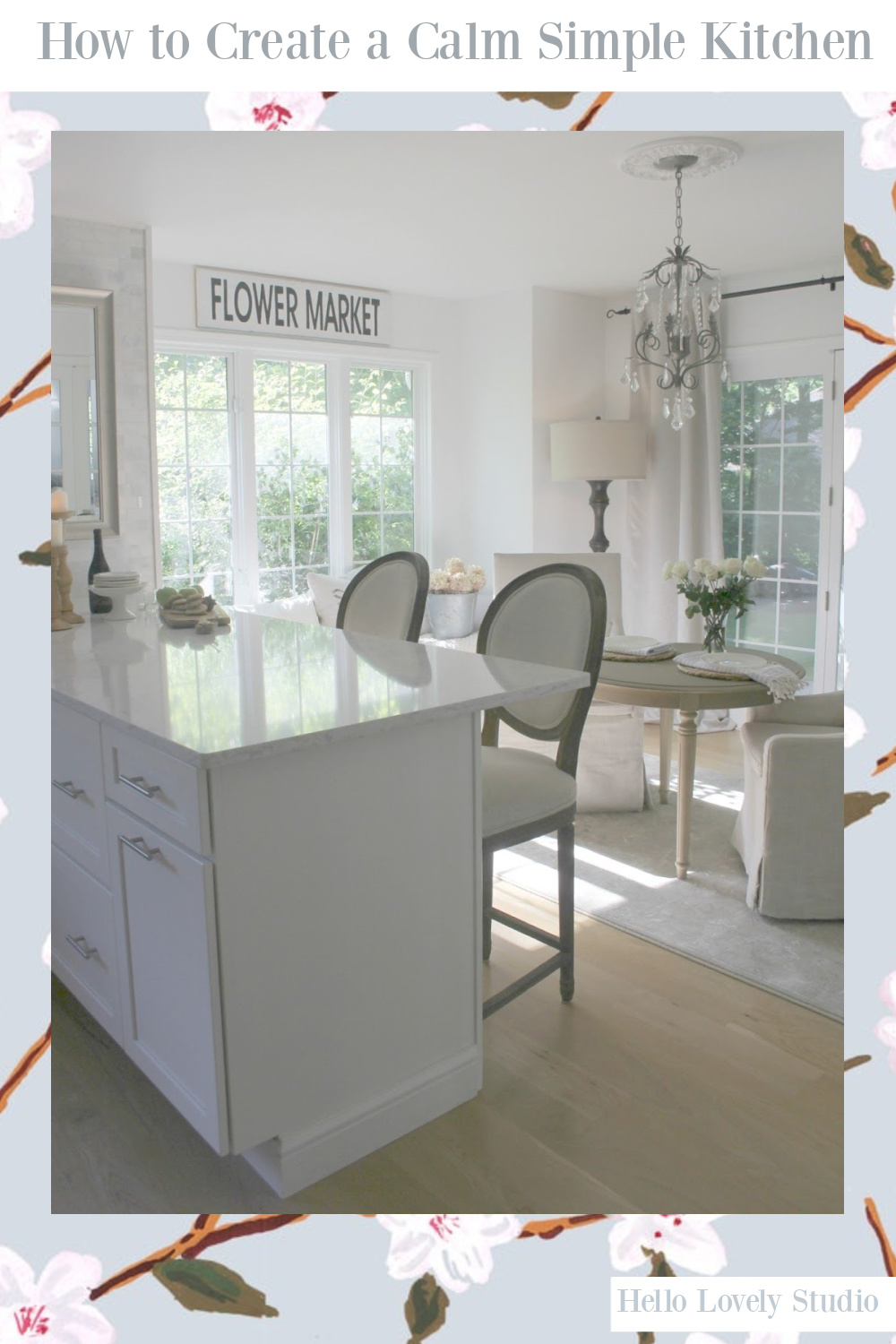
Ideas for Easy Breezy Cozy in a Kitchen
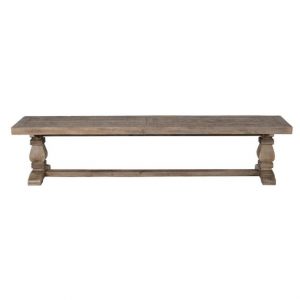
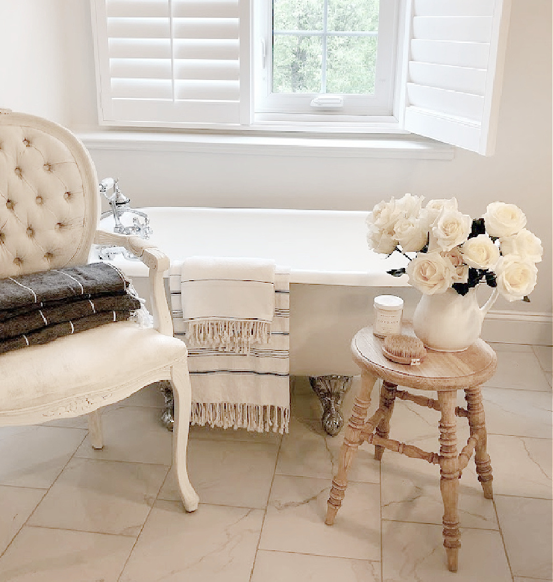
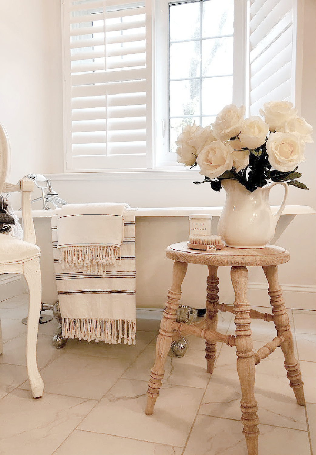
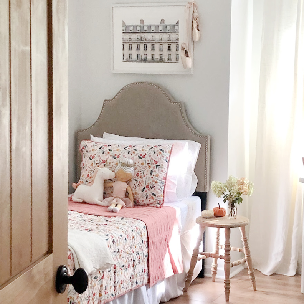
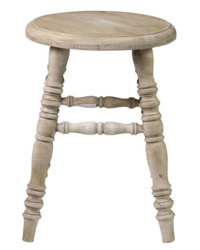
Wooden benches may look even cozier draped with a soft throw. Even a simple wooden stool that feels homey and humble can work.
Lastly, don’t forget about the magic of original art work.
Have you seen professional stylists display vintage canvas portraits, casually leaning them on a kitchen shelf? Try it.
I personally love living with original abstract paintings by me and others, and I hung three together in our former not-huge kitchen which still felt breezy.
WHY THIS ADVICE WORKS
Cozy corners and vignettes invite our eye to rest, and at rest, bodies and spirits more easily recover, heal, function optimally. With a body at ease, responses can arrive from a place of greater capacity and spaciousness to meet daily challenges.

No. 5: Honor a Favorite Color
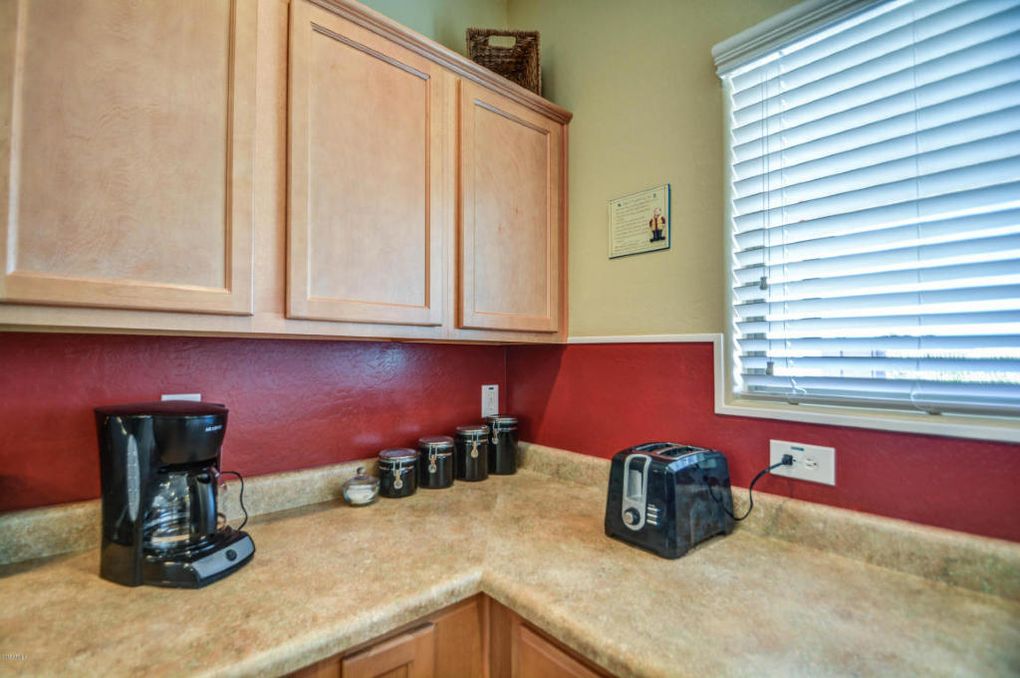
When you inherit a kitchen where someone else made all the kitchen design choices, it’s easy to feel stuck thinking you must live with an existing color palette. But a personalized result may be within reach.
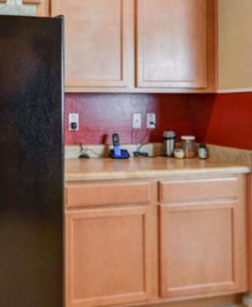
For example, if your jam is soft, ethereal, cool tones yet your kitchen is dominated with saturated or warm colors, you may not realize the right paint color alone could work wonders.
Here’s what you could do to start:
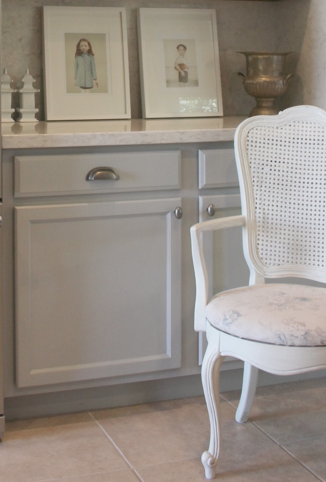
Snap a close-up photo of your cabinet door when there is good light in the kitchen so you get an accurate rendering of the color.

Next, do the same thing with more large surfaces i.e. wall color, counters and appliances. When you gather those images and can view them together, you’ll be equipped to view paint color swatches in a fresh way. Seeing the expanses together may even lead you to a paint color or accent color you had not considered. (BTW. You know I’m not afraid to paint cabinets!)
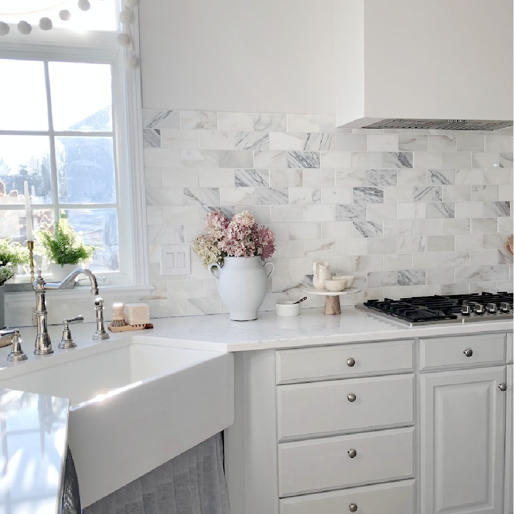
WHY THIS IDEA WORKS
There is a whole discipline of psychology devoted to color and its affect on human emotion, productivity, aggression, appetite, etc. Color matters for mood, well-being, resale and even as a functional matter since more reflective colors will help you see and be safe.

No. 6: You’re Allowed to Paint Trim
You have a permission slip from me to paint your trim. Painting the trim throughout your whole home may feel overwhelming. It’s more than okay to begin with just one room.
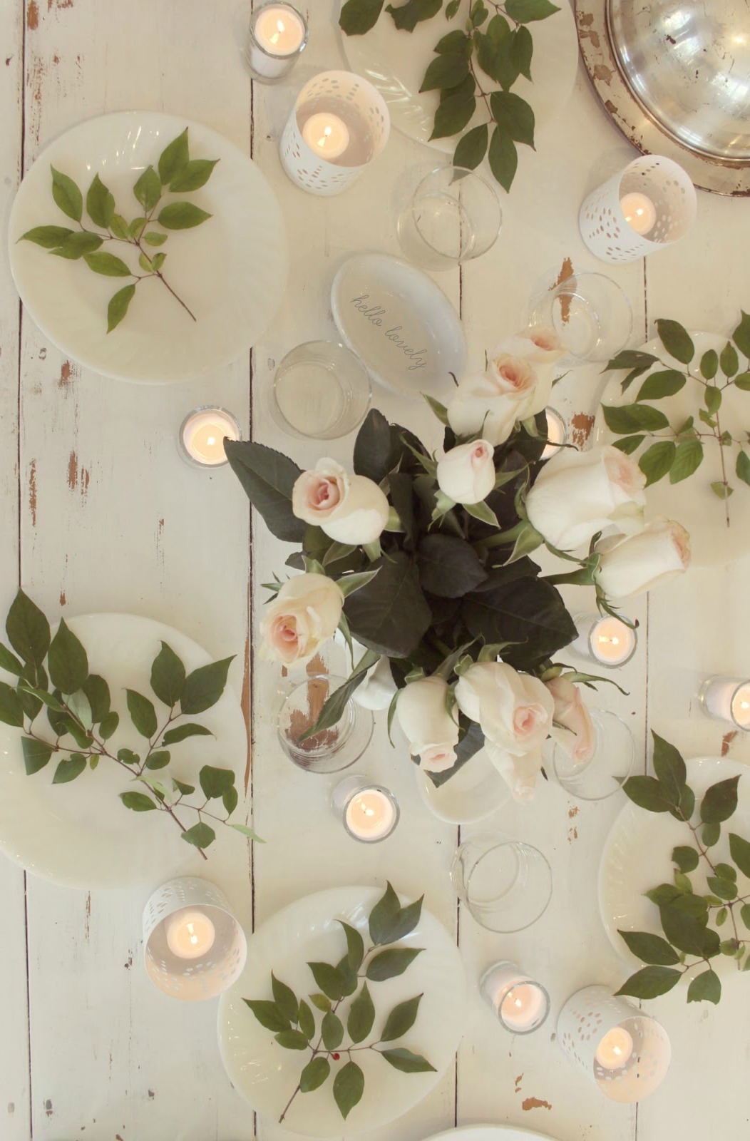
I know how scary this decision may be if you are painting over stained wood trim. But unless you live in a historical home with one of a kind architectural moldings, it’s just trim. Realistically, new wood trim could be added down the line if you grew to hate painted trim. What I know is that if dated wood trim or trim painted the wrong hue are bringing your mood down, change it.
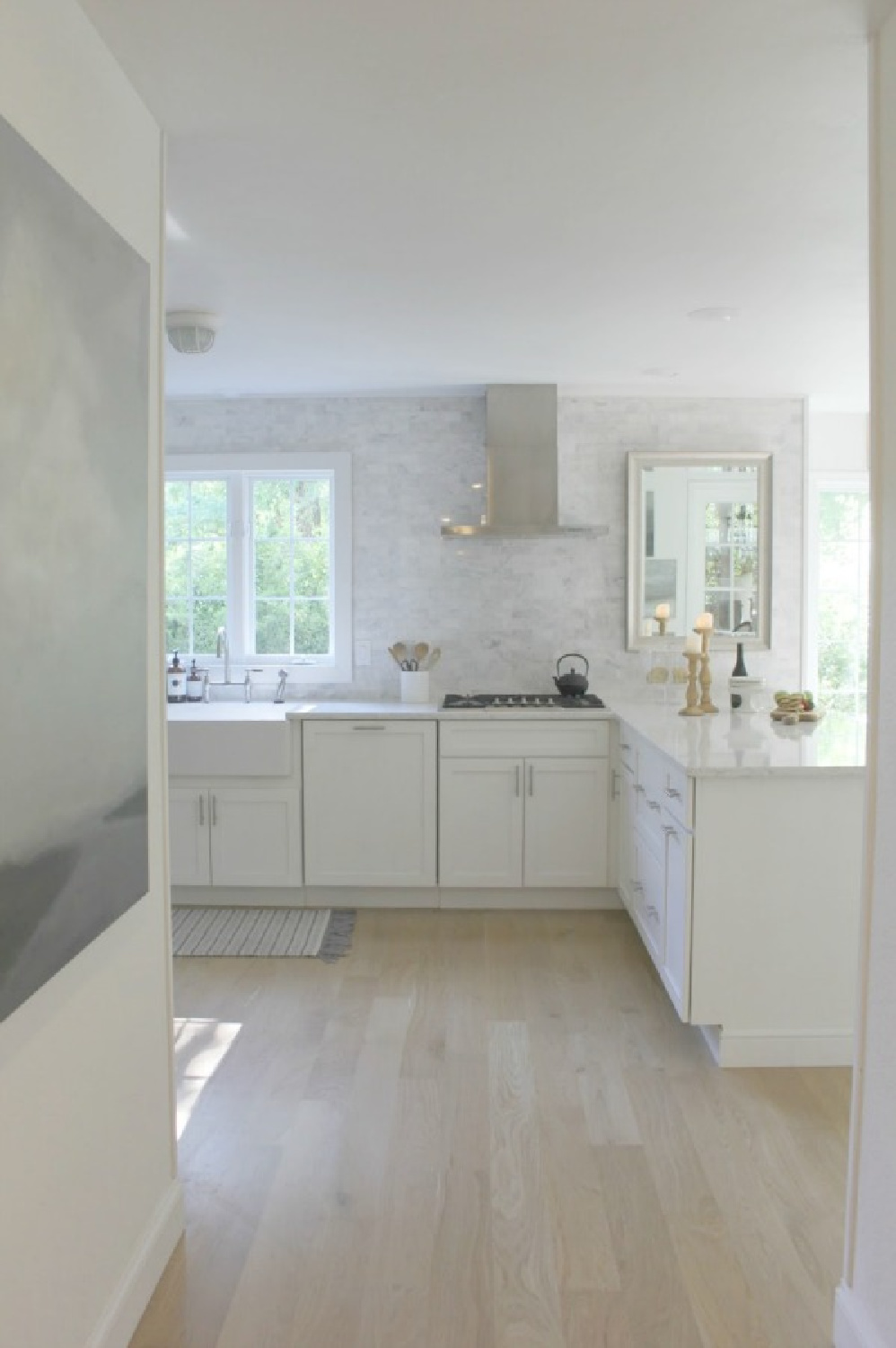
Color affects us in mysterious ways. Dark red-toned browns, for instance, assault and overwhelm my own senses. White oak flooring in our former home was left natural and glowed with golden warmth. Get to know yourself and how color affects your emotions.

Color Matters
For me, browns rarely emote a feeling of safety or coziness, and this lesson comes years after living in a home with quality, costly oak trim. (I thought I might learn to appreciate it with time in a prior spec home I didn’t design).
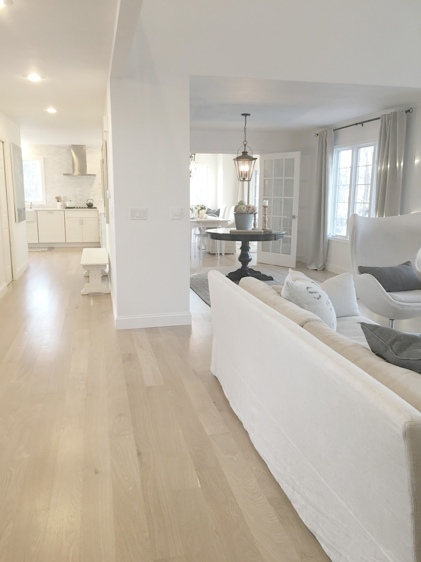
Folks who are less visual may hardly notice a trim’s tone. Practical, logical, left brain types who size up a room’s appeal based upon other factors may think this whole discussion is drivel.
But then there are aesthetes and design freaks…ha!
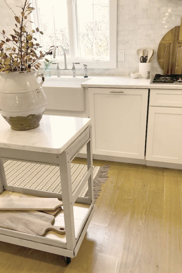
Since I’m mostly indoorsy, it makes sense that brown wood outlined everything feels more outdoorsy rustic and less home-cozy. Take time to discern how you respond to trim when it subtly recedes or assertively veers forward.
Be mindful too that painting over stained wood is generally not wise if your only motivation is to be on trend. If your eye loves stained wood, keep it!
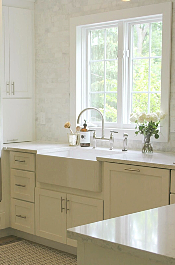
Painted trim and the addition of trim around windows and doors itself falls in and out of favor. (The Giannettis along with many high end designers skip trim altogether!). Your decision should support your personal style, taste, and preferences for what feels most like home.
And don’t forget there are all sorts of neutrals beyond white for trim.

HOW THIS ADVICE HELPS
Painting trim around windows, doors, and floors is a task which stirs up anxiety for many folks. Since it is still rather uncommon to deviate from either white or wood trim, we may forget the power of color. A calm trim color can help if there is a shortage of architectural interest or to enhance a not so great window.
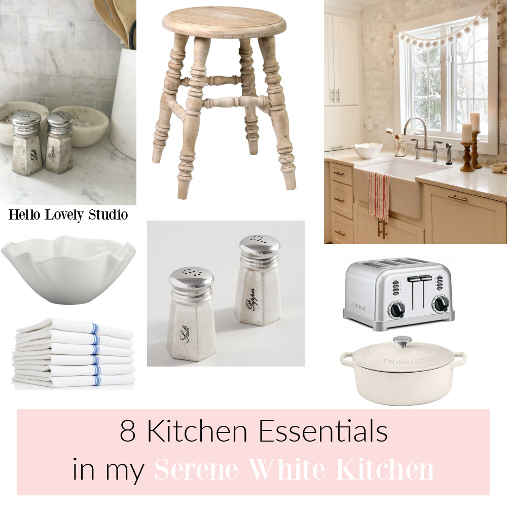
Peeks At Our Current & Former Kitchens
Thanks for trying on these ideas and ever adventuring into deeper calm with me.
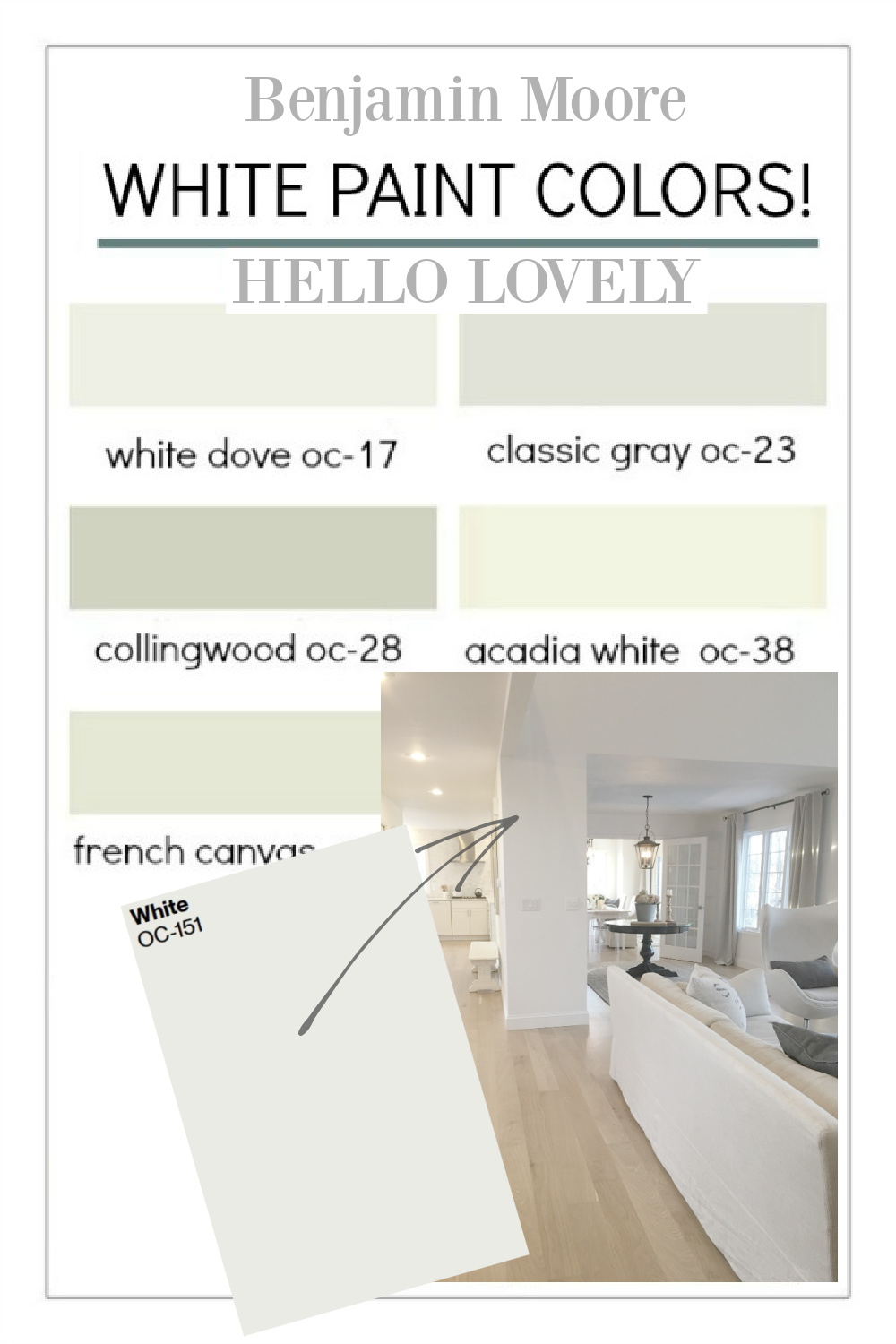
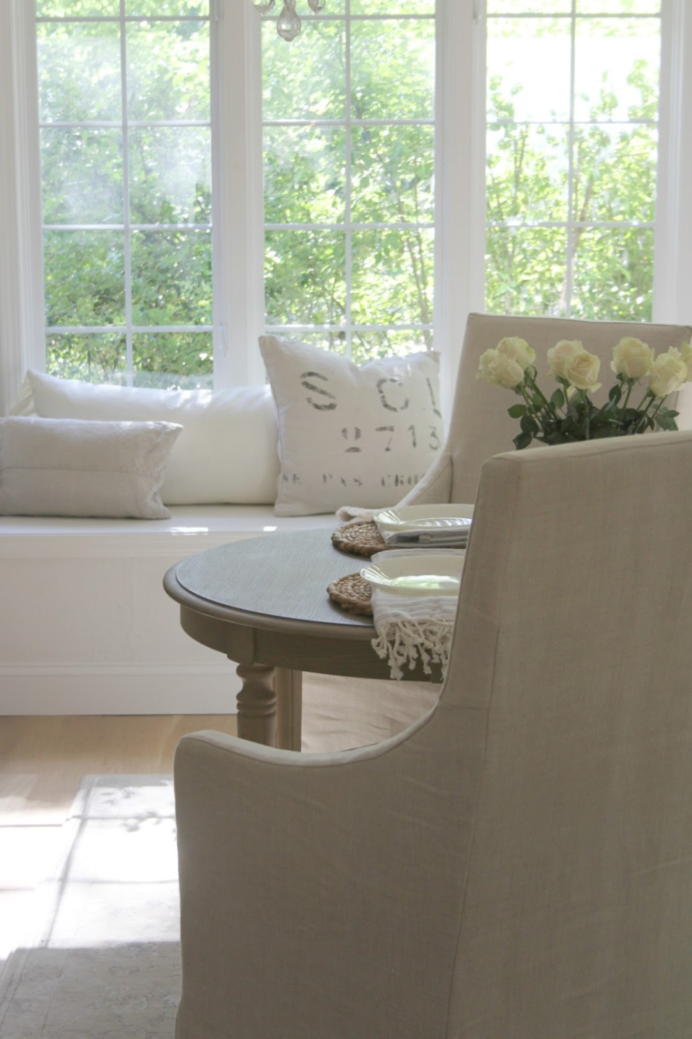
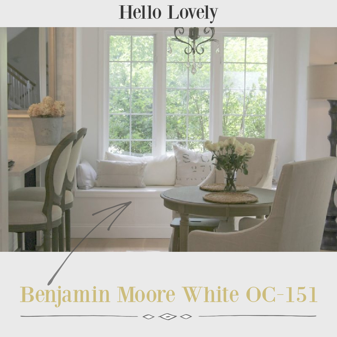
Need an idea for a cool, bright white paint for walls, trim, or even ceilings? Sometimes we simply need a place to start with plenty of images to get a feel for the paint color. In our former home, we chose Benjamin Moore OC-151 for all of the interior walls, ceilings, and trim. My style is modern European Country, and I wanted cool white subtle contrast with all of my warm neutral furnishings. BM calls this “a classic, all-purpose white that creates a clean canvas in the home,” and it definitely delivered on being a perfect white canvas to set a modern, gallery-like fresh mood.
I’ll show you this color’s effect within different rooms at different times of day so you can decide whether to sample this white in your own home.
This post contains affiliate links which I hope you will use since they won’t cost you a penny extra yet may earn this blog a small commission.
Benjamin Moore OC-151 Photo Gallery
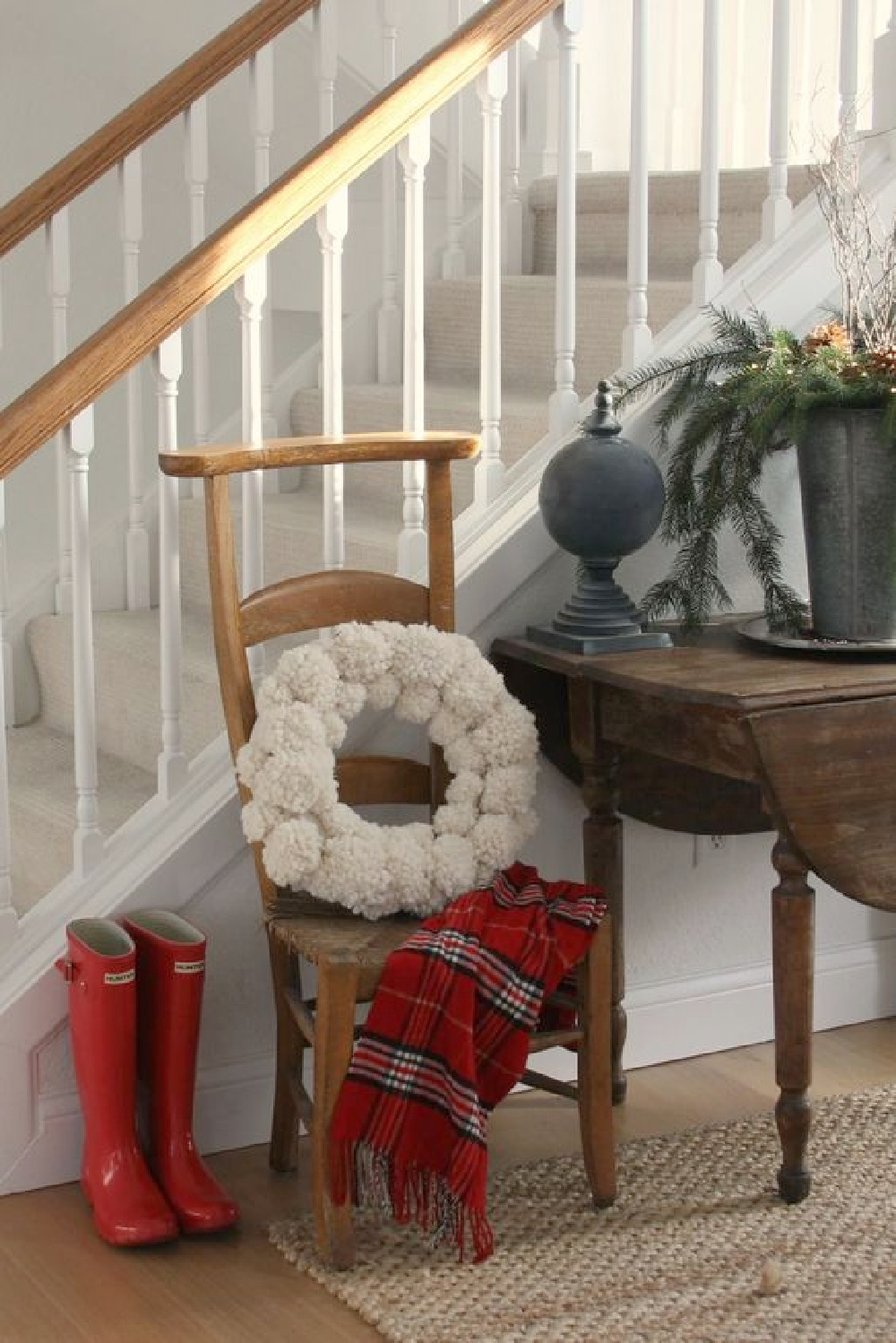
Hopefully it will help to see White OC-151 on walls (flat), trim (semi-gloss), and ceilings (flat) in various sheens in bedrooms, kitchen, bath, and living room with different amounts of natural light and in different seasons.
How Bright and Reflective is OC-151?
The LRV (light reflectance value) is 83.56 so it is going to reflect lots of light in the room. Our home receives a fair amount of strong yellow sunlight, and I needed a white that would not pull yellow or creamy warmth.

Plentiful shades of white paint exist for good reason: they vary in terms of undertones, light reflectance (LRV), and temperature (cool or warm?). Choosing the right shade of white for your unique space involves a little bit of detective work and mindfulness.
Even after you find what may be the best white paint for a particular room, it may look less than perfect in another part of the house or another home.
Why is that?
Your room’s unique lighting, exposure, lighting, furnishings, etc. impact perception of the color and the complete design picture. Rooms within your home vary in their exposure and window placement so the same color will vary.

It didn’t bother me that the BM white I liked best appeared slightly different room to room.

The important part was finding a white that met my criteria: felt modern and clean, didn’t look dingy, and had plenty of cool undertones so it wouldn’t look yellow at any time of day.
Let’s explore more advice for landing on the white with qualities that enhance your own space.
Paint Color Consultation?
Long before I became a writer or a blogger, in 1987, my husband and I began re-decorating homes. So I have a history and love affair with carefully choosing colors, patterns, and textures for interiors.
In addition to my experience decorating, designing, remodeling, and renovating homes for myself and others, I have also studied color theory, painted as an artist, and culled expert advice from professionals in the field.
Additionally, I have catalogued the best tips and paint color intelligence from in demand designers, artists, and analysts working in the industry.
Personal Tips for Choosing the Best White Paint Color
With decades of experience painting walls, objects, and canvases, I am most experienced with a neutral color palette and have a trained eye for whites in particular.
It is imperative to remember that there are not just a few good white paints floating around.
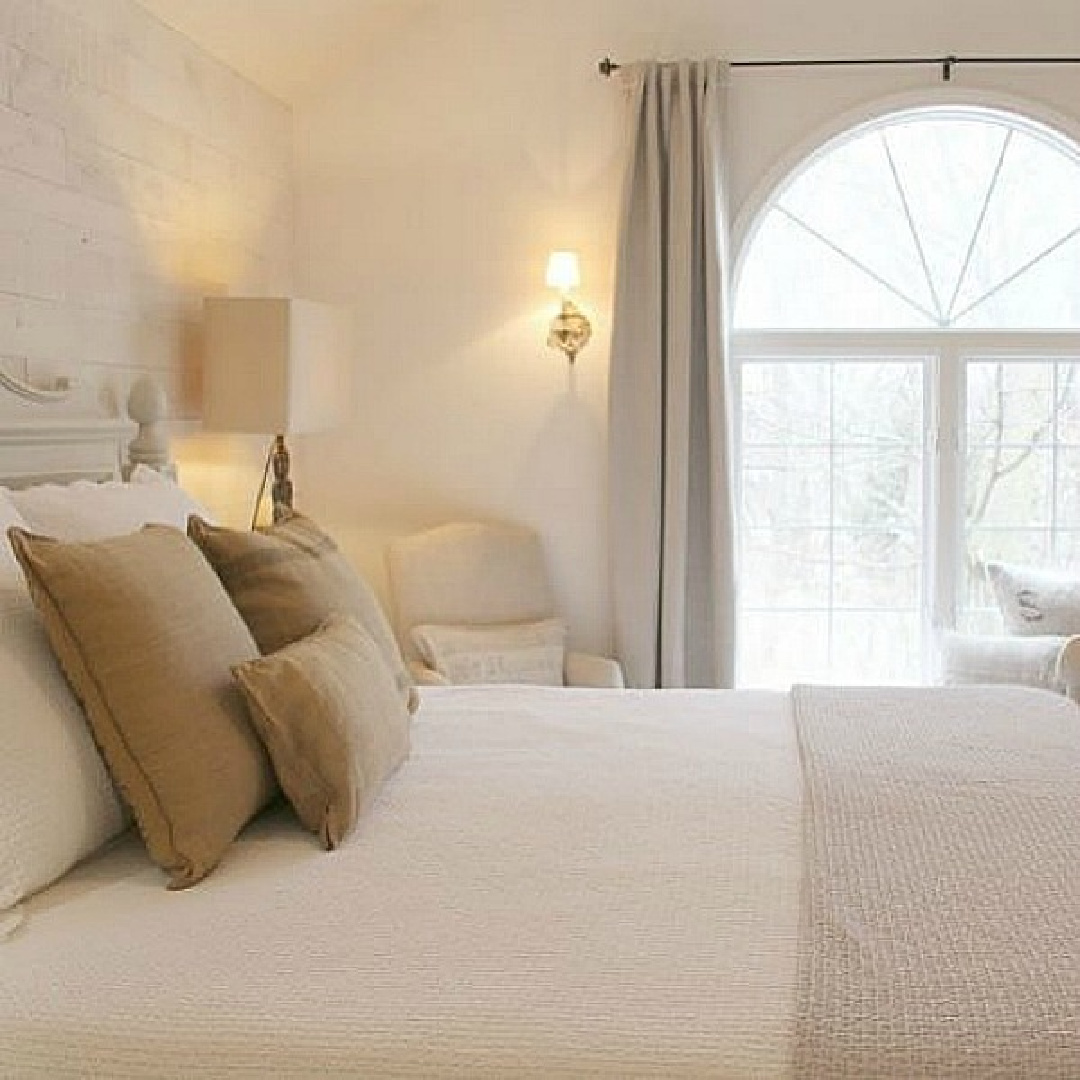
In fact, there are endless variations with varying pigments, LRV, and temperature.
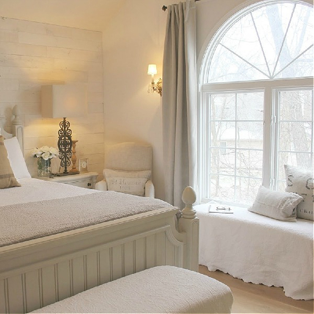
One of the most common questions I am asked all of the time is a version of: WHAT WHITE COLOR WILL MATCH WITH _________ AND _____________?
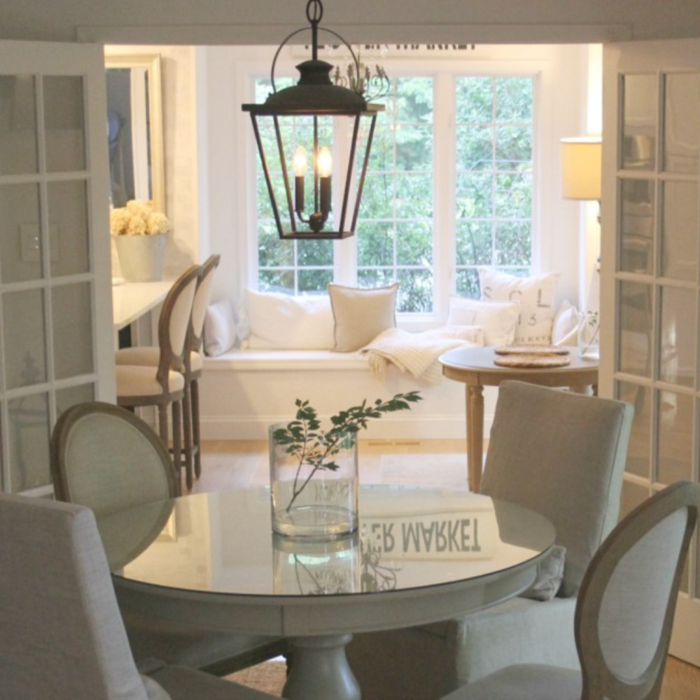
Most homeowners have little experience thinking about the beauty of a mix of whites living together.

Rather, they think the main goal is “matching” so that all of the whites (walls, cabinets, fabrics, trim, furniture) are the same white. But matching is NOT the objective and can leave the composition flat and uninteresting. To arrive at a pleasing, sophisticated, welcoming overall mood, it’s better to lean into concepts of harmony and balance as opposed to matching.
1. Whites Interact With Natural Light & Geographical Location
Since I live in Northern Illinois where the light is wholly different from the light in the Southwest, white paint colors here take on a particular quality as a result of the light. I like the contrast of BM OC-151 with warmer linen colors, sunlight and golden tones from light wood.
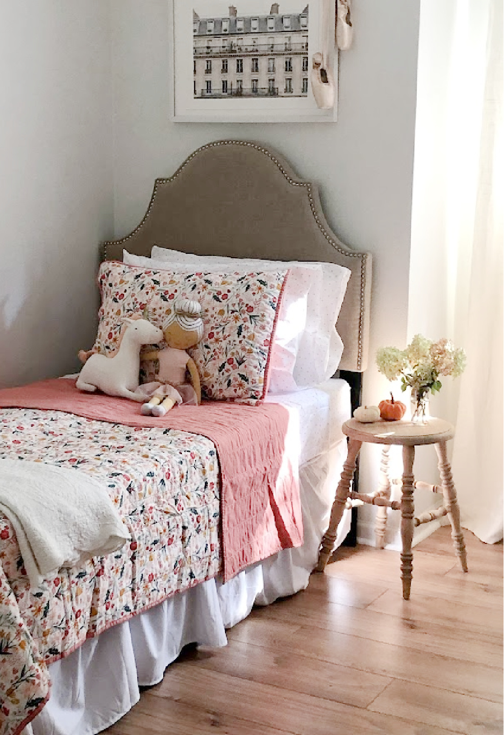
2. A Wildly Popular White Paint May Not Be the Right White
There are certain bestselling whites that work for a ton of spaces across the country, but they aren’t guaranteed to be the most flattering to your home. I had never heard of OC-151 and started with samples of BM Decorators White, White Dove, and SW Alabaster.
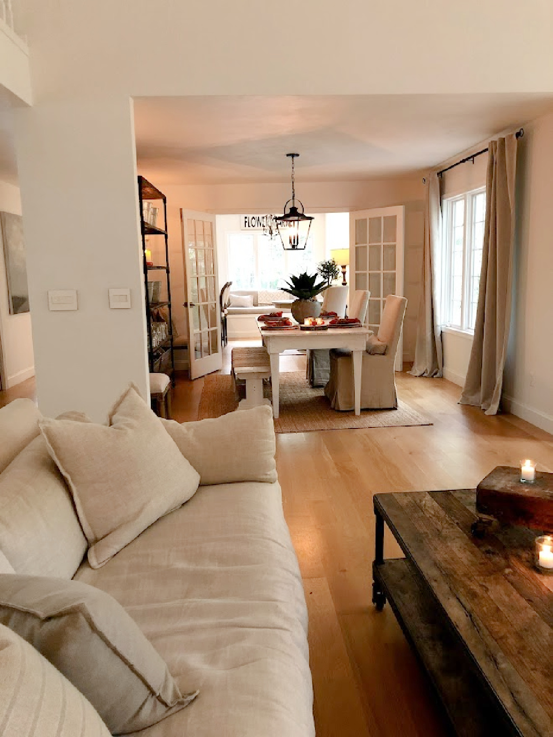
As soon as I sampled this color with the most boring name (sample Benjamin Moore White right here), it was the only choice that immediately felt right. To choose the BEST WHITE, don’t become obsessed with just one color you see in an image or on Pinterest and assume it will be perfect without trying a sample.
Why?
First, professional photography for print or web often involves editing. Second, your room’s location and lighting are unique. Third, often a lot of folks experience an emotional reaction to the mere NAME of a paint color which doesn’t mean a thing.
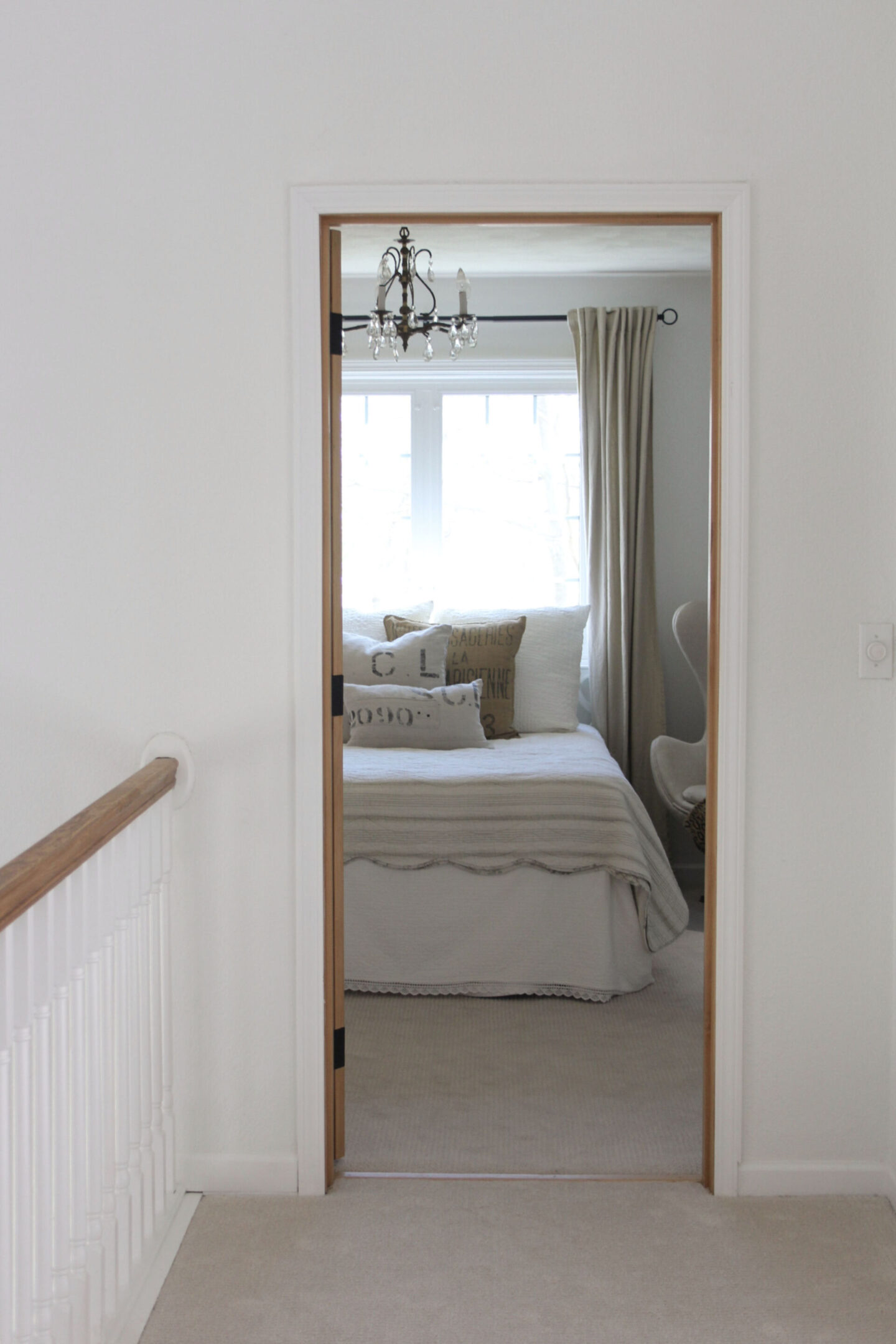
3. Sample This Benjamin Moore White With Other Whites
Begin with a handful of samples for your walls. You could also try Brilliant White OC-150, Sherwin-Williams SW Extra White, and BM Chantilly Lace.
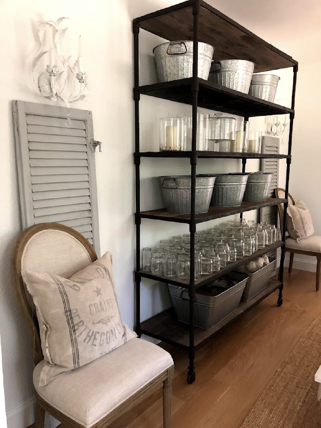
You’ll begin to notice the subtle differences and see the influence of undertones.
In our own home (we’re on our 6th whole house DIY renovation), I first selected about five different bright clean white contenders.

4. Analyze the White Paint Samples
After viewing the samples in different rooms throughout the home at different times of day, I scrutinized. I took time to notice how the white changed or didn’t change throughout the day.
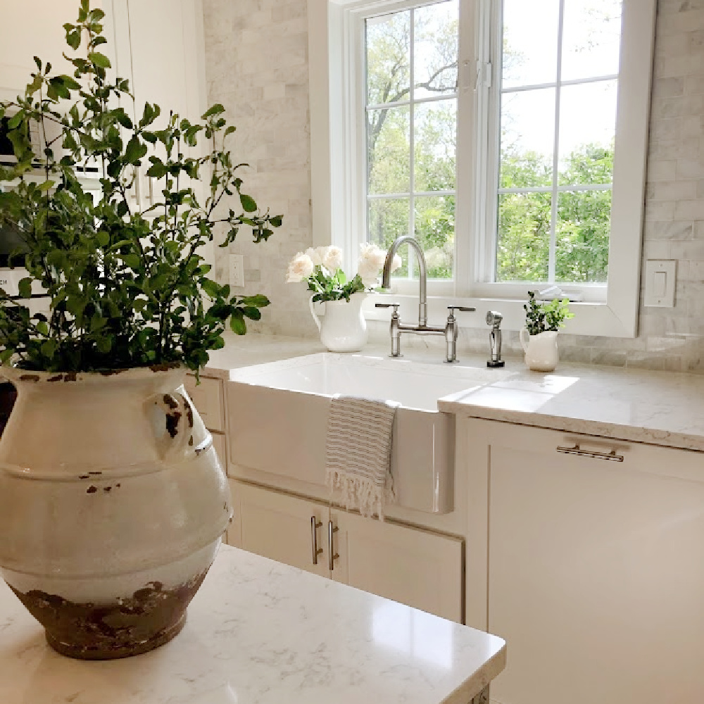
5. Undertones in White Paint
All whites have subtle undertones of grey, pink, yellow, brown, blue, etc. which influence the white’s temperature and perception in varying light.
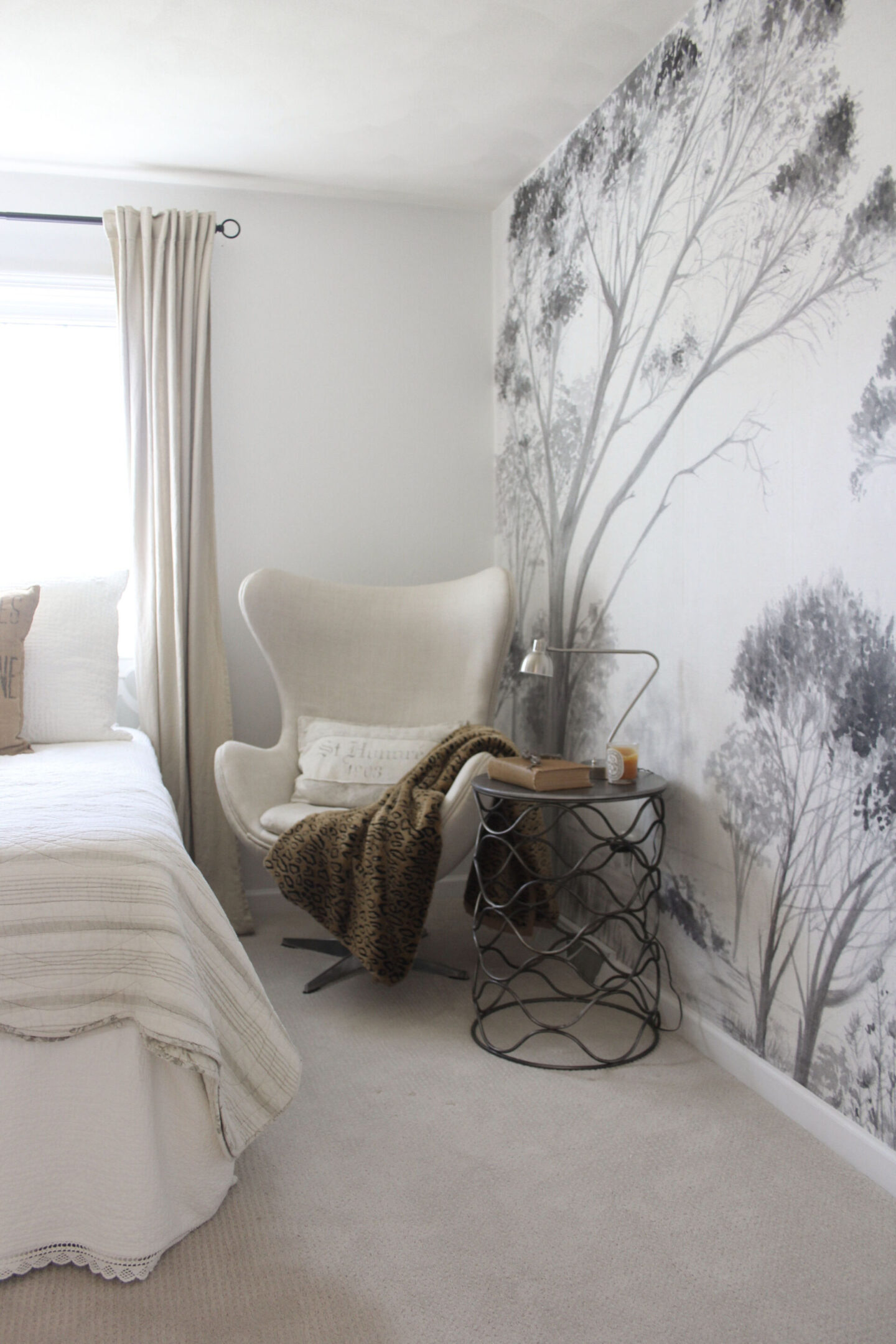
Even your age can come into play as far as perceiving color. Did you know as we age, the lens of the eye gradually yellows?
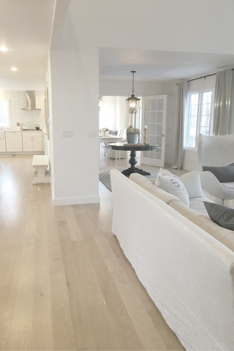
This yellowing lens will influence perception of colors. The lens will likely absorb and scatter blue light so that it is trickier to notice nuances in shades of purple, green or blue.
6. Why I Ultimately Chose This BM Neutral
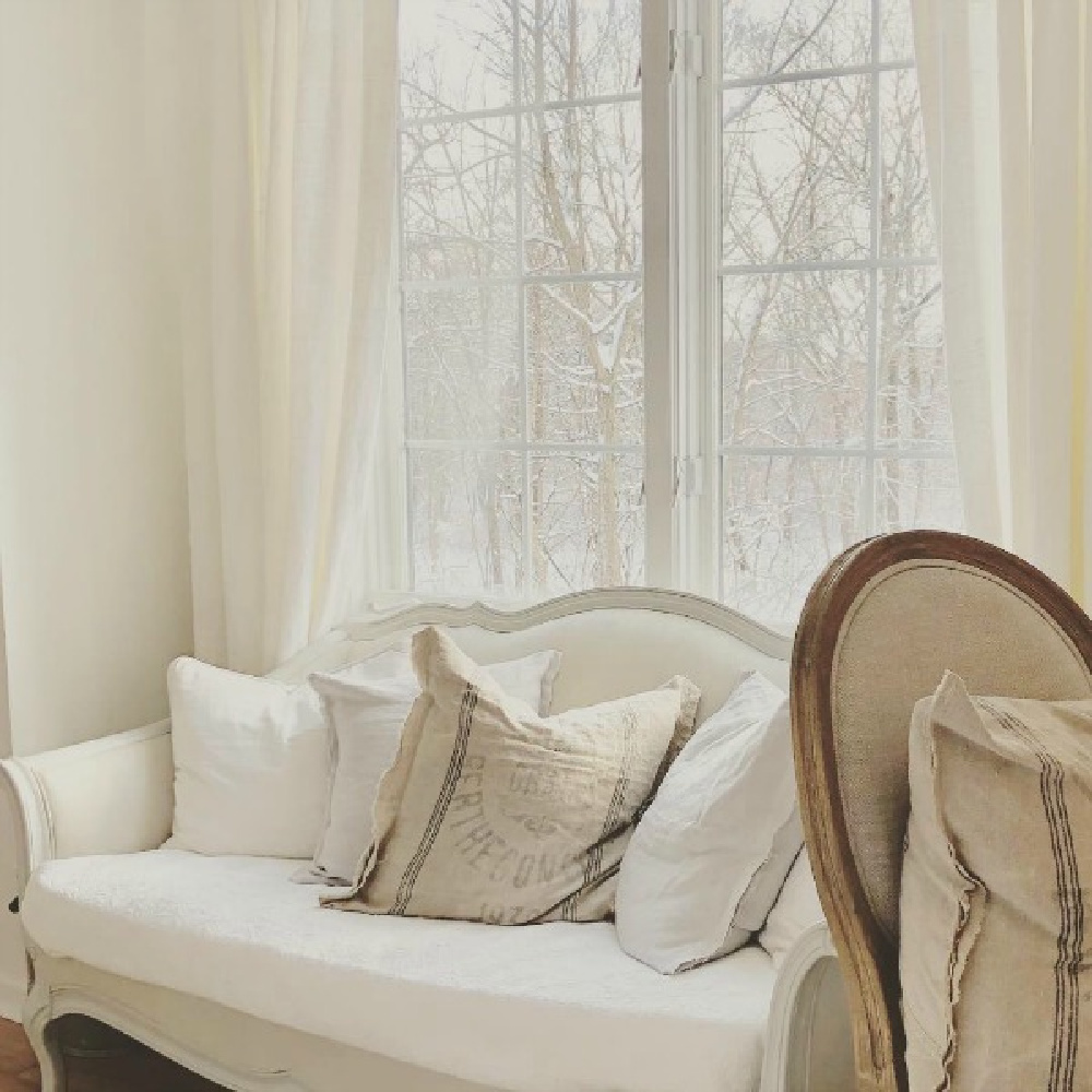
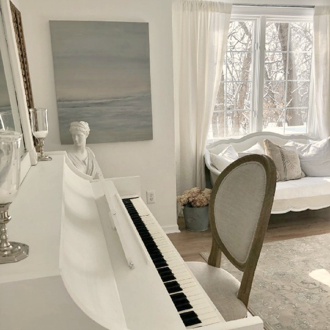
I can imagine that this white could be too stark for certain interiors, but in ours, it took on a cool, modern, gallery-like, slightly monastic and ethereal feel. You can see the snow outside in this image I snapped and how it reads much colder than the paint color.
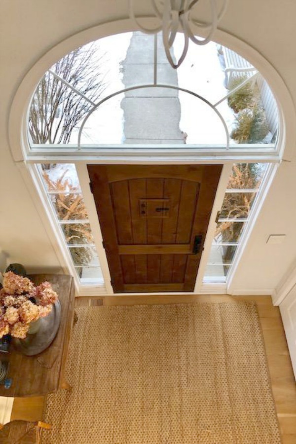
Will the Right White Stand the Test of Time?
We painted all the walls, trim, and ceilings in our North-South exposure home (which receives intense yellow sunlight) BENJAMIN MOORE White OC-151. Seven years later when we put the home on the market, we still loved it and had no plans to change it. Trends come and go, but when you stick to classics and listen to what a home’s architecture and lighting are whispering, you’re saving yourself a lot of time and money in the long haul.
What a transformation when we painted over yellow walls!
The minimal simplicity of the name of this Benjamin Moore white means there’s no chance we’ll forget the color’s name!
7. Choose the Most Flattering White Rather than a Trending Color
BM OC-151 White does not seem to be internet popular as it is cool white and perhaps not as gentle as white paints I chose for other homes.
8. More White Hues to Consider
BENJAMIN MOORE White Dove remains a favorite of mine for vintage furniture and what I chose to paint my family piano.
9. Viewing Image Galleries Online Helps
While there are paint color experts who may advise against stalking Pinterest and blogs for paint color ideas, I have my own opinion (however biased it is as a blogger!).
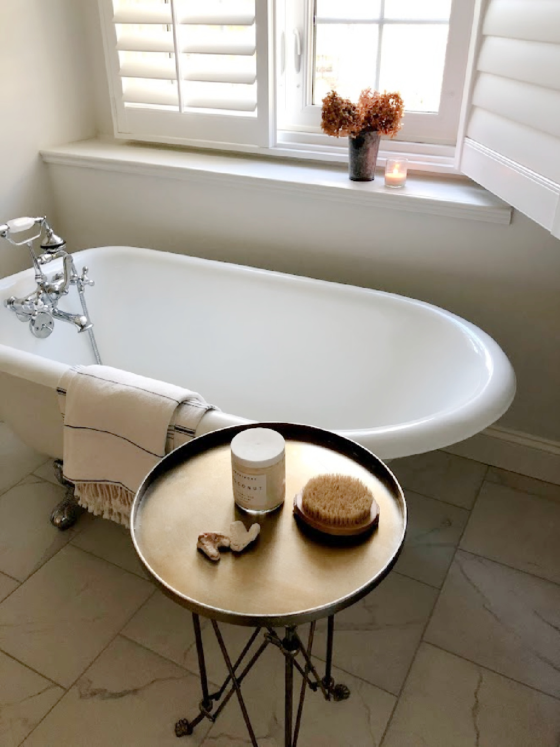
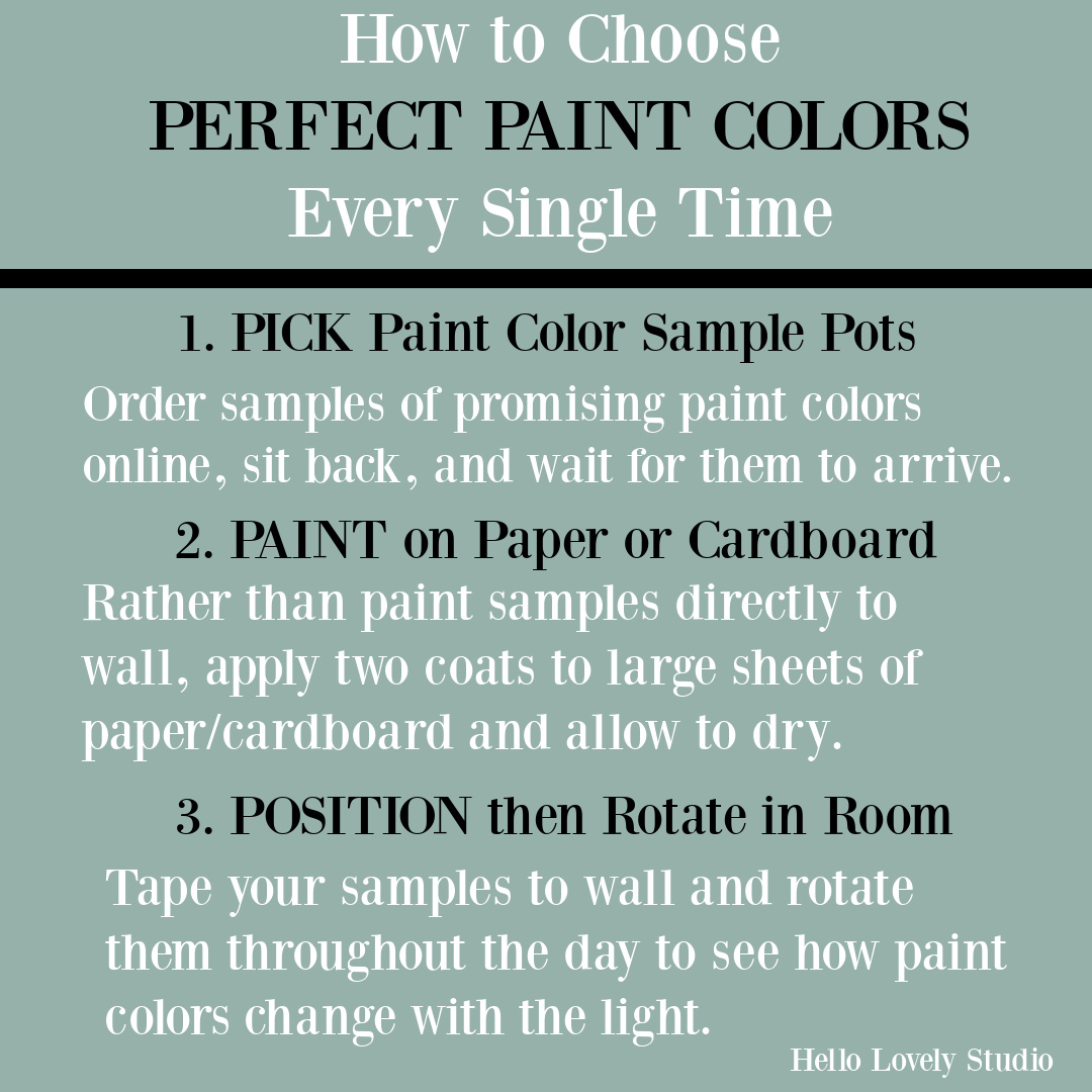
Collecting images of beautiful white painted rooms online or in shelter magazines (where the paint color name is provided) can be far more helpful for securing initial samples than deliberating over teeny pieces of cardstock under fluorescent lighting at the paint counter.
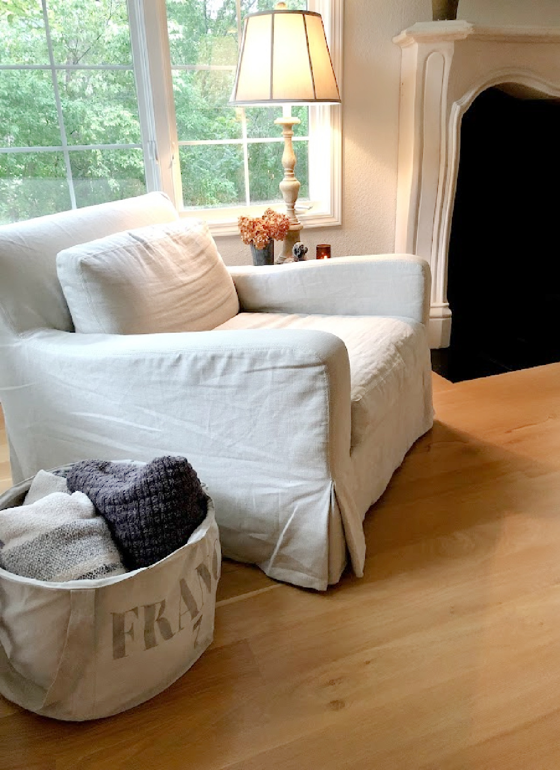
If you can’t wait for peel and stick paint samples to arrive in the mail and want to rush out to a paint store or big box paint counter for paint pots immediately…
Ever considered painting wood cabinets to brighten up your kitchen, bath, or laundry room?
Here’s a tutorial.
10. Pinterest for Paint Color Search
I have a Pinterest board HERE and white paint favorites HERE devoted to paint colors so you’ll score ideas.
BONUS TIP: Create your own Pinterest board devoted solely to white paint colors.
Peace to you right where you are.
-michele
I independently selected products in this post—if you buy from one of my links, I may earn a commission.
Thanks for shopping RIGHT HERE to keep decor inspiration flowing on Hello Lovely!
Hello Lovely is a participant in the Amazon Services LLC Associates Program, an affiliate advertising program designed to provide a means for sites to earn fees by linking to Amazon.com and affiliated sites.
