There have been plenty of paint color themed posts this month for good reason. As a paint color consultant, I can tell you folks love to begin planning their DIYs and home improvement in winter. And we need as many color ideas as possible since it takes a few samples to land on the best option. I appreciate it when interior designers share the names of neutral wall paint colors in their projects…especially showhouses. The benefit goes beyond how we get their professional approval or score paint names to sample. It is also helpful when (1) you can view the color in person, and (2) multiple photos are taken by visitors to the showhouse so we see the space in various lighting situations. Professional photos of interiors frequently are edited or photographed in the best light…but shadowy glimpses help too.
![Arched window seat nook with storage beneath in a beautiful French country new build home - Brit Jones.](https://www.hellolovelystudio.com/wp-content/uploads/2022/04/001-brit-jones-Rustic-French-farmhouse-den-Sherwin-Williams-Alabaster-window-seat-nook.jpg)
Neutral Wall Paint Colors Designers Give a Thumbs Up
What Makes a Paint Color “Neutral?”
Even though I write about neutrals alllll the time, sometimes it helps to backtrack and consider what we even mean by neutral paint color. A neutral paint color is typically muted and has undertones that will be perceived differently depending on the lighting context. The most common neutrals are usually described as gray, beige, white, cream, tan, putty, greige, black, and brown.
![Benjamin Moore PALE OAK on kitchen cabinets in a gorgeous warm, European inspired luxe kitchen by AKB Design. #benjaminmoorepaleoak #warmwhitekitchen #whitekitchencabinetcolor](https://www.hellolovelystudio.com/wp-content/uploads/2024/01/benjamin-moore-pale-oak-kitchen-cabinets-akb-design-2.jpg)
Wait a second though. Do neutrals need to be muted? Blacks and browns in a wardrobe are considered neutral since they complement a wide range of other colors. My personal opinion is there are plenty of colors in the land of neutrals that while neutral, aren’t commonly used neutrals. As an example, let’s start with a beautiful idea home from Southern Living and an incredible design and color story in the basement.
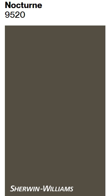
Sherwin-Williams NOCTURNE
Designer Laura Hodges chose Nocturne for the walls in this Leipers Fork home imagined for a family, and it creates a whole lotta warmth.
![Sherwin Williams NOCTURNE in a basement lounge by Laura Hodges Studio for Southern Living Idea House 2023. #sherwinwilliamsnocturne #moodypaintcolors](https://www.hellolovelystudio.com/wp-content/uploads/2024/01/sherwin-williams-nocturne-basement-southern-living-idea-house-2023-laura-hodgest-studio-leipers-fork.jpg)
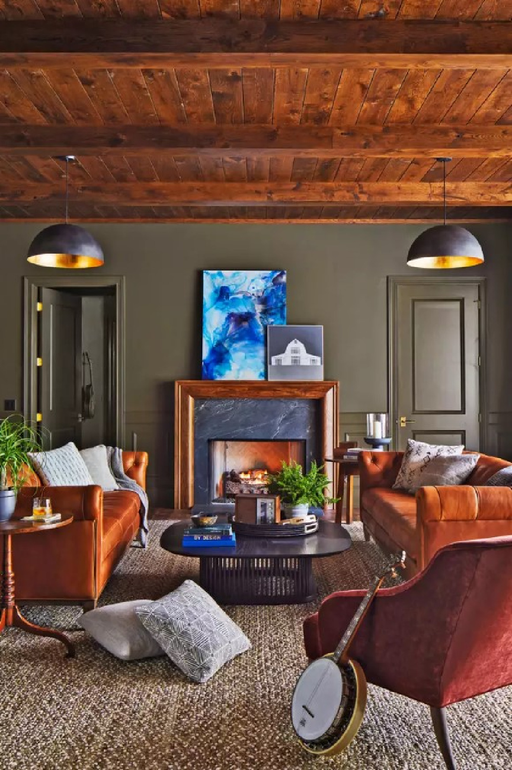
Is it too deep and moody for you to consider a neutral? It is quieting, sophisticated, and calm though. Because I’m seeing so many homeowners choose similar colors for studies, offices, home libraries, and media rooms where the whole point is to be enveloped in velvety richness.
Does Nocturne remind you of Sherwin-Williams Iron Ore or Urbane Bronze? I’m definitely perceiving the green undertones in Nocturne. Similar to Nocturne and selected for the pantry in this idea house…
Sherwin-Williams FORGED STEEL
Forged Steel is a strong color that pairs so well with natural wood tones, yes?
![Sherwin Williams FORGED STEEL painted pantry by Laura Hodges Studio for Southern Living Idea House 2023. #forged steel #moodypaintcolors](https://www.hellolovelystudio.com/wp-content/uploads/2024/01/sherwin-williams-forged-steel-pantry-southern-living-idea-house-2023-laura-hodges-studio-leipers-fork.jpg)
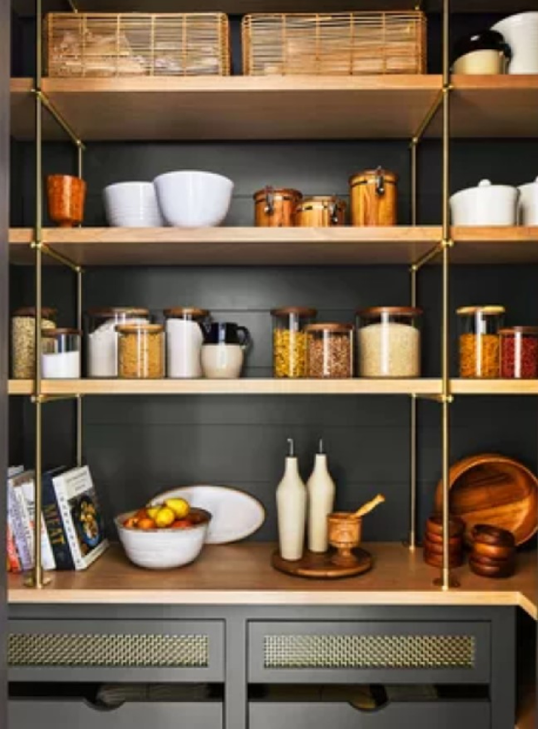
This neutral wall color is similar to Benjamin Moore Iron Ore and also SW Shade-Grown. Its LRV is 10 so not one of those shy neutrals we tend to imagine when we hear “neutral” or even “natural.”
It’s beautiful to use when you’re after interesting contrasts and can definitely make a statement. There aren’t many design elements such as paint where for a little money, you can add drama, warmth, character, and strength in one fell swoop.
![Encouragement quote on Hello Lovely Studio. #encouragementquotes #strugglequotes](https://www.hellolovelystudio.com/wp-content/uploads/2023/12/ENCOURAGEMENT-quote-hello-lovely-studio-001.jpg)
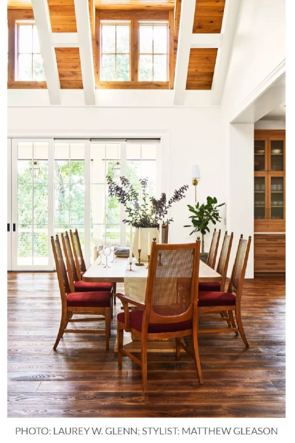
Sherwin-Williams WHITETAIL 7103
In the living and dining rooms of the 2023 Idea House, a warm off-white with yellow undertone was chosen for walls. It’s bright with its light reflectance value of 86.
![Sherwin Williams WHITETAIL in a living room by Laura Hodges Studio for Southern Living Idea House 2023. #whitetail #whitepaintcolors](https://www.hellolovelystudio.com/wp-content/uploads/2024/01/sherwin-williams-white-tail-southern-living-ideas-house-2023-leipers-fork.jpg)
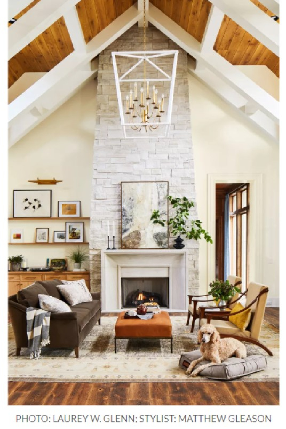
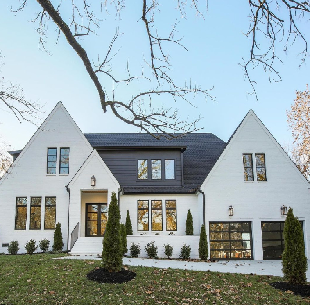
I’m wondering if yellow tones are gaining popularity…will antique white replace all of those cool modern farmhouse whites? While similar to Benjamin Moore’s Swiss Coffee and White Dove as well as SW Alabaster (see image at very top), you can definitely perceive yellow in the room above.
Coordinating colors for Whitetail? Sherwin-Williams recommends Cocoa Whip and Touch of Sand. (Personally, I think SW ought to hire me to name and maybe re-name their colors and watch them become more sellable.)
![Sherwin Williams WHITETAIL in a dining room by Laura Hodges Studio for Southern Living Idea House 2023. #whitetail #whitepaintcolors](https://www.hellolovelystudio.com/wp-content/uploads/2024/01/sherwin-williams-white-tail-southern-living-ideas-house-2023-leipers-fork-dining-room.jpg)
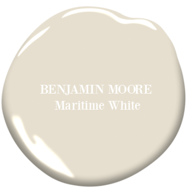
This white reminds me of…
![Maritime White Benjamin Moore paint color in bedroom with design by David Christensen for 2020 Southeastern Designer Showhouse. #maritimewhite #paintcolors](https://www.hellolovelystudio.com/wp-content/uploads/2019/07/maritime-white-benjamin-moore-paint-color-bedroom-southeastern-designer-showhouse-2020.jpg)
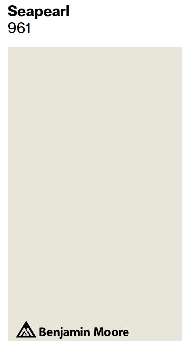
Benjamin Moore MARITIME WHITE
![Benjamin Moore Maritime White paint color swatch. #paintcolors #benjaminmoore #maritimewhite #warmwhites #interiordesign](https://www.hellolovelystudio.com/wp-content/uploads/2020/06/benjamin-moore-maritime-white-paint-color-swatch.png)
![Maritime White (Benjamin Moore) paint color on the walls of a coastal style entry in a luxurious traditional home - Kotzen Interiors). #paintcolors #benjaminmooremaritimewhite #maritimewhite #interiordesign #coastalstyle #entry](https://www.hellolovelystudio.com/wp-content/uploads/2020/06/benjamin-moore-maritime-white-paint-entry-coastal-home-katzen-interiors.jpg)
![Vulnerability poignant texting quote or tweet from Jon Acuff on Hello Lovely Studio. #textingtweet #lifequotes #vulnerabilityquotes](https://www.hellolovelystudio.com/wp-content/uploads/2023/02/poignant-tweet-texting-quote-jon-acuff-hello-lovely-studio.jpg)
Next up? Three gorgeous contenders for you to consider sampling. Psst. Aren’t they sort of magic together as you see on this mood board to pin:
![Neutral paint colors are designer picked from showhouses: SW Pure White, BM Oystershell, and SW First Star. #neutralpaintcolors](https://www.hellolovelystudio.com/wp-content/uploads/2021/06/neutral-paint-colors-from-a-showhouse-hello-lovely-studio-banner.jpg)
![SW Pure White paint color on walls of kitchen, scullery, bar, pantry in Southeastern Designer Showhouse 2022 - Cathy Rhodes Interiors. #swpurewhite #neutralpaintcolors](https://www.hellolovelystudio.com/wp-content/uploads/2021/06/cathyrhodesinteriors-southeastern-designer-showhouse-2022-kitchen-pantry-bar-2.jpg)
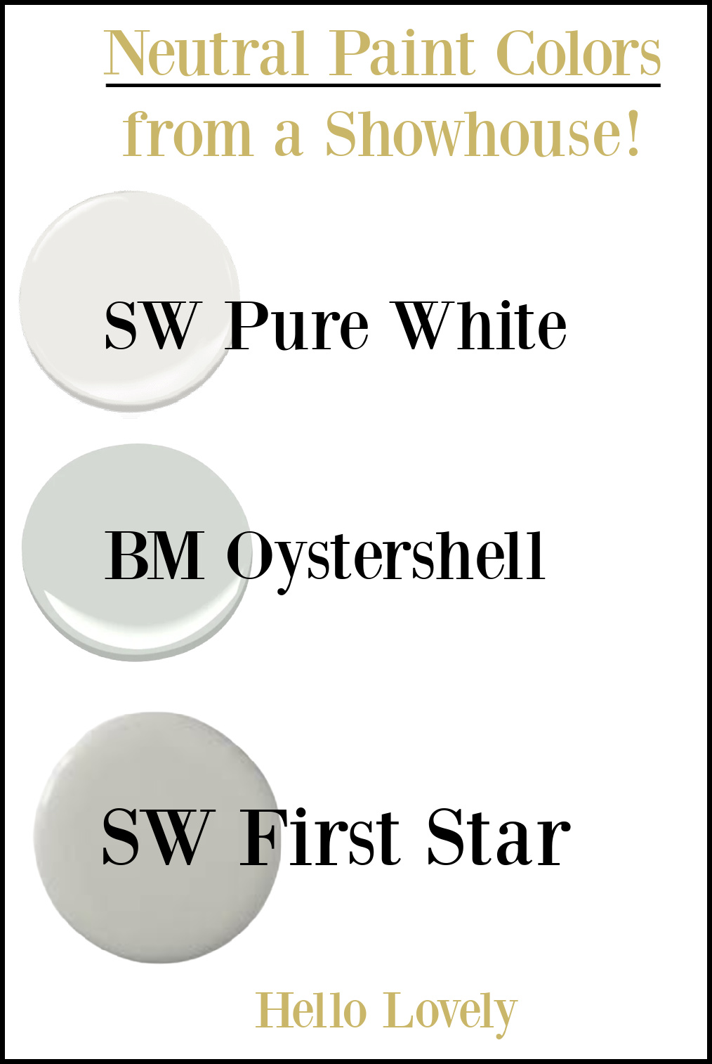
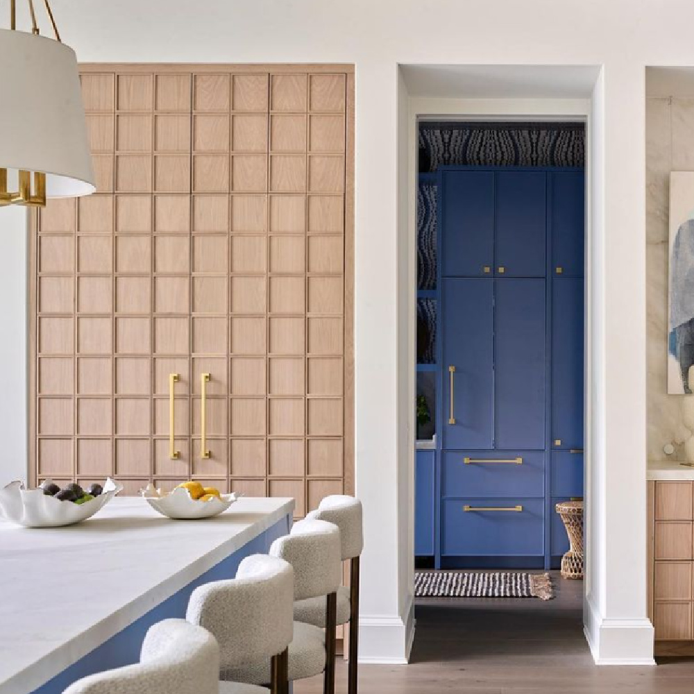
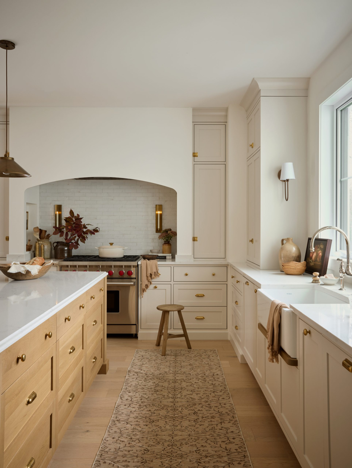
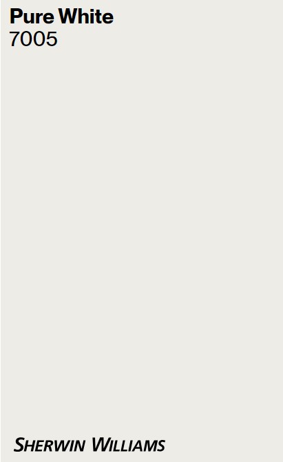
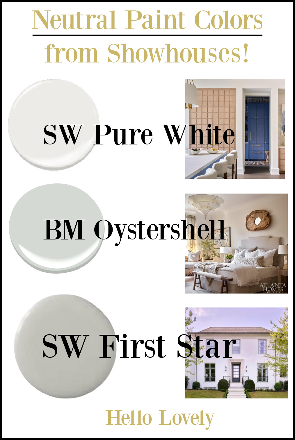
Sherwin-Williams PURE WHITE 7005
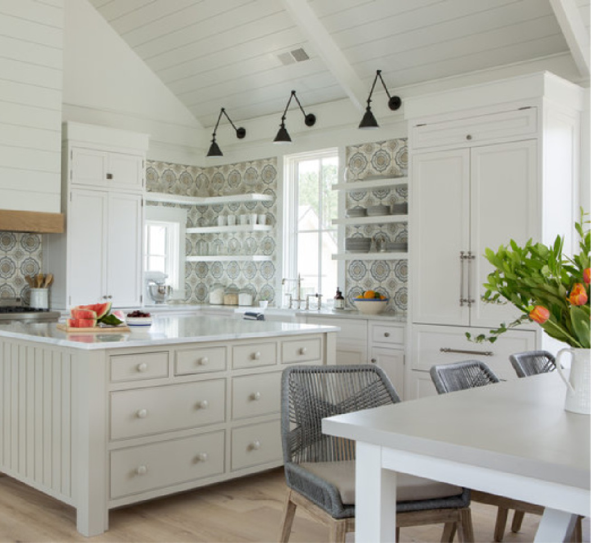
This is a reflective white we covered HERE, and it happens to be a bestseller at Sherwin-Williams. In this showhouse kitchen, it feels freshly modern and is warmed by wood cabinetry along with that strikingly bold blue..
![SW Pure White paint color on walls of kitchen, scullery, bar, pantry in Southeastern Designer Showhouse 2022 - Cathy Rhodes Interiors. #swpurewhite #whitepaintcolors](https://www.hellolovelystudio.com/wp-content/uploads/2021/06/cathyrhodesinteriors-southeastern-designer-showhouse-2022-kitchen-pantry-bar-3.jpg)
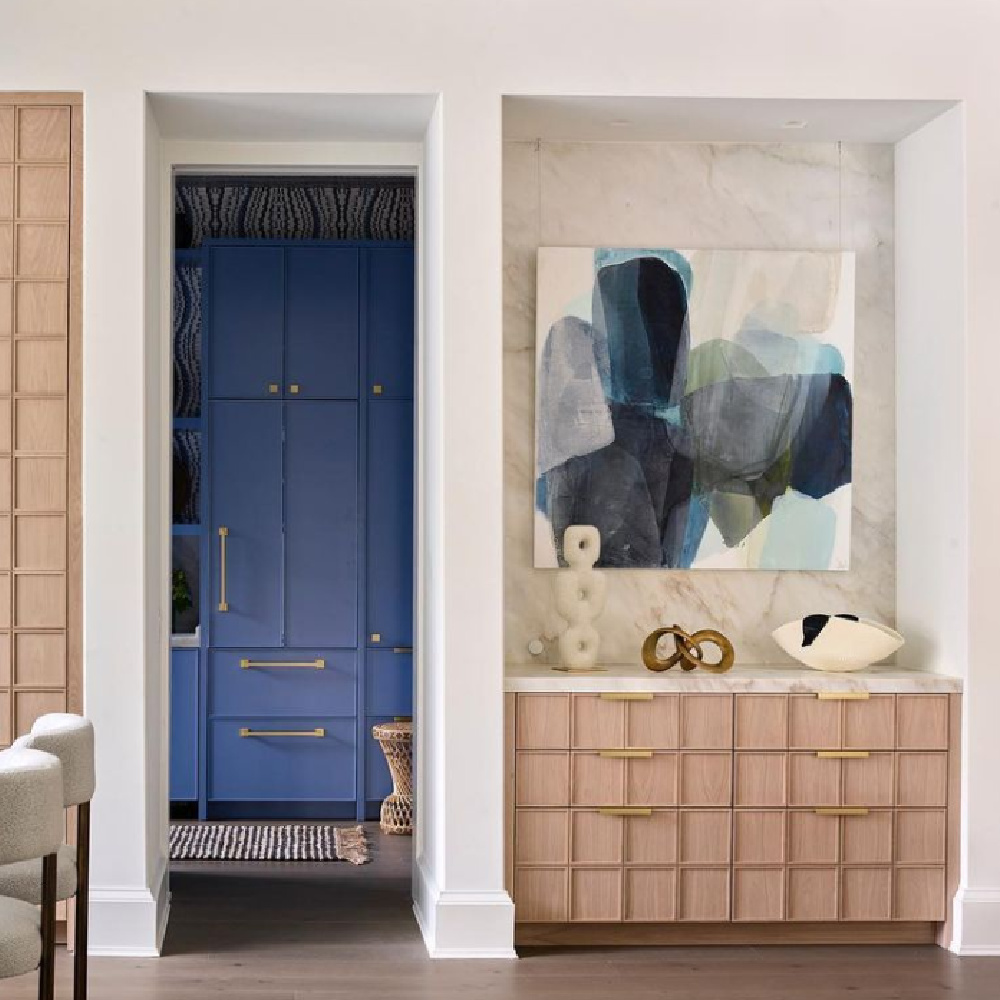
This Atlanta kitchen is such a great example of how neutral wall paint is but a single layer in an elegant design plan which may not have quiet, subdued, or calm qualities at all!
A vivid blue stands out and brings an energetic dynamic thanks to the understated walls with what SW calls a versatile bright white with the slightest yellow undertone.
![Southeastern Designer Showhouse kitchen 2022 with blue cabinetry white walls and light oak wood.](https://www.hellolovelystudio.com/wp-content/uploads/2023/05/southeastern-designer-showhouse-2022-kitchen-blue-cabinets.jpg)
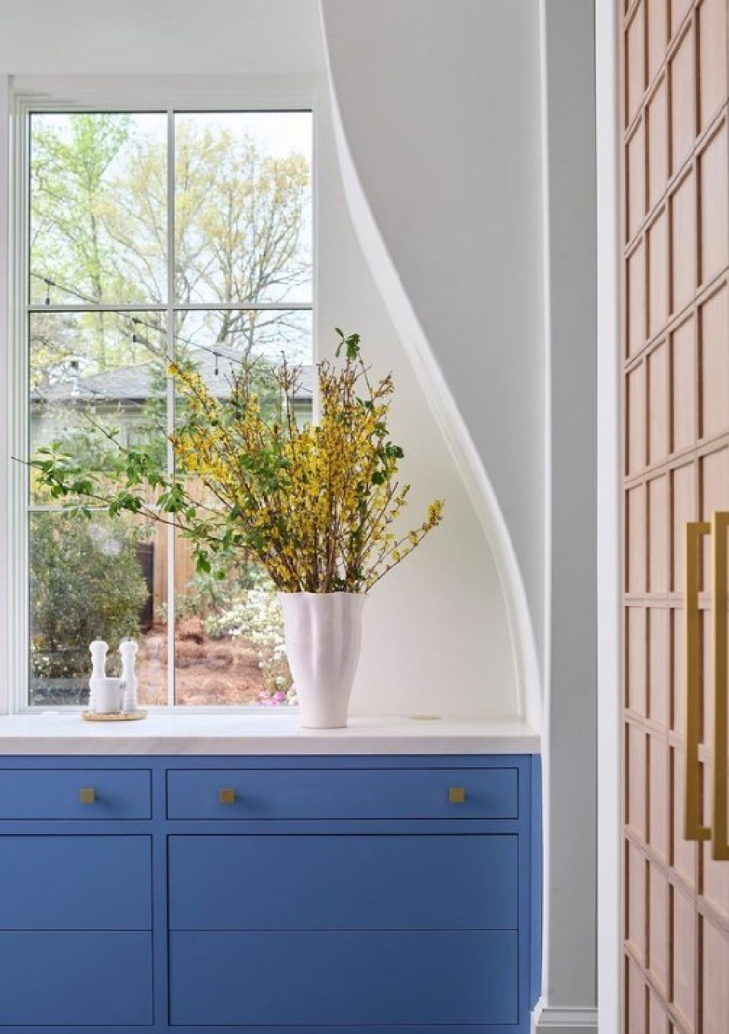
This kitchen’s magnificent architecture makes a statement too. Sometimes the paint color sets the mood, and sometimes a neutral is there to recede, to allow other elements to come forward with their story.
![Funny overwhelm quote from Hello Lovely Studio. #funnyquotes #overwhelmquotes #momlifequotes](https://www.hellolovelystudio.com/wp-content/uploads/2023/02/FUNNY-overwhelm-quote-Hello-Lovely-Studio.jpg)
More PURE WHITE Examples for Inspiration
![Sherwin Williams Pure White painted seaside living room with gallery wall and Belgian linen sofa - Pottery Barn. #sherwinwilliamspurewhite #coastallivingroom](https://www.hellolovelystudio.com/wp-content/uploads/2024/01/sherwin-williams-pure-white-pottery-barn-sofa.jpg)
The LRV for Pure White is 84 so it’s going to reflect tons of light.
![Bright white walls (Sherwin Williams Pure White) and black cabinets in a lovely kitchen by House of Silver Lining. #sherwinwilliamspurewhite #whitepaint #paintcolors #bestwhite](https://www.hellolovelystudio.com/wp-content/uploads/2020/08/whitest-white-paint-color-sherwin-williams-pure-white-kitchen-black-cabinets-house-of-silver-lining.jpg)
Even though we’re focusing on wall colors, if you’re searching for house exterior paint colors, these ideas may be helpful too.
![SW Pure White paint color on a beautiful new house exterior by 2kDevelopment. #swpurewhite #whitehousecolors #whitehousepaintcolors](https://www.hellolovelystudio.com/wp-content/uploads/2022/06/sw-pure-white-paint-color-house-exterior-2kdevelopment.jpg)
Curious about coordinating colors? Look at March Wind and Perle Noir for ideas on how these may work together. And don’t forget if you’re after a white paint for an exterior, the color name may not have “white” in it:
![Breathtaking front door and entry to traditional style white stucco mansion in Buckhead. The 2020 Southeastern Designer Showhouse 'Villa Flora' is painted Benjamin Moore Seapearl and trim is Benjamin Moore Pashmina. #paintcolors #seapearl #benjaminmooreseapearl #pashmina #benjaminmoorepashmina #houseexteriors #housecolors](https://www.hellolovelystudio.com/wp-content/uploads/2020/06/southeastern-designer-showhouse-2020-exterior-david-christensen-atlanta-homes-lifestyles-villa-flora.jpg)
Ooooooh, I forgot about the beauty of PASHMINA:
![Benjamin Moore PASHMINA on a kitchen island in a beautiful coastal classic kitchen by Lisa Furey Interiors. #benjaminmoorepashmina #benjaminmoorewhiteoc151](https://www.hellolovelystudio.com/wp-content/uploads/2024/01/benjamin-moore-pashmina-kitchen-island-coastal-lisa-furey-shiplap.jpg)
![Encouragement quote on Hello Lovely Studio to uplift and soothe in times of struggle. #strugglequotes #encouragementquotes](https://www.hellolovelystudio.com/wp-content/uploads/2023/02/sunrise-sunset-encouragement-quote-HELLO-LOVELY-STUDIO.jpg)
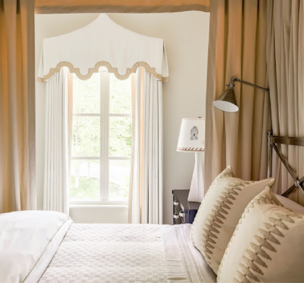
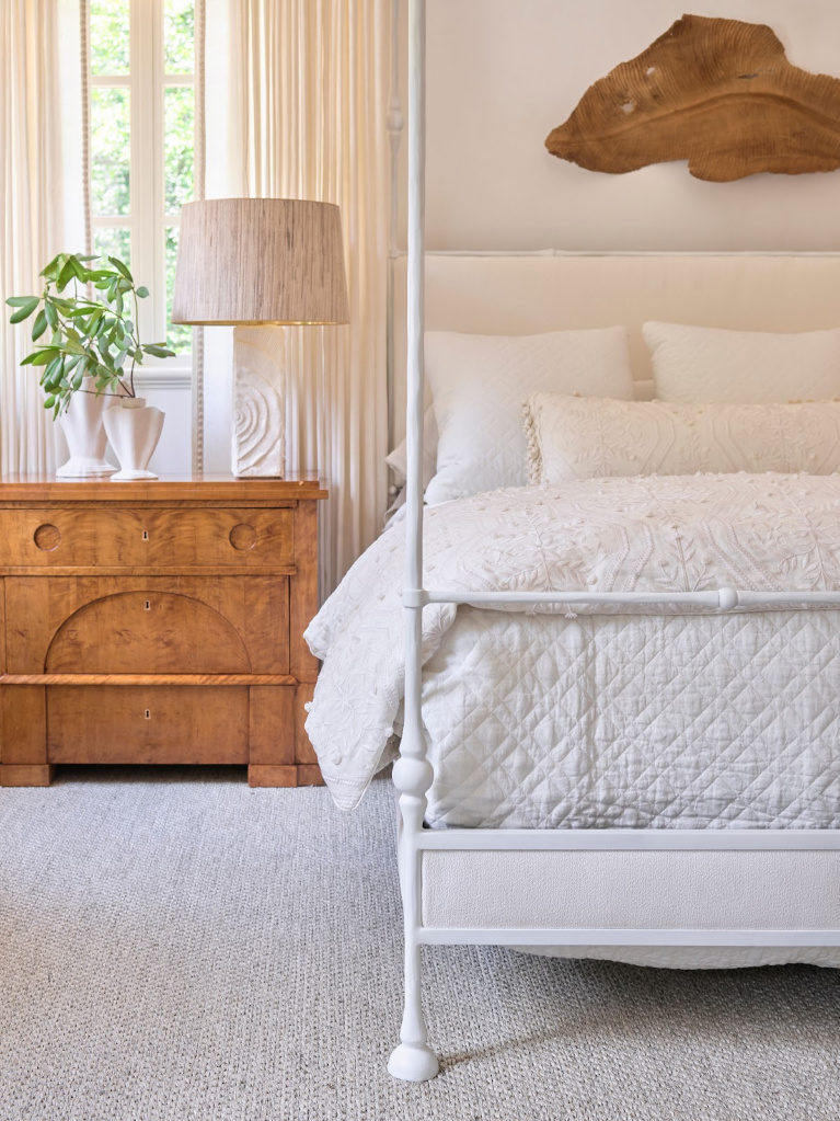
Here’s the neutral wall color Seapearl in a bedroom:
![Stunning traditional style white bedroom designed by Phoebe Howard. COME FIND 3 Neutral Paint Color Ideas from Southeastern Designer Showhouse 2020! #bedroomdesign #phoebehoward #interiordesign #benjaminmooreseapearl #traditionalstyle](https://www.hellolovelystudio.com/wp-content/uploads/2020/06/southeastern-designer-showhouse-phoebe-howard-bedroom.jpg)
Easiest way to see if a color is right? Order samples to be delivered to your door with Samplize (a peel and stick sheet of “paint” to stick on your wall and easily move around to other walls!).
![Serene, sophisticated, stunning white bedroom by designer Phoebe Howard for the 2020 Southeastern Designer Showhouse. #bedroomdecor #phoebehoward #interiordesign #whitebedrooms #traditionalstyle](https://www.hellolovelystudio.com/wp-content/uploads/2020/06/atlanta-homes-lifestyles-southeastern-designher-showhouse-2020-phoebe-howard-white-bedroom.jpg)
![Seapearl by Benjamin Moore is the white color above the paneled wainscot in this powder room while Stonington Gray is the paint color on trim. #powderroom #paintcolors #benjaminmooreseapearl #benjaminmoorestoningtongray #seapearl #stoningtongray](https://www.hellolovelystudio.com/wp-content/uploads/2020/06/benjamin-moore-sea-pearl-paint-walls-powder-room-stonington-gray-wainscot.jpg)
![Seapearl white paint color from Benjamin Moore on the walls of an entry in a modern farmhouse by Veranda Estate Homes. #seapearl #benjaminmooreseapearl #paintcolors #interiordesign #entry #modernfarmhouse](https://www.hellolovelystudio.com/wp-content/uploads/2020/06/benjamin-moore-seapearl-paint-color-entry-staircase-veranda-estate-homes.jpg)
![Midlife feminist quote from Hello Lovely Studio about letting go of need for approval when you're over age 50. #over50life #over50quotes #feministquotes](https://www.hellolovelystudio.com/wp-content/uploads/2023/02/feminist-over-50-quote-hello-lovely-studio.jpg)
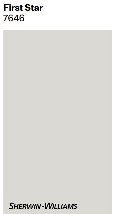
Sherwin-Williams FIRST STAR
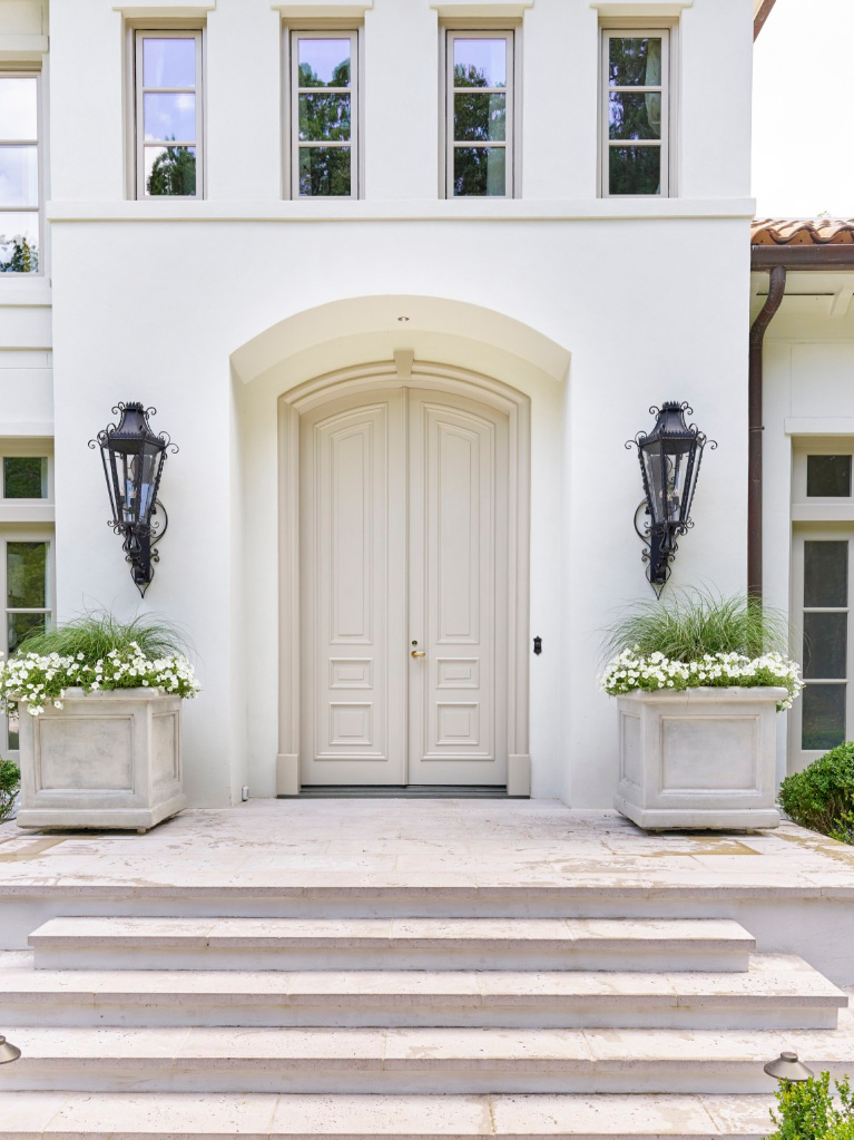
The new home built for Southeastern’s Showhouse in 2021 (steps from Buckhead’s Chastain Park) has a breathtaking facade!
![SW First Star paint color on exterior cornice of SE Showhouse 2021. #swfirststar #exteriorpaintcolors #neutralpaintcolors](https://www.hellolovelystudio.com/wp-content/uploads/2021/06/seshowhouse21-white-home-exterior.jpg)
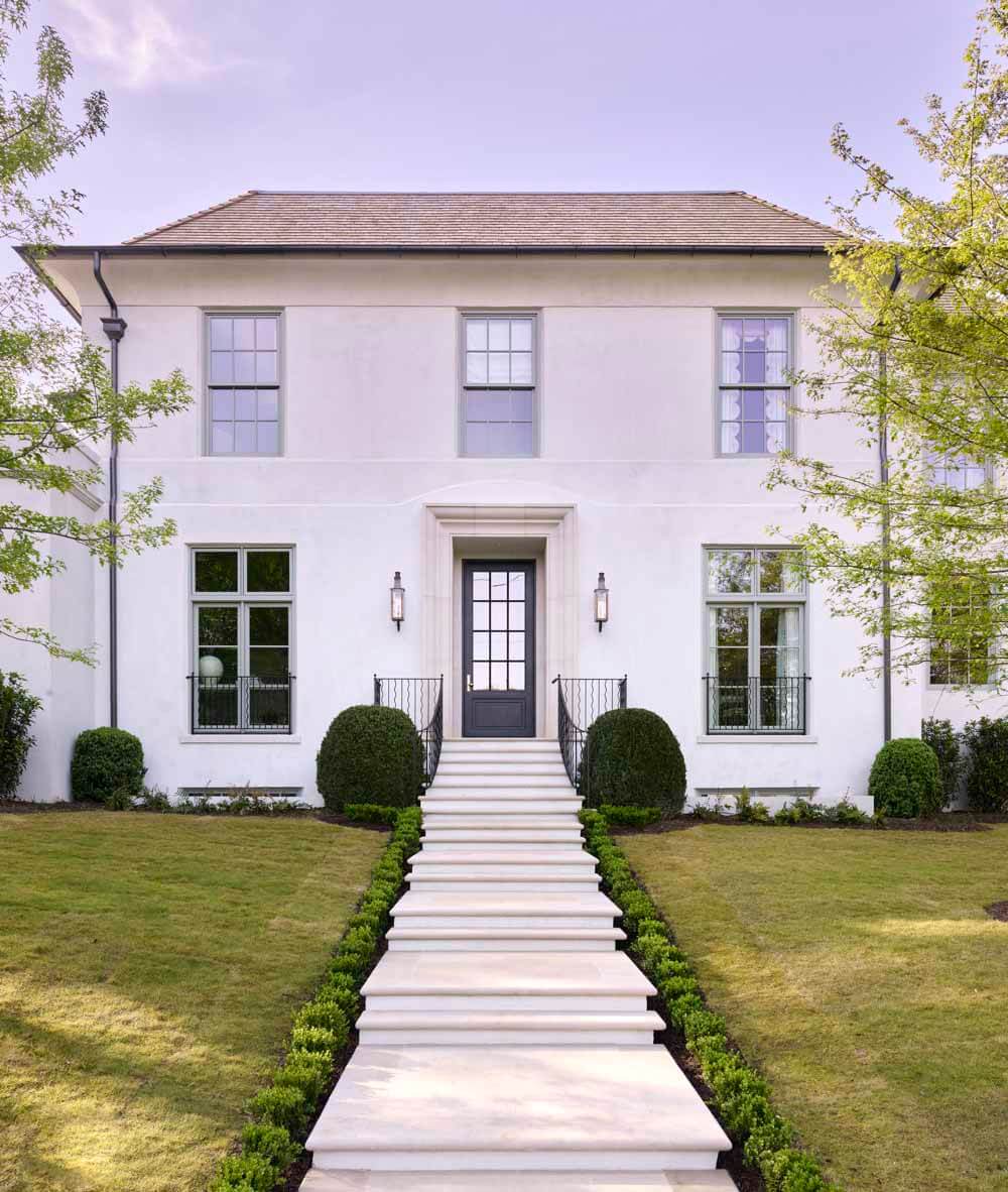
Love the color selected for the exterior? SW First Star has a light reflectance value (LRV) of 69. A value higher than that can begin to feel too bright depending on the context.
Pacific Fog, Solstice and Winter Walk are similar colors from Sherwin-Williams to peek at if you like First Star. Colors to coordinate with FIRST STAR include Ellie Gray, Deep Forest Brown, and Extra White. What’s wonderful about knowing these coordinating paints is they may help you develop an exterior color story for siding, trim, doors, shutters, etc.
Some designers stick with the rule that the LRV for an exterior should be below 80. Care to see more peeks inside this Tuxedo Park home?
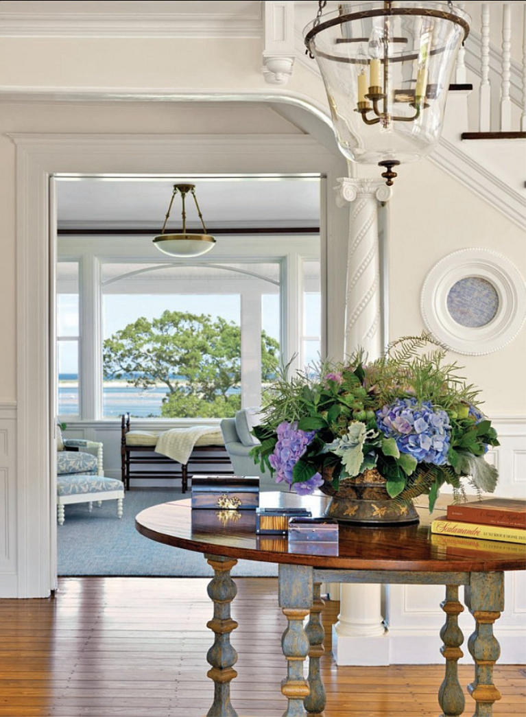
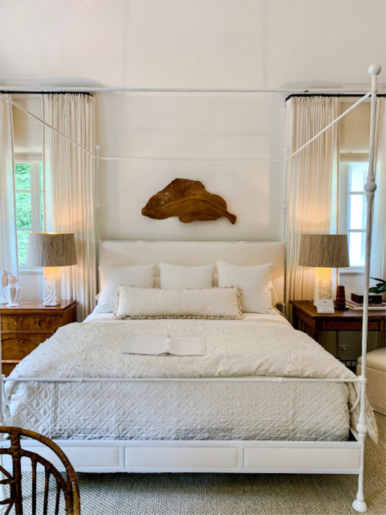
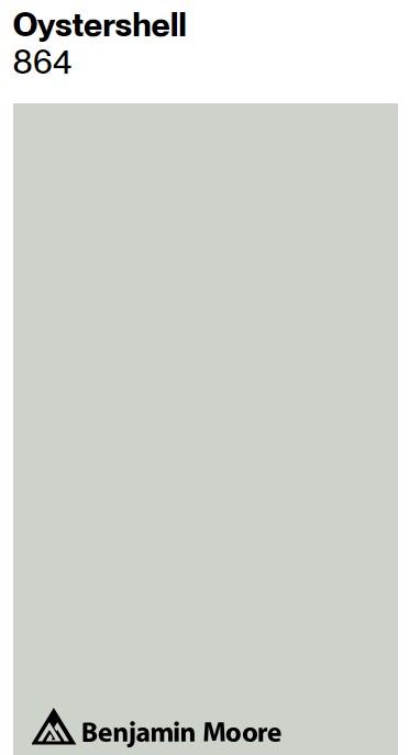
Neutral Wall Paint Color: Benjamin Moore OYSTERSHELL
Here’s an example of a neutral (LRV is 67.87) bringing serenity to a tone on tone bedroom from a 2021 showhouse:
![BM Oystershell paint color in a beautiful bedroom designed by Kati Hardwick. #bmoystershell #neutralpaintcolors](https://www.hellolovelystudio.com/wp-content/uploads/2021/06/bm-oystershell-paint-color-bedroom-seshowhouse21-atlanta-homes.jpg)
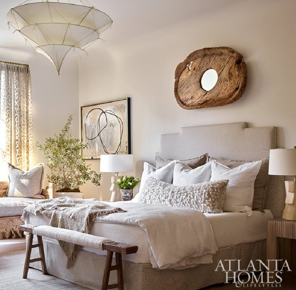
Sometimes a neutral is hard to pin down in terms of coolness or warmth. This may be one of those chameleon-like colors. In the room above, it appears rather warm and beige, but here’s the swatch:
SW calls it an eye pleasing gray with buoyant blue undertones. I’m currently living with chameleon greige colors, and they’re quite mysterious. Here’s SW Agreeable Gray downstairs:
![SW Agreeable Gray in tonal family room with built-ins and Belgian linen - Hello Lovely Studio. #swagreeablegray](https://www.hellolovelystudio.com/wp-content/uploads/2023/07/IMG_5480-1.jpg)
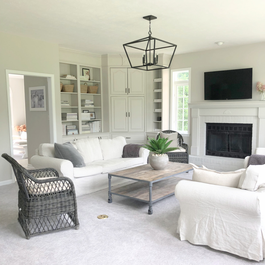
And then upstairs in a bedroom (below).
![SW Agreeable Gray on bedroom wall with tree mural (Photowall) and modern lift desk (BDI) - Hello Lovely Studio. #agreeablegray](https://www.hellolovelystudio.com/wp-content/uploads/2023/09/001-agreeable-gray-sherwin-williams-hello-lovely-studio-guest-bedroom.jpg)
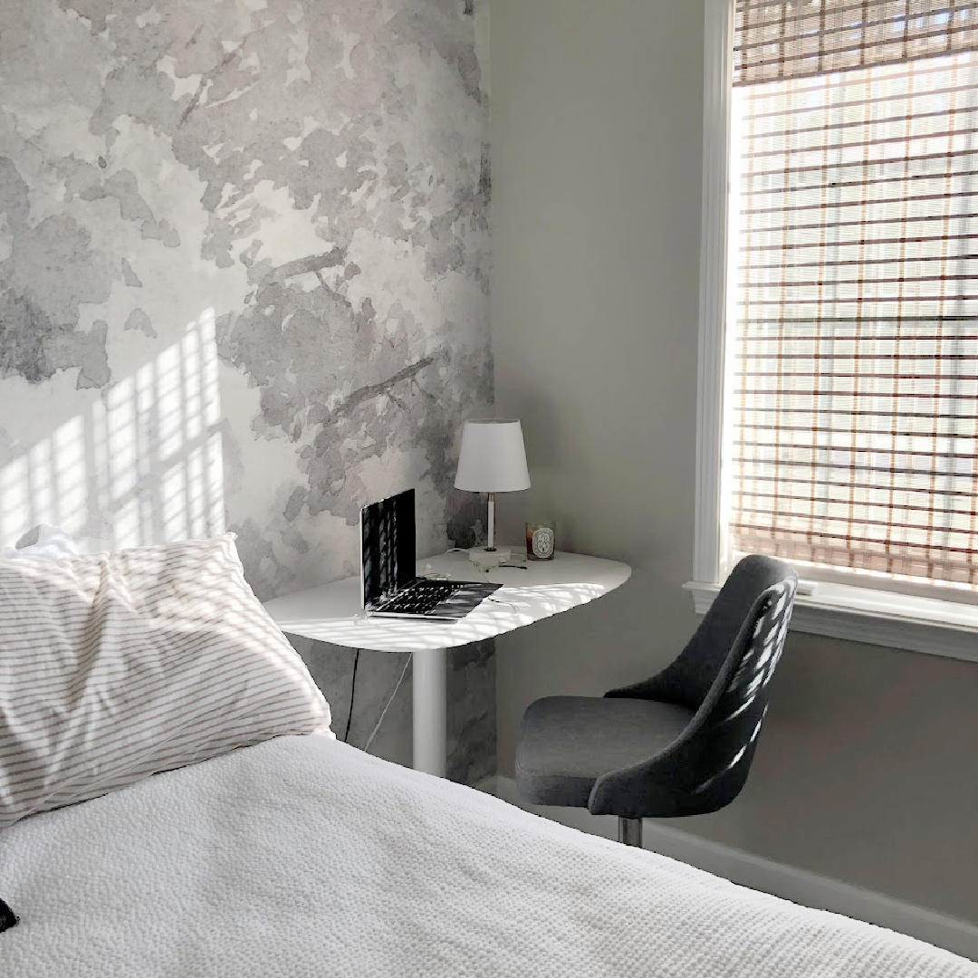
It looks so much cooler in certain light (yet still warm next to the cool greys in the grisaille wallpaper mural).
![Maritime White (Benjamin Moore) paint color on the walls of a coastal style entry in a luxurious traditional home - Kotzen Interiors). #paintcolors #benjaminmooremaritimewhite #maritimewhite #interiordesign #coastalstyle #entry](https://www.hellolovelystudio.com/wp-content/uploads/2020/06/benjamin-moore-maritime-white-paint-entry-coastal-home-katzen-interiors.jpg)
Why So Much Mindfulness About Neutral Wall Paint?
While it may seem like fluff to some, it’s not a superficial pursuit for me. Think of the hours you spend within those walls. We are all spending more time at home. Many are working remotely from home. Our homes seem to evolve as they serve as multi-generational living spaces, office, school, and spa.
![Howard Thurman quote on Hello Lovely about authenticity and self-awareness. #howardthurman](https://www.hellolovelystudio.com/wp-content/uploads/2022/12/howard-thurman-authenticity-quote-hello-lovely-studio.jpg)
If in small ways I can somehow bring a bit of ease to home improvement, guide decorating schemes, and offer ideas for resources, it’s bound to create ripples. Small gestures, yes. But here I am in my 15th year of Hello Lovely, spotlighting timeless and tranquil interiors and muddling through with great love.
Get Inspired By These Showhouses
![Neutral paint colors are designer picked from showhouses: SW Pure White, BM Oystershell, and SW First Star. #neutralpaintcolors](https://www.hellolovelystudio.com/wp-content/uploads/2022/06/neutral-paint-colors-from-showhouses-hello-lovely-banner.jpg)
Peace to you right where you are.
-michele
I independently selected products in this post—if you buy from one of my links, I may earn a commission.
Thanks for shopping RIGHT HERE to keep decor inspiration flowing on Hello Lovely!
Hello Lovely is a participant in the Amazon Services LLC Associates Program, an affiliate advertising program designed to provide a means for sites to earn fees by linking to Amazon.com and affiliated sites.
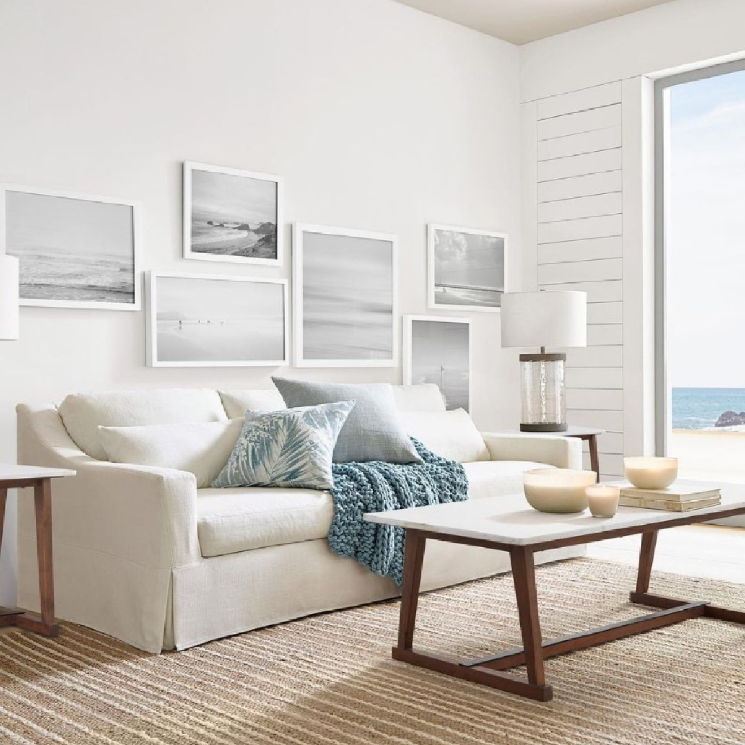
Love the coastal living room from the sherwin williams picture. Beachy, classy, not too extravagant. It really puts the room together.
Katia
Author
Thanks for reading and adding to the beauty here. 🙂