It’s all over once you start seeking and finding more and more snug room inspiration and find yourself admiring old cottages in the English countryside! What a wonderland of lovely exists, and what a treasure are these homes loved for centuries. Today’s inspiration is a 16th century millhouse known as Goulters Mill located at the heart of Cotswold Way. It’s the home of the architect Renshaw Hiscox and artist Sarah Hiscox. I spied this lovely home tour in the beyond gorgeous House and Garden. You’ll learn some of the exact paint colors used within this 16th Century Cotswold Home as well as some ideas for the custom colors.
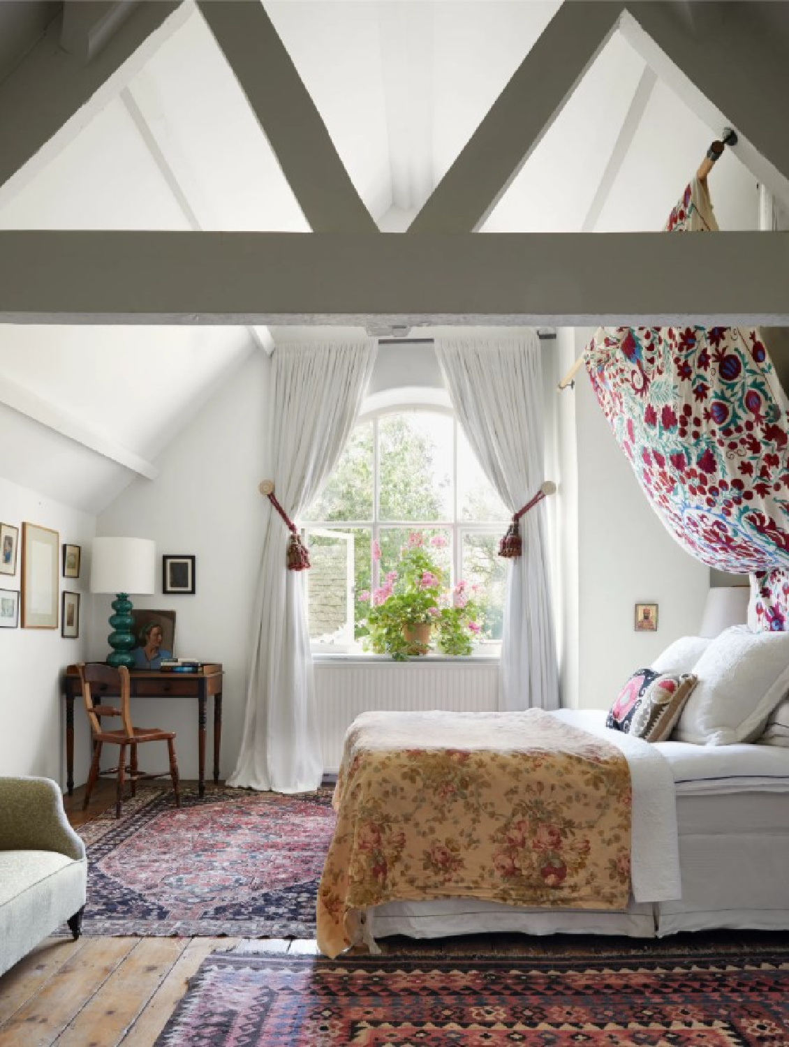
Paint Color Inspiration from a 16th Century Cotswold Home
Photos: Paul Massey for House & Garden
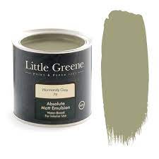
Little Greene Normandy Grey
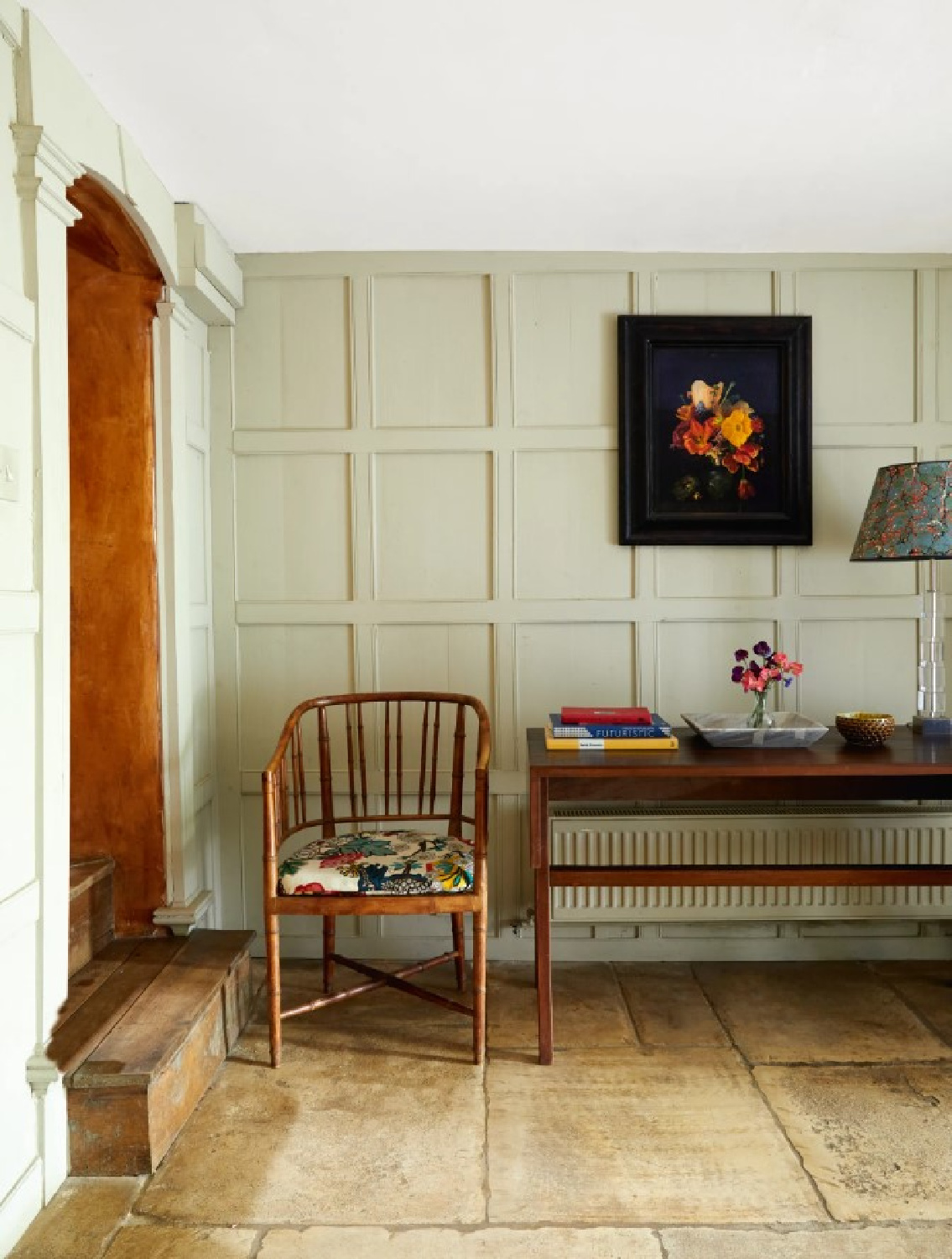
If you love warm muddied colors that echo the stone and nature here, you’ll be drawn to the color story within this cottage. Here’s the glorious paneled entrance with its aged stone floor and rugged ancient door!
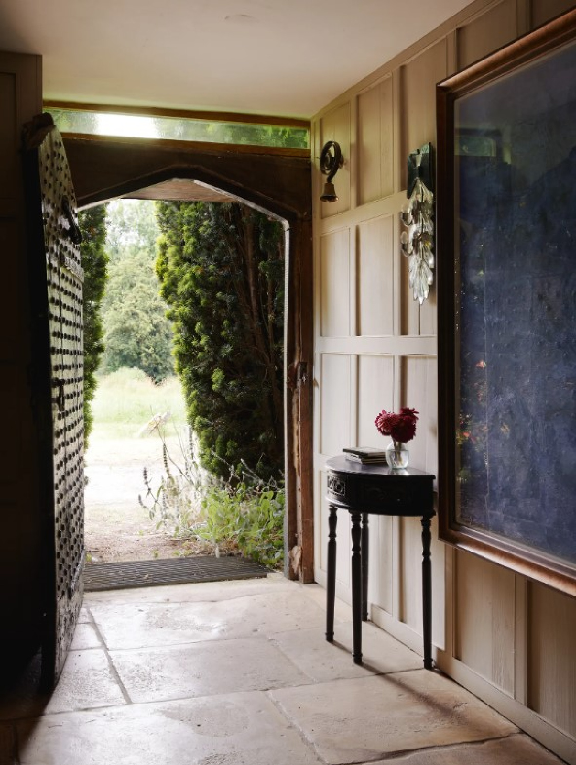
The color on the walls is Little Greene’s Normandy Grey:
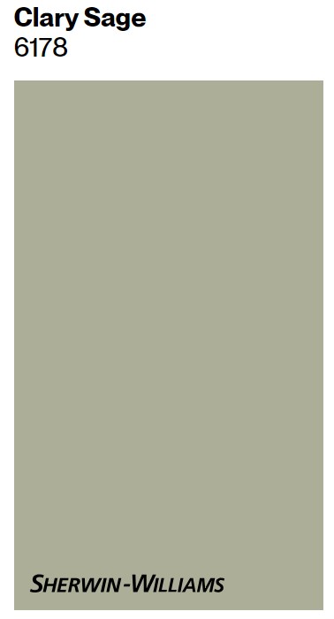
Should you not have access to this paint, you could peek at another grey-green that is similar. Sherwin-Williams Clary Sage may have a little less of the brown undertones of Normandy Grey.
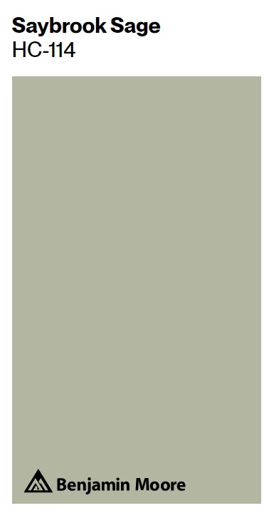
But it’s a very natural, soothing, muddy greenish gray, don’t you think? Sherwin Williams calls it “botanical” as well as a “soft herbal.” Another possibility is Saybrook Sage by Benjamin Moore:
Here’s Normandy Grey washed in light:
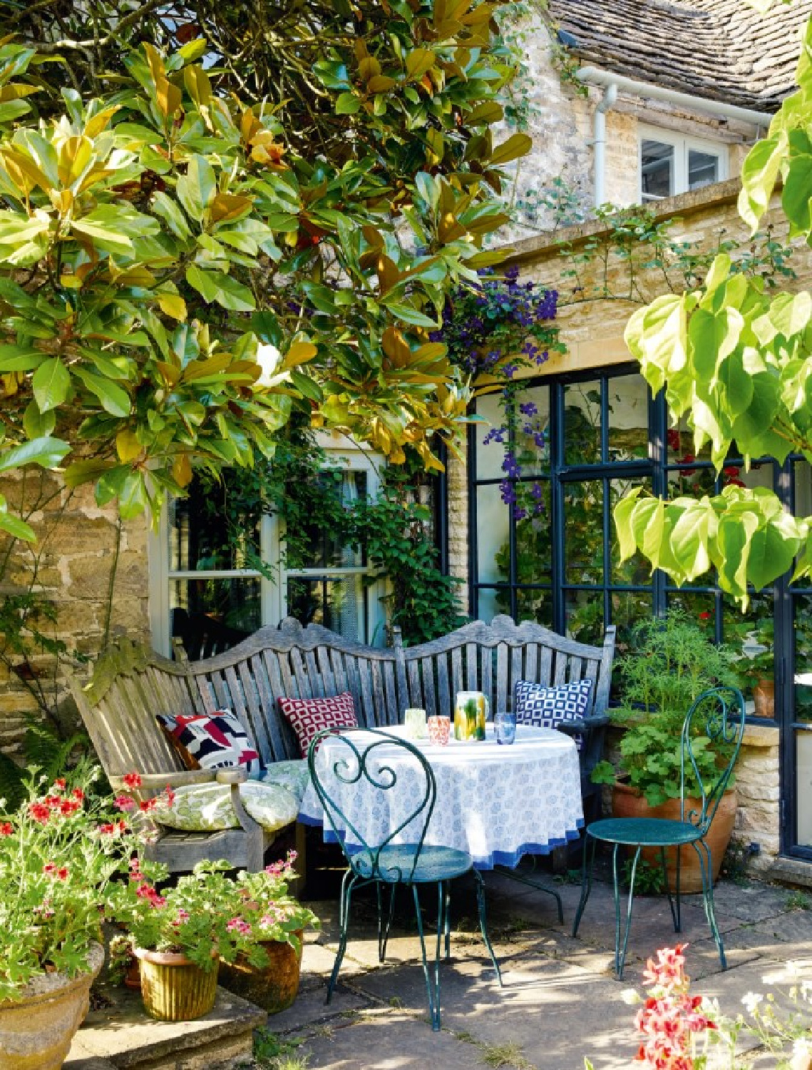
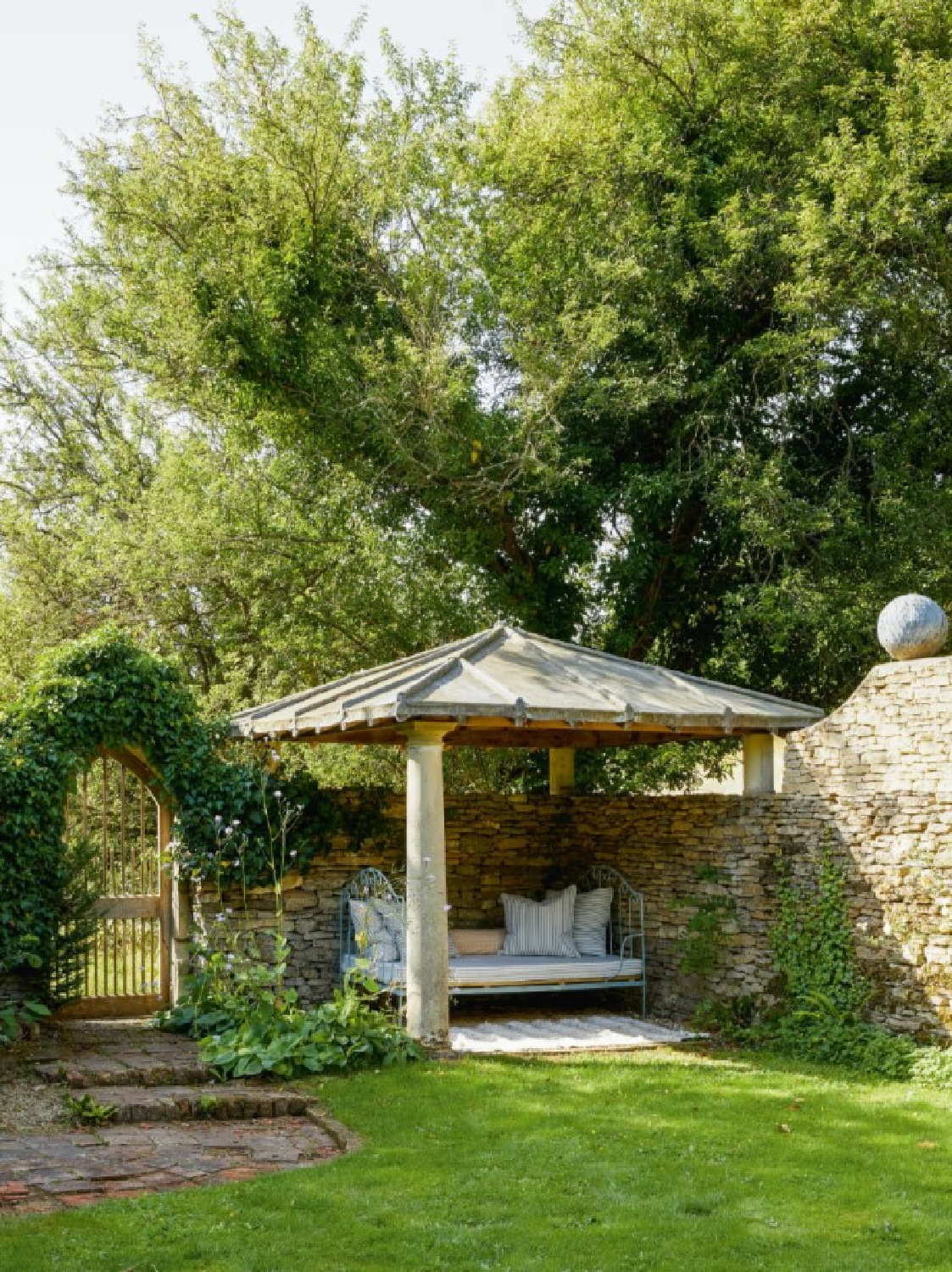
I am so enchanted by the sunny stone on the exterior of this Cotswold cottage!
Farrow & Ball Pink Ground
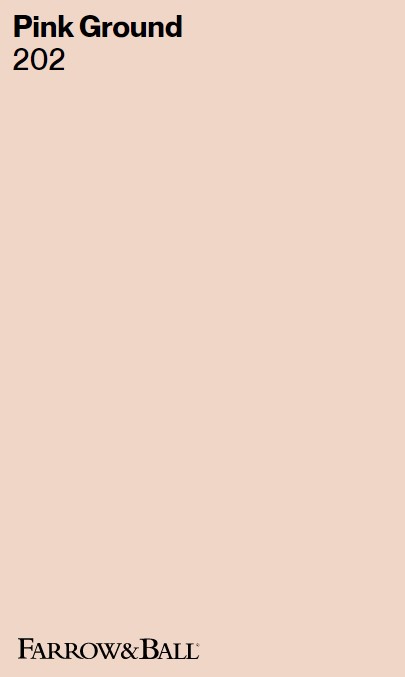
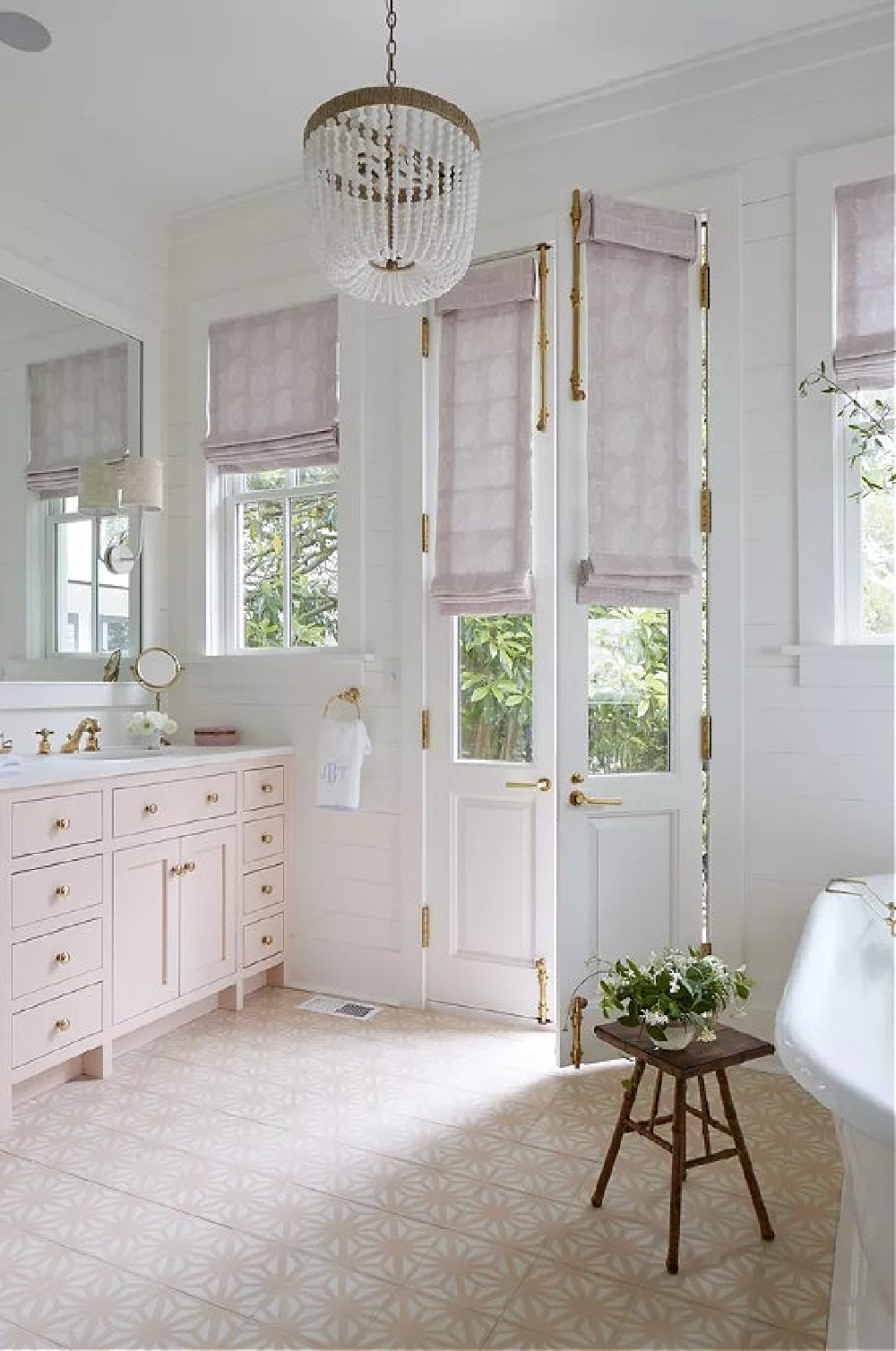
In a bath at the cottage, the walls are a lovely tried and true pink…
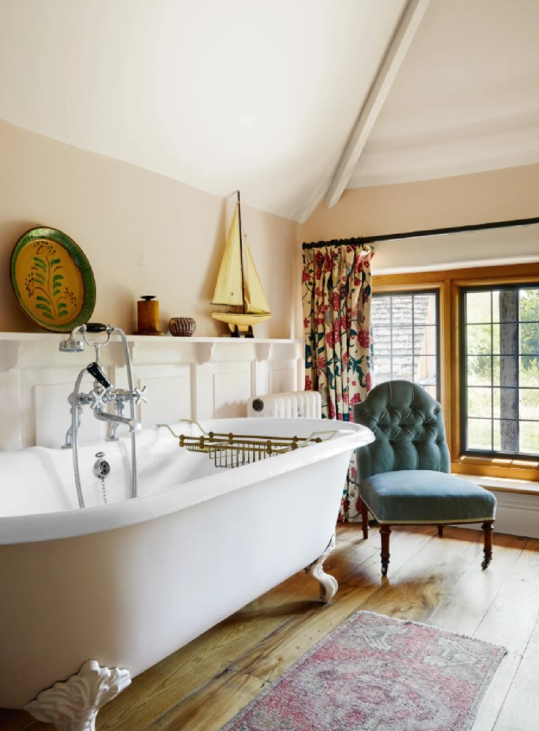
The exact color is Farrow & Ball Pink Ground 202:
Here’s Pink Ground in another bath (the Charleston home of Julia Berolzheimer) which appeared in Southern Living:
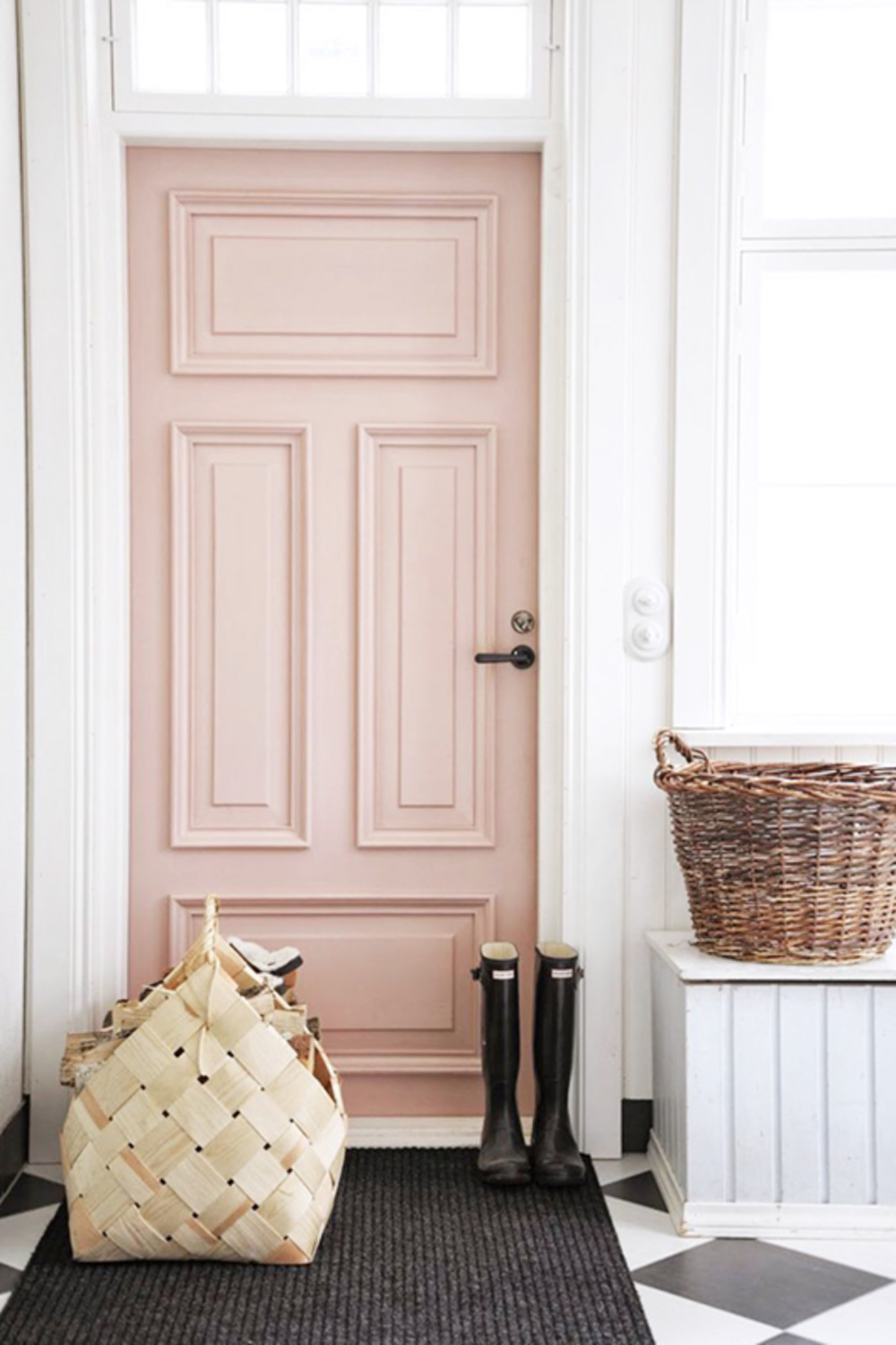
I just love it when folks paint a door with this hue. (And now I’m dreaming and scheming about where I could sneak in a pink door!!!)

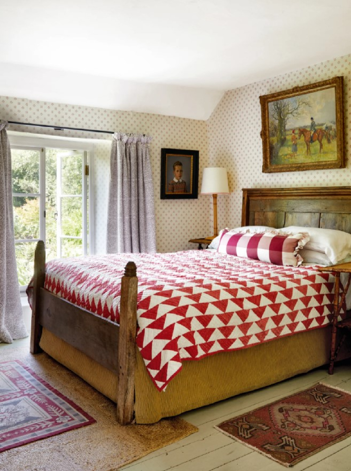
There are so many details to devour beyond paint colors in this special home. English country style is not about matching and the expected. Unusual color combinations and pattern mixing pack such personality. In a bedroom snowflake wallpaper, a beautiful vintage quilt, and antiques feel timeless together.
Farrow & Ball James White
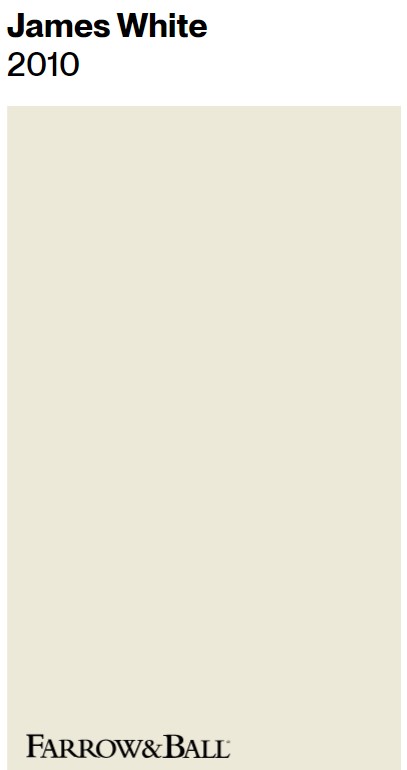
Here’s a snug room (see more snug inspiration in THIS) where we know the exact wall color…
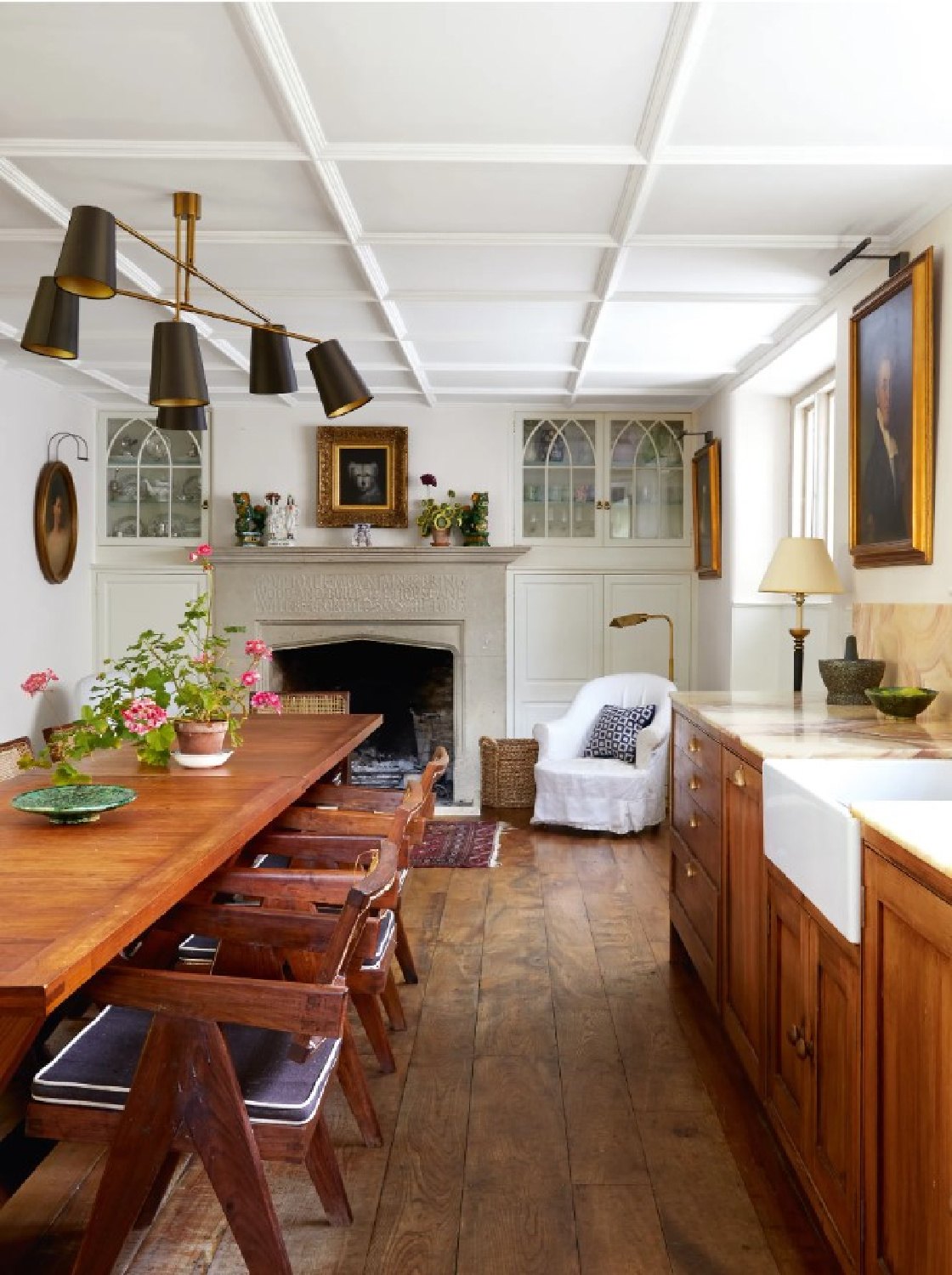
What a charming space for all sorts of living and dining and togetherness! Farrow & Ball James White is the neutral in here.
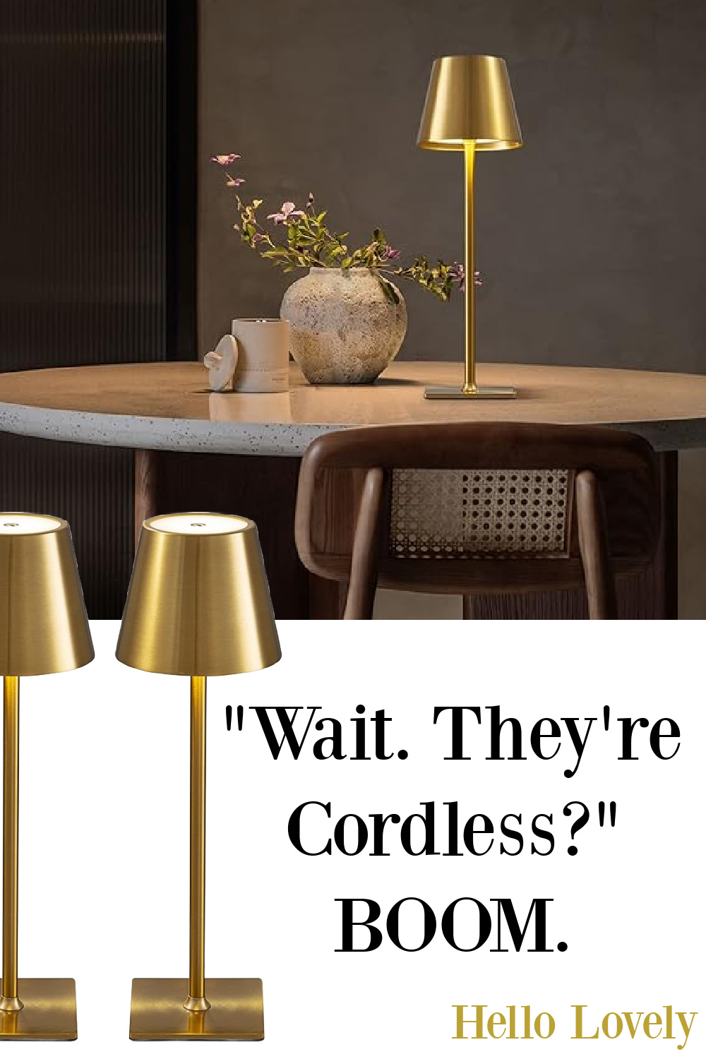
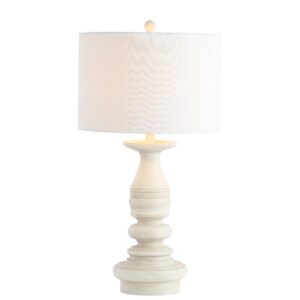
Should you find yourself exactly one snug room or Cotswold cottage short, what about a touch of cozy lighting that you can add absolutely anywhere since no electricity is needed?
I have these cordless lamps in my Amazon cart so I haven’t tested them yet, but don’t they hold promise? I’m thinking they would be swell to make a small dining area cozy restaurant-like.

Ochre Painted Trompe L’oeil Walls
Believe it or not, these paneled walls are actually painted to look like the real thing! Isn’t the ochre gorgeous here?
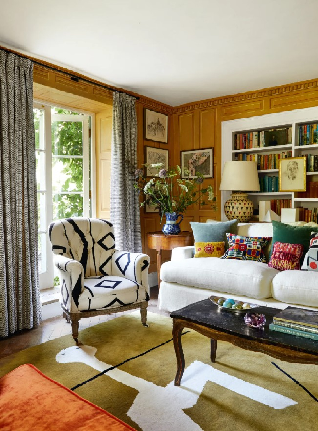
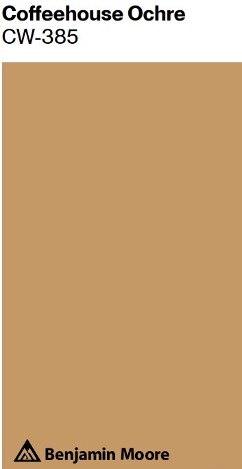
Here’s an ochre paint color to approach the look:
I actually consulted on a kitchen where we used a color for walls like this delicious Benjamin Moore Coffeehouse Ochre. The homeowner wanted to change her red walls to a color with less contrast with oak cabinetry. She loved how the ochre quieted the room and added snug factor.

Farrow & Ball All White
What about a white that will feel timeless and that you can trust to work in a variety of settings?
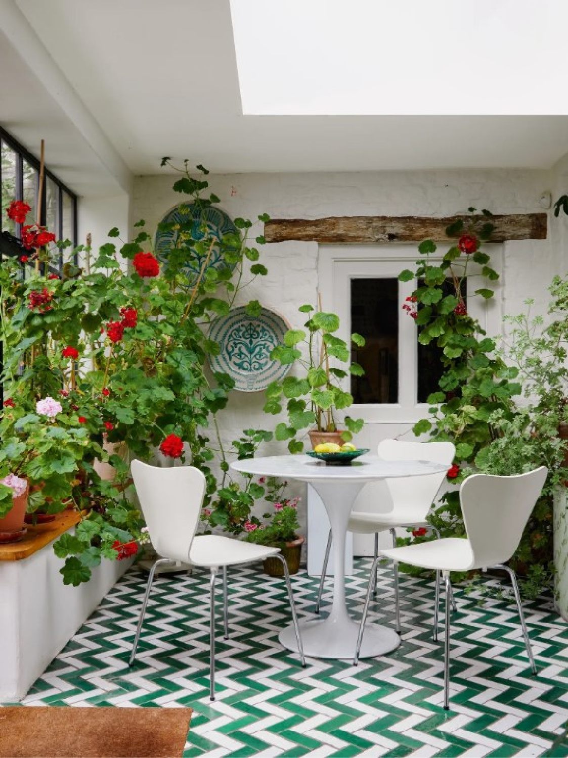
While I’m not certain it’s All White in this geranium-graced space with wonderful Moroccan tiled floor, it reminds me of it.
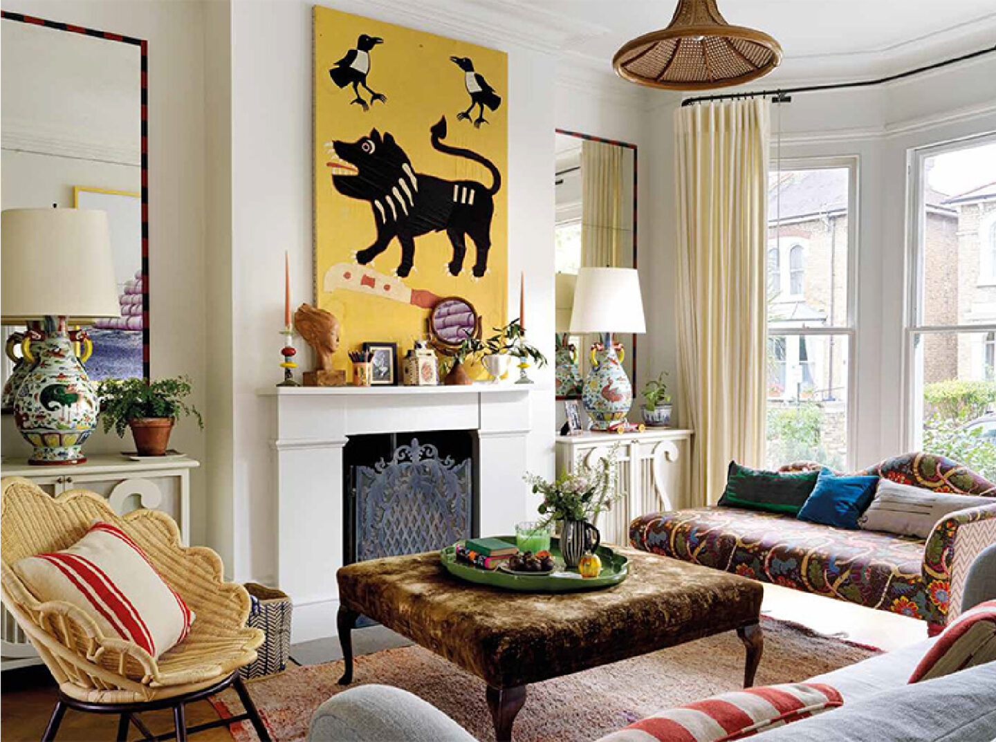
When we toured the design work of Beata Heuman, we learned she loves using Strong White which is another possibility if you’re going for cool and crisp:
Here it is in Beata’s London home:
Paint Color Idea for Rosy Pink
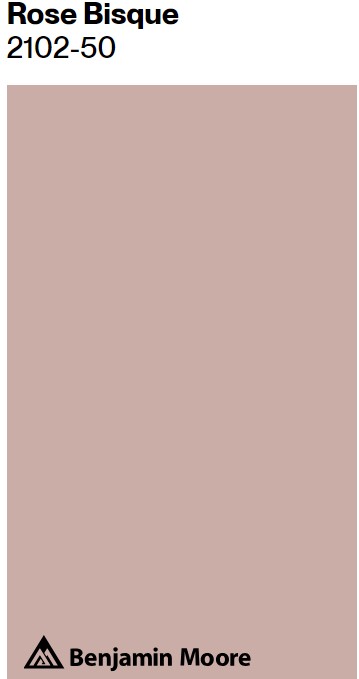
The color in this next beautiful room in the cottage is described as a Sanderson rosy pink.
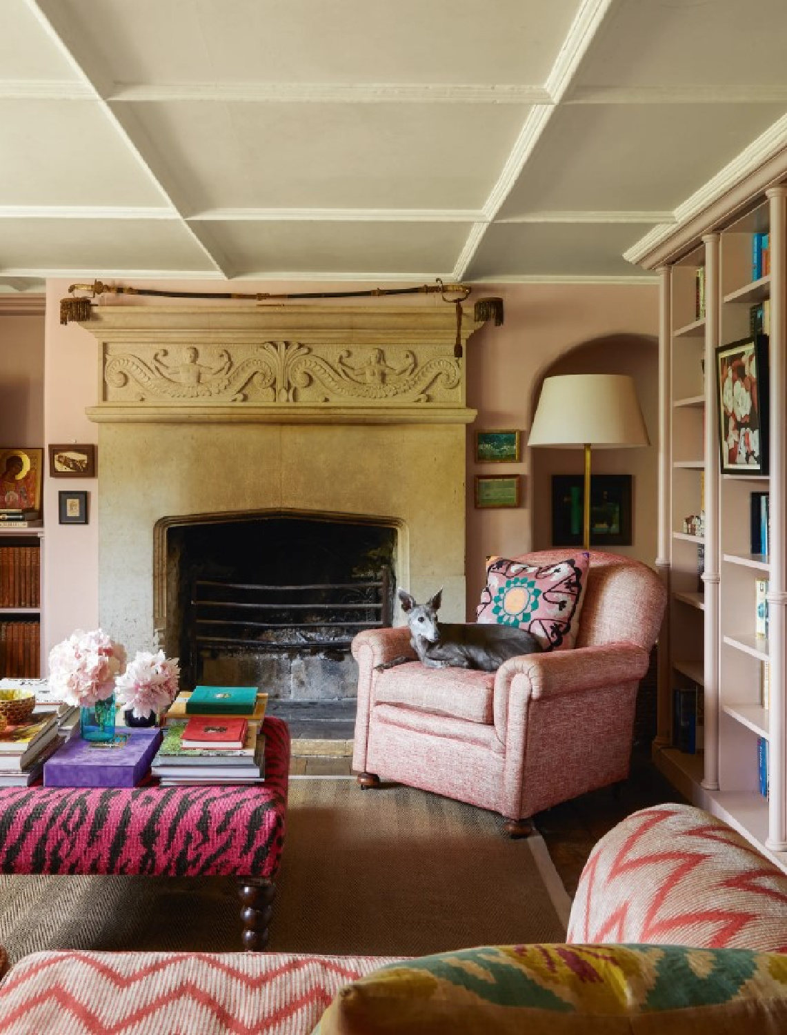
It strikes me as a tender mauve, and it’s always tricky to get pink right so make sure to sample multiple options. This Benjamin Moore rose color may appear slightly darker, but the above pink looks awash in light. Remember you can always adjust the saturation and use a percentage if a color is “almost” right but a little too saturated.
Are you feelin the rosy pinks?
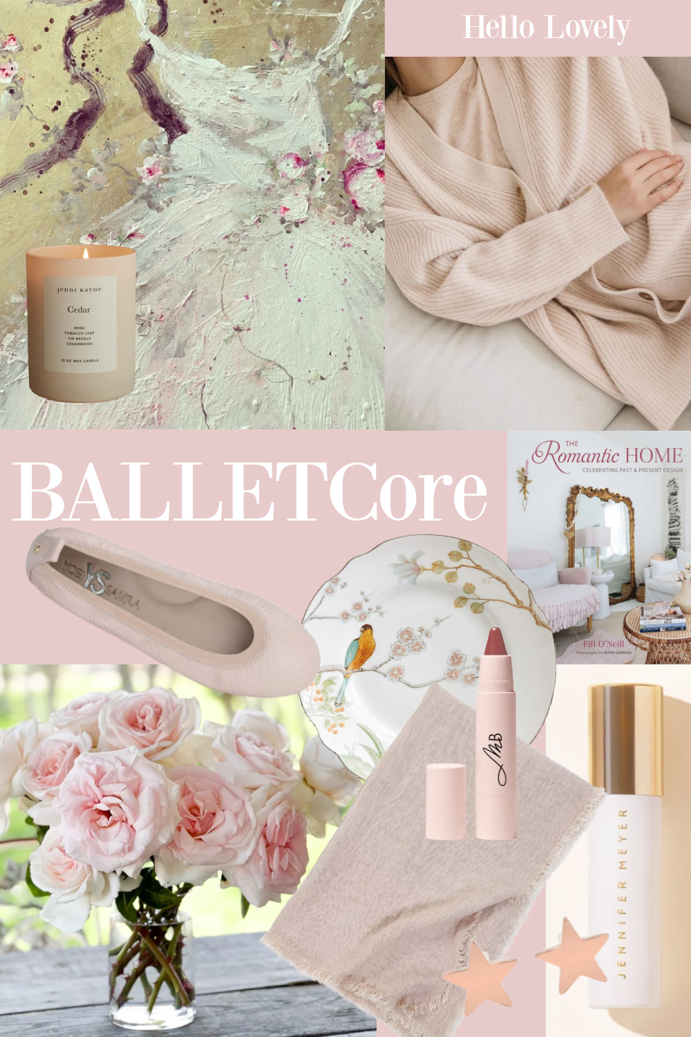
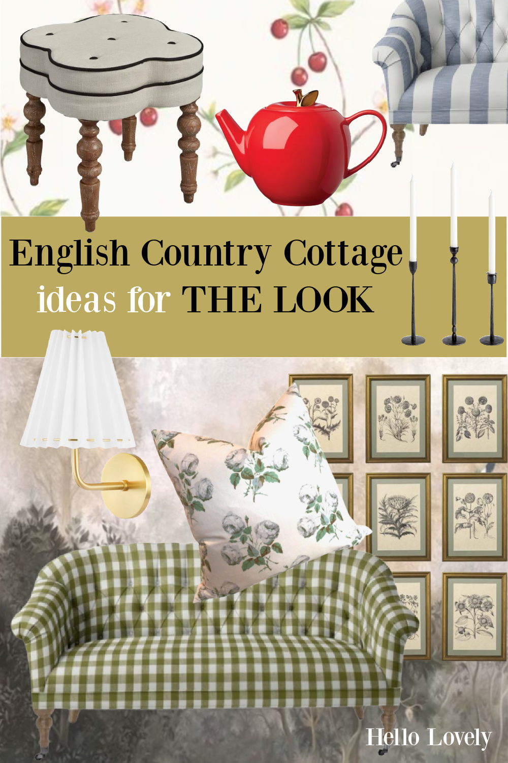
I can’t guarantee I am over obsessing over all things Cotswold Cottage Cozy so prepare for more and dig into pretty inspo here too!
I independently selected products in this post—if you buy from one of my links, I may earn a commission.

Peace to you right where you are.
-michele
Thanks for shopping RIGHT HERE to keep decor inspiration flowing on Hello Lovely!
Hello Lovely is a participant in the Amazon Services LLC Associates Program, an affiliate advertising program designed to provide a means for sites to earn fees by linking to Amazon.com and affiliated sites.
