You are likely aware of the “joy” of tumbling down an internet rabbit hole, and I have a special talent for tumbling. In a search of airbnbs near Folly Beach or Charleston, I landed on a wee boho cottage with sweet whimsical pastels. The owner used paint color blocking in a brilliant manner to create interest and break up expanses of white walls. Charming! Then I stumbled on an L.A. house renovated by Palisociety’s Avi Brosh & Kirsten Leigh Pratt (did you tour their timeless English cottage in Malibu HERE?) distinguished by chic green painted half walls. The green paint color reminded me of Farrow & Ball’s Breakfast Room Green which led to more green paint inspiration. Let’s retrace my tumble!
Breakfast Room Green, Painted Half Walls & Color Blocking
Whimsical Color Block Accents in a South Carolina Cottage
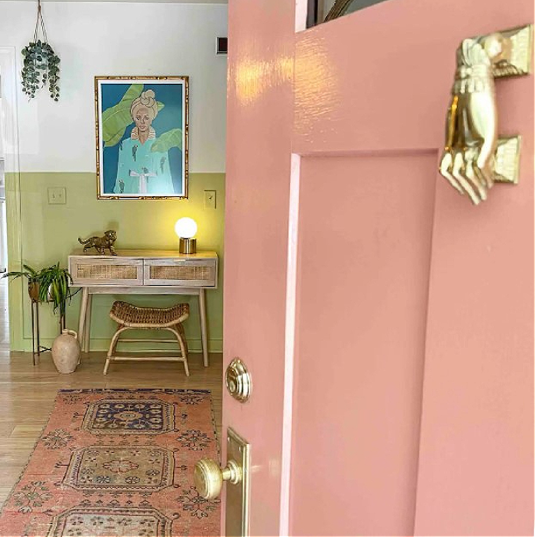
Isn’t the front door and the entry to this sweet Charleston cottage charming? Those dusty pinks and retro yellow-greens strike a nostalgic chord!
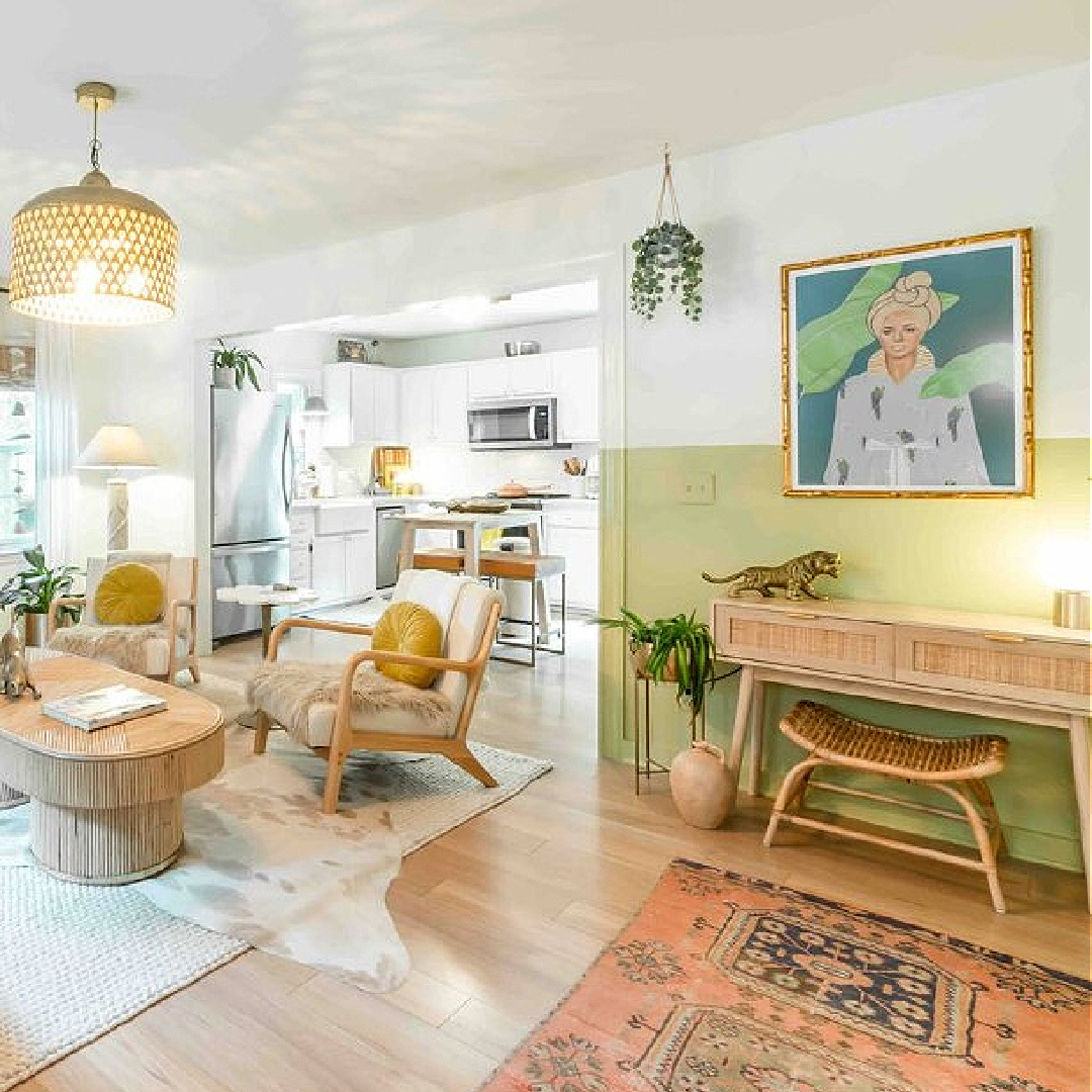
Even if boho is not your cup of tea in your own home, I love how cozy and comfortable the style feels in a vacation setting.
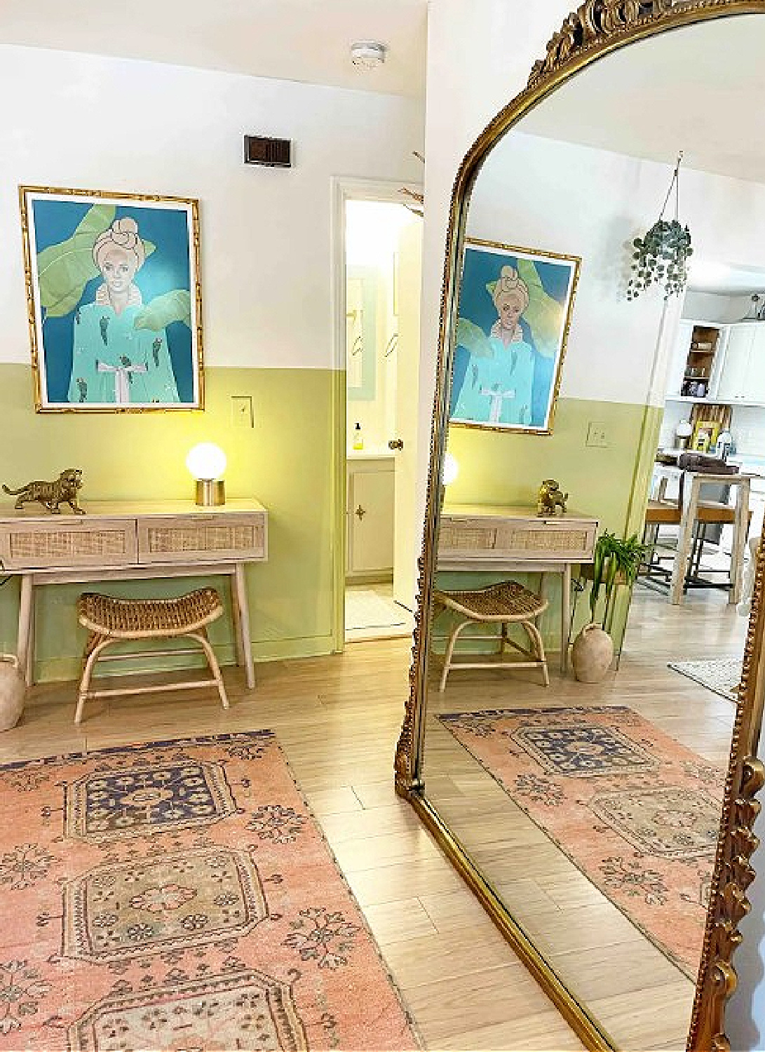
Notice how the chartreuse-like paint color was also applied to the trim in the area it defines. The success of such color blocks may rely on that inclusion!
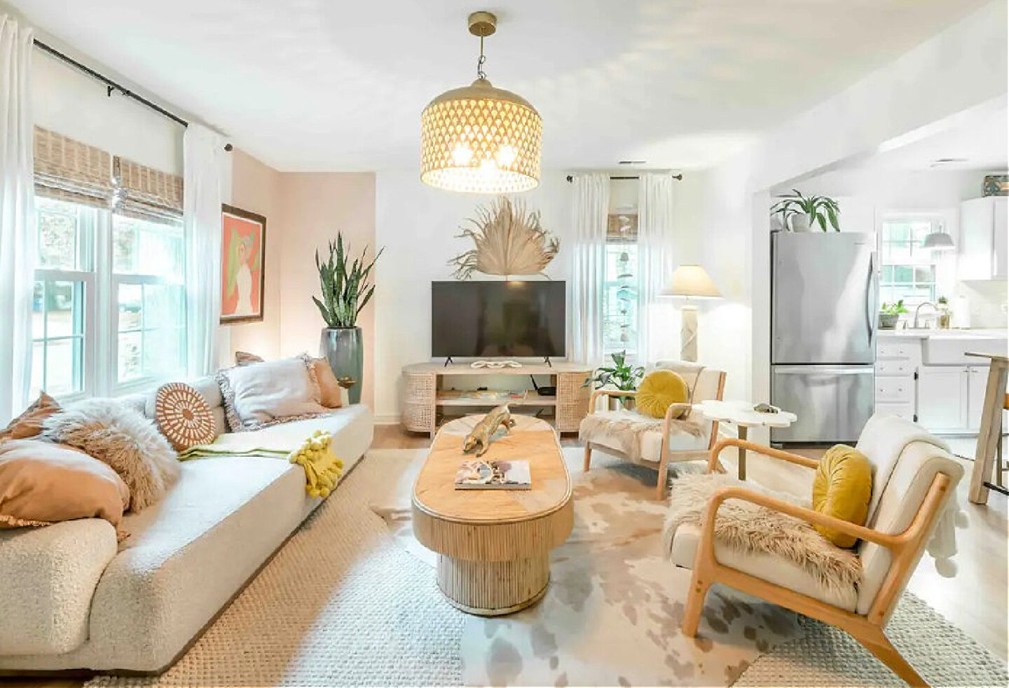
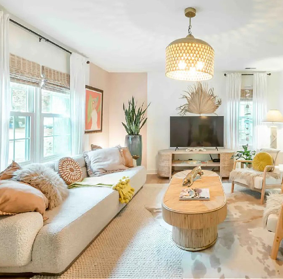
Above, in the living room, that gorgeous dusty pink is blocked in the corner, balancing that far wall with its single window. So clever and effective with no demo or construction involved! (Need an idea for a sophisticated pink paint?)
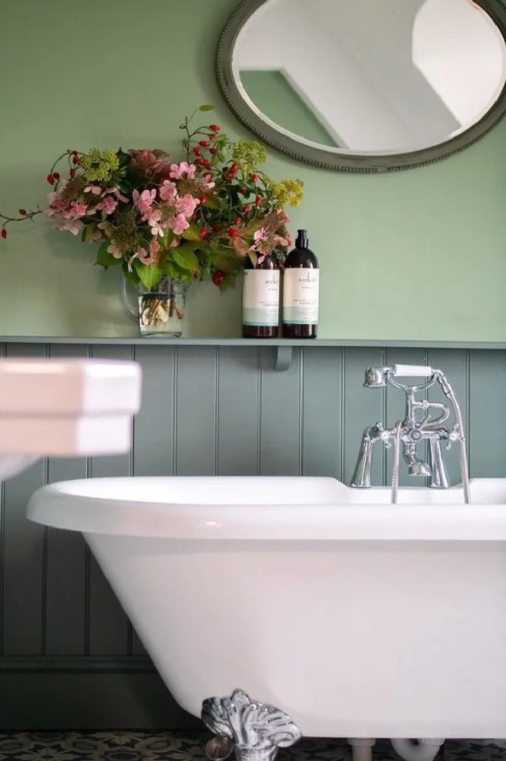
Another gorgeous coastal pastel was introduced to beadboard in the bath:
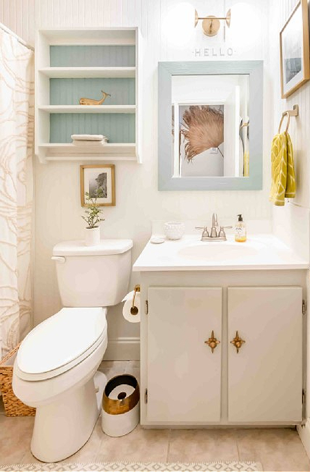
A gorgeous aqua makes the surrounding white pop and is repeated on the mirror frame.
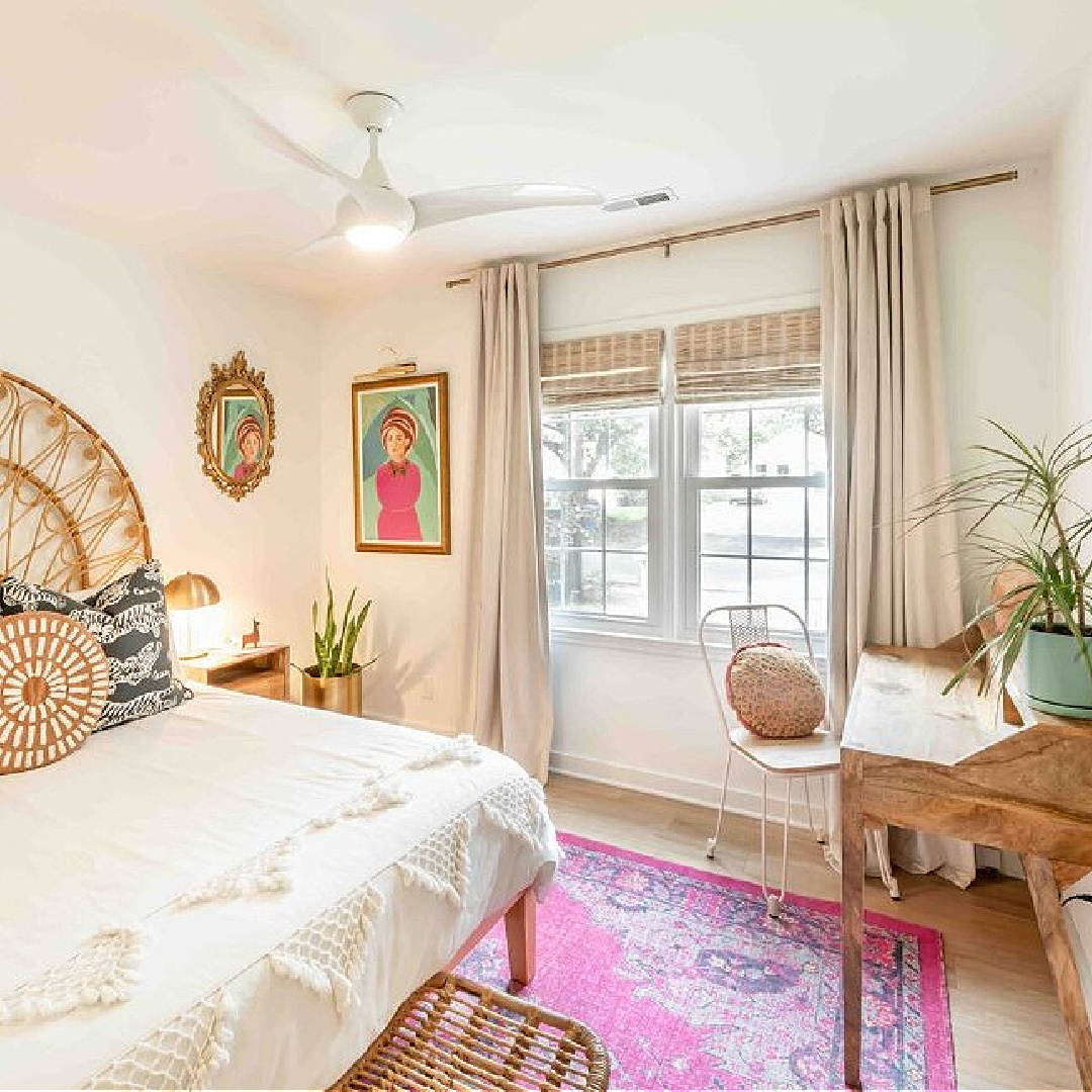
No color blocks I noticed in the bedroom where the bold art makes a statement without overwhelming the restful space.
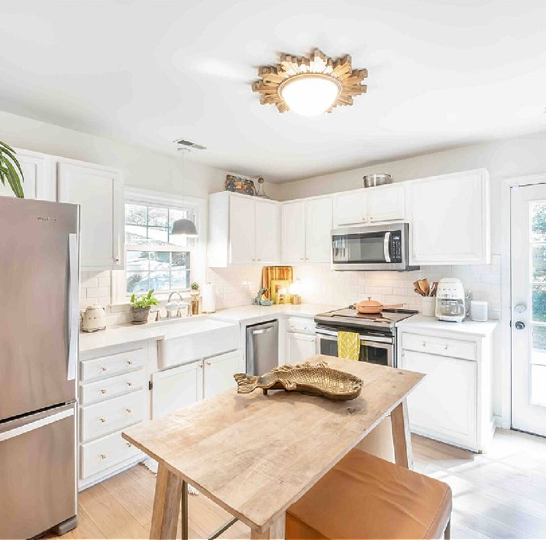
The charming white kitchen with farm sink is also uninterrupted by pops of color, and it’s always wise to consider “appetizing factor” when choosing accent colors for dining areas.
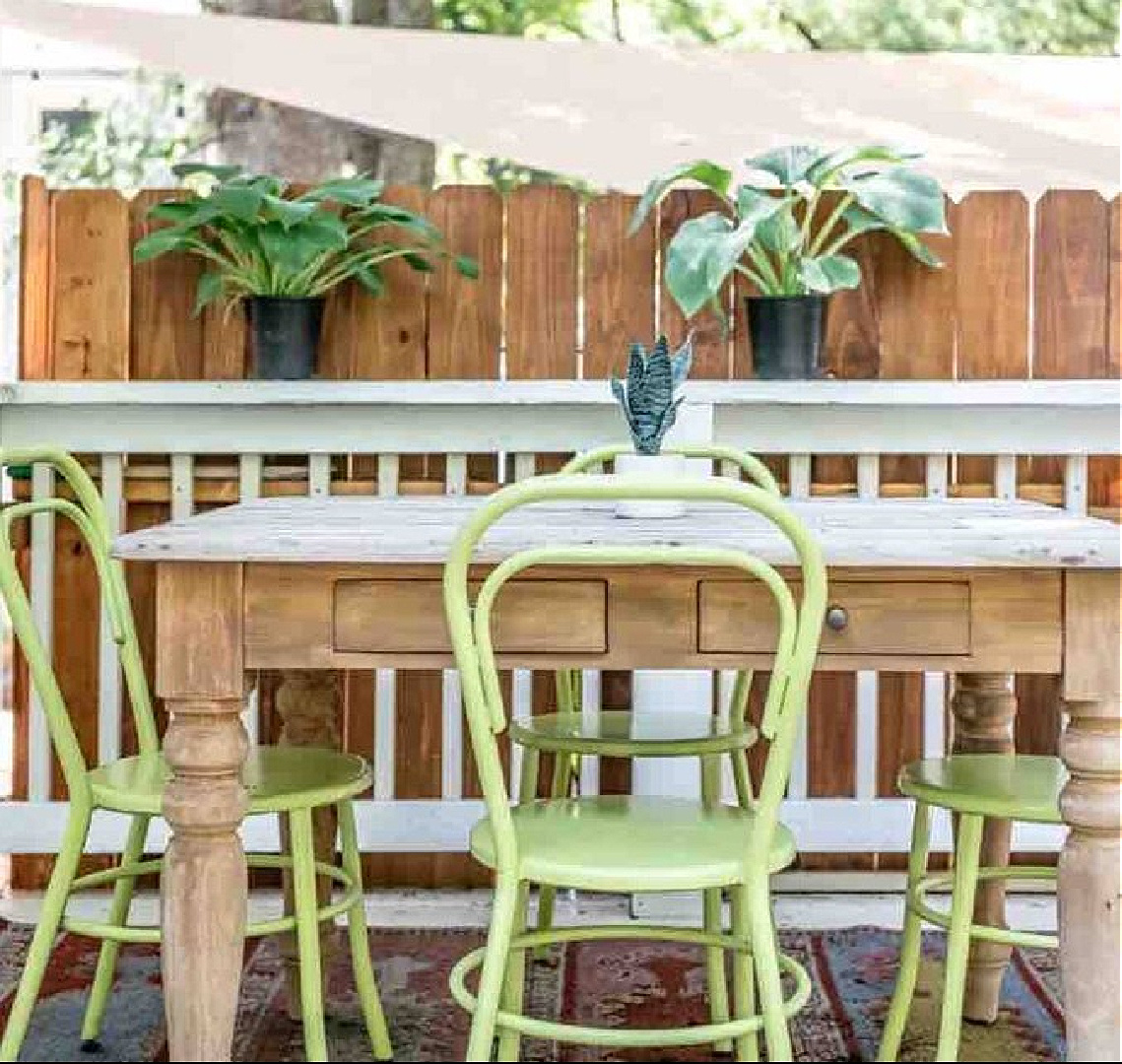
What a fabulous green the owner added on the deck! And this airbnb has the sweetest outdoor shower ever:
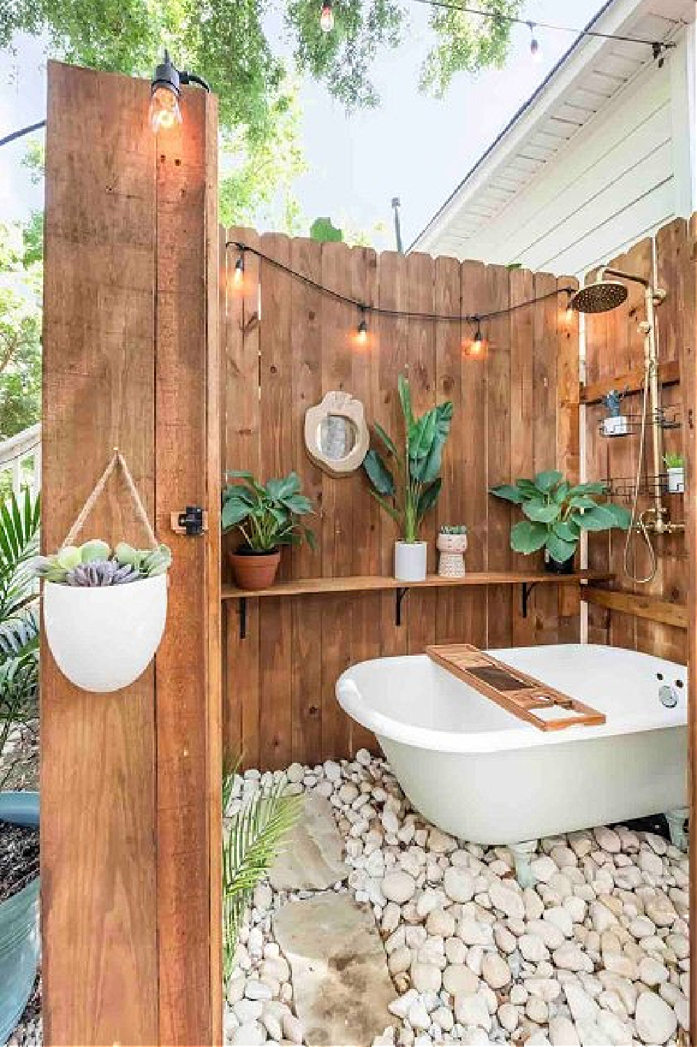
How perfect is that!?!
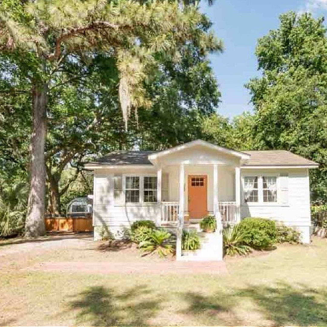
Are you ready to check in? Fiona’s place is at the top of my list, and what a bonus when a vacation rental suggests new color combinations and decor schemes.
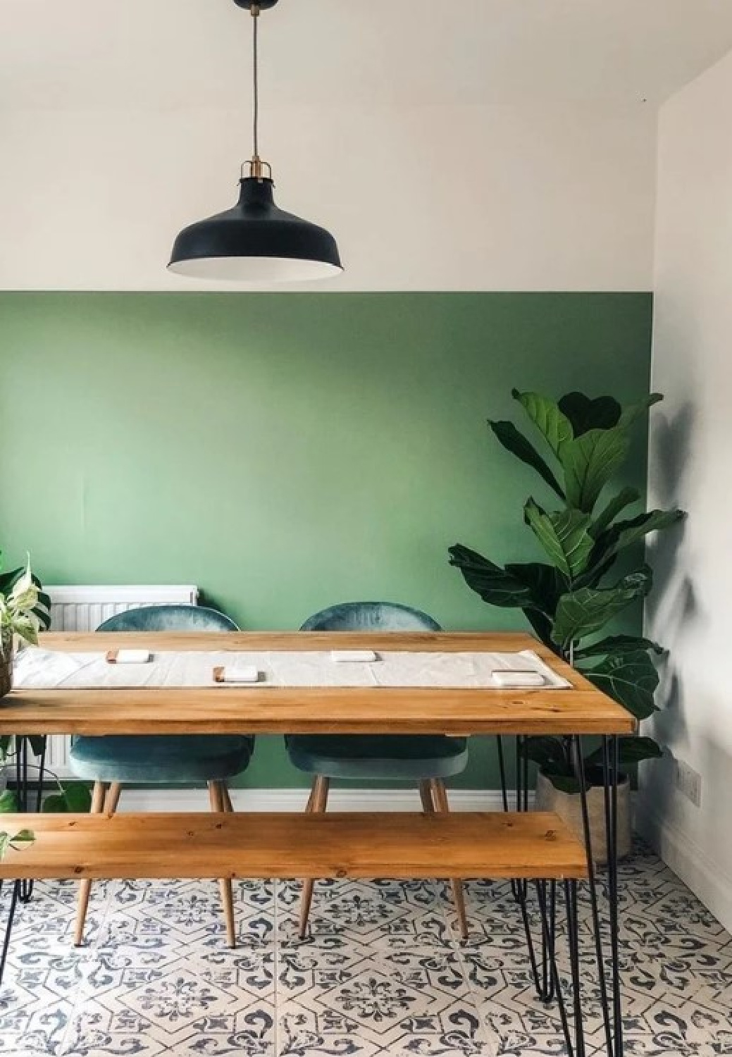
Green Painted Half Walls
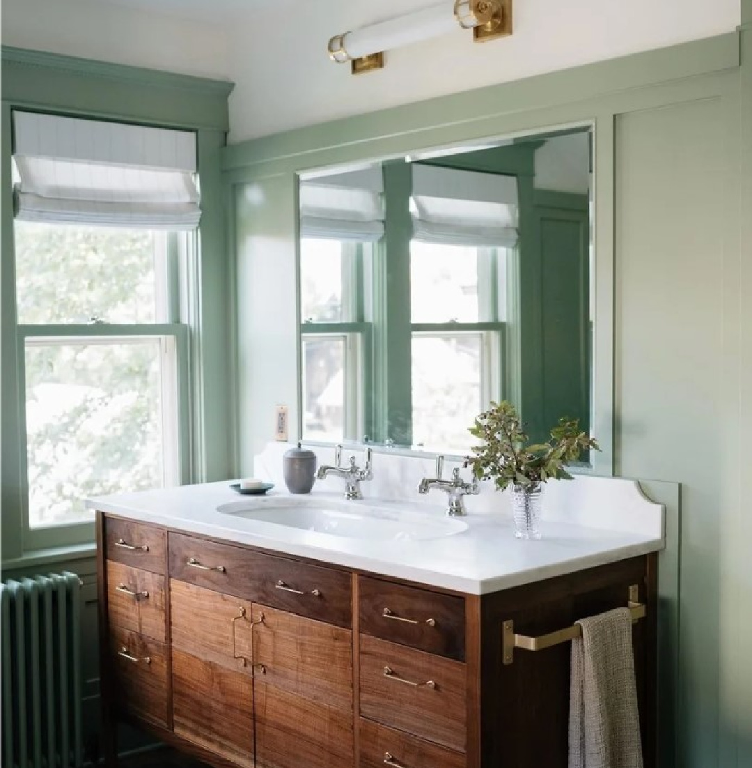
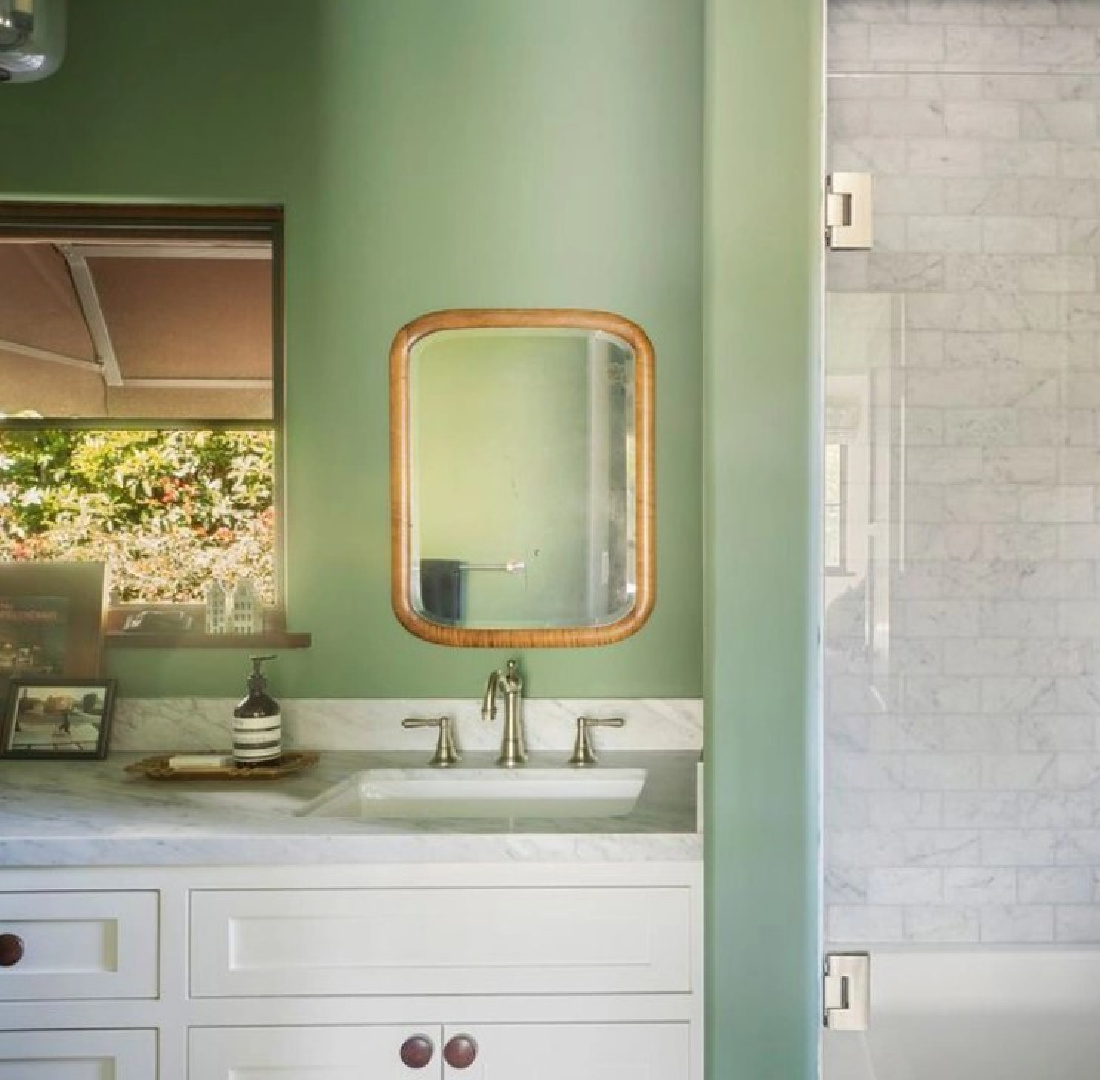
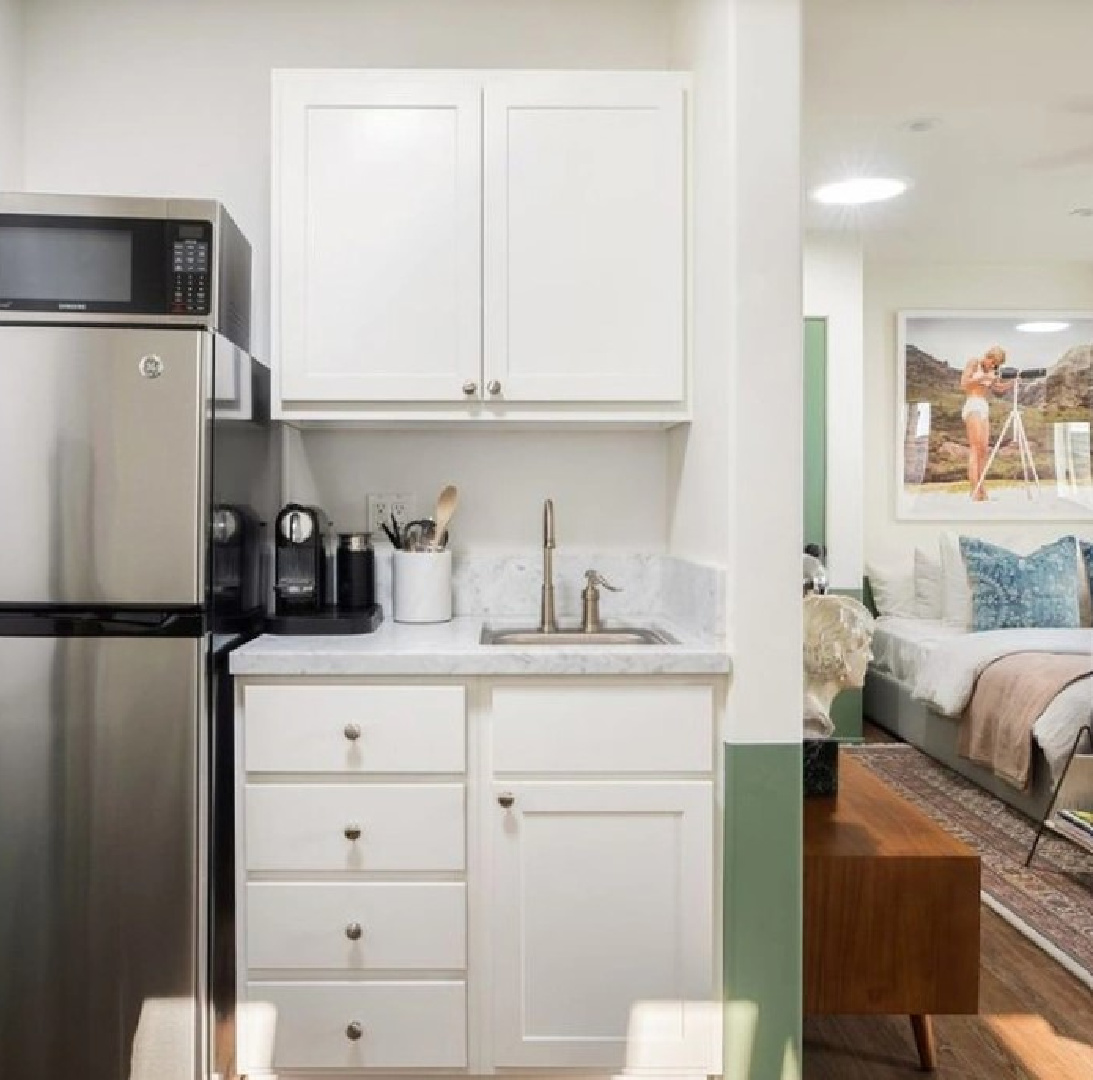
Before they renovated their Malibu cottage, Avi Brosh and Kirsten Leigh Pratt reimagined a 1920s home in LA. These images from the real estate listing when the home was on the market reveal a love affair with green and white.
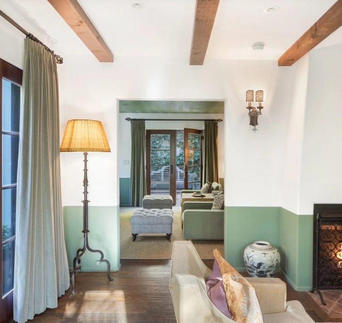
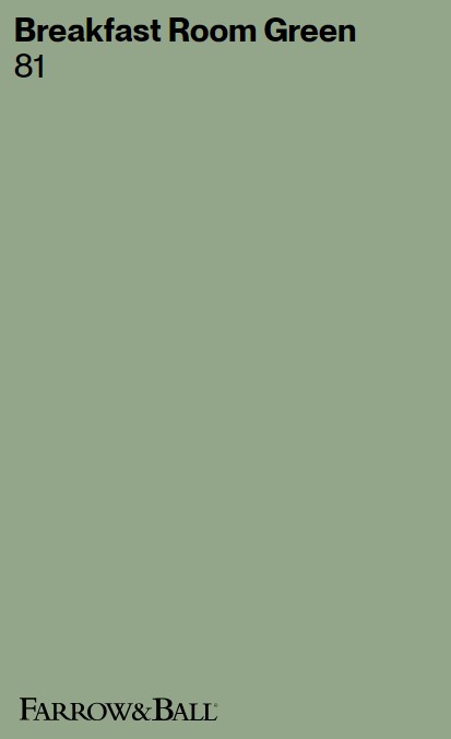
The color reminds me of Breakfast Room Green (Farrow & Ball), but I can’t confirm if that’s the green.
I’ll share more ideas for using Breakfast Room Green below in case you are seeking a sophisticated shade of sage like this.
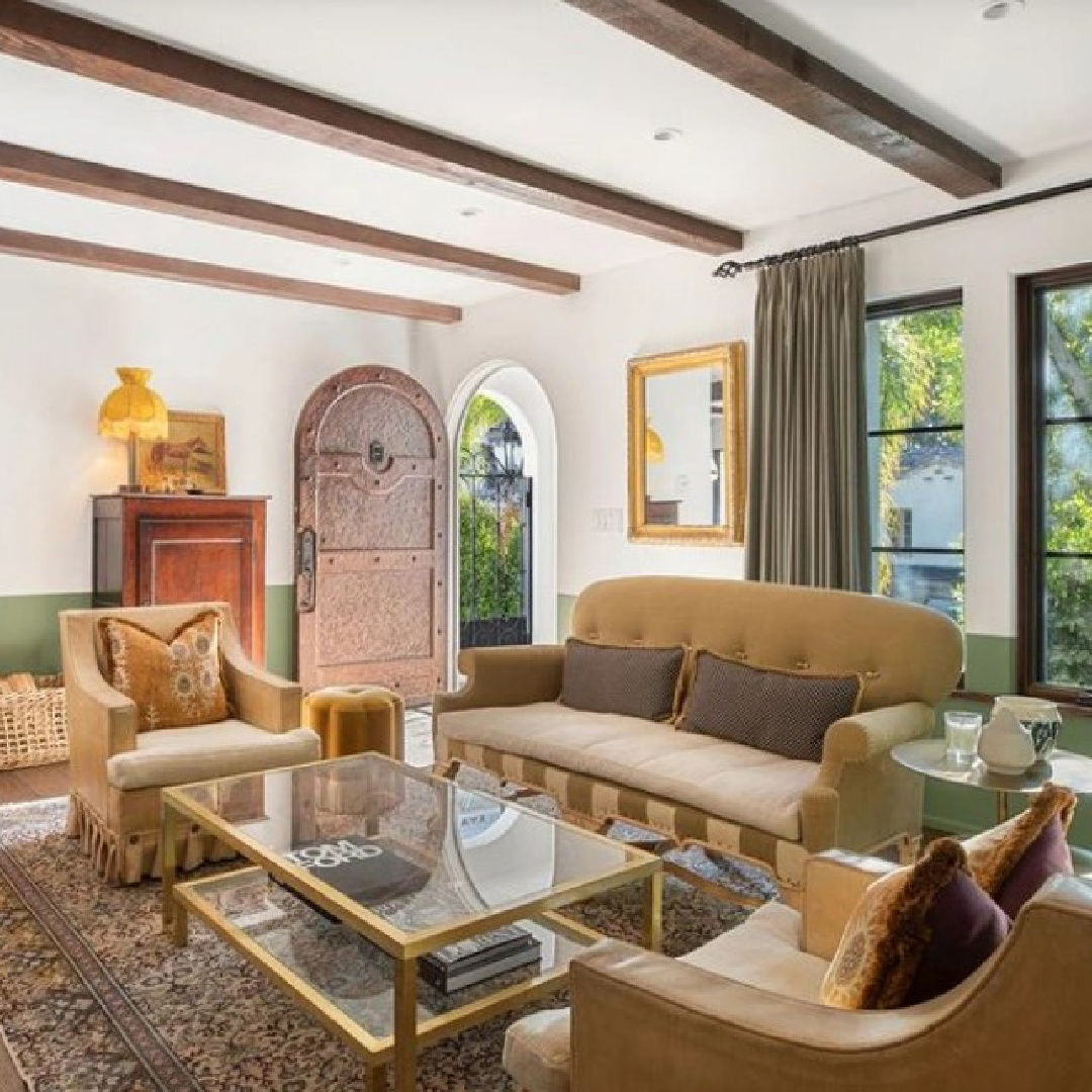
Farrow & Ball call it the most cheerful of all their greens and that it remains lively in both bright sunlight or softer candlelight.
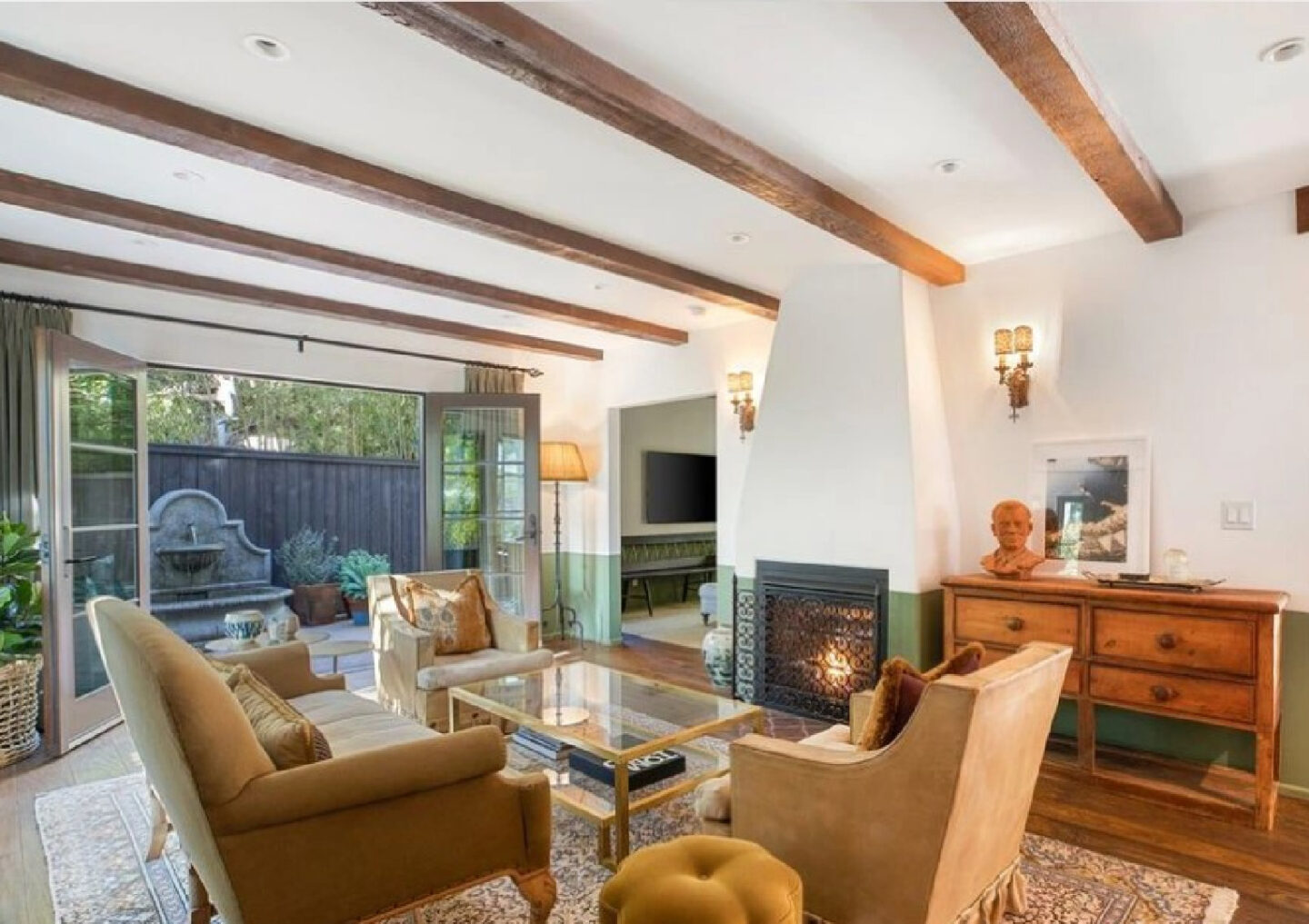
“Named after the usually east facing rooms designed for eating the first meal of the day, it is particularly beautiful in the dawn light. When used alone on both walls and woodwork it becomes incredibly striking” -F&B
When you consider all the greenery on the outside of this beautiful home, there is definitely a harmony happening:
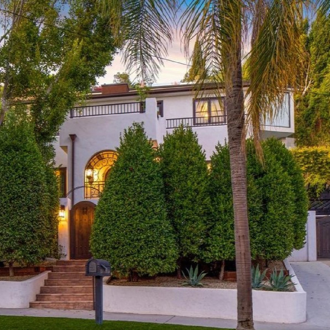
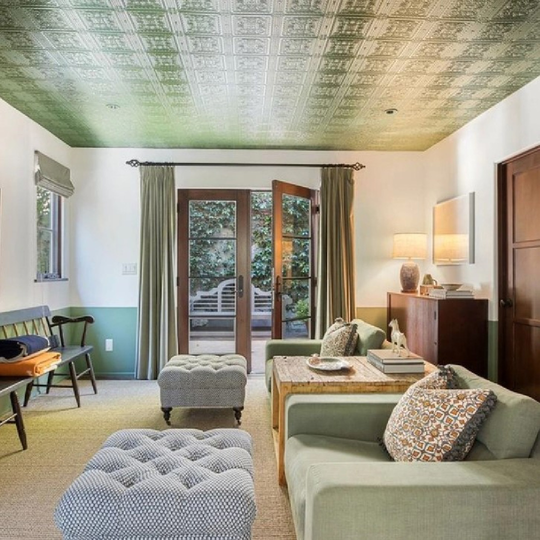
How does it work with wood tones? You can definitely see how it adds an organic layer. Even the ceiling was treated to rich lively color:
The absence of color in the beautiful kitchen of this California home allows a serene and buoyant atmosphere to emerge.
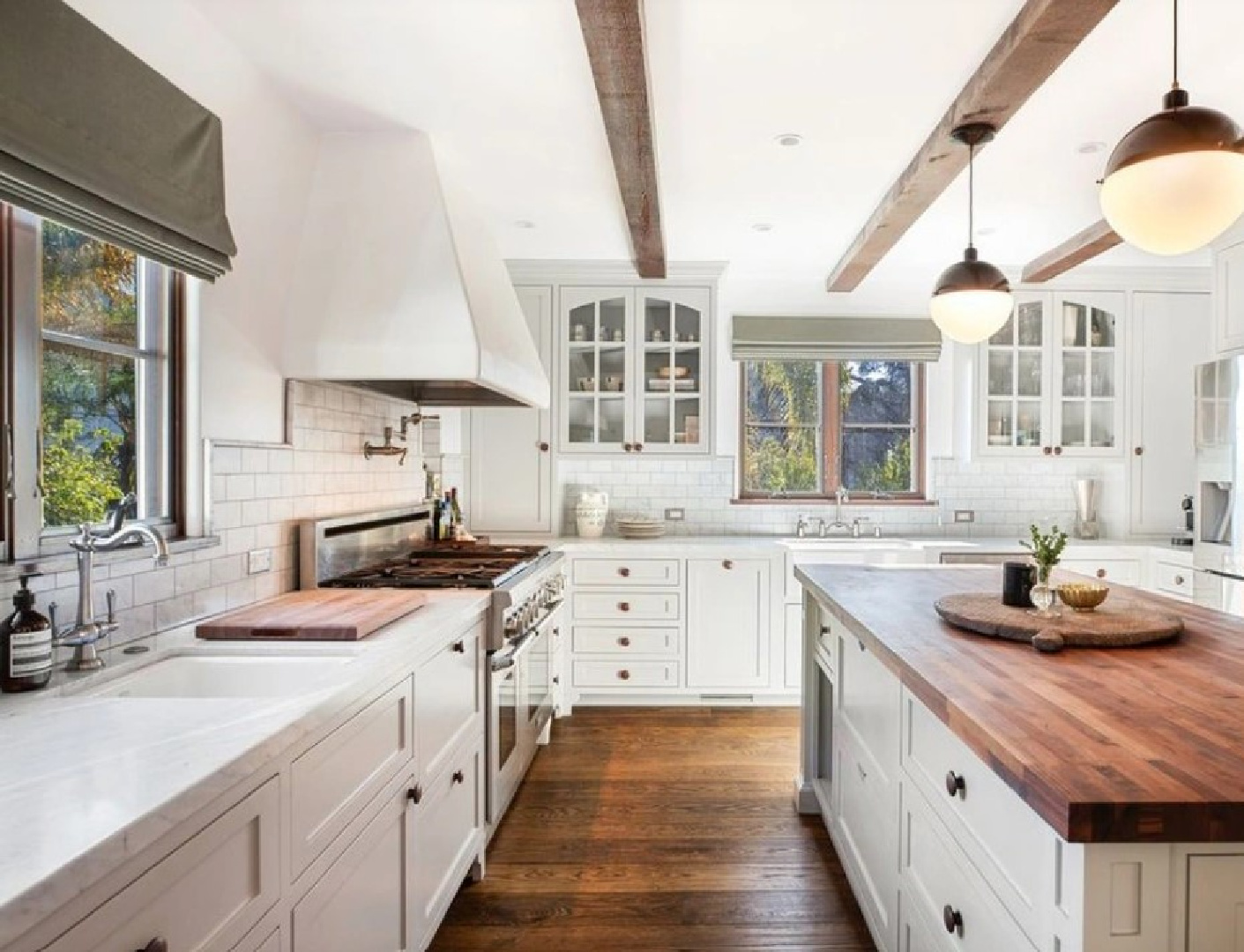
I wonder if the new owner of the home kept these color schemes!?!
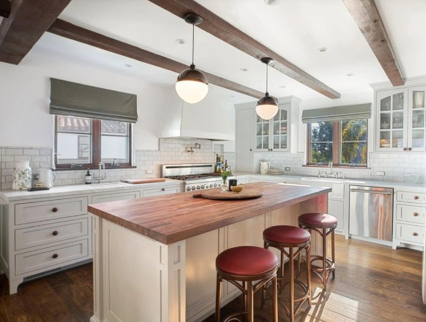
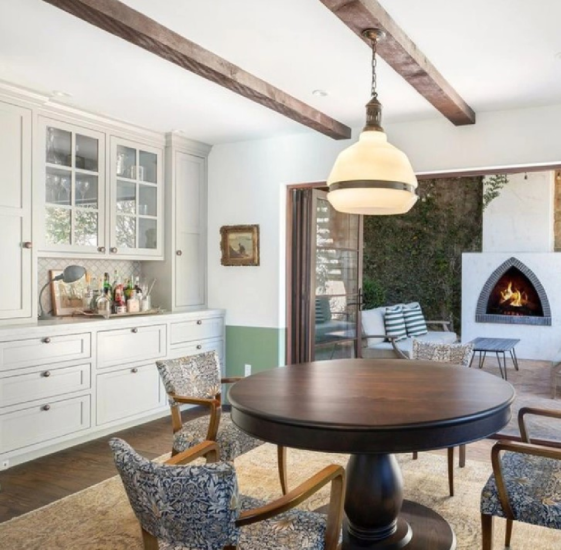
Wouldn’t it be interesting to see it with an alternate color story? Psst. I see a sweet little green below the dado (chair rail) level below:
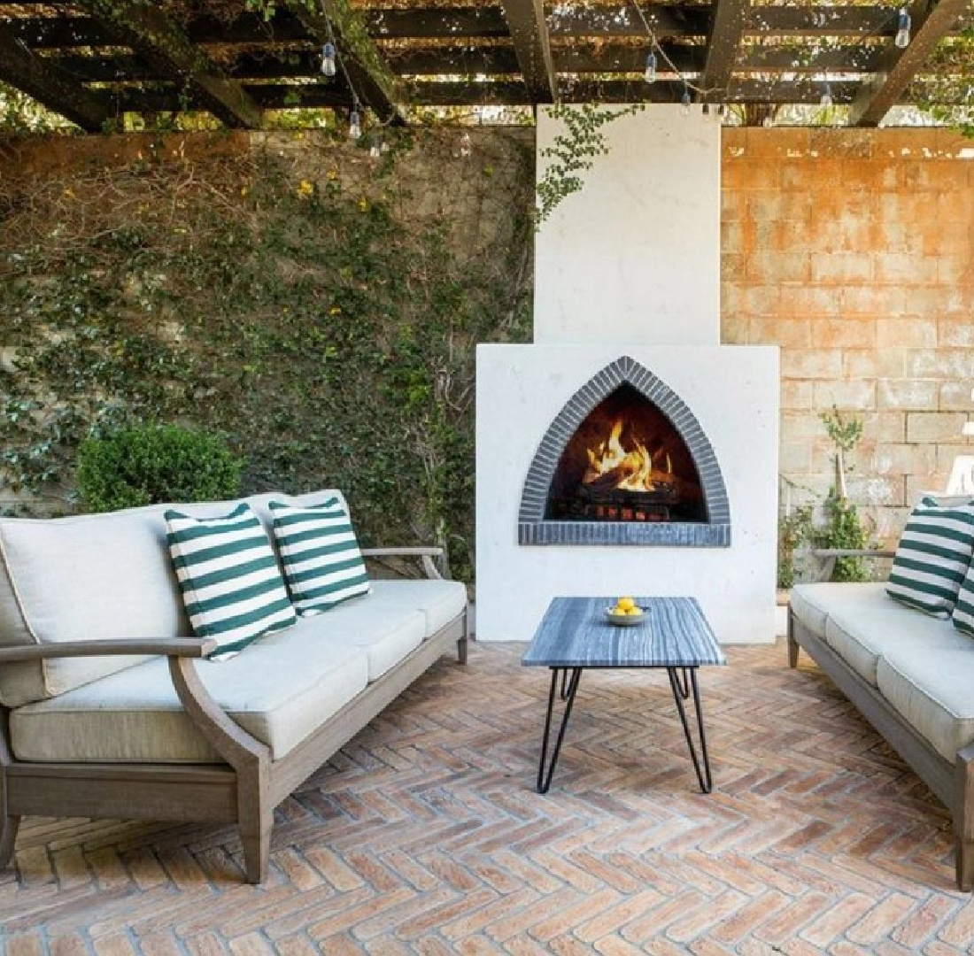
Chic green stripes outside feel so fresh.
Green on Trim & Ceilings
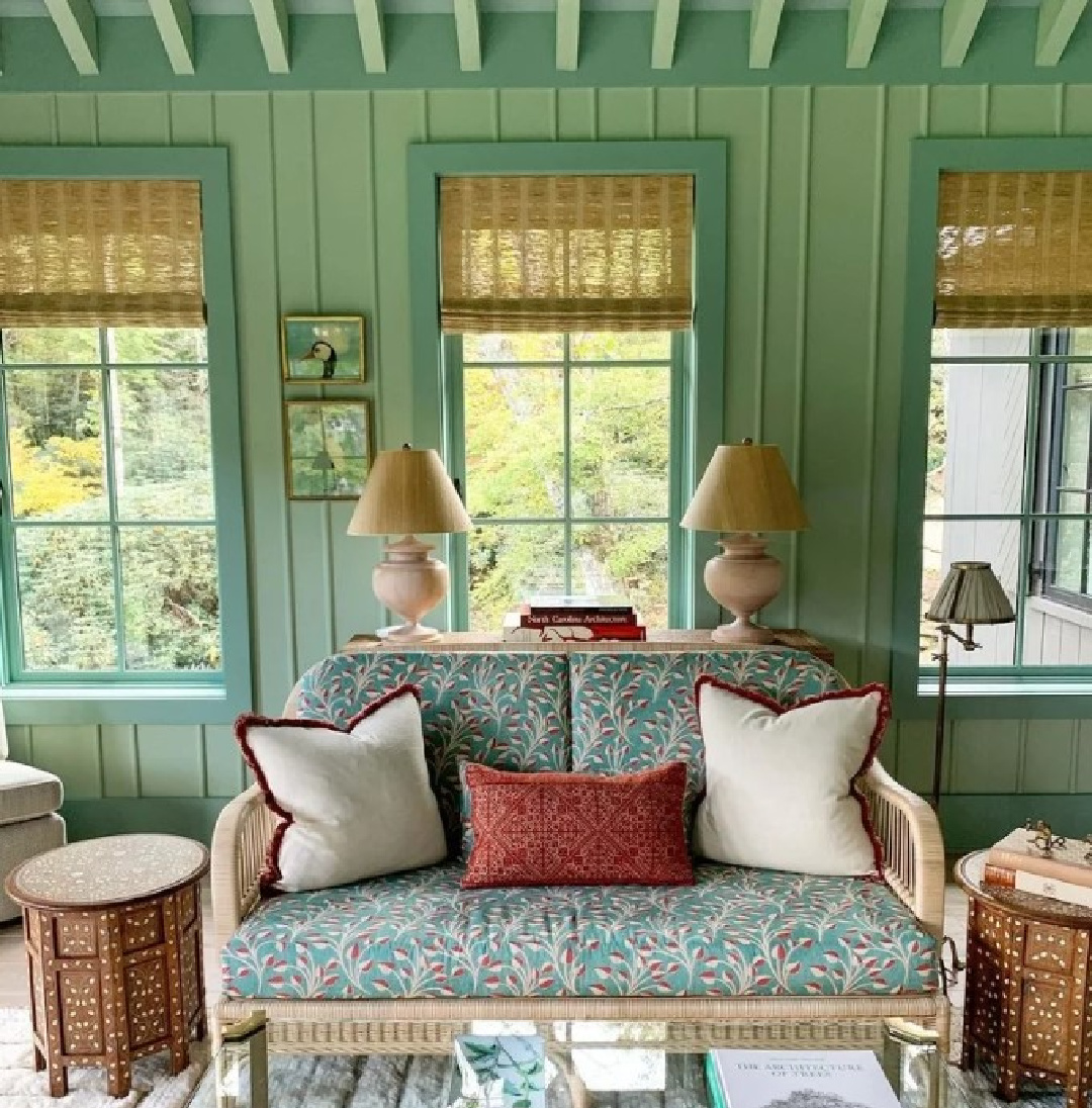
Here we see how Palisociety owners continue this chic signature green in a guest house on the property.
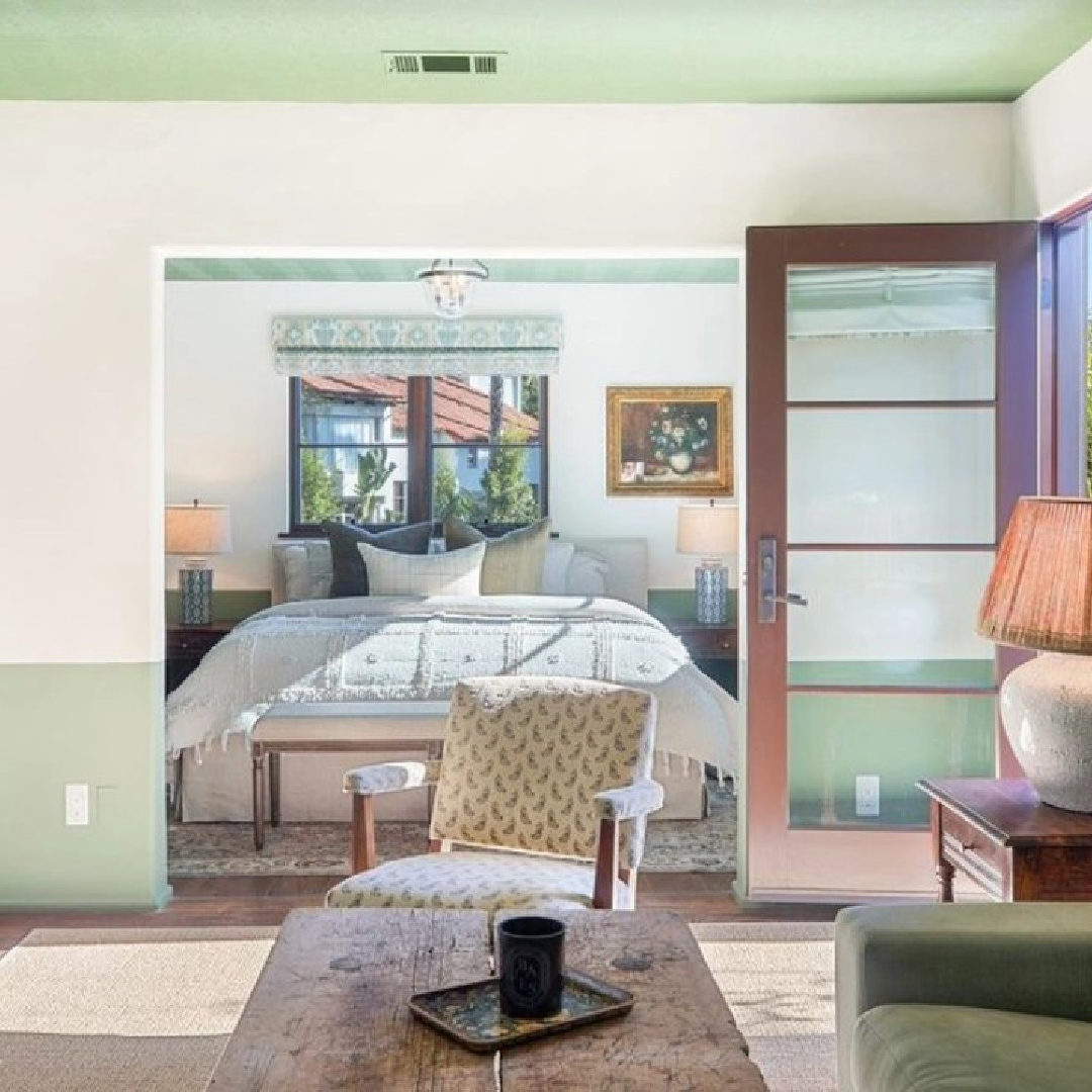
Have you ever lived with a partially painted wall suggestive of wainscot or paneling?
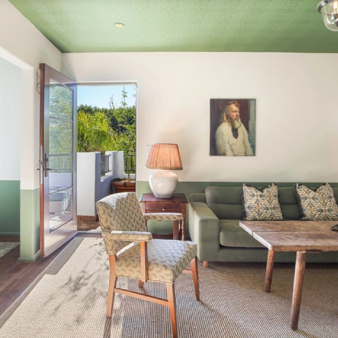
I recall learning about such whimsical faux panels in Katrin Cargill’s book on historic painted Swedish interiors decades ago. What’s interesting is how the effect feels more modern than traditional.
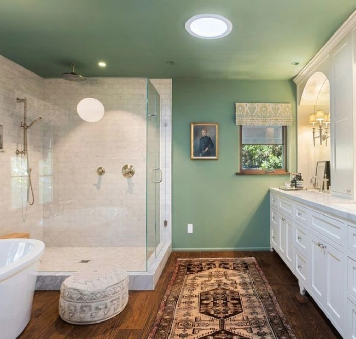
I can imagine this green working well in a midcentury modern home or a home where the wood trim and doors are stained brown, and you’re not crazy about brown.
Before painting all your trim white (ahem…not that there’s anything wrong with painting it white if it’s not a historic home or rental), maybe the right green could bridge the gap.
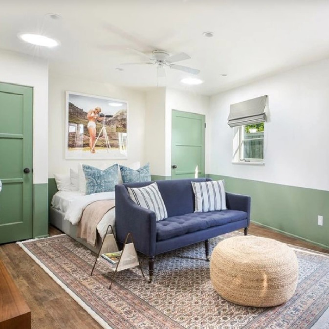
Not sure you noticed, but the baseboard trim is also painted green.
Farrow & Ball Breakfast Room Green
If you’re considering Breakfast Room Green for a wall, piece of furniture, trim, or kitchen cabinets, these inspiring examples may help.
You can truly see the beauty of this color in its relationship to woodwork, yes?
It always helps to see a paint color in various lighting conditions, and above, we see it in a more dim space so the color appears cooler.
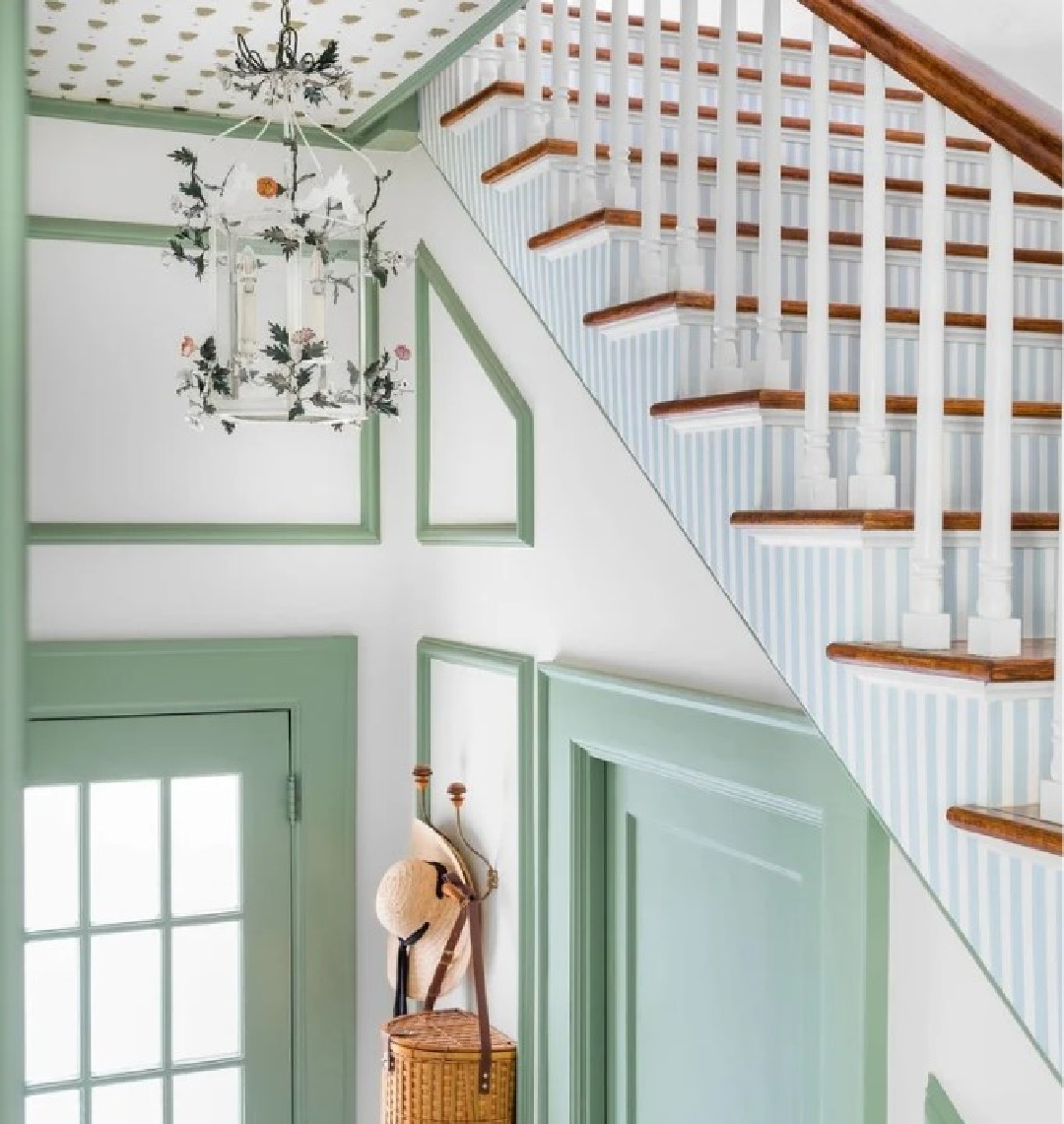
What a divine celebration of Breakfast Room Green in this entry area above! Notice the bee wallpapered ceiling and striped wallpapered staircase! Storybook charm is delivered!
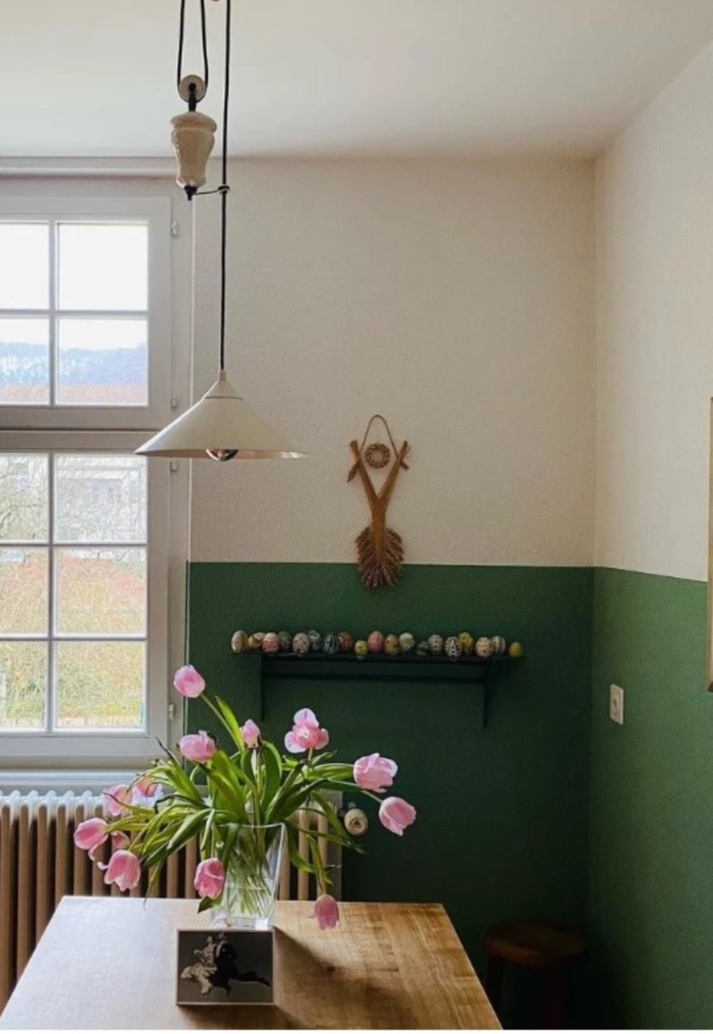
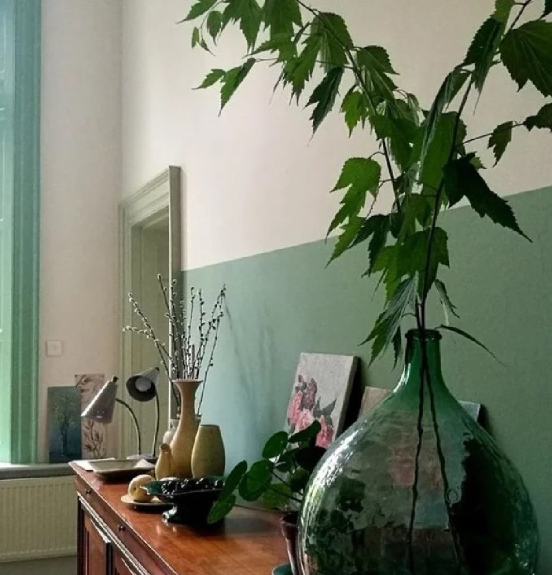
In this dining area above, a lower wall is painted green but the green does not extend to the perpendicular wall.
YOU: Are accent walls in style or so five minutes ago, Michele?
me: HERE ON PLANET TIMELESS, WE JUST DON’T HAVE TIME TO CARE. If you like them, go for it. Not for you? Skip ’em. The design police are still not making any arrests.
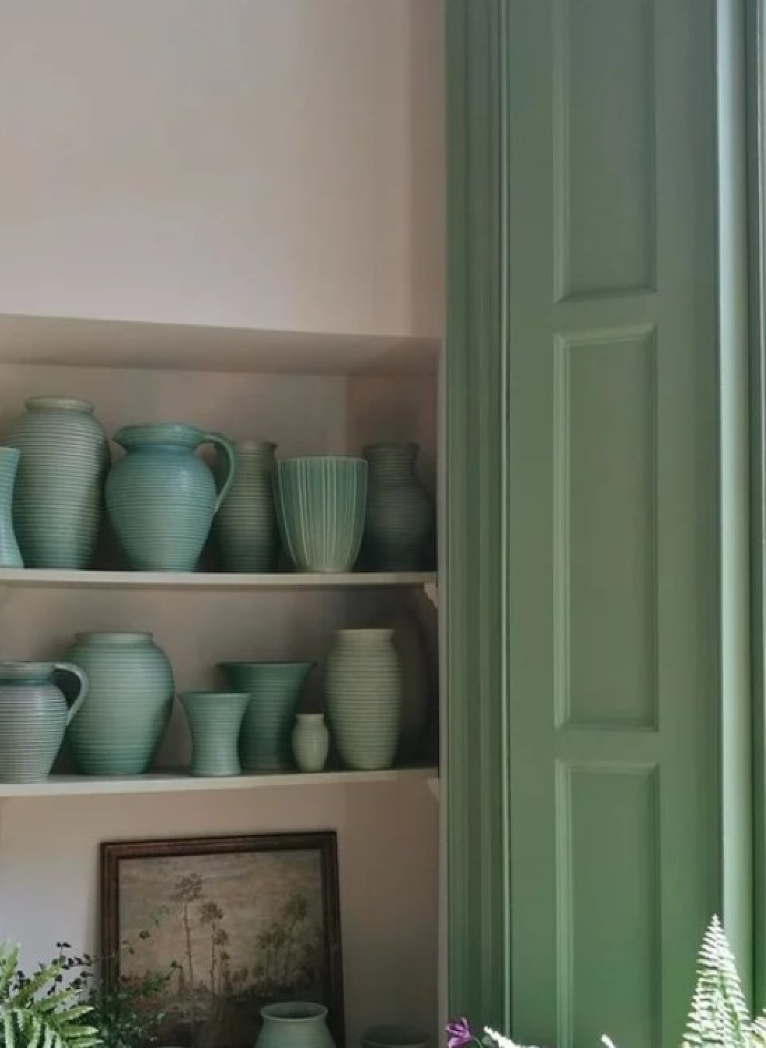
I have always been smitten with how this green was used on a shutter with all the green pottery! And don’t forget there isn’t any sort of rule as to how much of the wall to paint with an accent color. It truly depends on your room’s architecture, ceiling height, and furniture placement.
Combining Your Favorite Greens
What if you can’t decide between beautiful green paint colors that hold potential? Feelin’ saucy?
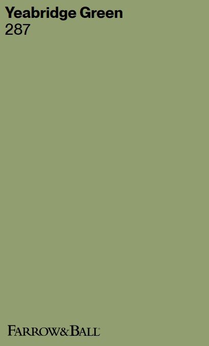
Fancy Yeabridge Green?
“This fresh avocado green was discovered in an 18th century Georgian farmhouse in Yeabridge, Somerset, when the original gun cupboard was removed. Although untouched for many years, it was still astonishingly bright and reminiscent of the lush grass that surrounds the house. This uncomplicated, clean green sits happily in both contemporary settings and period homes. It has a little more yellow than Breakfast Room Green. Pair with Hague Blue to create a truly uplifting interior.” -F&B
I am suddenly craving guac, and that’s something to consider if you are covering your walls with green. You can definitely see Yeabridge Green’s yellow undertones when you compare the two swatches together. Would it EVER occur to you to combine these greens as designer Timothy Whealon did (above)?
Here’s another context where two greens (Green Smoke and Yeabridge Green) collide:
So innovative and interesting! If you’re thinking you could never live with all that green…bet you live with the color unknowingly since so many beige, grey, and greige tones have green undertones! Are you a fan?
I independently selected products in this post—if you buy from one of my links, I may earn a commission.
Peace to you right where you are.
-michele
Thanks for shopping RIGHT HERE to keep decor inspiration flowing on Hello Lovely!
Hello Lovely is a participant in the Amazon Services LLC Associates Program, an affiliate advertising program designed to provide a means for sites to earn fees by linking to Amazon.com and affiliated sites.
