Gray colors are on my radar this very moment as they are playing a prominent role for renovations at the new house. 9 Light Gray Paint Colors for a Zen Look You May Love + Interior Design Inspiration Photos is a brilliant place to start when you’re seeking inspiration for calm greys. Trial and error is an intelligent part of the process and necessary for arriving at the perfect hue, so don’t rush into a quick decision. Also, I have strong sentiments about trending paint colors and whether grey is in or out…curious to know this color consultant’s take?
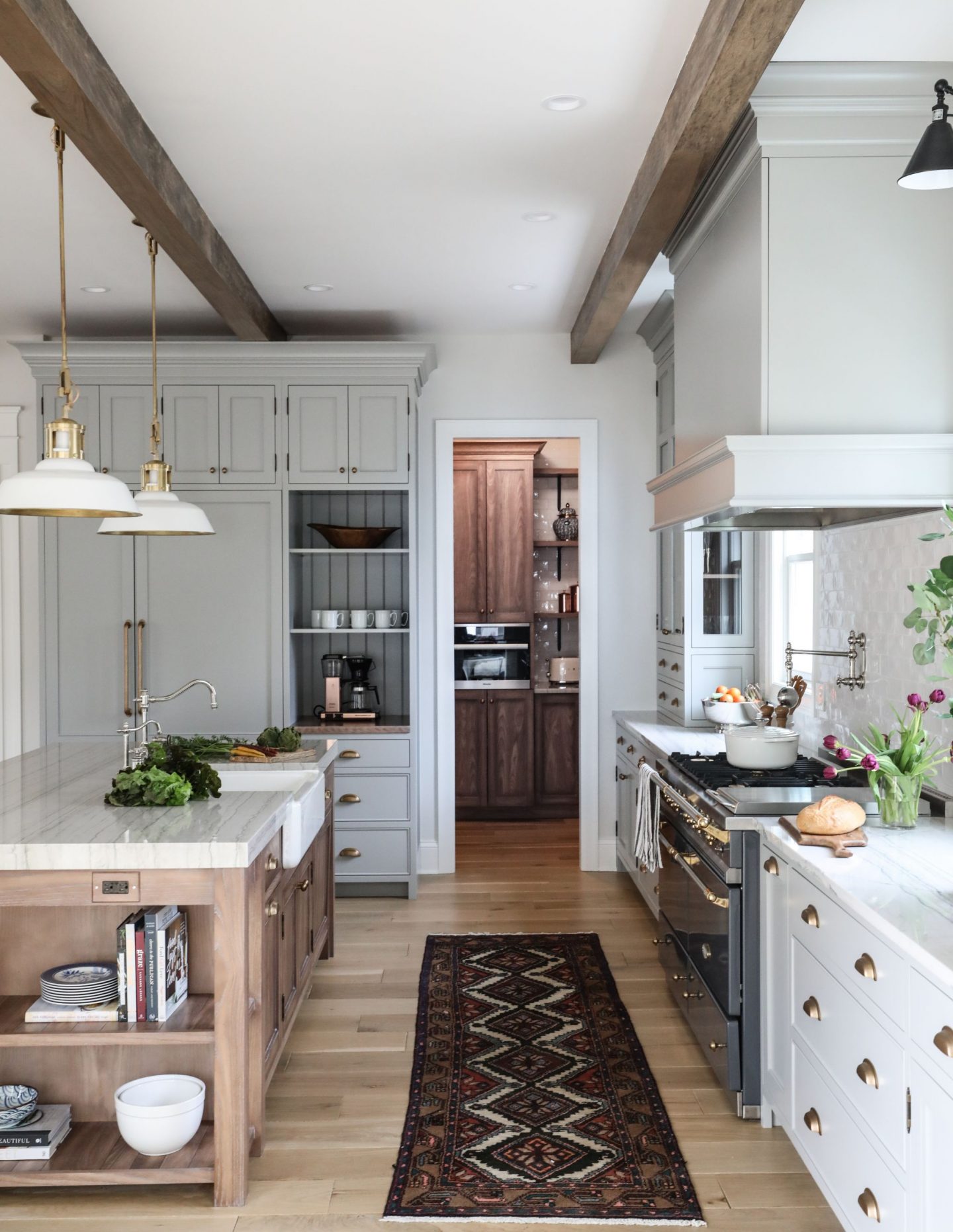
9 Light Gray Paint Colors for a Zen Look You May Love + Interior Design Inspiration Photos
Light grey is the color of a Northern sky, a dolphin, silver, pebbles, the moon, and furry friends of varying species.
The color creates a mood, and for me, that mood is quiet and zen-like. So it doesn’t surprise me whenever it happens to be trending for interiors and walls.

What DOES surprise me is when homeowners feel hesitant to paint walls grey because some blogger (or micro-blogger on Facebook…I’m lookin’ at you, Aunt Sue or your cousin Mike) blasphemes that grays are out.
Really? Is silver just “so yesterday?”
Nope.

Choose your palette by adopting a broader lens and a timeless mindset. Choose your palette by adopting a broader lens and a timeless mindset. If a color imparts warmth, has depth, seems like the perfect greige or the best gray for your lighting conditions, that is quite enough reason to go ahead and sample it on your walls.
In other story, we looked at blue-greys in particular.
Buy Samples & Organize Your Favs
Pssst. Buy samples before investing time and money into a whole gallon. (In fact, did you know Farrow & Ball now offers sample pots to the USA? YES! TAP HERE and you can choose color samples to try…SCORE!).
The Farrow & Ball sample pots are 100 ml, which is roughly 3.5 oz of beautiful paint.

If you don’t already have a Pinterest board devoted to paint, create a board and tap here to PIN THIS POST so you’ll have paint names at the ready when you head to the store to buy samples to try on your walls.

Some of these grays meant to inspire may read “medium” or even slightly dark gray, depending on the lighting in your space.

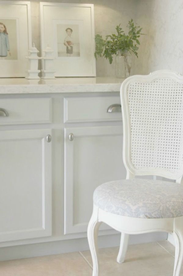
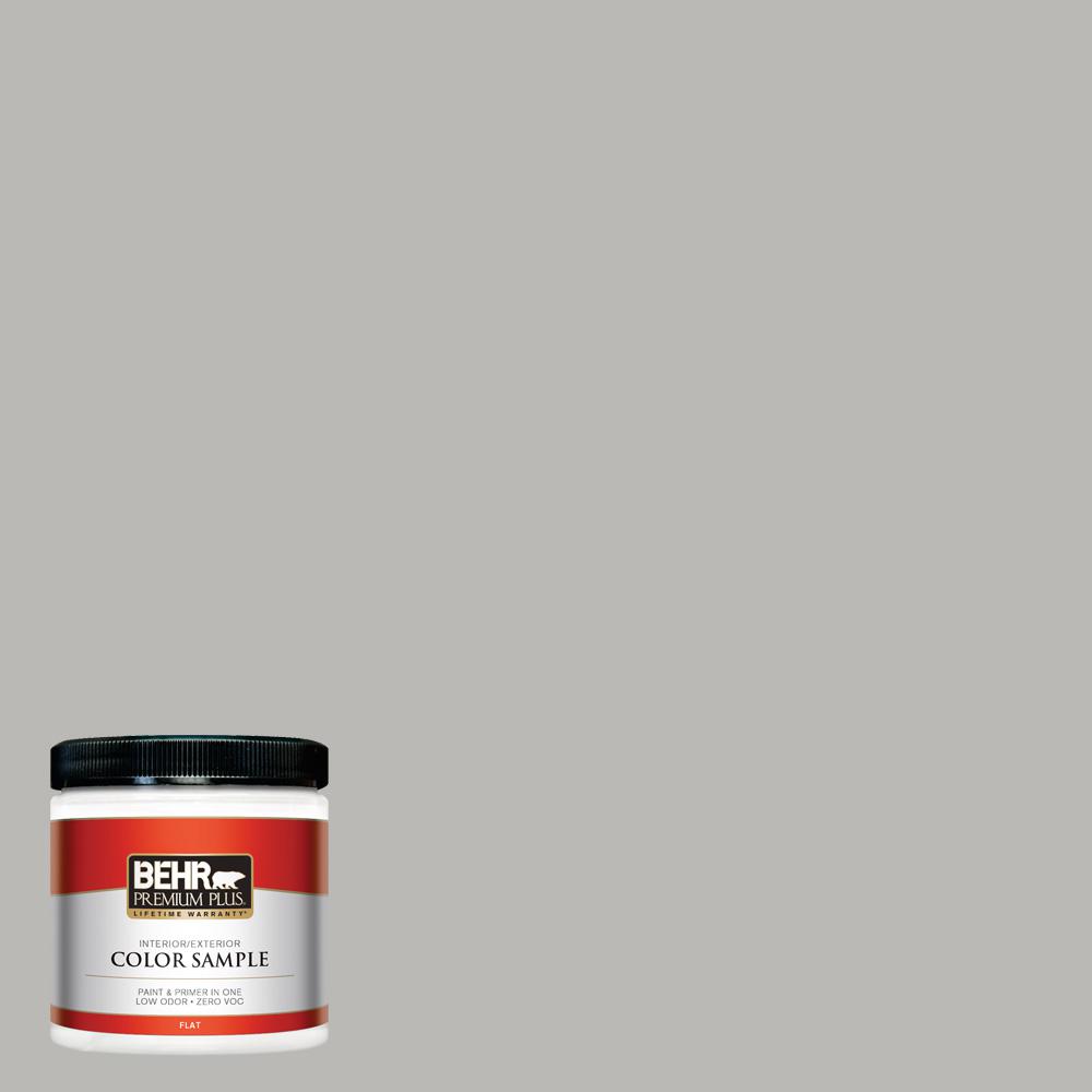
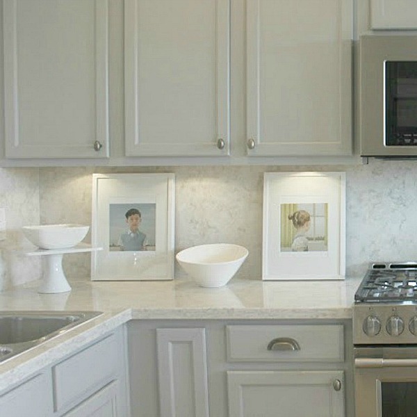
For example, this first gray, BEHR Classic Silver is the grey I painted the cabinets in our second home in sunny Arizona. Because of the intense sunlight and its blue undertones, the color reads as light French gray in the space.
Don’t count out pricey Farrow & Ball colors either (which you can always color match after snagging a sample – get them RIGHT HERE!)
1. BEHR Classic Silver
I love how serene this grey feels in the kitchen, and the blue undertones gave those builder-grade plain ol’ cupboards a very sophisticated, timeless boost.
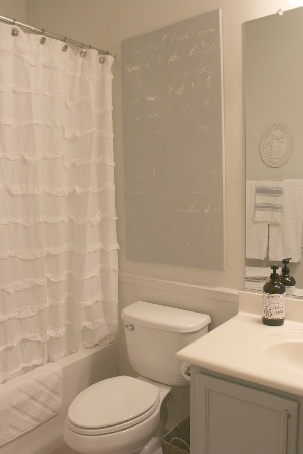
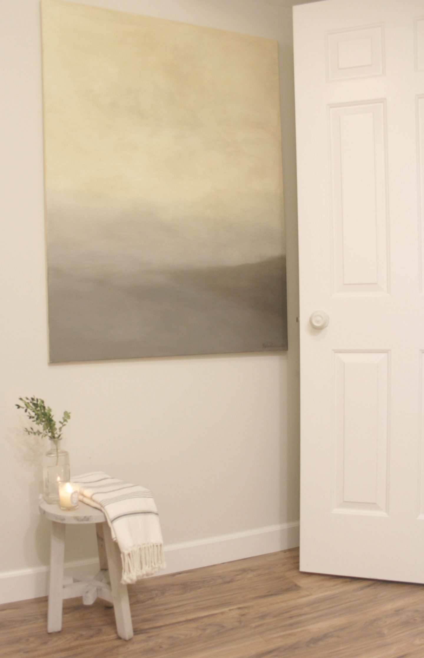
For this art work in a bathroom, the canvas is painted BEHR Classic Silver (and wall color is VALSPAR Salute).
2. BM Pashmina
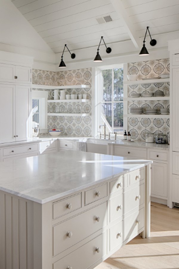
When a designer reveals the paint names used in their own living space, I’m all ears! Lisa Furey painted her white interiors and exterior in the same color I used here at home…BM White.
For the gorgeous mushroomy taupe-ish Parisian style grey painted kitchen island in her coastal cottage, she painted it BM Pashmina. Pashmina is similar to Agreeable Gray SW which is what our current bedrooms are painted.

3. SHERWIN WILLIAMS Tinsmith
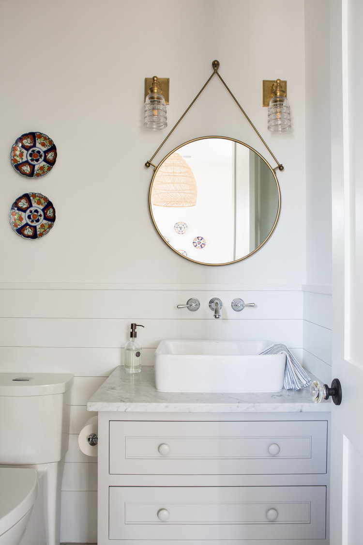
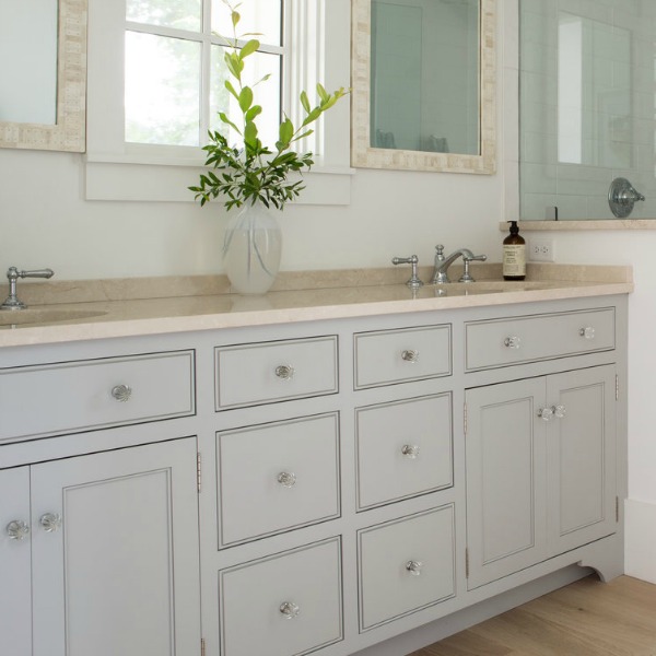
Another light gray suggestion hailing from Lisa Furey is an amazing ray called SW Tinsmith, a cooler and gentler grey used on bathroom vanities. Also take a peek at these possibilities with green undertones: Gray Owl, Mindful Gray, SW Dorian Gray.

4. SHERWIN WILLIAMS Dorian Gray
Sometimes word gets around about a certain color, and you see it crop up everywhere…which was certainly the case with this popular one!
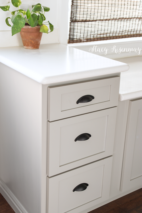
The thing is, it’s popular for good reason!
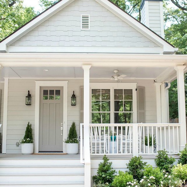
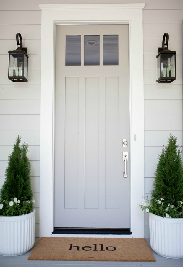
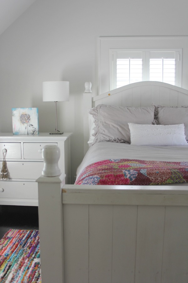
5. BM Stonington Gray
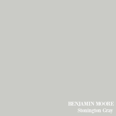
I love how atmospheric, neutral, and balanced this cooler gray, Stonington Gray is – almost like a tranquil overcast day where you cozy on down with a book.
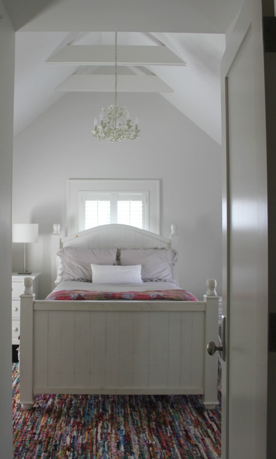
BM Stonington Gray
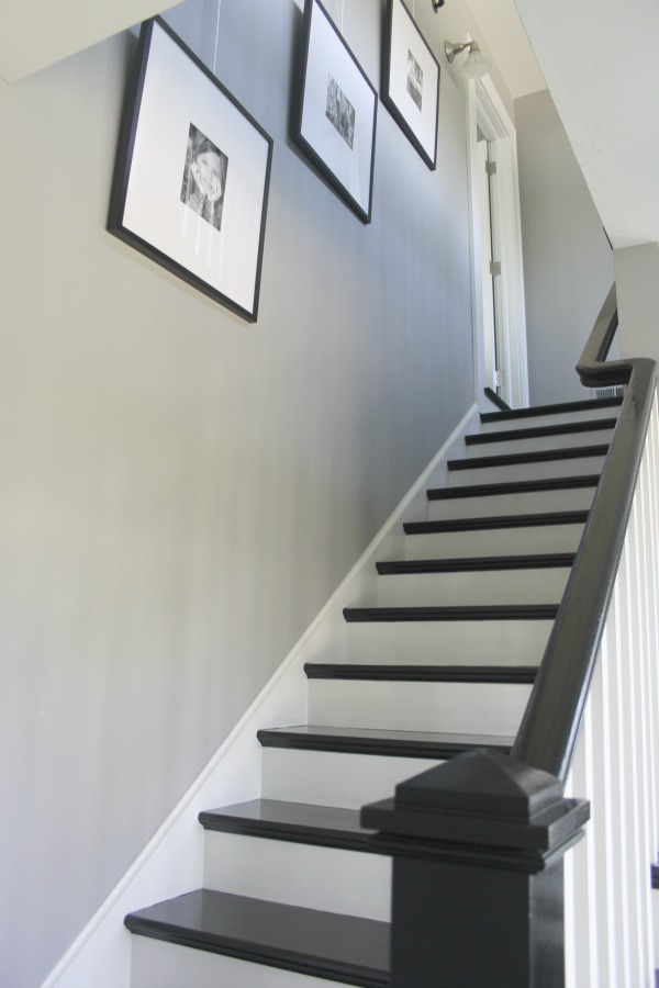
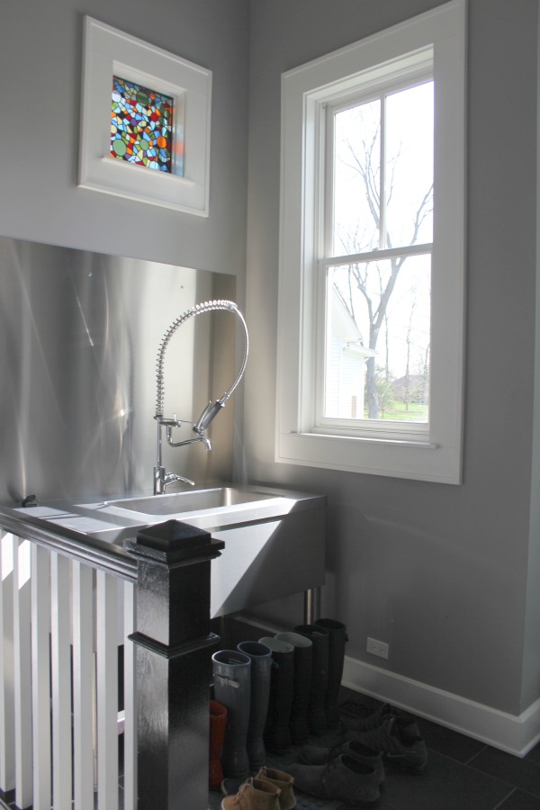
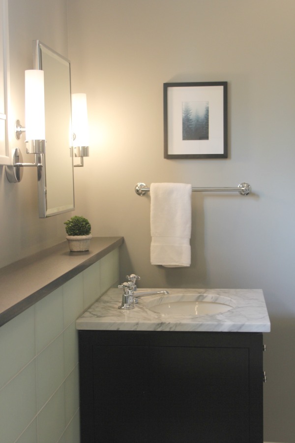
Similar to Stonington Gray? FARROW & BALL Pavilion Gray:
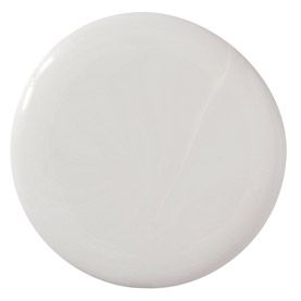
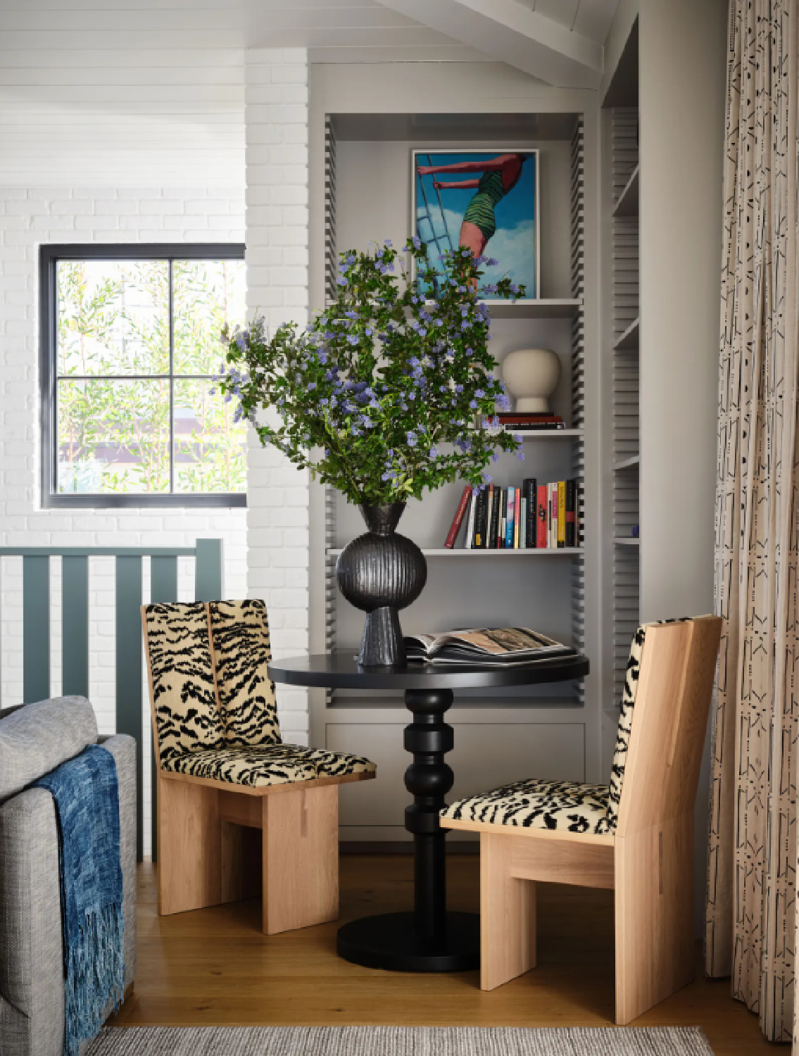

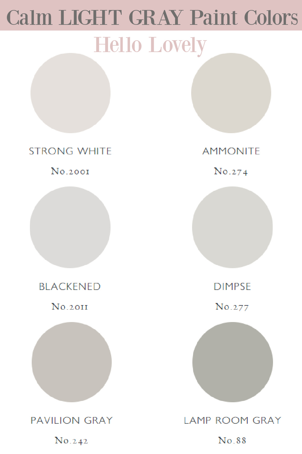
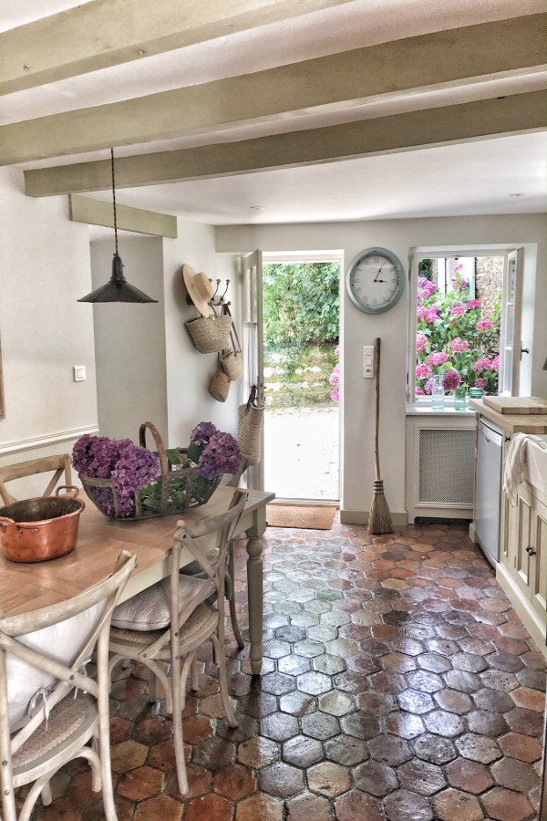
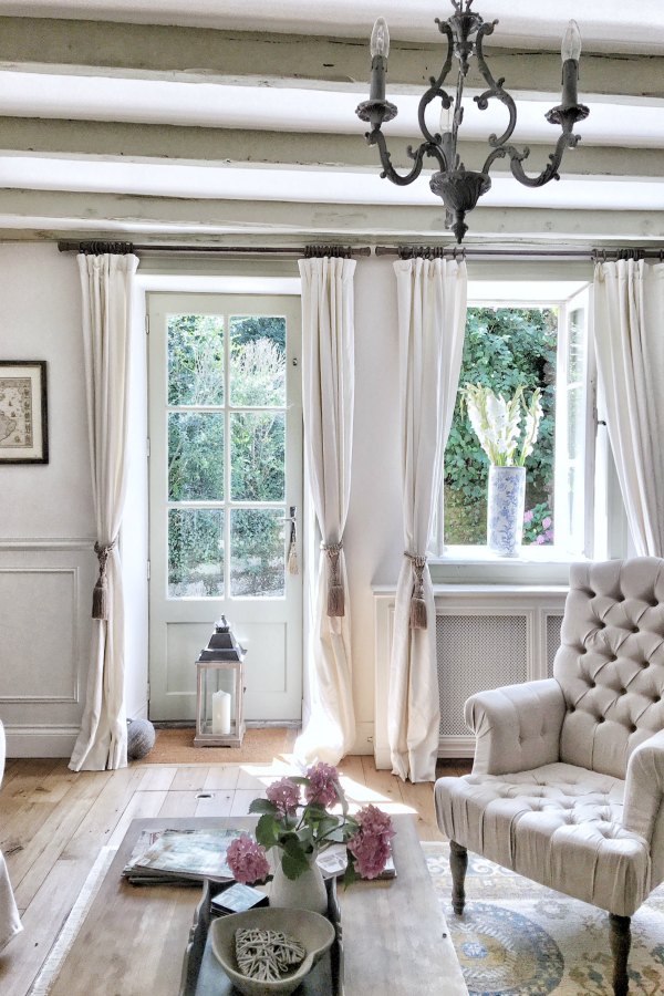
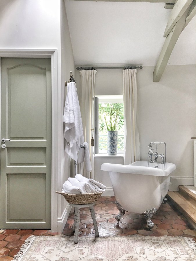
6. FARROW & BALL Strong White 2001
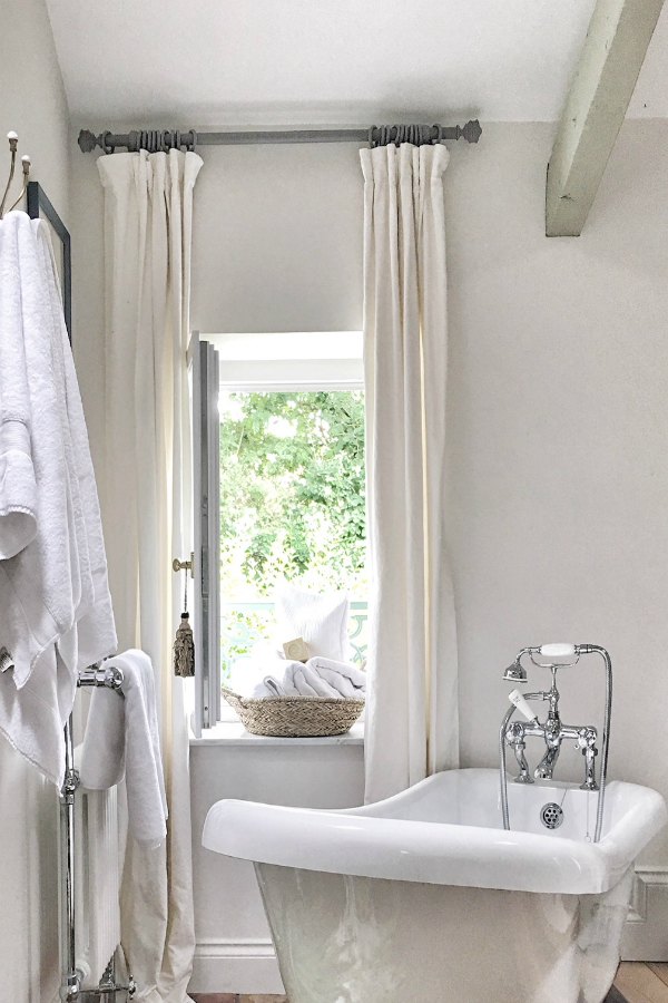
Here’s the thing about paint names: sometimes they contain “white” in them when they live large as a grey.
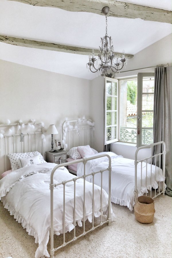
FARROW & BALL Strong White 2001


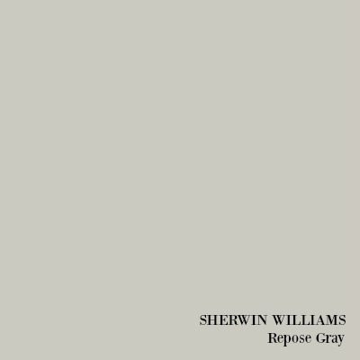
7. SHERWIN WILLIAMS Repose Gray
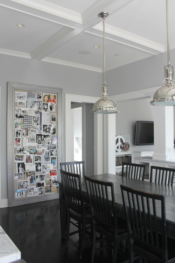
This is a gorgeous, calming grey color that I am presently living with at the new house. It is painted on the walls of the dining room, living room, entry, and powder room. It never reads cream or beige as SW Agreeable Gray often does.
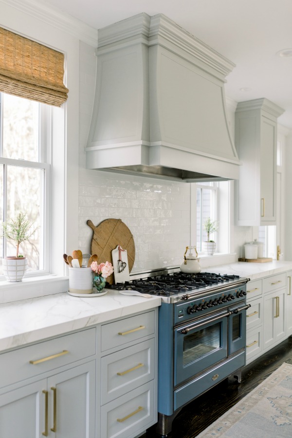
I am considering Repose Gray for kitchen cabinets too! Why? It is beyond popular for good reason. When you’re after a greige that adds dimension with crisp white trim and only seems to improve when the sunlight hits it…this is it.
In fact, since I’m a huge fan of atmospheric blue-greys, I love how Repose Gray looks with natural light. BUT. If your room is dim, you may still love it!
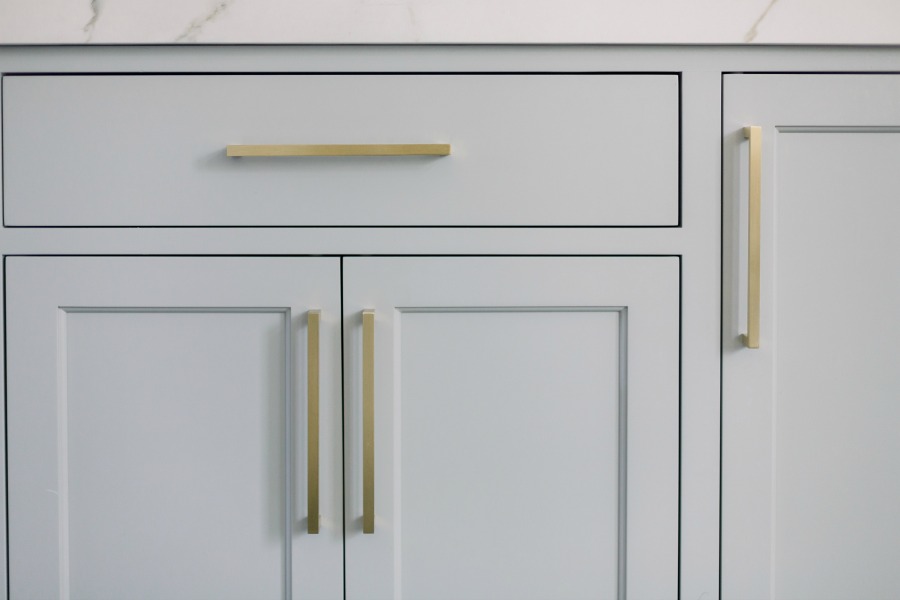
I know this because I still love it on the gloomiest of Chicagoland days! It is cooler for sure, but never cold or sterile.
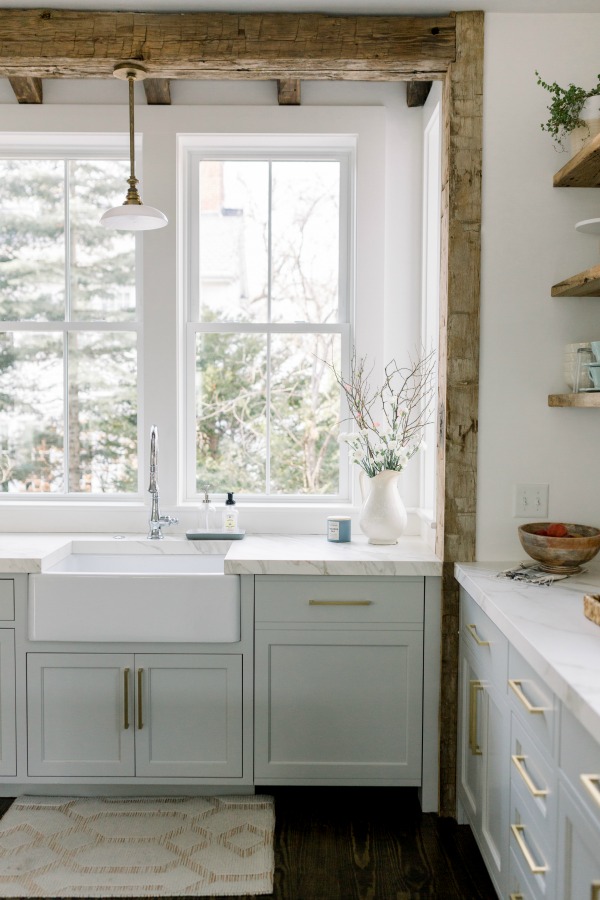
See this kitchen tour and resources too RIGHT HERE.
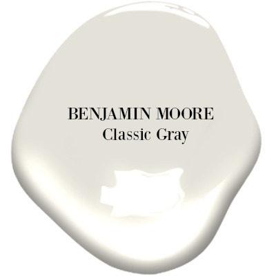
8. BM Classic Gray
If you’re looking for a perfect white for your room, it just may be a barely there, light grey like this one which I used in a bathroom. (Don’t underestimate it paired with navy!)
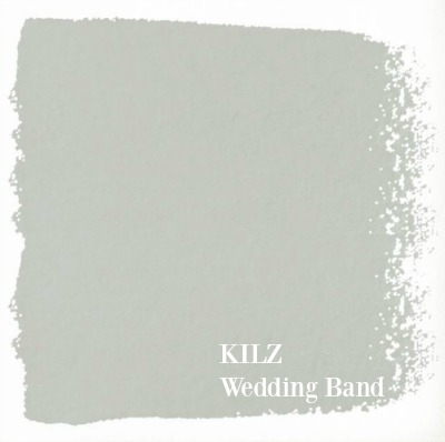
9. KILZ Wedding Band
For a soothing warm gray color, Joanna Gaines has gone on record and given a thumbs up to KILZ Wedding Band.


Smart Gray Color Tips
1. Consider all the various nuances of light grey paint colors (is it cool, warm, bluish, mushroom-ish?).
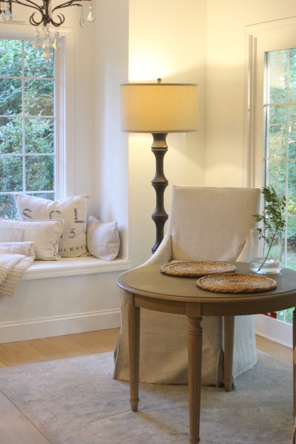
2. Decide whether objects in the room are cool (choose a cool grey) or warm (choose a warm grey).
3. Assess the lighting in your space…does it receive a ton of natural light (go with a less pigmented hue) or very little sunlight (go with a more pigmented option).
4. Choose a few greys to test large swatches on the walls.
But which greys?
It’s Smart to Start Your Search Online
We all understand how the perfect white at my house in Chicagoland may come off completely different for someone trying it in New Mexico.
A room’s exposure, geography, and other factors come into play.
Additionally, photos we view online are often edited and tweaked so the the actual color may vary significantly!
So why should you even bother?
Well, it’s still a good idea to pay attention to images online and info as to what designers and folks in the industry suggest as a place to start because it saves time and launches your quest.
Try a Handful of Samples
It is wise to begin your search for the perfect light gray paint with a handful of possibilities because the differences between them will give you valuable information.
While it’s possible to paint on just one sample and decide it’s all wrong or (yay!) perfect, typically you need to see multiple tones to tease out why it works or doesn’t work.
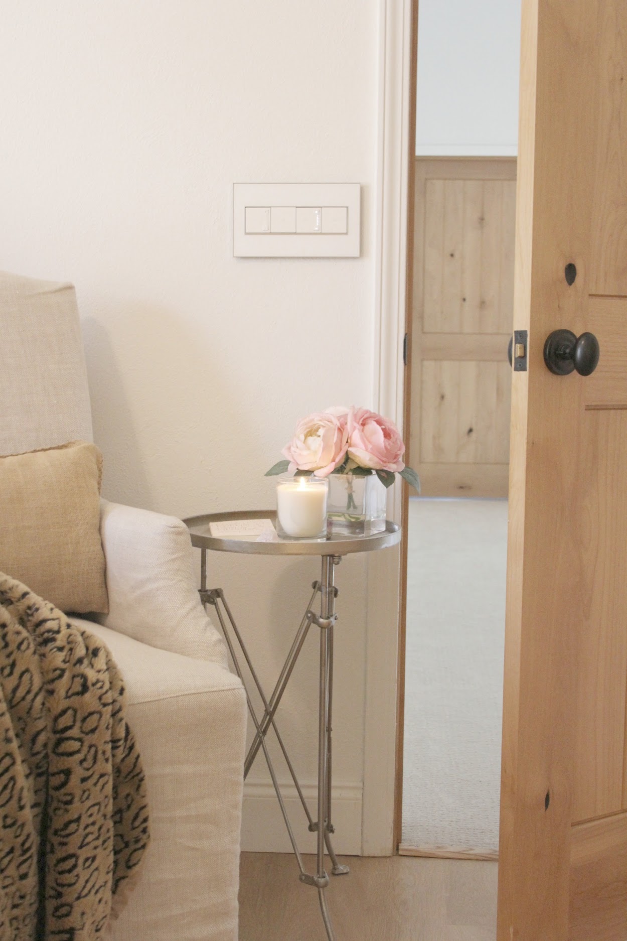
When you view three or more shades of grey in your space, you’ll be able to easier identify undertones coming forward or how one or more may feel too dirty, too green, too cool, or too brown.
Need a Moody Darker Grey Shade?
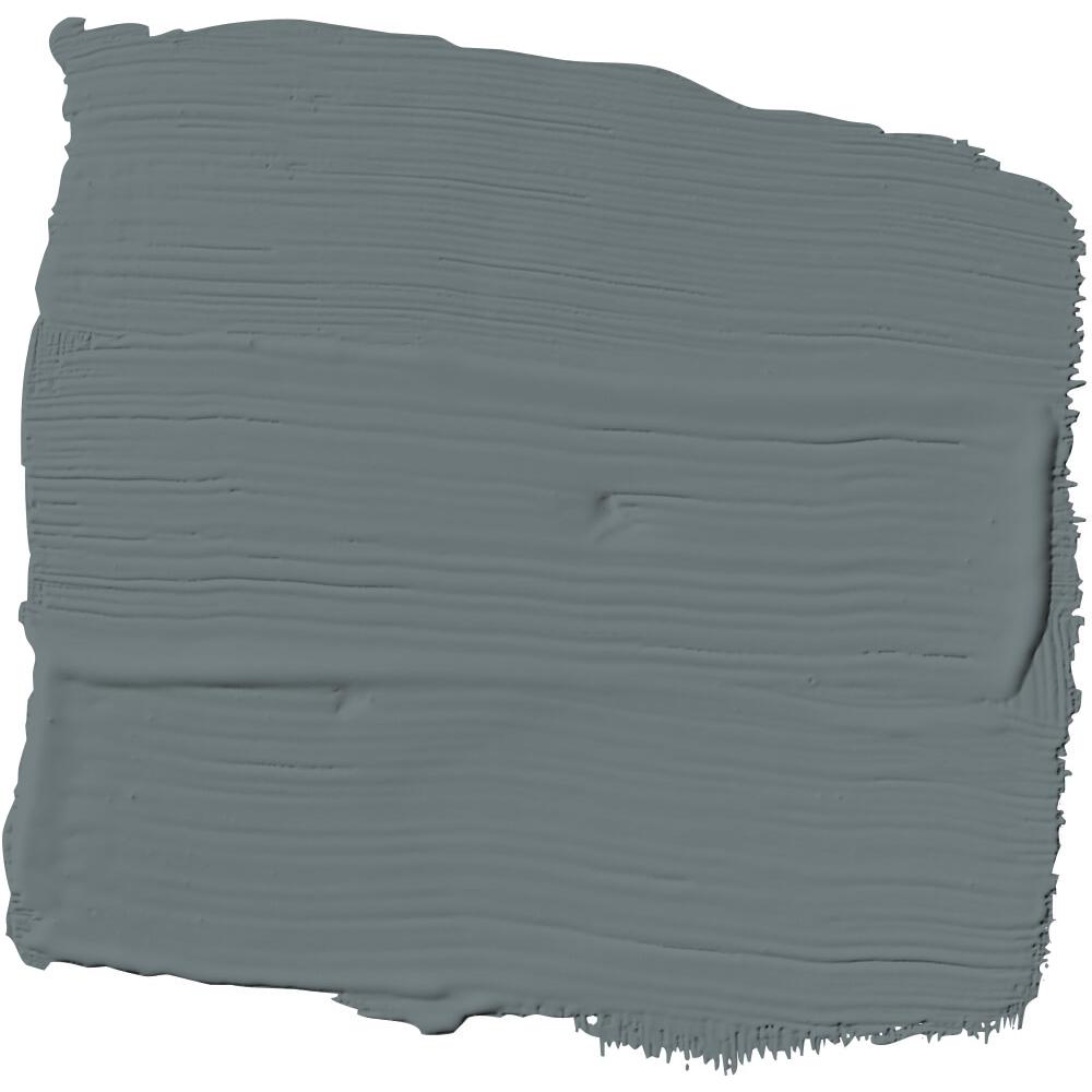
OMG. I spied this shade of grey on a door in Leanne Ford’s IG (are you following me there?), and it’s gorgeous!
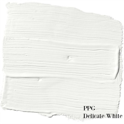
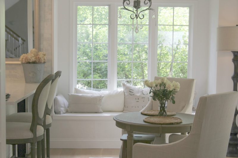
She paired it with walls painted this white which is super similar to the white throughout my own home:
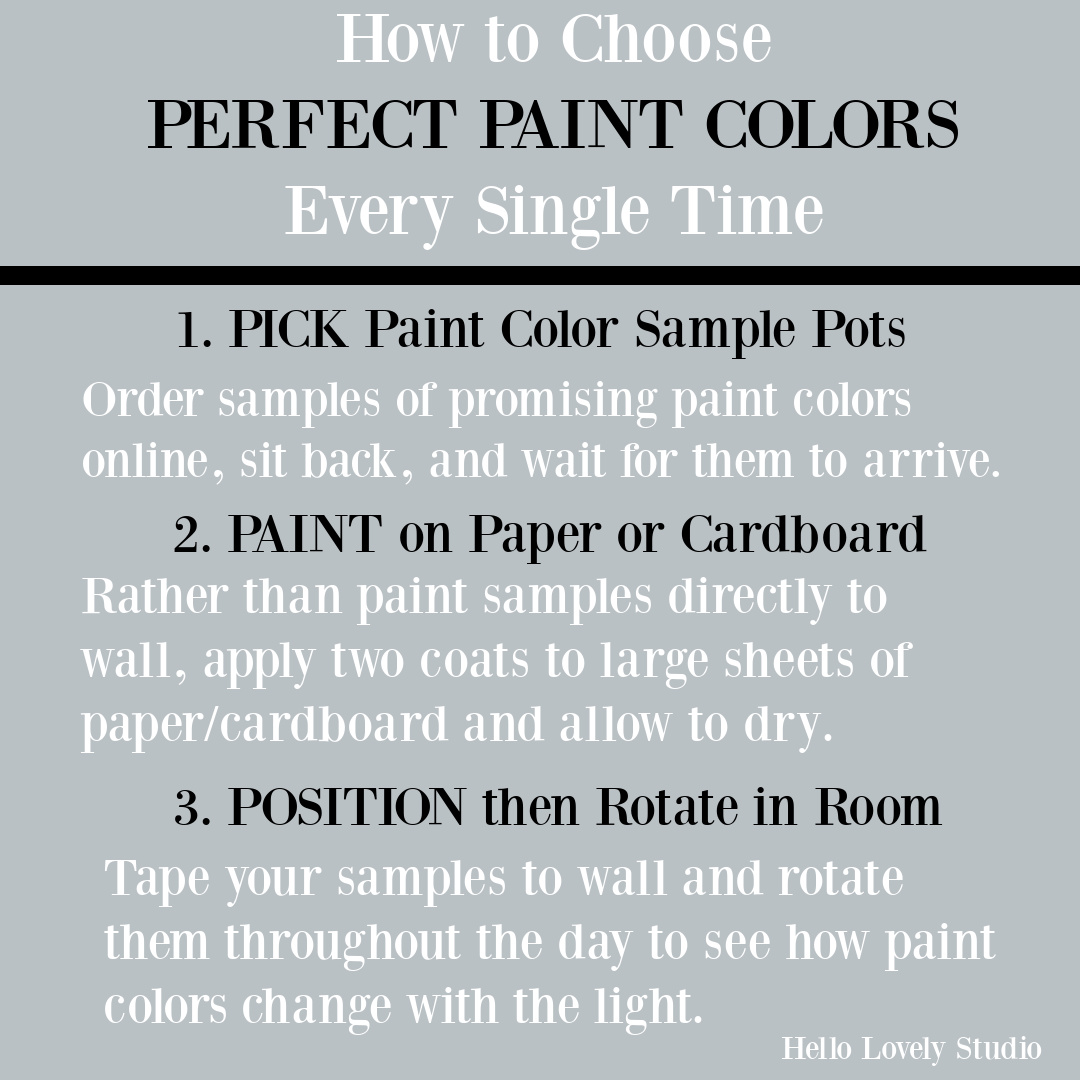
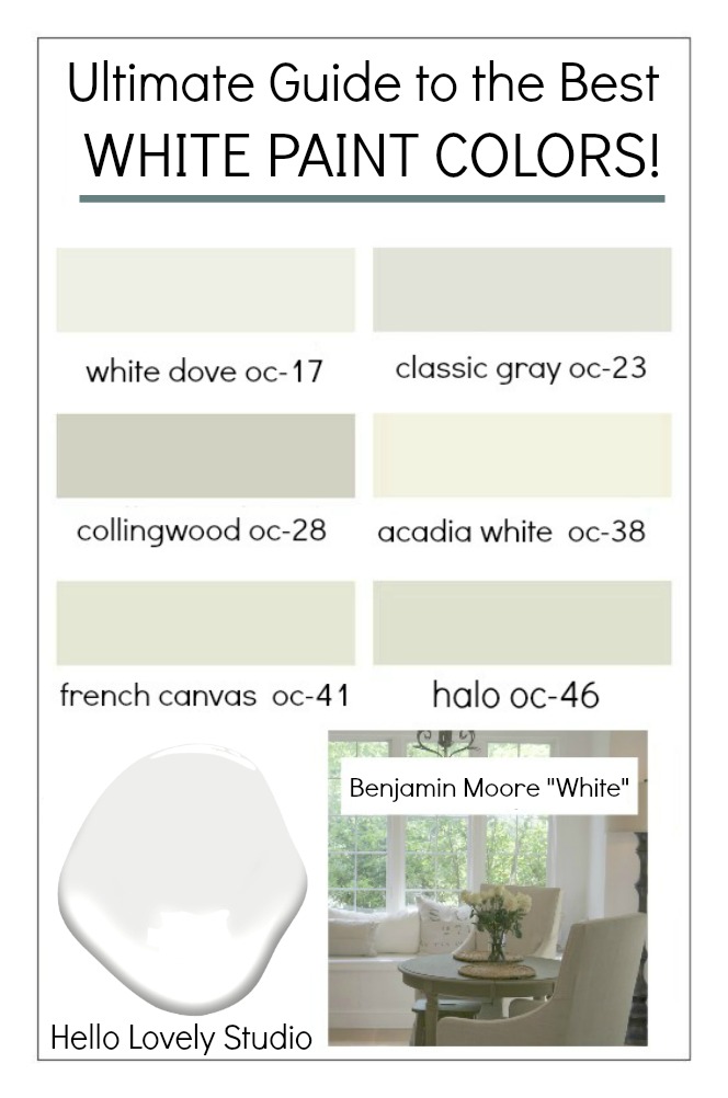
Here’s an infographic with a few more of my favorite white and neutral paint colors from BENJAMIN MOORE (tap it to discover how to choose a great white paint):
YOUR TURN! Have a favorite go-to light grey or neutral paint color? Why do you love it?
I independently selected products in this post—if you buy from one of my links, I may earn a commission.
Peace to you right where you are.
-michele
Shop for items you already intended to buy on Amazon RIGHT HERE, and also find home decor here to keep decor inspiration flowing on Hello Lovely!
Hello Lovely is a participant in the Amazon Services LLC Associates Program, an affiliate advertising program designed to provide a means for sites to earn fees by linking to Amazon.com and affiliated sites.












Good tips on interior color tips. Thank You for the article
Author
Thanks so much for reading. 🙂
Great article since grays are still so popular 🙂 Could you do a post on some popular beige tones? That would be great too!
Author
You bet! Thanks so much for reading. 🙂
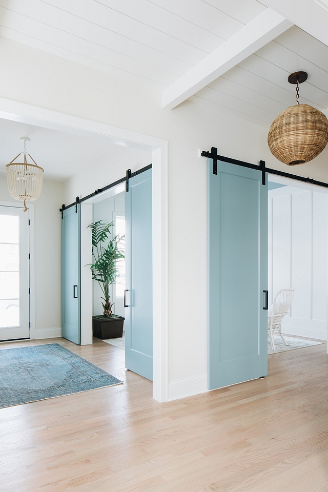
What color are the barn doors?
Author
I couldn’t find the answer – here’s a gorgeous blue in the same spirit: https://rstyle.me/+ZL6Ndx4z6TAEFAXe5KQNJw
Author
Hi again – also check out Benjamin Moore Hearthstone – it is gorgeous.
Loved this article – thank you. On the little cottage painted in repose gray – can you tell me what color the porch floor and ceiling are?
Author
Hi there! No idea – you should send a DM on instagram to Bell Sheep Studio with any inquiry about those colors. Hope this helps.
Fantastic article! Thank you.
Author
Thanks for reading – so happy to have you here.
Thanks for the inspiration.
I am searching for the perfect colour to paint the exterior of our home. Our roof is brown shingles. Do you think gray matter would work with th brown roof or should we stick with sage?
Author
I think gray or sage works well with the brown, and sometimes when I can’t decide, I mix the two tones together and find it’s just right. So how about a greeny-gray custom color from the two you like?
Thank you so much for this informative article.
Author
So happy you liked it. 🙂
what wall color goes good with amber cherry cabinet ?
Author
If you’re looking for a light gray color to go with the cherry cabinets – try Sherwin-Williams Agreeable Gray. It’s a grey-beige or greige and is not too cool, not too warm. If it isn’t dark enough and your space has ample natural light, consider Benjamin Moore Revere Pewter.
Great post! I’m saving onto Pinterest. The gray I love most is SW Agreeable Gray. It works in sunny rooms and also those with no light. In my sunny living room at some times of day, it takes on a little green and others, a little blue. It never feel cold.
Thank you for your wonderful blog!
Author
Thanks so much for sharing these particulars about Agreeable Gray, Beth! It is the color we currently have in all of the upstairs bedroom at the new house and is so calming. So happy to have you here and hope you’ll keep following the journey. Have a wonderful weekend.
Thank you for the information I’m trying to redo my house and I’m looking at Joanna Gaines wedding band I have different lighting throughout the living room due to a porch that gives me less light. versus open windows which gives me more light I’m just afraid it may be too dark but with the white trim I think it will look good with my furniture and my home. I need to have a color that I could do all my kitchen cabinets with do you have any suggestions I want them to be light color wanting them to be more on the white scheme.
Thanks
Diane
Author
Hi Diane. Wedding Band is similar to what I have in my living room here (Sherwin Williams Repose Gray). The upside of not having a lot of natural light with a grey color is it won’t read blue which can happen when yellow sunlight. However, if you love blue (as I do), you may want to go a little lighter – you could have them mix it at 60 or 70% saturation. As far as a white for kitchen cabinets, if you like a more traditional look, I would go with Benjamin Moore White Dove. If you like a greyed white, try Benjamin Moore Classic Gray (it’s very light and not like Wedding Band). If you are after a modern, crisp, brighter white, go with Benjamin Moore Chantilly Lace. If you pick up a sample of BM Classic Gray, check to see if you like it for the living room – it would be lower contrast with white trim, but still would provide contrast. I loved Classic Gray in our lower level which received little to no natural light. Let me know your thoughts.