Time to paint! HOW HOW HOW is it possible we have already lived in this house for a year? For months, we camped out in dust and chaos without a kitchen, and we are now approaching the homestretch of our primary bath’s full gut and remodel. Today I am mulling over neutral paint colors for the walls. Do I continue the bedroom color into the bath? Go for bright white? A soft off-white with grey undertones? THESE ARE PRESSING MATTERS, AND YOU CANNOT CONVINCE ME ANYTHING ELSE IS MORE IMPORTANT. Fine. But it’s important enough to devote time to mindfully select a good neutral so I won’t have to change it for years. Serene Neutral Bath Paint Colors and timeless inspiration are comin’ at ya.
I independently selected products in this post—if you buy from one of my links, I may earn a commission.
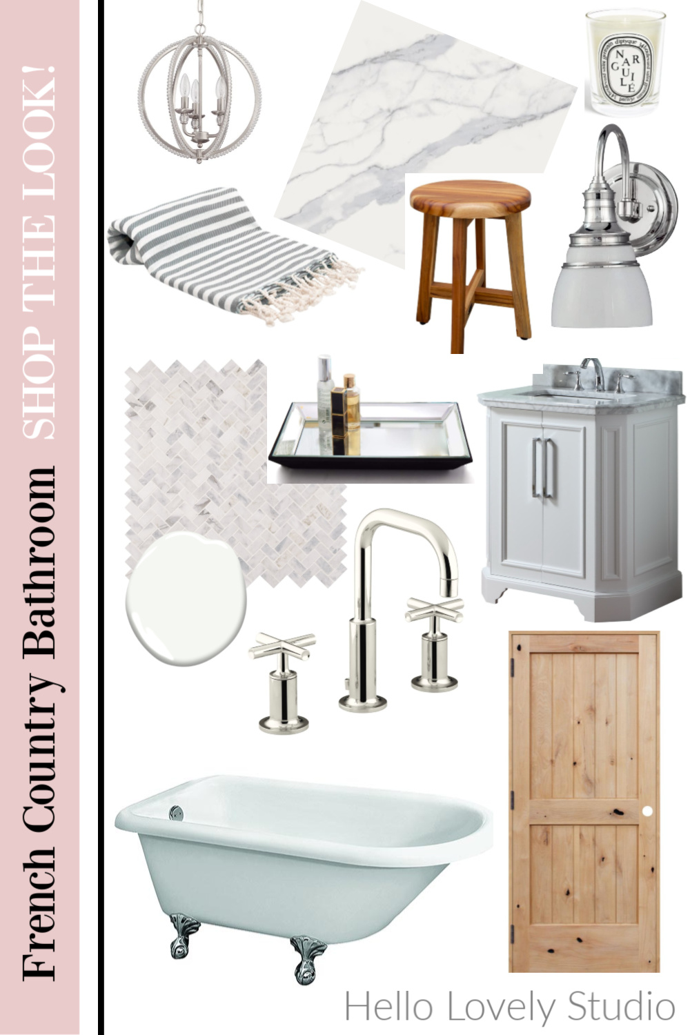
Serene Neutral Bath Paint Colors
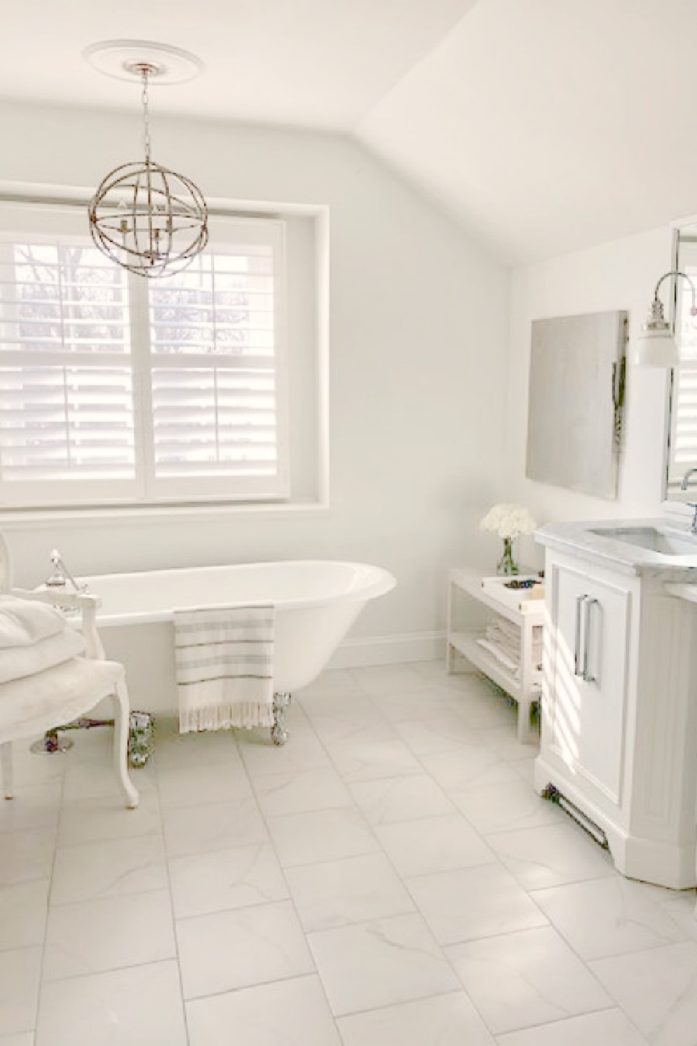
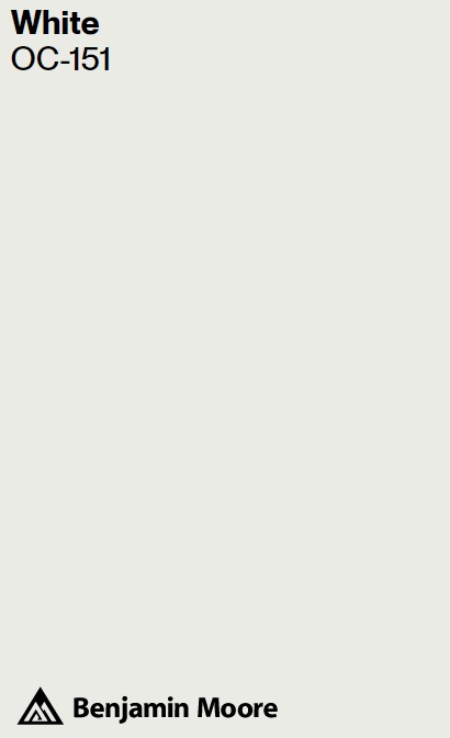
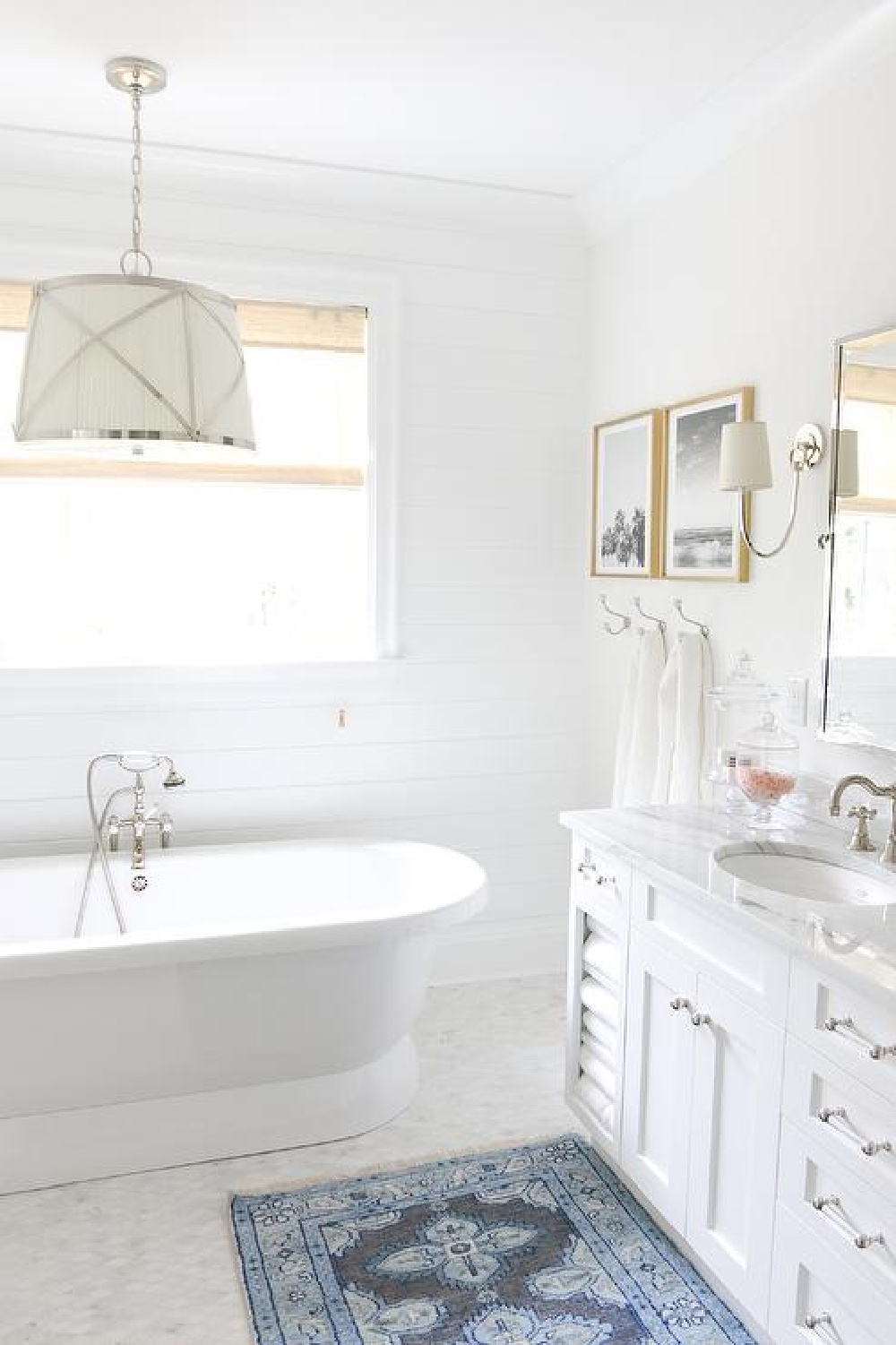
BM White OC-151
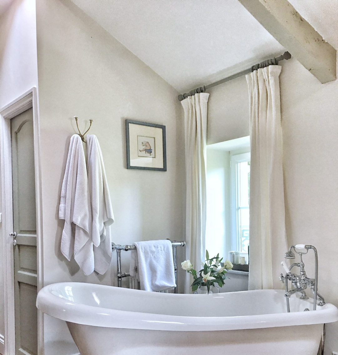
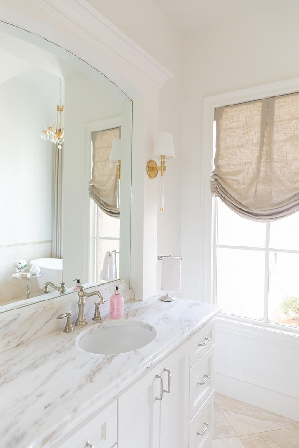
I am strongly considering sticking with this bright cool white since it served us so well in our last bath (see image above). I never tired of it, and I love its clean feel. In our former home where we used it on everything from ceilings to walls to trim, it had blue undertones for which I’m a fan.
Blue or grey undertones would also be nice with the other design elements we’re putting in the bath including carrera marble, white statuary marble, and polished nickel. BM White OC-151 is what Benjamin Moore calls an “all-purpose” white that is classic and like a clean canvas. If you don’t like an airy blue cast to your white paints, you may not dig it. But lots of us are into blue.
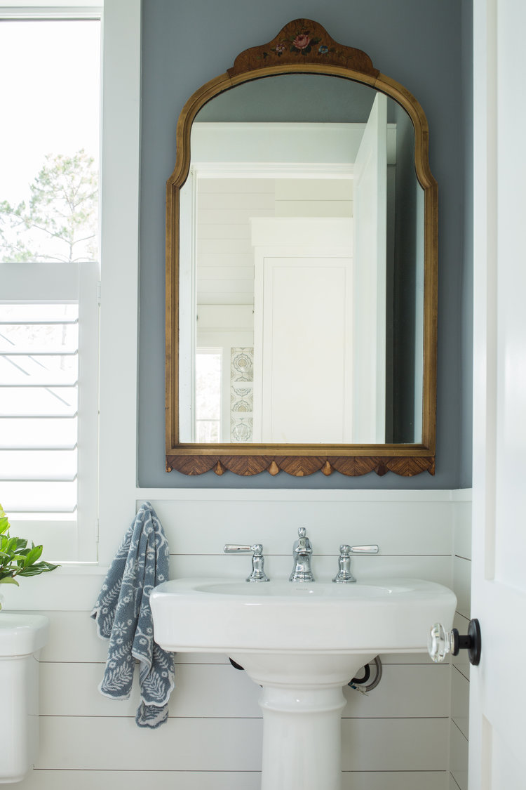
Lisa Furey used BM White on all the interiors and exteriors of her former Palmetto Bluffs coastal cottage, including the bath above with shiplap. (I think the blue on the wall above shiplap is BM Andes Summit.)
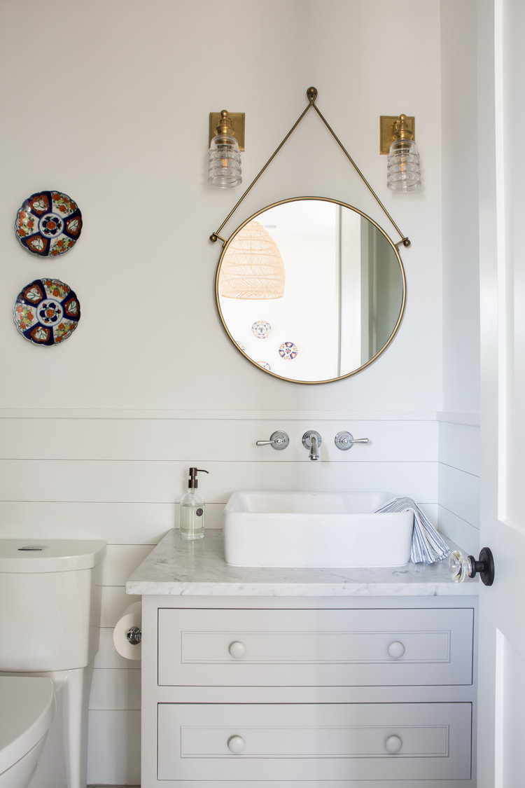
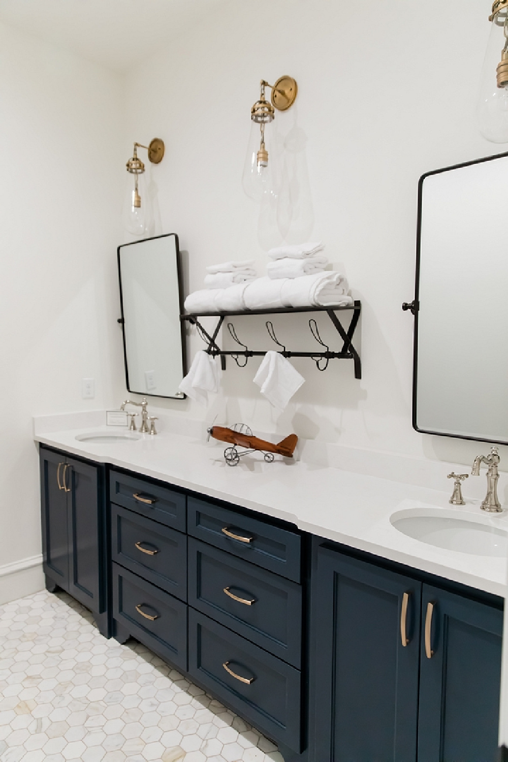
The vanity above is painted BM Tinsmith.
Are You Tackling a Bath Makeover or Remodel?
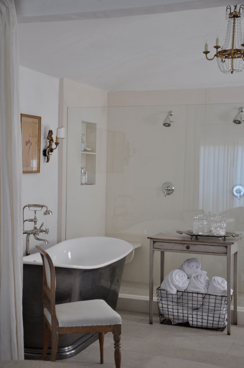
Psst. About our bath reno. Painting the walls are THE easiest part of the project by far. If you aren’t a DIYer or have never hired anyone to remodel a bath for you, you may not realize how many details are entailed in even the smallest and simplest of bathrooms.
Watch this to see the process and gain new respect for those among us brave and insane enough to reimagine a bath! (Bear in mind, direct to stud panels were added in this bath, whereas a custom project like mine involves cement board and then one tile at a time!)
BEHR Polar Bear
I love the style and aesthetics of designer Monika Hibbs who chose Polar Bear 75 (the LRV is 90 which sort of blows my mind) for this bath:
This white color intrigues me for a bath with its atmospheric mystery.
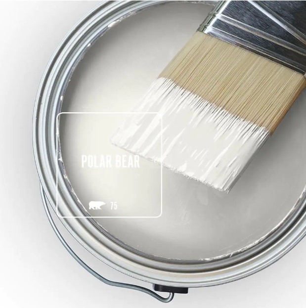
Polar Bear reminds me of a color I chose for a bathroom we created from scratch in our former home:
Benjamin Moore Classic Gray 1548 for Bathrooms
BM Classic Gray lives like a white and is similar, although the LRV is 73.67 so it reflects less light.
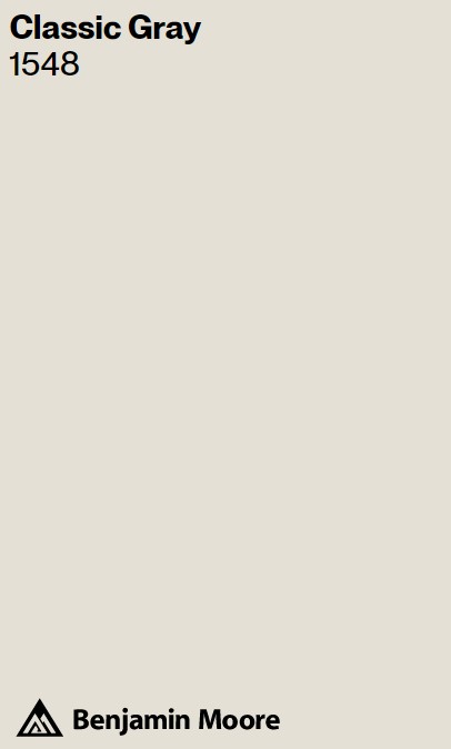
Benjamin Moore says 1548 (also known as OC-23) is the lightest gray and can function as an off-white, and I loved how it felt silvery yet not suggestive of blue at all.
Leanne Ford Favorite Neutral Bath Paint Colors
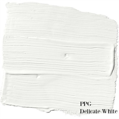
PPG Delicate White
When you’re not exactly sure which neutrals to begin sampling for your project, it helps to look to experts you trust. For me, Leanne Ford is at the top of the heap. Delicate White is one she favors:
Don’t you love those softer whites that don’t feel so jolting?
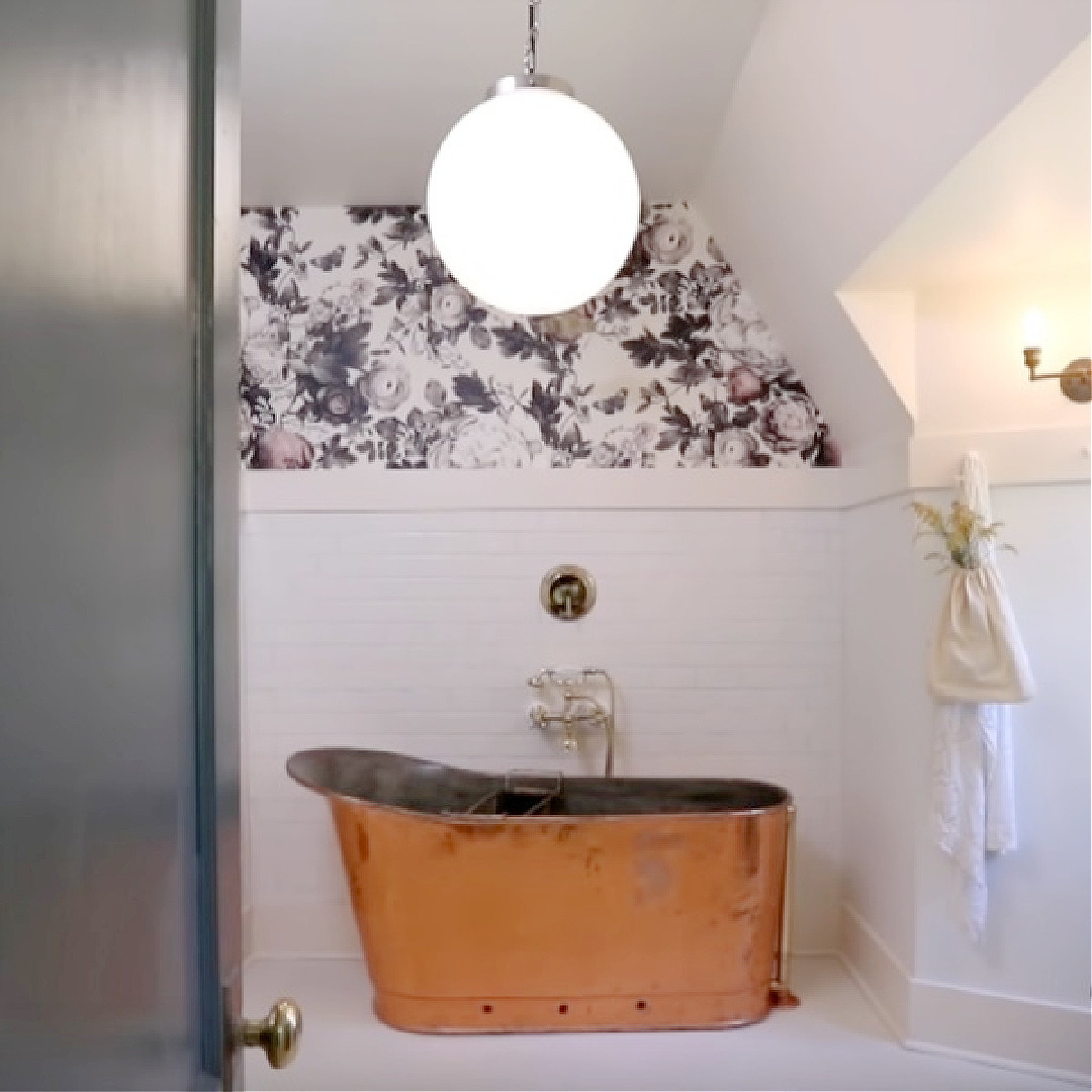
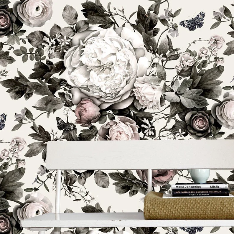
I actually think that Summer Squall wallpaper could work in our bath as well.
BEHR Crisp Linen MQ3-13
Oh this bath! And the entire house Leanne Ford renovated. The craftsman style interiors are sort of an ode to this paint color, Crisp Linen, which she slathered on walls liberally.
If you’re a fan of Leanne or linen, you’re going to love this color. It is soft and light (LRV is 76, which is definitely the sweet spot for a lot of designers.)
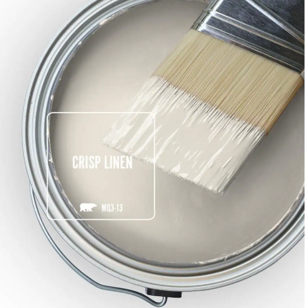
With white trim and white vanities, sinks, or fixtures in a bath, Crisp Linen provides subtle contrast.
My favorite quality about Crisp Linen is how it seems so well suited for modern vintage projects where you’re trying to evoke a calm, not energetic mood.
BEHR Blank Canvas DC-003: A Celebrated Neutral to Discover
Here’s a neutral from Behr that is getting a lot of attention this year since they named it color of the year for 2023.
At a juncture where all of the other paint brands seem to be emphasizing bold color and risky hues (read about 2023 trends here!), I was surprised to see this easy breezy neutral with an LRV of 84 chosen as THE color.
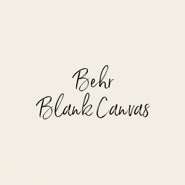
But then I remembered the color Blank Canvas reminds me of, and it all became clear. Because everyone and their granny knows that Benjamin Moore’s White Dove works gorgeously in any number of lighting conditions and settings.
White Dove (LRV is 83.16) is in fact described by Benjamin Moore as “unerring.” Unerring? Wow. I have to say in my experience with it since the 90s, it is nearly unerring. It’s timeless yet popular and still trending for trim, baths, furniture, interiors, and exteriors.
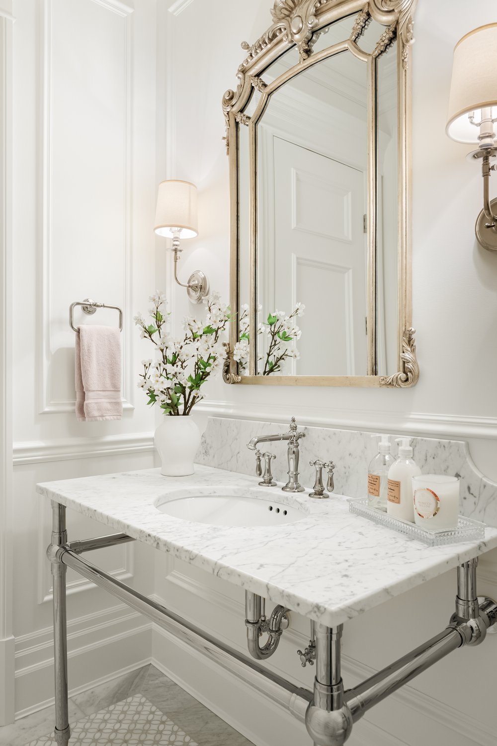
While I don’t know for certain if White Dove is the paint color for the bath above, it’s just the sort of style bath I think is asking for it. Classic, timeless, soft, and not jarring.
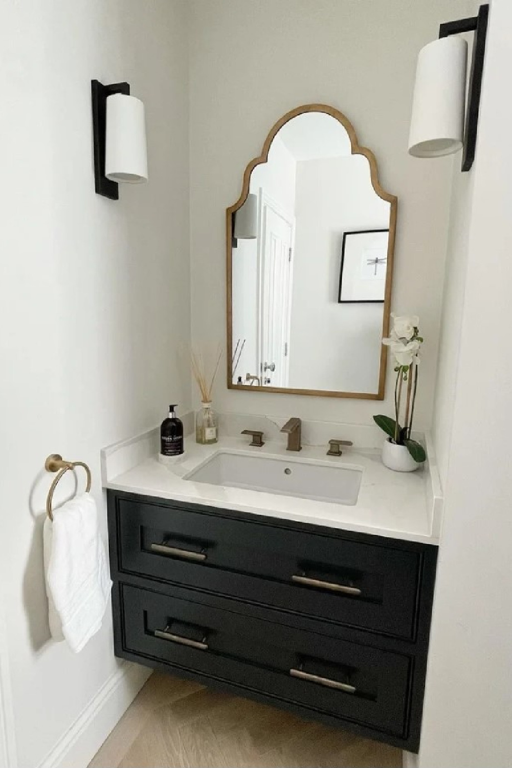
Farrow & Ball Strong White 2001
For a European inspired neutral for your bath that is cool and pale with light grey undertones, consider Strong White 2001.
Strong White came on my radar when I saw Charlotte Reiss use it brilliantly throughout their French farmhouse near Bordeaux.
If you study images of interiors with this color online, it can grow a little confusing. That’s because a photo of a space in one part of the country at a particular time of day is going to reflect something different than others.
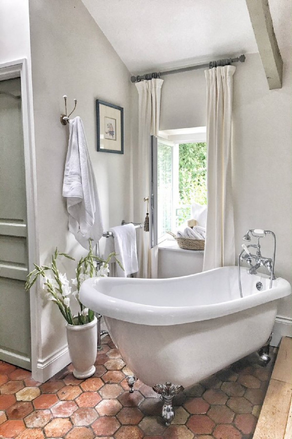
Additionally, there is often editing of photos online so the exposure may be increased or decreased. Consider how Strong White appears on old walls in the historic farmhouse above versus a contemporary bath like this:
So it definitely pays to sample a few contenders with promise before making the final decision.
Does Paint for Bathrooms Deserve Special Attention?
Since most bathrooms don’t receive a ton of natural light, it becomes even more important to be thoughtful about sampling a handful of neutrals. If the color makes your spirits sink, it may be too dark or muddy. If you feel cold at the sight of it, a warmer shade may be a better option.
Sherwin-Williams Agreeable Gray 7029
There are two important reasons this color, SW Agreeable Gray, is in the roundup today. (1) I’m strongly considering it for the bath since it is the original color that was in the bath! Yep. Our bedroom is also painted this color so no sampling is necessary.
(2) It is a SW bestseller. A lot of folks enjoy this as part of a neutral palette. While Agreeable Gray looks clean and light in the bath above, it actually appears very dark and with green undertones currently in our bedroom. Since I want our bath to feel airy and clean, I’m not sure it’s the best choice.
Wildly popular in terms of Sherwin Williams neutrals and the perfect greige touted by homeowners across the planet, it is one of those super flexible chameleon colors. Is it warm? Yes. Is it cool? Kind of. Would you characterize it as beige? Probably.
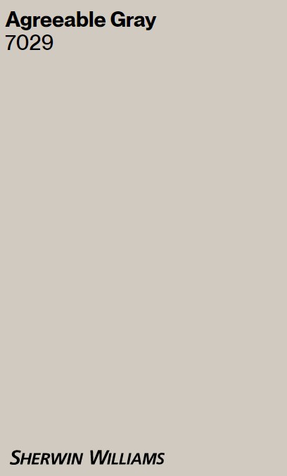
Do those responses seem ridiculous? There are these neutral tones that simply cannot be pinned down, and that’s their super power. They shift in different environments and are subtle in their understated beauty. The LRV on this one? 60. So in our east facing bedroom, it actually reads very moody and dim compared to other neutrals with which I have lived.
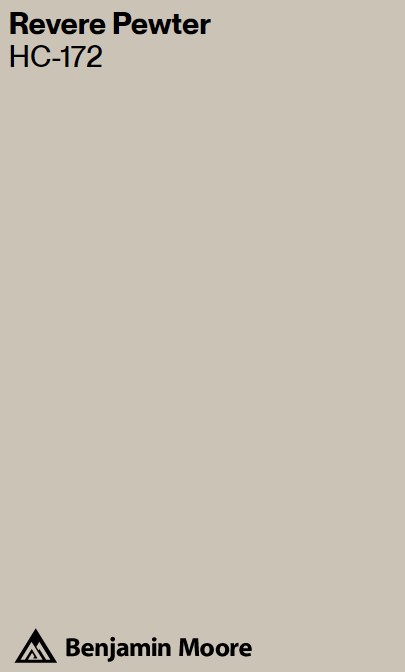
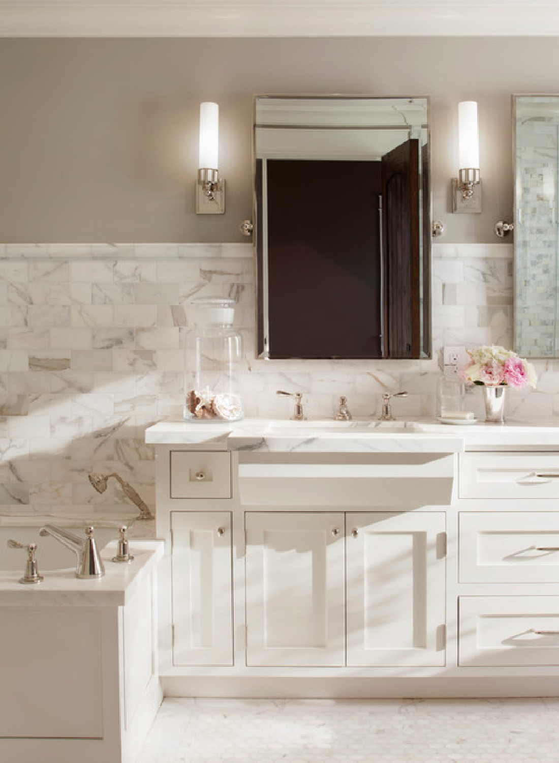
Benjamin Moore Revere Pewter CH-172
If you’re leaning toward a greige like Agreeable gray and want to check out a similar hue in Benjamin Moore’s line, check out BM Revere Pewter. It’s gorgeous, and I loved it enough to paint all of our cottage style bedroom furniture this color years ago.
Here it is in a lovely serene neutral bath design that takes my breath away:
And just in case you haven’t been reading every single word attentively…our bedroom furniture which is painted Revere Pewter? It moved into our bedroom at the new house with SW Agreeable Gray walls, and it’s not a good scene.

Good gracious. The greige colors are similar but a little off so the “almost no contrast look” was a disaster as far as I was concerned. A few weeks back, I changed the finish on our bedroom furniture to give it more depth and in hopes of brightening the whole mood. I’m not sure it will do. It’s just paint though. I’ll worry about those finishing details when the full gut reno of our bath is done.
Sherwin-Williams Alabaster 7008
While we’re on the subject of bestselling neutrals and whites from Sherwin Williams, we can’t leave ALABASTER out of the mix.
It is gorgeously creamy and when you want to cozy on down, it may be just right.
“When you want the brightness of a white without sacrificing a warm coziness, try this soft, warm but balanced white. And turn up the peaceful.” – Sherwin-Williams
The light reflectance of 82 means it is going to feel nice and reflective in a bathroom where it’s a matter of safety to see things clearly!
So lovely! I see images of a creamy white bath and think YES, a warm white it is! And then a cool white bath pops up, and I’m all about a cool white.
Unpainted Bathroom Inspiration from Plaster Walls
Lately I have been thinking about the EFFECT I want to create with the neutral paint color for our bath as much as the mood and harmony with the adjacent bedroom.
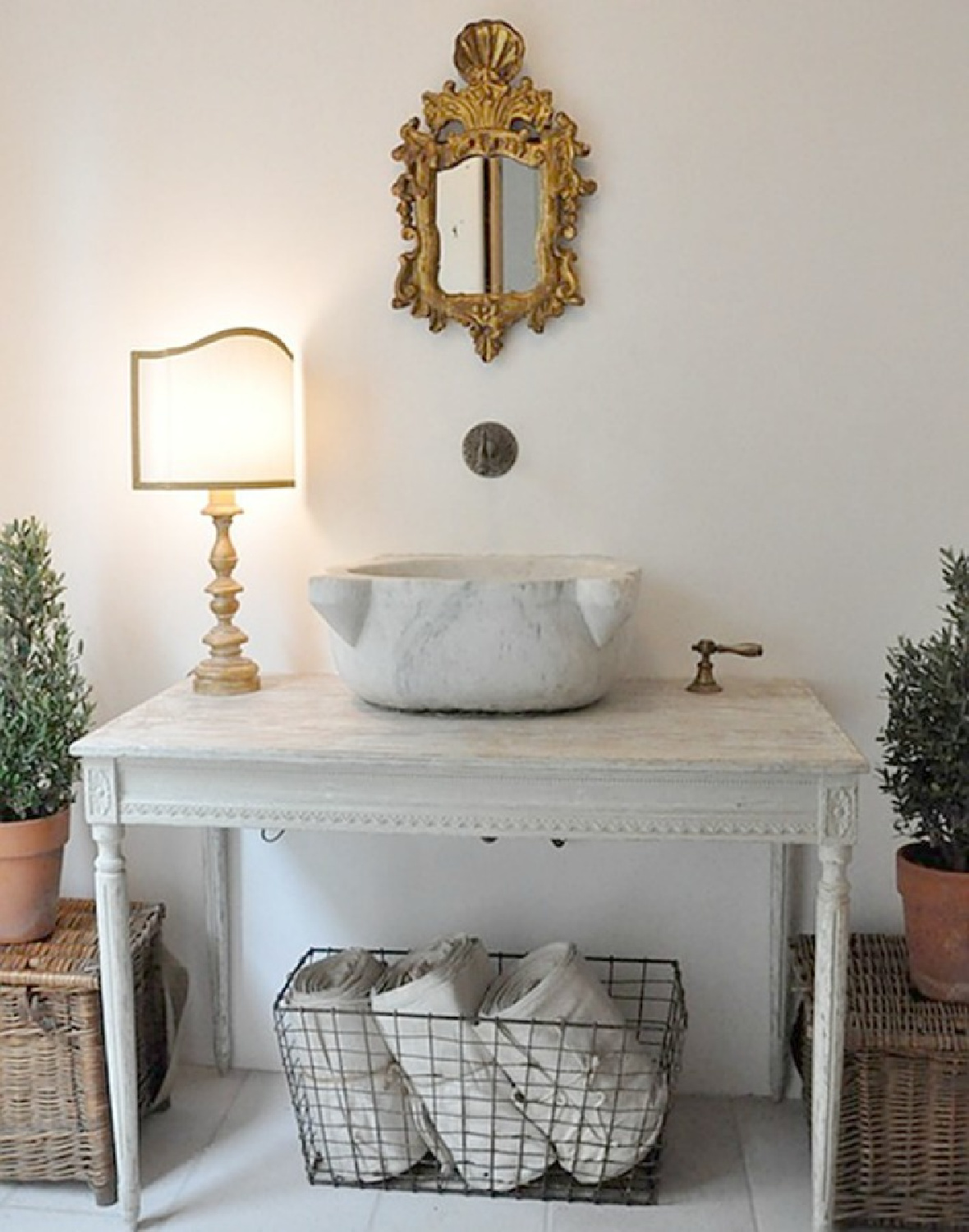
Ultimately, I’m always after a timeless look that won’t feel dated in a few years.
I have been especially challenged in this project because if I was going for Old World timeless, I would opt for plaster walls that require no paint.
And I certainly wouldn’t be compromising on lighting (as I am!) were I simply channeling designers like Brooke Giannetti, Pamela Pierce, and others who consistently achieve a rich, ageless charm. The thing is. It’s a bath that will be shared with someone who has his own wish list and his own boundaries since he is doing the DIY.
I’ll have lots more to write on that topic of compromise, but I did want to include some incredible examples of plaster walls in case they help you select a paint color suggestive of plaster.
Beyond Paint for Bathroom Walls
I’m toying with the idea of some wallpaper in the bath too. For crying out loud, I have added it to the entry, dining powder bath, and two bedroom walls already. It’s not as if every single wall has to be covered. Consider this Susan Harter mural in a bath:
Or this delicate pattern which would be incredible to awaken to each morning:
I used a small amount of this Thibaut wallpaper in our former home, and it was a favorite!
I hope these ideas helped, and keep reading to discover more decorating resources for the bath. There is a vanity sconce that would work in any number of baths and is on sale this moment for under $30!!!
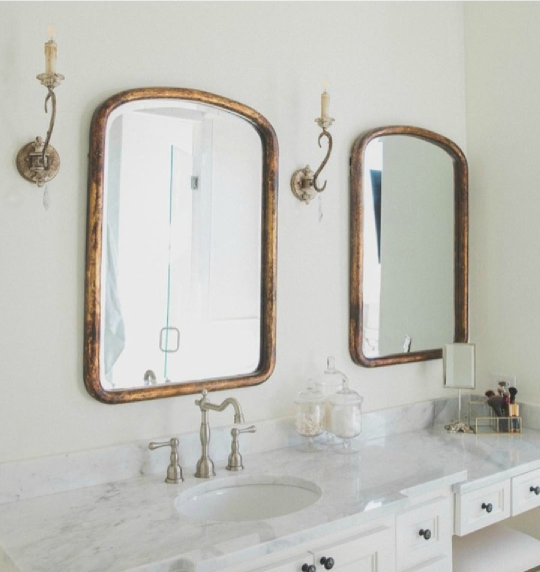
Decorating Resources for Bathrooms

I love the shuttered look of these doors:

I wish we had room for two of these 43″ vanities because I think it’s just right in terms of giving you a bit of counter space, and I like the inset drawers. We have 84″ total, and this would have required at least 86″…dang! Maybe I’ll use it in a guest bath.


In a bathroom design, very often you must be mindful of every INCH so a smaller mirror or tub may be important to fit in the space.
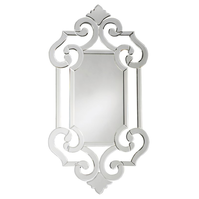
You can find more petite models like this:


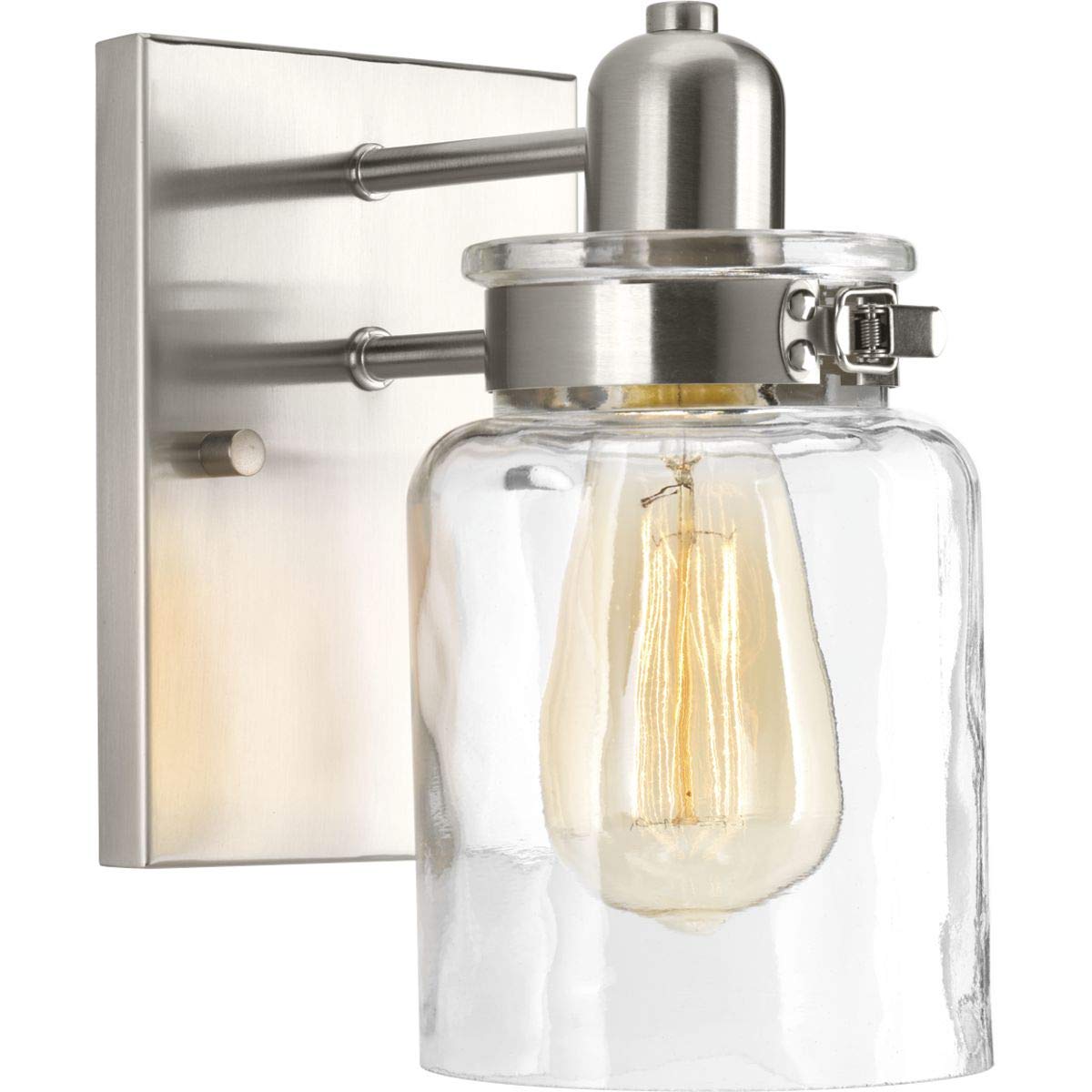
You will NOT believe the price on this polished nickel light:


Peace to you right where you are.
-michele
I independently selected products in this post—if you buy from one of my links, I may earn a commission.
Thanks for shopping RIGHT HERE to keep decor inspiration flowing on Hello Lovely!
Hello Lovely is a participant in the Amazon Services LLC Associates Program, an affiliate advertising program designed to provide a means for sites to earn fees by linking to Amazon.com and affiliated sites.


