Are you a fan of the interior design work of Atlanta’s Sherry Hart? Same! She always strikes a balance between timeless, neutral, and modern while remaining unmistakably chic. There is always an unfussiness and understated glamour about the spaces, whether they were created budget-consciously or not (would that make it budget-unconsciously?). Sherry Hart Paint Colors & Down to Earth Tranquil Interiors will inspire with glimpses of sophisticated, soulful spaces along with Sherry-approved favorite colors.
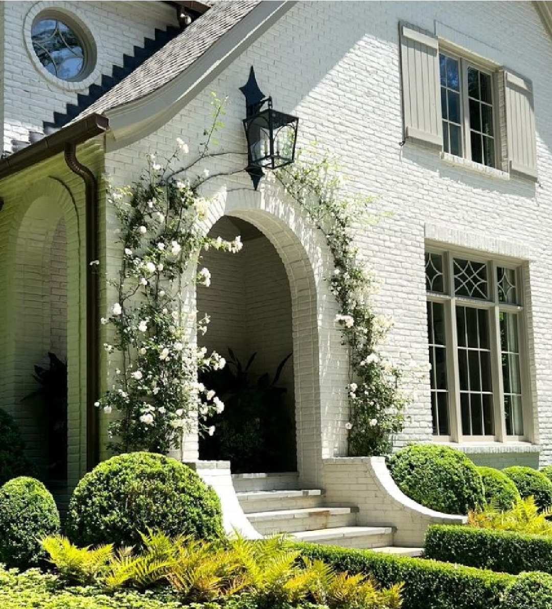
Photos: Sherry Hart
Sherry Hart Paint Colors & Down to Earth Tranquil Interiors
It’s always a design lesson and a delicious treat to see interiors by Sherry Hart whether they show up on her blog, IG, or House Beautiful.
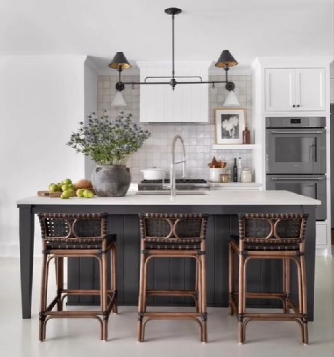
One of the qualities setting her apart from the pack?
She is gracious about sharing paint colors, fabric names, sources for the best art, and helpful tips that are actionable no matter your bougie level.
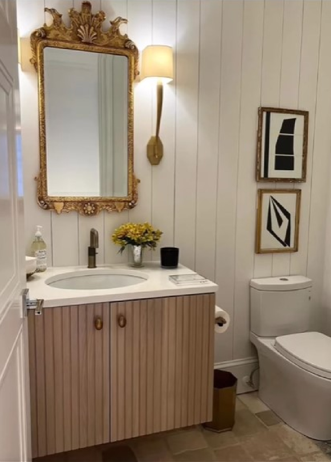
She’s always peeling back the veil and demystifying the world of the interior designer. (So we know, for example, that the vintage mirror in the bath above was only sourced at the final hour in a panic given the space restraint between sconces. If you have ever designed a bath. Omg. Then you know.)
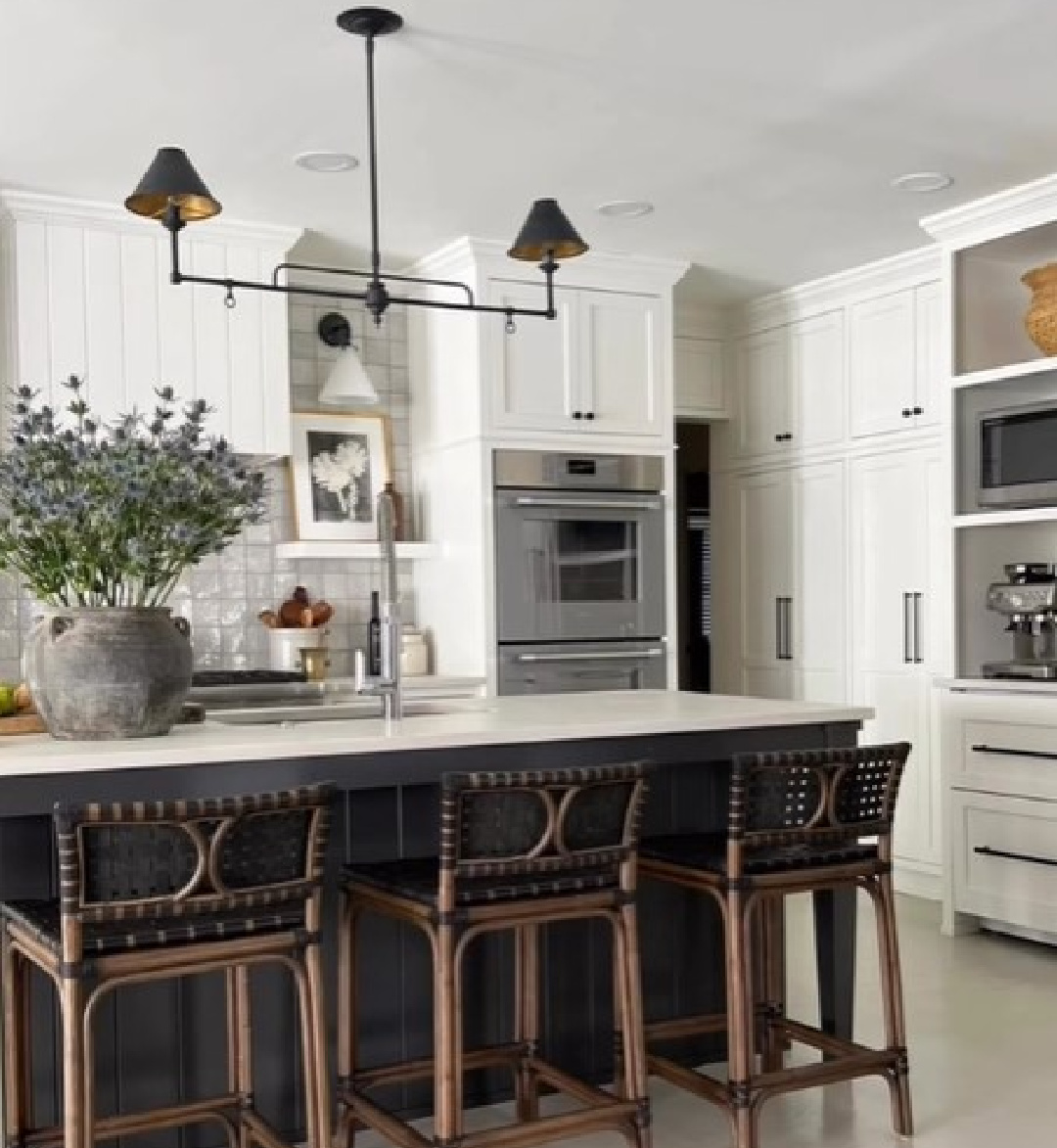
Because the designer is so down to earth, kind, and candid, we know the beautiful kitchen above was a labor of love for her sister battling cancer. While she left her body, her spirit surely enlivens and blesses the hearts even now of her people.
Sherry Hart Neutral Paint Colors & Timeless Design Elements
I’ll never tire of following Sherry’s work because she is drawn to the same sophisticated color palette I love.
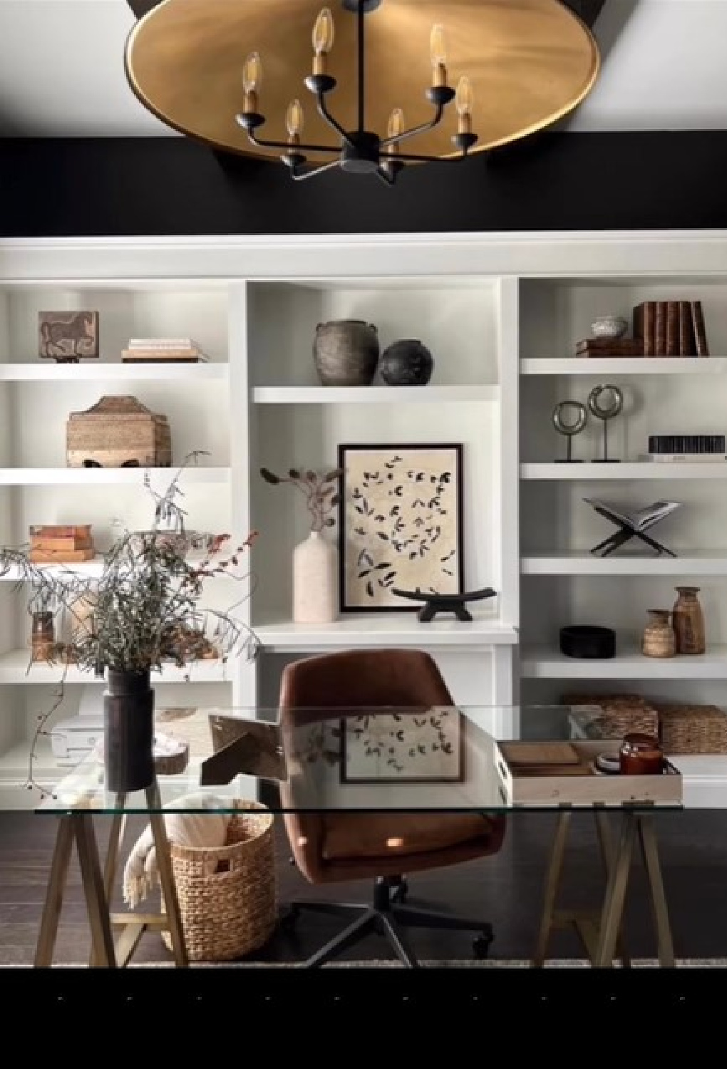
While she is quite comfortable with color and pattern, her devotion to neutrals and white are apparent.
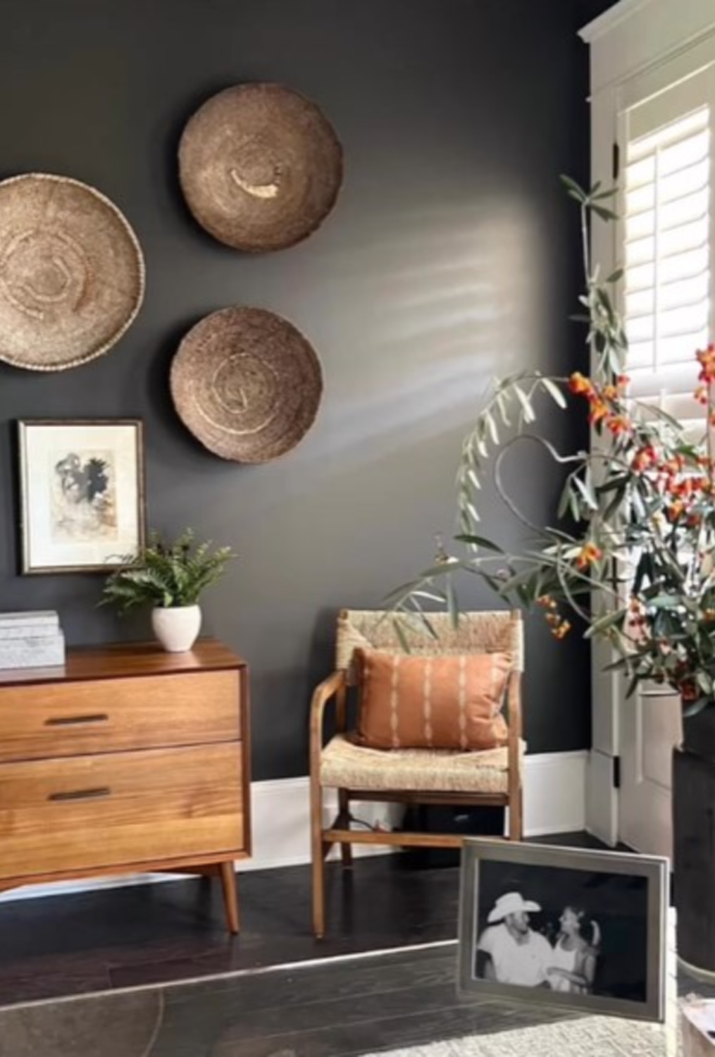
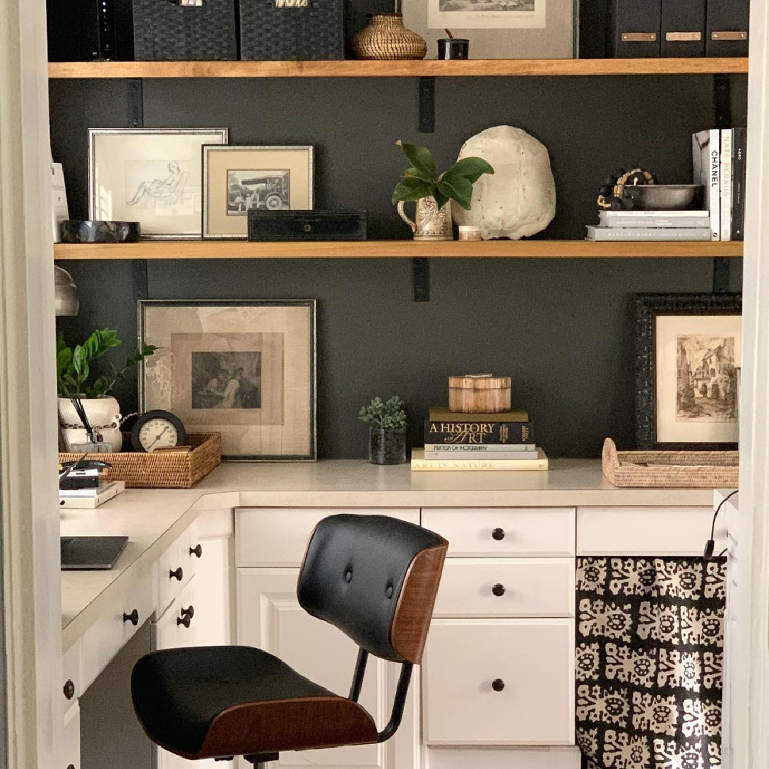
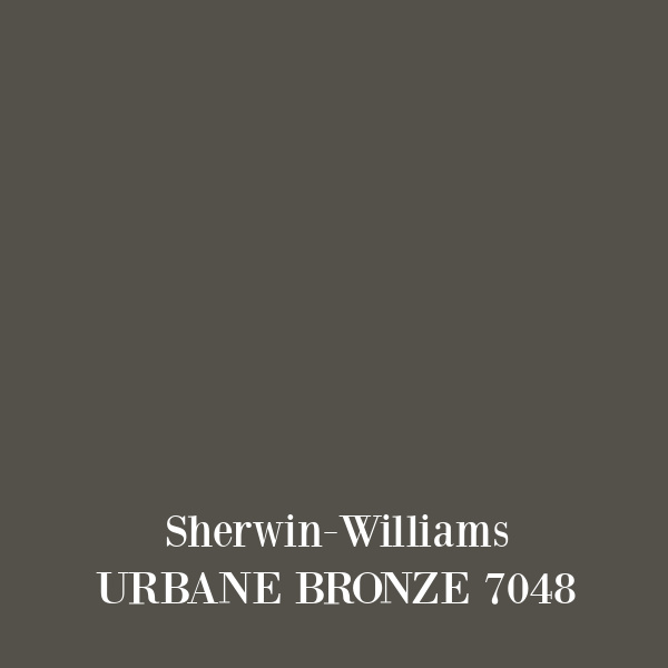
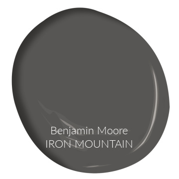
SW Urbane Bronze 7048 and BM Iron Mountain
In her own home, a dance of neutrals with natural elements and rich texture feels young, vibrant, and layered.
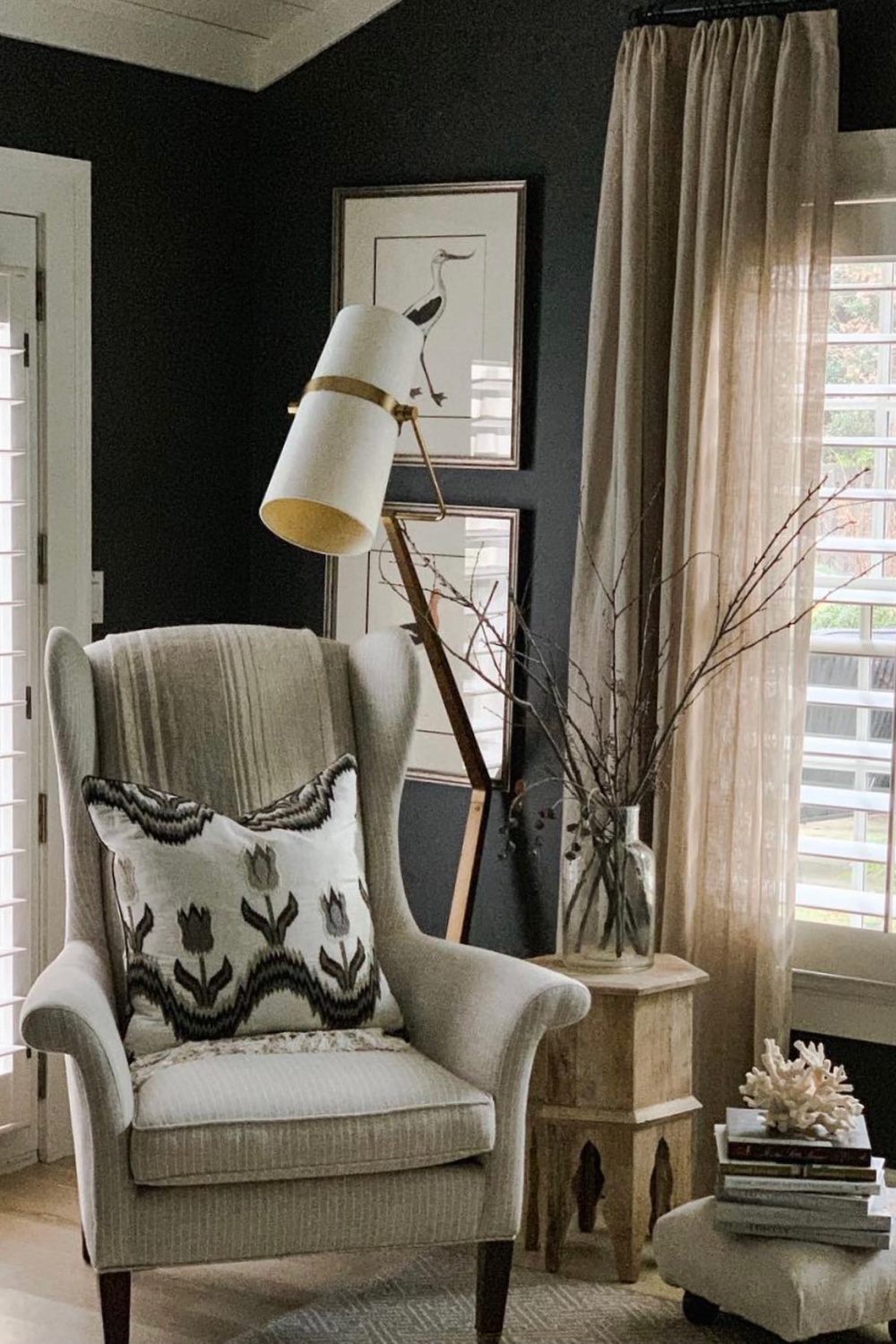
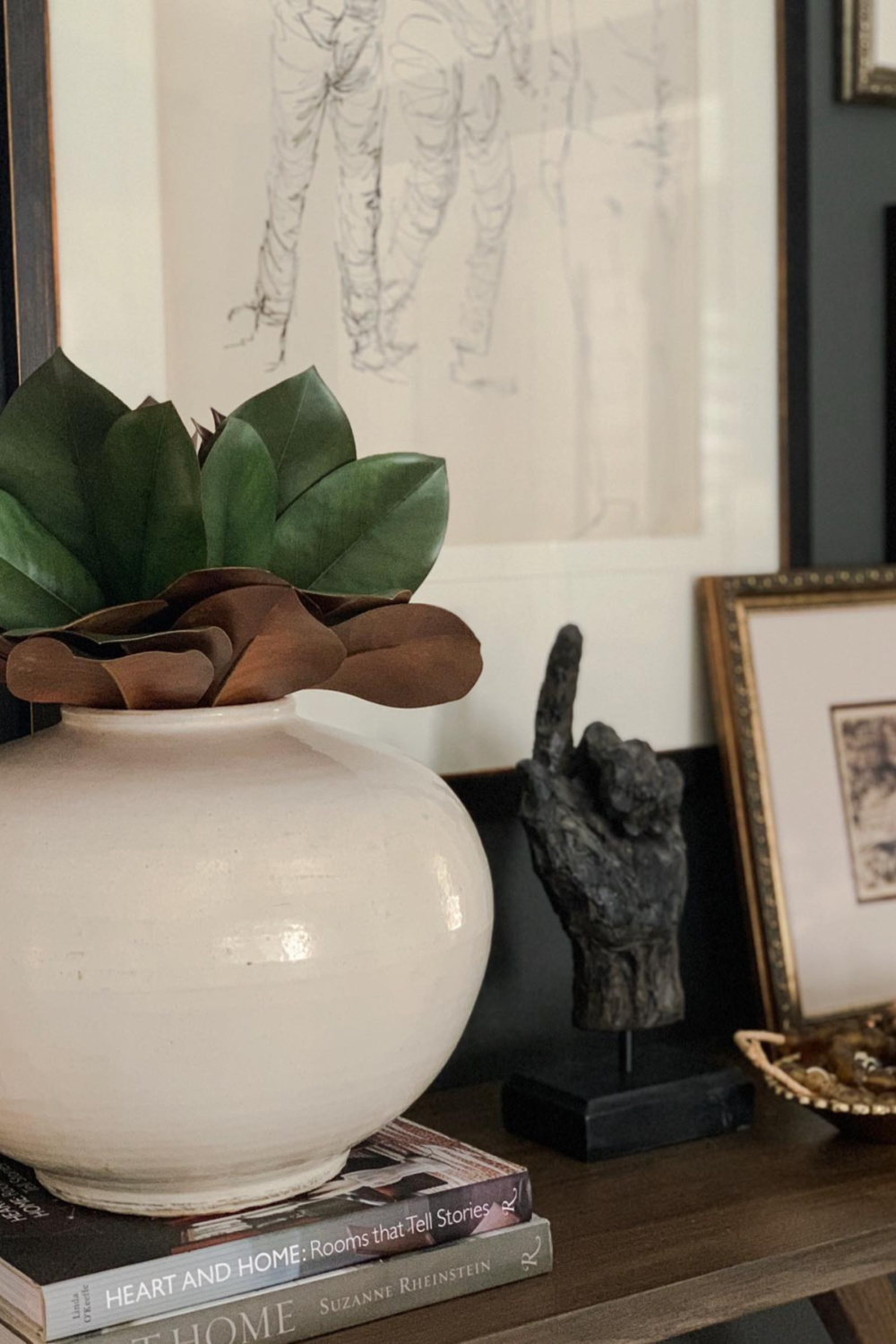
Recurrent favorite paint favorites include, SW Urbane Bronze (which was color of the year in 2021 and coordinates well with Shoji White and Extra White)
and BM Iron Mountain. Both are dark and moody. Iron Mountain has a light reflectance value (LRV) of 10.96 and is wonderful with BM White Dove and BM Barren Plain.
They may not be the first colors that spring to mind for a home office…
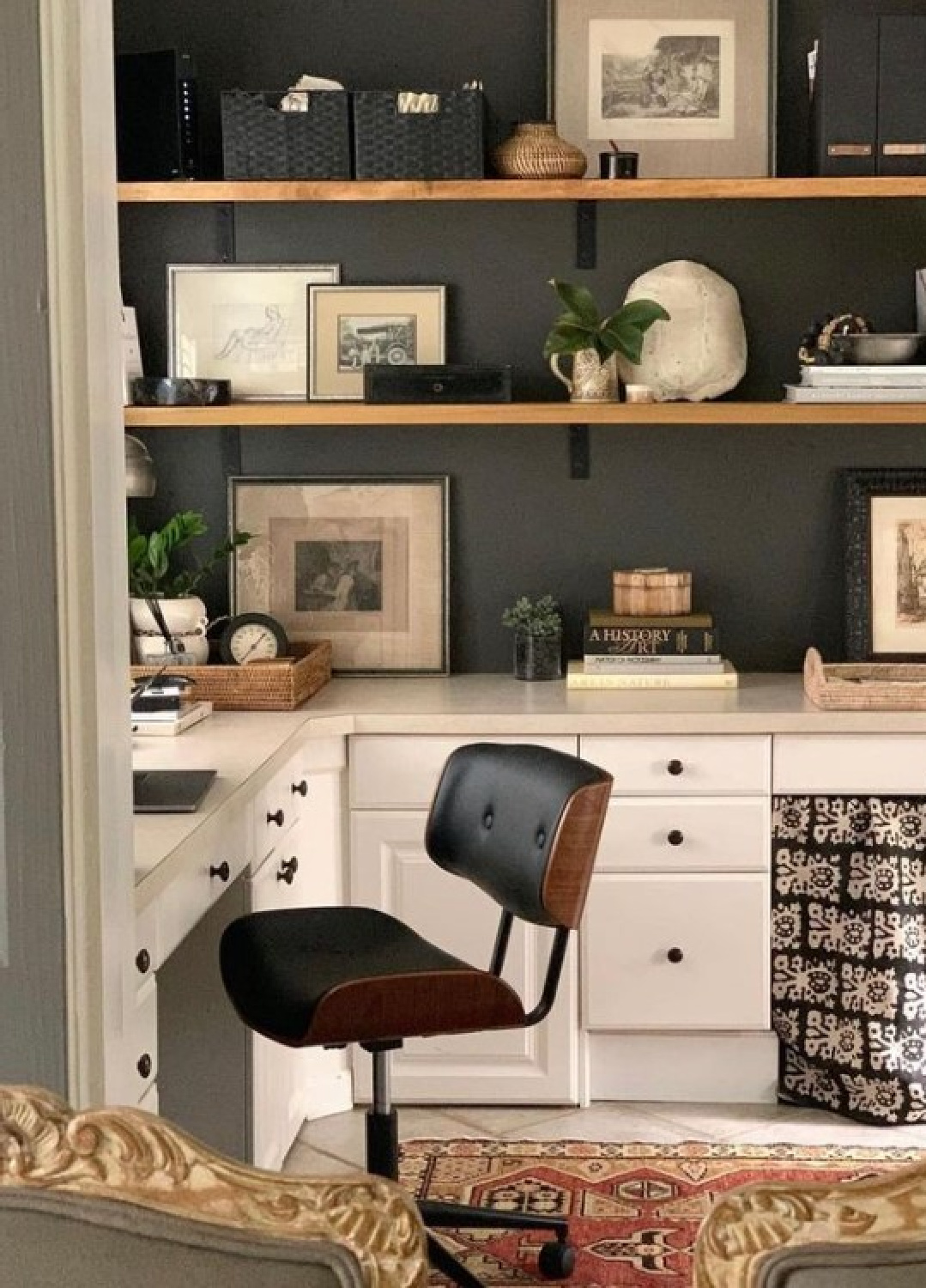
But isn’t a wrought iron color chic and commanding whether used on walls or trim? Sherwin-Williams describes Urbane Bronze as
“Rooted in nature, this brownish gray evokes a down-to-earth tranquility and a subtle sophistication that is hard to beat.”
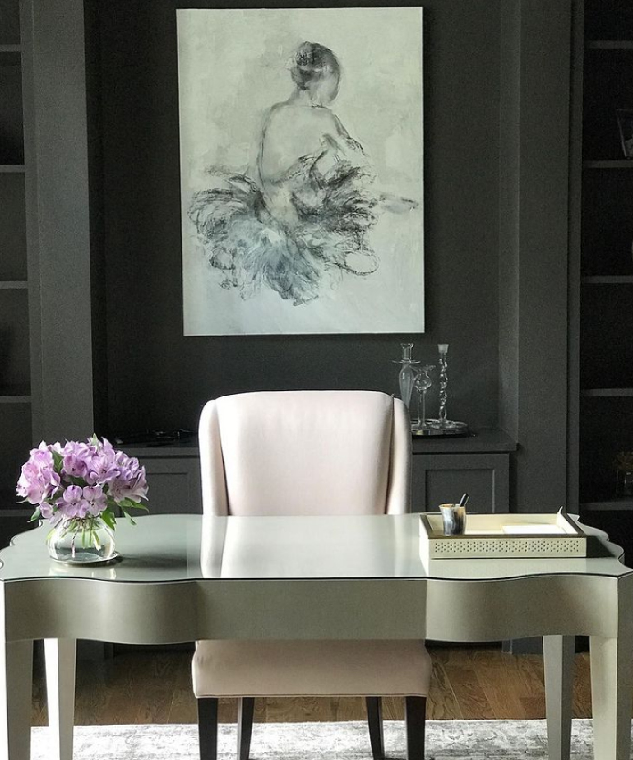
Down to earth tranquility? Subtle sophistication? Those are qualities I am always after! And THE SHERRY has Ph.D’s in both!

I can only imagine how many folks have painted a space Iron Mountain or Urbane Bronze thanks to this designer.
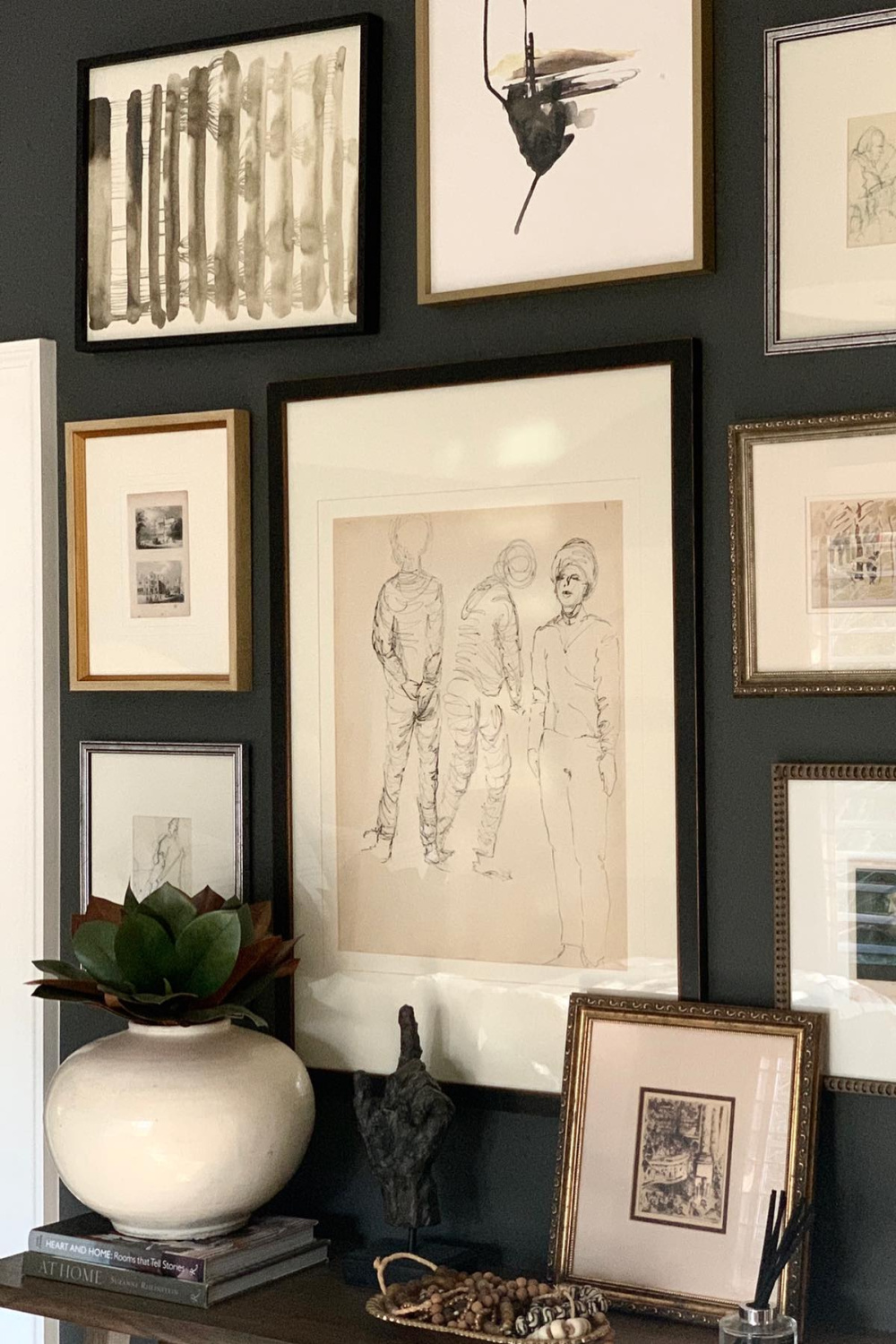
Both colors have an understated presence and mystery. Benjamin Moore says Iron Mountain is, “A use-anywhere shade of soft black with rich undertones that complement both warm and cool color schemes.”
Consider this bath where the designer juxtaposed soft curvy elements and an elegant Hadley chintz pattern from Schumacher.
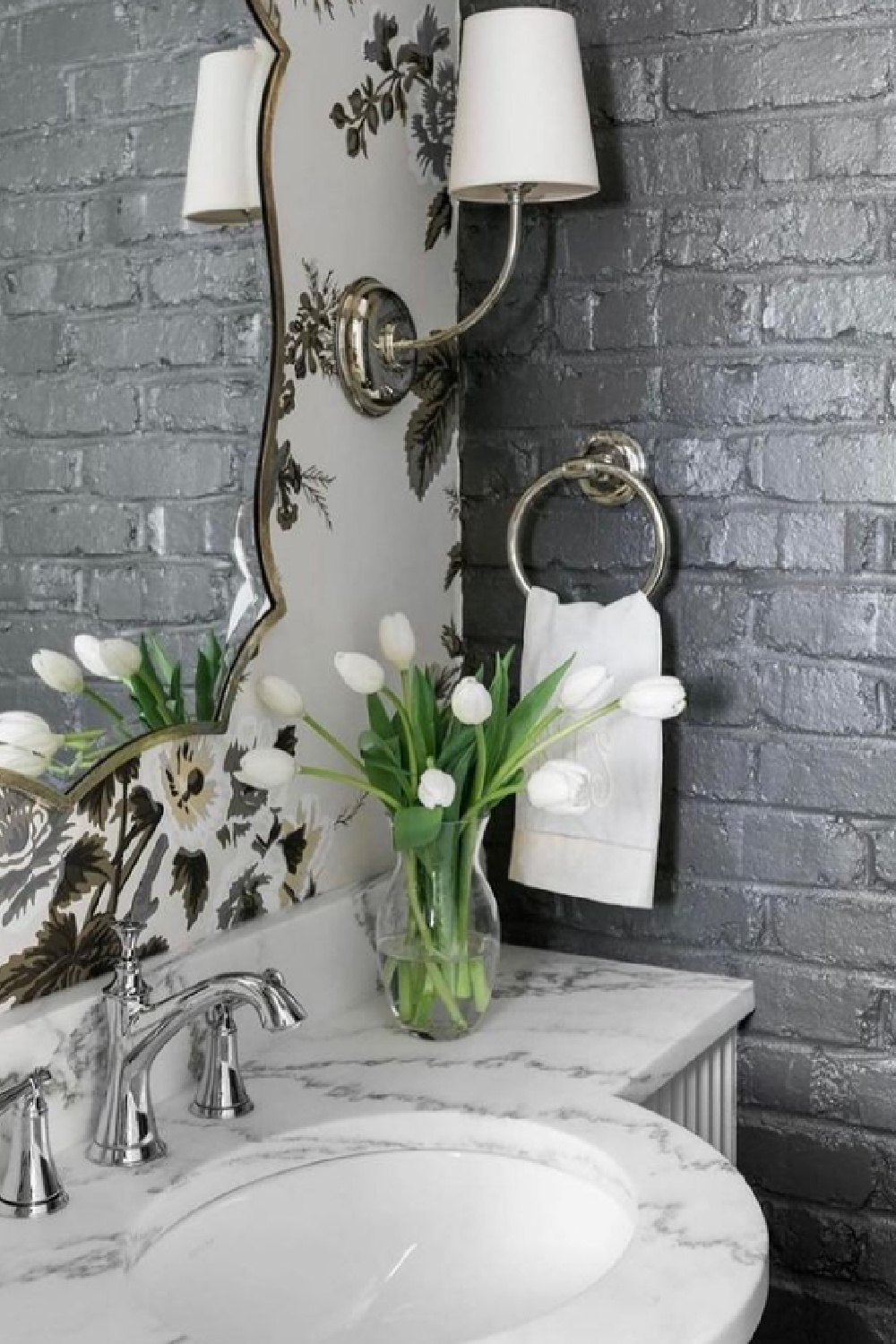
Oh that chintz she loves enough to use in her own home!
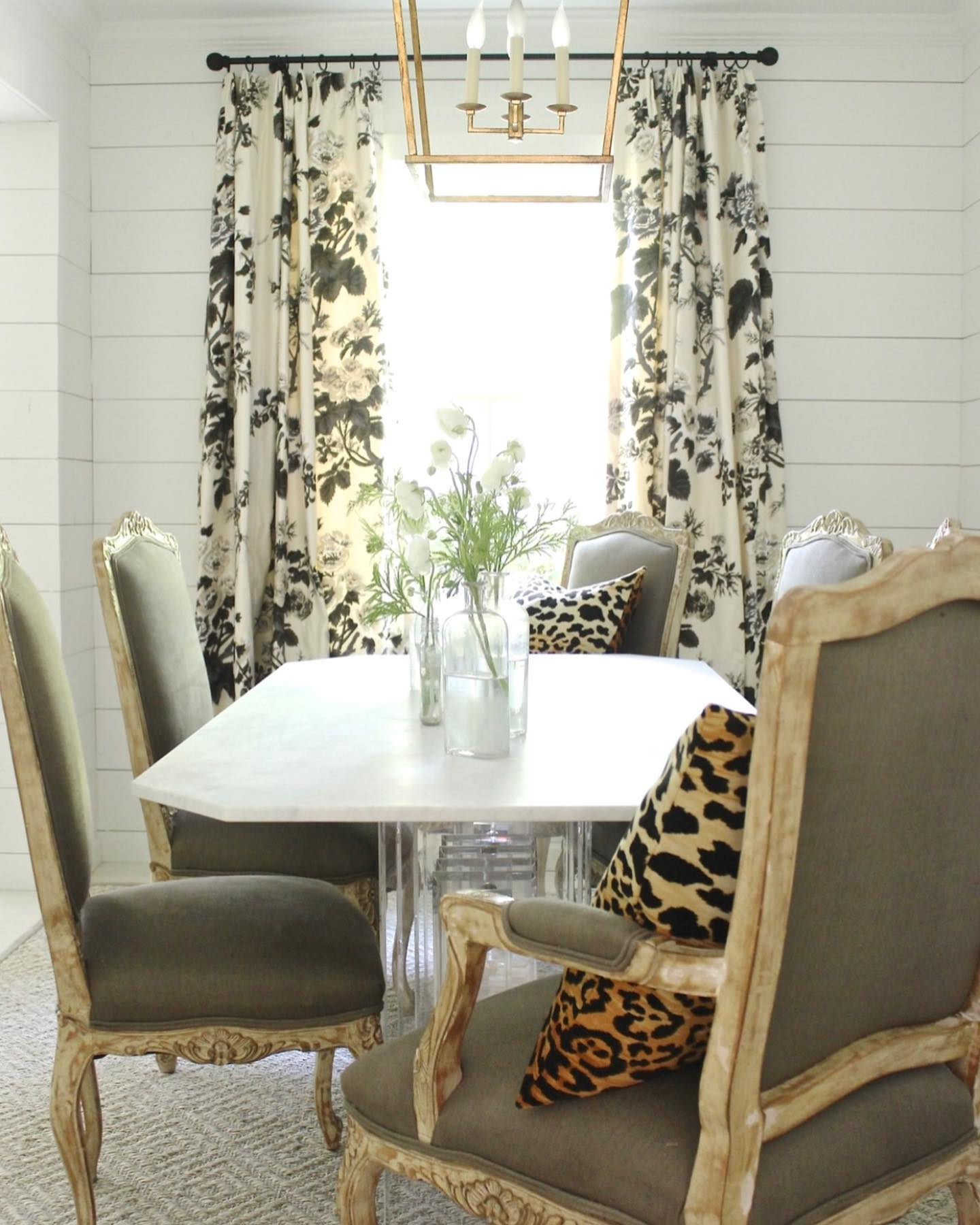
I would never want to leave this down to earth tranquil living room.
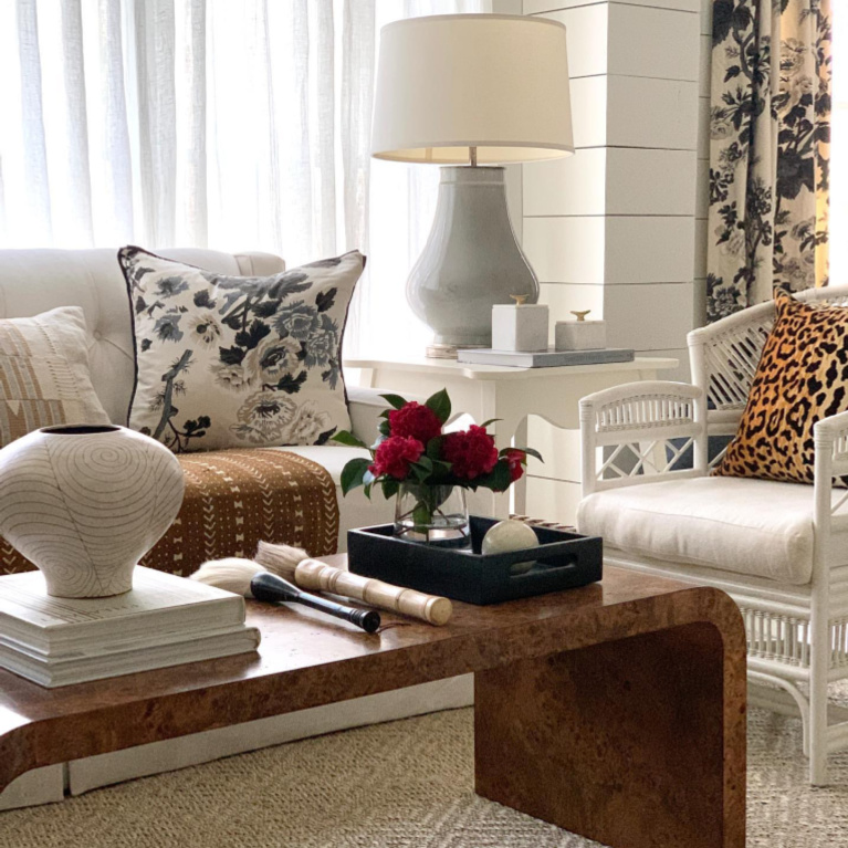
The Designer’s Love Affair With White
I pray she never tires of whites and neutrals for clients and herself!
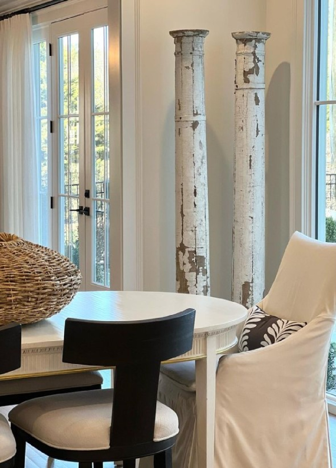
There’s always a mix of eras and influences so nothing screams “minimal beige” or “modern French” or “coastal chic.”
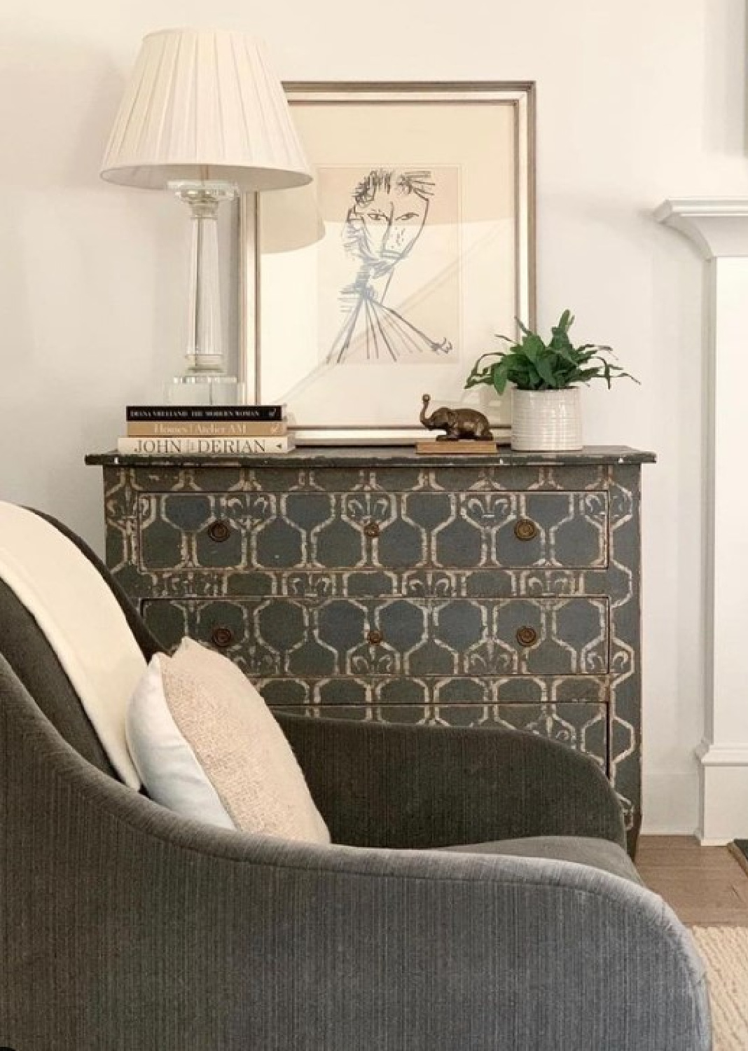
But there are definitely murmurs of “ooh, that’s sexy.”
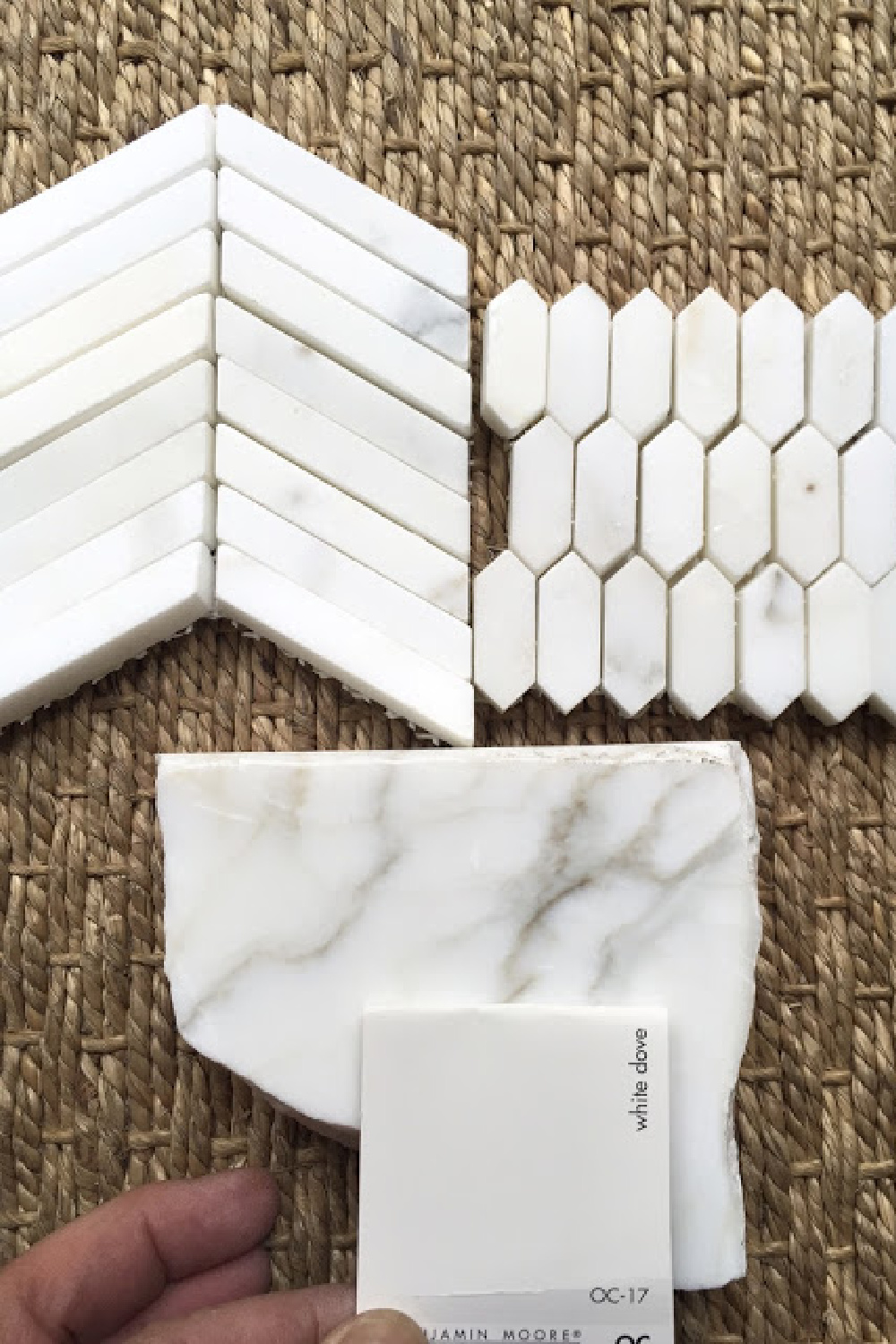
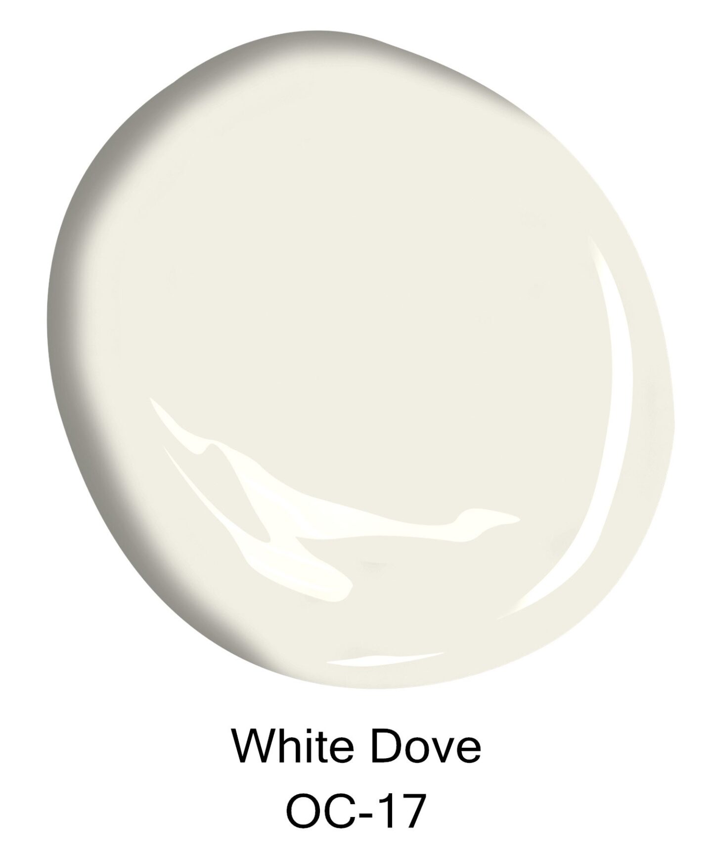
Benjamin Moore White Dove OC-17
If you’re after a lovely white trusted by designers across the globe for decades, look to this paint color endorsed by Sherry Hart.
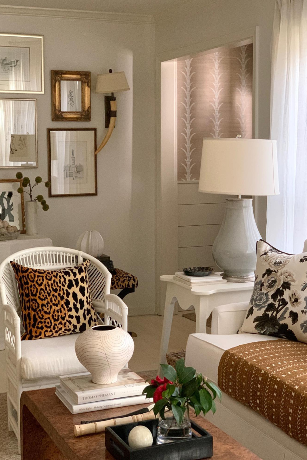
Don’t think for a second you need to go searching for a white paint color that isn’t as commonly used or has a flashier kind of name.
There’s a reason certain colors attract cult status. WHITE DOVE is your friend, and designers in the know often rely on it.
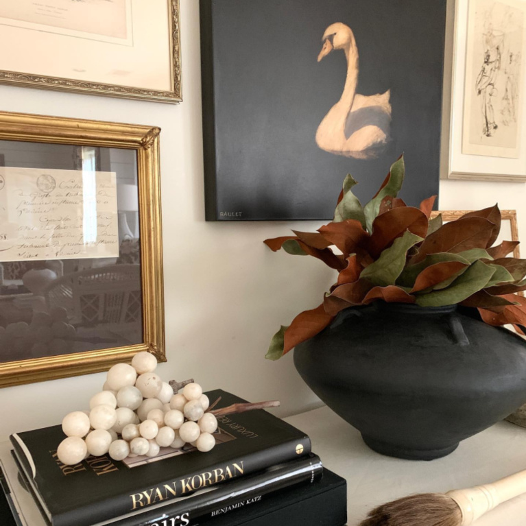
White paint has varying undertones, and this clean white with its LRV of 83.16 has become a classic.
I personally have happily used it successfully in our 1920s Chicago bungalow, a French country manor house, and a 1950s tiny home. Not sure if Sherry Hart used it in this project:
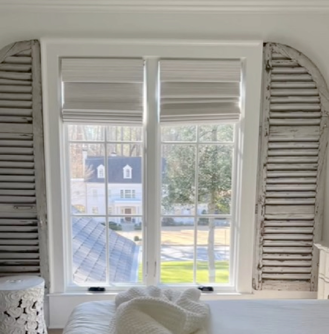
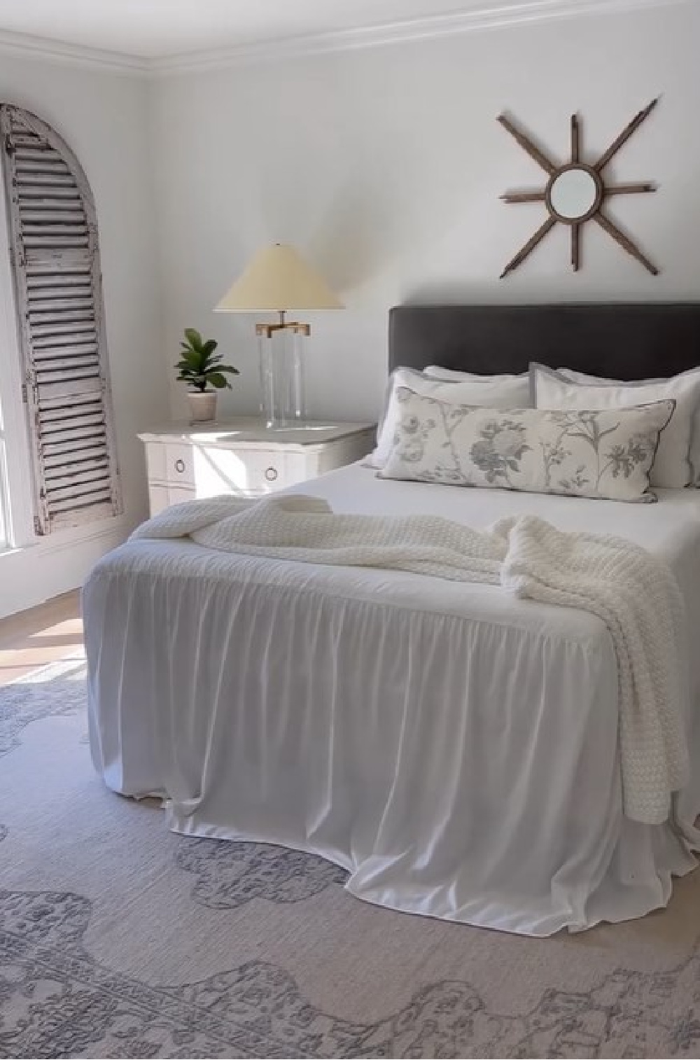
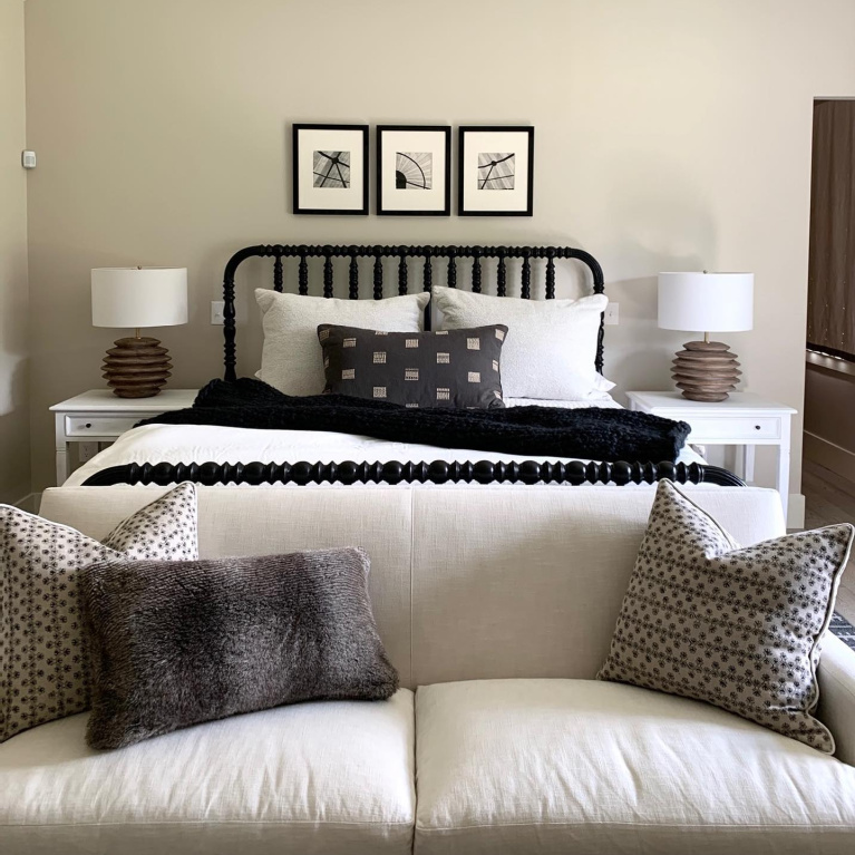
Doesn’t this serene bedroom capture the level of calm and sanctuary retreat so many of us desire as life grows hectic?
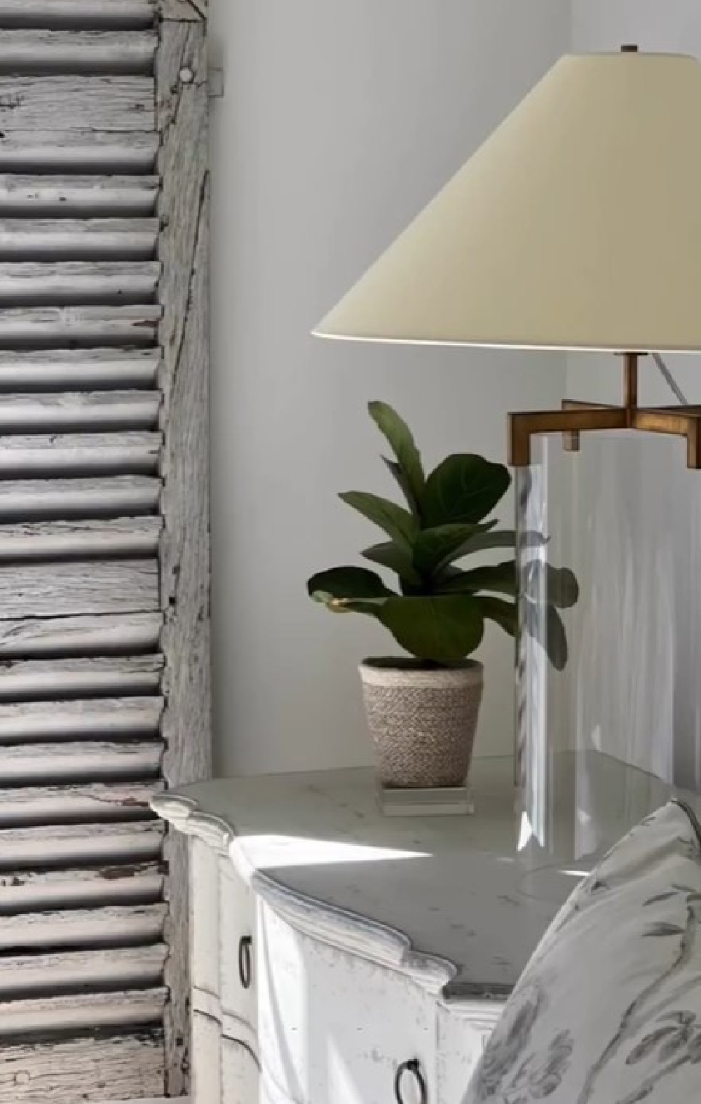
I’m one of those design freaks who loves when designers share process photos or interiors before they are perfectly styled or “done.” My imagination fills in any of the spaces where my eye rests, and I create my own story of how I would live in the space.
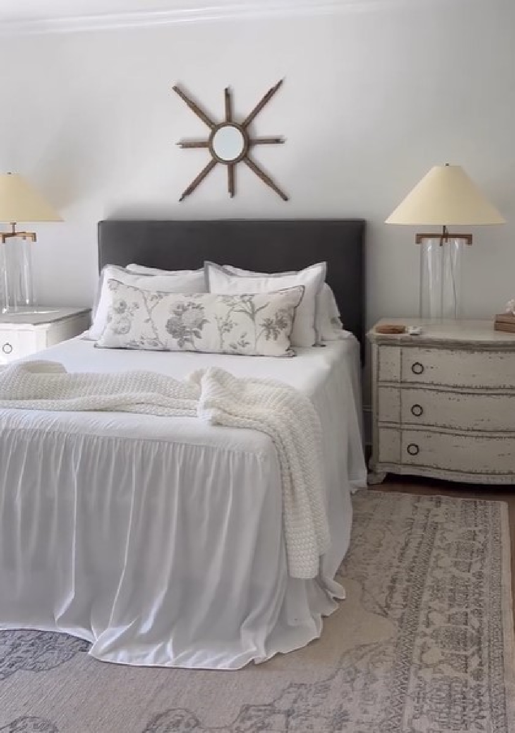
Ya know? Perfectly completed rooms published in high places have their purpose, yet I long to see real authentic landings where life is happening, where the story is more vulnerable. While I’m not sure if White Dove is on the trim in this space:
…it is often the best choice for trim, and I love it for exteriors too.
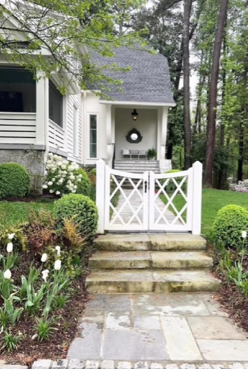
White Dove coordinates beautifully with Kendall Charcoal and BM Revere Pewter as well as this next Sherry Hart favorite.
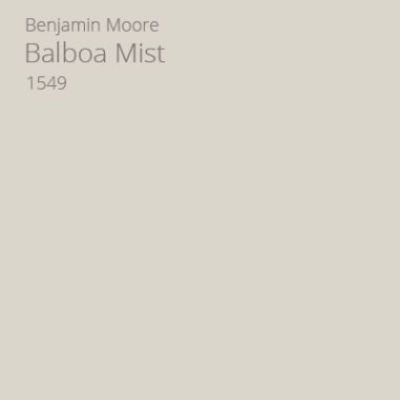
BM Balboa Mist 1549 (also known as OC-27)
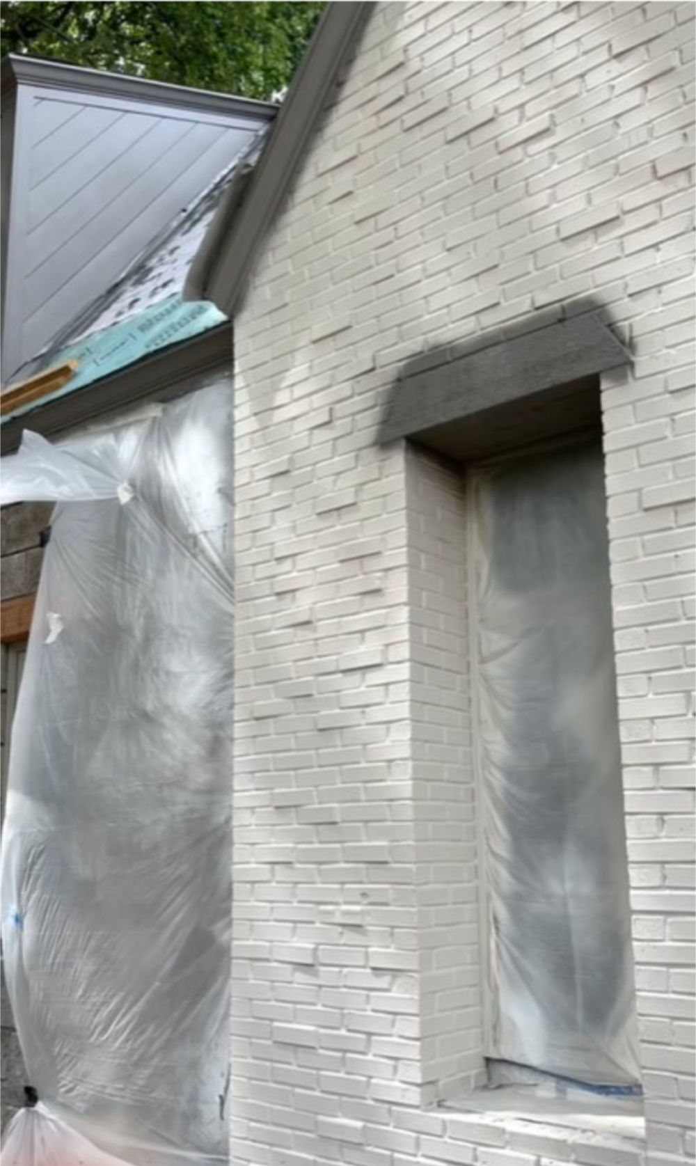
Balboa Mist is a pale gray that goes with just about anything and truly comes to life on an exterior.
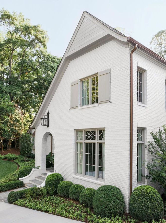
Choosing classic colors for a home’s exterior is not for the weak!
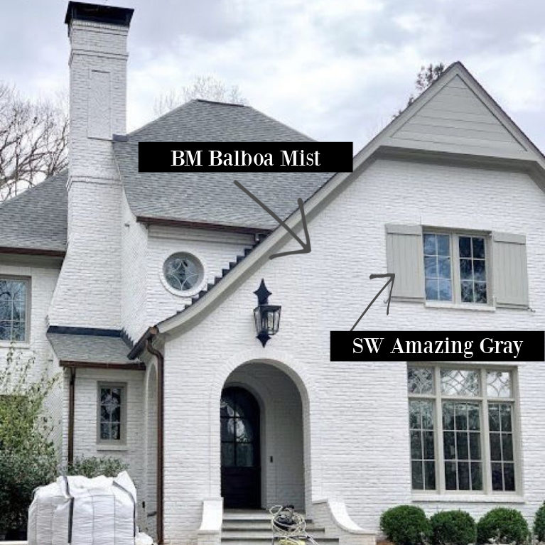
Thank goodness we have pros devoted to their craft who inspire us and give us courage and direction so we have a place to start!
Because it’s never a quick decision when you’re selecting colors that work well together and in a particular context.
The only way to be sure you land on the perfect balance of undertones and reflectance is to sample a bunch! Here’s another painted brick exterior where Sherry chose Farrow & Ball Purbeck Stone:
SW Pewter Green 6208
Deep moody greens often show up in the designer’s work too. Here’s a color for which I wasn’t familiar called Pewter Green.
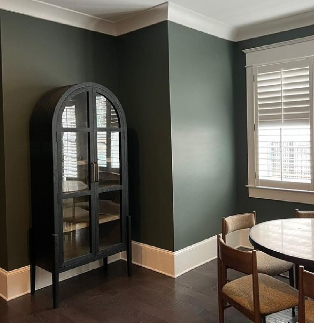
Sherwin-Williams says it coordinates with Spare White, Shoji White and Silver Mist, calling it:
“Dark yet calming, this cool green complements natural elements like wood and metal. Bring a down-to-earth elegance to your favorite room.” There’s that “down to earth” theme again! Coincidence? I think not. Here’s another deep green cozy space by Sherry, but it looks smokier and mossier than Pewter Green.
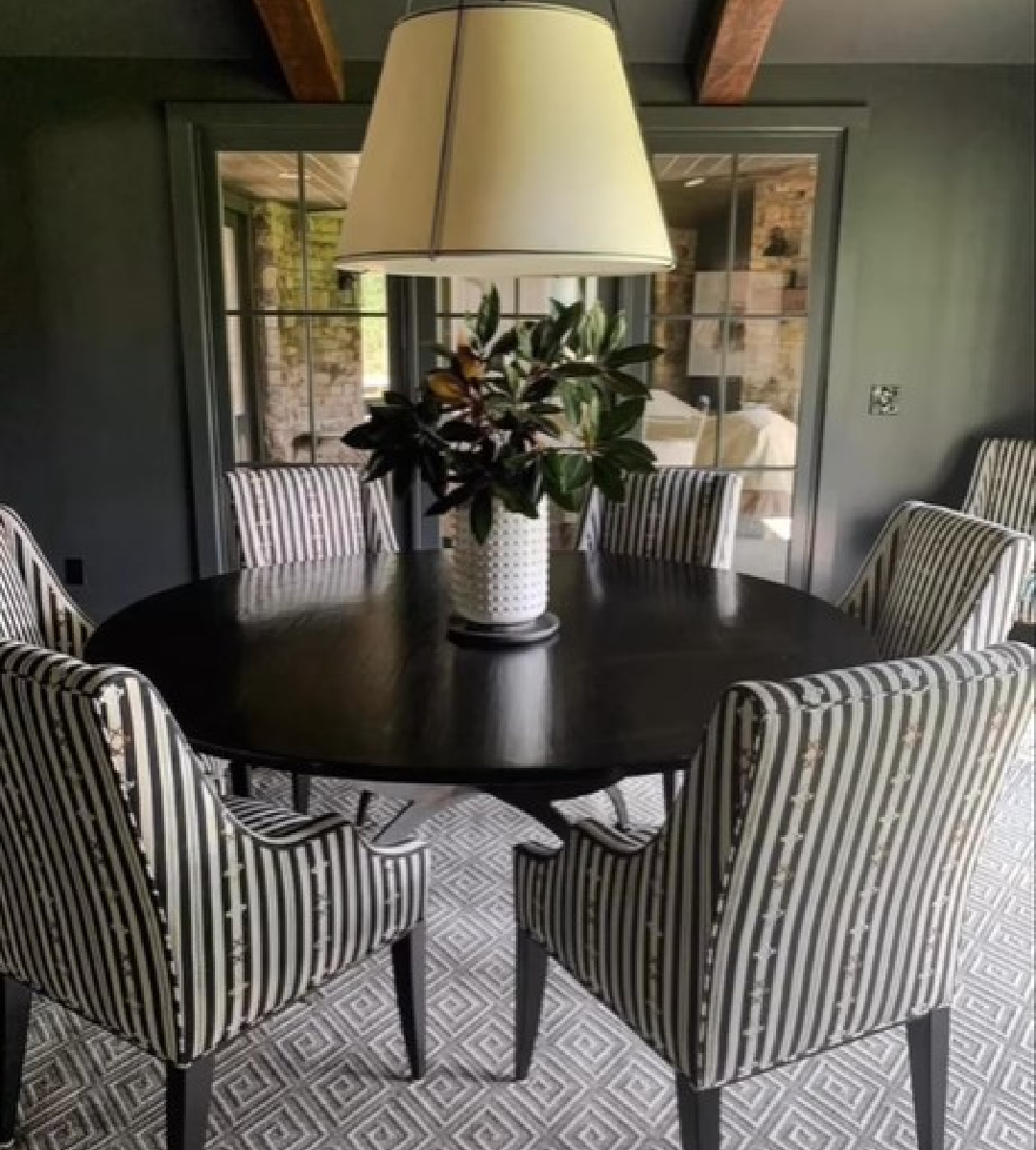
Pssst. What is the easiest way to know whether a paint color will look as great in your space? Order samples with Samplize…they’ll be delivered straight to your door.
Farrow & Ball Setting Plaster
Sooooooo sophisticated and European inspired!
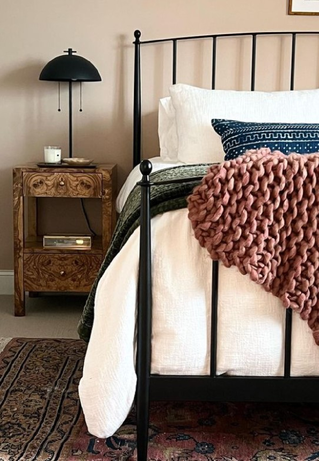
I can imagine so many complexions for which this color would be deeply flattering! I know we don’t typically think about such matters, but shouldn’t we? There are just certain colors where we look washed out or less than ideal.
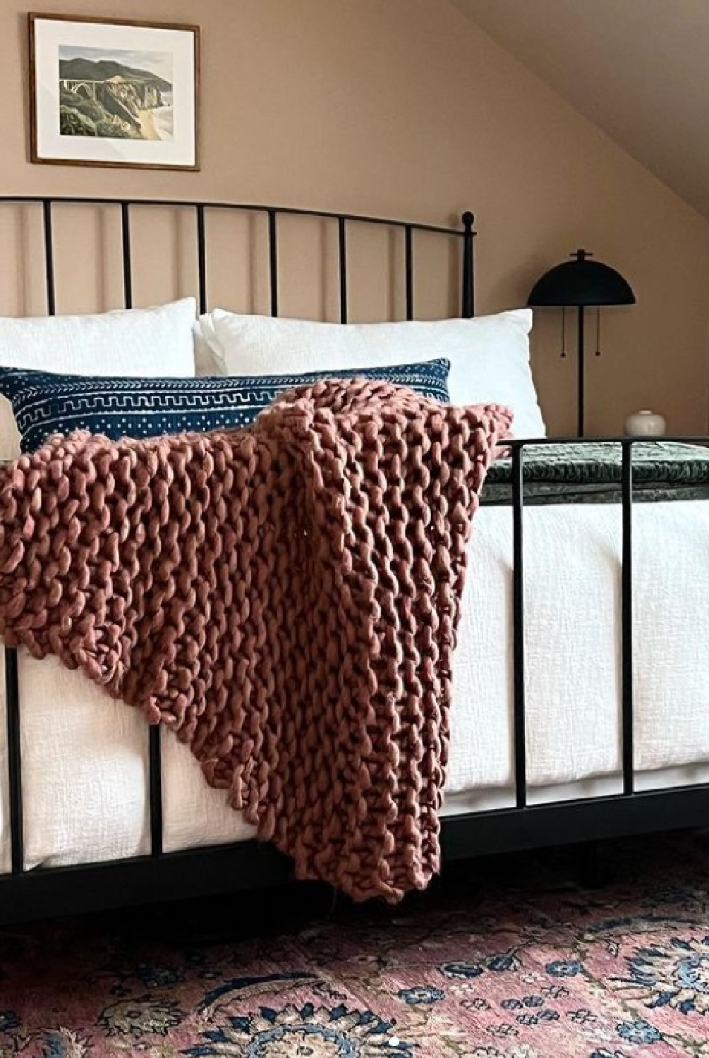
Why not wake up in a space with a more cooperative backdrop for skin and hair!?!
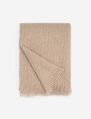
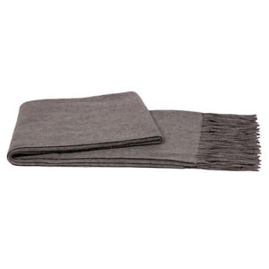
If you aren’t ready to cover your bedroom walls in a blushy color, you could always take baby steps and try a throw like this one…
Another option is trying a new to you color in a space like a bath. Here’s one that makes everyone look like a million bucks because it was designed by Ms. Hart so fiercely:
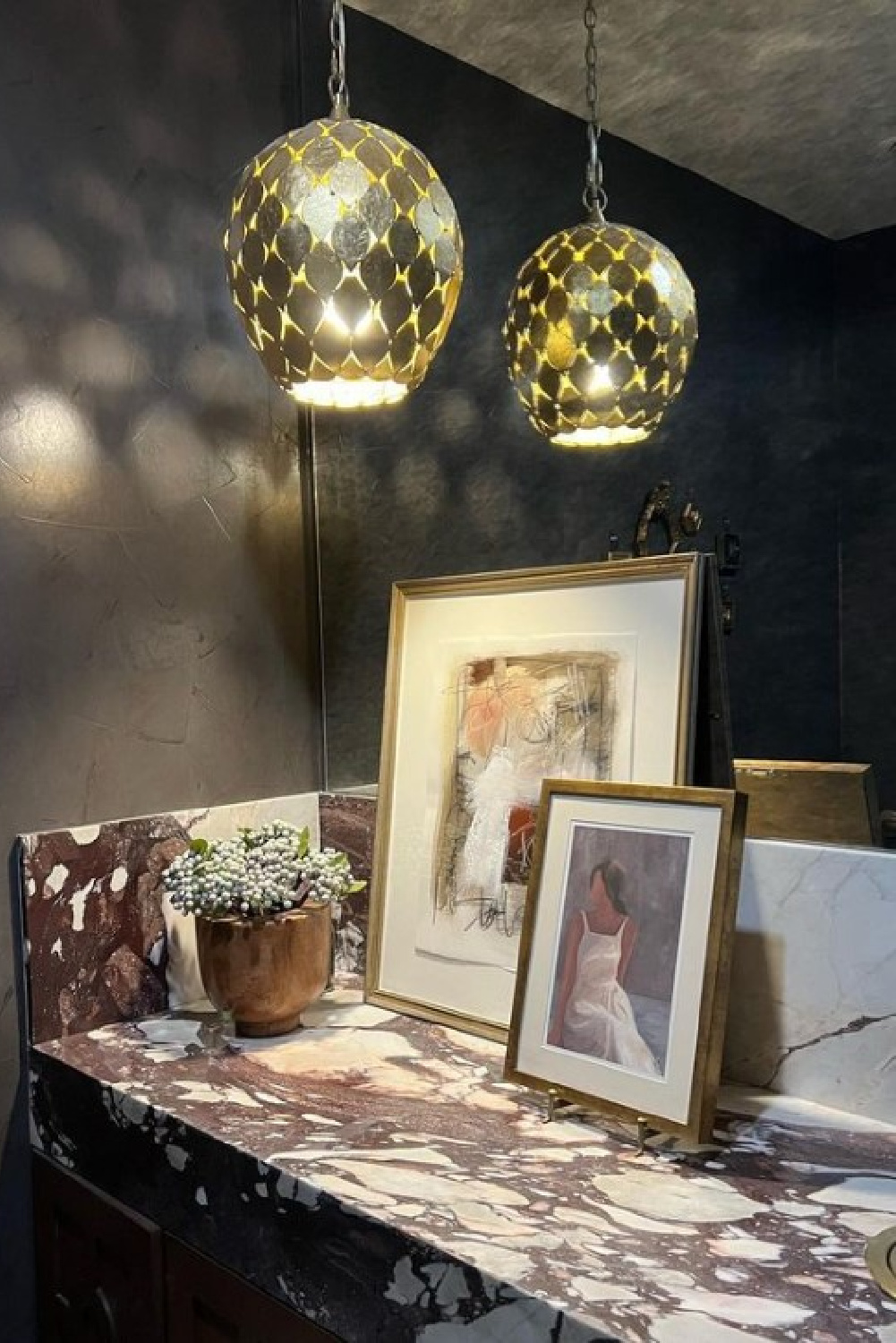
While the bath is wallpapered, not painted, what black paint color might Sherry recommend as a fav?
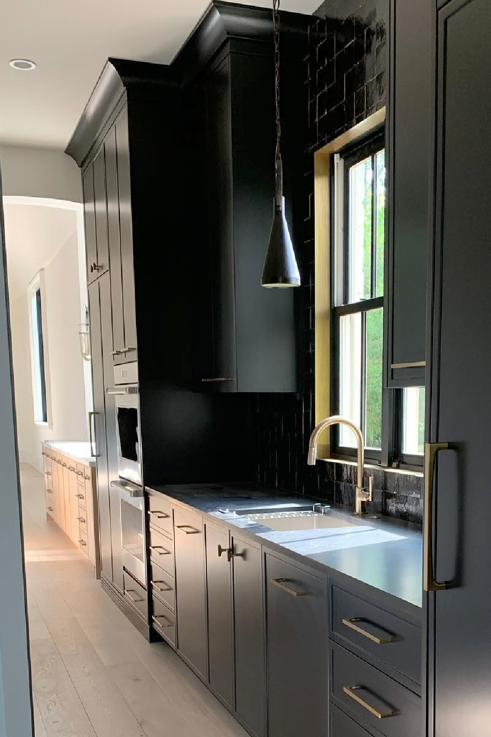
Sherwin-Williams Tricorn Black
We know she likes Tricorn Black!
I independently selected products in this post—if you buy from one of my links, I may earn a commission.
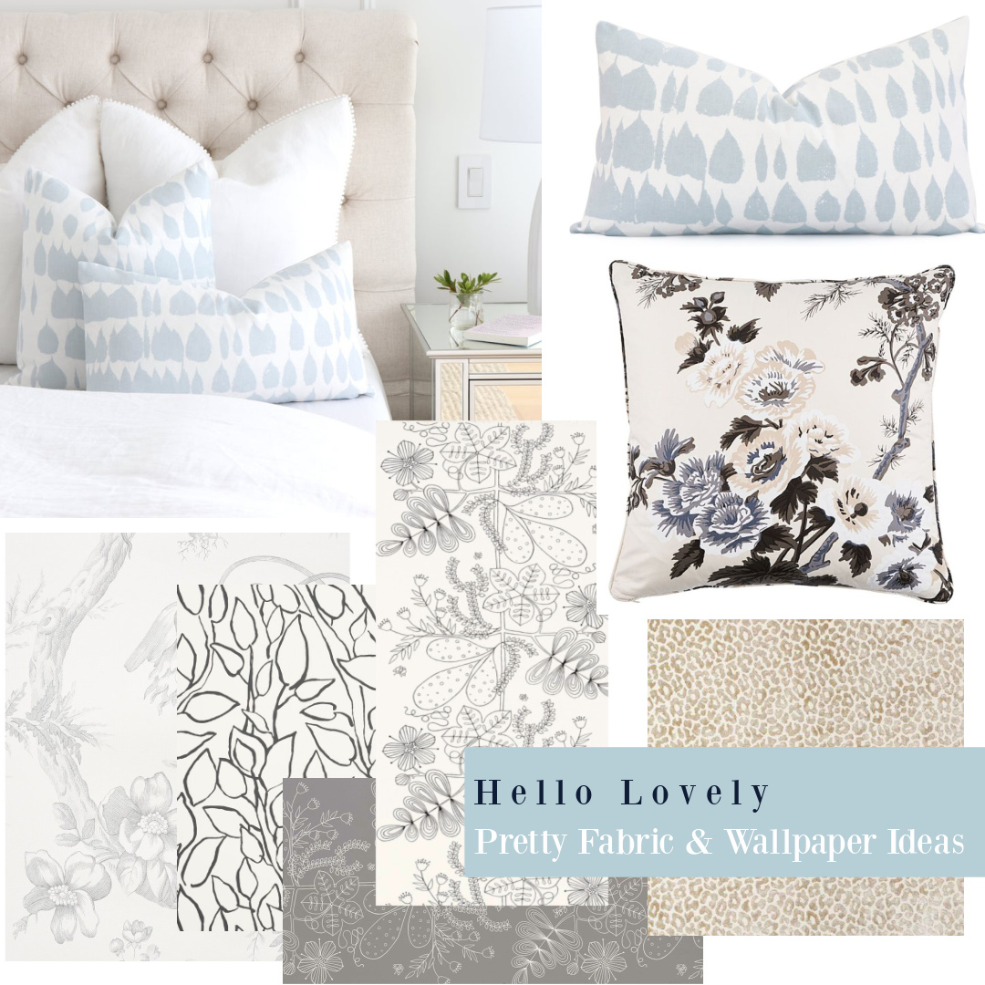
Sherry & Schumacher Wallpaper Favorites
While Sherry Hart has been singing the praises of these classic prints and patterns for many years, everybody and their granny is now appreciating them.
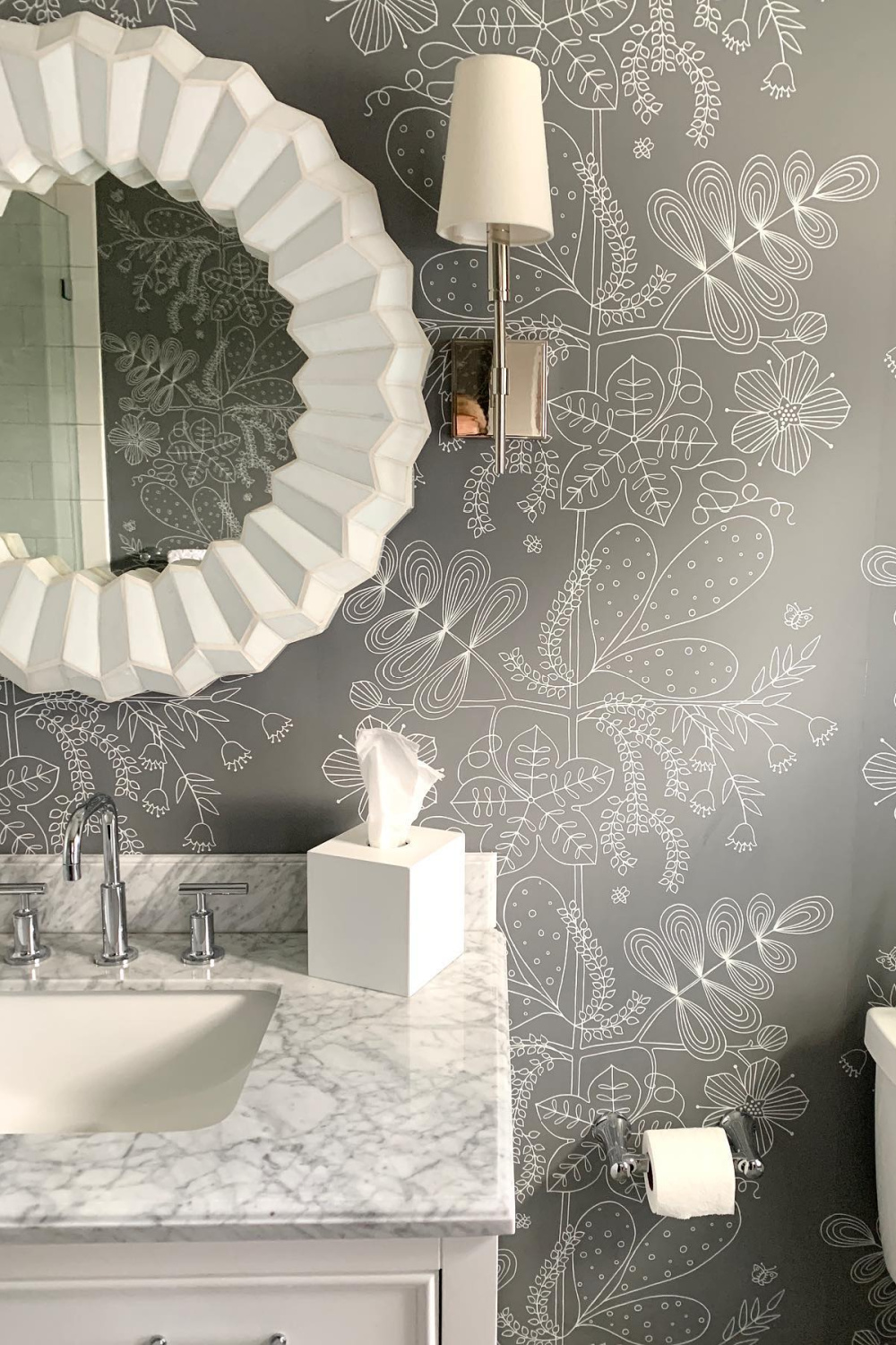
It’s always so exciting to see what interesting patterns she chooses for powder baths and more!
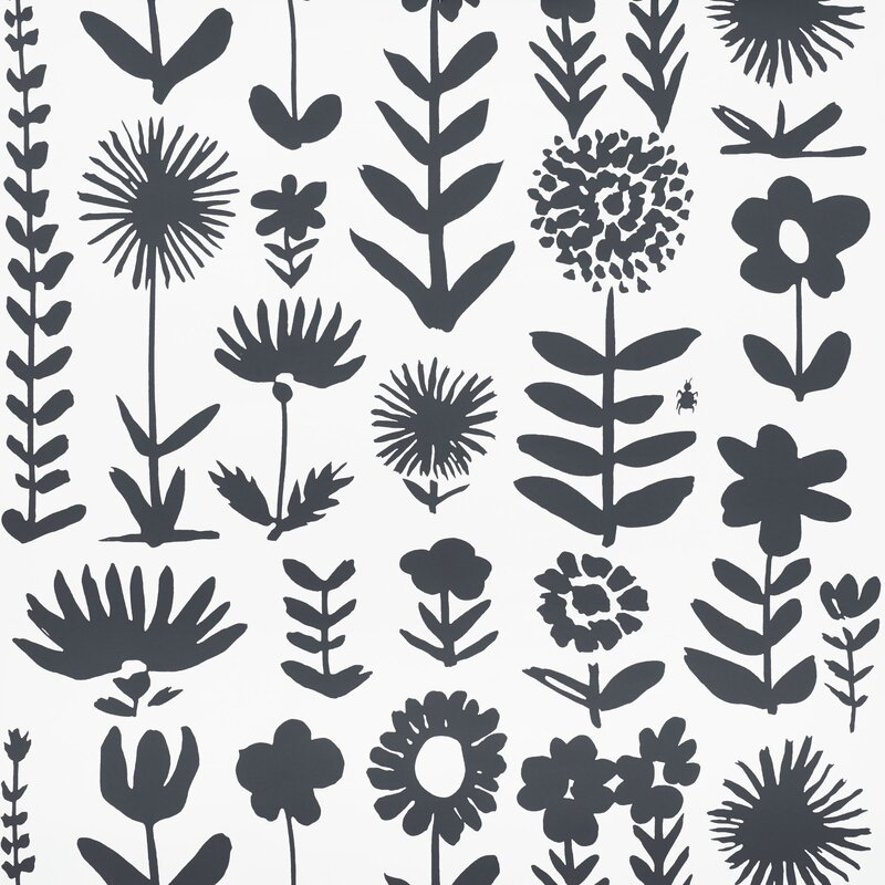
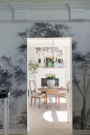
This Schumacher paper above works in so many different environments with its nature theme.
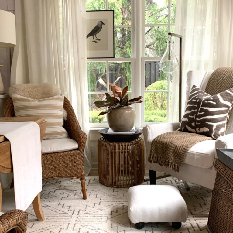
Make sure you check out more inspiring interiors from Sherry in this story.
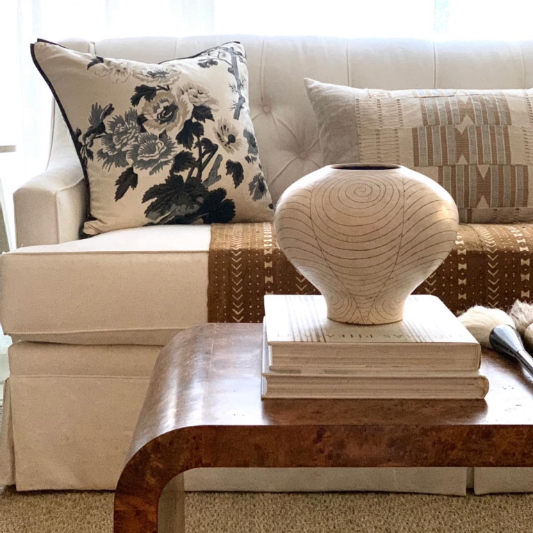
Should you be able to call on Sherry for your design needs? What a blessing!
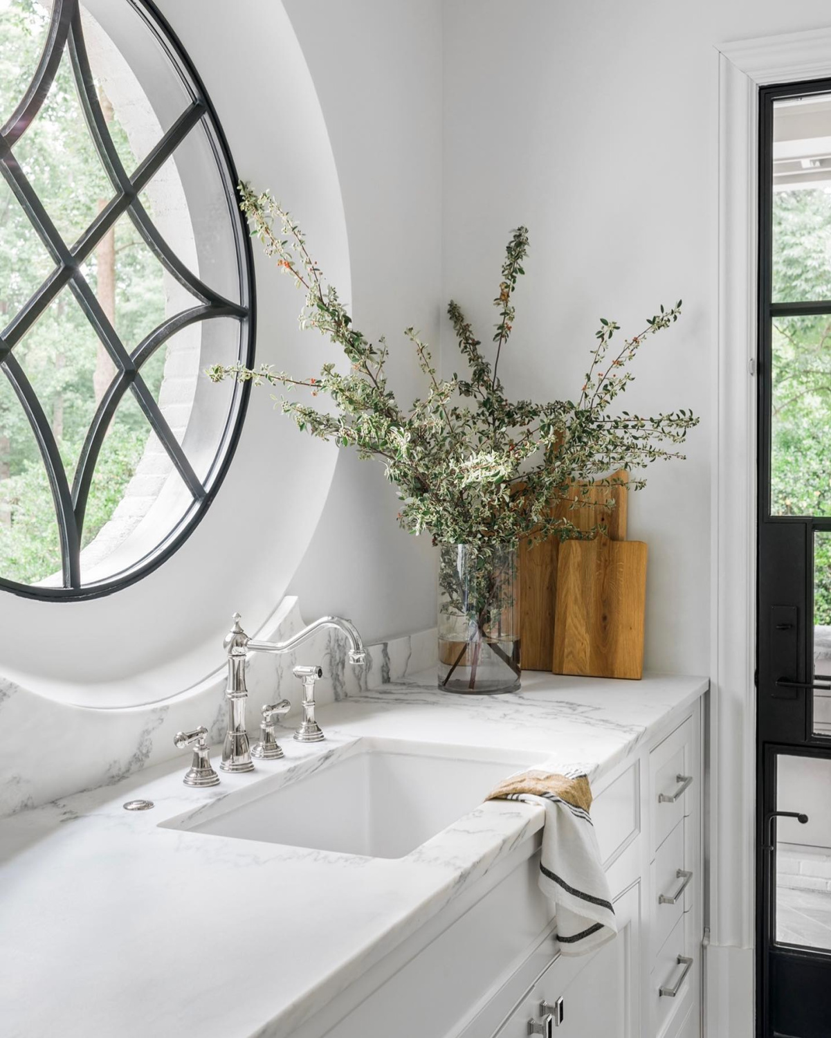
The next best thing is following her legendary blog, Design Indulgence.
Peace to you right where you are.
-michele
I independently selected products in this post—if you buy from one of my links, I may earn a commission.
Thanks for shopping RIGHT HERE to keep decor inspiration flowing on Hello Lovely!
Hello Lovely is a participant in the Amazon Services LLC Associates Program, an affiliate advertising program designed to provide a means for sites to earn fees by linking to Amazon.com and affiliated sites.

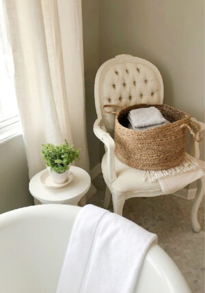
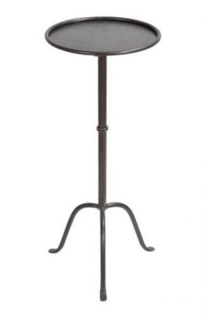
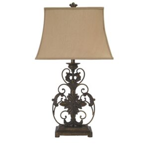
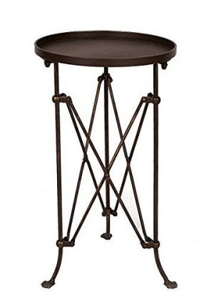
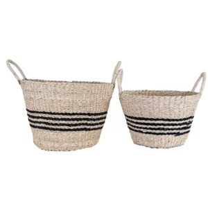
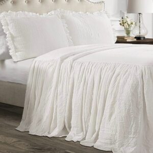
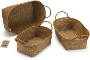
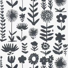
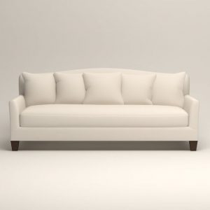

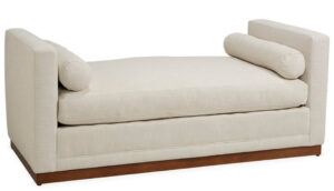
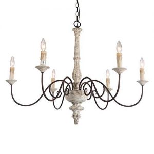
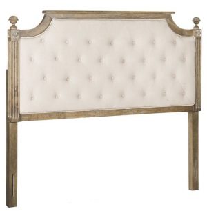
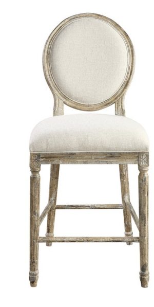
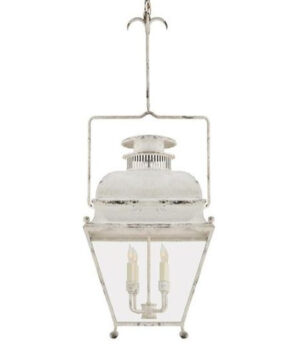
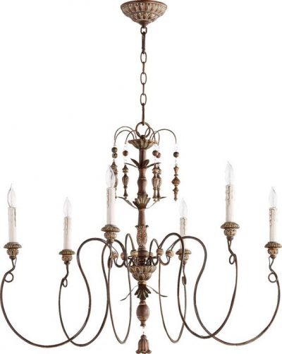
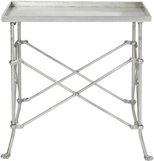
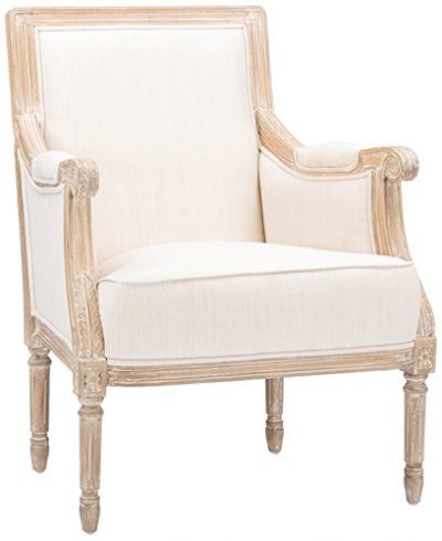
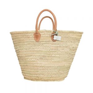
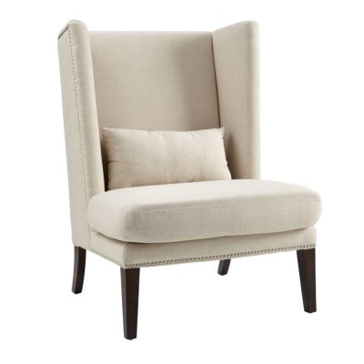
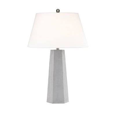


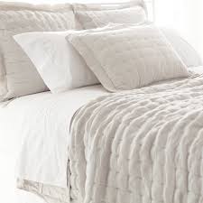
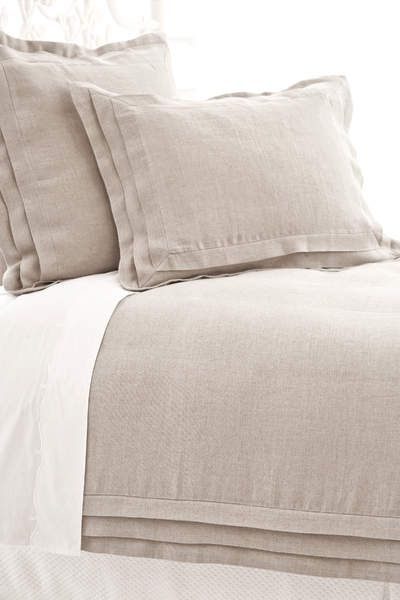

Lovely. It was interesting to see how many times she slipped in pale, and not so pale, blush to surprise the eye.
Author
Thanks for reading, and yes, you’re right! I love blush used as a neutral!