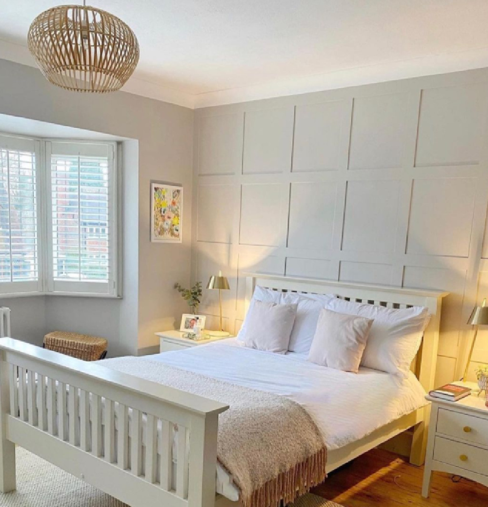
We recently moved into a home with a variety of greyed-whites, and I have plenty of experience to guide you on this topic! There’s good reason so many designers turn to Farrow & Ball when they’re after classic, timeless, sophistication. These are thoughtfully designed rich colors with staying power. If you Need a Greyed White Neutral Paint Color, I have four pleasing options to peruse. This inspiring photo gallery will help you narrow down the best contenders to sample.
I independently selected products in this post—if you buy from one of my links, I may earn a commission.
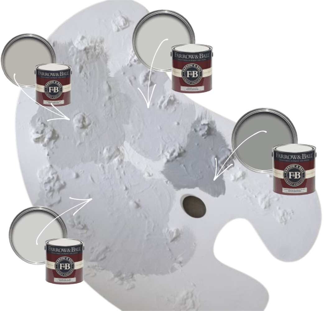
Farrow & Ball Greyed White & Neutral Paint Colors
Don’t let a paint color’s name be too influential. Plenty of colors containing the word “gray” are options if you are seeking white paint colors (both cool and warm) or neutral paint to work with existing decor. And in fact if you’re after the perfect grey, the name of the paint may in a collection of whites. Wait. What?
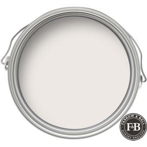
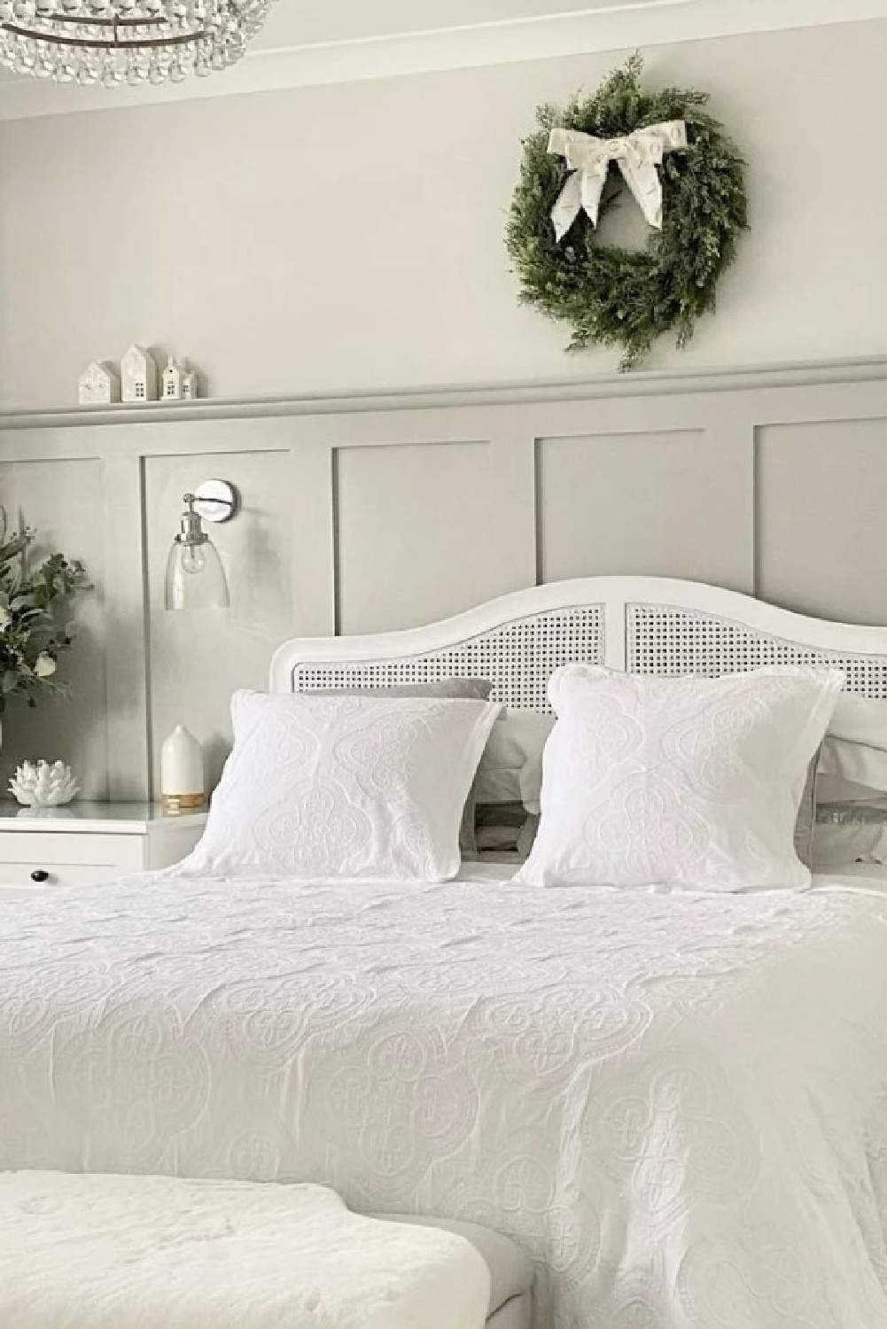
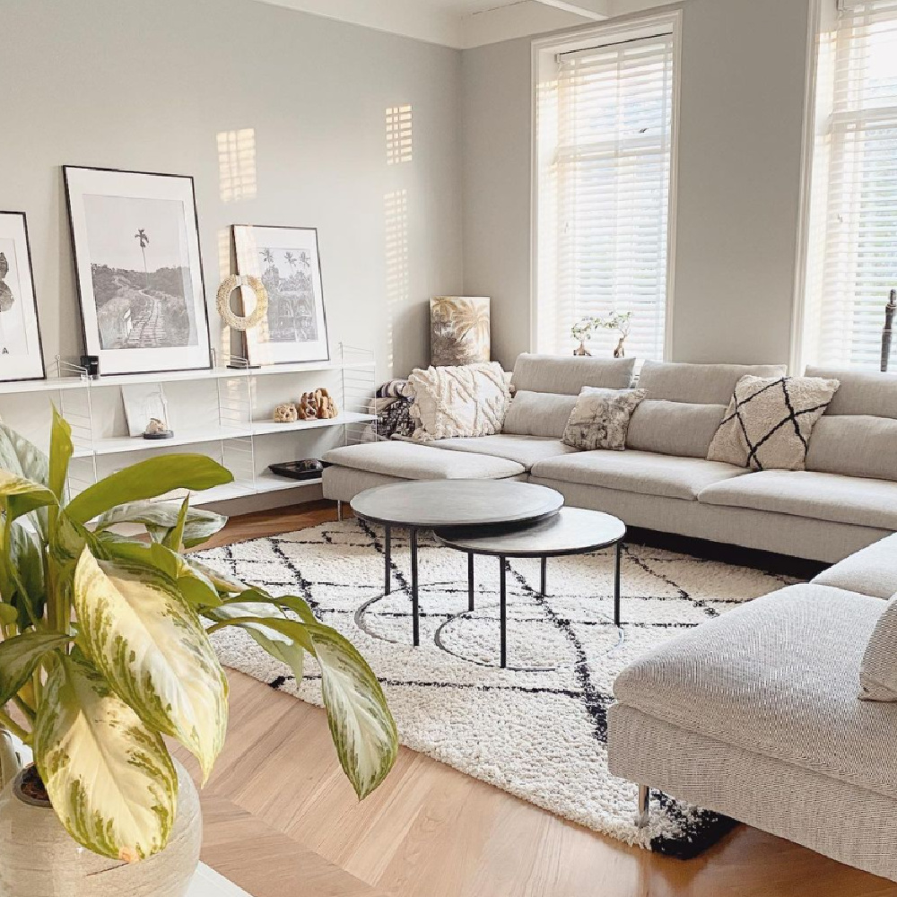
Strong White No. 2001 (Farrow & Ball)
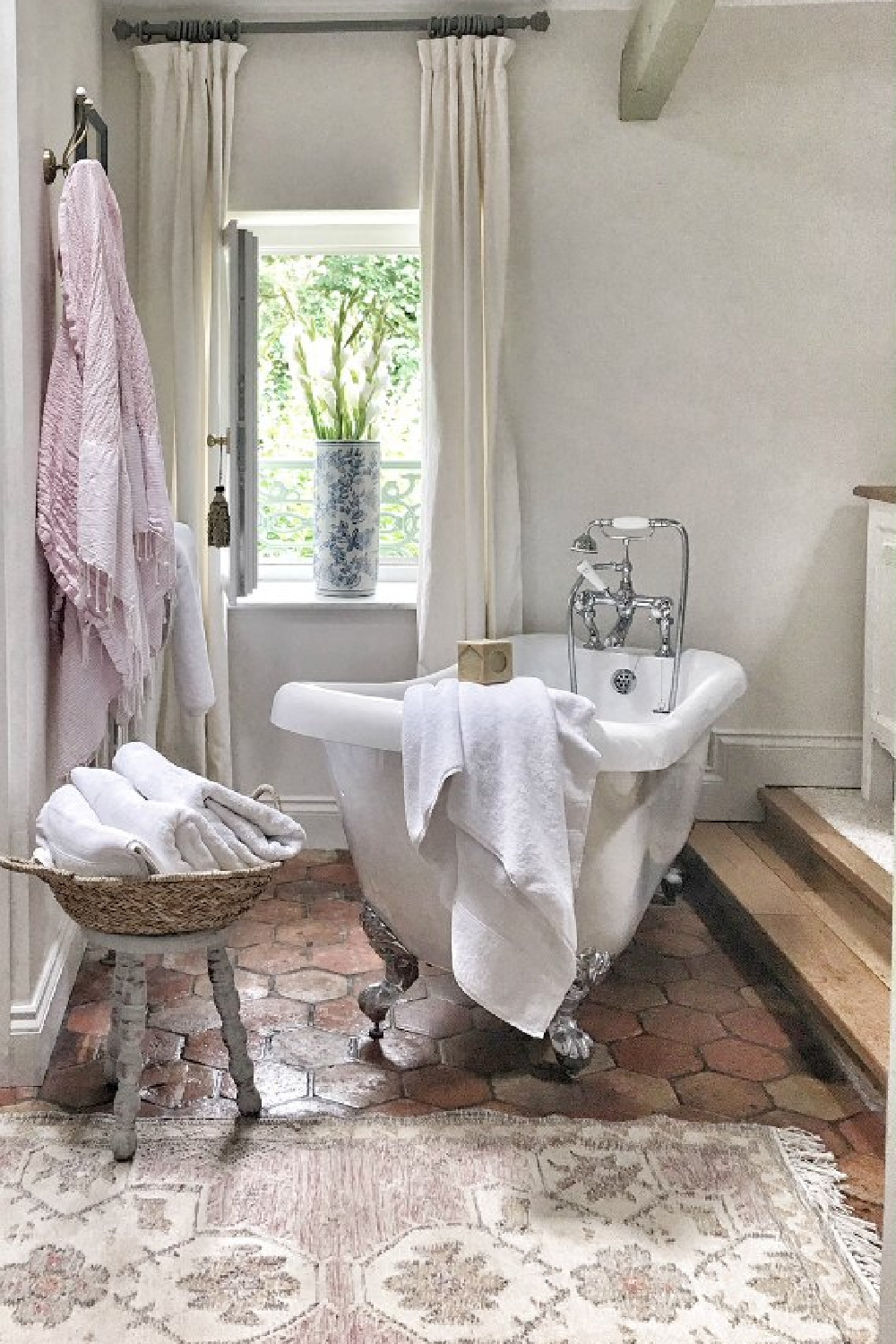
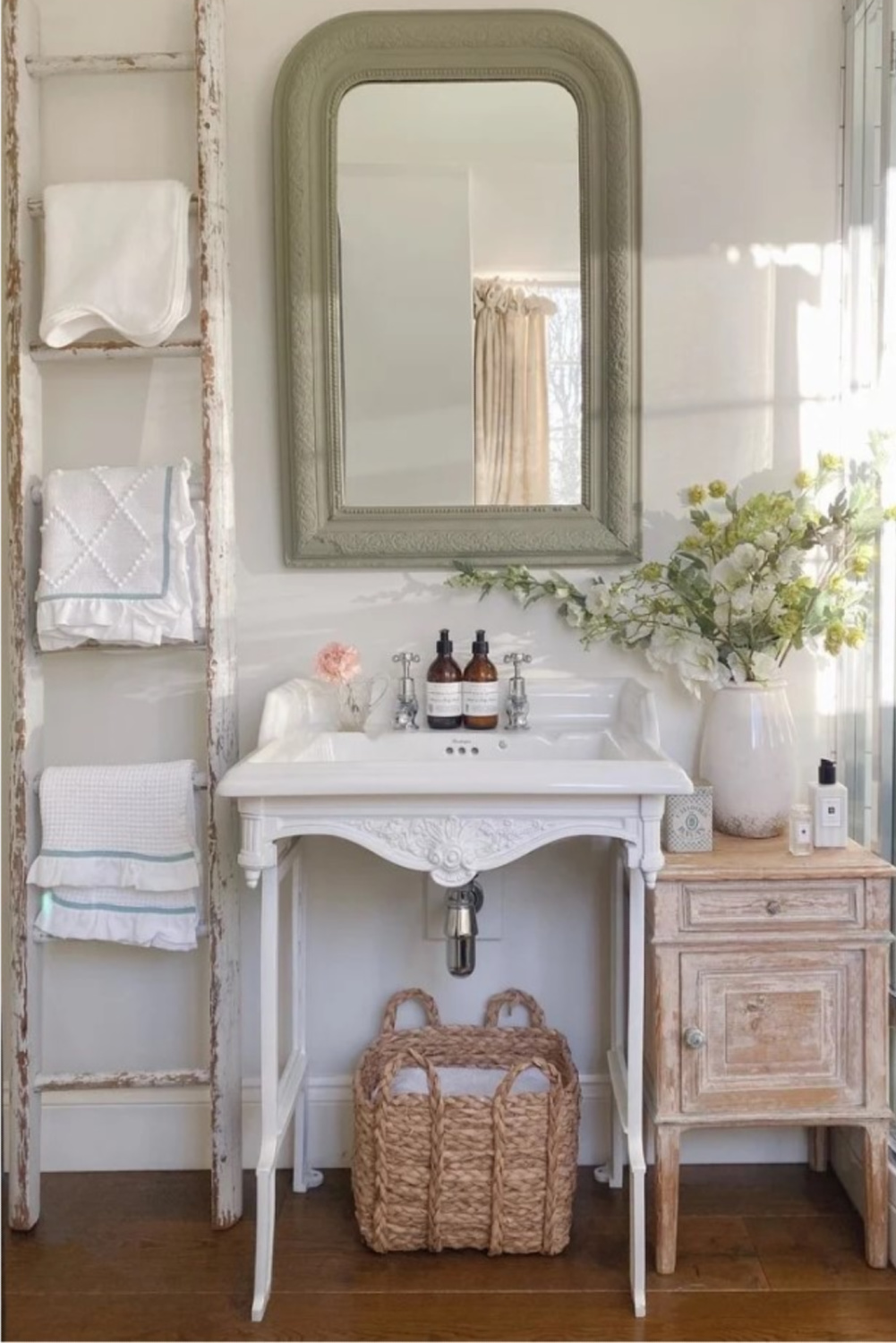
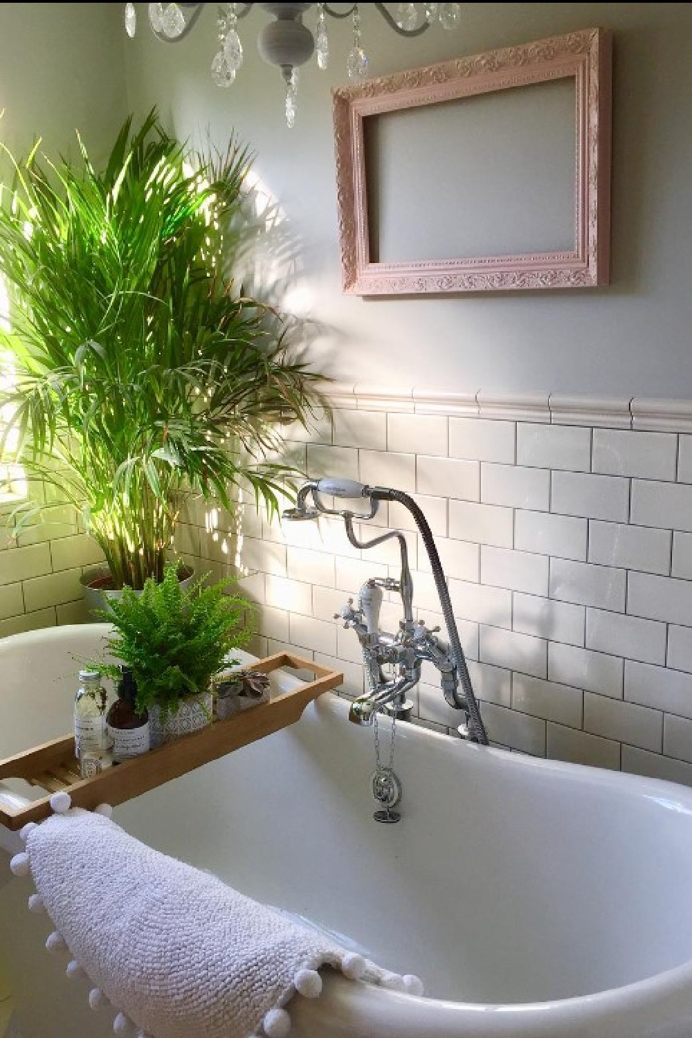
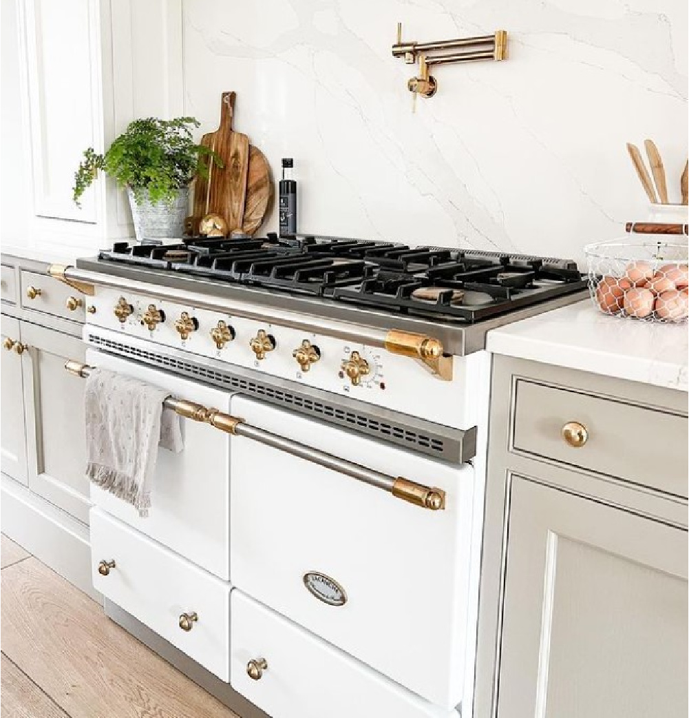
For example, this French farmhouse bath which likely appears beige or grey to your eye is Farrow & Ball Strong White:
Perhaps NEUTRAL is a better descriptive term, but let’s yield to the names chosen by Farrow & Ball since these ARE their colors!
“This cool white is both strong by name and strong by nature. One of our Contemporary Neutrals, the subtle urban feel of its light grey undertones add a contemporary twist to period homes, while staying in keeping with modern properties. Pair with Skimming Stone, Elephant’s Breath and All White in any combination for an effortlessly cohesive scheme.”
It worked modern magic in this old French farmhouse (above) into which Vivi et Margot breathed new life.
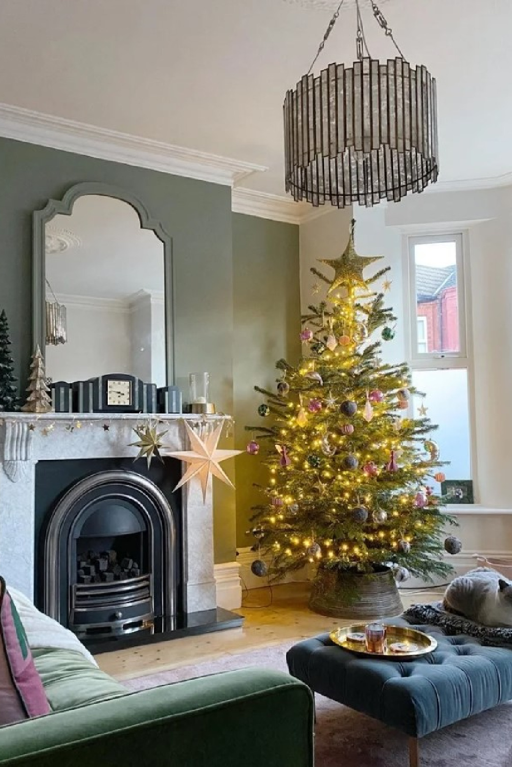
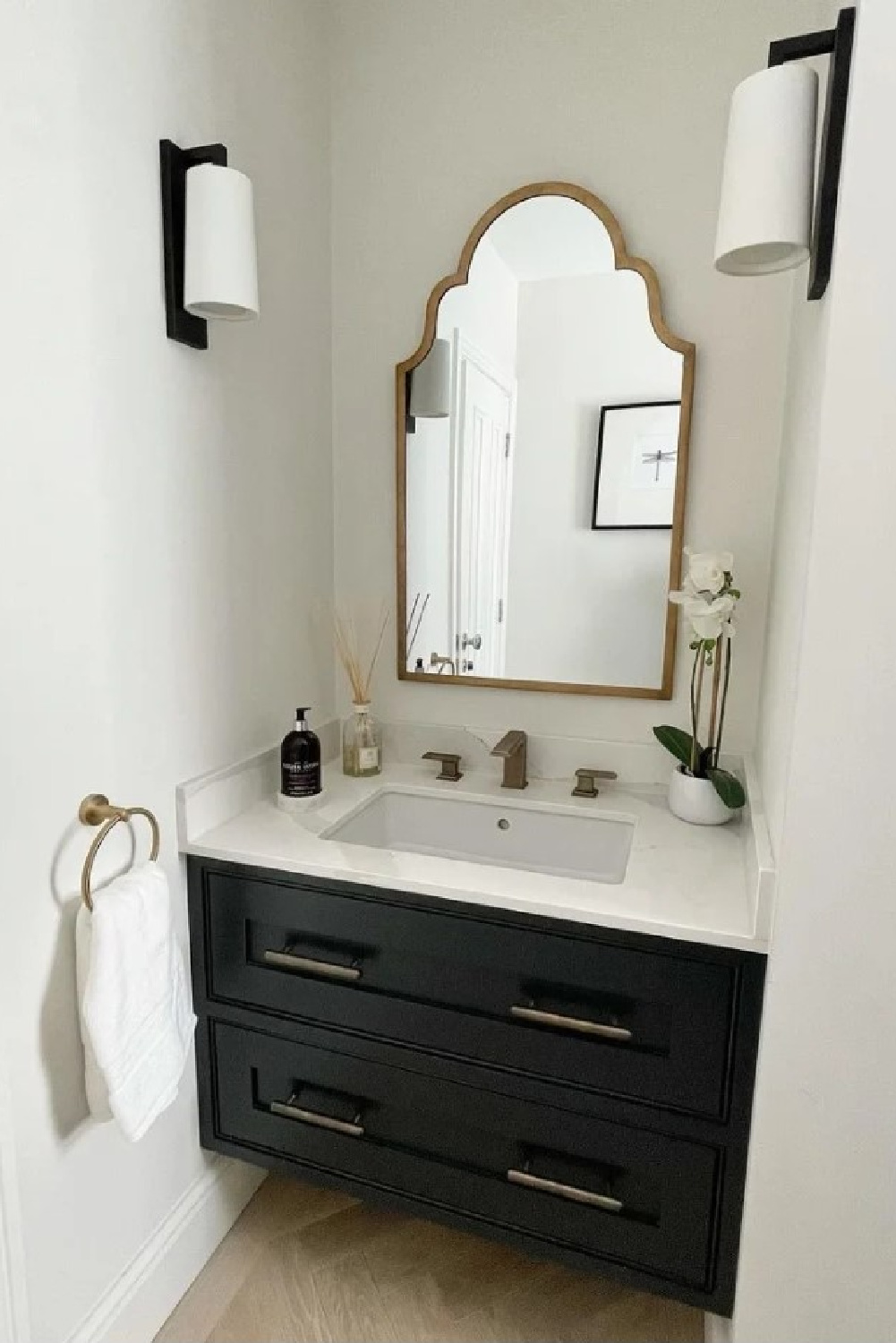
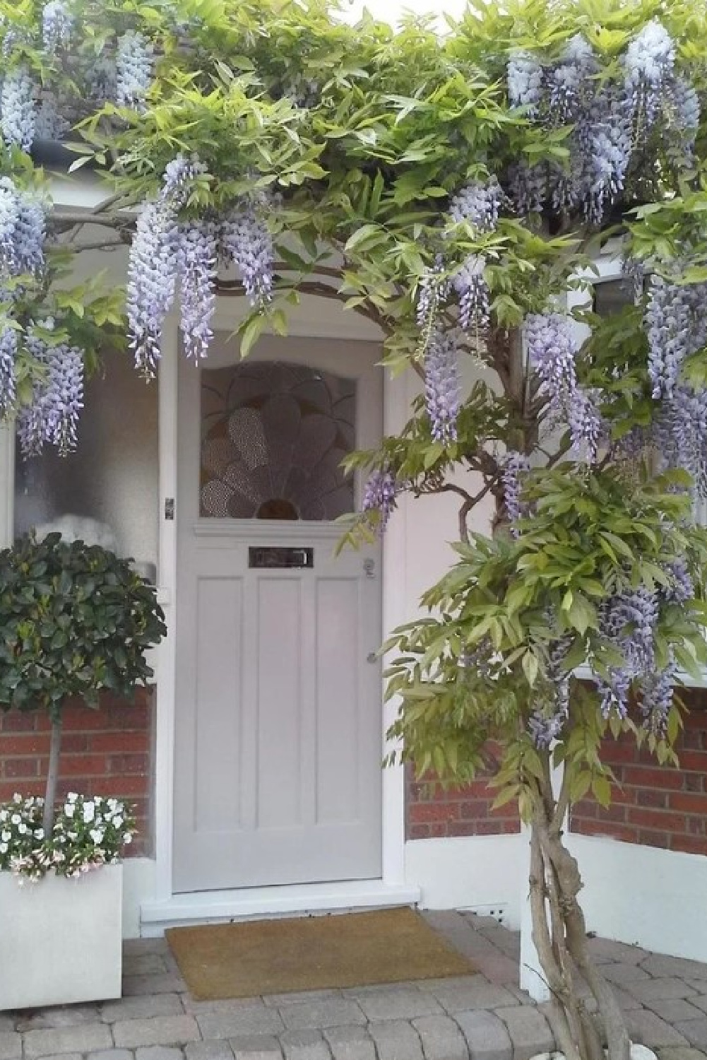
Isn’t Strong White amazing paired with Card Room Green (above)? For high contrast, here’s an idea for a small bath:
Strong White is also stunning and serene paired with one of my favorite F&B colors of all time: Pavilion Gray:
Pavilion Gray No. 242
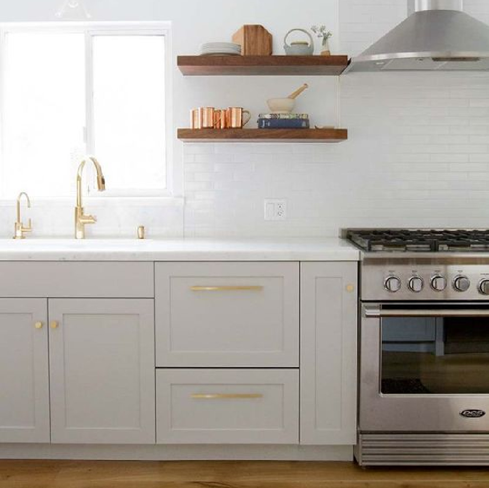
I used this color at 66% strength on our existing kitchen cabinets, and with all of the natural sunlight, they appear pale blue-grey.
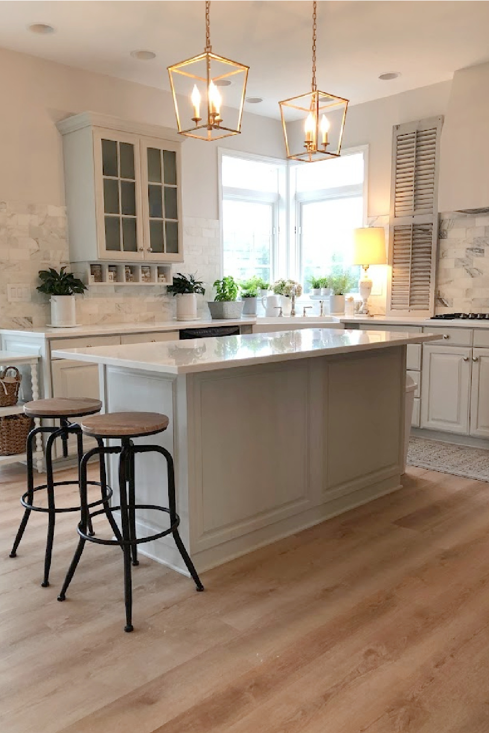
I mixed 2 parts Pavilion Gray with 1 part pure white (Sherwin-Williams Emerald Urethane in Satin).

Here’s how Farrow & Ball describes this classic mid grey:
“…was originally created for a bespoke pavilion, but is also reminiscent of an elegant 18th century Swedish colour. One of the Architectural Neutrals, the subtle blue undertones of Pavilion Gray add a contemporary touch and sense of spaciousness.“
Those subtle blue undertones are why I am such a fan! As far as I know, the examples shown of Pavilion Gray are at full strength.
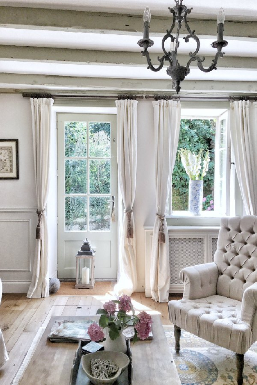
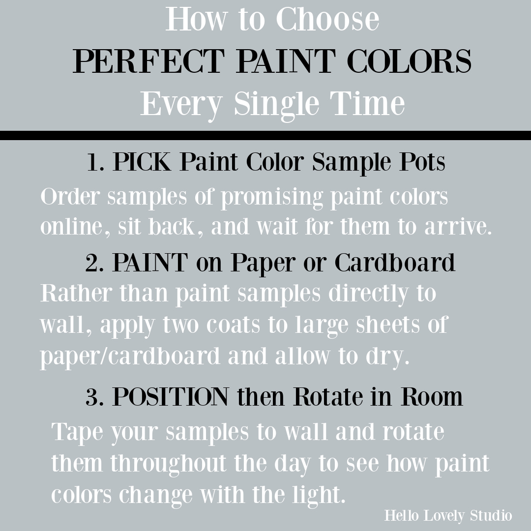
It can be helpful to browse photo galleries for paint color inspiration to see how the color looks in different lighting situations and with surrounding colors.
While Farrow & Ball paints could be challenging to source in the USA years ago, it’s easy to get your hands on samples now here!
The topic is discussed in more depth RIGHT HERE. It always pays to take the time to test samples and live with those swaths on the wall for a little while before moving forward!
Pause for a Tranquil Soundtrack As You Browse
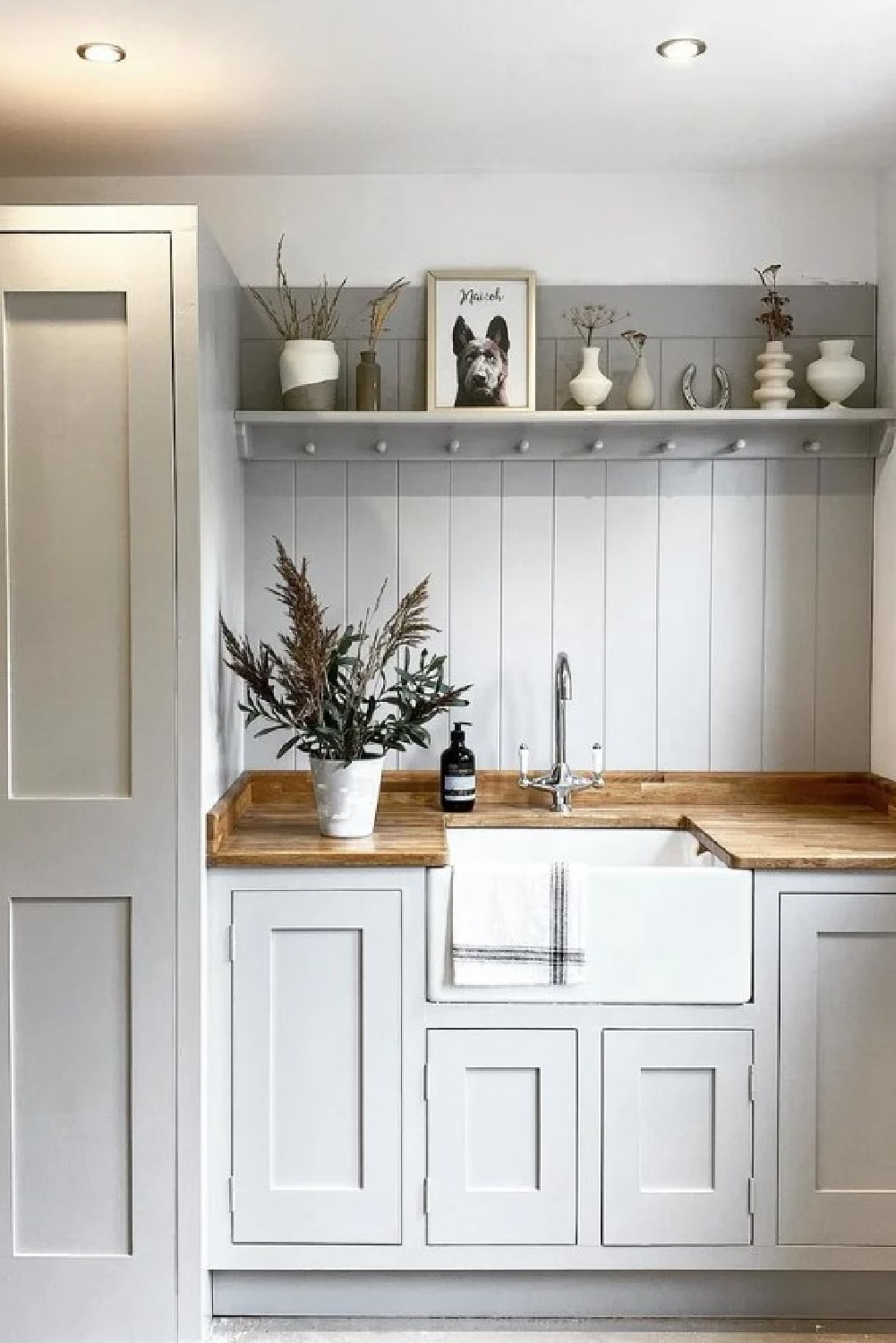
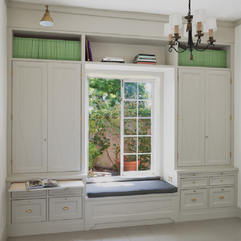
It’s a tranquil mid-grey for trim and panels:
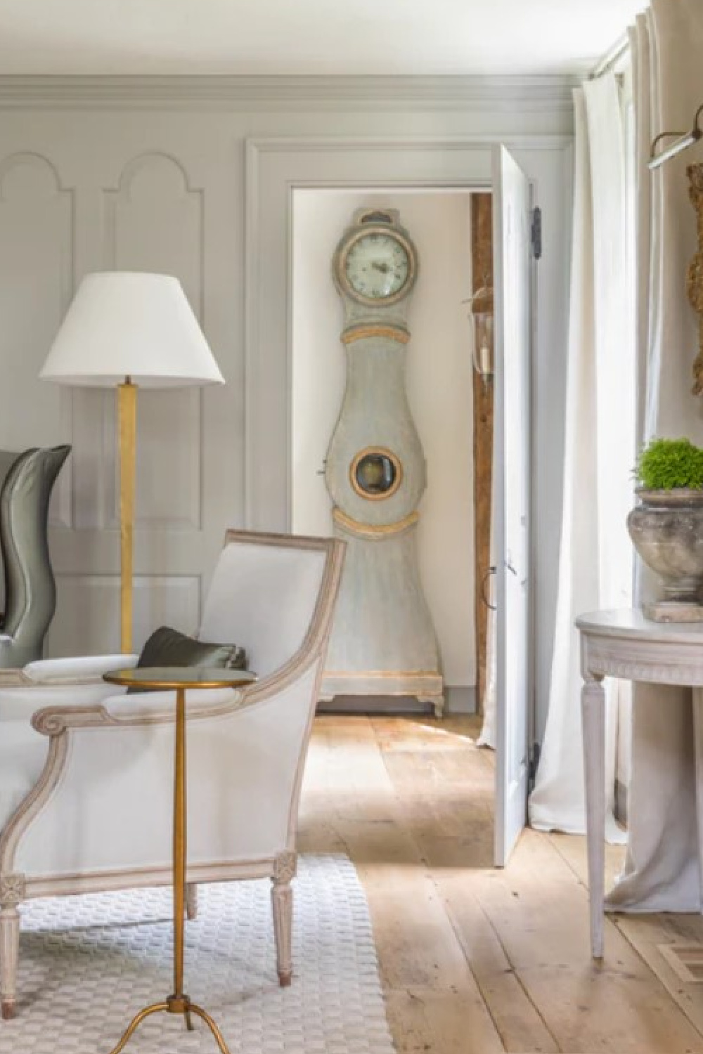
and can be softly soothing in a bath:
Easiest way to see if a paint color will work? Order samples with Samplize and have them delivered straight to your door.
How to Make Sure You Have Picked a Winning Paint Color
It is truly worth the effort, friends:
Do pin this to your paint color Pinterest board. Don’t have one? Create one and pin all these ideas to save for future reference!
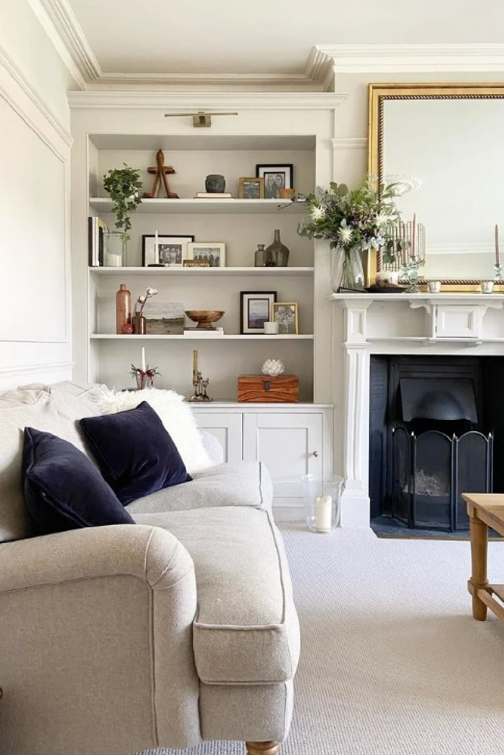
Cornforth White No. 228
Here’s another gorgeous Farrow & Ball neutral for which I have experience. It’s an understated grey without gray anywhere in the name:
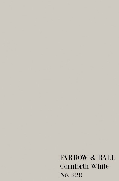
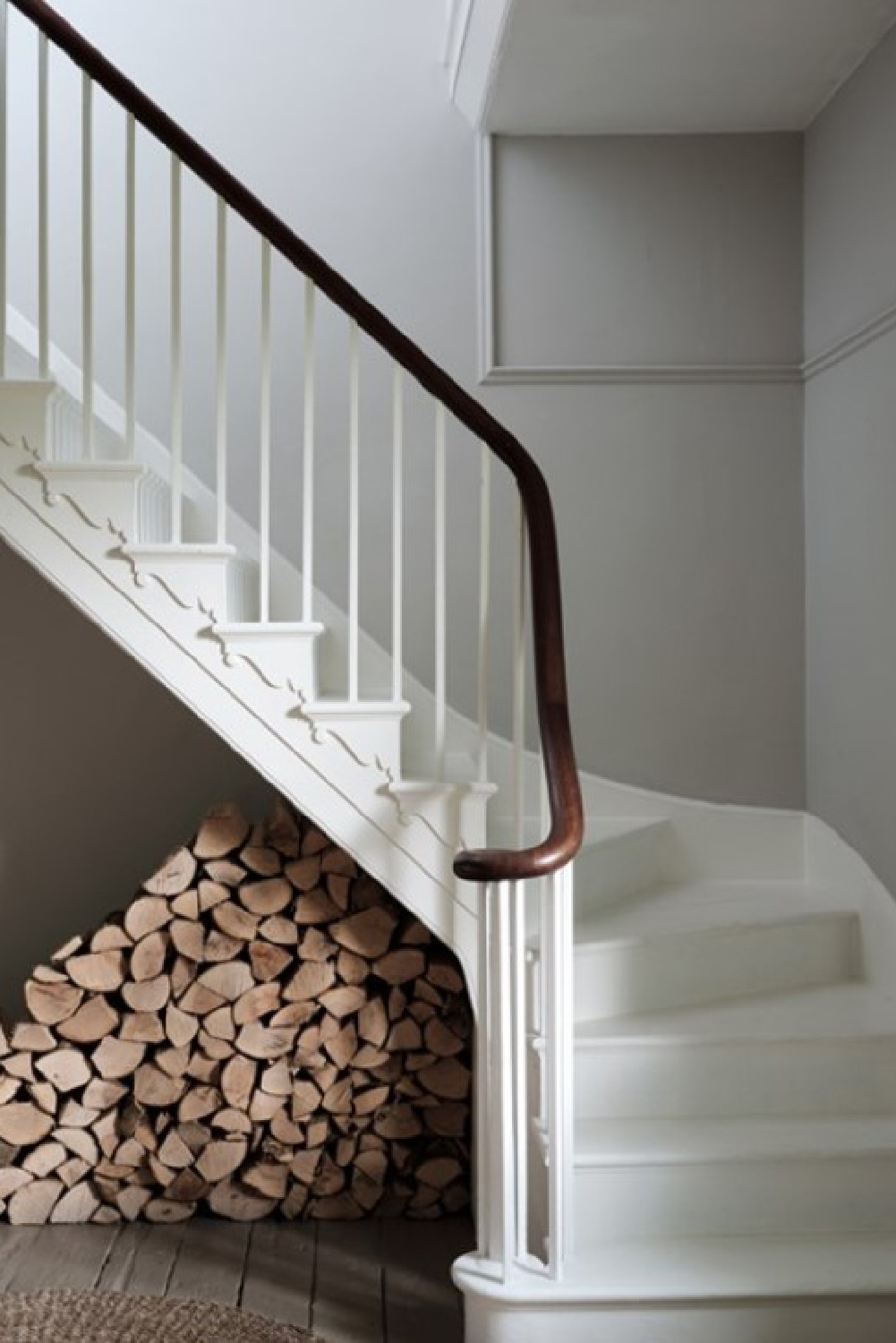
“Cornforth White is the mid tone in the group of Easy Neutrals which are totally understated and extremely versatile. Neither too warm nor too cool, Cornforth White sits contentedly between Ammonite and Purbeck Stone to create a hushed and calming retreat.”
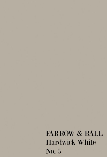
Hardwick White No. 5
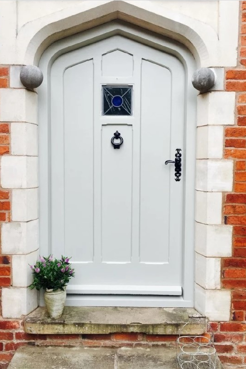
Here’s a traditional grey that Farrow & Ball explains was, “originally created to touch up the old limewash at Hardwick Hall and doesn’t look very white to most, unless contrasted with strong shades like Off-Black. Less blue than Lamp Room Gray and with an unsurpassed depth of colour, Hardwick White’s rich and chalky hue sits just as well in a contemporary room as it does in a historic house.”
Here’s the color on another style of door:
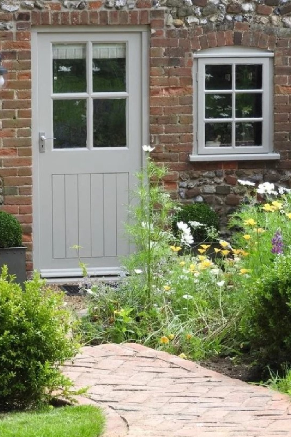
The swatch image above may read brown, yes? Yet it doesn’t appear that way in plenty of contexts:
Did You Know You Can Mix Your Favorites!
Sometimes you’re torn between two paint colors – maybe one is a little too warm, and the other not quite right. Sometimes the answer is simply mixing them and sampling the new custom color you created.
In our former courtyard, I mixed 50% Cornforth White and 50% Hardwick White for a custom greyed-white that was perfect for cast-off furniture that had seen better days.

How did I decide on this winning combo?
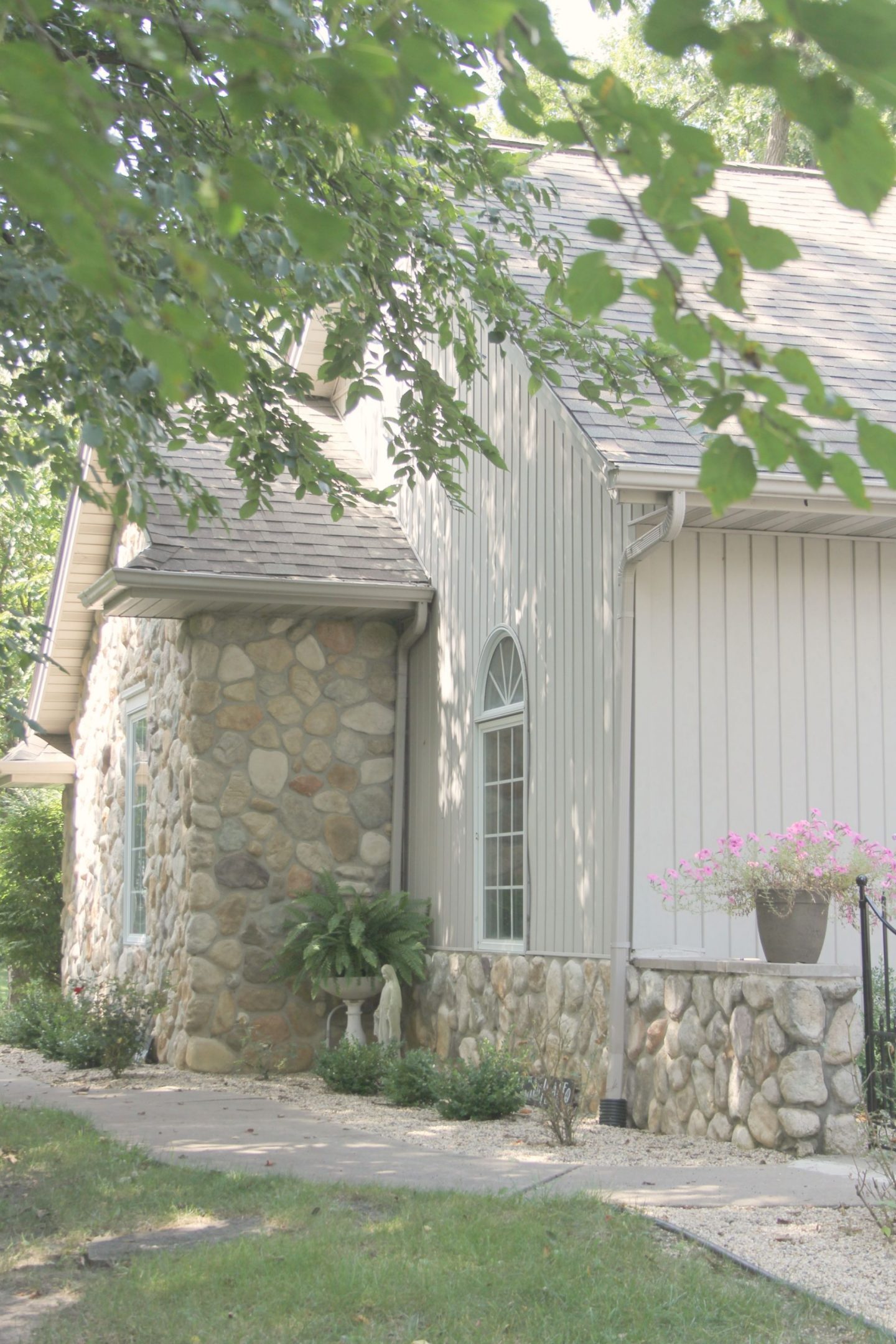

I looked to our home’s siding which is a gentle stone-like greyish white hue which falls somewhere between those two colors.
I liked it so much, we used that same formula for our garage doors.
I independently selected products in this post—if you buy from one of my links, I may earn a commission.
Peace to you right where you are.
-michele
Thanks for shopping RIGHT HERE to keep decor inspiration flowing on Hello Lovely!
Hello Lovely is a participant in the Amazon Services LLC Associates Program, an affiliate advertising program designed to provide a means for sites to earn fees by linking to Amazon.com and affiliated sites.


Beautiful post, Michele. Beautiful rooms, beautiful descriptions, beautiful quotes, beautiful music. Thank you! Now I need some ‘beautiful’ advice. I am interested in a soft grey. My home is over one hundred years old and has lovely original warm oak woodwork, that I don’t want to paint. What suggestions do you have for the walls?
Author
Let me know if you’re after a cool grey or a warm one. SW Agreeable Gray is in our current bedroom (I’ll prob change it eventually), and it looks lovely with oak woodwork which I haven’t yet painted.
Warm or cool? I’m not sure. With the rest of my decor, it could go either way. My goal is to highlight the beauty of the woodwork, not fight with it, and I’m not sure whether warm or cool will do that best.
Author
I would probably try a cool grey – I love the combination of it with warmth. Benjamin Moore Stonington Gray is one to sample. Let us know what you think.
Thank you, Michele, I will.
Author
🙂
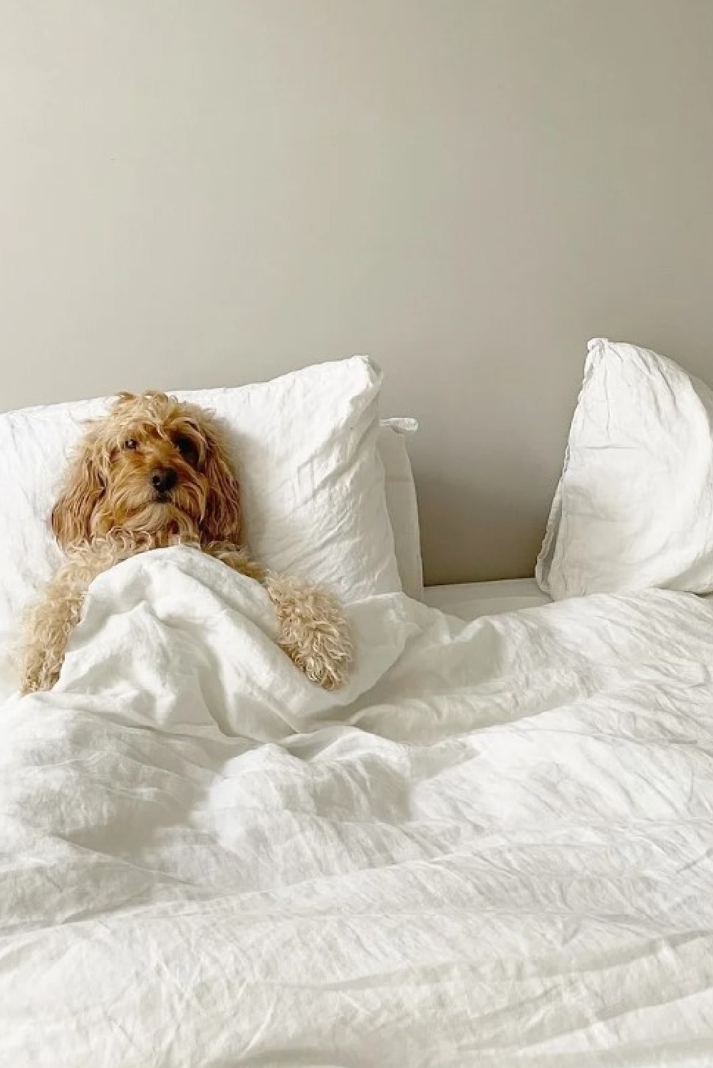
You made my day with the picture of that puppy in the bed. Hilarious, just like a person. Dogs are so cool! Hope you are doing well with your health.
Author
I loved it so much too! So sweet! It has been a better week, and one of my newer supplement additions (a prokinetic) is finally helping. Thanks so much for visiting and the support.
Excellent article. Thank you for your valuable information.