What an inspiring collection of interiors and ideas emerge with each year’s Southeastern Designer Showhouse! Did any of you have the chance to safely tour this year’s showhouse? Please let me know what you thought and share any pics! I have admired this springtime traditional event in Atlanta from afar (thanks to designer Sherry Hart’s coverage each year!) and always look forward to learning the resources such as paint colors shared by its talented contributing designers. I hope these Neutral Paint Colors from Breathtaking Showhouses inspire you as you choose a palette for your home.
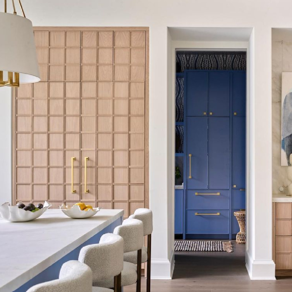
Neutral Paint Colors from a Breathtaking Showhouse to Try Now!
It always helps to have a place to start when you’re seeking lovely neutral paint colors that get the the thumbs up from an interior designer. In this particular collection of paint colors, we’ll explore showhouse paint colors from a handful of amazing interiors and exteriors.
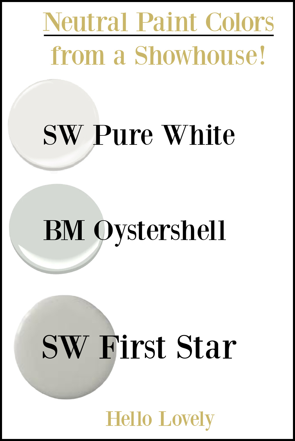
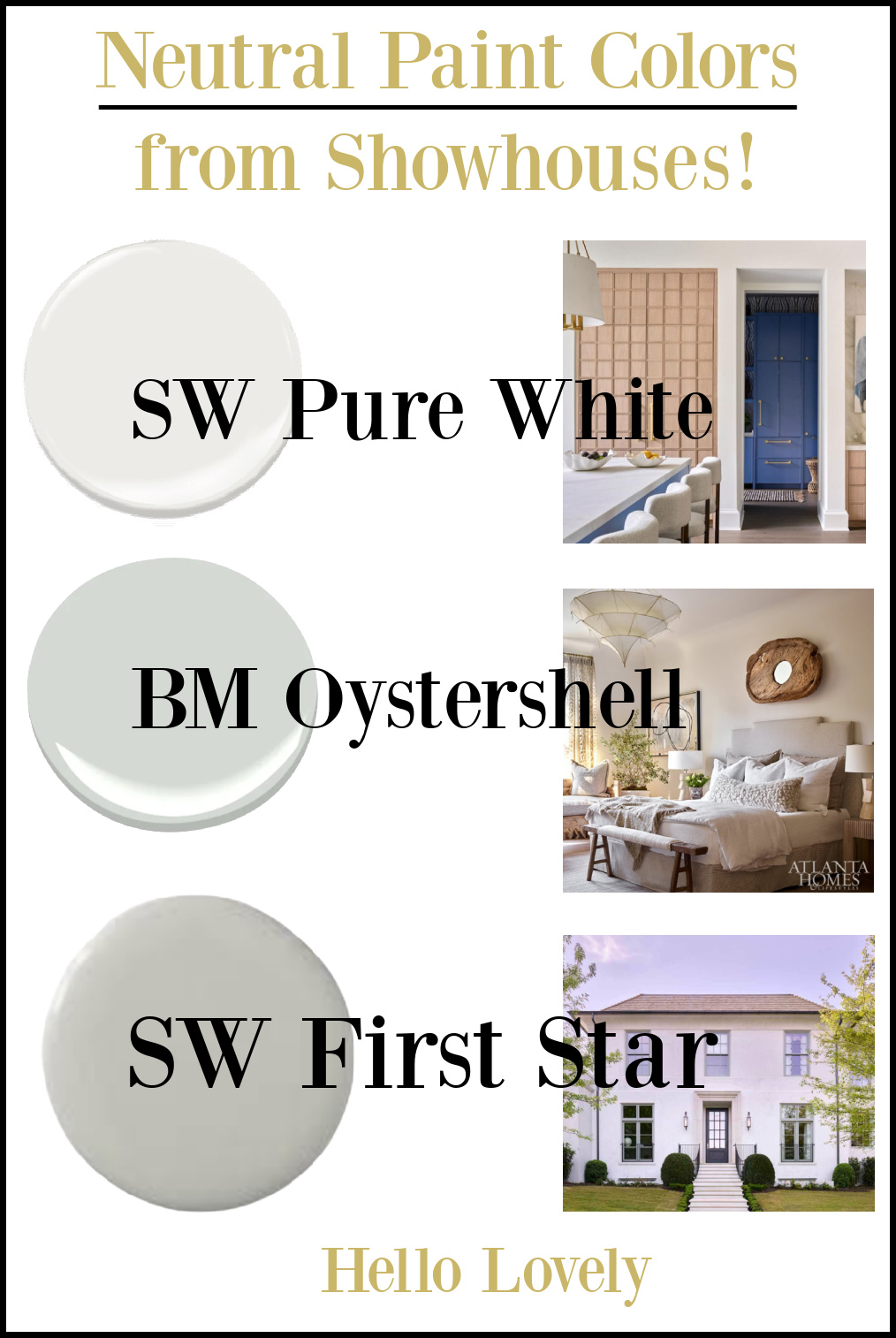
1. Sherwin-Williams PURE WHITE
What’s wonderful about this white paint color on the walls of the 2022 Southeastern Showhouse’s kitchen, is how we have the privilege of seeing it with the warmth of wood cabinetry as well as cool and boldly blue painted cabinetry.
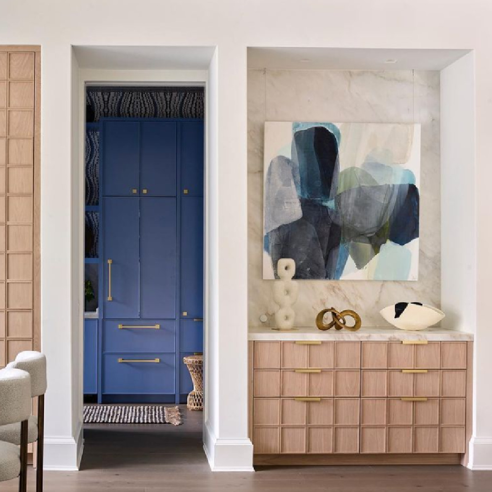
To see more interiors with SW Pure White, see THIS helpful paint color story!
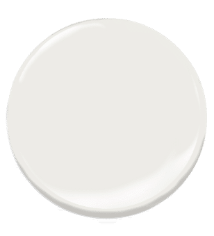
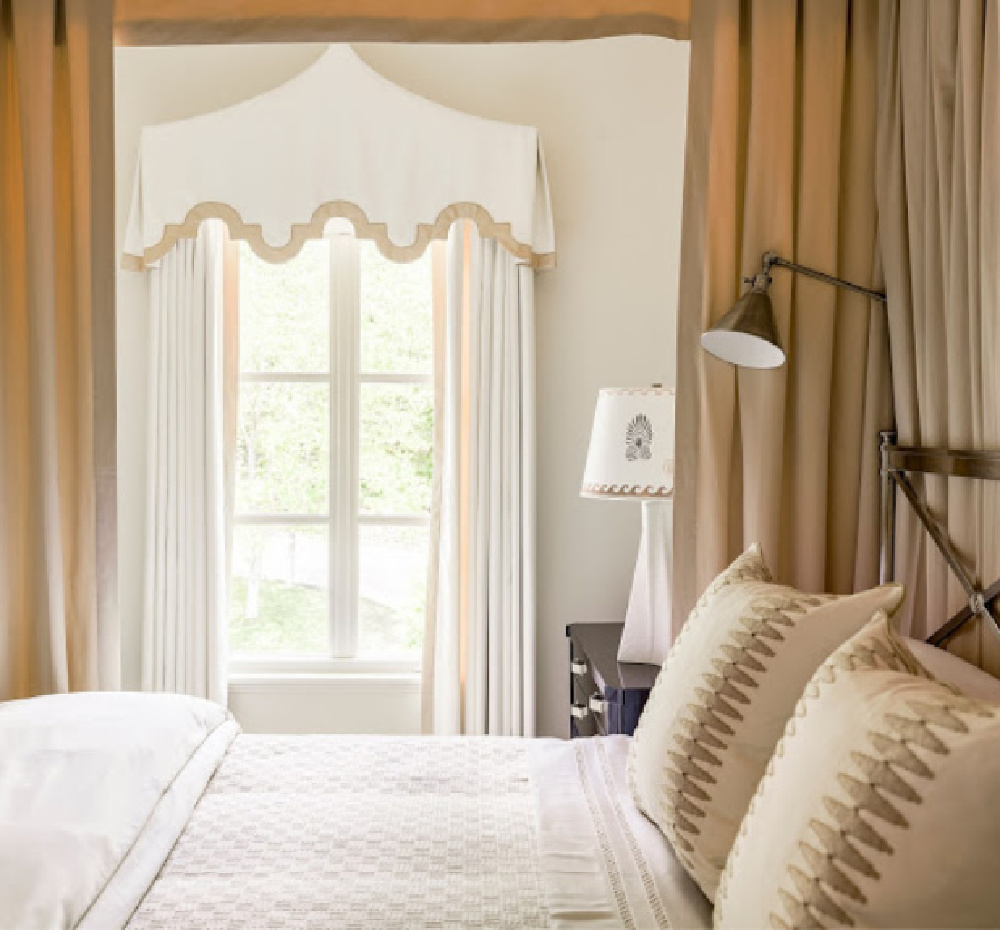
2. Benjamin Moore OYSTERSHELL
How serene is this tone on tone bedroom from last year’s showhouse!?!
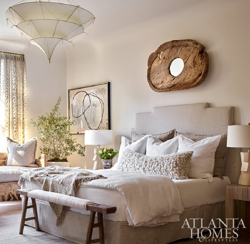
These neutrals with soft green undertones are so gorgeous with natural linen when you want a cozy cocoon retreat.
3. Neutral Paint Color Idea: SW First Star
This newly constructed 8,000-sf showhouse from 2021 located steps from Buckhead’s Chastain Park, has five bedrooms, seven baths, pool, loggia, gardens and a finished basement. Completed by design-build team Benecki, SOURCE, William T. Baker Residential Design and Land Plus, here is the beautiful exterior:
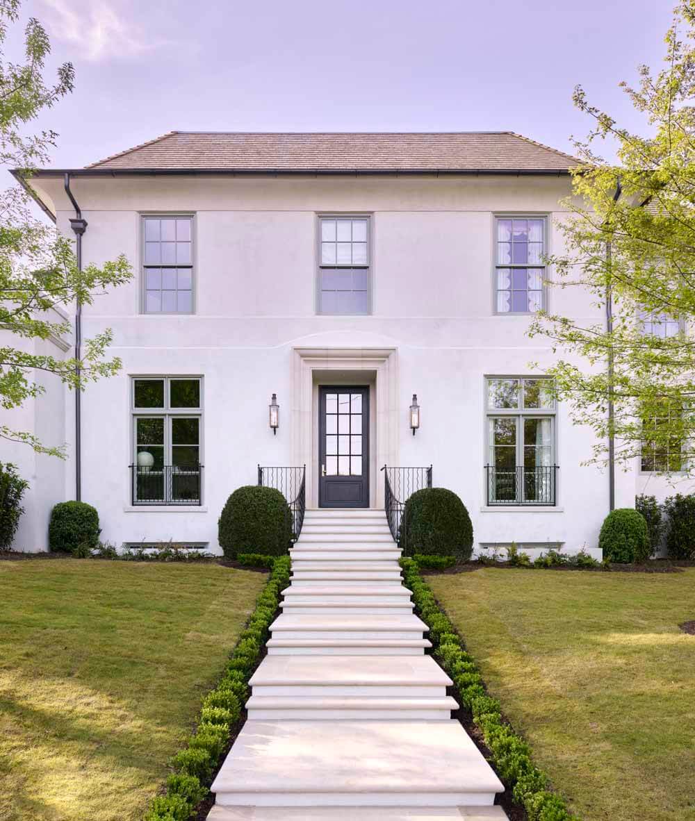
Sherwin-Williams First Star is the name of the paint color on the home’s exterior cornice above. Care to see a little more of that beautiful home? Tour it here:
So beautiful, and I have even more paint colors for you to consider!
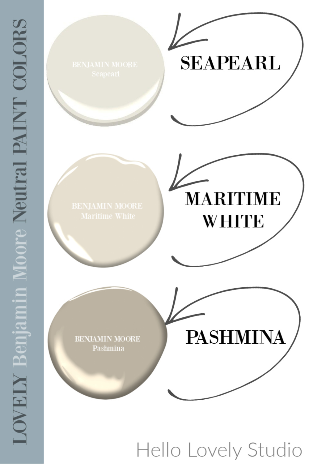
4. Benjamin Moore SEAPEARL
It can be a tricky challenge to choose the right white for an exterior so it helps so much to watch design professionals at the top of their game guide us!
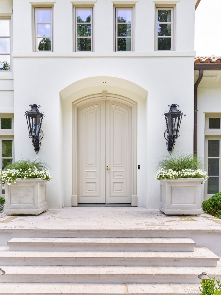
This Southeastern Showhouse 2020 exterior (Builder: Jason Cole, Cole Construction | Interior Specifications and Selections: Cydney Mitchell and Brittany Stafford, Source
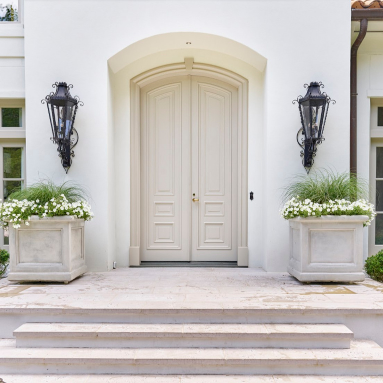
Beneficiary: The Atlanta History Center) is sophisticated and the picture of timeless tranquility thanks to Seapearl and Pashmina.
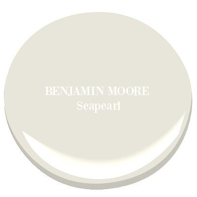
Easiest way to see if a color is right? Order samples to be delivered to your door with Samplize (a peel and stick sheet of “paint” to stick on your wall and easily move around to other walls!).
Care to see more Seapearl?
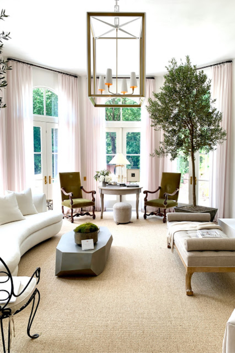
Go inside for the 2020 tour!
The style? “As close to Santa Barbara as you can get without moving” with plaster walls, unique finishes, pools, and a turfed rear courtyard as well as trails punctuated by original sculpture.
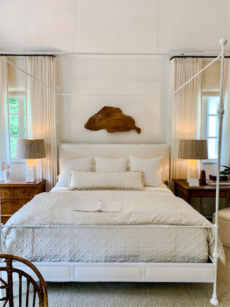
Here’s the neutral color in a bedroom:
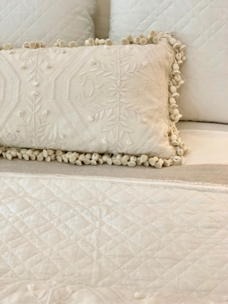
Not a paint color, but a pretty detail to note!
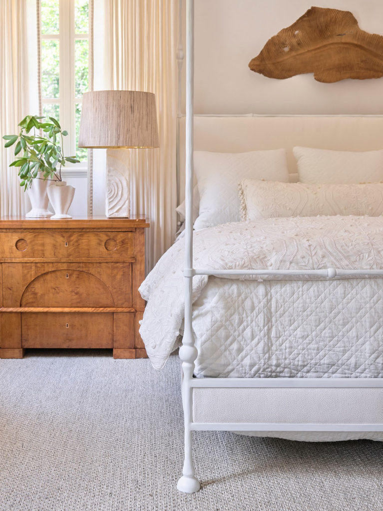
Traditional Style White Bedroom With Seapearl
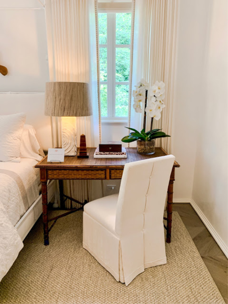
Do you love Seapearl with these warm wood tones?
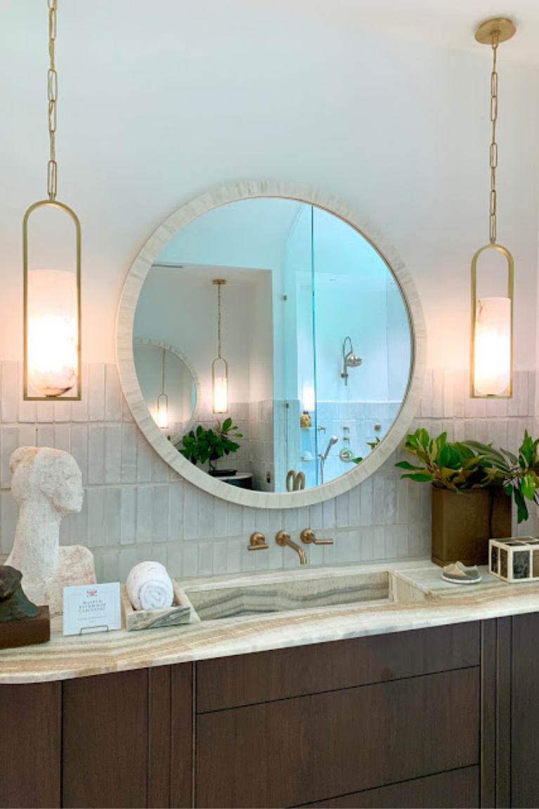
It’s pretty amazing in this bath with glazed tile and brass hardware:
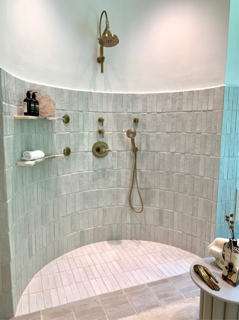
Ever seen a curvy shower like this one?
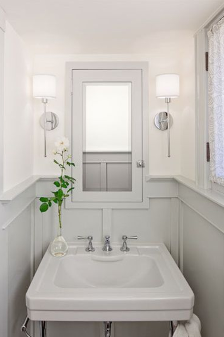
SEAPEARL Paint Color With BM Stonington Gray
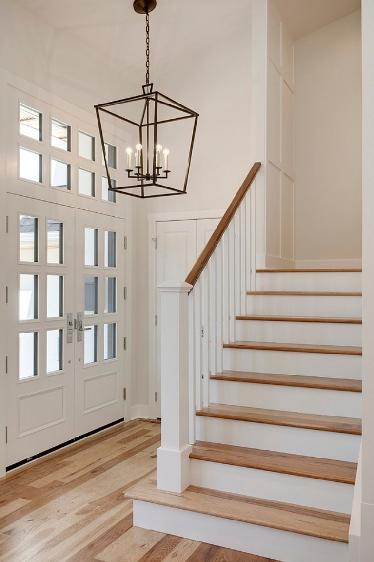
5. Benjamin Moore PASHMINA
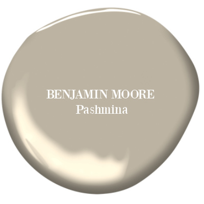
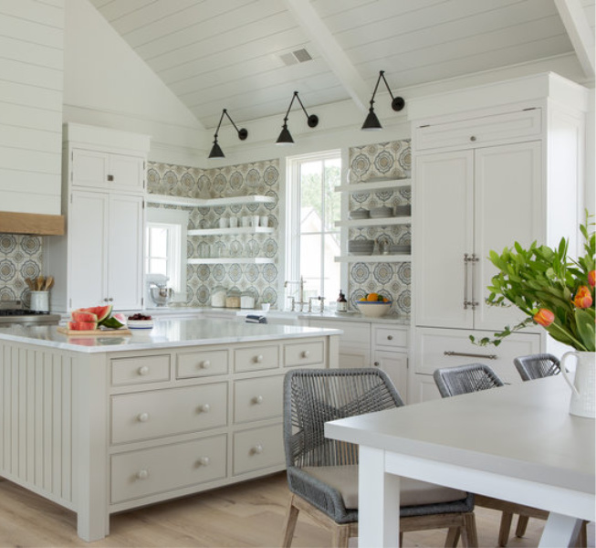
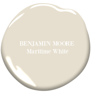
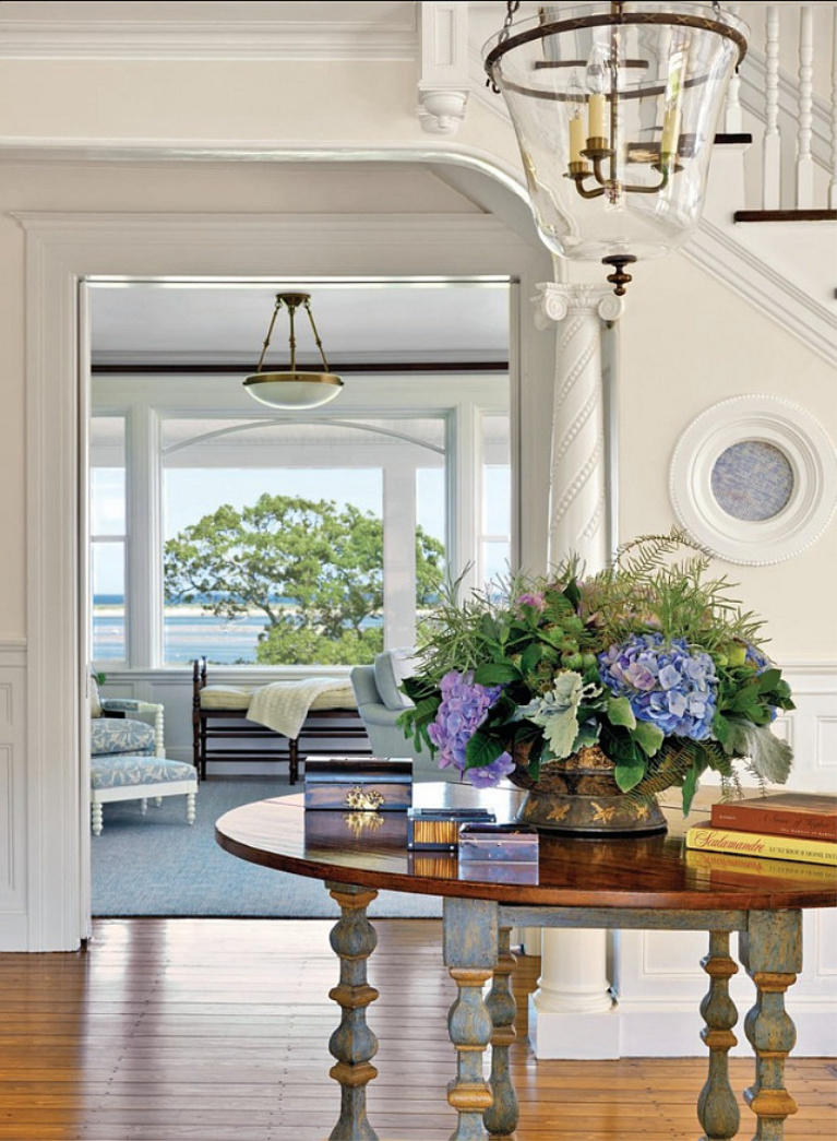
6. Benjamin Moore MARITIME WHITE
See Maritime White Outside of a Showhouse
Pause for a personal note…
A year ago, tornado sirens were blaring, a global health crisis was still flaring, the spotlight on social systems was glaring, and I wondered how you were faring.
Are things better now?
Here in the heartland, my daily battle with autoimmune disease is real, but I’m managing and muddling through. As my husband and I make slow progress at the new house, the days don’t feel like carefree summer days, yet I’m ever aware of blessings. I hope you are noticing the little things in daily life that unlock joy. For me, it is melodic birdsong through the open window as I paint trim (all day today!!!), gratitude that my arthritic hip is not throbbing, and relief from the heat allowing me to dine outside for lunch today.
Physical illness has provided me with a unique perspective I might never otherwise experience. Since my physical strength often fails, I have gained courage to keep going and learned to draw from an inner landscape.
Why Even Bother Exploring So Many Paint Colors?
While it may seem like fluff or trivial to some that I devote time and thought to paint colors, I also know colors impact our moods. Let’s face it. We are spending more time at home. The workplace changed. Social calendars have shifted. Homes continue to evolve as they serve as sanctuary, office, temple, school, and healing station.
If in small ways I can somehow ease home improvement, offer home office ideas and guide decor decisions, it’s not a huge contribution, but it has potential for ripples. So yep, they are small things, but is it possible to limp along with great love?
I am willing to try.

Thank you for visiting this blog with so many alternatives before you. While I am not particularly wise, my posture remains open. Reality continues to shape me (as a writer and a daughter of the Divine Mystery) into something new.

A Look Back at Past Showhouses
Inspiration from 2018’s Southeastern Designer Showhouse
My favorite Atlanta designer, Sherry Hart of Design Indulgence, snapped these photos in 2018:
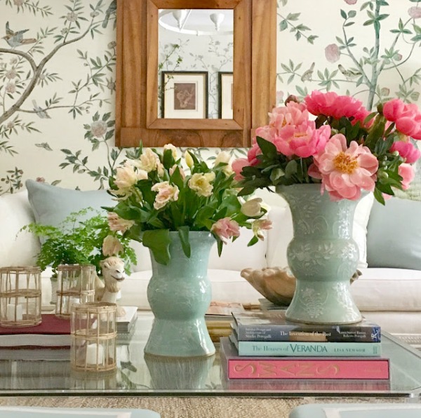
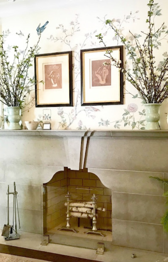
Traditional Style Living Room by Beth Webb
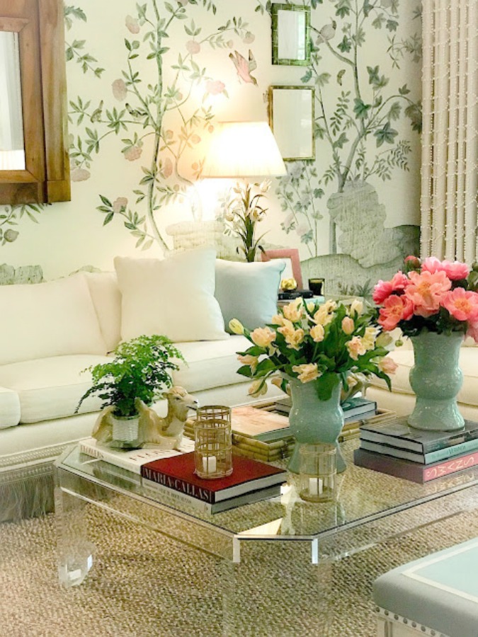
I shared my fondness for the designer’s gorgeous book An Eye for Beauty right here in this story.
English Country Mud Room by Helen Davis Hanavich
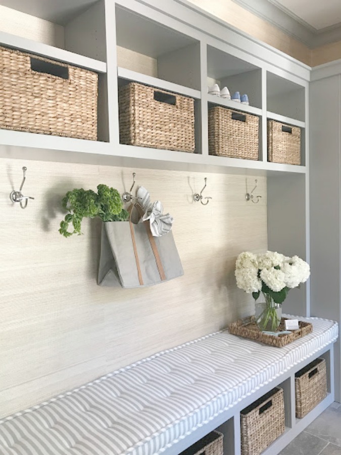
I spy hardworking Savannah Utility Baskets to store essentials beautifully in this gorgeous mud room!
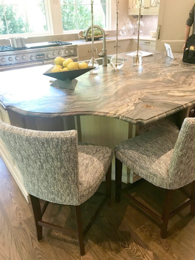
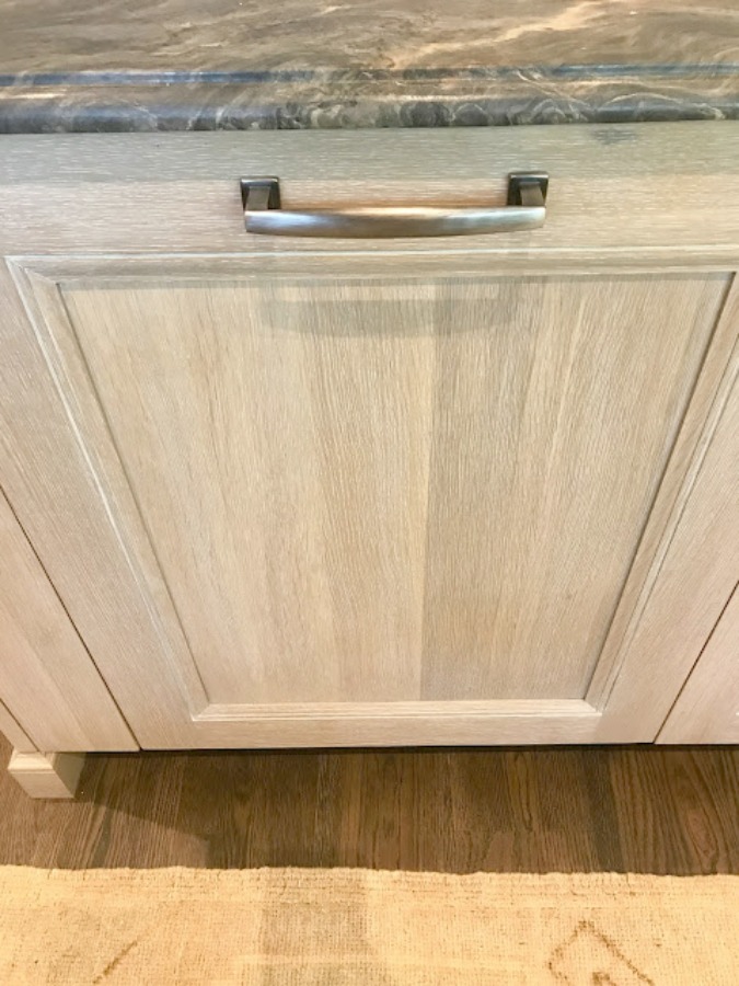
Traditional English Country Kitchen by Matthew Quinn
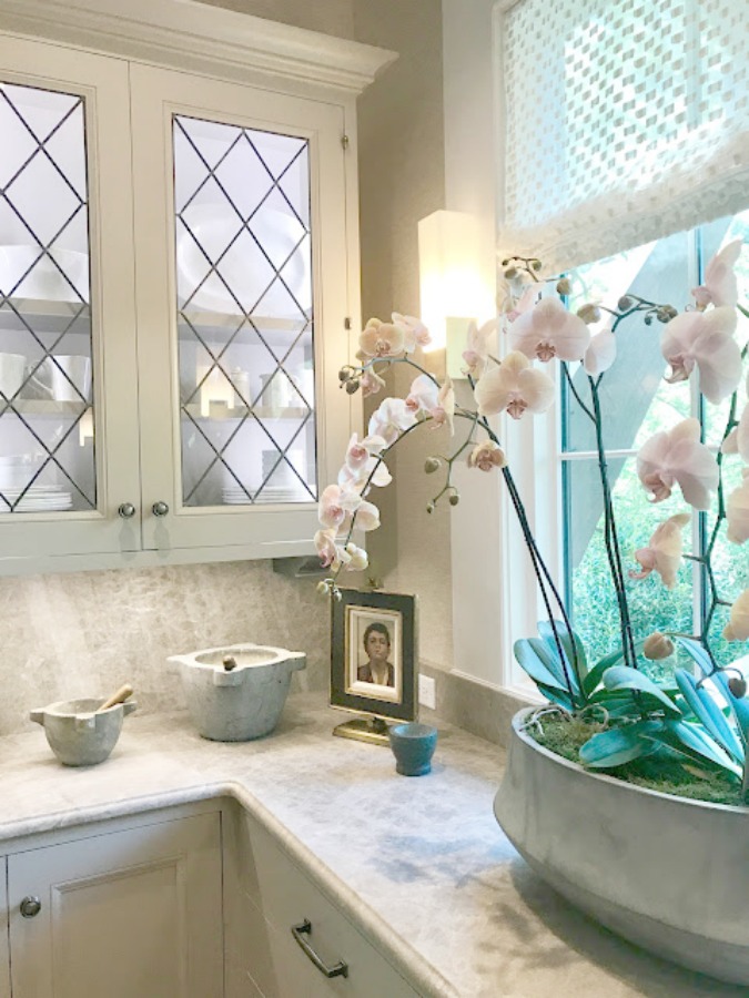
I may or may not have three timeless marble bowls upon my counter this very instant…classic indeed.
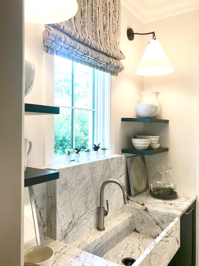
English Country Style Butler Pantry
Easiest way to see if a color is right? Order samples to be delivered to your door with Samplize (a peel and stick sheet of “paint” to stick on your wall and easily move around to other walls!).
While I have neither a scullery nor an extraordinary sink like this, I do know where to find classic egg cups made in France that would be right at home in here!
Also see THIS and THIS in case you missed ’em!
Peace to you right where you are.
-michele
I independently selected products in this post—if you buy from one of my links, I may earn a commission.
Thanks for shopping RIGHT HERE to keep decor inspiration flowing on Hello Lovely!
Hello Lovely is a participant in the Amazon Services LLC Associates Program, an affiliate advertising program designed to provide a means for sites to earn fees by linking to Amazon.com and affiliated sites.












We visit your site for the relaxing, calm beauty and your eloquent writing, so don’t forget a minute think it shallow in these trying times. It’s a lovely distraction at the start of my day.
Neutrals rule! Lol
Author
Thank you, friend. It’s a strange time to blog about paint colors, and I want to be sensitive and helpful. xox
Michele, this is a perfect time to blog about paint colors and every other beautiful blog you post. You set the tone for my day and it’s always Happy!
Author
You just blessed me, Cindy. Thank you so much. xox
Hi Michele,
The house is beautiful, love the colors inside and out. Would you happen to know the make of the bed linen in the master bedroom. Maybe custom!! Just lovely. 🙂
Author
Hi there. All the fabrics for the master are Cowtan & Tout and the coverlet and bedding hail from Mrs. Howard: https://www.mrshowardpersonalshopper.com/ While they aren’t an online shopping source, you can direct questions there. Thanks for reading.
Hi there,
Thank you for sharing, I agree it is the best time to write about anything and everything that makes someone smile. Paint colors happen to be one of those things for me. I am incredibly fortunate to be working on the design of our retirement home (new build). We break ground in about 60 days. It has been wonderful to put my energy into something that can be so time consuming and that takes my mind off the things we are dealing with nowadays. I absolutely adore this paint scheme on the exterior. Our home is going to have a European cottage feel (painted brick mixed with some Hardie siding). I have a question… i was planning to use white windows, do you think that could be made to work with this paint scheme without looking too “stark”? They will be vinyl, so they can’t be painted.
Blessings to you and keep up the good work!
Author
It sounds so lovely, Lori. I think white windows will be fine as I love how different values of white mix beautifully. Creamy white top with white jeans? Yes, please.
Love the colors Seapearl & Pashmina, which I considered using but ended up going with Edgecomb Gray. You could not to wrong with those two! I will continue to lift you up re: your chronic health issues…I completely understand as my husband battles diabetes daily and my best friend here also battles with chronic health issues. So you are not alone. And as you say chronic illness does provide you with a very unique perspective on life that forces you to draw from the One who orchestrates all the details of our lives. But who better to be constantly looking to for all your needs? He is using it all somehow for His glory and our good, and I think those who suffer the most have the most to give and such great wisdom because of their sufferings. That is SO true of you dear one! Thanks for sharing your life and perspective with us. You are a huge inspiration & encouragement!
Author
Thanks so much, Amy. I am so grateful that God seems to not waste a single thing. It is all used for our good, even the suffering and unsavory parts of life. Hope you have a wonderful holiday weekend.
What a beautiful post! I just painted my downstairs rooms Seapearl and I love it. It was a difficult choice as the den faces east with a porch over the windows;this was the only color that didn’t go muddy gray, lavender, blue, green….I tried a lot of the popular grays. The master was painted “Classic Gray”; it doesn’t have much light and this color is beautiful in it. I found that Seapearl is the same as China White. When I was at Benjamin Moore, I asked if the colors were the same and they confirmed and were surprised themselves that it was the same.
Author
Thank you so much for all of this helpful info – I love hearing about the lighting conditions and exposure where these neutrals work best since folks are always asking for such details. And the fact that Seapearl and China White are the same is a big help as well – you’re awesome. Please keep us in the know as you gather more nuggets of wisdom!
Hello,
Would you be willing to share with me the beautiful trim color used in the photo with the Maritime White. Maritime was recently suggested as a wall color for my southern home, but I’m stuck on a trim color.
Thanks so much.
Be well.
Author
My best guess is Benjamin Moore White Dove for that trim color. I don’t know whether it’s the designer’s go-to white (Phoebe Howard), but it is Suzanne Kasler’s go-to for good reason. 🙂 Hope this helps.