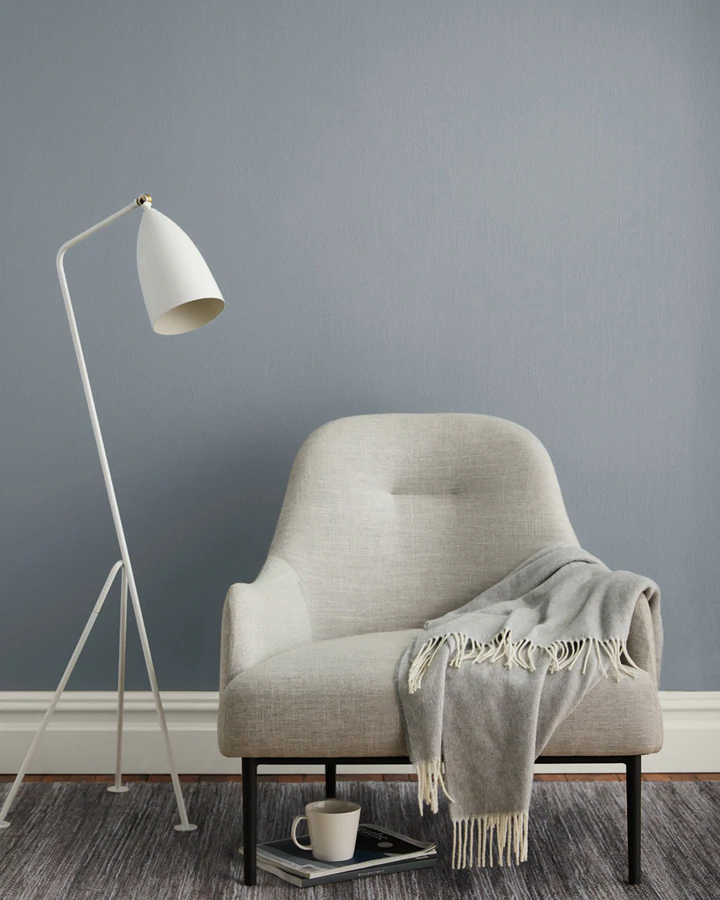
Moody, atmospheric, complex colors are having a moment, and I think I understand why. Since the pandemic, as more people grow increasingly attached to their homes, they are thinking more deeply about design. They are becoming more intentional about paint color selection because they have gained a greater appreciation for how design affects well-being. And they’re after calmness. Strong Blue-Gray Paint Colors: How to Evoke a Moody Vibe is a great start if you’re seeking the best blue-gray paint colors for a cool, and likely dramatic feel.
Strong Blue-Gray Paint Colors: How to Evoke a Moody Vibe
Don’t you love those strong blue-grey tones that are hard to describe and pin down? How gorgeous is this kitchen by Park and Oak?
It was this kitchen designed by them that got me thinking about that gorgeous Pigeon color by Farrow & Ball. However, I was shocked when I visited Farrow & Ball and viewed the swatch of Pigeon which looks very brown. Natural lighting matters and can’t be underestimated!
Such a great reminder to sample and not judge from a tiny square on Google.
Here are the six colors we’ll explore in this post:
I’ll also mention a couple of suggestions from Sherwin Williams and Benjamin Moore. But before we even jump into these gorgeous paint colors, take a peek at an amazing designer’s own home (Liz Caan!) who has strong blue-gray painted kitchen cabinets. You are going to feel so inspired!
Okay. Now let’s look at those greyish bluish contenders (they can be chameleon colors for sure)!
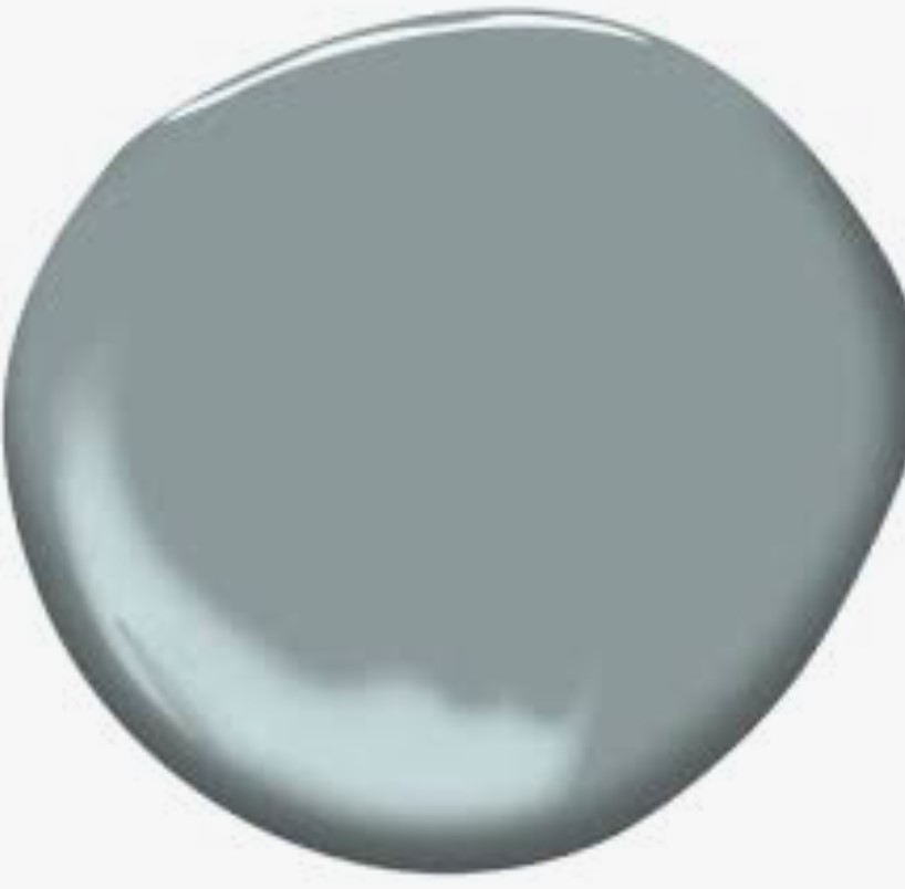
Farrow & Ball Blue Gray No. 91
Before we look more closely at Pigeon, take a gander at Blue Gray.
I have seen a lot of talented designers reach for this hue. Remember this front door from Loi of Tone on Tone?
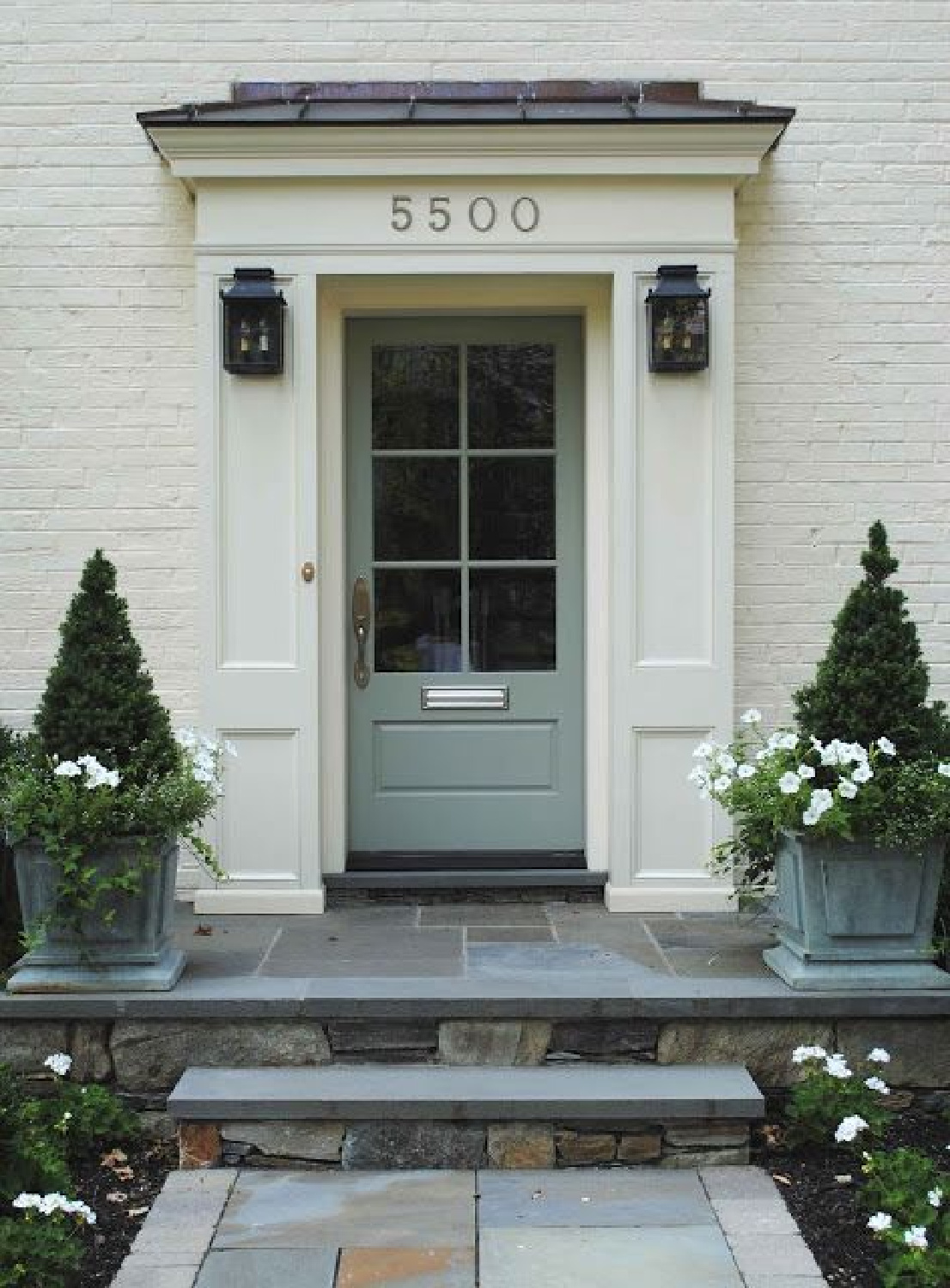
How fabulous does this blue-gray look with the stone and surrounding nature!?! It is always good to see how the color looks in other parts of the world in different light. If you like the green cast in the gray, also consider Sherwin Williams Acacia Haze 9132:


This looks like a building structure in London:
Obviously, yellow sunlight is going to affect the color which can read more green with ample light.

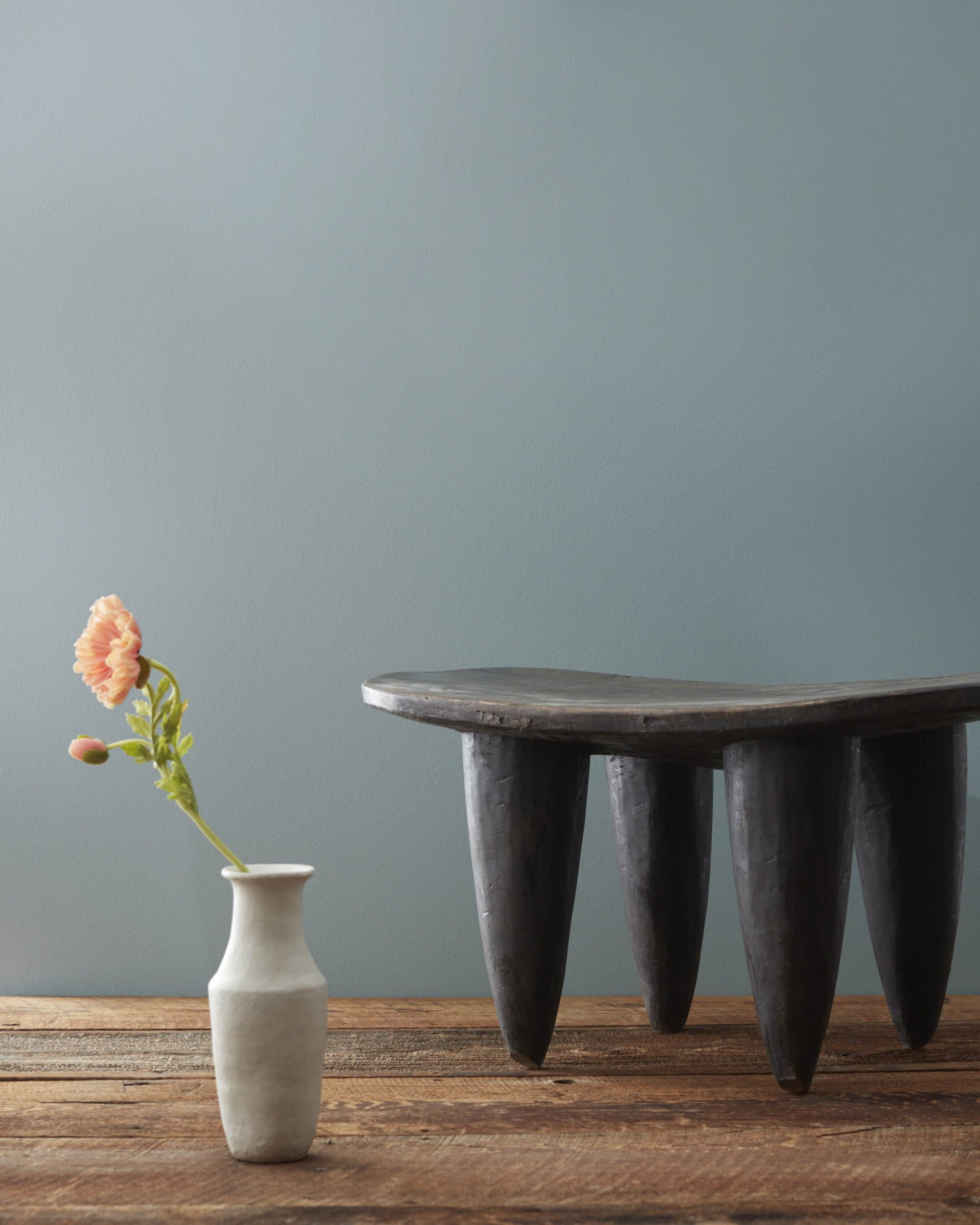
Farrow & Ball Pigeon No. 25
Designer at Brown Interiors Amber Brown Matlack is a fan of Pigeon and told Southern Living “It works with so many different other colors—it can be used all over without being too overpowering, or it can be used as an accent.”
You can definitely spy the gray undertone, yes? The designer recommends this color be paired with warm white paint colors and warm color palettes. Here’s how Pigeon looks with not a lot of natural light:
It reminds me of Benjamin Moore Cloudy Sky 2122-30. And notice how Pigeon contrasts when paired with bright off white:
Have you been following the design journey to a new house playing out on Chris Loves Julia? I love so much of what that innovative team does, and I have learned so much from them!
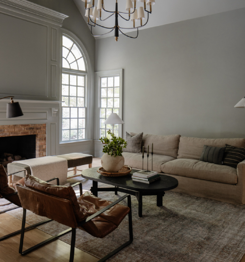
For example, this blue-gray (Pigeon) can look beyond sophisticated and moody in the best ways in a living room!
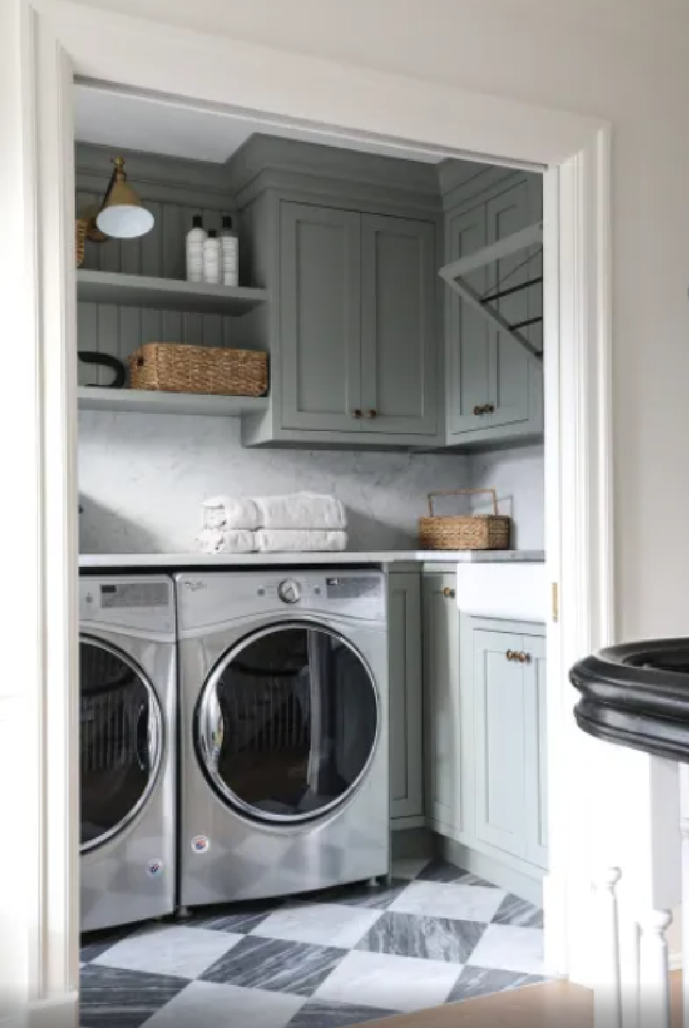
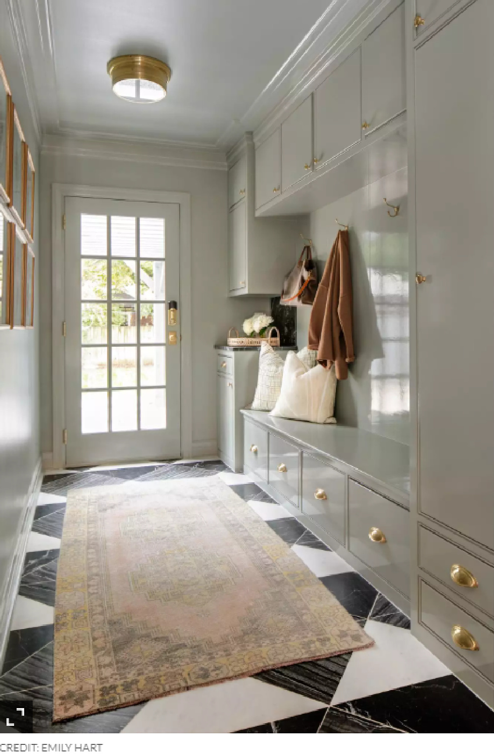
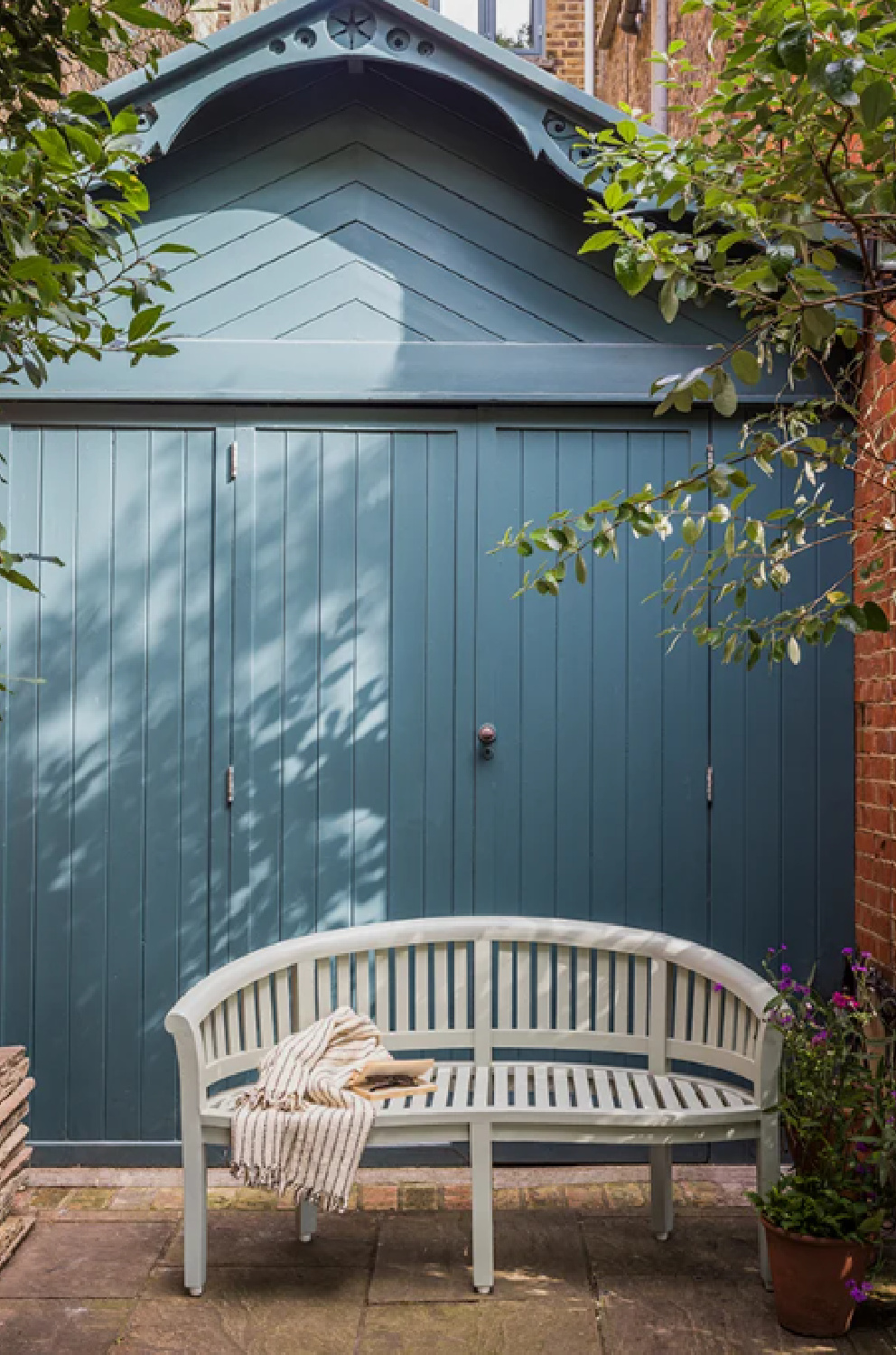
A laundry or mud room can be a smart place to try a new paint color…just look at what the possibilities are above!?!

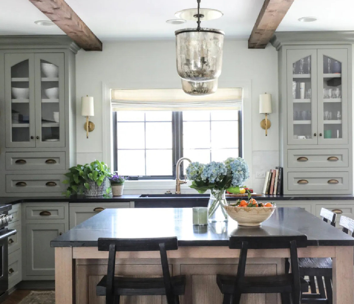
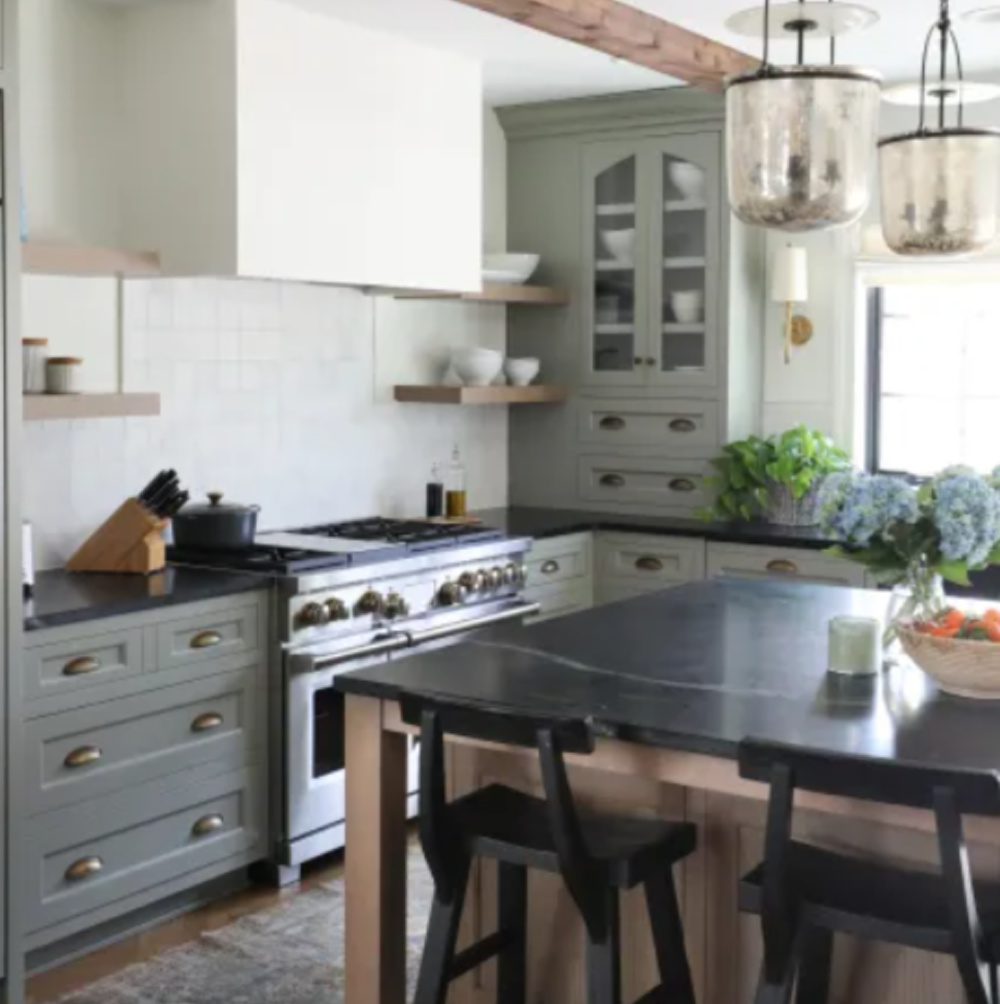
Choosing a color for kitchen cabinetry is a daunting task so it certainly helps when designers share the paint color names.
Here we see Pigeon paired with dark countertops – a design element that seems to be having a moment. Pigeon actually appears slightly light blue-gray in this kitchen, but bear in mind it may read dark if your space is more dim.

Benjamin Moore Cloudy Sky 2122-30
I mentioned I would share a couple of bonus colors from Benjamin Moore, and Cloudy Sky (Benjamin Moore 2122-30) is infused with steely blue-green undertones and captures the moody, romantic ambiance of a rainy day.
Isn’t it richly dark and velvety?
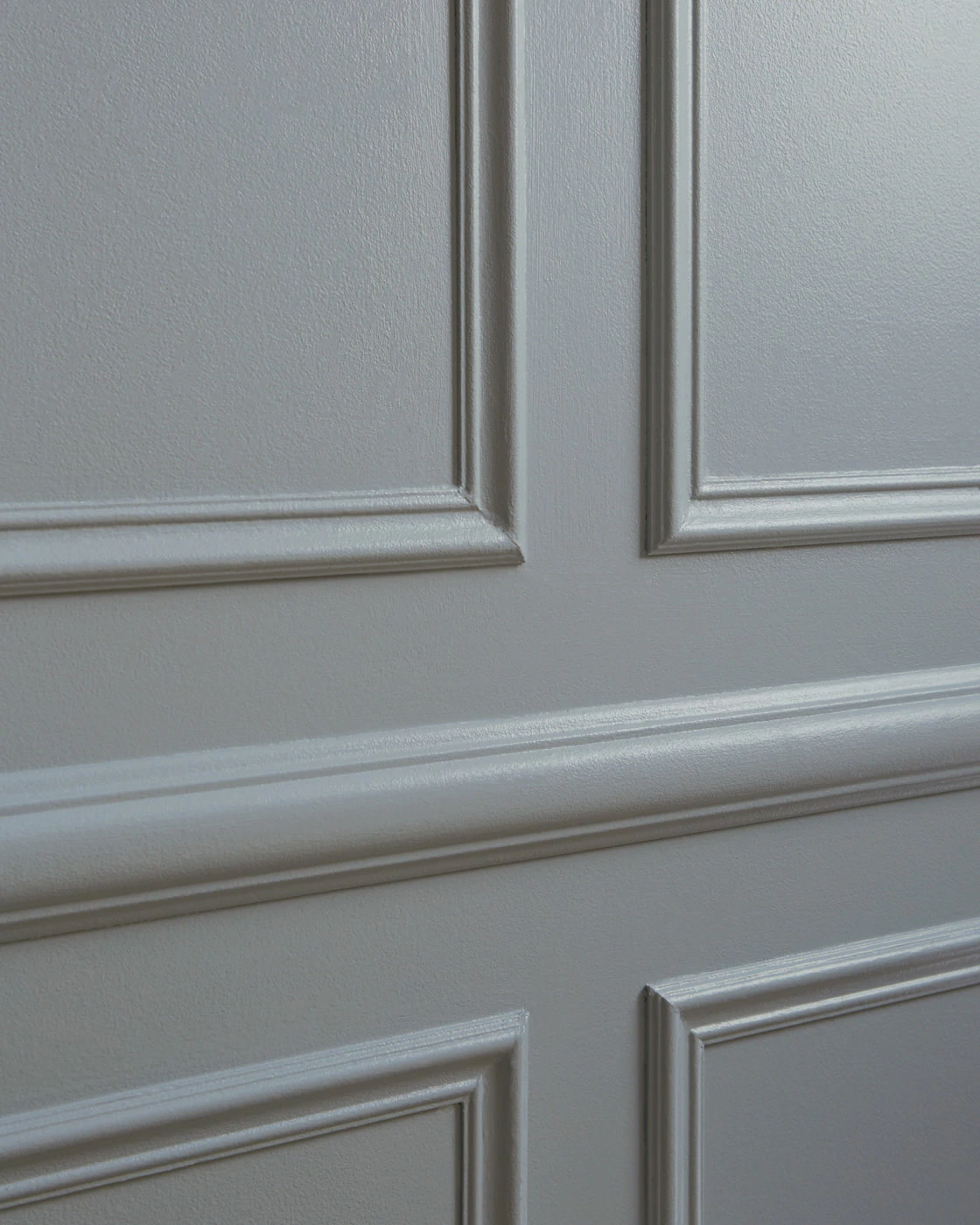
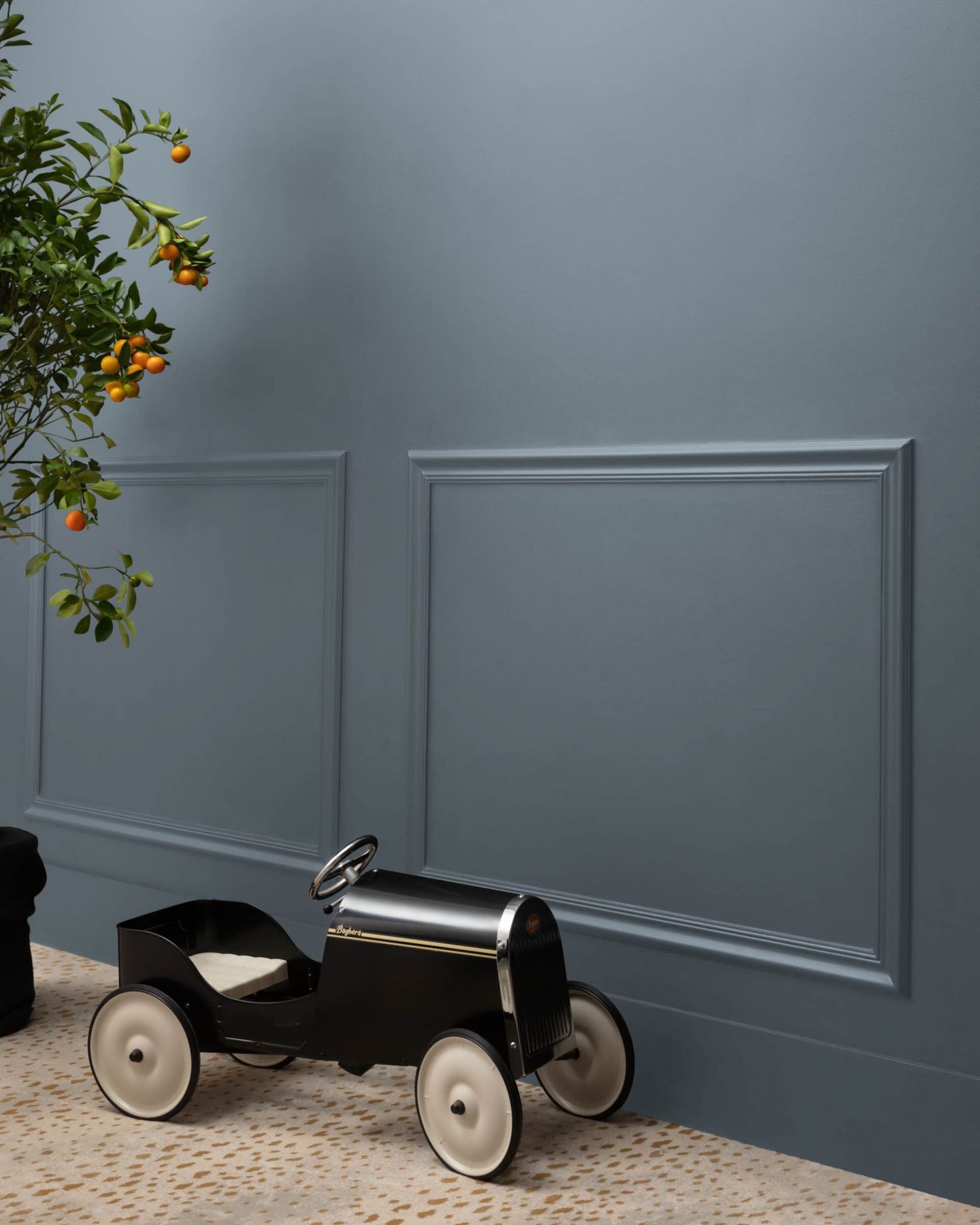
Clare Paint – Set in Stone
This strong and moody blue-gray caught my eye when I spotted it here on closet doors:
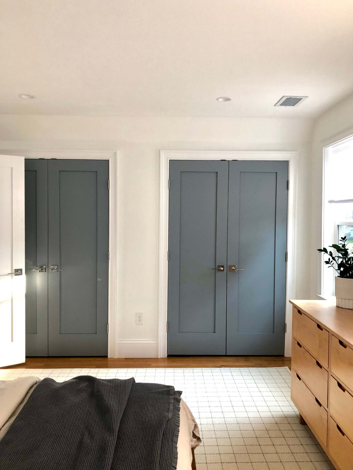
Isn’t that a brilliant use for it when you love the color but aren’t sure about painting ALL the trim? It may read slightly purple in your space which is why your purchase of a sample pot, color swatch, or stick paint samples is a smart move.
I also love how it looks on applied trim:
By the way, if you have never ordered paint from CLARE – you’re in for a pleasant surprise. I love their colors, customer service, and the ease of delivery to my doorstep!
Clare’s Set in Stone is gorgeous with a natural linen accent color as you can see here:
f this Set in Stone dark blue gray has you suddenly thinking about navy blue, look at BM Hale Navy which is trusted by so many designers.

How to Select the Right Color for Your Space
I created this infographic, and I hope you will all pin it! A lot of folks are not sure how to begin their search for the proper color, and this has worked best for me:
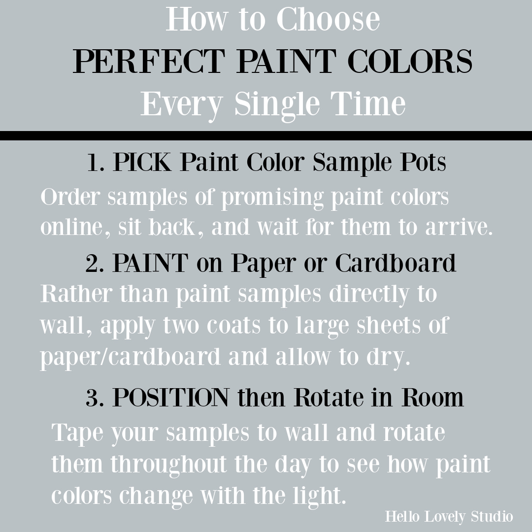
It is always tempting to open a sample pot and go straight to the wall with the paint. However, you’ll be able to gather much more helpful info if you follow the instructions above and paint on cardboard or foam boards. This way, you can move the sample around at different hours of the day to notice changes with natural lighting.
It’s also possible to purchase samples which is a brilliant move from vendors.
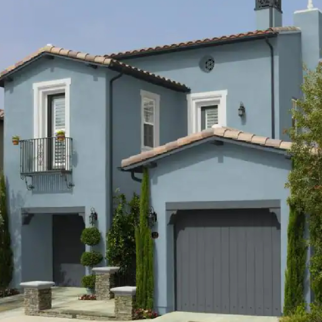
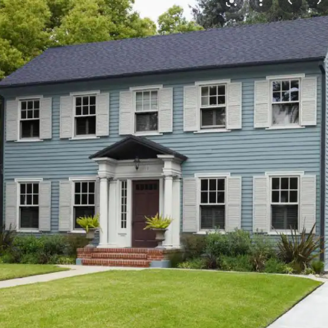
Behr French Colony
If you like French blues that lean toward grey, you may like French Colony by Behr. Here it is on a Mediterranean style exterior:
And you can get a sense of what it would feel like in a bath from this:
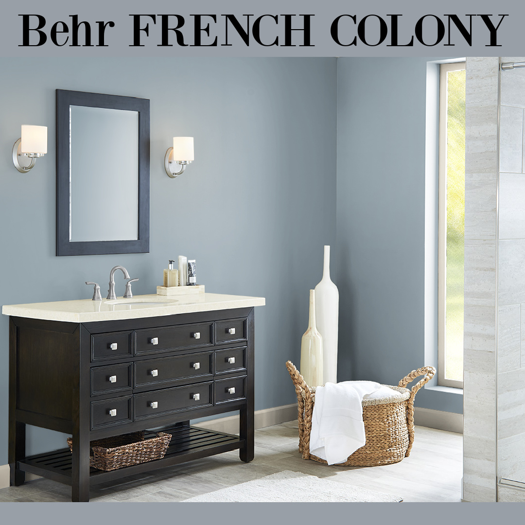
The grey-blue color appears different of course with different exposure:
Are you a fan of deeper tones closer to slate blue-gray?
Benjamin Moore Eclipse 2132-40
By now, you may be thinking they all look the same! And I feel your pain. But if you had these paint samples in front of you, you would begin to be able to distinguish them by their undertones and warmth or coolness. Eclipse (Benjamin Moore) is deep and dark with blue undertones. (Benjamin Moore says it is “sharpened” with a hint of blue.)
Easiest way to see if a color is right? Order samples to be delivered to your door with Samplize (a peel and stick sheet of “paint” to stick on your wall and easily move around to other walls!).
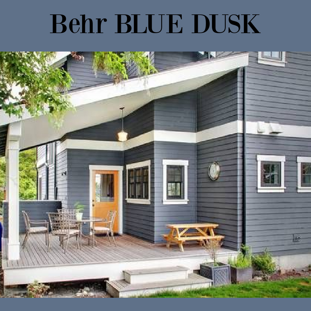
Behr Blue Dusk
Blue Dusk can look so sophisticated on a house exterior, yes?
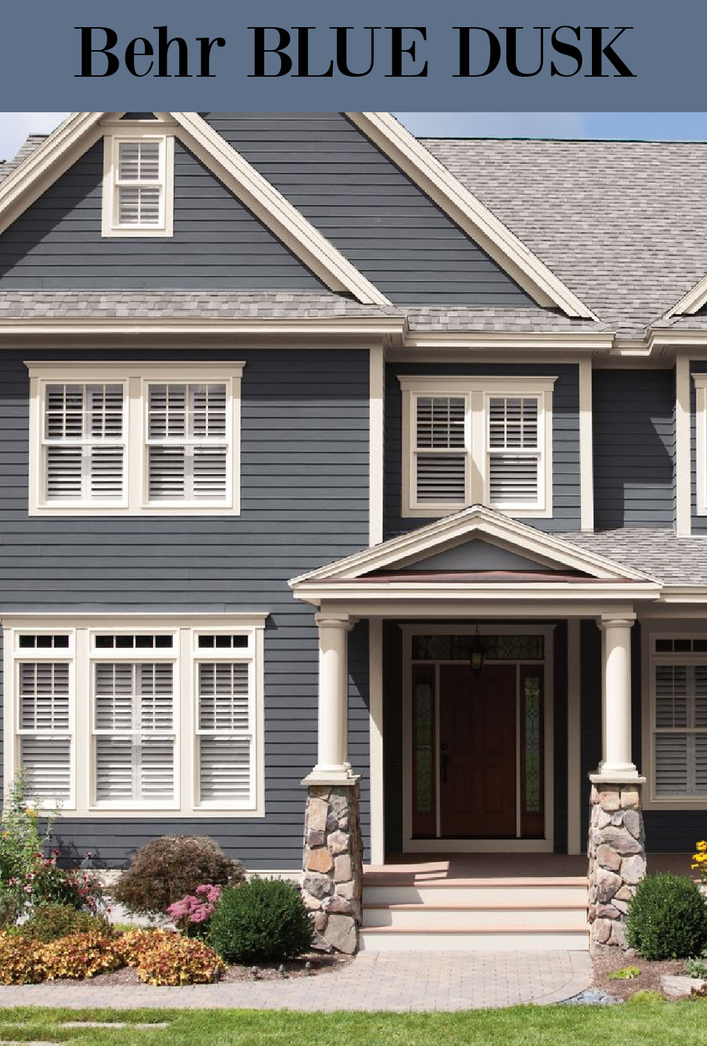
Notice the relationship this color has with the green grass and white trim. It has such a classic yet moody vibe different from a true navy.
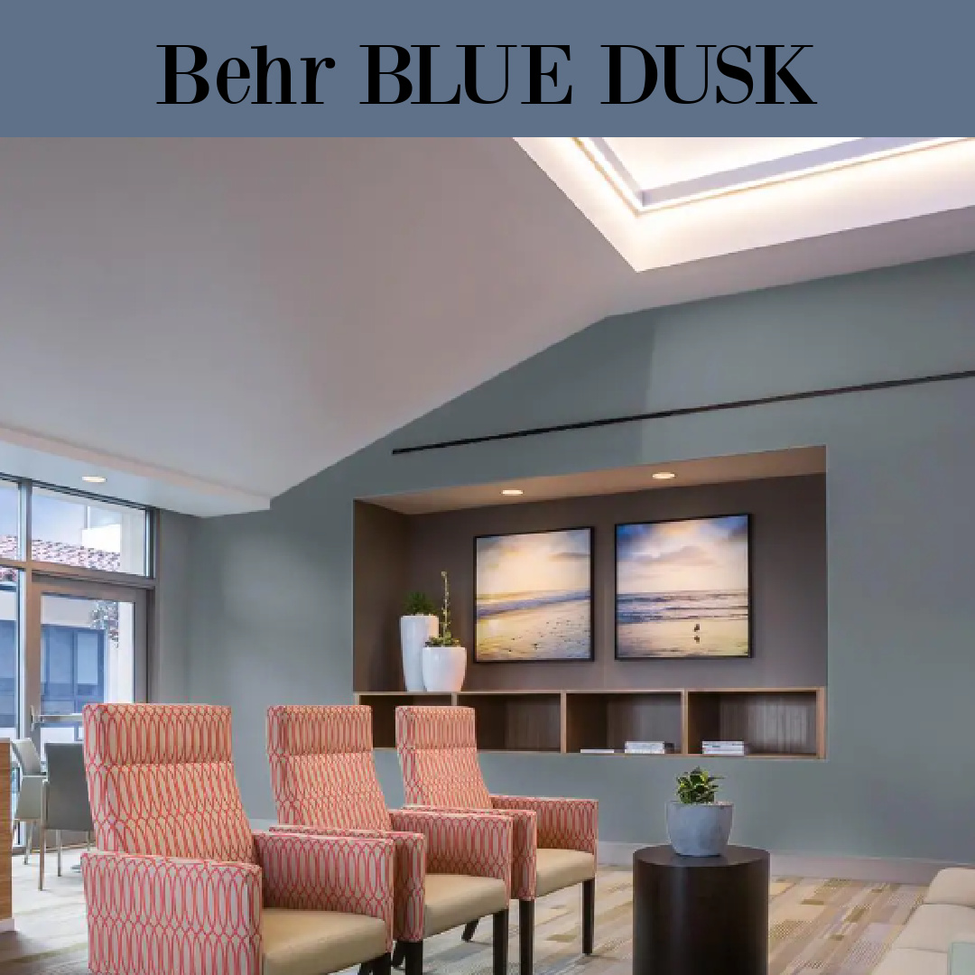
Blue Dusk seems to read more teal in this lobby above and cool grey on the modern home below:
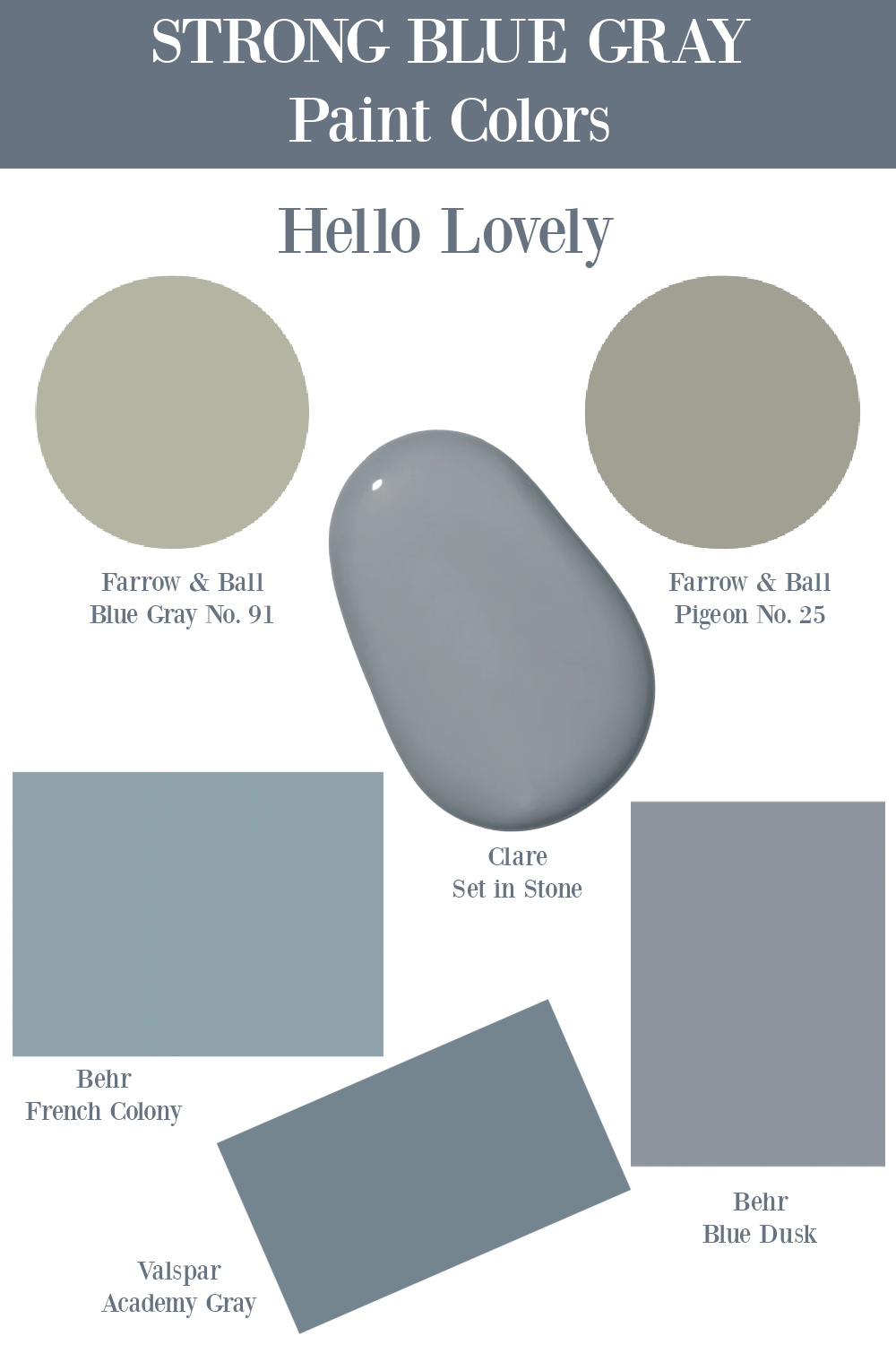
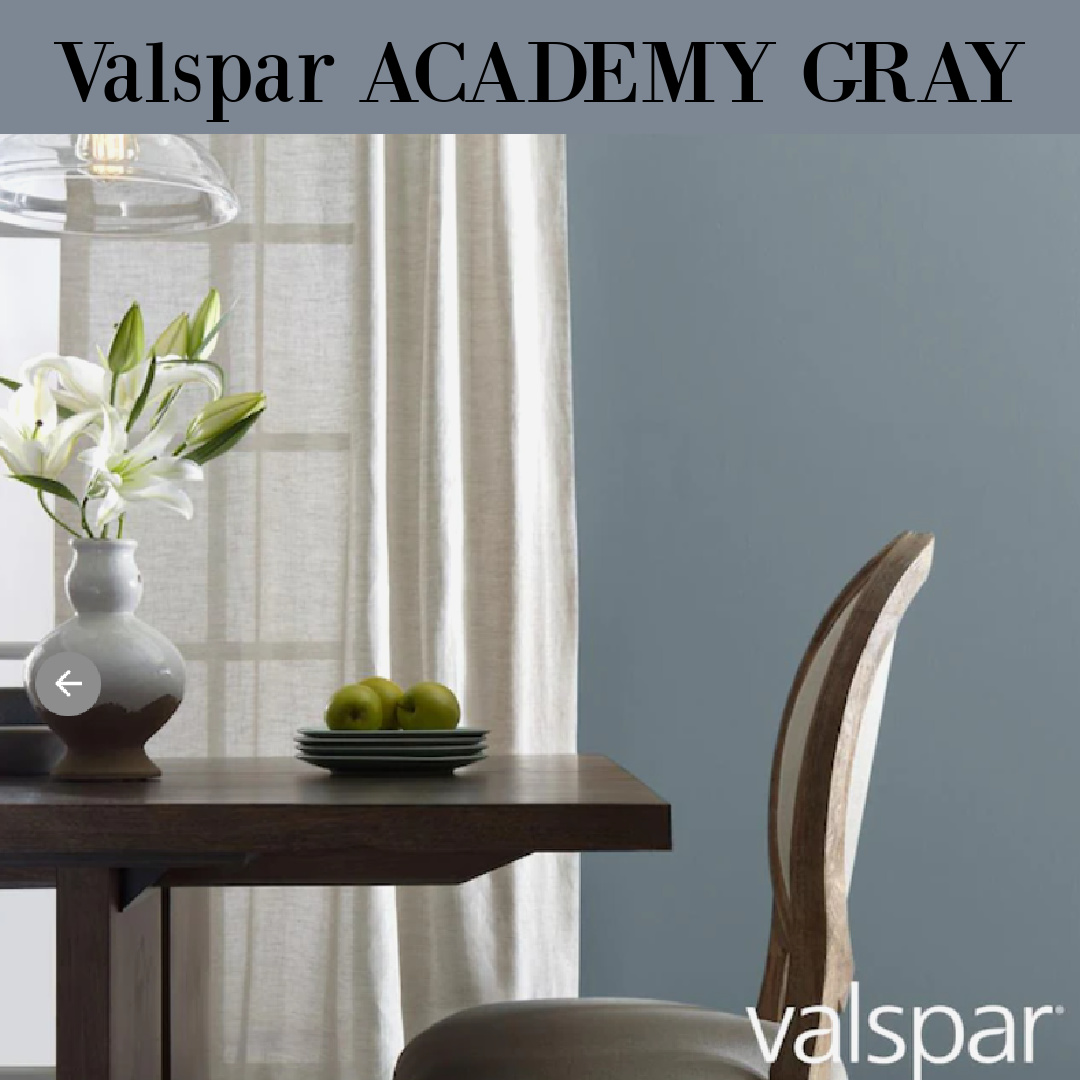
Valspar Academy Gray
Finally, here’s a strong blue-gray paint color that you cannot quite pin down as blue or gray or green or teal. I love those types of colors!
Sherwin Williams Blue-Grey Paint Ideas
If you’re partial to colors from Sherwin Williams, here are a few strong contenders.

Does SW Waterloo appear navy on your computer screen?
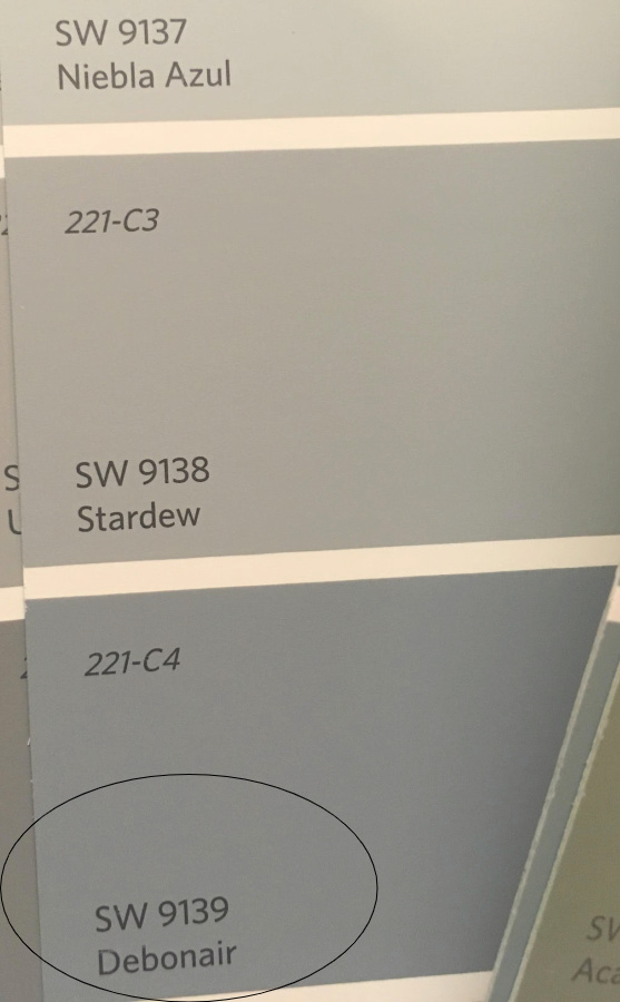
Less dark, SW Debonair by Sherwin Williams coordinates nicely with Stardew.
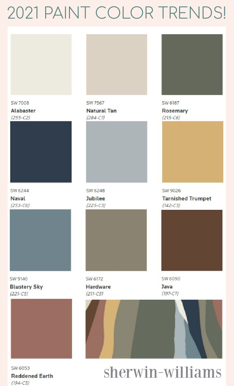
Last year, Sherwin Williams chose SW Blustery Sky as one of their popular trending blue-grey colors.
I hope these paint colors have given you food for thought if you are looking for a house for your interior or exterior. Which of these darker blue grays is your favorite blue gray?
If these tones are too strong, you may want to peek at these light blue-gray options for a Zen feel.
I know there are folks who are still hesitant about shopping online for paint, but sometimes I wonder if their experiences in paint stores have been rosier than mine. The lighting is often pretty awful in those places so looking at little pieces of cardstock with colors gets confusing.
Thank goodness sample pots of paint are so reasonable and convenient!
I independently selected products in this post—if you buy from one of my links, I may earn a commission.
Peace to you right where you are.
-michele
Shop for items you already intended to buy on Amazon RIGHT HERE, and also find home decor here to keep decor inspiration flowing on Hello Lovely!
Hello Lovely is a participant in the Amazon Services LLC Associates Program, an affiliate advertising program designed to provide a means for sites to earn fees by linking to Amazon.com and affiliated sites.


