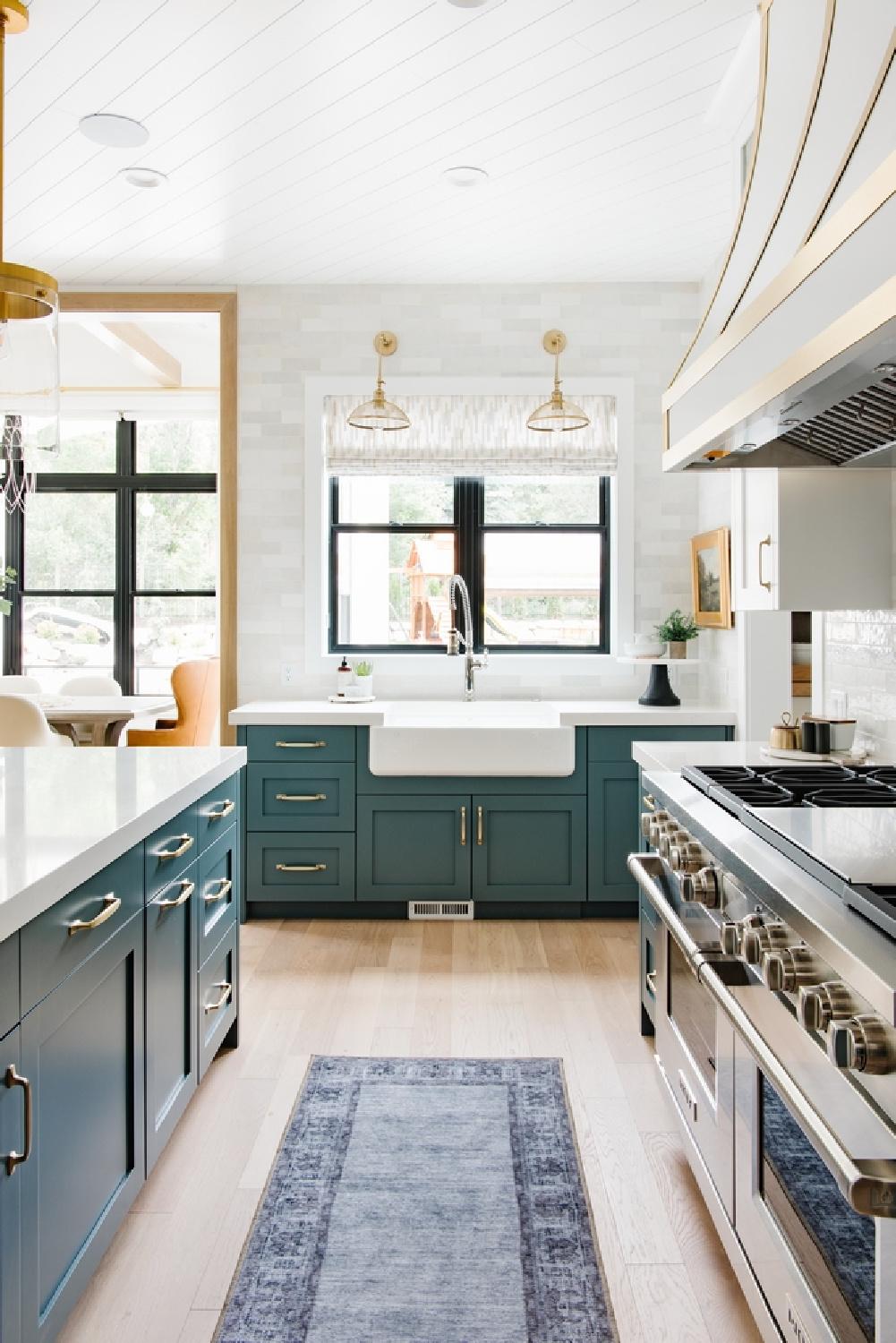
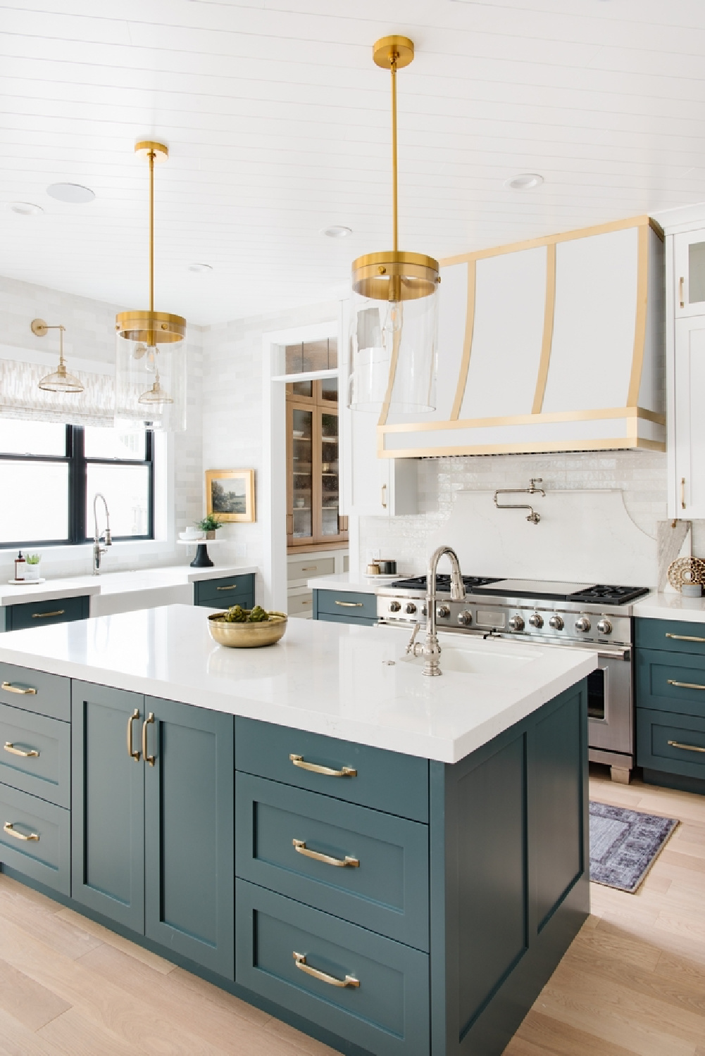
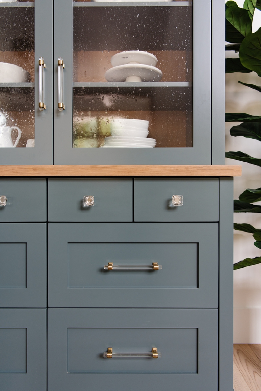
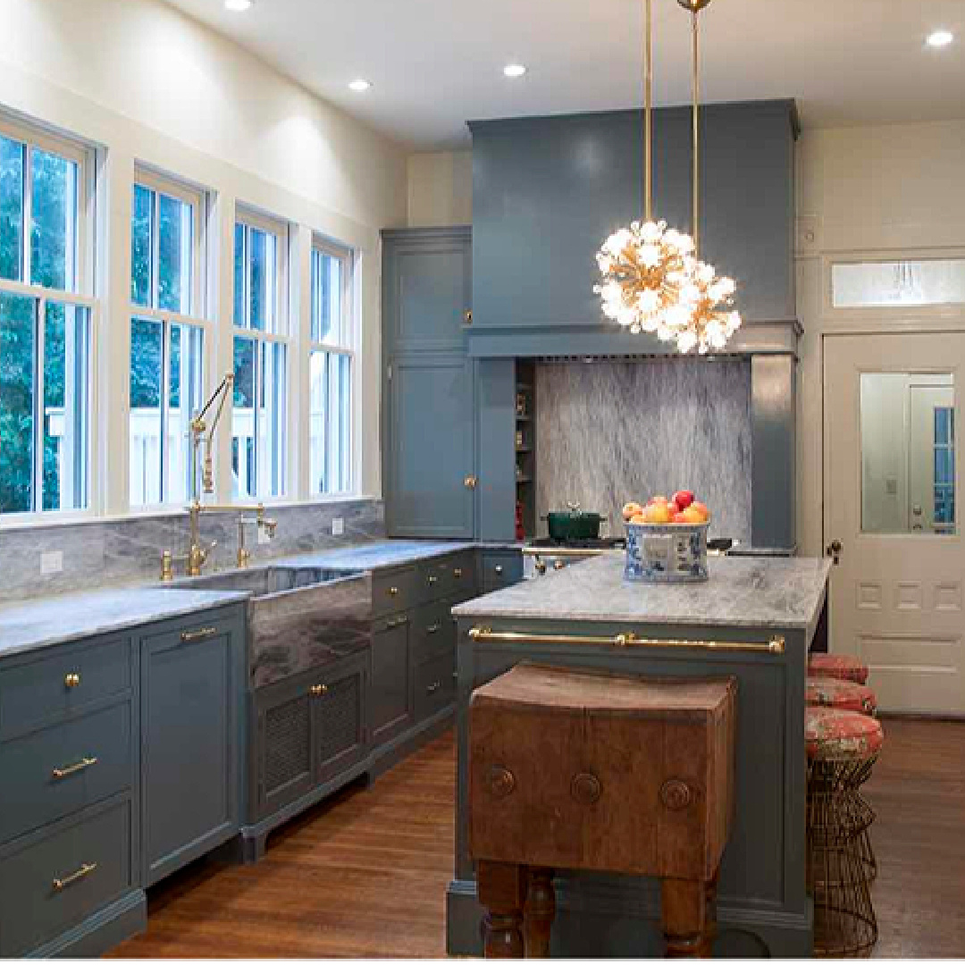
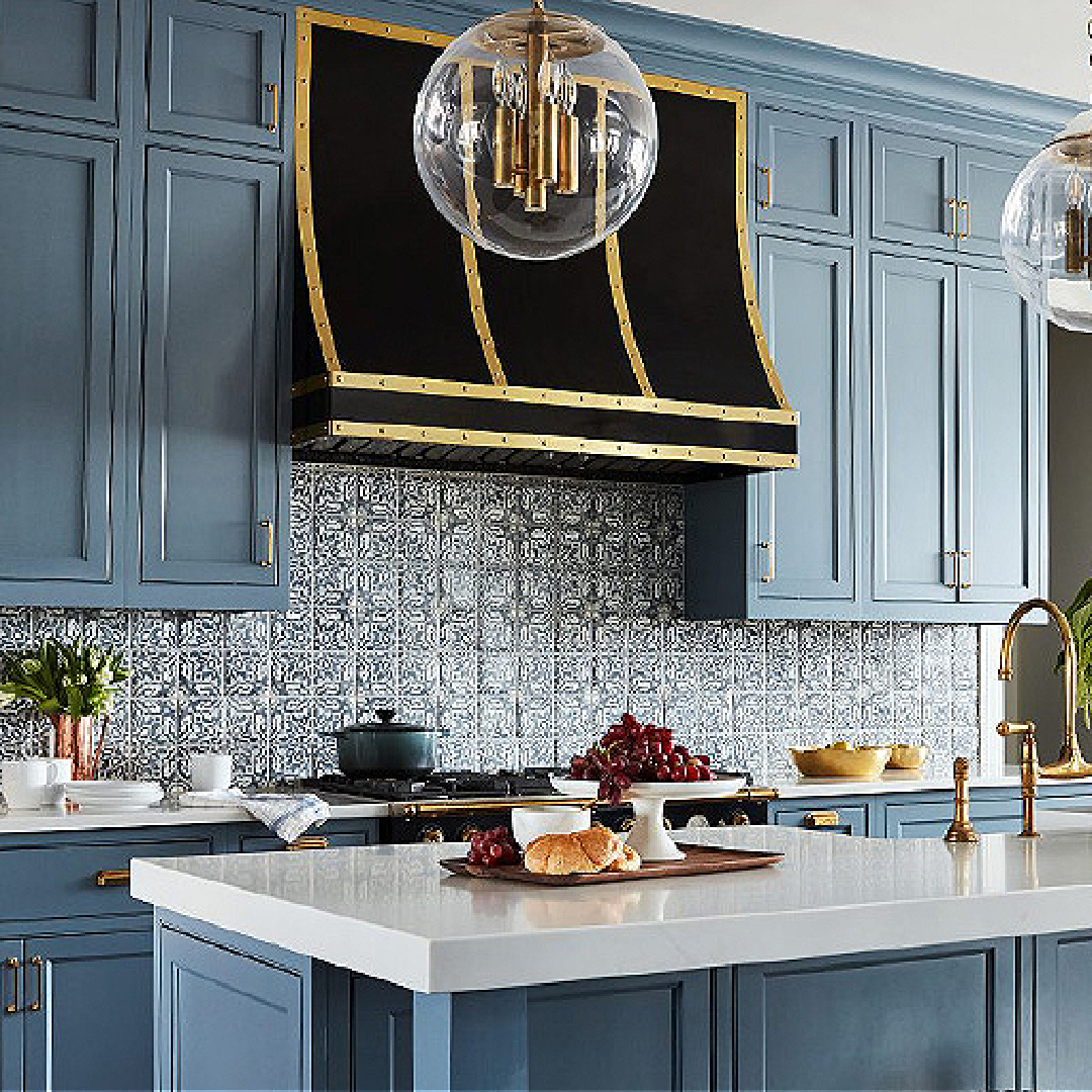
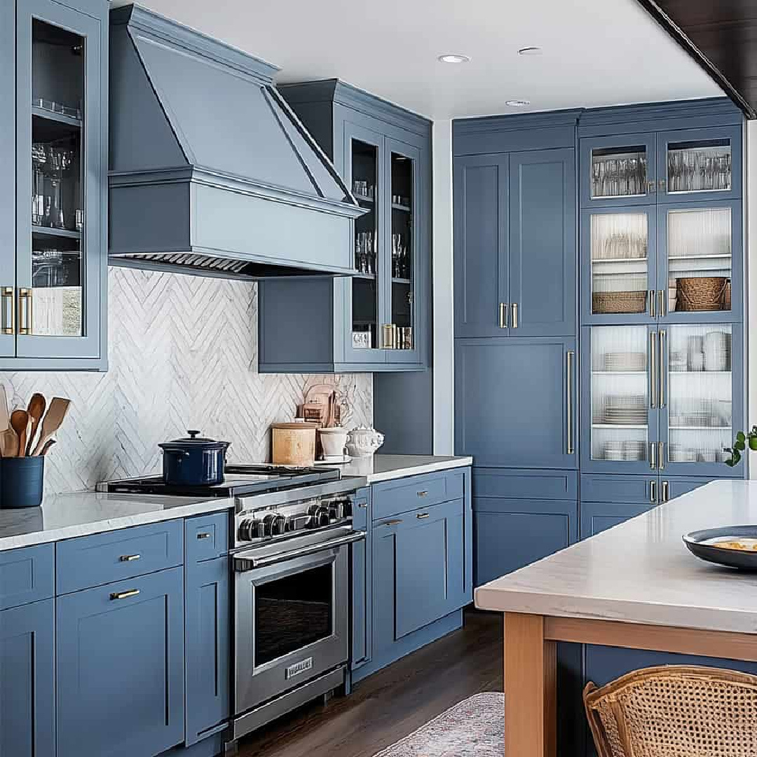
If your eye is drawn to a moody toned slate blue color, these rooms may make your heart sing. While I personally don’t have the chance to use it often, I still enjoy learning how talented designers use it for projects. I noticed the color is a favorite for heritage and traditional styled interiors, yet it can also feel quite natural in a European country style kitchen.
Slate Blue Color Ideas
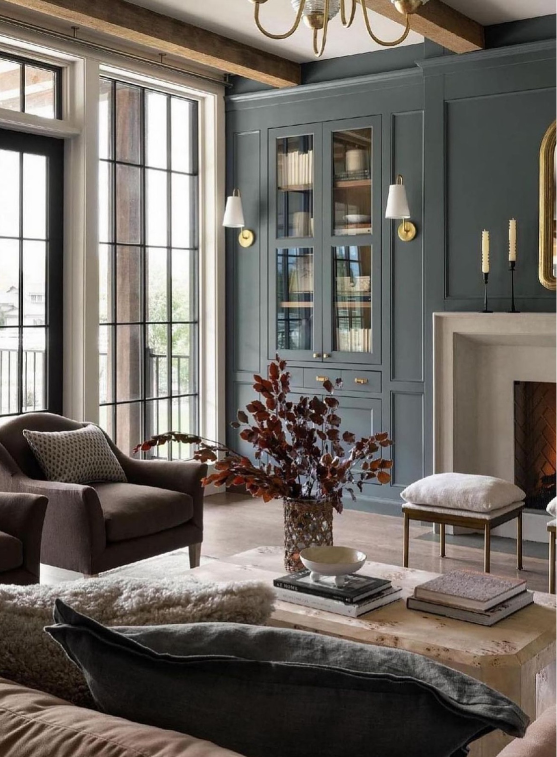
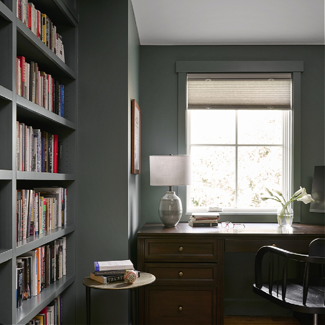
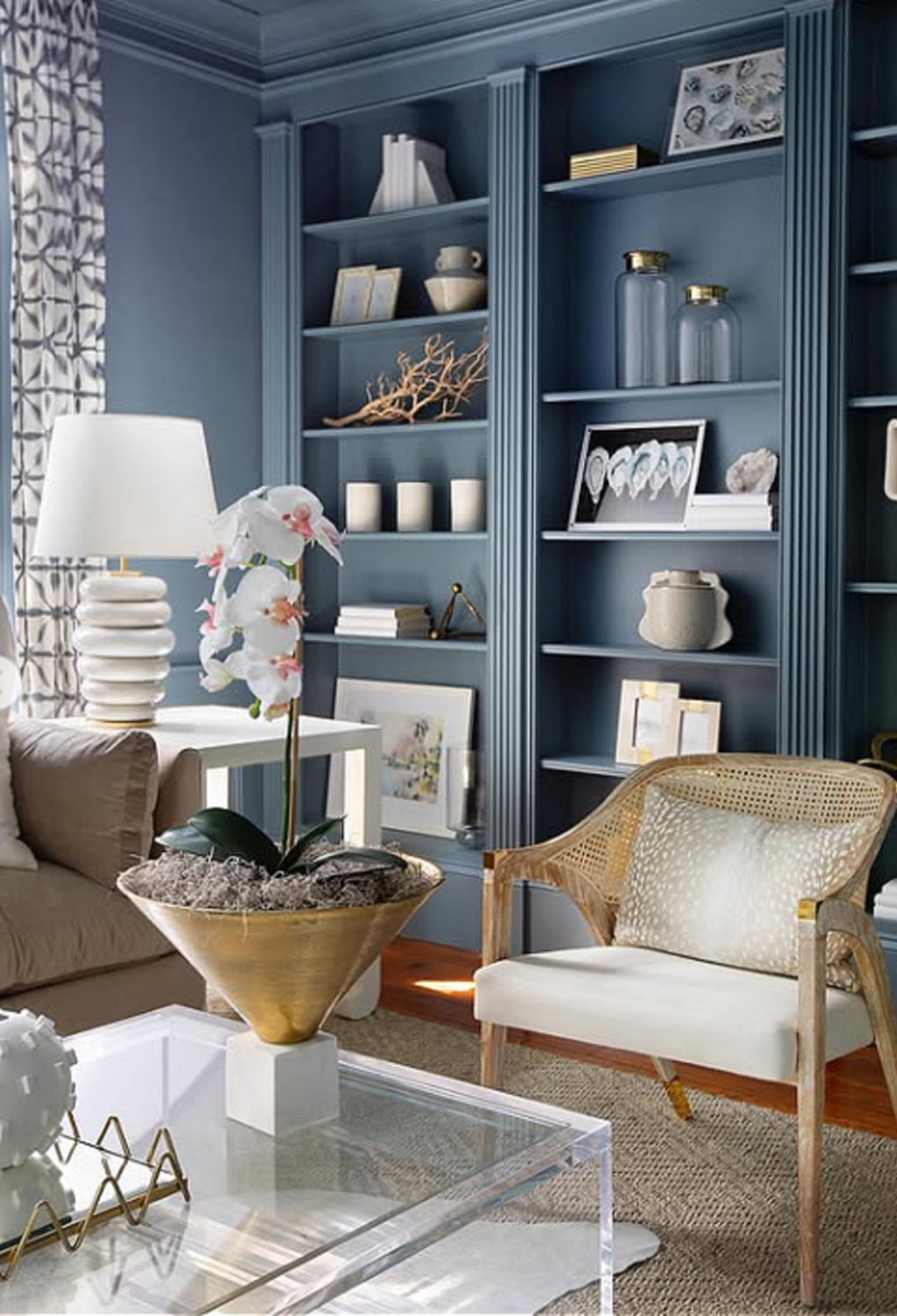
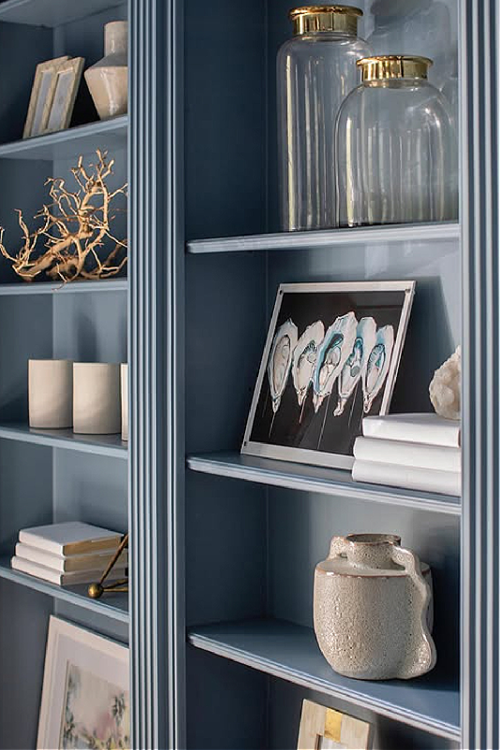
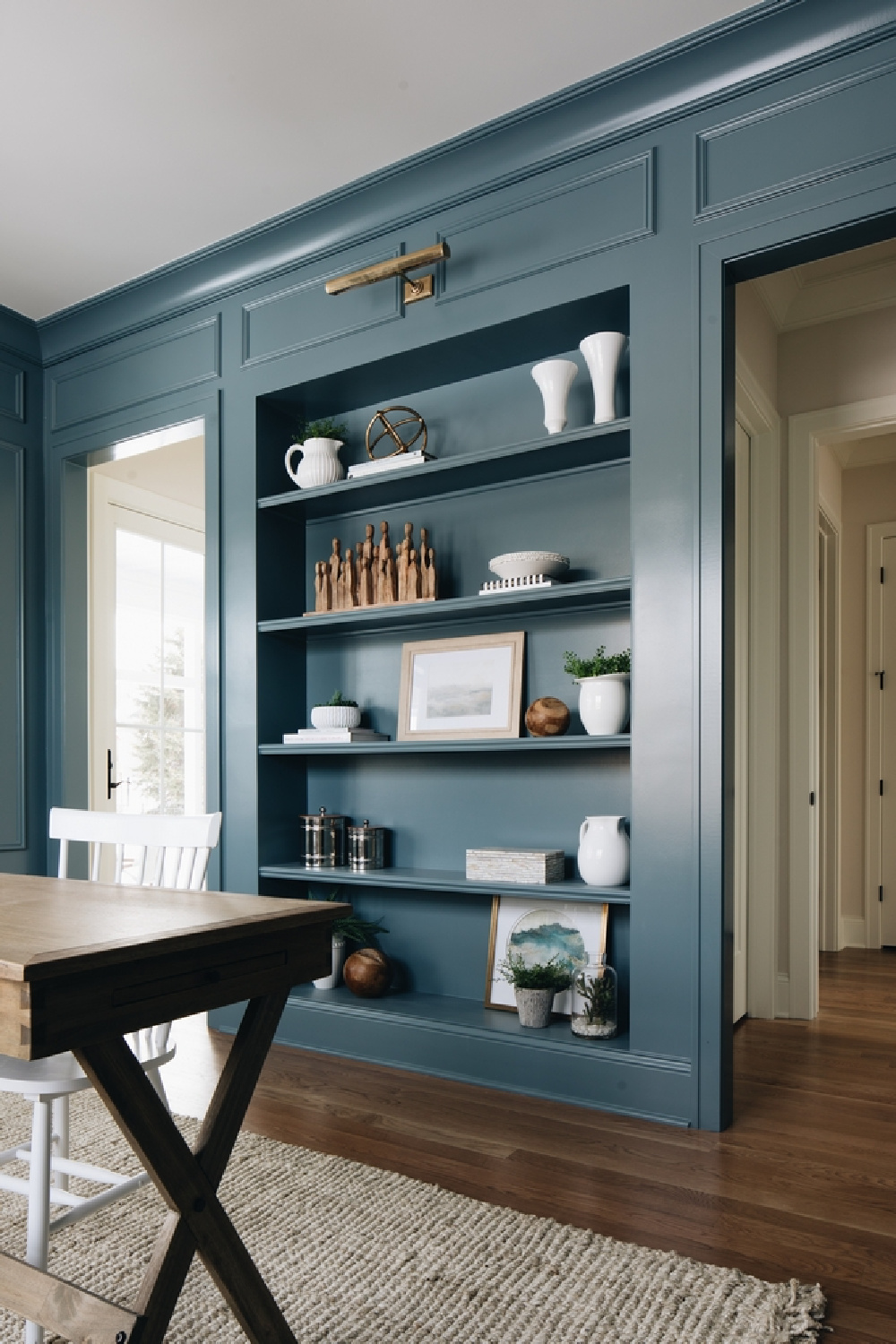
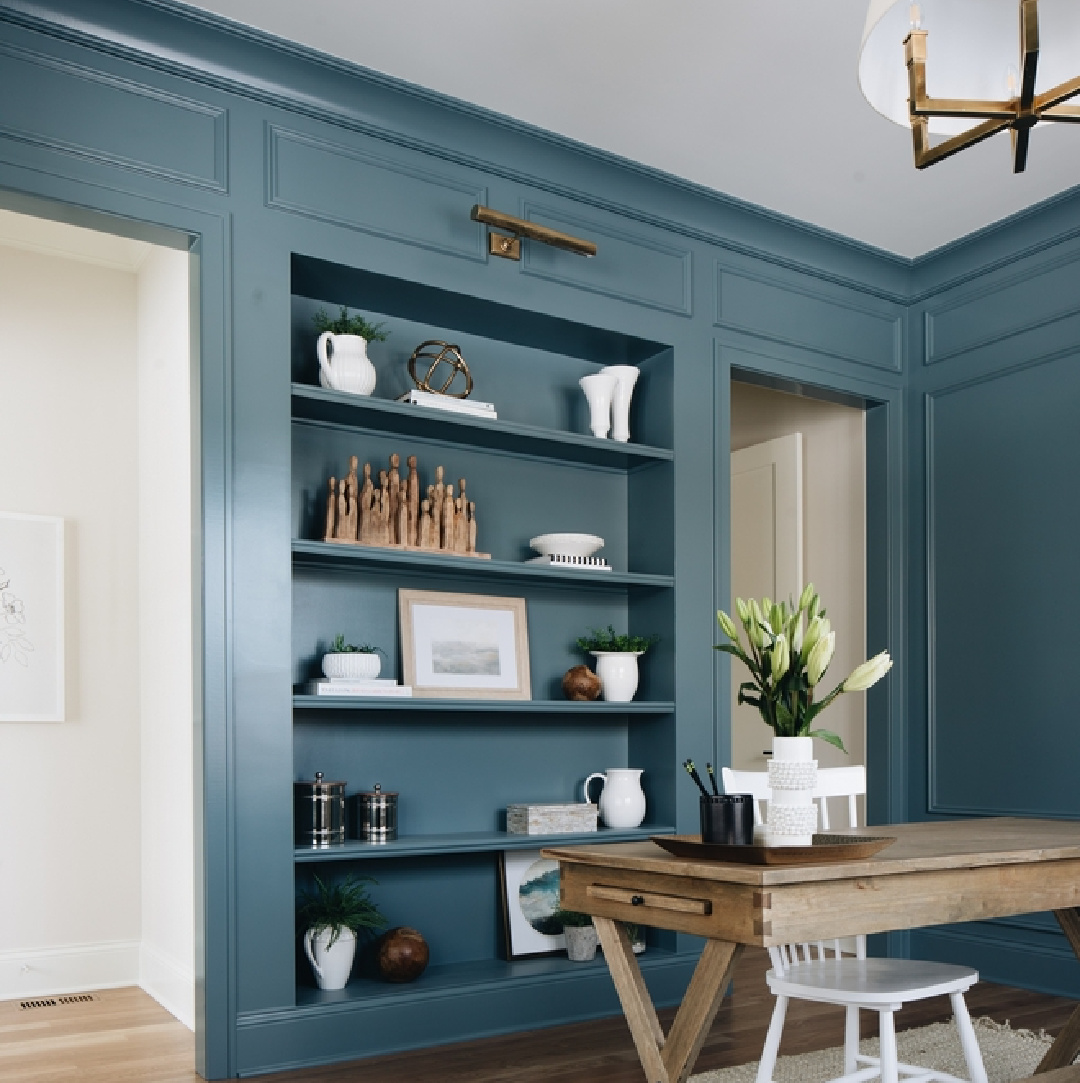
Make sure to visit my Pinterest boards with paint color ideas too! FB followers remain cuckoo for the slate blue of the built-ins in thes great room (above) and MUST know the exact color. Until we know it (more likely it is custom), here are some educated guesses.

Benjamin Moore KNOXVILLE GRAY HC-160
The brand calls this slate color an alluring blue-green with a heavy dose of gray.
What is the light reflectance value of Knoxville Gray?
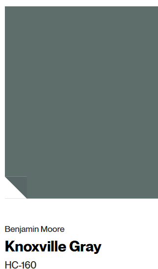
15.68. If you care to get geeky, this means about 16% of light will get reflected back into the room…not a shy color, doncha know.
BM recommends that Simply White, Cloud White, and Greenmount Silk are good accent colors with it.
Like the color but looking for more subtle iterations of it?
Benjamin Moore suggests Silvery Moon, Winter Solstice, Adagio, Brewster Gray, and Gray Pinstripe.
Similar to Knoxville Gray but with more blue undertones than green ones?
Benjamin Moore BLUE SPRUCE.
Bear in mind if you are using it in a kitchen, it will be perceived differently depending on the amount of natural light coming in.

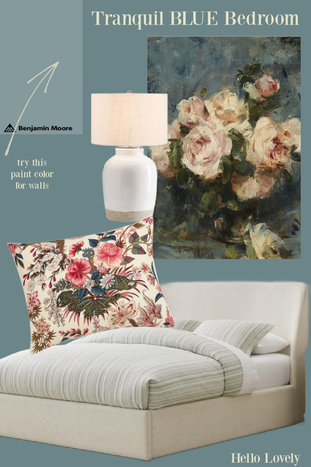
Benjamin Moore NORMANDY 2129-40
Searching for a deep distinguished shade of blue-gray with endless adaptability?
Maybe NORMANDY will tingle your jingles.
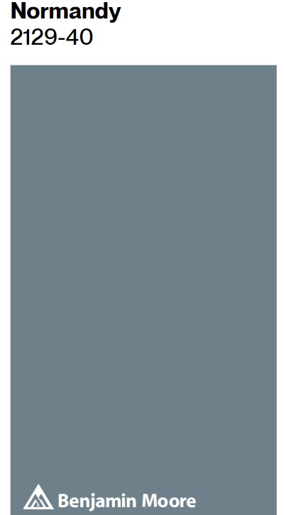
It isn’t as dark as Knoxville Gray (above) or Charlotte Slate (below) with its LRV (light reflectance value) of 21.73.
Benjamin Moore likes Marilyn’s Dress and White Heron for flattering accents with Normandy.
It is less blue than Alfresco and less gray than Stillwater.
For a slightly more subtle slate but still similar, peek at Black Pepper.
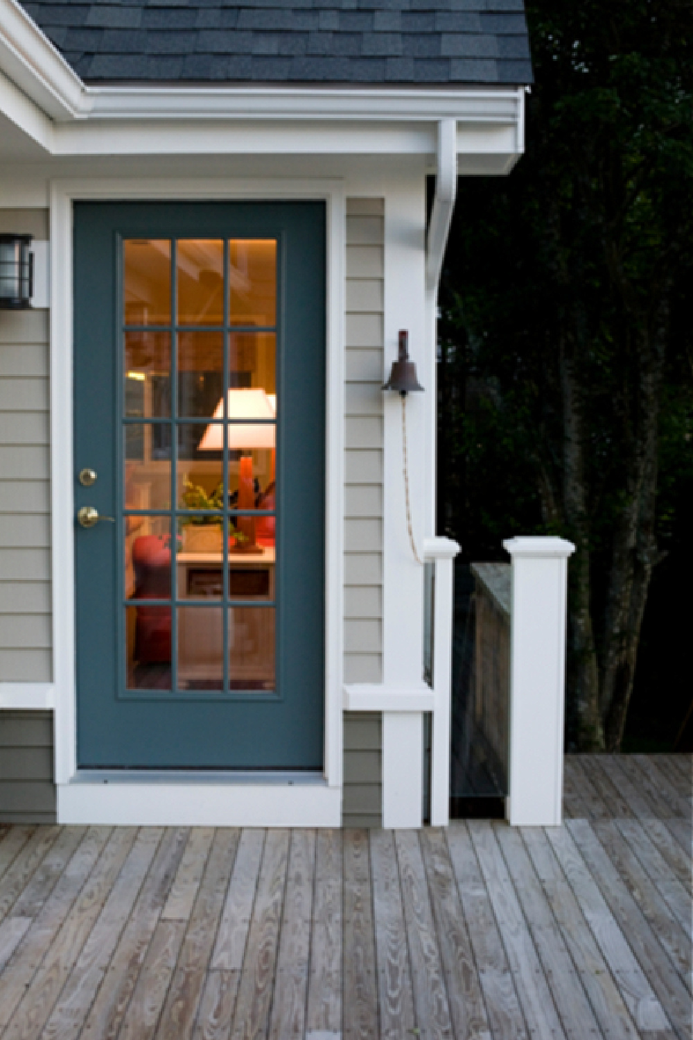
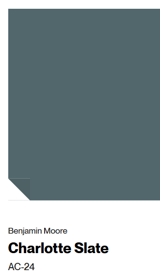
Benjamin Moore CHARLOTTE SLATE
What is this SLATE paint color like?
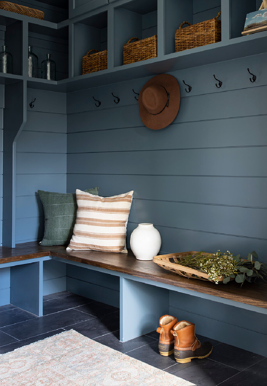
This paint color is also known as Providence Blue 1636. With a light reflectance value (LRV) of 18.09, it’s a deep rich blue-gray.
The color is part of America’s Colors from Benjamin Moore (a concise collection of soft neutrals features a snapshot in color of America’s most popular, well-traveled regions).
Geographically inspired with tones that are welcoming, this collection features sophisticated colors ranging from the pale grays of America’s beautiful coastlines to rich, clay earthtones of the Southwest desert.
In fact, doesn’t Charlotte Slate look incredible with warm wood tones and terracottas you see in the Southwest?
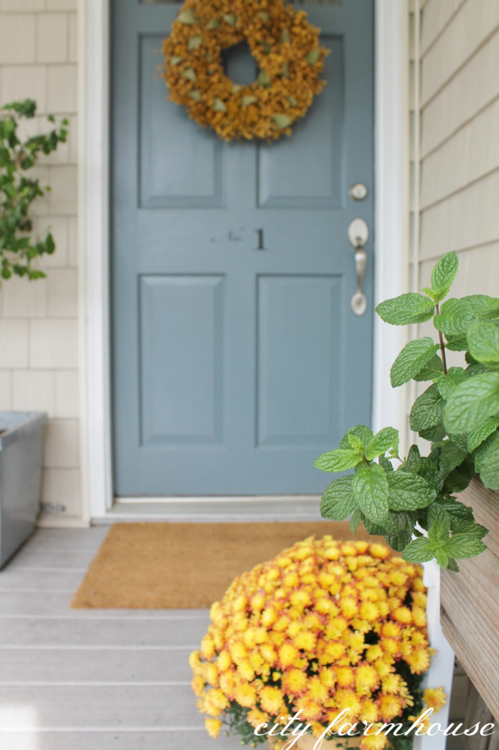
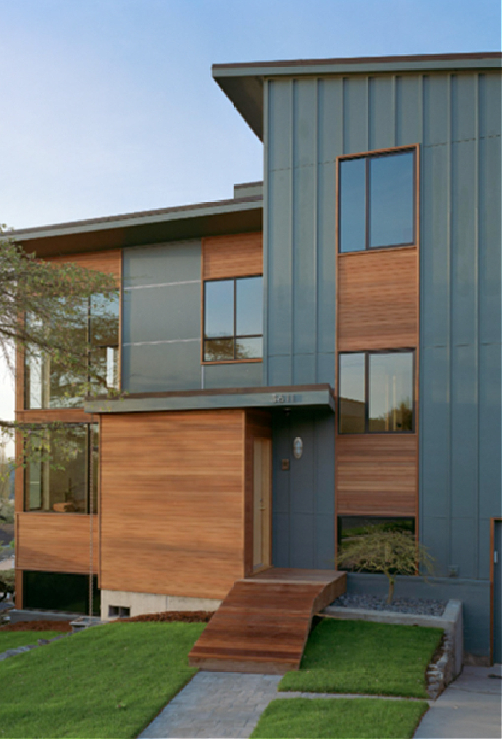
Above, see Charlotte Slate washed out from the sunlight on this exterior door.
Peace to you right where you are.
-michele
I independently selected products in this post—if you buy from one of my links, I may earn a commission.
Thanks for shopping RIGHT HERE to keep decor inspiration flowing on Hello Lovely!
Hello Lovely is a participant in the Amazon Services LLC Associates Program, an affiliate advertising program designed to provide a means for sites to earn fees by linking to Amazon.com and affiliated sites.


