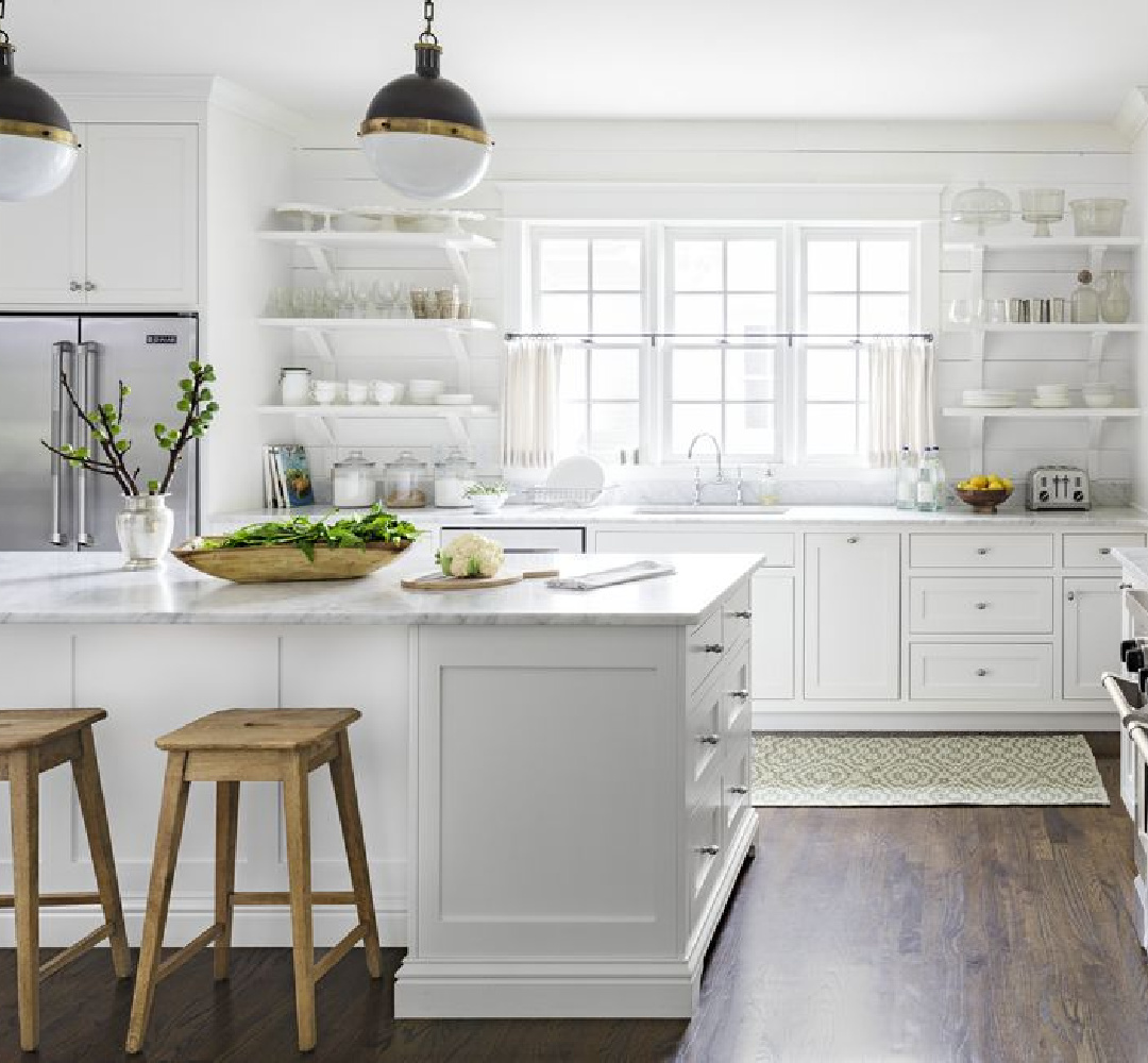
Sorry not sorry, marketers and timeless design critics…white kitchens? Not going anywhere in 2025. But plenty of other kitchen cabinet colors aren’t either! My boredom with trends continues (except when boredom hits an extreme waiting in a checkout lane and finds me doomscrolling and falling for clickbait). Timeless is ever a winner, and examples are not limited to neutrals. Societal and cultural climates do influence colors and moods for changing appetites. With a background in counseling psychology, I’m curious about what lies beneath those appetites and behaviors. When followers can’t get enough inspiring green kitchen cabinet colors, I perk up. Why green at this juncture?
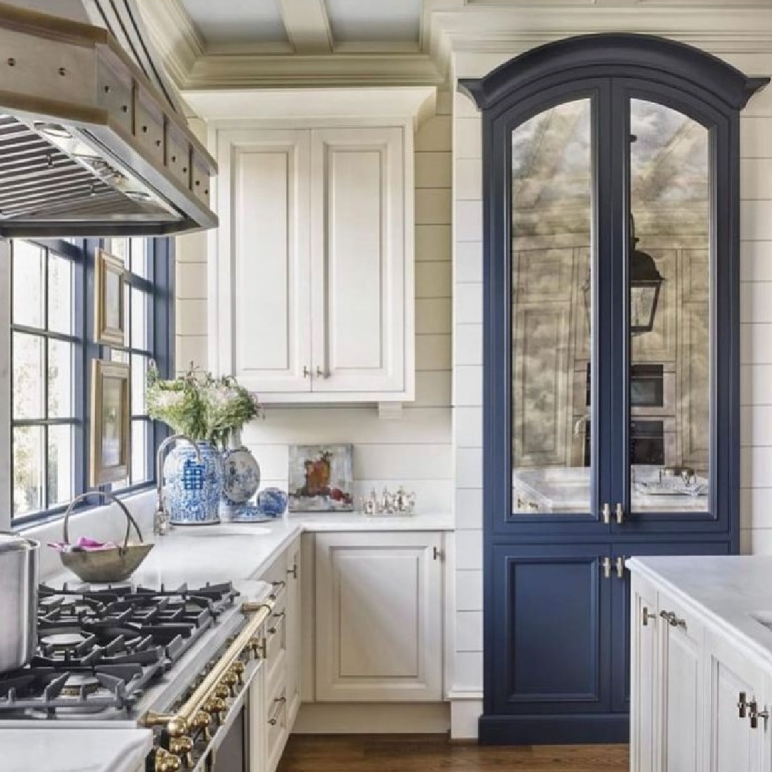
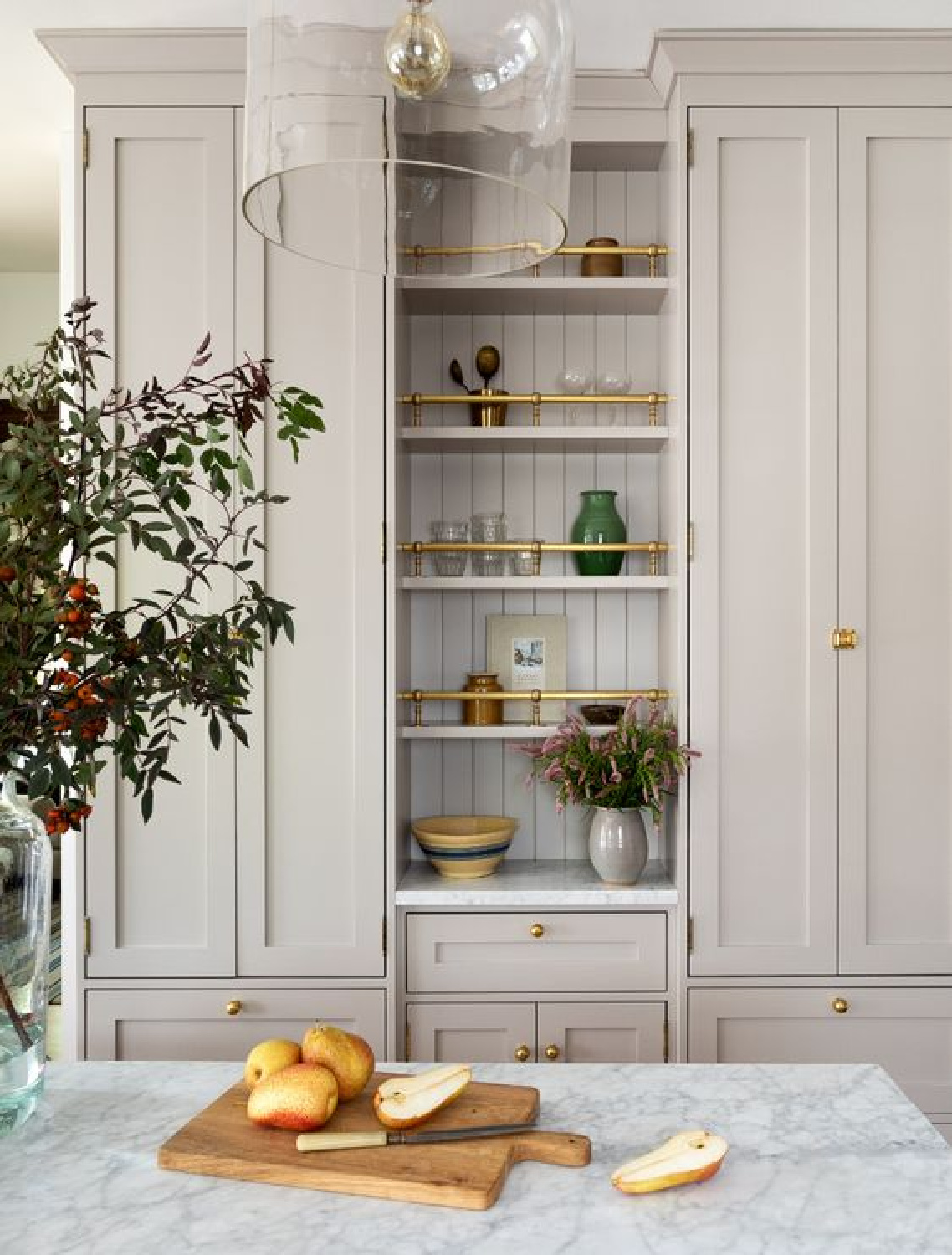
Why does the kitchen above feel innovative yet traditional? So many thoughtful details. For starters, the stunning blue custom pantry cabinet.
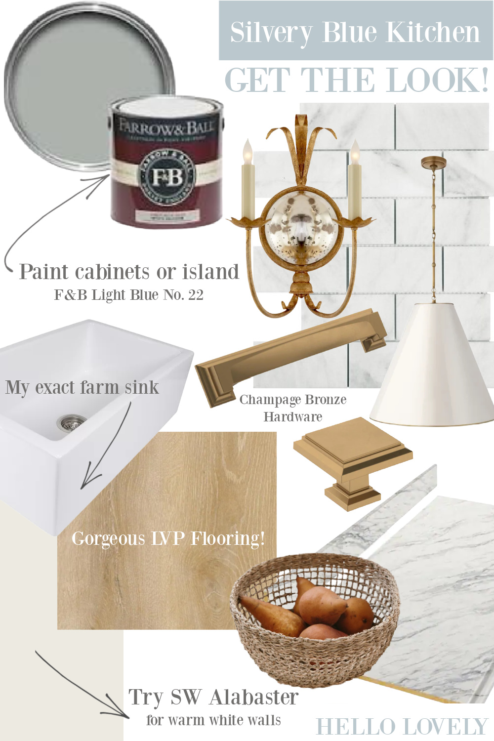
Kitchen Cabinet Colors: Blues & Greens
I independently selected products in this post—if you buy from one of my links, I may earn a commission.
Psst. For more stunning kitchen ideas, do check out these gorgeous country kitchens.
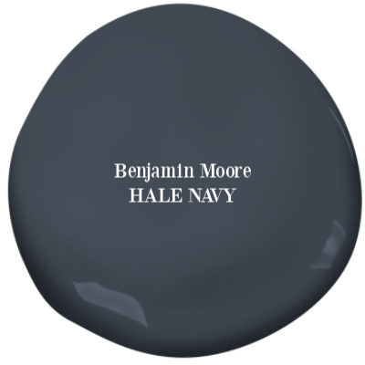
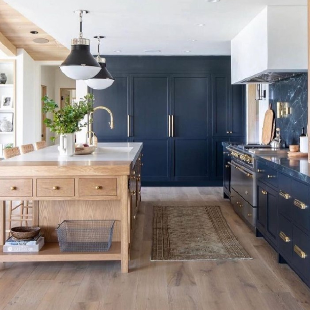
Benjamin Moore HALE NAVY
A mirrored pantry or china cabinet painted in this blue to contrast with all of the white?
Yes, please! Tuck away this idea even if you’re sold on neutrals as you consider various paint color options below. Perhaps one of these colors will work as an accent to enhance a vintage cupboard, cart, or table.
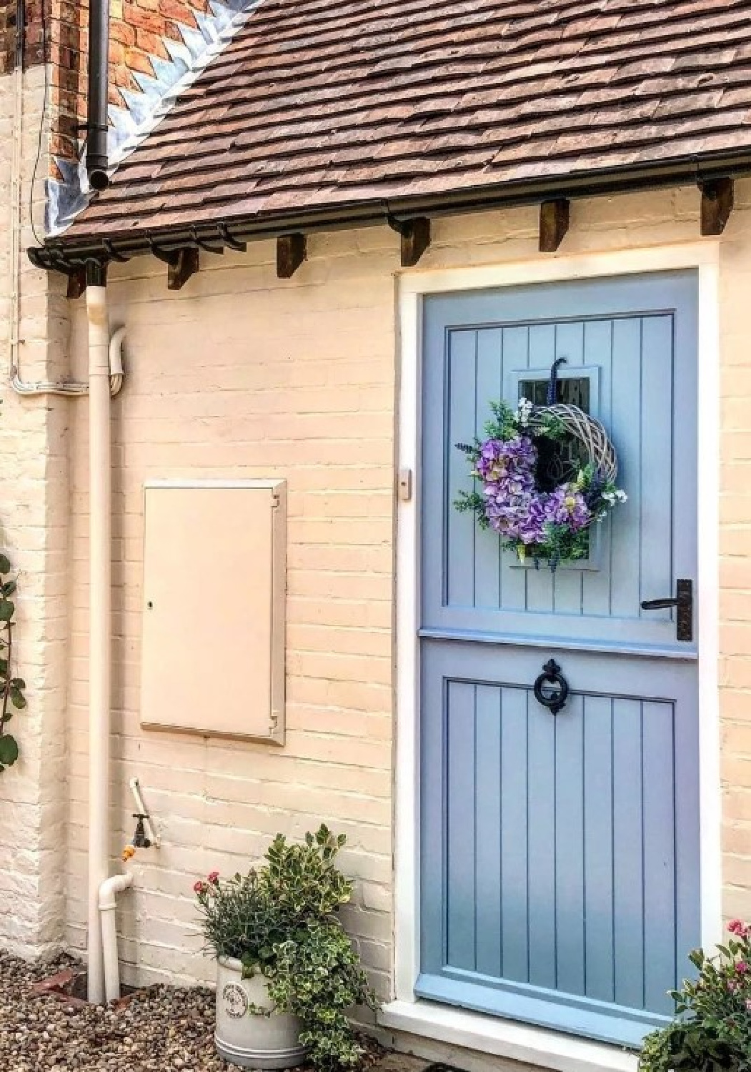
Farrow & Ball No. 89 LULWORTH BLUE
F&B consider this a fresh mid blue, and the name comes from the shade of the sea at beautiful Lulworth Cove, Dorset.

“Typical of a formal Regency hue, Lulworth Blue sits happily alongside similarly clean Wimborne White and Parma Gray. Despite its brightness, it can promote deep and peaceful sleep when used in low lit rooms, especially when used on both walls and woodwork.” -Farrow & Ball
Here’s the color on an exterior Dutch door:
as well as on trim in a bath with walls painted Clunch.
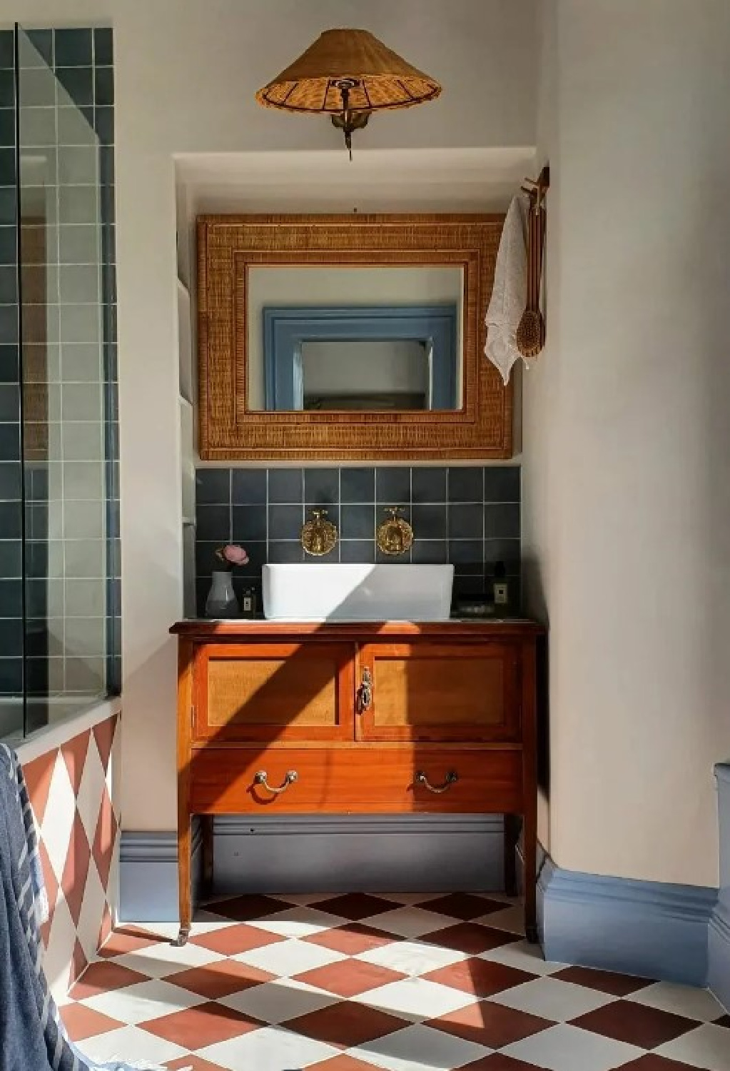
Clunch reminds me of this color:
Benjamin Moore LIGHT BREEZE
We tend to write off neutrals like this one to being safe, gentle, and without much punch.
But look at the energy a Light Breeze can bring:
Don’t allow platitudes to guide your design decisions and color selections. So many times you simply need to sample colors and note your emotional reaction before making the final decision
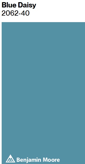
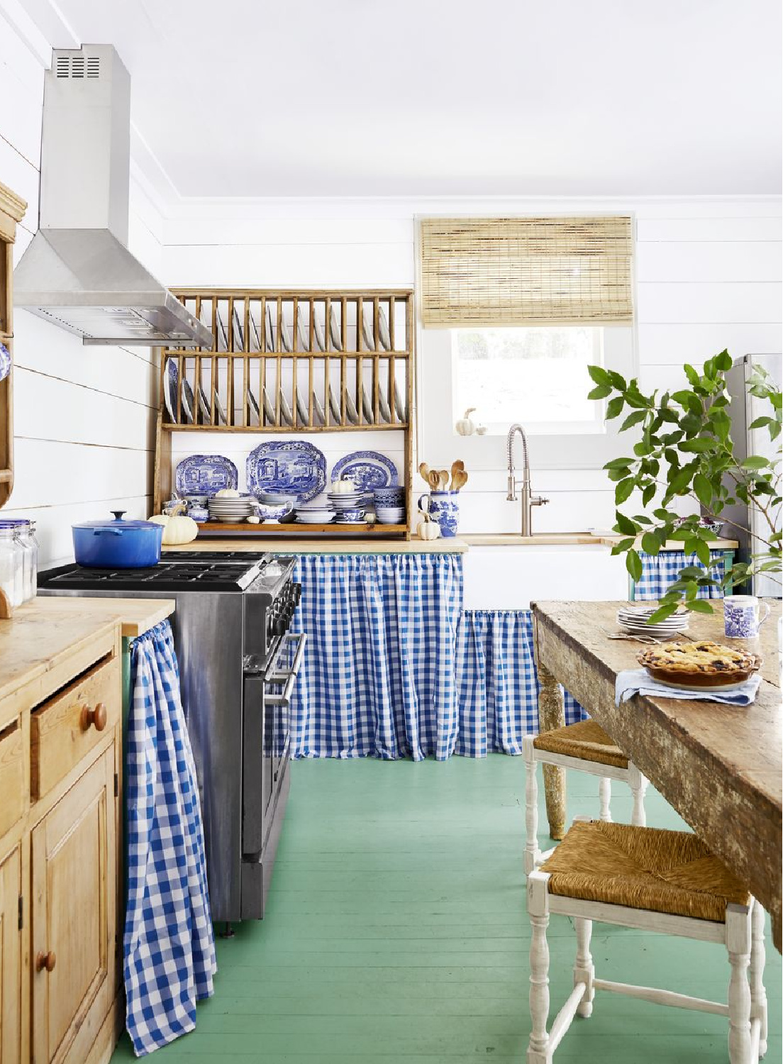
Benjamin Moore BLUE DAISY 2062-40
I’m always slightly annoyed/surprised when I watch a home improvement show on TV and the client reacts to the “reveal” or finished design by saying “I just love how everything matches.” The thing is, the goal is not for everything to match or even to follow a formula to match colors and textures well. Sometimes it’s the clashing that creates a magical design moment. Here’s an example of a cheerful blue meeting a sophisticated tonal wallpaper and warm brass hardware:
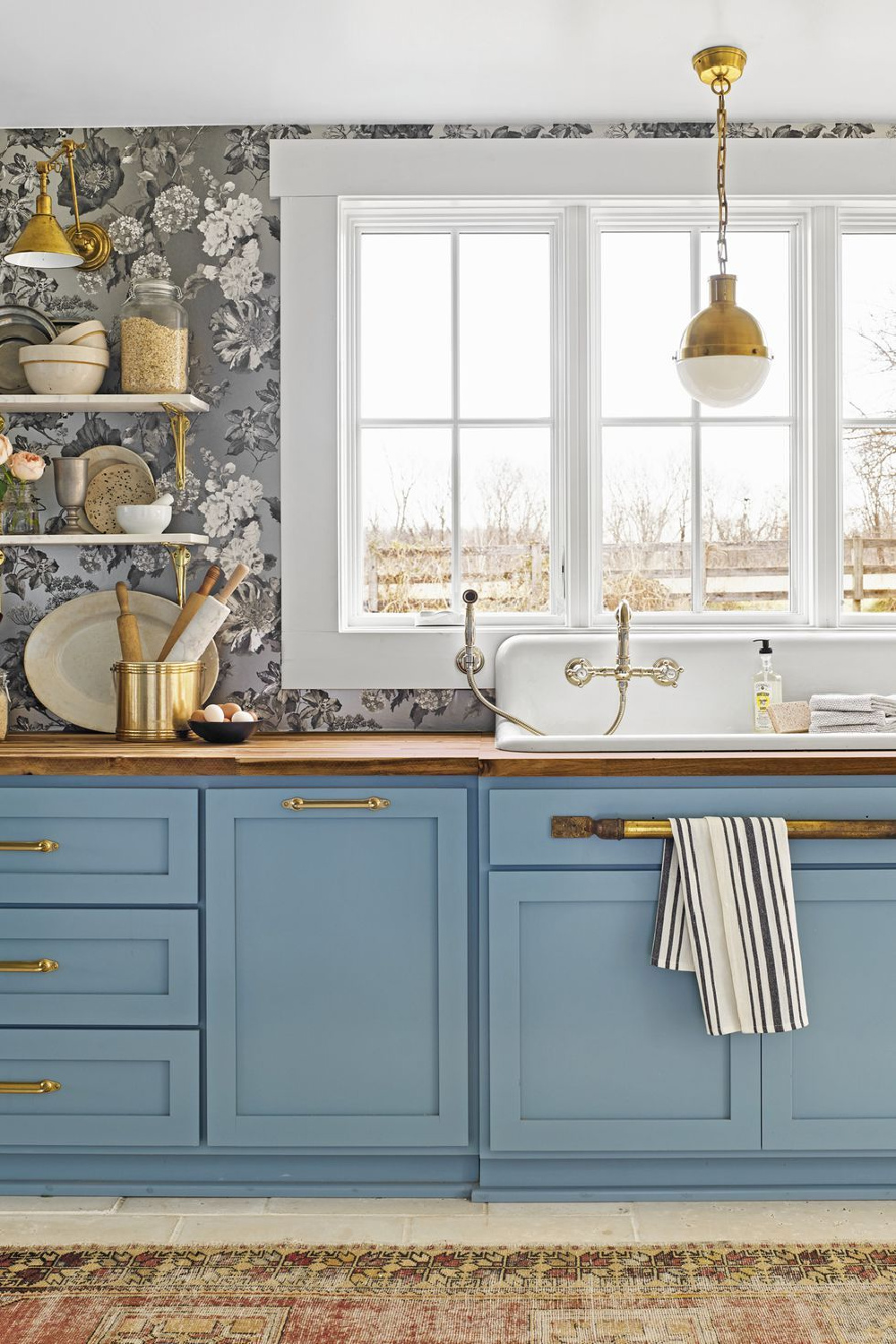
This intriguing medium blue subtly shaded with gray and green tones has an LRV (light reflectance value) of 25.59…that means it will reflect back about 25% of the light.
Psst. When I popped into Holly Williams’ shop in Franklin a couple visits ago, I hoped to catch a glimpse of her, and there that hardworking lovely woman was!
Farrow & Ball ARSENIC
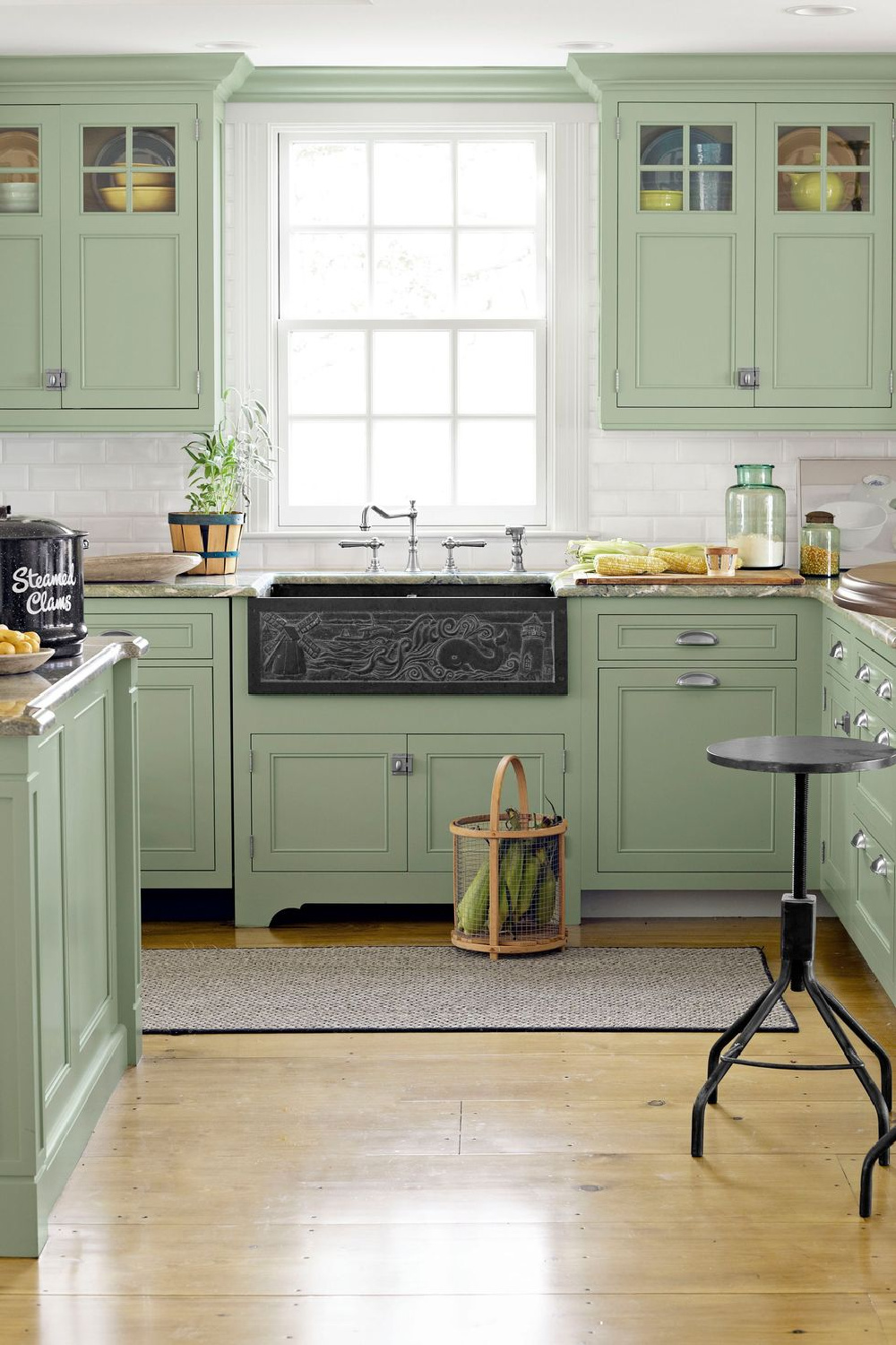
When you hear “green kitchen,” what comes to mind? Are you picturing emerald, sage, seafoam, teal, or olive? What about…wait for it…ARSENIC?

And what if your vision for your kitchen involved painting the floor a bold green like this?
Wow! It’s so unique and cheerful…not unlike a cool spring meadow underfoot.
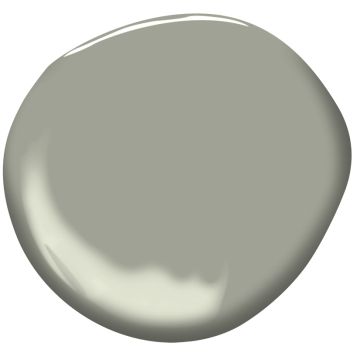
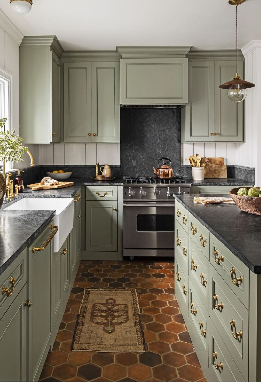
Benjamin Moore LOUISBURG GREEN HC-113
Here’s a muddier tone which may not immediately occur to you.
I think of it is as a favorite green to wear with its gray undertones and softness.
Benjamin Moore MOHEGAN SAGE 2138-30
Here’s another idea for a hard-to-pin-down-a-description of deep, moody green when you’re after a rich green.

It feels smoky, handsome, and sophisticated, yet it seems to be right at home in a country setting with beadboard:
If you like your blues and greens muddy or grey-sh, here’s another option you may like for a blue.
BM FRENCH TOILE
Blue-grays (or blues for that matter!) can be challenging to get just right, doncha think?

That’s why I recommend limiting your search to the range of gray paint swatches. While there are plenty of exceptions, the key is trying multiple samples for your unique lighting situation.
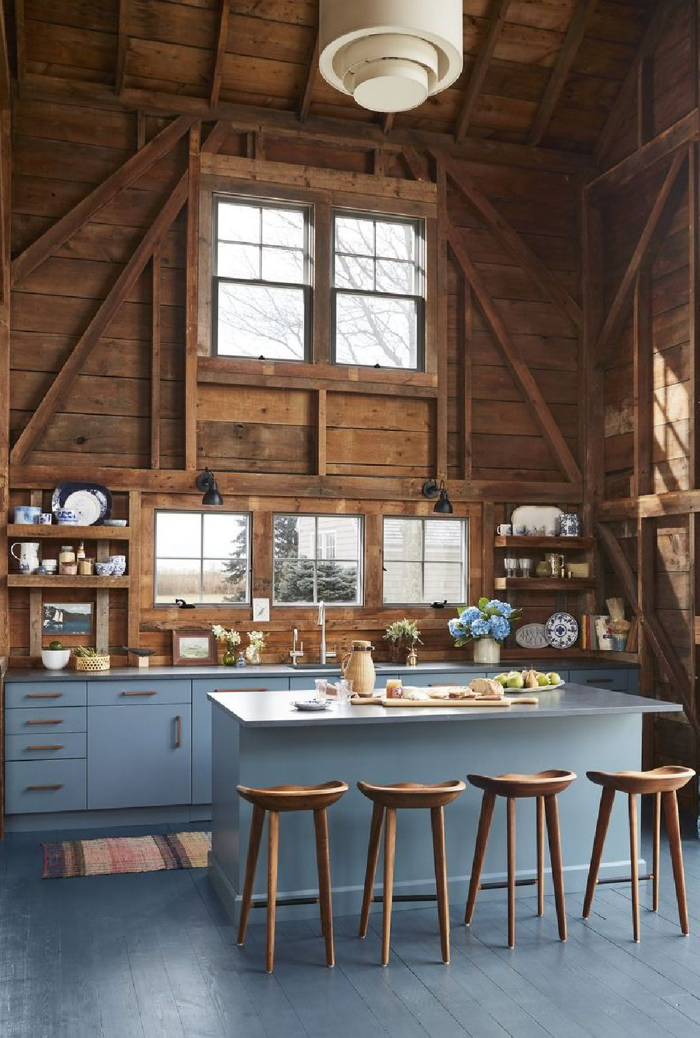
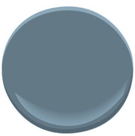
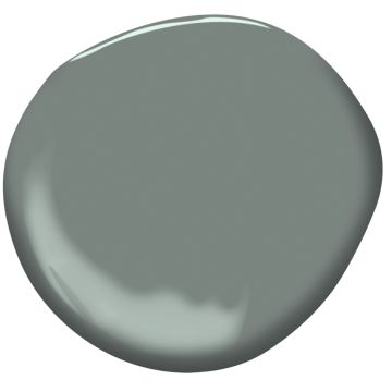
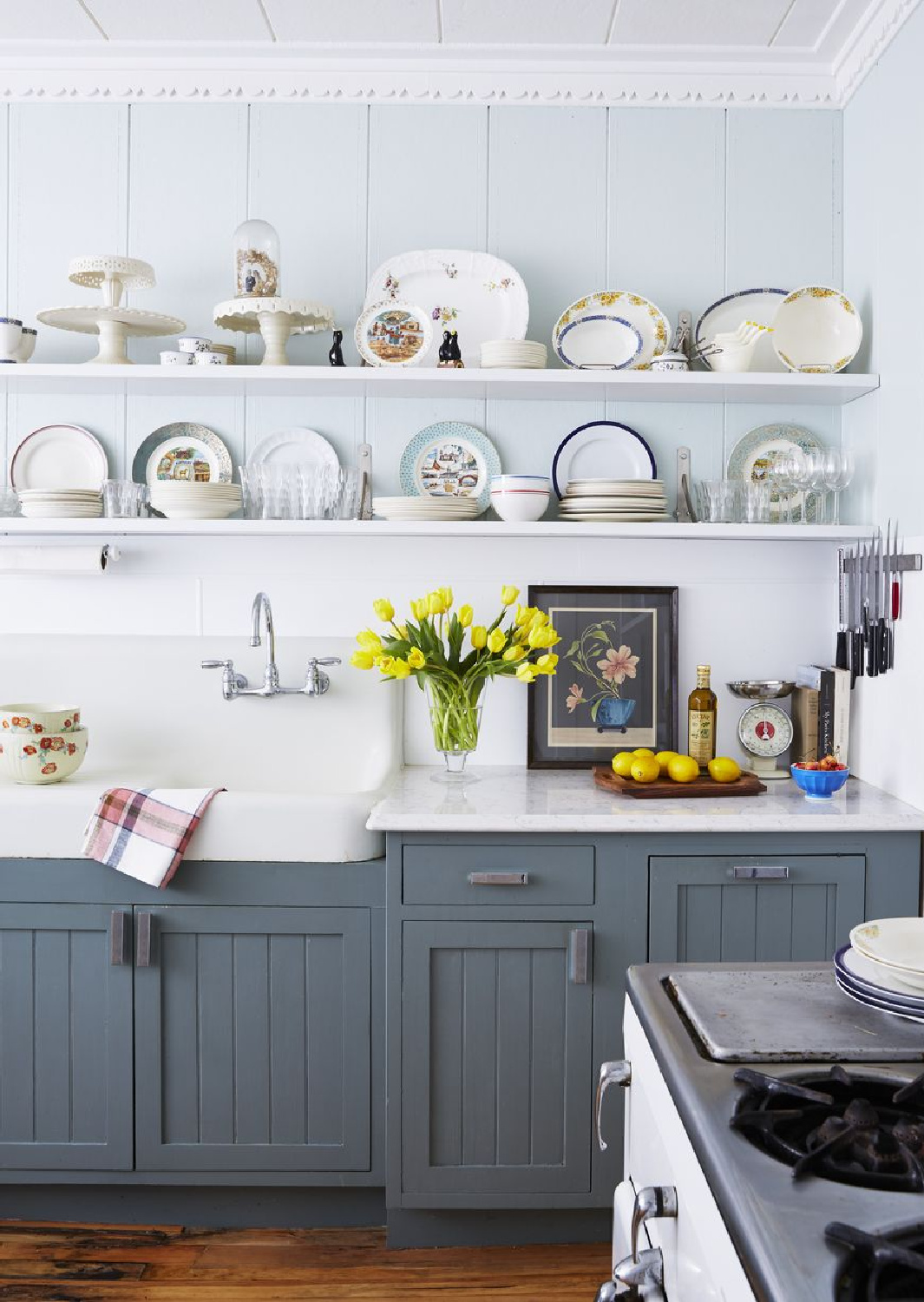
Benjamin Moore PHILIPSBURG BLUE
I admire how this particular blue set a particular mood in the design below.
It’s an unusual yet pleasing combination that feels both cozy and cool.
The kitchen above is a reminder that color can quiet a room and even inspire optimism…qualities that may be especially significant if life grows chaotic. Here’s another idea for a calm kitchen with a color story beyond white:
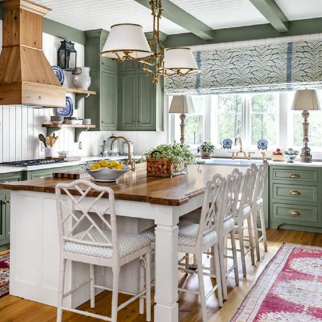
Sherwin-Williams COASTAL PLAIN
There’s a timelessness about this green that strikes all the right chords in the kitchen below. And I know it appears lighter in the image when compared to this swatch:

It may be that the kitchen gets a ton of light or it may be a photo-editing issue. Just another reason to sample and note whether the color is the right saturation for your own space.
What do you think of the black accents?
Farrow & Ball RAILINGS
Black is still a less popular neutral for kitchens, but thanks to influencers in social media, it seems suddenly everywhere.
Farrow & Ball PITCH BLACK
While it seemed reserved for urban and industrial kitchen designs, now black seems versatile and can even strike a modern European country chord.

When black meets gold tones…SHAZAM!
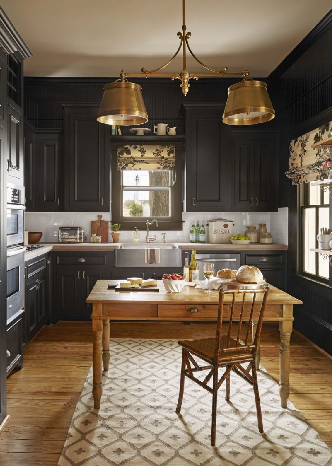
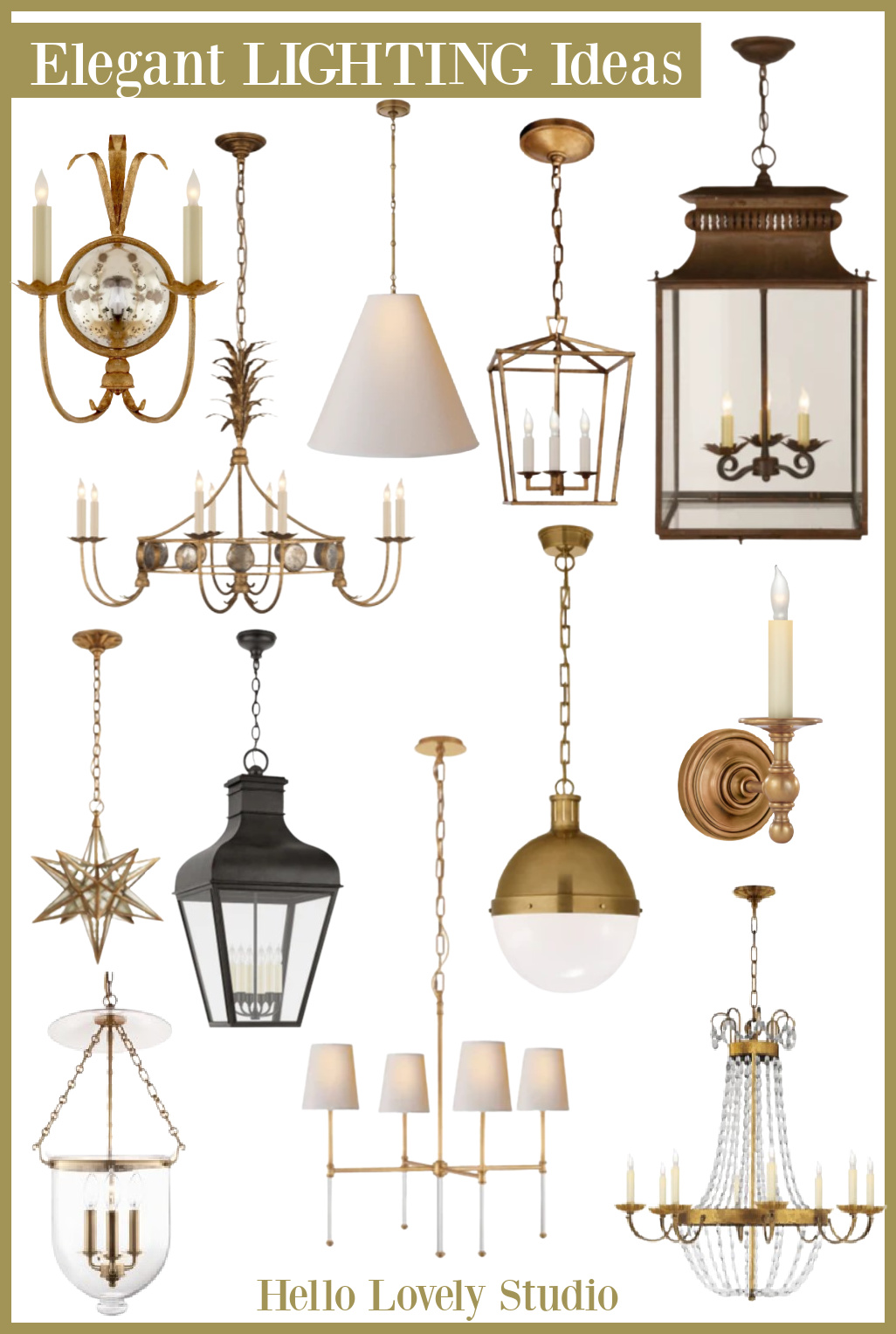
Psst. Just in case you need ideas for kitchen lights…
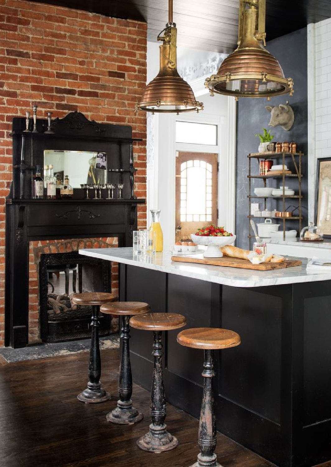
It’s super common to see kitchen islands painted black, and here’s another design from Holly Williams where black is repeated:
Farrow & Ball LIGHT BLUE
Farrow & Ball’s Light Blue played a starring role in my favorite blue kitchen in 2017:
Farrow & Ball ELEPHANTS BREATH
What if you’re after one of those sophisticated neutral colors that is hard to describe and rather complex?

Elephants Breath feels very chic and Parisian to me:
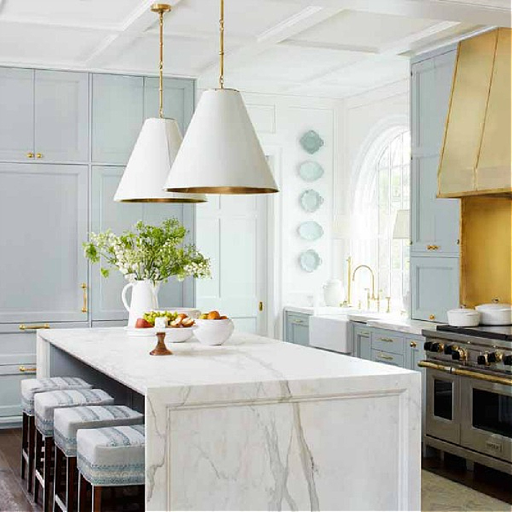
Need a trusty paint color for white trim and doors with almost all of these color options?
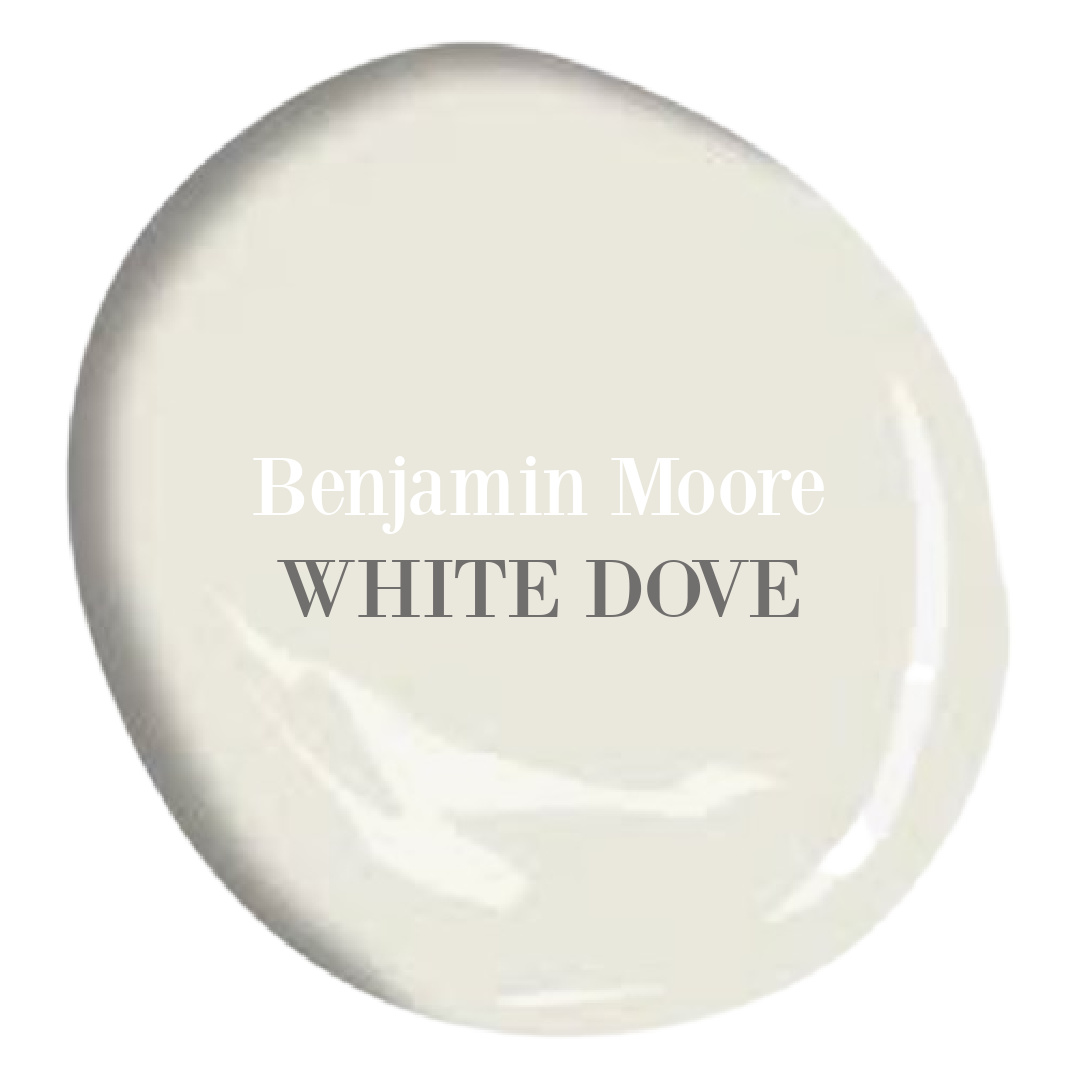
Just a gorgeous white that feels timeless and clean.
Not that your trim need be white! I love how Martha Stewart used Stormy Monday on everything.
Are you still seeing taglines that say grey interiors were a fad that’s over? Greys are timeless and natural and may be just the right backdrop for your rich, sophisticated kitchen.
And I do mean RICH…
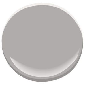
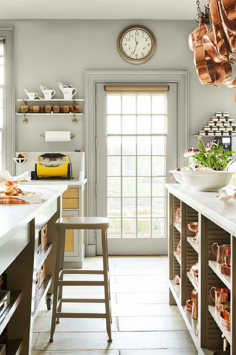
Benjamin Moore NIGHT TRAIN 1567
There are great paint color names, and then there’s NIGHT TRAIN.
Right? Don’t you love how it is paired with all this sweetness?
Okay, one more kitchen paint color option beyond white that straddles the line between neutral and not neutral…
Benjamin Moore OIL CLOTH
Wait until you see how this color interacts with terracotta.
Ready or not!
I hope these inspiring photos and ideas gave you delicious food for thought. Easiest way to see if a color is right? Order samples with Samplize and have them delivered straight to your door.
Here’s a bonus bit of inspiration from a neutral kitchen with a glorious burst of color from blue platters and dishes placed high on the wall:
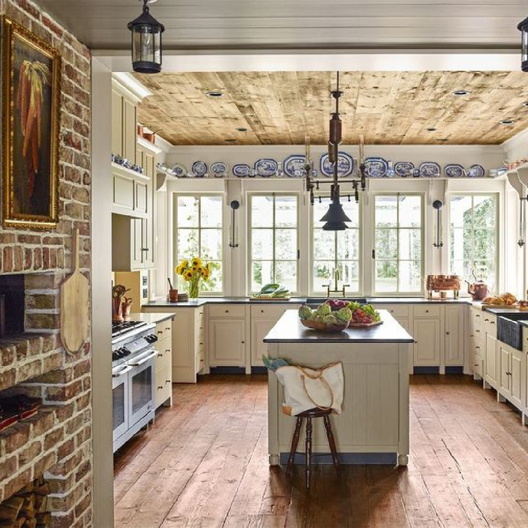
Isn’t it divine?
Peace to you right where you are.
-michele
Thanks for shopping RIGHT HERE to keep decor inspiration flowing on Hello Lovely!
Hello Lovely is a participant in the Amazon Services LLC Associates Program, an affiliate advertising program designed to provide a means for sites to earn fees by linking to Amazon.com and affiliated sites.


I love seeing color in kitchens, again. It gives the room so much personality. Thank you for all of the lovely examples.
Author
Yes – so many cheerful colors to make it as custom and personal as you like. Thanks for the kind words.