Ready for even more delicious kitchen paint colors to sample? I hope you’ll play along with my psychological color analysis along the way. I’m a trained psychotherapist doncha know. Plenty of interest in all that lies beneath the surface of things up in here! We started off with a slew of green kitchens in THIS and continue now with blues and grays. While most of these examples are country kitchens, since the topic is color, they truly are relevant and helpful beyond any specific design style. Maybe a color will work for your walls or a vintage dresser. You can also assess how these cabinet colors work with other colors in the space. How do countertops contrast, harmonize, or recede? It may help you clarify personal preferences. Finally, collect paint colors to sample and pin to your boards so you’ll have these for future reference!
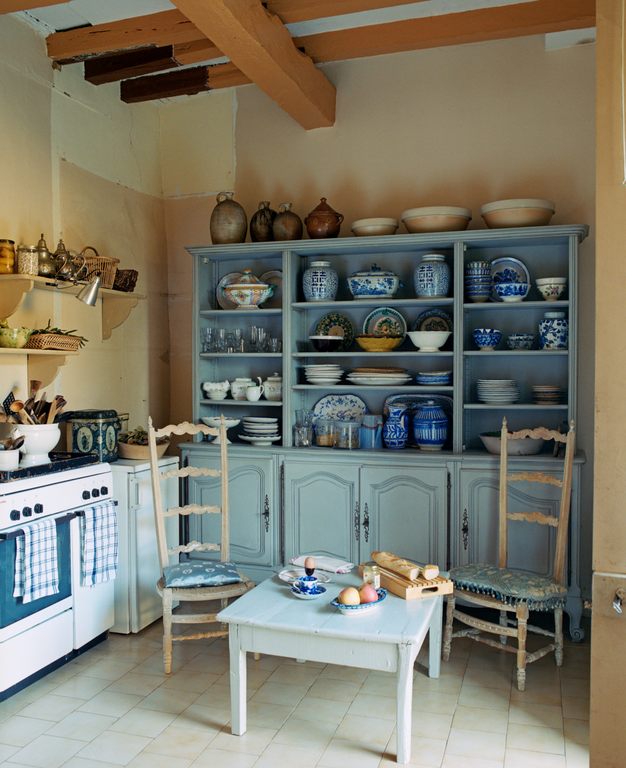
Unexpected Kitchen Paint Colors: Sample These Blues and Grays!
I know I’m a broken record, but it’s not enough to fall in love with a single paint you see online and just KNOW that’s your color. Sometimes it works. More often, you are falling in love with the look of that color in that unique lighting and maybe even with those photo edits. And you can definitely emulate it. But it may take a slightly different paint color or saturation level to get there. Sampling in your space and thoughtfully taking your time is critical.
Overview of Beautiful Unexpected Blue Kitchen Colors
Blue has so many psychological associations!
Why are lovers of blue drawn to its variations as a color? We’ll chat about various psychological implications of the color blue.
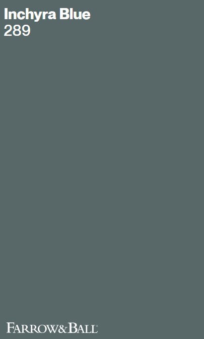
Farrow & Ball INCHYRA BLUE
Calm serenity…Blue is often perceived with feelings of calmness, tranquility, and serenity.
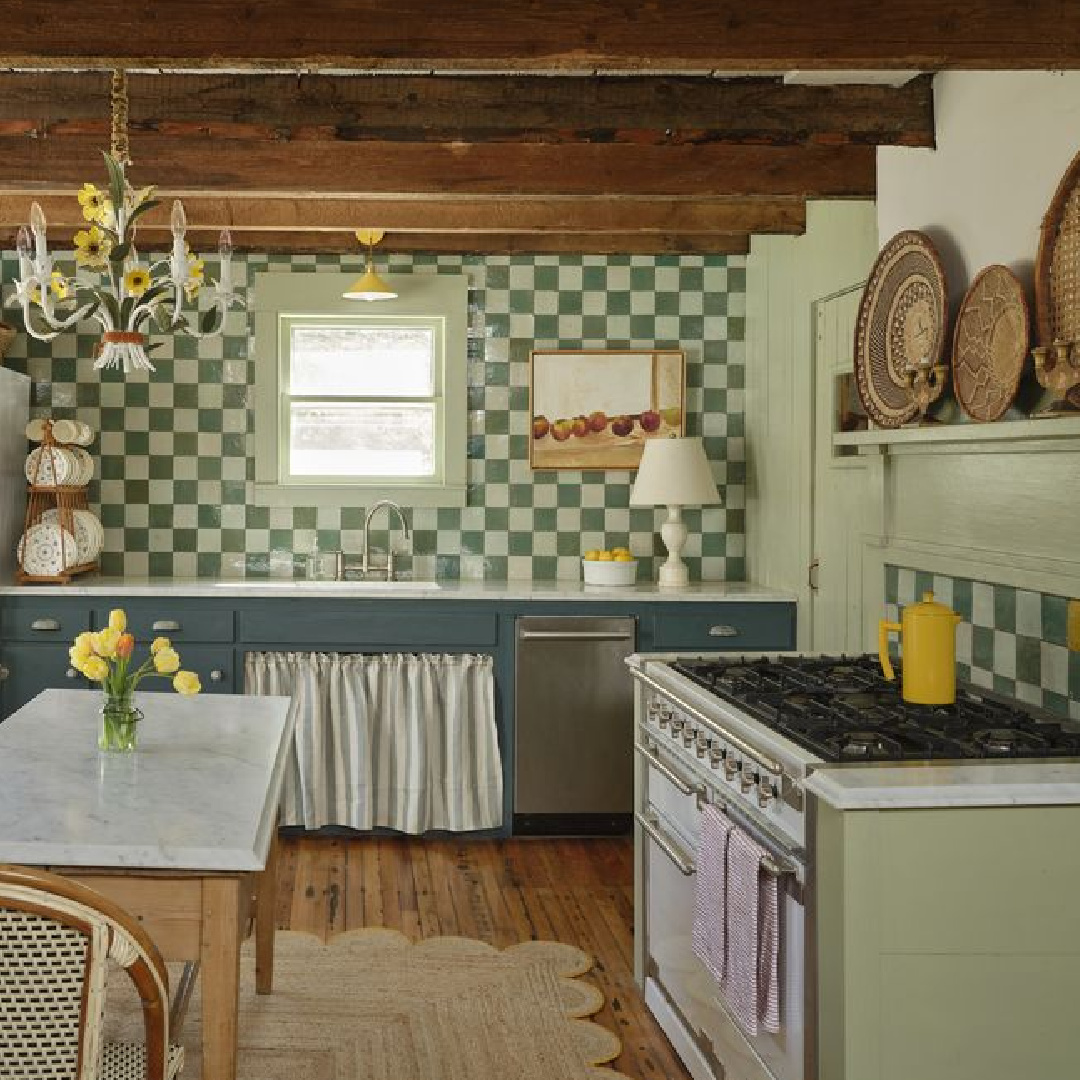
It’s easy to understand why when you note how it reminds us of sky and ocean.
What do you think of this blue in combination with F&B Vert de Terre in the kitchen above?
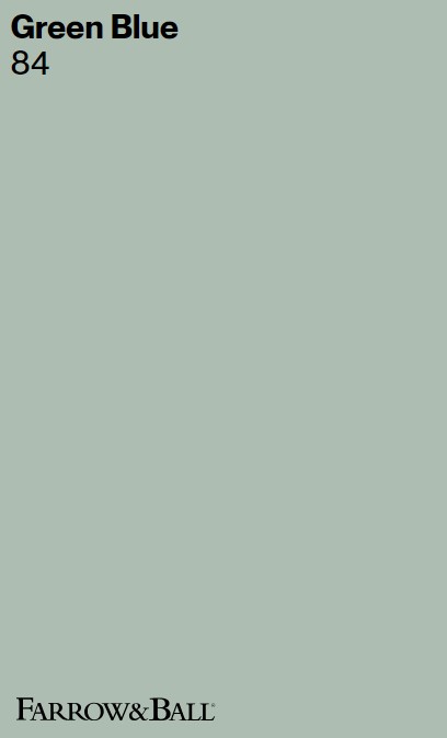
Farrow & Ball GREEN BLUE
Some of the most peaceful elements on the planet are blue. Living with blue can be a soothing experience, suggestive of tranquility and relaxation.
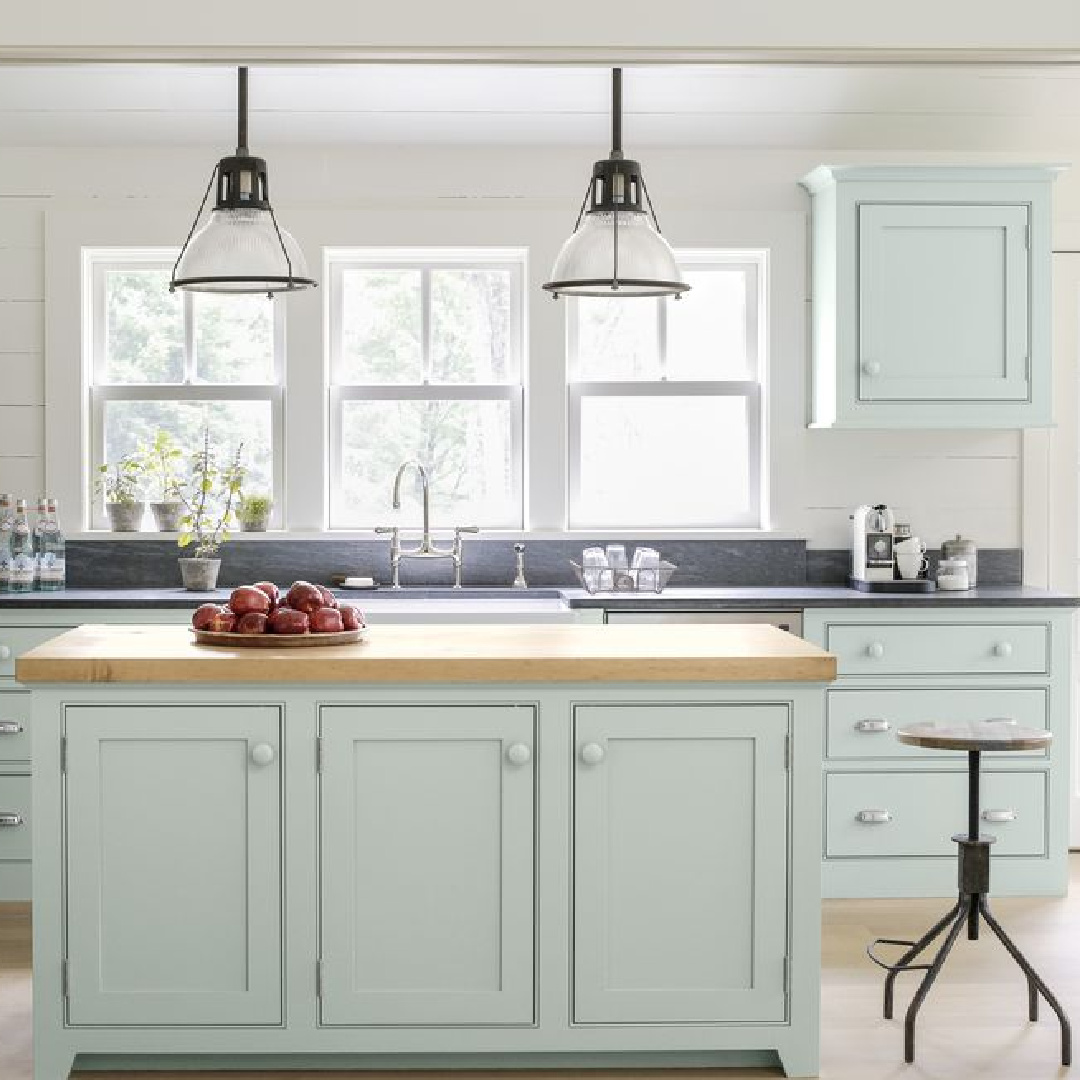
This is one of my favorite aqua colors which feels so wonderfully earthy yet buoyant.
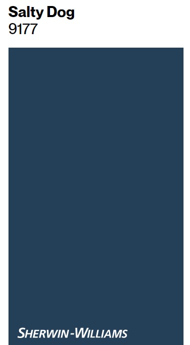
Sherwin-Williams SALTY DOG
Why do you suppose blue is suggestive of trust and reliability? Are the sky and sea trustworthy?
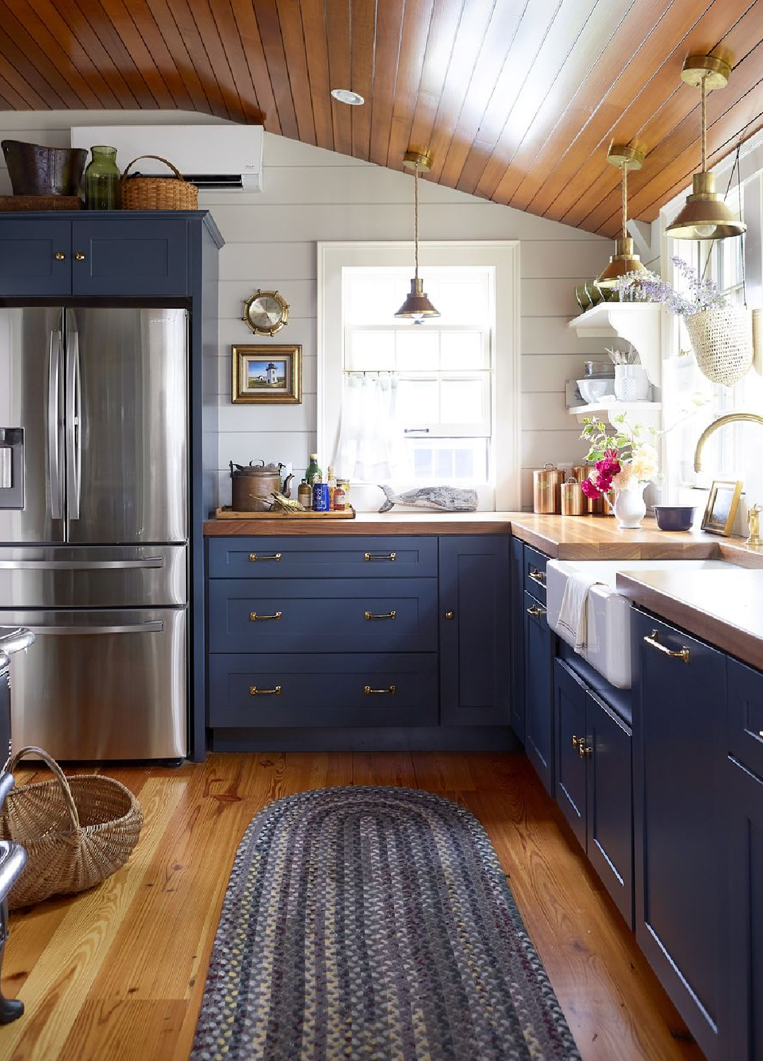
I suppose it is up for debate, but the suggestion of stability is why it shows up so often for corporate logos and uniforms.
Isn’t it a lively navy blue?
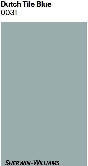
Sherwin-Williams DUTCH TILE BLUE
There are so many subtle associations with blue that most of us probably never consider. For example, blue can be suggestive of communication and clarity. Wait.
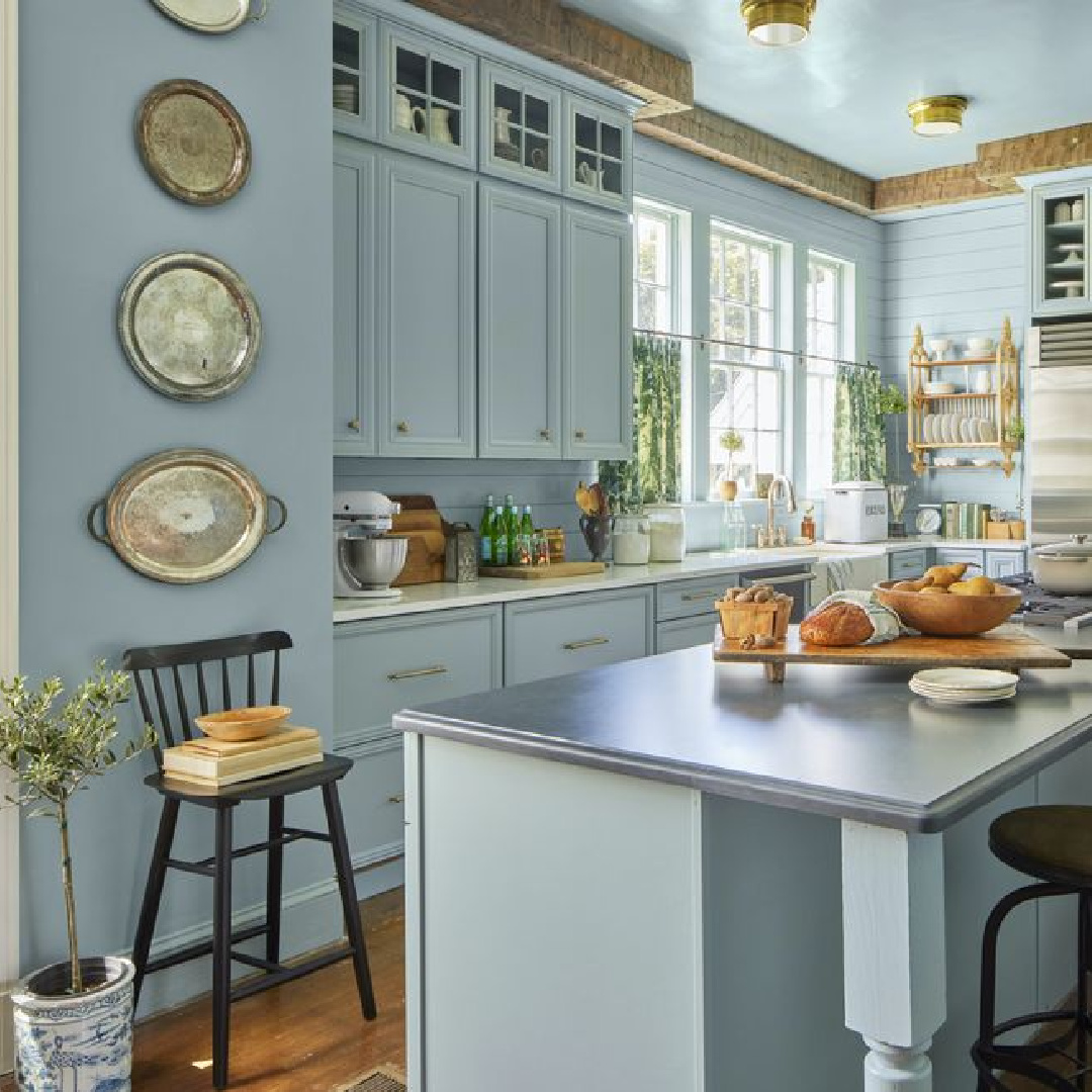
Mental clarity is blue (think: “out of the blue”)? The connection is that a calm mind can settle, focus, and think clearly.
What a gorgeous blue for a peaceful kitchen!
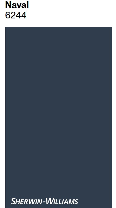
Sherwin-Williams NAVAL
Blue is a color that has melancholic symbolism too.
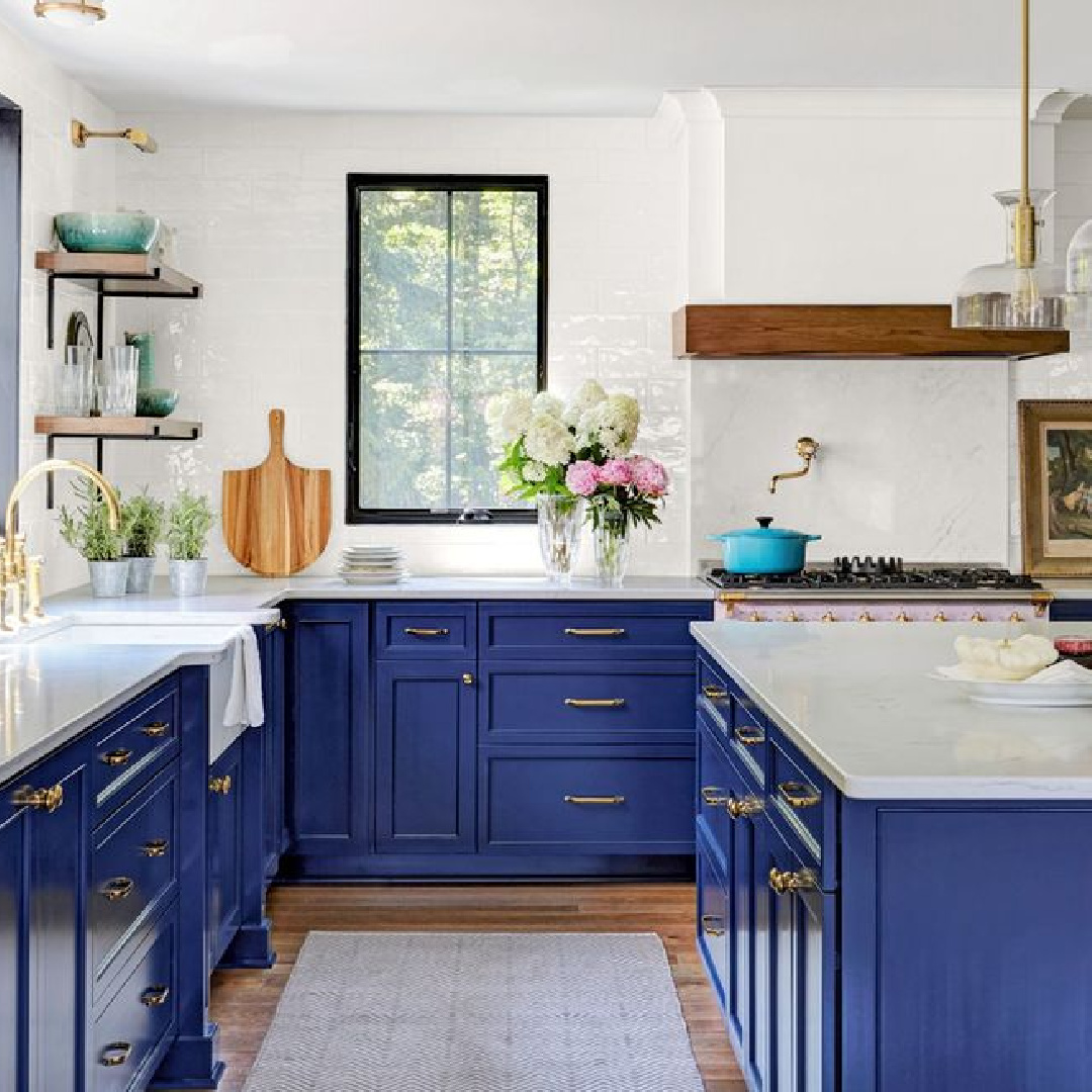
Think of how we refer to sad periods as “the blues.”
I suppose it shouldn’t be surprising that blue seems so emotive–sometimes calm and sometimes lonely or moody like the sea or the changing blue sky.
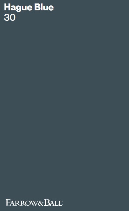
Farrow & Ball HAGUE BLUE
Coolness and detachment are synonymous with this cool color for multiple reasons.
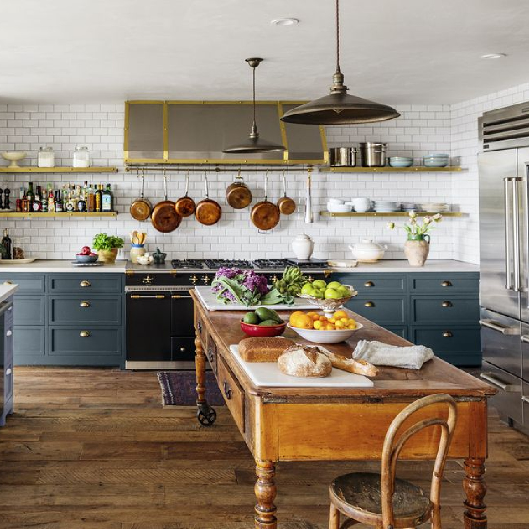
It is cool on the spectrum of color and also is evocative of detachment. As a result, blue is a common color for uniforms (think navy blue) and professional domains.
There’s something both mysterious and comforting to me about Hague Blue. It is one of those blues I instantly recognize when I see it in images of walls or millwork.
Benjamin Moore VARSITY BLUES
Some blues are less common and difficult to forget.
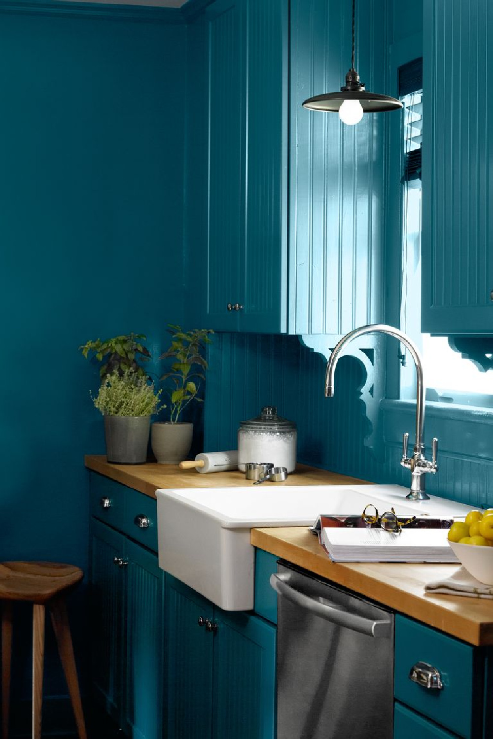
Is it teal? Green? Turquoise?
Varsity Blues is bold and memorable if you’re after a bespoke look.
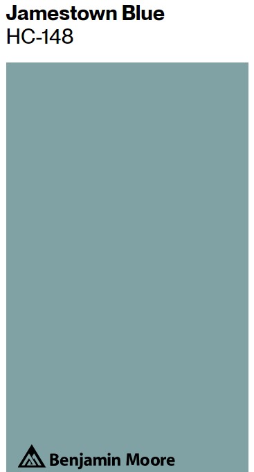
Benjamin Moore JAMESTOWN BLUE
Are green and blue best friends? I feel as though they are in Jamestown Blue.
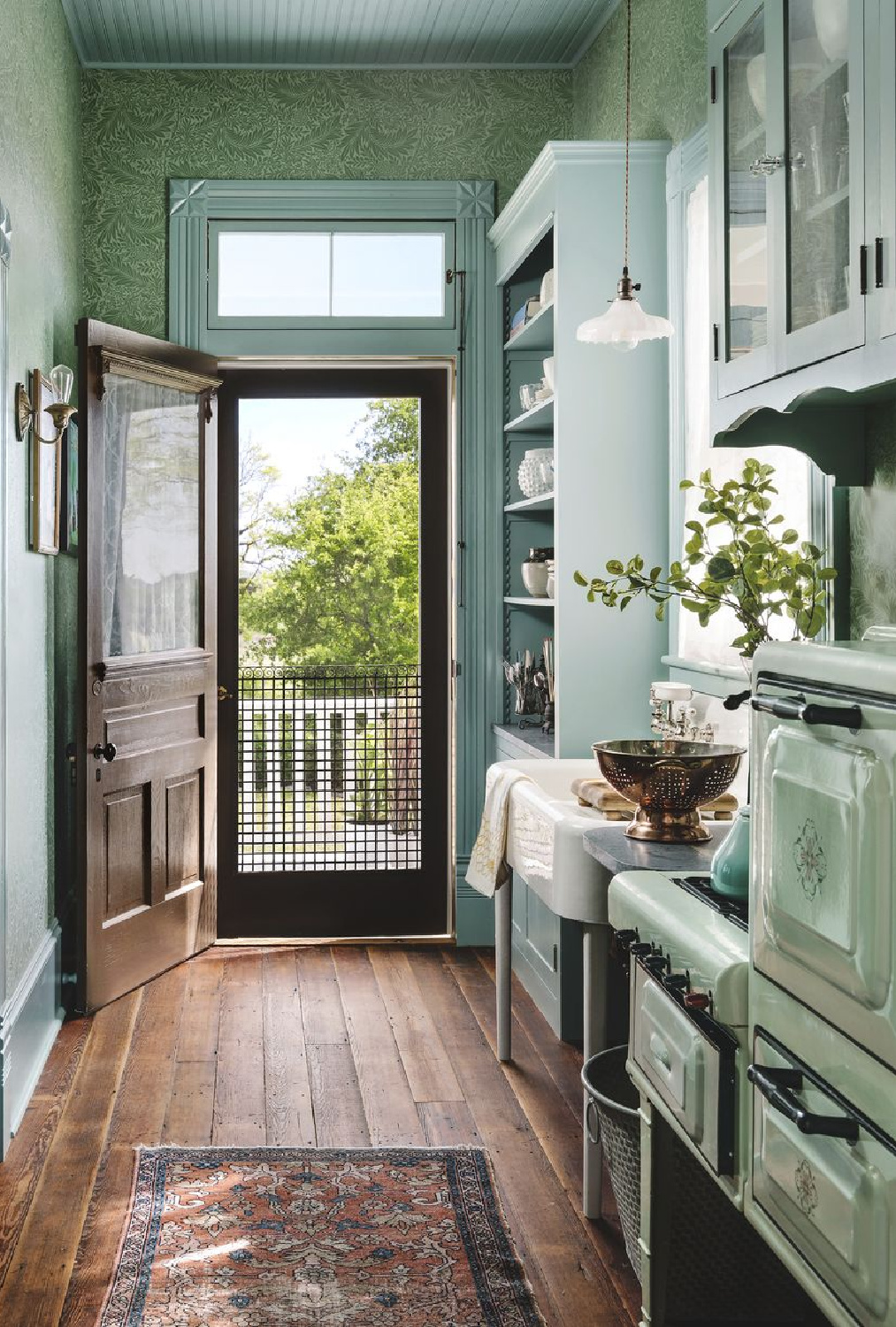
What a kitchen with history, patina, and high style!
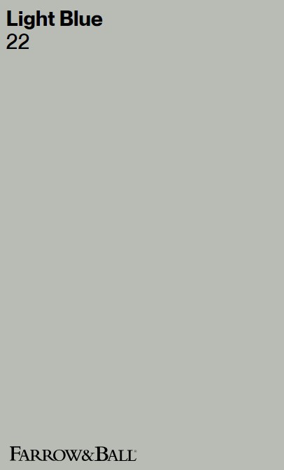
Farrow & Ball LIGHT BLUE
Designer Lauren DeLoach has caused us all to adore this blue from Farrow & Ball.
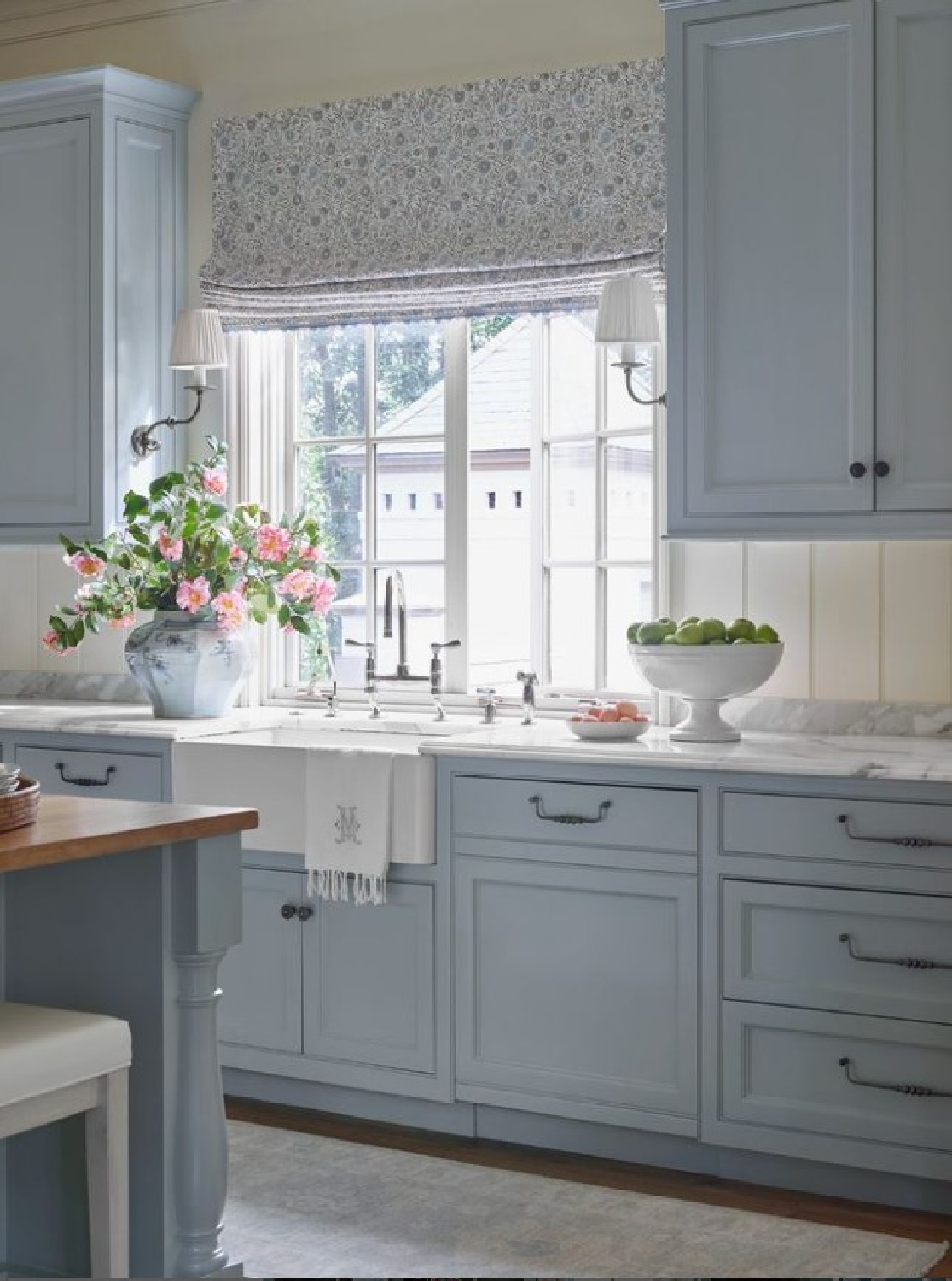
It’s going to convey differently depending on the context and lighting situation. Which is why you must sample at least three colors close to it if you truly want to arrive at the best blue for your space.
When it comes to painting kitchen cabinetry, you want to exhaust all of the possibilities since re-painting is not something any of us care to think about!
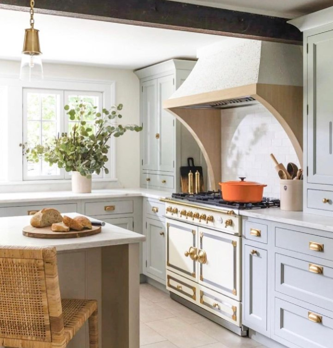
Unexpected Gray Kitchen Paint Colors
Let’s continue with the cool tones for kitchens!
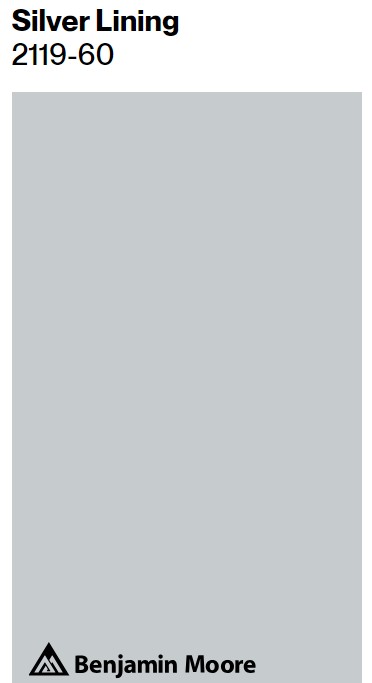
Benjamin Moore SILVER LINING
Ambiguity and uncertainty are associated with grey since it evokes feelings of ambiguity, uncertainty, and indecision.
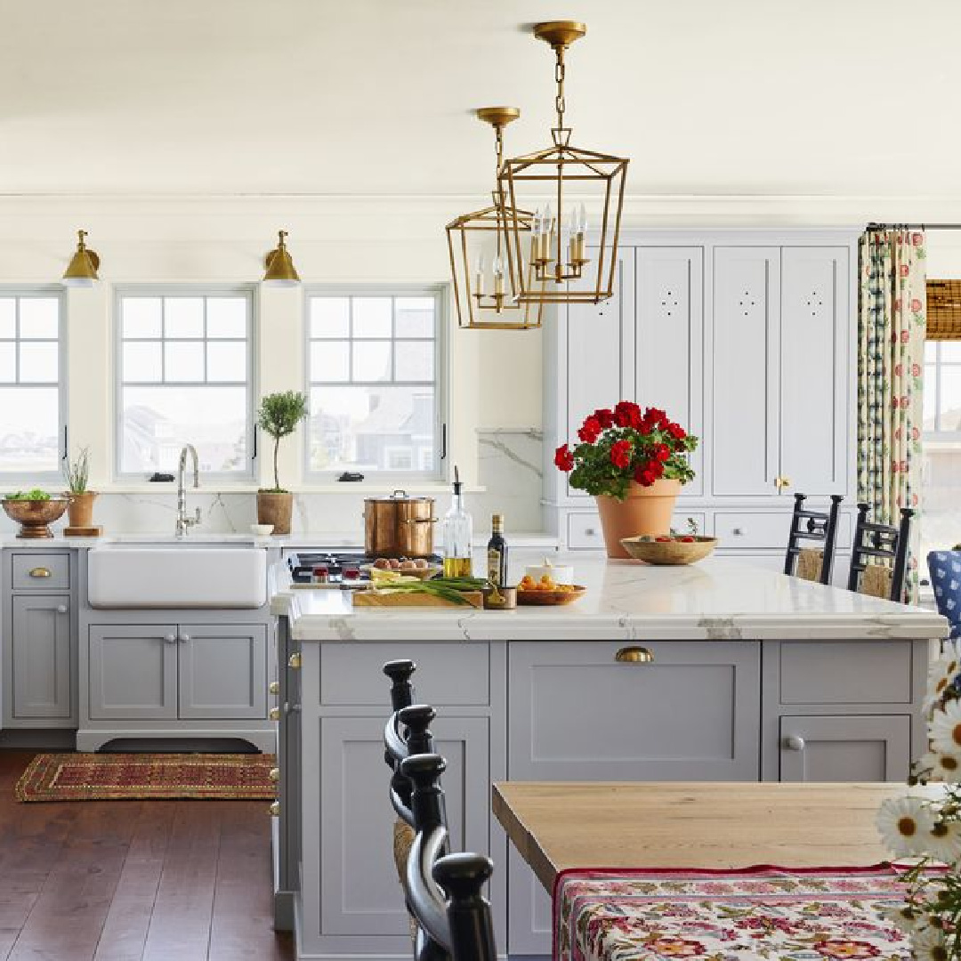
It flows in that realm between light and dark, without clear definitive direction.
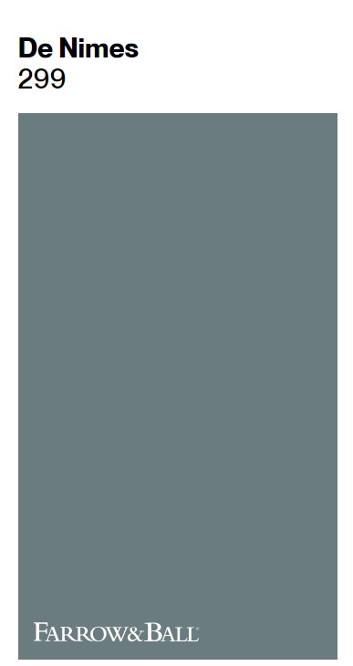
Farrow & Ball De Nimes
Does grey feel sophisticated and elegant?
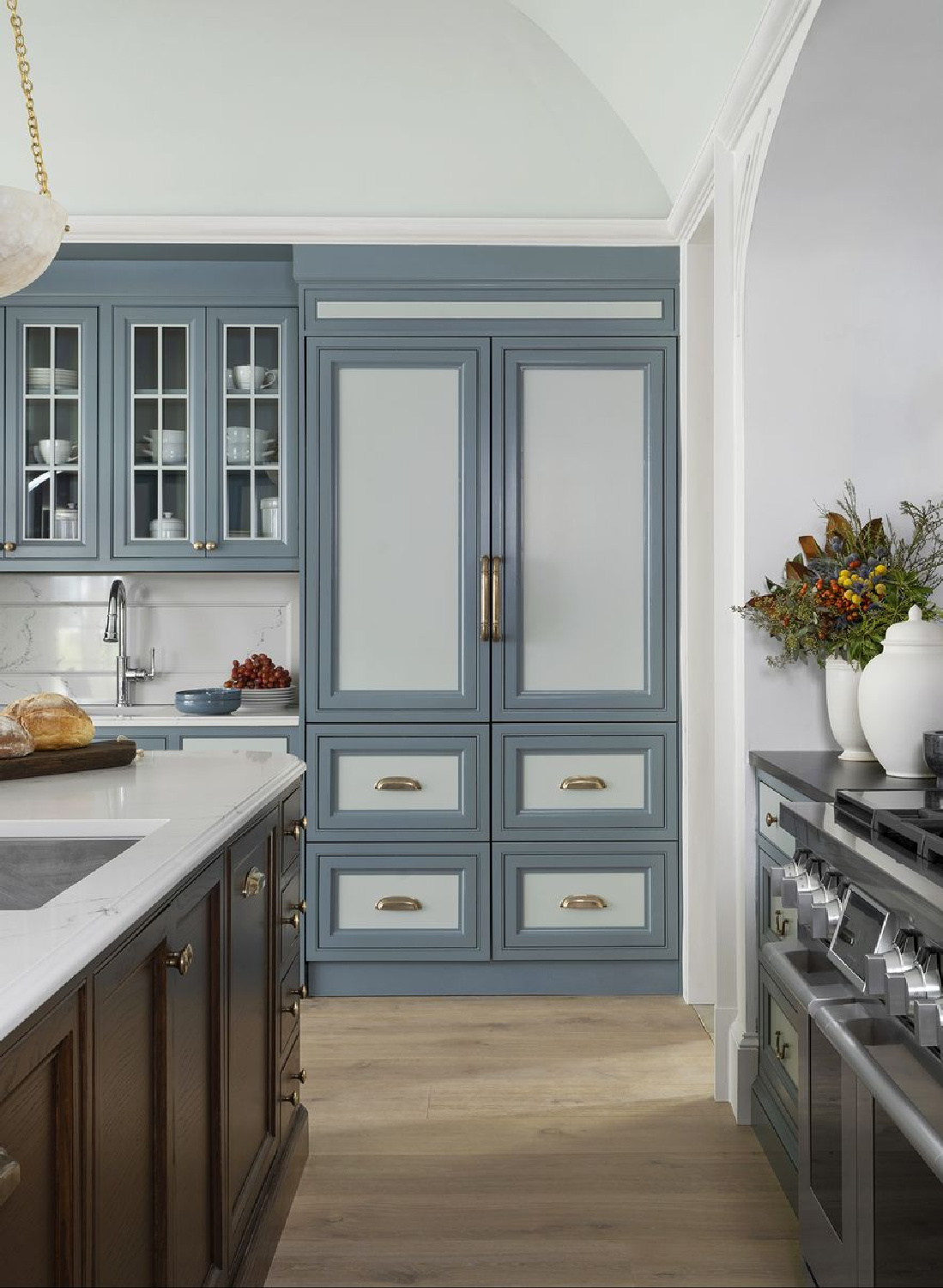
In fashion and interior design, gray tones commonly appear, suggestive of understated luxury and chic minimalism. I automatically think about the greys in Paris! While it may seem to be a rather melancholic hue, it also feels elegant and classic.
I think the timelessness of gray may be my favorite aspect of this color. Timeless?
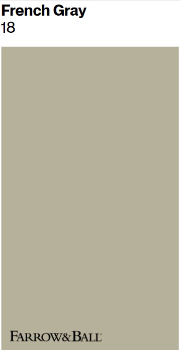
Farrow & Ball FRENCH GRAY 18
Forget about any trends rejecting it for design, fashion, or paint color. It is much too classic and sophisticated to ever care about what fashions are traveling down a catwalk.
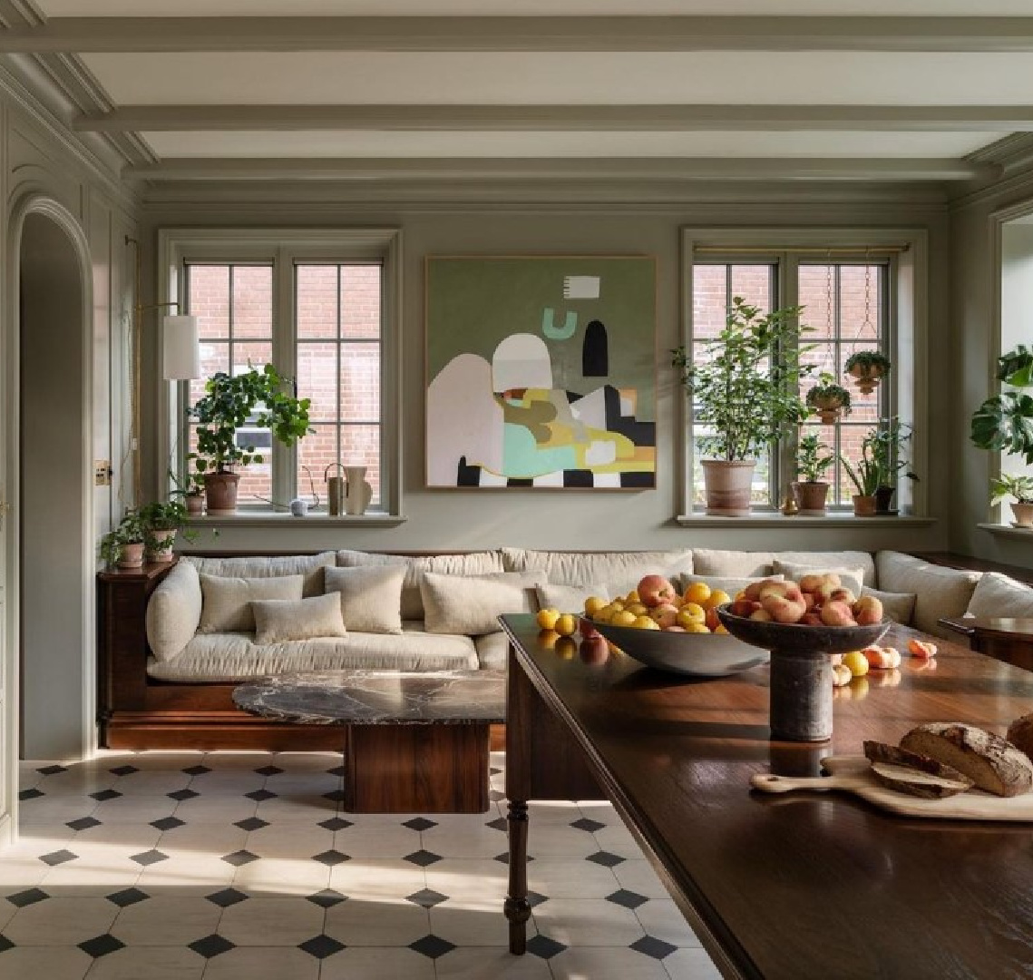
Progress, innovation (think urban and industrial references!), maturity (grey hair), and wisdom all seem to go along with gray.
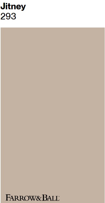
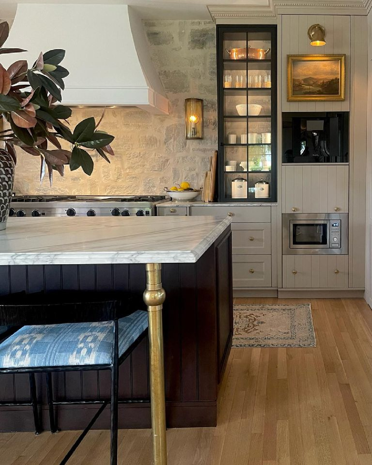
Farrow & Ball JITNEY
What’s interesting is that grey area is also “the unknown.” And I love the spiritual quality of grey.
As we age and grow in wisdom, we begin to realize how much mystery and unknown exists. In our unknowing and humility, we gain perspective and a new type of mature wisdom.
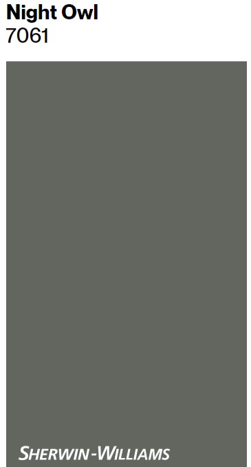
Sherwin Williams NIGHT OWL
No wonder that while a grey haze makes it tricky to get a clear picture, it also adds a spiritual layer of enlightened humility.
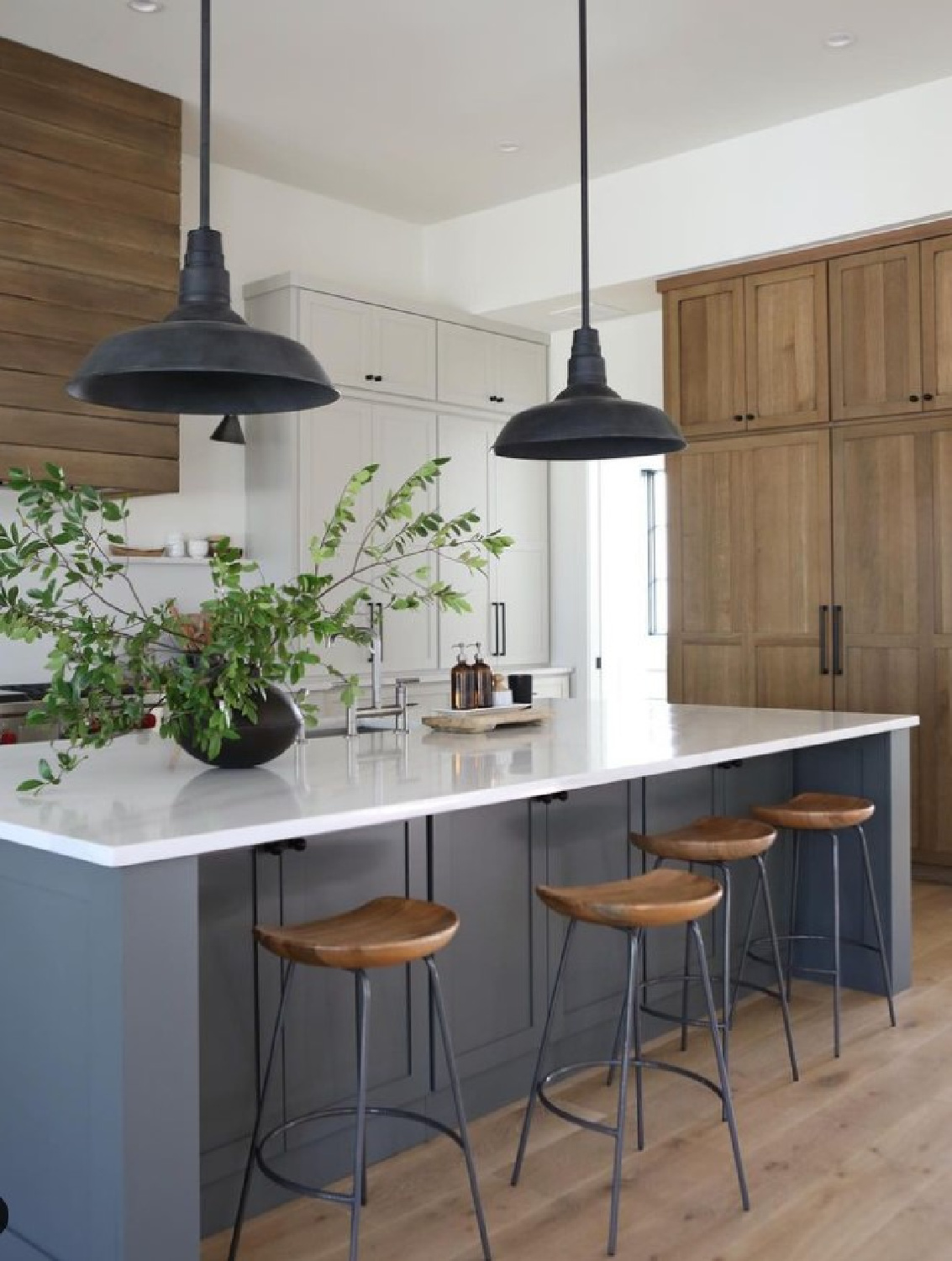
Humility?
Gray recedes and allows the other colors to come forward and capture attention. It’s a great equalizer, yes?
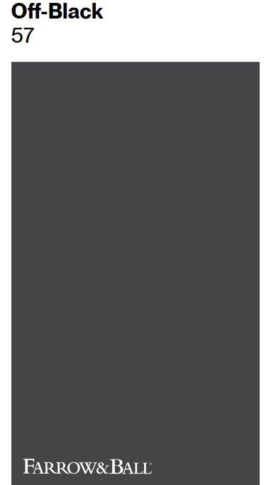
Farrow & Ball OFF-BLACK
But maybe you’re after a very rich dark charcoal that is nearly black.
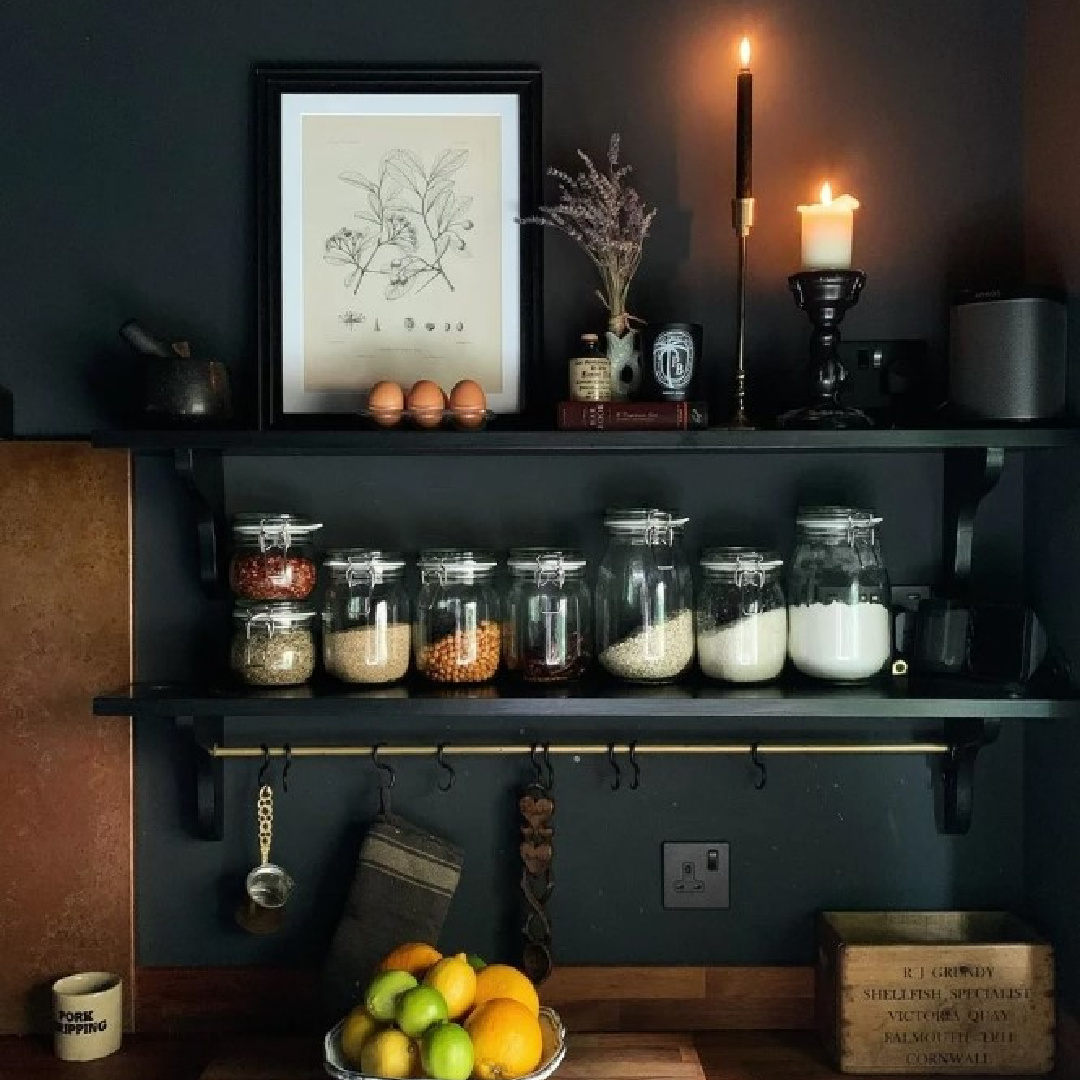
It’s interesting that so many timeless aspects of design are trending right now. Moody rooms, and even darkly moody interiors and finishes are quite popular at the moment.
Is it really all that surprising that such a trend developed in our culture with the challenges of the 2020s? There’s a seriousness, a weight, and a complexity involved in a moody atmosphere.
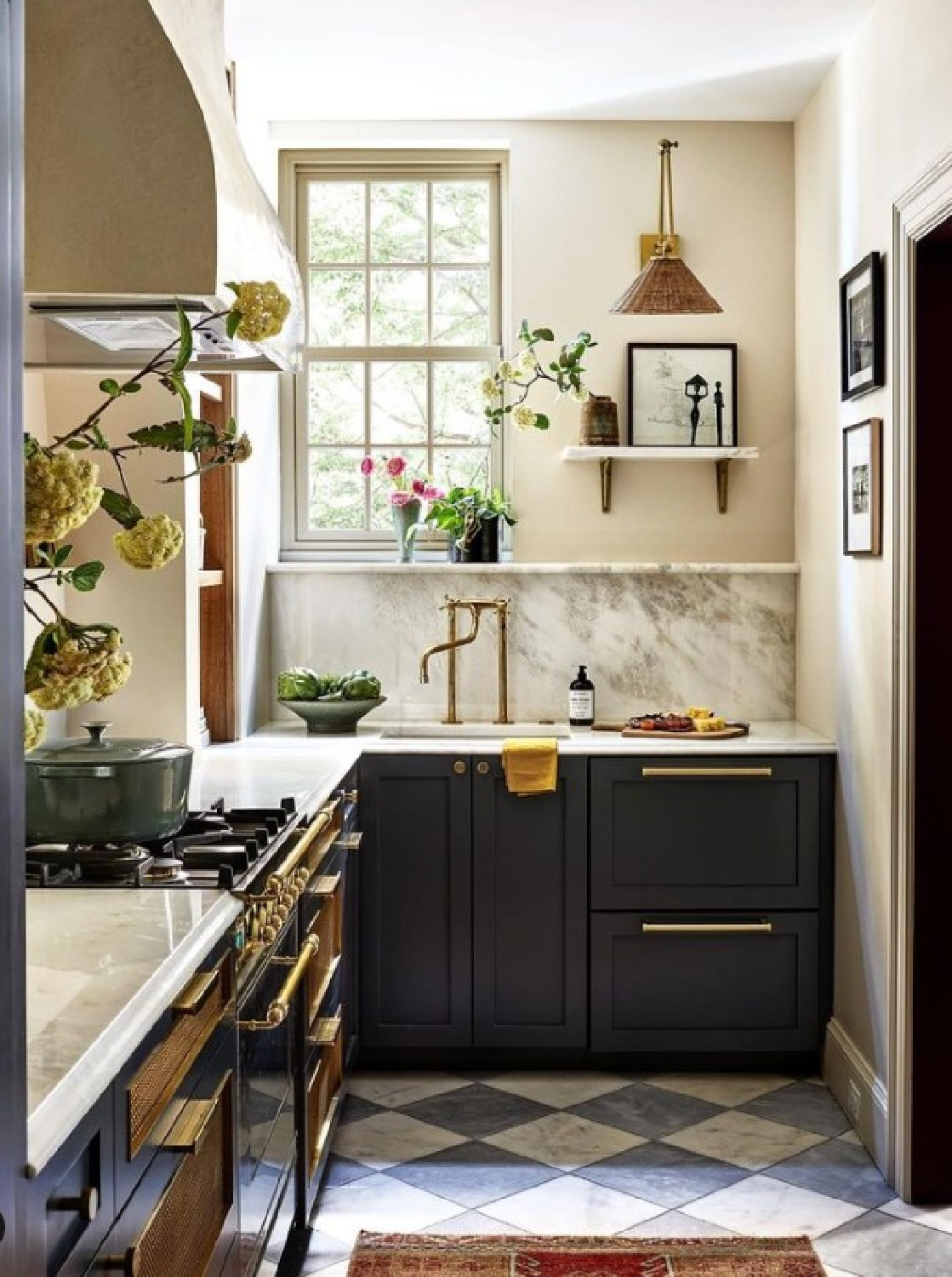
It takes a certain tolerance and a certain strength to endure melancholy times of depth.
And just in case you love the wall color…
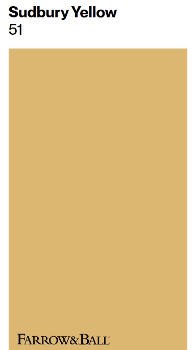
While there may be resistance or strides to deny the complexity and layers of deep meaning… can’t it all just be covered with sunny yellow:
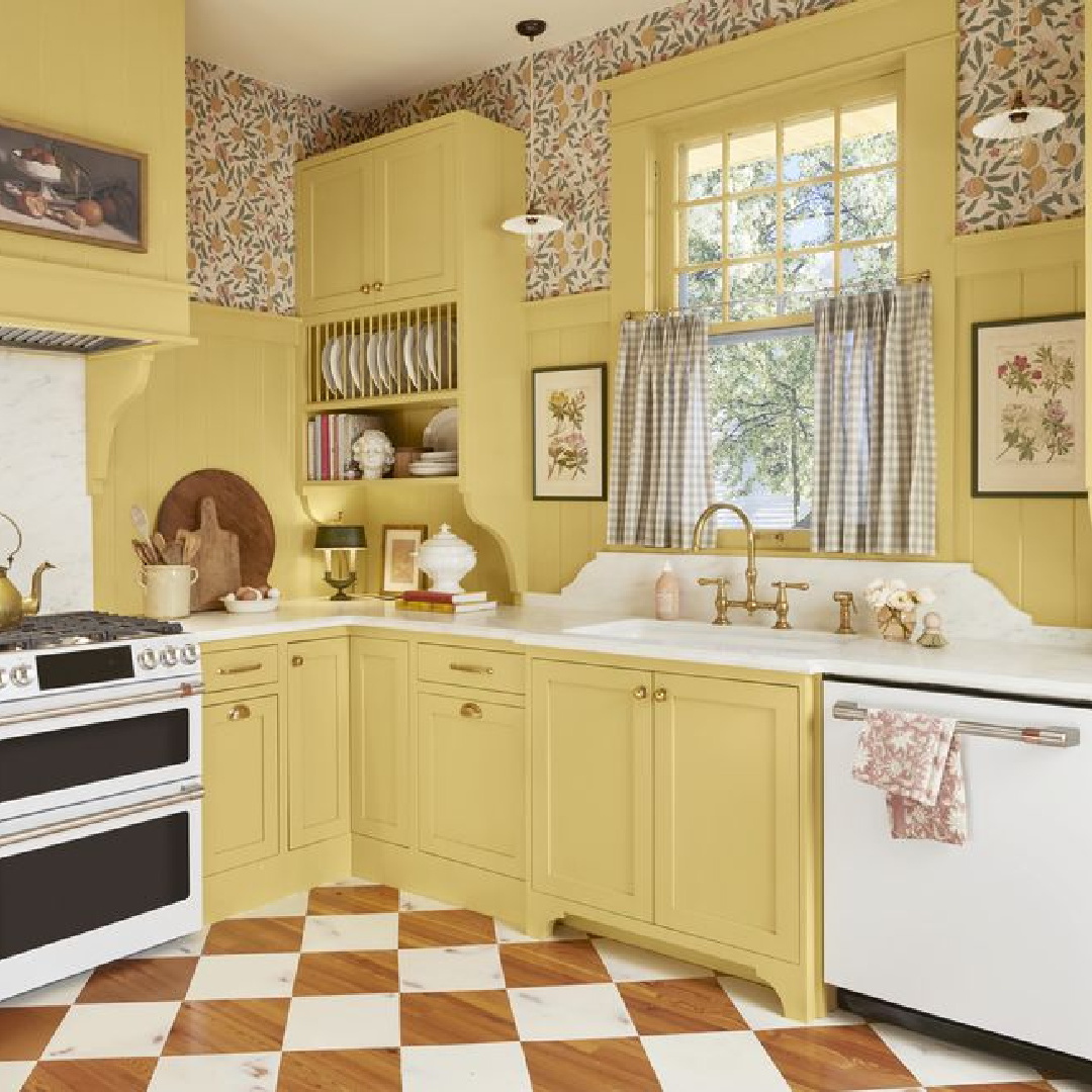
Yellow has its charms. Yet there’s an integrity, resilience, and flexibility that grey brings.
Find PART ONE of this post with beautiful green kitchen paint colors. Photos (unless otherwise noted): Country Living, where you can find even more ideas for kitchen color stories.
Peace to you right where you are.
-michele
I independently selected products in this post—if you buy from one of my links, I may earn a commission.
Thanks for shopping RIGHT HERE to keep decor inspiration flowing on Hello Lovely!
Hello Lovely is a participant in the Amazon Services LLC Associates Program, an affiliate advertising program designed to provide a means for sites to earn fees by linking to Amazon.com and affiliated sites.

