Not sure the idea of taking a risk with color in the kitchen is a popular one when remodeling or designing one from scratch. We want the timeless look of a kitchen to endure, and frequently, that involves safer neutrals. Yet timelessness also flows from natural elements. And some folks are more interested in pleasing themselves than being constrained by resale trends. If you look to nature, colors like those below exist with every color of the rainbow. If there’s a trick, it is knowing thyself. Choosing colors that set you at ease or inspire you to live large. Let’s peek at unexpected kitchen paint colors, and perhaps you’ll discover new-to-you colors to sample for your interiors.
Unexpected Kitchen Paint Colors: What’s That Color?
Overview of Gorgeous Atmospheric Green Kitchens
How does green make you feel, and does it make sense for your project? Green carries various psychological implications and influences from cultural, individual and contextual factors. We’ll chat about such matters as we discover exact green paint colors in an eclectic gallery.
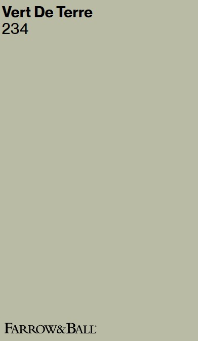
Farrow & Ball VERT DE TERRE 234
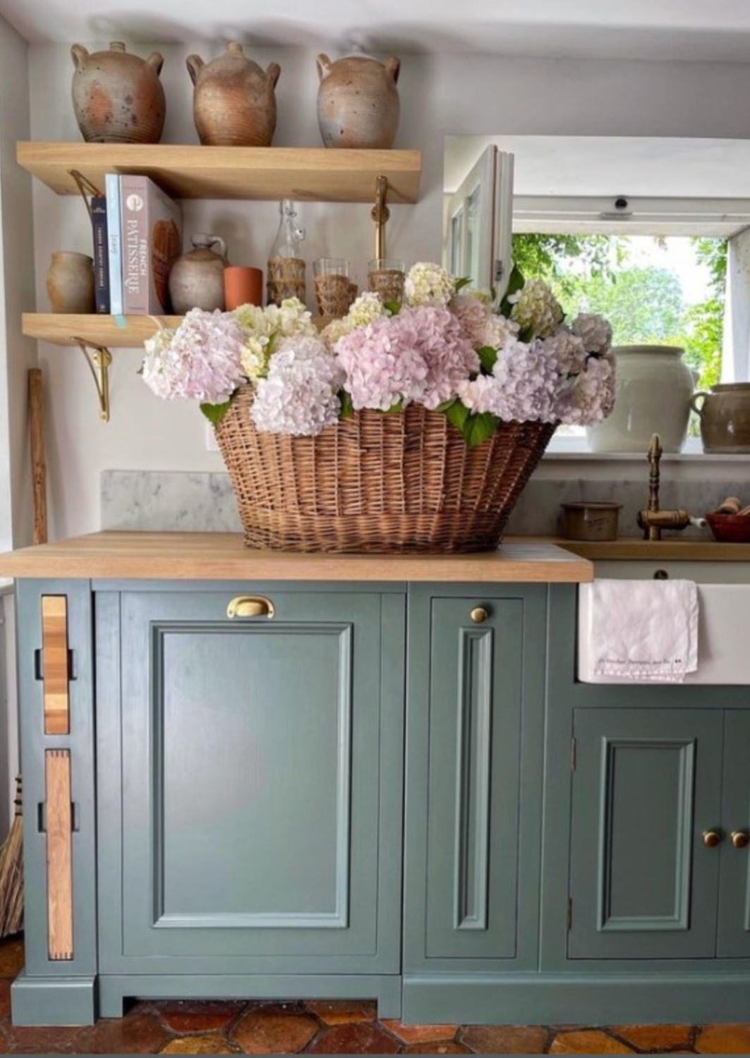
Nature and tranquility: Here’s a green strongly associated with nature and symbolizing growth, renewal, and vitality.
Vert de Terre is said to be a fresh and incredibly soft green reminiscent of the pigment Green Earth.
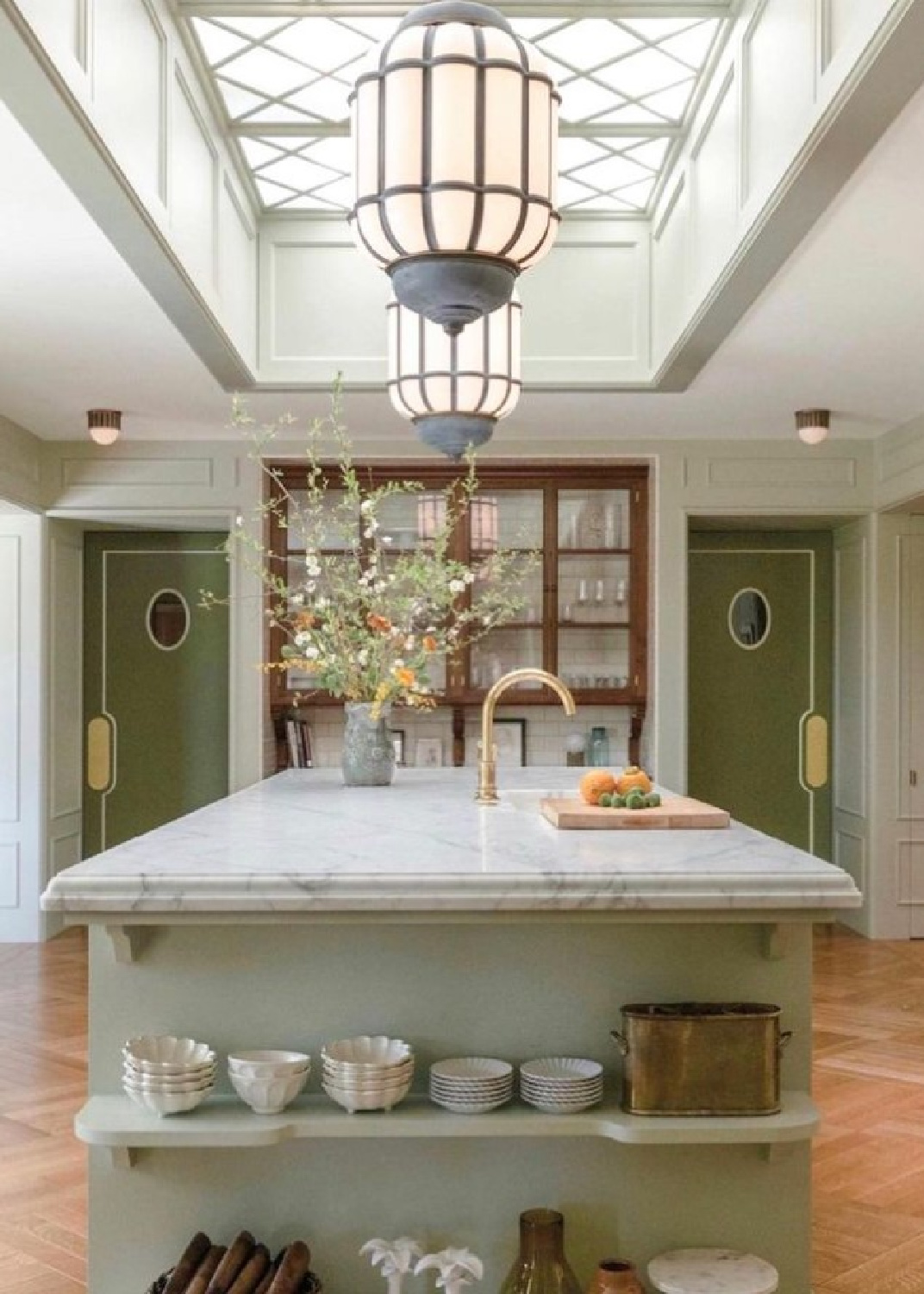
Leaves, chlorophyll, lush rolling hills, and nourishing nutrients. Exposure to green environments or simply the color green can calm the mind, reduce stress and promote relaxation.
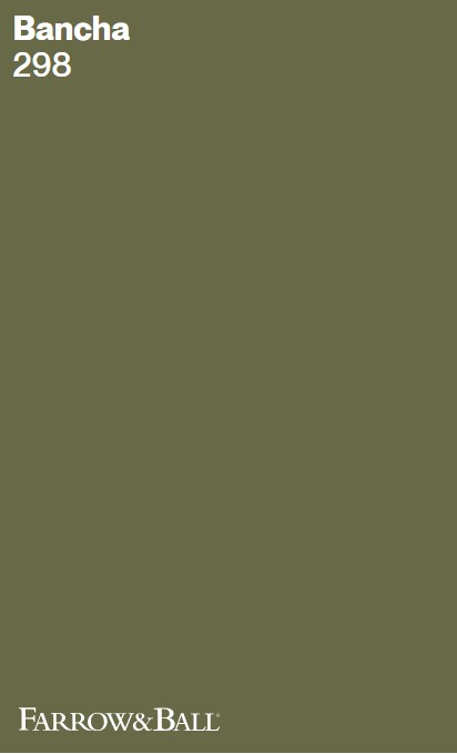
Farrow & Ball BANCHA 298
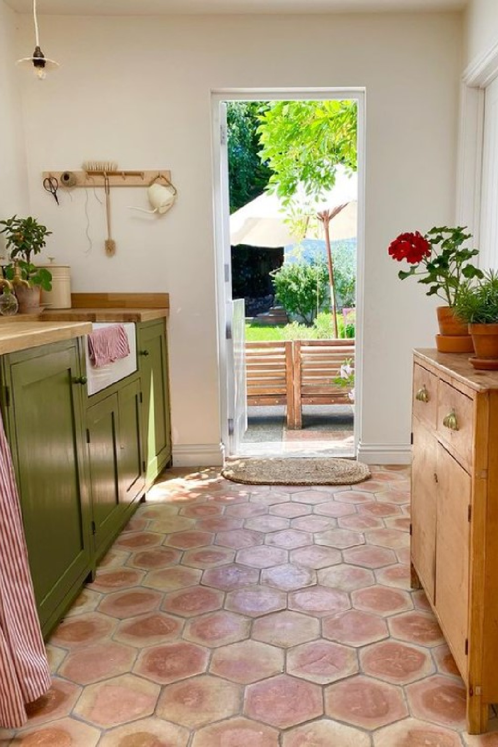
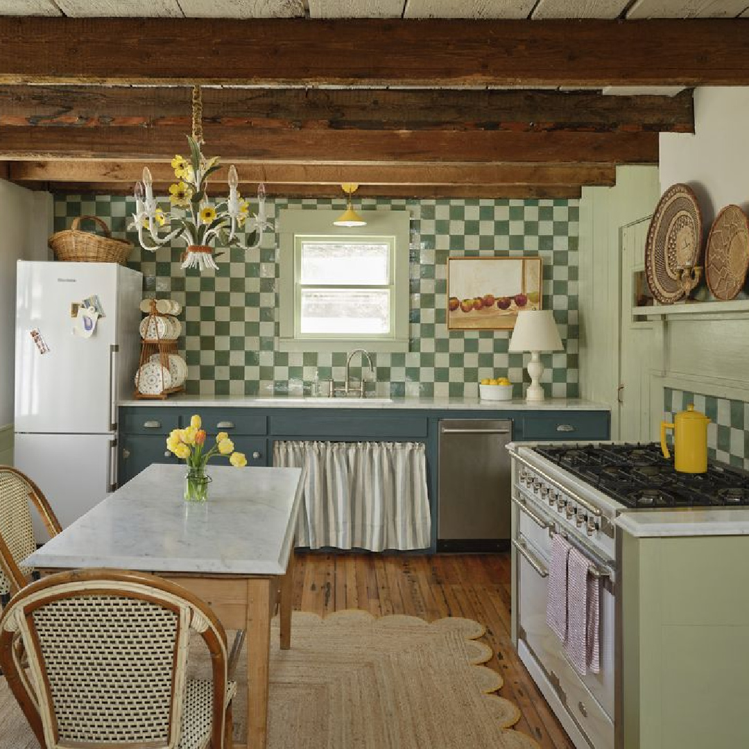
I’m not sure I would ever think to pair Vert de Terre with F&B Bancha, but that’s just what the designer did above.
This mid-century modern green is a darker version of the much loved Farrow & Ball color Olive. Named after Japanese tea leaves, it provides a sense of security. It has prominence in this gorgeous utility area below, and notice how it works with the terracotta hex tile.
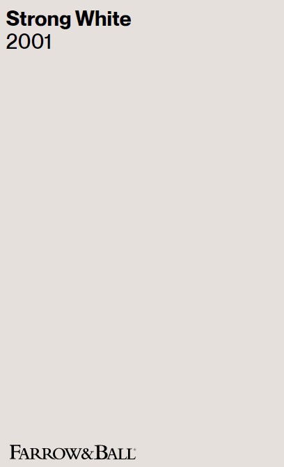
Just in case you need a suggestion for a neutral to use with Bancha (above):
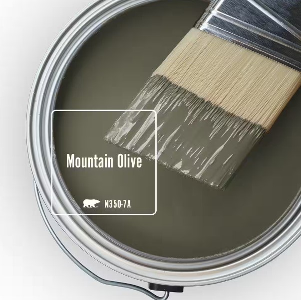
Behr MOUNTAIN OLIVE
Hope and optimism: Green is often linked with hope and optimism perhaps since it is associated with new growth in plants, spring, and promising fresh starts.
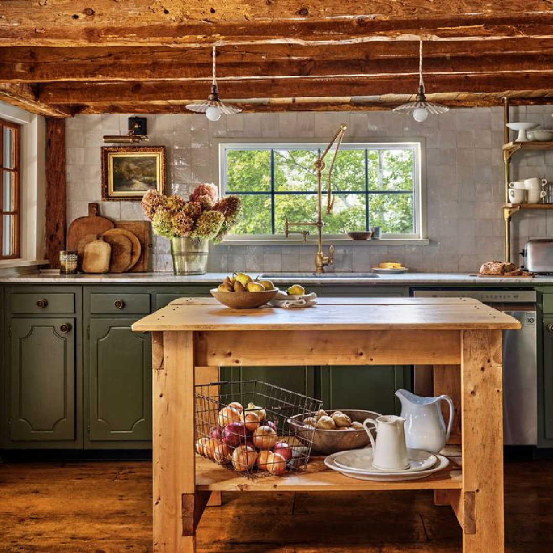
No wonder this evokes feelings of positivity and a sense of renewal. Green endures as a popular choice for those with a passion for the environment and wellness.
This association with nature also suggests feelings of harmony and balance.
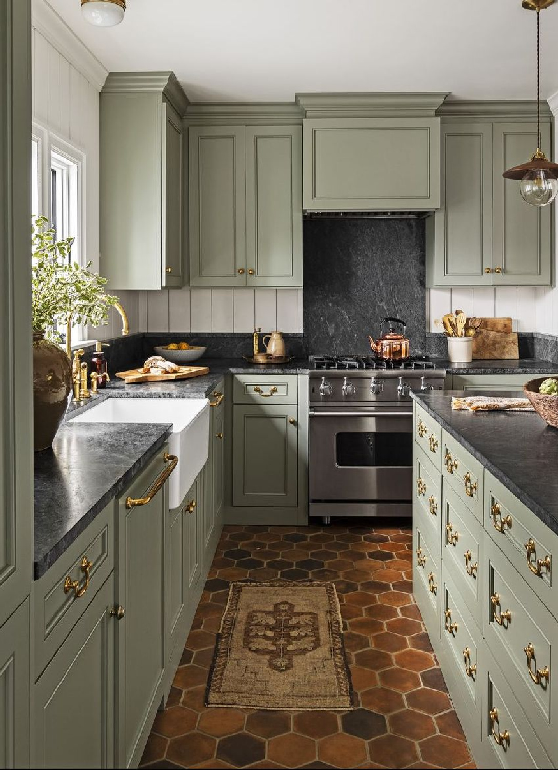
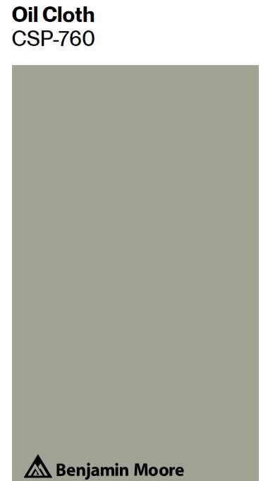
Benjamin Moore OIL CLOTH CSAP-760
BM says Oil Cloth was named this because “For years the old farmhouse table was covered by the cloth-protecting a found treasure underneath.”
I’m not sure I’m as fond of this paint color’s name as I am of the design dreamed into reality by Heidi Caillier above.
The thing is, we must acknowledge the color green may also sometimes be associated with envy. So many of these kitchens are enviable! The light reflectance (LRV) of Oil Cloth is 35.31.
Farrow & Ball PALM
Is a pale, fresh green calling? I lived with minty greens in the 90s when color was more my thing and my kids were young.
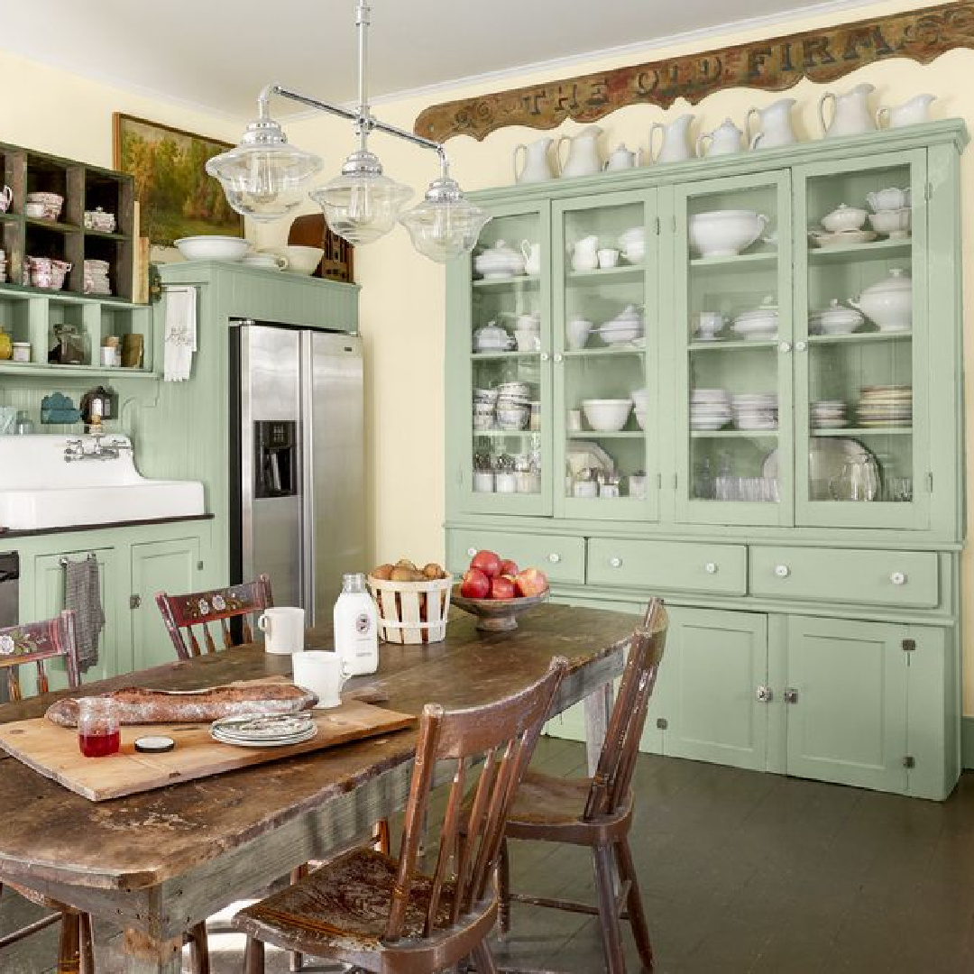
What’s special about this pale, fresh green?
Farrow & Ball say PALM is “a love letter to the iconic palms that dot the LA skyline. It has a desaturated quality, as if always being seen in the clear, bright light characteristic of California.”
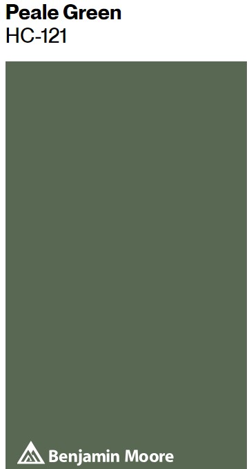
Benjamin Moore PEALE GREEN HC-121
Health and healing: Green is commonly associated with health and healing, possibly because of its connection to nature and the idea of growth and renewal.
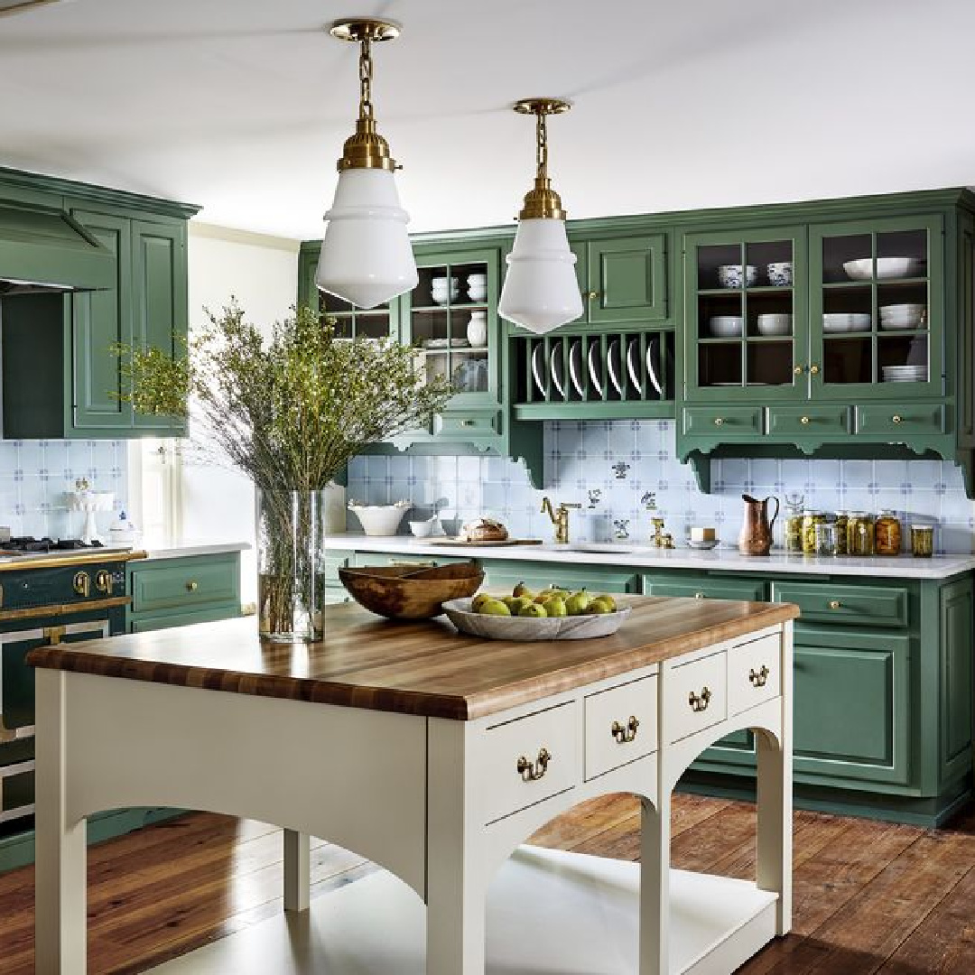
Hospitals and healthcare facilities often use green in their decor to create a sense of calm and well-being. Love a deep elegant green like this earthy classic forest green with an LRV of 14.15?
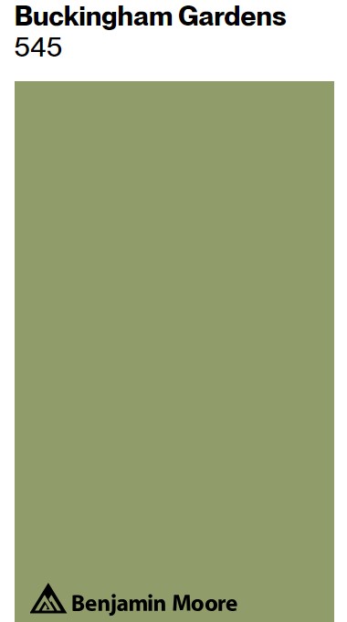
Benjamin Moore BUCKINGHAM GARDENS
Money and wealth: In many cultures, green is associated with money and wealth, likely due to its historical connection with fertile land and abundance. I’m not sure what “Buckingham” brings to mind, but I automatically think of royalty and wealth.
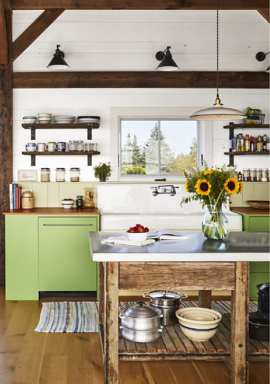
Isn’t this green rather unexpected as a kitchen color above? This association can evoke feelings of prosperity, success, and ambition in addition to nature.
Do you ever see a green like this and think maybe for a velvet pillow but not for an expanse of cabinets? I think the context, the owner’s personality and interests, and past experiences deeply influence our tolerance.
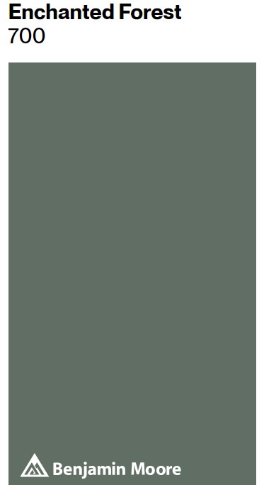
Benjamin Moore ENCHANTED FOREST
With a light reflectance value of 15.96, Enchanted Forest is said to be distinguished by a gray cast. It’s not shy at all as a deep and darkly moody green.
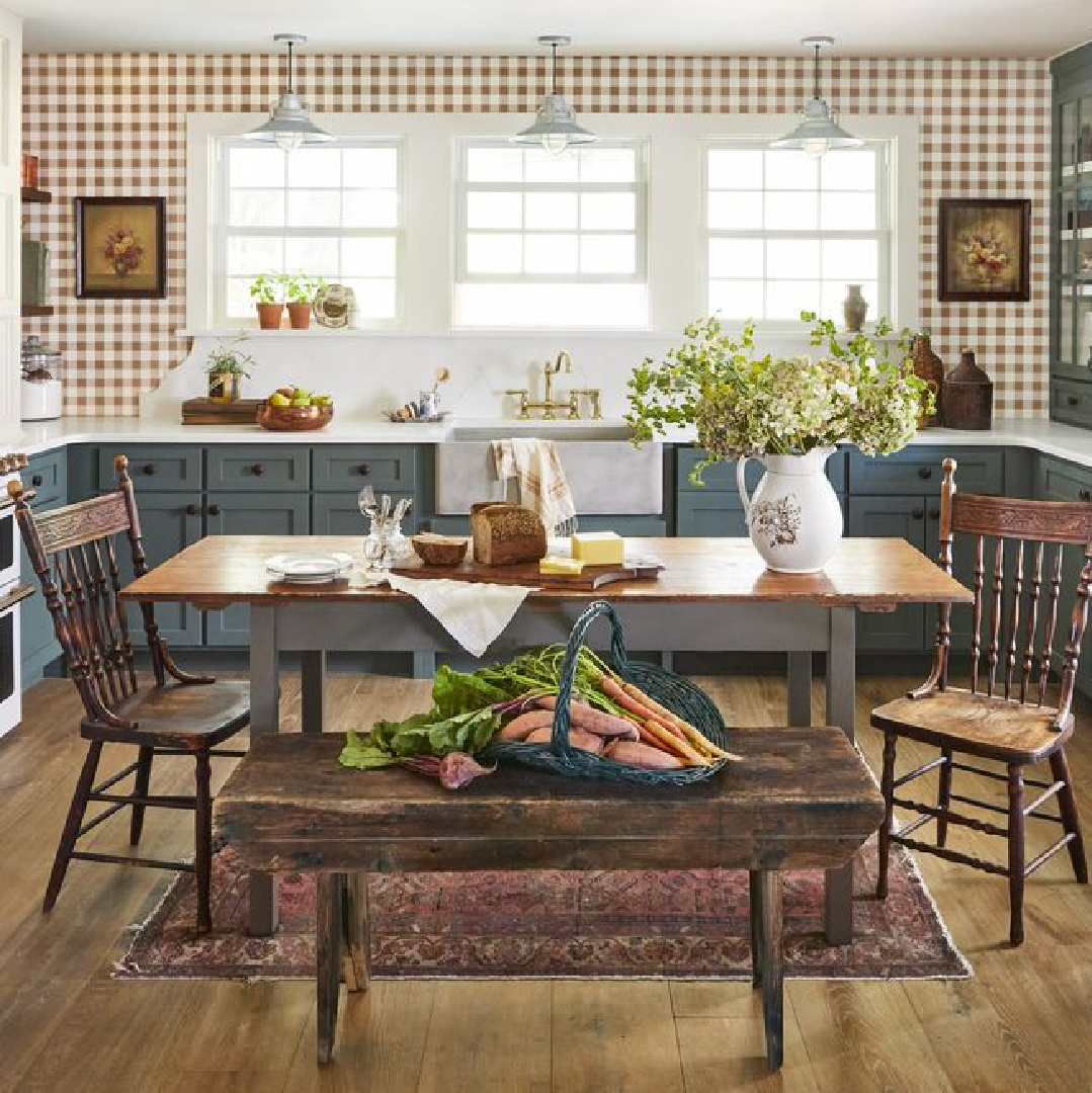
Additionally, Benjamin Moore says this dark green brings to mind a magical, mist-covered forest.
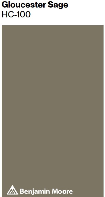
Benjamin Moore GLOUCESTER SAGE HC-100
Balance and harmony: Green is situated in the middle of the visible spectrum, making it a color of balance.
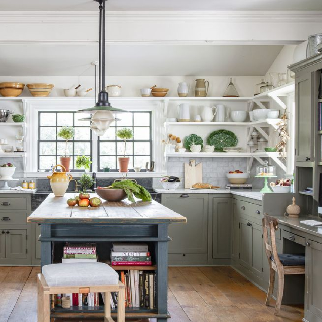
It can promote feelings of stability and harmony, both emotionally and psychologically. In color therapy, green is sometimes used to restore balance and promote emotional healing.
Gloucester Sage is called “An adaptable dark hue that can conjure rain-soaked moss to elegant wrought iron.” If you haven’t before sampled dark colors with complex undertones, you may think this is a bit dramatic as descriptions of green go. But trust me, when you interact with the color up close, you’ll get it.
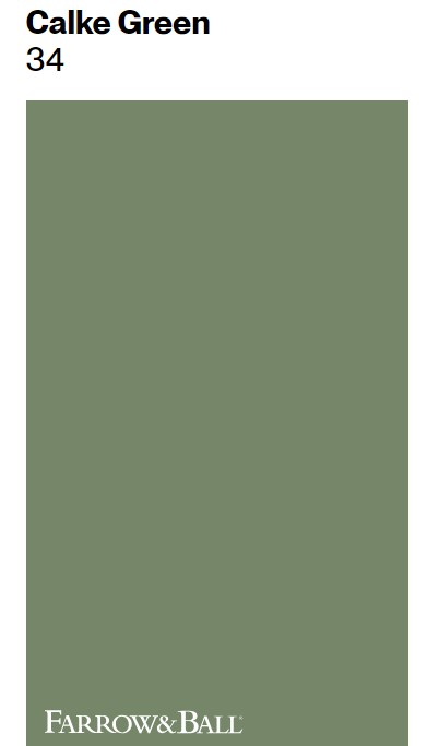
Farrow & Ball CALKE GREEN
F&B says “This rich dark green is a cleaner version of a color originally found in the Breakfast Room at Calke Abbey.”
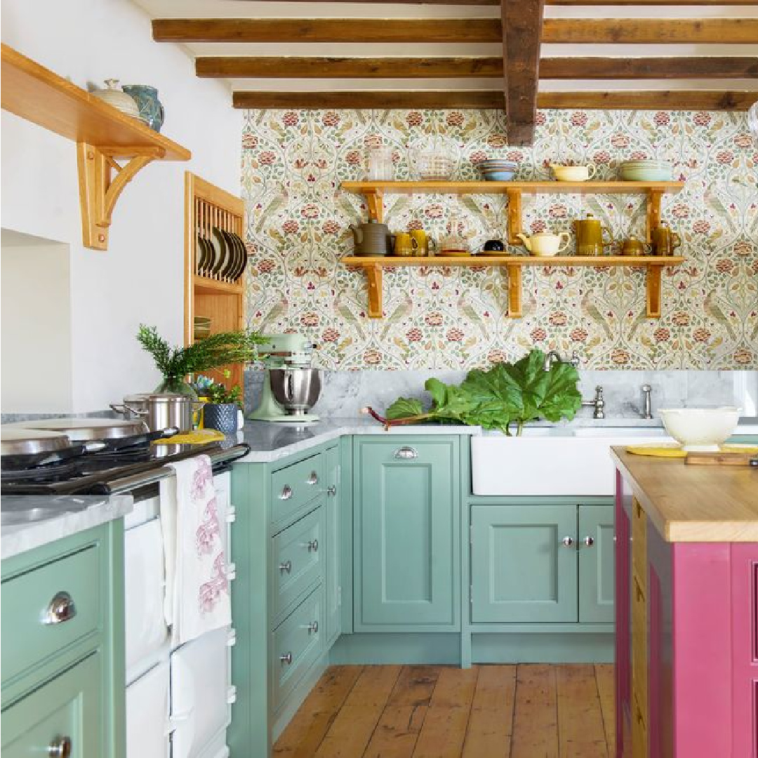
Try Calke Green with Old White for trim and Lime White for accents. Do you like it with the reddish island above?
Overall, the psychological implications of the color green are diverse and can vary widely depending on context, individual experiences, and cultural influences. By this point in the post, I be you have developed some opinions about these various greens.
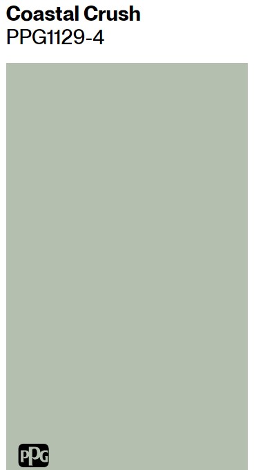
PPG COASTAL CRUSH
Have you noticed how the color swatch often looks different than the green kitchen cabinets in the photo due to the presence of natural light?
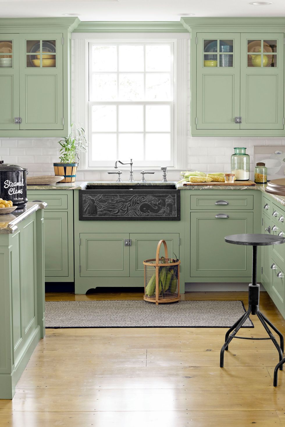
Just another reason to sample plenty of colors and watch how they interact with light throughout the day.
Photos above (unless otherwise noted): Country Living. Ready for Part 2 with blues and grays? Yay, GO HERE.
Tour This Green Kitchen
This kitchen was inspired by a deep green rainforest, and that’s intriguing in itself. But what if I told you the home is a 290 square foot apartment in an art deco building!?! Green plays a starring role!
We’ll continue the blue and gray kitchen paint colors in a separate post, and I’d love to hear your thoughts about green or green kitchen cabinets!
Peace to you right where you are.
-michele
I independently selected products in this post—if you buy from one of my links, I may earn a commission.
Thanks for shopping RIGHT HERE to keep decor inspiration flowing on Hello Lovely!
Hello Lovely is a participant in the Amazon Services LLC Associates Program, an affiliate advertising program designed to provide a means for sites to earn fees by linking to Amazon.com and affiliated sites.
