It’s one thing to agonize over a light neutral paint color for your walls, doors, or cabinets and quite another to consider a mid-tone, deep, dark, or moody blue. This post will provide insight for just right, sophisticated blue and gray paints to sample. Darker tones are not the easiest to cover when you get it wrong…all the more reason to take time to discern which color will best suit your project. We’ll explore a handful of possibilities for deep and moody blues and gray. And by all means, sample different values of the color you’re after to confirm it looks great within your unique lighting situation.
I independently selected products in this post—if you buy from one of my links, I may earn a commission.
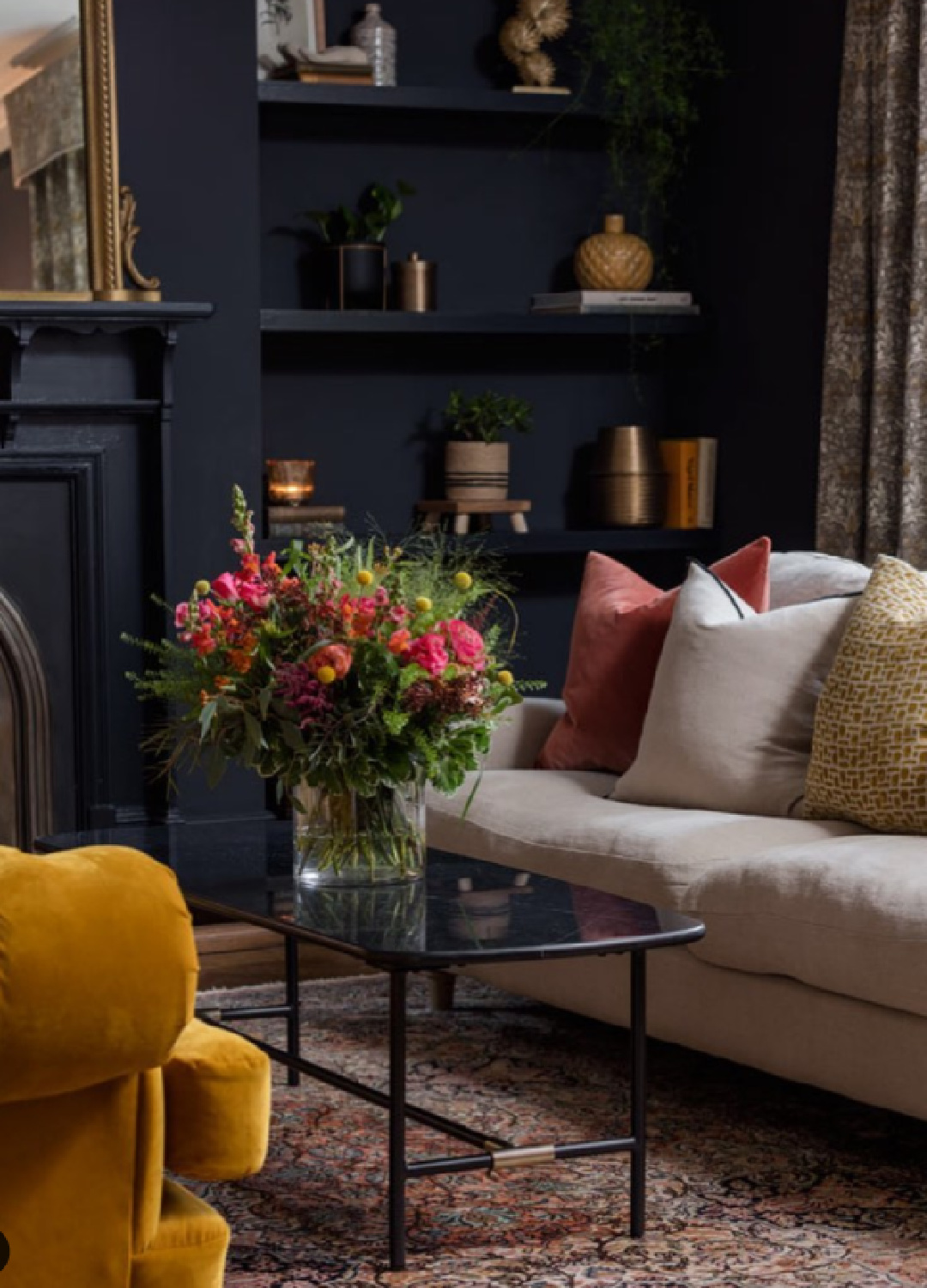
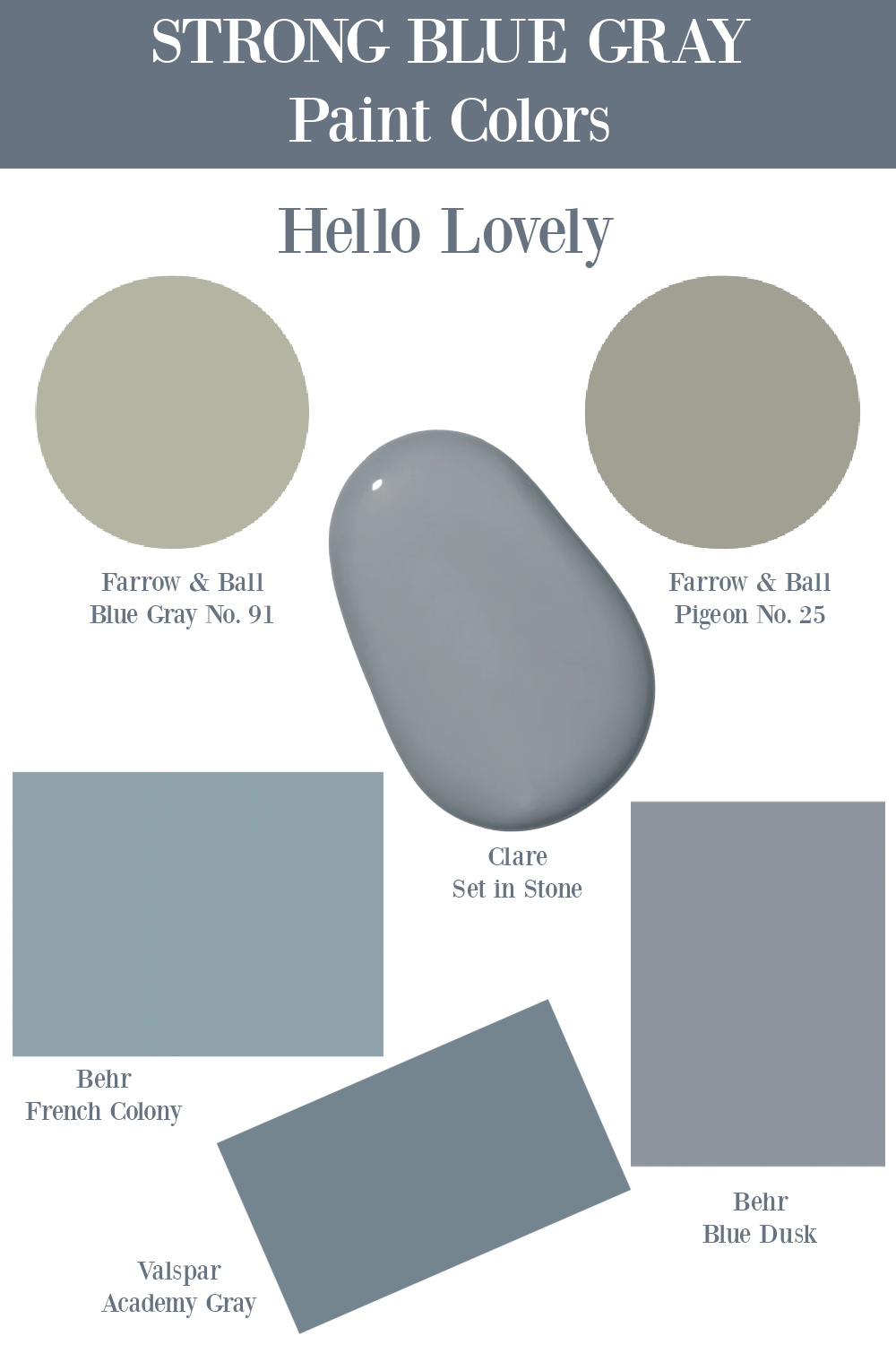
Best Moody Blue and Gray Paints
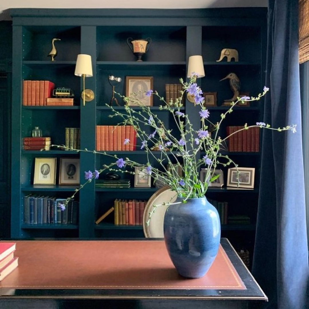
We’ll start with one of my favorite moody blue and gray paints which can look very marine blue in certain environments and more navy in others. I shared a video recently of Karen Mooney’s home tour, and if you skip toward the end where the homeowner shows off her gorgeous renovated basement, I’m thinking the walls are Hague Blue 30.
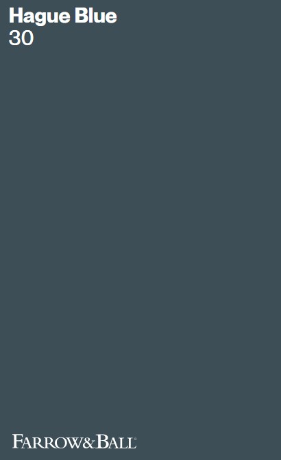
Farrow & Ball HAGUE BLUE 30
Don’t you love those evocative and mysterious blue, blue-green, and blue-gray hues that are hard to describe and pin down?
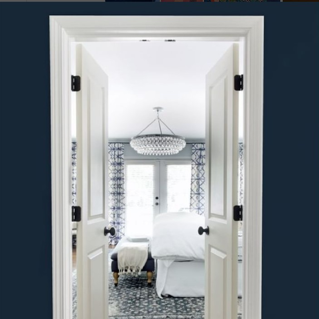
With abundant natural light, my oh my, this moody blue changes:
Without the yellow of sunlight, you get a different effect:
“This strong blue takes its name from the fantastically coloured woodwork much used by the Dutch, and still works wonderfully to ground skirtings or as an accent colour on the walls when teamed with Borrowed Light. The green undertones of this timeless, deep and dramatic blue means it sits as happily outside as it does in small dark rooms.” – Farrow & Ball
Those green undertones mean the color feels like a rich teal.
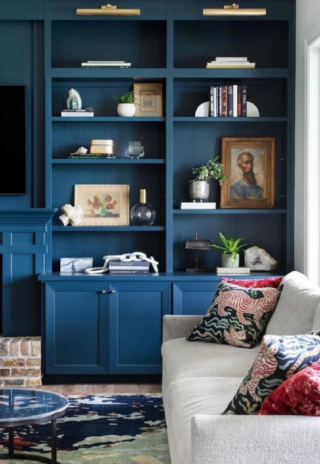
Yet it is more of a blue-teal, wouldn’t you say?
So what makes a color feel moody anyway?
“Dark shades offer a sense of drama and create movement through a house by encouraging exploration from rooms that are lighter shades.
If you spend most of your day in a light, bright space, a dark-painted room can feel especially rich and enveloping. The right dark color can feel equally cool and refreshing in the summer and cozy and warm in the winter.
Our preference is often to paint both the walls and the trim the same shades, with a more matte finish on the walls and more sheen on the trim. Dark shades also look spectacular on cabinetry, and wear a little easier than lighter colors.” – YOND INTERIORS
Resources for a Tranquil Blue Interiors
Farrow & Ball PIGEON 25
What a sophisticated and slightly mysterious color Pigeon is!
It can look so very different depending on the image you spy online!
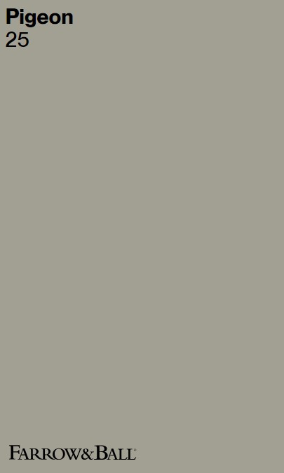
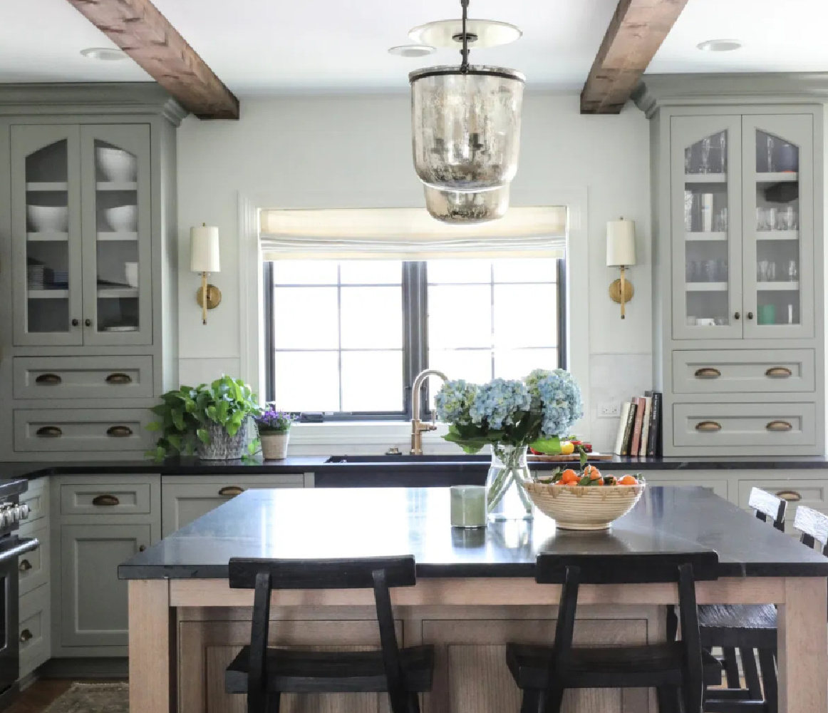
It was this kitchen by Park and Oak with F&B Pigeon that piqued my interest. Yet I was shocked when I viewed the swatch of Pigeon which conveys rather brown on my computer screen.
Lighting and sampling can’t be underestimated!
Here’s what Farrow & Ball say of the color:
“This cosy and nostalgic blue grey is named after the colour of the bird often sighted around the London landscape. Softer and bluer than more contemporary grey shades like Mole’s Breath, Pigeon is particularly suited for use in boot rooms, cloakrooms or darker spaces like studies and panelled rooms.
It is also incredibly popular on kitchen islands with the more delicate Dimpse on units.” – FARROW & BALL
It reminds me of Benjamin Moore Cloudy Sky 2122-30 which you’ll see further ahead in this post.
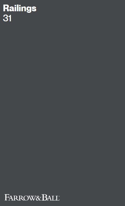
Farrow & Ball Railings
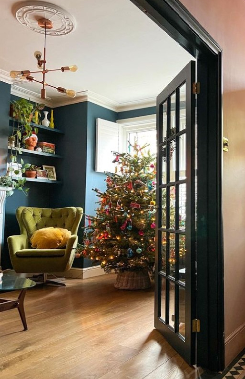
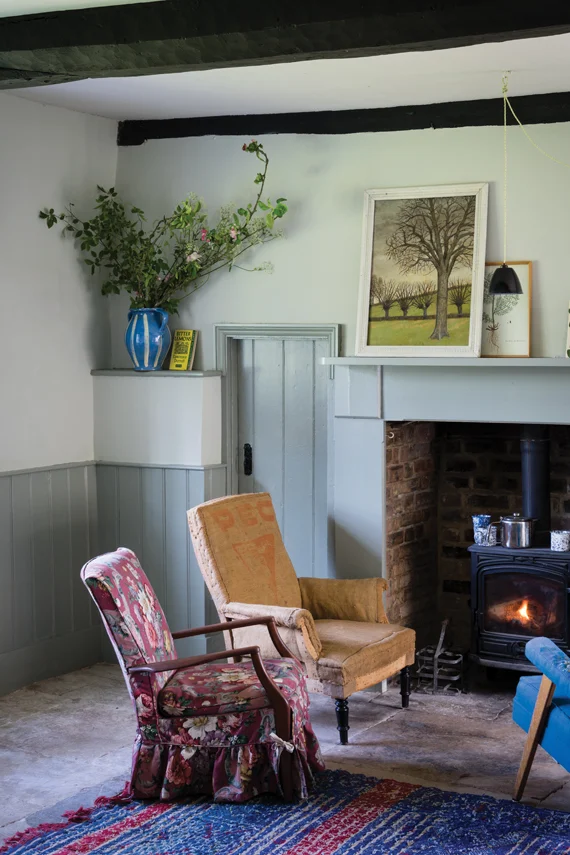
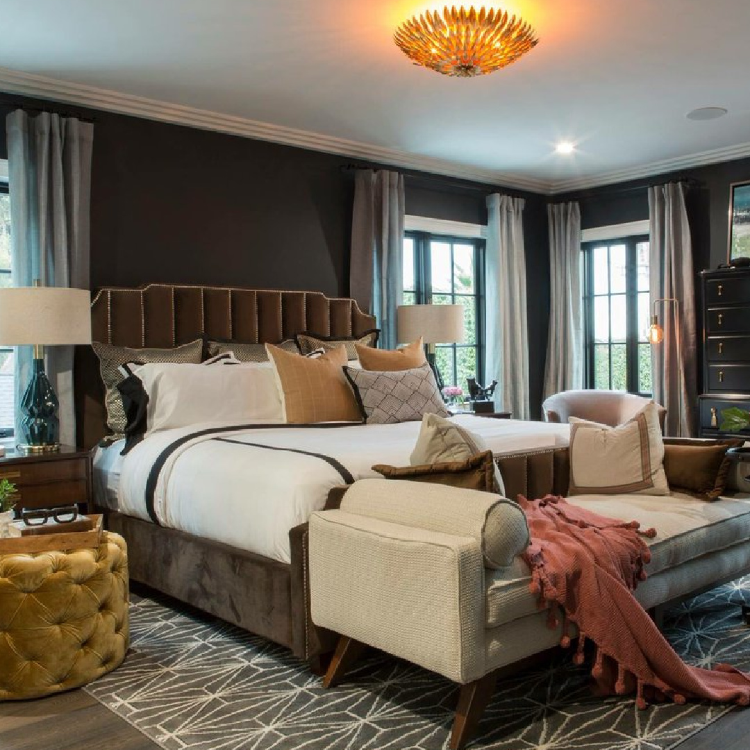
Sometimes you need an ultra moody dark blue-black like Railings.
Railings is a paint I sampled for our front doors and staircase hand rail here at the Georgian.
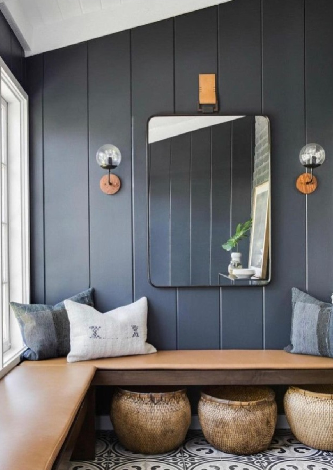
What was surprising about the color was it appeared to be a deep charcoal or even soft black until I sampled it with similar colors.
In my space, the blue undertones came through. When you read the description of Railings, Farrow & Ball state:
“More blue than black, Railings is a softer alternative to black which is particularly suited to the ironwork it takes its name from.
When used in Full Gloss on front doors it creates a handsome and commanding entrance, but becomes much more relaxed in feel in our Estate Eggshell finish.
The bluer undertones of this dark hue transform rooms into dramatic and enveloping interior spaces.” – FARROW & BALL
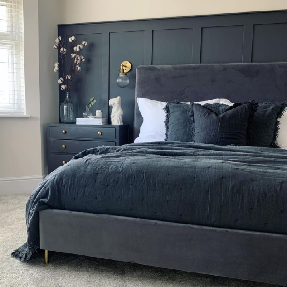
In fact, when you see Railings paired with deep blue teal velvet bedding (above), those blue undertones truly can be appreciated.
Yet Railings can often look like black in photos online. All the more reason to see it in person as I did and SAMPLE SAMPLE SAMPLE!
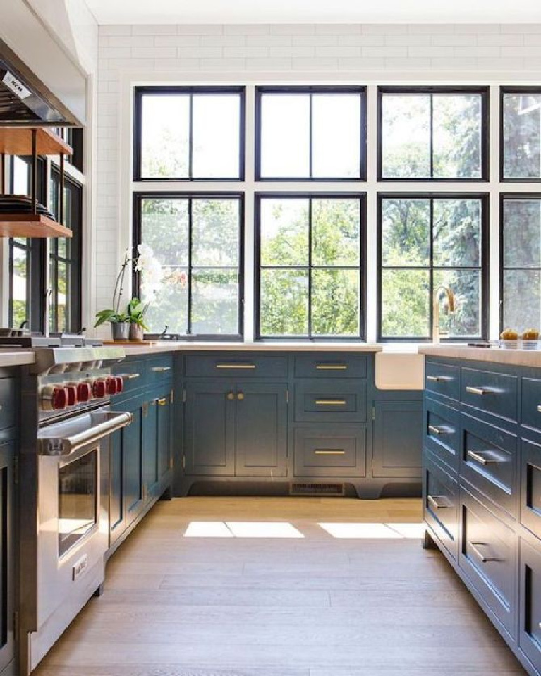
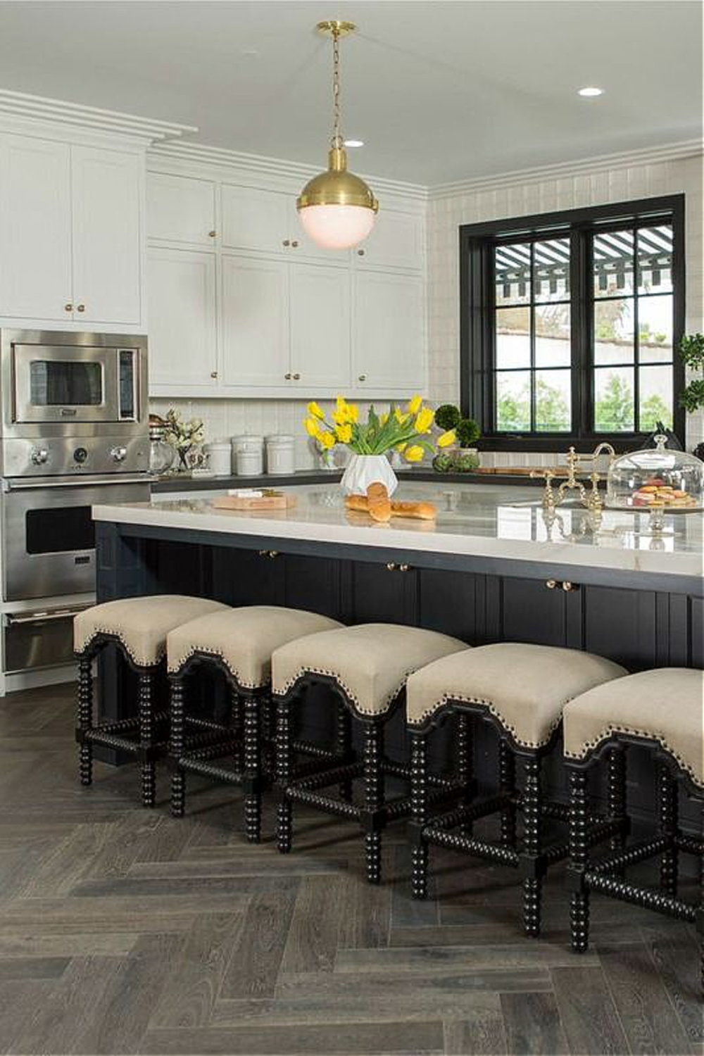
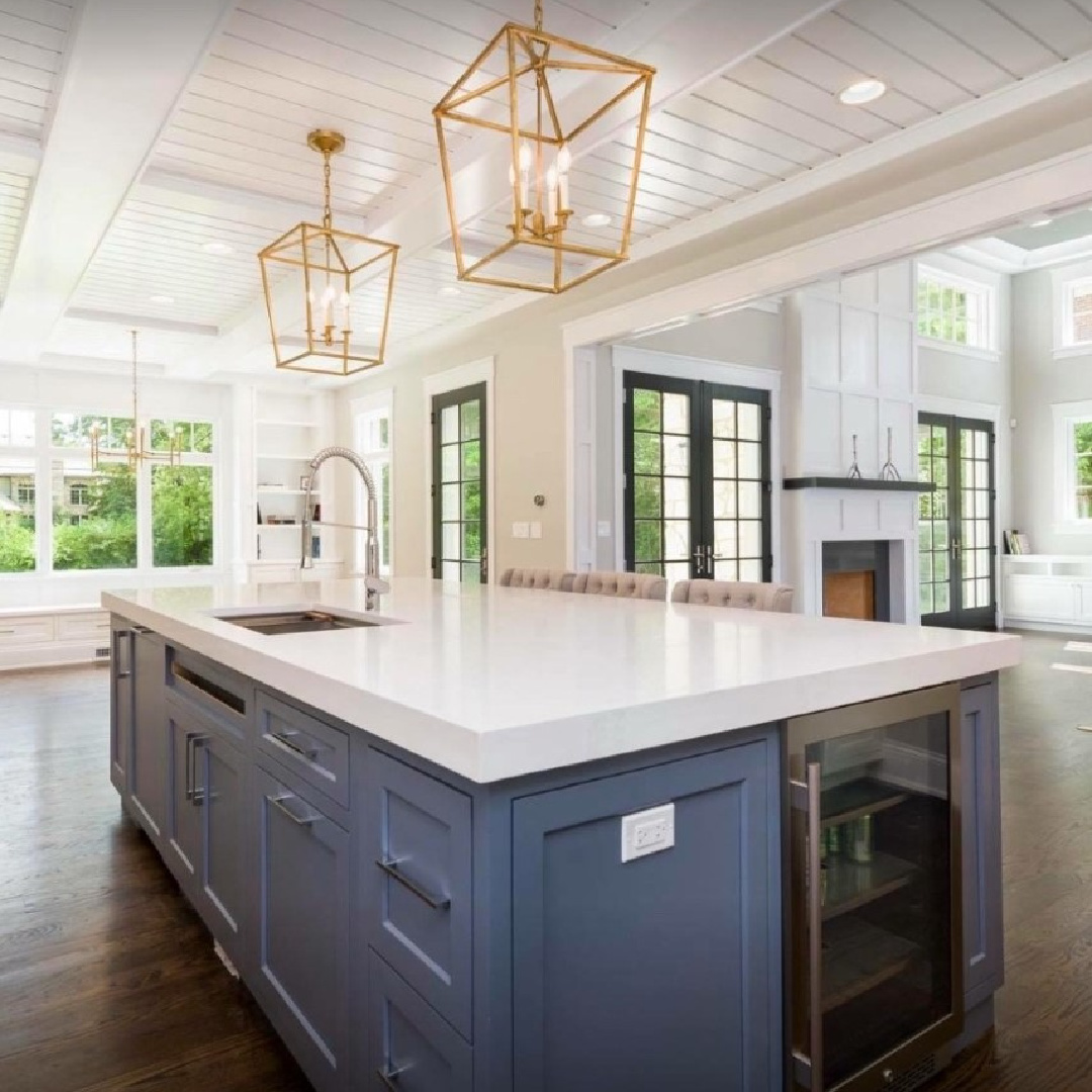
We tend to see dark moody blues and blacks used in more modern kitchens so it is enlightening and refreshing to see it used traditionally. Take a tour of an amazing designer’s home (Liz Caan!) who chose strong blue-gray paint for kitchen cabinets. Bet you’ll soon feel inspired!
Right!?!
But what if you like your moody more medium and less dark. Maybe a moody gray is what you’re after.
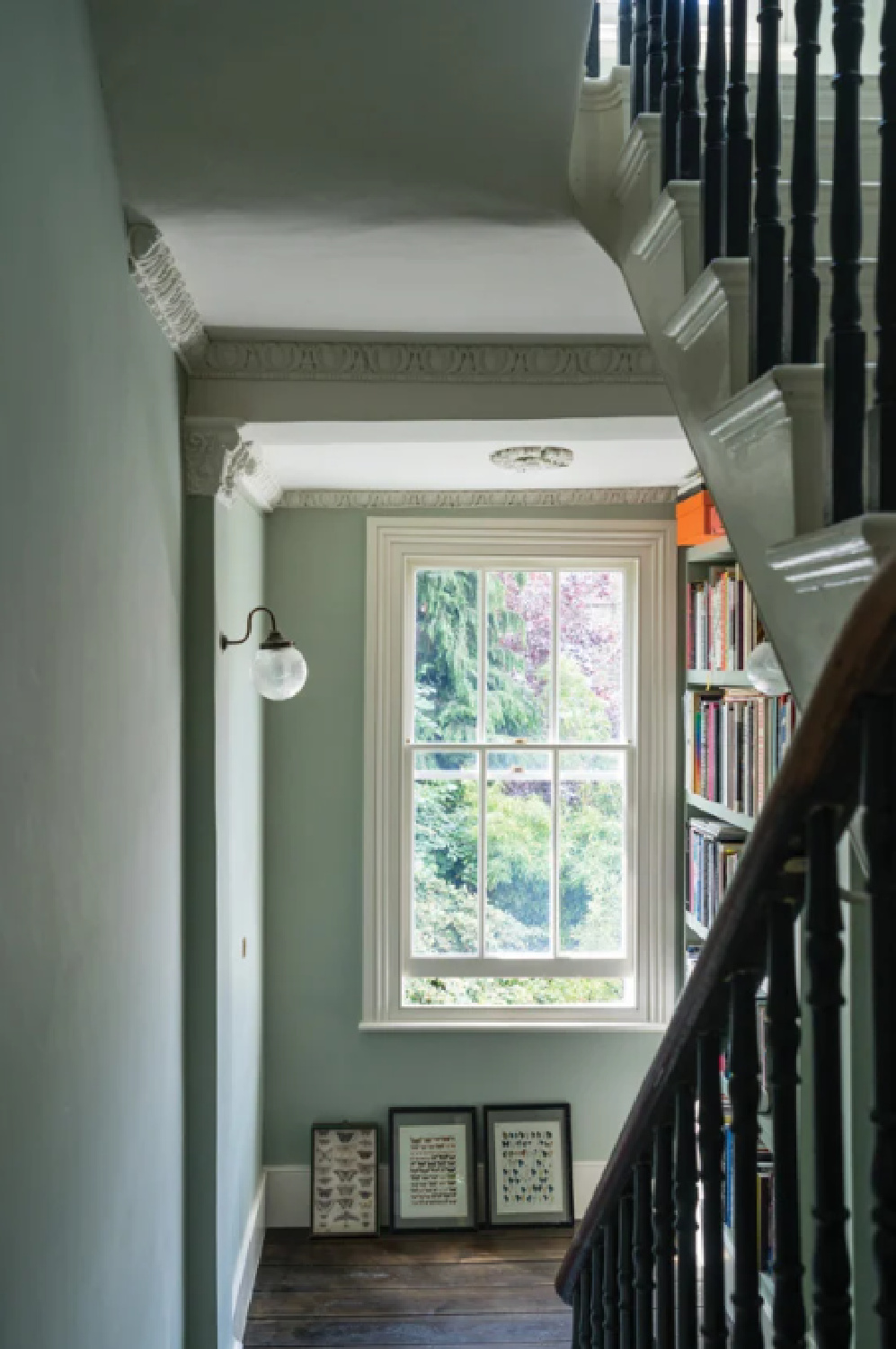
Farrow & Ball Blue Gray No. 91
When I consider the look of the swatch as it appears here on the screen…
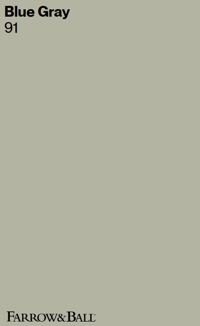
I see a very neutral warm greige or taupe. So it’s surprising that when you read the description from F&B about the color you learn:
“With its subtle mix of blue, green and black pigments, Blue Gray creates the most relaxed of rooms that feel as if they have always been there. It is a cooler, more weathered version of French Gray and has the almost magical quality of gently shifting between blue and grey depending on the light and time of day.” – FARROW & BALL
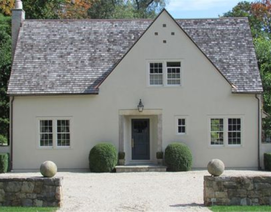
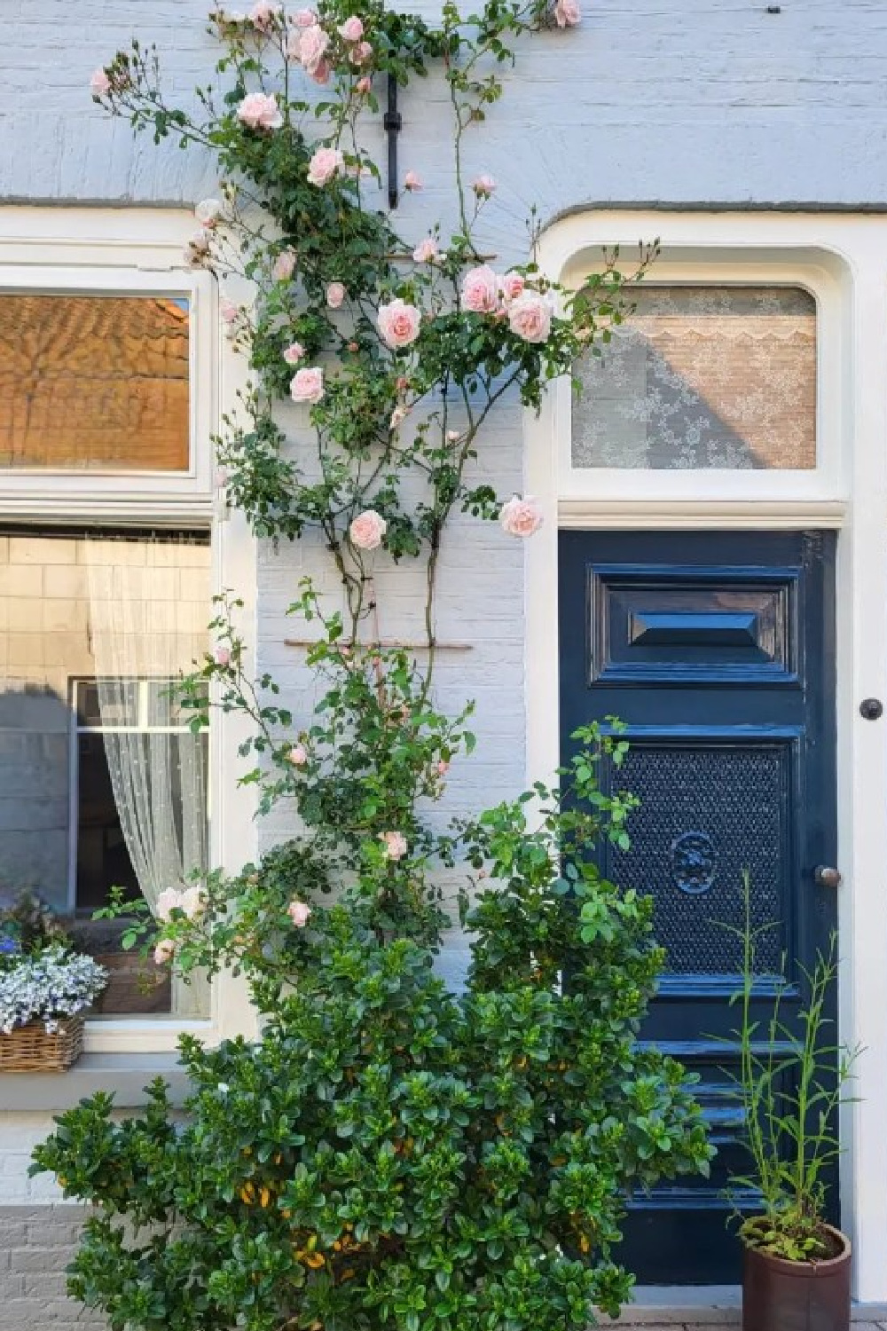
It is actually a cooler color! I suppose all things are relative. It is cool when compared to F&B French Gray. It truly looks lovely with the stone and surrounding nature above on my friend Loi’s door (above).

If you like the green cast in the gray of this hue, also consider Sherwin Williams Acacia Haze 9132:

It is always helpful to see how the color conveys in various regions where the light conditions vary.
Obviously, yellow sunlight is going to affect the color which can read more green with ample light.
Benjamin Moore Cloudy Sky 2122-30
Cloudy Sky (Benjamin Moore 2122-30) is infused with steely blue-green undertones and captures the moody, romantic ambiance of a rainy day.
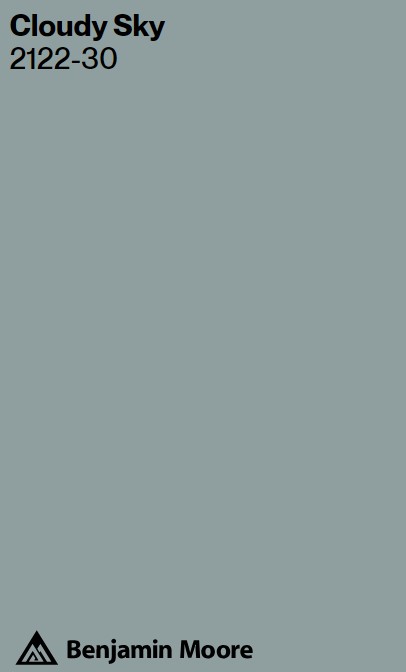
Isn’t it richly dark and velvety?
Moody in naturally lovely ways, notice how Cloudy Sky varies in appearance depending on the strength of the light exposure (above and below).
So much more washed out by the sunlight on the home above, yes?
In more dim lighting situations, I think the moodiness increases. Don’t you love those colors that are difficult to describe? They tend to be atmospheric and calming but don’t shout “blue” or “gray.”

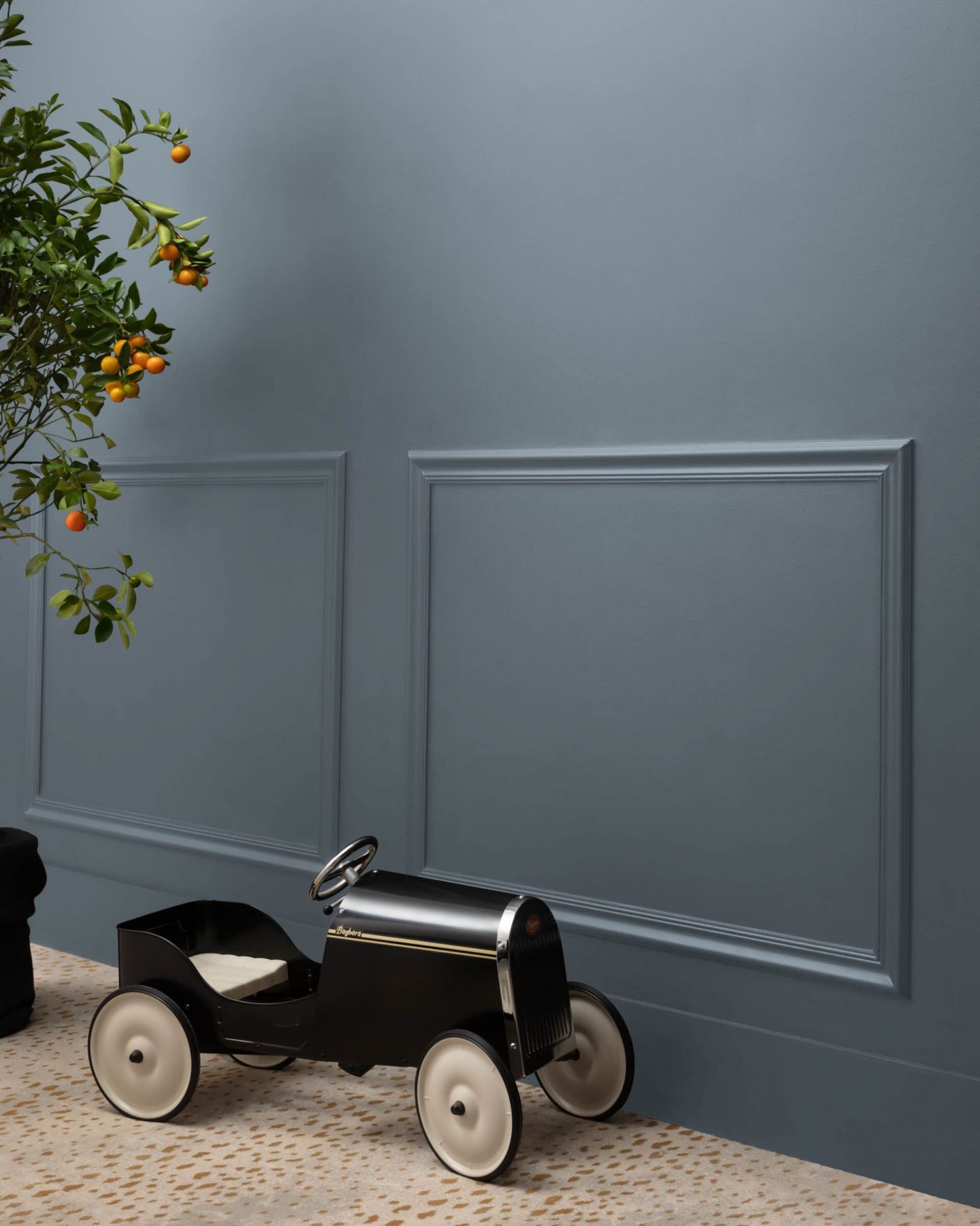
Clare Paint – Set in Stone
This strong and moody blue-gray caught my eye when I spotted it here on closet doors:
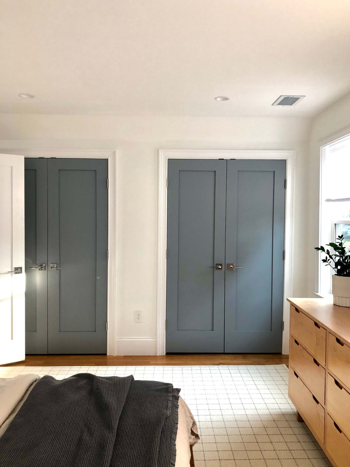
Isn’t that a brilliant use for a moody blue or moody gray color when you love the color but aren’t sure about committing to changing every bit of trim?
Set in Stone may read slightly purple in your space which is why your purchase of a sample pot, color swatch, or stick paint samples is a smart move.
I also love how it looks on applied trim:
By the way, if you have never ordered paint from CLARE – you’re in for a pleasant surprise. I love their colors, customer service, and the ease of delivery to my doorstep!
Clare’s Set in Stone looks lovely paired with natural linen too:
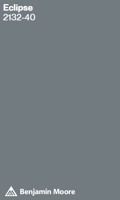
Benjamin Moore Eclipse 2132-40
I know that these moody blues and blue-grays begin to all look the same after awhile! Hahaha.
But believe me, once you have samples at home, their differences (undertones, light reflectance value *LRV*, warmth…) will emerge.
Even subtle differences will help you choose the best shade for your project.
Benjamin Moore calls Eclipse: “A dark, moody gray sharpened with a hint of blue.”
Eclipse is deep and dark (LRV is 20.01) with blue undertones. At certain times of the day, it may read more gray and at others, more blue.
Easiest way to know if a lovely color is the right color? Order samples to be delivered to your door with Samplize. This peel and stick sheet of “paint” simply gets placed on your wall (it sticks!) and then you can easily move it around.
If these particular options are too strong, you may want to peek at these light blue-gray options.
Peace to you right where you are.
-michele
Thanks for shopping RIGHT HERE to keep decor inspiration flowing on Hello Lovely!
Hello Lovely is a participant in the Amazon Services LLC Associates Program, an affiliate advertising program designed to provide a means for sites to earn fees by linking to Amazon.com and affiliated sites.


