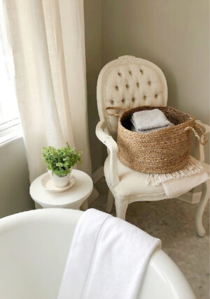
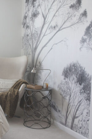
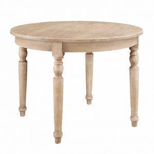
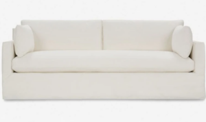
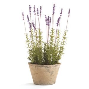
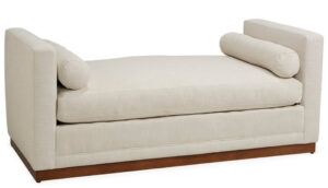
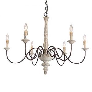
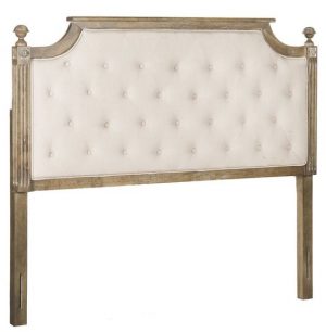
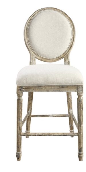
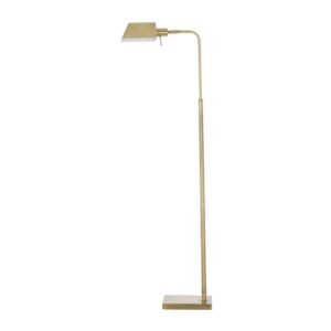
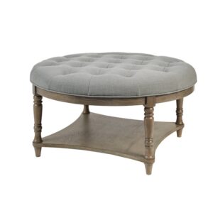
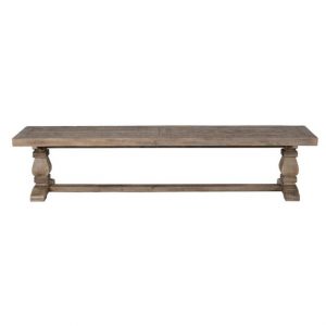
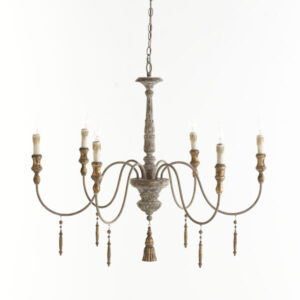
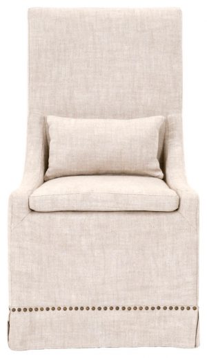
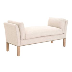
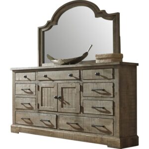
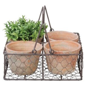
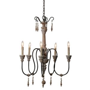
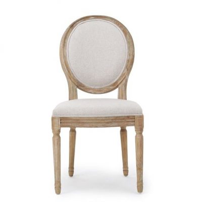
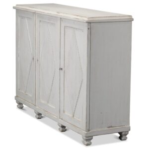
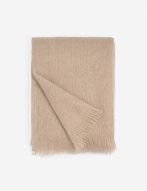
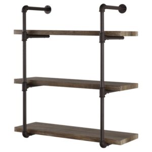
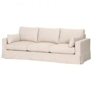
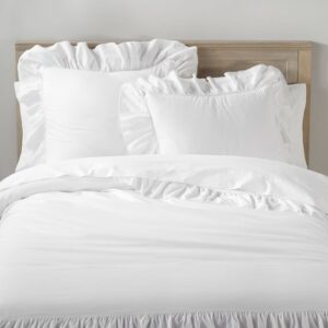
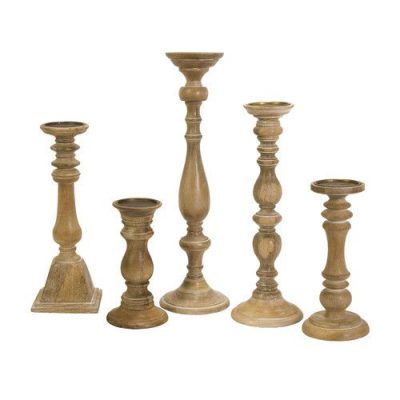
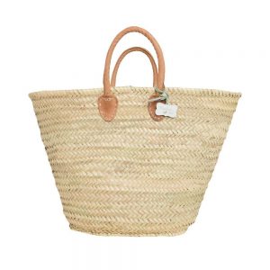
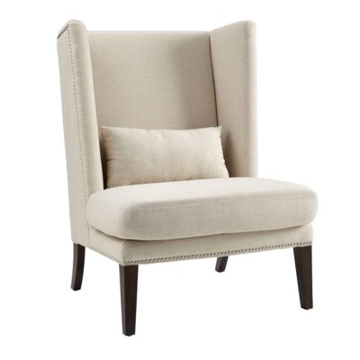
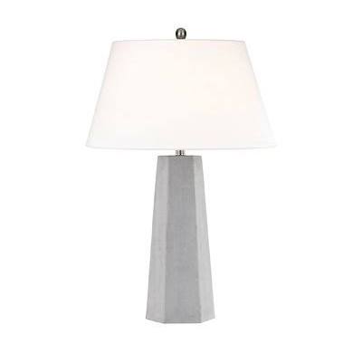
Farrow and Ball Colors & Euro-Country Interiors brings together a few European inspired favorites! Explore ideas for sophisticated paint colors created by Farrow & Ball, get a feel for their mood in different settings, and collect inspiring interior design from gorgeous projects singing with rustic elegance. What you won’t find here? Trendy, overly fussy, fancy, show-offy shiny blinged out spaces. Understatedly sophisticated simplicity is the timeless look for our purposes here.
Farrow and Ball Colors + Euro-Country Interiors
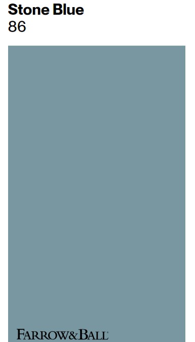
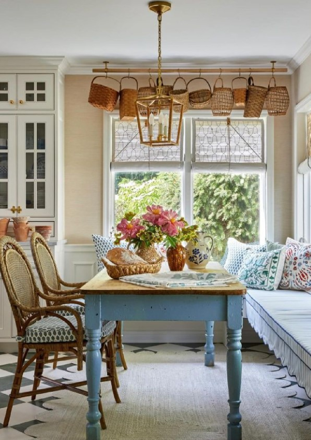
psst. I’m smitten with designer this kitchen by Steph Perez! The walls are wallpapered, the cabinetry is painted SW Creamy, and this blue table! Here’s a color to consider for the shade:
What design elements and guiding principles bring Euro-country beauty to these interiors? I mean we could be here for weeks discussing such a prospect.
Instead, these lovely images will sing the secrets of their stories, and I’ll do my best to illumine the mor subtle tenets.

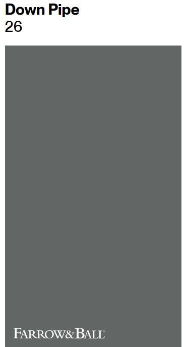
F&B Down Pipe No. 26
While we tend to think of pale palettes and quiet color stories when it comes to Euro-Country interiors, this isn’t a hard rule.
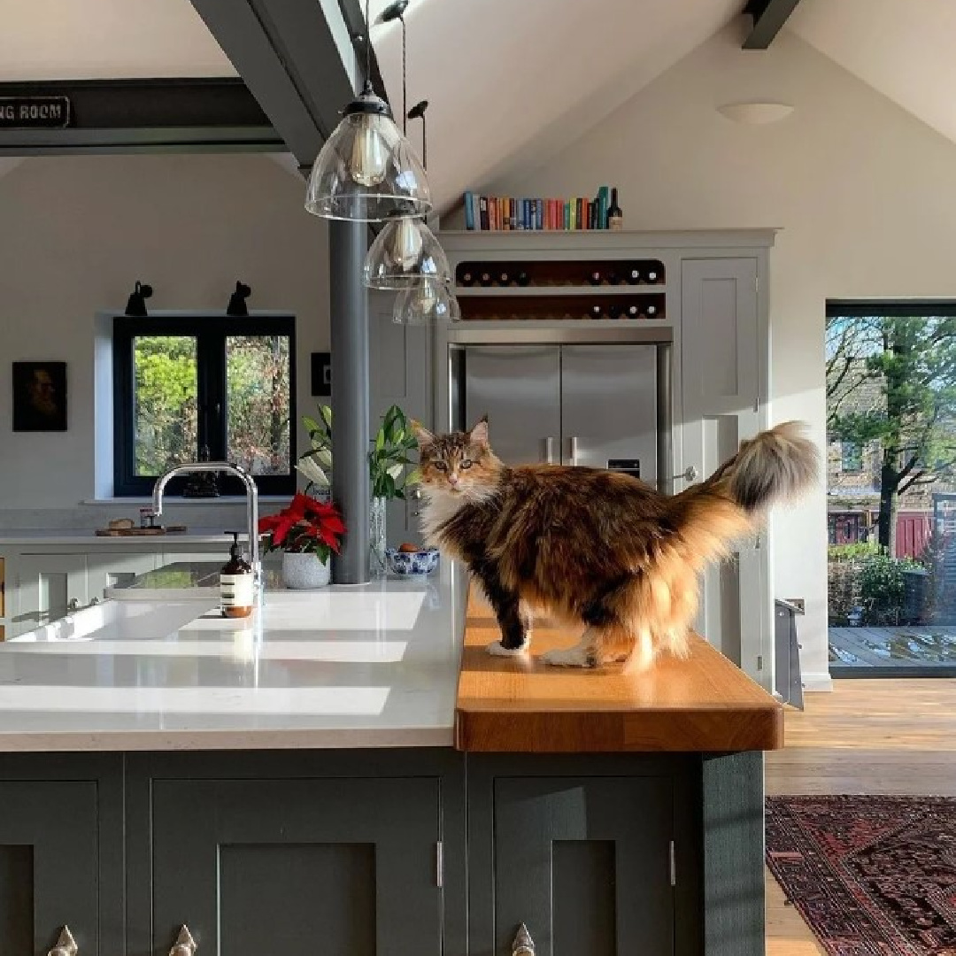
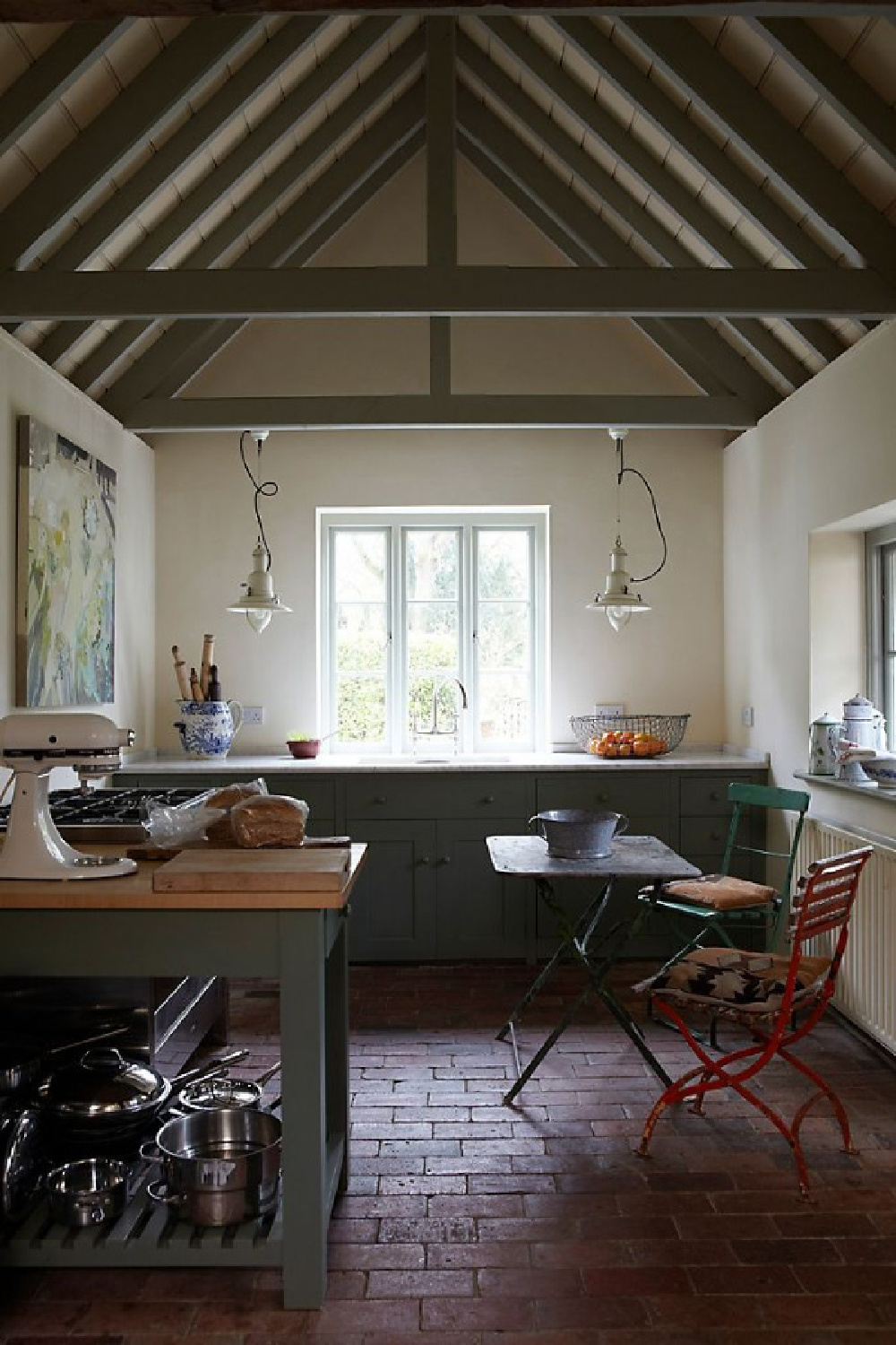
Natural colors in the dark and mid-range create drama, contrast, weight and boldness. Is this dark gray beamed ceiling calling?
Here’s the description of Farrow and Ball: “A dark lead grey, has definite blue undertones to it which deepen the complexity of the finish. Originally inspired by the colour used to paint downpipes and guttering, it has been embraced for use inside the home with fanatical zeal! This daringly dark hue is fabulous as a background to art, and extremely effective for use in halls to create a deeply dramatic entrance to the home.”
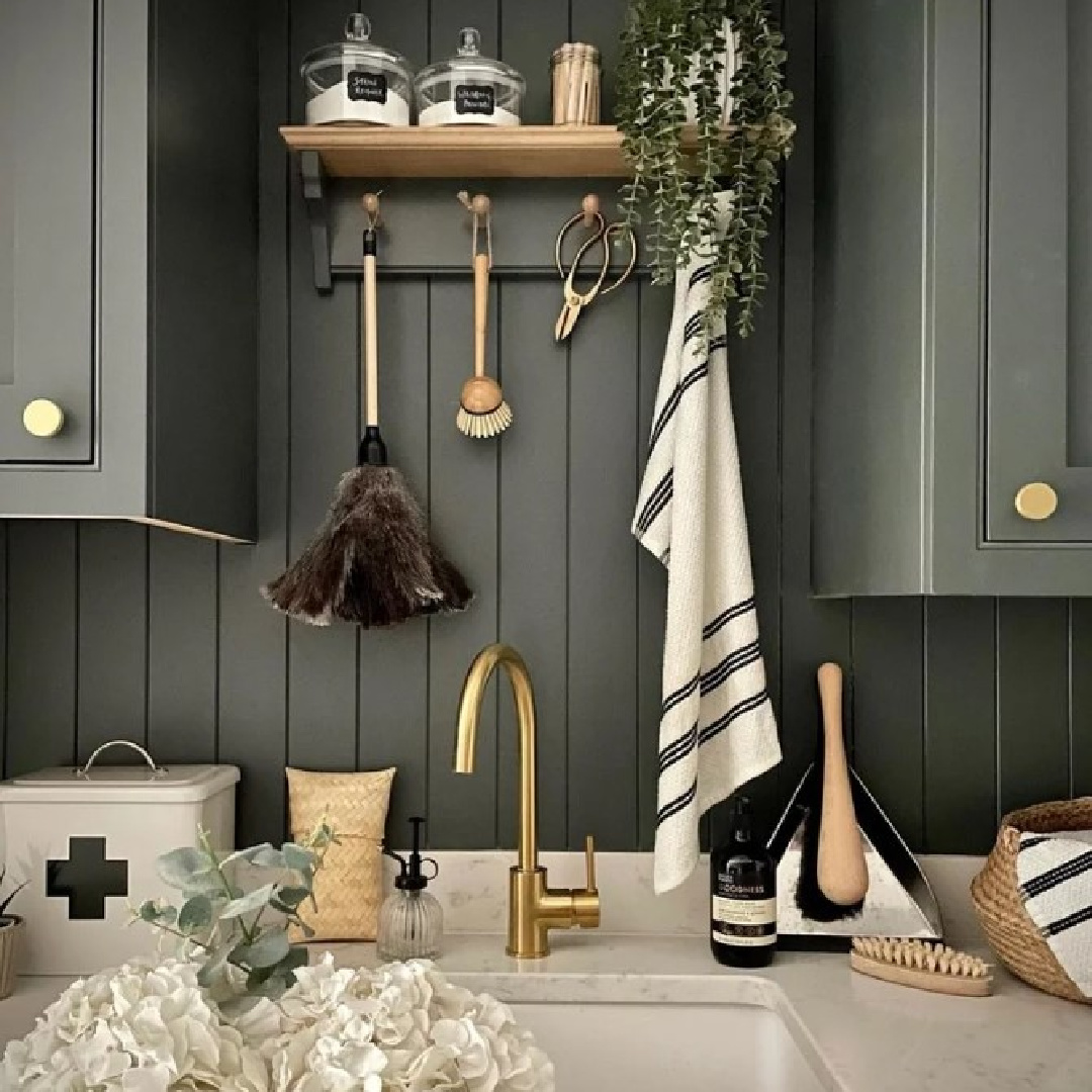
For a darker blue-black? Railings.
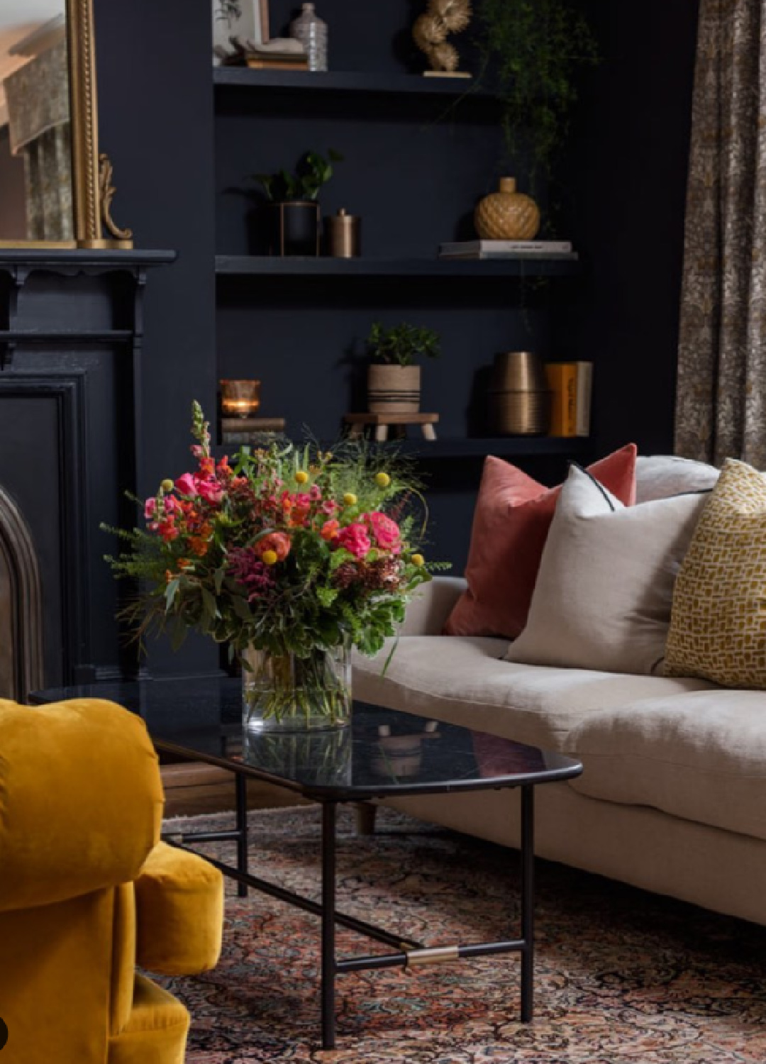
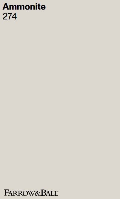
F&B Ammonite 274
Here’s a gorgeous light grey to create an atmospheric envelope that works across a range of different contexts and lighting situations.
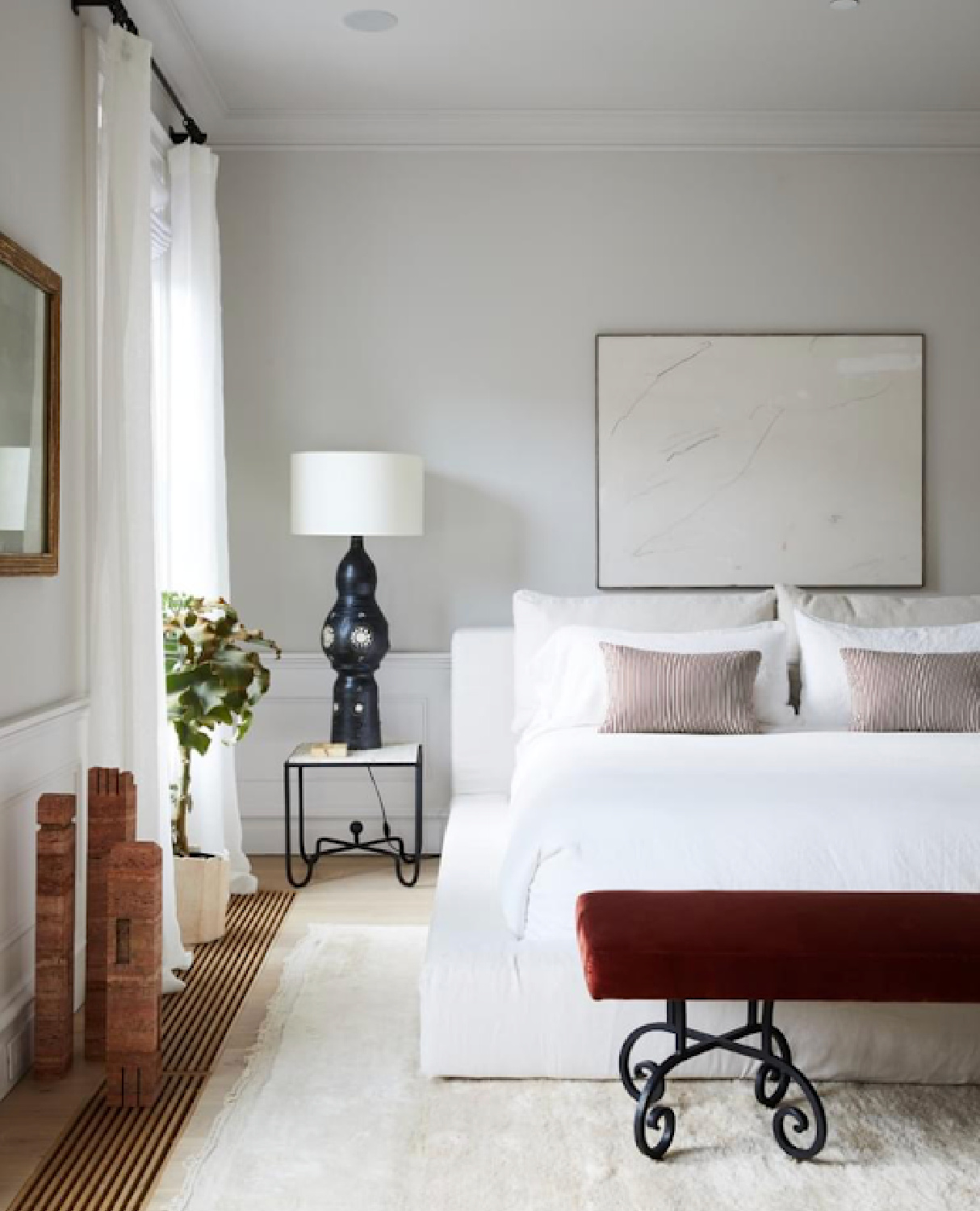
See what I mean about various contexts? The bedroom above feels Italian inspired, modern, and earthy.
While this more traditional style English room below is homey and completely different in mood.
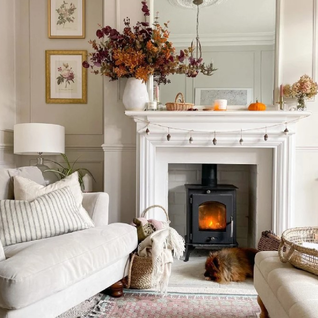
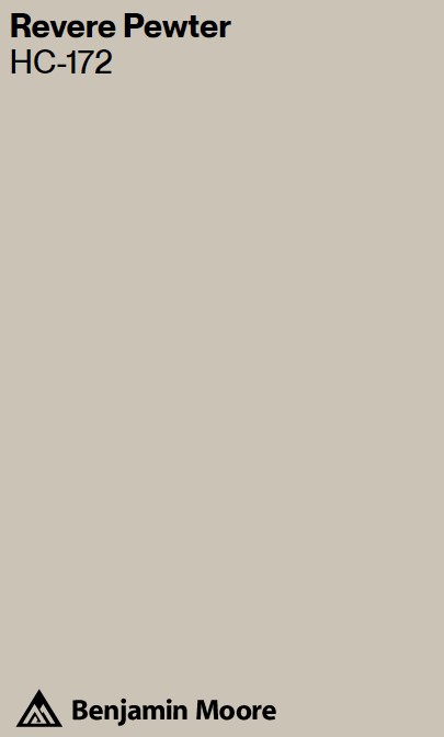
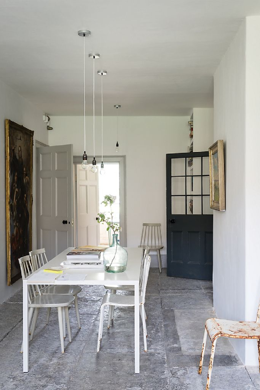
Ammonite was named for the treasured fossils found on the Dorset coast. The brand says it is not too warm and not too cool. I love the hushed tranquil feel of this grey, and it reminds me of Revere Pewter (should you prefer a slightly more saturated hue from the Benjamin Moore line).
It’s the understated serene quality of Ammonite that captures my attention. You can see how it softly contrasts with the white ceiling and moldings above the doorway:
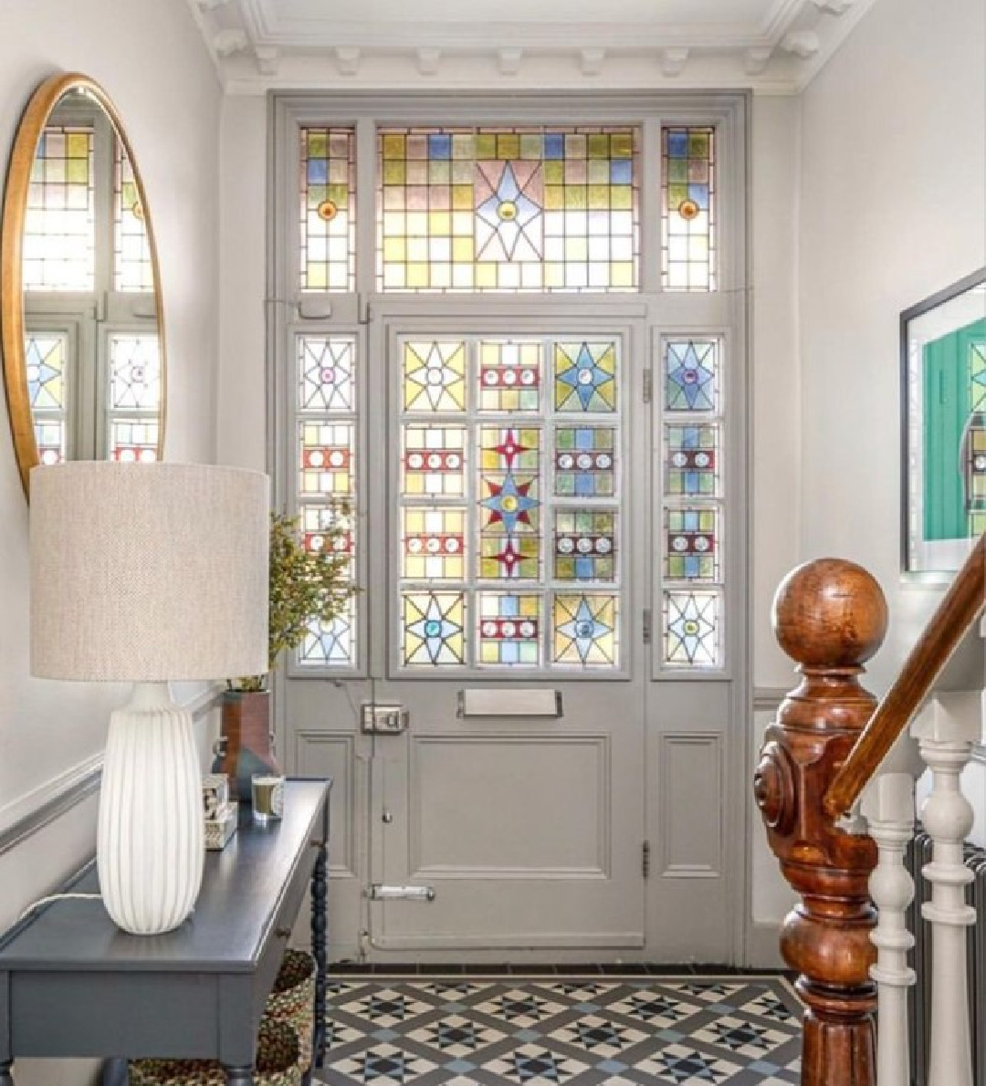
And don’t overlook it paired with a deeper gray trim:
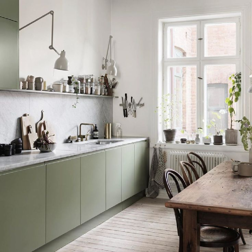
While I’m not sure if it is Ammonite on the walls in this kitchen below, it suggests it so this gives us an idea of how it would feel with a soft sage green:
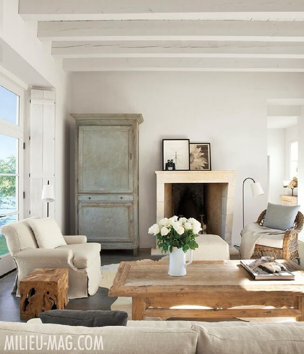
The walls of this glorious Texas farmhouse are likely plaster, but in the photo they remind me of Ammonite:
Do note that plenty of inspirational rooms here are located outside of Europe. You can even bring the aesthetic to a California cottage…
or a Texas bungalow…
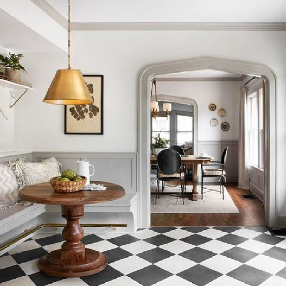
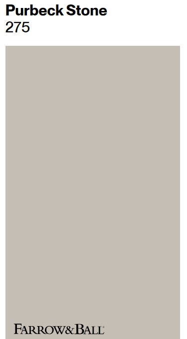
Psst. Though we don’t know the exact color Joanna Gaines used in this wonderful kitchen renovation above, the trim reminds me of this:
Here’s Purbeck Stone on teh trim with lighter toned subway tile:
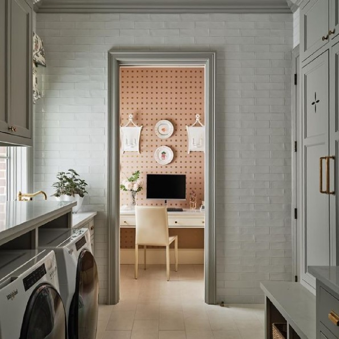

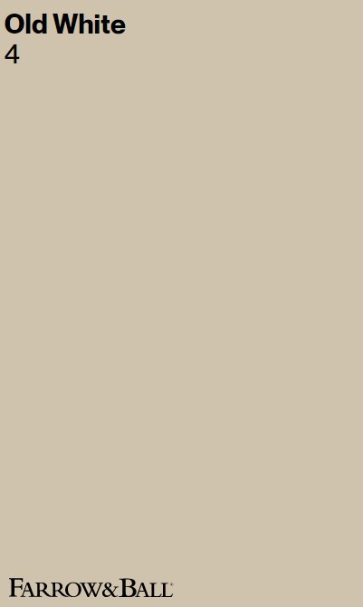
Farrow & Ball OLD WHITE
Don’t let the “white” in the name of this color fool you. Old White is the most historic of all Farrow & Ball’s whites, sophisticated and at home in historic houses as well as modern kitchens.
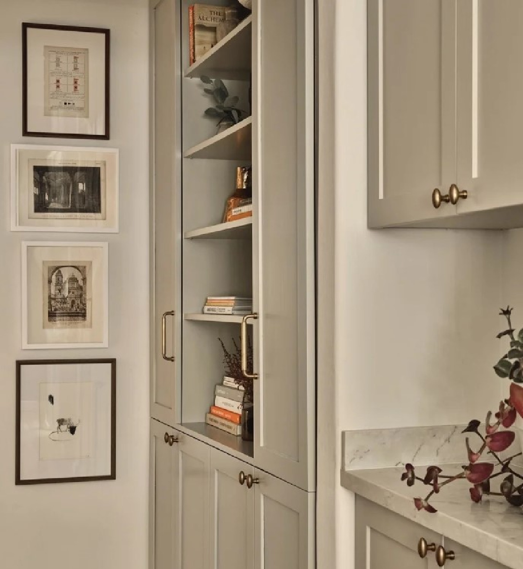
In fact, Farrow & Ball call it a soft grey green:
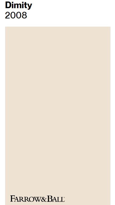
You can definitely see the yellow in it, and it’s the toner he painted his living room and office in the 1929 home he renovated, and I believe it is on the trim of his breakfast room where the walls are DIMITY:
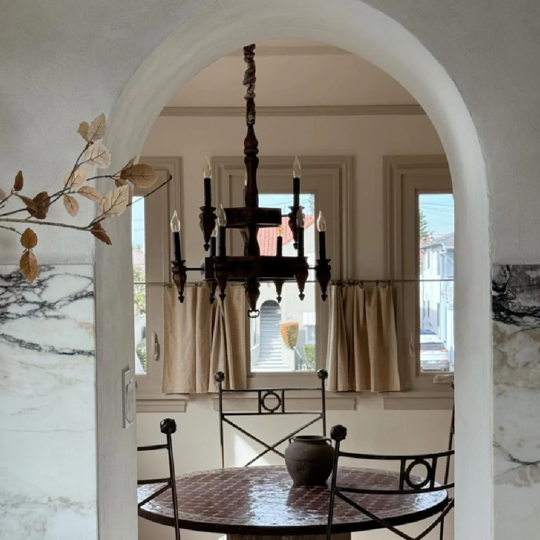
Both Old White and Dimity remind me of the French country home we built for our family in 2007 where I experimented with warm European country color stories.
It was a manse with many rooms that served as my lab. My budget was limited when we first moved in because we still owned our former home (thanks so much, recession!). It forced me to get creative.
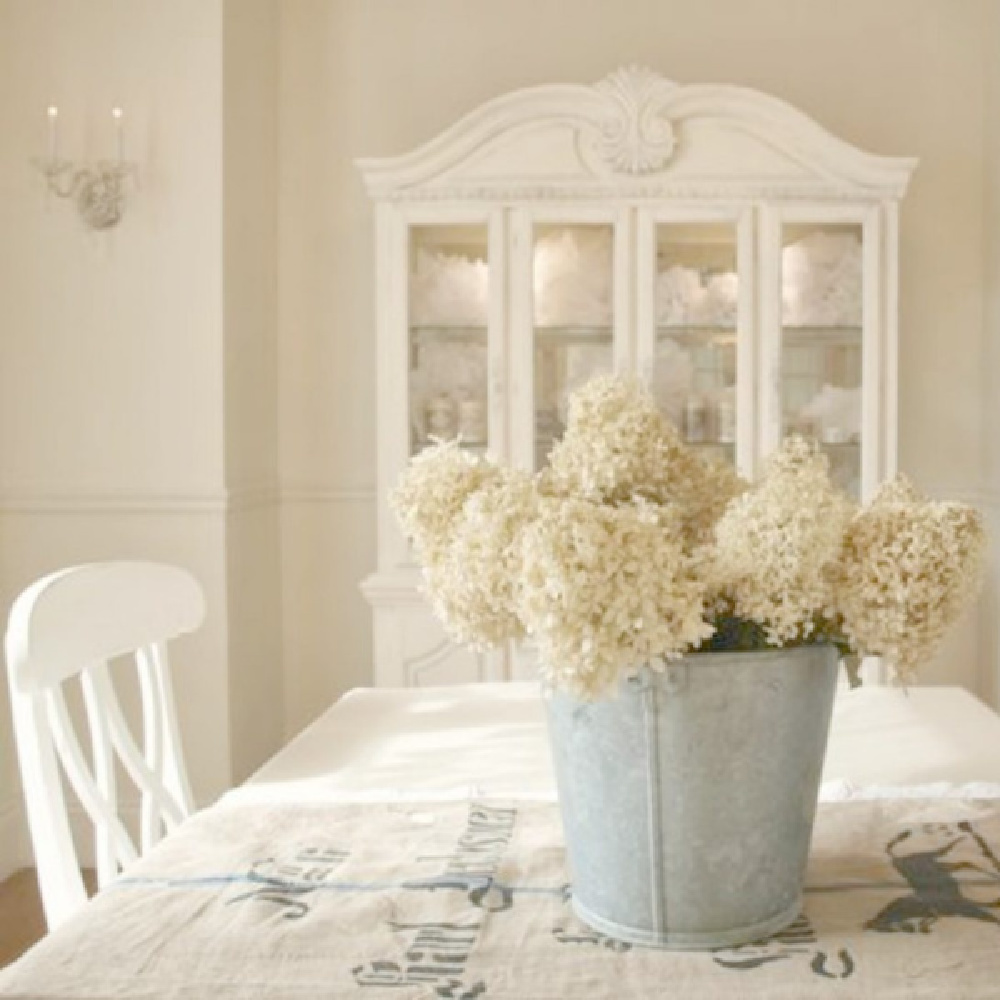
I found cast-offs and thrifted finds then tweaked them with paint to please only myself since “influencing” hadn’t been invented, and I was a happy hobby blogger. In the dining room (above), I snagged the hutch and buffet (above) for a song and slathered on Benjamin Moore White Dove. (Peek at All White 2005 for a similar look.)

I painted walls Benjamin Moore White Sand which is warm and similar to something between Dimity and Old White.
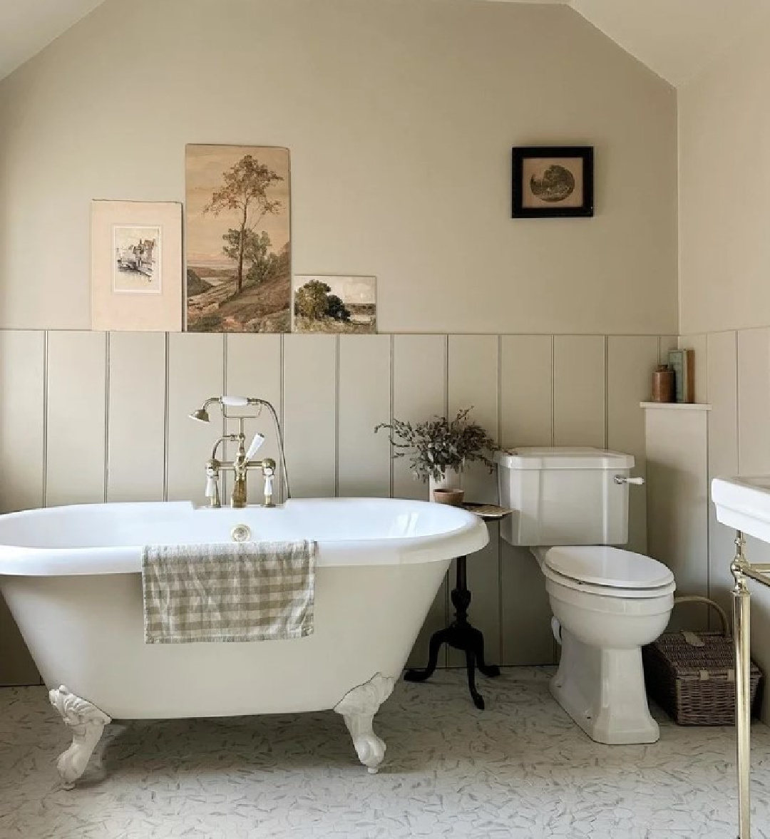
It’s helpful to see the color across various contexts and lighting conditions where you can begin to perceive the green undertones, especially in spaces with low light.
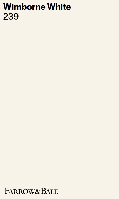
Wimborne White 239
Here’s a warm white designers trust when they are after a timeless calm look: Wimborne White 239.
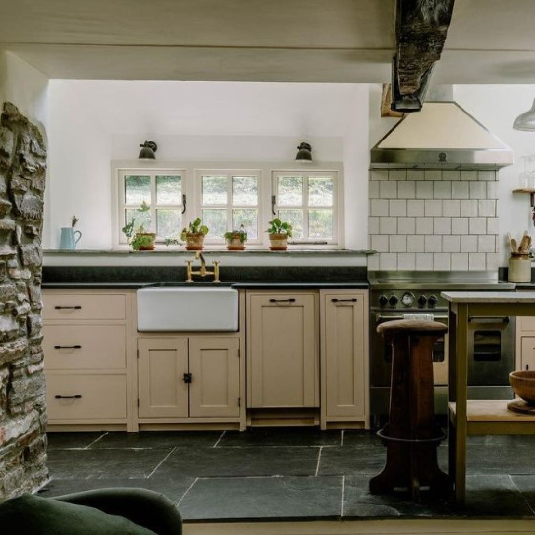
You know it’s a winner when just the look of the swatch online captures your heart:
It’s so important to sample a white like this before investing in a quantity of it. I have seen it look very warm with yellow coming through in certain natural lighting conditions. And it’s going to be perceived differently at night.
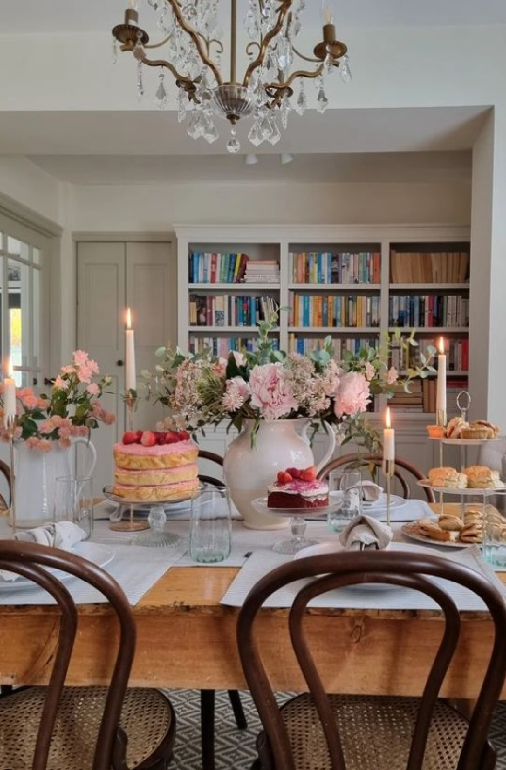
Sample at least three different colors that seem very similar. When you see them together, the various undertones will be more apparent.

Sometimes it will help you eliminate one or more straight away since it will seem all wrong in your space.
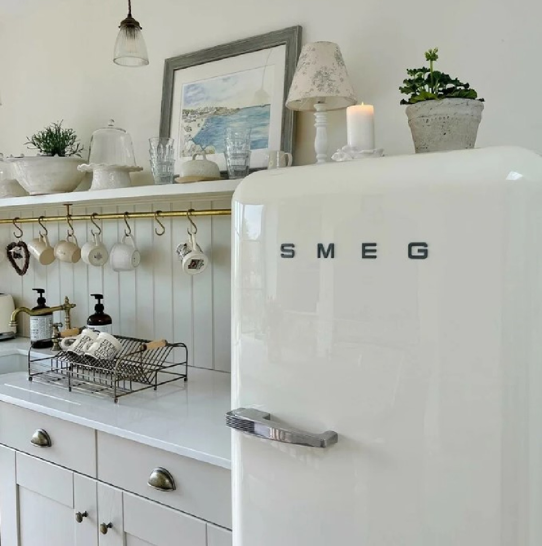
As I mentioned, there is yellow in Wimborne White so it is softer than All White.
This just off white is named after the market town of Wimborne in Dorset and home to Farrow & Ball. Only a shade away from a pure white, the addition of the smallest amount of warm yellow pigment creates a very versatile shade which is just a little softer than All White. – Farrow & Ball
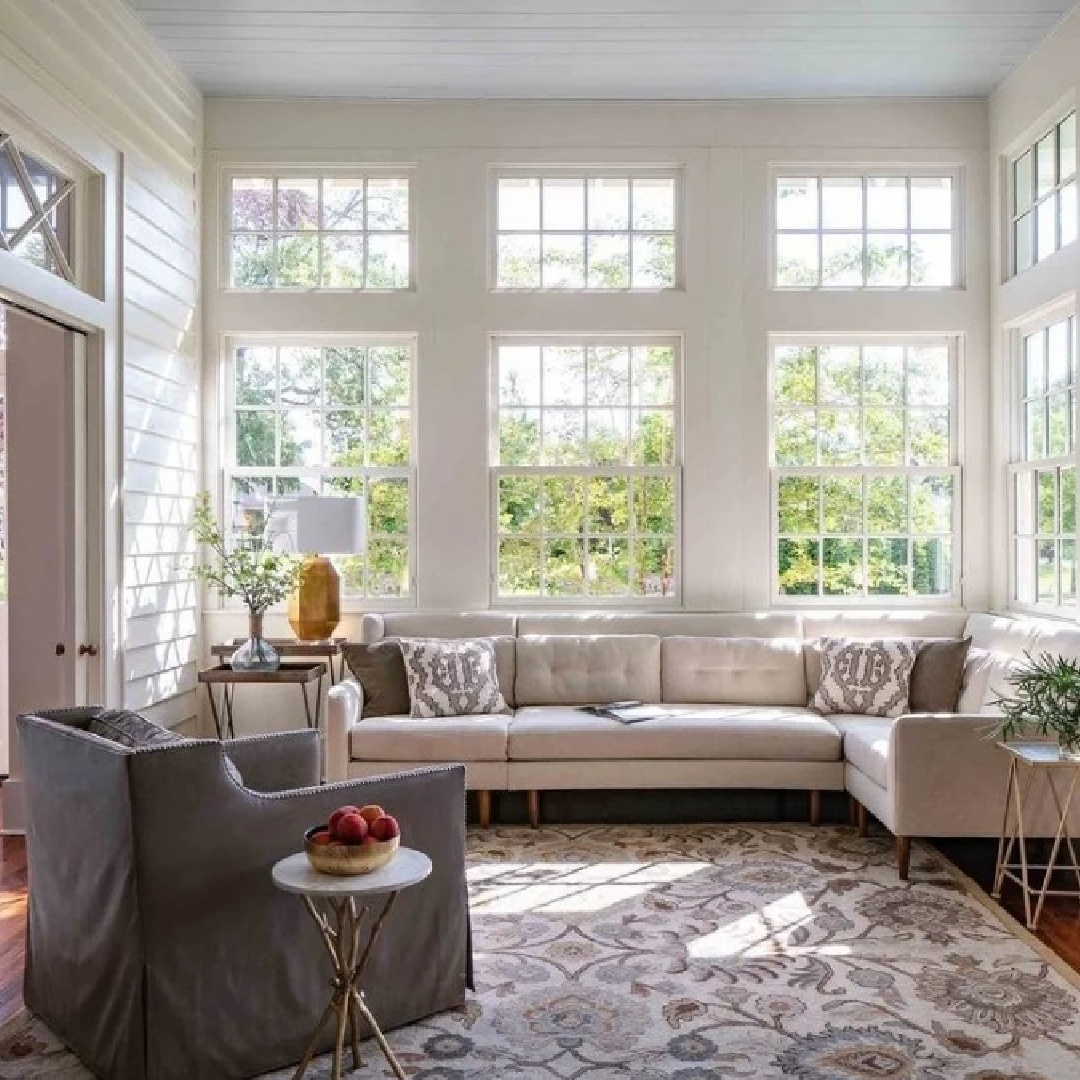
In some environments, you can sense that warmth:
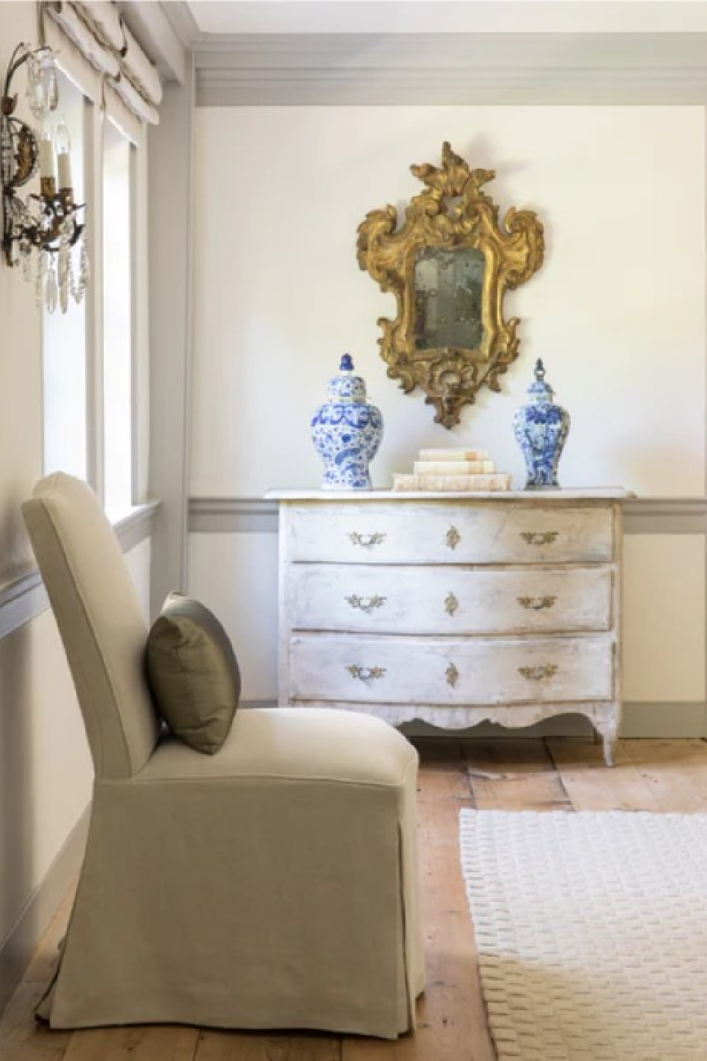
If you have ever moved to a different geogaphical region, you may understand how the same color you loved in a previous home will look all wrong depending on the quality of light at the new location.
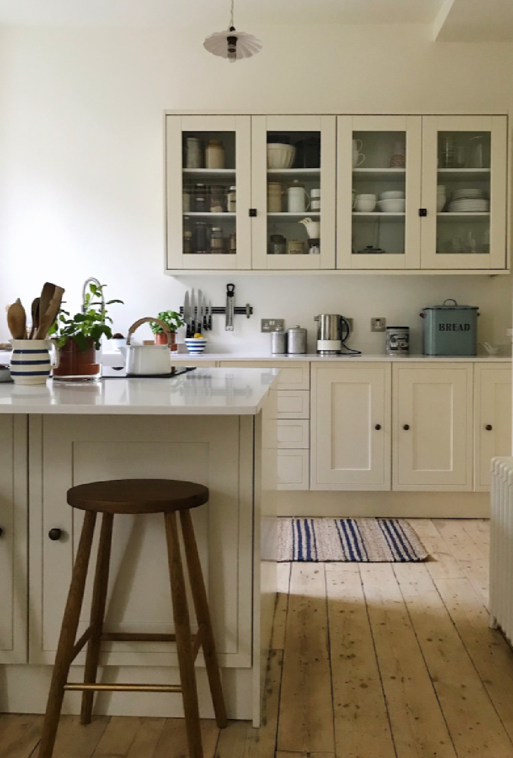
While the kitchen below likely has plaster walls (unpainted), the effect reminds me of the creamy nature of Wimborne White in the California sunshine:

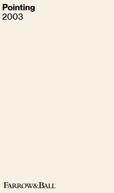
Pointing 2003
Farrow & Ball say Pointing is a fresh and uncomplicated white named after the colour of lime pointing used in traditional brickwork. One of our Warm Neutrals, Pointing has a red undertone to it which creates the prettiest of spaces when used on walls and always softens the feel of a room alongside strong, traditional colours.
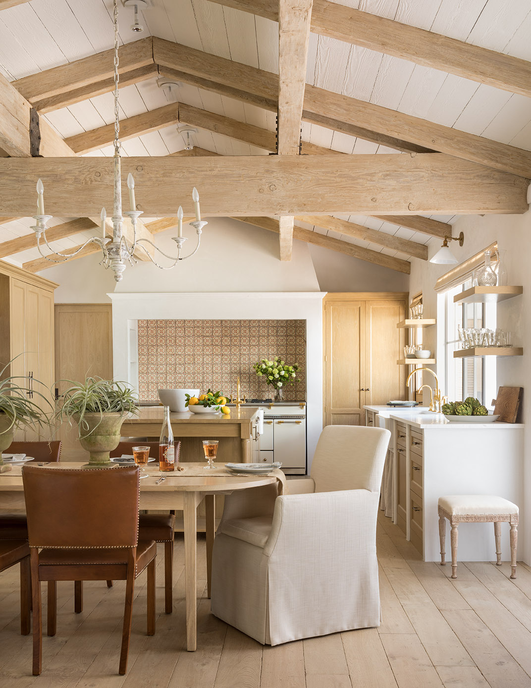
One of the qualities I admire about European country decor is how a mix of modern furnishings, rare finds, rusticity, and antiques still can feel so traditional.
In fact, that mix is key to prevention of the look growing too heavy, too historic, or too fussy.

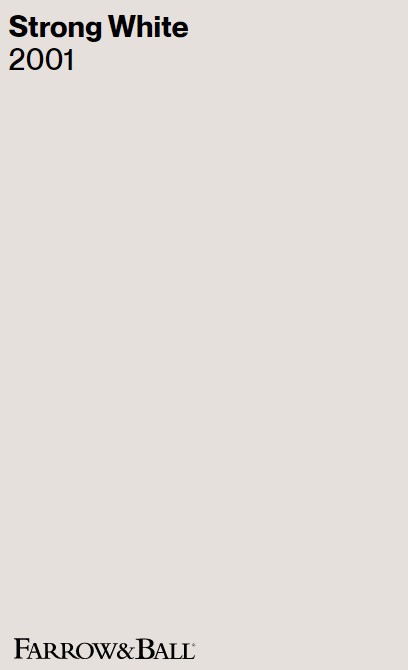
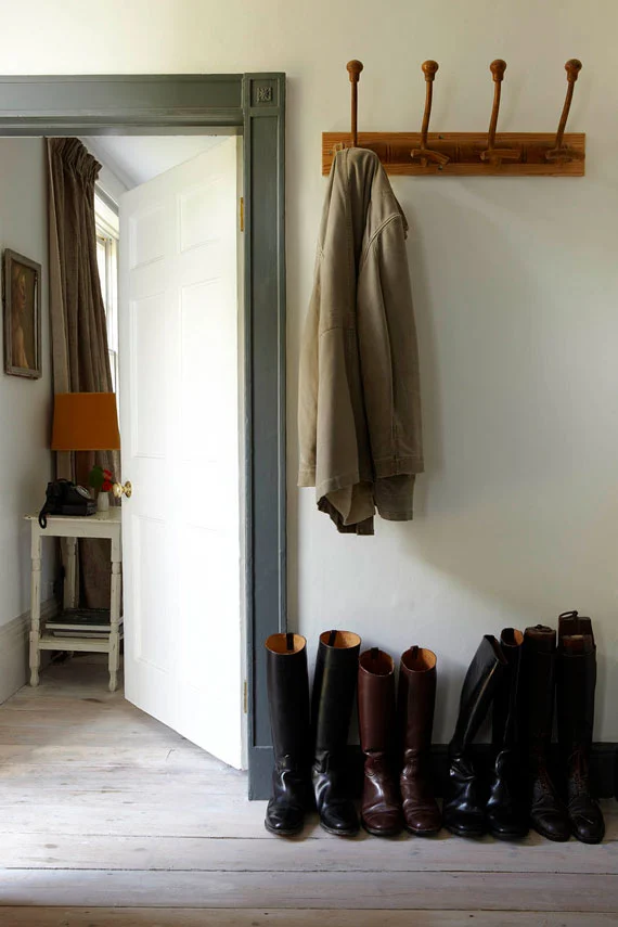
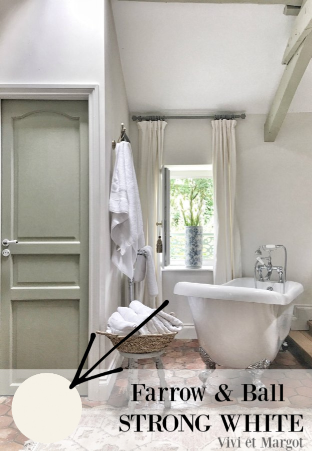
F&B Strong White
There’s a simplicity and elegance to country style when it is European inspired.
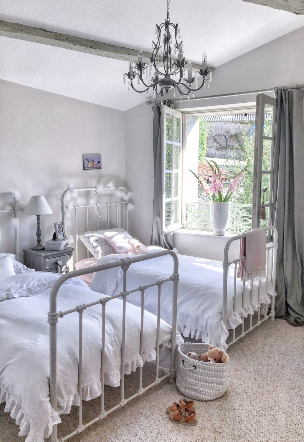
Such elegance seems to derive from a certain set of sensibilities, including this one: DON’T RUSH IT.
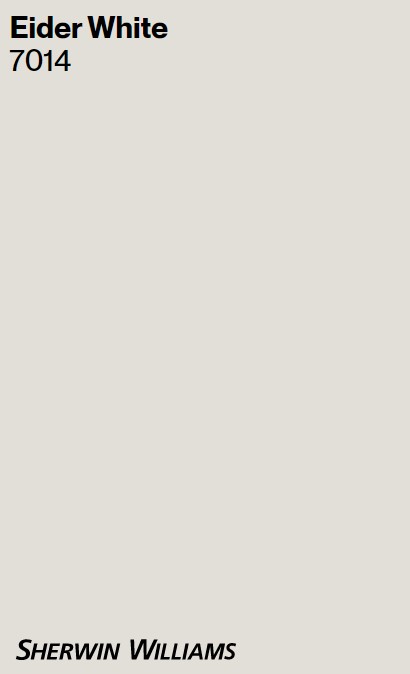
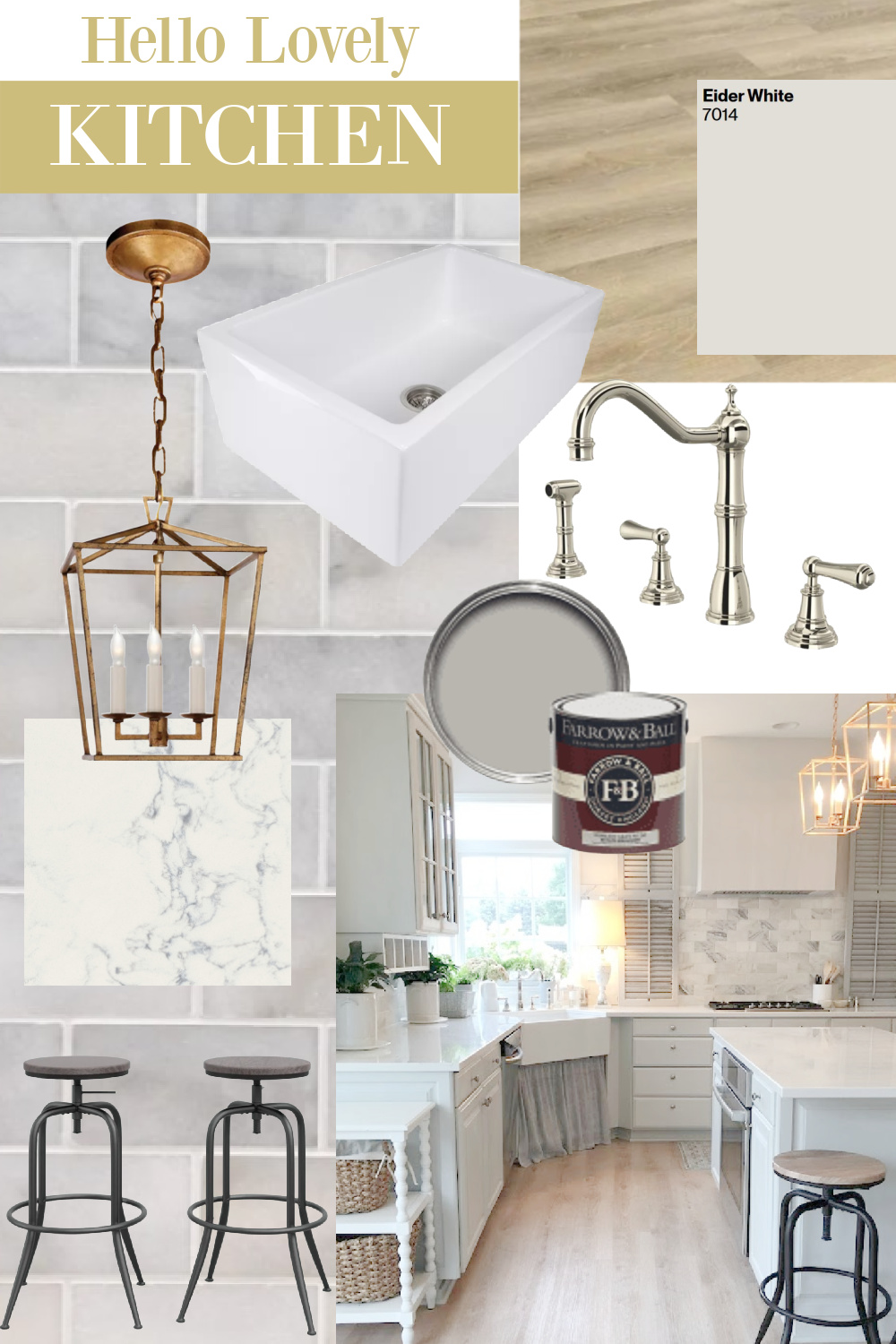
I love these cooler, mysterious whites, and does it remind you of SW Eider White? Because I can see the touch of magenta/pink in this neutral. I love Eider White in our kitchen and laundry room.
American culture is so frequently associated with hustling, fake it til you make it, and hard work.
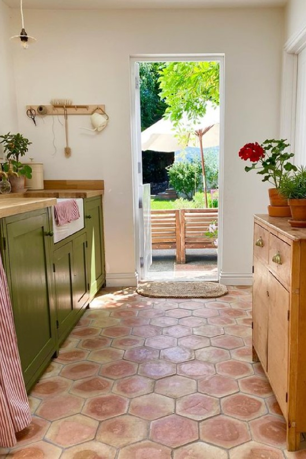
Collecting the right pieces for a single room or a whole house calls for an alternate set of values and guideposts.
The rush is the enemy in most cases. Sometimes the wait is purely a budgetary matter – the realistic need to save until you have the funds for antiques, handmade quality, and custom designs.
But in America there is always a message coming at you that THERE’S NO TIME LIKE THE PRESENT or SEIZE THE FRACKIN DAY THIS SECOND.
Slow decorating involves delay of gratification, and so few of us seem to prize it these days.
Taking cues from cultures outside of our own is one smart way to expand our horizons and broaden our perspectives.
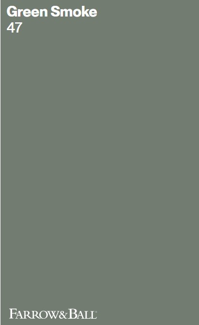
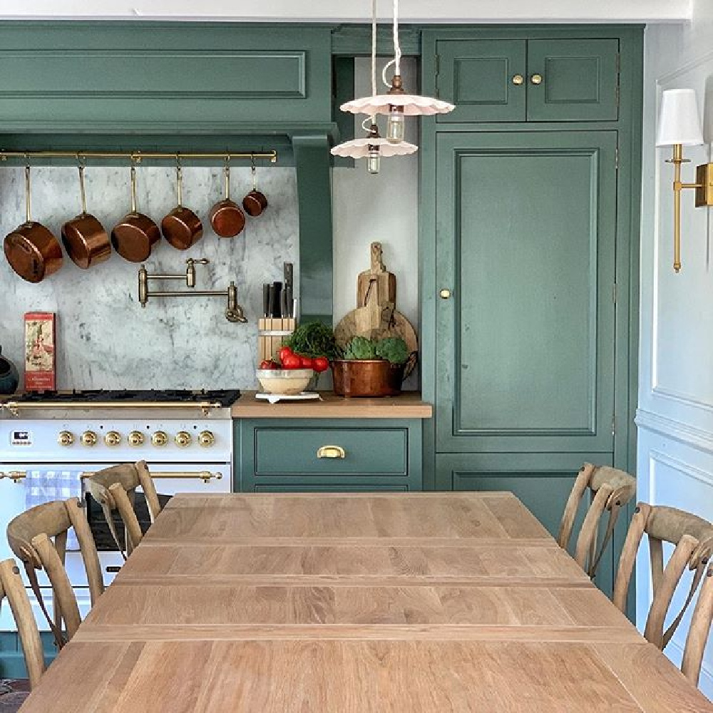
Farrow & Ball Green Smoke 47
We certainly will not neglect green from our discussion of lovely Farrow & Ball offerings! It is a timeless way to bring nature, life, and vitality to a variety of different spaces.
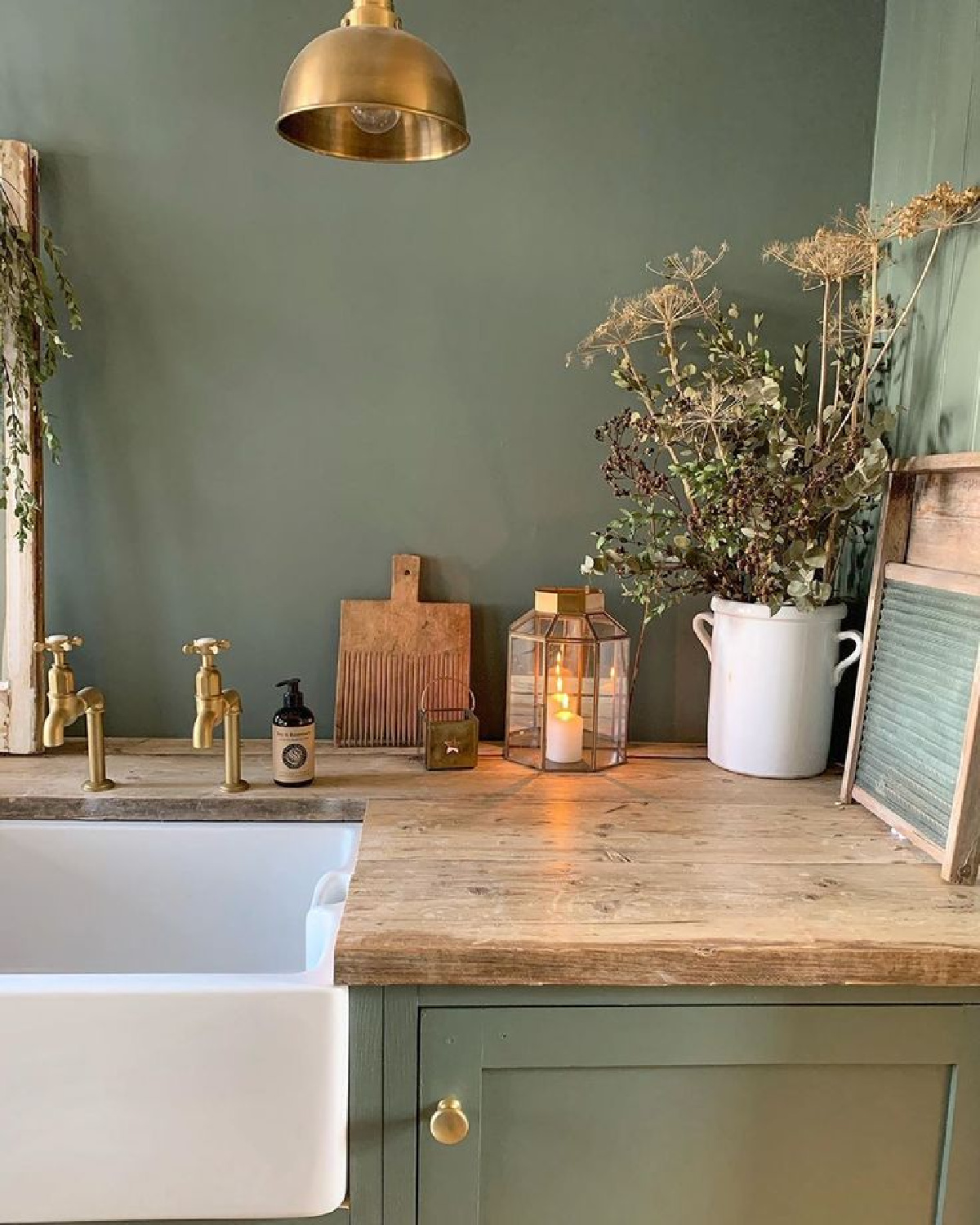
I personally find this rich green appetizing and thus perfect for a kitchen!
Why do you suppose greens drift in and out favor as far as trends go? Do psychological and cultural shifts, economic conditions and patterns in wellness contribute?
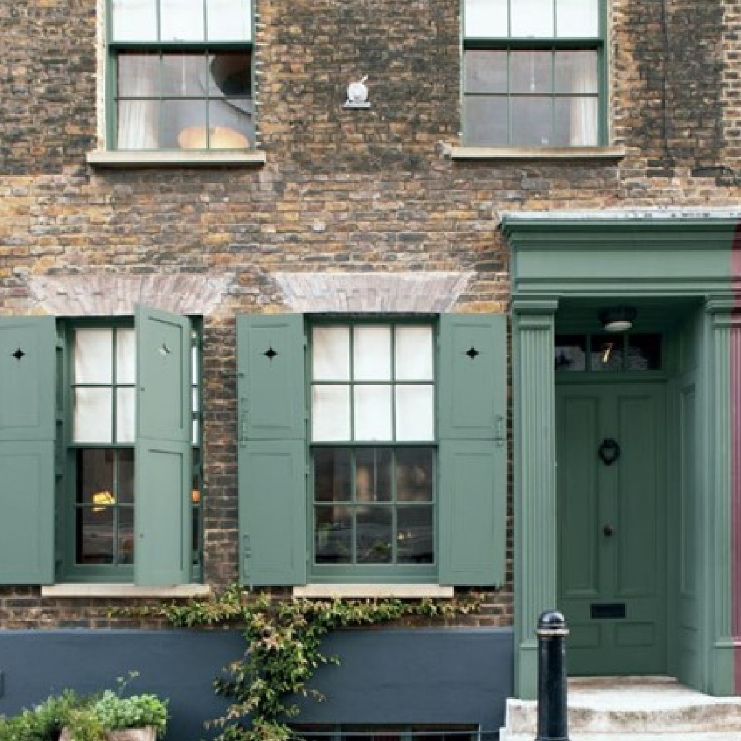
Design freaks like me always get curious about such underpinnings. Indoors or out, Green Smoke has has an organic, timeless, and classic feel.
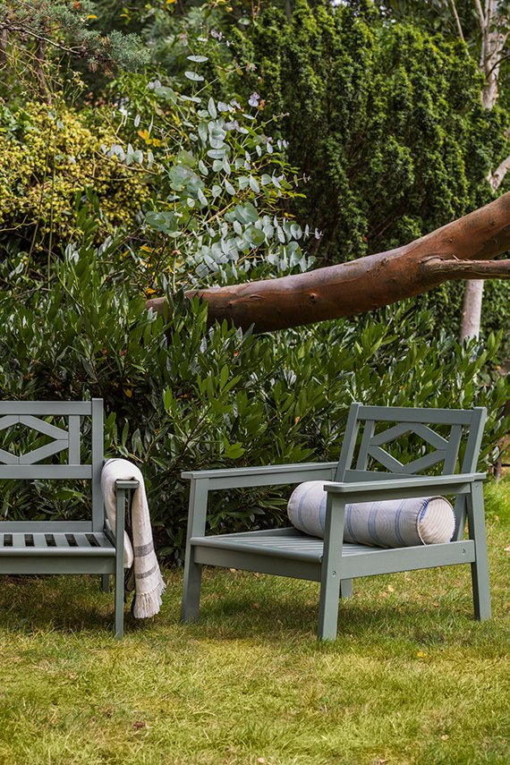
Here it is on outdoor furniture. Who is ready to experiment with it?

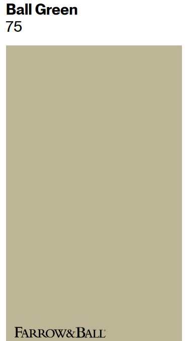
Ball Green No. 75
Here’s another green to consider if you’re after a restful one:
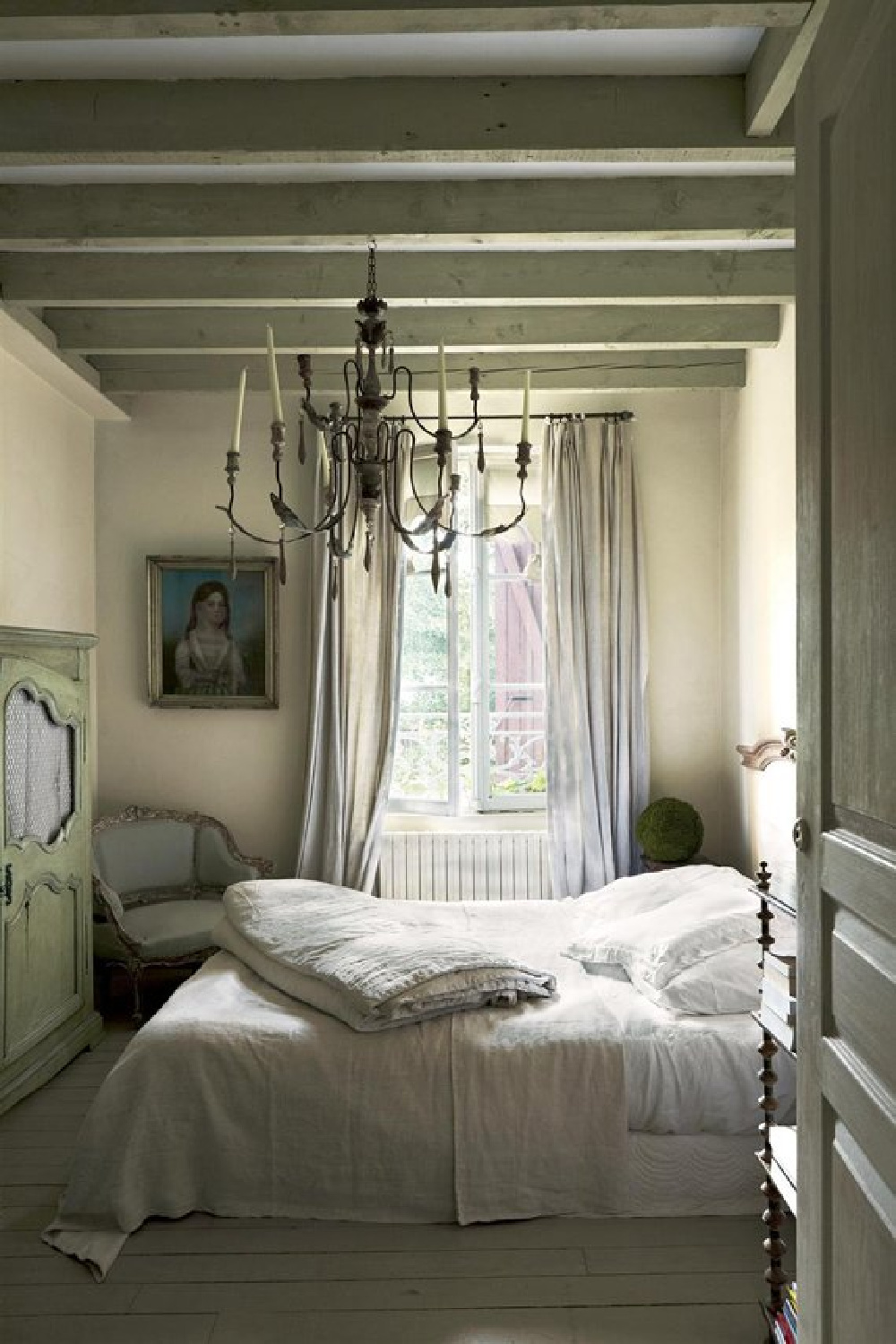
Try Ball Green if you like yellow.
Although iIn this setting with an entirely different lighting condition, the same green color appears sage:
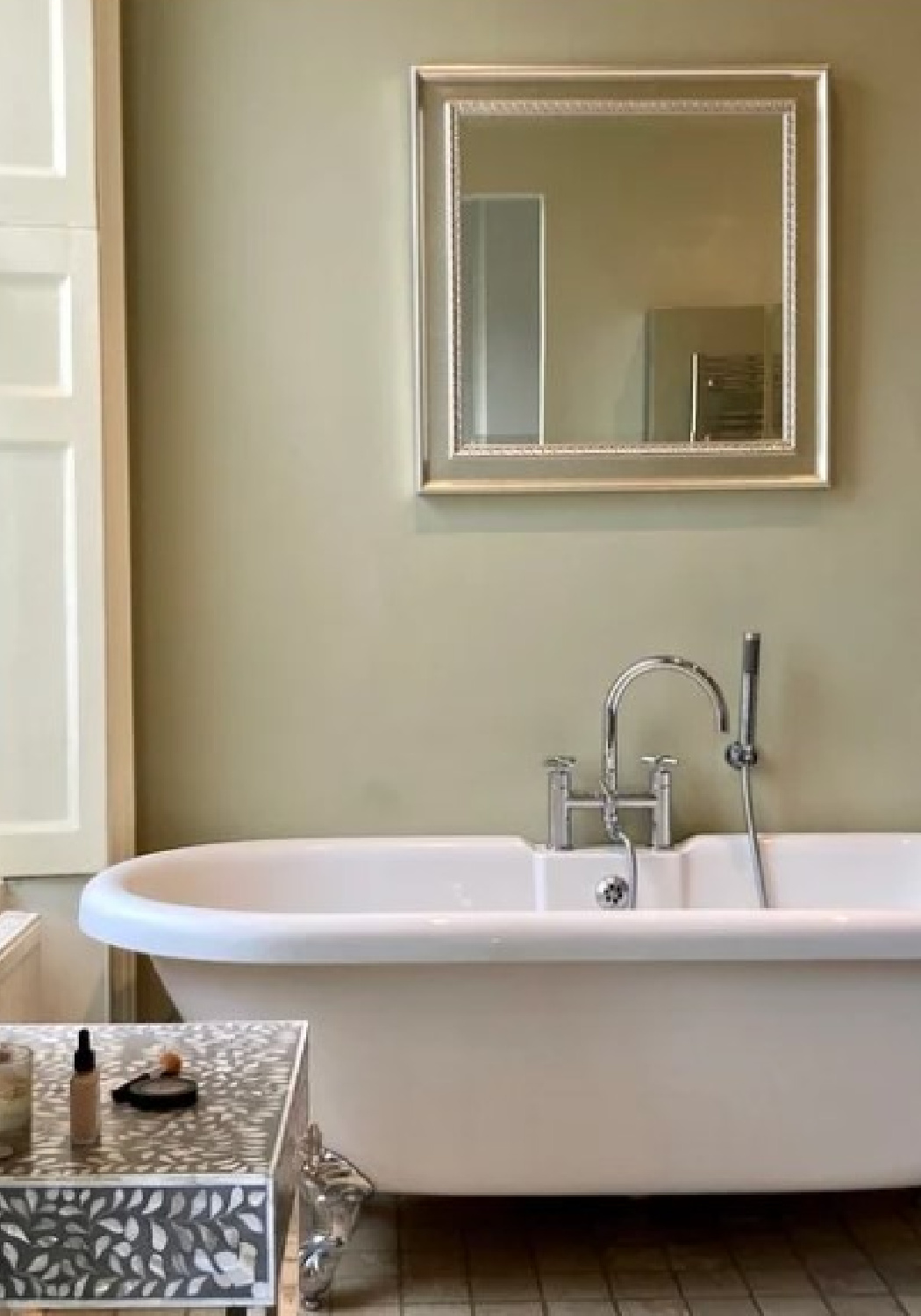
Just another reminder to not become attached to a single color even if it once worked well for you – always sample it for a new project with other contenders.

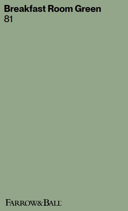
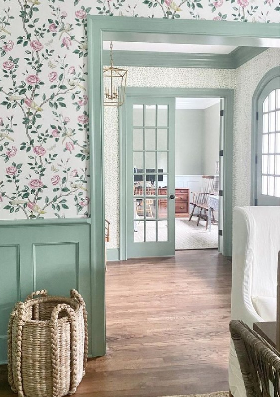
If you’re not a fan of yellow and are after a happier, cheerful green…
It comes alive in this layered wallpaper look, and notice the green is used on the lower wall and then trim:
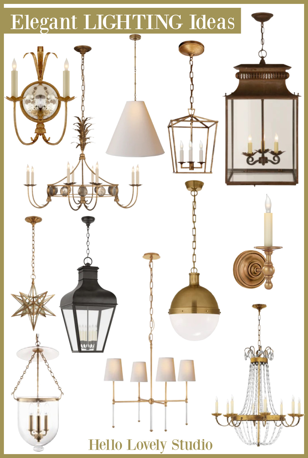
I spy a Darlana Visual Cofort fixture in the hall (I have these same lantern pendants in our kitchen).
How to Bring More Character to Euro-Country Designs?
Decorating with European country sensibilities in mind works particularly well when you enjoy juxtaposition, patina, aged finishes, and natural materials.
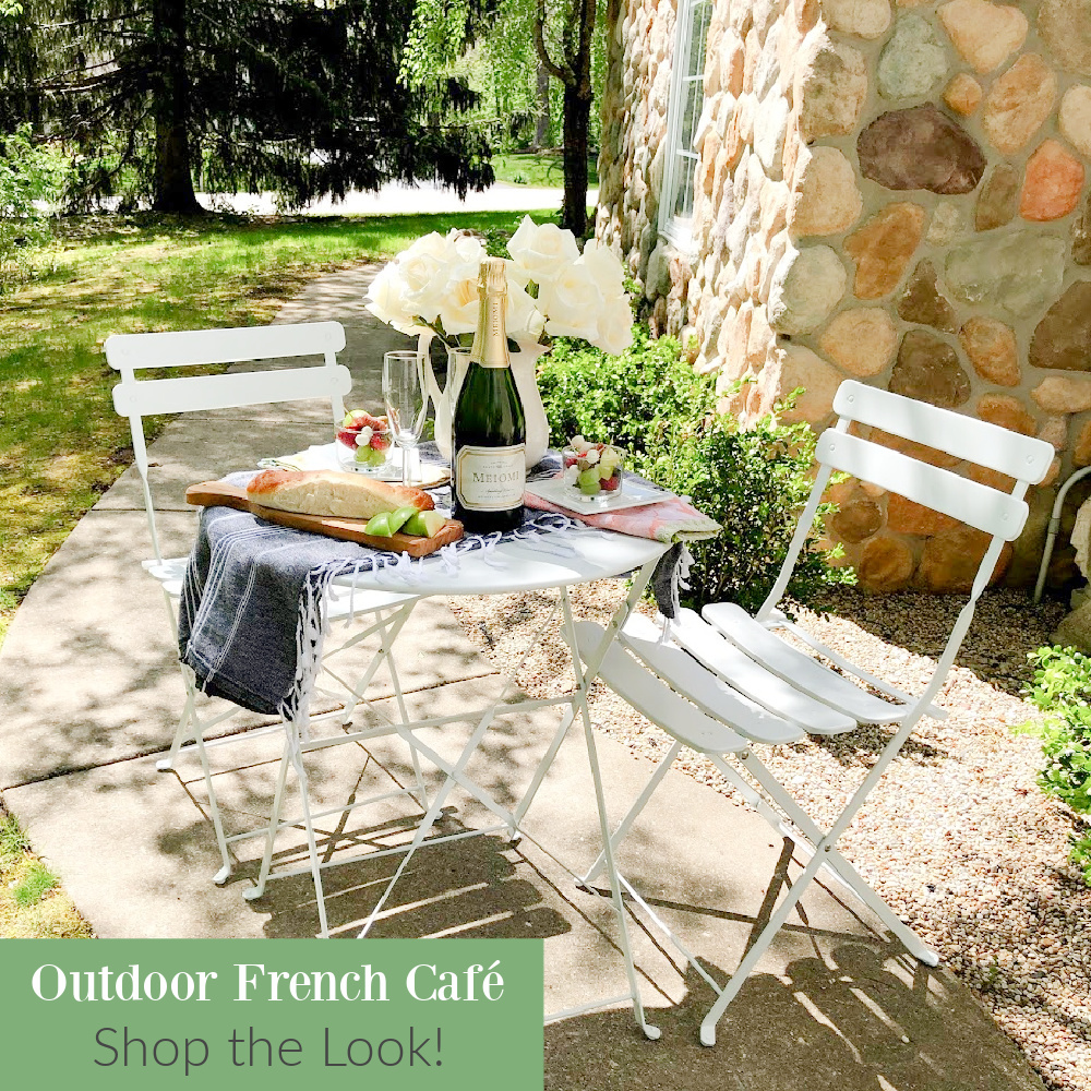
A mix of imperfect vintage pieces, antiques, family heirlooms, and collections can sometimes meld if you take time to edit and train your eye for scale, balance, whimsy, and composition.
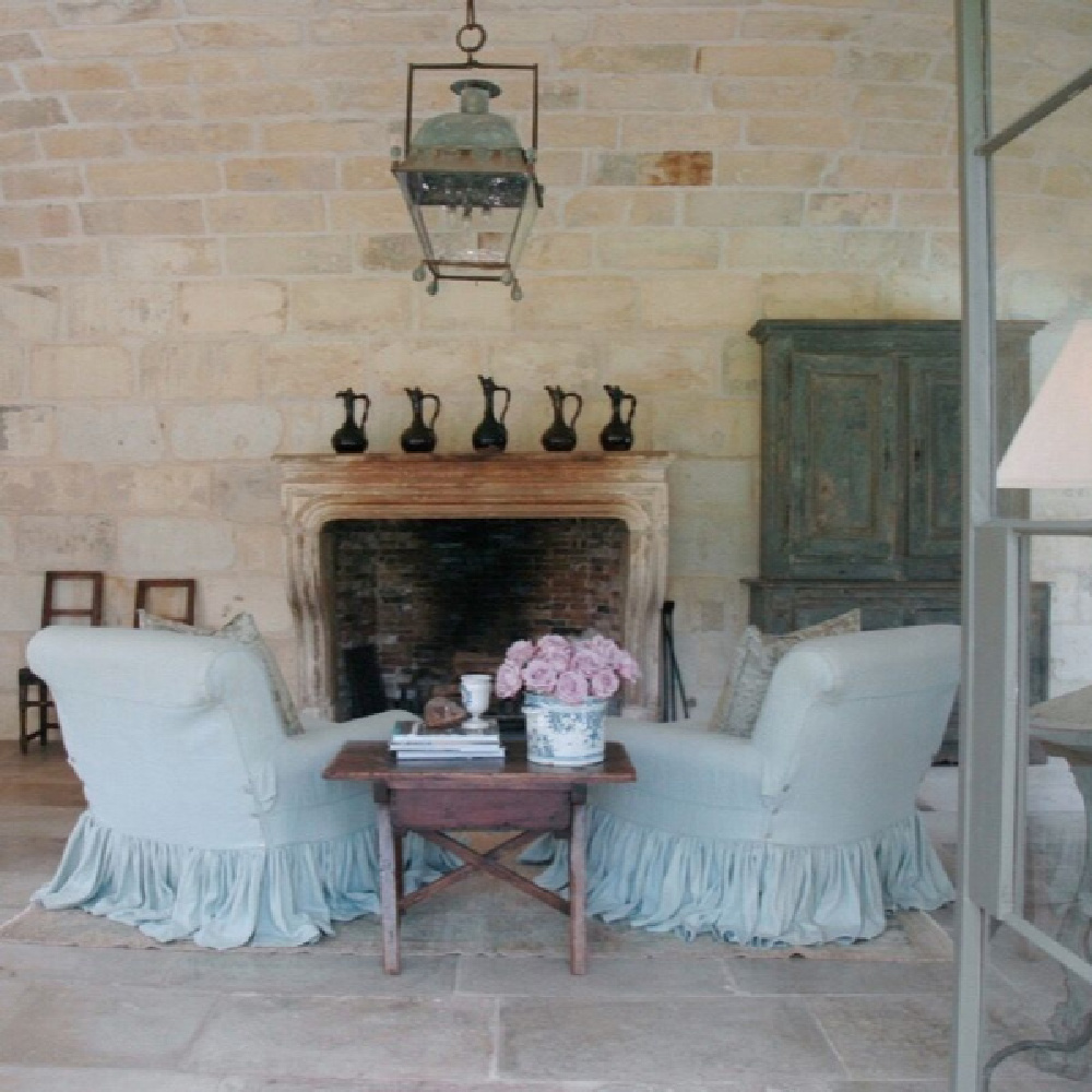
Function obviously matters too and European influenced designs often begin with function.
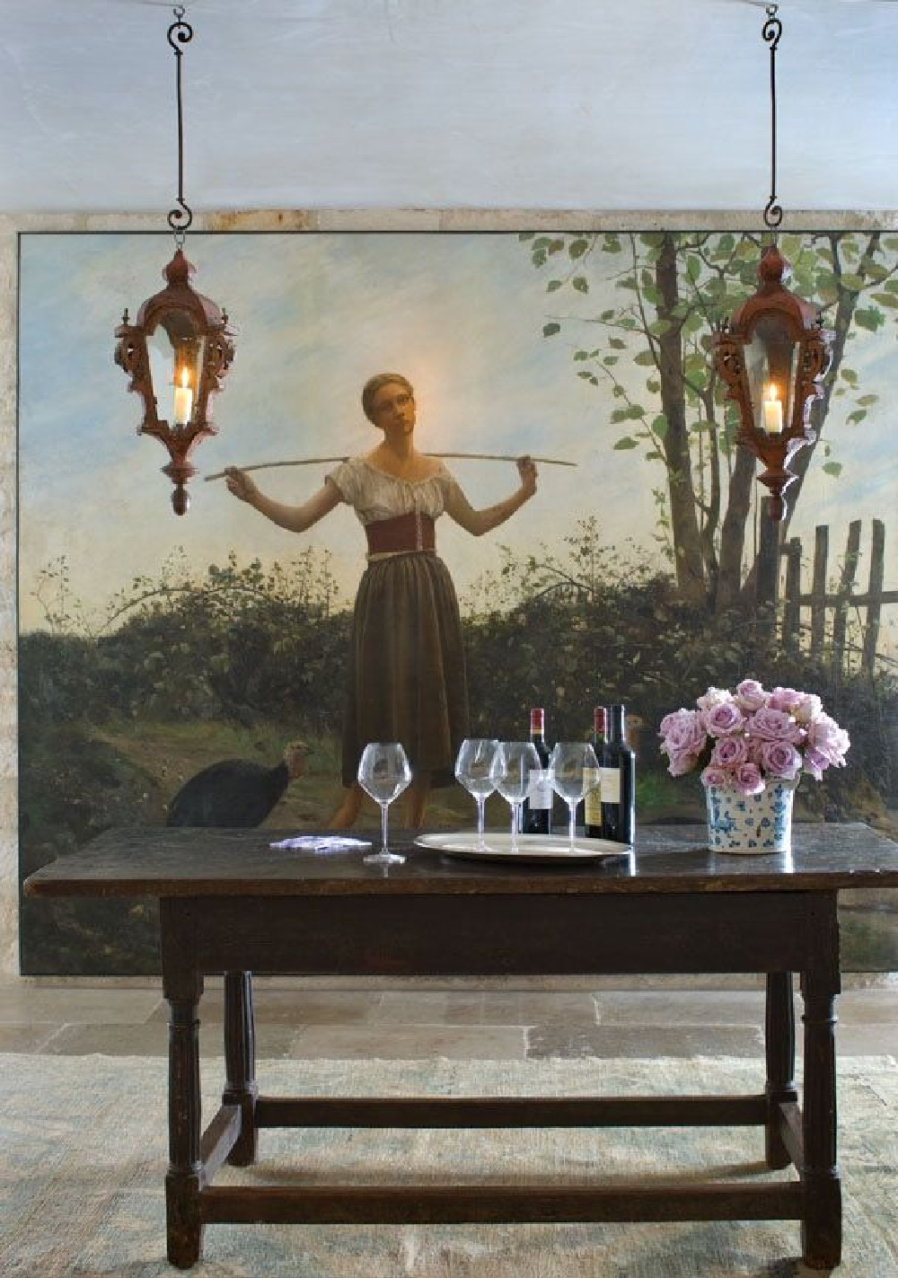
Antiques and vintage pieces need not be hands off and strictly for show as a strong sense of practicality and livability permeate the design style.
Objects old and handed down are honored, and a collected, timeless look looks away from trends, inferior quality, and the disposable.
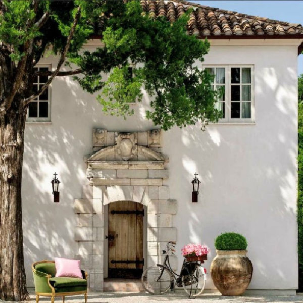
This is not a look for those who despair over scratches to wood floors, stains to white marble, and fading of fabrics!
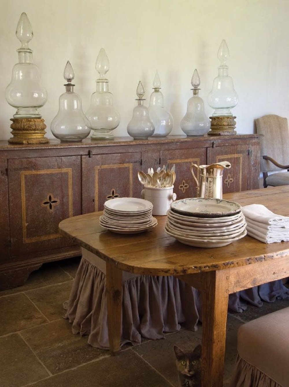
Signs of time, use, weathering and patina development are joyfully welcomed. No wonder legions of young American parents with a passion for modern country interiors find it refreshing! Young children are lovely natural distress-makers to finishes!

How to build a European country look?
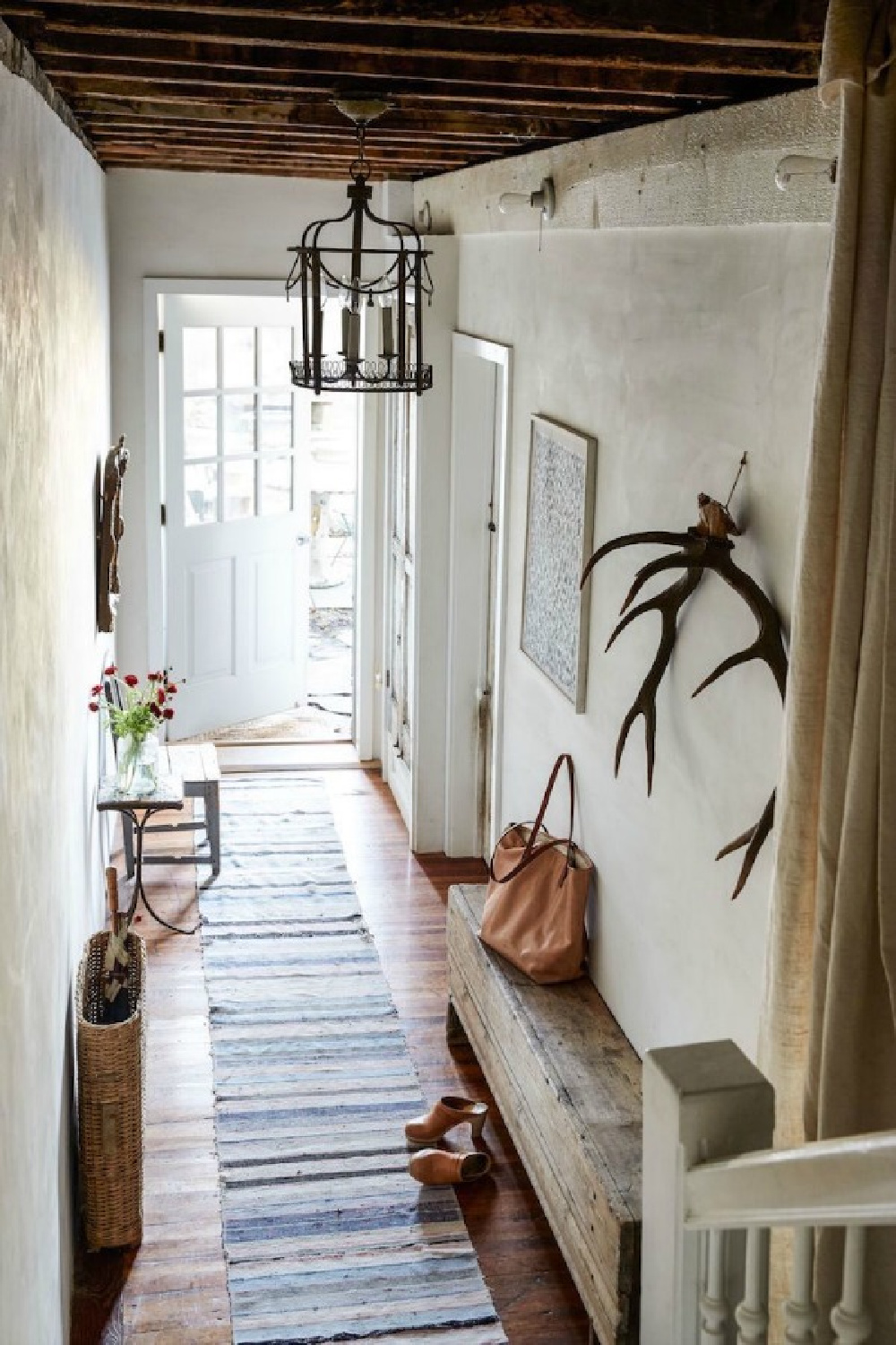
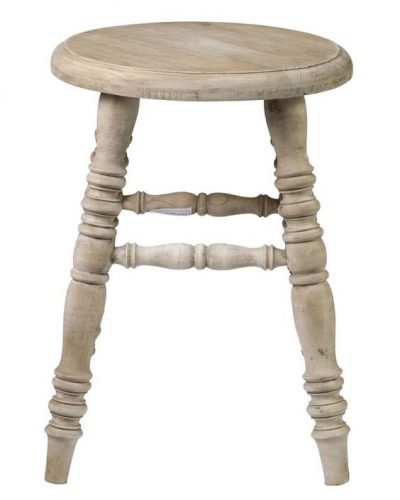
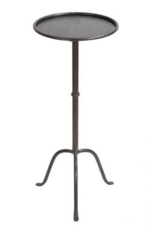
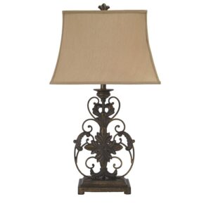
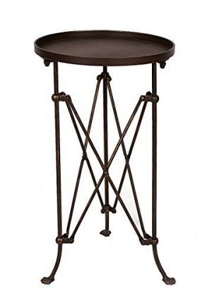
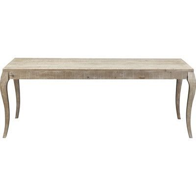
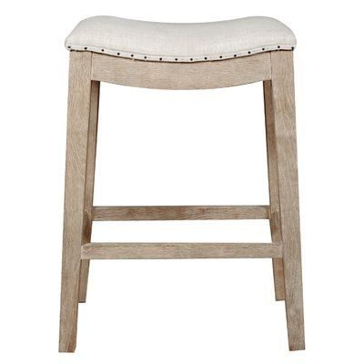
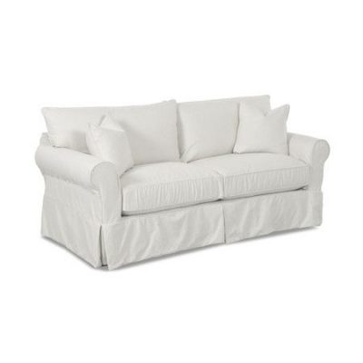
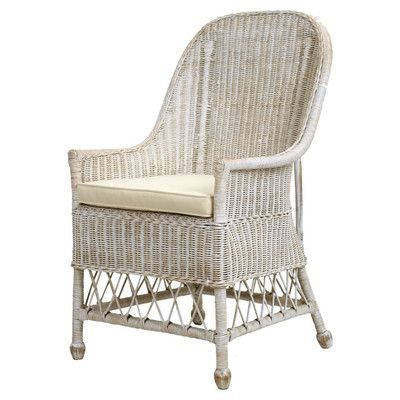
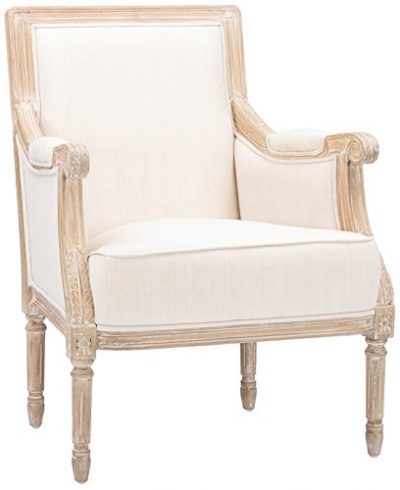
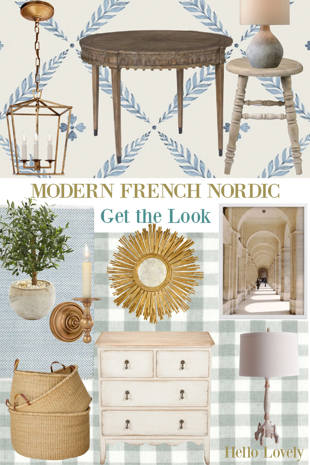
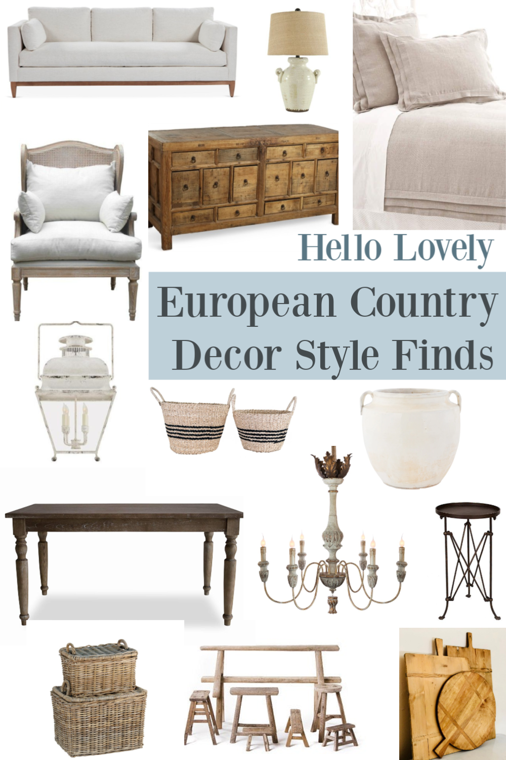
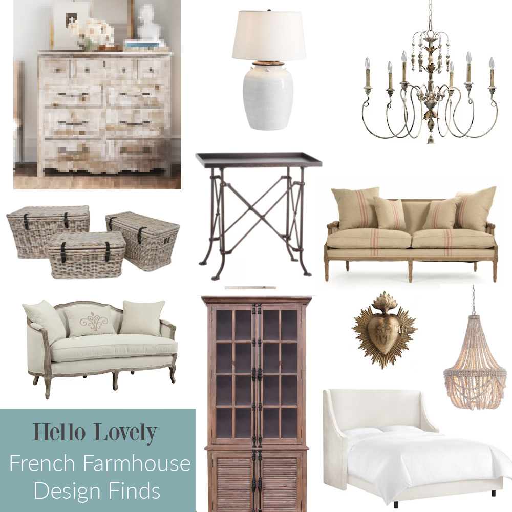
Home decor and furniture suggestions are often shared here to promote timeless and tranquil European country style.
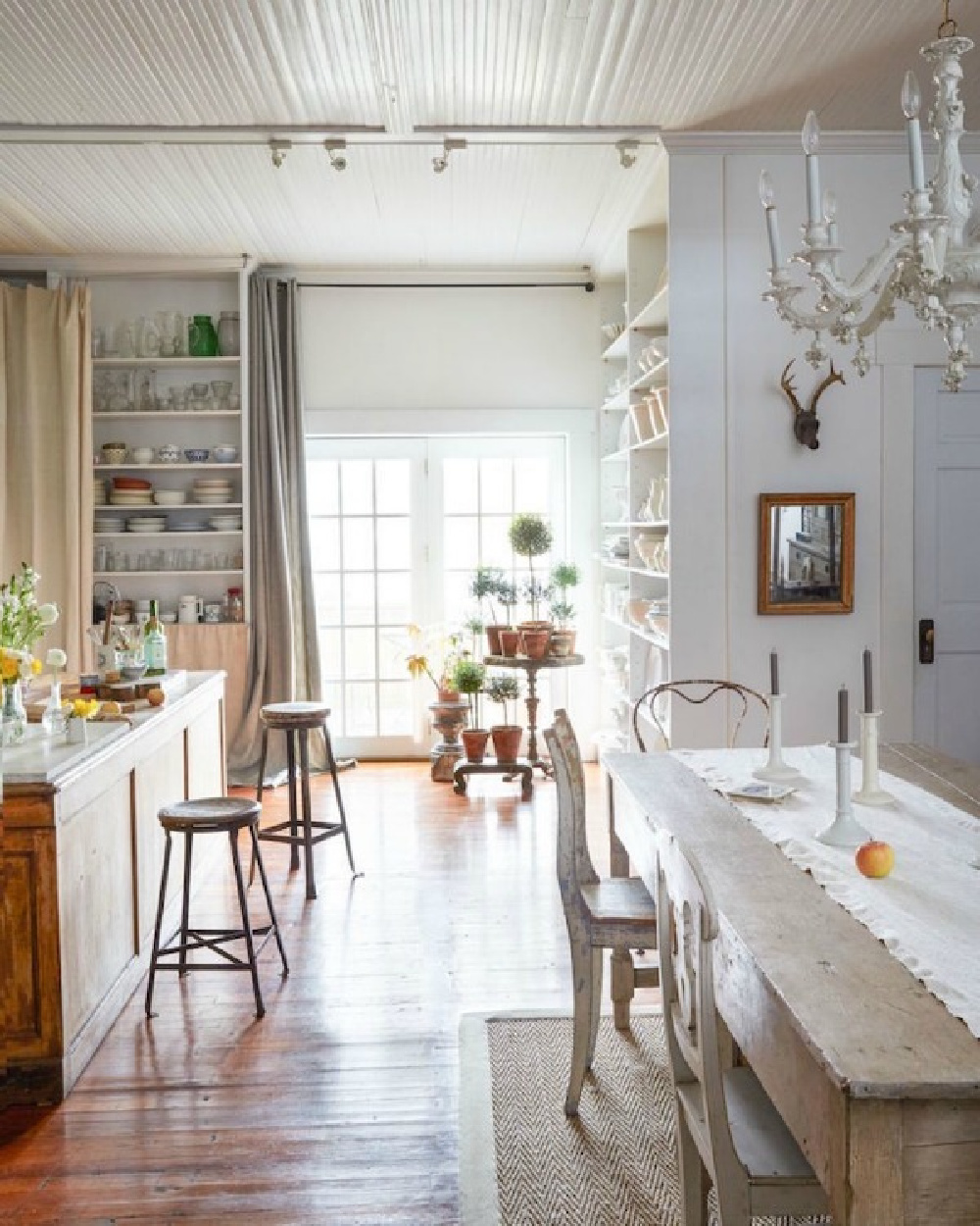
An added bonus to decorating with refined rusticity and barefoot elegance? Your bank account may thank you.
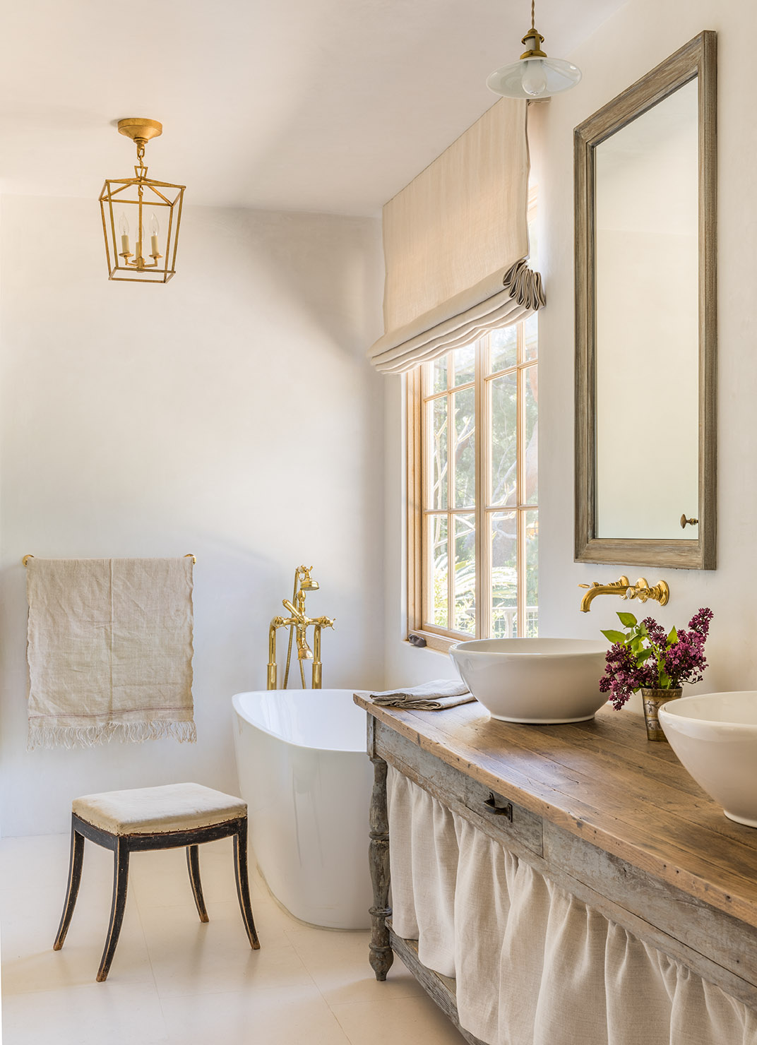
As long as you don’t intend to fill your shopping cart with collected, rare, and imported European antiques and handmade bespoke finds, it can be an attainable look!.
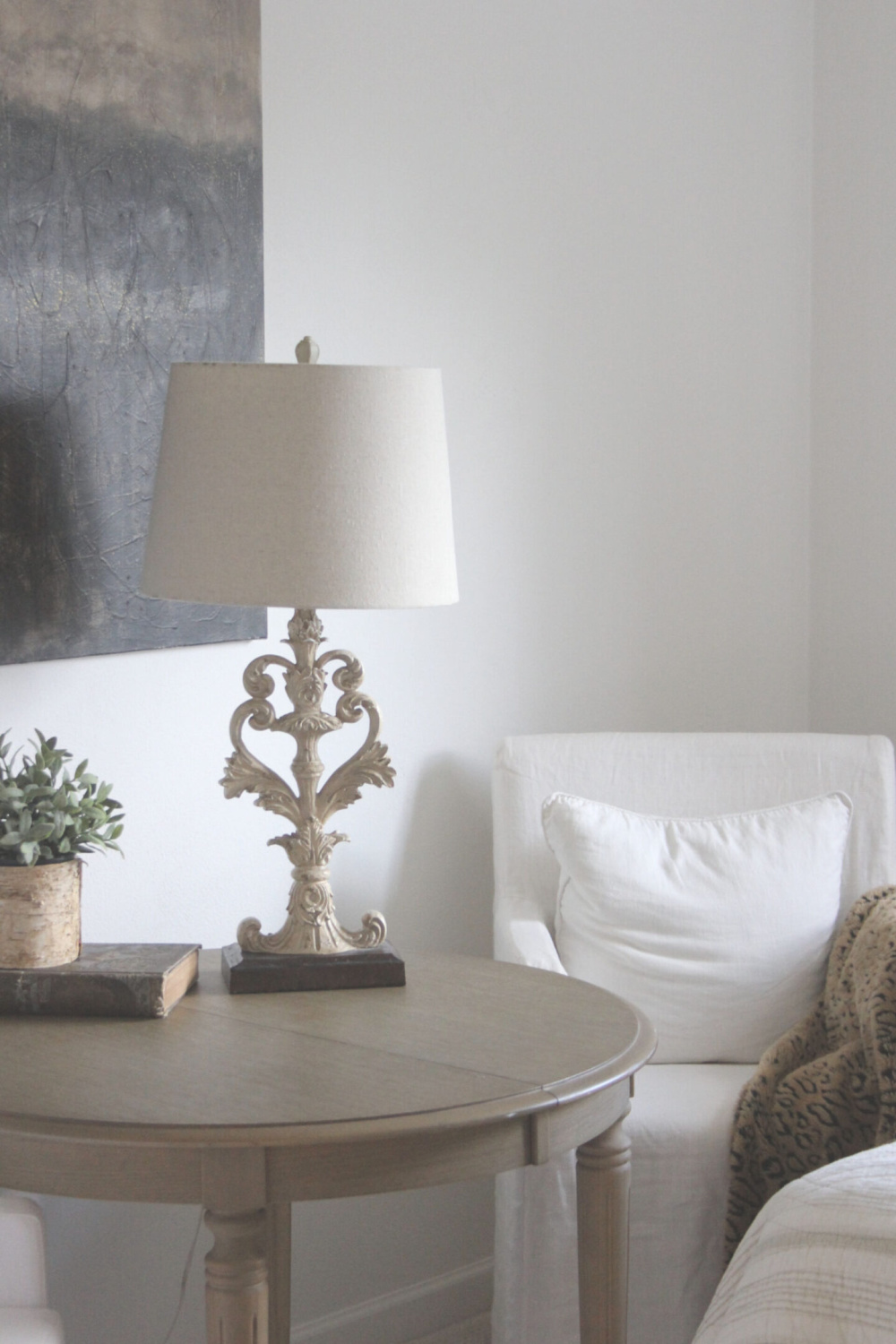
In my own home (above), bargains find their way into the mix all of the time. I bring home pieces for which I’m certain I won’t tire. If boredom arrives, I rotate pieces. The small round table above has lived in a number of places in various homes. A breakfast nook, guest bedroom, and an office. European country interiors need not be primarily rustic.
In fact, in our prior home, too-rustic pieces just don’t seem to work in our current Georgian home with its fussier bones.
Here’s an elegant French country kitchen sans rustic touches:
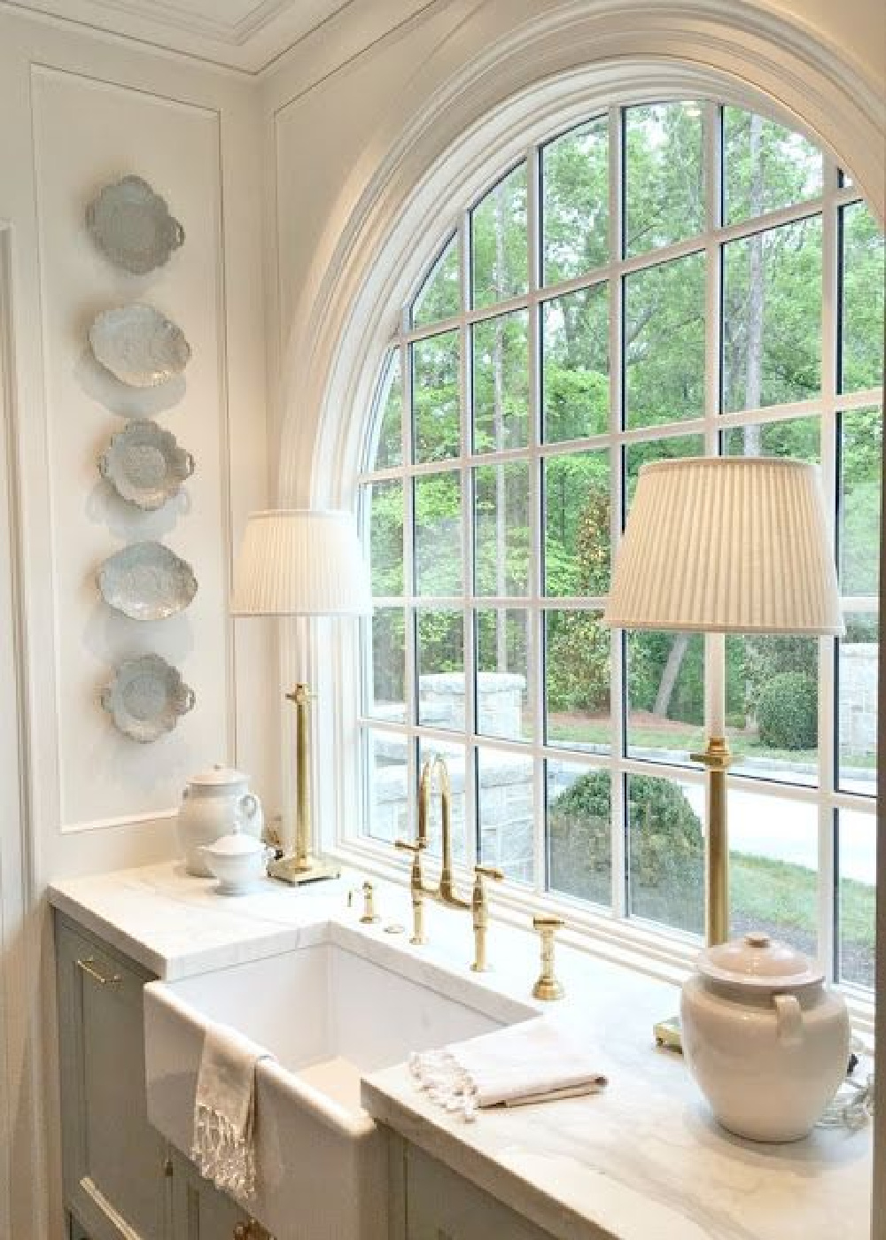
So pretty yet no rustic bread board, crusty farm stool pulled up to the farm sink, or peely paint in sight.
What qualities distinguish European country from American country?
An evolved look over time is an important distinction. The reason so many beautiful European country interiors have an effortlessly layered look as if they evolved over time? Because THEY DID not happen in a day.
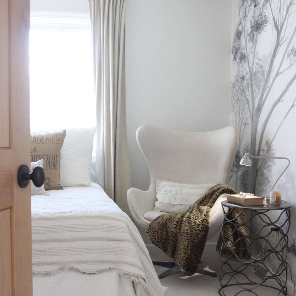
The good stuff takes time. We frequently do not want to face this. So anxious to create the dream now, we delude ourselves. How could we ever expect beautiful things appearing to be timeless to not take their own sweet time?

If you need it this very second, an interior designer may be your best resource.
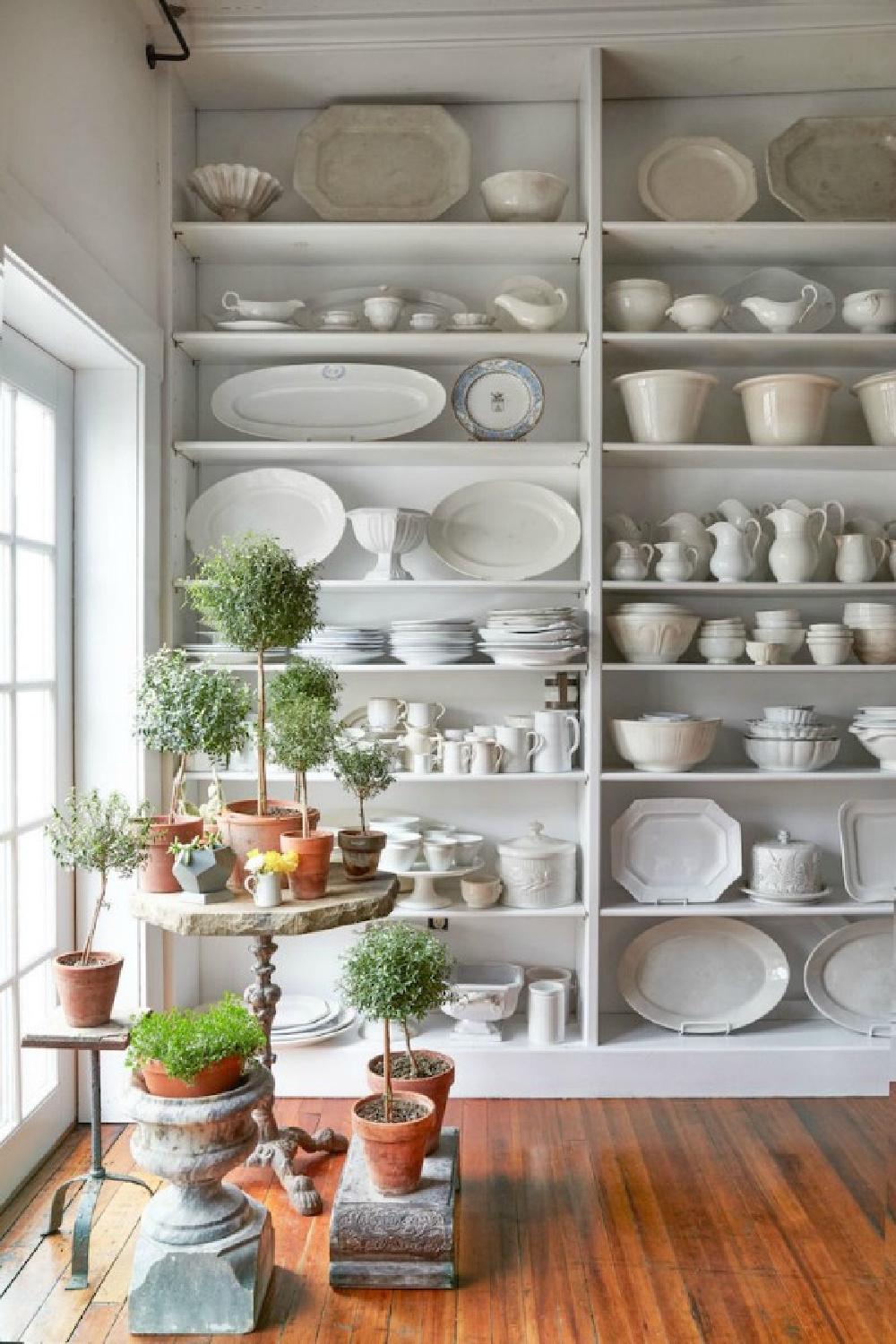
Taste also comes into play when you’re after a more European refined look. Plaques with pigs declaring ‘bless Le MESS’ in an American country entry will always miss the mark. *I’m lookin’ at you, Hobby Lobby. 🙂 Better to leave that open space open then layer on a ridiculous filler.
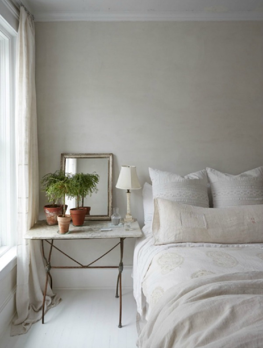
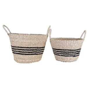
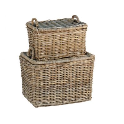
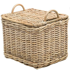
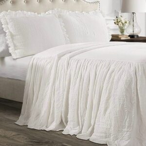
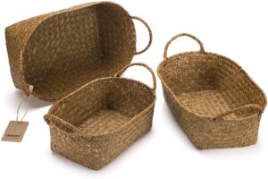
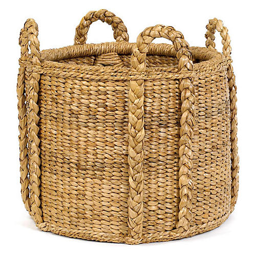
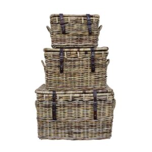
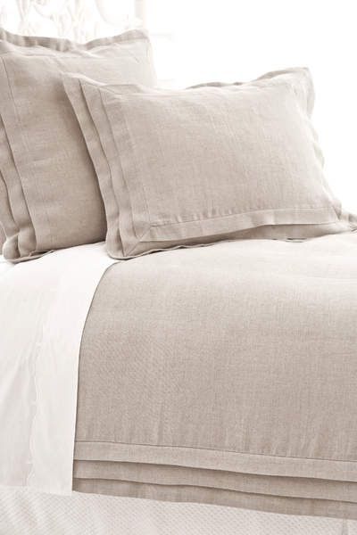
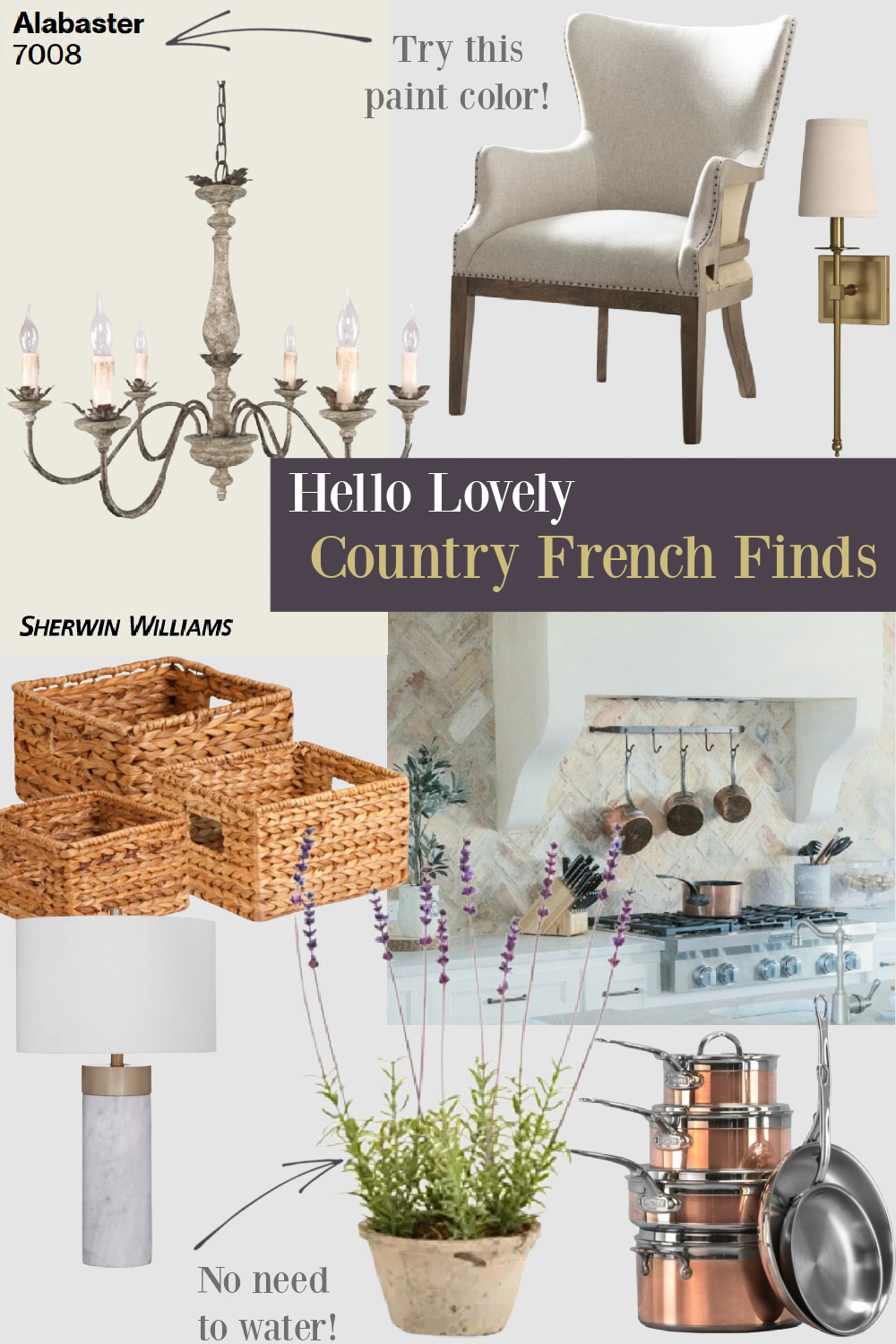
Try these elements: natural woven baskets, fresh flowers, ancient earthenware pottery, recycled glass bottles, branches from the garden, and beautiful linens growing better with use and age.

Also collect antiques, unusual vintage, personal mementos, painted furniture pieces in varying conditions and layered rugs (or none at all!).
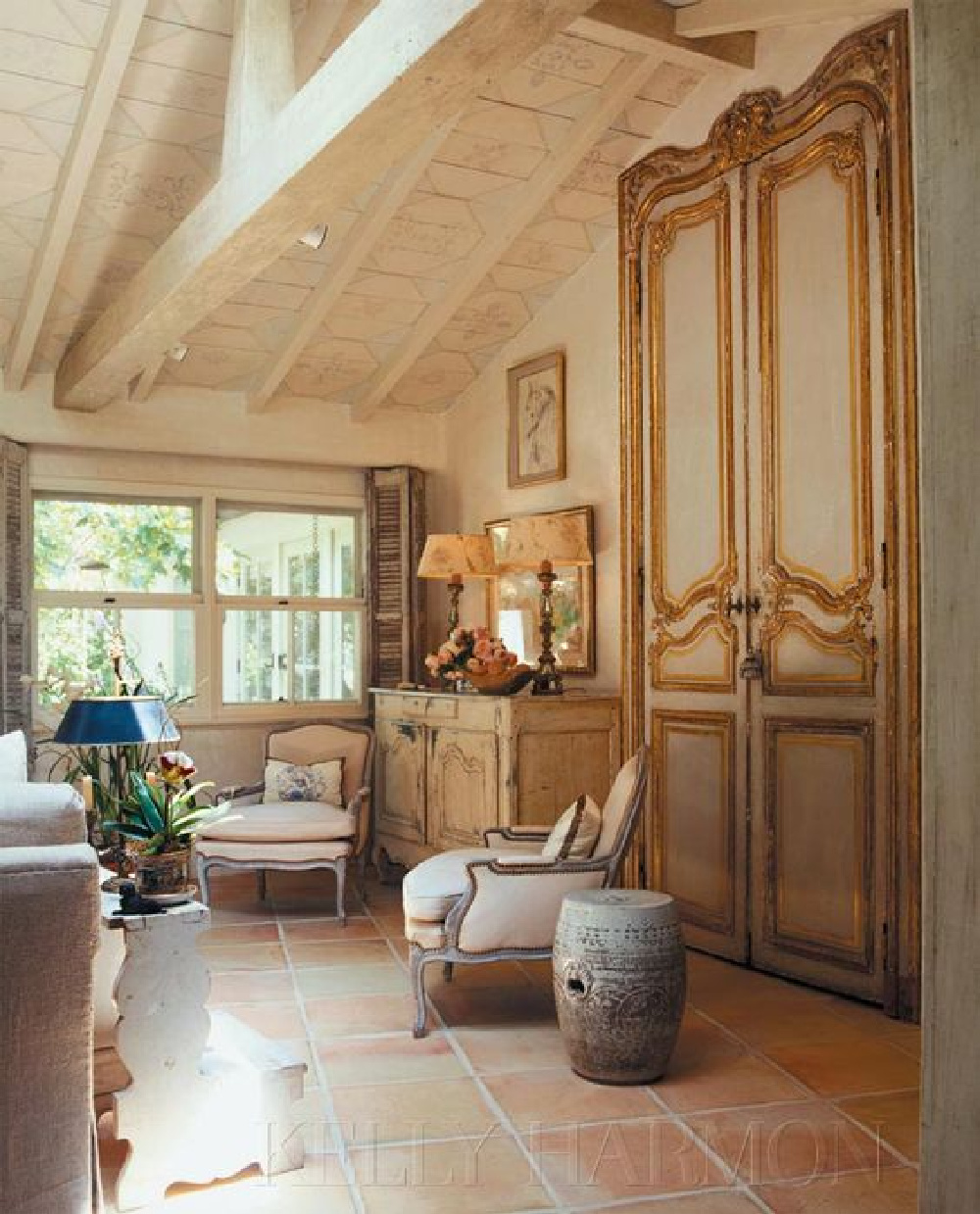
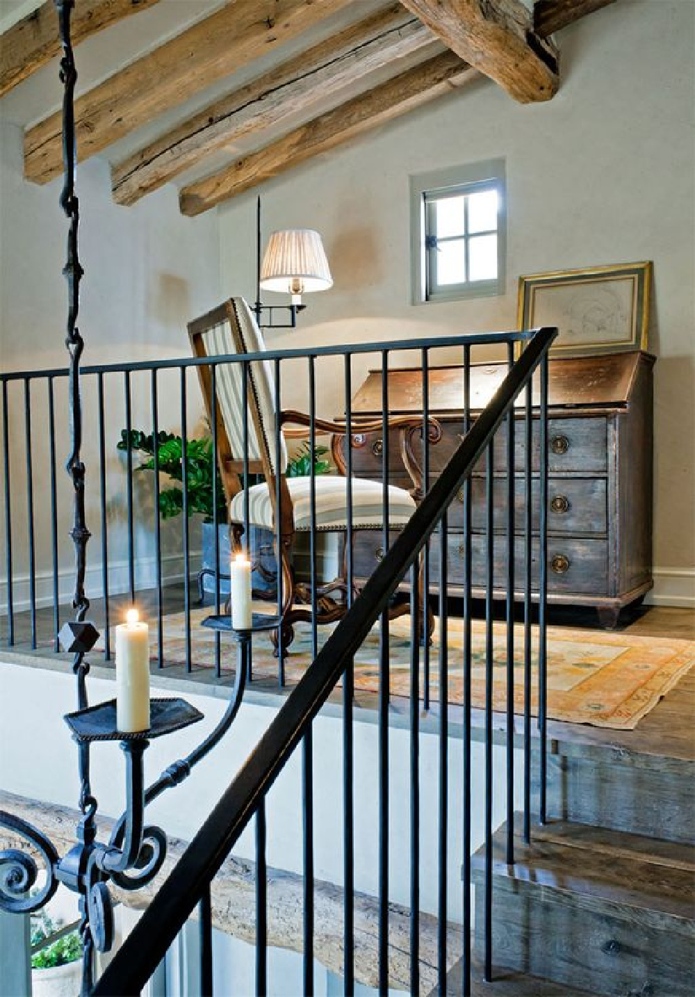
More authentic Euro country rooms reflect an absence of manmade and plastic. Think furniture arrangements encouraging intimacy that don’t feel rigidly appointed.
Recipe for a Masterful Euro Mix?
The thing is, this mix is always best when it is personal and tells your story. It should evolve over time as a result of interests, collecting, travel, and experiences.
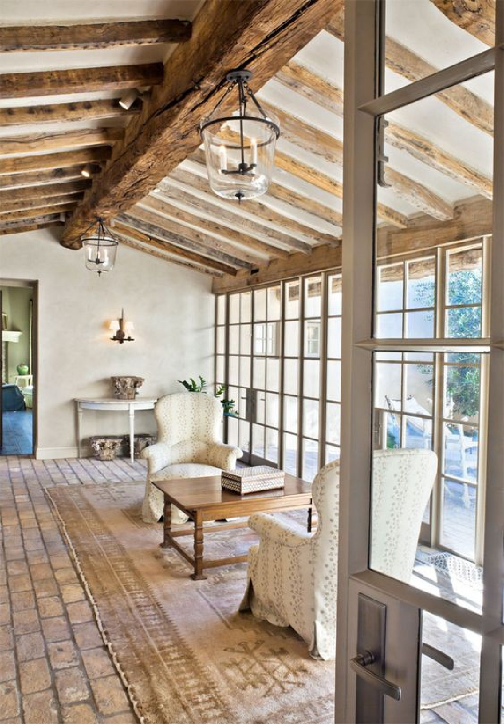
Euro-Country Ingredients to Consider
I scribbled down a list of European inspired ingredients that influence my own journey.
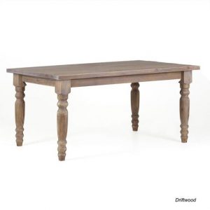
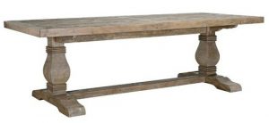
Harvest tables
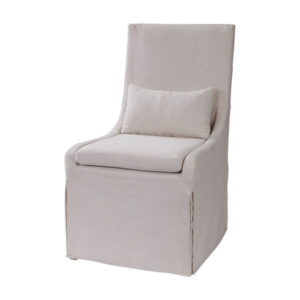
Antique chairs
Painted furniture
Natural, scrubbed, and raw wood finishes
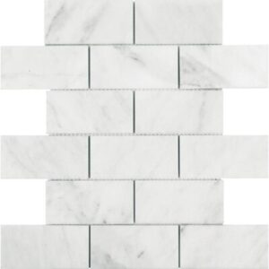
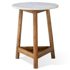
Rugged stone and marble
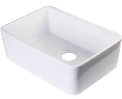
Farm Sinks
Solid wood doors
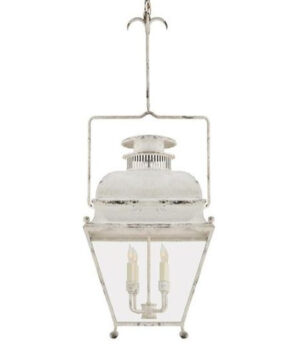
Iron lanterns
Handcrafted objects
Plaster walls
Rustic freestanding cupboards
Exposed rafters and beams
Reading Nooks
Butcher’s Block
Wood Ceiling Beams
Unlacquered brass
Weathered Wood
Fresh Flowers
Handpainted objects
Glazed tiles
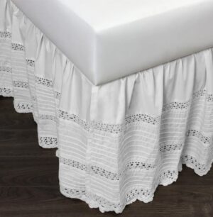
Vintage Linens and Quilts
Clawfoot Tubs
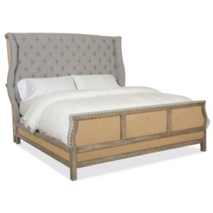
Canopy Beds
Matte finishes (non-shiny metals)
Steel windows
An absence of plastic/vinyl/disposable
I independently selected products in this post—if you buy from one of my links, I may earn a commission.
If you missed THIS story about Euro Country Elegance, give it a whirl!
Peace to you right where you are.
-michele
I independently selected products in this post—if you buy from one of my links, I may earn a commission.
Thanks for shopping RIGHT HERE to keep decor inspiration flowing on Hello Lovely!
Hello Lovely is a participant in the Amazon Services LLC Associates Program, an affiliate advertising program designed to provide a means for sites to earn fees by linking to Amazon.com and affiliated sites.
