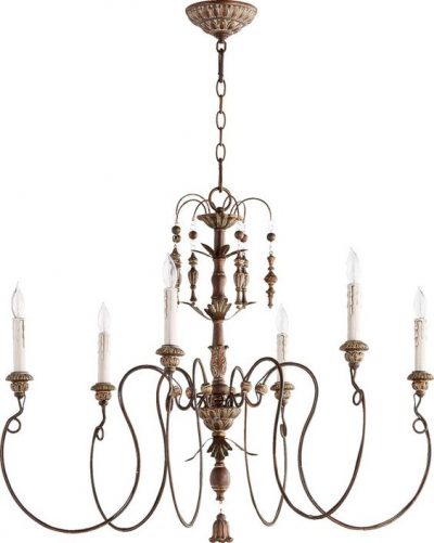
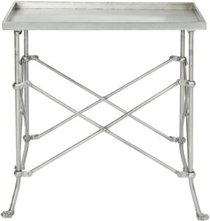
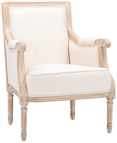
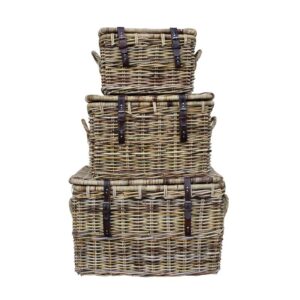
Even though I adore pale blue and whispery aqua colors, I couldn’t quite make them work anywhere at our former home. Since these tones work so well in classic traditional rooms, I’m hoping the new house may offer opportunities. Subtle, beachy, and reminiscent of sea glass, faded denim, summer skies, these blues bring to mind coastal landscapes. For me personally, they are also nostalgic since I grew up with a mother who adored aqua and dressed us in it. You’re going to love Classic & Country Interiors With Pale Blue, Duck Egg and Aqua (plus paint colors) if these soft, calm, cool tones also make your heart sing!
Classic & Country Interiors With Pale Blue, Duck Egg & Aqua
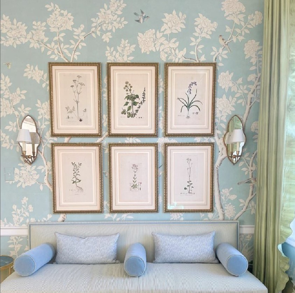
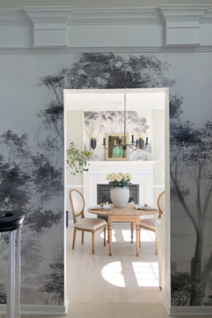
It’s hard to beat the beauty of a handpainted Gracie wallcovering with a blue this dreamy (above) for a classic interior.
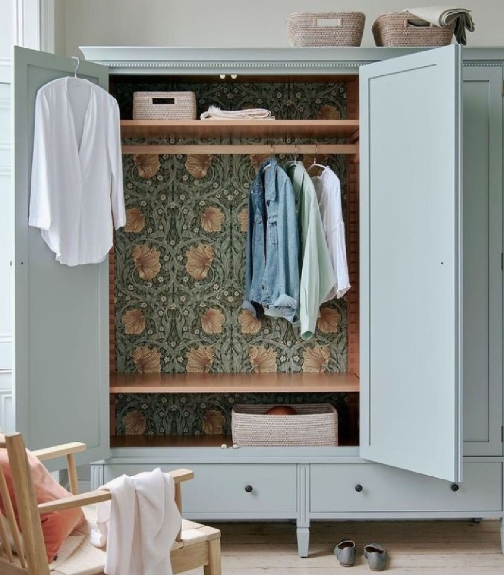
I thought this was an interesting combination for a European country wardrobe of duck egg blue with the surprise of a William Morris wallpaper inside:
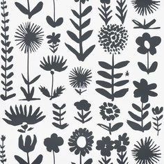
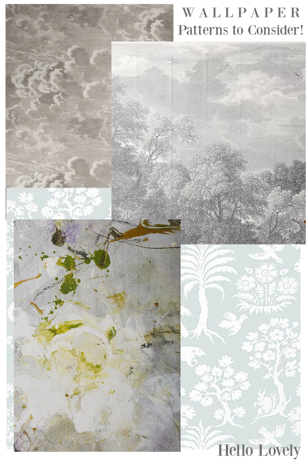
Need ideas for wallpaper?
Wondering WHICH blue for a cheerful front door paint color?
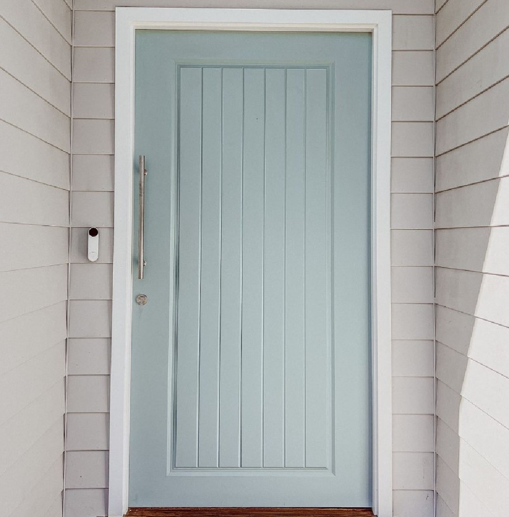
It’s Duck Egg Blue (Dulux Australia). Easiest way to see if a paint color will work? Order samples with Samplize and have them delivered straight to your door.
Tough to Pin Down Blue-Greens
This image from a Round Top, Texas farmhouse by Eleanor Cummings is never far from my mind when I consider my favorite use of a weathered, faded, blue-green.
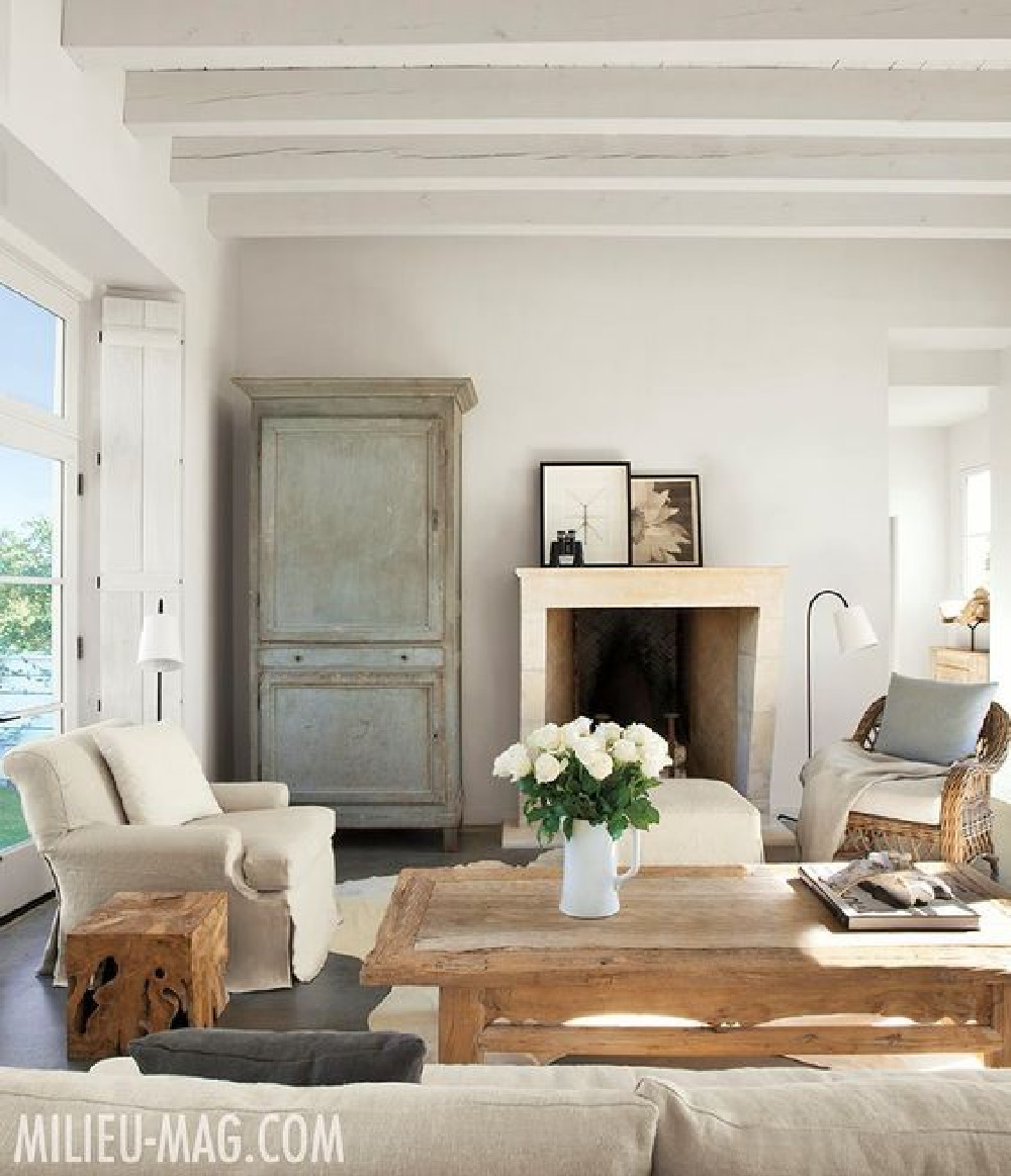
Don’t you love the layers of paint and warmth peeking through this antique? If a muddy, very Swedish sort of blue is your favorite, maybe a blue tile backsplash is in your future:
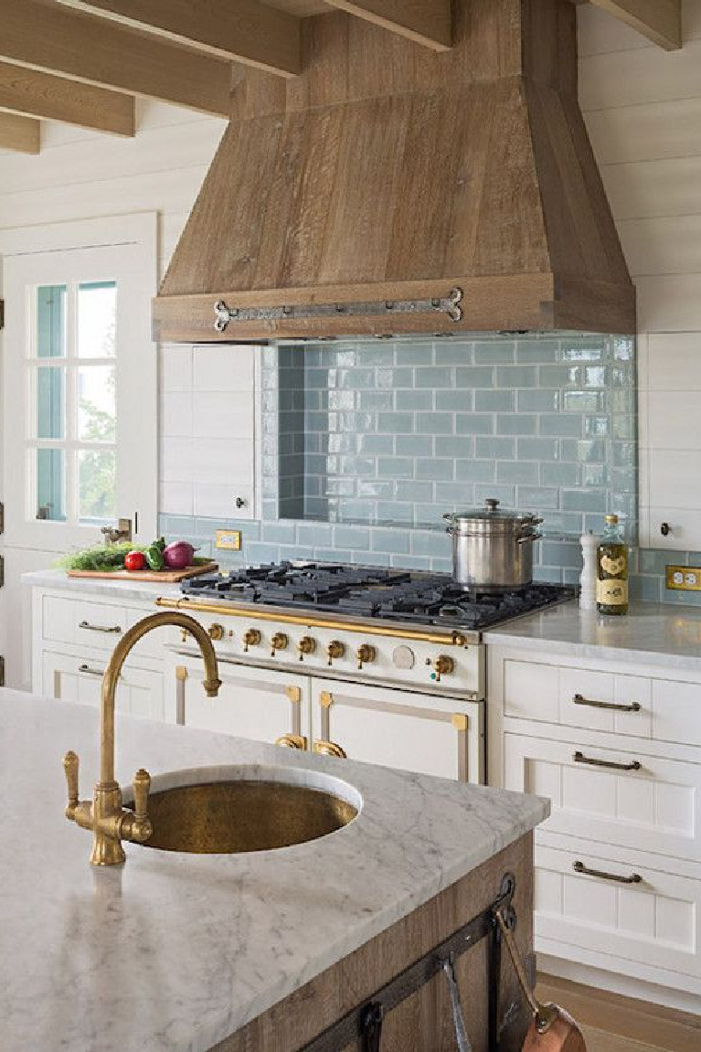
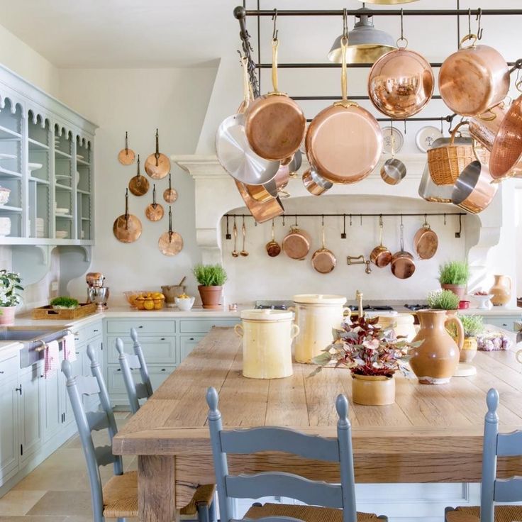
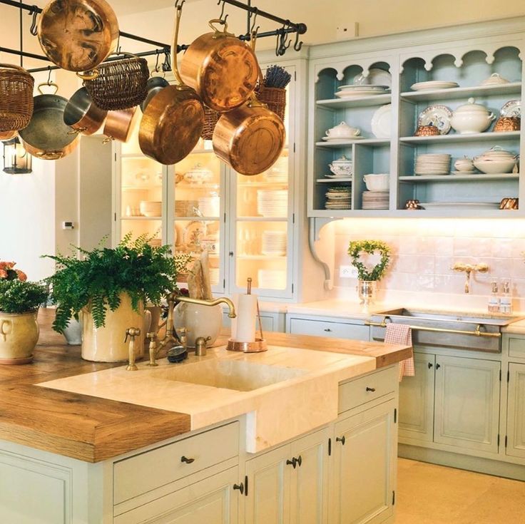
I share so many amazing fantasy kitchens on this blog, and of course they influence me as I consider what color cabinets for the new kitchen. In Shauna Varvel’s Provence kitchen, the blue inspiration came from a kitchen at her favorite hotel.
With all the copper, it’s positively magic. Gold tones also create a lovely marriage with light blue-greens:
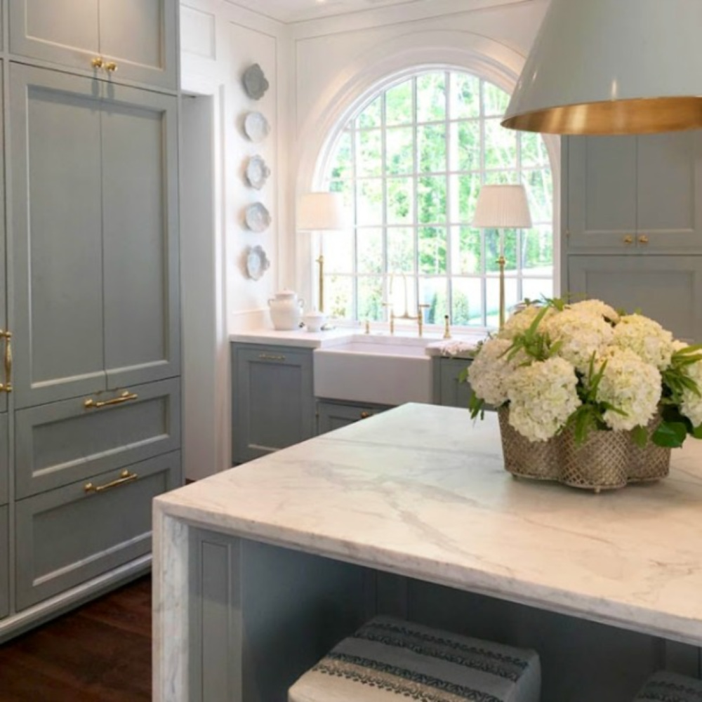
In both the Provence kitchen and this Southeastern Designer Showhouse 2017 kitchen (above), the blue is:
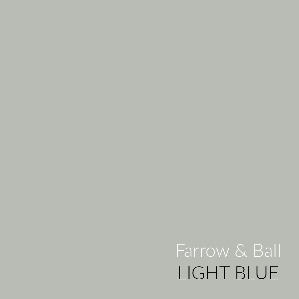
I’m strongly considering this silvery blue for our kitchen. Not sure if a light grey or light blue or a combination is the best choice for me since I tire quickly of color. Here is more of F&B Light Blue:
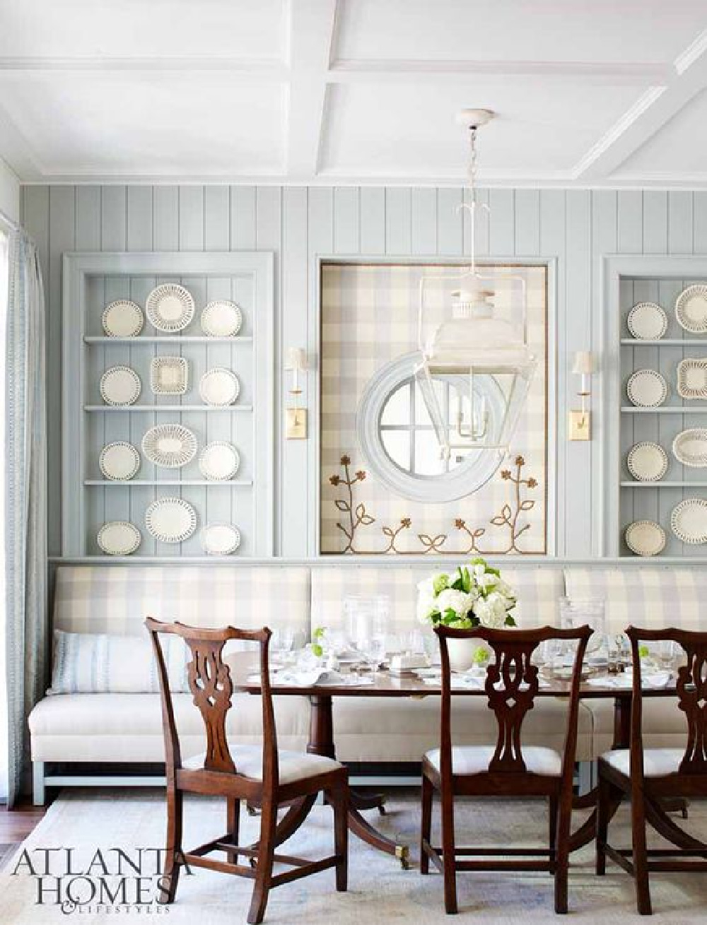
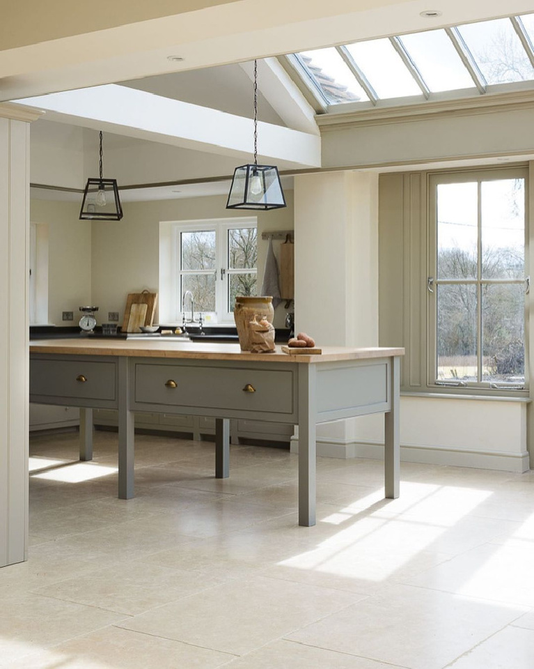
I think I would be quite happy in a very minimal English country kitchen like this:
Just for comparison sake, imagine the difference in mood for the kitchen above and below:
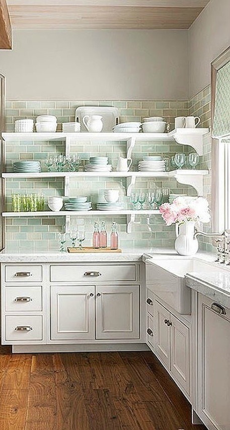
Soft greens and blues are so lovely in sunny kitchens with liberal doses of white:
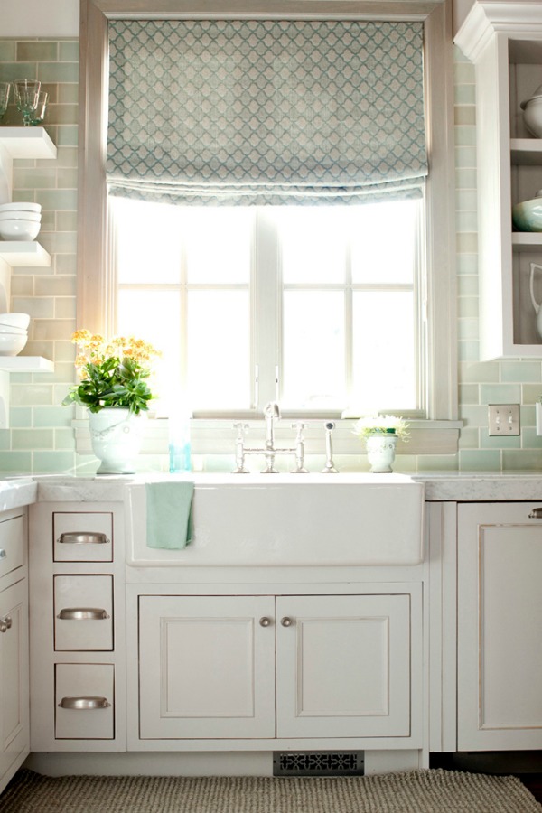
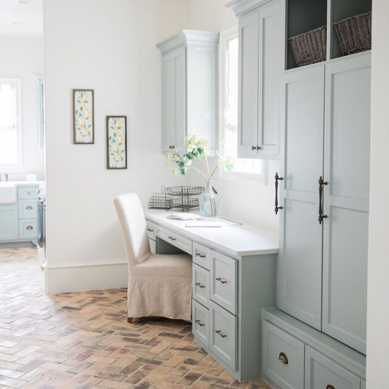
And I’ve always loved what Brit Jones did with this laundry space off a kitchen:
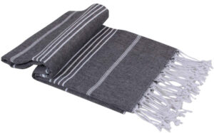
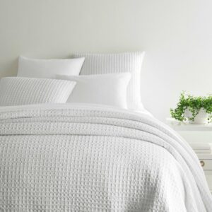
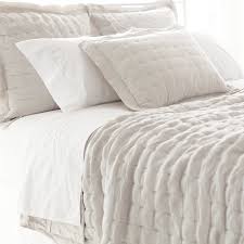
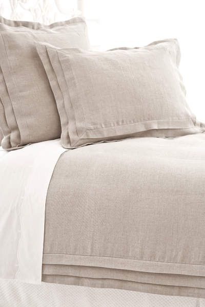
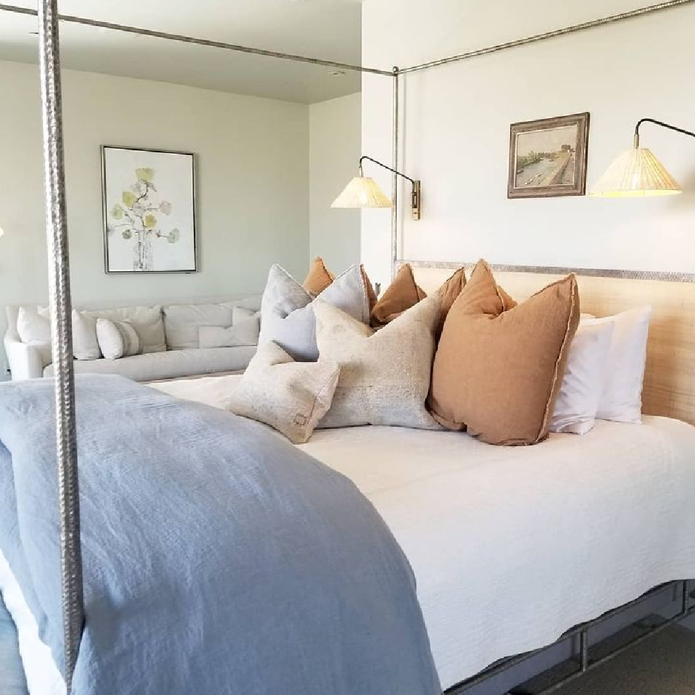
Of course, it’s not all about paint or wallpaper…pretty blue, aqua, and blue-grey linens are another way to accent with color:
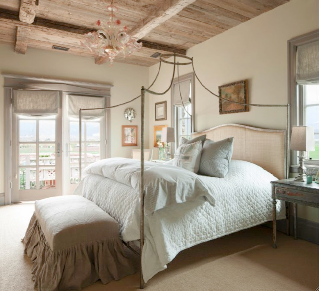
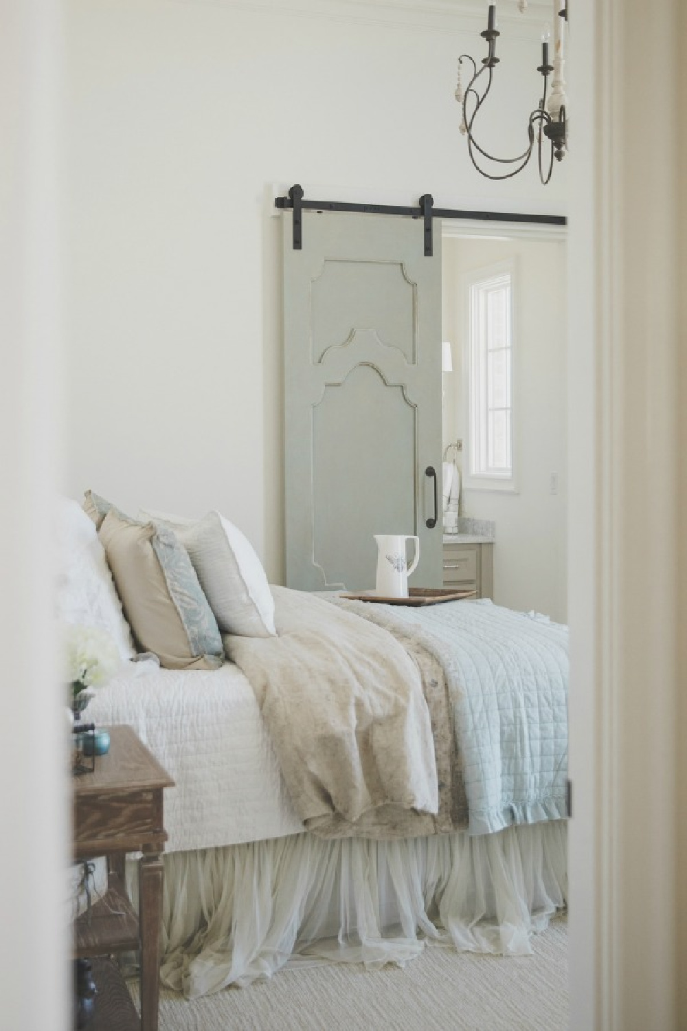
Unforgettable French Nordic Cottage by Decor de Provence
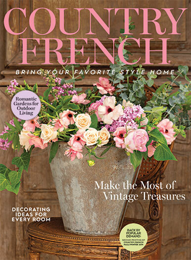
Source: Decor de Provence and Country French Magazine/Styling: Bonnie Broten
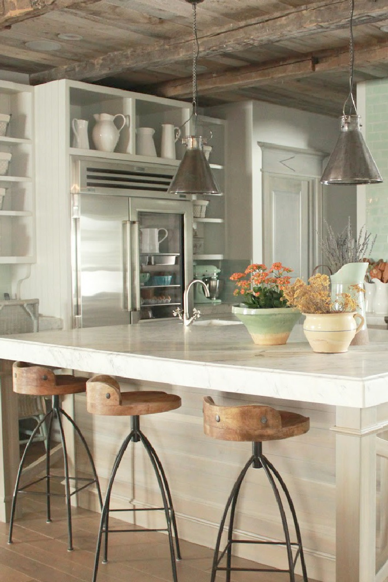
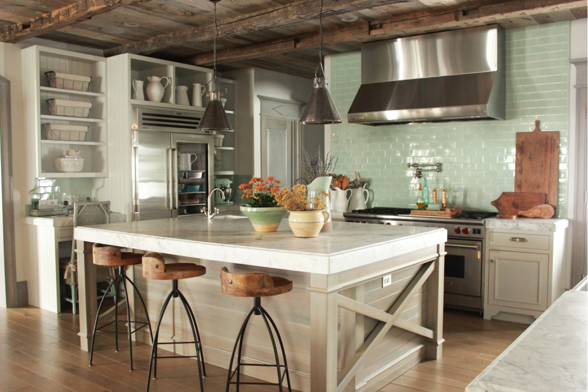
My longtime blog pal Desiree of Decor de Provence designed one of my all-time favorite Provence-inspired kitchens with atmospheric muddy grey-blue-greens where you can’t quite pin down the color.
(You can also find the designer at her shop, Beljar Home, where she can help you create your own dream space!). Look at the beautiful work they are doing:
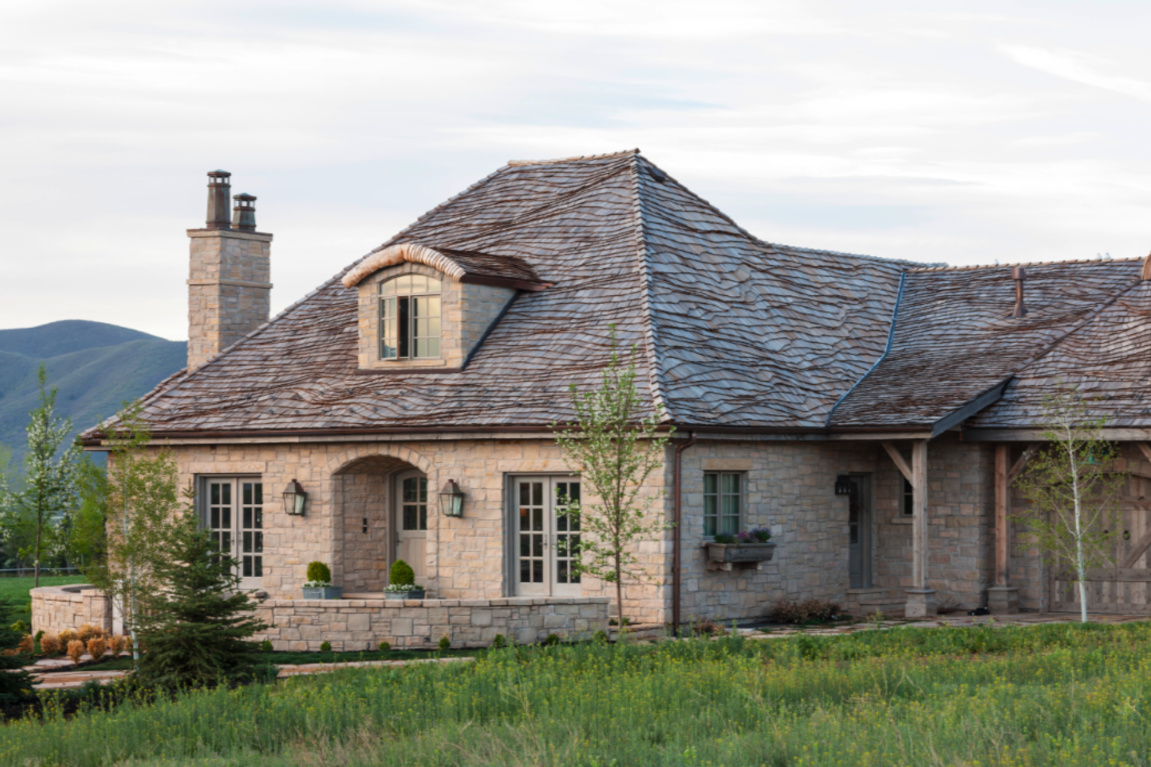
Desiree Ashworth’s Provence Inspired Cottage
Located in Utah, this quality crafted French inspired home created for a family is filled with collected antique treasures, rustic elegance, and the Provence-inspired and beachy colors the designer Desiree favors: soft blue-greys and aqua-greens.
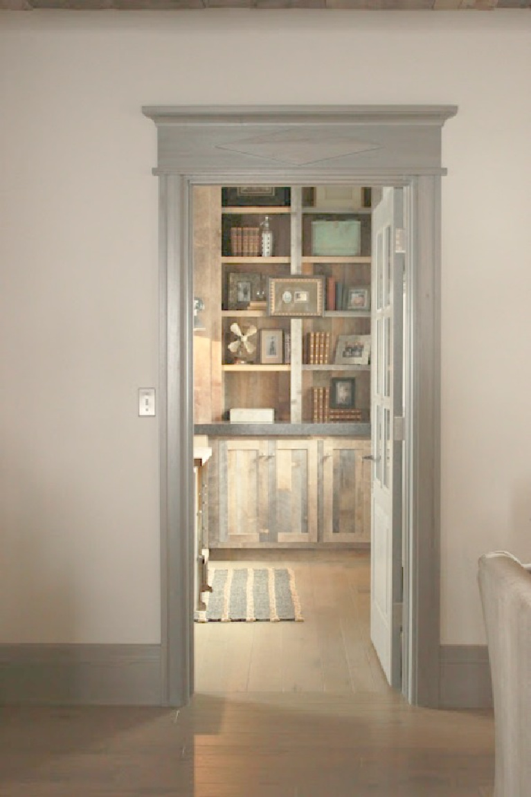
The trim in the Gustavian-French cottage is stained a custom shade many have admired. If ever she packages the formula, it may spark a revolution!
French Kitchen With Aqua and Green
This charming French Nordic kitchen is a lesson in rustic laid back elegance and a wonderful backdrop for a young family’s memories.
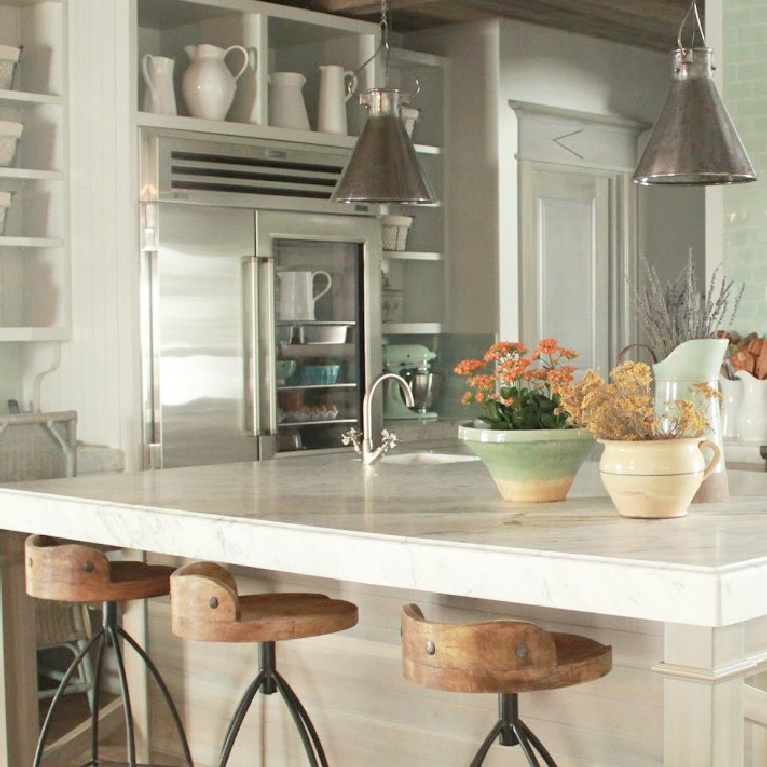
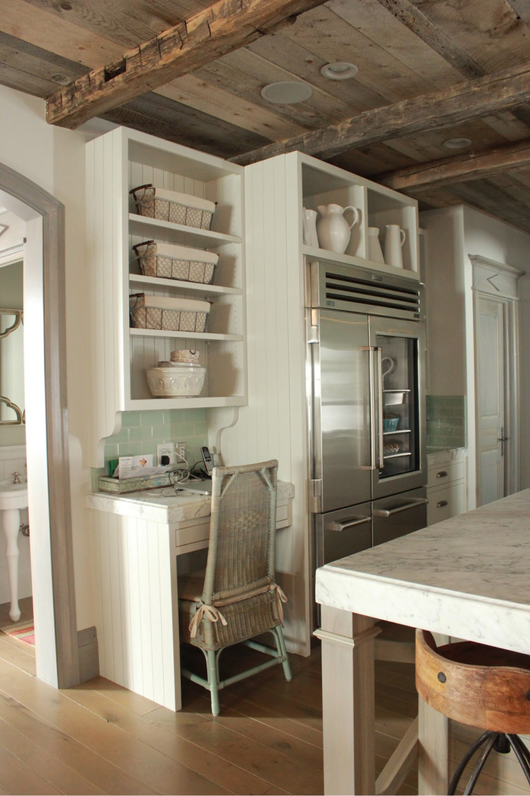
Let’s take a closer look at design details and finishes in the kitchen and dining area inspired by European farmhouses, yet interpreted in a pleasingly personal way.
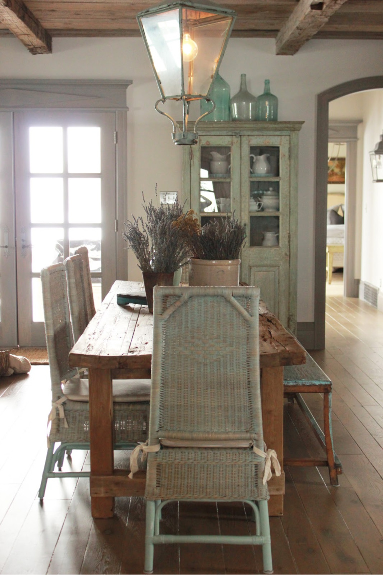
(Stylist extraordinaire Bonnie Broten styled these dreamy images, and I recall Desiree raving about the experience…don’t we all wish a stylist would show up on our doorstep with a fresh artful eye on our spaces?)
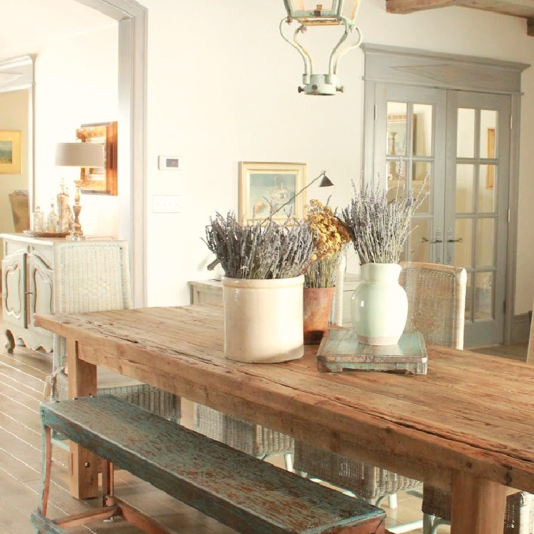
French Country Decor Accents With Green & Blue
I independently selected products in this post—if you buy from one of my links, I may earn a commission.
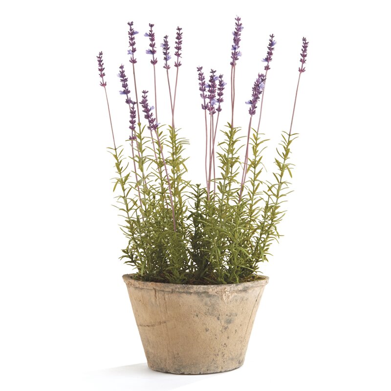
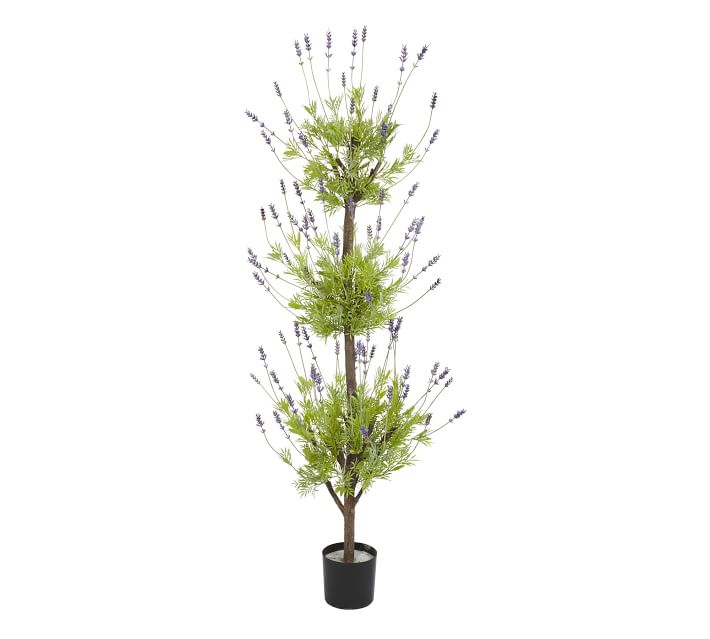
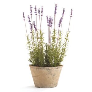
1. French Lavender
I learned lavender can mean devotion, luck, success, happiness or distrust (as far as floral language goes) and also these fun facts about lavender here:
*The name Lavender hails from the Latin word meaning to wash.
*Lavender comes from the same family as mint.
*2500+ years ago, it was used in ancient Egypt during the mummification process.
*In Elizabethan times, baths weren’t common practice, so lavender perfumed clothes and bed linen.
*Lavender’s scent deters mice, flies, mosquitoes and other pests.
*Lavender oil can be used to: soothe aching muscles and joints, reduce anxiety and stress, and induce sleep.
*Nectar from lavender plants is used to make high quality honey.
*Lavender propagation is done by cutting or root divisions.
*While most plants are blue or purple, there are also pink and yellow varieties.
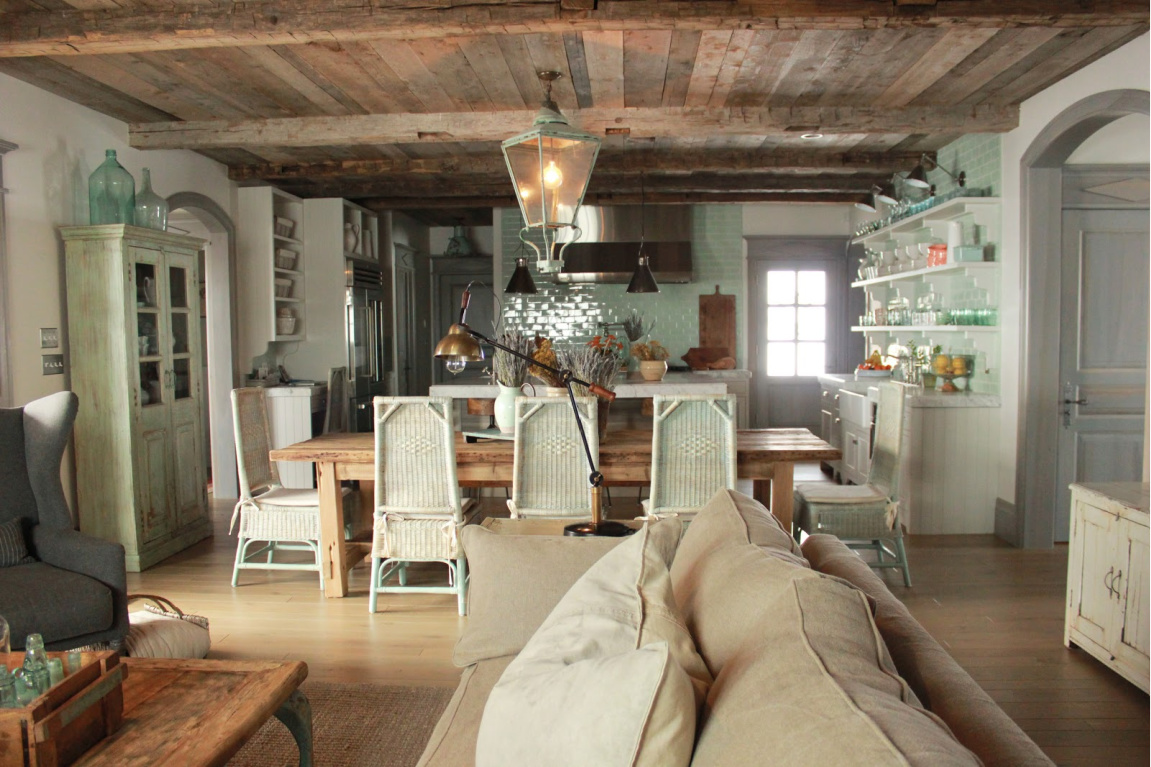
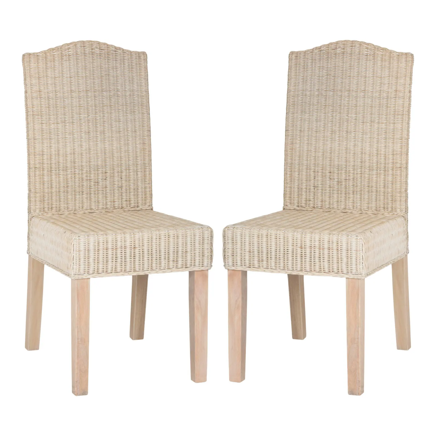
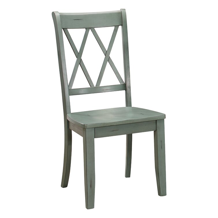
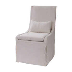
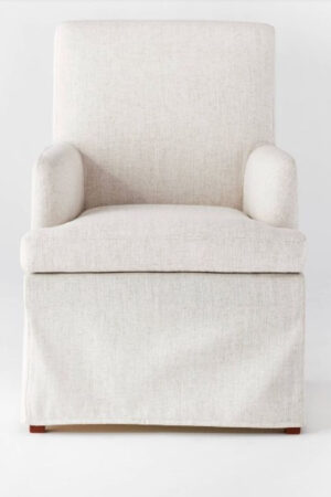
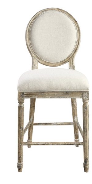
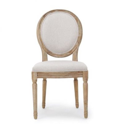
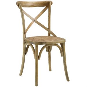
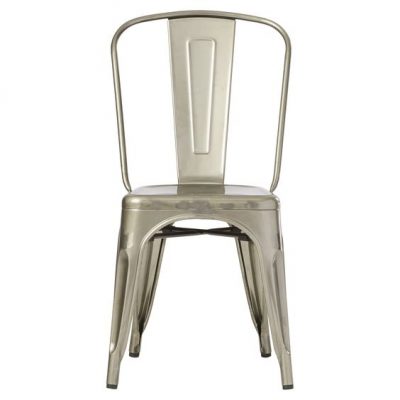
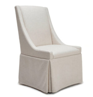
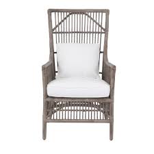
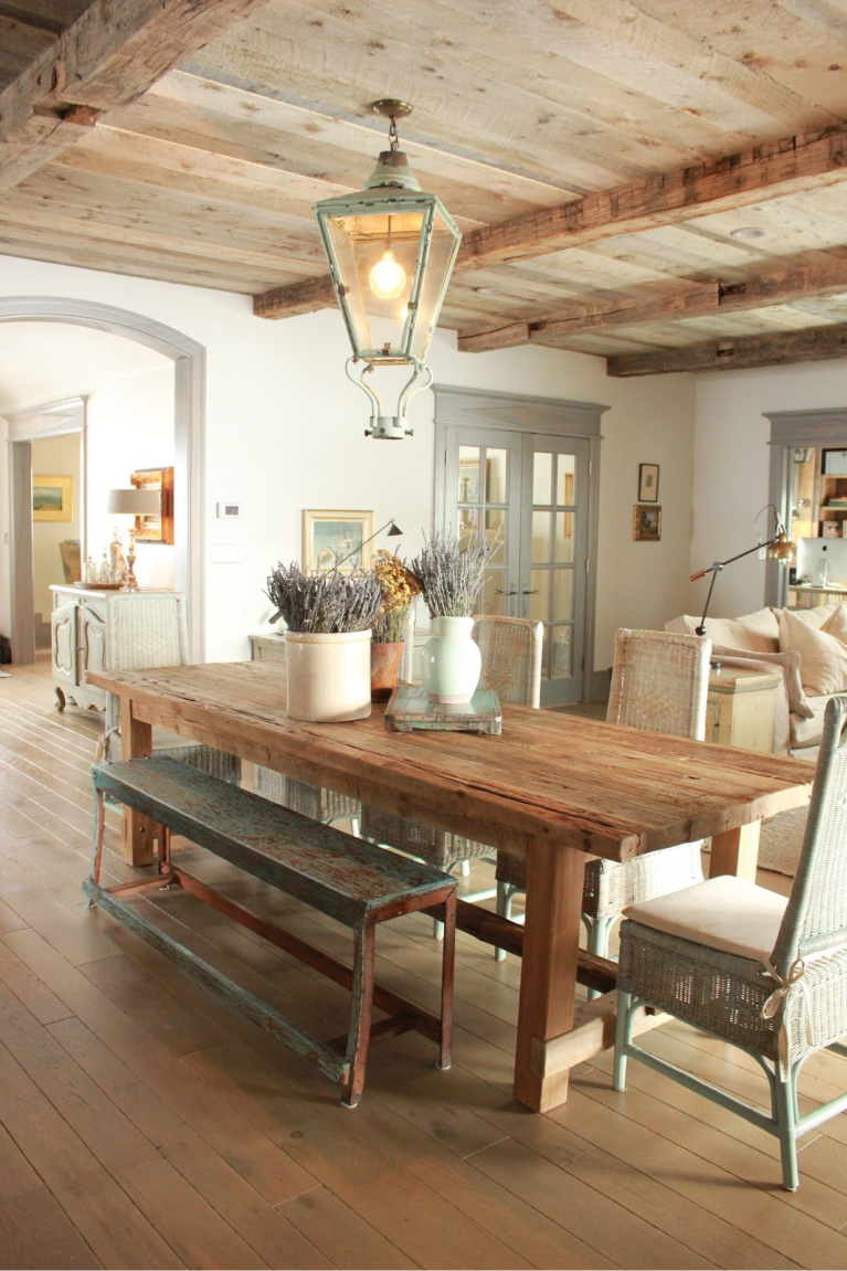
2. Dining Chairs
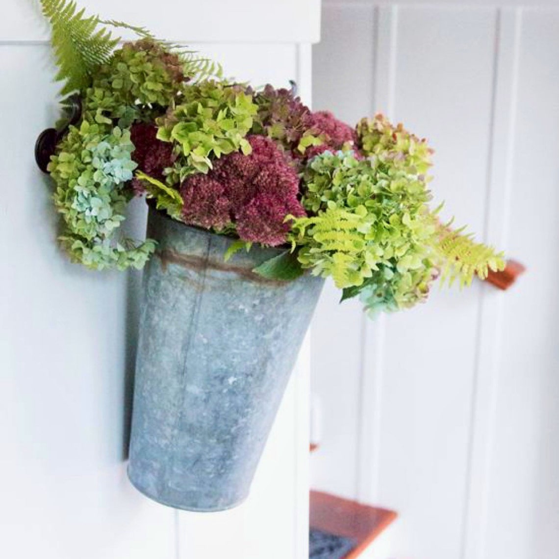
3. Zinc Finishes that Harmonize With Blue-Green
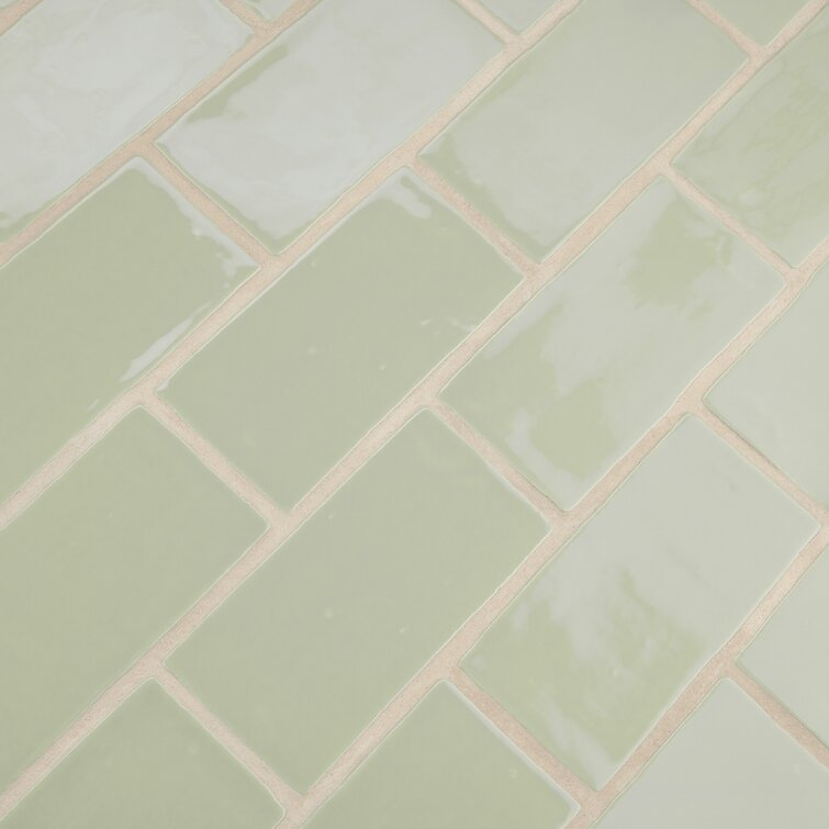
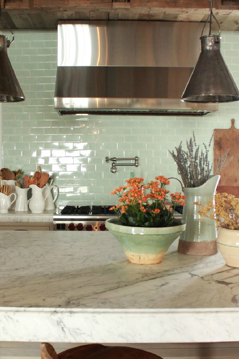
4. Soft Green Backsplash Tile
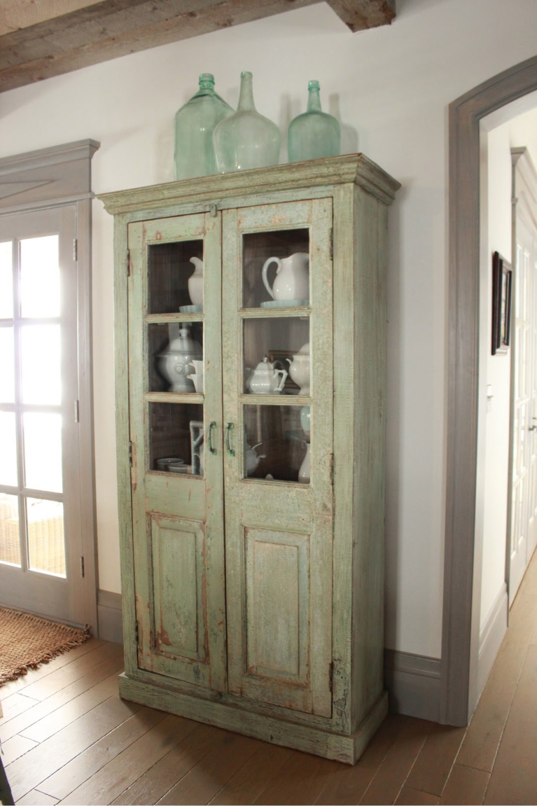
5. Green Glass Bottles
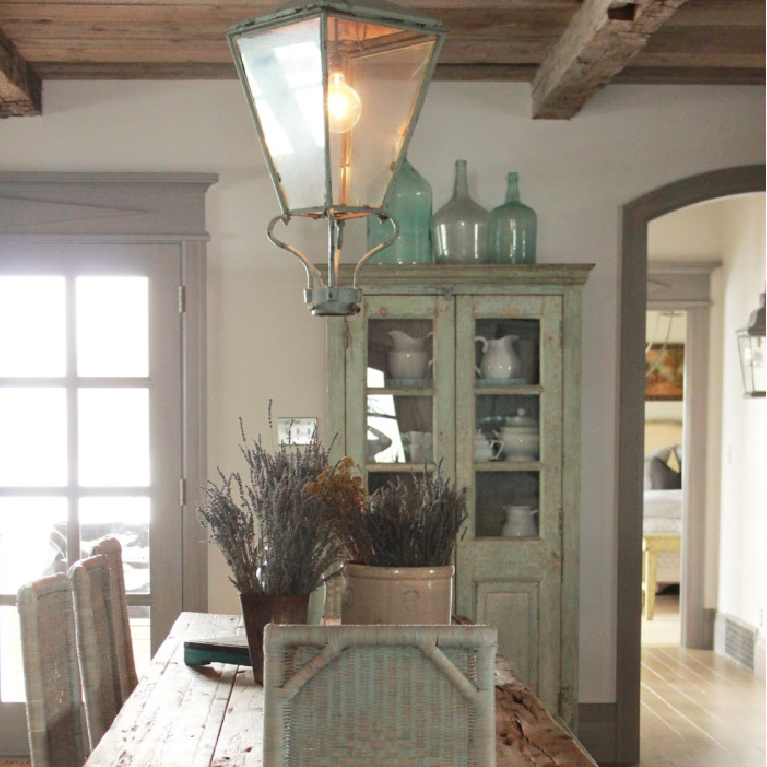
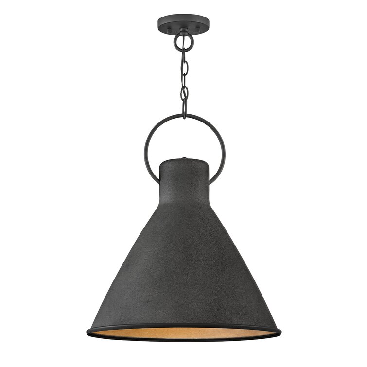
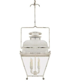
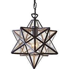
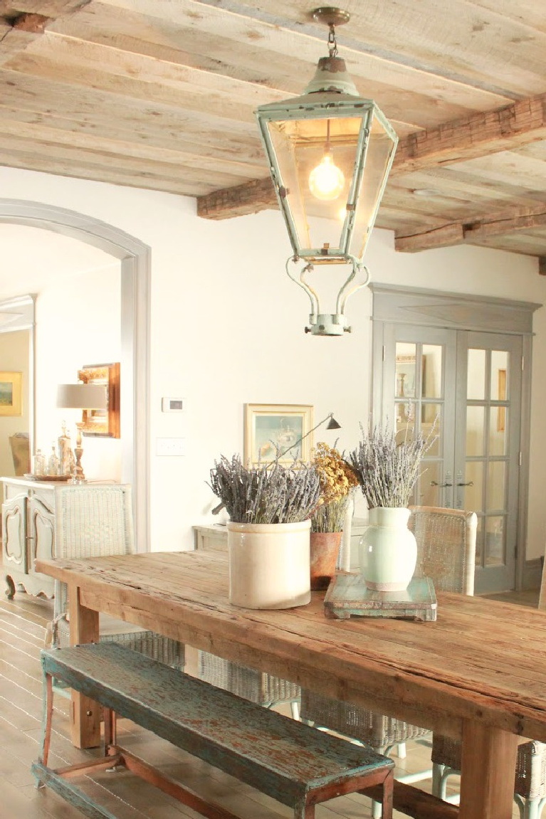
6. Painted Hanging Lantern
Even if you can’t find the “just right” vintage lantern for your space, you can improvise with a new one by tweaking the color and possibly giving it a vintage-look distressed finish.
For example, though this is an authentic finish, you could emulate it:

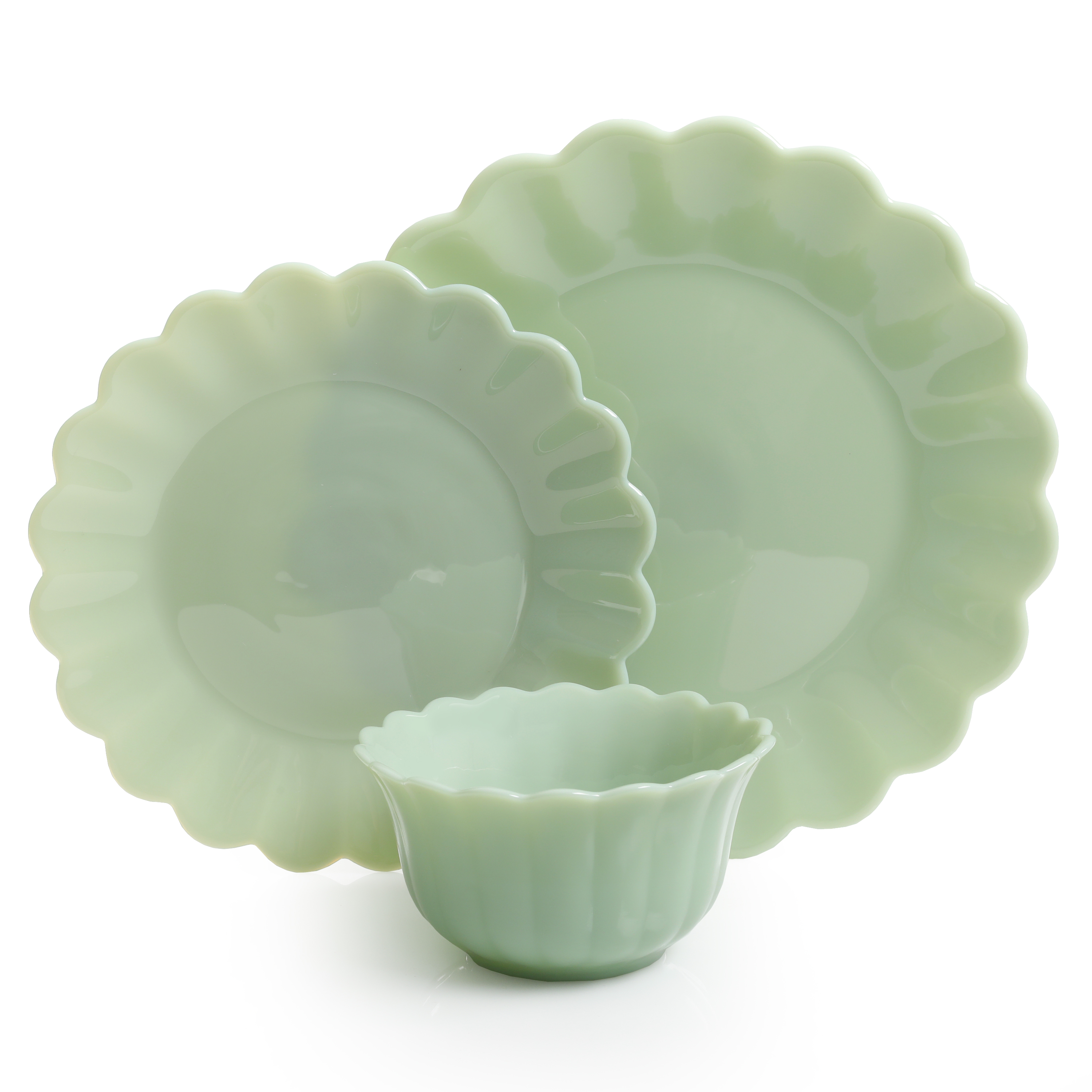
7. Charming Green or Blue Collections
So often we tuck our treasures away and only occasionally enjoy them. However, open shelves of pretty collected dishes and glassware are proof they can play starring roles.
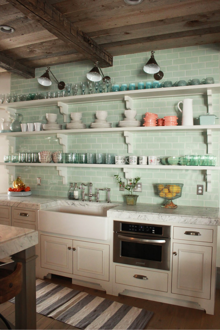
I hear a few whispers of: BUT THE DUST, MICHELE! and Mrs. Clean hears you…she truly does. I plan to try out the idea at our new home, and I’ll keep you posted.
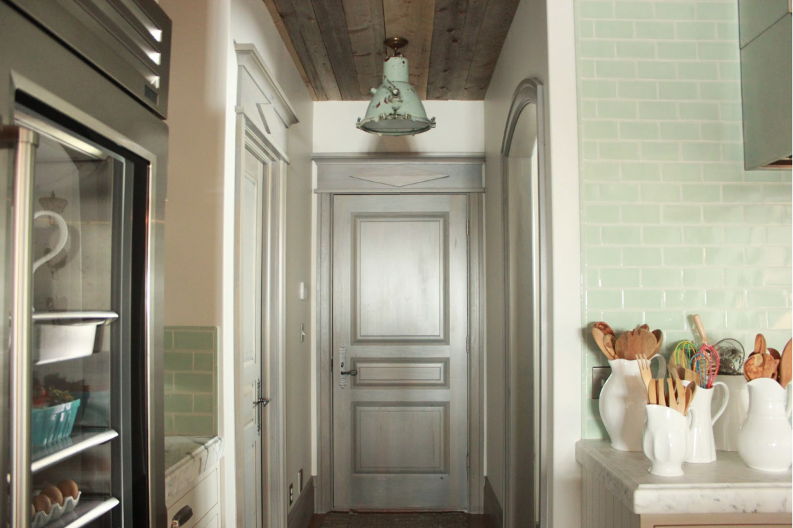
8. Think Beyond White Trim
I love how Desiree stained the trim and doors blue-green-grey. She also chose this option for her prior home. It adds a Nordic French feel, both more interesting and at home with the creamy walls. (The custom shade seems similar to Farrow & Ball’s Pavilion Gray which I just dipped my paintbrush into yesterday!)

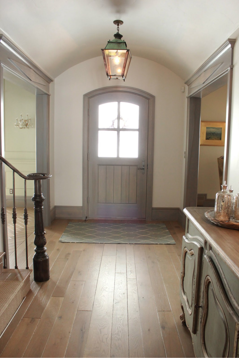
Don’t you love a timeless design that will still look relevant in a decade?
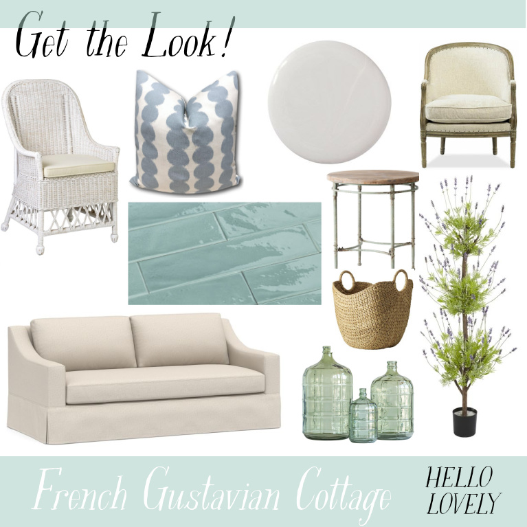
Tour This Cottage With Green
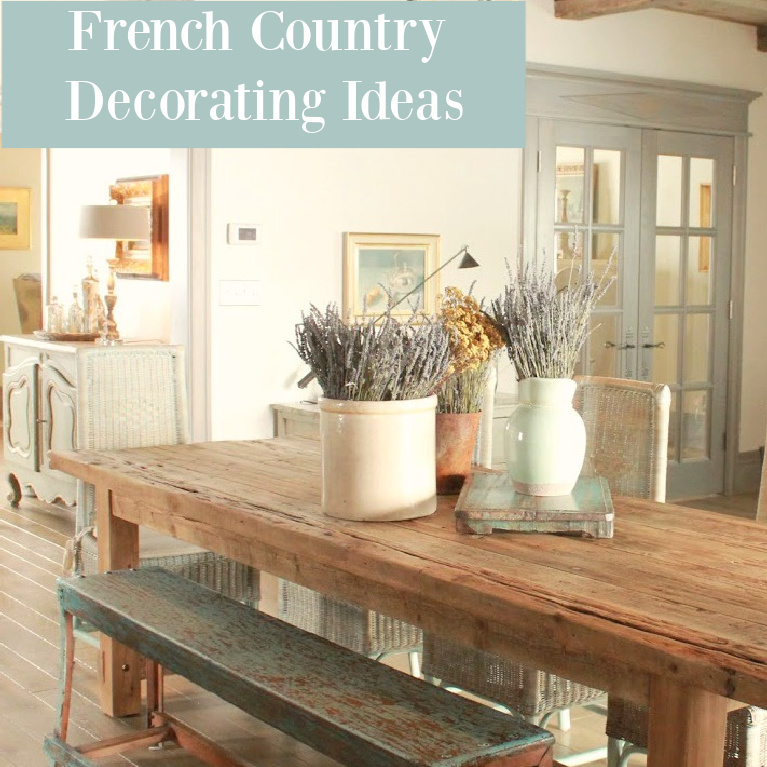
I independently selected products in this post—if you buy from one of my links, I may earn a commission.
Peace to you right where you are.
-michele
Thanks for shopping RIGHT HERE to keep decor inspiration flowing on Hello Lovely!
Hello Lovely is a participant in the Amazon Services LLC Associates Program, an affiliate advertising program designed to provide a means for sites to earn fees by linking to Amazon.com and affiliated sites.
